RE-PURPOSING TIME
By MICHAEL PERKINS
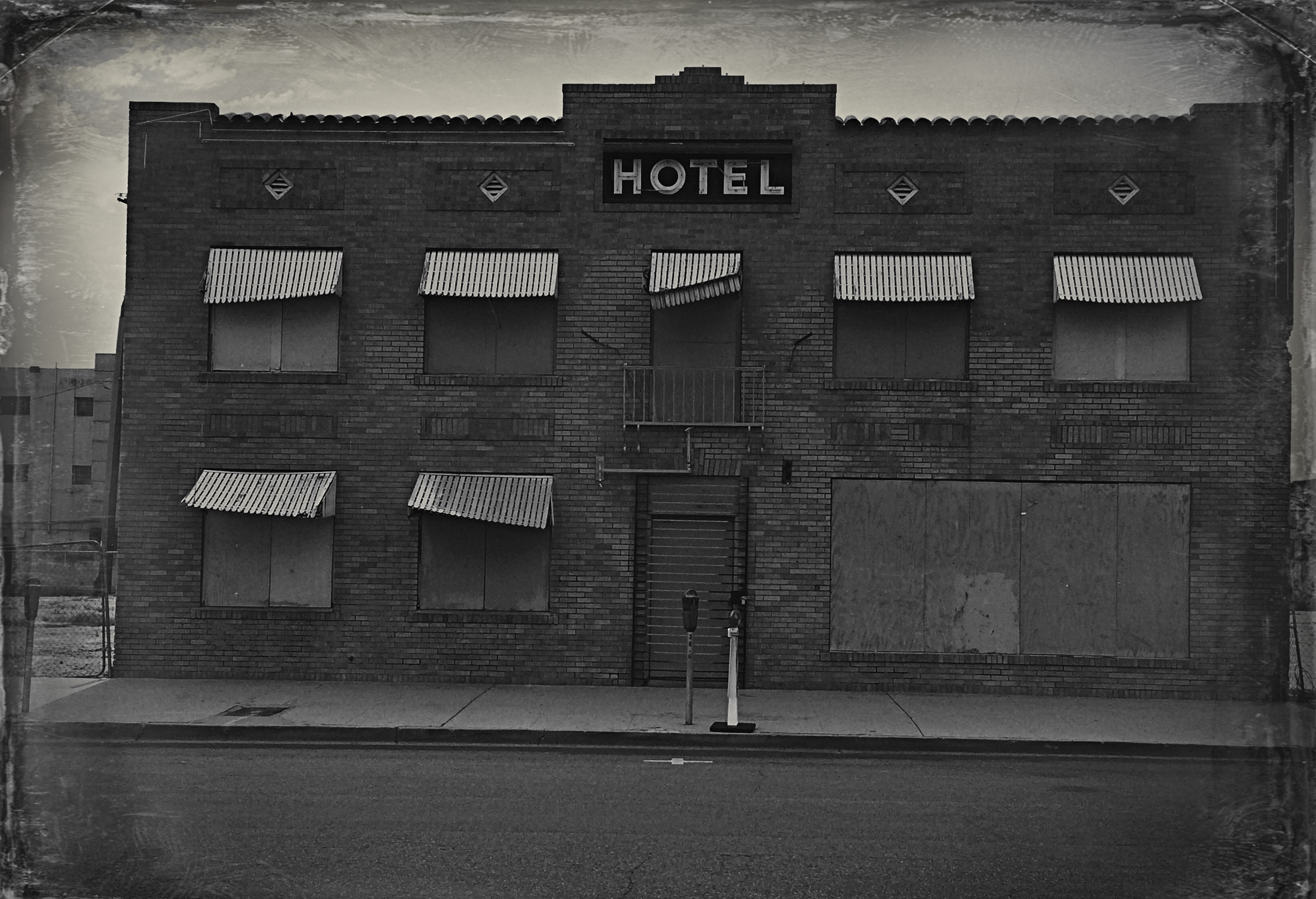
THE FIRST MASTERS OF PHOTOGRAPHY STRUGGLED with processes and tools that seemed to stack the deck against the chances that anyone would ever, ever create even a single photograph. Those first exposures, made with slow media and balky, uncertain lenses were not only works of art, but they were truly just plain, flat out work. I recently viewed a video demonstrating the bygone method known as photogravure, the means by which any “serious” photographic artist would render his work for critical approval in the late 19th-century. I was so utterly crushed by the sheer unforgiving precision needed to complete the process that I dropped to my needs and thanked the photo gods for giving me the luxury to merely….shoot. I felt at once lazy and liberated.
One thing these old exposure and processing systems did, however, is fix their visual aspects in time, so that, in our mental sorting process, we easily differentiate between the look of an 1850 wet-plate image and a 1950 Polaroid Land camera snapshot. Various periods in the methodological development of the art have their own distinct signatures. The strange thing is how, in the present era, we use apps and editing suites to summon those old ghost looks back into the present, mixing periods together like a cook throwing all his available ingredients into a garbage salad. We no longer give any thought to making something look old, or retro-old, or ironically old-ish. All times periods can exist in the same image, and whether they have any natural relation to each other is a moot point, if a point at all. We just do it because we can just do it.
Toto, I don’t think we’re in 1863 anymore.
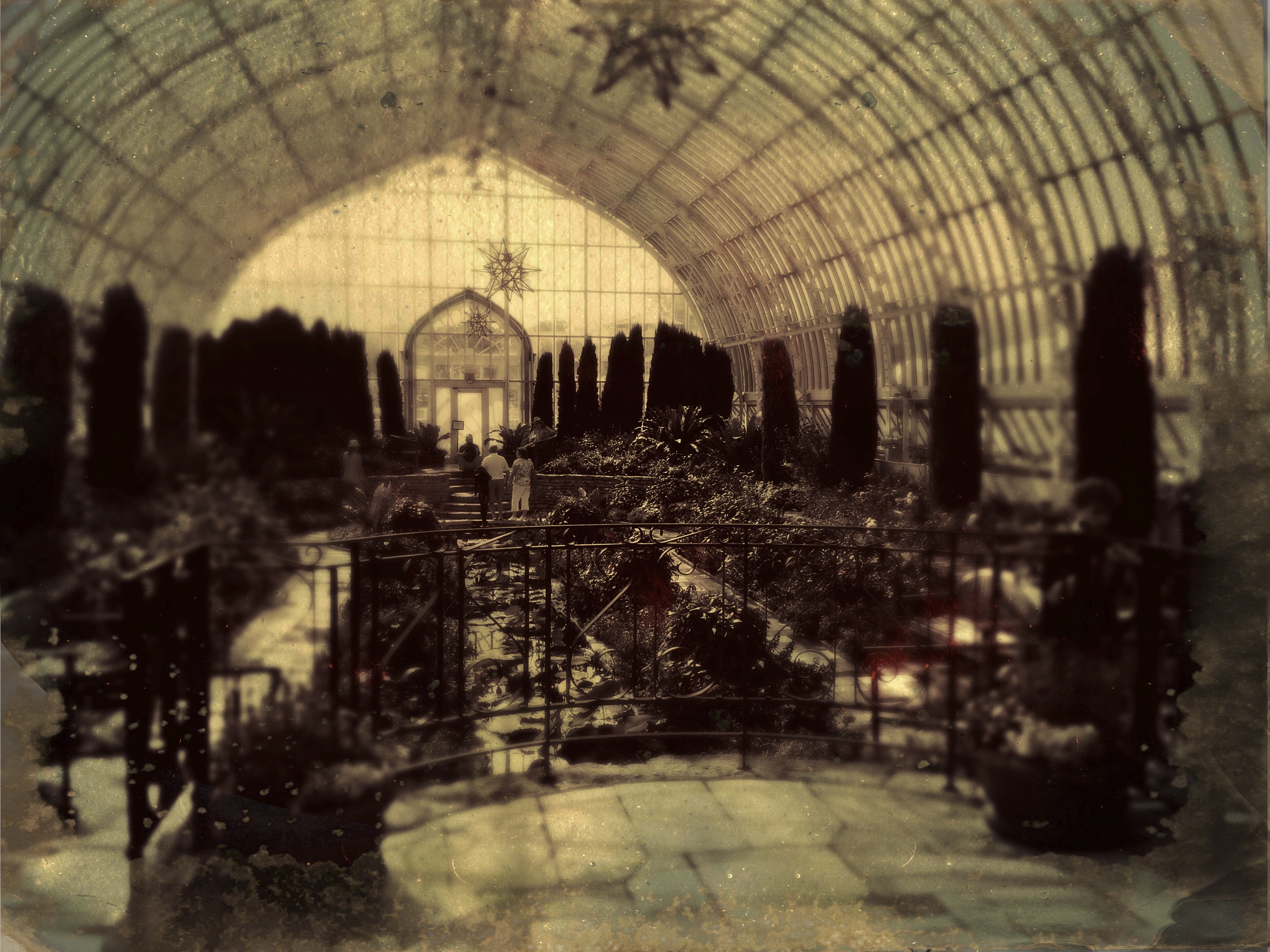
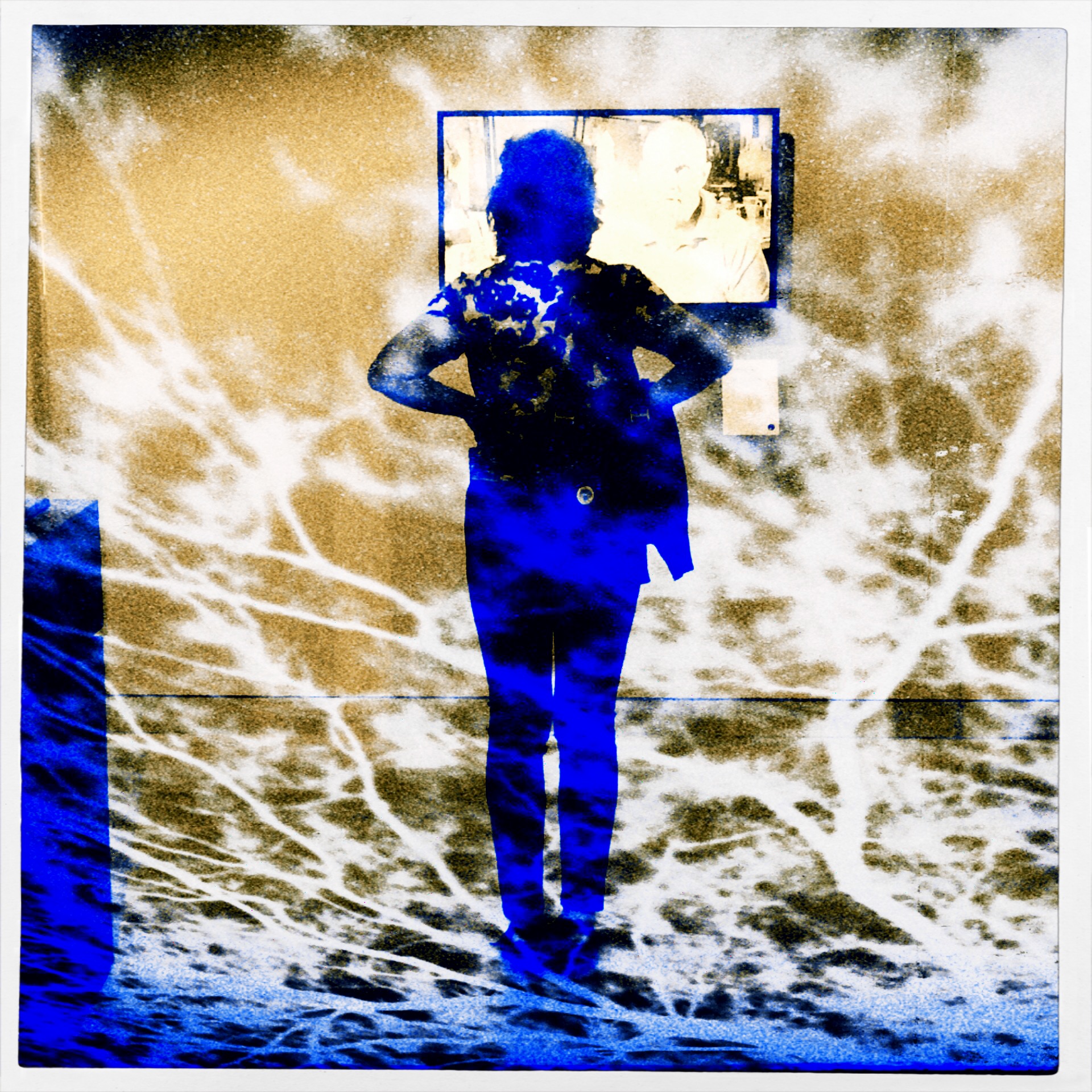
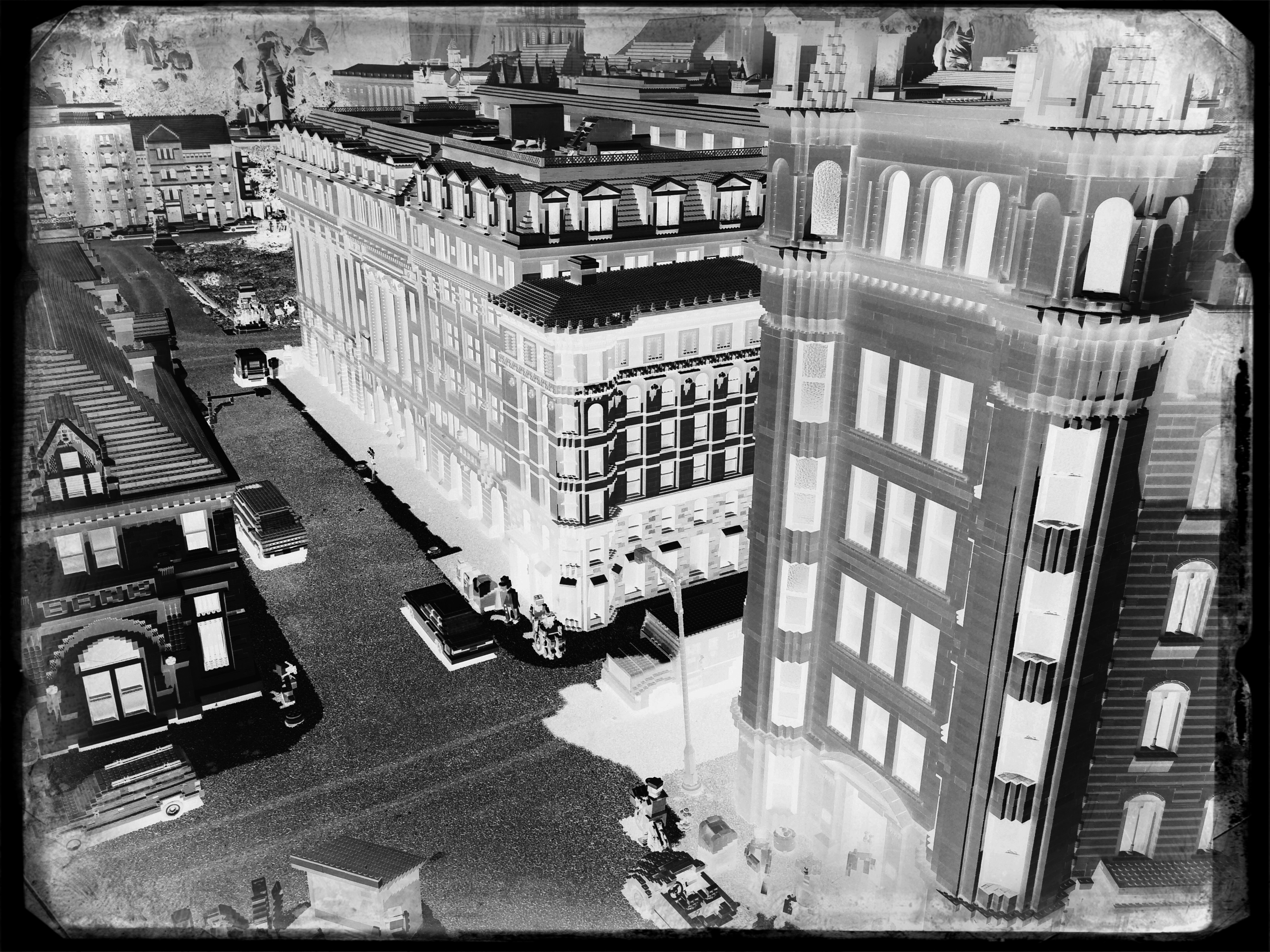
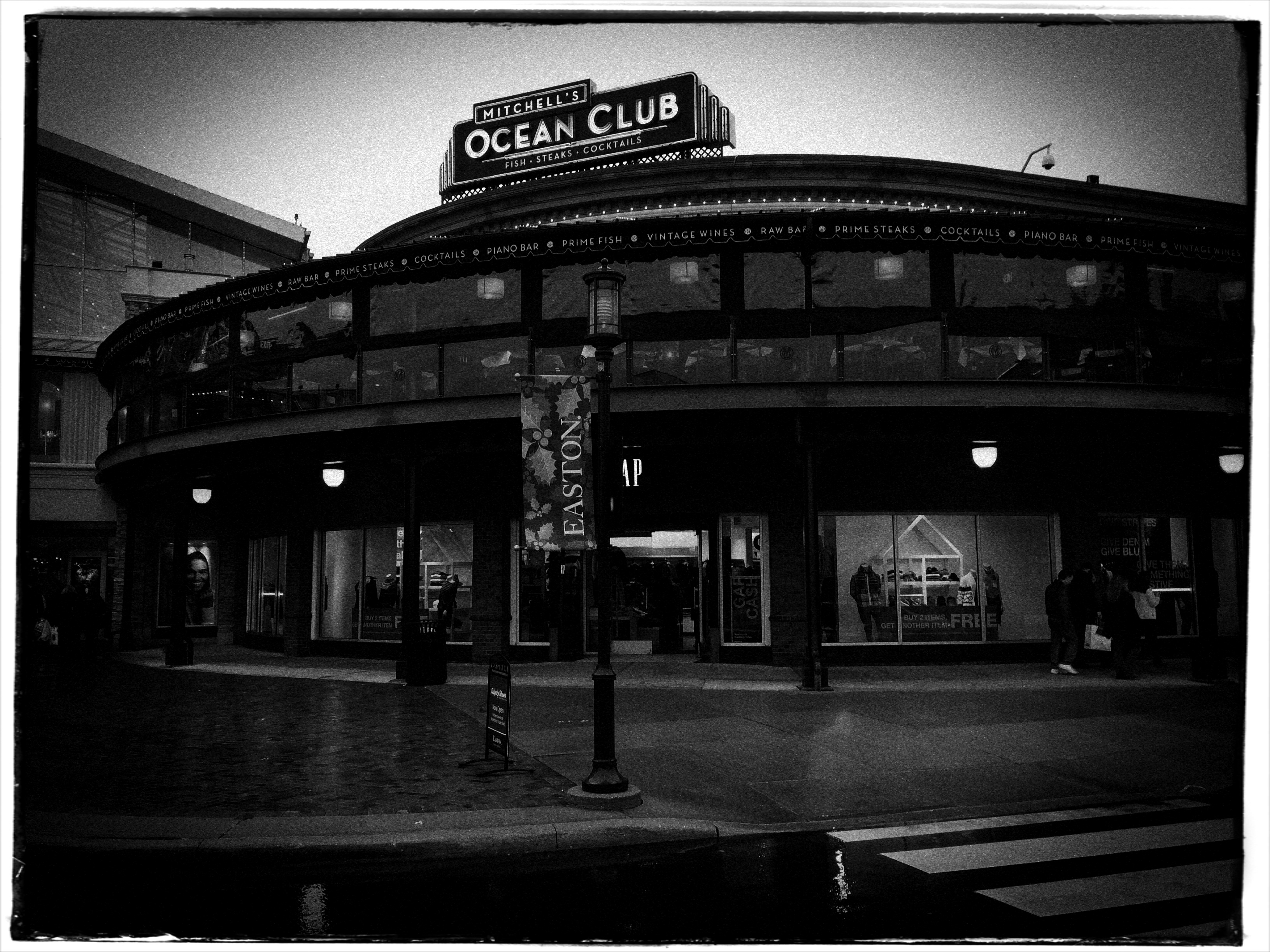
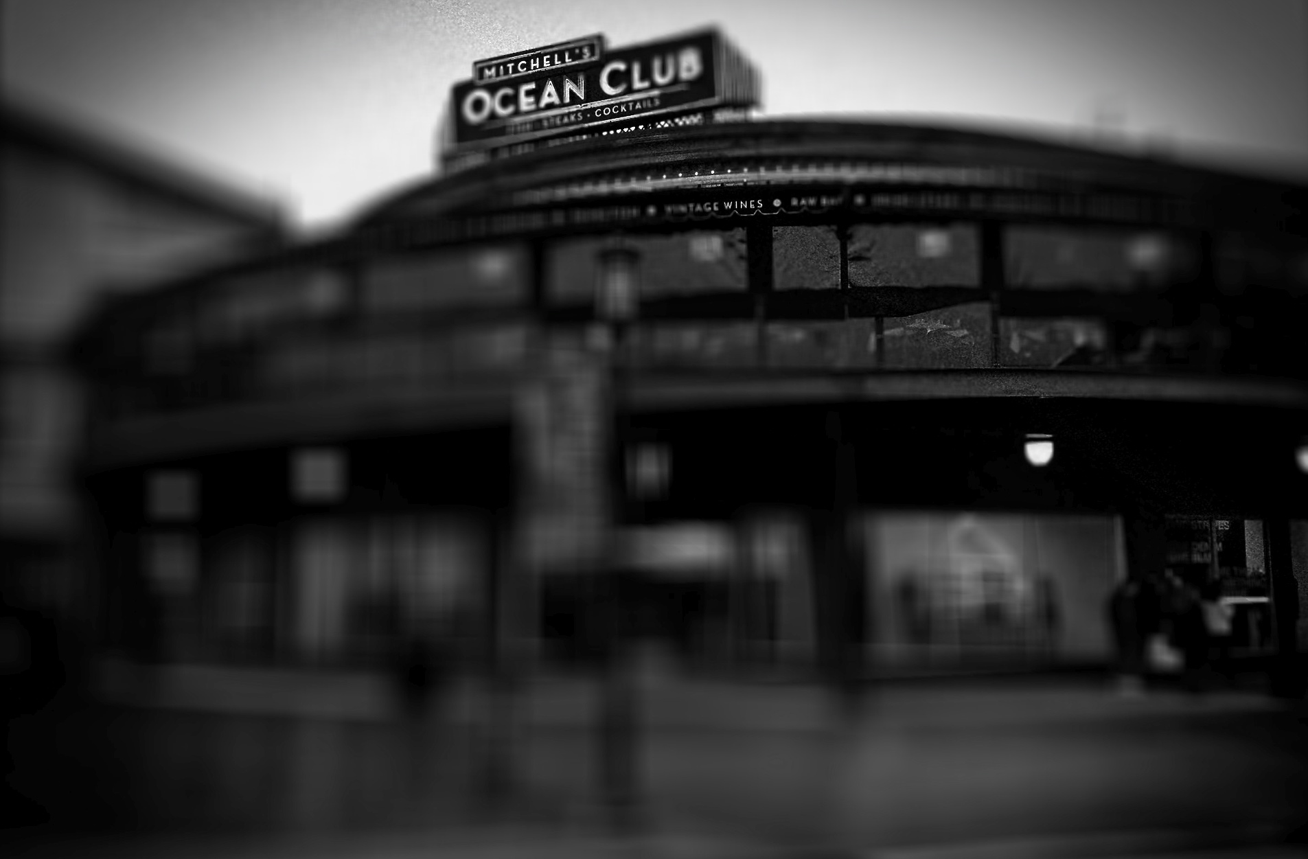
In the above picture, for example, I’m merely playing, without any real object in mind. The master photograph on which this remix is based was taken two months ago (Summer 2019) at the main greenhouse building at Minneapolis’ Como Park. The structure’s classic design, complete with rounded cupolas and gently curving rooflines, reminded me of the immense halls that were erected in the 1800’s to house international expositions, industrial shows and world’s fairs, and so I took a fairly straightforward shot from a cell phone and cranked it through an app to evoke an echo of that time, a visual masquerade that mimics the tintype process, right down to its selective pinpoint focus and plate grain. Admittedly, the illusion is spoiled a bit, since the people in the picture are wearing shorts and t-shirts rather than bustles and straw boaters, but that’s not the point. I wasn’t trying, like some master art forger, to make you think this was a newly discovered artifact of the Victorian age. And while I might have been trying to comment on “how we used to think of the purpose of grand public spaces”, or how that contrasts with the public spaces we value now…..I wasn’t. I was just goofing off, using quick and amazing tools the way a child might take Mr. Potato Head’s nose and put it where his ear should be.
What is singular, however, is knowing that any part of photography can be harnessed or combined with every other part of photography at any time. That’s not a hot bulletin, but it is worth pointing out from time to time that, after centuries of innovation, our art is now, like Kurt Vonnegut’s Billy Pilgrim, truly unstuck in time. Backwards, forwards, or right in the middle, what we shoot and where we stand are completely under our control.
TO BE CONTINUED
By MICHAEL PERKINS
AFTER YEARS OF STALLING AND DREAD, I just this week consigned my old desktop to the dustbin, and, at this writing, am taking a few days to reflect before its bright, shiny successor takes its place in my cluttered workspace. Normally, I wouldn’t even register the time blip between one computer and another, because, really, they’re just things, right?
But this seems different, only because this particular gizmo became the extension of almost everything I endeavored to do as a photographer over the last ten years. When I first inboxed the old girl, I was still teetering between film-dominant and digital-dominant work. Photoshop was a series of way-expensive DVDs that you bought at “the computer store”, a term which, then, still meant Gateway and Radio Shack. Cel phones were equipped with cameras that produced images that looked like bad xeroxes viewed through a mosquito net. “Mirrorless” meant a bathroom with no place to check your hair and makeup. “Raw” was how your guru liked his vegetables.
When my now-euthanized kerputer was new, the average shooter was only passingly familiar with online post-processing, the “digital darkroom” that was quickly revolutionizing how images were shot, tweaked, transmitted, and published. The art of photo editing, in some quarters, became more about fixing a photo than taking it, with many editorial decisions about the picture on Page One being made by young Turks who had never held a camera in their hands. In my case, my computer took me into new areas of control and refinement, even as I strove to create most of my magic in-camera. I traveled through new lands with names like HDR, Lomography, and There’s An App For That. Most importantly, the blog you’re now reading was born on that now-obsolete device, as well as the means for illustrating and editing my personal journey from taking pictures to making them.
And so, yeah, I’m just moving from one tool to a newer version of that tool, just as I once moved on from my childhood piano to the one I play now. But, even though you may own many bikes during your lifetime, you hold a special place in your heart for the one you learned to ride on.
But it is, finally, about the ride, not the vehicle, just as photography is about normalizing the eye, not mastering a particular camera.
So let’s get pedaling, and see where this road goes.
ACCIDENTALLY ON PURPOSE
By MICHAEL PERKINS
THE IMAGE SHARING GROUP UTATA, which operates within Flickr, has been, for this boy snapper, a daily touch of Christmas. It expands upon the rather pointless online quest for mere “likes” and is, instead, a genuine dialogue with other like-minded strange-o’s who want to push the boundaries of at least their own eyes and commiserate with others who long to do the same. The administrators keep Utatans united with periodic, deadline-based homework assignments organized along a a variety of seriously unconventional themes. Some require serious thought. Some can be created almost completely on impulse. And many more fall somewhere in between.
One of the nice bits of insta-fame conferred upon Utatans is having their work occasionally plugged onto the utata.org welcome page. Even better, head honcho Greg Fallis and his fellow guardians of the Utata universe will often provide new captions, poems, or essays of their own for the images, as if to tangibly demonstrate that, just as there is more than one way to see, there are a million ways to be seen. Upon recently conferring home-page status on a rather hurried celphone image I’d posted, Greg also managed to perfectly crystallize thoughts I’ve mulled over recent years:
A quick impulse, a thing of no importance. And that, in itself, may be important.
See, here’s the thing about shooting photographs with your cell phone: it’s not a serious camera. That means you can relax. Try stuff. Shoot something different. Shoot something familiar in a different way. Shoot something different in a familiar way. It’s liberating because it’s “just” your cell phone.
In fact, the image was made in a very short space of time, shorter by far than if I’d made it with my “real” cameras. The original phone selfie was fed through an app designed to mimic both the strengths and weaknesses of antique portrait lenses, and, since I liked the ethereal quality it delivered, I decided to stop. Just stop. Stop fooling, fretting and fixing. Stop, and publish.
So, have I gotten to the point, at least some of the time, when I’m really living that old saw that “the best camera is the one you have with you?” Am I more spontaneous, more open to experiment, higher up the “wot the hell” scale when armed with a cel? Dunno. Really. Not being coy. I definitely still feel that umbilical-cord connection to my trad gear. But I dig immediate gratification as well, at least the gratification of shortening the gap between “wonder what would happen” and “hmm, that kind of worked.”
Is my conventional gear more “real”than my iPhone? Well, how do you define real? Obviously, there is an almost infinite number of post-processing tools available to compensate for whatever shortcomings the cameras themselves might possess. So, if I do advance prep in a DSLR before the shutter snap to ensure a good picture, does it disqualify an image if I snap it first and then enhance it afterwards in a cel? What is a darkroom? What is a workflow?
Big questions. And I don’t always get the same answers when I ask them.
POCKET MASH-UPS
Cross-Purposes (2016)
By MICHAEL PERKINS
IT’S TRICKY TRYING TO TRACK THE HISTORIC ORIGINS OF PHOTOMONTAGE, or to even isolate great early practitioners of the technique. Suffice it to say that, ever since the development of the glass negative, people have wondered what it would look like if you stacked one of them on top of the other and printed the result. Opinions vary wildly as to whether the results of such experiments constitute madness or miracle…it’s a taste thing. One thing is clear, however: the mobile age presents easier means than ever before for diving in to the montage pool and creating fast experiments at a fraction of the hassle experienced in film days.
(Now is the part where you decide whether that’s a good thing…..)
One of the top benefits of phone-based cameras is the huge number of highly responsive apps targeted at the tinkerer, the guy who wants to try just one more filter, one more effect, or a grand mash-up of everything together. Unlike the days of lab-based development and printing, digital montages are almost an immediate thrill. Better still, they can be re-imagined and re-done with the same short turnaround time inherent in all digital processes. That means that certain types of shots that would have priced themselves out of many a film shooter’s budget or know-how in Film-World are now just givens in Digital World.
(Now is the part where you decide how you feel about that…..)
Immersive Experience (2016)
If the same tools for experimentation or interpretation are in everyone’s hand, then such effects are no longer judged as wonderful just because they are rare, or novel, but for how well they are employed. In fact, a gimmick like photomontage can quickly become tiresome if over-used or under-inspired. The sample shots in this post are two-image composites processed on an app called Fused, which allows two photos at a time to be overlaid and custom-blended for a variety of contrast and color tweaks. Sometimes the effect can help pictures which are totally dissimilar find some common bond, but, at least for me, about 90% of the blends I try are kinda meh and are sent to the Phantom Zone faster than you can say “well, that didn’t work”. You can’t force the linkage just to be arty (well, of course you can, but..).
Pocket mash-ups are just one more way to untether photography from “reality” (whatever that is), and channel it into a personal form of abstract expression. That means it’s all about you. So what’s not to like?
INSTANT VELVET
A portrait straight from my camera, with no prior filtration.
By MICHAEL PERKINS
THERE WERE, IN THE DAYS OF FILM, two main ways to create the velvety glow of uniformly soft focus so prized by portrait subjects. The more expensive route lay in purchasing a dedicated portrait lens that achieved more or less of the effect, depending mainly on aperture. The other, cheaper way was to screw-on a softening filter, making any lens adaptable to the look. Now, in the digital era, those two options have been joined by softening apps for phone cameras and in-camera “filters”, which add the effect after the photograph has been snapped.
That’s the beauty of where we are in the history of photography, where every problem has a half-dozen different solutions, offered at different levels of complexity, ease, and affordability. In the golden days of Hollywood, cinematographers achieved the soft look with some Vaseline smeared over the lens, or by attaching different gauges of gauze to the glass. Both tricks made yesterday’s matinee idols look like today’s ingenues, and now, anyone with a reasonably sophisticated camera can achieve the same success with half the bother.
The same image after the application of Nikon’s in-camera “soft” filter.
I myself prefer to shoot soft focus “live”, that is, in the moment, with either a dedicated lens or a filter, but you aren’t always in the same frame of mind when you shoot something as when you review it later. In-camera processing, while offering less fine control (tweaking pictures that have already been shot), can at least give you another comparative “version” of your image at literally no trouble or cost. With Nikon, you simply select the “Retouch” menu, dial down to “Filters”, select “Soft” and scroll to the image you want to modify. For Canon cameras, go to the “Playback” menu, select “Creative Filters”, scroll to “Soft” and pick your pic. The image at left shows the result of Nikon’s retouch filter, applied to the above picture.
One personal note: I have tried several phone app softeners as post-click fixes, and find that they generally degrade the quality of the original image, almost as if you were viewing the shot through a soup strainer. Your mileage may vary, but for my money, the app versions of soft focus are not ready for prime time yet. Best news is, the soft-focus effect is so popular that eventually all solutions will be generally equal, regardless of platform, since the marketplace always works in favor of the greatest number of people making pictures. Always has, always will.
All things considered, we got it pretty soft.
PUT ‘ER IN REVERSE
A glass elevator at a shopping mall, converted to a negative, then a fake Technicolor filter in a matters of seconds, via the phone app Negative Me.
By MICHAEL PERKINS
THERE ARE MANY WAYS TO FORCE YOUR AUDIENCE TO SEE THINGS ANEW, to strip away their familiar contexts as everyday objects and create a completely different visual effect. The first, and most obvious form of abstraction we all learned in our cradle, that of rendering a subject in black and white. Some early photographers spent so many years in monochrome, in fact, that they actually regarded early color with suspicion, as is it was somehow less real. The moral of the story is: the photograph demonstrates the world that you dictate, shown strictly on your own terms.
Abstraction also comes about with the use of lenses that distort distances or dimensions, with re-assignment of color (green radishes, anyone?), and by compositions that extract subjects from their natural surroundings. Isolate one gear from a machine and it becomes a different object. Magnify it, light it differently, or show just a small portion of it, and you are taking it beyond its original purpose, and into abstraction. Your viewer is then free to re-interpret how he sees, or thinks, about that thing.
One swift gift of the post-digital world that I find interesting is the ability, through apps, to render a negative of any image with a click or swipe, then modifying it with the same color filters that you might apply to a positive photo. This affords an incredible amount of trial-and-error in a remarkably short space of time, and better yet, you’re out in the world rather than in the lab. Of course, negatives have always been manipulated, often to spectacular effect, but always after it was too late to re-take the original picture. Adjustments could be made, certainly, but the subject matter, by that time, was long gone, and that is half the game.
The eerie look of a an aerial reconnaissance photo, here applied to a city model at Legoland.
Reversing the color values in a photograph is no mere novelty. Sometimes a shadow value can create a stunning design when “promoted” to a lead value with a strong color. Sometimes the original range of contrast in the negative can be made more dramatic. And, occasionally, the reversal process renders some translucent or shiny surfaces with an x-ray or ghostly quality. And, of course, as with any effect, it can just register as a stupid novelty. Hey, it’s a gimmick, not a guarantee.
“Going negative”, as they say in the political world, is now an instantaneous process, allowing you the most flexibility for re-takes and multiple “mixes” as you combine the neg with everything from toy camera effects to simulated Technicolor. And while purists might rage that we are draining the medium of its mystery, I respectfully submit that photographers have always opted for fixes that they can make while they are in the field. And now, if you don’t like the direction you’re driving, you can put ‘er in reverse, and go down a different road.
YA BIG SOFTIE
These uber-cupcakes didn’t look nearly seductive enough in reality, so I added a gauzy layer in SoftFocus and a faux Technicolor filter in AltPhoto.
By MICHAEL PERKINS
ONE OF THE MOST FREEING THINGS about digital photography, especially in the celphone era, has been the artificial synthesis, through aftermarket apps, of processes that used to require lengthy and intricate manipulation. Much has been written about various apps’ ability to render the look of a bygone film stock, an antique lens, or a retro effect with just a click or swipe. The resulting savings in time (and technical trial and error) is obvious in its benefit, as more people shoot more kinds of images in which the shooter’s vision can be realized faster, perhaps even more precisely, than in the days of analog darkrooms.
Okay, now that the sound of traditionalists’ heads exploding subsides, on to the next heresy:
The creation of the so-called Orton technique by Michael Orton in the 1980’s was a great refinement in effects photography. The idea was simple: take two images of a subject that are identical in every spec except focus, then blend them in processing to create a composite that retains rich detail (from the sharp image) and a gauzy, fairy-tale glow (from the softer one). The result, nicknamed the “slide sandwich”, was easy to achieve, even for darkroom under-achievers. The most exacting part was using a tripod to guarantee the stability of the source images. Looked nice, felt nice.
Early on in digital, editing suites like Photomatix, designed to create HDR chiefly, also featured an option called Exposure Fusion, which allowed you to upload the source images, then tweak sliders for the best blend of sharp/no sharp. And finally, here come the soft-focus phone apps like Adobe Photoshop Express, Cool Face Beauty, Camera Keys, and yes, Soft Focus, allowing you to take just one normally focused shot and add degrees of softness to it.
Caveat emptor footnote: not all these apps (and there are many more not cited here) allow you to begin at a “zero effect” start point, that is, from no softening to some softening. They start soft and get softer. Also, most allow basic tweaks like brightening and saturation, but that’s about it. If you want to add contrast or something sexier, you may have to head back to the PC.
The important thing about softening apps are: (1) they save time and trouble in the taking of the source image, of which you only need one (which can be handheld now), and (2) they don’t so much as soften the master image as layer a gauzy glow over top of it.You either like this or you don’t, so, as Smokey says, you better shop around. Gee-whiz factor aside, the old rule for gimmicks still applies: tools are only tools if you like and use them
UNDER A DARKENING SKY
Dark skies, old-school way: a red 25 filter in front of a DSLR.
By MICHAEL PERKINS
SOMEONE HANDIER WITH A SLIDE RULE THAN ME RECENTLY OBSERVED that the raw numerical totals, on photo sharing sites, had shifted in favor of mobile images over those taken with more conventional cameras. In other words, the war was over, and the phones had won, at least in the sheer tonnage of uploaded images. Not sure that I yet regard that assertion as divine revelation, but the fact is that, as mobiles become a bigger component of overall photography, a second shift in technique will also continue, that between conceptualizing and compensation.
Dark skies on a cel phone with the addition of a “red sensitivity” app effect.
By conceptualizing, I mean the system, for traditional photographers of planning their shots before the shutter clicks, choosing settings, pre-editing the composition in the frame, any kind of advance prep. By compensation, I mean the emphasis, with mobiles, on adding filters and fixes after the click, technically learning how to make the most of what you were able to get.
One rather fun element I like to play with at present is the two approaches to high contrast black & white, especially the “black sky” effect which can force foreground objects to pop with greater drama. Shooting out in the Arizona desert for years, I have more frequent use for this effect than I might in more, well normal areas of the country. Traditional approach to this with a DSLR, of course, is the attachment of a red filter. You have to grope around for the right exposure, since you might lose the equivalent of two stops of light, depending on the situation, but it’s a great look. So that’s for us “conceptualizing” folks. See an example up top of the page.
The “compensation” peeps, who might have done their original shot on a phone, in color, is often referred to in apps as “red sensitivity” which adds the dark-sky look as it converts the shot to black and white. Usually you can only tweak the intensity of the effect (sometimes brightness as well), but it delivers a fairly good facsimile of the DSLR’s red filter, albeit with a little black lint kind of texture to the skies that you can usually get rid of with a noise reduction slider in your computer. The results, as you can see off to the left, are fairly acceptable.
If you’re shopping for filters beyond those in your own camera native app, consider adding one that includes red sensitivity. It’s one more “compensation” tool that’s nice to carry in your back pocket.
POCKET PALS
A color shot converted in the app Alt-Photo, using its simulated red filter for super-contrasty monochrome.
By MICHAEL PERKINS
QUICK, DO YOU KNOW WHO MADE THE HAMMER IN YOUR KITCHEN DRAWER? Let’s assume that it’s not a Sears Craftsman, but something you bought on the spot when you just needed, like, a hammer. Yeah, I’ll wait.
Follow-up question: does your off-brand Thor-wacker drive nails any less efficiently than a Sears? Or is it really all in the wrist?
In photography, sometimes tools is just tools. Cellphone apps comprise one of the the most glutted product markets ever, and, while some products do rise to the top and/or international prominence, there are gobs of different players out there to help us solve the same old problems, i.e., composition, exposure, color range, special effects. Those are the basics, and you need not be loyal to any predominant type-A app when, by the time I type the rest of this sentence, forty more guys will have served up their own solution for the exact same need. Go with what works. Add, subtract, adopt, dump, delete, and adore as needed.
Most cel camera apps, toolwise, are closer to a Swiss Army knife than a scalpel, blunt instruments that either apply an effect all-on or all-off. Single click, caveman-level stuff. Still, even the casual cel photog will pack a few of them along to do fundamental fixes on the go, and I recently noticed that I had acquired a decent, basic utility belt of bat-remedies, including, in no particular order:
Negative Me. Just what it says. Converts positive images to negative. Not something you’ll use a lot, but..
Simple DOF. A quick calculator that measures near, far and infinite sharpness based on distance, aperture and lens.
Fused. Instant double exposures, with about ten different blending formulas.
Soft Focus. Sliders for sharpness, brightness, color saturation. Instant glamor for portraits.
Timer Cam. Get in the photo.
Instants. Genuine fake Polaroid borders around your landscape or square images. Because we can’t give up our hipster groove.
AltPhoto. Best simulations of older classic film stocks from Kodachrome to Tri-X, as well as red filter, toy camera and antique effects.
Tilt-Shift Focus. Narrow the sharp areas in your images from a pinpoint to a basketball.
Flickr. Direct link to the mother ship
Pic Stitch. Framing templates for collages of two or more images. Drag and drop simplicity.
Use of these gimcracks ranges from the (yawn) occasional to the (yes!) essential, and your mileage may vary. Thing is, it’s truly a buyer’s (and user’s) market out there. Gather your own gold and click away.
VIRTUAL SHOPLIFTING
Thrift shop still-life: a mobile phone close-up of an antique camera flash pan, negatized in post-editing.
By MICHAEL PERKINS
ONE OF THE EMERGING OPPORTUNITIES FOR PHOTOGRAPHERS is the newly accepted way not to look like a photographer, a kind of invisibility based on strange public perceptions. This has only become possible with the arrival of the smartphone, and, although insane logically, it affords a new freedom to street photographers.
It’s simple, if crazy: carry an actual camera inside a phone, just as many millions of others do, and you’re somehow “safe” or trustworthy, not one of predatory, intrusive “professionals” with obvious cameras who are out to trick you, track you, capture your soul in their satanic box. Now, how we explain away the fact that the phone camera is far more stealthy, far more insidious and far more omnipresent than, say, a Canon or Nikon is anybody’s guess. But, dopey or not, this new code is now hard-wired into people’s brains as it regards street work. So little camera=harmless. Big camera=end of the world as we (or over-zealous mall cops)know it. You figure it out.
So, when it comes to grabbing quick snaps in stolen moments, it’s becoming harder not to embrace the crazy and just use a smartphone as your default street tool. I’m not completely there yet, but when I’m surrounded by things that I will either never see again, or have never seen before, it’s tempting to play spy shooter with the little clicker.
Some of the greatest sources of still life material, for example, are the dense shelves of flea markets, antique shops and thrift stores. You don’t want to buy this stuff, since (a) you can’t afford it and (b) the Mrs. will send both it and you to Goodwill, but the occasional odd item might just make a decent abstract bit of design. Camera gear from yesteryear is always an easy sell, and I was ecstatic to do a virtual shoplift on the ancient flash attachment you see above as a fun way of re-purposing an object through selective framing and processing.
It’s frustrating to find more and more places where it’s easier to negotiate a nuclear treaty than get an okay for regular photography, so it’s no shock that more and more inroads are being made for mobile cameras and the access that no one feels like denying them. And they say I’m nuts.
REVERSAL OF FORTUNE
The bell of an engraved sousaphone, converted into a negative and color-boosted to resemble a faux vortex.
By MICHAEL PERKINS
FOR THOSE OF US WHO SWEATED IN LITERAL DARKROOMS (as opposed to digital ones), there has always been a fascination with the print photographer’s equivalent for “RAW” files, the celluloid negative. Manipulated properly, one neg could yield an almost endless variety of print results, as the sciences of burning, dodging and pure imagination were applied to coax subtle tonal changes and modulations out of either color or monochrome images. Ansel Adams’ frequently quoted remark that the negative was the score and the print was the performance was born out in his own visual “symphonies” along with those of millions of others.
But the negative need not merely be the understudy for the “final” version of a picture, but the final itself. And as we’re freed to experiment via new digital apps, we are more frequently re-imagining shots with reversed tones, often creating dramatically more effective results than the “positive” originals. Again, apps are speeding the time of practice and development in a way that chemically-based, film-based manipulation never could. Tap and you’re done. Tap, tap, and the result is either sent to the keeper pile or re-done in an instant. It’s pretty irresistible.
There have always been amazing examples of artists who made their negatives the “official” version of their pictures, although the neg is traditionally thought of as a step in a process, not an art form it itself. I remember being thrilled when, as a teen, I first saw F.W. Murnau’s silent masterpiece Nosferatu, which includes a thrilling, eerie scene with a ghostly, horse-drawn carriage on its way to Count Orlok’s castle, deliberately printed in negative to boost the creepy drama of the sequence. And with new phone-based apps, it’s easy and fast to get a basic version of this effect, albeit with some limits.
The app I use, called Negative Me, is a very basic (and free) tap-on layer. Choose a file photo, apply the effect, and you’re done. It’s also possible to shoot new pictures directly through the app. Yes, it’s frustrating that you can’t attenuate the tone or the intensity in any way, but, you can always take the extra step of feeding the first negative image into additional apps or editing suites where more precise processing can be added. It’s still easier than any process that was available in the film era, and, while it merely adds strangeness to many photographs, it allows some to be reborn as abstractions that are unearthly and dramatic.
Producing a negative variation on certain shots is just another way to re-interpret a shot, no less useful than any other color filter or post-processing tool. Like anything else, it’s the impact of the result, not the effect itself, that makes the shot.
SPREADING OUT THE SPRAWL
By MICHAEL PERKINS
PANORAMIC PHOTOGRAPHY IS REGARDED BY MANY AS A BIT OF A GIMMICK, an effect confined to the same realm as 3-d, fisheye lenses and faked pictures of cats driving sports cars. As a result, it’s rare that a pano is used for anything serious beyond landscape views, and, although apps have allowed even modest phone cameras to produce a modified panoramic effect, the majority of shots are still of ultra-wide, scenic vistas….the view from the beach to the resort hotel two blocks inland, and so forth.
But panos can be used to convey both scope and scale on subjects that have nothing to do with mountains or shorelines, and it’s encouraging to see more new photographers using the recently evolved technology to take advantage of that storytelling option. To use one example, the whole concept of sprawl–congested cities, vast arrays of clutter, the aftermath of the industrial age—seems custom-made for the panoramic’s less limited space requirements. It can actually open up editorial angles on a whole new range of subject matter.
The Ponderous Pile, 2015. Some subjects benefit from this obvious distortion of perspective.
Panos are great for showing overabundance, the sensory overload of contemporary life. In the above photo, it’s used to show the bulging, burgeoning, out-of-control volume of stuff in a congested antiquarian bookstore. The composition is dictated by the ultra-wide format to a degree, but when it’s married to the right subject matter, the shots can have a singular impact.
As with any other effect, there has to be a bottom-line benefit to the tale you’re trying to tell. It’s not enough to elicit a reaction of “wow, that looks weird”. That just relegates what you’ve shot to mere novelty. The upfront question should be: why are you deciding to distort visual reality or amp up the drama on this particular occasion? The effect has to seem inevitable in the result, with your audience admitting that, certainly, that was the best way to approach the shot and get the story across.
Sometimes photographs are about both process and subject. Panoramics have their place in serious photography, but only in serious hands.
DETAILS, DETAILS
Moody, but still a bit too tidy. Black and white by itself wasn’t enough to create the atmosphere I wanted.
By MICHAEL PERKINS
EVEN THOUGH MOST GREAT PHOTOGRAPHERS PROCLAIM that any “rules” in their medium exist only to be broken, it’s often tough to chuck out regulations that have served you well over a lifetime of work. Once you get used to producing decent images through the repetition of habit, it takes extra nerve to take yourself outside your comfort zone, even if it means adding impact to your shots. You tend not to think of rules as arbitrary or confining, but as structural pillars that keep the roof from falling in.
That’s why it’s a good exercise to force yourself to do something that you feel is a bad fit for your style, lest your approach to everything go from being solid to, well, fossilized. If you hate black and white, make yourself shoot only monochrome for a week. If you feel cramped by square framing, make yourself work exclusively in that compositional format, as if your camera were incapable of landscape or portrait orientations. In my own case, I have to pry my brain away from an instinctual reliance on pinsharp focus, something which part of me fears will lead to chaos in my images. However, as I occasionally force myself to admit, sharp ain’t everything, and there may even be some times when it will kill, or at least dull, a picture.
Sharpness just where it’s needed, and nowhere else.
With post-processing such an instantaneous, cheap, and largely effortless option these days, there really isn’t any reason to not at least try various modes of partial focus just to see where it will lead. Take what you believe will work in terms of the original shot, and experiment with alternate ways of interpreting what you started with.
In the shot at the top of this post, I tried to create mood in a uniquely shaped fish house with monochrome and a dour exposure on a nearly colorless day. Thing is, the image carried too much detail to be effectively atmospheric. The place still looked like a fairly new, fairly spiffy eatery located in an open-air shopping district. I wanted it to look like a worn, weathered joint, a marginal hangout that haunted the wharf that its seafood theme and design suggested. I needed to add more mood and mystery to it, and merely shooting in black & white wasn’t going to get me there, so I ran the shot through an app that created a tilt-shift focus effect, localizing the sharpness to the rooftop sign only and letting the rest of the structure melt into murk.
It shouldn’t be hard to skate around a rule in search of an image that comes closer to what you see in your mind, and yet it can require a leap of faith. Hard to say why trying new things spikes the blood pressure. We’re not heart surgeons, after all, and no one dies if we make a mistake.Anyway, you are never more than one click away from your next best picture.
APP-Y HOLIDAYS

You can convert a color shot through the “old Kodachrome” filter on the AltPhoto app…..
By MICHAEL PERKINS
THE HOLIDAY SEASON MAY OFTEN SEEM TO HAVE “OFFICIAL” COLORS, (red, green, etc.) but its unofficial colors reside primarily, and gloriously, in memory. Given how many iterations of photography span most of our lives, our minds tend to twist and tweak colors into highly individualized chromatic channels. Are your most treasured moments in ’50’s Black and White? ’60’s Kodachrome? In the time-tinted magentas of snaps from the 70’s? In blue-green Super 8 Ektachrome or expired Lomo film? Or do you dream in Photoshop?
This is personal stuff, very personal. It seems like we ought to agree universally on the “correct” colors of the season, but, given that our most precious holiday moments are preserved on various archival media, it might be our memory of seeing these events “played back” that is stronger than our actual remembrance of them. As Paul Simon says, everything looks worse in black and white, or in this case, what really happened pales in comparison to our print, Polaroid, movie and slide souvenirs.
..or you can whip up this warm platinum print simulation.
This means that there are a million subliminal color “cues” that trigger memory, and not all of them come from “correctly” exposed images. Color is mood, and seasonal pictures can benefit greatly from the astounding range of processing tools suddenly available to everyone. Not all photographs benefit from apps and digital darkroom massages, for sure, but their use is perhaps more seductive, in this mental mid-point between reality and memory than at other times of the year. Fantasy is in play here, after all, and fantasy has no “right” hue. Dreams are too vast a realm to be confined to the basics, so ’tis the season to dip into a wider paintbox.
Memory needs room to breathe, and the photographs that help them fully fill their lungs become the gifts that keep on giving.
I’M INTO METAL, MAN
A cel image processed through an app designed to simulate Pantatonic-X black & white film.
By MICHAEL PERKINS
WHEN I SAY THAT CURRENT DAY SHOOTERS ARE NOT HALF THE PHOTOGRAPHERS THAT THE OLD MASTERS WERE, that is not intended as an insult, but a simple bit of math. Given the fact that pioneers in the imaging game had to be equal parts artist and chemist, we only apply 50% of the effort these valiant visionaries did in negotiating the interactions of salts, albumens, bromides and other lab ingredients in an effort to even bring an image forth, much less do so with control. The technology that we employ today, and the speed and convenience with which we sling it around, should give us pause. The artistic mission of photography remains the same. It’s just that we don’t have to suffer as much for said art.
One of the marvelous processes from those years that still dazzles even the contemporary eye is the platinum print, so called because a platinum coating actually sits as a layer atop the developing papers, creating a print that contains a greater tonal range than any other monochrome process, including hints of gold, brown and red.Even better, what Kodachrome turned out to be for the archival permanence of color photography, platinum is for monochromatic images. It looks like a million bucks and will never degrade within the average person’s lifetime, or their great-grand kids’, neither. If you are over fifty and ever sat for a “serious” studio portrait, chances are you were immortalized in platinum. Literally speaking, you’re into metal, man.
Never for the timid (or the impecunious), platinum printing has largely faded (sorry) from the photographic scene along with the filmic science that birthed it, but, as with so many other “looks” in the digital era, things that were once merely processing are now content as well.
Same image as above, but processed through AltPhoto’s faux-platinum filter.
From where we stand, we can rifle through 200 years of processes and selectively decide to evoke an era or a mood a single picture at a time, just because we want to evoke a different time or place in our common cultural consciousness. We do this at our whim, unlike the people who actually devised the processes, who were stuck with them until they had (a) better knowledge of how to do things, (b) more money (c) both.
The digital apps that simulate the platinum print are gaining some popularity, as people apply instant alternate “mixes” of their cel phone shots, including up to a dozen different ways to envision a shot in monochrome. Those who appreciate the fine science in the original lab smarts required to create these looks in the film era claim that too little control resides in the user for a true one-to-one, film-t0-digital equivalency in any of these apps, but I have found that platinum creates a distinct, extra tool for monochrome fans, even if I experience guilt at not accruing the years of schooling it would have taken to do the process the “real way”. Anyway, above you will find a comparison between a basic mono rendering of an iPhone shot and a simulated platinum look, both cooked up in an app called AltPhoto. You may have a pref and you may not. That’s what makes horse races.
RELATIONSHIPS
By MICHAEL PERKINS
DIGITAL PHOTOGRAPHY DOESN’T TRULY MAKE ARTISTIC CHOICES “POSSIBLE”. Those decisions were always available in the medium, albeit at some cost of materials, time and work. You could always get nearly any effect from film, providing you were willing to invest the sweat in wringing it out of the tools at hand. Instead, digital processes make choices easier to act upon, and, for people who have made the transition from a lifetime of film-based analog shooting to digital, the leap to light speed on the trip from desire to result is especially mind-ripping.
This speed of implementation makes real-time differences when considering whether a shot will have its best impact in color or b&w. Even standard DSLRs and compacts have in-camera modes that allow you to immediately shoot and compare alternate versions of a subject, and, with the expanding universe of apps available to the smartphone shooter, you can instantly crank out half a dozen or more readings of the kind of color or the type of monochrome you’re looking for. This is especially important in black & white, where the range of tones and contrast values can make or break a picture.
Black and white was the right choice here, but a decision about the kind of black and white was also crucial.
By basically simulating the subtle changes that a film processor could have made in the gradations between the various intensities of either black or white, apps allow you to make incremental judgments of how the values in the image work or don’t work to produce the “statement” you’re looking for. Best thing about this is the best overall thing about digital: how quickly you can act on your impulse, then check, adjust, and act again. The above image lacked impact in the color original. The old workbench simply came off too warm and charming. I was looking for something that matched the grit and wear of the weathered wood, and I was able to shop for about three different grades of monochrome before settling on what you see here. Most days, this is a game of inches.
The sheer number of images that you will be able to salvage while the scene is still in front of you, and the light is still how you want it…. that’s an amazing freedom, and no generation of photographers before ours has enjoyed anything like it before.
The take-home of all this is that you should not only shoot a lot but shoot a lot of variations on what you choose to shoot. And remember, every shot that you “blow” is one shot closer to the higher average of excellent work that will only come after thousands of failures. Best to speed up the clock and get past them while you’re still young.
FREE ATMOSPHERE
Panos are not for every kind of visual story. The best thing is, you can make them so quickly, it’s easy to see if it’s merely a gimmick effect or the perfect solution, given what you need to say.
By MICHAEL PERKINS
PANORAMIC APPS FOR MOBILE CAMERAS CONSTITUTE A HUGE STEP FORWARD in convenience and simplicity in taking the kind of sweeping images that used to require keen skills either in film processing or in digital darkroom stitching. The newest versions of these apps are far from flawless, and, like any effect-laden add-on, they can become cheesy gimmicks, or, used to excess, merely boring. That said, there is a time and place for everything.
99% of the impact in a pano comes from the selection of your subject. Supposing a panoramic view to be a specialized way to tell a story, is the story you’re attempting to tell interesting in its own right? Does it benefit from the wider frame? Let’s recall that, as well as including a ton of extra left-and-right information, handheld pano apps create a distorted version of reality. In the earliest days of panoramas, multiple photos of a scene were taken side-by-side, all with the same distance from camera to subject. This was usually accomplished by shooting on a tripod, which was moved and measured with each new portion of what would eventually be a wide composite. At each exposure, the distance of the tripod to, say, the mountain range was essentially constant across the various exposures, rendering the wide picture all in the same plane….an optically accurate representation of the scene.
With handheld panos done in-camera, the shooter and his camera must usually pivot in a large half-circle, just as you might execute a video pan,so that some objects are closer to the lens than others, usually near the center. This guarantees a huge amount of dramatic distortion in at least one part of the image, and frequently more than one. The effect is that you are not just recording a straight left-to-right scene, but creating artificial stretches and warps of everything in your shot. You are not recording a scene that unfolds across a straight left-right horizon, but capturing things that actually encircle you and trying to “flatten them out” so they appear to occur in one unbroken line. By showing objects that may be beside or behind you, you’re kinda making a distortion of an illusion. Huh?
Again, if this is the look you want, that is, if your subject is truly served by this fantasy effect, than click away. You’ll know in a minute if it all made sense, anyhow, and that alone is a remarkable luxury. These days, we can not only get to “yes” faster, we can, more importantly, get rid of all the “no’s” in an instant as well.
THROUGH THE LOOKING GLASS
By MICHAEL PERKINS
PHOTOGRAPHY IS THE LATEST THING.
PHOTOGRAPHY IS OBSOLETE.
PHOTOGRAPHY IS DEAD.
PHOTOGRAPHY IS JUST BEING BORN.
All these statements are true.
Art cannot hide from the world, nor can it sequester itself away from change. There cannot be one “final” or “permanent” way to create a painting, one lasting method for bringing forth a face from a block of marble, one eternal way to capture and shape light. It’s more than obvious that, like most arts, photography has been in a constant state of metamorphosis since its inception, something which should comfort those for whom things seem to be, at present, “moving too fast”. Comfort, however, is not in the offing for many of us.
The sense that nothing is “permanent” anymore in the making of pictures is especially keen in recent years, since the shift from film-based imaging to digital has been such a convulsive and comprehensive break with the past. But, even though we’ve been using film for over a hundred years, the kind of film we use has always been in transition. We feel a little less solid right now because the technical means for photography are changing on a much more fundamental level. And we’re just getting started.
Shooting and processing this image in the film era would have been the work of hours, maybe days. With an iPhone app, I have it within two minutes.
The explosion of the post-processing photo app, itself a product of the ongoing evolution of the telephone, is changing the terms of engagement for everyone who takes pictures. Everyone. Okay, you don’t have a smartphone and don’t want one. I get it. That doesn’t change the fact that the essential means for capturing and shaping an image is shifting into overdrive. More than ever before, anyone can take a picture…..anywhere, anytime, instantly, and under damn near any circumstances. The walls of experience, privilege, and access between pro and amateur are dissolving faster than Splenda in a non-fat latte. Techniques which used to be the exclusive domain of the learned, the elite, are now available to the peasantry. There are no more secrets. The Bastille has fallen.
Apps are leading all this, making any kind of effect, tint, re-focus, re-balance and re-do feasible for anyone. The tsunami of new images flooding into the internet on any given day is the output of people whose vision can now be acted upon, without exhaustive expense, without years of slaving in a newspaper bullpen, without decades of chemical-stained fingers and dingy diligence in darkrooms. If you don’t have a good eye for what makes a good picture, then that one factor can keep you from greatness. But access to tools is no longer, and can never again be, a disqualifier.
Apps are already raising the question of whether bulkier cameras with costly lenses are even needed, and the next step is for apps to answer that question with shortcuts that will, at the very least, render whole classes of cameras superfluous, and, eventually, remove all but the most basic functions of traditional lenses themselves. Custom-made “glass” is one of the remaining barriers to complete photographic democracy: it costs too much and requires too steep a learning curve for today’s ADD universe. It will have to go.
And here’s where you decide whether, in your own case, that’s a positive or negative thing. The bad news is, everything is changing. The good news is, everything is changing.
You pays your money and you takes your choice.
ART VS. ARTIFACT
By MICHAEL PERKINS
PHOTOGRAPHY HAS NOW ARRIVED AT A TRULY STRANGE PLACE. It’s no big bulletin that modern processing and phone apps now allow us to simulate the various visual defects and flaws we used to summarily reject from our images, deliberately including them in our pictures as design elements. Things to be desired.
Features to make the picture better.
????? Let’s take this out of the realm of photography for a moment to see how truly insane it is.
One of the more ridiculous gimmicks of the digital age in audio (which is, let’s face it, free of the scratch and hiss of analog recordings) was to put both these sources of annoyance and noise back into CDs. Hip-hop has been particularly egregious in the inclusion of crackle and scratches into tracks, as if these effects conferred some kind of authenticity on the results. It’s like a guy who gets a chin scar in a woodshop accident, then tells women at bars that he got it in a knife fight. Fake life, fake cred.
Back to photos, where downloadable apps let you slather on filters that simulate photos which appear damaged, ravaged by time, poorly exposed, marred by light leaks, or ruined as the result of faulty film processing. Now, think about this: we have become the first generation of photographers who think it is creative/profound/cute to make our pictures look bad on purpose, to make images that our predecessors would have (rightly) rejected as marred, imperfect, wrong.
Is this photo anything, or did I just keep dress it up in a funny party hat?
I took this image on a cel phone, then processed it through the app Alt Photo to simulate a daguerreotype. I did it mostly as an experiment, but then, in a moment of weakness, I posted it on image sharing sites where, so far, it has garnered over 5,000+ hits. Here is the problem: I can no longer determine whether my essential image has any merit, or whether its popularity is solely due to the effect. That bothers me. I feel that any attention or approval this photo has achieved has happened, well, dishonestly. I get the fun aspect: I enjoyed it, as a novelty, a lark, but the thought of anyone taking it seriously disturbs me. And I am angry at myself for giving into the temptation to put it out there.
Gimmicks aside, photography means something. Making a picture means something. And technical crutches that draw attention from that process are just cheap card tricks. Distractions. What an interesting problem: as a consequence of our technical cleverness, we are now locked in an eternal struggle between art and artifact.
