I’M A STRANGER HERE MYSELF
By MICHAEL PERKINS
BEFORE I CAN SURPRISE ANYONE WITH A PHOTOGRAPH, I myself must be surprised. It’s true that by re-examining familiar subjects, I can occasionally bring some under-appreciated feature of it to light, but, in the main, I do my best work when I have little or no idea what’s coming next. I have to be dislocated to some degree to feel at home.
I have to jump-start the section of my brain that inclines toward a fresh perspective or a novel approach. Placing myself in the position of A Stranger or A First-Time Visitor throws me enough of a sensory curve to knock me back off my comfort perch and see with something that approximates an original eye. And the culture I have inherited from thousands of generations of seekers shows me that I am not alone in this.
The film director Sydney Pollack once said that many of the greatest stories in history involve being thrown out of Eden, lost from home, forced to navigate what Star Trek calls “strange new worlds”. His thinking was that, from the Odyssey to Huckleberry Finn to The Wizard of Oz to E.T., an amazing transformation happens to all of a culture’s heroes due to their being, at least for a while, outcast from their points of origin. In terms of photography, while I can’t say that my favorite images always result from striking out into alien territory, I am firmly convinced that the feeling of estrangement, of being, for a time, banished from one’s factory settings can create the spark for creativity. Images that come from that insecurity act as a kind of reset button for the senses. We are on heightened alert when we’re tossed out of the nest, and that informs the pictures we make.
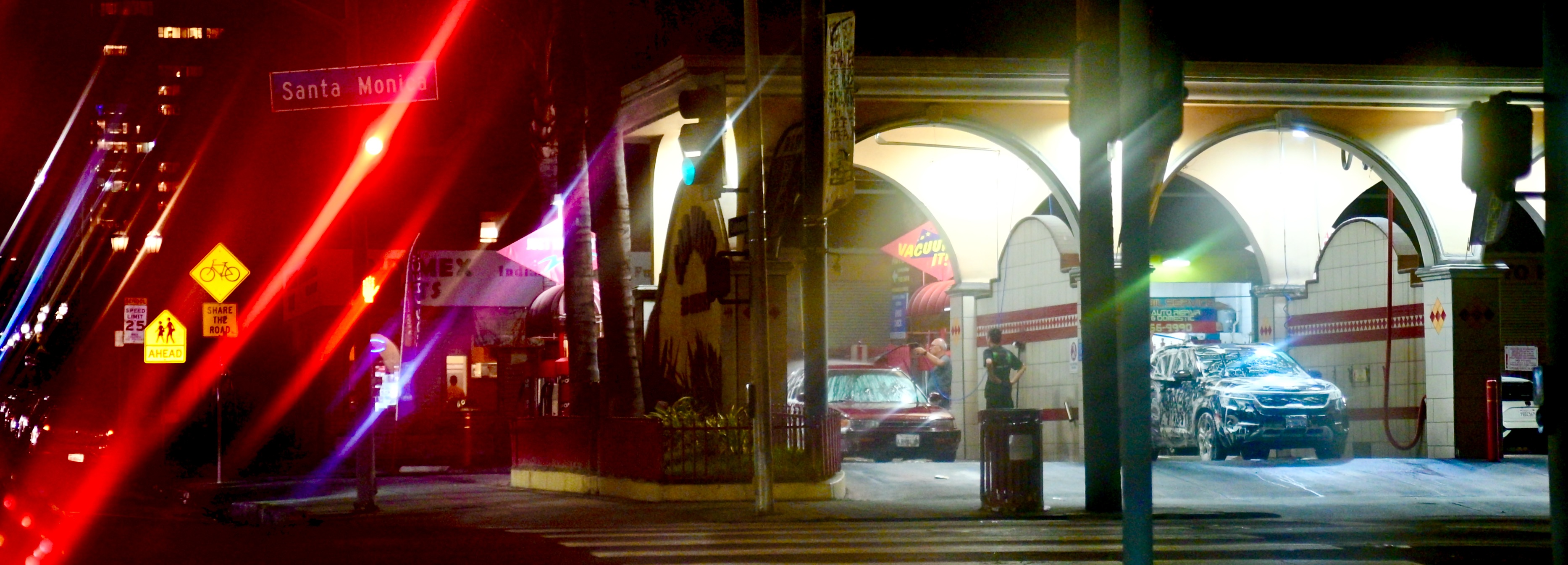
My absolute favorite pictures over a lifetime are the ones that I had no plan for in the moment, no prior experience that could help me know what to do about them, no other clear motive other than the certainty that I wanted to make them somehow. Let’s face it, few of us would deliberately head out to see what a car wash looks like after dark in a forgotten midtown neighborhood of Los Angeles as seen through a rain-smeared windshield, but once I saw one, I wanted to capture it. Don’t ask me why. It’s not my favorite picture in the world, but it is my favorite way to allow myself to stretch a bit.
“I photograph to see what something looks like photographed”, said Garry Winogrand, who shot with as pure a sense of impulse as any photographer I’ve ever seen. And I can come close to that purity of purpose when I’m out of my element. Sometimes that means going to a physically different location, but other times it might merely be achieved by going into the left side rather than the right side in a museum, or visiting an anteroom you’ve somehow ignored the first 10,000 times you entered the same building.
Some operate from the principle of familiarizing yourself with your surroundings before making a picture. I often hit pay dirt when I shoot despite the fact that I’m unsure of where it’s all heading. Both approaches have gifted me with images that surprised me. In the meantime, you may find that admitting that, yes, you’re a stranger here pries opens your eyes, and in turn, your heart.
EYES WIDE OPEN
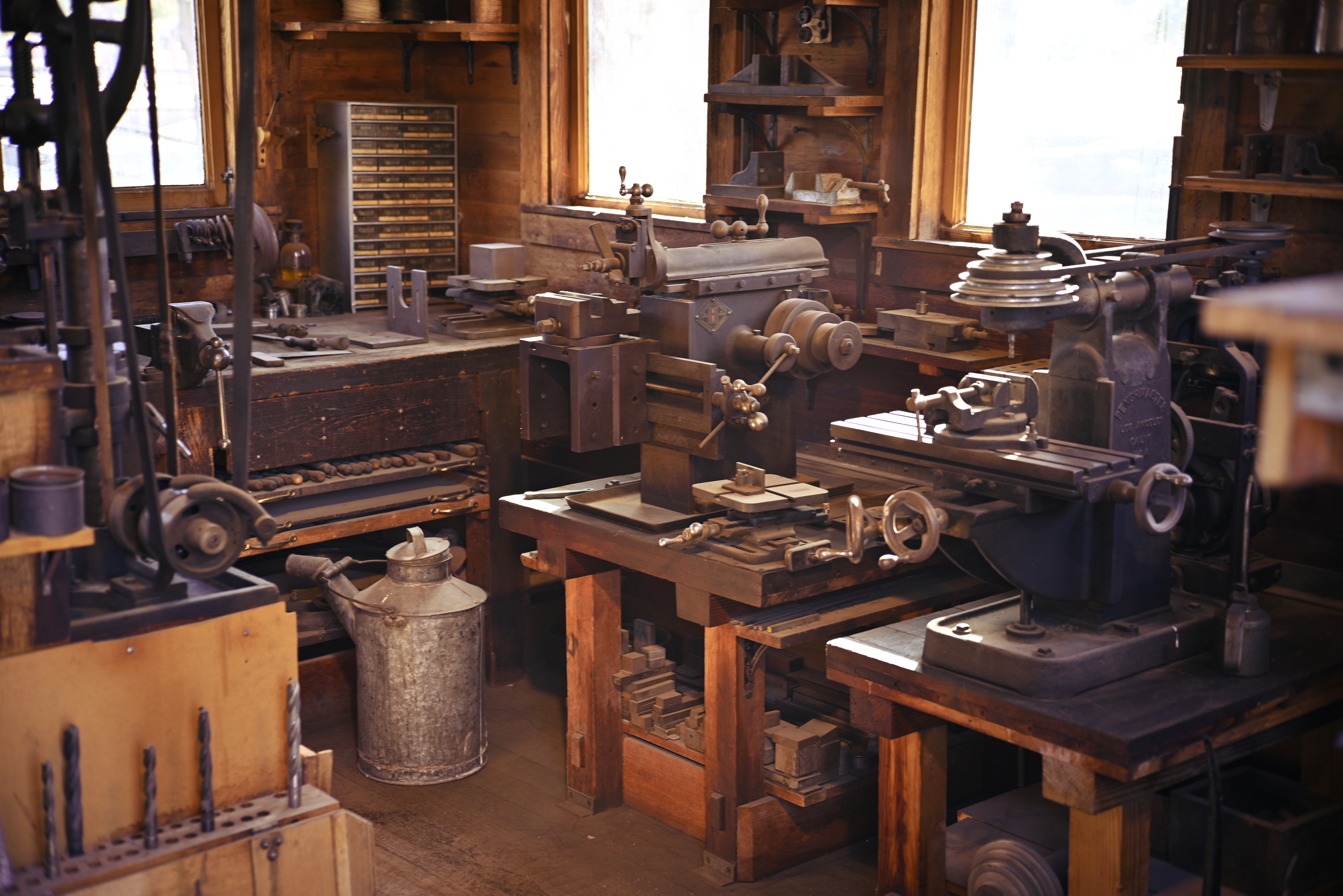
A quaint old workshop, but it’s inside a room that is too small for everything in it to be shown with a standard focal length.
By MICHAEL PERKINS
I DUNNO. IT MAY BE BECAUSE WE ASSOCIATE WIDE-ANGLES LENSES WITH LANDSCAPES. You know the kind of images I mean: vast canvasses of sprawling geography that seem to draw our eye enormous distances between left and right sides of the frame, enforcing an idea that we have to “get everything in” when composing our image. Perfect solution: Wiiiiiiide-angle! No cropping of a cool mountain or a winding river needed! Hey, all you trees, crowd in together, willya?
In reality, I almost never use a wide-angle lens for exposition of big subjects. The lens can magnify distances, especially front-to-back distances, that I don’t particularly need to magnify, and so I use a normal focal length and just stand farther away from the scene. I believe that wide-angles are not designed to “get everything in” your picture. They are best used when they put you, yourself, farther inside a scene. Most wide shots fail because they are taken from too far away, when the feeling of “being there”, of having yourself immersed in a scene, is only accomplished the closer you are to the action. Or if you think of it in sonic terms, consider how more immersive stereo feels if you create the illusion that you are amongst the musicians instead of across from them.
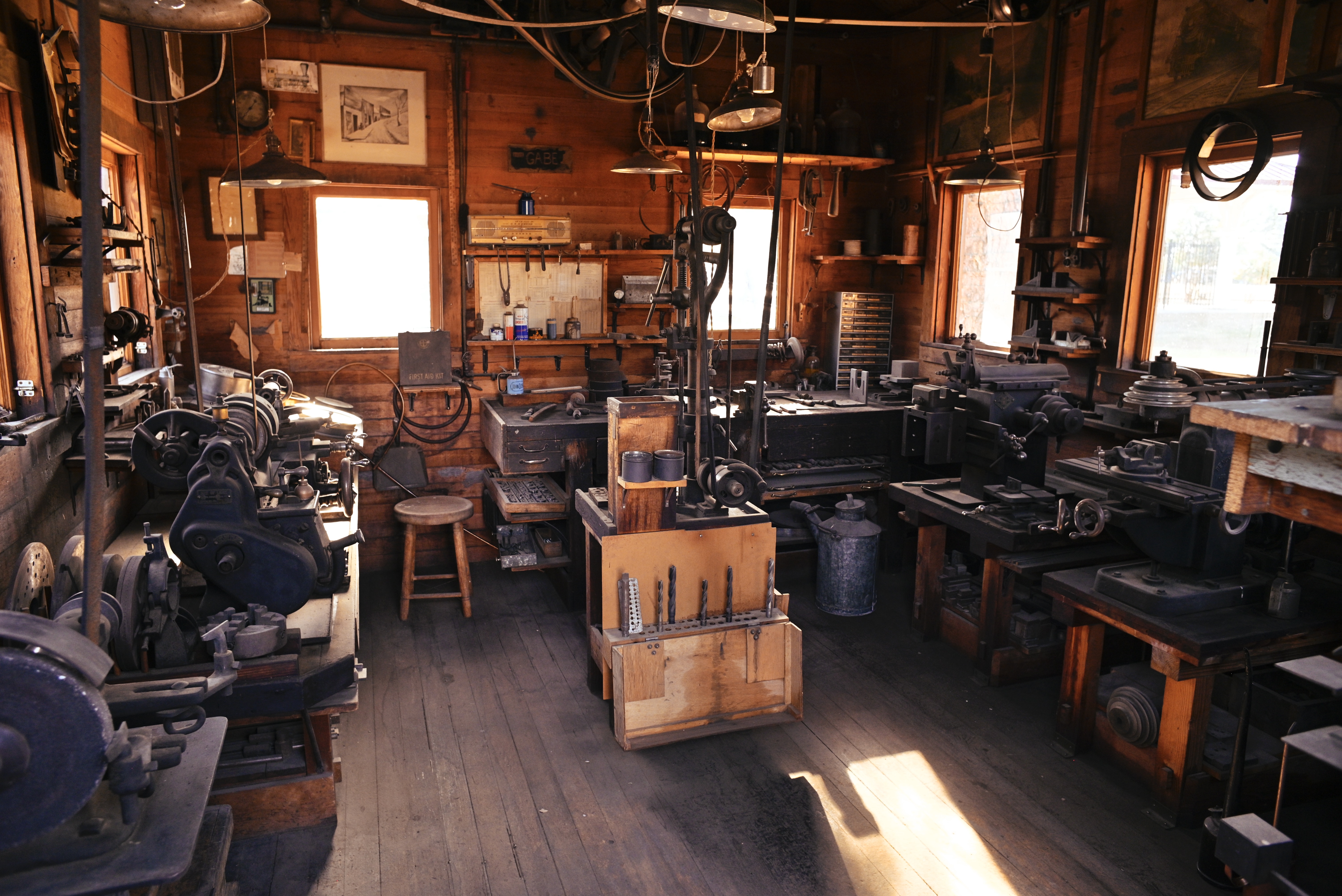
Same room, now shown completely by moving in closer and using a 24mm wide-angle.
With this in mind, I think that wide-angles are absolutely essential when you find yourself in a cramped space, whereas using a normal 50mm width in such a situation, as seen at the top of this page, heightens the feeling of claustrophobia. More than half the detail in the medium-sized workshop in the image is simply lost, including the space’s entire left side and ceiling, both of which are loaded with interesting information. Snap on a 24mm wide-angle, however, as I did in the second view, and the room opens up, even though I am leaning physically farther into the room’s doorway than I did when using the 50. Instead of using a wide-angle to back up and “get everything in” (what? the door frame? the outside of the tool shack?) I placed myself further into the scene and let it, if you like, wrap around me.
Composition is part instinct, part inspiration and part calculation. Focal lengths can operate counter-intuitively in some situations, but ahead of the right tool comes the right idea. When both arrive at the scene together, the good stuff happens.
THE GENTLE GIANT NEXT DOOR
By MICHAEL PERKINS
I DID NOT INHERIT MY FATHER’S PASSIONATE TALENT FOR GARDENING and landscaping, although I have always envied the way it miraculously devours him, each season bestowing on him distinct and endless variants of joy. He has owned and maintained the creekside half-acre back of his house for a third of a century now, and, as the aches and pains and limits of his ninety-three years often forbid his going out to play in his own private Walden, I cheer on days when I know it is clear enough, or warm enough, or safe enough for him to be out there. He and the yard get lonely for each other.
What was transmitted to me was his very special love of trees. I can’t recall a time when I wasn’t awed by their beauty, their power, their endurance. That’s why my favorite part of my own “estate” is my view of the towering, sprawling titan just over the rear fence in my neighbor’s back yard. It’s unusual for an old, solid, massive thing like this to have survived the yank-everything-out-start-over ethos of the Southwest suburbs. Perhaps removing it was simply too expensive, too troublesome, leaving it to stand when many lesser trees might have been cleared out to make way for (??) progress? In any event, like anything that is purely or simply beautiful, it makes photographing it fairly complicated.
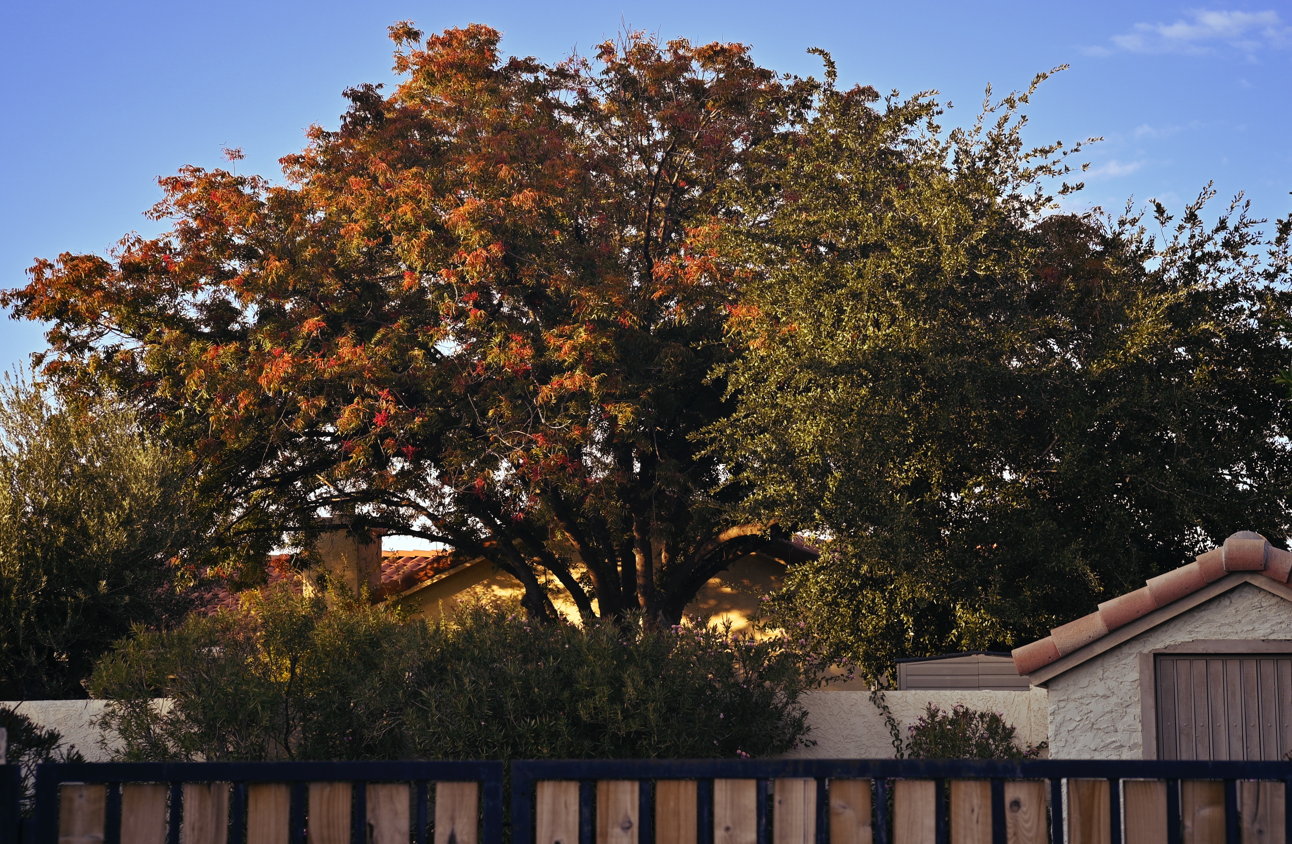
Over the past twenty years I have captured it in low light and full, dusk and dawn, rain or shine, and still I always come away feeling like I have failed to deliver its full story. Then again, what can its “story” even be? It’s a tree. But therein lies the paradox of making images of anything living, from human passersby to majestic landscapes. Their life is both static and in motion, both in and out of time. The camera both records accurately and lies absolutely when I point it at such a thing.
And so I keep going. What you see here is but the latest attempt from a few days ago. If you have the time, I can put on the kettle and guide you through the hundreds of other attempts I’ve made over the years at finding the soul of my gentle giant. Being that I don’t have to journey to the forest primeval to find something to admire this much, I admit to thinking that I have, you know, plenty of time to get it right. But, while the tree isn’t going anywhere, I certainly am headed, and before too long, for the stage exit. And so I keep going.
The tree has already gotten it right.
Maybe, by running a little harder, I can, in time, catch up with it…..
I AM A CAMERA. NO, I REALLY AM
To quote out of context is the essence of the photographer’s craft. His central problem is a simple one: what shall he include, and what shall he reject? While the draughtsman starts with the middle of the sheet, the photographer starts with the frame.
–John Szarkowski, The Photographer’s Eye
 By MICHAEL PERKINS
EVER SINCE I FIRST READ THAT SHORT PARAGRAPH, many moons ago, I realized that it contained everything I would ever need to know about composition. Other writers have rhapsodized both long and short, clear and muddy, beyond those few words, but John Szarkowski, the most significant figure in the curation of American photography, laid out, in concise prose, the terms of engagement between shooter and subject in such a clear fashion that little more need be said on the subject. It’s all there.
Szarkowski (1925-2007) was not the first director of Photography at New York’s Museum of Modern Art, but he was certainly among the first to act as a forceful, articulate voice to advocate for the act of making pictures, insisting that it assume its rightful place, without apology or embarassment, among the established arts. Moreover, he purposefully curated MOMA’s photographic collections with the fervor and eloquence of a true believer, using the institution’s reputation as a springboard to advance the careers of Diane Arbus, Lee Friedlander, Garry Winogrand, and dozens of other emerging American artists*. His third MOMA exhibition, 1964’s The Photographer’s Eye, was adapted into a book by the same name two years later, and has since maintained a vital place as one of the foundational primers not only on what to see, but also how to see. I recommend it to all avid new shooters, but also to anyone who even looks at photographs and wonders what all the fuss is about. It’s that essential.
TPE contains 172 duotone images arranged into five distinct sections, each addressing a part of the mystery: The Thing Itself, The Detail, The Frame (from which the above quote is taken), Time, and The Vantage Point. Szarkowski confines his commentary to a brief set-up essay ahead of each section, then lets the pictures, taken by unknown amateurs and pros alike, to do most of the talking. The Photographer’s Eye was followed by other instructional canons over the course of Szarkowski’s career, including 1973’s Looking At Photographs to 1989’s Photography Until Now among many others. If you’re keen on building an essential library, throw these in the shopping cart as well.
Coming from a sensibility borne of his own photographic output, John Szarkowski forever ended the debate about whether the camera could produce “art”, even as he sparked many other discussions about what that art should look like. The Photographer’s Eye is as essential to picture-making as learning how to select an aperture or calculate a shutter speed, as it glorifies all the myriad motives for what goes into, or stays out of, that wonderful frame.
*Winogrand, Arbus, and Friedlander were, in fact, specifically showcased in Szarkowski’s historic exhibition, New Documents, in 1967. Here’s a link to MOMA’s page celebrating its enduring impact—M.P.
FROM WHERE I SIT
By MICHAEL PERKINS
SMALL TOWNS ACROSS AMERICA STILL PRACTICE a way of observing life that many of us have more or less abandoned, the idea of our homes as reviewing stands for humanity’s passing parade. Porches, as we built them in our smaller, slower days, were more than mere entrances into our homes: they were places to visit, observe, and comment. The wraparound verandas and shaded repose that we designed into our houses were like a buffer layer between the raw world out there and the warm world beyond our thresholds. Porches, in the days before the stubby stoops and short step-ups we feature today, were for something.

Visit someplace that has been lucky enough to survive the transition from village life to city life and you will find these places still personalized and painted, still decked with mini-gardens, flags, and seasonal decor, still serving as a distinct middle world between inside and outside. The idea of the street as a kind of low-impact entertainment, with neighbors and newcomers alike filing past, some to be actively engaged with, some just serving as moving scenery, has a slow, simple appeal in an age dominated by screens, scrolling and infinite entertainment options. But you have to pause, and breathe, and be patient to get the full effect.
It’s worth lingering over, and that is why, in visiting small towns, the very first place I go is the main residential boulevard. That’s where the action is. The sad fact is that we are often moving too quickly to see that action. It’s like trying to train yourself to observe the movement of the hands of a watch. Getting yourself aligned with the steady but imperceptible pace of the timepiece takes practice, and learning to see the gradual reveal of a house’s heart by first taking the measure of its porch is a habit that we have long since lost the natural knack for. But there is a reward in it, and there are pictures in it, and therefore it is worth doing.
I GOTTA WORK TOMORROW, BUT……
By MICHAEL PERKINS
AS I CRUISE MY WAY CAREFULLY TOWARD THE END OF YET ANOTHER YEAR, I have the distinct sensation of coming to a slow, smooth landing after having descended through a bank of dense storm clouds. Having made pictures for over half my life, I find my mind, near year’s end, riffing through a stack of images that now serve as a catalogue for the markers and milestones of more than two thirds of a century, as if my existence somehow compiled one of those kids’ flip books that, when properly thumbed, looks like a continuous movie.
And as November careens toward December, I find that I want to slow the movie down. I want to celebrate moments that were miraculously, often accidentally, destined to be frozen, evergreen, in my mind. Trying to determine what pictures within a year earn the title “keeper”, I am also rotating past earlier years, to purer and purer depictions of joy that I could never have created myself, but was blessed to be witness to. This is one such picture.

2016.It is a summer Sunday evening in Seattle, Washington. I have never walked through this neighborhood before, but the joyful whoop of this street party has drawn me blocks away from my hotel. I am enjoying the long, golden sunset hours that are a photographer’s bounty in that part of the American Northwest, and I am drawn like a magnet to these wonderfully free and frolicsome people. The music is loud, the dancing is carefree, and the mood is lighter than a dandelion seed on a breeze. This is what happiness looks like.
I know nothing about who sponsored this shindig, be it the parks department, a bunch of friends, or just the sheer life-affirming impetus of a summer night. It matters little what started, it or why: what matters is that, when I enter this space, I never want to leave it. However, I know I am bound for other places, and so, if I must leave, I’m taking a souvenir.
Click.
One of the things I love most about this picture is that nearly everyone in it is present, attending to some other person or persons. They are there, not scrolling, not checking their Instagram, but immersed in the miracle of being with other human beings. Tomorrow, they have to work. Tomorrow, they have to report to someone, fulfill deadlines, make plans, cut their losses.
But here, in this frame, it ain’t tomorrow yet.
And it never will be.
CUTTING ALONE WON’T CUT IT
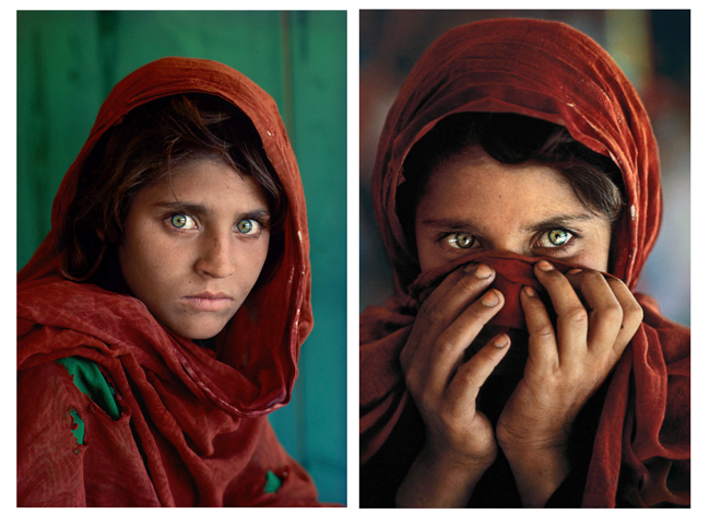
The published take of Steve McCurry’s immortal “Afghan Girl” and the frame that was nearly chosen in its stead.
By MICHAEL PERKINS
THE ENDLESS DEBATE ABOUT WHETHER GOOD PICTURES ARE “BORN” OR “MADE” shows no sign of abating anytime in the next foreseeable millennium. In fact, it’s kinda fun bickering endlessly about whether success stems from the concept of an image (nature) or the loving care afforded by processing and editing (nurture). It’s the kind of infinite chicken-or-the-egg loop that enlivens all the better cocktail parties. I myself have fought fearlessly on both sides of the aisle at different points in my life, but my latest thoughts on the subject are becoming a bit more nuanced.
While I marvel at the astounding raft of choices born from the use of various post-processing platforms, I reserve the specific word editing for the mental judgement, the trained eye that can not only distinguish good pictures from bad, but great pictures from good ones. Sadly, all too often, our emphasis is on how we can improve or “fix” a picture with processing, trying to salvage shortcomings that should have been weeded out by the conscious, deliberate act of editing.
Recent articles on NatGeo’s Steve McCurry’s iconic “Afghan Girl” portrait (the Face That Launched A Thousand Camera Purchases, not to mention selling a crap-ton of Kodachrome) have centered on one of the alternate frames taken at the time that lost out to the final image. Both pictures, as you can see, are marvelous in distinct ways, and so it took McNally’s discerning and experienced eye to separate the gold from the platinum and select the photo that was not merely poignant, but, in a way, transformative, the final visual word on a tough subject. It’s not the kind of decision that can be made by merely boosting the color, cropping, or filtering the shot through a dozen afterthought layers, even though such operations can place the cherry on top of an already strong photograph. It’s the ability to criticize and evaluate one’s own work, fearlessly and in depth, which must exist in the photographer’s mind.
The best pictures are always improved by tools, but they can never be about those tools. In the interest of humility, I keep entire folders of near-misses, images I could not, even with infinite fiddling, rehabilitate. In case after case, I used post-processing to complete the task of story-telling that I only partly achieved in the making of the master shot. Not quite lipstick on a pig, but clearly the work of someone who is covering his tracks. To have a “McNally Eye” takes total honesty, a skill which is harder to master than all the technical know-how in the world. A great job of tweaking can never compensate for a bad job of narration. It’s the different between a girl with a plaintive look in her eyes and a girl with a stare than can sear its way into your soul.
BACK TO THE BLUE PLATE
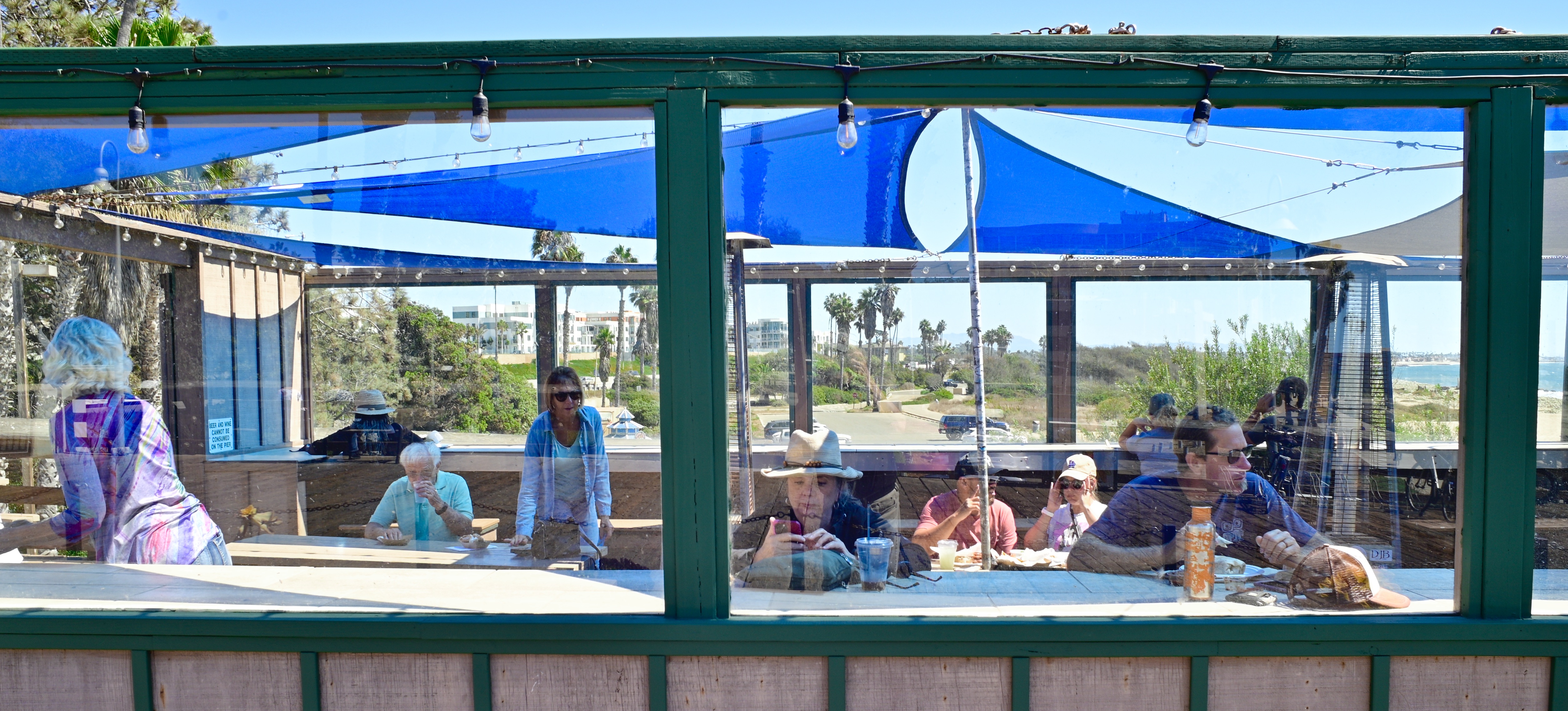
The lunch crowd at Beach House Tacos, Ventura, California, 2022
By MICHAEL PERKINS
THERE IS A KIND OF ROMANCE, CALL IT A CULT OF THE INDIVIDUAL, that informs our love of what can only be called The Great American Joint. We have a special affection for the one-location, one owner store or restaurant that outlasts global competitors. We revel in diners that celebrate “100 years at the same location” or burger stands that offer only one house specialty (no substitutions!) And it is altogether appropriate that Americans, in particular, should hold the Moms-and-Pops of the world dear. After all, we did everything we could to put them out of business.
The multiple-location business model was actually born in the U.K. in the 1700’s but really hit its stride in the States in the1860’s when a local New York tea shop owner opened multiple branches around the city. By 1900, The Great Atlantic & Pacific Tea Company (or the A&P to you) became the first true grocery chain, and from there, the chain movement exploded to include hardware and department stores, hotels, clothiers, drugstores and, most importantly, restaurants. Over a hundred years later, chains offer familiarity and reliability as we move from one golden arch to the next, but they also starve the landscape of variety and, worse for photographers, distinctive visual experiences.
That’s why I doggedly seek out joints when traveling and shooting. The food varies wildly in quality, and that’s just fine: one man’s uncertainty is another man’s adventure, if you like. Beyond that, joints offer the chance to celebrate the different, the odd, the innovative. Chains are all about guaranteed outcomes. With Bob’s Crab Shack or the Keep Portland Weird Cafe you never know what you’ll get, and, for the sake of the pictures, unpredictability is a strength. And, in terms of karmic balance, it’s only fair that the country that tried to un-invent the private business learn, in its maturity, how to nurture what’s left. And if that means occasionally eating at a place where we have only one kind of burger, made daily on the premises, and when we’re out we’re out.….well, then, save me a seat. I’ll be with you as soon as I switch lenses.
ARE WE BEING SERIOUS NOW?
By MICHAEL PERKINS
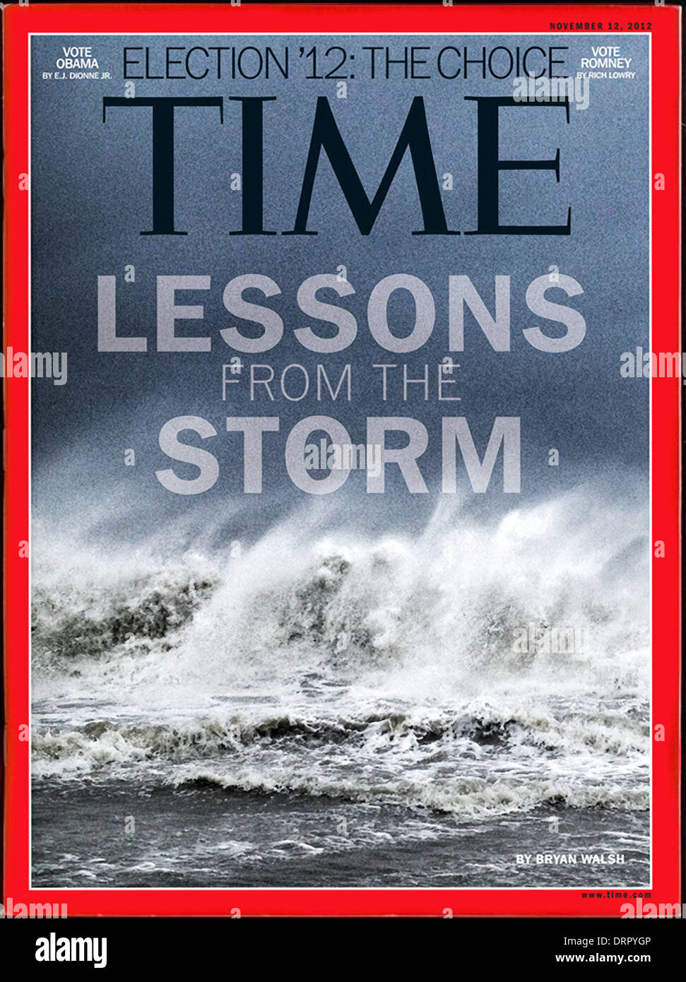
THIS MONTH MARKS AN IMPORTANT MILESTONE IN PHOTOGRAPHIC HISTORY, in that it was almost exactly ten years to the day that a major news magazine, on deadline amidst a horrific disaster, decided, for the first time, to run a cellphone image from an Instagram posting as its cover picture. The devastation caused by Hurricane Sandy in 2012 was, due to the newly accelerated penetration of mobile photography, covered to a much greater degree by the average shooter, but it was one very above-average professional, news photographer Ben Lowy, who provided the magazine with the image that would define the destruction and fury of the superstorm, and he took it not with his usual battery of Nikon and Canon gear, but with an iPhone 4S.*
This seems trivial in retrospect, but at the time, it actually represented a fairly seismic shift, as publications changed their idea of what constituted “real” coverage of a major new event. It also conceded what millions around the world already knew in their DNA: that their camera of convenience was now, also, their device of choice, their “real” camera. if you like. Lowy himself explained the mindset: “People don’t think twice about it. It’s a fast little camera, and I do like that on a tough assignment. At times, though, ‘pros’ will push me aside, assuming I’m a tourist or amateur. It’s the mind of the photographer that defines the quality of the image, not the equipment. Everyone has a pen, but not everyone can draw.”
Just as the average phone shooter knew by 2012 that the best camera is the one you have with you, so the world of editors had to grudgingly admit that a picture is a picture is a picture and who the hell cares what it was captured on? Of course, we know the answer to “who the hell cares”, as we all know people who argue that you need a “real” camera to get artistic results, at which point I remind them how many Pulitzer Prize-winning images are, in fact, underexposed, blurry, badly composed, or askew, despite the fact that they were made by world-class equipment. They copped Pulitzers because, despite how much we may spend or scrimp on gear, in the end, a compelling picture trumps everything else.
I have made my own dog-legged journey in my conception of a “good” camera, the device I would count on to make the “official” or “permanent” images of an important event or place. When traveling, for instance, I still use my mobile for snapshots, experiments or “pencil sketch” versions of things, bringing my formalized equipment in to render the “final” edition. I’ve gradually become more and more even-handed in budgeting shots between my “casual” and “serious” camera, but I know too well that I am behind a kind of global curve in thinking this way. Turns out photography is not merely about perfecting one’s technique, but also about perfecting the brain behind the shutter finger.
*Full disclosure: a bit of texture was added to Lowy’s shot before it was posted, not with Lightroom or Photoshop, but with the phone app Hipstamatic.
BEATING WINGS, BEATING HEARTS
By MICHAEL PERKINS
OF THE OVER 73,000,000 ACRES OF LAND IN THE STATE OF ARIZONA, only 43.2% is in private hands. That might, on paper, seem to weigh in nature’s favor, if “favor” means being protected from the more horrible by-products of human activity. However, from my the vantage point of my twenty-three years in Phoenix, the state’s largest urban concentration, it can seem like nature is either whipped to a draw by civilization (on a good day) or bound, gagged and locked in a dark closet by it (on all too many other days).
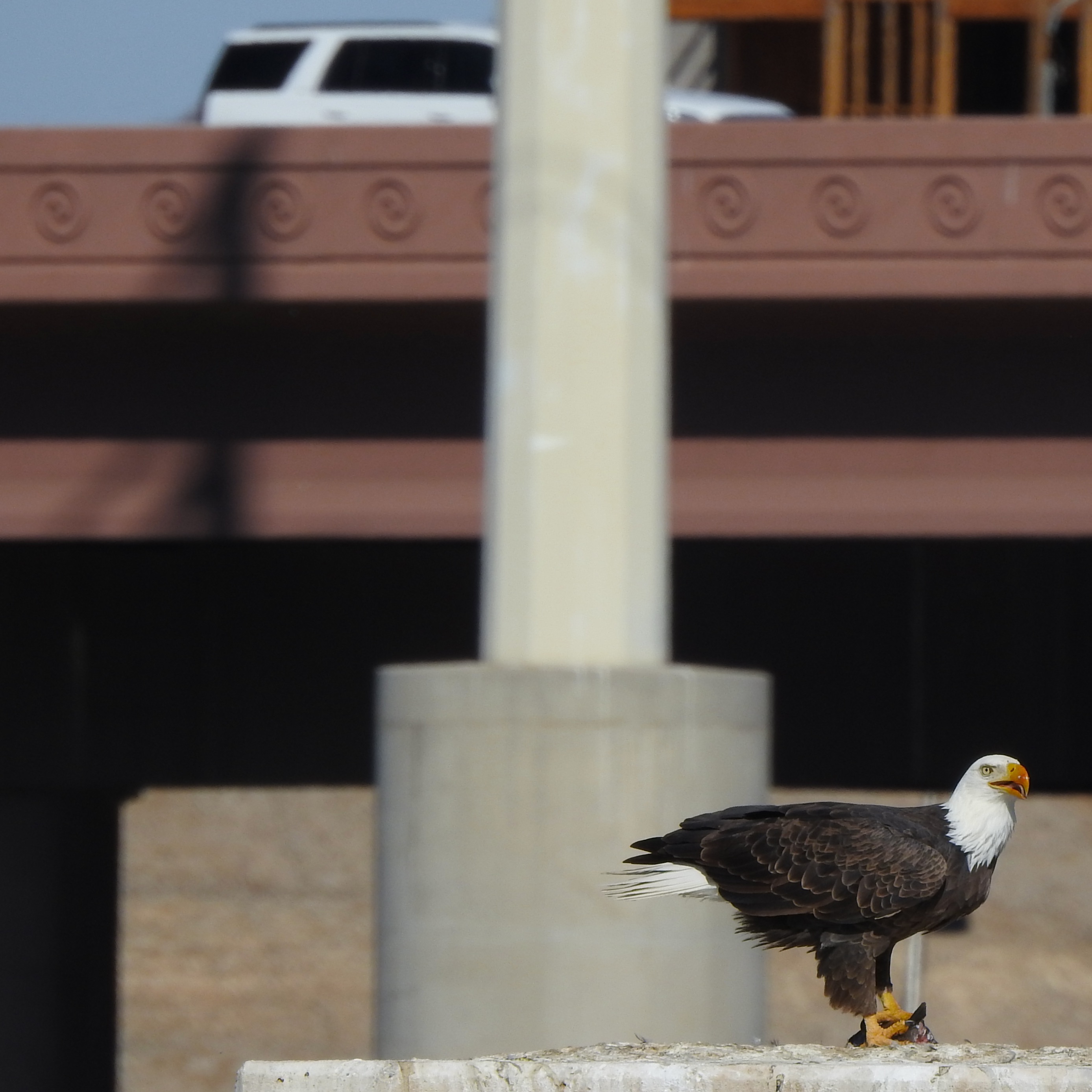
A bald eagle finishes a meal atop a concrete platform, just yards away from the 202 freeway in Tempe Arizona.
Nature photography in such a conflicted reality can be a challenge, but not because wildlife cannot be found near Arizona cities. In fact, rather than fleeing to the open desert or mountain ranges, it often thrives literally feet away from the most invasively harmful aspects of what we term “civilization”. No, the problem with making pictures of Arizona wildlife is in being tempted to do what I call “template photography”, to take the expected route toward idealization of animals, displaying them in the pristine conditions in which we wish they lived all the time. And yet, if we are to follow any tendency toward photojournalism, toward honestly chronicling the lives of these creatures in such a place, we must also make images of their struggles and triumphs within the world we have actually made for them. And that can be heartbreaking.
This is especially true in the case of birds, and most dramatic with larger varieties like raptors. The bald eagle you see in these images has learned to make his way alongside freeways, electrical wires, air traffic and other delights of the modern age, choosing, as seen here, the concrete footing for a bygone bridge over an urban stretch of the Salt River as the roosting point for enjoying a fish captured from what was, very recently, a dry bed deliberately replenished and stocked by the same governmental agencies charged with making the desert, well, “livable” for humans. It’s a strange and sad symbiosis, but it makes for enduring images. An eagle left to his own devices exists in an interlocking gearbox of interdependent ecosystems. It exists in balance. It’s brushing up against us that makes his life more hazardous than anything encountered in the wild.
Strangely, we begin to address this problem by addressing our own. If power grids go down because of birds becoming entangled in our wiring systems, those systems need to be re-designed, which has the dual effect of protecting more birds while guaranteeing that we keep our lights on. People are becoming more aware of how our own lives are impoverished if we make it impossible for creatures to grow and hunt and prey as nature intended, but, my God, the learning curve has been slow. How many of the motorists seen here, made aware of the majesty couched just yards away from their elevated roadways, might pull over, park, gawk and wonder? How many beating wings and hearts throb on, outside the scope of our impaired hearing? And how can we point our cameras at the wildness left in the world without also showing how our own untamed selfishness threatens that divine, raw beauty?
A WALK ALONG “K” STREET

An example of a custom mix of in-camera pre-sets designed to emulate the bygone Kodachrome film (details at bottom of page).
By MICHAEL PERKINS
KODACHROME FILM HAS, AT THIS WRITING, BEEN GONE FROM PLANET EARTH for thirteen years (!), and yet it continues to echo through the corridors of nostalgia for photographers of a certain age. As the first widely sold and truly practical color film shot by millions, its native strengths (and biases) in color rendition were enshrined across billions of images as a specific way of seeing the world. People try to characterize its look with adjectives like natural or warm or dozens of other modifiers, all of which fall short in comparison with the act of just looking at its effect. Photography may be the art that is most self-referential, in that we never completely live in the moment, but always have the looks, or systems, or tools of earlier versions of that art peering over our shoulders. Kodachrome is dead. Long live Kodachrome.
Just as we have never stopped simulating sepiatone, the painterly aspects of the Pictorialist movement of the early 1900’s, or even emulsion-smeared glass plates, we have never stopped trying to emulate the look of Kodachrome. The web is littered with the photographic equivalent of recipes that claim to be able to perfectly mimic McDonalds’ secret sauce, promising to conjure up the perfect re-creation of the big K’s tones and flavors. Nearly all of these are post-processing techniques in Lightroom or a half-dozen other editing suites, with a few puny phone apps, mostly horrible, taking a crack at the task here or there. Recently, however, there have been more and more tips on pre-sets that would allow shooters to do faux K-chrome in-camera, which is what would most appeal to me personally. Fuji users got the ball rolling by cooking up their own specific how-to’s, and I have recently been kitchen-testing a mix I stumbled across for Nikon’s Z-platform mirrorless cameras*. We are now in the “tasting” phase of the process. Too salty? Needs garlic? Who knows?

Another exposure of the above subject, this time with standard color rendition.
What’s easy to see in the two “with” and without” images seen here is that there is a decidedly different rendering of the range of reds and yellows, a hallmark of Kodachrome’s warm appearance (and key to its wonderful skin tones). The ability to store a bundle of settings in a special separate dial click (such as the “U” or user buttons on Nikons), so that it’s available virtually on demand, is of great value to me, since my camera has an electronic viewfinder, allowing me to see precisely what will be captured on the sensor in real time. That flexibility is worth more to me in the field than all the after-the-fact editing suites in the world. Is the ersatz K-chrome seen here much different than merely using, say, a very warm white balance setting, such as “shade” or “cloudy skies”? I’m still weighing all that, even as I’m trying to weigh my emotional fondness for this bygone film versus whether the look of it actually adds anything to what I’m doing. Do I love it because I loved what I was doing, back when I was first using it? Is a walk down “K” Street just a stroll down Memory Lane? Again, the final verdict comes picture by picture.
*For those who care: From the Nikon Photo Shooting menu, select “Set Picture Control”. Select menu item 15 for RED and set the level effect to 20. Within that sub-menu, set Filter Effects to GREEN with a toning level of 7, and then exit Photo Shooting. Set White Balance control for Direct Sunlight. Finally, to imitate the low ASA (ISO) of Kodachrome, you might experiment with slight under-exposure for deeper saturation. Or not, your mileage may vary.
INNER CATHEDRALS
By MICHAEL PERKINS
CALL IT THE WEAR AND TEAR OF A LIFETIME: call it a loss of faith: call it wisdom, if you prefer. Whatever the cause, I can no longer pray as I so easily and fervently did as a child. Maybe I should be considered “lost”, although I actually feel freed. Maybe I should be pitied, although I sometimes feel I should be envied. Suffice it to say that no building, no symbol, no text gives me that once-natural feeling of connection and community in the same way that a camera does.
The ways that I engage the world with a camera acts, in some ways, as my version of a prayer. In contrast to the petty entreaties that Junior Me sent heavenward in search of my various wants or desires, I find that learning to see the broad miracle that is existence, and trying to fix impressions of that onto various media….that is praying. Not a request for anything from a person, and not as a mere ritual or habit, but still a potentially sacred act.
Photography has become my way of saying thank you to everything, or nobody, in a language that mere verses and scriptures can no longer express. When I take seemingly disparate conditions or elements and cohere them into an image, that’s about as close to the act of creation as I am liable to get. Is the picture an offering, a sacrifice? Actually, it can be that, plus a lot more.
Prayer is thought to be about humility, of realizing that your arms are too short to box with the universe and trying to get said universe to stretch its own arms toward you, to meet you halfway. Photography, or really any art, is an attempt to get those two sets of arms linked. When it works, it produces in me a larger “answer” than anything else to the question, “what’s it all about?” Prayer, for the younger me, was about helping myself feel less alone, to tap into something broader and deeper than myself. And when I celebrate the vast variety of life, then try to share those secrets out with the larger world…well, if that isn’t holy, then I have no idea what is.
V.I.P.V.P’s
By MICHAEL PERKINS
GO ON.
We’ve all done one. Indulge yourself. You know you want to.
Well, I want to, anyway.
The classic Vanishing Point shot. Two parallel lines that seem to converge as they reach the horizon. A kind of “first love affair” shot for budding photographers. A lotta depth, a lotta drama. Train rails receding into infinity. Rugged trails vanishing into adventure. Or, in this case, a seaside pier drifting off to Dreamland. Yeah, it’s a cliche. Yeah, it’s the world’s cheapest optical effect. And we all love it.
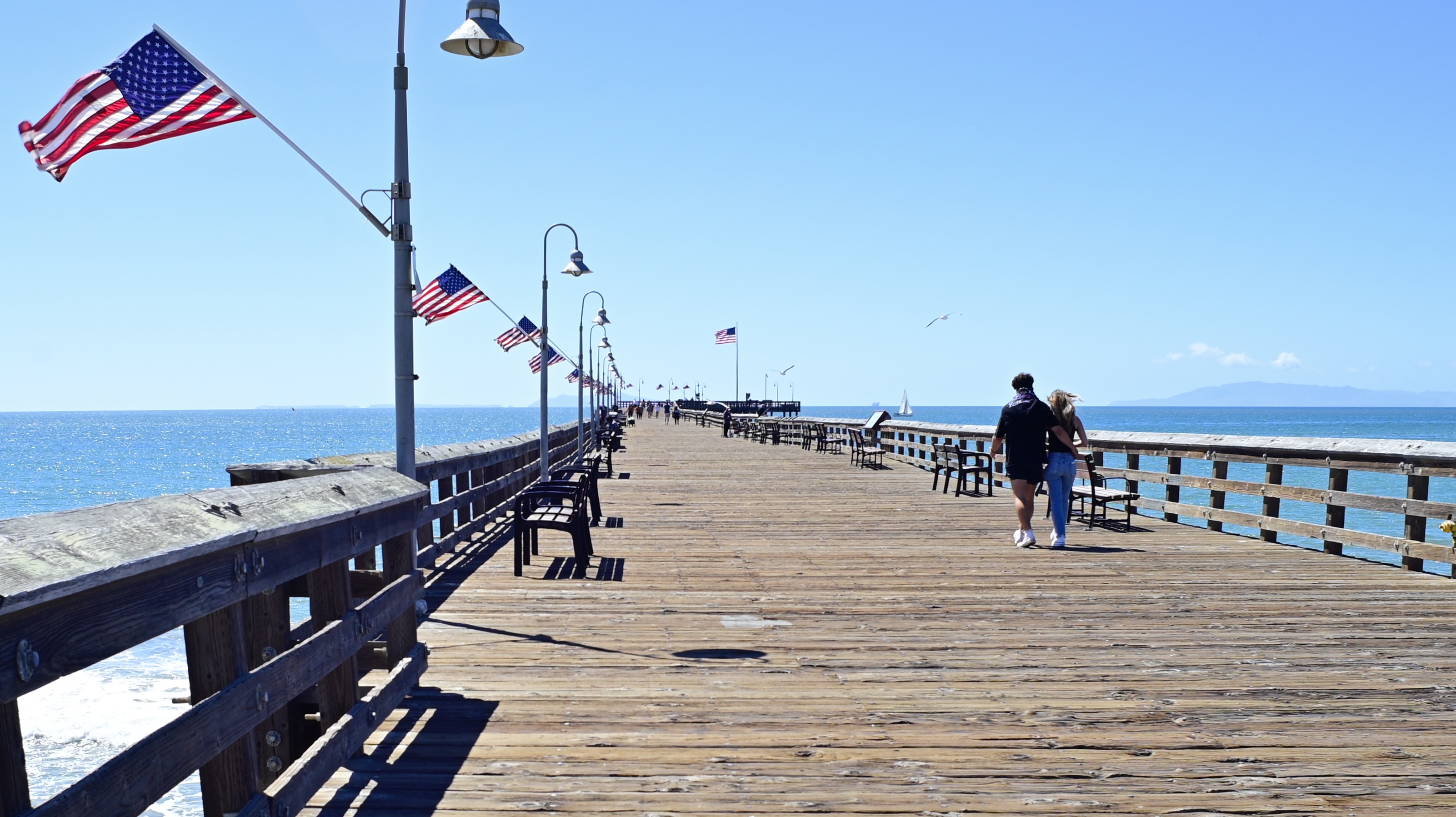
Someday I’ll actually walk a seaside pier without doing one. Or not. All it takes to hook me is the odd Ferris wheel, or crab shack, or pair of lovers walking hand-in-hand, or some crazy guy busking, and I’m sucker enough to think the shot is somehow different, enough to turn a plain old VP into a VIP. Piers are a strange linkage, anyway. Not quite free of the land, but not a true part of the land’s overall rhythm either. A transition bridge between worlds. You’re either almost embarking to somewhere or almost home from somewhere. Maybe the vanishing point is magnetic visually because of what it suggests, since much of photography’s power comes from what it does not, or cannot, show. I dunno. I’ll have to save that for my thesis.
In purely tech terms, the classic receding horizon shot benefits most from a true wide-angle, such as the 28mm used here, since, by shooting wider, it creates more places in the frame for objects to track from front to back, making the sense of depth greater and pulling the eye deeper into the image. However, the appeal of the VP operates on some more profound, emotional level. It reveals and conceals at the same time, setting up the mystery which originally sent us making pictures in the first place.
DETAILS, DETAILS
By MICHAEL PERKINS
MOST OF THE LOUDEST ARGUMENTS ABOUT THE USE OF COLOR in photography have, over the past sixty years or so, been turned on their heads. Before color film became the dominant medium for amateur shooters, roughly after WWII, elites within the fine art community, that is, the people operating at the Ansel Adams level of control and command, frequently debated whether color was of any value at all. Part of their argument stemmed from the primitive processing technology of the time, which made many photographers feel that color either exaggerated reality to an intolerable degree, or, worse, that really great color work looked flat or inaccurate in magazines or prints.
As I say, though, two thirds of a century can make a big difference, and for some time now, color has been such a prevalent default choice that it’s the decision to work in monochrome that is now questioned. Certainly b&w has not vanished from the earth, but, while it was thought of as a medium of imagination and fine control before color, it is now seen by some as limiting, “less than”. And that’s too bad.
Black and white invites speculation, an additional layer of interpretation on the part of the viewer. He or she must supply, out of their own imagination, something which is not stated in the original. Nearly everyone has some mental concept of colors, personal palettes so ingrained that we can seem to “see” them even when they are not shown to us in an image. That is, we have an internal way of visualizing color where there is none.
I keep detailed presets for both color and mono shots stored in my camera, so that I can switch back and forth between modes with very little delay. As a result, some of the images I shoot in color have an almost 100% compositional convergence between the b&w and color versions (see examples here), giving me the ability to shoot and evaluate quickly in the field, while the subject is before me in real time. If a subject is important to me, I nearly always ask myself whether it is better served in one medium or the other, and usually shoot it in both as a mental insurance policy against my own indecision. I mention the presets because I believe that sculpting the precise degree of contrast, sharpness, etc. in camera is far superior to merely desaturating a color shot later in post-processing.
Eventually, it’s freeing to arrive at a place where neither color or mono are “givens” for every situation but have to earn their use in each particular frame. All tools can be used for anything, but no tool will work for everything.
PIER GROUPS
By MICHAEL PERKINS
CIRCUSES ARE GONE. Carnivals are on life support. In most towns, there’s not a Chautauqua tent or traveling acting troupe to be had for love or money. Eccentricity, the wild, sharp-edged, warped neighborhood between Normalcy and Madness that used to be a part of every town the whole world ’round, appears to be shuttering. But there are still a few enclaves of the weird to be had, and celebrated. And pictures to be made of what remains.
To paraphrase Bogart, we’ll always have beach towns.
Strange little encampments near the water’s edge that are both the last chance for humans before the open sea and a natural collection point for a slew of strange energies, from craftsmen to shopkeepers to fishermen to tourists….a grand collision of urges and callings that celebrates the odd, the original and the openly quirky. Life is measured differently near the ocean. The smells and color schemes are different. The architecture is chockablock, random and loud. And the folk are charting their own course.
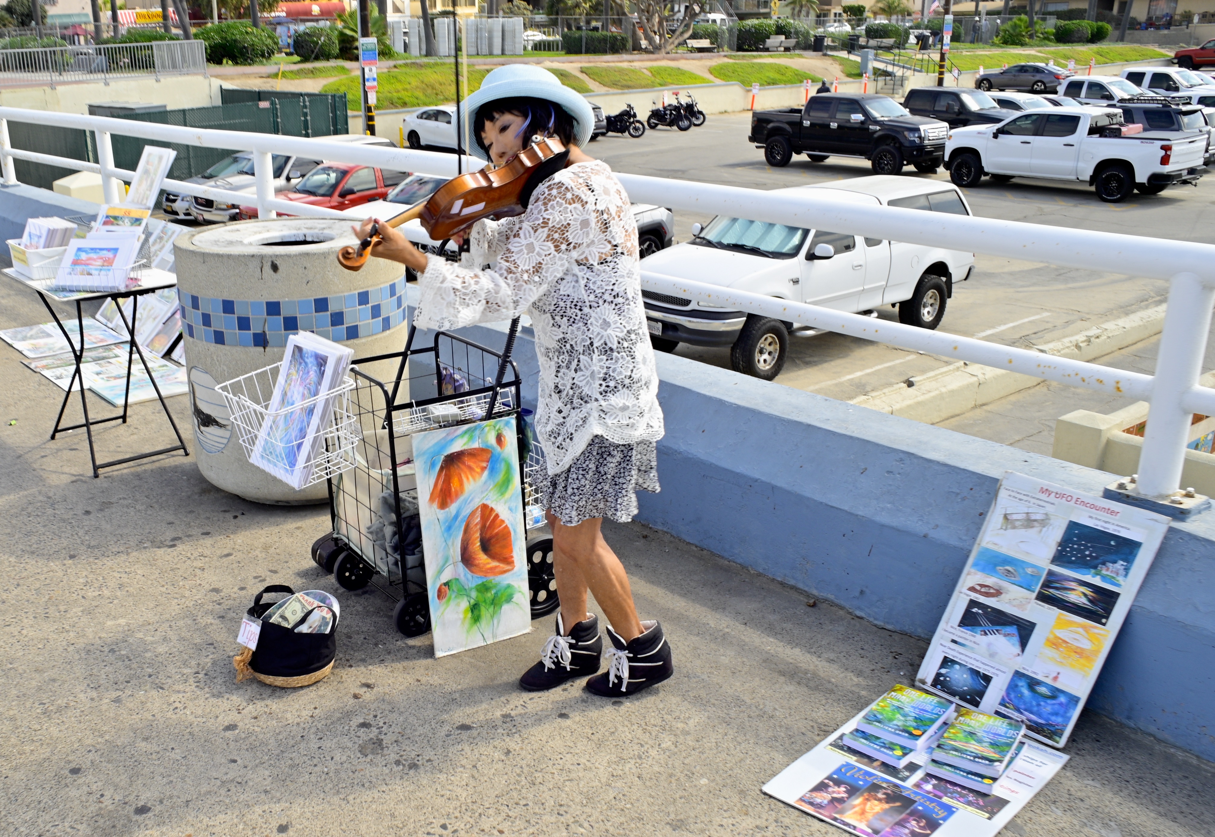
In such venues, you might encounter the Violin Lady, in her pert hat, her lacy blouse, and her concert-plus-art-sale gig on nearly any block. Further in from the coast, the forces of order have issued enough cautious ordinances to muffle all the lovely madness of her kind, whereas, in towns like Seal Beach, California, she’s just one more cast member. And, lest you believe that she’s “selling out” by peddling her paintings for profit, bear in mind that she’s also revealing Real Truth about “My UFO Encounter”, which makes the entire enterprise a public service, really.
Use your camera to celebrate the unique. It’s always in danger of being smothered beneath a blanket of respectability, a quality which might be morally admirable but is, sadly, pictorially stagnant. If weird is in short supply in your town, head for the beaches, and you’ll get it all back. And then some.
HEATED DISPUTE

By MICHAEL PERKINS
ONE OF THE KEY CHALLENGES IN SHOOTING WITH TELEPHOTO LENSES (and there are many) is in executing a stable shot. Simply stated, at the upper range of a lens’ magnification, there is an exponential increase in camera shake, with the usual remedies being either a more solid grip by the shooter or the use of a tripod, depending on the prevailing conditions. However, another problem, one that is much harder to either anticipate or control, can render images soft or blurry, despite the shooter’s best preparation, and that is the dread disease known as heat shimmer.
A long zoom means focusing over great distances, all of which might be experiencing the release of heat at the same time, blurring detail, and making straight lines look like they were drawn by a drunk monkey armed with a half-melted crayon. The result is a marked degradation in the image, especially at zoom ranges above around 300mm. Mind you, unstable air is just one of several challenges that plague telephoto shots. There is the loss of light as you zoom in, the size and efficiency of the camera’s sensor, even inconsistent color rendering. The raw truth is that heat shimmer is next to impossible to plan for, and, once in your master image, impossible to remove. The only real question is, in a particular picture, is whether you can live with it.

The topmost shot of the copper-topped tower of the iconic Bullock’s department store building on Wilshire Boulevard in mid-town Los Angeles, which I shot with a Nikon Coolpix P900 “superzoom” at around 650mm, shows this crummification effect at its worst. To be sure, decades of air pollution and weather have reduced the sharper edges of the tower appreciably since the 1930’s, but, as you can see from the stock image just above, I have paid the price for zooming across several hot rooftops and reflective surfaces that are all adding to the already compromised sharpness. It’s always hard to get the top of the Bullock’s building from street level, and so I used the occasion of an upper-floor hotel window to go for broke, and “broke” is pretty much what I got. And, yes, we could also argue that I should have shelled out three or four thousand dollars for a dedicated zoom with better optics, but as I have foolishly chosen food and clothing over a third mortage for a lens of such nature, we’ll stick a pin in that discussion.
The clearest cause of the overall softness of my shot lies in the heat shimmer factor, which may or may not have been better or worse had I waited for another time of day. Sadly, despite all our craft and cleverness, fate still packs plenty of uncertainty into the process of making images, and this time around, it bit me squarely in the rear quarters. But it’s like they say: if you can’t take the heat, get out of the hotel window…..
THE NOTHING-TO-LOSE CLUB
By MICHAEL PERKINS
TAKE ENOUGH PHOTOGRAPHS AND YOU WILL FIND YOURSELF acting more deliberately, and thus less reflexively. Your snapshot mind, the scatter-shot, try-anything part of your brain that acts purely on impulse, is never completely eradicated, but is suppressed, tamed if you like, by a more careful and selective way of seeing things, a habit of taking additional time to size up a situation before you shoot. This evolution in style is to be expected, as you learn, over the years, that a few extra moments of mental prep can yield consistently better results than merely shooting from the hip.
And yet.
It’s not really healthy to let the prudent half of our brains win every argument. Likewise, we should never completely renounce our membership in the “Nothing To Lose” club, that proud aggregation of people who will always, always go for the shot, despite the realizations that I Brought The Wrong Lens, The Light’s Not Exactly Right, or It Probably Won’t Come Out. Don’t get me wrong: I love, love, love to think that my extra seconds of calculation and forethought will consistently give me better results. And, often, I am proven right. But shooting on instinct, in fact being comfortable with both randomness and uncertainty, can sometimes bring home the bacon as well. The only uniformly wise option is: always shoot something, or, as they say in politics, don’t let the perfect be the enemy of the good.
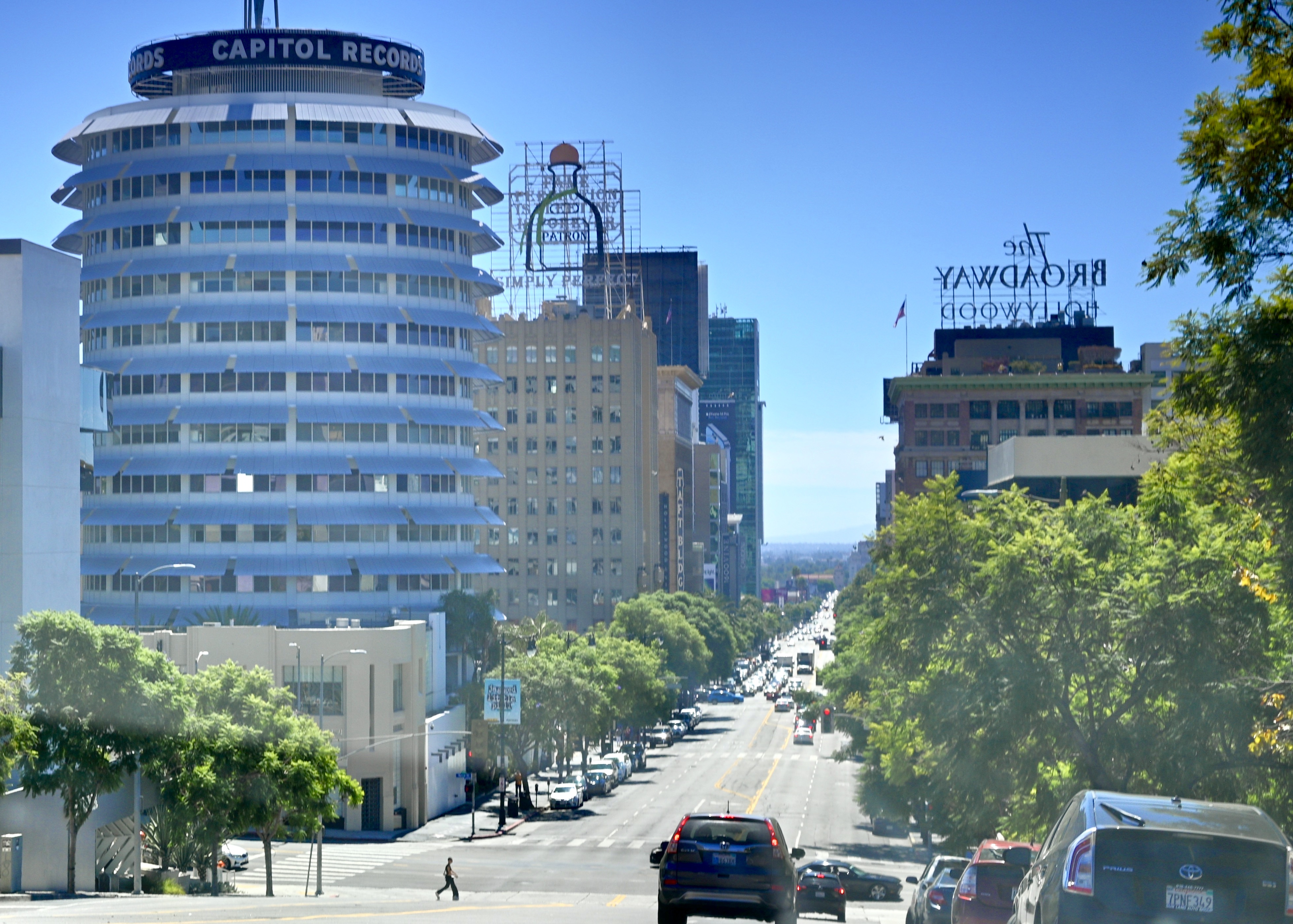
The Vibe On Vine, Los Angeles, September 2022
This windshield shot, taken on the fly during a recent ride down Vine Street in Hollywood, represents such a case. The car was not going to stop: it was not in our plans to get out, set up a formal composition of these iconic buildings, or take a walking tour through the neighborhood. And so I found myself, once again, a member in good standing of the Nothing-To-Lose club, and I got, well, what I got. And of course there are technical flaws galore in the shot, not the least of which is severe color imbalance caused by shooting through glare and factory window tinting, resulting in the loss of nearly a stop of light.
But I can live with the bruises on the peach because, generally speaking, I got to eat the peach. I may or may not be able to return to the scene in future to try for a four-star job, but, in the meantime, I can chalk this one up to what you might call a workable preliminary sketch, and stop stressing about it. Because, in the final analysis, by failing to at least try, I did have something to lose.
The fun of making a picture.
NO WORDS
By MICHAEL PERKINS
THE NON-STOP SELF-PROMOTION OF PHOTOGRAPHY (of which I am certainly a part) that has been created by the internet seems, to me, to center as much on explaining our pictures to each other verbally as it does trying to give them more impact visually. That is to say that we gab a lot a lot a lot about how we got our result, with increasingly text-heavy captions on the precise settings and processing that went into the project. Sometimes, it seems as if we believe that, if we gab enough, that alone will make the pictures more special.
I don’t believe that is true, which is why The Normal Eye has never been about “how I did it” as much as “why I did it.” For me, it’s simple: motivation outranks technique. Every. Single. Time.

Come To Me, All Ye That Are Burdened, 2022
I have never written a single caption that succeeded in “explaining” a picture, that made it a better storyteller than it already was. In trying to explain an image, I sometimes feel I am only calling attention to its poor power to make its own case. Any words I add to detail the execution of a photo prove inadequate to illustrate the special something that occurs (or fails to occur) once I’ve made a series of technical calculations. Such footnotes cannot express my motivations or dreams. They don’t make plain why, sometimes, I do everything “correctly”, and yet wind up with a picture where nothing is “right”…..or, more importantly, how, other times, despite my having fouled up every possible bit of intentional planning, the picture is unmistakably just there, that it somehow fought its way into life despite my own utter ineptitude. As an example, the above image is one that, in terms of technique, I have made dozens of times. And yet, this one, for me, made it into some other category. Something, if you’ll excuse the expression, clicked.
Finally, why even bother to make a picture if you can express your feelings better in words? How can you talk enough to redeem a shot that, essentially, didn’t work? Is a poor image any clearer because we slather more talk on top of it, like frosting a tasteless cake? Captions are occasionally a necessary evil, and, to the extent that they convey purely technical information, like lens or aperture used, they can at least be instructive on a purely technical level. But they don’t explain what a picture does or does not convey.
That is the picture’s job.
THE SUDDENING
By MICHAEL PERKINS
WHEN IT COMES TO OUR MOST PERSONAL PHOTOGRAPHS, we often reach an appreciation of them long after they are taken…..that is, after the delicate things we preserved in them have been largely taken away. We become misty-eyed curators of our own lives, remarking about “how young we once looked” or “man, I loved that car”, demonstrating just how delicate an operation it is to seize moments from those we love even as, in real time, we are trying to savor them. Much of the time, pictures are a sorry substitute for actual experience, a kind of take-home consolation prize. Sorry, you don’t get to keep the thing in your life that is real….but here’s a two-dimensional, incomplete souvenir.
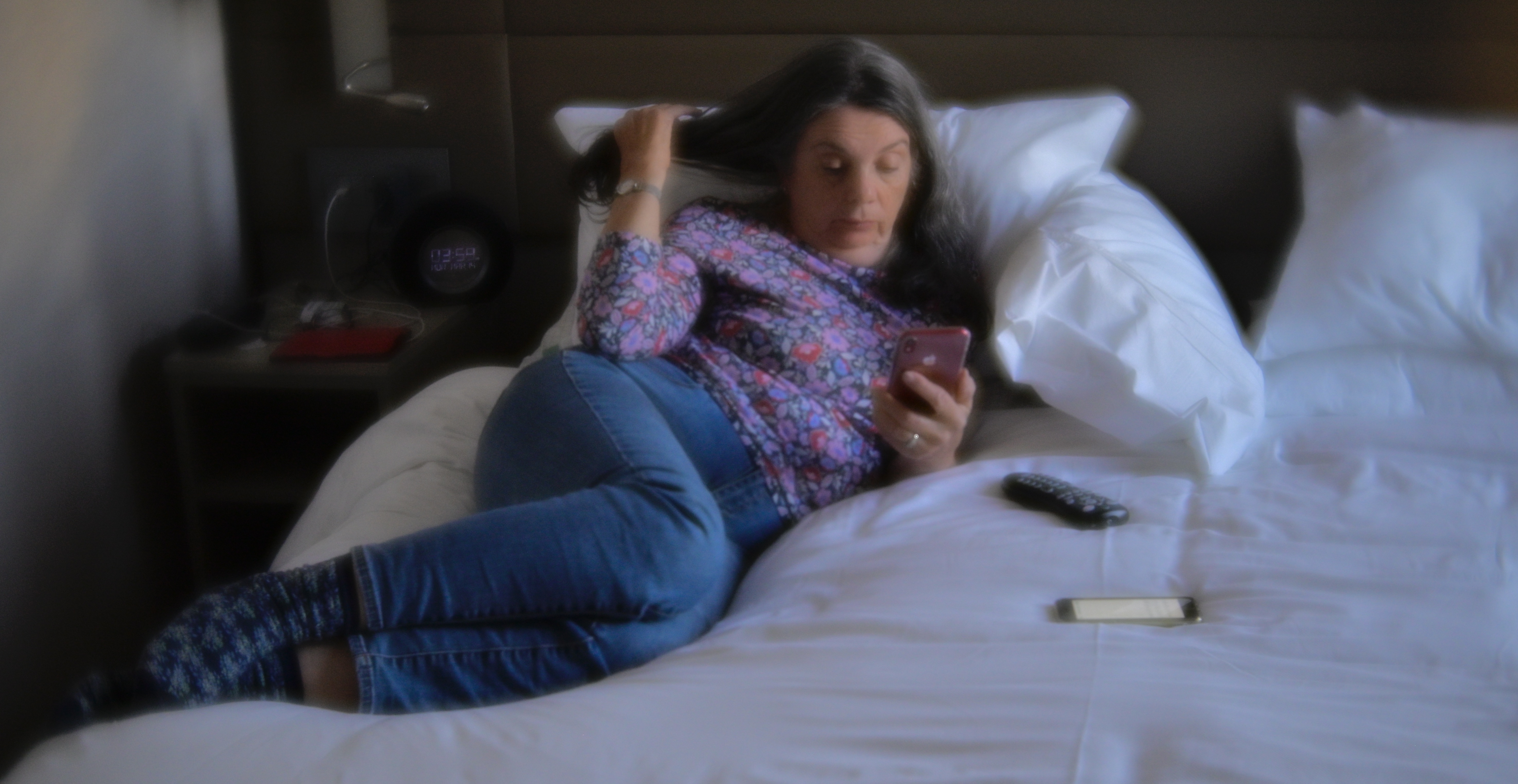
My wife Marian has been my most constant muse over the active years of my picture-making, and it’s always a balancing act when I see her doing something that I want desperately to keep. I have to, to a degree, yank myself out of the suddening she is in, the real, beating moment she occupies, and step back into a more objective role, more commentator than witness. I always get to keep some small part of who she was at that instant, but I have to become less real for her while I attempt to steal it away from time. It’s an odd bargain.
I could fill a bookshelf with moments in which, for an instant, I feel like I am seeing her again for the first time, the second the thunderbolt first hit me. In such settings, she is every age of her life, from toddler to elder, in a twinkling. That creates a challenge beyond the reach of any mere technical device, and so, like a squirrel visually drunk at the site of a tree with a thousand acorns lying beneath it, I have to quickly select what I hope is the best acorn within reach, and make good my escape. Portraits of anyone are made of such grab ‘n’ snatch instincts, but when it’s someone you love to your very core, the task is even more daunting.
Sometimes you get a 4 out of 10, or even, very rarely, a 7 or 8. The fact that no one has ever gotten a 10 should never deter you, however. All you need to keep in mind is that a miracle is playing out before you, right this minute, and that trying to grab “a suddening” is a worthy goal.

ALONE AGAIN, NATURALLY
By MICHAEL PERKINS
TAGGING, OR MARKING A BUILDING WITH GRAFFITI, seems to me one of the strangest bids for immortality that an artist can undertake. It’s obviously, on one level, a plea not to be ignored: I was here. But since so much of the information in its various signatures and symbols are rigidly encoded, it’s only a testament to some people for some vague stretch of time. Soon, like the grass reclaims the battlefield, rust and amnesia efface the artist just as surely as if he had never passed this way.
When infrastructures rot and fail, they either collapse in catastrophe (like a fallen bridge) or needless suffering (like a municipal water system), and, as their pieces are hauled away, every cultural element tied up in their daily use, especially signs or writing, are taken away as well, robbing the tagger of his/her shot at immortality. Other times, the rot just stands, useless and unmourned amidst other changes in our daily world, still emblazoned with the phantom scrawlings of earlier poets who now cannot rely on either memory or context to make their work persist in meaning.
The strange legend on this disintegrating trestle bridge in Ventura, California was explained to me by a local as a reference to a heinous crime that occurred in the area. She didn’t seem to recall the precise details nor the time frame, although I assume it does not pre-date the invention of aerosol spray paint. Point is, even though the bridge has the year of its erection, 1909, stamped into it at the back and front, the span’s name, to everyone who passes until it plunges into the river, will be “the ‘Baby Girl’ bridge”. Unfair to the anonymous scribe who sought to freeze a horrific event in time, but eventually a moot point.
I wanted to shoot the bridge because of the textures of its deterioration, but then I realized that, eventually, I was also making what would, eventually, become the lone record of a message that someone, somewhere, thought important enough to stamp onto the trestle’s oxidized remains. Maybe, in some way, I think it’s important as well. Artists hate the idea of other artists dissolving into history. We come into the world by ourselves, and, after mingling with the world, we all end up, as the song goes, alone again. Naturally.
Share this:
November 13, 2022 | Categories: Uncategorized | Tags: Commentary, history, memory | 1 Comment