ONE AND A HALF EYES
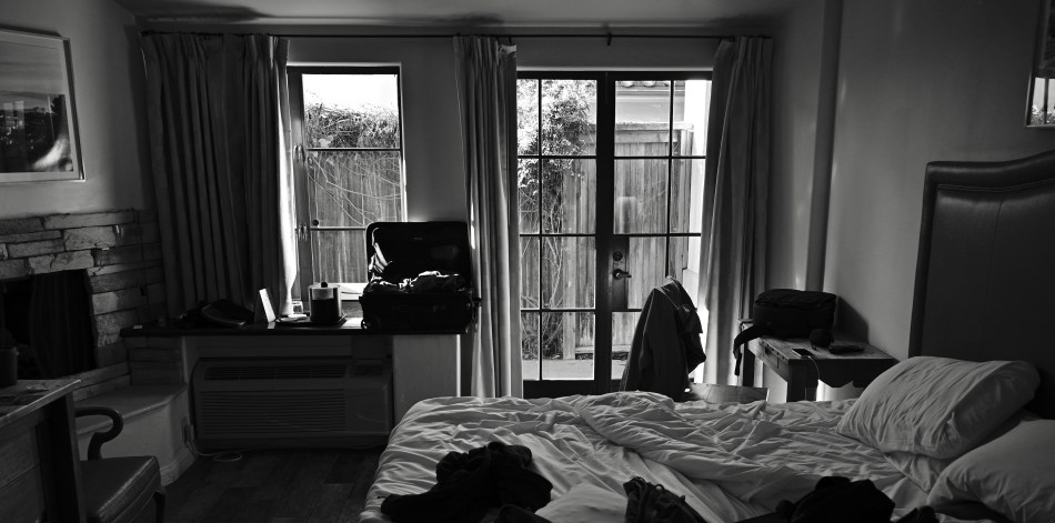
The settings stored on the “U1” mode button on my Nikon Z5 instantly produce this classic mono effect.
By MICHAEL PERKINS
OF ALL THE OCEANS OF INK SPILLED, OVER THE LAST GENERATION, on stories about the debate between photography’s analog and digital camps, relatively few have centered on the most salient difference between film-based and sensor-based devices, which is that the latter are truly miniature computers. Digital has never been about merely finding non-mechanical means to measure light, but truly about an explosion in options, tech that allows the shooter to store thousands of choices outside his own brain, creating, in effect, a database of preferences that he can call upon to instantly render any look he imagines. It’s like adding an extra half an eye to the two you were born with.
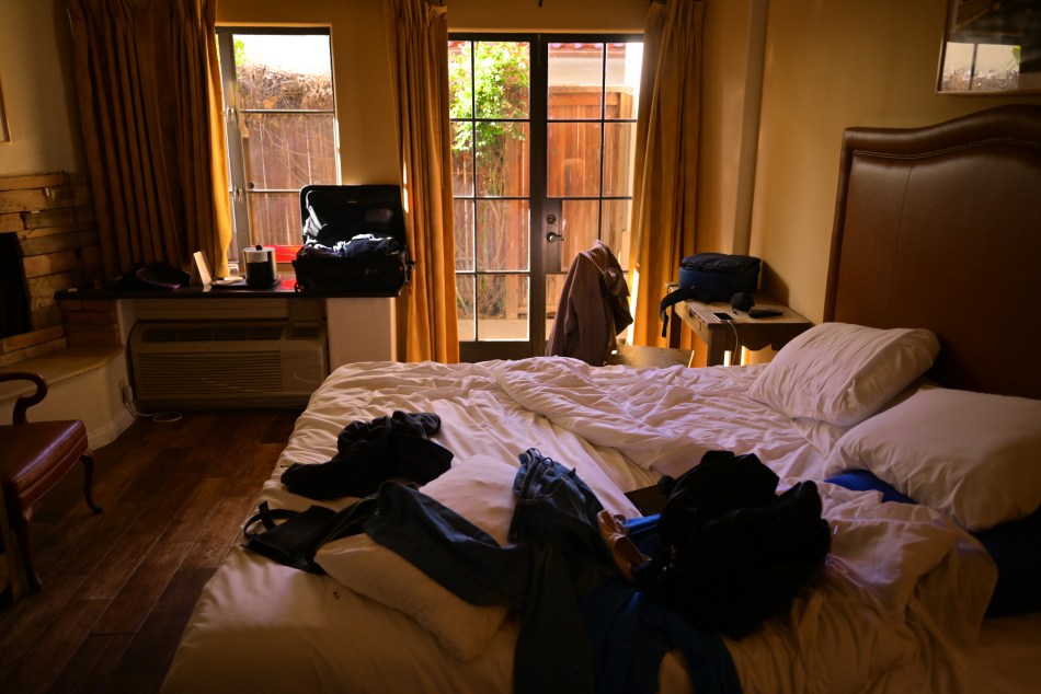
The stored “U2” settings deliver a pretty good Kodachrome fake.
Consider, as just a single example of what’s hanging from these new super-tool belts, the “user” buttons that come with nearly every camera on the market, slots where dozens of specific settings that add up to a particular “look” for an image can be stored on a mode button that, when dialed up, immediately creates that look without the need for further adjustment. Of course, in the film era, we could manually make many such custom adjustments, but they required doing so in the moment, one image at a time, cutting the implement time for shots and practically guaranteeing that many moments would simply be lost in fiddling. But now, since we make pictures with a computer, it’s nothing at all to sculpt all those elements, from focus to ISO to tonal range to, well, anything, and park them on a button that’s as easy a go-to as Manual, Shutter Priority, or Aperture Priority. Click to the user mode “button” that you’ve previously programmed, and go.
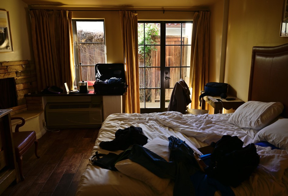
Another mode (“U3”), another tweak, this one miming an early 90’s Fujichrome slide film.
In my own case, my Nikon’s U1, U2, and U3 modes are programmed to three different kinds of film emulation. U1, seen at the top, is a monochrome look very similar to Kodak Tri-X, with contrasts and resolution that are much keener than anything straight out of the Auto mode. U2 is a pretty good approximation of Kodachrome, a recipe I copped from various online pundits, and U3 is dedicated to a fair facsimile of one of my favorite Fujichrome slide film emulsions. The beauty of having these modes pre-loaded is that, in those confusing moments when I’m unsure which approach to take with a given subject, such as the early morning hotel room seen here, I can crank off three “takes” on it very quickly, comparing them all to my fourth likeliest option of full manual in just a few seconds. This is the heaven of carrying a third half-eye in your pocket: the ability to shorten the lapse between what you see, what you shoot and what you get. It’s a menu of possibilities that no film camera ever afforded me, and further proof, as if I needed it, that this is the absolute best time ever to be a photographer.
FIFTY SHADES OF VANILLA
By MICHAEL PERKINS
THE DAWN OF DIGITAL PHOTOGRAPHY SO COMPLETELY CHANGED so many equations in the art of picture-making that it would take the rest of this calendar year to even take a stab at comprehensively listing them. Such an enormous roster would certainly include ease of operation, speed, enhanced learning, increased control, and a universe of choices and options. However, for me, it when I’m working in color that I realize that most of the effects that, years ago, were the exclusive products of the rich and well-equipped (call them the “darkroom generation”) are now at our fingertips at a whim. If the democratization of photography can be said to have begun with the first modestly-priced, more easily operated “everyman” cameras around 1900, digital process has certainly given all of us the power to deliver any look, any personal “reality” if you like, in any circumstances.
Color shows off this power this most effectively because we no longer are limited to a primary or official rendition of a hue, such as was the case in the earliest days of mass-appeal photo publications. Anyone who wanted to tweak a red to a magenta, for example, had to make very deliberate preparation before the shutter snap or complicated intervention after it (or both) to get that particular value. Now, a child can do it in a short series of clicks. Even the spectrographic presence of all colors, resulting (in light terms) in “white” is now subject to an infinite number of variants. Egg shell? Vanilla Ice Cream? Snow? Forget about being able to control all the other colors of the rainbow; plain old white is a complete spectrum unto itself.
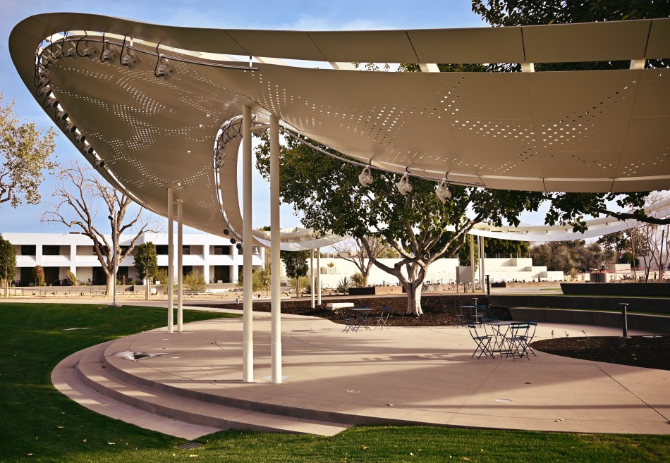
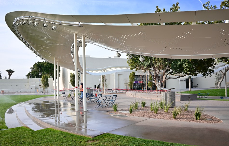
White balance, for decades a difficult and frustrating calculation, is now completely automated on even the cheapest cameras, adjustable to tons of variants with a mere twist of a knob. Going even further, apps by the zillions allow for white to recall any atmosphere or mood with incredible ease and speed. In the two pictures of a mobius-strip-like stage canopy shown here, the top is rendered in “daylight auto” white-balance in the camera’s manual mode, while the lower shot, taken mere seconds later, required nothing more than clicking the mode wheel to “U2”, where I’ve stored the settings required to instantly render a fairly good replica of the warmer tones of Kodachrome film. Both of the canopies can rightly be called “white” by the brain, and yet there is a lot of wiggle room in delivering what might best be termed “white according to whom?”. For those of use long enough in the tooth to remember how laborious this all used to be, it’s a miracle.
Photography was once the domain of magicians and wizards, practicing dark and unknowable arts in shadowy, secret places. There were the limited play spaces that we, the general public inhabited, and then there was their separate, mystical realm. Now everything’s out in the open, and, once again, technology has dissolved the barriers between the tinkerers and the artists, giving us all a shot at playing the same game. It’s a lot more fun this way.
A WALK ALONG “K” STREET
An example of a custom mix of in-camera pre-sets designed to emulate the bygone Kodachrome film (details at bottom of page).
By MICHAEL PERKINS
KODACHROME FILM HAS, AT THIS WRITING, BEEN GONE FROM PLANET EARTH for thirteen years (!), and yet it continues to echo through the corridors of nostalgia for photographers of a certain age. As the first widely sold and truly practical color film shot by millions, its native strengths (and biases) in color rendition were enshrined across billions of images as a specific way of seeing the world. People try to characterize its look with adjectives like natural or warm or dozens of other modifiers, all of which fall short in comparison with the act of just looking at its effect. Photography may be the art that is most self-referential, in that we never completely live in the moment, but always have the looks, or systems, or tools of earlier versions of that art peering over our shoulders. Kodachrome is dead. Long live Kodachrome.
Just as we have never stopped simulating sepiatone, the painterly aspects of the Pictorialist movement of the early 1900’s, or even emulsion-smeared glass plates, we have never stopped trying to emulate the look of Kodachrome. The web is littered with the photographic equivalent of recipes that claim to be able to perfectly mimic McDonalds’ secret sauce, promising to conjure up the perfect re-creation of the big K’s tones and flavors. Nearly all of these are post-processing techniques in Lightroom or a half-dozen other editing suites, with a few puny phone apps, mostly horrible, taking a crack at the task here or there. Recently, however, there have been more and more tips on pre-sets that would allow shooters to do faux K-chrome in-camera, which is what would most appeal to me personally. Fuji users got the ball rolling by cooking up their own specific how-to’s, and I have recently been kitchen-testing a mix I stumbled across for Nikon’s Z-platform mirrorless cameras*. We are now in the “tasting” phase of the process. Too salty? Needs garlic? Who knows?
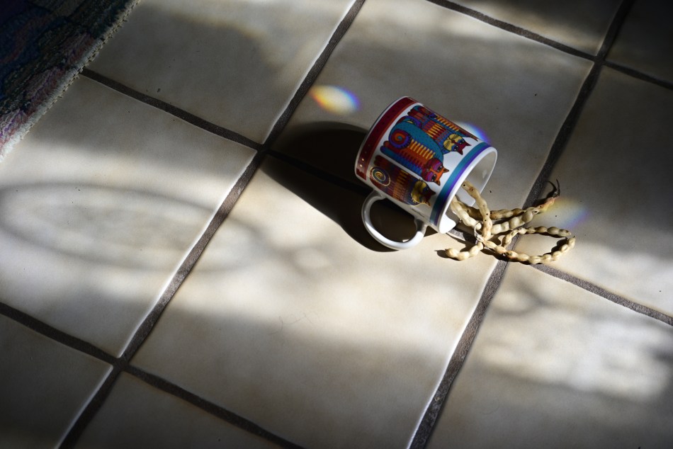
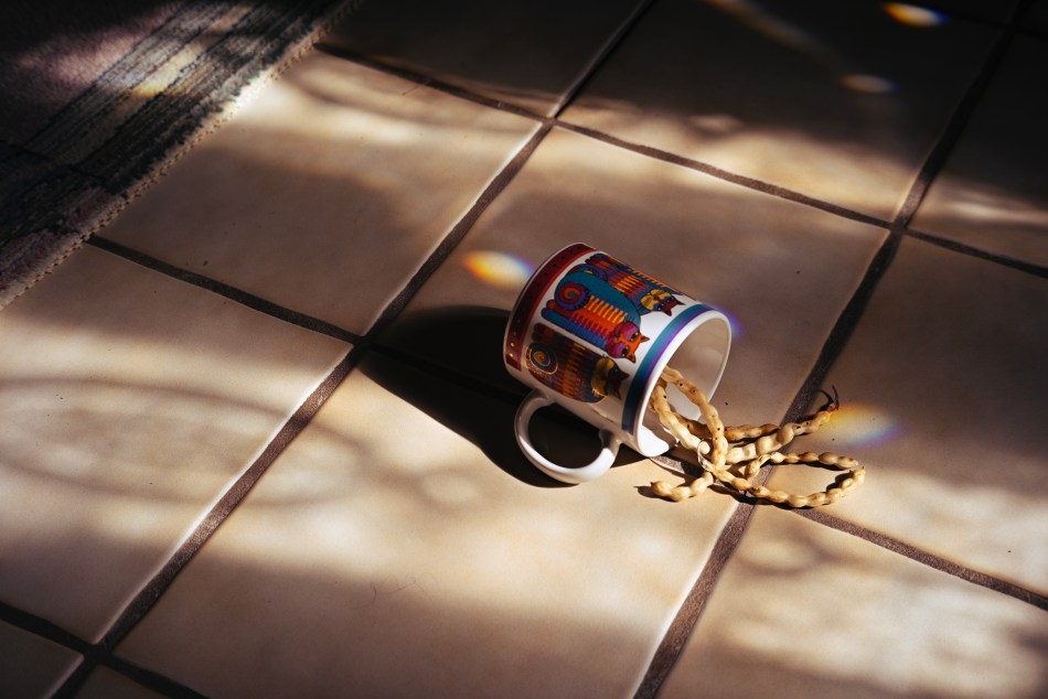
Another exposure of the above subject, this time with standard color rendition.
What’s easy to see in the two “with” and without” images seen here is that there is a decidedly different rendering of the range of reds and yellows, a hallmark of Kodachrome’s warm appearance (and key to its wonderful skin tones). The ability to store a bundle of settings in a special separate dial click (such as the “U” or user buttons on Nikons), so that it’s available virtually on demand, is of great value to me, since my camera has an electronic viewfinder, allowing me to see precisely what will be captured on the sensor in real time. That flexibility is worth more to me in the field than all the after-the-fact editing suites in the world. Is the ersatz K-chrome seen here much different than merely using, say, a very warm white balance setting, such as “shade” or “cloudy skies”? I’m still weighing all that, even as I’m trying to weigh my emotional fondness for this bygone film versus whether the look of it actually adds anything to what I’m doing. Do I love it because I loved what I was doing, back when I was first using it? Is a walk down “K” Street just a stroll down Memory Lane? Again, the final verdict comes picture by picture.
*For those who care: From the Nikon Photo Shooting menu, select “Set Picture Control”. Select menu item 15 for RED and set the level effect to 20. Within that sub-menu, set Filter Effects to GREEN with a toning level of 7, and then exit Photo Shooting. Set White Balance control for Direct Sunlight. Finally, to imitate the low ASA (ISO) of Kodachrome, you might experiment with slight under-exposure for deeper saturation. Or not, your mileage may vary.
FROM BEAUTIFUL TO BLEAK AND BACK
By MICHAEL PERKINS
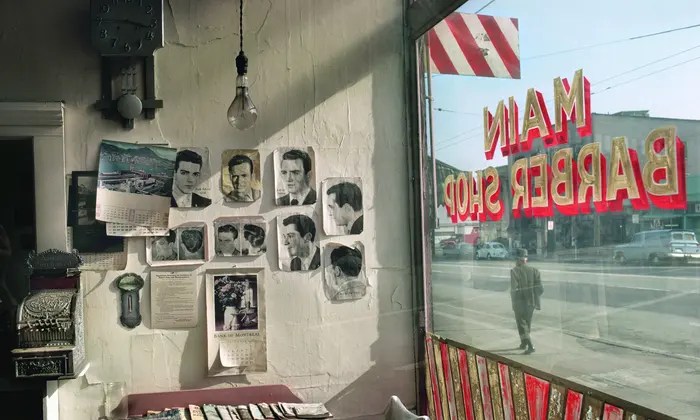
Main Barber, 1968 (Courtesy of the estate of Fred Herzog and Equinox Gallery)
BY MICHAEL PERKINS
FRED HERZOG (1930-2019) MAY BE ONE OF THE MOST IMPORTANT PHOTOGRAPHERS you’ve never heard of, just as there are hundreds of other unsung heroes in the slow transition of street photography from a medium dominated by monochrome to one defined by color. Indeed, it is because of Herzog and others like him that we now regard color as not only a valid tool for street work, but, for some, the only way to fly. However, it took a long time to get to this point.
By the time Fred began shooting almost exclusively in what we now call “un-re-gentrified” neighborhoods in the Vancouver of the 1950’s, he had earned his bread with less fanciful work as a medical photographer and fine arts instructor. At the time, the raw, immediate feel of black & white film was still the world’s go-to. Color films were thought to be the domain of amateur snapshots or high-end magazine ads. Monochrome was stark; color was pretty. How could any serious art shot depict the real state of mankind in the plump, primary tones of Kodachrome?
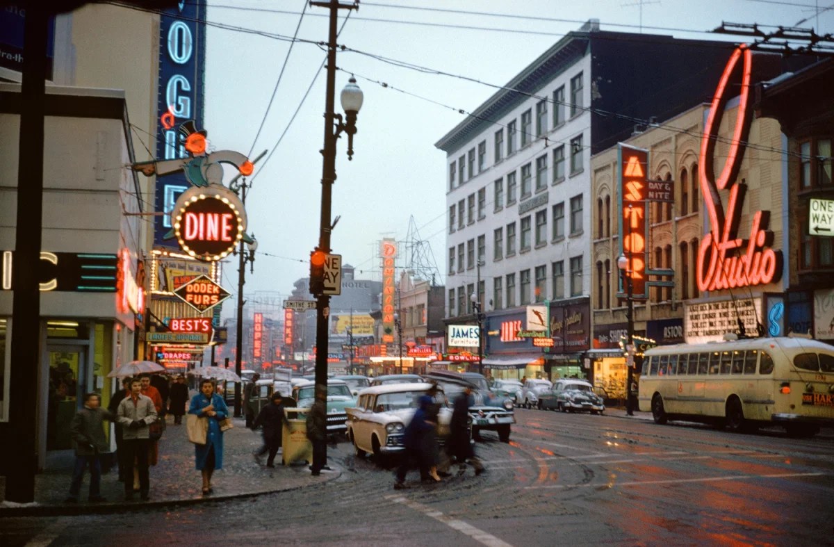
Granville/Smythe, 1959 (Courtesy of the estate of Fred Herzog and Equinox Gallery)
Herzog shot not only what he wanted, confining himself to the same small knot of neighborhoods for most of his shooting life, he shot how he wanted, and Kodachrome was his go-to. Vancouver was run-down and worn, but it was also bursting with a kind of bumptious neon flavor that would have been stripped away in black-and-white. In an age that said that color would beautify (and thus blunt) a picture’s reportorial impact, Herzog set out to demonstrate, in one iconic image after another, that color didn’t soften the harder edges of his world; it actually fleshed them out.
Technology, or rather its slow evolution, kept Fred’s work from being properly seen until years after he had created some of his best work. Kodachrome was a very slow reversal film which defied even the best labs’ efforts to create good qualtity prints, and so Herzog kept the results largely to himself in slide format until the world caught up, delaying the first public exhibition of his work until 2007. The wait was worth it, as his full body of work became one of the most valued studies on a single locality in photographic history. Herzog managed to chronicle the rise, fall, and resurrection of a city in a sprawling portfolio covering more than a third of a century, but, more importantly, he has become, with every passing year since his death in 2019, one of the greatest prophets of the full power of color, not to merely make life warmer, but to render it more completely. Time has vindicated his instinct, the feeling that life, rendered in all its natural hues, could still register the complete range of human experience, from the beautiful to the bleak, and do it faithfully.
A SHADE-Y BUSINESS
By MICHAEL PERKINS
PHOTOGRAPHY WAS NO SOONER OUT OF THE CRADLE than it was being aggressively tweaked and twiddled with, in a thousand myriad experiments aimed at improving it both technically and aesthetically. Seldom has the birth of an art form been accompanied by a surge of re-inventive energy equal to or greater than its release of creative energy. Photographs were both art and science, a strange hybrid of human expression and mechanical reproduction. One of the earliest and most consistent treasure hunts in the young craft was the quest for color, simulated and daubed on at first, then integrated into the actual making of the picture in-camera. In this age, which could be labeled Photography Century III, we use color mostly without thinking, even though it is one of the most crucial elements in how we tell stories in pictures.
Although the first practical color films date back to the early 1930’s, mostly by way of Kodachrome and its later imitators, the majority of important photographs for the first half of the twentieth century were taken and published in monochrome. In the minds of the pros like Ansel Adams, early printing processes for color were unsteady or “untrue”, with only mass-circulation magazines using them with any regularity (with a ton of touch-up) until well after World War II. After all the G.I. Joes and Janes came home, the tidal wave of leisure culture that accompanied them also brought a new explosion in amateur color photography, although it was not until the 1970’s that the economy of global film sales truly tipped in favor of the rainbow. Today, for many, monochrome is now a nostalgic effect, a quaint way of recalling the “look” of earlier photographic eras.
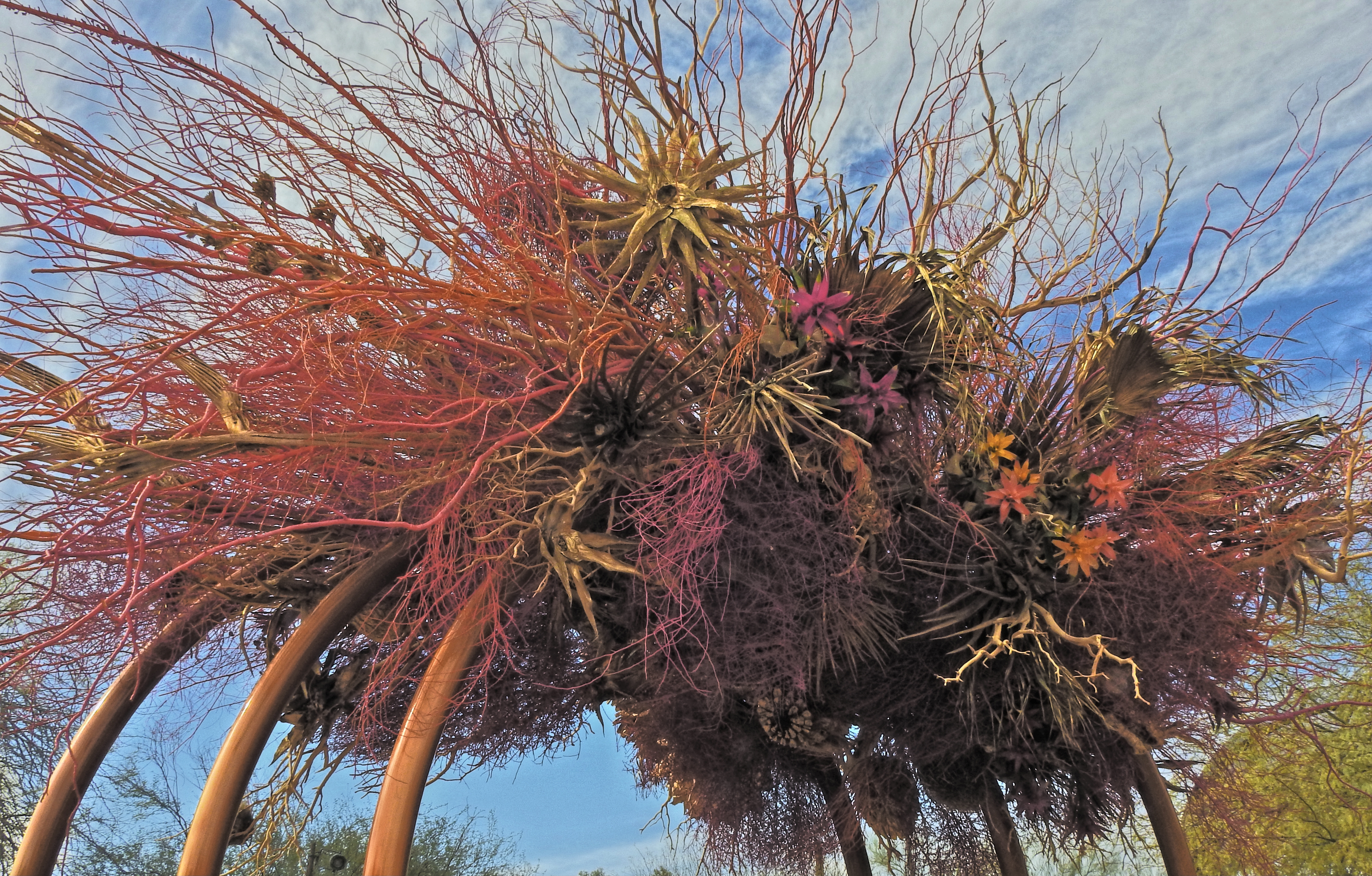
“Wind”, an art installation by Natasha Lasitsa and Daniel Schultz
In 2021, our attitude about hue is all over the road. Some still obsessively pursue the most accurate depiction of “natural” colors as is technically possible, while, for many others, color is negotiable, malleable. We acknowledge its power as an expressive tool, but we tinker with it for interpretative purposes more than ever before. We even seek out software designed to re-produce the color errors or biases of bygone brands of film stock, seeking a color that is technically “wrong” in order to get the right “feel”. We shoot with color as we use any other modern means of expression, which is to say, with an overlay of irony.
In making an image like the one seen here, the very nature of the subject is a kind of unreality, since the desert blooms and bushes used in this art installation have been dyed before the work was assembled, in an array of colors that is nothing like the limited palette they would display in their natural state. The resulting work is thus a kind of psychedelic fever dream of a desert scene. Do I record this as I find it? Do I remix the colors even further to interweave my own mood into it? Just trying to render an accurate record of this object with the color films of long ago would have been enough to send the most battle-hardened photo editor into choleric fits, and yet today, we accept that color is, as with any other element in a photograph, precisely what we say it is, and nothing more. In a way, we’ve come full circle to photography’s earliest days, before the development of actual color film, when painters touched up black-and-white images with whatever arbitrary color choices they thought “completed” the picture. Is it art? Is it not? The answer is, it is ours, a response which silences all other questions.
SPLENDOR ON THE DOWN LOW
By MICHAEL PERKINS
A WHOLE SUB-UNIVERSE OF PHOTOGRAPHY, as we near the two-century mark for the art, is devoted to emulation, or the artificial creation of the look of some part of photography’s past. This can include the aspect of a bygone lens, the framing offered by certain old cameras, and, in recent years, the digital simulation of the look of certain film emulsions. Seems that no sooner had we left the analog world than we began to devise ways to bring it back….or at least summon its ghost. Suddenly, through apps and other editing platforms, people who never shot a frame of film in their lives can render the color bias, grain, and even the speed (light sensitivity) of old stock. Part of this mini-craze is, of course, pure nostalgia, a longing for a certain simpler…. something. Part of it is also irony, as we use old recording media to impart a specific mood to a contemporary shot that it might not otherwise possess.
The revived visual impact of film in the digital era is reminiscent of those old-time photo booths that popped up at tourist attractions decades ago, providing customers with quaint costumes in which they might pose for sepia-toned “tintypes”, casting their families as pioneers and cowpokes. Today, faux-film is a tremendous profit machine within the world of phone apps, and is even creeping back in the recent resurgence of instant photography, which was resurrected in part because, hey, that weirdly imbalanced Polaroid film looked so cool. I have my own personal weakness in all of this, as a lifelong fan of Kodachrome slide film, which winked out of existence after nearly three quarters of a century just a few years ago. Kodachrome struck many as a very naturalistic kind of color medium, and it certainly introduced millions of amateurs to color in the 1930’s, just about the time shooters also embraced 35mm roll film. Everyone had to shoot a ton of the stuff, however, to get a high yield of usable images, mostly because it was verrrrry slow (50 ASA/ISO, although it eventually crawled to 100) and thus seriously prone to underexposure if you didn’t calculate your shots just so. Today, cameras do so much of all that figgerin’ that even those who still shoot film (you know who you are) don’t have half the head-scratching math their forebears needed just to take a snap. Still, I (and we) hunger for the look produced in the day when it was all too easy to make an expensive error. The horse, in uncertain times, even during a barn fire, always heads for the barn.
An example of the kind of rich “Kodachrome-era” color that is easily simulated in today’s more responsive cameras.
Of course, if you truly emulate a film, you also emulate everything that it did, good or bad, and one of Kodachrome’s artifacts, when slightly underexposed, was to enrich and deepen colors. Being basically lazy by nature, when I want that kind of muted, voluptuous look, I simply underexpose my shots by a few aperture stops….not enough to lose all detail in the dark areas, but enough to boost intensity and warmth and isolate the brighter elements from the darker ones with more pronounced contrast. The other way to get the same result, as seen in the above image, is to take an already dark scene (like this late sunset) and either speed up the shutter, to make it a mite darker, or use a fast shutter and an ISO that’s only raised to about half of what a “correct” exposure might require.
Like any other “look”, my Kinda-Kodachrome is not a consistent signature of my work, but an occasional fun asterisk on it. At some point, some able app-smith may eventually craft a faithful approximation of it, but, until then, I have fun blending old and new elements into a kind of composite-tribute of my own. Photography itself has always been like twin-headed Janus, looking into the past and future at the same time. Such is the dual goal of all art. Every time you record the now, you’re using the wisdom of the was.
DRINK / SHOOT YOUR FILL
By MICHAEL PERKINS
SHOOTING FROM A PROPRIETARY VIEWPOINT is the photographer’s equivalent of being invited to a wedding with an open bar. You try everything. Turns out you don’t really like Singapore Slings? Leave it on a tray and go back for the Jack and Coke.
It really is that simple. If you find yourself with a one-of-a-kind view, assume you’ll never be invited back and hit the subject with everything you’ve got. Change lenses. Up-end your normal method of working. Do something screwy. But do try it all. Hey, you’re on top of Mt. Fuji, right? So it’s not like you’re passing this way again next month. Go for broke.
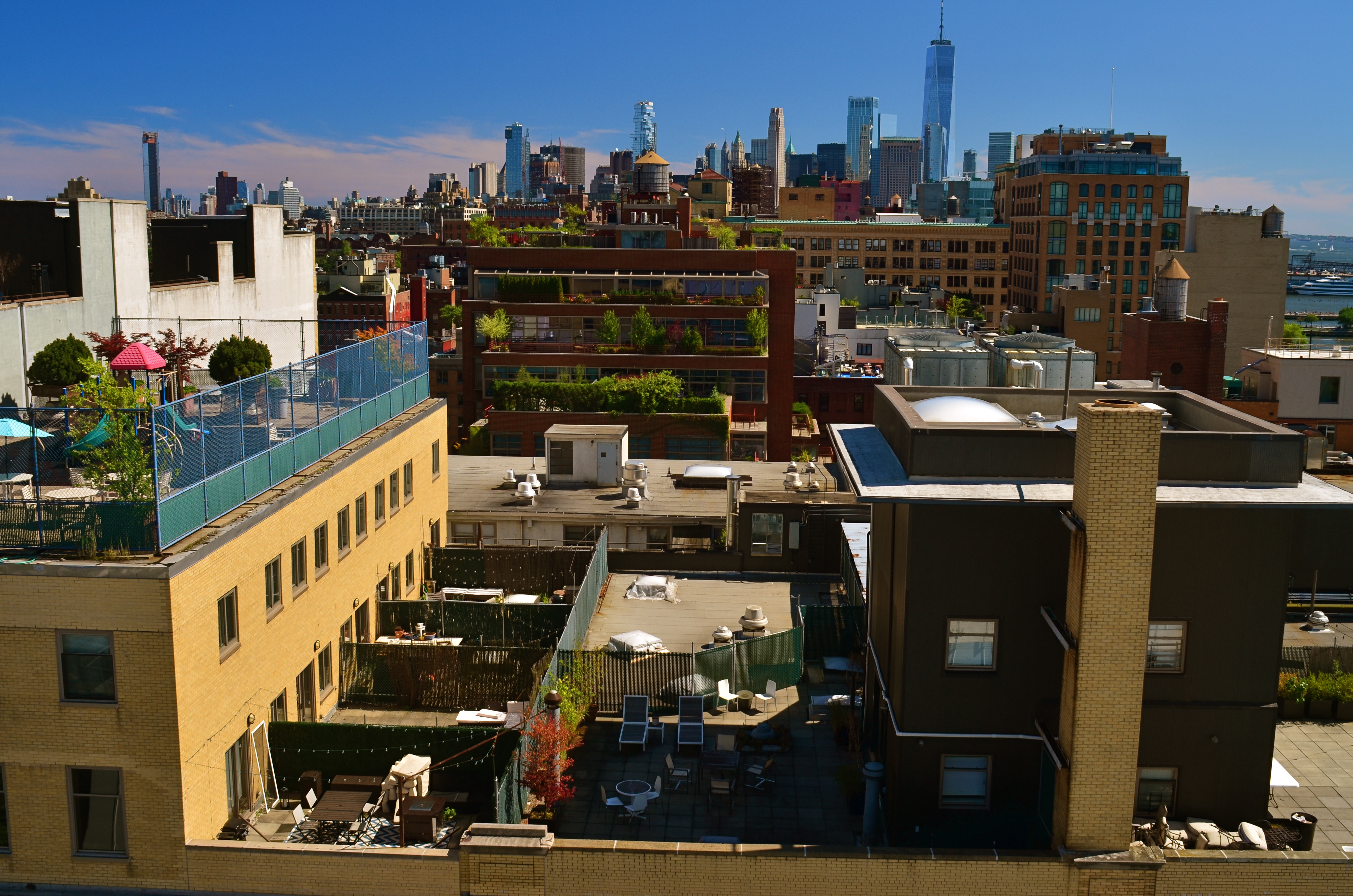
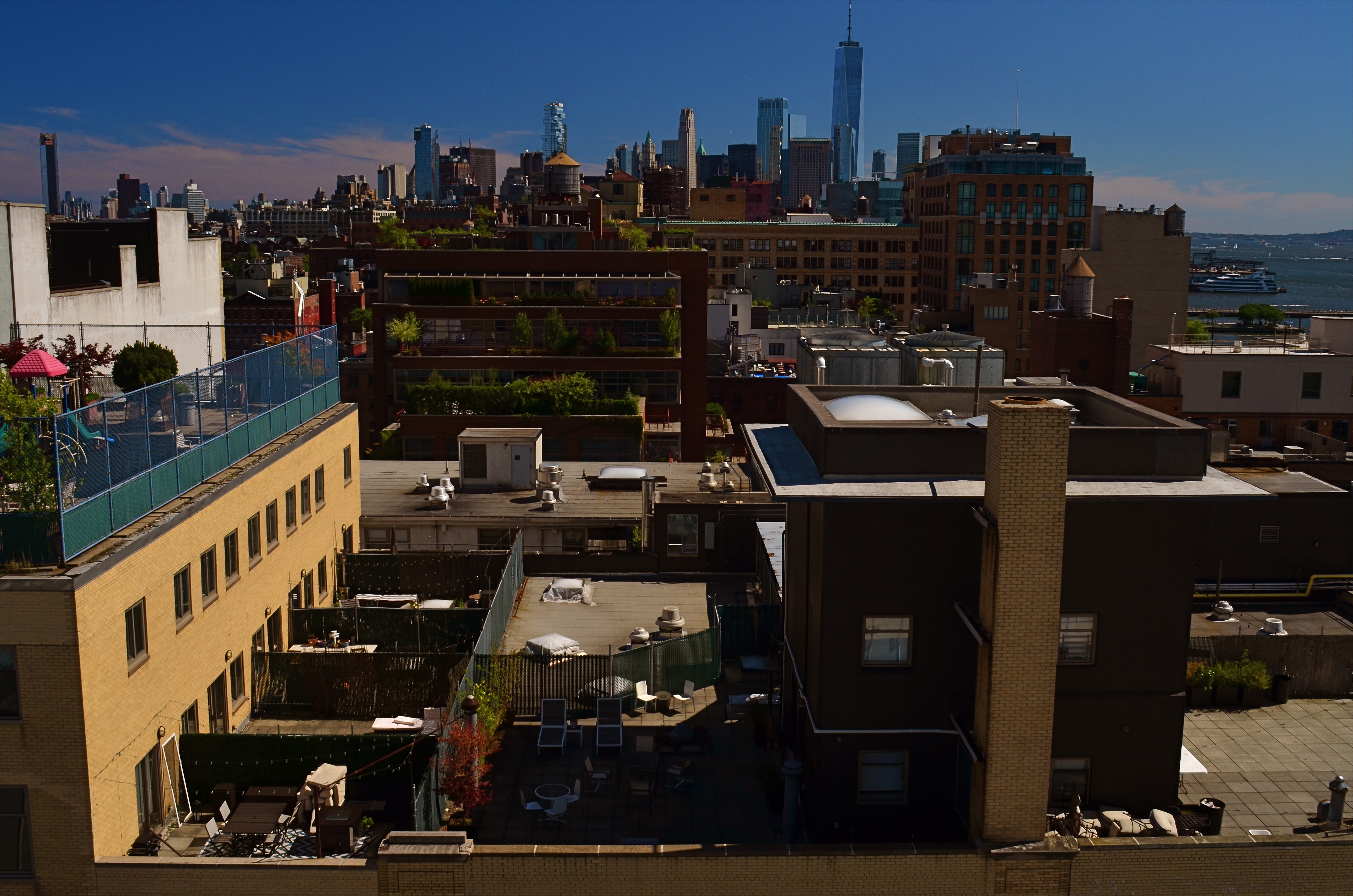
The Manhattan rooftop from which these samples were shot was a gift, and I knew it. I popped off dozens of frames in every direction with every combination of gear and settingscI could think of, simply because the vantage point would likely never be available to me in the future. Not anytime soon, anyway. One thing that’s always in the back of my mind when shooting in New York is the wonderful look of classic images shot in Kodachrome, the greatest but most temperamental film in history, now gone to that Big Darkroom In The Sky. Kodachrome had amazingly warm color saturation, but, all science-y talk aside, its “look” was probably due in large part to the fact that it was slooooww, just the equivalent of 100 ISO at its speediest. That means that, simply, many of us were underexposing it. By a lot. Anyway, I’m always out to craft my own Kodachromesque Manhattan, and I saw a chance to do so in this particular situation.
The two shots seen here were taken mere seconds apart from each other, both shot with a 24mm prime sporting a circular polarizing filter. The lighter one is f/8 at 1/60 sec., while the darker, more “day is done” image is deliberately underexposed at f/16, 1/160 sec. The combination of the smaller aperture and the filter doubles the intensity of all colors, but sacrifices someinformation in the shadier areas. I leave it to you as to what’s been gained and what’s been lost. The point is that I shot about eight other versions of this scene, erring on the side of too many choices in everything I aimed at that afternoon. Photography is not only apprehending where you are, but understanding just how briefly you’ll be there.
But, hey, it’s possible I’ll get a repeat invitation to this particular roof. Then again, I spilled my Jack and Coke all over the hostess on my way out, so you never can tell.
THE NON-EVENT EVENT
By MICHAEL PERKINS
EVENT PHOTOGRAPHY IS ONE OF THE MOST FORMALIZED MEANS OF MAKING PICTURES, a pure mission where there is usually only one “official” story being told. A happy wedding. A formal ceremony. A tearful farewell. We expect cameras to be more or less pictorial recorders at certain august moments in our lives, and anyone charged with performing that recording task is usually not expected to also serve up interesting or odd sidebars on human behavior along with the certified images we sent them to get. Event photography is not news, and may not even be persuasive human interest. It is a document, and a rather staged and stiff one at that.
But that’s what’s rewarding about being the non-official photographer at an event. It’s someone else’s job to make sure the crucial toast, the first dance, or the lowering of the casket is captured for posterity. Everyone else with a camera is free to do what photography is really about most of the time. There’s little opportunity for interpretation in the “important” keepsake shots that everyone wants, but there’s all kind of creative wiggle room in the stuff that’s considered unimportant.
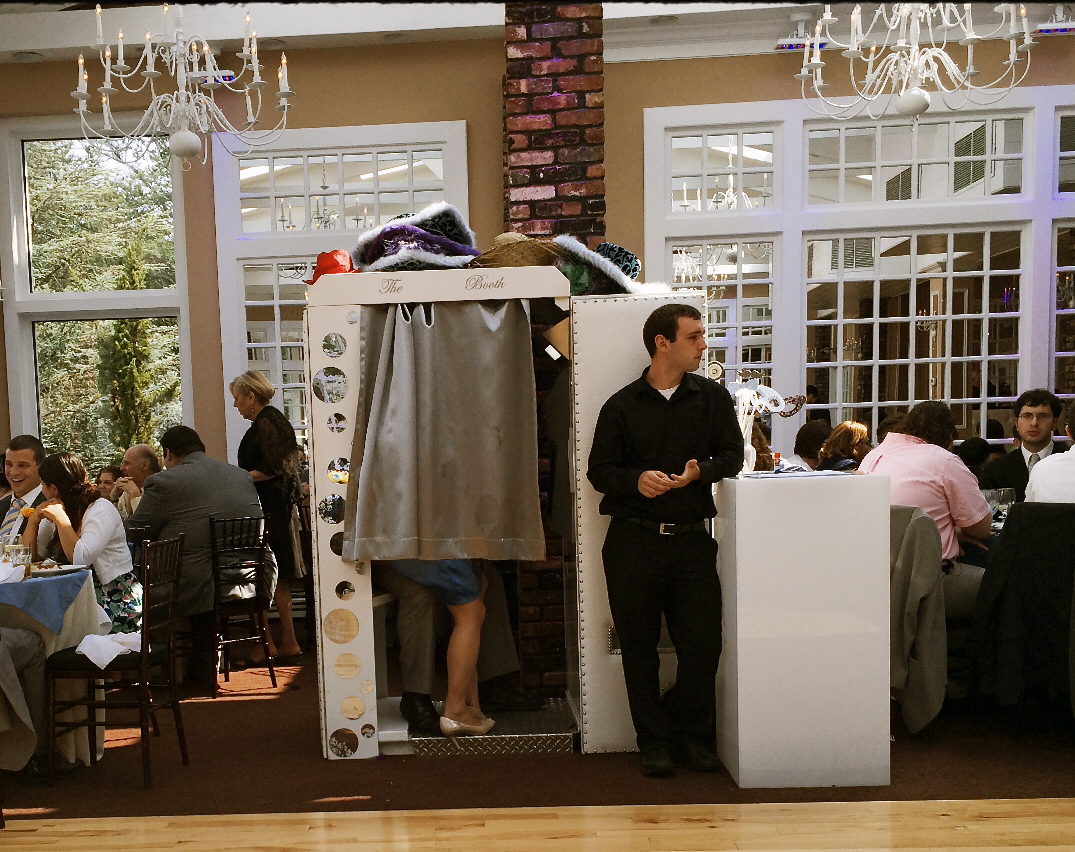
Working The Wedding, 2014
I recently attended a wedding at which every key feature of the proceedings was exhaustively catalogued, and, about two hours in, I wanted to seek out something unguarded, loose, human, if you will. The image seen here of a bored hired man doing standby duty on the photo booth was just what I was seeking. I don’t know if it’s the quaint arrangement of legs and feet inside the booth or his utter look of indifference on his face as he stoically mans his post, but something about the whole thing struck me as far funnier than the groomsmen’s toasts or the sight of yet one more bride getting a faceful of cake.
I was only armed with a smartphone, but the reception hall was flooded with light at midday so the shot was far from a technical stretch. The image you see is pretty much as I took it, except for a faux-Kodachrome filter added to give it a bit of a nostalgic color wash, as well as counteracting the bluish cast of the artificial lighting. I also did some judicious guest-cropping to cut down on distraction.
Taking pictures at someone else’s event is a great gig. No expectations, no “must have” shots, and you don’t even have to care if you got the bride’s good side. Irresponsibility can be relaxing. Especially with an open bar.
THE LION IN WINTER

Ralph Adrian Perkins, June 12, 2013. 1/100 sec., f/1.8, ISO 100, 35mm.
By MICHAEL PERKINS
I AM AMAZINGLY BLESSED TO BE ENTERING OLD AGE, STILL TRAILING MY FATHER BY ABOUT TWENTY-THREE YEARS. Defying the odds, statistical probabilities, and luck, my personal North Star is still, at 84, providing me with a point of light to steer by. I cannot imagine a world in which he is not just a few miles ahead of me, gently insisting, “this way.” And, years after the worst the world has to offer has long since stopped generating any panic in me, the thought of life without him remains unimaginable, like trying to envision the world without gravity, or sunlight.
I can’t begin to catalogue the thousands of ways his wisdom and patience have tempered and shaped me, but it’s worth singling out his influence on my visual sense and curiosity as a photographer. I remember his intrepid search for beauty, armed with the simple tool of a Kodak Pony 828 camera, a device which both intrigued and frustrated him. During my childhood, the Pony was the official recorder of dreams, events, and possibility for the Perkins clan. We all cheered when it delivered what Dad saw in his mind’s eye. We all offered sympathy and encouragement when he asked it to see beyond its powers, when a set of Kodachrome slides entered the “better luck next time” category.
As a designer and illustrator for North American Aviation, then, later, as a fine arts teacher, he had a developed eye for beauty, a genuine instinct for how a visual story was framed and shown. Armed with my first cheap plastic camera, I only knew I wanted my images to be as good as his own. His eagerness became my ambition, and, half a lifetime later, I still regard a picture as “good” if the old man sees something in it.
Like many photographers major and minor, I am happy to make my father a subject in my own work. I am recording, interpreting and saluting his life all at once, and trying, in my halting way, to capture, in his face, all of the wisdom I have drawn from him over a lifetime. It’s a tall order, but he always taught me to go a little bit beyond what you think you can deliver. I remember him pushing the Kodak Pony to its limits, and beyond, in impossible situations. Some projects landed with a clunk, but it was always about the next frame, the coming opportunity.
There was…is….no bad photograph. Just mileage markers on the way, toward “gee, who knows?”
Thank you, Dad, for showing me that the journey is everything.
THE BOOK OF KODAK
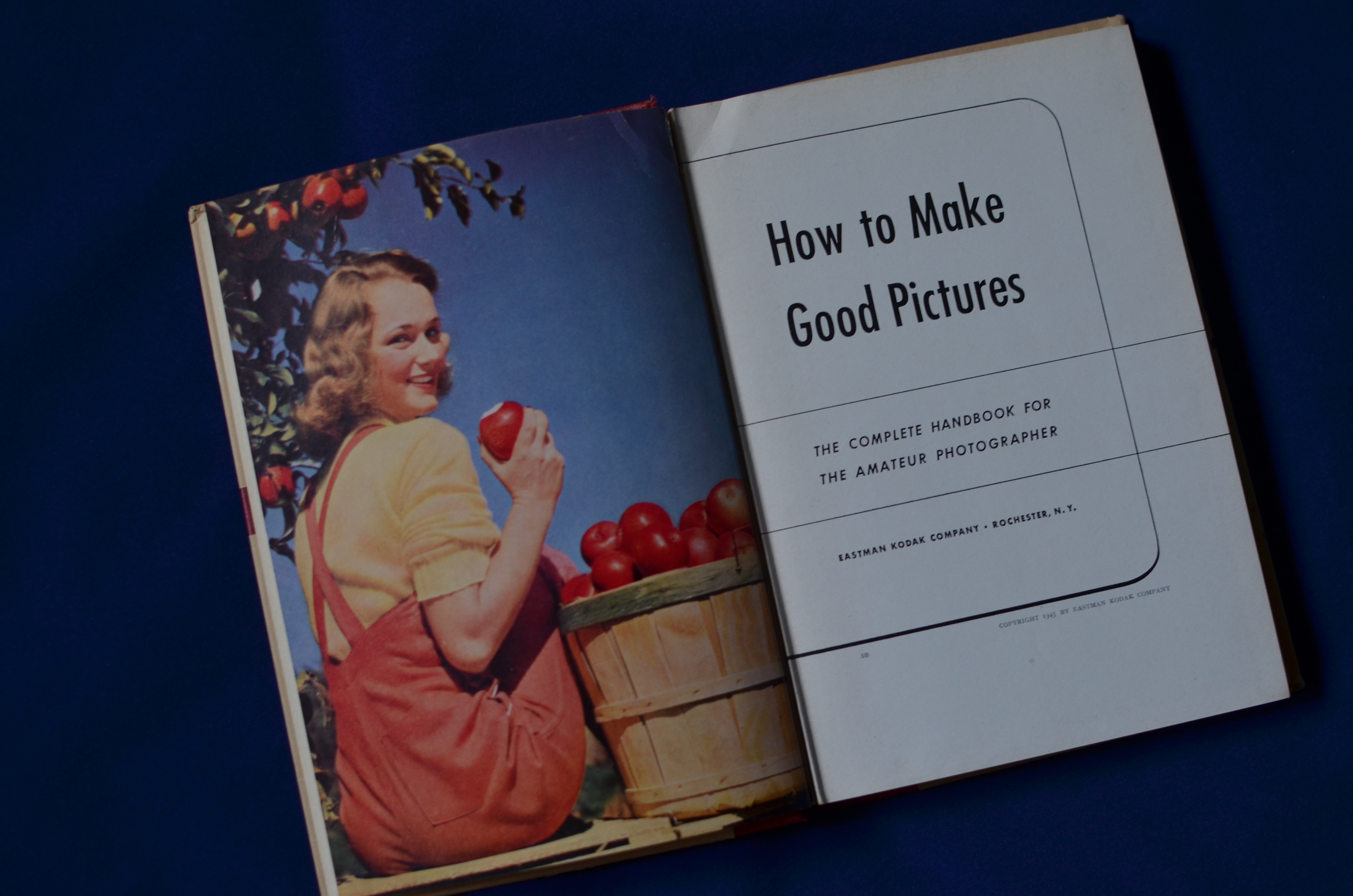
The Long-Distance Runner: The Most Successful Photography Instruction Series In History, Eastman Kodak’s How To Make Good Pictures (28th Edition,1943-47). From the collection of the author.
By MICHAEL PERKINS
KODAK’S SAD AND WOBBLY RE-EMERGENCE FROM BANKRUPTCY, announced this week, finalizes the process of “saving” a famous name, while annihilating the legacy of innovation that made that name great for over a century. Having already said goodbye to Kodachrome, most of its other trademark films, and camera production itself, Kodak will now concentrate on “imaging products”, which, for, most of us, means “printers”. Most of the news coverage of this corporate resurrection will “focus” (sorry) on what the new company stock will be worth, who goes, who stays, and a few scant mentions of the company’s original role as camera producer to the world.
That will leave a significant part of the story untold.
Certainly, George Eastman’s genius for marketing helped develop the first flexible roll films, then ingeniously created a market for them by putting a basic, usable camera in the hands of the Everyman. Nearly everyone has heard the slogan Kodak created to demonstrate how truly effortless its products had made photography: you press the button and we do the rest. But none of that would have guaranteed the company’s growth if Kodak has not also decided to become photography’s first great mass teacher, creating pro-active education programs to guarantee that, not only could Uncle Clem snap a photo easily, he could snap a good photo easily. What had once been a dark art for a select cabal of techno-wizards became, under Kodak’s outreach, something that could anybody could do.
And Kodak was going to show you how to do it.
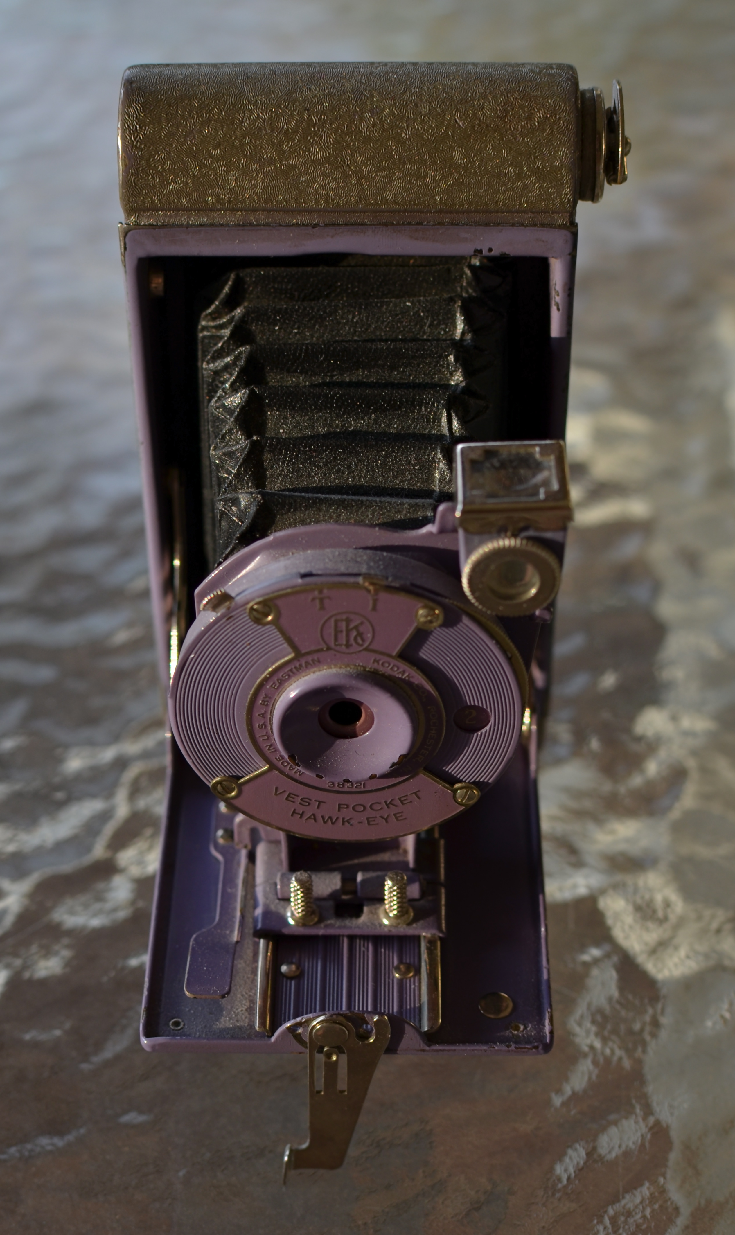
There was a time when this Kodak Vest-Pocket Hawkeye was truly intimidating. How To Make Good Pictures made it your friend.
Beginning before the end of the Victorian era, the company began to publish the first of an endless stream of practical guides on technique and simple theory aimed at the average shutterbug. Starting in 1898 with Picture Taking And Picture Making (115 pages of tips in a cardboard cover for fifty cents!), Eastman Kodak moved to 1905’s The Modern Way In Picture Making, and, finally, to the most successful photo instruction series in history, How To Make Good Pictures, introduced in 1912 and revised continually until finishing up with its 37th edition, in 1995. Over the years the “make” in the title had been changed to “take”, and its 1890’s essays on bromide paper, collodion matte, and ground-glass focusing had evolved, over the decades, to instructions on the use of flash, color, drop-in film cartridges, and “how to tell a picture story” with your Kodacolor slides. Hundreds of printings and millions of sales later, How To Make Good Pictures forged an ironclad link between consumer and company in a way no corporation before or since has done.
To everything there is a season. Kodak’s (now historically) tragic failure to see digital photography as a viable consumer revolution, until it was too late, is a matter of raw record. The company that taught the world to see had a blind spot, a fatal one, and the irony that nearly all of the rest of the industry developed digital technology by applying processes originated (and patented) by Kodak makes the story even sadder.
But, once upon a time, the Eastman Kodak Company not only knew what the future of photography was going to look like, it wrote a handy dandy little book that told everyone how to master that future.
Follow Michael Perkins on Twitter @MPnormaleye
Related articles
- Kodak moments are just a memory as company exits bankruptcy (kansascity.com)
POP’S MAGIC PICTURE BOX (Father’s Day 2013)
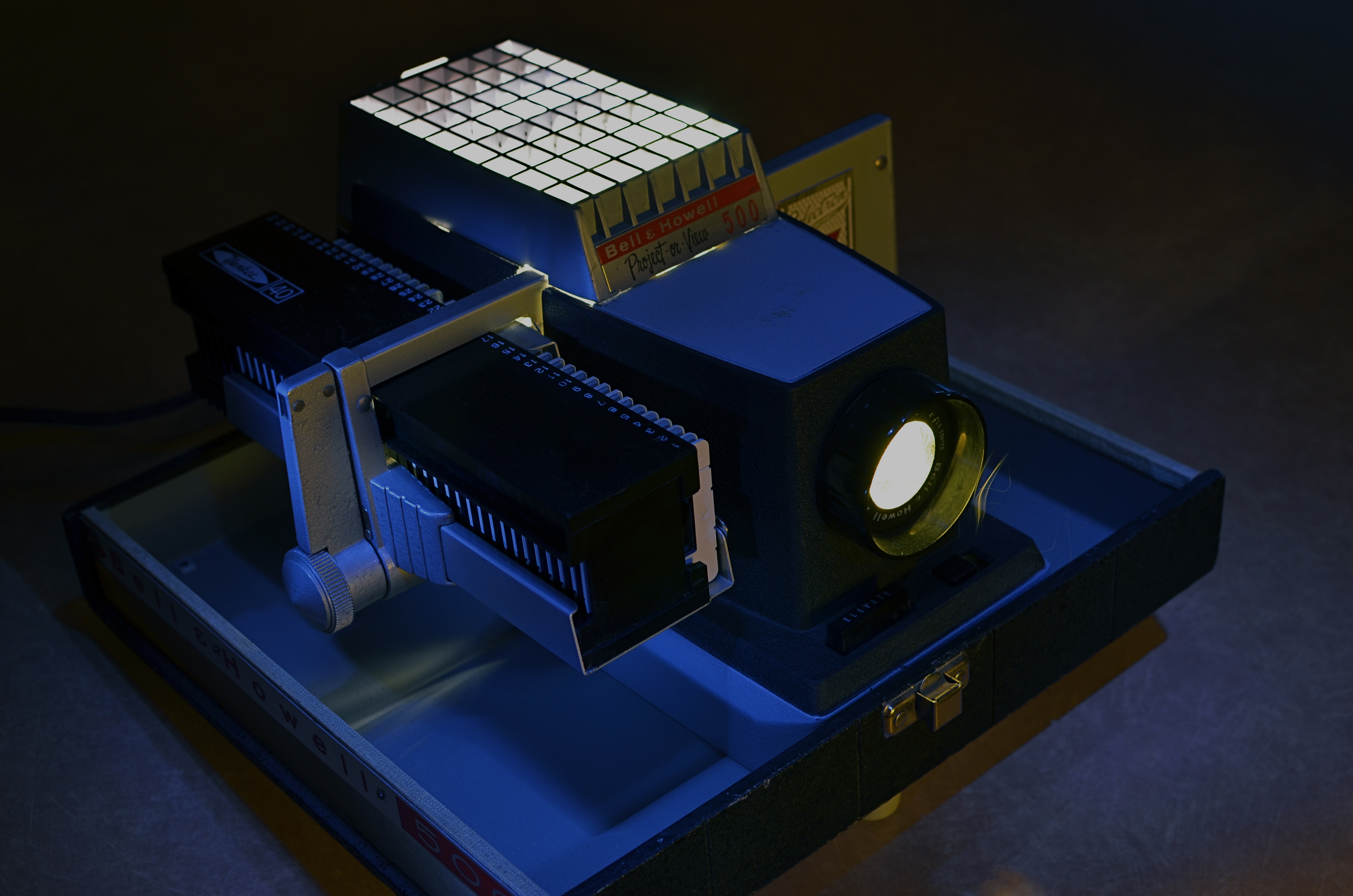
Magic in the darkness: my father’s Bell & Howell 500 projector, circa 1963. Image time-exposed and selectively light-painted in absolute dark. 10 sec., f/5.6, ISO 100, 35mm.
By MICHAEL PERKINS
YEARS AFTER, AS A YOUNG BOY, I FIRST SAW KODACHROME SLIDES PROJECTED ONTO OUR LIVING ROOM WALL, I learned that the first popular projectors had actually been called “magic lanterns” How right they were, and what an incredible spell these flashes of color and light wove for a little boy breathless in the familiar, yet miraculous dark.
It wasn’t that, as a family, we didn’t have dozens of albums crammed with traditionally processed prints of our most treasured moments. It’s just that, in the shadows, those clear, color-soaked images, half a wall in size, took on a life of their own. Bigger. More immediate. And as communal as a trip to the theatre. Only this was our theatre….our lore, our legend, writ large, compelling somehow in its size and scale.
Father’s Day is always a poignant time for me, since my life is insanely blessed. For me to be in the last third of my own life, and to still have the author of so many of my dreams still on the scene, still available to teach and direct my visions, as he did so ably then….well, it’s everything, that’s all.
As a father myself, I learned that it’s not always possible to transmit your passions to your children. Sometimes they don’t want to follow dear old Dad into whatever passionate pursuits he’s chosen for his own life. The fact that, sometimes, your kids “get” what even a part of you is really about is amazing, and, in the case of my father, I was lucky enough to be struck by the same lightning that hit him when it came to the graphic image….drawn or painted, realized in solid space in sculpture, or frozen on film. Photographs to him were another way of teaching himself to select, to edit, to choose something magical to depict or interpret, and he let me be the sorcerer’s apprentice.
Early into the Christmases of my adolescence, the power of our family albums was left in the dust as our memories began to shine and glow in our living room with the arrival of Dad’s new Bell & Howell 500 slide projector. It was Cinemascope, Cinerama, and the video wall from The Jetsons all in one, and I was mesmerized. The arrival of every yellow, flat box of new Kodak slides, all the way from the regional processing plant in Findley, Ohio, was like the reveal of a stage magician. I had caught the fever. I wanted to make pictures, too.
I wanted to make pictures like his.
The best statement I can make, all these years later, about the wonder of projected images was expressed several years ago on the Mad Men TV series, when adman Don Draper has the chance to make a fictional pitch to Eastman Kodak on how to market and name its new series of home slide projectors. And, even though our home projector used a “cube” tray instead of the wheel on Kodak’s “Carousel”, the magic was the same. Draper’s pitch began with the very essence of family memory:
“In Greek, ‘nostalgia’ literally means ‘the pain from an old wound’.
It’s a twinge in your heart, far more powerful than memory alone.
This device isn’t a spaceship, it’s a time machine. It goes backward and forwards, and it takes us to a place where we ache to go again.
It’s not called ‘The Wheel’. It’s called ‘The Carousel’ It lets us travel the way a child travels…around and around and back home again.
A place where we know we are loved. “
On this Father’s Day, as on every other, my heart is filled with memories and gratitude for the love that created them, but also a special thanks for a father who taught me the adventure, the patience, the joy of making an image. Armed with his trusty Kodak Pony 828, he taught me how to celebrate the triumphs and live with the failures, and, most importantly, to always go back to the well for another try. As both a photographer and graphic artist, he showed me that the concept is all, that it’s worth fighting for, worth worrying about, worth loving as your own special treasure.
Thanks, Dad. I love you.
Follow Michael Perkins on Twitter at MPnormaleye.
Related articles
- The best product placement in the TV shows (brandsandfilms.com)
- It’s a Magic Lantern (wordwenches.typepad.com)
