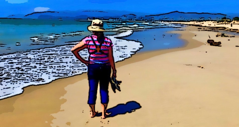
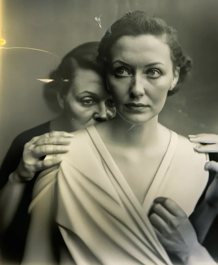
HERE I AM IN FRONT OF…..
By MICHAEL PERKINS
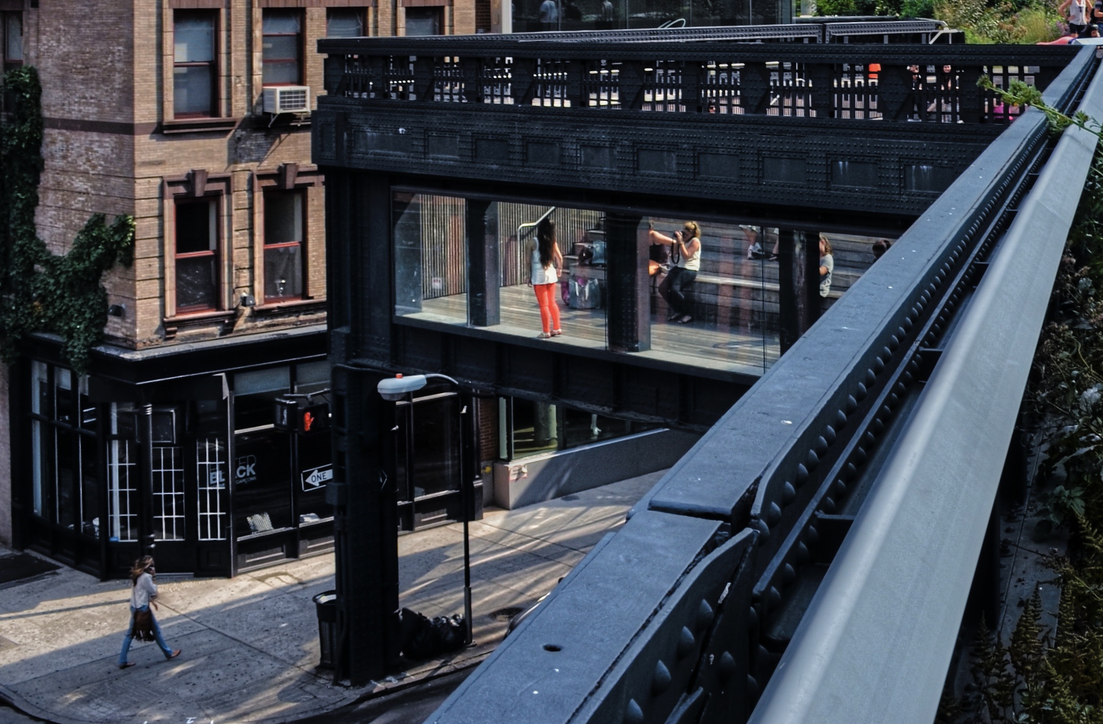
BY A WIDE MARGIN, THE MAJOR BY-PRODUCT OF THE EASE AND CONVENIENCE OF THE DIGITAL PHOTOGRAPHY ERA has been the boundless proliferation of the selfie. What was, just a generation ago, something of an experimental shot has now become the global baseline credential of personhood. “Today”, wrote Susan Sontag many years ago, “everything exists to end in a photograph”, which I would amend slightly to read “everything exists to end as a backdrop in a photograph of me.” The Eiffel Tower may have some innate impact, but nothing compared to the validation it receives if I am standing in front of it.
Of course, souvenir photography always functioned this way; people always shot Uncle Bob in front of the pyramids or Mom inside Notre Dame, as if to prove that they had made it to this place or that. What’s different now is the sheer volume of shots (and time) spent just in glorifying ourselves, usually in a tight head shot, reducing the attraction or destination in question to a distant prop or afterthought, as if our facial expressions comprised a kind of ego-driven series of trading cards, with the objective being to collect the entire set.

And so we rack up bigger and bigger totals of pictures of ourselves in front of….whatever, and we go from being shooting images of random activity to snapping pictures of people posing for pictures, getting ready to pose for pictures, or playing pictures back. Popular points of interest or tourist destinations roll with the trend and provide more opportunities for their patrons to pose in front of cool stuff. The street performers seen in the above shot do not work for a fair, a carnival, or a circus, but a botanical garden. Traditionally, taking in the seasonal shrubs and flowers does not seem to call for the services of eight-foot butterflies or zebras, but people will or must pose in front of something, and so these wandering backdrops spend all day smiling for “just one more, okay?”
The camera was created primarily as a way to take visual measure of the world beyond ourselves, and, of course, it still serves that purpose. But one of its main components, people-watching, is increasingly about people who are ready for their close-up, self-consciously eager to publish and be liked and be followed. Here I am in front of….hmm, you can’t really tell, but I like the way my hair looked that day….now, here’s…..
BACK TO BEING….A BEING
By MICHAEL PERKINS
VACATIONS ARE HARD WORK.
Well, sure, lying next to the pool and trying to grab the waiter’s attention for uno mas of whatever’s in this drink is not the exact same thing as hard labor. It’s just that, for some of us, effectively getting our minds on a leisure footing requires as much focus as learning any other important life skill, leading many of us to feel that it’s only as we head back for home that we’ve finally started to get the hang of the whole “chilling” thing. And since I am always making some kind of picture wherever I go, the results of my vacay snapping reflect the same process of adjustment as well.
It’s not enough to merely say that the images get “simpler”, or that I shoot more instinctively in some way while on holiday, although both those things certainly happen. It’s more like my entire perception of what a picture is for is changed, along with a different concept of what is worthy of a picture. For one thing, when I am away, I shoot almost equally with a cellphone and my more sophisticated cameras, something I rarely do at home. This affects the choices I make in a variety of ways, as happens whenever we shift from one device’s strengths/limits to those of another.
To cite but one example, I use a much narrower, and sometimes more dramatic range of post-processing effects (of which the picture up top is a product) on my cell camera than on my Nikon mirrorless, on which I nearly always shoot straight-out-of-the-camera. The phone camera also serves as a kind of “sketch pad” or first-take record of subjects I will return to later with the Nikon, whose tools are far more nuanced and controllable. All of this and more goes on in my back brain while my forebrain is telling relax, you idiot.
If I’m lucky, I come home with at least a handful of images in which I somehow managed to do something different, moments in which I actually figured out how to be “on vacation”. In such cases, the expense and planning all seem worth it, and I re-experience at least a part of the electric thrill I felt the first time I put my eye up to a viewfinder.
Now that’s relaxing.
GOING STRAIGHT, WITH A DETOUR
By MICHAEL PERKINS
I DON’T PRECISELY KNOW WHAT THE TERM “STRAIGHT OUT OF THE CAMERA” MEANS, and I suspect that you don’t, either.
As a phrase, SOOC is now more the expression of an ideal than any accurate reflection of a process. In the years since on-line file sharing began to codify our photographic work into broad categories (the easier to keep track of things, my dear) this baffling abbreviation has began to crop up more and more. You know the stated intent; to create groupings that are defined by images in which no manipulation or processing was ever added, ever ever, pinky swear on a stack of Ansel Adams essays. But just as with terms like “natural” or “monochrome”, SOOC tends to obscure meaning rather than enhance it; that is, it refers to something that is supposed to be desirable without explaining why.

We are given role models to admire and emulate; legends like Cartier-Bresson are historically held up as paragons of SOOC. The stories are repeated for each new generation: He never spent any appreciable time framing a shot in advance….no editor ever cropped a single one of his shots….and so on, into the realm of holy myth. But so flaming what if all that were even true? What additional authenticity or impact is conferred on a picture just because its author never touched it again after the shutter click? Beyond the wonderful vanity that our first vision of something could be so profound that no further action or intervention is needed to render it complete, does that mean anything more than someone who solved a crossword in under twenty minutes, or managed to go three years without eating dairy? I mean, on one level, I get it. We would all love to claim the mantle of auteur, creating our own perfectly realized art without assistance or adjustment. This my creation, and mine alone. It’s a pleasing fantasy.
But that’s all that it is.
The image you seen here is, by my lights, as close to SOOC as I personally ever get. And yet: I cropped it, leveled it, raised the luminance on the reds and oranges. I did, in fact, mess with it, though not in a majorly transformative way. This is called a “tweak”. Granted, it took a lot less intervention since the master shot generally worked out as planned. The result was a collaboration, if you like, between Shooting Me and Editing Me, and I’m fine with that. Here’s the deal: in creating a “straight out of the camera” category, image sharing sites have, for good or ill, drawn a line between preferred and regrettable, between instinctive genius and “coping well”, and that bothers me. Art cannot be crammed into ill-fitting “worthy” or “less than” pigeonholes. When that happens, it becomes “less than”, well, art.
EX POST FACTO
By MICHAEL PERKINS
PHOTOGRAPHING THE BUILDINGS THAT ONCE COMPRISED THE VISUAL LANDSCAPE of a vanished time is always an entire “term paper” project for me. Finding antique structures that were designed for very specific uses, and trying to shoot them in as close to their original form as possible, always trips me into reams of research on how they survived their eras, what threatens their further survival, or what grand new uses await them in the future. And most of those stories begin with my quite accidentally strolling past them en route to somewhere else.

This post office from 1935 popped into view as Marian and I were taking a recent post-lunch stroll around the reborn town of Westerville, Ohio. Photos from its grand opening show it to be nearly identical in appearance to the first day of its service, decades before its namesake was even officially a city. It was one of dozens, perhaps hundreds of village post offices built during the Great Depression by the job-creating New Deal program known as the W.P.A., or Works Progress Administration. Most of the P.O.s erected in those austere years were, themselves, no-frills affairs, devoid of all but the simplest decorative detail and as structurally logical as a Vulcan with a slide rule. Straight, clean lines. Modest appointments. Simple tablatures over the entrance.
The Westerville P.O.’s most distinct feature was actually inside the building, where a “noble work of the common man” mural typical of the period (another federal make-work project to help sustain starving artists) once decorated one wall. Sadly, Olive Nuhfer’s “The Daily Mail” depicted a neighborhood that resembled the artists’ native Pittsburgh, a bone of contention for the Westerville locals who pronounced it out-of-step with the small-town ethos of the area. In time, the painting was removed and returned to a permanent place in the Steel City.
Photographing these kinds of buildings is an exercise in restraint, in that I seek to idealize the structure, to lift it back up out of the past if you life, but without over-processing or embellishing it. Seeing it as close to how it first was is enough for me; it is absolutely of its time, and, as such, it’s a gift.
Post Script (see what I did there?): It’s also encouraging that a regional restaurant chain will soon give the empty building new life as a brew pub. However, it’s more than a little ironic in a town that was once the national headquarters of the Anti-Saloon League, the bunch that forced Prohibition down America’s throat (without a chaser), meaning that Westerville was, for a time, the busiest small postal system in the country, simply by virtue of sending out millions of pieces of anti-hootch literature every year. John Barleycorn gets the last laugh.
OF CLEAN SHOTS AND DIRTY BIRDS
By MICHAEL PERKINS
“WELL, THAT’S A DAY I’LL NEVER GET BACK” goes the cliche about irretrievably wasted time, muttered after many a dud movie, inert concert or (say it with me), a particularly frustrating photo shoot. Many days we greet the dawn overflowing with hope at the day’s golden prospects, only to slink back home under cover of nightfall with nothing to show for our efforts but sore feet. Such is the camera life.
One of my own key wastes of picture-making time consists of the hours spent trying to do workarounds, that is, outsmarting a camera that is too limited to give me what I want without a ton of in-the-field cheats and fixes. My chief offender over the last five years is the compact super-zoom that I use for casual birdwatching. I lovingly call this camera “The Great Compromiser”, since it only makes acceptable images if the moon is in the right phase, the wind is coming from the northeast, and if I start the day by sacrificing small animals on a stone altar to appease the bloody thing. We’re talking balky.
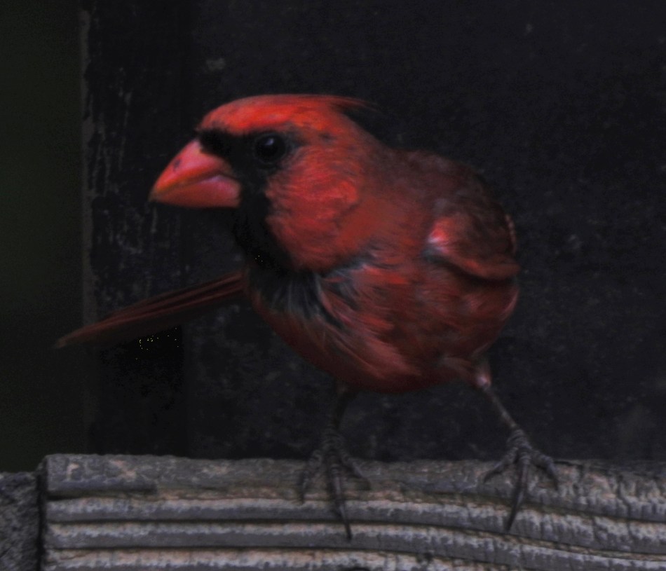
Out of the murk rises a small miracle. Or not.
The Compromiser achieved its convenient size and insane levels of magnification by writing all its images to a small, small sensor. That means that direct, plentiful sunlight is the only way to get acceptable results, proof of which can only be evaluated in playback, since the EVF is dim and utterly unreliable as a predictor of success. Add to that a maddeningly slow response rate after burst shoots, menus that only Satan himself could admire, and the surety that even a mild boost in ISO will generate more noise than a midnight Kid Rock show, and you begin to get the idea. I saved lots of money by not purchasing a dedicated prime zoom lens and I pay for it daily in the agony of using my “bargain” in the real world. Live and learn.
But just as any camera can deliver shots that are technically, well, caca, an occasionally “wrong” picture somehow works in spite of its shortcomings, and that’s where we find the above image, which gave me a dirty bird instead of a clean shot. The picture’s very imperfections gave me a look that I certainly would not have sought on purpose, but which is strangely endearing, even though nine out of ten other shooters might justifiably consign it to the Phantom Zone.
And so we soldier on, learning to love our red-headed (red-feathered?) stepchildren even as we see them as something that we never, ever want to do again. Love-hate is a term that seems to have been coined specifically to describe how the artist evaluates his art. Get away from me. Come here, I need you. I’ve never despised anyone like I despise you. Kiss me.
Repeat as necessary.
A RESETTING OF SETTINGS
By MICHAEL PERKINS
MY FIRST QUARTER-CRNTURY IN THE AMERICAN WEST has completely re-ordered my senses, and, in turn, my evolution as a photographer. My concepts of beauty, design, history, and ecology have all been filtered by those years through a visual grammar that is indigenous to deserts and the kind of scale of space that was purely abstract to me as a boy in Ohio. It only makes sense, then, that as I entered the back half of my life, a completely different approach to picture-making would become my mental default.
A recent return trip to my native Midwest, for a longer-than-usual stretch than has been typical for many years, allowed me to schedule more than the standard lunches and reunions with family and friends. That, in turn, let me literally stop and smell the roses, as well as re-awakening my inner tree talker.

This sounds a lot less important than it is, but, in the creation of nature images “back home”, part of me is not only around more green but re-acclimating my eye to the process in seeing it. It’s not as if the West is entirely composed of tumbleweeds and cow skulls; it’s that green takes a back seat of sorts, a reverse of the role it plays in other regions. In returning to the parks and creeks where I came of age, I find myself overwhelmed by the challenges to my work flow; it forces me to slow my shooting time by more than half, if only to re-calculate the regional shifts to the basics of exposure, composition, and so on. I have to find my way back to a sense of belonging here. It’s a fraught journey, made even stranger by memory and other tricks of the mind.
And so it goes. Photography begins as a simple mechanical process, the faithful transcription of experience. But all great pictures begin and end in the brain, and adjusting those settings is far trickier than merely clicking dials on a camera.
REDRAFTING THE RULES
By MICHAEL PERKINS
COMPOSITION IN PHOTOGRAPHY is an exercise in prioritization, a series of ranking decisions that inform the viewer what will be important in a picture. It is, if you like, a picture’s “ground rules”, the terms of engagement between shooter and audience. Look here. Notice this first. Regard these as important.
Most of the time, the assignment of space in an image depends merely on how naturally occurring elements in a photo are framed. The stuff that goes from left to right, top to bottom is thus determined by your shooting angle or distance from the subject. In some special cases, however, a composition is made by extracting select elements in a frame and creating a whole new composition through duplication of those elements; refracting, distorting or multiplying them until the way they occupy space and focus attention are radically re-assigned.
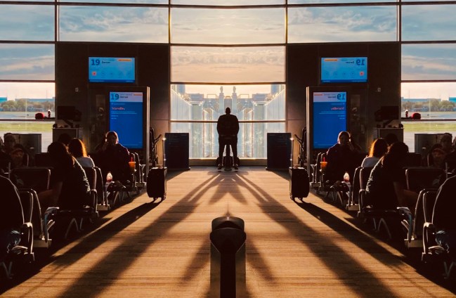
At this point, a standard object becomes purely a bit of design; it fails to be an actual thing and is repurposed as purely a collection of angles, shadows and patterns. As seen in the above image, which was crafted from a standard snap in an airport waiting area, so-called “real” things become components in a fantasy realm through duplication. What they signify or “mean” is completely recontextualized, suggesting worlds that can only exist within the newly re-drafted rules of that one picture.
Often, the unique arrangement of what is framed in a “real” image will supply all the story that photo needs. However, photographers must follow whatever paths lead to the best narrative. And sometimes those paths veer dramatically away from mere reality.
TRANSMISSION
By MICHAEL PERKINS
MY MOTHER’S PASSING, JUST A LITTLE OVER A WEEK AGO AT THIS WRITING, has understandably released a tornado of feeling, not all of it tragic. More specifically, the portion that is purely sad is actually quite compact; intense, certainly, and at times devastating, but by no means the dominant current in my head. Gratitude occupies the space within my heart far too greatly to yield much real estate to mere sorrow.
Looking over the many images of Mother for use in the usual tributes, I find myself wishing that someone, somewhere, had taken far more pictures of just the two of us together. That unique transmission of energy, hope, and love between parent and child is a rare quality, and is, in photographs, as visually elusive as heat lightning. Candids from birthdays, Christmases and graduations hint at it; few fully capture the entire miracle.
But, this morning, as I was once again bemoaning how few of those grownup-kid transmissions I possessed to comfort me in her absence, I saw that exact energy in a shot I had made of strangers, a single frame among hundreds in a sequence that I had glanced at once and filed away under For Future Consideration. Suddenly that “future” was upon me, as I rediscovered the image you see here.
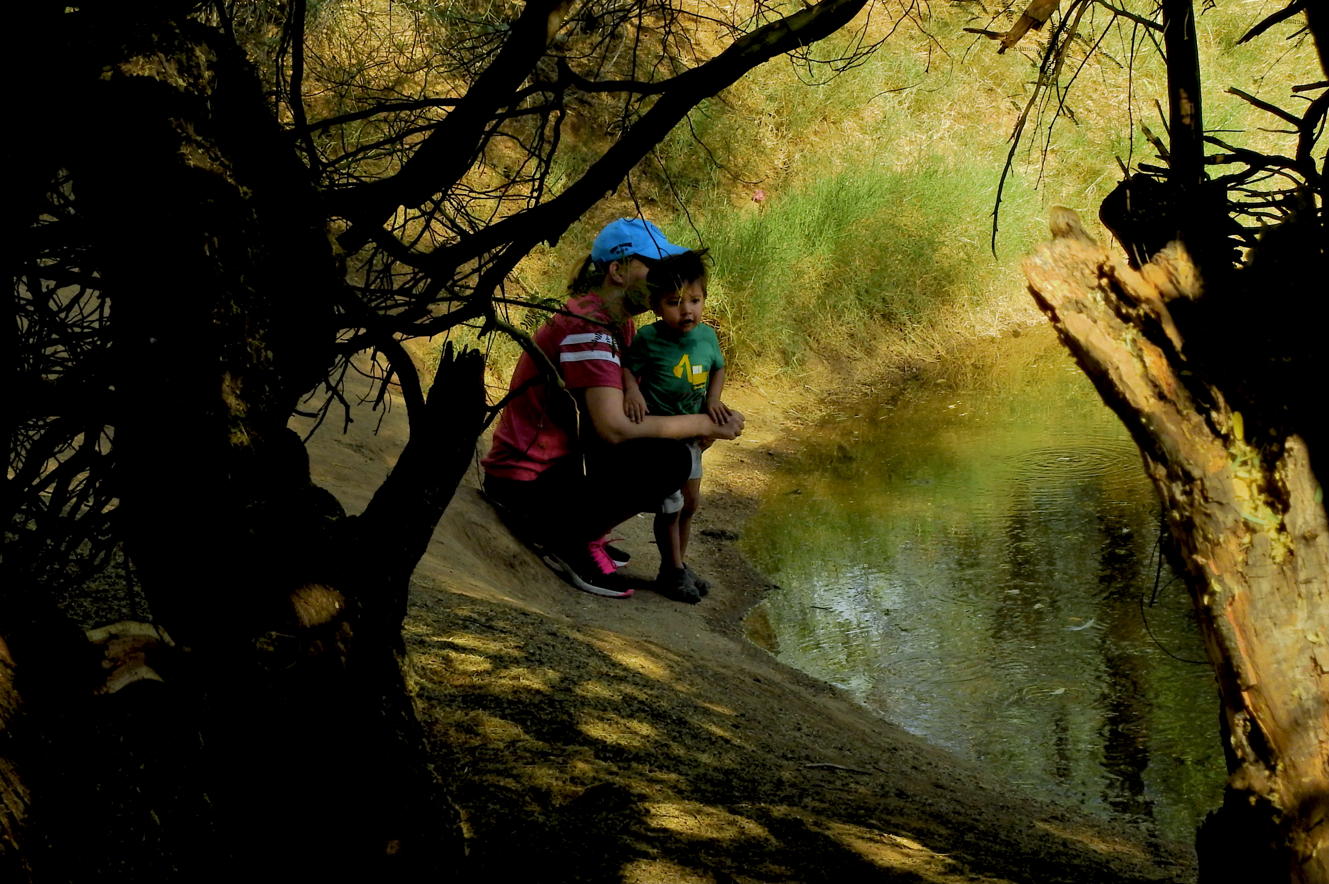
Like many photos, it’s as evocative for what it doesn’t show as what it does. I can’t tell if this is merely a tender moment, or one in which the small boy is excited, bewildered, tired or just clingy. And nothing of the mother’s face can be seen at all. In some ways, the picture is unfinished, a rehearsal for something more eloquent promised for a few moments later. However, there is the feeling that these two people are, for this one instant, totally sufficient to each other. Their connection is wonderfully profound. They are of each other, and the rest of the world is, at least for now, irrelevant. Looking at it through the filter of my recent loss, the image is no longer invisible to the current me. It’s now an essential possession, something magical that I was luckier than I knew just to witness.
For a moment, looking at the picture, I forgot about reality, and experienced the feeling that I’d love to show it to Mother. But, in her wisdom and her love, it’s nothing, really, that she hasn’t seen before, nothing she and I haven’t lived before. And that’s enough for now.
A CLIENTELE OF ONE
By MICHAEL PERKINS
MAN’S NEED FOR THE APPROVAL OF HIS TRIBE, as envisioned in photographs, is one of the great unifying themes of the visual arts. We make pictures about how we need each other, how we struggle to maintain an identity within this or that group, how we qualify for membership in the human club. Strangely, however, it is the need of the individual to shine or to distinguish itself from the masses that gives art its voice and authority. We can’t do honest creative work by merely miming everything that has gone before.
Which begs the question, why do we strive, in social media, for endless approval of the pictures we make?
Not only do we want our pictures seen (an urge that could actually lead to growth or enlightenment), we crave for those who see them to approve of them. In all too many cases, we allow the value or worthlessness of a photograph to hinge on whether we can chalk up a requisite number of “likes”, thumbs-ups, or stars for it. Many photographers who have never entered any kind of formal art competition judged by like minds readily submit their ideas to a vast sea of unseen jurors in some increasingly needy quest for validation. But art doesn’t get done that way, and producing pictures for anyone outside of a clientele of one is the very opposite of creativity.
Making any kind of art means walking your own path.
The trap inherent in all this hunger after “likes” is that it is progressive, like any other addiction. The amount of approval one gets today becomes the minimum baseline for the amount of it that will satisfy us tomorrow. Even though our art can never ascend on a steadily uphill plane without dips and reverses, we grow to expect that the tide of approbation for it will continue skyward forever, or else, who are we? Art that is based on popular approval becomes mere pandering, putting our work at the service of whatever will make the crowd smile on a given day. That leads to repetition, imitation, and eventually self-parody. And it’s the end of pictures that build or feed the soul.
As the first Age Of A.I. threatens the very concept of authorship, challenging what makes an image “ours”, photographers must be more convinced than ever before of the value of their personal art. That means that we need to be content within ourselves, not endlessly second-guessing the vacillations of public taste. Make your pictures for yourself. If their stories are true and universal, others will find them. Chasing after likes is running away from what qualifies a photo as a narrator in the first place, and that resides only in the person who created it.
TALISMAN

By MICHAEL PERKINS
WEEKS AGO, DURING WHAT WOULD PROVE TO BE MY FINAL VISIT TO MY MOTHER, my sister, who had long served as her in-house caregiver, presented me with something of a family relic; a small porcelain figurine of Pinocchio that I had not seen since my toddler days. I still don’t know if she simply found it in some cranny of the family home, or whether Mother, who certainly knew she was gravely ill, had somehow deputized her to give it to me. I didn’t ask any questions, but quickly secured the little guy in my shaving kit, where he would nap on the way back home.
I’m even unclear as to how the little statue, just over an inch high, even made it into our first house, that is, the first house I remember as a child. Mother liked to post it on the packed soil around various potted plants in our living room, and may have even moved it around as a sort of game for me. I had a tendency to want to own Pinocchio for myself, and frequently slipped him into my small hand, studying his little face, his red gloves, his green Tyrolean cap. And now, after all these years, here he was back again, staring at me from a curio shelf, a souvenir of a life that was all shadows and a Mother that was about to become, well, something that dwelled in them.

In these first days following her death, the figurine has come to symbolize something that I wanted my camera to help…explain. I wanted an image that captured the magic and mystery of the object, to make it appear suspended in space and time, floating between memory and prophecy. The fact that the figure was of a toy who yearned to be a real boy struck me as mystical in a way, and I dreamed of making a picture that suggested that. But the mystery remains. Why does he return to me now, at the nexus of an irretrievable past and an unknowable future? Am I the toy that once again must aspire to becoming “real”? And can I, or anyone, ever make a picture of all that?
In these first few strange days without my mother in the world, even though I was blessed to have her for nearly a century, all things seem equally real and unreal. Maybe this little toy/boy has come to me just now for some reason.
Or maybe it’s mere sentiment, fantasy.
Either way, I’m glad he’s home.
TOWARD A MESSIER MOI
By MICHAEL PERKINS
I SPENT THE FIRST TEN YEARS OF MY PHOTOGRAPHIC LIFE in a more or less constant state of frustration, given that I had not mastered the mechanical basics of the art, measuring the “success” of my pictures only in that light. The “if only’s” ruled my thoughts; if only I had a better camera; if only I could get more even results; if only I could make my subjects look more “realistic”. Everything in those early years….personal emotion, vision, impact….was subordinated to a worshipful pursuit of technical precision. I shot like I was recording illustrations for a travel brochure.
Miraculously, the digital age has eliminated a lot of the risk that used to confound me and other shooters. In such an era, we, more often than not, get some kind of usable picture, freer than ever before from technical defects. In this way, our cameras protect us from our messier selves. But that, in turn, can lead us to another kind of failure, one in which we neglect the unpredictable but potentially exciting irregularities that stamp our personalities onto our images. In recent years, almost as a kind of correction or recoil, photogs in the Age Of Guaranteed Outcome have sought to retro-fit photographs with the feeling that this is not a perfect process. This shift has been seen in several trends: the re-introduction of lo-fi film cameras, which actively seek the accident or the tech fail; post-processing apps which aim not merely to evoke the look of other eras, but to illustrate that uncertainty and imprecision are key parts of memory; and art glass and instant photography that romanticize the random.
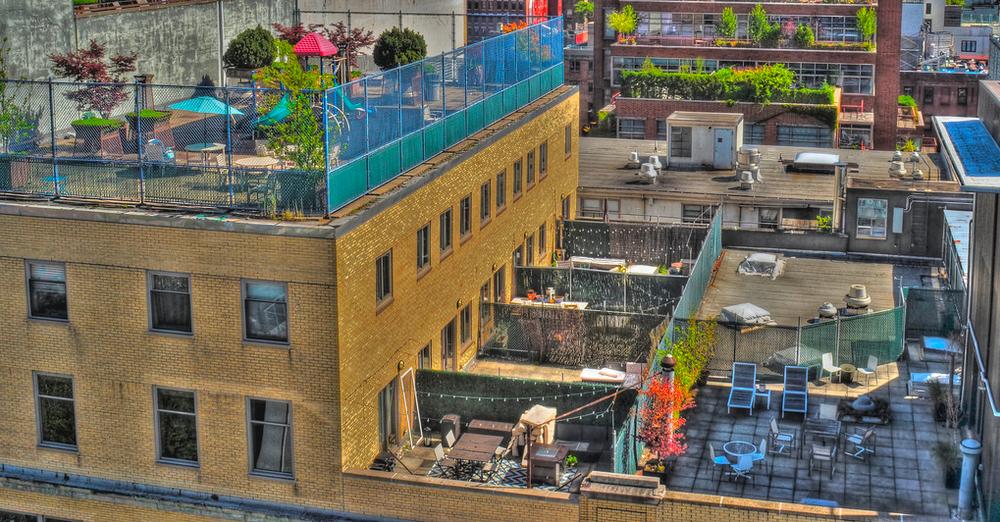
I have come full circle in these times, opting occasionally to overrule reality in pursuit of feeling. The master shot of the above image, taken at some distance, originally smoothed out the rougher textures of the urban rooftops, or at least those that I saw in my mind. The un-retouched “reality” of the subject was too pretty, if you will, straight out of the camera. A quick HDR conversion, however, brought every brick and stone into gritty relief; meaning that I had to deliberately re-flaw the image to make it truer, saying a polite “no thanks” to the “actual” look delivered by my advance device. I needed some wrongness to be put back in the scene to make it right.
When we express ourselves with a minimum of even well-meaning interference between initial vision and final result, we produce a really inconsistent mix of correct and incorrect execution, making our hits nearly as mysterious as our misses. But this personal autographing of our images is important, more so than ever before, especially as we peer into the dark, spooky cave of A.I. and wonder how to keep our work truly ours. One thing is sure; authorship, properly asserted, cannot be counterfeited or aped, and photographs can never merely be about a mixtures of processes. It’s in the sloppy soup of the actual human brain that anything pretending to true “art” resides, and that unique product can never be assimilated or simulated.
ALWAYS KEEP ON THE SUNNY SIDE (OR DON’T)
By MICHAEL PERKINS
IF YOU RELISH VIEWING A LOT OF PHOTOGRAPHIC DISCUSSIONS THAT BEGIN with either “I always” or “I never”, enter “Do You Use Flash Photography?” into a search engine, stand back, and brace for impact. I check such forums on a fairly regular basis as I personally believe that, with fewer and fewer exceptions, we are generally entering the twilight of the flash era, and I am curious as to why the hangers-on still defend its use, exclusive of very special situations.
Hmm. Reading back that last sentence, it sounds as if I’m trying to start a grudge match of some sort. I am not. All I am doing, as a photographer of some fifty years’ experience, is relating my own experience and comparing it with that of others. I tend to see flash as a tool that once was needed by nearly everyone, which is much the same view I have of, say, tripods. Both tools were once much more essential to good results than they are today, simply by virtue of the evolving acuity and sensitivity of current tech. Cameras cannot absolutely copy the eye in all its operations, but increasingly intuitive functions have been engineered across more and more shooting scenarios, including much faster and more precise evaluation of things like contrast and color temperature. As a result, the benefit of flash is often counter-weighted against all the things that can go wrong with flash (including bulk, expense and difficulty of consistent results), leading people like myself to go for years at a space without ever shooting a single frame with it.

Today’s cameras have drastically redefined the phrase “adequate light”. Is flash photography headed for the scrap heap of history?
The signs of change abound: wedding shoots, once a key domain for flash, are increasingly flashless upon the insistence of either the bridal party or venues that simply don’t allow it; more full-service cameras are being marketed with no flash hot shoe whatsoever, achieving the needed thirst for additional light with larger sensors and greater ISO ranges; and while cellphone cameras still default to the use of flash, the chance to opt out of it altogether has been offered for more than a decade now.
Nikon’s global ambassador (and shooter extraordinaire) Joe McNally once defined “available light” as “any damn light that’s available” and he has taught millions how to keep flash on something of a short leash, using it to balance or enhance rather than to actually serve as primary illumination. For me (and that’s the only person I can speak for), the meeting of advanced technology and a better understanding of how all light works has reduced the number of must-flash situations to a short list. That said, many people continue to produce miracles using it, meaning that it may never completely wink ot of existence.
IN CHARGE OF THE MAGIC
By MICHAEL PERKINS
YOU FEEL IT THE FIRST TIME YOUR GRANDCHILD HAS TO HELP YOU access an app or activate a new toy, that uneasy fear that you are falling behind the latest technological wave….that the bus is leaving the terminal, and you ain’t on it. And of course, you, along with everyone else, tend to interpret such apprehension as a direct by-product of “aging”, but, is it really? Experience would seem to prove that, whatever our stage in life, we are estranged or intimidated by all kinds of processes or inventions; the only real issue is whether we merely use the magic without understanding it (turn the switch on and the gadget just works) or, by our level of engagement, actively pair our own energy with the magic, actively partnering with it.
I believe that’s the reason the technical end of photography has continued to hold its central appeal to me over a lifetime, not only because I apprehend, at least in general, how it works, but also because I see a part for myself in helping make it work. The media analyst Marshall Mcluhan famously said that all media were extensions of the human body. The wheel was an extension of the foot; the loudspeaker was an extension of the ear; and the camera was an extension of the eye. Photography is a mechanical process that is initiated only after an impression or idea is formed in the mind and eye. Its recording capacity is deaf and dumb until a concept propels and shapes it. Its interpretive process is completely non-existent except at the service of the eye’s guidance. Even the most automatic, “intuitive” cameras, such as those in cellphones, can never be set on full “automatic”. The computer has the means to be easily programmed, but the program itself, the code that is written between the shooter’s ears, must be supplied first.
There are many places in which my connection to tech is that of a user only, a relationship in which the magic arrives fully formed and I merely consume it. Snap on a light, open up the water tap. But with a camera in my hand, I am in a collaboration. Neither the tech nor I have the means to reach our ends without the other. That makes the workings of a lens and shutter sacred to me, since they are the pens I write with, the crayons I draw with, the extensions of myself. Nothing is automatic, and nothing is guaranteed, except that I am always in charge of the magic.
NEVER SAY ALWAYS SAY NEVER
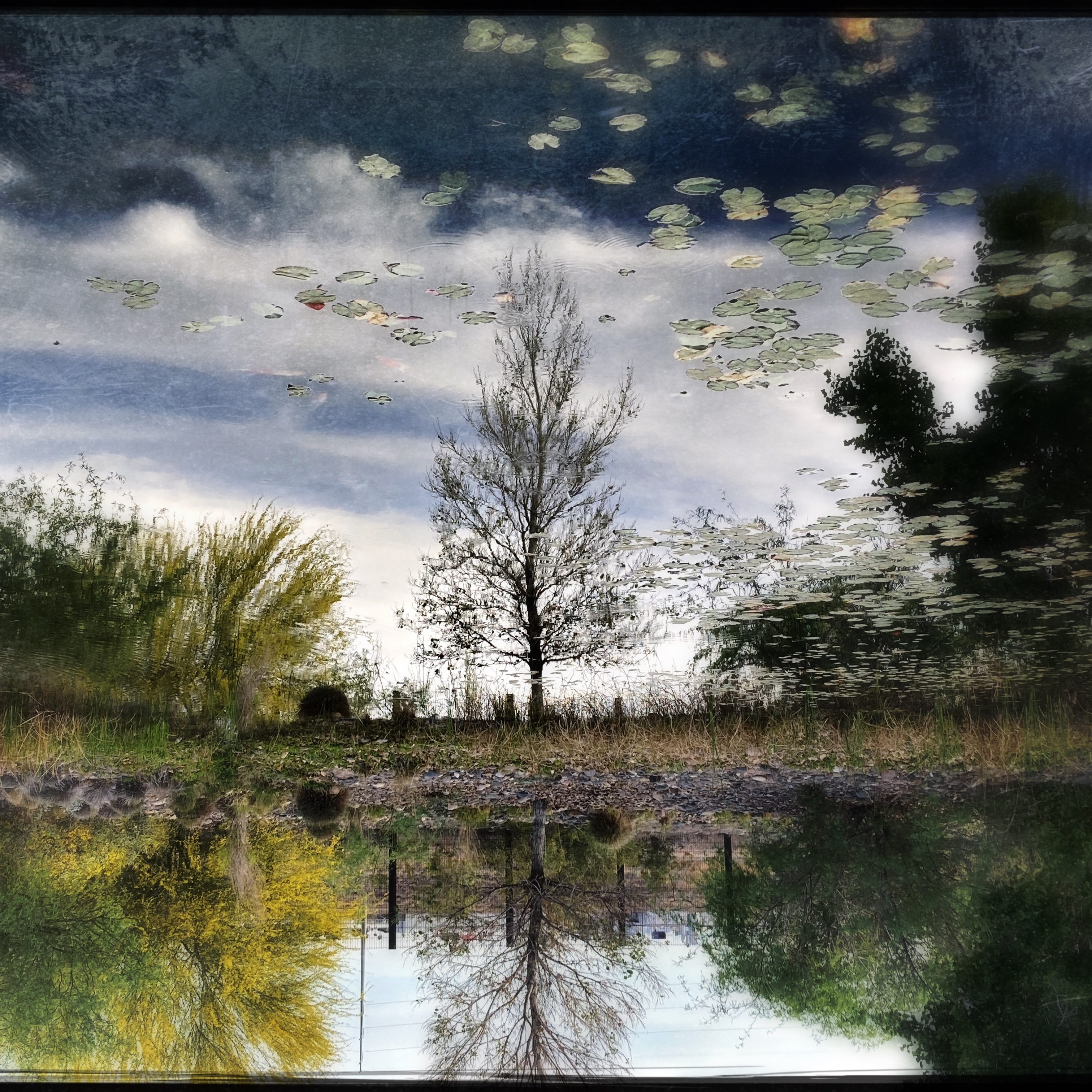
A texture and feel beyond the real: An iPhone snap rendered through the Love 81 film emulator within the Hipstamatic app.
By MICHAEL PERKINS
TALKING ABOUT “TRENDS” IN PHOTOGRAPHY, AS IF THEY SIGNIFY ANYTHING, is like standing near the ocean and commenting on individual waves, as if any one of them will be the standard for all waves forever going forward. More than any other of the graphic arts, picture-making is not so much a strict canon of laws but a seismic measure of our most mercurial moods in a given moment.
As an example, as of this writing (May 2023, in case you wind up reading this in archive), it seems that there has been a recent turn away from the realism of formal photography, once again swinging the pendulum toward apps and software that deliberately muck up precision, processes that celebrate flaws (even artificially created ones), rip pictures free of specific time-era “looks” and otherwise make them sloppier or more random in their result. We are, at the moment, looking for the total effect of an image, including everything that is formally “wrong” about it. Maybe because there is something wrong about it.
The iPhone-bred Hipstamatic alternative to a “serious” picture of the same scene I had taken with my “real” camera.
I am looking at this phenomenon through somewhat fresher eyes these days, even though I have been a long-time user of the ubiquitous and long-running Hipstamatic platform, which has been offering lo-fi tweaks to shooters almost since the dawn of the cell phone era. Problem is, the uneven, customized look of the pictures I created with it have often been categorized in my brain as “something I just do for fun with my phone” versus making “actual” pictures with my “real” cameras. The result was that, over the past ten years, I built up an enormous folder of orphan Hipstamatic images, pictures that I seldom shared and almost never published because I regarded them as cheats, gimmicks, or “just screwing around”….in other words, unworthy of consideration in the same arena as the product of, say, a DSLR.
Which is to say that I have wasted a lot of time trying to arbitrarily disqualify a lot of photos that, upon recent review, really ain’t so bad.
The specific “film” emulator within Hipstamatic that I prefer, a filter effect called Love 81, has emerged over all others as having the proper blend of weathered texture, selective focus, and hyper-saturation that looks both like specific eras or none at all, depending on how it’s applied. And I guess that’s its big strength; the ability to make certain shots come unstuck in time, or to at least suggest times that are unavailable to those of us anchored in the present. Sometimes, like any process, it can ruin what began as a basically okay image, and, also like any process, it can’t make a great picture out of a lousy one. Thing is, our present era is really the best era ever, a world in which photographers can permanently float between disciplines, blithely floating from Never to Always and back to Never at our whim. What could be more human, and more like a photograph?
FEEL LIKE MEXICAN?
By MICHAEL PERKINS
I NEVER GOT TO SEE the titanic floating pig that wafted over stadiums for the Pink Floyd Animals tour. And my only in-person glimpse of the Macy’s Thanksgiving Parade uber-balloons was at street level, the year a horrific wind storm necessitated yanking Underdog and Bullwinkle almost as low as the tops of city busses. Let’s just say that my overall resume on epically inflated beasties is, to be kind, thin.
But, hey, I’ll always have the ginormous Pastel Burro.
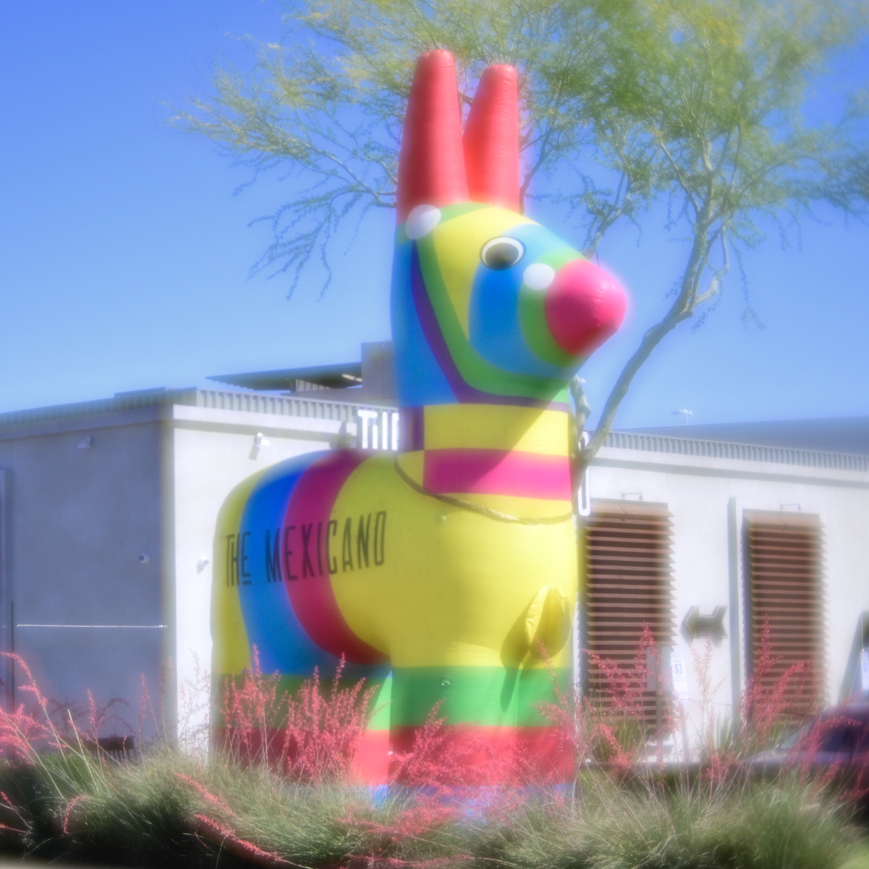
That is, at least as long as a local Phoenix restaurant touts its Cinco De Mayo celebrations by mounting this oversized donkey, resplendent in its delightful dumbness, alongside Cactus Road in Paradise Valley.
Hi, burro. Long time admirer, first-time shooter.
Once I finally decided to park roadside and take a crack at it, I figured a dreamy art lens like the Lensbaby Velvet 56 would render it properly. Too weird to be real, too wonderful to be fake.
Maybe I’ll drop in for a quick fish taco.
It pays to advertise.
MAGICAL (PHOTOGRAPHIC) THINKING
By MICHAEL PERKINS
HOLLYWOOD LOVES STILL CAMERAS, exploiting them for dramatic impact in thousands of films over the first one hundred years of the movies. Entire plots hinge on the ability of protagonists, from intrepid reporters to dogged private eyes, to save the day or solve the mystery with a judicious snap, images that spring up in the eleventh-hour of a murder case or point to the tough truths in a medical inquiry. Seems Our Hero (or Heroine) is always on hand with some photographic device that ties the story together and brings it in for a successful landing, ofttimes making his/her camera a key player in the story. Magical thinking regarding photography is a part of the collective movie myth.
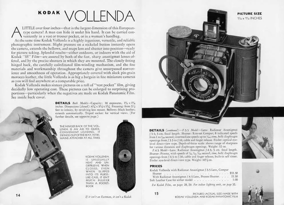
HBO’s recent (and successful) re-boot of the old Perry Mason series is the latest case of a camera becoming a key agent of action in a teleplay, spawning scads of on-line theories about the make, model and performing properties of the sleuth/attorney’s chosen kit. The candidate with the most votes so far looks to be the Kodak Vollenda, a compact folding model (see original ad, above) created by German optical wunderkind and former Zeiss employee August Nagel in 1929 and marketed in the U.S. after he entered into a co-operative deal with Kodak in 1931, the year before the Mason stories are set. The early versions of the camera produced images of roughly 1.25 x 1.62 inches, each taking up half a frame on 127 roll film, giving the shooter better bang for his film buck in terms of picture count but also limiting the size of its negatives, and, in turn, how sharp enlargements (for those climactic courtroom scenes) could be. For your average superstar lawyer shooting a lot of medium and long shots in natural light (or even darkness) with a maximum aperture of f/3/5, this could spell trouble, at least if you were counting on the results for critical evidence. Hooray for Hollywood.
The Vollenda in Perry Mason’s era would probably have fed on the old Verichrome Pan film, with a not-too-aggressive ASA (or ISO) of 125…again, pretty good in brightly lit situations, but not so great when skulking around dark alleys or spying on suspects misbehaving across nightlit streets. But, ah, well, the thing looks amazing in actor Matthew Rhys’ hands, and is historically consistent with the period, despite the fact that its original $33.50 list price would equate to well over $600 in today’s currency, a bit steep for a down-on-his-luck gumshoe in the middle of the Great Depression. But, ah, well, as Billy Shakes often said, the play’s the thing, and Hollywood’s greatest photographic illusion is in selling us all the fantasy of a super camera that save the day by the end of the final fadeout.
Cut.
Print it.
THE FACTUAL / ACTUAL FAULTLINE
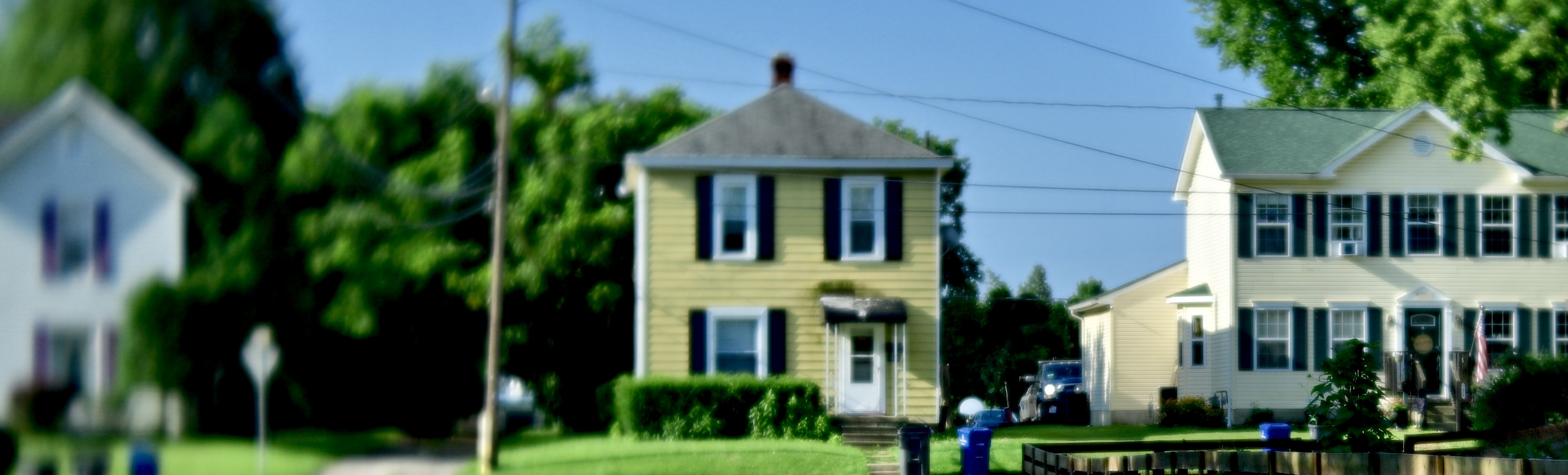
Back When The Browns Lived On Main, 2022
By MICHAEL PERKINS
I RECALL A 1972 INTERVIEW WITH A PROMINENT ROCK CRITIC in which he confessed that, three years into the new decade, he was just getting used to the idea that the 1960’s were “going to end”. Not the idea that they were already over. No, he was even wrestling with the concept that they would ever be so. Such is the plastic quality of our sense of time. In some moments, it seems like the things we’re living through will continue forever, while, at other times, it seems like everything, everywhere, is already past. This yo-yo-ing sensation plays hell with our emotions, and, in turn, with the pictures we attempt to create with transient subjects. At least, that’s what happens with mine.
One situation which gets my own internal yo-yo spinning involves making images of small-towns life, which always sets me careening between the sensation that I’m both experiencing something that’s truly eternal and, simultaneously, something that’s as gone as the dodo. Standing on the simple main streets and leafy, sleepy lanes of the villages and burgs that have so far outlasted the twentieth century, it’s easy to be assimilated into the place’s slower rhythms, to briefly be lulled into thinking that it’s really the rest of the world that is imaginary. But then there is the rude shock of walking past a 1940’s drug store, complete with lunch counter and soda fountain, and bumping into a place that repairs iPhones. For a second, nothing makes sense. The two “realities” do, of course, co-exist; however, we are aware that the relics of the earlier era have essentially overstayed their welcome. They are living on borrowed time, the same borrowed time we, as photographers must now use wisely before….before…..
The surreality of shooting in small towns dictates the look of my pictures of them. I tend to use exaggerated tonal ranges, soft, painterly looks and dreamy art lenses on them, rather than merely recording them with the sharpness and balanced exposure of mere documents. As their very actualness is now so fluid in my mind, I prefer to see them as in a dim vision or imperfect remembrance. They seem more poignant for being less fixed in our regular way of seeing.
Like the 70’s reporter that couldn’t imagine his “time” ever coming to a close, I wrestle with the task of depicting worlds that are rapidly receding into the realm of memory. Oddly, making them look less literal bolsters their reality to me. For, like that reporter, I can’t imagine that they are ever going to end, and that dictates how I tell my camera to see. At that point, the machine, the instrument, is as unreliable a narrator as my own memory, just as it’s also made more reliable to my heart.
SOMETHING’S LOST, BUT SOMETHING’S GAINED

By MICHAEL PERKINS
AGAINST MY BETTER JUDGEMENT, I OFTEN SUCCUMB to the allure of those endless Facebook memes which pose a mathematical conundrum, i.e., “6 + 10 x 4- 3 – 8 x 3 x 3=? or some such other brain torture. I always labor long and sincerely over the solution, and I am always, always wrong. Instead of spending the rest of my declining years admitting that, sorry, numerical concepts are not my forte, and going my way in peace, I instead keep returning to the scene of the beating and begging for yet another blow.
(This is the part where I attempt to make a tenuous connection to photography. Don’t blink or you’ll miss it..
So here’s my pitch; when it comes to the process of making pictures, I love the endless process of addition and subtraction, the ongoing calculation of where, in an image, information needs to be either included or eliminated. Half my process in composing is spent in determining what size the frame should be, and the other half is deciding what deserves to make the cut within that box. Many other aspects the making of the image, from exposure to the whole color/mono choice, or even subject selection is colored by the initial decision about what will or won’t earn its bit of real estate within a picture.

If the right choices are made, then what I call the Joni Mitchell Balance (i.e., “something’s lost, but something’s gained”) will be struck in such a way as to maximize the impact of the photo. Or not. Sometimes you have to settle for Close, since Totally There is off the menu. Take these two shots as an example. The subject was originally mastered in color (see top), and deliberately under-exposed to quiet the effect of color in comparison with the the three figures on the right. Turns out that even the minimal hues I got were still too distracting, and so I converted to mono (directly above), since I felt that the trio, albeit with a great deal of non-defined detail, were the real stars of the picture. meaning that anything that did more than force the eye in their direction was expendable. I remember hearing the old western classic “Ghost Riders In The Sky” as I snapped the frame, and the idea of figures who destinations or aims would forever be shrouded in mystery appealed to me.
Like those blamed Facebook add/subtract/multiply/divide exercises, the picture required careful calculation and re-calculation. However, photography is much more forgiving than math, and so, at least when making pictures, I will never have to settle for the assertion that there is but one single correct answer to the problem. It’s an admittedly sloppier way to see the universe, but (brace yourself, now) it adds up, at least for me.
NEITHER HEAVEN NOR HORROR
By MICHAEL PERKINS
DEPENDING ON WHO YOU ASK, ARTIFICIAL INTELLIGENCE is either a miraculous boon or an existential threat to mankind, seen by some camps as an opportunity to evolve in untold ways and by others as the fast track to enslavement. As pertains to the arts, a quick scan of current press clippings yields mega-scads of hair-on-fire warnings that all creative pursuits, photography among them, will soon be usurped by Our Machine Overlords. Why, the reasoning goes, should anyone put up with fussy and imperfect human artists when the Frankenstein Brains can be just as creative?
This image, in particular, has recently scared the Bellowing Bejesus out of photogs the world over. As of this writing (April 2023, for you archive hounds), its creator, Boris Eldagsen, has just won the Sony World Photography Awards competition with it. He has also thrown a rock into the pond of public discussion by refusing said prize, explaining that he cannot accept it since the picture was generated by A.I. instead of a camera. Suddenly “someday” has been shoved right into our “present-day” faces, given the image’s compelling realism as well as its nostalgic evocation of an earlier “photographic” processes. If anything can convincingly suggest the look of a photograph, Eldagsen’s entry certainly does. To make it, he typed a series of cues and conditions into a program which produced the results in mere minutes in what Boris refers to as a “promptograph”. “You start from your imagination, and you describe what you would like to have”, he said of the process in a recent interview with NPR, “and you can make such a text prompt quite complicated.” Like many people viewing the results, Eldagsen is both delighted and terrified by the results:
As an artist, I love AI. (But) as a citizen of a democratic country, I’m shocked about the possibilities of disinformation it gives. Anyone that can just type a couple of words can create a photorealistic image of the Pope in Balenciaga. You can’t trust an image anymore. We need some kind of labeling – some kind of fact-checking where you see that an image has gone through certain instances – has been getting proof by photo editors. Only then we can know it’s an authentic picture – shows something that has happened.
What’s been missing from all the panicky reaction seems to be the plain fact that photography has always, always lived at the juncture of pure light recording, technological manipulation, and the artist’s vision. Photographs are a group effort, never devoid of whatever tweaking and “post” is out there at the moment or the raw act of freezing time but always in the service of an artist who decides what the mix should eventually be. Every change in recording medium, technical gear, enhancement or format has been initially met with, at best, disdain, and, at worst, outright outrage. But just as photography never supplanted painting, A.I. imaging merely needs to be labeled and marketed for what it is, neither heaven nor horror, but merely another way to tell a story. If you love the mechanics and science of a camera-rendered image, stay in that lane. If you want to see what else is out there, trust the story you’re telling more than the language you choose to tell it. Given the advance of photography over its first two centuries, “Promptographs” have no clear advantage over conventional picture making; both require a thinking mind as their initial spark.
WITHIN THE WITHIN
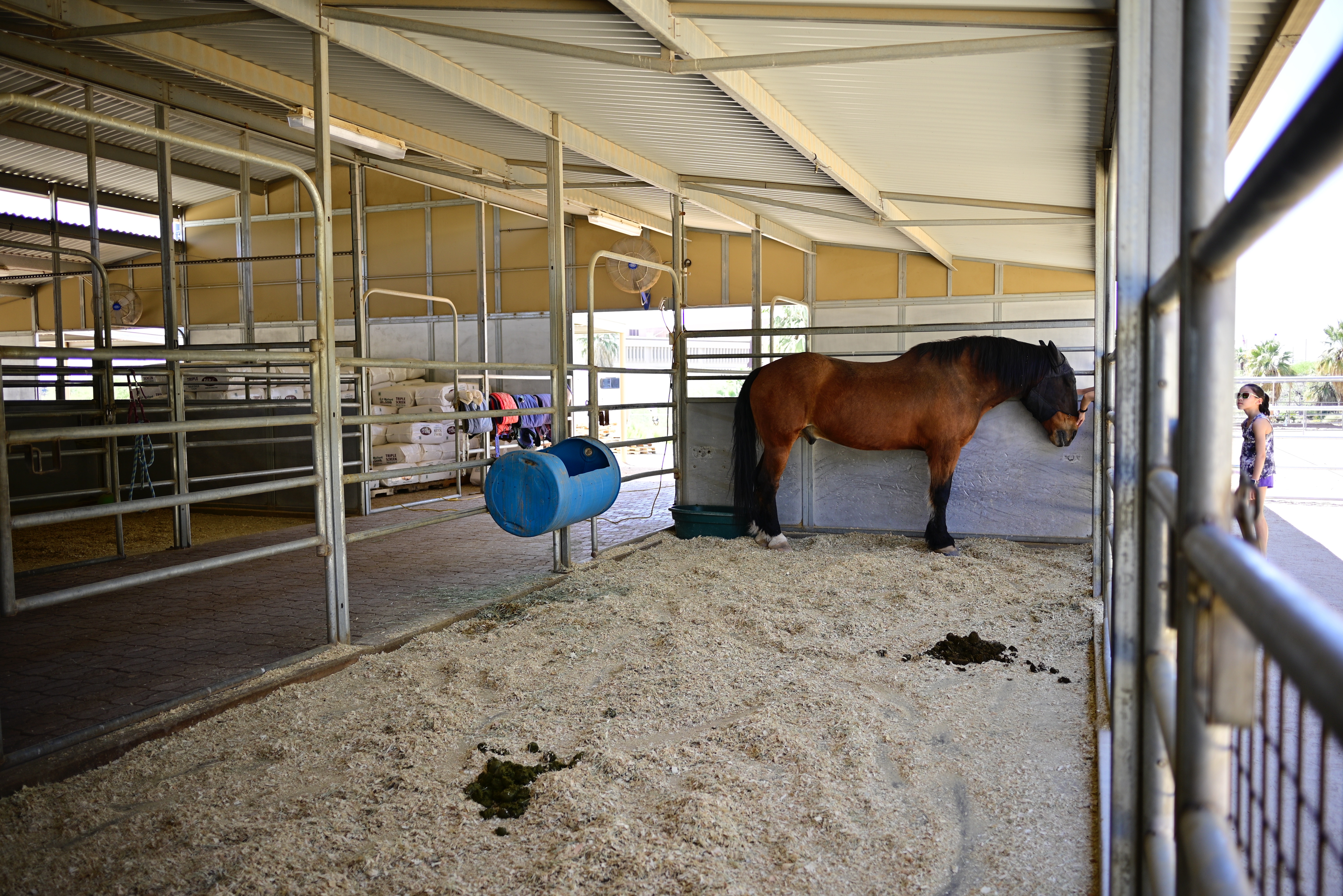
Wide lenses can capture a lot of data. Sometimes too much.
By MICHAEL PERKINS
A FULL YEAR AFTER SWITCHING FROM CROP SENSORS TO FULL-FRAME SENSORS, I am still getting my bearings on some elements of composition, at least as I had grown used to them. To greatly over-simplify, the focal length of my lenses has, for more than ten years, been magnified by about 1.5x, so that, for example, a 35mm lens would “read” on a crop sensor as a 50mm. That determined what I’d would or wouldn’t see in the frame, with the biggest cramping occurring in wide-angle shots, where I live about half of the time.
The result was that my mid-70’s 24mm, a real- go-to for me, was actually delivering the aspect of a 35mm; still wide, but not really panoramic. This was no big deal, since I got used to composing and cropping for what my camera was seeing and shot accordingly, as we all do. The real difference is being felt now, when my 28mm on a full-frame is really 28mm, meaning that a whole lot more…..stuff is being included in my wide shots than before, stuff that I must police much more stringently than I might have done in the past.
Take a look at the shot up top, taken inside a stable, empty except for a single horse. There is so much space within the frame, all chock-full of equipment, gravel (so much gravel) and other atmospheric elements that the purpose of the shot, right out of the camera, can easily be interpreted to be, aww…the poor horse is all alone in this huge building, as if that’s the “message” of the picture. Now, from my vantage point, I could not have framed any tighter; my location was dictated by barriers that held me back at quite a distance. And, since I’m shooting with a prime lens, I can’t zoom, so all compositional control defaults to how I will crop later.
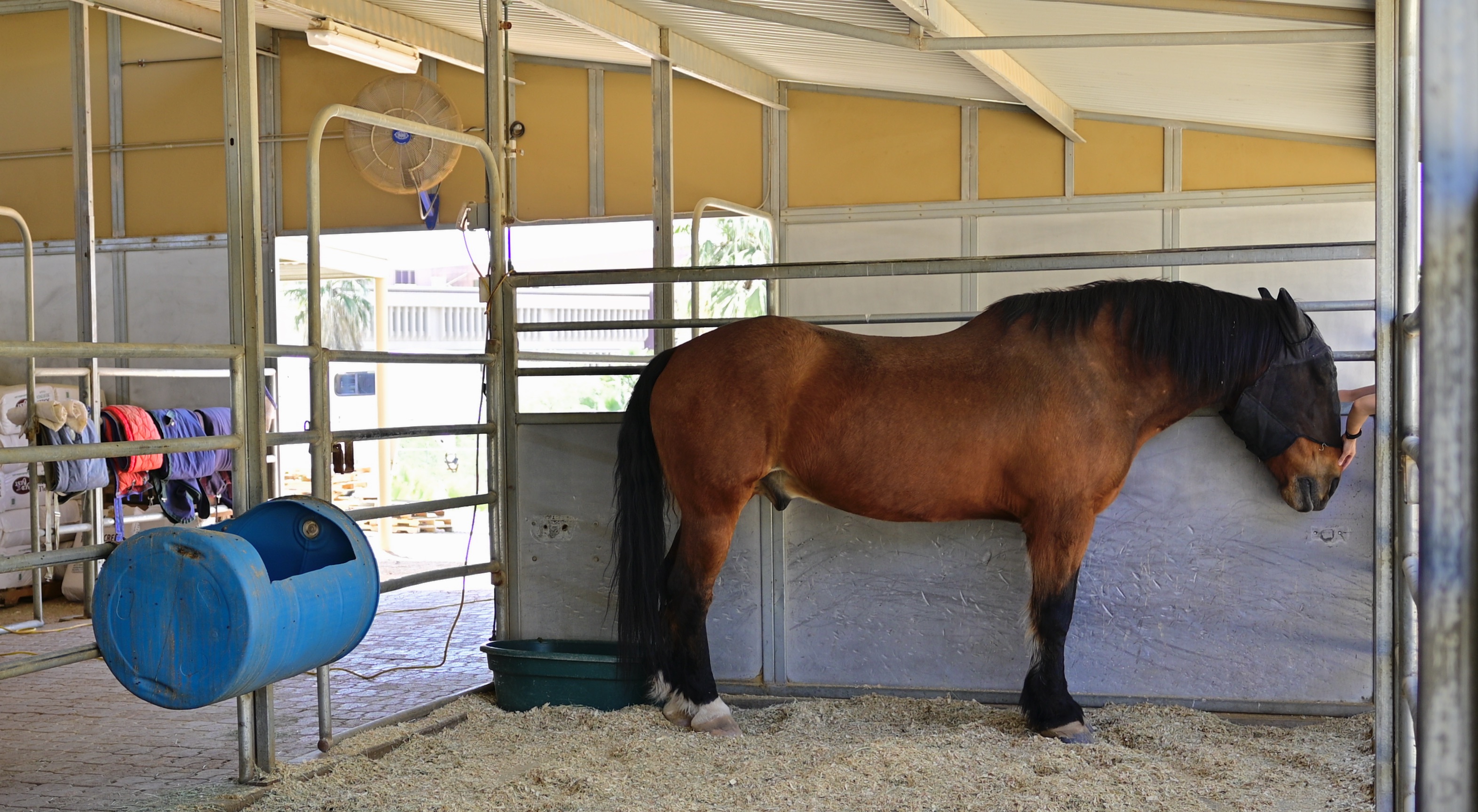
The horse, not where he lives, is the real story.
Turns out that it takes very little extra space around the horse to sell the idea that he’s “all alone”, so I can easily cut stalls, hay bales, and other filler off on both sides and still easily convey his “solitude”. But here’s the deal; once I started cropping, I began to observe a different story emerging in the picture, since now I was actually seeing the small arm that’s coming in from the right to pet the horse. Now the image is about He’s Not Alone, that, in fact, someone cares about him enough to stop and offer a bit of tenderness.
Wide-angle shots can sometimes keep us from getting into our pictures, and, if we change the way that we see what we shoot, such as the revision of “what is a frame” that I’ve been dealing with recently, our viewpoint can be modified in subtle ways. Shooting wide is a great tool, but only if we reserve the option, upon further thought, to think narrow as well.
