A SHOT IN THE DARK
By MICHAEL PERKINS
ONE OF THE MAJOR DINGS IN THE SIDE OF DIGITAL PHOTOGRAPHY in its earliest days, and something which gave analog haters a legit gripe against the emerging technology, was the narrow dynamic ranges of some of the first sensors. The full spectrum of exposure from light to dark was simply not represented in the earliest digital cameras, giving rise to more than a few smug “see? we TOLD you film was better” editorials. One of the first remedies to the problem, as we waited for the tech to catch up, was the fix known as HDR, or High Dynamic Range processing. Maybe you toyed with it; maybe you embraced it; and maybe you recoiled from it in horror. Fact is, it caught on big, and, by the time of this writing it is….well, less so.
The idea was simple. Just take several bracketed exposures, from dark to light, of the same subject in rapid succession, then stitch them all together in programs like Photomatix, tweaking the lows and taming the highs until you got a balanced composite. HDR was capable of rendering a variety of looks, from passably real to ultra-real to what I call Tolkien Fever Dream, with a heavy emphasis on enhanced sharpness. Soon, manufacturers, from conventional cameras to iPhone variants, hurried to bundle HDR generating software into their designs, simplifying the process, if not always achieving the same results.
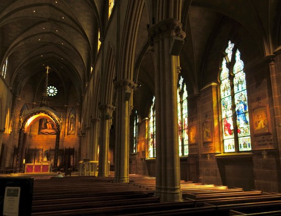
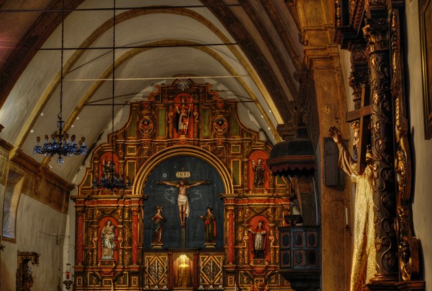
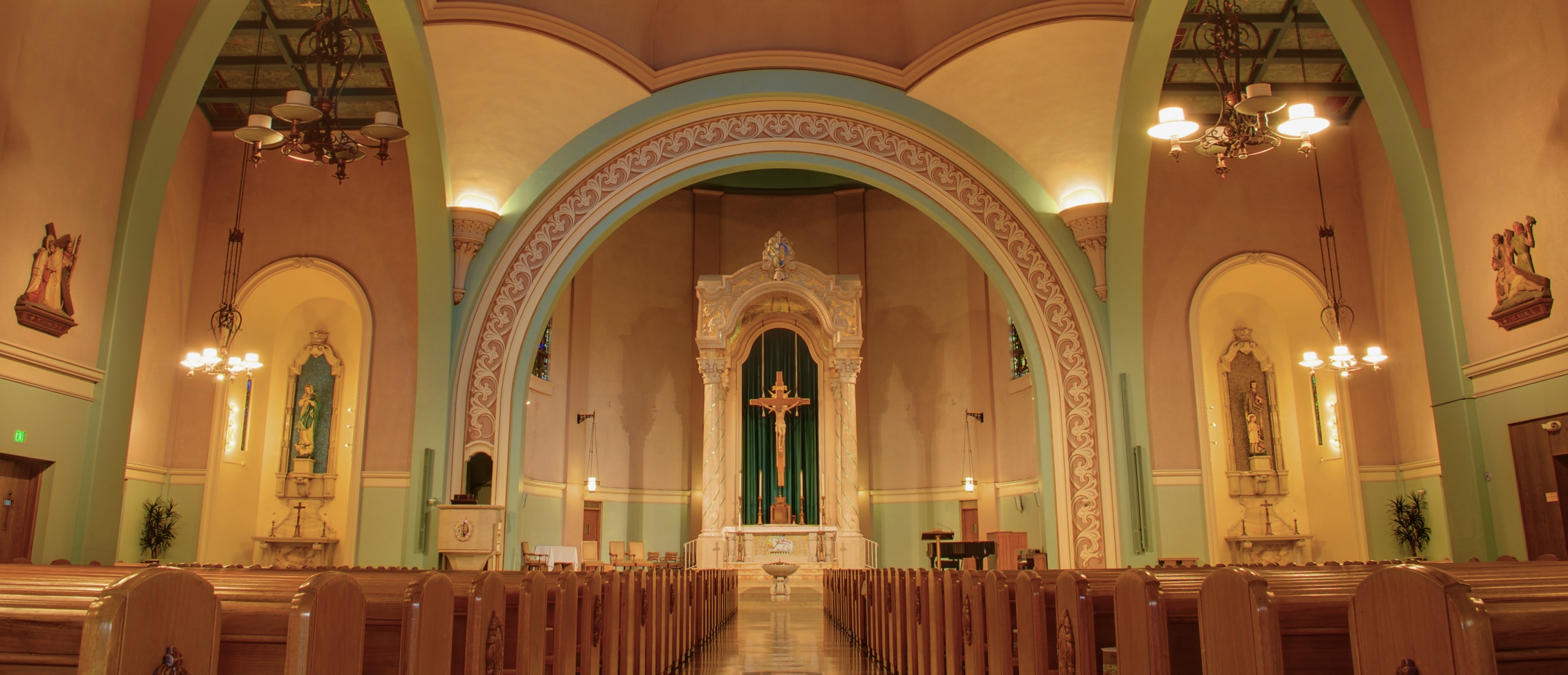
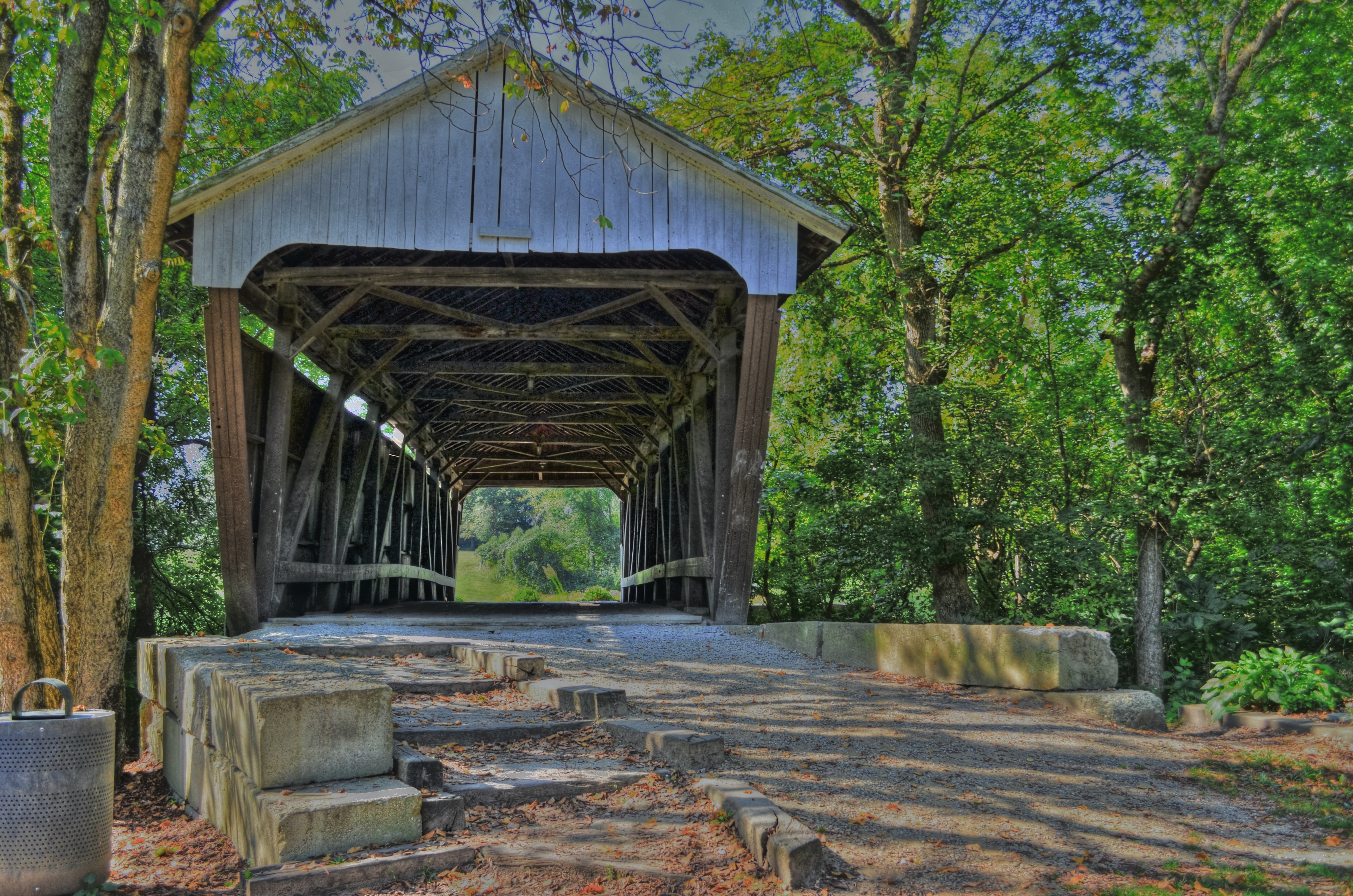
But yesterday’s essential hack is today’s bygone parlor trick. The image at top, made in 2010, is a Photomatix blend of seven different exposures, all taken on a tripod, inside as especially light-starved church in Monterey, California on a crop-sensor Nikon D60. The second image is a single, hand-held exposure inside an equally darkly church, taken on a full-frame Nikon Z5 in August 2024. A minor amount of shadow rescue was needed, and, of course there was some blowout on the stained-glass windows, but essentially this shot is straight out of the camera.
The facts on the ground have simply changed in a mighty big way. Sensors in nearly all cameras are much larger in 2024 than at the beginning of the digital era, resulting in a much wider dynamic range in even modest gear, and making for much more balanced exposures regardless of conditions or subject. This simply makes all the prep and mechanics of HDR manipulation unnecessary, rendering the process an art effect, or just another interpretive tool for special occasions. Once again, the forward march of technology works to remove more and more obstacles between the photographer’s vision and his machine’s ability to deliver that vision, a trend that began when the first Kodak Brownie enabled average shooters to make a predictably reliable picture with the touch of a single button over 100 years ago. Allowing photogs to get out of their own way, and to concentrate primarily on what they see in the moment….that is progress.
TOWARD A MESSIER MOI
By MICHAEL PERKINS
I SPENT THE FIRST TEN YEARS OF MY PHOTOGRAPHIC LIFE in a more or less constant state of frustration, given that I had not mastered the mechanical basics of the art, measuring the “success” of my pictures only in that light. The “if only’s” ruled my thoughts; if only I had a better camera; if only I could get more even results; if only I could make my subjects look more “realistic”. Everything in those early years….personal emotion, vision, impact….was subordinated to a worshipful pursuit of technical precision. I shot like I was recording illustrations for a travel brochure.
Miraculously, the digital age has eliminated a lot of the risk that used to confound me and other shooters. In such an era, we, more often than not, get some kind of usable picture, freer than ever before from technical defects. In this way, our cameras protect us from our messier selves. But that, in turn, can lead us to another kind of failure, one in which we neglect the unpredictable but potentially exciting irregularities that stamp our personalities onto our images. In recent years, almost as a kind of correction or recoil, photogs in the Age Of Guaranteed Outcome have sought to retro-fit photographs with the feeling that this is not a perfect process. This shift has been seen in several trends: the re-introduction of lo-fi film cameras, which actively seek the accident or the tech fail; post-processing apps which aim not merely to evoke the look of other eras, but to illustrate that uncertainty and imprecision are key parts of memory; and art glass and instant photography that romanticize the random.
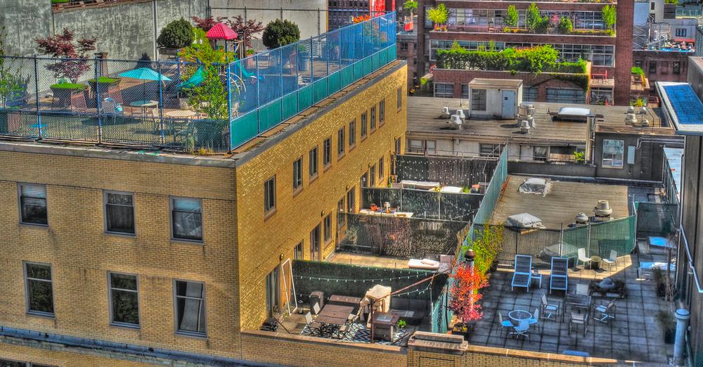
I have come full circle in these times, opting occasionally to overrule reality in pursuit of feeling. The master shot of the above image, taken at some distance, originally smoothed out the rougher textures of the urban rooftops, or at least those that I saw in my mind. The un-retouched “reality” of the subject was too pretty, if you will, straight out of the camera. A quick HDR conversion, however, brought every brick and stone into gritty relief; meaning that I had to deliberately re-flaw the image to make it truer, saying a polite “no thanks” to the “actual” look delivered by my advance device. I needed some wrongness to be put back in the scene to make it right.
When we express ourselves with a minimum of even well-meaning interference between initial vision and final result, we produce a really inconsistent mix of correct and incorrect execution, making our hits nearly as mysterious as our misses. But this personal autographing of our images is important, more so than ever before, especially as we peer into the dark, spooky cave of A.I. and wonder how to keep our work truly ours. One thing is sure; authorship, properly asserted, cannot be counterfeited or aped, and photographs can never merely be about a mixtures of processes. It’s in the sloppy soup of the actual human brain that anything pretending to true “art” resides, and that unique product can never be assimilated or simulated.
SKETCHPAD PSYCH
A 2012 HDR mix of five bracketed exposures, my attempt to rescue additional detail from the dark areas.
By MICHAEL PERKINS
HAVING BEEN AN ILLUSTRATOR LONGER THAN I HAVE BEEN A PHOTOGRAPHER, I have long since learned to live with “the gap”, that unbridgeable space in the arc of creation between conception and execution. We’d love our art to be a closed loop, with an unbroken line from our original idea to our final product, but that gap, that realm of uncertainty and unrealized dreams, is stubborn, and keeps the circle from completely closing. In pencilling a notion on a sketchpad, I had to become resigned to the fact that, once I began inking the pencil lines, something indefinable would be lost in translation.
Being okay with the gap has kept me sane in the making of photographs.
Regardless of our training, practice, equipment or eye, we can never deliver images that fulfill 100% of our dreams. We work like mad over a lifetime to make the gap smaller, and in our best moments we nearly manage it. Ironically, it’s the pictures with the bigger gaps that really get our attention and sharpen our perception. The raw, gnawing irritation of knowing exactly how we failed is the only road to better images. Like an illustrator, we enter into a lifetime “sketchpad psych”, an acceptance that the devices we use to extend our senses (brushes, cameras, etc.) will never perform to perfection. Some of this is because, maddeningly, our internal conception of our own original ideas is never actually “finished”.
Same five images, remixed in 2022 with an exposure fusion process.
These two images, both blended from five bracketed exposures, from super-dark to super-bright, were “mixed” a decade apart. Now, beyond the fact that, given modern tech’s more sophisticated ability to record wild swings in contrast, I probably would not even approach the master shot in the same way today, it’s sobering to realize how much my conception of “correct” processing has shifted in a mere ten years. The top take is classic HDR, very heavy on the details, along with the slightly garish color palette and overall brassiness of that process. The bottom version is done with the same software, but using exposure fusion. A lighter tone over all, one that’s absent the micro-fine particles of things like woodgrain or wall texture. The first process changes everything in the picture all at once, while the second gives you a bit more control over individual elements, along with the option of understatement.
Both versions have their points, but in classic sketchpad psych, neither is a complete rendering of what I saw in the moment, but rather, an artfully constructed compromise. Some days, close is as close as you can get. The only cure is to turn over the page on the sketchpad and start drawing again. Here the graphic artist and the photographer can agree on the same two-word mantra: next time.
UNDERDOING
By MICHAEL PERKINS
OF ALL MY REGRETS AS TO WHY AN OLD PHOTOGRAPH CAME OUT WRONG, my usual default is the wish that I’d done a whole lot….less. In most cases in which a picture doesn’t age well with me, I don’t feel like I neglected to add just one more thing. Instead, I typically wish I’d left out five.
Over a lifetime as an illustrator, I should already know how easy it is to “overdraw”, to so exhaustively festoon a sketch with much detail and surplus “stuff” that it becomes claustrophobic. I had to learn that, of all my original pencil lines for a piece, only about a fifth of them should be inked permanently into the final rendering. So too with photographs. That’s why I almost always have to lock post-processing hardware out of my own reach, lest I gorge myself on it like a kid breaking into a candy store.
These two images show better than I can explain why I have to dose very sparingly on tweaking apps, at least if I want to streamline the effect of my pictures. In both frames seen here, I have tinkered after the snap, applying High Dynamic Range software in the first and Exposure Fusion in the second. The mission of the picture is ridiculously simple: to memorialize a charming old covered bridge and the surrounding scenery. That’s it. But a funny thing happened on the way to making that very basic picture.
HDR, developed to help compensate for the poor dynamic range of early digital cameras, was designed to rescue detail in the dark passages and dial back blowout in the lighter parts, typically by blending a series of bracketed exposures into a balanced composite. But it also could over-emphasize details, making the grit grittier and the wood grain woodgrainier, all with the unwanted result of upstaging the central impact of the picture. Moreover, it tended to amp up color saturation, which delivered a surreal, lit-from-behind quality. Hence, all but the most restrained users of HDR found it far too easy to keep even simple compositions from morphing into some kinda gooey ’60’s drug poster, and I was, predictably, far from restrained in its use. Ick.
Exposure Fusion, by contrast, doesn’t overly accentuate detail, doesn’t produce day-glo colors, and produces a more natural look overall. It does what HDR does in fewer steps and produces a far less hyperbolic result. Note: this is not an article advocating either type of processing, although there are excellent online articles comparing them, such as this one from the editors of Photofocus. Still, since I have created both okay and tres-awful shots with both tools, this demo shows what can happen when you overthink, over-process, or otherwise glop up a picture. Find what’s essential in your narrative and deliver just that, then pull up your wheels before you crash in a sea of your own artiness. We all know what “overdoing it” means. Over time as photographers, we need to learn how good underdoing can feel as well.
ALWAYS, OR ALMOST ALWAYS
The Eureka Moment, 2019
By MICHAEL PERKINS
THERE ARE ENTIRE BOOKSTORES CRAMMED WITH TUTORIALS FROM PHOTOGRAPHERS who have developed what, for marketing purposes, is called a “style”. This is a catch-all word for the accumulated experiences, biases, tricks, shortcuts, philosophies or habits that inform one’s work, all of it showing up frequently enough to constitute some kind of artistic signature. It’s a list of “I usuallys” and “I almost alwayses” and ” I nevers”, and those of us who study the output of others can get into a bit of a trap over it.
We’d all love to be able to answer that tantalizing interviewer’s question, “what’s your personal approach?”, as if we could reduce what we do to a set formula. I certainly can’t do that with my own stuff, and I’m a little distrustful of those who figure that they’ve got themselves sussed out to the degree that they can define their style. Of course, just because I don’t think a single trait or phrase can sum up a photographer’s identity, it’s tempting to try to produce such a profile, like trying on a suit that you probably won’t buy just to see how it looks on you. That means that, occasionally, I wonder if (a) I have a discernible style at all, and (b) what its features might be.
I really can’t say that there’s an (a) at all for me, or at least one that I can discern. As for the (b) stuff, there are in fact things that I lean on or come back to from time to time, although they may not always serve what I’m trying to achieve. One very basic thing that I find myself returning to repeatedly is exposure, more specifically, under-exposure. If my work has anything like a consistent look to it, it’s probably in a predisposition to work with as little light as possible. Over the past thirty years, much of this may be attributable to having lived in the American southwest, a place so bleached in sunlight that I was forced long ago to drastically revise my idea of how much light I’d need for a given shot. These lessons were not only palpable but, initially, expensive, since my first disastrous outings out here as a tourist were shot on slide film, which was heinously unforgiving whenever I’d miscalculate an f-stop. We’re talking supernova white on entire rolls of film.
This is not to say that merely getting burned on a few runs of slides, all by itself, turned me toward minimalist exposures, but it sure as hell got my attention. Since I learned photography in the make-or-break era of film, I was already operating under a pretty mindful model of pre-planning strategy (fore-thought?) when it came to photo shoots, so that, once I transitioned into digital, while I was freed from the dollar smackdown associated with blown pictures, I still retained the habit of sweating shots before shooting them. I totally delighted in the fact that errors could be countered and corrected faster with the immediate feedback loop that was a given in digital, but I also still tended to purposely think of what the camera could and could not do, even without being bitten by mistakes. I began gradually to expose for the highlights, rather than worry about the loss of detail in darker patches. Get the parts that can ‘blow out’ right, I tended to believe, and most of the shadows will yield at least something in post-processing. I also experimented extensively with blending bracketed shots (a series of exposures of the same scene, ranging from bright to dark) in HDR or other processes, and that sometimes rescued a lot of dark information. Behind all of this was the belief that the only data you really can’t get back from a shot is the stuff you blew out from over-exposure. Shoot with less light and you’d be safer, generally.
In general I tend to control exposure by an adjustment of shutter speed rather than aperture, and to do everything manually, avoiding semi-automatic exposure modes like Aperture Priority, since, at least for me, they tend to over-expose. I see camera after camera whose auto settings deliver images that are much too bright and non-contrasty for my taste. This is uniformly true in the new generation of film-based instant cameras, many of which do not even allow the user to turn off the flash. Is my choice of exposure range a style, or just a mode of working? Certainly, I don’t perversely under-expose every shot I take, regardless of the conditions, so, to that extent, it’s not really a “signature” thing. Maybe it’s just like any other work habit, like always standing with your legs in a perfect “A” or constantly keeping a light meter at the ready….a starting point, a basis of procedure. I do know that there’s so much going on inside the head of the individual photographer that none of us can universally prescribe for each other. If it works for you, everyone else’s lip music is irrelevant. Bring even 50% of your original concept to your final picture and you’re a hero. Tools and techniques are only as valid as your work makes them.
WHEN NOTHING TURNS OUT TO BE EVERYTHING
By MICHAEL PERKINS
EVER SINCE ADAM AND EVE BIT THAT DAMNED APPLE, humans have demonstrated that the thing they really want is the thing they are told they can’t have.
Stay with me here: this actually has a lot to do with photography.
Deny somebody something and they will long for it, lust after it, obsess about it. Consider the case of the Portugeuse, who, for a while, tried to run things in Mozambique, in order to harvest that African nation’s rubber, and who told the locals that their traditional ceremonial instrument, an early kind of xylophone called the mbila, would henceforth be forbidden as a cultural expression. As a result, an entire underground of information on how to play it was maintained by exiled miners, prisoners, and assorted other rebels. The result? Eventually the Portugeuse left: the mbila stayed. Today, the instrument is even featured on the local currency.
We can’t have it? Wanna bet?
Humans. Go figure.
But back to photography, where, similarly, the thing we are “told” we “can’t have”, at least in an image, is whatever is left out of the frame. Missing detail. People rendered in shadow. An activity that’s implied by the manner in which part of it is cropped. We love what the photographer shows but we hunger for what he leaves out.
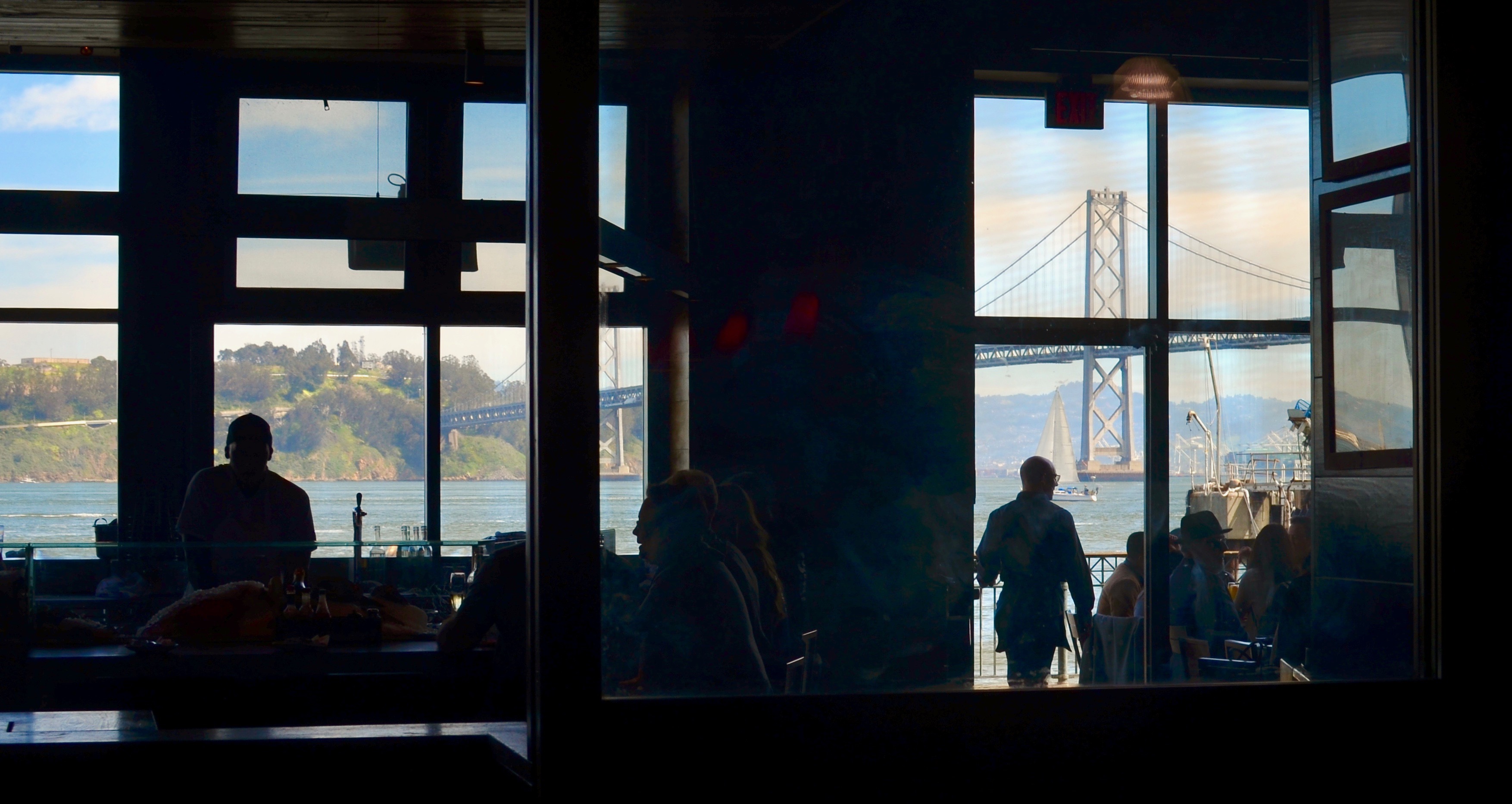
Subdued Baywatch, 2019
Out-the-window shots are a great source of this phenomenon, since shooters are usually forced to expose for either what is in front of said window or beyond it….but seldom both. The rise of HDR and tone mapping in recent years has tried to address this, rendering everything in the same degree of illumination, often with bracketed exposures, from light to dark, that are blended afterwords in software. But there’s a problem. Many HDR’s are simply over-processed, defying the mind’s knowledge of the proper relationships between light and dark. Everything’s visible but can easily be garish, unnatural. And so many of us go back to simply deciding what selected parts to illuminate in an image, and which to leave undefined. That means some darkness, which in turn means some things don’t get shown. And, if we’re lucky, those things that we don’t reveal can be more tantalizing than those that we do.
I was walking around the back of the old Terminal building in San Francisco, which is the place that all the city’s ferries used to dock and disembark before the Golden Gate Bridge was built, making many daily boat trips across the bay unnecessary. The building now houses eateries, produce stands, and an insane amount of tourist traffic, much of it crowded into restaurants such as the one seen here. The view out the back includes the Bay Bridge and the local ship traffic, as well as the occasional sailboat, such as the one seen here. I exposed for the scenery, leaving the restaurant’s patrons and workers in shadow. The scalloped, rather “peek-a-boo” view that resulted keeps the image from being a standard postcard shot, but while that “purity” is lost, what’s gained is a smidge of mystery about the shadowy folks in front. What are their conversations about? Why are they here?
I am just suggesting here that, instead of always regarding an image like this as a “blocked” or “obstructed” view of a scenic vista, you can choose to tantalize your viewer by providing a partial reveal of both foreground and background, since their inclination is already, like that of Adam and Eve, to obtain what they’re denied (in this case, by the exposure and the limits of the frame). Sometimes, in a photograph, a nothing can be a very important something. It all depends on who’s looking and what they themselves bring to the experience. In that way, they and the photographer are having a conversation. Which is kind of the idea.
YESTER-ESSENTIALS
By MICHAEL PERKINS
ONE OF THE MOST REMARKABLE POP CULTURE TRENDS OF THE PAST FEW YEARS has been the improbable reemergence of the vinyl LP, inching its way back onto shelves in edgy fashion boutiques and chain stores alike along with an entire battery of support materials: preeners, cleaners, racks, boxes, even the iconic hippie fruit crate, along with a new generation of high-and-low tech turntables and speakers. It’s fun to watch the emotional re-run that people of, ahem, a certain age will experience as we recall a world that used to be divided into Side One and Side Two.
However, we’ re missing out on a very important part of all that lore. The humble 45 rpm record.
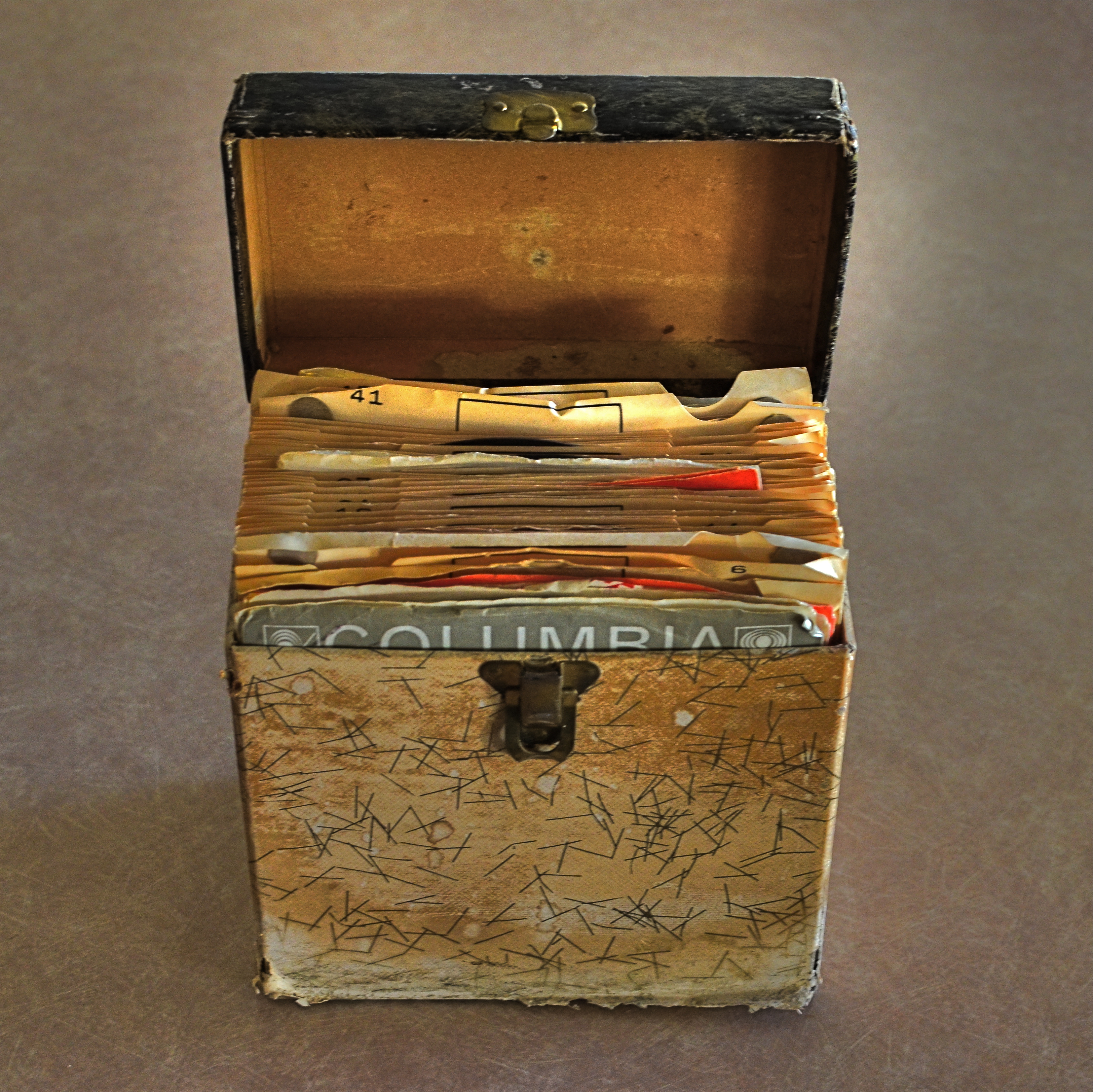
Party On, Garth: A pseudo-HDR made with two copies of the same starter exposure, blended in Photomatix.
Singles were the dominant format for record sales from the beginning of rock to the mid-’70’s, with marketing of pop tunes aimed squarely at the middle bulge of the Baby Boom, a flood of teens armed with disposable cash but consuming their music mostly two songs (A-side, B-side), or about a dollar’s worth, at a time. Eventually, a new crop of college students embraced the LP for its long-form story-telling potential, graduating from singles like Love Me Do to albums like Sergeant Pepper.
Photographically, the remains of all those singles-fed slumber parties and sock hops tell a strong story in the tattered textures of kid’s objects that, like action figures and train sets, were loved to death and treasured all the more because of their imperfections. In the above 45 carrier (party in a box!), half the visual story is told in the wear and tear that is hard-wired into analog. The battered box sings a song all its own.
For this shot, I took a single exposure, side-lit with bright but soft window light, then made a dupe of it, one copy tweaked to near-underexposure, the other to uber-brightness. The two were then made into a fake HDR in Photomatix, which is, above all, a great detail enhancer. Since the shot was done at f/5.6, the whole box is sharp, giving the software plenty to chew on. A few minor changes in contrast to amp up the differences in color along the faded box pattern, and presto, the golden age of Rock ‘n’ Roll.
Photography is about recording change, halting decay in its tracks for a moment….preservation, if you will. The new flawless vinyl reissues of our old faves possess the sound of yesterday, but they can’t tell us a thing about how it all looked.
And that’s where you, the guy with the camera, come in.
THE LAST OF MANY GOODBYES
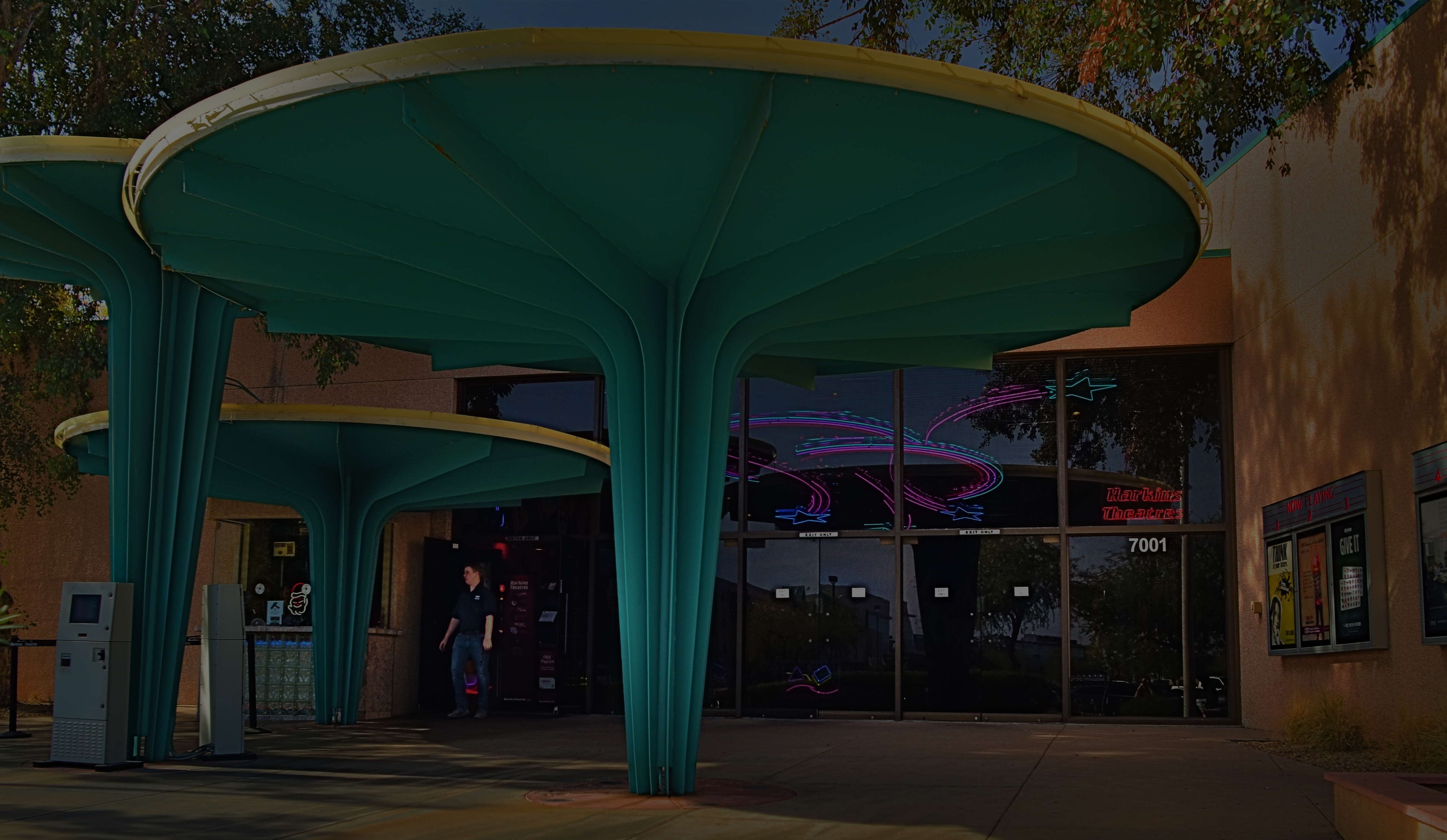
Scottsdale, Arizona’s gorgeous little art-house complex, the Camelview Theatre, on the afternoon of its final day, December 10, 2015.
By MICHAEL PERKINS
ON THE SPOCK SIDE OF OUR BRAINS, OF COURSE WE KNOW that there is nothing particularly magical about buildings per se. Stone and steel cannot, after all, generate memory or experience; they merely house the people who do. Still and all, the loss of certain edifices engenders a purely emotional response in us, perhaps because special things can no longer happen there, and the physical proof that any of it happened at all is being rendered, at least physically, into dust. That puts us in the realm of dreams, and that’s where great photographs are born.
When a place that is special to us is about to wink out of existence, everyone who used that place stamps it with their own stories. We went to school here. This is where I proposed to your mother. The bandstand was here, along this wall. So personal a process is this that our farewell photographs of these places can take on as many different flavors as the number of people who walked their halls. And, as a result, it’s often interesting to compare the final snaps of important places as filtered through the disparate experiences of all who come to reflect, and click, in the shadow of the wrecking ball.
I have attended many an opening at theatres, but I always make a point to attend their closings. Not the end of a certain film or engagement, but the final curtain on the theatres themselves. How best to see their final acts? As a quiet, gentle sunsetting, as with the above image of Scottsdale, Arizona’s Camelview theatre, shuttering in deference to a bigger, newer version of itself at the end of 2015? Or, in the colorful confusion of the venue’s final night, with crowds of well-wishers, local dignitaries and well-wishers crowding into the final screening?
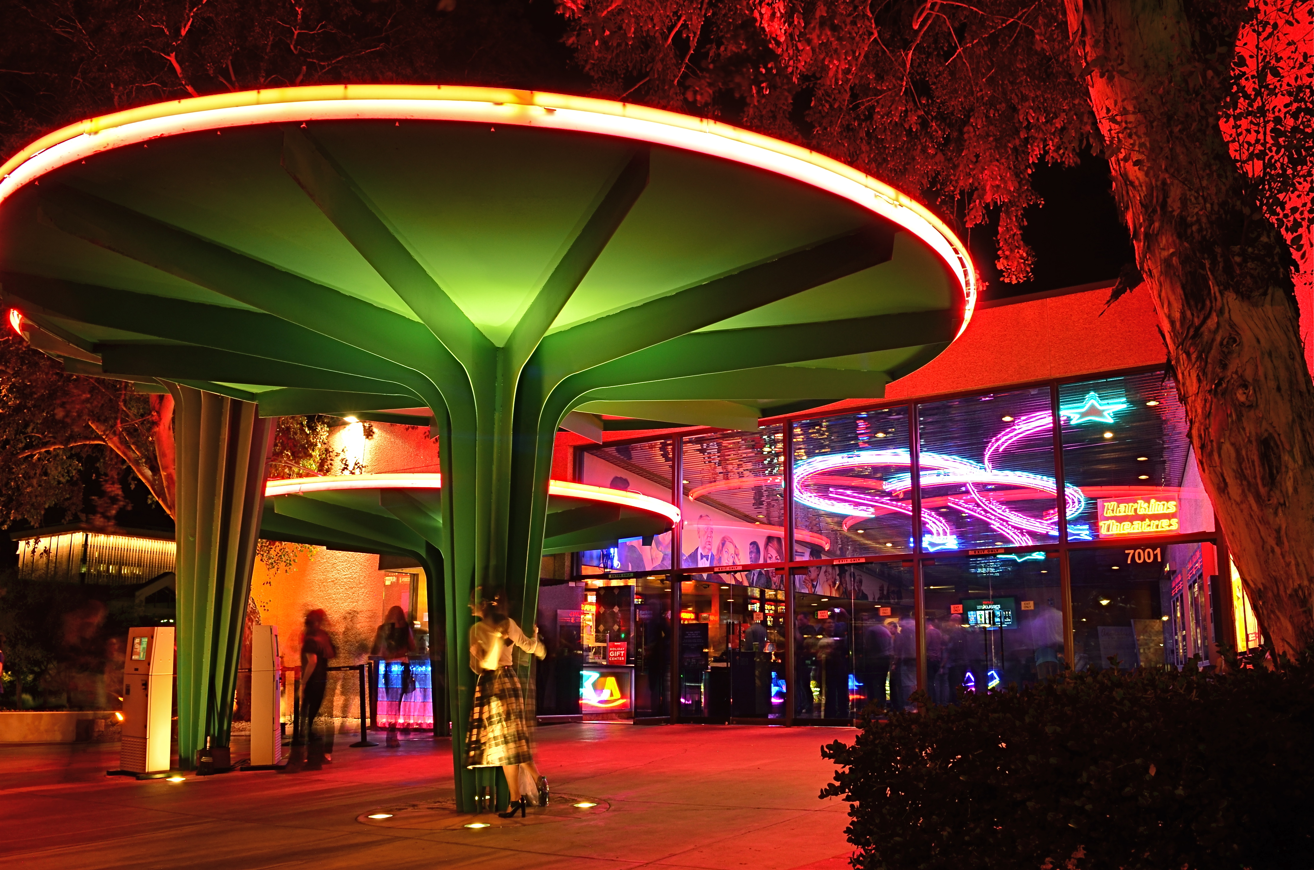
Later that same day: the Camelview’s last neon-lit night of glamour.
Each view projects my own feelings onto the resulting images, whether it be a golden dusk or a frenetic, neon-drenched, tomorrow-we-die send-off, complete with champagne and cheers. The introspective daytime shot has no teeming crowds or fanfare. The night, with its ghostly guest blurs (a result of the longer exposure) features people who are as fleeting as the theatre’s own finite run. Both are real, and neither is real. But they are both mine.
Buildings vanish. Styles change. Neighborhoods evolve. And photographic goodbyes to all these processes are never as simple as a one-size-fits-all souvenir snap. People, and memories, are too customized for that. As with movies themselves, there is always more than one way to get to the final fadeout.
THOSE WHO STAND AND WAIT
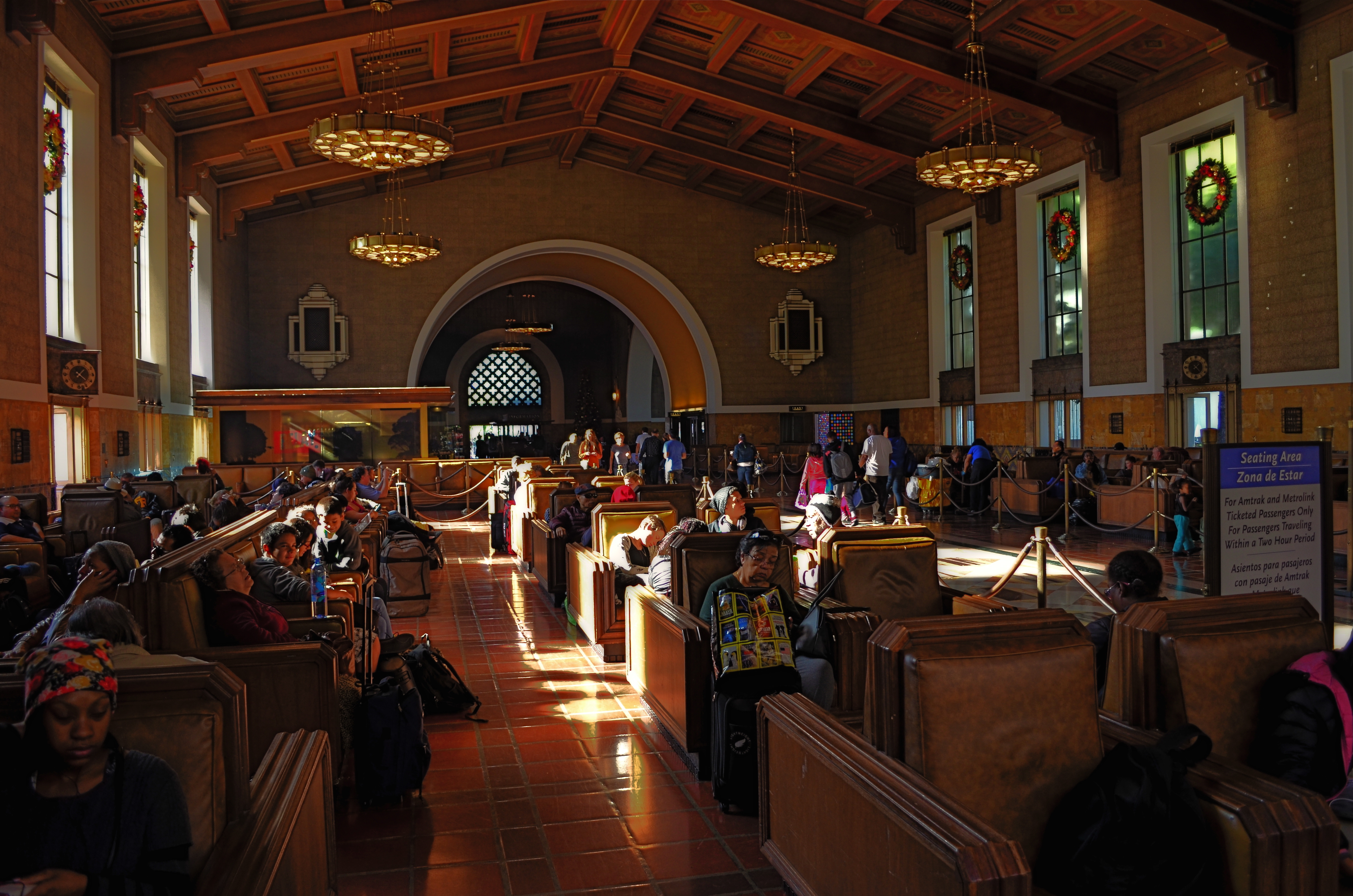
Please Listen For Announcements, 2015. The iconic waiting room at Los Angeles’ Union Station terminal.
By MICHAEL PERKINS
SHOW ME A HOLIDAY SEASON AND I’LL SHOW YOU PEOPLE WAITING FOR SOMETHING TO HAPPEN. They form lines for special orders, last-minute items, a kid’s brief audience with Santa. They hope to bump someone on a flight, beat someone out of a bargain, talk someone into a discount, refund or exchange. But mostly, they wait.
For as many festive holiday subjects that dance before the photographer’s eye, there are many more scenarios in which nothing much happens but..the waiting. And, while this seemingly endless hanging-out never offers images that define joy or wonder, they are fodder to the street shooter within us, the guy looking for stories. Stories of tired feet. Tales of people who can’t get a connecting flight ’til tomorrow at the earliest. Sagas of mislaid plans and misbegotten presents. Folklore of folks who are lost, lonely, disappointed, and down. In short, all of us, at various times.
Transit points are often among the most poignant during the season, with legions of faces that plead, what’ll I get for her? How will I get all the way down this list? How soon can I get home? Your best bet? Hang at the train stations, the port authorities, the airports, and hear the plaintive strains of I’ll Be Home For Christmas sung in the key of ‘as if’. Seek out those aches, that weariness, the many false starts and stumbling finishes of the holidays. And keep your camera ready, hungry for whatever visions dance in your head.
BACKING OFF, BACKING AWAY
An early case of HDR madness on your humble author’s part. Yeah, nothing in nature looks like this. Ever.
By MICHAEL PERKINS
YOU MAY HAVE HEARD THE JOKE ABOUT THE COUNTRY PARSON WHO WAS IN THE HABIT of writing, in the margins of his sermon script, “Argument weak here. Scream like hell.” If he were a man of the camera instead of a man of the cloth, this instruction might have read, “photograph ineffective here. Over-cook everything.”
Choose your favorite post-editing workflow and chances are that you, or someone like you, have tried to rescue an indifferent image by pouring a few gallons of digital gravy over it, hoping to turn flank steak into filet. And you probably have your own personal folder of shame for the results of such attempts. Mine would fill up a small bookshelf. In the Library of Congress.
One of the hallmarks of the early digital age seems to be an affection for over-saturated color, as if we had had quite enough of natural tones, thank you, and were desperate to return to the earliest days of photographic color, when everything was played on the loud pedal. It’s kind of perverse, but it seems like, as soon as photographers outdistance an old technical barrier, they seem to get nostalgic for it and try to revive it. Why resuscitate daguerreotypes, pinhole cameras, high grain slow films, etc. Irony? Curiosity? Novelty? Who knows?
Whatever the motivation, the result has been a cornucopia of mobile apps that aim for an unnatural distortion of color values (spend ten minutes on Instagram for as many samples as you want) and the lo-fi or lomography movement toward cheap plastic toy cameras that can’t help but deliver hyped up hues (again, Instagram). There are also a number of HDR programs which tend to tempt people beyond their endurance when it comes to electrifying color even in an image’s shadows, making everyday like a day-glo version of your uncle’s golf togs and resulting in some pretty hideous excess (and yet, alas, such was I. See left).
What’s the new normal? Again, can’t tell you. It’s pretty certain, though, that we love cranking the color up to 11, whether it serves the photo or not. Backing off and backing away on the hue-mongous overkill takes real discipline. The amped-up image is fascinating in some kind of moth-to-the-flame way, but eventually it becomes like any other excess, in that it stifles, rather than frees, your art. No effect is so miraculous as to work in every situation. Eventually, it’s about what you’re seeing and saying.
EXTENDING THE INVITATION
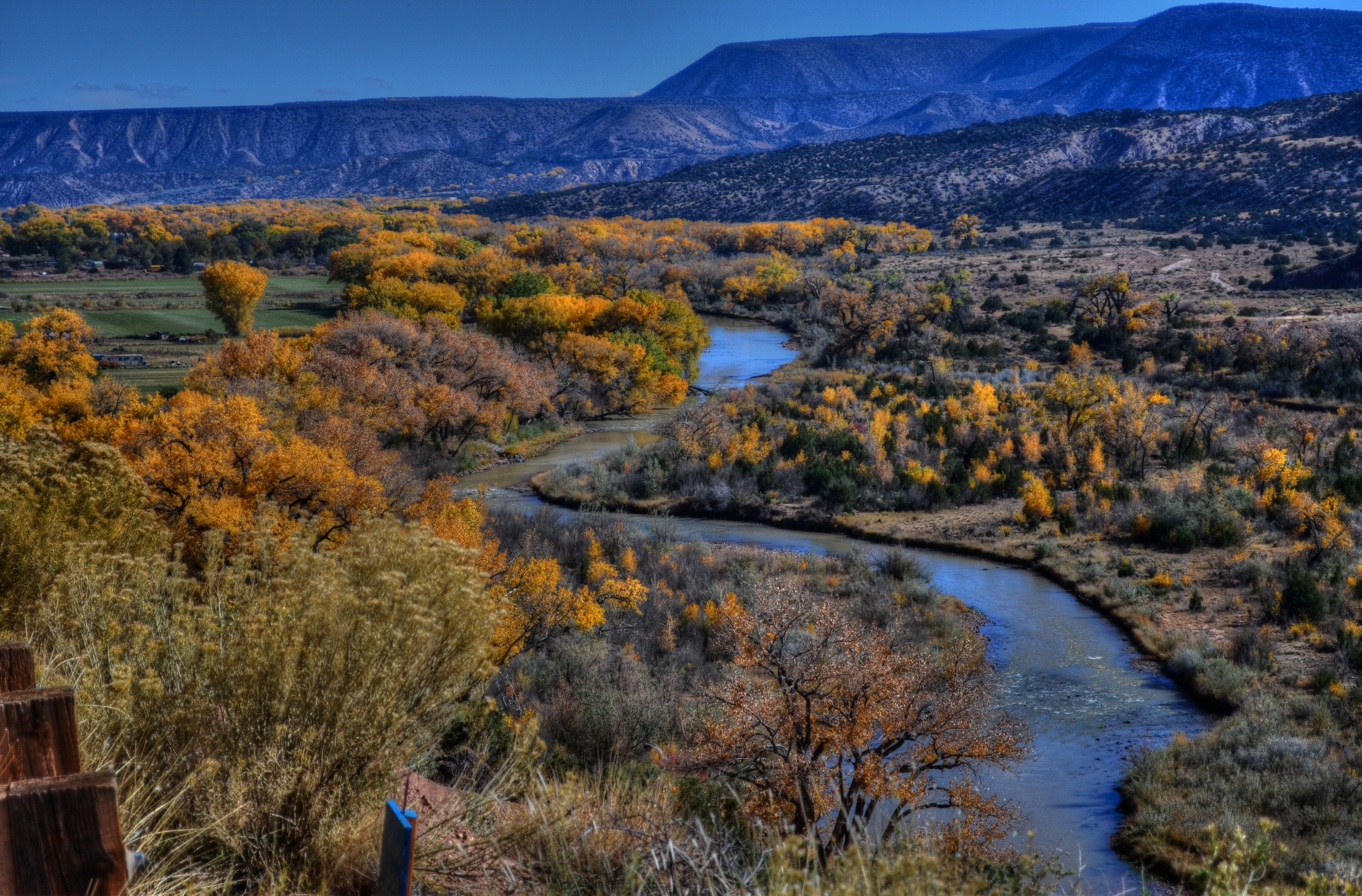
Sinuous, 2013. The river’s journey takes it, and your eyes, back “into” the picture.
By MICHAEL PERKINS
PHOTOGRAPHY AND PAINTING, DESPITE ENGAGING THEIR AUDIENCES IN VERY DIFFERENT WAYS, have retained one common aim over the centuries, at least when it comes to pictorial or scenic subjects. Both the photo and the canvas arrange their visual information on a two-dimensional surface, and both seek to draw the viewer’s eye into a depth that is largely illusionary. The cameraman and the painter both contrive to create the illusion that the distance from front to back in their works is as real as the distance from side to side.
In terms of simulating depth, some photographs benefit from both shadow and light, which alternatively “model” the information in an image, making it seem to “pop” in some faux-dimensional sense. But the best and simplest trick of composition is what we popularly term the “leading line”, information that trails from the front of the picture and pulls the viewer’s attention to an inevitable destination somewhere deeper back in the scene.
Putting a picture together this way ought to be the most automatic of instincts in the composition of a photograph, but it still is formally taught, as if it were less than obvious. In fact, it just means extending an invitation to someone to join you “in” the photograph.

Minutes Away, 2012. The girders give you a stick-straight diagonal from journey to destination.
Trails, paths, railroad tracks, lines of trees or phone poles….these are all examples of information that can start at one side of a photo and track diagonally to the “back” of the image, making the eye experience a kind of gravity, tugging it toward the place you want their gaze to end up. It is also the easiest way to force attention to a central subject of interest, sort of like inserting a big neon arrow into the frame, glowing with the words over here.
Leading lines are a landscape’s best friend, as well, since the best landscapes are arranged so that the focal point of the story is streamlined and obvious. Anyone who has ever shown too much in a landscape will tell you that what fails in the composition is that it allows the viewer to wander around the place wondering what the point of the picture is. The use of a powerful leading line gives the illusion of depth and corrals the eyes of your audience to the exact spot you need them to be for full effect.
Composition is the most democratic of photographic skills. It’s easy, it’s free, and anyone from a point-and-shooter to a Leica addict can use it effectively. Bottom line: there are great things happening in your pictures. Invite the people inside.
NORMALEYE GALLERY UPDATE: HOME, HOME ON THE “RANGE”
A two-exposure HDR image with more emphasis on content than processing.
By MICHAEL PERKINS
HISTORY BUFFS WHO HAVE EXHAUSTIVELY RESEARCHED THE HELLISH ANIMOSITY OF THE AMERICAN CIVIL WAR, a conflict which sowed seeds of resentment that bear bitter fruit to this very day, may have some small grasp of the vitriolic divide between those who espouse High Dynamic Range (HDR) photography and those who believe its practitioners are in league with Beelzebub. Pro-HDR factions believe those who resist this magical art should be forced to declare themselves Amish on the spot, while the opposite camp believes that all cameras that shoot HDR should be pulverized and used as landfill in Hades. We’re talking irreconcilable differences here.
When HDR first came to my attention, I welcomed it, as many others did, as a way to get around a long-standing problem in exposure….how to modulate between blackout and whiteout in extremely contrasty situations in which a single exposure would either blow out the sky through the window or bury the corners of an interior in blackness. My first attempts with it were exciting, as I tried to shoot frames bracketed across a three or five shot range of exposures, then smooth out the drastic differences between light and dark in the final image. The idea of using HDR for a sci-fi look or a painterly effect never appealed to me. I was really trying to use it to make my pictures replicate more closely the adjustment between light and dark that the eye makes instantaneously.
Over the last five years, however, as I review images I’ve made with HDR software. First, I use the program less with each passing year, and second, I no longer use it to retrieve “lost” tones in dark or light areas of an image. The program I have used since day one, Photomatix, has two main choices, Detail Enhancement and Tonal Compression, and, at first, I worked almost exclusively with the former. For wood grain, stone texture, botanical detail and cloud contrast, it’s remarkably effective. However, it’s also easy to produce images which are too dark overall, and accentuate noise in the individual images. Overcook it even a little and it looks like a finger painting done with hot lava. It thus actually works against the original “looks more like reality” objective.
On the other hand, producing the blended image in the Tonal Compression mode retains most of the sharp detail you get in Detail Enhancement without the gooey consistency. It has fewer attenuating controls, but as I go along, I find I am using it more because it simply calls less attention to itself. In either mode, I have made a conscious effort to throttle the heck back and under-process as much as I can. I’m just getting sick of shots that announce “hey, here comes an HDR photo!” two blocks ahead of its arrival.
I’m also in the middle of a back-to-basics phase based on getting things right, in-camera, in a single frame, and learning to be more accepting of dark and light patches rather than artificially mixed goose-ups of rebalanced tones. Anyway, as of this posting, I’ve taken down the original selection of images that was in the HDR gallery tab at the top of this page and loaded in a new batch that, while certainly not a “final” word on anything, shows, I think, that I’m still wrestling with the problem of how best to use this technology. Give them a look if you can, and let me know your thoughts on the use of HDR in your own work. We all have to figure out our own way to be home, home on “the range”.
WHAT SIZE STORY?
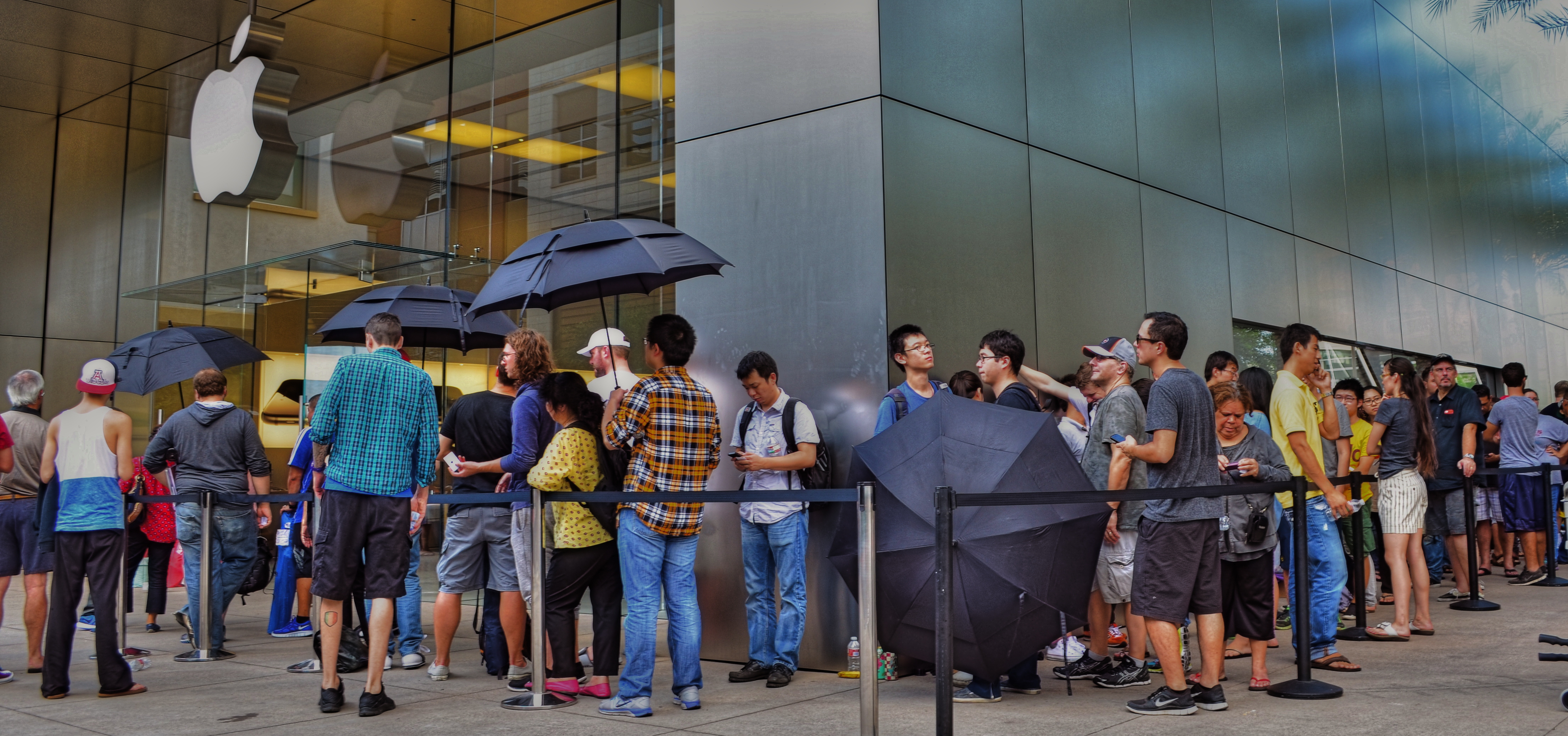
iPhone 6 debut at Apple Store in Scottsdale, Arizona, September 19, 2014. Sometimes the story is “the crowd…”
By MICHAEL PERKINS
IN THE EARLY 1950’s, AS TELEVISION FIRST BLINKED INTO LIFE ACROSS AMERICA, storytelling in film began to divide into two very clearly defined camps. In theatres, desperate to retain some of the rats who were deserting their sinking ships to bathe in cathode rays at home, movie studios went for stories that were too big to be contained by the little screen, and almost too big for theatres. You remember the wider-than-thou days of Cinemascope, VistaVision, Todd-Ao, Cinerama and Super-Panavision, as well as the red-green cardboard glasses of 3-D’s first big surge, and the eye-poking wonders of House Of Wax, Creature From The Black Lagoon and Bwana Devil. Theatres were Smell-O-Vision, True Stereophonic Reproduction and bright choruses of Let’s Go Out To The Lobby sung by dancing hot dogs and gaily tripping soda cups. Theatres was Big.
The other stories, the TV stories, were small, intimate, personal, compact enough to cram into our 9-inch Philcos. Tight two-shots of actors’ heads and cardboard sets in live studios. It was Playhouse 90 and Sylvania Theatre and The Hallmark Hall Of Fame. Minus the 3,000 Roman extras and chariot races, we got Marty, Requiem For A Heavyweight, and On The Waterfront. Little stories of “nobodies” with big impact. Life, zoomed in.
…but, within that crowd, there are “little” stories.
For photographers, pro or no, many stories can be told either in wide-angle or tight shot. Overall effect or personal impact. You can write your own book on whether the entire building ablaze is more compelling than the little girl on the sidewalk hoping her dog got out all right. Immense loads of dead trees have been expended to explore, in print, where the framing should happen in a story to produce shock, awe or a quick smile. I like to shoot everything every way I can think of, especially if the event readily presents more than one angle to me.
The release of the new iPhone 6, which dropped worldwide today, is a big story, of course, but it consists of a lot of little ones strung together. Walk the line of the faithful waiting to show their golden Wonka ticket to gain admission to the Church of Steve and you see a cross-section of humankind represented in the ranks. Big things do that to us; rallies, riots, parties, flashmobs, funerals….the big story happens once a lot of little stories cluster in to comprise it.
Simply pick the story you like.
Remember, just like the phone, they come in two sizes.
REAL PHONIES
Reality check: a retail mall in Hollywood, doubling as a tribute to D.W. Griffith’s Intolerance. huh?
By MICHAEL PERKINS
“You’re wrong. She is a phony. But on the other hand you’re right. She isn’t a phony because she’s a real phony. She believes all this crap she believes.”
—Truman Capote, Breakfast At Tiffany’s
THE ABOVE REFERENCE TO MISS HOLLY GOLIGHTLY, she of the powder room mad money, also applies very neatly to Hollywood, California. The official kingdom of fakery has been in the business of fabricating fantasy for so long, it actually treats its hokum as holy writ. Legends and lore become facts of life, at least our collective emotional life. Dorothy’s ruby slippers (even though they were originally silver) draw more attention than actual footwear from actual persons. Wax figures of imaginary characters are viewed by more people than will ever examine the real remains of wooly mammoths at the La Brea Tar Pits. And, when it comes to the starstruck mini-Vegas that is the nexus of Hollywood Boulevard and Highland Avenue, even a fake of a fake seems like a history lesson.

The gang’s all here: Griffith’s original 1916 Babylon set for Intolerance.
Hollywood and Highland is one grand, loud, crude note of Americana, from its out-of-work actors sweating away in Wookie suits in front of the Chinese theatre to its cheesy Oscar paperweights at the souvie shops. This small stretch of carnival, high-caloric garbage chow, and surreal retail is a version of a version, a recreation of a creation, a “real phony” rendition of cinema, defined by its resurrection of the great gate of Babylon, which anchors a multi-level mall adjacent to the Dolby Theatre, the place where all those genuine cheesy paperweights are given each year. The gate and the two enormous white elephants that flank it are a partial replica of D.W. Griffith’s enormous set for the fourth portion of his silent 1916 epic Intolerance. The full set had eight elephants, an enormous flight of descending stairs, two side wings, and a crowd that may have originally inspired the term “cast of thousands”. That’s how they did ’em back in the day, folks. No matte paintings, no CGI, no greenscreen. We gotta build Babylon on the back set, boys, and we only got a week to do it, so let’s get cracking.
The original set, which stood at Hollywood and Sunset, was, by 1919, a crumbling eyesore and, in the city’s opinion, a fire hazard. Griffith, who lost his shirt on Intolerance, didn’t have the money to demolish it himself, and eventually it fell into sufficient disrepair to make knocking it down more cost-effective. Hey, who knew that it might make a great backdrop for a Fossil store 2/3 of a century later? But Hollywood never balks at the task of making a fake of a fake, so the Highland Center’s ponderous pachyderms overlook throngs of visitors who wouldn’t know D.W. Griffith from Merv Griffin from Gryffindor, and the world spins on.
Photographing this strange monument is problematic since nearly all of it is crawling with people at any given moment. Forget about the fact that you’re trying to take a fake image of a fake version of a fake set. Just getting the thing framed up is an all-day walkabout. So, at the end of my quest, what did I do to immortalize this wondrous imposter? Took an HDR to ramp up an artificial sense of wear and tear, and slapped on some sepia tone.
But it’s okay, because I’m a real phony. I believe all the crap I believe.
Hooray for Hollywood.
RESTORING THE INVISIBLE
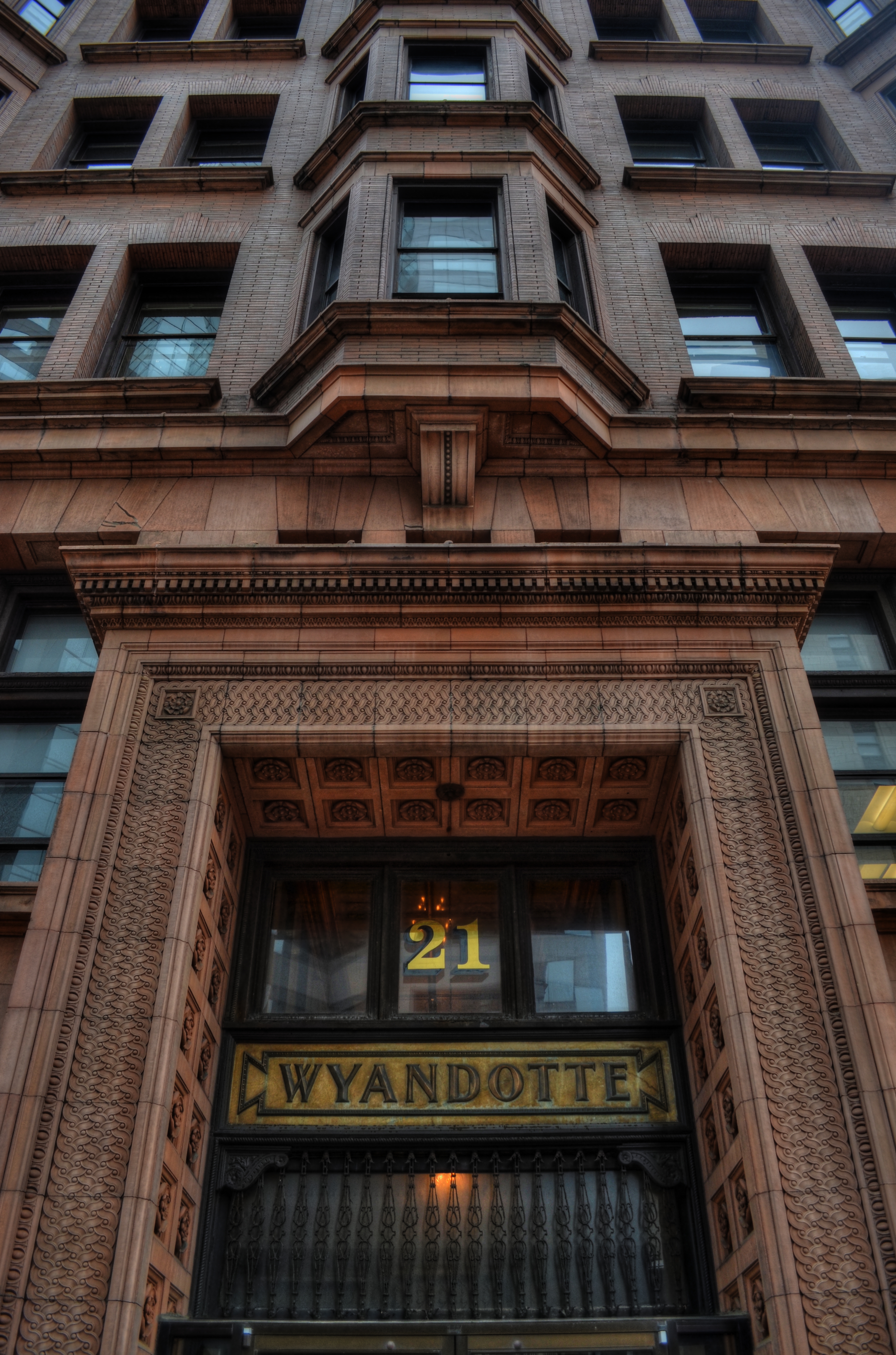
as[e The Wyandotte Building (1897), Columbus, Ohio’s first true skyscaper, seen here in a three-exposure HDR composite.
PHOTOGRAPHY IS ONE OF THE BEST RESPONSES TO THE DIZZYING SPEED OF CONTEMPORARY EXISTENCE. It is, in fact, because of a photograph’s ability to isolate time, to force our sustained view of fleeting things, that image-making is valuable as a seeing device that counteracts the mad rush of our “real time” lives. Looking into a picture lets us deal with very specific slices of time, to slowly take the measure of things that, although part of our overall sensory experience, are rendered invisible in the blur of our living.
I find that, once a compelling picture has been made of something that is familiar but unnoticed, the ability to see the design and detail of life is restored in the viewing of that thing. Frequently, in making an image of something that we are too busy to notice, the thing takes on a startlingly new aspect. That’s why I so doggedly pursue architectural subjects, in the effort to make us regard how much of our motives and ideals are captured in buildings. They stand as x-rays into our minds, revealing not only what we wanted in creating them, but what we actually created as they were realized.
In writing a book, several years ago, about a prominent midwestern skyscraper*, I was struck by how very personal these objects were…to the magnates who commissioned them, to the architects who brought them forth, and to the people in their native cities who took a kind of ownership of them. In short, the best of them were anything but mere objects of stone and steel. They imparted a personality to their surroundings.
The building pictured here, Columbus, Ohio’s 1897 Wyandotte Building, was designed by Daniel Burnham, the genius architect who spearheaded the birth of the modern steel skeleton skyscraper, heading up Chicago’s “new school” of architecture and overseeing the creation of the famous “White City” exposition of 1893. It is a magnificent montage of his ideals and vision for a burgeoning new kind of American city. As something thousand walk past every day, it is rendered strangely “invisible”, but a photograph can compensate for our haste, allowing us the luxury of contemplation.
As photographers, we can bring a particularly keen kind of witnessing to the buildings that make up our environment, no less than if we were to document the carvings and decorative design on an Egyptian sarcophagus. Architectural photography can help us extract the magic, the aims of a society, and experimenting with various methods for rendering their texture and impact can lead to some of the most powerful imagery created within a camera.
*Leveque: The First Complete Story Of Columbus’ Greatest Skyscraper, Michael A. Perkins, 2004. Available in standard print and Kindle editions through Amazon and other online bookstores.
THE TORQUOISE TIME TRAVELER
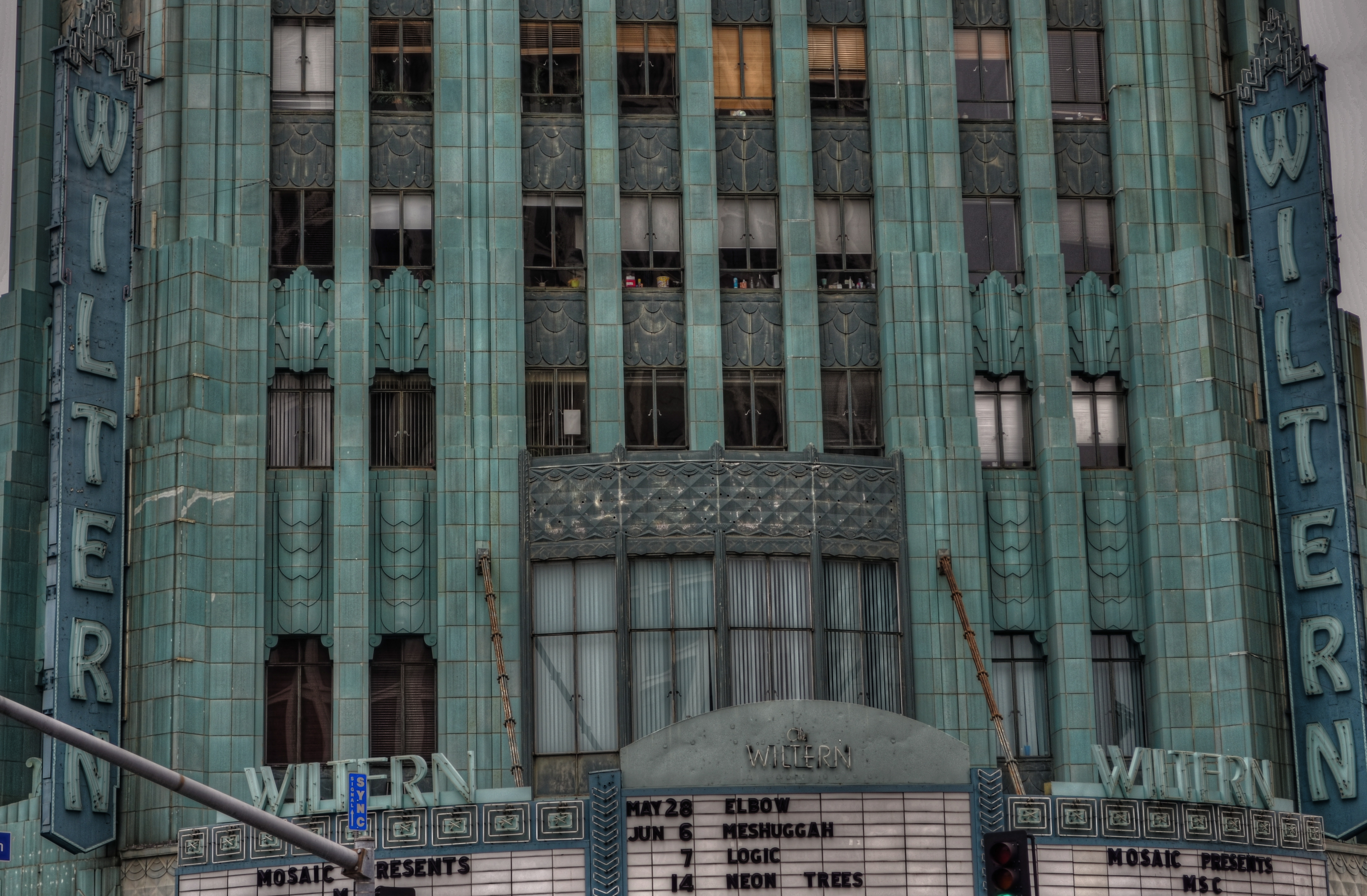
The wondrous Wiltern Theatre in Los Angeles. A three-exposure HDR to amplify time’s toll on the building’s exterior.
by MICHAEL PERKINS
SHE HAS WITHSTOOD THE GREAT DEPRESSION, A WORLD WAR, DECADES OF ECONOMIC UPS & DOWNS, and half a dozen owners (some visionaries and some bums), and still, the sleek green/blue terra-cotta wedge that is the Wiltern Theatre is one of the most arresting sights in midtown Los Angeles. From her 83-year old perch at the intersection of Western Avenue and Wilshire Boulevard, the jewel in the lower half of the old Pelissier building still commands attention, and, for lovers of live music, a kind of creaky respect. The old girl isn’t what she used to be, but she is still standing, as the same house that once hosted film premieres in the days of Cagney and Bogart now hosts alternative and edge, with pride.
And she still makes a pretty picture, lined face and all.
Opened in 1931 as a combination vaudeville house and flagship for Warner Brothers’ national chain of film theatres, The Warner Western, as it was originally named, folded up within a few years, re-opening in mid-Depression L.A. as the Wiltern (for Wilshire and Western) operating virtually non-stop until about 1956. As a vintage movie house, it had been equipped with one of the most elegant pipe organs in town, and enthusiasts of the instrument built a small following for the place for a while with recitals featuring the instrument. By the 1970’s, however, economies for larger-than-life flicker palaces were at an all-time low, and the Wiltern’s owners tried twice themselves to apply for permission to blow her down. Preservationists got mad, then got busy.
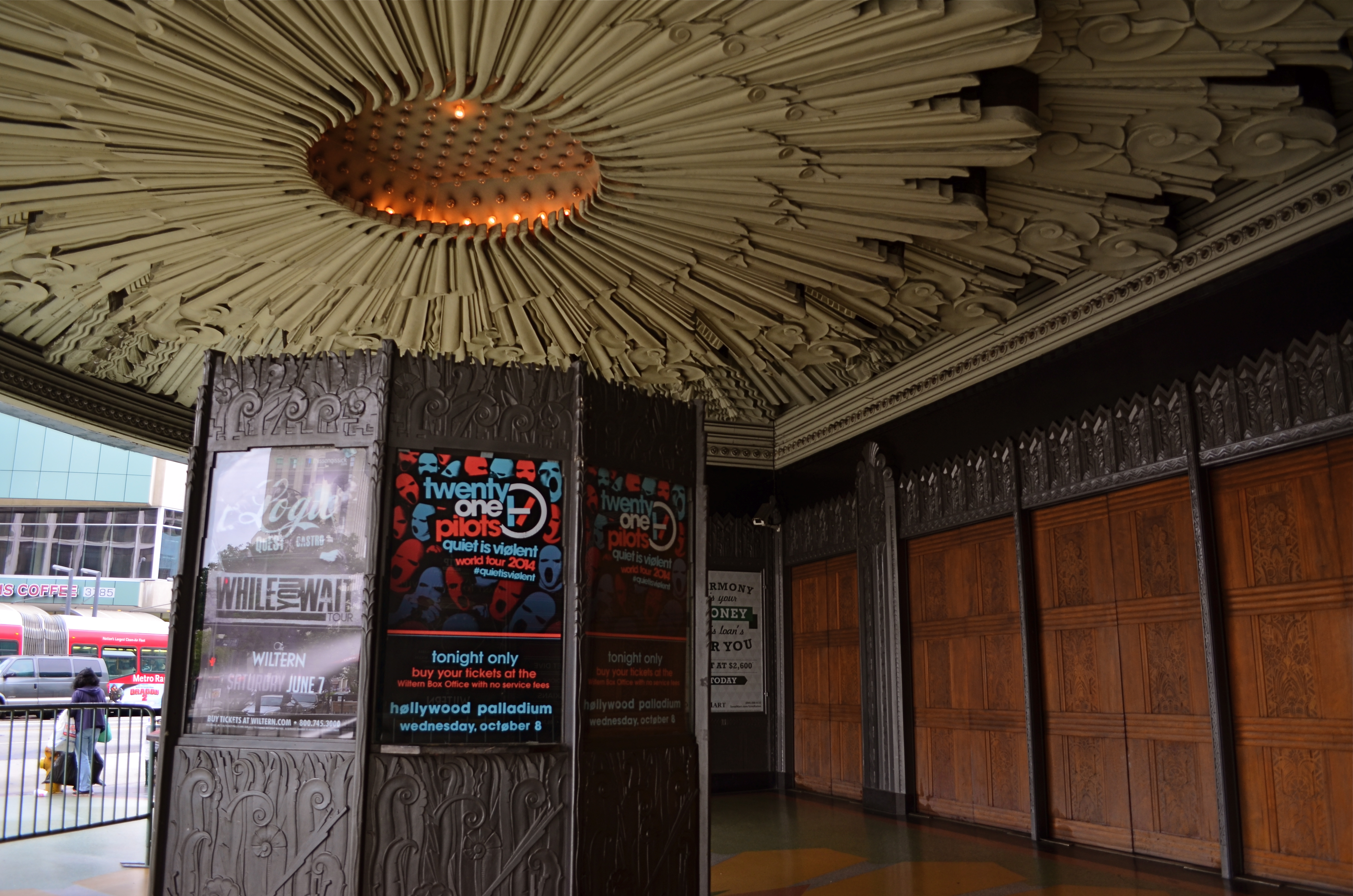
The Wiltern’s ticket kiosk sits under a plaster canopy of Deco sunrays. 1/40 sec., f/3.5, ISO 100, 18mm.
Restoration began in the 1980’s on the Pelissier building in general, but the Wiltern, with its ornate plaster reliefs and murals, had been so neglected over the years that its turnaround was slower. It was finally reborn in 1985 as a live performance theatre, losing some seat room but newly able to stage everything from brain-blaster garage rock to Broadway road productions and ballet.
I shot the Wiltern with three HDR frame, all f/5.6, with exposure times of 1/60, 1/100. and 1/160, and blended the final image in Photomatix to really show the wear and tear on the exterior. HDR is great for amplifying every flaw in building materials, as well as highlighting the uneven color that is an artifact of time and weather. I wanted to show the theatre as a stubborn survivor rather than a flawless fantasy, and the process also helped call attention to the building’s French Deco zigzags and chevrons. For an extra angle, I also made some studies of the glorious sunburst plaster ceiling over the outside ticket kiosk. It was great to meet the old girl at last, and on her own terms.
HIGH DYNAMIC RAGE
HDR, used here to recover a few dark details in this somewhat contrasty ladnscape. Far from perfect, but I can live with this.
By MICHAEL PERKINS
THE INTERNET HAS A UNIQUE WAY OF TURNING AN IFFY LOOKING MOLE INTO TERMINAL SKIN CANCER, that is, fanning small sparks into raging infernos by squaring and cubing people’s discontents until they appear monumental. In photographic circles, this phenomenon has made the process known as High Dynamic Range, or HDR a hot potato. Whereas just a few years ago this technique sparked input from people who found it “kind of helpful” or “just not for me”, the current intensity of dialogue on the subject now characterizes HDR as either the greatest tragedy since Ben Affleck got cast as Batman or the miraculous equivalent of mother’s milk.
What has made the average shooter feel like they he has to side with either Mommy or Daddy in a custody battle for the soul of picture-taking? Jeez H. Loueeze. HDR, which is actually just a tool, and thus good or bad depending on how it’s used, has become an enormous bone of contention, with both sides of the debate hurling burning tar balls at each other, safe within the knowledge that they alone possess Real Truth.
Uh….okay, fine.
How’s this for Real Truth: processing in the digital age is no different from the burning, dodging, manipulation and filtering of the analog era, and, somehow, photography has survived both the modest and excessive uses of these and countless others for over two centuries. HDR’s original stated purpose was to modulate the tones of extremely contrasty subject matter, rendering a smoother transition between really light and really dark values to produce a picture that seemed to more accurately reflect how the human eye compensates for contrast. It was concocted as a workaround for one of the optical barriers that cameras are always striving to overcome.
This may have been taken inside a chapel, but not even Jesus could save this one. Gooey and creepy.
So what do you expect humans, always the “X” factor in any art, to do with any new tool? Answer: Anything they damn well please. Of course some people are going to produce beauty while others produce sludge. Of course some will use it to mask or slap a band-aid on badly conceived images. And, of course decent HDR processing platforms will be imitated by cheap apps created in Hacky McHackmore’s Dad’s garage and selling for $1.99.
I have had my own uneasy romance with HDR going back several years. I have found it to be a nice way to tweak color, an intensifier for detail and grain in things like stone and wood, and, yes, a way to dramatize contrasts in superkeen ways. I have also been guilty of slathering it on in the desperate hope that I can “rescue” a shot with it, and have been horrified at the way it makes human skin look like it was hosed down in molten Crayolas. Sometimes I have used it to make things more natural, while, at other times, I have taken advantage of its special talent for making things unearthly. And even when I have made the most inane use of HDR, the planets have, amazingly, continued on their daily orbits. In the words of the not-too-great Bobby Brown, it’s my prerogative.
The intense hater-ama currently being mounted against HDR might better be aimed at what makes its misuse all too predictable: the fact that human judgement is variable, unpredictable, and sometimes, twisted. If there’s a photo process that can eliminate that from the pitcher-taking mix, I’d love to see it. In the meantime, HDR is no more harmful (or salvational) than any other processing platform. If there’s a flaw, it’s inside the skull of the guy pressing the button.
Always has been, always will be.
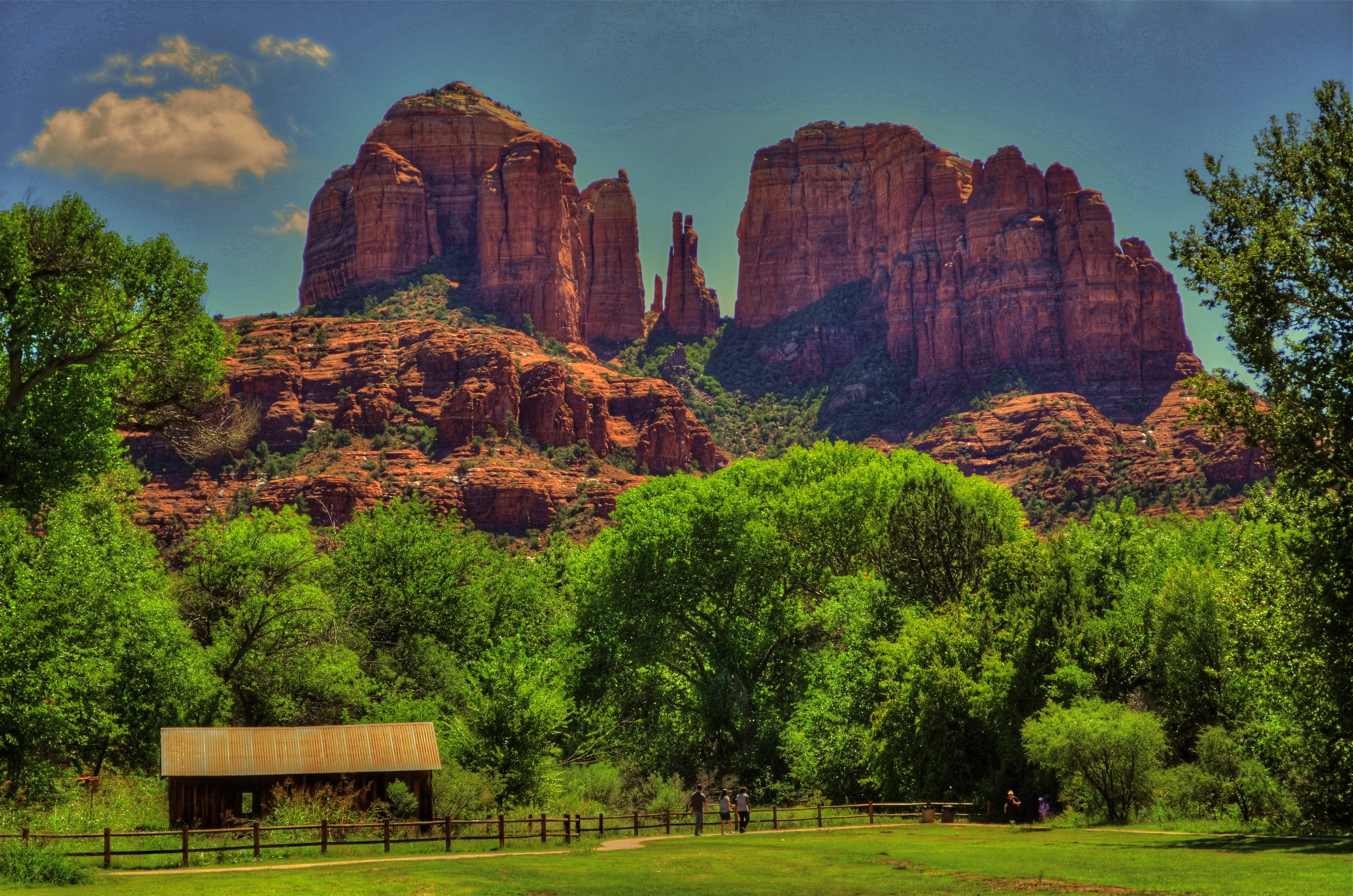
A CHANGE IN PRESCRIPTION
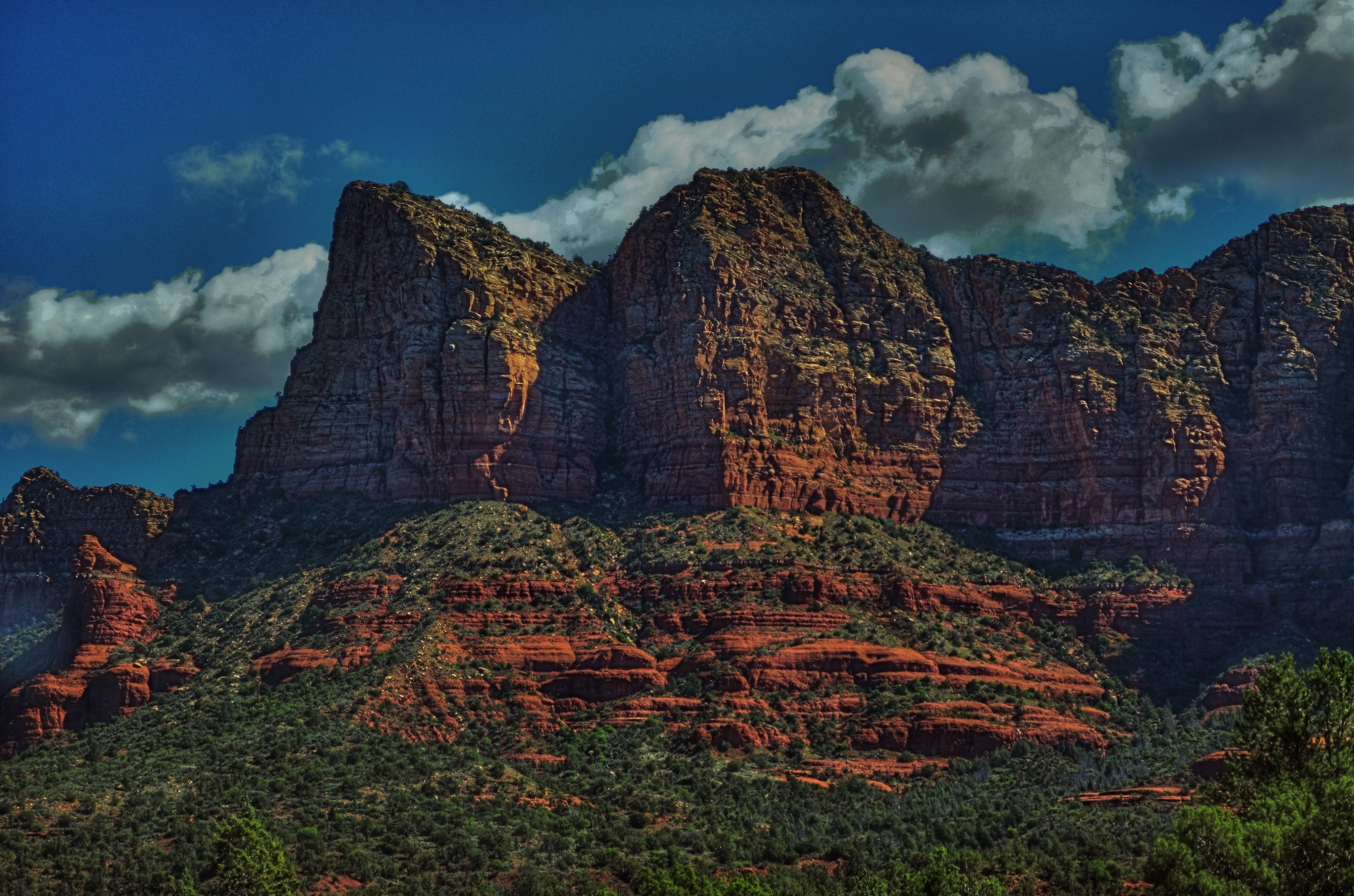
Sedona Bluffs, 2013. HDR can be your best friend when rescuing detail and shadow on subjects like this. But it will make your Aunt Hilda look like the Portrait of Dorian Gray.
By MICHAEL PERKINS
THERE IS AN OLD STORY ABOUT AN IRISHMAN WHO FINDS AND RUBS A MAGIC LAMP. Upon emerging from said lamp, the genie tells the boyo that he can have three wishes. For his first, he asks for an everlasting pint, a beer glass that will endlessly refill every time he drains it, forever. “Try it out”, says the genie, whereupon the lad gulps down several draughts, each one replenished in an instant. “This is grand!” he shouts. “All right, now”, reminds the genie, “what about your other wishes?” “Oh, that’s easy”, says the Irishman, “just give me two more of these.”
High Dynamic Range, or HDR processing is a little like those two unused wishes. You can fall in love with the effect of using it without pausing to see if it makes sense to use it, or see what else is out there on the horizon.
HDR can be the photographic equivalent of a crack habit, especially when you first test-drive it. Rescuing information from shadows, accenting detail to ever-crisper levels, tweaking colors to Peter Max-imums…..it’s all pretty stunning, and, like the 98-pound weakling in the Charles Atlas ads, the drama is best seen in “before and after” comparisons. And then there follows The Great Period Of Overcompensation, that heady phase in which you turn everything you shoot into a psychedelic fever dream. It’s garish, sometimes cartoonish, but eventually you get to a point where you want to throttle back and just use HDR as a tool instead of a magic paint box. It can’t be a style all by itself, but it can amplify your own style, extend your reach. Ground Control To Major Tom….
This blog has always been a discussion of why we do things rather than a tutorial on how to do them. It’s the decisions that we make with technology that matter, more than the technology itself, so we talk about judgements, motivations, intentions. In that vein, I’ve updated the HDR gallery tab of the blog with all new images, in an attempt to chronicle where I am with this process today. I originally intended the galleries to do this….to be a visual track on what I thought important to try in a given period. We are,literally, different photographers every day we wake up, so it’s absurd to think that any technique, approach, or magic wish will work for us equally well forever. The patient still has needs, but he requires a periodic change in prescription.
So settle back with an endless pint and give us a look.
The pictures may not work for you, but, hey, if the beer’s cold, it’s not a total loss.
Follow Michael Perkins on Twitter @Mpnormaleye.
Related articles
- HDR Photography: craze or crazy? (homesandlandofmontreal.wordpress.com)
LIPSTICK ON A PIG
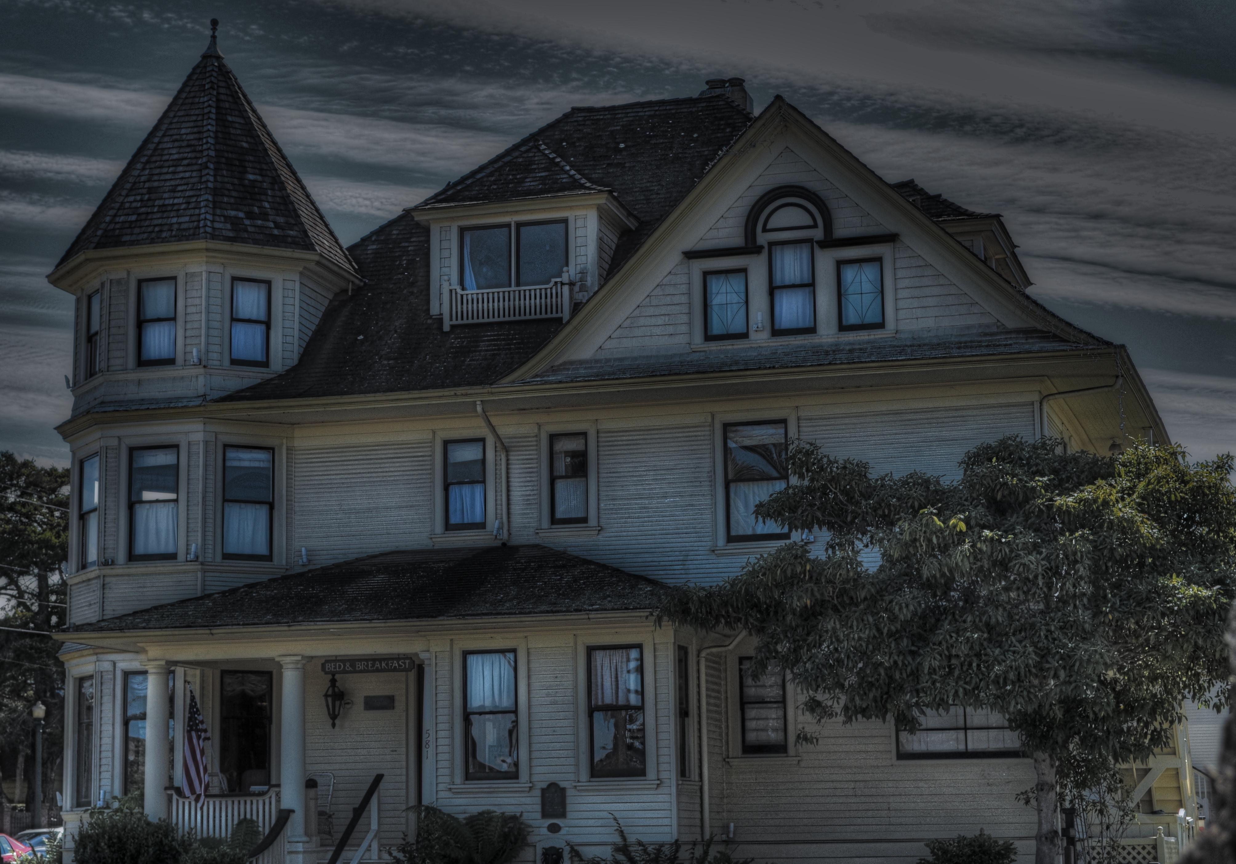
Bad day at the office: having failed at making this house charming, I then went on to also fail at making it sinister and forbidding. I did, however, succeed in making it an unholy mess.
By MICHAEL PERKINS
IT’S TV-DOCTOR SHOW CLICHE NUMBER ONE. The frantic ER crew valiantly works upon a patient who is coding, pulling out every tool in a desperate search for a discernible pulse. Then the close-up on the earnest nurse: “He’s gone.” and the final pronouncement by the exhausted resident: “Okay, anyone have the time? I’m calling it….”
That’s pretty much what it’s like to try to rescue a lousy photograph by extraordinary means…tweaking, sweetening, processing, whatever you call the ultimately futile emergency measures. Sometime the unthinkable is obvious: the picture’s a goner…no pulse, no soul, no life.
Cue Bones McCoy: It’s dead, Jim.
I have made my share of ill-advised interventions in the name of “saving” photos that I was unwilling to admit were lifeless, pointless, just a plain waste of time. You’ve done it too, I’m sure. Trying to give some kind of artistic mouth-to-mouth to an image that just wasn’t a contender to begin with. It was a bunch of recorded light patterns, okay, but it damn sure wasn’t a photograph. Smear as much lipstick on a pig as you want….it’s still a pig.
The unremarkable original image.
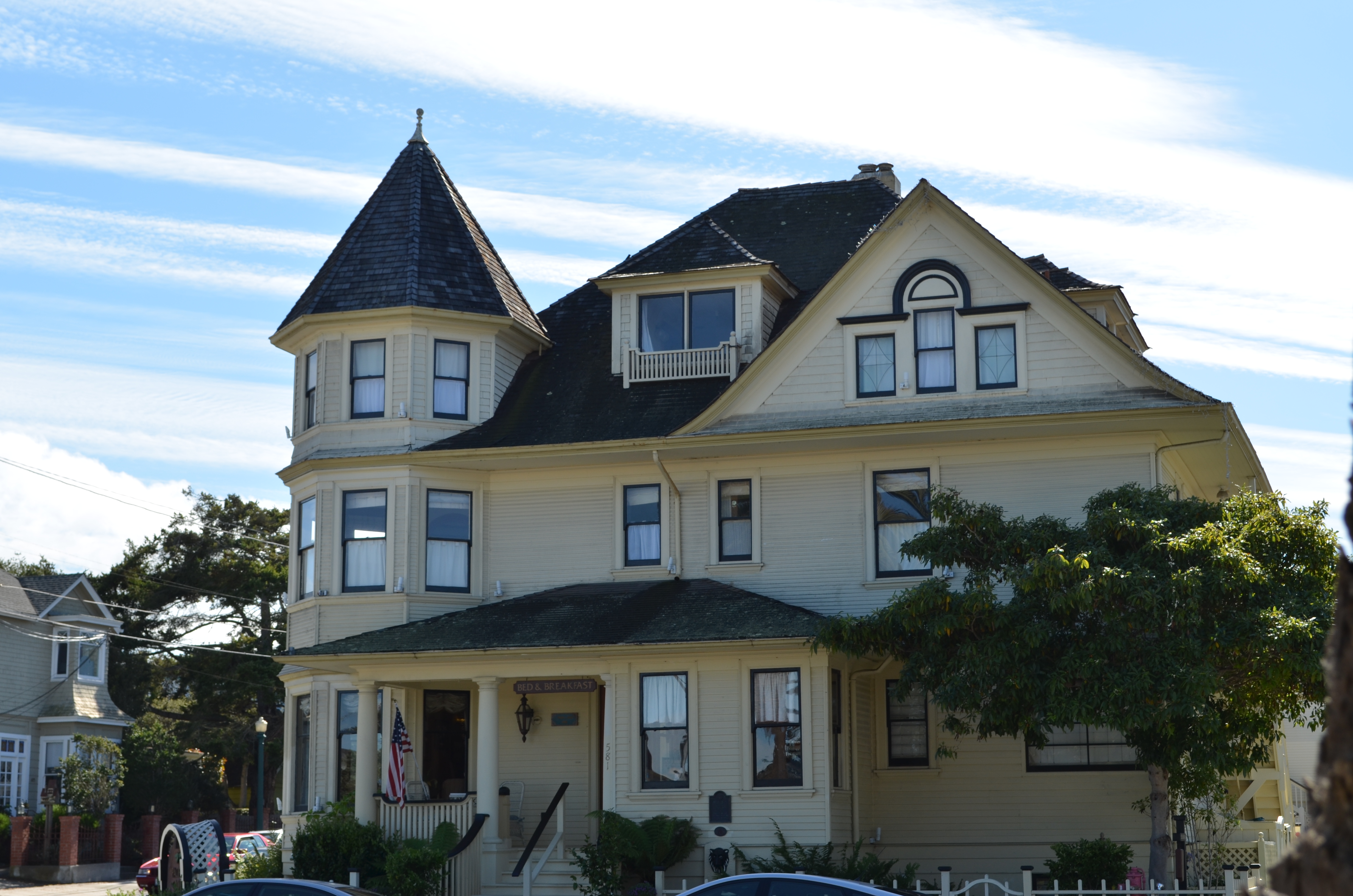
The above image shows the worst of this pathology. I wanted to show the charm of an old bed-and-breakfast in the gloriously beautiful little town of Pacific Grove, located just up the peninsula from Monterey in California (see image at left). But everything that could have made the image memorable, or even usable, was absent. The color, a cool buttercup yellow, is common to many town dwellings. In the warm glow of dawn or the late waning, dappled light of late afternoon, it can be charming, even warm. In the mid-day light, weak, withered. Then there was the total lack of a composition. The picture was taken in a second, and looked it.
So, angry at having failed at the “charming” look I had gone for, and unable to make the backlighting on the house work for me, I went into Photomatix (usually a very solid HDR tool) and started, almost angrily, to take revenge on the damned thing. If I can’t make you pretty, I’ll make you magnificently ugly, hahaha…. Seriously, I was pretty far into the journey from “happy little house” to “creepy little twilight creep castle” before realizing there was nothing to be extracted from this picture. No amount of over-glop, taffy-pulling or prayer would magically compensate for a central core concept that just wasn’t there. Like it or not, the pig was always going to show through the lipstick.
Sometimes you just gotta declare the unlucky patient in front of you dead, and try to save the kid on the next gurney over.
This blog was always supposed to be about choices, both good and bad, and how we learn from each. I have shared my failures before, and firmly believe that the only honest conversation comes from admitting that sometimes we make colossal errors in judgement, and that a fair examination of even our “misses” is more important than an endless parade of our “hits”.
Photography is not about consistent genius. It’s about extracting something vital from something flawed.
Being able to identify when we have fallen short is the most important skill, the most essential tool.
PRETTY/UGLY
By MICHAEL PERKINS
LEGEND HAS IT THAT ORSON WELLES, STAYING FOR A WHILE AS A GUEST AT PETER BOGDANOVICH’S HOME AROUND 1970, convinced him that the small Texas town he wanted to portray in the bleak drama The Last Picture Show would be “too charming” if shot in color. Bogdanovich went with the starkly toned palette of black and white, and you know the rest. Eight Oscar nominations, two wins, and an honored slot in cinema history.
Bogdanovich made an artistic decision to make something “uglier” in order to make it “real”.
For me, this idea has always been like swimming against the current, since, as a kid, I was influenced initially by scenic photographers, then, somewhat later, photojournalists, who seek a completely different end product. I tend to default to the idea of making things look pretty. Even today, me knowing the impact of recording things as they are, warts and all, is one thing, while me, deliberately manipulating an image in order to change or amplify its darker elements is a stretch. It’s not something I instinctively bend toward.
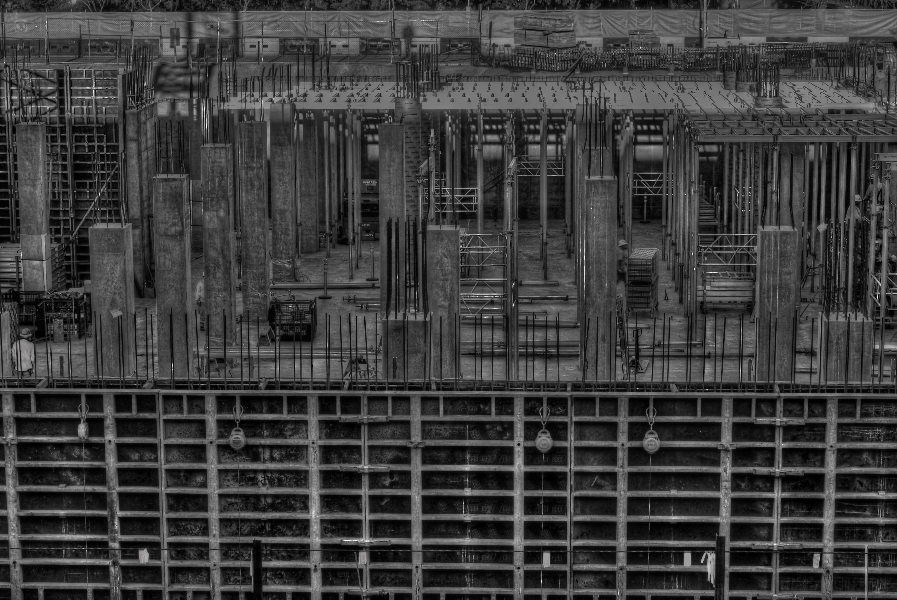
Hideous or wondrous, depending on how you see it. A deliberately “over-cooked” HDR from three exposures, all taken at f/11 for maximum detail, and ISO 100 with a 50mm prime lens.
Still, some stories are told in capture and others are revealed in processing, and while photography is interpretation as well as mere recording, I like to take a crack at changing the context of a picture, to make its parts add up to something drastically different. A few years ago, the parking garage near my job looked out at a massive construction project. My parking slot was situated such that I was about three floors up in the air, peering through the open wall of the garage to easily take in a panoramic view of the entire length of the new building’s emerging structure. I soon got into the habit of getting to work about fifteen minutes early so I could hop out and snap whatever activity I could catch.
The finished building eventually smoothed into something acceptably serviceable, if bland, but, with its raw skeleton mounting day by day, an immense feeling of grim, awful power was climbing out of that place. It couldn’t be seen in color, especially not in the benign, golden light of early morning. This thing was appearing to my eye as a sinewy, dark life force, inevitable, dreadful……an impression I would have to achieve through a complete reworking of tone and texture. I decided to use High Dynamic Range processing, not to merely rescue detail lost in highly contrasted nooks, but to intensify every grain, granule and hobnail of the building, to render it in a surreal, slightly hellish aspect. To make it “ugly” on purpose…..or, more exactly, to my purpose.
Playing at changing the emotional feel of a picture isn’t native to me, so I am always grateful when this part of my brain rouses from sleep and demands to be exercised. The persistent (and false) notion of photography since its inception is that it shows the world as it is, a lie which is debunked with every willful act of picture-taking. No less than painting, the photo image is both document and statement, truth and distortion.
It never has to settle for being mere reality, nor could it claim to be.
And that is its seductive pull.
