INVISIBLE BLIGHT
By MICHAEL PERKINS
CLEAR BACK IN THE LATE 1940’s, ARCHITECT FRANK LLOYD WRIGHT began correspondence with various agencies and even president Harry Truman to protest the construction of an array of massive electrical towers proposed for the open desert directly opposite his seasonal headquarters at Taliesin West in Scottsdale, Arizona. He was furious at the idea of the pristine view out the front door of his architectural academy being polluted with the sight of the metal monsters, and proposed that the power lines connecting them be buried underground. Wrong century for fighting the westward advance of American infrastructure. The towers were built and Wright reversed the entrance to his retreat, architecturally turning his back on the ugly sight.
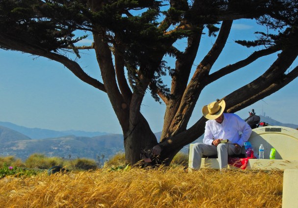
Skip forward three-fourths of a century later and views all over the world are still blocked and blighted with the hideous snarl of wires and relays from the 1900’s. It is the kind of visual garbage that, as regular citizens and especially as photographers, we have all learned to not see, rather like looking through a windshield that is so coated with spatters and bug guts that our lacerated eyes simply focus through it all. Moving from Wright’s bailiwick in Scottsdale to Ventura, California nearly two years ago, I found myself with a stunning view out my apartment terrace of the Topatopa mountain range which, like many peaks along the central coast of the state, rises up rapidly from the nearby Pacific shoreline, going from warm sands to snow-capped peaks of well over 7,000 feet in height within just a few miles. It is the kind of view that begs to be captured in a camera, one of nature’s photographic freebies.

Except.
Except that, to my amazement, while composing the shot, I was astonished by the degree to which I simply did not notice that any view of mountains would have to be through a maze of wires. More upsetting than the horrible clutter of the scene was realizing that I had simply become accustomed, over far too many years, to just not seeing them at all. I once heard a Nikon ambassador say that one of his students could have been on an ocean liner, hundreds of miles from land, and still manage to get wires into her pictures. Now, I was that person, instead of the champion of intentional vision that I had convinced myself I was. Given the gorgeous sight of snow across the top of the Topatopas the other day, I’m still glad I took the shot, although it now goes, along with many other near misses, into the Good Idea, But file. In my youth, I held put the hope that that file would shrink somewhat as I grew old and wise in my photographic pursuits. But, as it turns out, the mountain of mastery is always there, day after day, and just as dauntingly tall, no matter how many times you loop around the race track. And learning to look for what you’ve taught yourself not to see, the invisible blight, is part of that daily ascent.
RETURN TRIP
By MICHAEL PERKINS
“HEY!!!”
A very young, high and urgent voice from nowhere in particular.
“COME BACK HERE!!!”
Who come back where? Oh, wait, the sound seems to be coming from straight ahead, but I can’t see…
Oh, there’s something….
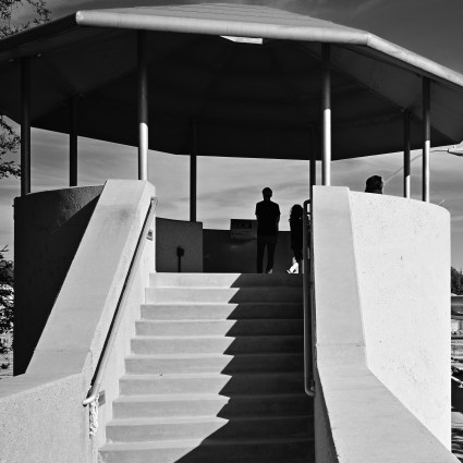
A small blur with a blue tail on it streaking off to left, followed, an instant later, by a small boy, emerging from the front entrance of a coffee bar that occupies the corner parcel of a retrofitted apartment building in downtown Ventura, California. The blur is, in fact, his dog, and the blue tail is his leash, and boy, is he bulleting out of the joint, heading down the street at Tireless Puppy Speed, pursued by his young master. Me, I’m shooting architecture in the neighborhood at the moment, which is why I find myself directly opposite the java joint, armed with a camera, but too slow to actually catch Fido’s escape. However, I have faith that I will soon get another bite at the apple.
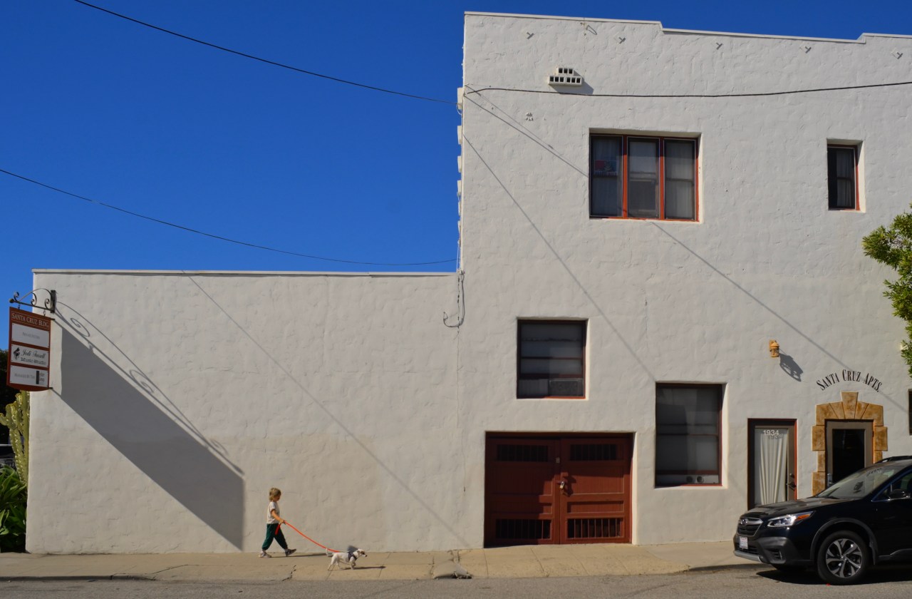
And so I do, as Young Master catches up with the little one within half a block and proceeds to march him back to the coffee shop entrance, giving me a chance to squeeze off a series of shots of the two framed against the incredible blue of the SoCal sky and the lumpy off-white of the long adobe building. It’s a great time of day for long shadows, as witness the shade cast by the wall-mounted sign, but I wait to get the boy clear of that to keep the shot simple; just two small figures against the broad, empty canvas of the building. Young Master is moving at a fairly slow space, giving me the luxury of planning a bit. Frame number three is the one. I have been largely taking pot luck with the other shots of the morning, but this one opportunity redeems all the meh results from the session. That’s the way street work happens; on its own terms, with little notice and just a quick clue that something worth having might be on the way.
Like Tireless Puppy, you just need to sense when a door is opening, and be ready to run.
ALL OR NEARLY ALL
By MICHAEL PERKINS
A COMMON MISTAKE AMONG CAMERA-TOTING NEWBIE BIRDWATCHERS (a very distinct subset among photographers at large) is to regard their outings as either Successes or Failures, as if they were hunting for deer, or trying to land a ten-pound bass. That is, either I ‘came back with something’, or the morning was a waste of time. Of course, it’s disappointing when either no birds show, or the ones that do show can’t be persuaded to jump into your camera. I have even heard some photogs say that, unless they actually managed to capture an image of a particular breed or species, it doesn’t, for them, really exist. Such people are bound not only to be horribly bad birders; they are also likely to be failed photographers.
To be out in the world in search of a particular thing is to deliberately narrow your concept of what’s “worth shooting”, and it’s counter-productive to why you should be out in the first place; to develop and exercise your eye. Certainly, there will be days when the winged ones seem to be deliberately thwarting you, but who said that they must be the only thing you train your camera on while you’re out anyway? In short, if the birds ain’t happening, what else is? If you’re not trying to answer that question, then your shooting experience will be pass/fail, completely binary. It’s as if you went to a state fair and said you were only going to shoot the hot dog stands. Using that logic, a quartet of naked aerialists juggling flaming chainsaws might pass by you while you held out for a shot of a wiener on a stick. Short-sighted?
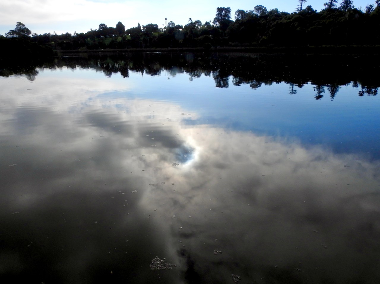
Some of the things that redeem many of my birding outings have nothing to do with what I couldn’t find and everything to do with what else was available in the moment. Birdwatching is really about observation, and so, being already in that state of mind, why wouldn’t you also be equally fascinated with whatever else comes to hand? Yesterday I shot over 100 frames, most of them failed attempts at capturing winged subjects that were just having none of it. As birding is usually communal, this left me with a lot of time to fill, since the others in my pack were having better luck or were simply more skilled. As they scored on the feathered column of their scorecards, I shot environmental impressions of a pond we were scouting. It wasn’t what I came for, but I was glad I didn’t write off the entire morning as a “miss”. Photographers obviously stumble upon many naturally amazing scenes that are, if you will, “ready-to-eat”, but remaining open to the less obvious is even more important than a quick win. That’s where your growth comes from. A bird in the hand….
SIDE HUSTLE
By MICHAEL PERKINS
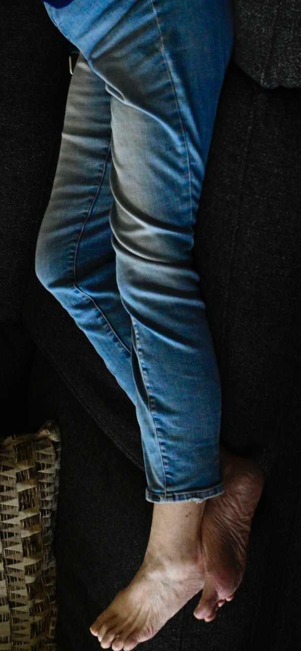
SHOULD I OUT-LIVE MY WIFE (don’t even want to go there, mentally), I have toyed with the idea of changing her epitaph to read, “DON’T TAKE MY PICTURE!”, as it is already miles ahead of any other utterance in terms of her signature phrases. I married a woman whose attitude toward being captured by a camera is on par with every other female in my family. I don’t know if this is down to false modesty (the real message being “PLEASE take my picture”?) or a raging epidemic of insecurity complexes. Bottom line; to catch Marian, I almost always need to catch her unawares.
Jacy At The Rexall, 2026
A recent Saturday afternoon catnap seemed just the vehicle. No posing, no prep, no re-takes, just, boom, this is what she looks like, and I’ll hear no backtalk, thank you. I managed several frames, and was content that I would be the only purveyor of the results, as is many times the case. But the angle and sprawl of her long legs (best in the business) on the living room couch seemed to suggest something very different for the fate of the picture.
With her upper torso completely cropped out and the rest of her upended vertically, her legs and bare feet seemed to suggest something far more sensuous. Here was a woman relaxed in her skin, casual about her appeal, confident in her power to disrupt and attract attention. Thus, “Standing Marian”, in my mind’s eye, now recalled the easy allure of the character of Jacy Farrow, the small-town boy-torturer portrayed by Cybill Shepherd in The Last Picture Show. I could see her standing near the local drug store’s romance magazine, sipping on a bottle of Orange Nehi, all while the local lounge lizards hoped she would glance their way. Just once.
Often the initial purpose we envision for a picture turns out to be just a first draft. There seems to be an assertive energy about some images, such that they will themselves into their final form. If we listen well, we often reap surprises, in that the photo makes us look smarter than we really are. Creatively, it gives you a leg up.
Sorry.
THE LAND OF NO EXCUSES
By MICHAEL PERKINS
THE TIME IS FAST APPROACHING where most of the photographers in the world will have no personal memory of just how much technical skill once needed to be applied just to obtain a usable photograph. We are already a full generation removed from a world in which film had to be purchased, loaded, exposed, unloaded and processed before the results could be viewed. Also gone for most people is the careful budgeting of shots that had to be plotted so that snaps of a vacation could be captured within the span of 24 or 36 exposures, rather than the endless barrage of shots made typical in the digital age. And beyond all that lies an additional plethora of calculations, tools, aides, and attachments once enlisted in the great effort expended in making pictures look, well, effortless. These all speak not to the art but to the craft of photography, and, as they fade away for good, all we are left with is endless possibilities and greatly increased responsibility. Simply put, there is almost no excuse for making a bad image.
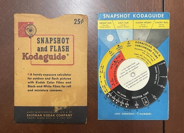
The little wonder you see here was produced by Eastman Kodak Company for generations, and was always tucked into my father’s shirt pocket for quick consultation before triggering the shutter. For shooters of his generation, taking a shot meant first solving a math problem. Composition and inspiration came in second or third after just being able to hack the science of it all. Many cameras had basic instructions for use or loading inscribed inside their covers, and every roll of film was accompanied by a flier on how to correctly expose that particular emulsion. The aforementioned Kodak also kept HOW TO MAKE GOOD PICTURES, its basic primer on photo techniques, in print for nearly sixty years. And then you also factor in the efforts of the true purists, those who chose to process their own film. The point is, the apparatus involved in being able to take the uncertainty out of photography is largely gone, with more responsive “serious” cameras and mobiles virtually guaranteeing a workable result every single time.
So why are there still so many awful, bland, uninteresting, insanely misconceived photos? Well, it could be because there is still a real limit to what cameras can do. Granted, they are better than ever at anticipating what we need in a given situation and trying to supply it. They are also incredible at protecting us against our own limited skills. But they cannot think. Or feel. Or, to be very hippy-dippy, dream. The best photographers are, in fact, dreamers, and it was not so long ago that our dreams were thwarted, or at least compromised, by our need to “master” the camera, to tame it as one might a wild stallion. Now, we no longer have to fight our gear to a draw. The craft aspect is largely gone. The art part remains. And that’s on us.
THE BOYS ON THE BEACH
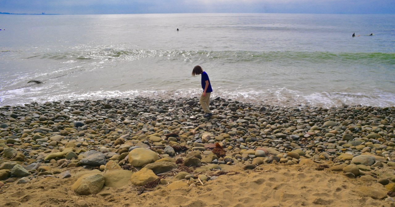
By MICHAEL PERKINS
ONCE THEY ENTER THEIR TEEN YEARS, many young folk enter a very exclusive photographic club, whose rules dictate that, while they will suddenly become withdrawn or sullen if an adult tries to snap their picture, there is no limit to their enthusiasm for posing ad nauseam for their contemporaries. If their bff points a phone at them, out comes the goofiness and ease. Let a parent make the same move, however, and an iron curtain of blank expressions descends.
I used to think it was just me, since, during my own kids’ adolescence, the questions I received most from the three of them, at the first appearance of a camera, were “really, Dad?” or “again the with camera” or both together. My own children were born too early to come of age in the “always on” era of cel snappers, but they definitely gave their pals a wider berth than myself when it came to striking a pose or showing me their “real face”. Turns out, blood or no blood, they all do it. I mean, I am annoying when armed with a camera, but that’s beside the point.
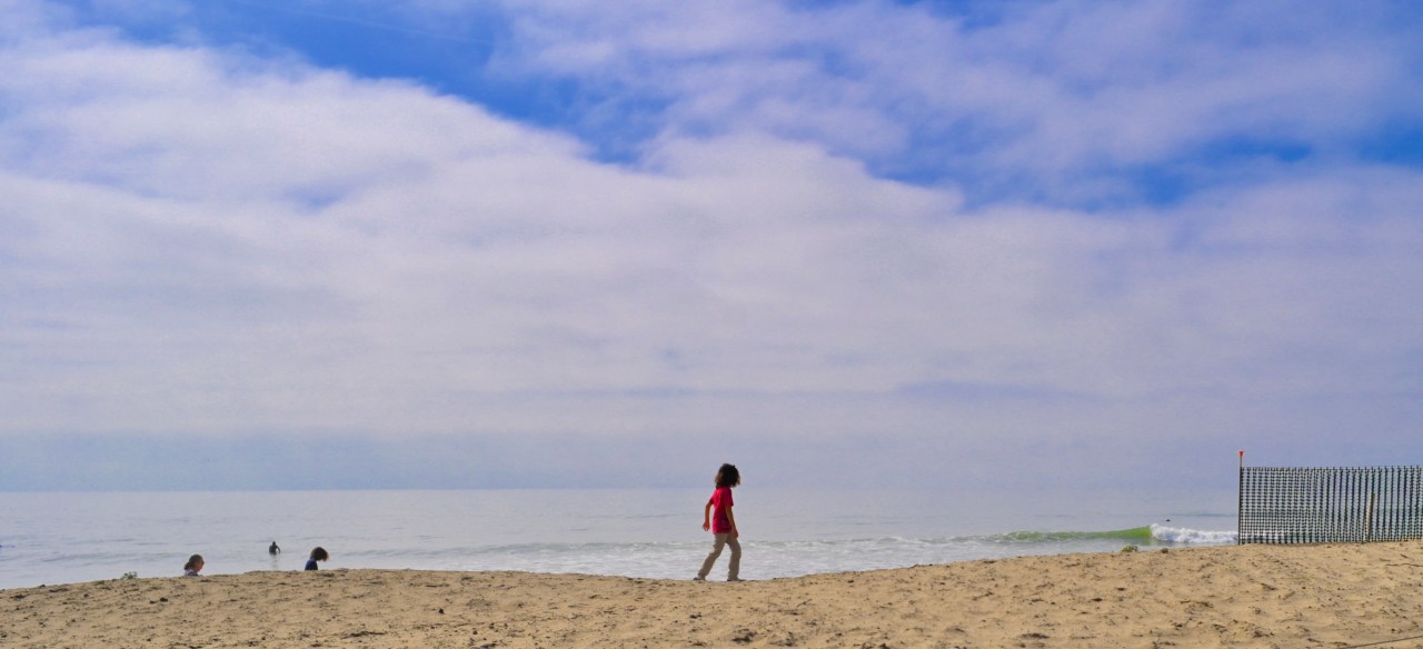
My wife’s grandsons have now entered the corridor of time in which she has to enact the will of Congress to get them to sit for portraits, suffused with coolness as they are. As the default chronicler for their lives since Day One, I still make the effort, but I work twice as hard rendering them, well, mere components within a composition, as you see here. Getting them to “act natural” when they are enjoying a day at the beach is, well, no day at the beach, and so I merely absorb them into their surroundings, as you see here. And, it’s no concern whether they will like seeing themselves this way, since neither one of them will show any interest in even seeing the results until they reach, say thirty. To get them to care that I even took the picture I would have to be thirteen, female, and cute. I mean, I’m fairly well-preserved, but everyone has their limits.
AN AUDIENCE OF ONE
By MICHAEL PERKINS
YEARS BACK, MY FATHER, TAKING NOTE OF MY OBSESSIVELY FASTIDIOUS MANNER OF WATCHING MOVIES, i.e., free of interaction with my fellow audience members, remarked that, in a perfect world, I would have my own private projection room, watching films in perfectly controlled environments as a fussy, controlling audience of one. Unfortunately, that dream film-critic scenario never presented itself.
Until this year.
Turns out, if you want to share a movie with a minimal number of people, go see a sixty-year-old French art film in the middle of a weekday afternoon. We’re talking guaranteed crowd control here. Marian and I had driven from Ventura, California to a quaint cinema high in the hills above Santa Barbara, hardly the venue to catch Godzilla XXXIV: The Final Reckoning or any other cinematic Hoover designed to suck in the public by the millions. Upon taking our seats, it soon became obvious that we would have the entire house to ourselves, a true rarity. Additionally, ahead of the curtain time, the theatre was not pumping a firehose of advertisements and idiotic on-screen trivia quizzes into the room, but, instead, bathing us in pure, wonderful silence.
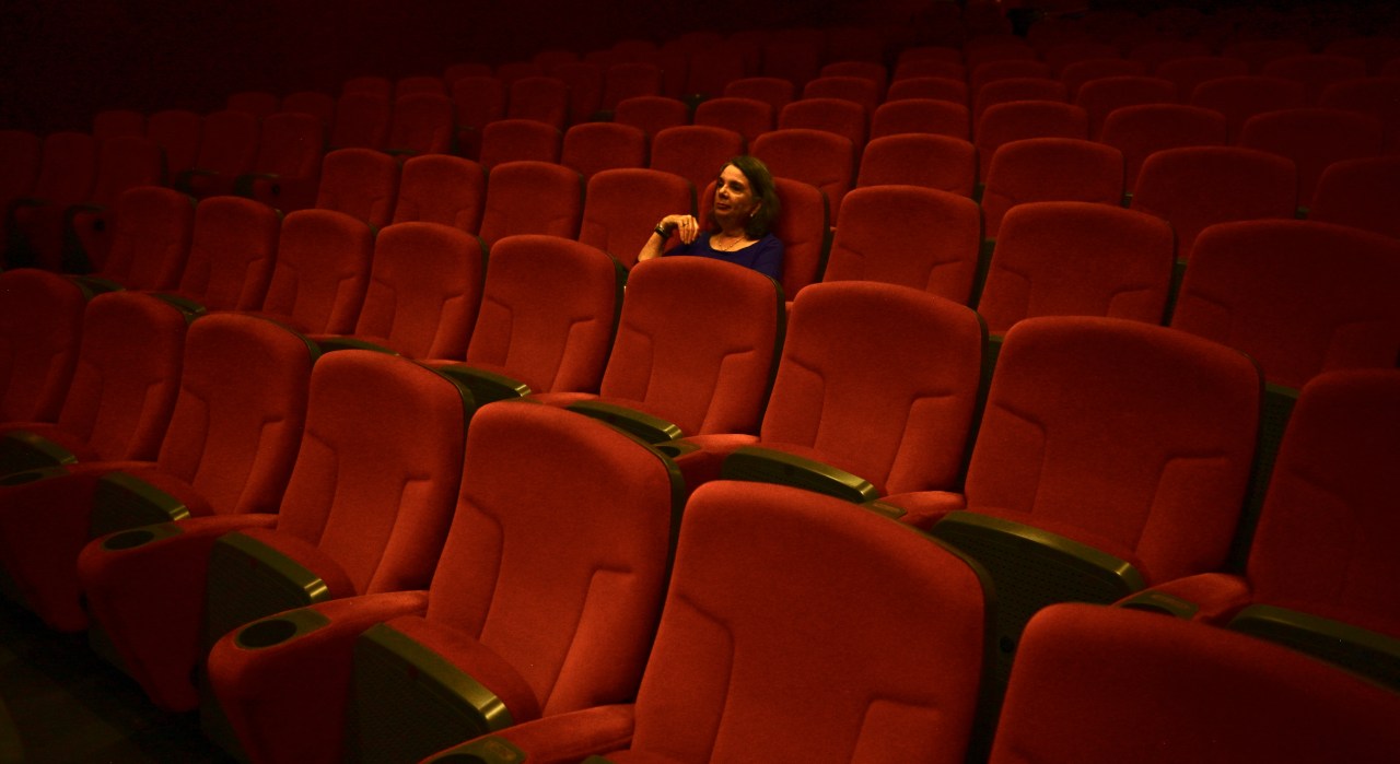
It didn’t take long for me to realize that, there, at that moment, I could take a picture of Marian that would be impossible in 99% such cases. There was that face in the middle of a sea of muted red. The image would compose itself! Three frames and I was happy enough with the Edward Hopper-ish result to sit back down and dig the quiet. I knew I’d stolen something precious out of the darkness.
Fifteen minutes later, a few other people drifted in (the film had a French plot, meaning no plot, so it really didn’t matter when they arrived) and the moment was gone. But I had at least obeyed my instinct and had the great fortune to make a record of it. That is the heart and soul of making a good picture, and I’ll sit through someone else’s lousy one, anyday, to make that happen.
THE WONDER OF THE WALKABOUT

By MICHAEL PERKINS
I AM ASTOUNDED BY PHOTOGRAPHERS WHO UNERRINGLY APPREHEND the essentials of the ideal framing for a composition. And, believe me, they are out there; artists whose eye immediately fixes on the ideal way to launch a narrative in a static shot. The legendary Henri Cartier-Bresson was one. He reputedly kept his camera hanging around his chest until the very instant he was ready to make a shot, whereupon he lifted his Leica to his eye, and snap, one flawlessly framed image after another. The photo editor’s dreaded wax pencil never defaced his images in search of crop lines or a way to trim away fat to make HCB’s pictures communicate more effectively. There was no “fat”. The editor was already looking upon perfection.
For me, composition is more typically trial and error, and so my favorite subjects are things that will more or less remain in place long enough for me to literally walk around them in search of their “good side”. or the angle that best serves the visual story I’m after. Street photography offers up some opportunities for such focused study, but, in that real-time environment, the stories are often morphing too quickly, and one has to trust to instinct to nail that one second of eloquence, since a follow-up or re-take may not present itself. But, when I can, I try to be slow, deliberate. To do things with purpose and on purpose.
Digital, and the luxury of nearly endless numbers of exposures with immediate feedback, has been a life saver for me in a way that film, God bless its little analog heart, never was. This instantaneous concept-to-result cycle has saved many an image for me, since I am granted the ability to make a lot of wrong pictures very quickly, thus arriving at the right picture with more efficiency. The gentleman seen here in two frames was very accommodating in ignoring me, allowing me to squeeze off perhaps fifteen shots as I walked from his rear left side to his rear right side. Along the way, the scenery and props rose and fell as focal points, subtly changing the message of the photographs. Were I expert enough to follow Cartier-Bresson’s example, the image just just above might have been my goal, but, as I dwell among mere mortals in Photo-Land, I find myself by getting lost a bit. I go on walkabout.
WALK BETWEEN THE RAINDROPS
By MICHAEL PERKINS
THERE ARE PICTURES, AND THEN THERE ARE PICTURES OF PICTURES, and then…
At this point in the history of photography, we have probably made almost as many images of other people’s images as we have made original photographs of our own. We cop a shot of a great painting; we snap a souvenir of a stunning statue; and then, there are those other kinds of “pictures of pictures”; those that are actually also of the surrounding spaces around and between them, as seen in galleries or museums. And while it may seem odd to think of light fixtures, benches, or visitors as part of the same composition as an art exhibit enshrined in those spaces, I find it an exciting challenge to take in entire rooms….paintings, furnishings and all, as a single piece, almost like a stage set.
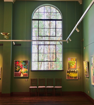
Well, let’s face it; galleries are stages, and their look is set or designed so that every element in it enhances all the others. This means organizing both active and empty space as a continuum, and it means thinking dynamically about the role of those spaces where “nothing” seems to be happening. Open areas give the works room to breathe; the eye can then, in the words of Steely Dan, “walk between the raindrops”.
In the above shot of an art gallery in Santa Paula, California, what was once just one of many tall, arched windows in an old bank building becomes, under the careful curatorial eye, a centerpiece of the frame, affording a view of the outside world which both reflects and amplifies the beauty of the framed art. Everything works together, and yet nothing collides or occludes. Visually, there is space for all of it to happen, on equal terms with itself.
Is that zen? Is it feng shui? Is it just the fever dream of your humble author? Who knows and who cares? The paintings, designed to be seen on their own terms, can also be viewed within a context that caresses them, completes them in a way. And I’ll make a photograph of that any day of the week.
OUT OF ONE, MANY

By MICHAEL PERKINS
SOME PHOTOGRAPHIC SUBJECTS ARE SO DENSE that they simply give the eye too much to decode or prioritize. When in the act of shooting immense or complicated compositions, I often fail to see that I am taking in enough information for two or more completely different images, and that wielding the scissors this way or that can drastically re-direct the intention of the picture. This is perhaps why shooting vast landscapes only works occasionally for me as wholes. I see the mountains and the neighboring farmlands and the barns and the babbling brook and am never certain if, in a single frame, I’m actually creating more confusion than clarity.

One recent example of my not being aware of this, at least not in the moment, happened last year as I stepped inside St. Patrick’s cathedral in midtown Manhattan. This massive space was devised in a time when going to church was a sensory experience that was designed to be overwhelming, to inspire awe, where even the cheap seats afforded complex, competing vistas. In taking a rapid series of snaps, however, I came away with a feeling of sensory overload, with many images containing more than enough information to be cropped by half, or even two thirds.

The original frame, seen up top, sends my eye looking into so many sub-stories at once that a general view is, well, too much of a good thing. A left-handed crop (middle image) make the picture about something, as attention is now centered on the beautifully ornate pulpit. Cropping to the right, we see a story that could be about worshippers on a journey; that is, heading from front to back in search of something, perhaps the devotional altar in the distance. All cropping is, of course, a creative act all its own, with its own dictates and designs, and sometimes a very busy image can be stunning (think a complex overhead skylight of concentric stained glass panels). However, many of the big canvasses we shoot could be, if you will, subdivided into even more effective individual parts rather than one stunning whole. Reviewing our old so-called “very good” pictures can often find a “wow” picture hiding within.
AS LOUD AS A WHISPER
By MICHAEL PERKINS
THE GRAPHIC ARTIST CHARLEY HARPER was dead and buried some twenty years or more before his balletic interpretations of the natural world were “discovered”, even though, during his lifetime, his commercial work was published in the world’s most popular magazines and generations of school kids viewed the illustrations he created for their nature and science books. What happened to make Charley a newly “found” treasure was twofold: first, over a lifetime, he steadily streamlined and simplified his style to convey animals, insects and the elements in fewer and fewer lines, constantly learning how to put an idea across without excess ornamentation; and secondly, and perhaps equally important, his audience, which had always accepted Charley’s eye as a natural way of seeing the world, came to realize just how difficult it was for him to make it all look so effortless.
Photography, never a final product but a lifetime process, works the same way. The first versions of our visions can be cluttered, busy, an audition for attention (or “likes”, if you prefer) as the artist struggles for acceptance. We tend to throw everything into the soup. We initially regard words like “minimalism” with suspicion, as if the work done under that term is somehow incomplete. However, if we are lucky, we come to see mere compiling of detail as occasionally unnecessary for the task at hand, which is to convey an idea.
I don’t always have the discipline to shoot with the bare essentials in mind. I defer to sharpness; I become fixated not with the bridge but with the billion bolts holding the bridge together. Pulling stuff out, doing more with less, is never instinctual to me. If I were a small child making a drawing of a sunset, such as the one seen here, I would likely make it about simple shapes, basic colors and a direct message. Unfortunately, I grew into an adult and started gilding the lily. In terms of writing, same same. This blog tends to bloat in its first drafts, whereas the posts I re-write the most somehow become shorter and clearer. In viewing our images, especially those from earlier versions of ourselves, it’s worth asking whether we could have upped our impact by turning down the distractions.
Sometimes we use our cameras to shout. Sometimes, a whisper will suffice. Charley Harper knew that he was in a partnership, a conversation, with his audience. He was thus free to use his simplified style as an opening remark, waiting for others to jump in and supply the rest of the thought. When we conform that kind of relationship with our photographs, connections with our viewers become truer.
Stronger.
360 DEGREES OF SPECULATION
By MICHAEL PERKINS
A good photograph is knowing where to stand.

ANSEL ADAMS MAY WELL HAVE HAD HIS TONGUE FIRMLY IN HIS CHEEK when he made that famous remark, given that he devoted his life to all of the technical mastery of photography that lay well beyond the mere skill of composition. However, many of us following in his footsteps adopted the sentence as Holy Writ, governing our very sense of how to capture a scene, based on where you choose to see it from.
One of the reasons I love to work in museums so much is that the quiet and measured pace of reality within their walls. It makes even the most fevered brain hit the brakes, slowing our roll to the point where tiny things that might not reveal themselves out on the street spring up out of the shadows and whispers. This serves me well when trying to deal with a ton of brand new visual information, and, in turn, trying to answer the question “what do we make of this?”
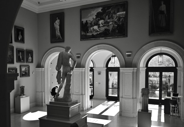
The three shots you see here, all of the entrance foyer to the Santa Barbara Museum of Art, were taken over the space of an hour and a half, under slightly different lighting conditions and with a slight variance in exposure and color strategy. Each one presents an opportunity for a narrative, but trying to select a so-called “best” shot among them is really irrelevant. What’s important is that slowing my process, taking time to digest the subject matter, resulted in several distinctly different takes on the same scene. That means options, choices, and a kind of photography that is the polar opposite of a snapshot.

Of course, some pictures do actually spring fully-born out of the moment, and they need to be respected for the miracles that they are. Other images build slowly. You turn your airplane around and take one more pass over the field, and then another, and another. It’s that fear that “I may not really have it yet” that makes it likelier that you eventually will get it, or at least get something deliberate, something considered. Going for just one more take is particularly valuable when you’re shooting something that has been shot to death, like an international landmark. Nailing the expected postcard shot can be gratified, but it’s always valuable to hear Uncle Ansel’s voice in your head, and asking yourself if there’s a better, different place to stand.
PRODUCTION FOR (RE) USE
By MICHAEL PERKINS
PHOTOGRAPHERS TOGGLE BETWEEN TWO APPROACHES TO SUBJECTS, two very distinctive ways of justifying something’s place in a picture. The first, which almost exclusively defined the first age of the young art, was largely about documentation, creating the first visual chronicle of human experience. This surge of reportage resulted in a huge spike in tourism and travel in the 1800’s, immortalized in the billions of post cards and stereo views that “covered” the entire world. We mapped the globe to give everyone their first look at what was going on in the lives of everyone else, with magic lantern presentations and illustrated lectures on the pyramids, the Parthenon, a real, live Indian elephant. We catalogued.
The other approach to subject matter is far more abstract and interpretive. We mechanically capture an object in the same way, but we gentle massage composition, light and lenses to suggest all of the things that it might be, not merely what it is in nature. In this kind of picture-making, we ask the viewer to suspend their instinctual judgement of what they’re looking at and share in the shooter’s idea of all the things that it suggests. In such a situation, to know what a subject actually was designed to be, or do, is actually rather, well, dull, compared to what the mind, freeing itself, will allow it to become. If I were to open up a discussion, for example, on what the true use of the structure shown in the above frame was, just given what’s shown in the image, I’d likely open up a pretty rangy chat, whereas, if I were to photograph the same thing in the context of its intended purpose, it would serve as a document, but not as a point of departure.
Both approaches to material, either the prosaic and the poetic, can make for compelling photographs. As is usually the case, the photog sets the terms of engagement, and decides what kind of conversation he wants to start.
*********
( Note: THE NORMAL EYE is an archive of every article posted on this blog over its first twelve years. To search for posts from any month or year clear back to 2012, just scroll to the very bottom of any page and click on “Post Timeline”. )
THE YEAR OF THE “GO” PILE
By MICHAEL PERKINS
THIS SPRING SAW THE CURTAIN RUNG DOWN ON OUR LIVES IN PHOENIX, ARIZONA. Marian had stuck it out in the Valley Of The Sun for thirty-three years; I put in twenty-five. We were both, as the young say, “over it” for some time prior to our move to California, but we had to wait until all the planets and stars lined up along with our retirement options to give us an escape window. What made the final phase of this strange was that, after decades of dreaming about The Final Day, we found the end-stage events leading up to it to be traveling at light speed. At the end of a looooong stretch of “wait”, we were fired out of a big “now” cannon.
I didn’t chronicle the entire project. On most days. there was simply too much to do in too short a span of time to stop to pick up a camera. We had about three furious weeks to finalize our new lease in Ventura, sort 3,000 square feet of earthly goods into a take-with pile comprising about half that space, hire and direct the efforts of an estate sale agent, get the surviving stuff packed and trucked westward, re-carpet the entire empty house, meet our transferred junk on the other end, and supervise the sale of the house through phone, fax and email. As I say, not a lot of time for snaps.

The scene here is something of a mish-mosh, in that it’s an early study of what-goes-what-stays, done before any final decisions for any of it were made. Hence, I can pick out objects, here and there, that we actually brought with us, some that went to estate sale, some that had yet to be ruled on, and a few things we thought we could sell that eventually went to charity. The reason this photo recently bobbed back up into my consciousness was because Marian and I are presently in the “did we leave that behind, or did we pack it?” phase, which looks as if it will go on for the next immediate….millennium. There were other photos made during the madness, including many tabletop commemorations of school and art projects by her two children going back over thirty-some years. Every museum isn’t a house, but every house is a museum. I could sum this all up by saying something philosophical about how little you can live with once you make a few tough calls, but I don’t want to congratulate myself too much while I am still occasionally opening boxes filled with “why the hell did I bring this…..?”
SNEAKING WITHOUT SPOOKING
By MICHAEL PERKINS

No zoom on hand, and yet I see a potential story happening at the center of a very wide frame. Take the shot anyway? Abso-photo-lutely.
THERE IS A DELICATE BALANCE TO STREET PHOTOGRAPHY, which is really spywork of a kind. Just as wildlife shooters tread carefully so as not to flush birds to flight or startle feeding fawns, street snappers must capture life “in the act” without inserting themselves into the scene or story. Quite simply, when it comes to capturing the real eddies and currents of everyday life, the most invisible we are, the better.
Part of the entire stealth trick is about making sure that we don’t interrupt the natural flow of activity in our subjects. If they sense our presence, their body language and behavior goes off in frequently unwanted directions. Undercover shooting being the aim, then, it’s worth mentioning that such work has been made immeasurably easier with cel phones, simply because they are so omnipresent that, ironically, they cease to be noticed. That, or perhaps the subjects regard them as less than “a real camera” or their user as less than threatening somehow. Who knows? The thing is, a certain kind of visible “gear presence” is bad for business. That said, telephotos can become attractive simply because, shooting from longer distances, they are easier to conceal. But is that the One Best Answer?

Same story, severely cropped, but with more than enough sharp detail to deliver the central idea.
To carry as little gear as possible as well as keep things simple, I mostly do “street” shots with a fixed wide-angle prime lens, meaning that I simply won’t have a telephoto as an option, nixing my ability to hang back from a great distance undetected. And yet I seldom feel handicapped in staying fairly far from my subject and just shooting a huge frame of what could be largely dispensable/ croppable information once I locate the narrative of the shot within it. In fact, shooting wide gives me the option to experiment later with a variety of crop-generated compositions, while shooting at smaller apertures like f/16 on a full-size sensor means that I will still have tons of resolution even if half of the shot gets pared away later.
Another consideration: besides being bulkier/easier to spot, telephotos have other downsides, such as loss of light with each succeeding f-stop of zoom, or having problems locking focus when fully extended. Your mileage may vary. The top shot here was taken with a 28mm prime. about a hundred feet away from the water’s edge, but the cropped version below still has plenty of clean, clear information in it, and it was shot at half the equipment weight and twice the operational ease. These things are all extraordinarily subjective, but on those occasions when I come out with a simpler, smaller lens, I don’t often feel as if I’ll be missing anything. For me, the first commandment of photography is “always be shooting”, or, more specifically, “always take the shot.”, which means that the best camera (or lens) is still the one you have with you.
AIR THROUGH A REED
By MICHAEL PERKINS
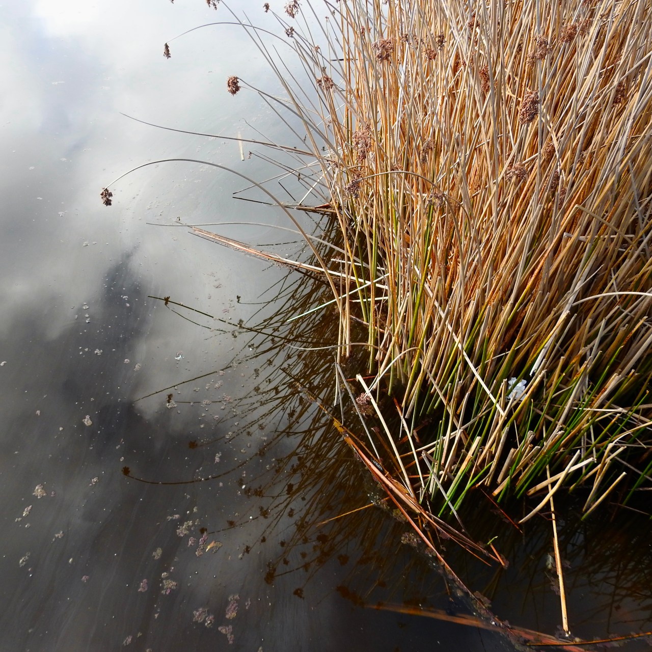
MERE HOURS AFTER MY NINETY-FOUR-YEAR-OLD FATHER and I shared a recent conversation on the creative process, I found myself staring at the computer screen in amazement. Both Dad and I have been photographers, musicians and writers over our lifetimes, and we have long marveled over the miracle of creation, and how it tends to happens not by us, but through us. The old metaphor of air whistling through a hollow reed to make music is not lost on us. We know that, when the muse is on us to any serious degree, it, not us, is in charge. And so, looking through my day’s shots a little after our conversation, I could not fail to be struck when I finally got around to reviewing this image:

I took this with about three seconds of forethought. The light, the color, the spareness of the composition, all coalesced very quickly, as did my belief that the entire inspiration had been my own. Following my talk with Dad, however, it struck me as merely my re-channeling of things I already “knew” from the work of other photographers, things that were operating on me far beyond the limits of mere influence. And, in looking at this random shot of a food truck at sunset, I searched my memory for what I believed to be the true genesis of the appeal of the shot. It didn’t take long.
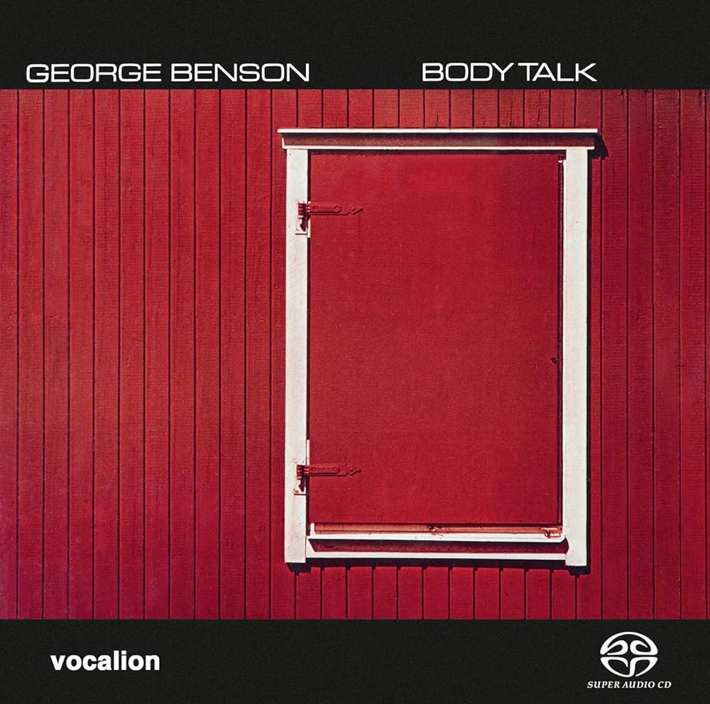
Pete Turner (1934-2017) was not, for the most part, a photographer who was commissioned to create album covers from scratch. In fact, many images from his existing body of work were often chosen by art directors at various record labels who just liked the pictures for their own sake. His photographs were not, then, “about” the featured artist or album title: they were just, as photographs, purely themselves. His cover here, for the George Benson album Body Talk, is typical, and, like many of the other covers I owned by him, it stunned me in its simplicity and directness. Years later (last week), I was not trying to “copy” Pete, nor create an homage to this shot; it simply bubbled up in some form in a way that was both unwilled and uncontrollable.
Photographers who fret too much about establishing their own “style” need not be dismayed when fragments of other artists come to the surface in their own work. No one can undertake the creative process without someone else’s hand on their shoulder. The trick is to celebrate what perhaps someone else has celebrated before you. The fact that you weren’t the first to enjoy smelling a rose does not make it smell less sweet. Let the air flow through you, and sing.
COMFORT
By MICHAEL PERKINS
Home is the place where, when you have to go there, they have to take you in.—Robert Frost
PHOTOGRAPHY IS ABOUT BOTH SUBSTANCE AND SYMBOLS, about showing things in their most minute detail, and, alternatively, also about suggesting volumes with simple arrangements of light and shadow. I began my professional life as a writer struggling to fully explain the world, documenting everything from mountains to grains of sand with meticulous accuracy. It was exhausting, and I imagine that it exhausted whatever readers I had at the time as well. Over the decades, I became comfortable with talking less and saying more, especially when it came to the important things like Love, Truth, Knowledge, even the creative act itself. That evolution had the principal effect of streamlining my writing, but it also simplified my approach to photography. I don’t always express the important ideas of life in the simplest terms, but the effort is there.
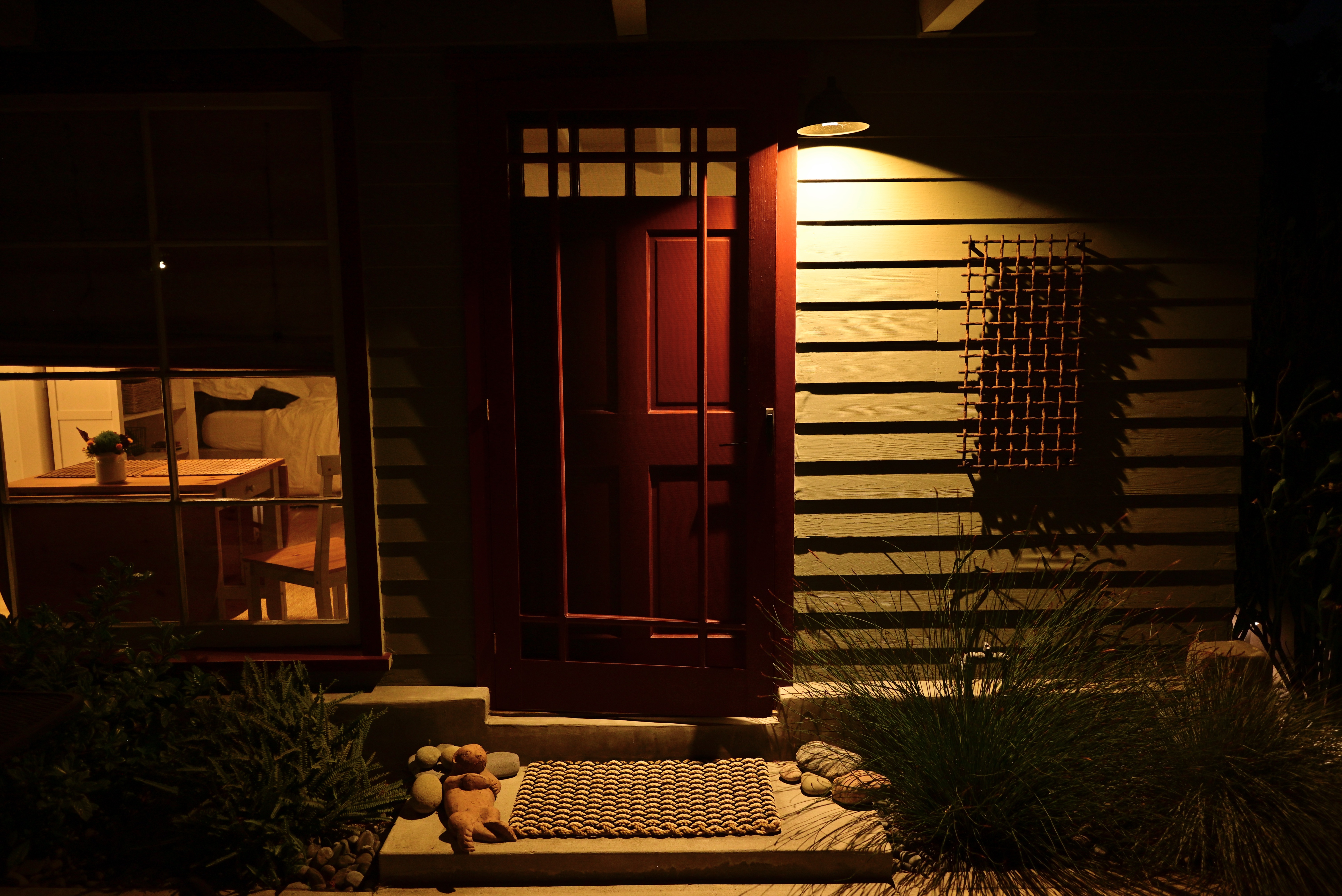
When it comes to a concept like “home”, I really try to take all the thicker poetic, philosophic and emotional implications of the term and reduce it to the simplest visual symbols I can muster. Buildings instead of the people within them. Stark compositions of color and shade, with an emphasis on under-exposure whenever possible. A muting of the decorative clutter that complicate the impact of a home, with a focus on doors, windows, paths. Strong rectangles and triangles. Lighting that hints at things instead of spelling them out.
As I say, I still waver from a simplicity that, by now, should be an article of faith. Sometimes I use the camera to blurt out a paragraph when a half-sentence will do. In this image, which is not of my own house but a casita I was renting on vacation, I am trying to convey the idea of what the psychologist Christopher Lasch called a haven in a heartless world, or Frost’s concept of a place where “they have to take you in.” The interlocking rectangles and squares, the warm red of the door flanked by the yellowish porch light, the amber tones through the window, and the simple straw welcome mat all combined to form a kind of comfort food for my eye, and I made the picture very quickly. This is not the way to think of “home” merely a way. But it is in finding our own truest ways that we make our truest images. And, more and more, mine run truer when I manage, in small ways, to speak smaller, not bigger.
THE DEVIL’S IN…
BY MICHAEL PERKINS
TOO MUCH OF NOTHING, AND VICE VERSA
By MICHAEL PERKINS
IT WOULD BE FAIR TO ASSUME THAT MOST DEFINITIONS OF PHOTOGRAPHIC COMPOSITION refer to the total arrangement of space between objects, as well as the selection of what goes into, or stays out of, the frame. This can include objects like furniture or people, even intangibles like weather, but, for the most part, what we mean when we say a shot is well composed means that the final assignment of things within the frame is either balanced or busy, correctly directing the eye to things that are compelling and steering it away from items that are extraneous. The word “composition”, then, tends to be, primarily, a thing-based term.
I would argue, however, that the consideration of value and tone is every bit as vital a consideration as where the scenery is placed. Certainly the photographer must make solid calls on where a tree or a mountain or a left-right parameter figures in a shot, but key decisions in the use of color, contrast or overall exposure are also a kind of composing. In sound terms, for example, the sheer inventory of items in a photographic frame is roughly akin to the notes on a piece of sheet music the composer decides what the total number of notes will be on the page, and whether that arrangement is sparse or dense. However, the art of “composing” requires a second dimension; the values assigned to said notes, from near-silence to fortissimo; the rests; the attacks; even what orchestrators call “color”. The same thing holds true in a photograph.
Once I have agreed what the dispersal of, let’s say, the props within a shot is to be, I still have to direct the eye in terms of how it will weigh the importance of those items in relation to each other. In the case of the above image, the choice of monochrome and a relatively high-key exposure attempts to do that. This in turn leads to other decision: for example, is the texture of every single brick important here? The grain of the stucco buildings in the background? Do I need to adjust shadows so that more information is revealed within them? In other words, the picture’s composition is affected by every choice made in its making, not merely what makes it into the frame from top to bottom or left to right. Even without cropping, I can “de-select” certain visual data, or give clues as to its relative importance. That all just goes to whatever singular formula it takes to make a picture “work.” Bob Dylan wrote of the maddening power of a life defined by “too much of nothing”, but, without either changing “something” in a picture to “nothing”, or vice versa, we are, in effect, saying that all things in the frame are equal, and, artistically speaking, we know that just isn’t true.
HOW LITTLE IS TOO MUCH?
By MICHAEL PERKINS
ROGER PRICE, THE CO-CREATOR OF MAD LIBS, the most popular party game on earth, was, ahead of all those famously incomplete one-page narratives, the best-selling cartoonist behind a slim volume entitled Droodles, a series of simple scribbles whose economy of line was the “set-up” of a joke, the punch line being supplied by the accompanying comic captions. The fun was in trying to decide what the picture was “about” before Price supplied the answer. One of his best is seen above, named Ship Arriving Too Late To Save A Drowning Witch. You get the idea.
Price inadvertently (or was it advertently?) demonstrated a skill essential for truly communicative photography, a talent I call Knowing What To Throw Out. It’s been my experience that, absent a few geniuses, most of us shoot too much. Not in the number of exposures we click off, but in the overload of visual information that we allow to remain in the final product. Recomposing and amplifying such shots with the most fundamental of tools, mere cropping, is an exercise in learning the answer to a nagging and constant question; in a picture, how little is too much?

In my case, one of the most revelatory exercises in reviewing old photo files is discovering that many frames I had initially written off as “failed” actually contained smaller sections within the overall image that would be perfectly strong if a major portion of the original were to hit the cutting room floor. Sometimes, of course, this method only reveals that, sharp, ruthless knife or no, there’s really no strong story in the picture at all, no matter how you slice it or pare it down. So it goes.

In the master shot of this multi-textured house, several strong structural elements have potential. The stucco, tile, wrought iron, masonry, fabric, wood, and glass all collide in a building that, overall, has a certain visual appeal. But, in cropping, we find that the closest intersection of all of these elements is where the compositional set point actually occurs. All the shot’s other visual information serves as nothing more than a distraction, since we really don’t need the entire structure to convey the idea of “house”. The various textures work best when they actively compete for attention, and a tight crop shows every flavor of a charming edifice with no fat and no fillers. As in Price’s cartoon, we don’t need to show the entire ocean around the rescue ship, or convey all of the back two-thirds of the vessel. Nor do we need to show the entire drowning witch; the hat is enough.
“Doing more with less” is such a hackneyed phrase that you can get shame arthritis in your fingers just typing it on the page. But pore over some of your own “almost” images sometime and see what happens. You may find that, imbedded within some of your most maddening misses, there lies a hit or two.
