TOO MUCH OF NOTHING, AND VICE VERSA
By MICHAEL PERKINS
IT WOULD BE FAIR TO ASSUME THAT MOST DEFINITIONS OF PHOTOGRAPHIC COMPOSITION refer to the total arrangement of space between objects, as well as the selection of what goes into, or stays out of, the frame. This can include objects like furniture or people, even intangibles like weather, but, for the most part, what we mean when we say a shot is well composed means that the final assignment of things within the frame is either balanced or busy, correctly directing the eye to things that are compelling and steering it away from items that are extraneous. The word “composition”, then, tends to be, primarily, a thing-based term.
I would argue, however, that the consideration of value and tone is every bit as vital a consideration as where the scenery is placed. Certainly the photographer must make solid calls on where a tree or a mountain or a left-right parameter figures in a shot, but key decisions in the use of color, contrast or overall exposure are also a kind of composing. In sound terms, for example, the sheer inventory of items in a photographic frame is roughly akin to the notes on a piece of sheet music the composer decides what the total number of notes will be on the page, and whether that arrangement is sparse or dense. However, the art of “composing” requires a second dimension; the values assigned to said notes, from near-silence to fortissimo; the rests; the attacks; even what orchestrators call “color”. The same thing holds true in a photograph.
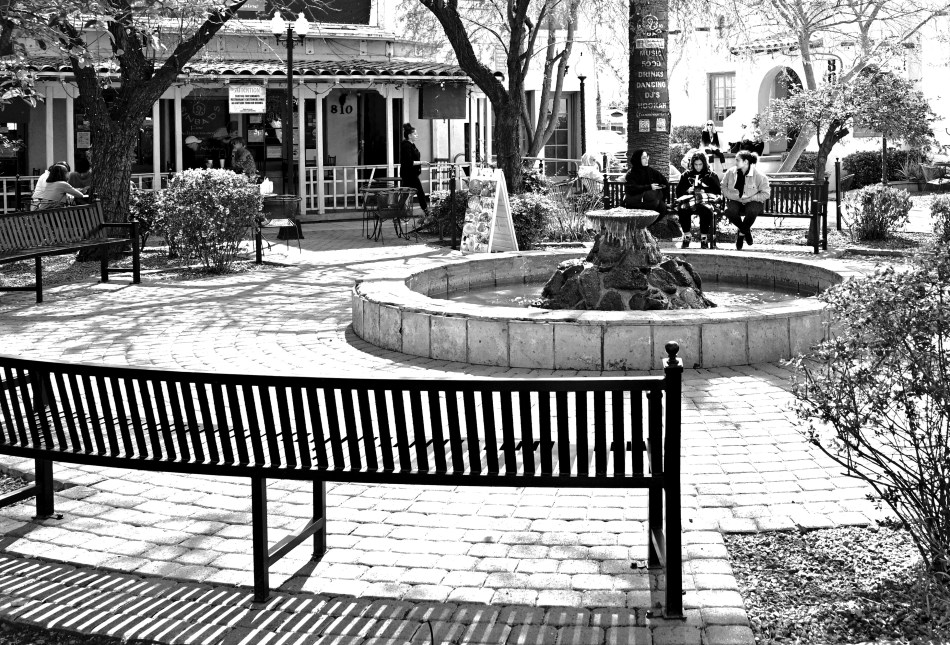
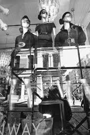
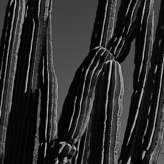
Once I have agreed what the dispersal of, let’s say, the props within a shot is to be, I still have to direct the eye in terms of how it will weigh the importance of those items in relation to each other. In the case of the above image, the choice of monochrome and a relatively high-key exposure attempts to do that. This in turn leads to other decision: for example, is the texture of every single brick important here? The grain of the stucco buildings in the background? Do I need to adjust shadows so that more information is revealed within them? In other words, the picture’s composition is affected by every choice made in its making, not merely what makes it into the frame from top to bottom or left to right. Even without cropping, I can “de-select” certain visual data, or give clues as to its relative importance. That all just goes to whatever singular formula it takes to make a picture “work.” Bob Dylan wrote of the maddening power of a life defined by “too much of nothing”, but, without either changing “something” in a picture to “nothing”, or vice versa, we are, in effect, saying that all things in the frame are equal, and, artistically speaking, we know that just isn’t true.
POP GOES THE CONTRAST
By MICHAEL PERKINS
NIGHT CITYSCAPES PRESENT TREMENDOUS OPPORTUNITIES to me these days, especially with the technical advances of recent years. Many shots that required tripods or lengthy exposures just a short while ago are now possible as handheld snaps. Great improvements in the balanced exposure performance and color rendering of digital sensors, along with smoother resolution, even at higher ISO settings, have tamed the “black ‘n’ blurry” curse of night images that haunted much of my earlier work. Even so, I still employ a few old-school tricks to further improve my odds, as I try to impart a greater sense of depth, or “space” in pictures jammed with competing information.
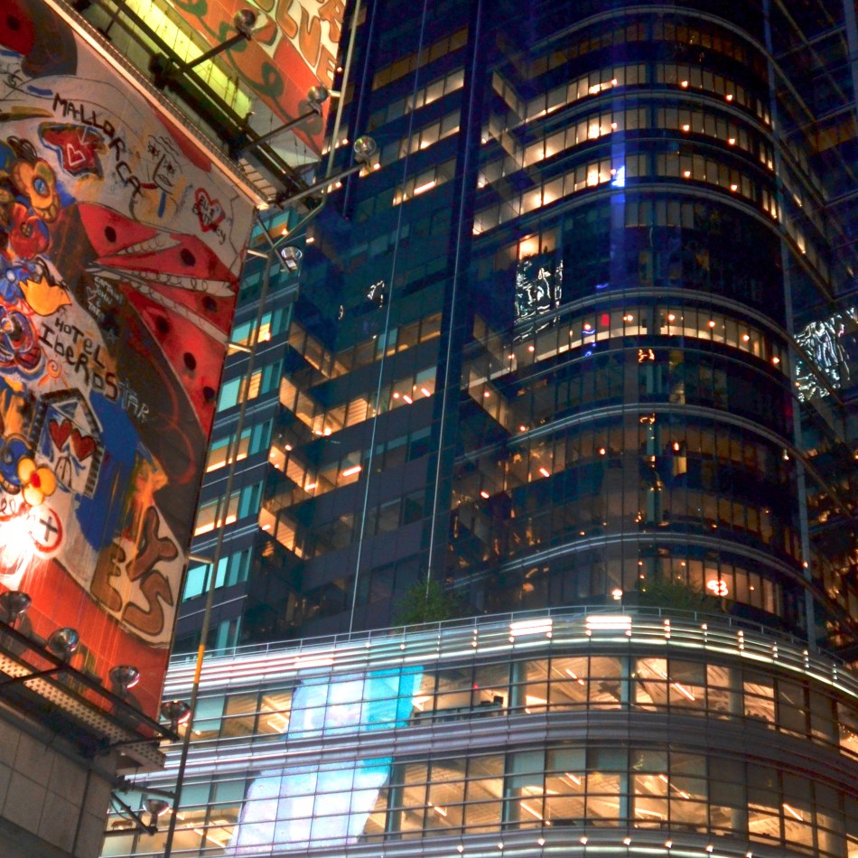
Glasscade, 2019
Conveying a dimensional look in the dense mashup of buildings of a big city can be tricky. I could certainly decide to avoid the problem completely, deliberately going for a flatter effect with the use of a zoom lens (a look I don’t really like). If, however, I do want parts of the photograph to “pop” in reference to others, there are a few things to try. Shooting foregrounds and backgrounds with boldly divergent color schemes and textures, as I was able to do in this image, can help the various layers of the image to stand out in clear relief from each other. Experimenting with depth of field can also diminish the focus of one plane and make the other call more loudly for the eye’s attention. Additionally, foreground objects (like the immense billboard at left) can be partially cropped out (as seen here) so that they only narrowly enter the edges of the shot, operating as a kind of partial frame around the main subject.
Shooting on the fly in night cityscapes can still be tricky for me. Take bright downtowns areas, like, say the bright-as-eff, blitzkrieg of light in Time Square, which falls off to nearly nothing within the space of a single city block because distant structures are used less at night, creating a contrast nightmare. Newer cameras are better at capturing detail in the shadows, or at least enough of it to be retrieved in post-production, but the real challenge is taking the time to plan a shot when (a) technology frequently rewards us for even an imperfectly executed image and (b) the overall stimulus level of the city tends to make us shoot more and shoot faster, rather than slowly and purposefully. As always, your best shots are balanced on a knife’s-edge between impulse and deliberation.
SHAPER #1
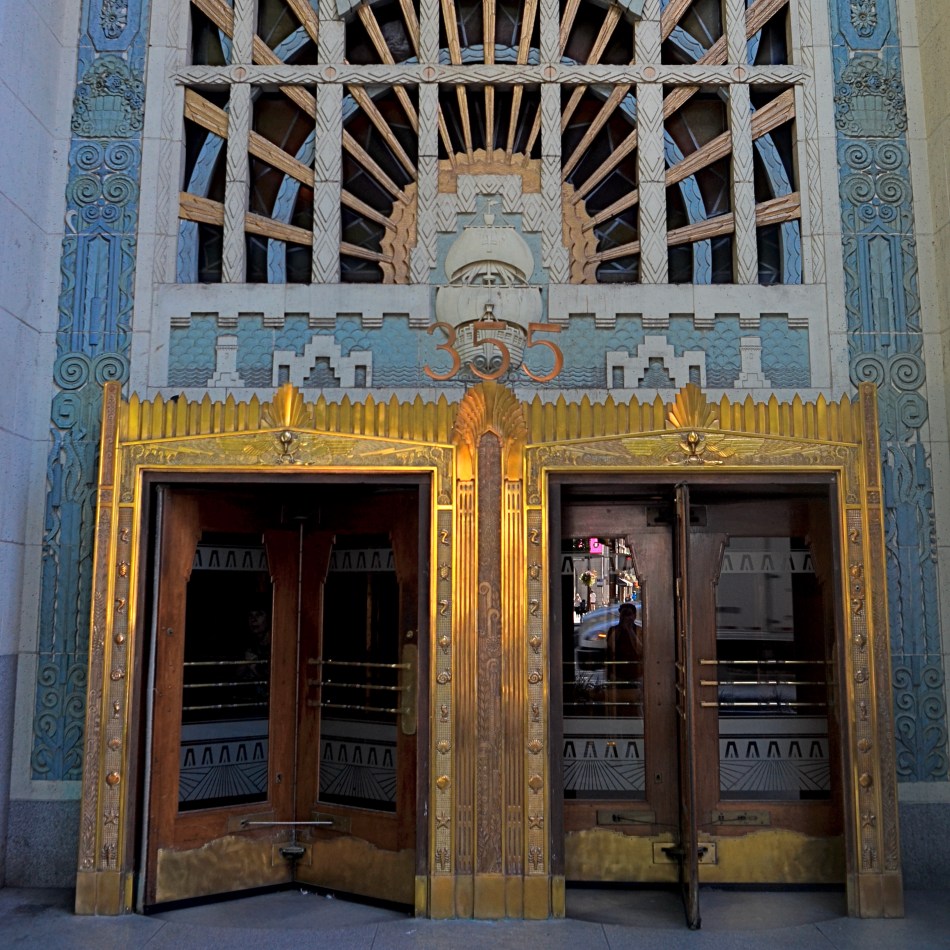
By MICHAEL PERKINS
THE WORD “PHOTOGRAPHY” OFTEN SUGGESTS THE IDEA OF MERELY RECORDING SOMETHING, of using a machine to arrest time in its flight and imprison it forever. That, to me suggests a very passive act, that of merely opening the shutter and harvesting whatever comes along, much in the way one might cast a fishing net. You might haul in a marlin, but you will also snag the occasional boot.
So, for me, the term photography is often misinterpreted, as if the shooter has little choice in the process, a concept I absolutely reject. The word itself basically translates as “writing with light”, and, in that interpretation, the act of making a picture is an active one, with light not merely being a component but the prime determinant, Shaper #1 in that process. George Eastman himself said it first, and best:
Light makes photography. Embrace light. Admire it. Love it. But above all, know light. Know it for all you are worth, and you will know the key to photography.
So now, we have an art form, because, in this mindset, one can begin with accidents and end up with mastery, merely by using light purposefully and with a kind of earnest literacy.
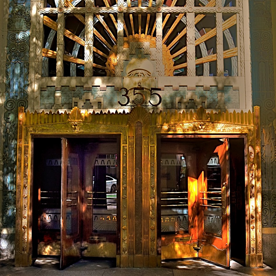
The first thing the study of light teaches is how fleeting its effects are. Many people who have shot the Grand Canyon have experienced the incredible minute-to-minute changes in the gorge as shadows shift, dance and crawl across the terrain. Many others, working in the transient light of shifting weather patterns, or the sudden remapping of illumination at sunrise or sunset, know the importance of getting the shot the very moment it presents itself, all delays changing your results measurably, even drastically.
These two images of Vancouver’s glorious Marine building, one of the most amazing examples of Art Deco in North America, were taken just twenty-nine minutes apart from each other. The earlier shot, taken at about 10:45 in the morning, presents the elaborate entrance with a kind of even, flat value, while the second shot is a crazy quilt of a million tiny bounces and reflections, as well as a dramatic increase in contrast. I was merely lucky in being able to get two very different impressions of the same building, even though a clearer knowledge of the local light conditions in the area might have allowed me to create two greatly more nuanced pictures. As it is, I got an object lesson on how to do things better the next time, and clear illustration that Eastman was right. Know the light, Shaper #1 in a picture, for all you are worth, and you have the biggest riddle solved.
REALITY 2.0
By MICHAEL PERKINS
EVEN THOSE OF US WHO HAVE BEEN UNDER QUARANTINE FOR A VERY BRIEF TIME have learned how quickly our concept of “reality” becomes almost abstract. The immediate and local evidence of our senses, our measure of the smaller environments we currently inhabit, become the measure of all actuality, with everything else in the outside world growing less and less concrete. We imagine what the battlefields of the disease look like: we speculate about how much of the greater world has been warped or scarred beyond recognition. But our view of what lies beyond our own four walls can quickly become like a dream. Or a nightmare.
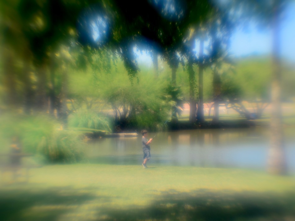
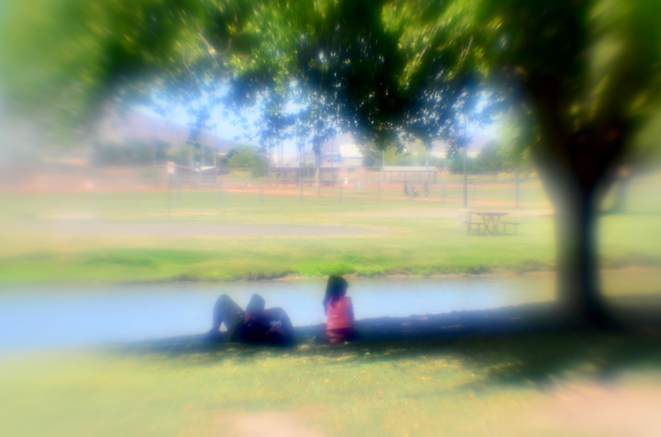
That’s why, even with a fairly regular resurfacing for errants or exercise, the photographer in me can look at things that were formerly almost invisible with new eyes. The formerly commonplace becomes the extraordinary. And because nothing is quite as it was, we are drawn to drastically update our approach to the everyday. In the case of this week’s trip to a local park, I was immediately struck by how normal everything, and everybody, looked. I almost expect the landscape beyond the house to resemble the bombed-out streets of London, during the blitz, and when it looks like, for example, just a park full of people walking, biking, or playing, it’s even more jarring than if the whole thing looked destroyed. I wanted to try to photographically render that feeling of unreality, of being in a dream state.
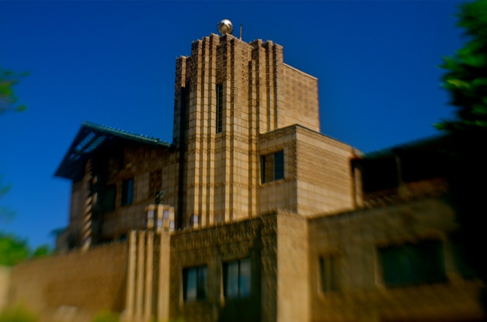
I decided to try to shoot these, for lack of a better word, “real” scenes in an unreal fashion, using a Lensbaby Single Glass Optic shot wide open at f/2. Now, with any lens, this huge aperture means a very shallow depth of field, but this particular piece of glass adds its own artifacts. It’s a bit of a time machine, a throwback to the way lenses used to operate for everyone. It’s uncoated, for one thing, meaning that the usual factory treatment that now helps lenses avoid color fringes and flaring are deliberately left off, allowing these “mistakes” to be captured rather than prevented. The lens’ incredible softness is actually a fairly focused image beneath a thick overlay of glow, or what we used to call the “Vaseline” effect. This gauzy look is most pronounced at the edges but adds a very warm look to the entire frame. The pictures made with such a lens are also very high in contrast, with everything registering as either a high or deep, deep color. Details are sacrificed in favor of a hallucinatory, painterly result. And then there’s exposure. Here in sun-abundant Arizona, I had to shoot very fast, almost 1/4000 sec.
Finally, there was a distinctly personal reason for making these pictures in this way, as there always is for any photographer. We try to craft the re-creation of a world we “see”, whether that world is a hopeful or horrible one. And so these pictures represent an article of faith. In the face of the millions of images we are currently seeing of loss, horror, and fear from all around the world, we must remind each other that sacrifice, honor, and, yes, an occasional moment of fun are also “part of the world.” Call it Reality 2.0.
The beta version.
PALLBEARING FOR HDR
By MICHAEL PERKINS
MANY OF THE TECHNOLOGICAL ADVANCES IN PHOTOGRAPHY, over the centuries, have been made as specific remedies to the limits of either cameras or recording media. Lenses and films were made faster, sharper, or more accurate because photographers were thwarted by the cramped parameters of the media. Such a cycle of malady-and-cure creates temporary and manic convulsions, fads if you like, along with solid, permanent improvements. Sometimes, as in the case of the now declining technique known as High Dynamic Range, or HDR, it’s easy to confuse a quick fix for a permanent one.
To review, HDR was an attempt to compensate for the limited range of light recorded by first-generation digital sensors, which effectively “read” extreme highlights or shadows, but were spotty in the mid-ranges, delivering only a portion of what the eye could detect. The solution was to take a bracket of anywhere from three to seven frames over a wide exposure range (grab your tripod, kids), then blend them, via software, to more consistently even out all values for a “balanced” or “natural” view. The other side-benefit of the process was a drastic amplification in detail.
HDR was immediately praised as having helped the photographer hurdle the last remaining barrier between the camera and real life. It quickly muscled its way into everything from amateur landscapes to commercial real estate, conferring prophet (profit?) status on authors like Trey Radcliffe, who soared to best-selling fame with books brimming with hyperbolic color and iridescent textures, every hobnail and brick in his goth HDR cathedrals registering the same, loud detail.
And that sameness, eventually, became the problem. Every part of every picture was now shouting. In the hands of many, HDR did not make images evenly modest: it made them uniformly garish. Too many HDR pictures were overripe, overcooked, as if the world were awash in day-glo gravy. Worse, the technique couldn’t work with live subjects or hand-held shots. Worse yet, in-camera HDR simulators in DSLRs and phone apps were virtually useless. Finally, if you actually liked photographing, you know, actual people, HDR made human flesh look like wet liver inside a tanning booth.
In the end, the problem HDR was created to address actually resolved itself, with second-gen camera sensors finally performing better along a wider range of light, delivering more even exposures right out of the camera. More importantly, photographers fell back in love with shadow, understatement, and mystery, satisfied that you don’t have to show everything to see everything. So, rest in peace, HDR. There now are better ways to keep it real.
EDITING WITH LIGHT
By MICHAEL PERKINS
THE ETERNAL TUG OF WAR IN PHOTOGRAPHY SEEMS TO BE the pull between extremes of revelation and concealment. Toggling between the strategies of showing almost everything and showing nearly nothing, most shooters arrive at some negotiated mid-point which describes their own voice as a visual narrator. Shuttling between the two extremes, shooters have to decide how much information is appropriate not only for their overall style, but in each specific shooting situation.
Managing light in the moment, rather than trying to re-balance values after the picture is made, affords the most crucial control you will ever exercise over your subject. We tend, as beginners, to shoot things where there is “enough light”, growing ever more discriminating about the kind of light we prefer as we mature in our approach.
One of the most fruitful exercises for me has been those rare occasions in which I have had the luxury to remain in one area over a span of several hours, discovering the nuanced variations that prevail from minute to minute in a single setting. Many times, I have begun this process with an initial concept of the “ideal” lighting for a shot, then, through comparison, rejected that in favor of a completely different strategy. It’s strangely thrilling to come home completely satisfied with an image, even though it’s the dead opposite of the way you originally conceived it.
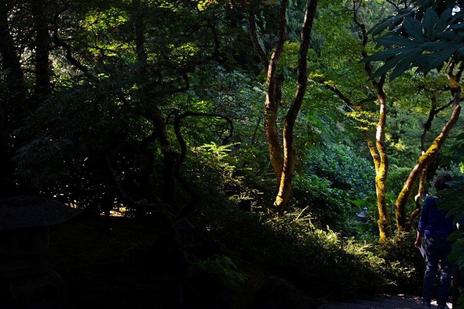
Waiting for the right light may be more time-consuming, but it is the cheapest, easiest, and surest way to control composition. If one particular lighting situation reveals too much in the shot, diluting the impact of your visual message, waiting for shadows to deepen and for bright spots to shift can make your photograph urge the eye more effectively toward the center of your “argument”. In the image seen above, I could not have sold the idea of a gradual walk from high left to lower right without the light actually working as a kind of directional arrow. A fully lit forest might have been lovely, and was, in fact, available to me just an hour earlier. But by the late afternoon, however, the partial dark helped me edit excess information out of the shot, and, in comparing the two approaches, I like the “less” version better.
Part of getting the shot you want is often learning to see, and edit out, the parts you don’t want, a process which is better when you wait for the “best”, rather than the “correct” light for right here, right now.
TWO-WAY GLASS
By MICHAEL PERKINS
IF THE EYES ARE THE WINDOW TO THE SOUL, then certain windows are an eye into contrasting worlds.
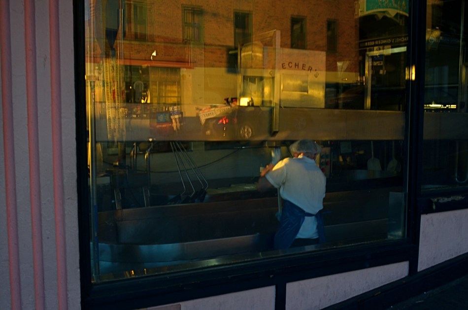
Photographers have devised a wide number of approaches when it comes to using windows as visual elements. Many choose to shoot through them with a minimum of glare, as if the glass were not there at all. Others use them as a kind of surreal jigsaw puzzle of reflected info-fragments.
To show these two approaches through the eyes of two great photographers, examine first Eugene Atget’s shots of 19th-century Paris storefronts, which mostly concentrated on shopkeeper’s wares and how they were arranged in display windows. Straightforward, simple. Then contrast Lee Friedlander’s 21st-century layered blendings of forward view and backward reflection (seen at left), which suspends the eye between two worlds, leaving the importance of all that mixed data to the viewer’s interpretation.
Much of my own window work falls into the latter category, as I enjoy seeing what’s inside, what’s outside, and what’s over my shoulder, all in the same shot. What’s happening behind the glass can be a bit voyeuristic, almost forbidden, as if we are not fully entitled to enter the reality on the other side of the window. But it’s interesting as well to use the glass surface as a mirror that places the shop in a full neighborhood context, that reminds you that life is flowing past that window, that the area is a living thing.
Thus, in an urban setting, every window is potentially two-way glass. Now, just because this technique serves some people as a narrative or commentary doesn’t make it a commandment. You have to use the language that speaks for you and to your viewer. Whatever kind of engagement serves that relationship best dictates how you should be shooting. I just personally find layered windows a fun sandbox to play in, as it takes the static quality away from a still photo to some degree, as if the image were imbued with at least the illusion of motion.
Sometimes it’s good to conceal more than reveal, and vice versa. The only “must”, for this or any other technique in photography, is to be totally mindful as you’re creating. Choose what you mean to do, and do it with your eyes fully open.
EQUATIONS
By MICHAEL PERKINS
EVERY CHANGE YOU MAKE IN THE CREATION OF A PHOTOGRAPHIC IMAGE also changes every other element of the picture.
You can’t alter a single element in a photo in isolation. Each decision you make is a separate gear, with its own distinctive teeth, and the way those teeth mesh with all the other gears in the photographic equation determines success in the final picture.
As an example, let’s look at sharpness, perhaps the big “desirable” in an image. The term sounds simple, but is, in fact determined by an entire raft of factors, among them:
A) Choice Of Lens. How uniform is the sharpness of your glass? Is it softer at the edges? Completely sharp at smaller apertures? Does it deliver amazing pictures at one setting while causing distortions or inaccuracies at another?
B) Aperture. The most basic predictor of sharpness, whether you scrimped or splurged on Item “A”.
C) Choice Of Autofocus Setting. Are you telling your camera to selectively sharpen a key object in an isolated part of your image, or asking it to provide uniform sharpness across the entire frame?
D) Anti-vibration. On some longer exposures (for example, on a tripod) this feature may actually be costing you sharpness. Protecting your shot against the hand-held shakes is good. Confusing a camera with active Anti-vibe on a stabilized shot may not work out as well.
E) Contrast. Some people believe that the sharpness of lines and textures is actually the viewable distance between light and darkness, that contrast is “sharpness”. Based on what you prefer, other big choices can be affected, such as the decision to shoot in color or black and white.
F) Stability. Deals with everything from how steady you grip a camera to what else besides yourself, from shutter triggering to SLR mirror shifting, can cause measurable vibration, and thus less sharpness.
G) Editing/Processing. This is where miracles occur. Sometimes. Other times, it’s where we try to slap lipstick on a pig.
We could go on, and so could you. And then consider that this quick checklist only deals with sharpness, just a single element, which, in turn, affects every other aspect of your pictures. Photography is a constant juggling act between technique, experience, experiment, and instinct. What you want to show in your images will dictate how much (or how well) you keep all those balls aloft.
A MATTER OF DEGREE
By MICHAEL PERKINS
NIGHT CREATES SUCH A DRASTICALLY DIFFERENT FLAVOR in anyone’s photography that some shooters, romantically attracted to its unique look, have made night-time their exclusive domain. Night is also the toughest time of day to render properly, and a zone wherein one’s interpretation of “reality” varies wildly. From the earliest days of the photographic medium, the hours after sunset were, first and foremost, a technical minefield, filled with pitfalls and perils.
Today, fast lenses and the higher ISO that can be dialed up pretty much at will mean fewer tripod shots, more hand-held shots, and thus a much bigger yield of often stunning night-time images. Even modest cameras are evolving so quickly that it’s getting hard to remember a time when we couldn’t shoot pretty much whatever we desired.
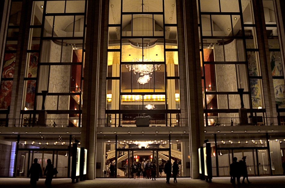
In many night settings, the contrast between bright and dark objects is dramatically multiplied. That means that getting proper exposure still has to be calculated based on widely varying elements within the frame. The night I took this image at New York’s Lincoln Center, I shot the various performance buildings on the “campus” in every compositional combination and setting possible, using a Nikon f/2.8 24mm prime lens. I framed the theatres at right angles to each other, by themselves, juxtaposed with neighboring skyscrapers, with and without the center’s fountain plaza, from medium distances to the lobby, tight distances to the lobby, and so on. In one “almost” calculation, I shot at f/8 and about 1/80 sec. at 1500 ISO, didn’t like how grungy it looked, then cranked the lens wide open to f/2.8, used as slow an exposure as I could execute hand-held (about 1/20 sec.), and backed off the ISO to about 400. That’s the combo you see above.
Normally, an aperture like f/2.8 produces a very shallow depth of field, which is generally bad for distant subjects. However, if you are focused to infinity, and your subject is, say, forty feet away, the image starts to get a little sharper at about twenty feet out, and is pretty sharp by forty. One sharpness caveat: if you use a slow exposure, as I chose to, and you’re also boosting your ISO, the electrical lights in your image will begin to go soft and globby fairly quickly…to “burn in” to some degree. You can see this in my image in the lobby chandelier, which registers as a velvety glow instead of a sharp grouping of individual bulbs. As an alternative, if you have time to experiment, you can amp up the up the ISO a little more, speed up your shutter, and perhaps render the lights a little sharper. This depends greatly on how many wives you have standing nearby, asking, “can we please just walk to the subway now?” It’s also not the only solution possible. Fiddle with it and see what works for you.
Also, if you are lucky enough to be shooting on a tripod, then you can shoot at minimal ISO, an aperture of f/11 or narrower, and as long an exposure as you desire. But the above guidelines are offered for someone shooting hand-held, and in a moderate hurry. I use very fast prime lenses to give me the sharpest focus and the most light latitude possible in the greatest number of situations, assuming that I won’t be allowed to mount a pod, even if I wanted to take one to the theatre (I don’t). So, as always, you have to decide a little ahead of time what you might be shooting, what the reality on the ground will be, and what you’ll need in the way of toys to bring home a goodie. Night is a very different animal, but trying to tame it is surprising and fun.
TONAL RECALL
By MICHAEL PERKINS
IF YOU WANT TO GET ALL MYSTICAL AND OOKY-SPOOKY ABOUT PHOTOGRAPHY, you can almost talk yourself into the idea that pictures kind of force their way past you on the way to their eventual best form. And, yes, I can hear your eyes rolling back in your head at the notion that an image is somehow destined to be created, that it emerges from your process almost despite you, like a rock that is pushed up through the earth by shifting tectonic plates. However, I have taken a handful of such pictures over a lifetime, as, no doubt, have you yourself, pictures that seemed to keep coming forth even beyond your first false steps until they reached their fullest expression.
Gee, is that incense I smell? Ommmmmm….
What I’m fumbling for here is a shared experience, and I do think that every photographer has had a semi-magical instance in which a photo almost taunts you to figure out how to make it work. Even in the best shots, there are moments of aching regret, maybe years down the path, that, had one or more things gone differently in the picture, it might have been eloquent or consequential. I truly believe that this very “so near, yet so far” quality is what keeps us in the hunt. After all, for the hunter, it’s the tiger he hasn’t been able to bag that calls louder than the ones already mounted over the mantel. So with photos. We are always singing the blues about the one that got away.
That’s why I’m a big believer in thinking of images as never really finished. They are, at best, preliminary studies for something else, picture that we still need to grow in order to complete. We lay them down, dissect them, re-shoot, re-imagine, and re-edit them. If you bend your thinking around, you can become comfortable with the fact that everything is a dress rehearsal for something that hasn’t arrived yet.
One of the starkest demonstrations of this fact is shots that were originally conceived as color images but which were later re-thought in monochrome. Nothing accentuates or streamlines your choices like shaving your tonal palette to the bare minimum. And, in the same vein, nothing makes you surer (or more unsure) about an image than reducing it to its simplest terms.
I think that, even as we are constantly expanding our arsenal of visual techniques, seeing them as growing, living things, so too we must think of our images as points on an evolutionary line, rather than final product.
DON’T MESS WITH MR. IN-BETWEEN
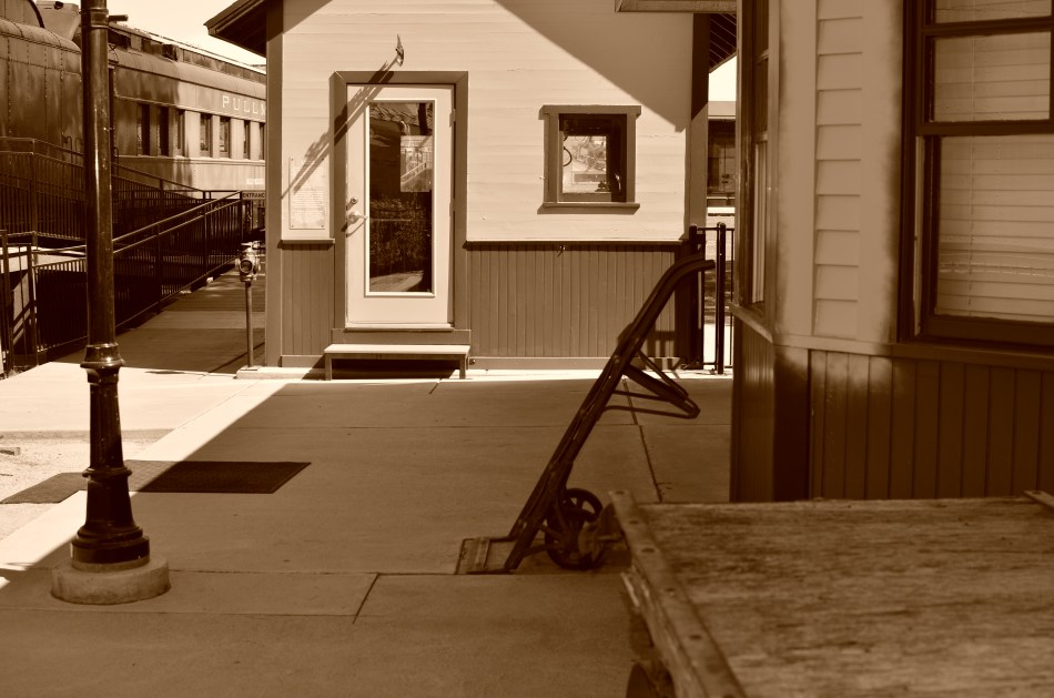
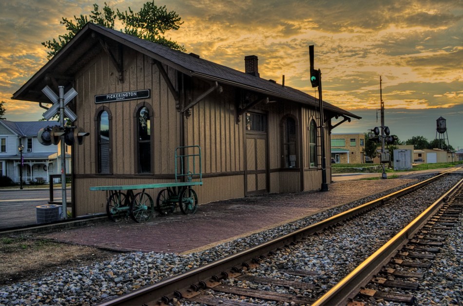
The light on this railroad depot was not as harsh or contrasty as seen here: I merely liked it better that way.
By MICHAEL PERKINS
PHOTOGRAPHY ALWAYS SEEMS TO BE ABOUT TWO THINGS THAT ARE POLAR OPPOSITES. On one hand, we have labored mightily for nearly two hundred years to make our little boxes reproduce as full a representation of the range of tone in nature as possible, to ape the eye to a clinical certainty. On the other hand, we love to distort that reality for specific purposes…..call it abstraction, minimalism, or your own favorite buzz word. We extol the natural look and revere the unnatural in nearly the same breath.
Originally, there wasn’t much in the way of attenuation between light and dark in photographs. Black was blackblackblack and white was whitewhitewhite (yes, I read a lot of e.e. cummings as a child). Better films eventually led to a greater variance in shades and nuances, and pioneering work by Uncle Ansel and other Big Saints produced exhaustive studies on precisely how many shades of grey could be delivered in a carefully crafted photograph. But even as we can now easily produce images with great variances in light and dark, some pictures are still served better by going back to clean, simple boundaries for values.
Hard, high-contrast blacks and whites are killers of texture but they are great modelers of dimension. A cube with stark differences between its light and dark sides takes on the more tangible feel of a solid object occupying space, and that extra degree of dimensionality helps in the success of certain compositions.
The above image was originally far more nuanced than the altered version you see here, but, as a very basic arrangement of shapes in space, I like the picture better without too much midrange value. It helps the faux nostalgia feel of the subject matter as well, even though it might be altogether wrong for a million other subjects. The unscientific answer is, you know it when you see it.
One thing is for sure. Even when we look for the ring of truth in our images, turn out that there’s more than one ring tone. Decide what you need for a specific image. Maximized selection of tools is the most single important part of making a picture.
RAZOR’S EDGE
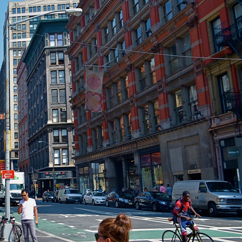
Sharpness should be achieved in your intial shot by use of contrast and color, not “dialed up” in post-editing. 1/160 sec., f/8, ISO 100, 22mm.
By MICHAEL PERKINS
THE AVAILABILITY OF PHOTO PROCESSING TOOLS, TO ARTIST AND BEGINNER ALIKE, in the digital era, has created a kind of unfortunate slingshot effect, as all suddenly achieved freedoms tend to. Once it became possible for Everyman to tweak images in a way that was once exclusively the province of the professional, there followed a trend toward twisting every dial in the tool box to, let’s be honest, rescue a lot of marginal shots. Raise your hand if you’ve ever tried to glam up a dud. Now raise your hand if you inadvertently made a bad picture worse by slathering on the tech goo.
Welcome to the phenomenon known as over-correction.
It’s human nature, really. Look at Hollywood. Suddenly freed from the confines of the old motion picture production code in the 1960’s, directors, understandably, took a few years to make up for decades of artistic construction by pumping out a nude scene and/or a gore fest in everything from romantic comedies to Pink Panther cartoons. Several seasons of adolescent X-rated frolics later, movies settled down to a new normal. The over-correction gave way to a more mature, even restrained style of film making.
Am I joining the ranks of anti-Photoshop trolls? Not exactly, but I am noting that, as we grow as photographers, we will put more energy into planning the best picture (all energy centered before the snap of the shutter), and less energy into “fixing it in post”. If you shoot long enough and work hard enough, that shift will just happen. More correctly designed in-camera images equals fewer pix that need to be dredged from Dudland.
Look at the simple idea of sharpening. That slithery slider is available to everyone, and we all race after it like a kid chasing the Good Humor truck. And yet, it is a wider range of color and contrast, which we can totally control in the picture-taking process, which will result in more natural sharpness than the Slider Of Joy can even dream of. As a matter of fact, test my argument with your own shots. Increase your control of contrast or color and see if it doesn’t help wean you off the sharpen tool. Or expose your shots more carefully in-camera rather than removing shadows and rolling off highlights later. Or any other experiment. Your goals, your homework.
The point being that more mindful picture-making will eliminate the need for many crutch-like editing tweaks after the fact. And if that also makes you a better shooter overall, isn’t that pretty much the quest?
FREEZING GOODBYE
By MICHAEL PERKINS
PHOTOGRAPHERS HAVE A CERTAIN LOVE FOR LIVING AT THE EXTREMES, in seeing how far we can stretch the limits of light, or at least our ability to harness it. It’s strange: we have plenty of the stuff available to us during the meat of the day, but it’s where night and day perform a kind of “changing of the guard” where we really like to go stealing those renegade rays of near-dark and almost-bright. We love to go trapping along the seams of light, chronicling the nether territory where night and day get spliced together.
Lately I seem to have been lucky enough to do what I call “chasing” light, standing in deep shadow as the last rays of gold fade just ahead of me. There’s an expectant quality to it, a preciousness. Suddenly it’s undeniable that something unique is dying, that another measure of our mortality is about to be checked off the list, to be irretrievably gone. It’s only the promise of another day that makes this bearable…that, and our small attempts to, if you will, freeze the goodbye.
The contrast between light and shadow at this time of day is profound, and it’s easy to either blow out the highlights or lose a ton of narrative detail in the darkness, or both. There is also incredible minute-to-minute change in the balance between dark and light, making every frame you take a kind of all-or-nothing proposition. Seconds after you’ve tried a picture, you’re actually now after a completely different picture, and so the wonderful shoot-adjust-reshoot cycle made possible by digital is an even more amazing tool.
There are amazing opportunities for image-making in both pure day and pure night. But treat yourself to the nether world between the two, and freeze a goodbye or two, if you can.
It’s wondrous out here on the borderline.
DOCUMENTARY OR DRAMA?
By MICHAEL PERKINS
I RECENTLY HEARD AN INTERESTING CRITIQUE OF A DRAMATIC CONTENDER for Best Film in the 2015 Oscar race. The critic in question complained that the film in question (Boyhood) was too realistic, too inclusive of banal, everyday events, and thus devoid of the dynamics that storytellers use to create entertainment. His bottom line: give us reality, sure, but, as the Brits say, with the boring bits left out.
If you’re a photographer, this argument rings resoundingly true. Shooters regularly choose between the factual documentation of a scene and a deliberate abstraction of it for dramatic effect. We all know that, beyond the technical achievement of exposure, some things that are real are also crashingly dull. Either they are subjects that have been photographed into meaninglessness (your Eiffel Towers, your Niagara Fallses) or they possess no storytelling magic when reproduced faithfully. That’s what processing is for, and, in the hands of a reliable narrator, photographs that remix reality can become so compelling that the results transcend reality, giving it additional emotive power.
This is why colors are garish in The Wizard Of Oz, why blurred shots can convey action better than “frozen” shots, and why cropping often delivers a bigger punch and more visual focus than can be seen in busier compositions. Drama is subject matter plus the invented contexts of color, contrast, and texture. It is the reassignment of values. Most importantly, it is a booster shot for subjects whose natural values under-deliver. It is not “cheating”, it is “realizing”, and digital technology offers a photographer more choices, more avenues for interpretation than at any other time in photo history.
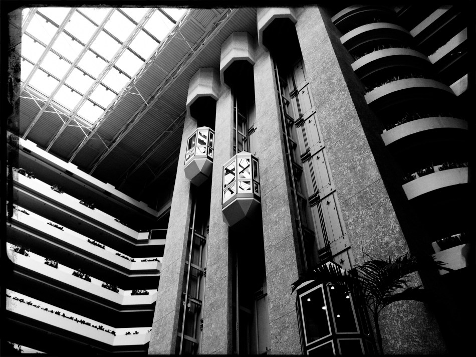
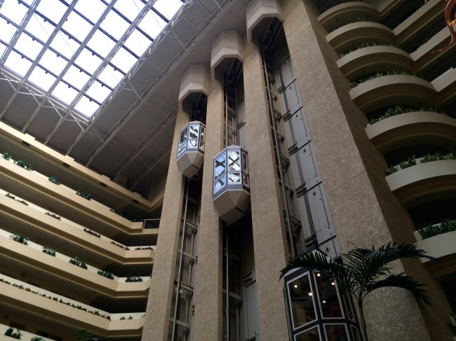
The photo at left was taken in a vast hotel atrium which has a lot going for it in terms of scope and sweep, but which loses some punch in its natural colors. There is also a bit too much visible detail in the shot for a really dramatic effect. Processing the color with some additional grain and grit, losing some detail in shadow, and amping the overall contrast help to boost the potential in the architecture to produce the shot you see at the top of this post. Mere documentation of some subjects can produce pretty but flaccid photos. Selectively re-prioritizing some tones and textures can create drama, and additional opportunity for engagement, in your images.
WHEN TEXTURE IS THE TALE
By MICHAEL PERKINS
THOSE WHO BELIEVE THAT SUBJECT MATTER IS KING IN PHOTOGRAPHY ARE FACED OFF in an endless tennis match with those who believe that only impressions, not subjects, are the heart of the art. Go away for fifty or sixty years and they are still volleying: WAP! a photograph without an objective is a waste of time! WAP! who needs an object to tell a story? Emotional impact is everything! And so on. Pick your side, pick your battle, the argument isn’t going anywhere.
Thing is, my assertion is that you don’t actually have to choose a side. Just let the assignment at hand dictate whether subject or interpretation is your objective. There are times when the object itself provides the story, from a venerable cathedral to an eloquently silent forest. And there are times when mere color, light patterns, or texture are more than enough to tell your tale.

Set Your Face Like Flint, 2014. Shot wide at 18mm, cropped to square format. 1/100 sec., f/5.6, ISO 100.
I find, for example, that texture is one of my best friends when it comes to conveying a number of important things. The passage and impact of time. The feel and contour of materials, as well as the endless combinations and patterns they achieve through aging and weathering. A way to completely redefine an object by getting close enough to value its component parts instead of viewing it as a whole. This is especially true as I try to refine my approach to images of buildings. I find that breaking the overall structure into smaller, more manageable sections helps to amplify texture, to make it louder and prouder than it might be if a larger scene just included the entire building among other visual elements. Change the distance from your story and you change the story itself.
This Massachusetts barn has tons of character whether seen near or far, but if I frame it to eliminate anything but the raw feel of the wood, it demands attention in a completely different way. It asks for re-evaluation.Contrast the rough-sawn wood with the hard red of the windows,and, again, you’ve boosted the effect of the coarser texture. Opposing textures create a kind of rudimentary tug-of-war in a picture, and the more stark the contrasts, the more dramatic the impact.
Traditional, subject-driven story telling will dictate that you show the entire barn, maybe with surrounding trees and a rolling hill or two. Abstracting it a little in terms of color, distance and texture just tell the story in a distinct way. Your camera, your choice.
SOMETIMES THE MAGIC WORKS…
By MICHAEL PERKINS
THE DIGITAL ERA IN PHOTOGRAPHY HAS SMASHED DOWN THE DOORS TO WHAT WAS ONCE A FAIRLY EXCLUSIVE CLUBHOUSE, a select brotherhood (or sisterhood) of wizards who held all the secrets of their special science. The wizzes got great results and created “art. The rest of us slobs just took snapshots.
Today, the emphasis in photographic method has shifted from understand, study and do, to do, understand and, maybe study. We are now a nation of confident what-the-hellers. Try it, and if it don’t work, try something else. In some ways, this is a shift away from intellect and toward instinct. We are all either a little less technically aware of why the magic works, or completely indifferent to the underlying processes at work. You can all huddle together and decide whether this is a good thing.
Which, by way of introduction, is a way of saying that sometimes you do something that flies in the face of science or sense and it still works out. To illustrate, let us consider the humble polarizing filter, which, for me, is more important than many of the lenses I attach it to. It richens colors, cuts reflections, and eliminates the washed-out look of shots taken in intense daylight sun, as well as taming the squinty haze caused by smog. Or, if you want the Cliff’s Notes version, it makes skies blue again.
Now there is a “proper” way to get top results with a polarizer. Make an “L” with your index finger and thumb, finger pointing straight up. UP in this example is the position of the sun overhead, and your thumb, about 90 degrees opposed to your finger, roughly represents your camera’s lens. The closer to 90 degrees that “L” is, the more effective the filter will be in reducing glare and boosting color. Experts will tell you that using a polarizer any other way will deliver either small or no results. That’s it. Gospel truth, science over superstition, settled argument.
That’s why I can’t explain the two pictures in this post, taken just after sunrise, both with and without the filter. In the first, seen at left, Los Angeles’ morning haze is severe, robbing the rooftop image of contrast and impact. In the second, shown above, the sky is blue, the colors are intense and shadows are really, well, shadows. But consider: not only is the sun too low in the sky for the filter’s accepted math to work, I am standing inside a hotel room, and yet the filter still does its duty, and all is right with the world. If I had followed and obeyed package directions, this shot should not have worked. That means if I were to pre-empt myself, defaulting to what is scientific and “provable”, and ignoring my instinct, I would not even have tried this image. The takeaway: perhaps I need to preserve just enough of the ignorant noobie I once was, and let him take the wheel sometimes, even if the grown-up in me says it can’t be done.
The yin and yang wrestling match between intellect and instinct is essential to photography. Too much science and you get sterility. Too much gut and you get garbage. As usual,the correct answer is provided by what you are visualizing. Here. Now. This moment.
TAKING FLIGHT ONCE MORE
By MICHAEL PERKINS
ONE OF THE CHARGES GIVEN TO ALL PHOTOGRAPHERS IS TO MARK THE PASSAGE OF TIME, to chronicle and record, to give testimony to a rapidly vanishing world. Certainly interpretation, fantasy, and other original conceptions are equally important for shooters, but there has been a kind of unspoken responsibility to use the camera to bear witness. This is especially difficult in a world bent on obliterating memory, of dismantling the very sites of history.
Humorist and historian Bill Bryson’s wonderful book, One Summer: America 1927 frames the amazing news stories of its title year around its most singular event, the solo transatlantic flight of Charles A. Lindbergh. A sad coda to the story reveals that nothing whatever remains of Roosevelt Field, the grassy stretch on Long Island from which the Lone Eagle launched himself into immortality, with the exception of a small plaque mounted on the back of an escalator in the mall that bears the field’s name. Last week, hauled along on a shopping trip to the mall with relatives, I made my sad pilgrimage to said plaque, lamenting, as Bryson did, that there is nothing more to photograph of the place where the world changed forever.
Then I got a little gift.
The mall is under extensive renovation as I write this, and much of the first floor ceiling has been stripped back to support beams, electrical systems and structural gridwork. Framed against the bright bargains in the mall shops below, it’s rather ugly, but, seen as a whimsical link to the Air Age, it gave me an idea. All wings of the Roosevelt Field mall feature enormous skylights, and several of them occur smack in the middle of some of the construction areas. Composing a frame with just these two elements, a dark, industrial space and a light, airy radiance, I could almost suggest the inside of a futuristic aerodrome or hangar, a place of bustling energy sweeping up to an exhilarating launch hatch. To get enough detail in this extremely contrasty pairing, and yet not add noise to the darker passages, I stayed at ISO 100, but slowed to 1/30 sec. and a shutter setting of f/3.5. I still had a near-blowout of the skylight, saving just the grid structure, but I was really losing no useful detail I needed beyond blue sky. Easy choice.
Thus, Roosevelt Field, for me, had taken wing again, if only for a moment, in a visual mash-up of Lindbergh, Flash Gordon, Han Solo, and maybe even The Rocketeer. In aviation, the dream’s always been the thing anyway.
And maybe that’s what photography is really for…trapping dreams in a box.
THE ENVELOPE
By MICHAEL PERKINS
HAVING LIVED IN THE AMERICAN SOUTHWEST FOR OVER FIFTEEN YEARS, I HAVE NEGOTIATED MY OWN TERMS WITH THE BLAZING OVERKILL OF MIDDAY SUNLIGHT, and its resulting impact on photography. If you move to Arizona or New Mexico from calmer climates, you will find yourself quickly constricting into a severe squint from late breakfast to early evening, with your camera likewise shrinking from the sheer overabundance of harsh, white light. If you’re determined to shoot in midday, you will adjust your approach to just about everything in your exposure regimen.
Good news, however: if you prefer to shoot in the so-called “golden hour” just ahead of sunset, you will be rewarded with some of the most picturesque tones you’ve ever had the good luck to work with. As has been exhaustively explained by better minds than mine, sunlight lingers longer in the atmosphere during the pre-sunset period, which, in the southwest, can really last closer to two hours or more. Hues are saturated, warm: shadows are powerful and sharp. And, if that dramatic contrast works to your advantage in color, it really packs a punch in monochrome.
This time of day is what I call “the envelope”, which is to say that objects look completely different in this special light from how they register in any other part of the day, if you can make up your mind as to what to do in a hurry. Changes from minute to minute are fast and stark in their variance. Miss your moment, and you must wait another 24 hours for a re-do.
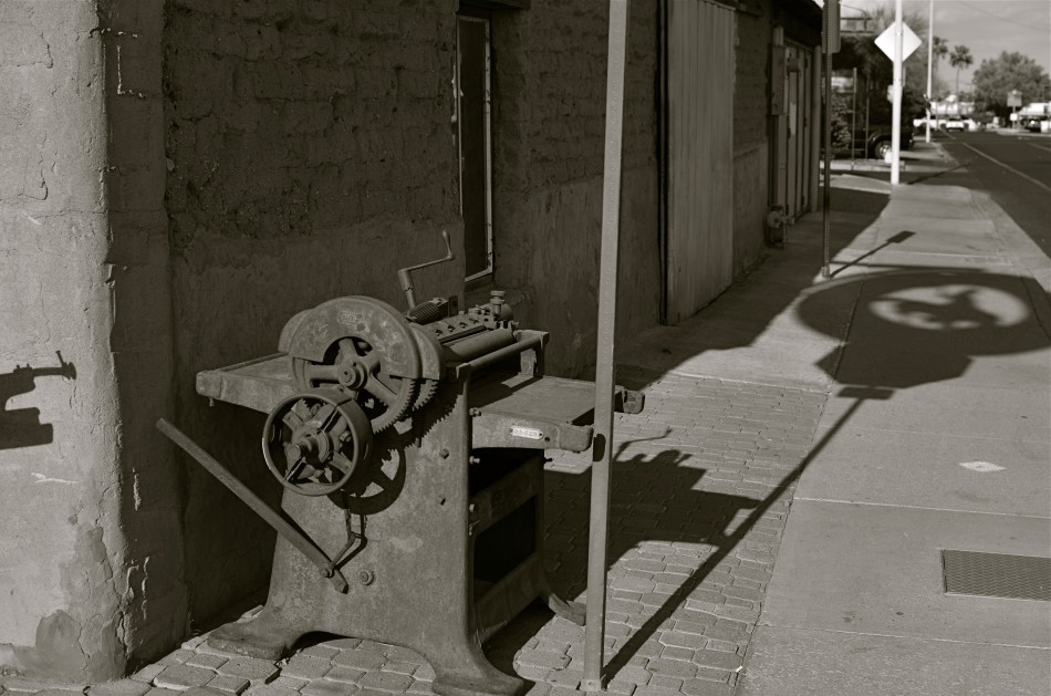
In the west, the best action actually happens after High Noon. Just before sunset in Scottsdale, AZ: 1/500 sec., f/4.5, ISO 100, 35mm.
The long shadow of an unseen sign visible in the above frame lasted about fifteen minutes on the day of the shoot. The sign itself is a metal cutout of a cowboy astride a bucking bronco, the symbol of Scottsdale, Arizona, “the most western town in the USA”. The shadow started as a short patch of black directly in front of the rusted bit of machine gear in the foreground, then elongated to an exaggerated duplicate of the sign, extending halfway down the block and becoming a sharper and more detailed silhouette.
A few minutes later, it grew softer and eventually dissolved as the sun crept closer to the western horizon. There would still be blazing illumination and harsh shadows for some objects, if you went about two stories high or higher, but, generally, sunset was well under way. Caught in time, the shadow became an active design element in the shot, an element strong enough to come through even in black and white.
If you are ever on holiday in the southwest, peek inside “the envelope”. There’s good stuff inside.
THE POLAROID EFFECT
BY MICHAEL PERKINS
I’VE BEEN TRYING TO FIND A WAY TO DESCRIBE THE COMBINATION OF HOPE AND ANXIETY THAT ATTENDS MY EVERY USE OF A SMARTPHONE CAMERA. Coming, as do many geezers of my era, from a tradition of full-function, hands-on, manual cameras, I have had a tough time embracing these miraculous devices, simply because of the very intuitive results that delight most other people.
But: it’s a little more complicated than my merely being a control freak or a techno-snob.
What’s always perplexing to me is that I feel that the camera is making far too many choices that it “assumes” I will be fine with, even though, in many cases, I am flat-out amazed at how close the camera delivers the very image I had in mind in the first place. It doesn’t exactly make one feel indispensable to the process of picture-making, but that’s a bug inside my own head and I gotta deal with it.
I think what I’m feeling, most of the time, is what I call the “Polaroid Effect”. To crowd around family or friends just moments after clicking off a memory with the world’s first true instant film cameras, those bulky bricks of the Mad Men era, was to share a collectively held breath: would it work? Did I get it right? Then as now, many “serious” photographers were reluctant to trust a Polaroid over their Leicas or Rolliflexes. Debate raged over the quality of the color, the impermanence of the prints, the limited lenses, the lack of negatives, and so on. Well, said the experts, any idiot can take a picture with this.
Well, that was the point, wasn’t it? And some of us “idiots” learned, eventually, to take good pictures, and moved on to other cameras, other lenses, better pictures, a better eye. But there was that maddening wait to see if you had lucked out with those square little glimpses of life. The uncertainty of trusting this…machine to get your pictures right.
And yet look at the above image. I asked a lot in this frame, with wild amounts of burning hot sunlight, deep shadows, and every kind of contrast in between just begging for the camera to blow it. It didn’t. I’m actually proud of this picture. I can’t dismiss these devices just because they nudge me out of my comfort zone.
Smartphone cameras truly extend your reach. They go where bulkier cameras don’t go, prevent more moments from being lost, and are in a constantly upward curve of technical improvement. People can and do make astounding pictures with them, and I have to remind myself that the ultimate choice…that of what to shoot, can never be taken away just because the camera I’m holding is engineered to protect me from my own mistakes.
GOING OFF-MENU
By MICHAEL PERKINS
I AM ALREADY ON RECORD AS A CHAMPION OF THE ODD, THE OFF-KILTER, AND THE JOYFULLY STRANGE IN AMERICAN RETAIL. As a photographer, I often weep over the endangered status of the individual entrepreneur, the shopkeeper who strikes out in search of a culturally different vibe, some visual antidote to the tsunami of national chains and marts that threatens to drown out our national soul. Sameness and uniformity is a menace to society and a buzzkill of biblical proportions for photography. Art, like nature, abhors a vacuum.
It is, of course, possible that someone might have created a deathless masterpiece of image-making using a Denny’s or a Kohl’s as a subject, and, if so, I would be ecstatic to see the results, but I feel that the photog’s eye is more immediately rewarded by the freak start-ups, the stubborn outliers in retail, and nowhere is this in better evidence than in eateries. Restaurants are like big sleeves for their creators to wear their hearts on.

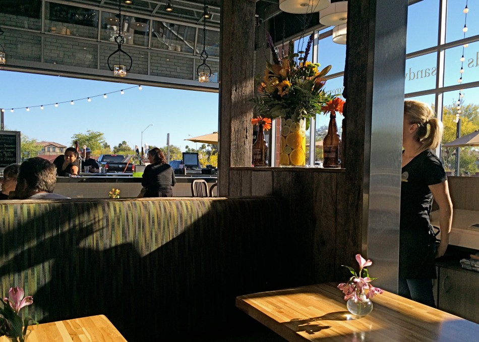
The surf is seldom “up” at the Two Hippies’ Beach House Restaurant in Phoenix, AZ, but the joint is “awash” in mood. 1/640 sec., f/5.6, ISO 100, 18mm.
That’s why this divinely misfit toy of a diner, which was hidden in plain sight on one of the main drags in central Phoenix, has given me such a smile lately. I have never eaten at the swelegant Two Hippies’ Beach House, but I have visually feasted on its unabashed quirkiness. And if the grub is half as interesting as the layout, it must be the taste equivalent of the Summer of Love.
Even if the food’s lousy, well, everyone still gets a B+ anyway for hooking whoever is induced to walk in the door.
On the day I shot this, the midday sun was (and is) harsh, given that it’s, duh, Arizona, so I was tempted to use post-processing to even out the rather wide-ranging contrast. Finally, though, I decided to show the place just as I discovered it. Amping up the colors or textures would have been overkill, as the joint’s pallette of colors is already cranked up to 11, so I left it alone. I did shoot as wide as I could to get most of the layout in a single frame, but other than that, the image is pretty much hands-off.
Whatever my own limited skill in capturing the restaurant, I thank the photo gods for, as the old blues song goes, “sending me someone to love.”
Trippy, man.
Follow Michael Perkins on Twitter @MPnormaleye.
