PLANE GEOGRAPHY
By MICHAEL PERKINS
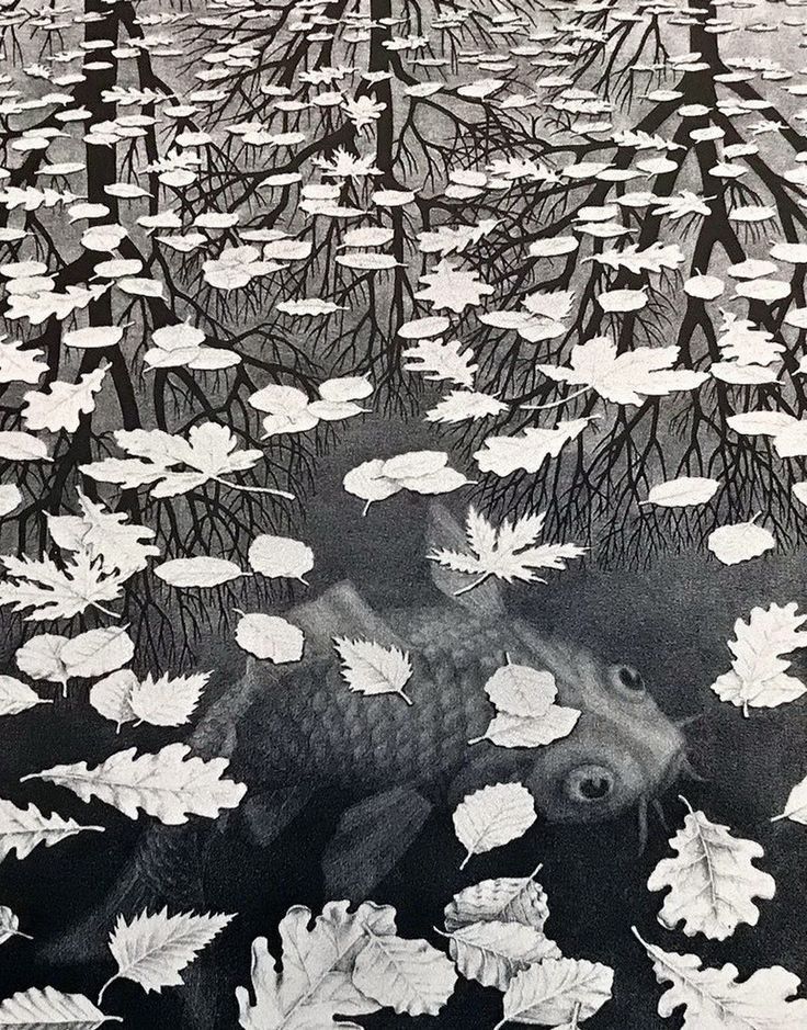
Three Worlds, M.C. Escher, 1955
LOOKING THROUGH MY FAVORITE IMAGES, either hand or camera-created, I have always been drawn to those that ride a tightrope between discovery and mystery, balancing delicately between what is revealed and what is concealed. For me, viewing a composition, whether in a painting, drawing or photograph, I am, of course, intrigued by what the artist chose to include in the frame, but I am just as fascinated by the decisions that were made as to what to leave out of it. By choosing something, the framer is un-choosing every other possible choice. That very deliberate action, to me, is the essence of picture-making.
I once heard a boorish person described as someone who could add something to a room just by leaving it. I probably have been that person several dozen times without knowing it. But in visual art, subtractions can often function as additions of a sort. The act of creating a photograph, as I myself practice it, is the presentation of certain information that also implies information that I’ve withheld. Three Worlds, the M.C. Escher illustration show above, is a perfect example of how these artistic choices can spur curiosity. Here, in the single plane of the water surface, both the life of the forest above and that of the pond below are suggested, and yet the three “worlds” remain more suggested than displayed. We never have the complete reality of either the forest or the pond spelled out in full. In fact, there is more detail provided in the leaves floating on the water than in the selective depiction of the other two realities. The leaves act as a portal between two other disparate states that will forever remain largely unexplained. The result is tantalizing, a tease for the mind that results in deeper speculation. The viewer’s mind is fully engaged.
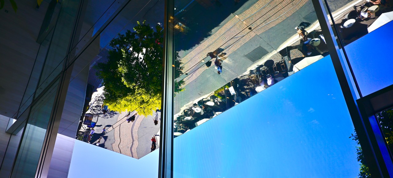
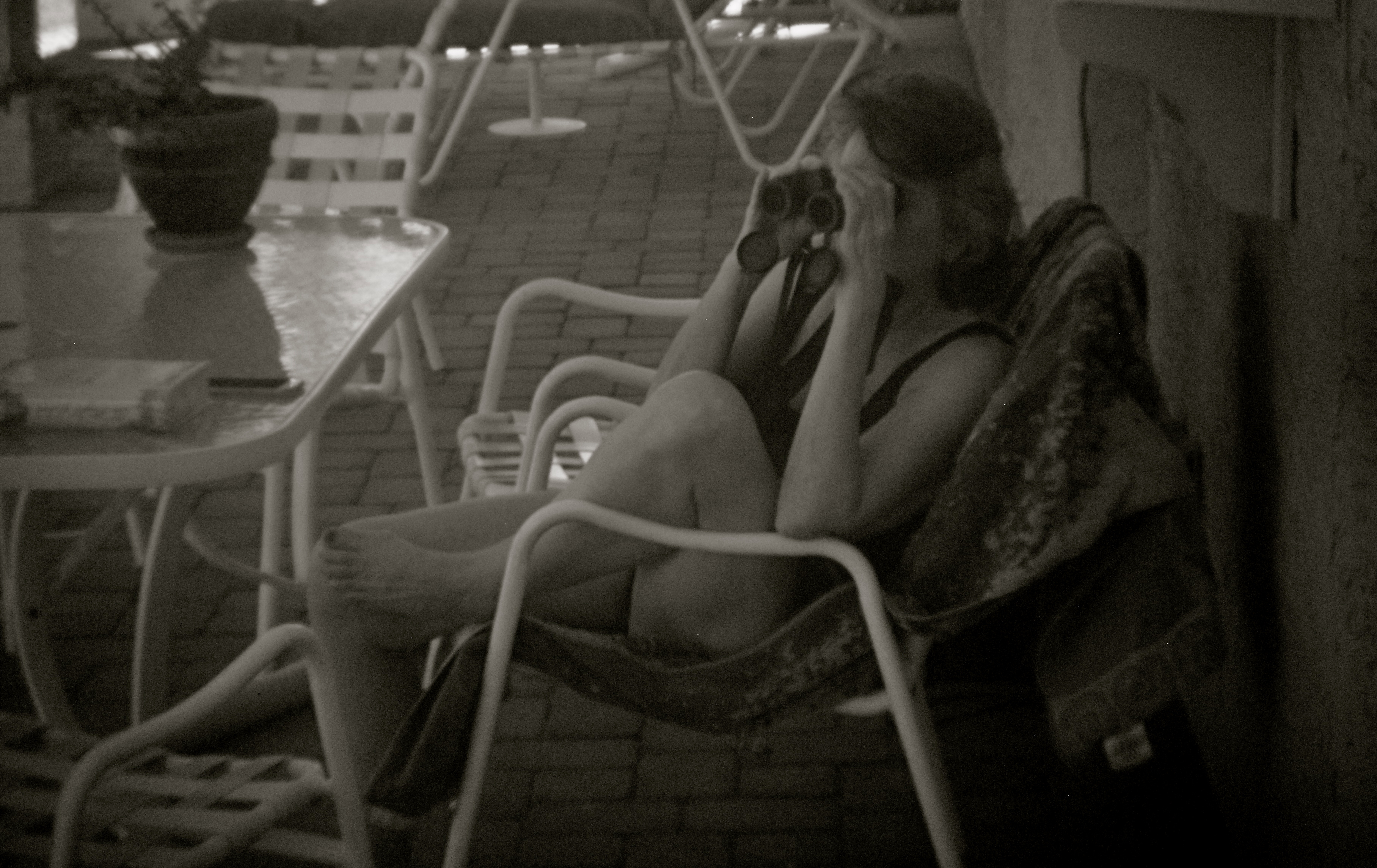
Skywalkers, Michael Perkins, 2026
In the other image, the very under-explained aspect of the reflective surface is designed to ask more questions than it answers. The viewer is free to speculate, to wonder, to try to decipher what, actually, he is looking at. Most importantly, no final answer needs be rendered, just as no explanatory caption is required. The image simply is, whether or not the individual attaches anything extra to it. The wall between reveal and conceal is inviolate, and should be. Any discussion is legitimate, as is no discussion at all. Pictures can be “about” things, or they merely be about themselves. Riding that tightrope between “is it?” and “it is” is a big part of the fun.
AS LOUD AS A WHISPER
By MICHAEL PERKINS
THE GRAPHIC ARTIST CHARLEY HARPER was dead and buried some twenty years or more before his balletic interpretations of the natural world were “discovered”, even though, during his lifetime, his commercial work was published in the world’s most popular magazines and generations of school kids viewed the illustrations he created for their nature and science books. What happened to make Charley a newly “found” treasure was twofold: first, over a lifetime, he steadily streamlined and simplified his style to convey animals, insects and the elements in fewer and fewer lines, constantly learning how to put an idea across without excess ornamentation; and secondly, and perhaps equally important, his audience, which had always accepted Charley’s eye as a natural way of seeing the world, came to realize just how difficult it was for him to make it all look so effortless.

Photography, never a final product but a lifetime process, works the same way. The first versions of our visions can be cluttered, busy, an audition for attention (or “likes”, if you prefer) as the artist struggles for acceptance. We tend to throw everything into the soup. We initially regard words like “minimalism” with suspicion, as if the work done under that term is somehow incomplete. However, if we are lucky, we come to see mere compiling of detail as occasionally unnecessary for the task at hand, which is to convey an idea.
I don’t always have the discipline to shoot with the bare essentials in mind. I defer to sharpness; I become fixated not with the bridge but with the billion bolts holding the bridge together. Pulling stuff out, doing more with less, is never instinctual to me. If I were a small child making a drawing of a sunset, such as the one seen here, I would likely make it about simple shapes, basic colors and a direct message. Unfortunately, I grew into an adult and started gilding the lily. In terms of writing, same same. This blog tends to bloat in its first drafts, whereas the posts I re-write the most somehow become shorter and clearer. In viewing our images, especially those from earlier versions of ourselves, it’s worth asking whether we could have upped our impact by turning down the distractions.
Sometimes we use our cameras to shout. Sometimes, a whisper will suffice. Charley Harper knew that he was in a partnership, a conversation, with his audience. He was thus free to use his simplified style as an opening remark, waiting for others to jump in and supply the rest of the thought. When we conform that kind of relationship with our photographs, connections with our viewers become truer.
Stronger.
THE INS AND OUTS
By MICHAEL PERKINS
THE FIRST MIRROR WAS A CALM POND, the kind of naturally reflective surface that moved Narcissus to fall in love with his own reflection, much to his later regret. Mirrors of every kind are probably one of the only universal elements in our daily visual experience. Many homes have nearly a dozen in one place or another. In addition to reflecting a reverse view of reality (itself a conflict in terms), they create the illusion of space, bounce and amplify light, and even break the world into panes and shards, partial worlds that both imitate and mock our own.
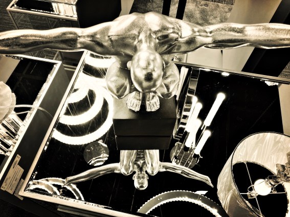
Arc Of A Diver, 2024
Small wonder that photographs are so obsessed with the impact mirrors have on our perception of what’s real, what isn’t, and what falls somewhere in between. When we build so-called “fun houses”, mazes in which to create a slightly panicky, if fun, feeling of being lost, we use mirrors to add to the confusion, to render mysterious the path in or out.
What will get me photographing a mirror (or multiple mirrors) is that very effect of getting lost in some alternate space, the “other” reality that, like Alice, we can step into, often in the hope that the mere reversal of our own world is somehow better, or at least, more interesting. Photographs themselves are lies that tell the truth, that is, they are depictions drawn from reality that, having been extracted from actuality, are immediately rendered as an abstraction of it. Maybe looking into a mirror is as close as most of us will get to entering another dimension, and maybe, just maybe, our fascination with them runs parallel to our wonder at what a camera does, rendering reality and fantasy equal, if only for an instant.
REALM OF THE RETRO-REAL
By MICHAEL PERKINS
I TEND TO REGARD MUSEUM SPACE MUCH THE SAME WAY I VIEW THEATRICAL SPACE, as a staging point for stories and dreams. The best of such institutions achieve nearly the same suspensions of disbelief and time as one experiences in a great play or opera. Curators can create their own version of reality, choreographing our interpretation of events in nearly infinite ways. And just as there is no set “correct” theatrical interpretation of an eternal work like Hamlet or Death Of A Salesman, museums can present their own “take” on history, while freeing us to do likewise.
This, as you might surmise, follows through to the pictures we make of the various exhibits and objects. Therefore, as photographers, we need not be anchored to the mere documentary recording of images of things on display. With a little experimentation in either equipment or approach, we can be as interpretive in how we perceive an artifact as the presenters were in how they choose to showcase it. There is no one “right” way to photograph rare or exotic exhibits.
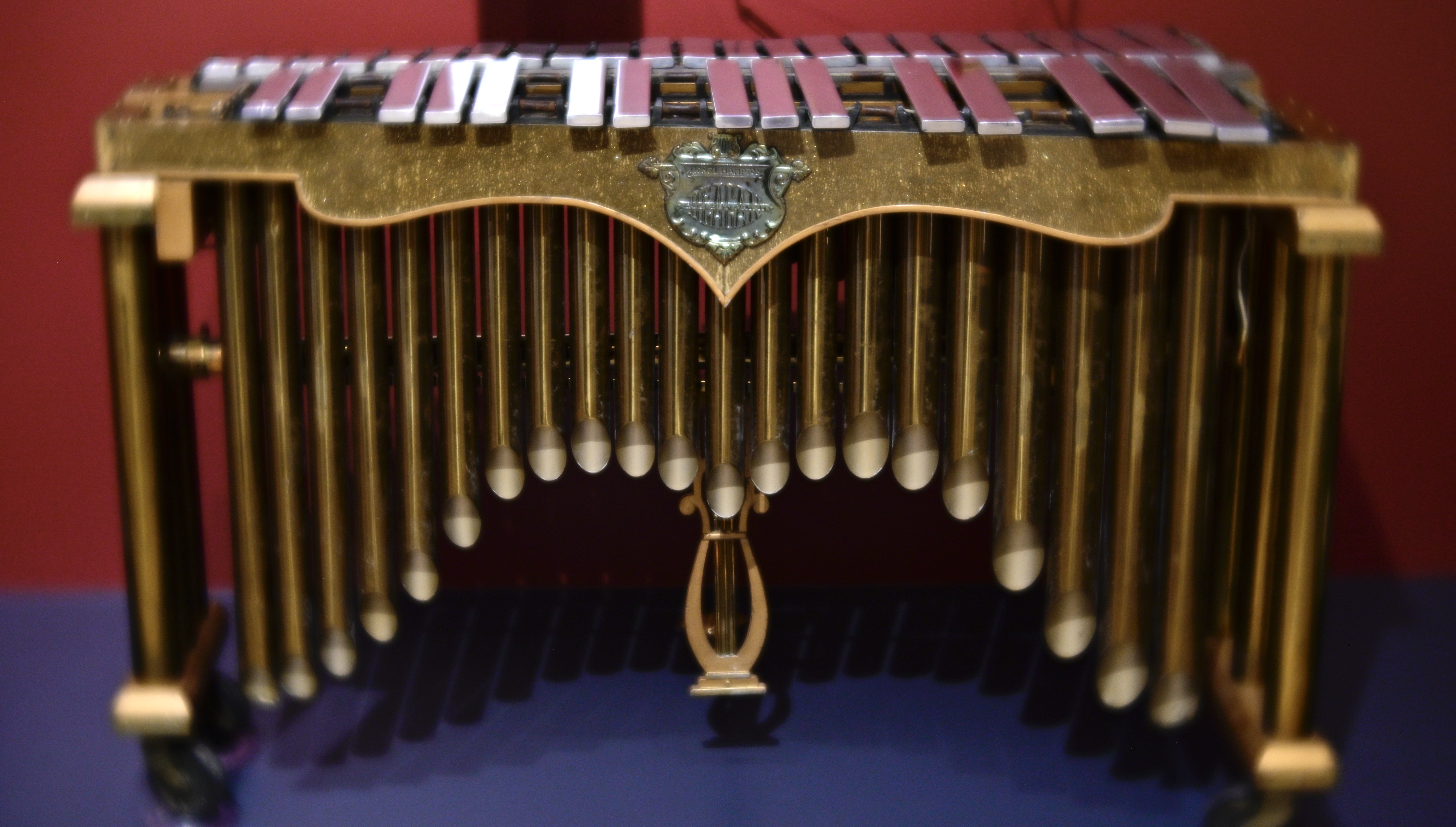
Jazz giant Lionel Hampton’s 1935 Deagan “King George” Vibraphone, seen at the Musical Instrument Museum in Phoenix, AZ.
Official photographs by the museums themselves tend to be straight “product” or “catalog” shots, and, from a purely marketing point of view, that’s probably as it should be. But in visiting the museum as artists, we are free of all such constraints. We are not on salary, and it’s not our job to reflect upon the intentions of the House. In that way, our views of the goods are completely liberated, and that is where the fun stuff happens.
Personally, I tend to render exhibits that interest me in a gauzy dream state. I find that framing them in a kind of retro-real fashion tears them loose from their original temporal moorings. They return to being just things, judged by their own contours and design, rather than as part of an official narrative. And once they are absolute objects, anything can be drawn from or projected onto them as I desire. And that is so much more interesting than just snapping them as a sort of souvenir of my visit.
Museums are not merely warehouses. They are places for dreams to converge and reveal themselves. And if we are lucky (and open), we can aid that process, and make everything in those hallowed halls ring with new song.
FORWARD INTO THE PAST
By MICHAEL PERKINS
IN HIS ESSENTIAL 1982 BOOK MEGATRENDS, the late John Nesbit, trying to predict the uber-changes that would eventually govern our present-day world, described a coping method, a law of compensation called “high tech / high touch”. HT/HT was a kind of social recalibration in which the feeling of dislocation generated by surges of technological advancement would be followed by movements that re-emphasized the comforts of the world just vanished. Think of it as a kind of emotional recoil, in which we spring back from forward leaps to the familarity of simpler times, such as the recent re-emergence of physical vinyl phonograph records as a reaction to the phantom musical realms of the cloud. Nesbit’s prophecy seems to have been realized in many such areas of our society, and photography has certainly seen its share of the phenomenon.
In the camera world, Nesbit’s “high tech-high touch” is a boomerang reaction to the digital era in picture-making, a time of enormous advances in the way images are recorded, manipulated and distributed. Indeed, as foretold in Megatrends, the past thirty years has seen a tremendous counter-revolution that, far from embracing a world that is bent upon perfecting the photographic process, actually rejects it, longing for a return to the very imprecision that defined the analog world, topped off, this time around, with a healthy dollop of nostalgia.
Digital photo sharing was no sooner off the drawing board than people began to pine for their old shoeboxes of physical prints, pictures “you could hold in your hand”. Cue the rebirth of the defunct Polaroid company and a return to instant analog photography, bad film, faulty lenses and all. Hate the coldness of binary storage? Enter the new passion for film of all kinds, aimed at an audience too young to remember how expensive and unwieldy it was, or how poorly built some bargain cameras had been. Coated with the sheen of yester-appeal, these shortcomings became pluses, hailed as “spontaneous”, “unpredictable”, or “delightfully imperfect” in the re-introduction of cheap old plastic toy cameras like the Holga (see above image) and, in turn, the creation of an underclass of all-new, technically compromised gear under the banner of the “Lomography” movement. Like your retro on the arty side? Welcome to the all-manual Lensbaby line, whose higher-end optics sold selective focus to a global fanbase.
A loving return to the imprecision and high failure rate of the film era became attractive to the creators of apps as well, and today, the insanely efficient cameras of the iPhone age sell millions of dollars of applications designed to simulate light leakage, expired film, high grain, lens flares….to, in essence, enshrine all the aggravations of the analog age as some kind of photographic golden oldies. We now praise the defects we used to spend tons of money to avoid. The scary uniformity of high-tech photography has come with a side of high-touch comfort food. It’s a little like Captain Kirk refusing the option of living in a world free of conflict, declaring, without irony, “I need my pain.” Perhaps the chance that something will go wrong is a needed contrast in a world where the likelihood of error has largely been engineered out. Neither precision or randomness is a guarantee of artistic merit, however: that, at least remains, as constantly as ever, in the individual photographer’s hands.
VERITIES AND VARIABLES
By MICHAEL PERKINS
FIRST OFF, LET’S AGREE ON ONE THING: photographs are not “the truth”. Well, at least not what we think we mean by truth. Maybe we use the “reality” of a captured image as a mere point of departure, the place we start off from, on the way to…well, that’s up to the artist, innit? What I’m trying to say here is that merely snapping a picture doesn’t mean that you’ve told the absolute truth about what your lens was pointing toward. Only the bones of truth…a structure on which to drape the rest, through interpretation, and the shared experience of inviting other eyes into the discussion.
Some of our inherited thinking about the veracity of a photo (“the camera doesn’t lie”) is that it is produced by a machine, a device inserted between our vision and the finished product, a mechanism that we associate with reproduction. After all the device measures light; it is indifferent, just as a seismograph or a lie detector would be. Only it isn’t. We humans are interacting with that “recording” function at every turn, just as personally as the painter measures and controls strokes of a brush. And then there’s the consideration of time. We don’t capture all of life in our box, just a stolen sliver of it, which guarantees that the sample, having been yanked out of its original context, is tainted from the start.
Even the best picture, then, comes out compromised, depending on how it was taken, and by whom. Clicking a shutter may be a means of producing something thought provoking, even profound, but it is nothing as simple as capturing the truth. As illustration: it’s easy to identify all the contributing elements of the above image….light, shadow, color, water textures, solid objects…but it was only possible to combine them all into the result you see here for a single moment. Someone else, working with the very same elements just a second later, would likely produce vastly different results. And yet, both of us are “right”.
Thinking of photographs as truth is tricky business. Consider this quote from photographer Giles Duley, who has garnered some distinction of late as what I call a camera-oriented journalist:
“I don’t believe there’s such a thing as ‘truth’ in photography. As soon as I walk in a room and point a camera at you, I’ve already ruled out the rest of the people. As soon as I press the shutter on that second, I’ve ruled out the rest of the day. There is only honesty….”
A photograph is something used to illustrate a point of view. It’s not the only point of view to be had, and so it can’t be the absolute “truth” for everyone. But that’s the beauty of it, the fascinatingly infinite variety of “my truths” to be had in the artistic realm. This is not science. Science is different. You can’t present your “version” of gravity, or photosynthesis, or the speed of light. They just are. Art happens in the realm of “might be” or “could be”, and our photographs are, at their best, suppositions, suggestions. This picture might be true, and it might not, and so let the debate begin. And that is what makes the creation of image an art. Because it’s yours, and, with luck, it might be ours, and the dialogue that decides that is, well, everything.
DOING WITHOUT
By MICHAEL PERKINS
PHOTOGRAPHIC STYLE IS REFLECTIVE of the human aging process. You often make pictures differently in different phases of your life. Many of my favorite shooters have, over their careers, evolved on two parallel tracks, both toward simplicity. That is to say that their picture-taking process, i.e., equipment and gear, becomes more streamlined as they age, even as their approach to composition becomes simpler. In every way possible, the best photographers tend to learn, over time, how to do more and more with less and less.
Going into battle with a single camera that’ll do 98% of what you need in any situation is highly desirable, but it takes time to learn how to do that, to resist the temptation to carry every gizmo under heaven on your shoulder at once. But the struggle is worth it; knowing every single feature and quirk of a camera that’s ergonomically solid and functionally streamlined allows you to work fast and instinctively. As for composition, I found that, at least for me, I had to either learn to simplify or just give up on things like landscape work, where everything I shot was crammed with clouds, trees, trickling streams, flocks of birds, and, who knows, the Barnum & Bailey circus. I was making picture after picture where, if the human eye was asking, “where do I look?” my answer was likely to be, “It’s a smorgasbord! Pick anything!” The truth was that I had to go simpler as I aged if I was ever to be effective at all in conveying visual ideas.
Simplicity is the final step in a photograher’s development….or at least in mine.
Twenty years ago, this image would have taken up twice the area you see here, because, even today, its master frame included, along with the barn and stable, a side building, some empty blue sky, and a few small piles of farm implements….enough distractive information for five pictures. Zeroing out all the color and cropping to keep the entire picture to a basic series of rectangles and triangles (plus their multiplied shadows) turned out much better; all I had to do was develop the courage to cut, decisively, in search of a less cluttered picture. I only select this example because it’s a very clear illustration of the process that I now go through for composing nearly every shot, in that I try to pre-visualize how little information I need to convey my concept. Yes, how little.
This is an ongoing struggle for any photographer, because it’s easy and alluring to do more of everything…more stuff to carry, more stuff to cram in the frame, more things to draw energy away from your primary vision. I am nowhere near where I need to be in this journey, but I can track a little progress, and, amidst all the distractions of, well, living, that’s at least something.
(FIAT LUX, Michael Perkins’ latest collection of images, is now available from NormalEye Books.)
LIP SERVICE
The Elder Speaks His Truth, 2016
By MICHAEL PERKINS
PRIOR TO AROUND 1920, photographs of objects were generally naturalistic recordings of objects as they were popularly perceived in the actual world. Apples were shot to resemble apples, trees to emulate trees, and so forth. Techniques that had served photography in the nineteenth century, which favored the same objective rendering of things in the same way that painters did, persisted until generally after the First World War, after which both camps began to question whether reality was, indeed, the only way to portray the world. Some shooters began to veer away from any painterly softness or interpretation, declaring focal sharpness and documentary truth over the dreamy qualities of the canvas. Others, however, took another page from paint’s playbook, opting to see compositions as arrangements of light or shapes, and nothing more. Everyday objects were filtered through a new way of seeing, and the ordinary was drastically reconsidered beyond the act of mere recording. Photographers began to also be interpreters.
A Weston Pepper.
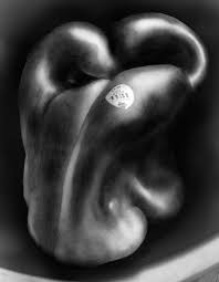
One of the most stunning examples of this new freedom were Edward Weston’s “pepper” images of the 1920’s, a series that re-envisioned vegetables as new somethings that were reminiscent of abstract nudes. Weston’s monochromes were, first and foremost, compositions of line, absent the context that the normal world typically afforded. Suddenly, shapes were absolute: the photograph didn’t have to be about anything: it merely was, in much the same way that modernist paintings re-framed the way people saw faces, bodies, architecture. Some were shocked, even frightened by the newfound freedom Weston and others were championing, while others felt liberated. As ever, the best photographs sparked the best arguments.
I was reminded recently what a simple revolution can be created by such a minor warping of the visual sense when I unpacked a pepper that I felt could have escaped from Weston’s own garden. The gnarly thing seemed, even before my memory had made a connection back to his work, like a ripe, red set of lips, something between the cartoon kiss of a Jessica Rabbit and the Rolling Stones’ lascivious logo. The curviness of the pepper proved too seductive for me to just start immediately carving it up for salad, so I attached a macro lens and started to take a tour around the thing. At one angle, the vegetable almost looked like a mouth in profile, but with perhaps the faintest suggestion of an overall crimson face as well. The entire exercise took about three minutes, after which the pepper dutifully kept its prior appointment with my homemade balsamic dressing. The one fun takeaway was reminding myself that, no offense to reality, but it’s fancy that makes photographs.
Just think what kind of portrait I could make from a rutabaga with attitude.
THE HOP-ON POINT
By MICHAEL PERKINS
PHOTOGRAPHY AT ITS MOST EFFECTIVE, is a pure and wordless kind of storytelling, virtually limitless and astoundingly efficient. Using a visual shorthand, that is, the static image stolen in an instant, we can suggest any narrative, past, present or future. Our tales not only feed off the storyteller’s intent but also off of what the viewer interprets. We can make anything mean anything. If stories are a constantly moving parade, we determine where the “hop on” and “hop off” points in it will be.
We do this by controlling the frame.
We make very intentional choices in a photographic frame. What is included is vital, but so is what is deliberately excluded, since both choices spark the imagination. We are, in effect, having a conversation, a debate over those choices with our audiences. Why did we show this and not that? Is this thing important because it naturally occurred in the picture, or am I making it important because I placed it there? And what do I think about what the photographer decided to leave out?
As the aforementioned parade of existence passes, the photographer’s hop-on point for the eye can supply context, showing connection between one thing and another…..or it can editorially destroy context, forcing us to see a thing in isolation, on its own terms. Consider, for a moment, the….. thing in the above image. Where did I get it? What was its purpose versus other things in its “world”? Can you, the viewer, assign it a new association that, for you, works just as well as the original?
All this discussion, all this interpretation, all these individual conceptions of what a thing “is”…all abetted by assembling the frame and than adding and subtracting within it. We talk a lot in these pages about the various sciences of photographic measurement…..exposure, light, apertures…. but I think composition outranks them all. Sure, know how to harness the tools that will help you record your message. But first, figure out what the hell you’re talking about.
And where you want your passengers to hop on.
SILHOUETTE SHORTHAND
1/250 sec., f/8, ISO 100, 300mm.
By MICHAEL PERKINS
AS AN OBSESSIVE CHILD, I became crazed with the drawing of short animations on pads of paper known as “flip books.” You know the drill. Draw a picture on the top sheet, turn the page, draw another picture with a small change in position, and repeat several dozen times until you produce a brief cartoon by flipping the entire pad from the front to the back. I actually got pretty good at it, if, by “good” you mean manically addicted to perfection and insanely fixated on detail. I could make three seconds of cinematic grandeur. I just couldn’t do it fast.
Meanwhile, on the other side of the playroom, my sister and her partner, my cousin Mark, had so such problem. While I would spend the better part of a week sweating over the laws of locomotion for such classics as The Mummy Goes Mad or Spider–Man vs The Vulture, Liz and Mark cranked out ten titles a day, crude stick-figure blackouts created in ten-minute surges of creative hysteria, all ending with the unfortunate (and unnamed) hero exploding, then emitting a dialogue balloon with the single, sad existential word “WHY??” While I was doing DeMille parting the Red Sea, they were doing Mack Sennett one-reel wonders, heavy on the pie fights. Fact is, I found their stuff gut-achingly hilarious. There was no disputing which of the two “studios” better understood the entertainment biz.
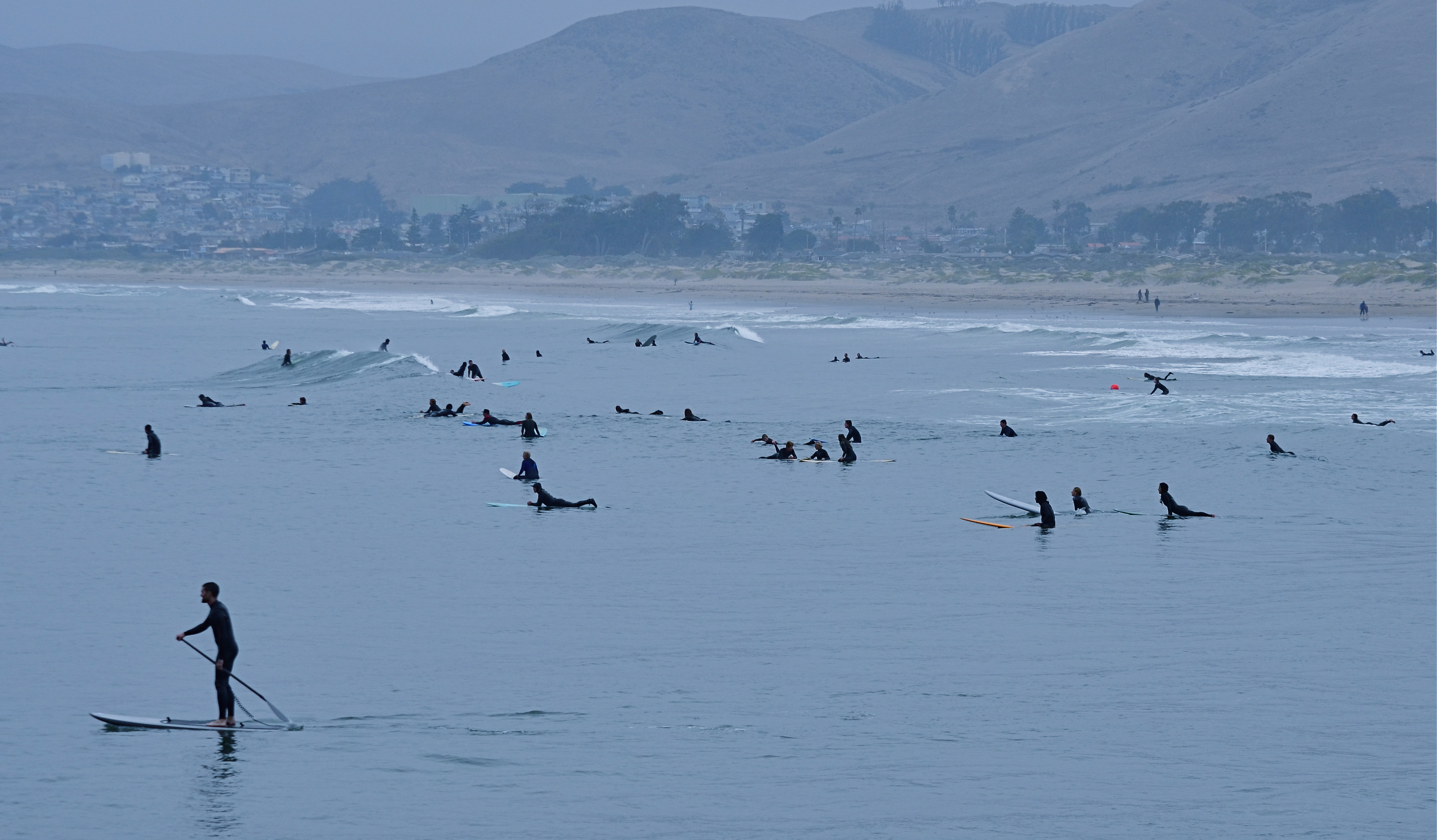
Lizzie and Mark’s stick figures moved every bit as well as my fully-rendered players, but their impact was more immediate. Their drawings didn’t have even a single line that wasn’t absolutely essential to their narratives. I thought of all this recently when working with some distant crowds which were reduced to mere silhouettes in a deep telephoto of the coastline at California’s Morro Bay. As components in a larger composition, they were just markers, measures of linear space. Shooting even closer might have revealed their hair color, lines on their faces or the shine of water on their wet suits, but to what benefit for the overall effectiveness of the picture?
There are many forms of visual shorthand in the making of a photograph, and they can be effective in speeding the journey from the viewer’s eye to his heart. We might think of photography as the complete recording of detail, a piece-for-piece re-play of reality, just as I thought I had to draw every single web line on Spider-Man’s head. However, the most eloquent images often speak louder by using fewer words.
Sometimes, a stick figure is exactly what you need, and no more.
NOTHING AT FACE VALUE

By MICHAEL PERKINS
SOMETIMES I THINK THAT PHOTOGRAPHERS, especially beginners, needlessly hem themselves in by “pre-editing” their work. Being human, we all care, to some degree, about how our images “play” to various viewers, and so it’s understandable that we can be scared away from attempting certain things that are too jarring or disorienting to our intended audiences. We work to hard to avoid the attachment of certain labels to our pictures.
The “a” word, “abstract”, is one such label. It’s a scare word. And it can spook us out of truly innovative image-making.
Sure, we may know that, strictly speaking, abstraction really just means extraction, pulling a visual shorthand of essence out of a more complex subject. Rather than merely recording the full detail of an object in a photograph, the abstract photographer reduces it to its most effective basics. A baseball loses its stitches and writing and becomes just a sphere. Abstraction can also yank something out of its familiar context, forcing the viewer to regard it on its own merits, so that an entire salad is reduced to the sensual curvature of one section of a single vegetable.
Okay, so that’s what we know about abstraction. However, what we feel, even about just the word, can cow us into conformity. We fear being called “artsy”, avant-grade, pretentious. And we gradually adjust our images to reflect what others regard as “real”. It’s tough: learning to trust your own vision is the single hardest lesson in any art. But what’s the alternative? Cranking out the same systematic execution of a flower for the next forty years just to curry favor with the mob?
If you observe an orchid (like the one above), and see, not merely a flower, but a winged creature taking flight, why not take the extra step and reclaim the “realness” of that object for your own purpose? The camera is an interpretative tool, not a video recorder.
Anytime we are tempted to restrict our pictures to what the world at large regards as “real”, we should listen for abstraction’s quiet but persistent question. “Real” according to whom?
THE LOVE OBJECT
By MICHAEL PERKINS
IN EARLIER OUTINGS, WE HAVE DISCUSSED THE VALUE of knowing how sunlight enters your house at all times of the day. Knowing where bright spots and slatted beams hit the interior of your home in different hours gives you a complete map of “sweet spots” where natural light will temporarily isolate and flatter certain objects, giving you at least several optimized minutes for prime shooting each day.
Keeping this little time-table in your head allows you to move your subjects to those places in the house where, say, the daily 10 a.m. sun shaft through the family room window will give you a predictably golden glow. For me, that location is my living room window, across which the southwestern sun tracks east/west, and the object is my white baby grand piano.
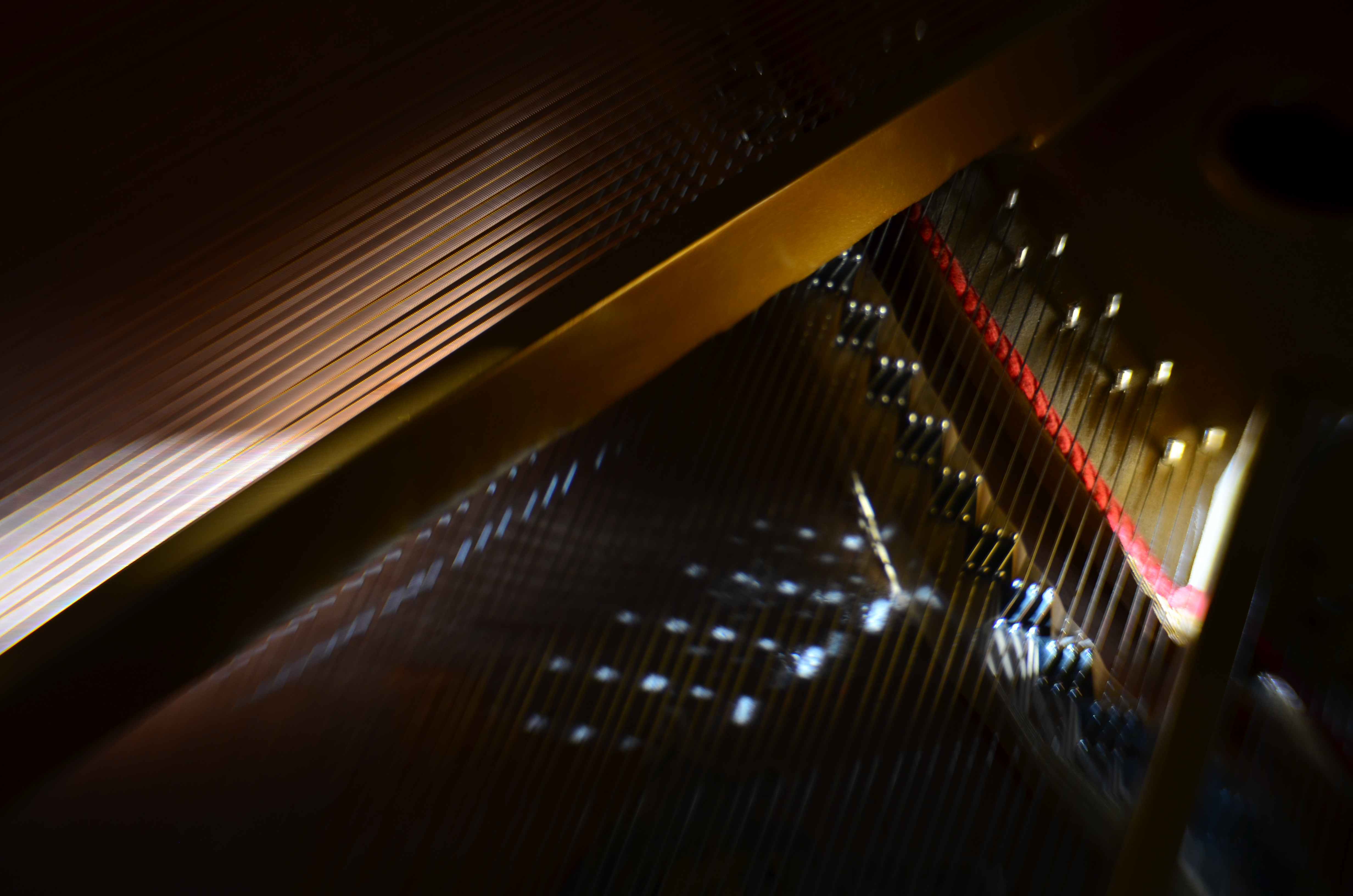
Cordophone Chroma (2017).
Pianos, to me, are divinely complex gadgets, creations of the first great industrial age, their impossibly intricate mechanics offering thousands of possibilities for macro shots, fisheye explosions, abstract compositions, shadow studies, and delicate ballets of reflections as the morning sun dances across harp, strings, and hammers in an endless kaleidoscope of radiance. I have long since tracked how the sun showcases different parts of the piano as the day progresses, and how that corresponds to the instrument’s various sections and subsections.
Hard-wiring that schedule into my skull over the years means I know when a shot will work and when it won’t, making the object more than just something to shoot. It becomes, in effect, an active kind of photo laboratory, a way of teaching and re-teaching myself about the limits of both light and my own abilities. Better still, the innate intricacy of the piano as an object guarantees that I can never really get “done” with the project, or that something that was a mystery in January will become a revelation by June.
What gives this process a special lure to me is my endless effort to exploit natural light to the full, believing, as I do, that nearly every other less organic form of illumination is measurably poorer and less satisfactory than that which comes plentifully, and for free. The house I live in has thus become, over the years, a kind of greenhouse for the management of light, an active farm for harvesting the sun.
ISLANDS IN THE SHADOWS
By MICHAEL PERKINS
FIFTY-PLUS YEARS INTO MY LOVE AFFAIR WITH PHOTOGRAPHY, I now regard my earliest concept of a “good picture” as I regard other ideas of my youth….that is, seeing how I viewed the world given the limited scope of my own experience. When I first started making my own pictures, my models were drawn from the pages of the then-dominant photo magazines, like Life, Look, and National Geographic. Thus, for me, “good” photographs served either the reportorial functions of a news assignment or the color-saturated visions of landscape lovers. And that, for me, back then, was more than enough.
Both these kinds of images favored a fairly literal translation from the actual into the photographed: interpretation and abstraction was not anything I gave serious thought to, since I wanted my simple box-camera creations to look like “real photographs”. Art photography certainly existed, but very much at the edges of the culture. Most museums, by the early 1960’s, had still not mounted their own photographic exhibitions. Most popular photography, shaped by a large middle-class consumer culture (think Kodak Instamatic), was candid and personal in nature. Most people wanted Grandma to look like Grandma, unfiltered through any Warholian irony, commentary or experimentation. It was still a compliment for someone to say of your pictures that they “looked like a photograph”.
Would more light, more detail, convey the story any better in this image? 1/10 sec., f/2.8, ISO 2000, 24mm.
Strangely, one of the things that revised my thinking on what was “good” was an increased awareness of the works of some of the first photographers, pioneers who sweated mightily to wrangle the infant media into something like reliable performance. In their work with ever-changing combinations of plates, media, lenses and emulsions, the first photogs’ breakthrough photographs often failed from a purely technical viewpoint, producing irregular patches of light appearing randomly like islands in a sea of shadows.
But what these wizards’ first attempts often achieved, almost by accident, was the first real abstraction in photography: pieces of reality, rather than its totality: hints of the truth which invited speculation, examination. New questions were posed: what was missing, and did it matter if it wasn’t there? Could a photographer, in fact, deliberately extract parts of the “whole” picture, letting the minimum speak for everything that was left out? I gradually began to wander in search of answers to these questions.
There are times when a picture speaks louder the less it says. My original orientation to “good” images, seeing them as the most faithful translation of the literal onto film, expanded gradually to include whatever visual language communicates best in a given picture. Sometimes, in some very key instances, it helps to think like the first practitioners, who discovered, however haphazardly, that mere reality sometimes comes up short.
EXQUISITE CORPSES
Phytomorphology 2 (2017). Macrophotography helps alter the memory context of familiar objects.
By MICHAEL PERKINS
AS A BOY, THEODORE ROOSEVELT TAUGHT HIMSELF THE ANATOMY OF BIRDS that same way James Audubon did, by studying birds he himself had killed. Although this coldly clinical approach may strike us as cruel today, it was accepted practice for a young naturalist in the late 1800’s, a time when even eminent surgeons, faced with a shortfall of cadavers for academic study, occasionally hired freelancers to raid graves in search of, er, manpower. And so it goes.
At decidedly less risk, photographers have also made still-life studies of dead things, from game kills to seed pods, trying to appreciate structure, design, and function in a controlled environment. But there is more to their pokings than the grand advancement of science, given that death changes things in a way that transforms their aspect, altering their usefulness as visual subjects. Objects that have gone from living to non-living reflect light differently; textures and patterns are re-shaped; in short, the thing becomes an abstraction of itself.
Add magnification to the mix, and a thing becomes completely untethered from our usual conception of it, since, among other things, we are used to viewing it from a distance of feet or inches rather than millimeters. Just as where you stand affects the impact of a landscape, the place where you park a macro lens on an object dictates a completely different story with just the smallest variation.
There is a renewed fascination in the photographic world with minimalist abstraction, in which an object is changed so much in magnification and composition as to become a completely new thing, or…if the photographer so desires, a whole new nothing, a subject with which the viewer has no prior associations, functioning as pure pattern or design. For me, that’s the appeal of macro work…..to take the familiar and render it neutral in meaning, allowing me to re-assign it visually, to ask the viewer to, in effect, regard it as a foreign object, one that can take on whatever significance he sees fit.
Photography is primarily about what to see but it often provides cues as to how to see as well. Viewpoint is verification, and things impart different truths to our eyes, depending on how we approach them.
2016: THE YEAR OF SEEING DIFFERENTLY

Isoceles’ Greatest Hits (2016). Our idea of what a photograph “is” must be constantly in play.
By MICHAEL PERKINS
IF YOU SPEND ENOUGH YEARS MAKING PICTURES, you will see, looking back over your shoulder, several visible mile markers indicating when something fundamental changed in how you went about the pursuit of the capture. It can be a simple time line from one camera or lens to the next, or a sequence of shifts in style or emphasis.
For some, it’s the leap from film to digital. For others, the moment when it seemed important to commit anew to monochrome, or the day when one’s work flow took on decidedly new features. For me, it’s always been those events or people who have allowed me to dramatically re-evaluate the process of seeing.
Poring over various things I attempted to do in 2016, I seem to be standing in a niche between how I have traditionally visualized subjects and how I’m aspiring to, marking a more dramatic evolution than I’ve experienced for a while. This change can be simply expressed as a different view of what’s “real” in a picture, brought on by my work with lenses that allowed focus to be more selectively manipulated within an image.
Some of this can be seen in images seen in the new page 20 for 16, clickable at the top of this one. Like other year-end summaries, it tries to cite examples of every type of photograph I attempted over the space of a year, from portraits to still lifes and everything in between. However, unlike most other years, the images have what I might call an evolving view of the role of sharpness; how it features in a composition, how much of it is essential, whether it is even needed at all, given the right conditions.
Some of these explorations in variable sharpness involved embracing a new crop of specialized lenses which either evoke the softer look of vintage glass or allow the shooter to place focus anywhere in the frame, and to any degree desired. However, at least one picture is the product of post-production apps applied to smart phone images, showing, if nothing else, that it’s probably the destination that matters more than the journey. Or not.
As an essential component in all photography, focus is a major determinant in that we think of as a “photograph”, and, in turn, what makes that photograph “real”. However, photography is not merely the recording of the actual but a visualization of the possible. It bridges the gap between tangible and potential. Merely unchaining sharpness, by itself, guarantees nothing in the way of order, and might merely produce chaos. Still, the moment when a particular choice can either enhance or enchant…. that’s we live for; that’s what we reach for.
Thank you again for your kind attention, your advice, and your enthusiasm….and Happy New Year.
MAKE IT SO
I’ve been photographing this for years, and I still don’t know what I think about it. Needs more work….
By MICHAEL PERKINS
WHEN PHOTOGRAPHY IS PURELY REPORTORIAL, as it is in journalism or documentation, it sticks pretty close to the accepted state of the world. It tries to depict things plainly and without comment; it delineates and defines; it shows us the true dimensions of events.
But when the same technology is used interpretively, there is no absolute “real”, no pure authenticity, other than what we choose to show. It is in re-purposing the world visually, shaping and framing it as we choose, that we can confer meaning on it pretty much at our whim. That’s where the “art” part comes into what would otherwise be a merely technical measurement of light. We not only choose our subject….we set the conversation about it. Simply stated, what you shoot is about whatever you decide it’s about.
Even with hyper-familiar objects, things seen and re-seen to the point that they are iconic (think Empire State Building) images can re-set the way we take those objects in. And, in the case of what I like to call “found objects”, such as the image seen at the top, the photographer is completely unfettered. If your viewer’s eye has no prior mental association with something, you’re writing on a blank sheet of paper. You can completely dictate the terms of engagement, imbuing it with either clarity or mystery, simplicity or symbolism.
I have always been flat-out floored by photographs that take me on a journey. Those who can conjure such adventures are the true magicians of the craft. And that’s what I chose to play in this arena over a lifetime. Because, when photography liberates itself from mere reality, it soars like no other art.
THE UNREAL REAL

No, this isn’t a picture of the “real world”. And might that not be freeing, in a way?
By MICHAEL PERKINS
I’M A PHOTOGRAPHER, AND YET I CANNOT TELL YOU WHAT “REALITY” IS.
I point machines at the world and I get some kind of recording of light and shadow. Is what I get a literal translation of the way something, at least for an instant, really was? How did my composition, which necessarily had to leave out some things in order to include others, alter the complete truth of a scene? How did my selection of a lens, a time of day, the place where I stand, my own mood effect the outcome? And, if this machine, this recorder does not actually show “reality”, does that make me more of an artist, or less of a technician?
The world as we see it is never mere visual “evidence”. It comes to us filtered through every personal trait that shapes our ability to observe in the first place. Then we, in turn, filter that subjective experience into an even greater abstraction, shoving it through a lens that adds its own biases, limits, or flaws. So what comes out the other end? Should we even be worried that a photograph can’t be real? Might we not, in fact, be relieved to be freed from the constraints of the actual, just as painters and sculptors always have been?
The above image was taken by a person who stood in a particular place at a particular time with a specific piece of optical equipment and decided that the resulting balance of visual elements constituted a “picture”. That selection of a single part of a single moment will either convey a similar feeling to someone else, or it won’t. That’s what we uncertainly refer to as “art”, and, whether we like the terms of engagement, those “really” are the terms. Reality is beyond our reach.
But a commentary on it isn’t.
EXTRACTION
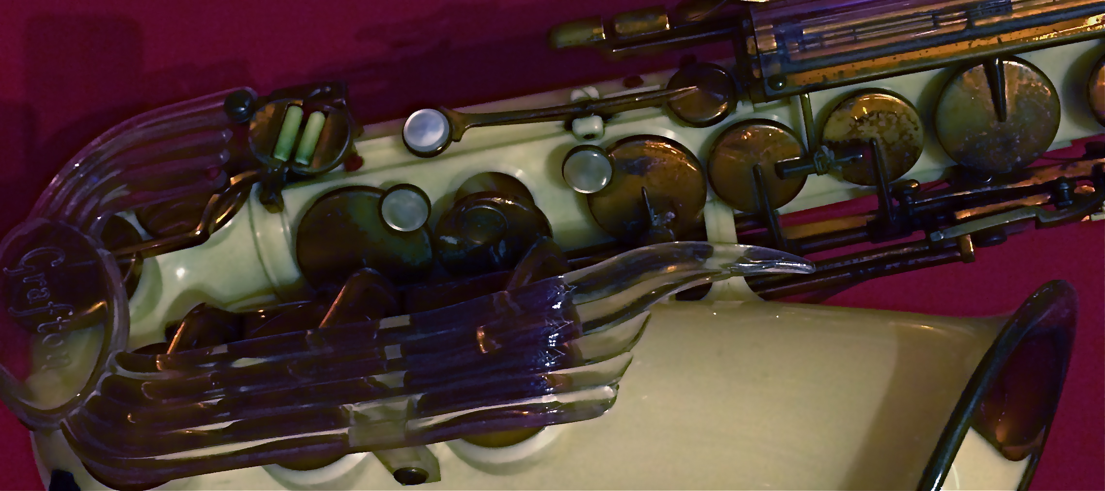
Grape Cooler (2016)
By MICHAEL PERKINS
FOR SOME, UTTERING THE WORD ABSTRACTION ALOUD is like saying bringing up politics at a family get-together, in that it forces people to take sides, or to account for their taste in front of others. And when you tie that scary word to art, specifically photography, people start to forget about making pictures, and begin wondering “what it all means”, or, worse, what an image is “supposed to be about”. We start making photos like regimented school children, all of us coloring the sun the same yellow and always drawing people with eyes in the same part of their face.
Color assignments, as well as light and dark relationships, are all subject to interpretation.
Instead of using the term abstraction to describe the idea of seeing something differently, I prefer the word extraction, as if we are pulling something different out of a subject. And it’s really not that academic. When we abstract/extract something, we are changing the relationship between the object and how we typically view it. Can showing just part of its shape register in our brains differently than viewing the entire thing? If I interpret it in monochrome versus color, can I re-shape the way you look at its positive (light) or negative (dark) space?
In abstracting/extracting, aren’t we really acting like designers, taking the familiar and rendering it unfamiliar to look at how it’s made and how we interact with it? Just as a designer might decide to create a different kind of teapot, can’t we take an existing teapot and change the way it impacts the eye? That’s all extraction is; one more way to shuffle the deck.
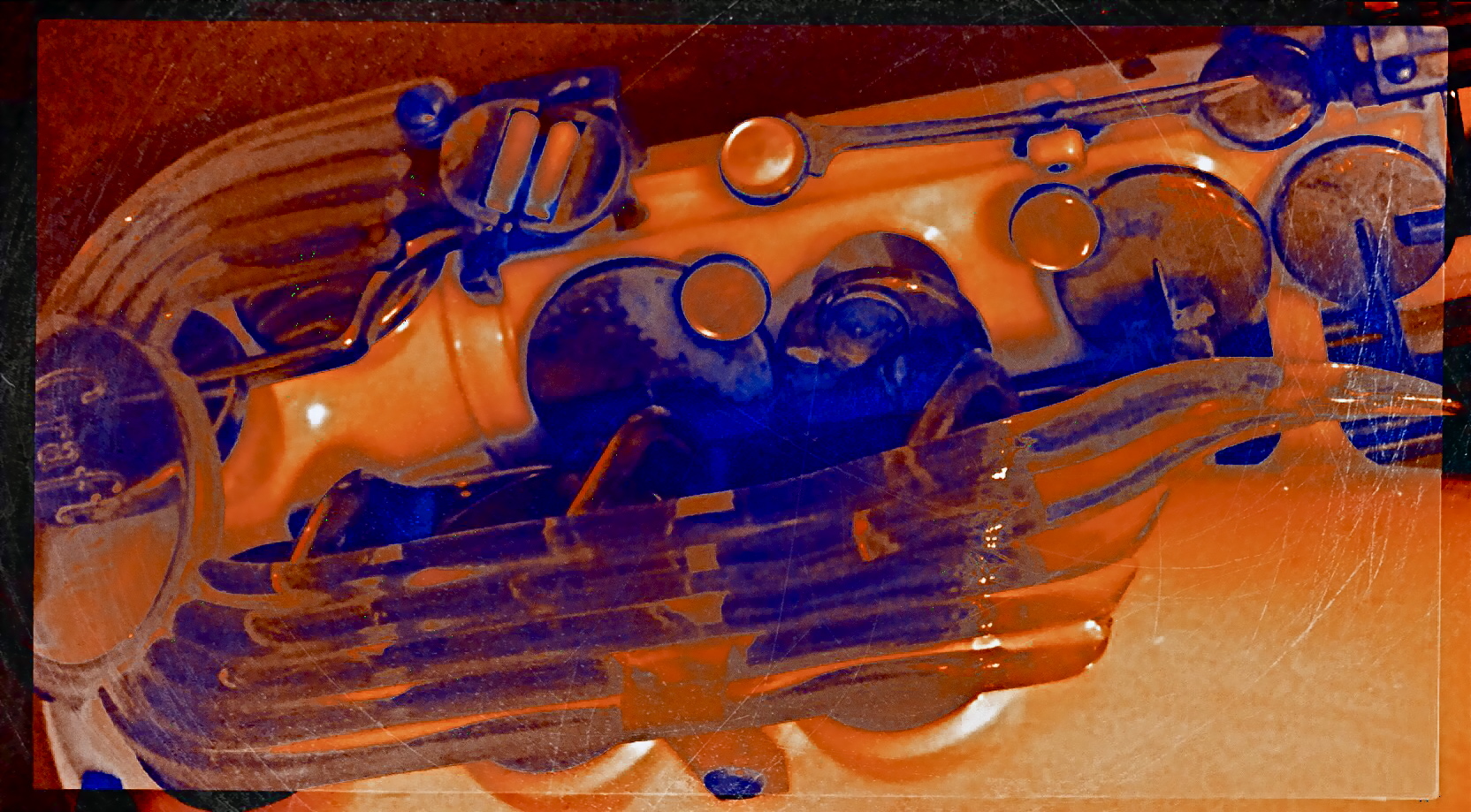
The object at the top of the page, a rare injection-molded plastic saxophone from the 1940’s, had already been “abstracted” by its designer, since we all have a traditional way of visually “knowing” that instrument. That is, it’s supposed to be brass-colored metal, curve in such-and-such a fashion, and feature ornamentation of a set type. Prominently, the designer re-ordered the sax’s features… in plastic, with browns and purples arranged in a fluid, stylized flow of elements. That means, that, as a photographer, I begin with my own set of expectations for the object already substantially challenged. Further, in photographing it, I can rotate the sax, compose it in the frame in an alternate fashion, reassign or intensify its colors, or, as in the small insert(which is a composite of a color negative, a monochrome negative, and a color positive), even change the relationship between surface and shadow.
There is a reason why even the police “abstract” a face into two interpretations, using both head-on and profile views in mug shots. Fact is, when you choose the viewpoint on an object, you change the interpretation of how the eye “learns” it. You extract something fresh from it . That’s the nature of photography, and scary words like “abstract” shouldn’t halt the ongoing conversation about what a picture is…or isn’t.
CUES AND CLUES
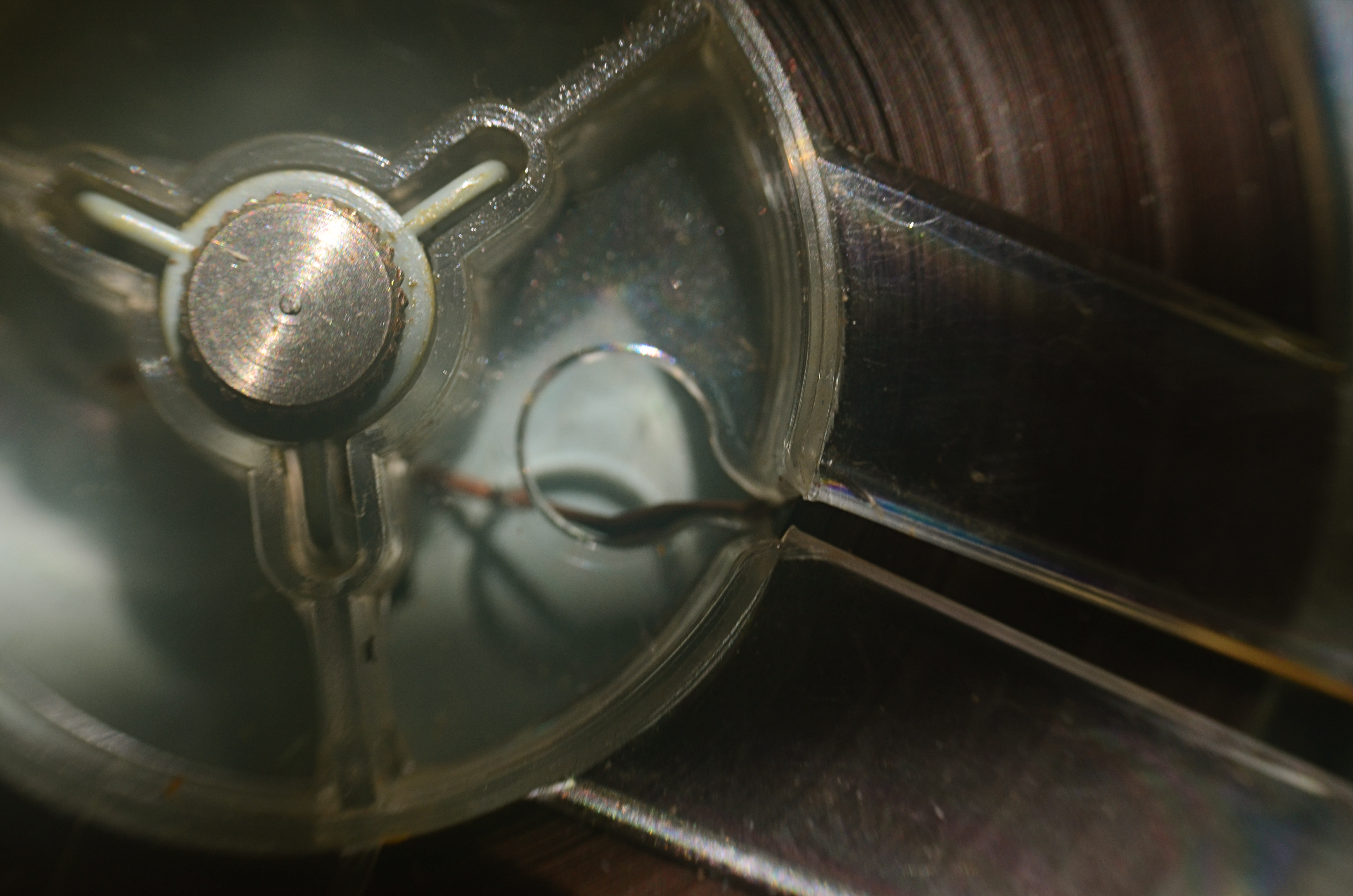
Good Morning, Mr. Phelps (2016). How little of a tape recorder need be shown to convey a sense of that object?
By MICHAEL PERKINS
SAY THE WORD “MINIMALISM” TO SOME PHOTOGRAPHERS, and you conjure visions of stark and spare compositions: random arrangements of light blobs, stray streaks of shadow, or scattered slivers of light, each conveying mood more than content. For some, these images are a kind of “pure” photography, while, for others, they are, to use a nice word, incoherent. Part of us always wants a picture to be, in some way, about something, and the word minimalism is charged, positively or negatively, depending on whether that “narrative thing” happens.
I actually associate minimalism with the formal storytelling process, but doing so with the fewest elements possible. It seems like a natural evolution to me, as I age, to make pictures talk louder with fewer parts. Simple cropping shows you how much more you can bring to an image by taking more of it away, and, with closeups and macro work, the message seems even clearer. Why show an entire machine when a cog carries the same impact? Why show everything when suggesting things, even leaving them out entirely, actually amps up the narrative power of a photograph?
Of course there are times when mere shape and shadow can be beautiful in themselves, and it doesn’t require a lot of windy theorizing to justify or rationalize that. Some things just are visually strong, even if they are non-objective. But minimalism based on our impressions or memory of very real objects, from a pocket watch to a piece of fruit, can allow us to tell a story with suggestions or highlights alone. If something is understood well enough, just showing a selectively framed slice of it, rather than the thing in its entirety, can be subtly effective and is worth exploring.
In the above image, you certainly understand the concept of a tape recorder well enough for me to excise the device’s chassis, controls, even half of its reel mechanism and still leave it “readable” as a tape recorder. You may find, upon looking at the picture, that I could have gone even farther in simplifying the story, and in your own work, you can almost certainly suggest vast ideas while using very small bits of visual information. Knowing the cultural cues and clues that we bring with us to the viewing process tells you how far you can stretch the concept.

DOUBLE REVERSE CHAOS
By MICHAEL PERKINS
SOME THINGS CANNOT BE MADE VISUALLY COHERENT merely by pointing a camera at them. That is, all subjects won’t give up their secrets to the mere act of photographic recording. And that’s when mere documentation must give way to interpretation.
A case study……
There is probably no denser concentration of immersive marketing on earth than in the yawning canyons of New York City’s Times Square, a cacophonous minefield of flashing, spinning, exploding LED overload. Messages aren’t simply or singly sent or received here: rather, they elbow past each other by the hundreds, desperately contending for the viewer’s attention in microbursts of insane color and absurd scale, in what actually amounts to the dead opposite of communication. Billboards, marquees and crass chunks of street theatre, from ersatz Miss Liberties to pose-with-me Batmen, all scream and stream at once, sending the senses careening from sensation to sensation like pinballs on ampthetamines. The irony: nobody wins the race: messages all eventually fail to register, cascading in a blur like a flipped deck of cards.
Street Rebus (2018)
This is why, for a Times Square-type subject , “straight” photography is doomed to disappoint. It’s just not enough to convey the feeling of fragmentation created by the site’s sensory bombardment. Merely freezing the action with one’s camera is an attempt to “make sense” of a reality that is, by definition, non-sensical. We don’t need to slow things down so they’re recognizable…..quite the opposite. We need instead to capture and comment on the confusion in a visual language we ourselves improvise.
In my own case, I try to further amp up the broken, shattered quality of the information that meets the eye by breaking pieces of data into even smaller pieces….a kind of double-reverse chaos. In the image seen here, I’ve turned away from a bright cluster of signs on one side of the street to shoot their reflections in a split-panel office window, forcing all the messaging from the signs into splintered abstractions, some of which come from shadows within the office itself.
This is, of course, just an example and not in any way a universal template. The precise method for creating a distortion of an already distorted reality isn’t paramount, but what I don’t want is a literal representation of these streets. Reality is in short supply in the Times Squares and Tokyos of the world. Photographers intent on commenting on that condition have to stay one step ahead, to find the double reverse chaos lurking within.
Share this:
July 15, 2018 | Categories: Americana, Composition, Conception, New York | Tags: Abstraction, Commentary, Surrealism | Leave a comment