UP, DOWN, LEFT, RIGHT
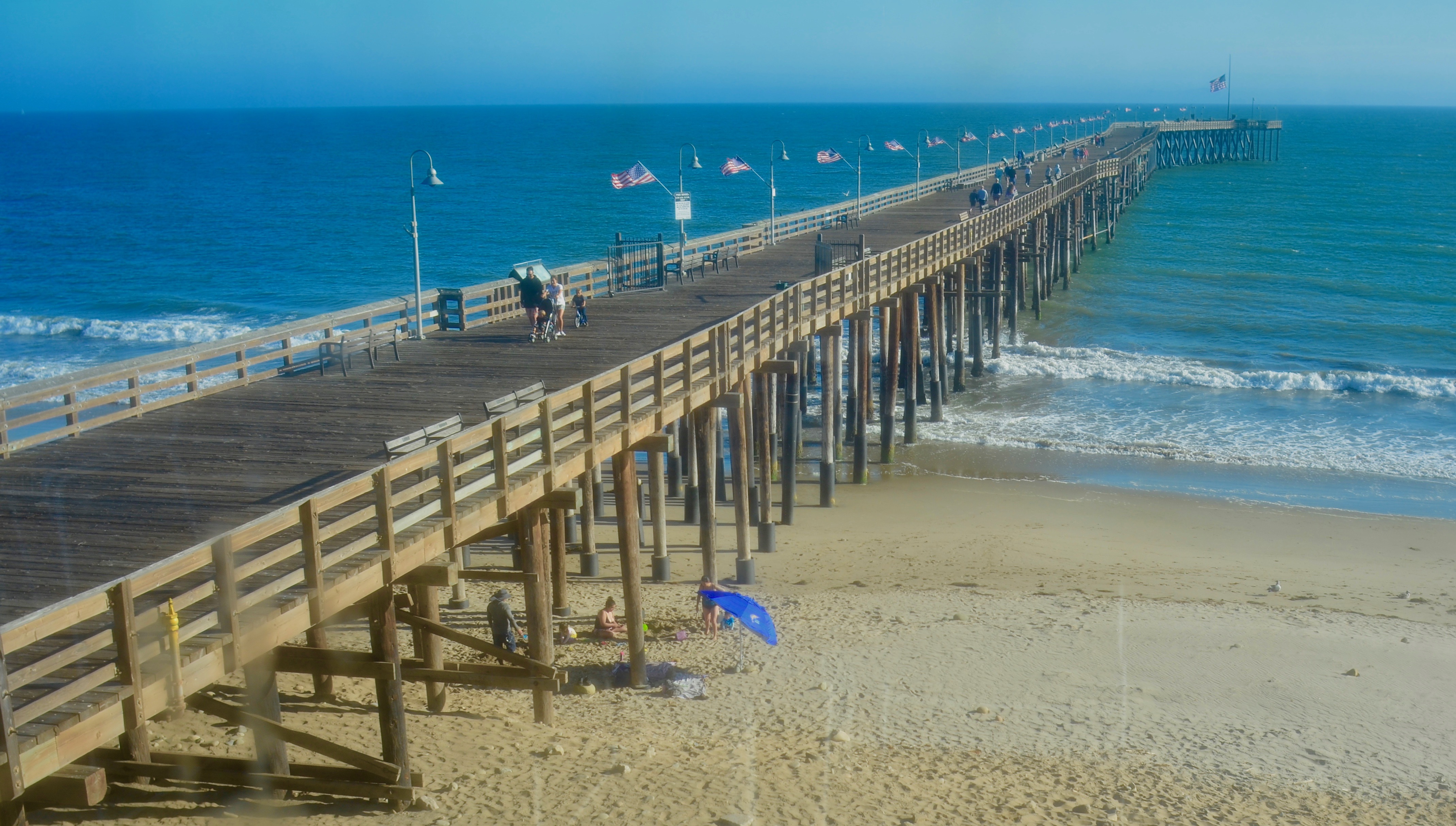
Over And Under, Ventura Beach, California, 2019
By MICHAEL PERKINS
COMPOSITION IN PHOTOGRAPHS IS NOT MERELY A MATTER of getting everything you want into the frame, whether your subject is crowded or stark. It’s about both the arrangement of objects or patterns in a given space and the relationships those things have with each other. It’s a process which often makes photography as frustrating as it is thrilling. Or maybe a more precise way to say it is, composition is the frustration you endure to get to the thrill.
Yeah, I like that a little better.
Part of the method of composition, in what is essentially a flat plane, is the arrangement of your subject in such a manner that it creates the illusion of depth, a kind of invitation to the eye to look further “in”. There have been entire libraries filled with references to these so-called “leading lines” such as the trail-off on the pier you see in this ocean view. Everyone mentions it because, well, goldarn it, for a cheap little trick, it works pretty well. This particular image is about as rudimentary an example of faux depth as you can find, but nailing it involves a lot of little things that are quite variable from one situation to another.
Ansel Adams once half-jokingly said photography was largely about knowing where to stand, and it’s still the best compositional advice I’ve ever heard. Certainly in the case of this photo, where I chose to stand (a decision I changed and re-changed across the space of several minutes) made a huge difference in how the depth effect displayed the picture’s information. I was originally walking toward the pier at beach level, at which angle the front-to-back view of the pier tended to emphasize the information most near at hand, with the rest of the pier dramatically foreshortened or “squished”, like the contracted bellows of an accordion, and objects at the far end of the pier greatly reduced in detail or prominence. Standing beside the pier rendered it as a long left-to-right line reminiscent of a snake or a train. Lots of detail but not much drama, and no practical way to show the entire structure.
Walking to the second-floor landing of a beach restaurant at the head of the pier, however, gave me a sensation of distance that appeared natural and yet was a little more dramatic, the lines of the pier converging as they reached the horizon, just like your ninth-grade mechanical drawing teacher taught you to do. But that’s the process of composition in a nutshell: a combined approach consisting of what to include and how to include it, or like Ansel says, knowing where to stand.
“WHAT” IS THE QUESTION
ONE OF THE MOST FREQUENTLY ASKED QUESTIONS of shooters is, “what’s that supposed to be?”, usually asked of any image that is less obvious than a sunset shot of the Eiffel Tower or a souvenir snap of Mount Rushmore. You may have found, in fact, that the number of times that the question is asked is directly proportional to how intensely personal your vision is exercised on a given project. As much as the hidden aspects of life fascinate us, the obvious recording of familiar objects soothe the eye, like a kind of ocular comfort food. The farther you wander in your own direction as a photographer, the greater journey you also ask of your viewers. Sometimes the invitation is taken. Sometimes you must face “the question”.
What’s that supposed to be?
How, actually, in a world shaped by our own subjective experience, an image is “supposed” to be anything is a little baffling. It’s probably safe to say that what we present, as artists is probably supposed to be the view as one’s mind filters it through his or her accumulated life. When we use the camera as a mere recorder, it may make it easier, presenter-to-viewer, to agree on that image’s terms of engagement, but that may or may not reveal what we actually felt about when creating it. If I use the same three colors to render a picture of the American flag as everyone else uses, I may get into fewer arguments about how appropriate the resulting image is, but then, I don’t get to open up the discussion to any other conceptions of that flag. Back in the first days of the environmental movement, the simple use of green on the original, Old-Glory-derived ecology flag suggested an alternative way of being American, of living your life. As I recall, some viewed the design as sacrilegious, while others embraced it as liberating.
Over 150 years after the first photographs were regarded as a threat to the painter’s domain, we are still most at ease with pictures that ape the painting’s method for framing the world. Oddly, it is always outlaws and amateurs that break free of these pictorial chains first; the professionals must protect the turf they have so carefully mapped out for themselves in the mainstream. There remains, then, an ongoing battle over what should or should not be called a “picture”. Abstractions, arranged or perceived patterns, even selected details or drastic re-imaginings of small parts of the so-called “actual” world must always fight for their place at the table alongside the technically accurate mirroring of easily named subjects. We still regard that which is realistic as being the most real, and the most worthy of praise.

Cactropolis, 2011. Three bracketed shots about a half-stop apart combined into an HDR composite. CLICK TO ENLARGE.
To want to show something for its own sake on our own terms is to move into more personal territory, and hence onto shakier ground for critical evaluation, but occasionally we strike a balance between what people want to see and what we must show. In the above image, I only wanted to focus attention on an arrangement that was a very small and visually ignored accent along a heavily travelled public street. An unsung landscaper’s arrangement of tiles, gravel, paving rock, and succulent plants, was in plain view, and yet, at only a few inches in height, easily missed by the thousands of daily passersby speeding along the street. To me, when framed close to ground level, it resembled a kind of desert cityscape, blocks of abstract skyscrapers, a cactus metropolis, and that’s how I tried to frame and process it. Of course, it us, after all, just a pattern, and anyone who looks at the image can fill in their own blanks with impressions that are just as valid as my kind of toy idea.
The vital point is that no one else’s take on your dream can be wrong, just because it differs with yours. Art is not a science, which is why we don’t become photographers, or as the word implies, “light writers” just by pushing a button.
We become photographers by pushing everyone’s buttons.
What is it “supposed to be”? You tell me, and I’ll tell you.
Thoughts?
