A WONDROUS MESS

Too busy? Well, when it comes to seasonal shots, it’s a lot harder to say.
By MICHAEL PERKINS
Consulting the rules of composition before taking a photograph is like consulting the laws of gravity before going for a walk.
Edward Weston
PHOTOGRAPHERS LOVE TO COMPILE LISTS OF LAWS that must be obeyed to ensure the capture of great images. Bookshelves are jammed to fracturing with the collected works of wizards large and small who contend that all of this art stuff is really about craft, or adherence to techniques that are the equivalent of Einstein’s law. And, of course, with every fresh generation, a new slew of shooters come sneering along to deride this starched and stuffy discipline. All that matters, these young turks snigger, is my grand vision.
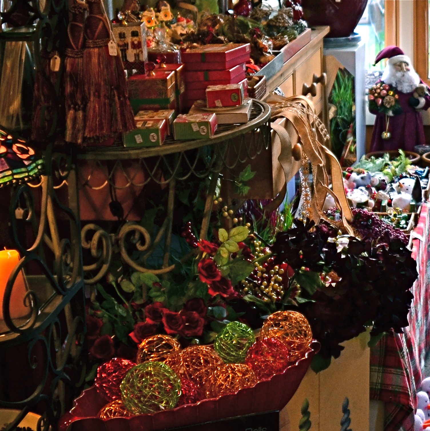
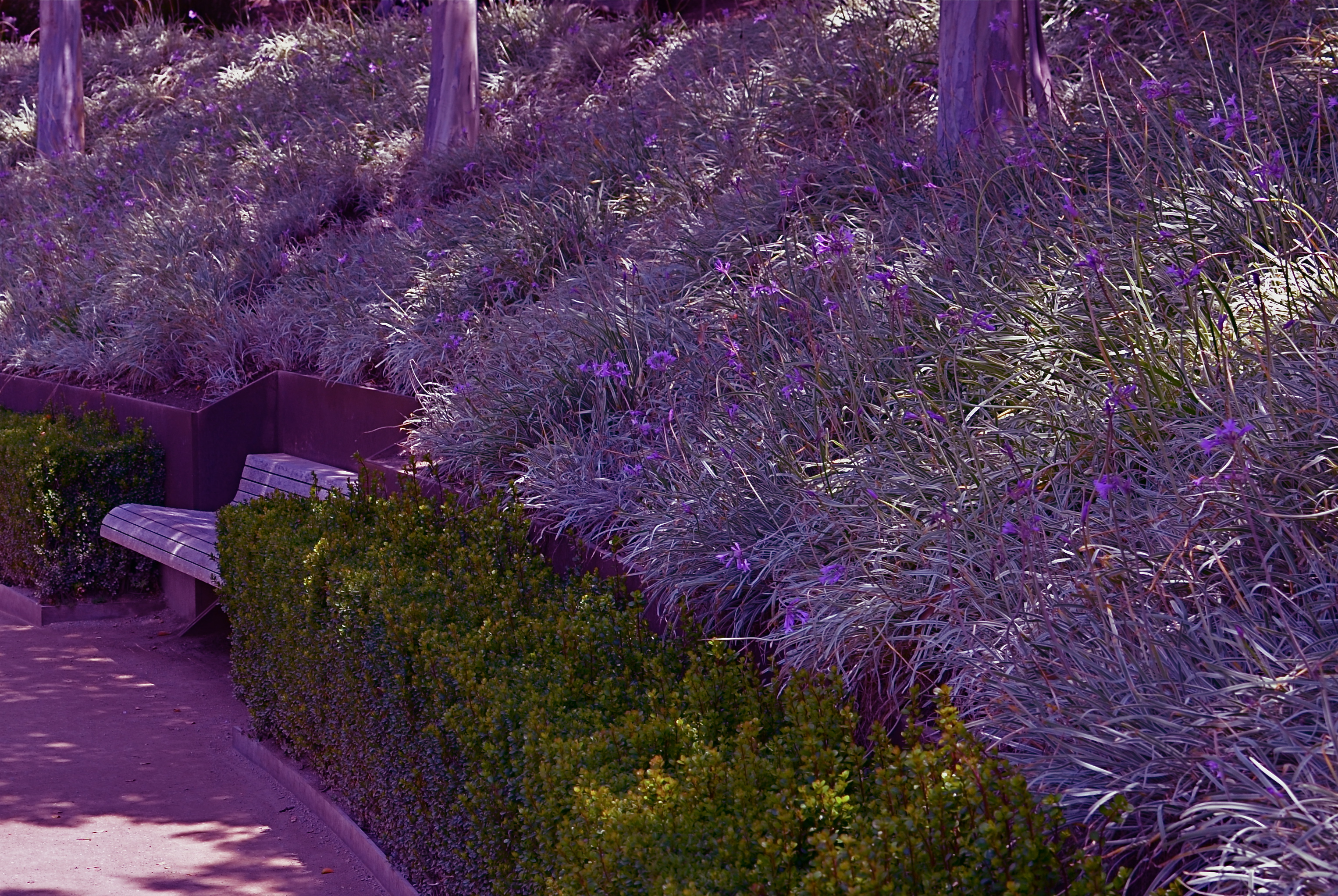
Worlds within worlds: many vast holiday scenes can be “subdivided with cropping.
Let me again re-state the obvious, which is that both viewpoints are correct and/or totally wrong. And since Mr. Weston has introduced the subject of composition, let us consider the special task of seasonal photos, specifically, arrangements of yuletide objects. The classic rule on still-life shots is that less is more, that it’s better to perfectly light and expose three pieces of fruit than whole baskets of the stuff. Meanwhile the festive, instinctual artist concedes that many holiday scenes are mad with detail and crammed with more, more, more…..and that’s okay.
The unique thing about Christmas decor is that in many cases, you not creating the compositions, but merely reacting to someone else’s creations…in nativity scenes, churches, and especially in retail environments. Obviously your local department store doesn’t adhere to the admonition “keep it simple”; quite the opposite. Seasonal trim in most stores is served up not by the spoonful but by the truckload. Anything less than overkill seems skimpy to many yuletide decorators, and so, if you favor basic subject matter, you’re either going to have to mount your own arrangements or selectively zoom and crop the more congested scenes. If, however, you already subscribe to the idea that more is better, then life gets easy fast.
Holidays come layered in much that is intensely personal, and that makes clean compositional judgements about “how much” or “how little” tricky at best. Just get the feelings right and let your regular rules relax into guidelines.
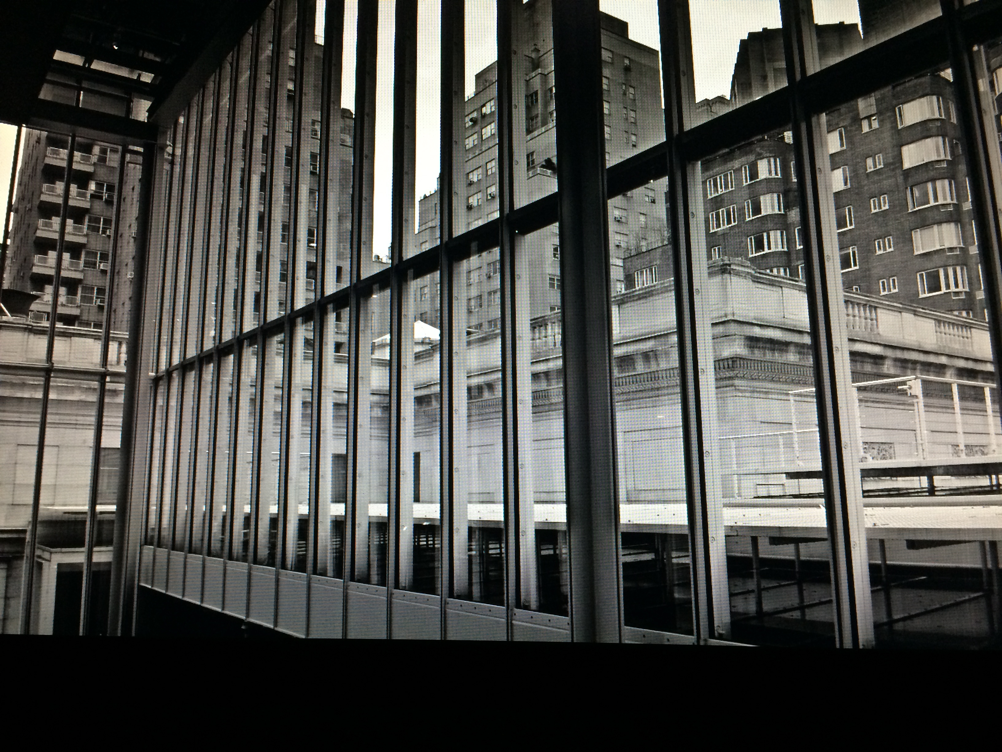
URBAN MIX
Competing architectural styles establish a natural rhythm of conflict in major cities.
By MICHAEL PERKINS
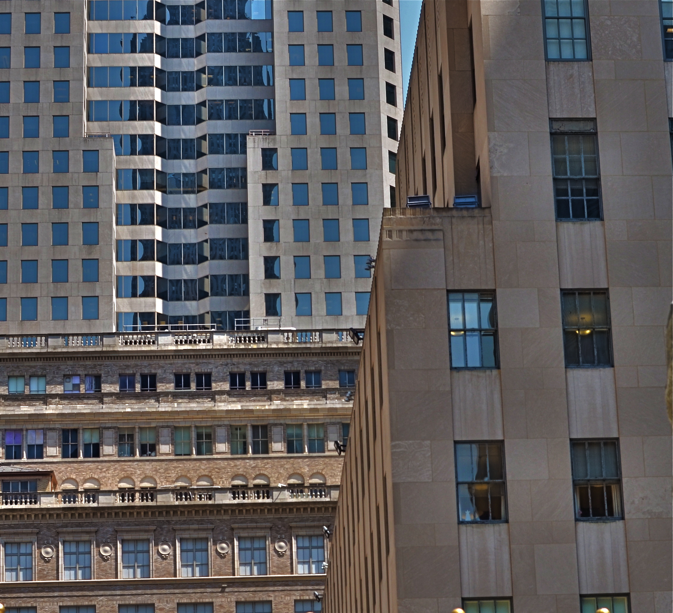
EACH MAJOR URBAN CENTER HAS ITS PHOTOGRAPHIC SUPERSTARS, those destination attractions that are documented to death by shooters great and small. Name the city and you can rattle off the names of the usual suspects. The landmarks. The legends. The here’s-proof-that-I-was-there vacation pictures. Meanwhile, the rest of the buildings within our super-cities, that is the majority of the remaining structures on most streets everywhere, remain under-photographed and, largely, unknown.
Part of the problem is our photographic viewpoint, which apes our human viewpoint. As drivers or pedestrians, we necessarily focus most our attention at events topping out at just about two stories above street level. This means we will almost certainly n0t see the mashup of architectural styles just outside our peripheral range. We don’t follow the visual line of buildings all the way up, either because we are walking, or because we don’t want to look like some out-of-town rube. But there is real drama in the collision of all those unseen details, and, if you’re interested in showing the city as an abstract design, some real opportunities.
I find that shooting toward the intersection of parts of three or more buildings amplifies the contrast between design eras, with doric columns and oak clusters crashing into International style glass boxes, overlayed with Art Deco zigzags. I shoot them with standard lenses instead of zooms to preserve the intensity of color and contrast, then create the final frame I want in the cropping. Zooms also tend to flatten things out, making buildings that are actually hundreds of feet from each other appear to be in single flat plane. Regular lenses keep the size and distance relationships relatively intact.
Importantly, I don’t shoot entrances, emblems, signage, anything that would specifically identify any one building, and I steer away from places that are recognizable in a touristy way. I’m not really interested in these buildings in their familiar context, but as part of a larger pattern, so I don’t want to “name” things in the image since it will draw away interest from other elements.
The city is a concrete (sorry) thing, but it is also a rich puzzle of design that offers almost infinite variety for the photographer. Best thing is, these compositions are just inches away from where you were bored to death, just a second ago.
WATERCOLOR DAYS
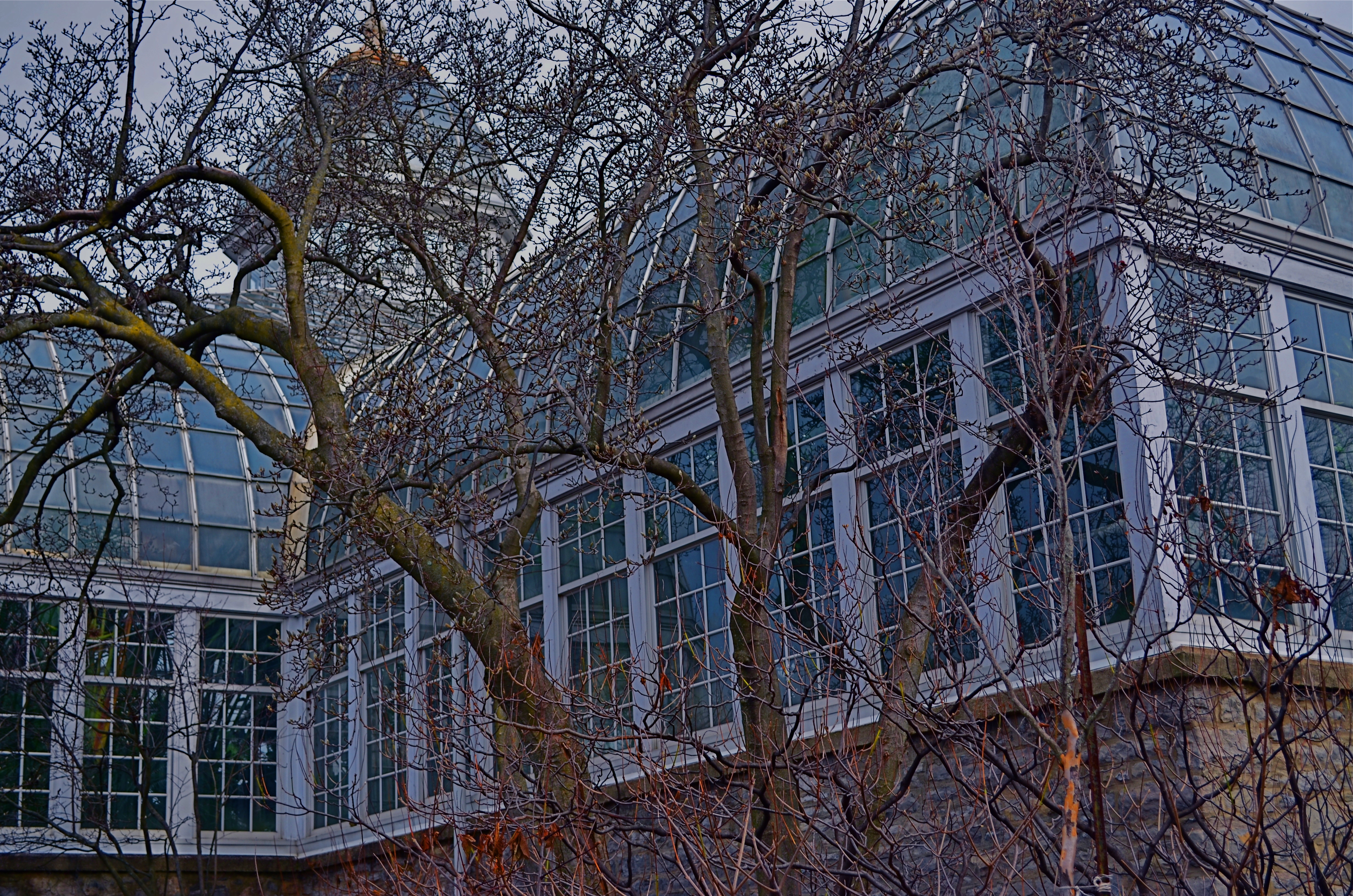
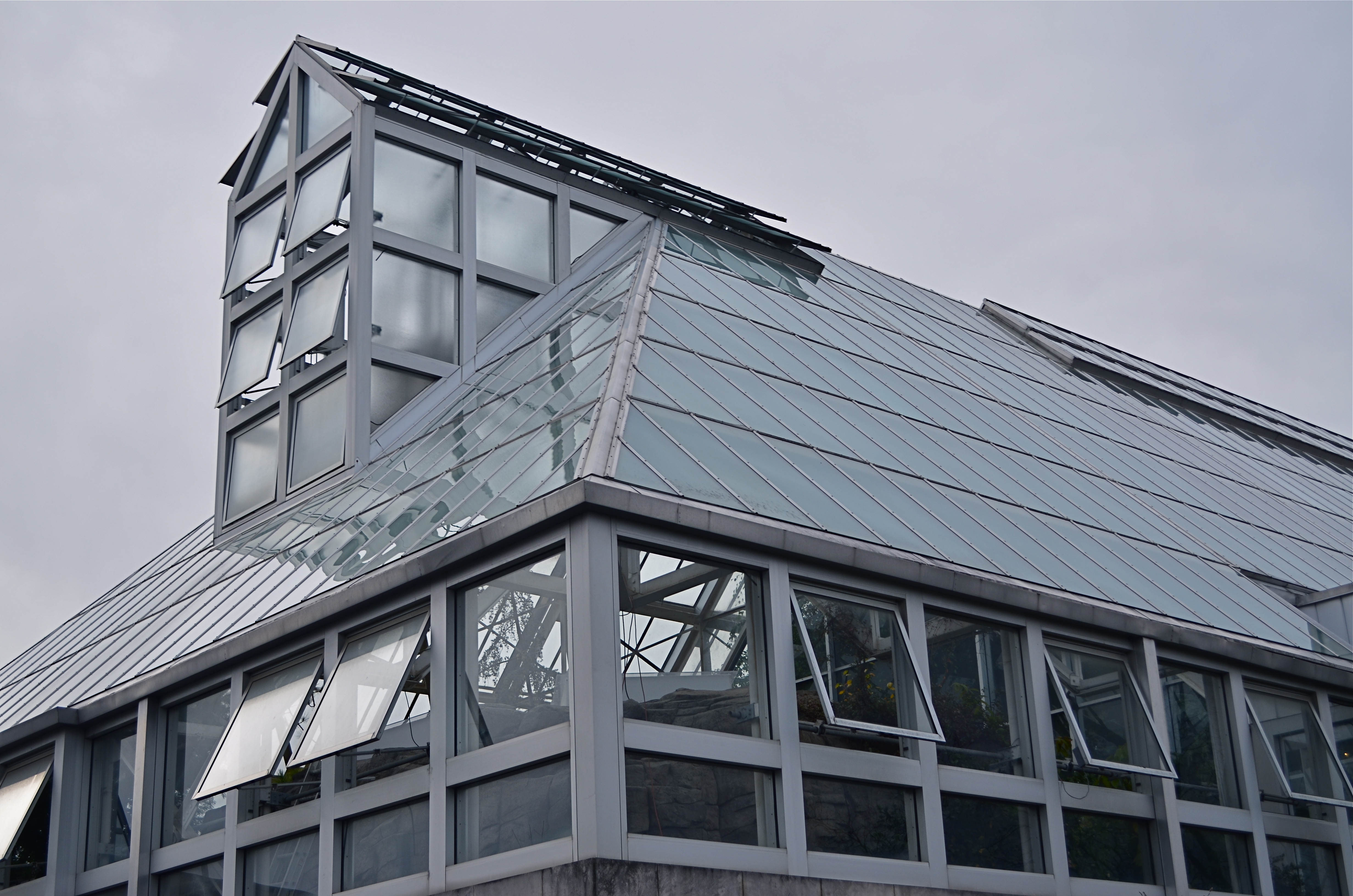
Franklin Park Conservatory, 2015.
By MICHAEL PERKINS
THE FIRST COLOR PHOTOGRAPHS REALLY…WEREN’T. That is to say, the various recording media, from glass plates to film, were technically incapable of rendering color, leaving entrepreneurial craftsmen (mostly post card artists) to lovingly apply hues with paint and brush. It was the Fred Flintstone version of Photoshop, and, boy howdy, did it sell, regardless of the fact that most flesh tones looked like salmon and most skies looked more eggshell than azure. Until the evolution of a film-based process near the end of the 19th century, these watercolor pastels stood in for the real thing.
Glass Barn, 2014
Winter’s months-long overcasts and grey days can remind a photographer of what it was like to only be able to capture some of the color in a given subject, as the change in light washes the brilliance out of the world, leaving it like a faded t-shirt and creating the impression that color, as well as botany, goes into the hibernational tomb during winter.
Of course, we can boost the hues in the aftermath just like those patient touch-up artists of the 1800’s, but in fact there are things to be learned from rendering tones on the soft pedal. In fact, reduced color is a kind of alternate reality. Capturing it as it actually appears, rather than amping it up to neon rudeness, can actually be a gentle shaper of mood.
Light that seeps through cloud cover is diffused, and shadows, if they survive at all, are faint and soft. The look is really reminiscent of early impressionism, and, when matched up with the correct subject matter, can complement a scene in a way that a more garish spectrum would only ruin.
Just like volume in music, color in photography is meant to speak at different decibel levels depending on the messaging at hand. Winter is a wonderful way to force ourselves to work out of a distinctly different paint box.
WHEN TEXTURE IS THE TALE
By MICHAEL PERKINS
THOSE WHO BELIEVE THAT SUBJECT MATTER IS KING IN PHOTOGRAPHY ARE FACED OFF in an endless tennis match with those who believe that only impressions, not subjects, are the heart of the art. Go away for fifty or sixty years and they are still volleying: WAP! a photograph without an objective is a waste of time! WAP! who needs an object to tell a story? Emotional impact is everything! And so on. Pick your side, pick your battle, the argument isn’t going anywhere.
Thing is, my assertion is that you don’t actually have to choose a side. Just let the assignment at hand dictate whether subject or interpretation is your objective. There are times when the object itself provides the story, from a venerable cathedral to an eloquently silent forest. And there are times when mere color, light patterns, or texture are more than enough to tell your tale.

Set Your Face Like Flint, 2014. Shot wide at 18mm, cropped to square format. 1/100 sec., f/5.6, ISO 100.
I find, for example, that texture is one of my best friends when it comes to conveying a number of important things. The passage and impact of time. The feel and contour of materials, as well as the endless combinations and patterns they achieve through aging and weathering. A way to completely redefine an object by getting close enough to value its component parts instead of viewing it as a whole. This is especially true as I try to refine my approach to images of buildings. I find that breaking the overall structure into smaller, more manageable sections helps to amplify texture, to make it louder and prouder than it might be if a larger scene just included the entire building among other visual elements. Change the distance from your story and you change the story itself.
This Massachusetts barn has tons of character whether seen near or far, but if I frame it to eliminate anything but the raw feel of the wood, it demands attention in a completely different way. It asks for re-evaluation.Contrast the rough-sawn wood with the hard red of the windows,and, again, you’ve boosted the effect of the coarser texture. Opposing textures create a kind of rudimentary tug-of-war in a picture, and the more stark the contrasts, the more dramatic the impact.
Traditional, subject-driven story telling will dictate that you show the entire barn, maybe with surrounding trees and a rolling hill or two. Abstracting it a little in terms of color, distance and texture just tell the story in a distinct way. Your camera, your choice.
THE AGE OF ELEGANCE
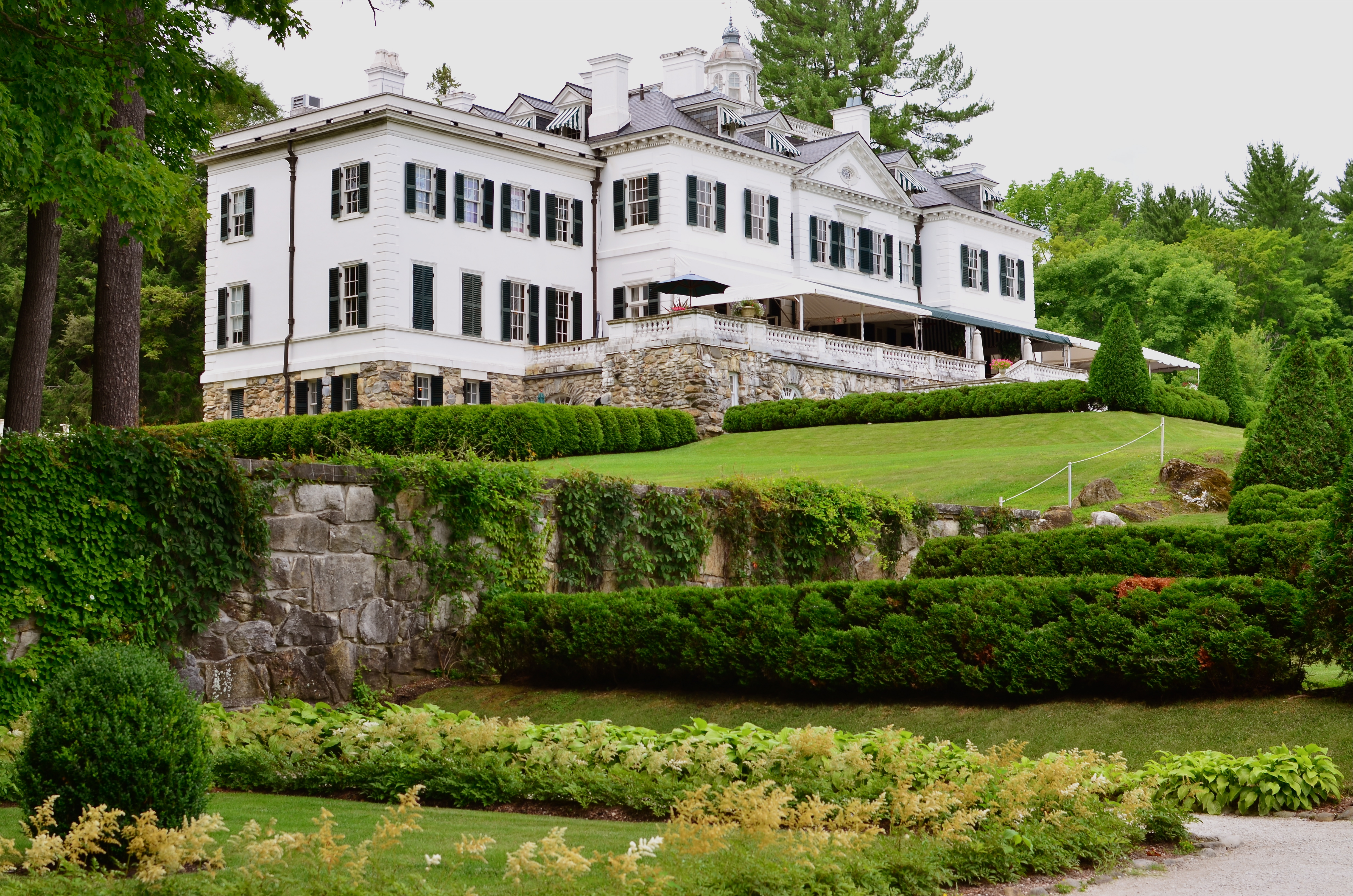
The Mount, Edith Wharton’s Berskshire Estate, now a working museum.
If only we’d stop trying to be happy, we could have a pretty good time.——Edith Wharton
By MICHAEL PERKINS
LONG BEFORE HER NOVELS THE AGE OF INNOCENCE, ETHAN FROME, AND THE HOUSE OF MIRTH made her the most successful writer in America, Edith Wharton (1862-1937) was the nation’s first style consultant, a Victorian Martha Stewart if you will. Her 1897 book, The Decoration Of Houses, was more than a few dainty gardening and housekeeping tips; it was a philosophy for living within space, a kind of bible for combining architecture and aesthetics. Her ideas survive in tangible form today, midst the leafy hills of Lenox Massachusetts, in the Berkshire estate her family knew as “The Mount”.

A world apart.
Wharton only occupied the house from 1902 to 1911, but in that time established it as an elegant salon for guests that included Henry James and other literary luminaries. Although based on several classical styles, the house is a subtle and sleek counter to the cluttered bric-a-brac and scrolled busyness of European design. Even today, the house seems oddly modern, lighter somehow than many of the robber-baron mansions of the period. Many of its original furnishings went with Wharton when she moved to Europe, and have been replicated by restorers, often beautifully. But is in the essential framing and fixtures of the old house that the writer-artist speaks, and that is what led me to do something fairly rare for me, a photo essay, seen at the top of this page in the menu tab Edith Wharton At The Mount.
The images on this special page don’t feature modern signage, tour groups, or contemporary conveniences, as I attempt to present just the basic core of the estate, minus the unavoidable concessions to time. The house features, at present, an appealing terrace cafe, a sunlit gift store, and a restored main kitchen, as part of the conversion of the mansion into a working museum. I made no images of those updates, since they cannot conjure 1902 anymore than a Mazerati can capture the feel of a Stutz-Bearcat. The pictures are made with available light only, and have not been manipulated in any way, with the exception of the final shot of the home as seen from its rear gardens, which is a three-exposure HDR, my attempt to rescue the detail of the grounds on a heavily overcast day.
Take a moment to click the page and enter, if only for a moment, Edith Wharton’s age of elegance.
RESTORING THE INVISIBLE
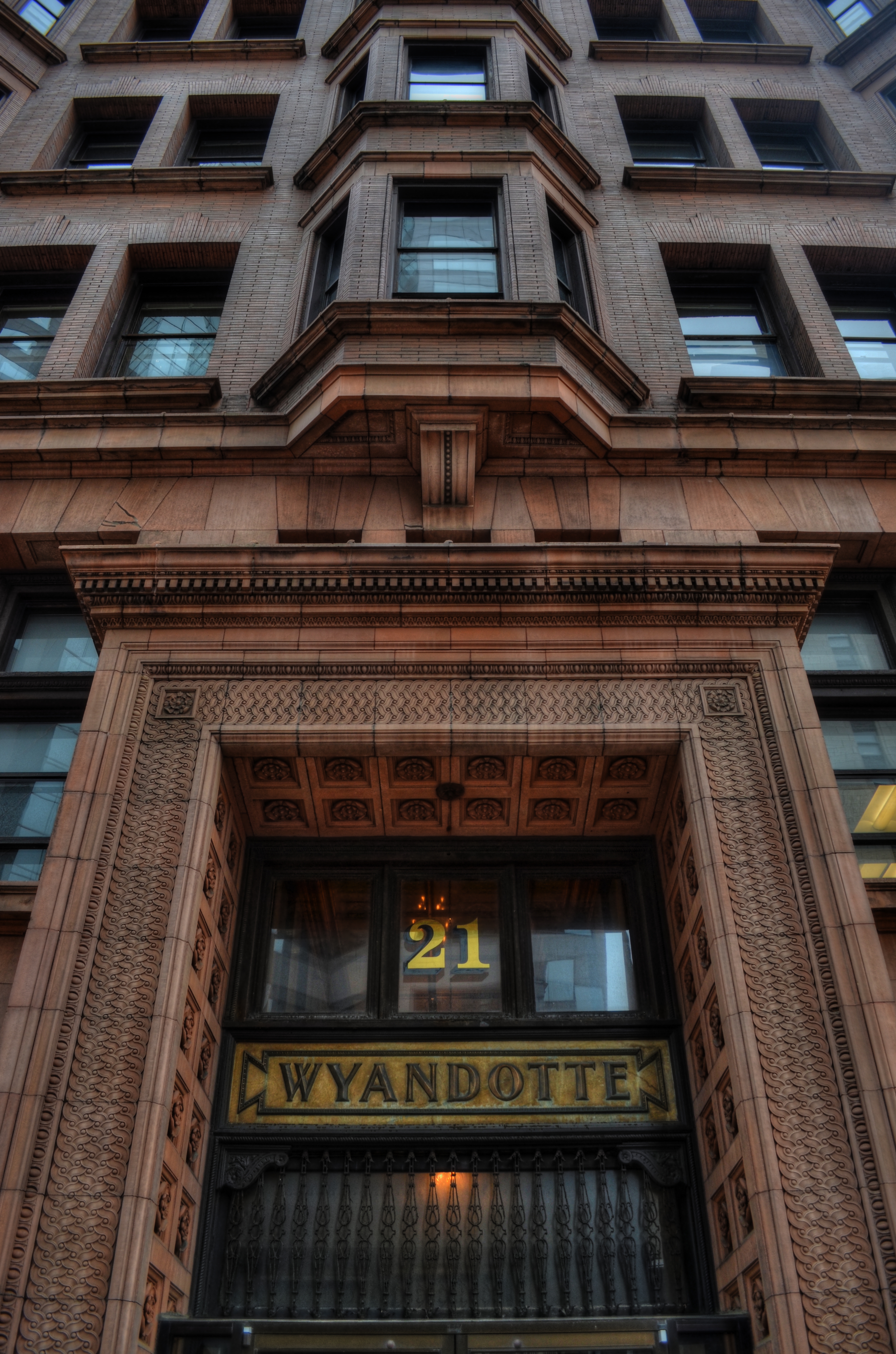
as[e The Wyandotte Building (1897), Columbus, Ohio’s first true skyscaper, seen here in a three-exposure HDR composite.
PHOTOGRAPHY IS ONE OF THE BEST RESPONSES TO THE DIZZYING SPEED OF CONTEMPORARY EXISTENCE. It is, in fact, because of a photograph’s ability to isolate time, to force our sustained view of fleeting things, that image-making is valuable as a seeing device that counteracts the mad rush of our “real time” lives. Looking into a picture lets us deal with very specific slices of time, to slowly take the measure of things that, although part of our overall sensory experience, are rendered invisible in the blur of our living.
I find that, once a compelling picture has been made of something that is familiar but unnoticed, the ability to see the design and detail of life is restored in the viewing of that thing. Frequently, in making an image of something that we are too busy to notice, the thing takes on a startlingly new aspect. That’s why I so doggedly pursue architectural subjects, in the effort to make us regard how much of our motives and ideals are captured in buildings. They stand as x-rays into our minds, revealing not only what we wanted in creating them, but what we actually created as they were realized.
In writing a book, several years ago, about a prominent midwestern skyscraper*, I was struck by how very personal these objects were…to the magnates who commissioned them, to the architects who brought them forth, and to the people in their native cities who took a kind of ownership of them. In short, the best of them were anything but mere objects of stone and steel. They imparted a personality to their surroundings.
The building pictured here, Columbus, Ohio’s 1897 Wyandotte Building, was designed by Daniel Burnham, the genius architect who spearheaded the birth of the modern steel skeleton skyscraper, heading up Chicago’s “new school” of architecture and overseeing the creation of the famous “White City” exposition of 1893. It is a magnificent montage of his ideals and vision for a burgeoning new kind of American city. As something thousand walk past every day, it is rendered strangely “invisible”, but a photograph can compensate for our haste, allowing us the luxury of contemplation.
As photographers, we can bring a particularly keen kind of witnessing to the buildings that make up our environment, no less than if we were to document the carvings and decorative design on an Egyptian sarcophagus. Architectural photography can help us extract the magic, the aims of a society, and experimenting with various methods for rendering their texture and impact can lead to some of the most powerful imagery created within a camera.
*Leveque: The First Complete Story Of Columbus’ Greatest Skyscraper, Michael A. Perkins, 2004. Available in standard print and Kindle editions through Amazon and other online bookstores.
SYMBOLS (For Father’s Day, 2014)
By MICHAEL PERKINS
PHOTOGRAPHY IS, ALTERNATIVELY, AN ART OF BOTH DOCUMENTATION AND SUGGESTION. It is, of course, one of its essential tasks to record, to mark events, comings, goings, arrivals, and passings. That’s basically a reporter’s function, and one which photographers have served since we first learned to trap light in a box. The other, and arguably more artistic task, is to symbolize, to show all without showing everything. And on this Father’s Day (as on every one), we honor our parents by taking photographs which address both approaches.
For many years, I have taken the obvious path by capturing the latest version of Dad’s face. It’s an ever-changing mosaic of effects, which no photographer/storyteller worth his salt can resist. But in recent years, I also am trying to symbolize my father, to make him stand not only for his own life, but for the miles traveled by all parents. For this task, a face is too specific, since it is so firmly anchored to its own specific myths and legends. To make Dad emblematic, not just as a man but rather as “Man”, I’ve found that abstracting parts of him can work a little better than a simple portrait.
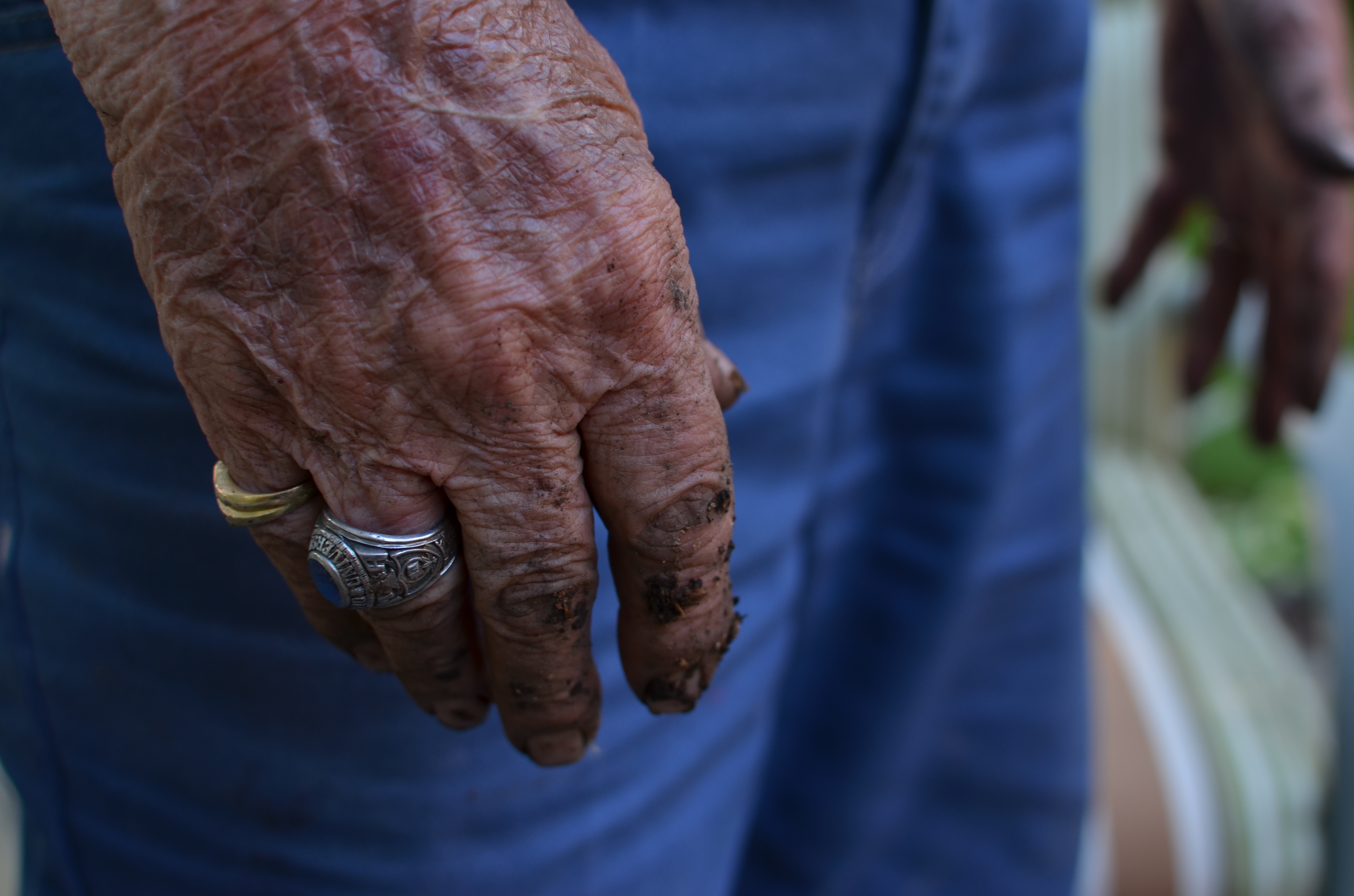
Survivors, 2014. 1/80 sec., f/4, ISO 100, 35mm.
These days, Dad’s hands are speaking to me with particular eloquence. They bear the marks of every struggle and triumph of human endeavor, and their increasing fragility, the etchings on the frail envelope of mortality, are especially poignant to me as I enter my own autumn. I have long since passed the point where I seem to have his hands grafted onto the ends of my own arms, so that, as I make images of him, I am doing a bit of a trending chart on myself as well. In a way, it’s like taking a selfie without actually being in front of the camera.
Hands are the human instruments of deeds, change, endeavor, strength, striving. Surviving. They are the archaeological road map of all one’s choices, all our grand crusades, all our heartbreaking failures and miscalculations. Hands tell the truth.
Dad has a great face, a marvelous mix of strength and compassion, but his hands…..they are human history writ large.
Happy Father’s Day, Boss.
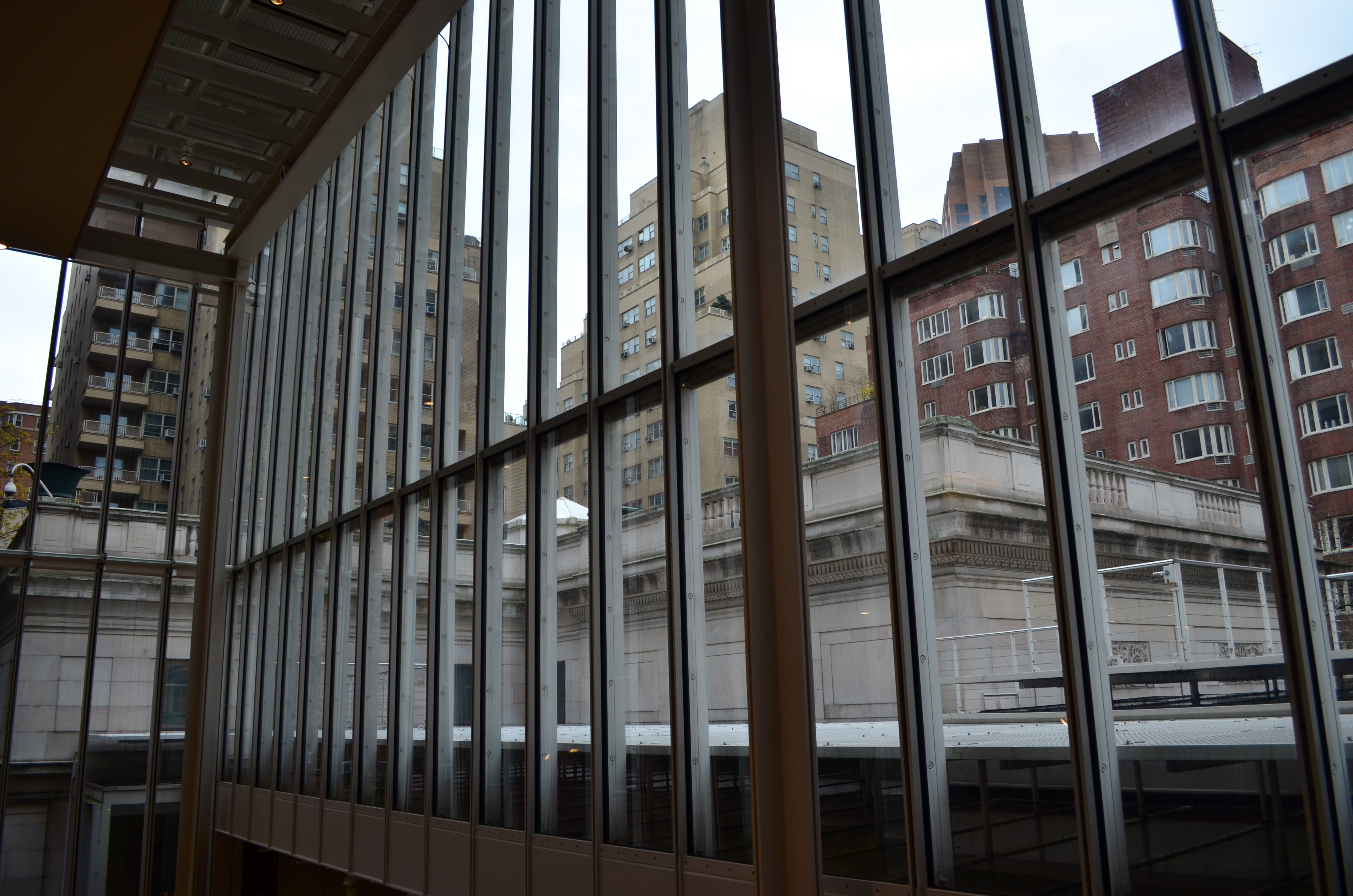
OH, IT’S HIDEOUS. I LOVE IT.
By MICHAEL PERKINS
THERE MAY BE NO RULES LEFT TO BREAK IN PHOTOGRAPHY, in that everybody is comfortable doing absolutely anything….compositionally, conceptually, technologically…to get the picture they want. Maybe that’s always the way it’s been, seeing as the art of image-making, like the science of breeding apple trees, has always grown faster and stronger through cloning and grafting. Hacks. Improvisations. “Gee-What-If”s.
Shots in the dark.
Not a bad starting point, but either too pretty, or not ugly enough…or something.
Recently I walked out into the gigantic atrium that connects all of the original buildings of the Morgan Library complex in NYC to get a good look at the surrounding neighborhood of big-shouldered buildings. I was fascinated by the way my wide-angle lens seemed to line up the horizontal grid lines of the atrium with the receding lines of the towers and boxes down the block. Only one thing bothered me about the result: the color, or rather, the measly quality of it.
A rainy day in Manhattan is perhaps the final word on rainy days. Some colors, like the patented screaming yellow of a New York cab, or the loud neon reds of bodegas, are intensified into a romantic wash when the drops start. This view, however, was just a bland mash of near-color. If the neighborhood was going to look dour anyway, I wanted it to be dour-plus-one. Thing is, I made this, ahem, “artistic” decision after I had already traveled 3,000 miles back home. In the words of Rick Perry, whoops.
Time to hack my way to freedom. I remembered liking the look of old Agfa AP-X film in a filter on my iPhone, so I filled the screen of my Mac with the bland-o image, shot the screen with the phone, applied the filter, uploaded the result back into the Mac again, and twisted the knobs on the new cheese-grater texture I had gained along the way. At least now it looked like an ugly day….but ugly on my terms. Now I had the kind of rain-soaked grayscale newspaper tones I wanted, and the overall effect helped to better meld the geometry of the atrium and the skyline.
No rules? Sure, there’s still at least one.
Get the shot.
BALLET OF HORROR
By MICHAEL PERKINS
THERE USED TO BE A MOVEMENT IN FINE ARTS CALLED THE “ASHCAN SCHOOL”, WHICH SOUGHT TO SHOW POWER AND BEAUTY in banal or even repellent urban realities. It posed a question that continues to stoke debate within photography to this day: how much should art engage with things that are horrible? Is the creative act vital when it shows us ugliness? More importantly, is it vital because it shows us these things? And, if we choose to depict beauty to the exclusion of the ugly, is our art somehow less authentic?
The whole matter may come down to whether you see photography as a constructed interpretation of the world, kind of a visual poem, or as a sort of journalism. Of course, the medium has been shown to be wide enough for either approach, and perhaps the best work comes from struggling to straddle both camps. A world of gumdrops and lollipops can be just as pretentious and empty as a world constructed exclusively of the grisly, and I think each image has to be defined or justified as a separate case. That said, finding a ying/yang balance between both views within a single image is rare.
Falling, as I did, under the influence of landscape photographers at a really early age, I have had to learn to search for a kind of rough ballet in things that I find disturbing. I’m not saying that it’s hampered my work: far from it. Look at it another way: as a missionary, you can plant crops and build hospitals for your village, but you still have to address the area’s cholera and dysentery. It’s just a part of its life.
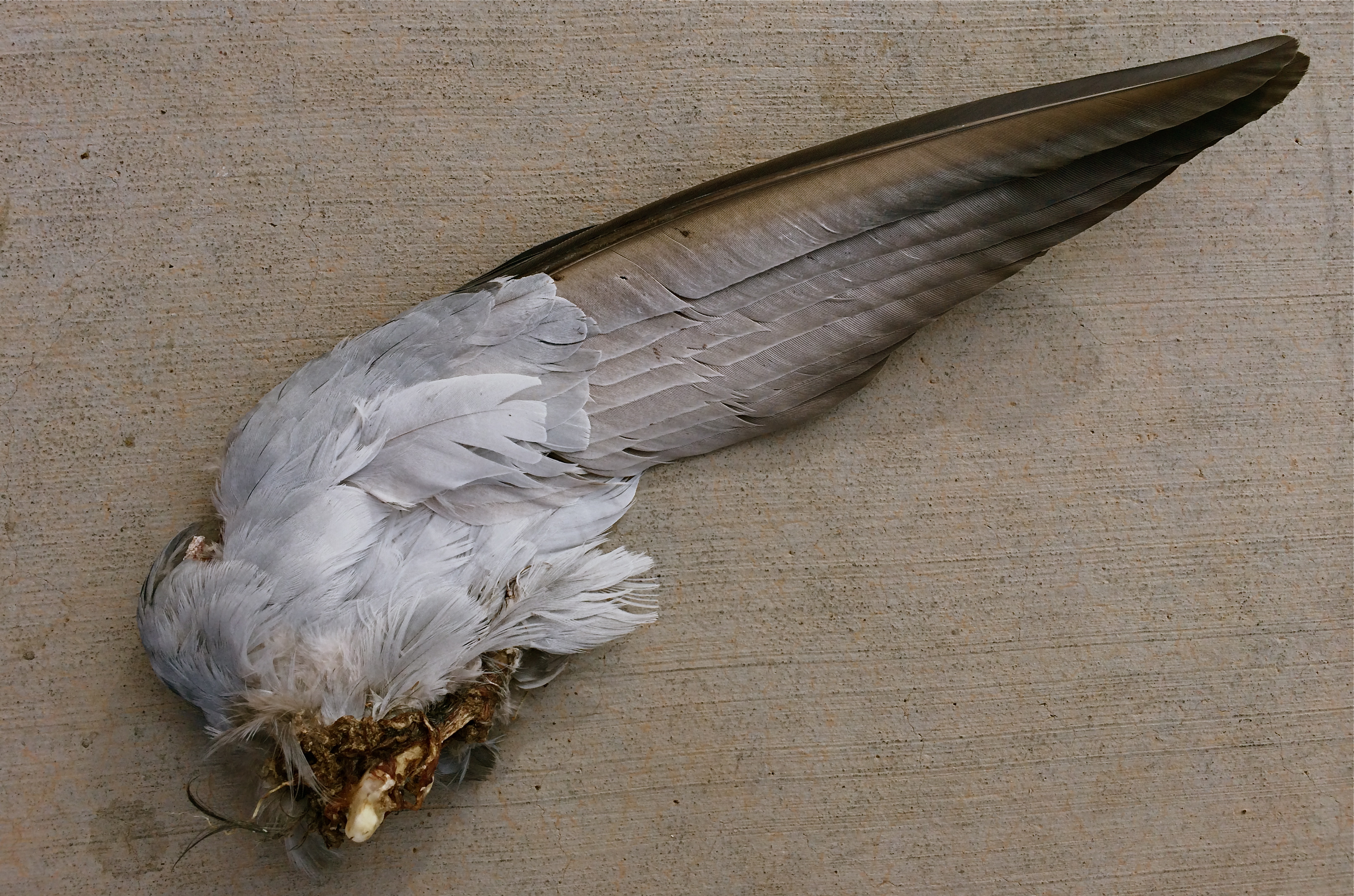
Death On The Wing: 1/900 sec., f/2.2, ISO 32, 4.12mm
The image above was pretty much placed right in my path the other day as I walked to enter an urban drugstore, and, as horrified as I was by the likely origin of this savage souvenir, I had to also acknowledge it as a Darwinian study of beauty and design. The virtually intact nature of the wing, contrasted with the brutal evidence of its detachment from its owner, made for an unusual transition from poetry to chaos within a single image. Many might ask, how could you make that picture? And it’s a hard question to answer. Another question that would be just as difficult to answer: how could I not?
Certainly, I won’t be entering this in Audubon magazine’s annual photo contest: it’s also no one’s idea of cutest kitty or beautiful baby. But it is one of the most unique combinations of sensation I have ever seen, and I did not want to forget it, nightmares and all. Because we live, and take pictures in, the world at large.
Not just the world we want.
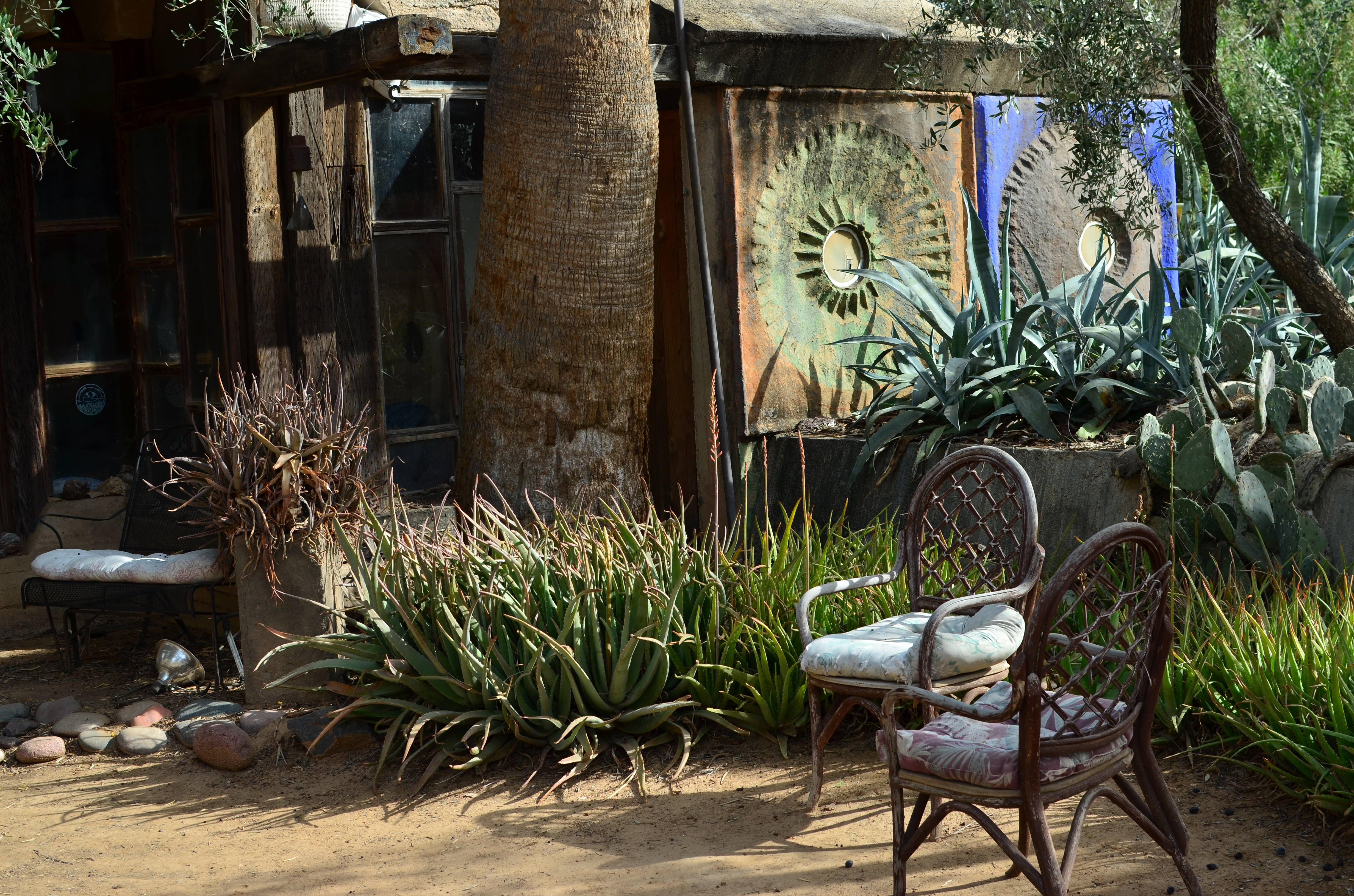
MAGNIFICENT RUIN

Clay pre-firings and molds for bronze bells at Paolo Soleri’s COSANTI studios in Paradise Valley, Arizona. 1/20 sec., f/5.6, ISO 100, 35mm.
by MICHAEL PERKINS
IN 1956, ARCHITECT PAOLO SOLERI BEGAN THE FIRST MINIATURE DEMONSTRATION OF WHAT WOULD BECOME HIS LIFE’S WORK, an experimental, self-contained, sustainable community he called Cosanti. Erecting a humble home just miles from his teacher Frank Lloyd Wright’s compound at Taliesin West, in what was then the wide-open desert town of Paradise Valley, Arizona, he started sand-casting enormous concrete domes to serve as the initial building blocks of a new kind of ecological architecture. And, over the next half-century, even as Soleri would call Paradise Valley his home, he would construct bigger versions of his dream city, now renamed Arcosanti, on a vast patch of desert between Phoenix and Flagstaff.
The project, which at his death in 2013 was still unrealized, was funded over the years by the sales of Soleri’s custom fired bronze and clay wind bells, which became prized by Arizona visitors from all over the world. At present, his early dwellings still stand, as do the twisting, psychedelic paths and concrete arches that house his smelting forges, his kilns, the Cosanti visitor center, and a strange spirit of both wonder and dashed dreams. It is a magnificent ruin, a mad and irresistible mixture of textures for photographers.
One of COSANTI’s bizarre dwellings, scattered amongst the compound’s forges and kilns. 1/400 sec., f/5.6, ISO 100, 35mm.
Name the kind of light…….brilliant sun, partial shade, catacomb-like shadows, and you’ve got it. Name the material, from wood to stone to concrete to stained glass, and it’s there. The terrain of the place, even though it’s now surrounded by multi-million dollar mansions, still bears the lunar look of a far-flung outpost. It’s Frank Lloyd Wright in The Shire. It’s Fred Flintstone meets Dune. It continues to be a bell factory, and a working architectural foundation. And it’s one of my favorite playgrounds for testing lenses, flexing my muscles, trying stuff. It always acts as a reboot on my frozen brain muscles, a place to un-stall myself.
Here’s to mad dreamers, and the contagion of their dreams.
HIGH DYNAMIC RAGE
HDR, used here to recover a few dark details in this somewhat contrasty ladnscape. Far from perfect, but I can live with this.
By MICHAEL PERKINS
THE INTERNET HAS A UNIQUE WAY OF TURNING AN IFFY LOOKING MOLE INTO TERMINAL SKIN CANCER, that is, fanning small sparks into raging infernos by squaring and cubing people’s discontents until they appear monumental. In photographic circles, this phenomenon has made the process known as High Dynamic Range, or HDR a hot potato. Whereas just a few years ago this technique sparked input from people who found it “kind of helpful” or “just not for me”, the current intensity of dialogue on the subject now characterizes HDR as either the greatest tragedy since Ben Affleck got cast as Batman or the miraculous equivalent of mother’s milk.
What has made the average shooter feel like they he has to side with either Mommy or Daddy in a custody battle for the soul of picture-taking? Jeez H. Loueeze. HDR, which is actually just a tool, and thus good or bad depending on how it’s used, has become an enormous bone of contention, with both sides of the debate hurling burning tar balls at each other, safe within the knowledge that they alone possess Real Truth.
Uh….okay, fine.
How’s this for Real Truth: processing in the digital age is no different from the burning, dodging, manipulation and filtering of the analog era, and, somehow, photography has survived both the modest and excessive uses of these and countless others for over two centuries. HDR’s original stated purpose was to modulate the tones of extremely contrasty subject matter, rendering a smoother transition between really light and really dark values to produce a picture that seemed to more accurately reflect how the human eye compensates for contrast. It was concocted as a workaround for one of the optical barriers that cameras are always striving to overcome.
This may have been taken inside a chapel, but not even Jesus could save this one. Gooey and creepy.
So what do you expect humans, always the “X” factor in any art, to do with any new tool? Answer: Anything they damn well please. Of course some people are going to produce beauty while others produce sludge. Of course some will use it to mask or slap a band-aid on badly conceived images. And, of course decent HDR processing platforms will be imitated by cheap apps created in Hacky McHackmore’s Dad’s garage and selling for $1.99.
I have had my own uneasy romance with HDR going back several years. I have found it to be a nice way to tweak color, an intensifier for detail and grain in things like stone and wood, and, yes, a way to dramatize contrasts in superkeen ways. I have also been guilty of slathering it on in the desperate hope that I can “rescue” a shot with it, and have been horrified at the way it makes human skin look like it was hosed down in molten Crayolas. Sometimes I have used it to make things more natural, while, at other times, I have taken advantage of its special talent for making things unearthly. And even when I have made the most inane use of HDR, the planets have, amazingly, continued on their daily orbits. In the words of the not-too-great Bobby Brown, it’s my prerogative.
The intense hater-ama currently being mounted against HDR might better be aimed at what makes its misuse all too predictable: the fact that human judgement is variable, unpredictable, and sometimes, twisted. If there’s a photo process that can eliminate that from the pitcher-taking mix, I’d love to see it. In the meantime, HDR is no more harmful (or salvational) than any other processing platform. If there’s a flaw, it’s inside the skull of the guy pressing the button.
Always has been, always will be.
ONE OUT OF FOUR
Main bar, Greasewood Flats, Arizona, 1/12/14. 1/30 sec., f/3.5, ISO 250, 35mm.
By MICHAEL PERKINS
IF YOU ARE DEPENDENT ON NATURAL LIGHT FOR YOUR ONLY SOURCE OF ILLUMINATION IN AN IMAGE, you have to take what nature and luck afford you. Making a photograph with what’s available requires flexibility, patience, and, let’s face it, a sizable amount of luck. It means waiting for your moment, hell, maybe your instant of opportunity, and it also means being able to decide quickly that now is the time (perhaps the only time) to press the button.
I recently had such a situation, measured in the space of several seconds in which the light was ready and adequate for a shot. And, as usual, the subject seemed as if it would serve up anything but acceptable conditions. The main bar of the classic western “joint” named Greasewood Flats, just outside of northern Scottsdale, Arizona, is anything but ideal in its supply of available light. Most of the room is a tomb, where customers become blobby silhouettes and fixtures and features are largely cloaked in shadow. I had squeezed off a few shots of customers queued up for bar orders, and they all registered as shifting shadows. The shots were unworkable, and I turned my attention to the fake-cowboy-ersatz-dude-ranch flavor of the grounds outside the bar, figuring that the hunt inside would be fruitless.
Minutes later, I was sent back inside the building to fetch a napkin, and found the bar empty of customers. I’m talking no human presence whatever. In an instant, I realized that the outside window light, which was inadequate to fill a four-sided, three-dimensional space, was perfectly adequate as it spread along just one wall. With crowds out of the way, the rustic detail that made the place charming was suddenly a big still-life, and the whole of that single wall was suddenly a picture. My earlier shots were too constrasty at f/5.6, so I tried f/3.5 and picked up just enough detail to fill the frame with Old West flavor. Click.
All natural light is a gift, but it does what it wants to do, and, to harness it for a successful shot, you need to talk nice, wait your turn, and remember to give thanks. And, in a dark room, be happy with one wall out of four that wants to work with you.
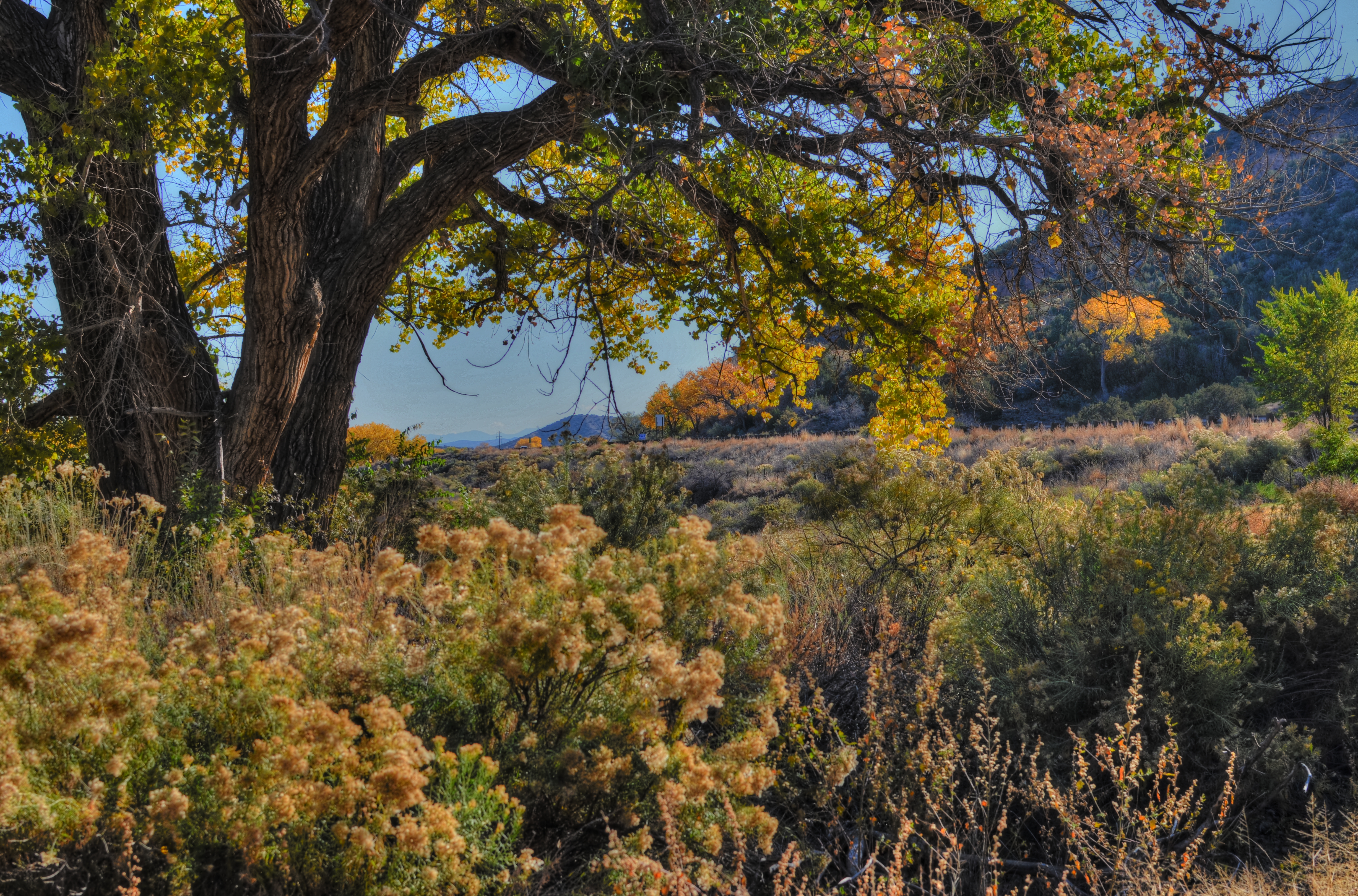
DEPTH OF FEELING
By MICHAEL PERKINS
OFTEN, THERE ARE ONLY SCANT MOMENTS TO DETERMINE HOW TO “USE” PEOPLE IN YOUR PHOTOGRAPHS. The decision as to how prominently a person figures in the overall scheme of a given image is frequently made on the fly, and your result will reflect whether that person is an element of the picture or a select feature.
Of course, you can wind up with wonderful photos either way, which is one of the most attractive aspects of picture making. This is all multiple choice, and there is no wrong answer. Also, if the answer was right for you, chances are that it will be so judged by others. Your conviction carries the picture to its desired audience, if you will.
This October, I fell into a virtual pot of gold on a trip to visit friends in rural New Mexico, since the entire countryside was awash in a gilded flood of yellow with the turn of the leaves. You could literally point the camera at a trash can, and, if it was next to a cottonwood tree, the thing became a palace. As a midwestern kid who has spent nearly fifteen years in the Arizona desert, I was long overdue for the richness of the autumnal palette, and I got a little drunk on it all. I wanted to immortalize every tree, shooting generally at small apertures to get as much sharp detail as possible.
1/80 sec., f/5.6, ISO 100, 35mm.
That’s what I was doing in the side yard of a roadside gallery when my wife Marian wandered outside for a brief walk, so the first few frames I shot showed her and the background in about the same focus. Just for variety, I re-focused on mostly her at f/5.6, slightly softening the foliage beyond so it wouldn’t fight with her for the viewer’s attention. In that one frame, she morphed from element to feature, and all that color was put at her service, so to speak. As an afterthought, I made a dupe of the image, lightened it by about a third, then blended the two in Photomatix, since HDR processing also accentuates detail, giving me an even sharper contrast between her sharpness and the softer background. It wasn’t a big bump, processing-wise, just the bow on the box.
Experimental “light field” cameras, once perfected, may make such planning moot, since images taken with this very different technology allows the photographer to redo the depth of field on an image after it has been taken. For now, however, it’s a decision of the moment.
Again, part of the fun.
Related articles
- Depth of Field (mariatobon.wordpress.com)
QUICK STUDY
Don’t think you’re paying me a compliment to say that this “looks like a painting”. Or a cabbage. Or a hammer. It’s a picture.
By MICHAEL PERKINS
THE INCREASINGLY COMMON USE OF THE WORD “PAINTERLY” AS A GENERIC COMMENT ON CERTAIN KINDS OF PHOTOGRAPHIC IMAGES has got me grinding my teeth, as it perpetuates the use of a term that is absolutely meaningless. Almost as meaningless as noting, or caring, at this late date, whether elements of painting are present in photos. This argument goes back so far that I feel compelled to provide the following “Cliff’s Notes” in order to compress 150 years of bickering into a compact format. Presenting:
A COMPLETE CHRONOLOGY OF PHOTOGRAPHIC “TRUTH”
a) We are just as good as painting.
b) No seriously, we are.
c) Who said that? We are so not like painting, which is old and tired.
d) Well, we’re a little bit like it, but we kinda feel weird about it.
e) Wow, I’d love to photograph that painting.
f) Man, I’d love to layer paint on that photograph.
g) Hey, I found a way to make my photographs look like paintings!
Enough already. We never praise a painting by saying it looks “Photo-ish”, so why make the opposite comment? What visual flavor makes any image fall on either side of an arbitrary line, and who the $%#&! cares? The only comment that could possibly matter is to remark that something is “a great picture”, but even that is superfluous. Does it speak? Did it work? Is there something there? Was anything amplified, simplified, defined, revealed in said picture?
This kind of semantic drift persists because, amazingly, some people don’t think photography is miraculous enough without being laden with little linguistic Christmas ornaments that display their acumen and intellect. These are the same people who fret that processing is “cheating” and that expensive cameras make better pictures than cheap ones, and it’s a disservice to any authentic discussion, like the fact that those who wield brushes and those who wield Nikons can both exalt, or denigrate, the human experience.
You don’t have to paint me a picture. You just have to tell me a story.
Related articles
- Blending painterly elements with photography (flickr.net)
THE GREAT RIDDLE
By MICHAEL PERKINS
IT’S FORTUNATE THAT NONE OF US HAS ANY IDEA WHAT APPEALS TO OUR VIEWERS, or else everything we do would revert to a dull formula. If it was possible to predict which of our creations would establish a connection with other hearts and minds, wouldn’t our human nature tempt us to churn out clumsy duplicates of that creation again and again? You see this at craft shows where “artists” hawk dozens of copies of the same image to anyone who passes by, customizing only the frames and enlargement sizes. The first version of the idea was “art”; the cannily repackaged remakes are merely marketing.
With this in mind, the act of putting photographs on the web via various sharing sites is often a puzzling process, since I have no way of knowing whether anything I regard as “successful” will total even one view, and since the pictures I regard as merely “all right” may resonate in a fashion that I never foresaw. Again, I have no control over any of this, which makes it both gratifying and, well, stupefying.
Dream Gardens, Los Angeles (2013). 1/250 sec., f/5.6, ISO 100, 35mm.
You’re looking at the runaway champ photo for total views in my entire Flickr photostream. To me, it’s a bit of whimsy at best, and, if I am totally truthful, an attempt at a partial “save” on what started out to be a rejected image. Backstory: the massive and visually busy central gardens at Los Angeles’ Getty art campus are wonderful to walk through, irresistible to shoot, and a nightmare to capture. If you do the cliché overhead “master shot” of the entire area from, say, two stories in the air, you get something which generally work. However, trying to get a sense of the densely landscaped details at ground level is a fool’s errand. This shot represents a kind of surrender, as it was an attempt to create a quiet composition along one of the more sparse sections of one footpath. Even so, what you’re seeing here is a paring-away of more than half the original frame. There was just too much visual information to work with.
The psychedelic rework on the color is yet another sign that I am not truly comfortable with what I am doing, but it at least represents an attempt to create an “otherness” with the image, to take it out of the normal world. This strategy gave me a picture I could live with, but hardly one I would point to with pride. The verdict from every one else? 5,000 % more eye traffic than the next most popular picture I’ve ever posted on the web, and no sign of slowing. And yet, I know that if I intentionally take another picture like this, it won’t become part of a “series” or a “school of thought”, merely me trying to cash in on a great riddle.
We use our photography to make a case for our various visions to an unknown jury, but, in most cases, we sort of “get” what worked about a picture. But when mysteries like these occur, we can merely
a) be grateful
b) say goodnight, Gracie.
I am reminded about an old bit where Billy Crystal “imitated” famous people by cutting out the mouths of big posters of various icons, then sticking his own lips where theirs should be and “speaking” for them. I fell on the floor as he took his place behind a huge image of Albert Einstein, and in his best Catskills accent, kept repeating, “WHO KNEW? WHAT DID WE KNOW??”
What, indeed.
Follow Michael Perkins on Twitter @MPnormaleye.
BLACKTOP GYPSIES
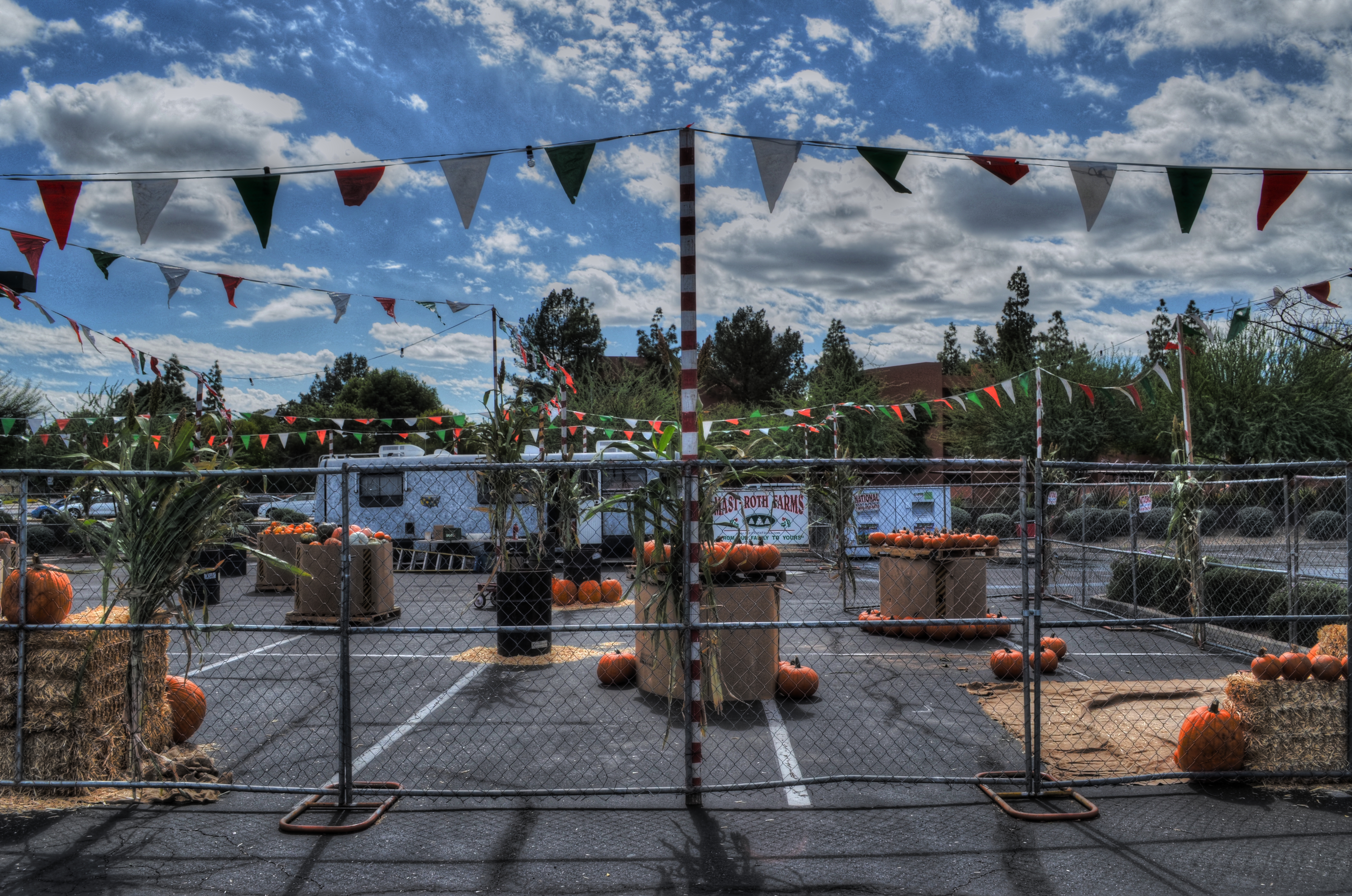
Low overhead? Hey, we invented it. A parking lot, some pumpkins, and opportunity. For the merchants and you.
By MICHAEL PERKINS
RETAIL CHAINS ARE STARVATION FOR A PHOTOGRAPHER, a barren field where nothing grows, at least visually. America used to be a place where, in our business doings, our petticoat showed a bit; a certain raw vitality showed through our saggy banners, our improvised displays, our homespun marketing. It’s no wonder that the photojournalists of the Great Depression or the choniclers of the Lower East Side of the early 1900’s made poetry out of our back-of-the-truck veggie stands, our horse-drawn pushcarts, our roadside tag sales. There was texture there. There was the real drama of struggle, and it was a pictorial gold mine.
Of course it’s not all gone, and we are not, uniformly, Wal-Mart Nation. Not yet.
As picture makers, we have so much more to work with looking at the human, the risky, the uncertain in our do-it-yourself capitalism. There are stories in it. There are real people on the front lines of the culture to watch and capture. It’s also a hell of a lot more fun than trying to find drama in the grand opening of, say, Kwikie Mart # 3425.
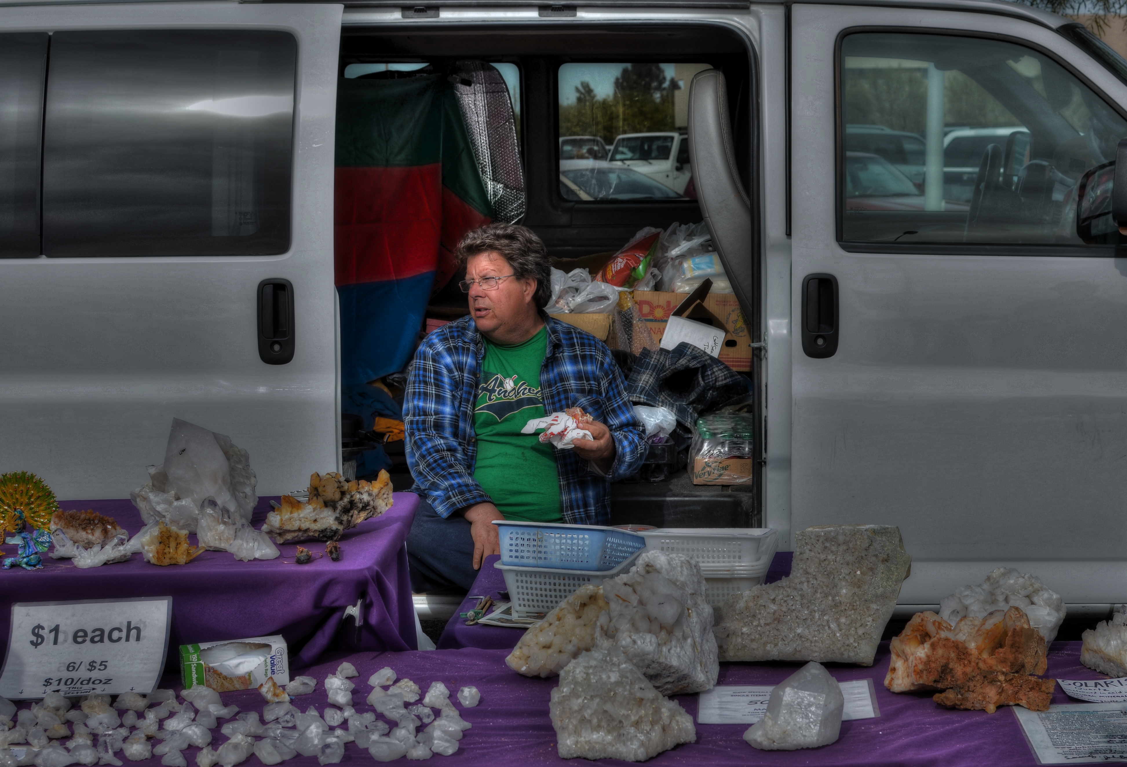
Look Around, See If You Like Anything, I’m Almost Done With My Lunch….
And picture opportunities, created by the blacktop gypsies of our time, are still setting up shop across the country…..six days in a Target parking lot to sell fireworks, four hours in a church driveway to hawk cakes and pies, three weeks in a vacant lot to peddle Christmas trees. And then there are the fairs, the craft shows, and the garage sales, those stubborn little machines of mercantile faith. You can’t not grab gold in these fields.
There may be a great epic just waiting to be shot inside a massive wholesale warehouse, but I prefer my drama smaller, and a little more on the human side. Show me a guy trying to make a buck against all odds and I’ll show you a picture.
Or make you one.
ON THE ROAD TO FINDOUT
A box of mirrors: 1/500 sec., f/5.6, ISO 100, 35mm.
By MICHAEL PERKINS
LATELY I’VE TAKEN TO GRABBING LYRICS OR TITLES FROM POP SONGS TO SUM UP WHAT I WANT TO SAY IN A GIVEN POST, and apparently I haven’t yet kicked the habit. Like the searcher in Cat Stevens’ early ’70’s tune, I am sure that (a) I don’t really know where I’m going most of the time, and (b) the place I’m eventually going to will explain all, eventually. Pretty sunny outlook for a burned out old flower child, I’ll admit, but, especially in photography, the journey is the quest. What we encounter “on the road to findout” is worth the price of the trip.
That’s a fancy-pants way of saying that, frequently when I’m on a photo walkabout, I only think I know what I’m looking for. Sometimes I actually snag the object of the expedition, then find that it’s as disappointing as winning that cheap plush toy that looked so wonderful behind the carnival barker’s counter. Such a thing happened this week, when I drove five miles out of my way to revisit a building that had grabbed my attention several months prior. Short term result: mission accomplished…building located and shot. Long term result: what did I think that was going to be? Ugh.
I was walking off my mild disappointment, heading back to my car, and then the mundane act of stowing my camera forced me to rotate my gaze just far enough to see what the midday light was doing to the building across the street. It’s masses of glass looks rather flat and dull by morning, but, near noon, it becomes a slatted mirror, kind of a giant venetian blind, reflecting the entire street scene below and across from itself. The temporary light tilt transforms the place into a surreal display space for about thirty minutes a day, and, had I not been standing exactly where I was across the street at that moment, I would have missed it, and missed the building as a subject for the next, oh, 1,000 years.
Kurt Vonnegut had a dear friend from Europe who always parted from him by hoping that they would meet again in the future if the fates allowed. Only the idiom got crumpled a little in translation, coming out as “if the accident will”. Vonnegut loved that, and so do I.
On the road to findout, we may take wonderful pictures.
If the accident will.
Follow Michael Perkins on Twitter @MPnormaleye.
THE COLORS OF DREAMS
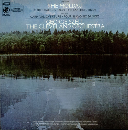
I will never know the name of the stock photographer at Columbia Records who shaped me with this image. But I know his genius.
By MICHAEL PERKINS
ONE OF THE TRICKIER PARTS OF BEING MY AGE is that I have been carrying around certain creative influences inside my skull for so many consecutive decades that their origins often blur. Who said it? Where did I brush up against that angle, that idea? Where did I see it? Book? Movie? Conversation? Who brought me into contact with this treasure? Inspiring mentor? Loving teacher? Teaching lover?
Of course, it can be argued that what you walked through the door to discover matters more than the door itself.
Maybe. But for me, the door and the room it leads to are two halves of one whole.
For most of my life, I have been fascinated by the intentional “un-realing” of color, the hypnotic spell of hues that weren’t “that way in nature”, but, through interpretation, could add drama and impact, even magic to the final version of an image. About a week ago, I was reminded of one important reason why I feel that way.
Researching composer Bedrich Smetana’s gorgeous musical love poem to his homeland, The Moldau, I set eyes on an image that I had not seen for over forty years; the cover photograph for a recording of Moldau by George Szell and the Cleveland Orchestra that I purchased in the 1970’s. My own copy of the original LP is long gone, but I still own a reissue of the performance, music that afforded my teenage self a serenity, a dream quality, a magic that travels within me to this day. In true “multi-media” fashion, I never listened to the original album without its cover within clear sight, its blue-green image of a soft-focus lake and forest quieting my nerves, inducing the music’s spell again and again.
One one level I knew that the colors in the photograph were not “natural” in the strictest sense, but they were nonetheless hypnotic. Through them, I saw Smetana’s homeland, its villagers, its folks rituals, and the beautiful river Vlatava. For me, the picture was the music, and the music was the picture. Energy flowed seamlessly from one conception of beauty to the other.
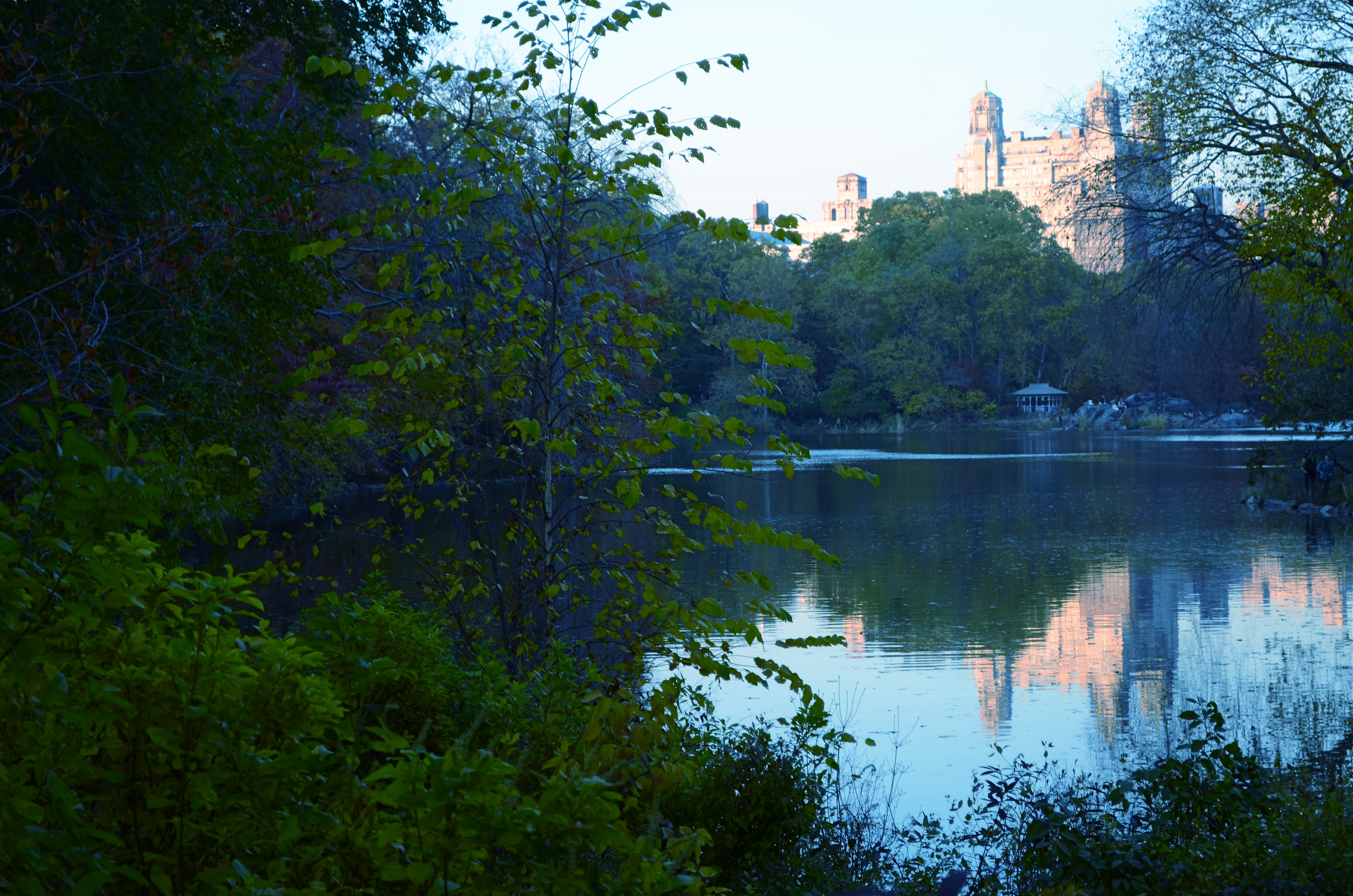
The Lake, Central Park West, NYC., 2011. 1/80 sec., f/5.6, ISO 160, 50mm.
Some of my own work, naturally, strives for this quality, the ability of a photograph to unchain the mind, to allow feelings to flow, to allow color to be abstracted, just like language or music. Some will call it influence, others imitation. I prefer to think of it as respect. And while I will never know the name of the stock photographer whose image was probably slapped onto The Moldau’s album cover as a clerical afterthought, I love it when I see his work leak through my fingers, if only a little.
Shade your dreams however you like.
And let the music surrender its colors.
Follow Michael Perkins on Twitter @MPnormaleye.
CHASING THE SENSATION
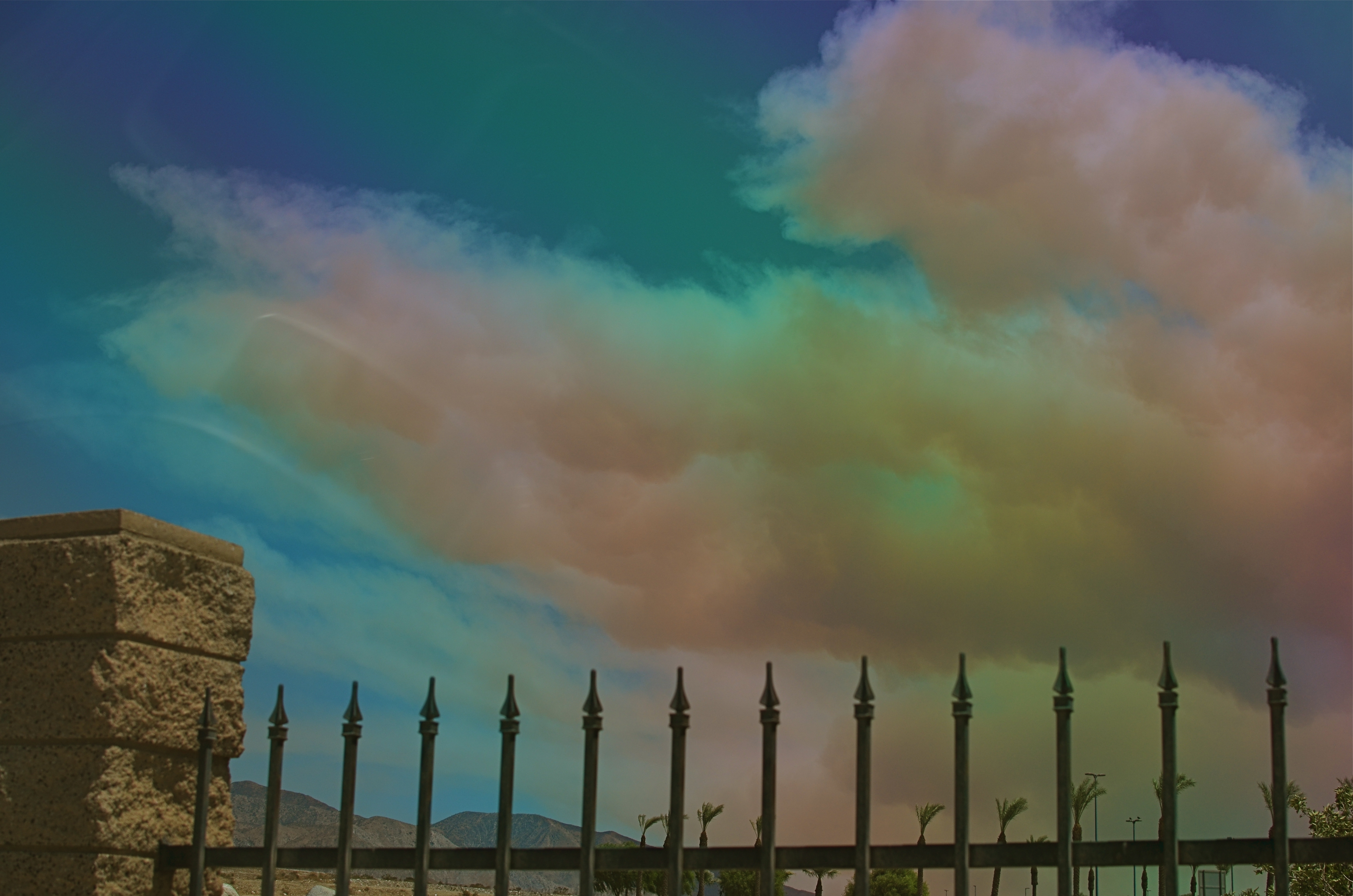
Wildfire, Cabazon, California, August 8, 2013. 1/500 sec., f/5.6, ISO 100, 35mm.
By MICHAEL PERKINS
SHOOTING LARGE SUBJECTS IS OFTEN MORE CHALLENGING THAN CAPTURING STORIES NEAR AT HAND. If you’re doing a tight frame around a bowl of fruit, there may be more than only one story for the shot, but, compared to trying to find the essential visual core of a vast area, it’s not really the stuff of MENSA club meetings. When you’re shooting tight, the message, the central spine of the idea reveals itself fairly quickly. Panning over an immense scene, the story is “out there”, but your editor’s eye will certainly get a more rigorous workout in paring away the unneeded extras.
Important note before we continue: I am not a storm chaser. I lack the mixture of admirable fortitude and creepy bravado that allows people to take truck and gear in hand in an insane game of dodge-ball with a meteorological Godzilla. So, if I am in the position to grab a moment during one of Mother Nature’s more picturesque tantrums, it’s purely a case of being in the right place at the right time. I am not intrepid. To my thinking, the only thing cool about being Indiana Jones is, you get to wear a seriously rockin’ hat.
Thus, the above frame is largely luck, the very casual luck associated with pulling off the road for a rest stop precisely as something is becoming interesting. The cloud you see belongs to a horrible wildfire that tore through more than 20,000 acres in California’s San Jacinto Mountains last Thursday, August 8, 2013. From our westward trek toward Los Angeles on the I-10, most of what we saw of the fire, for nearly 100 miles, was a dense, diffuse haze which more closely resembled Pollution’s Greatest Hits of 1968 than a fire. However, during our leg-stretcher at the wonderful Hadley Fruit & Nut superstore in Cabazon, California, it was finally possible to see a salmon-colored, tightly defined cloud of fire smoke, snaking its way southward across the freeway, billowing to the size of a football stadium over the mountainous terrain near our car.
The cloud was a free, here-you-are gift, the central part of the story, but the shot wasn’t ready. I needed some earthly point of reference to convey its size, and all I had were distant palm trees and fairly featureless terrain. Fortunately, there was a short masonry wall that marked Hadley’s lot from those of its neighbors, and, crouching down a bit, I could bring it into frame as some way to contextualize the cloud monster. The other problem was haze, which was rendering all colors too faintly, given the high position of the sun reading off the smoke. A simple screw-on polarized filter cut the haze and delivered the hues. Click and done.
Back in the car, far away from the Devil Cloud, and on to L.A.
With a lucky frame in the back seat.
And walnuts and raisins in the front.
Follow Michael Perkins on Twitter @MPnormaleye, and view his Flickr photostream at:

CORNERING

Tackle a big subject in parts, and thus re-frame its context. A blend of two bracketed exposures with varied shutter speeds, both f/5.6, ISO 100, 55mm.
By MICHAEL PERKINS
PHOTOGRAPHERS ALL HATE THE TASK OF SHOOTING OVERLY FAMILIAR SUBJECTS. The famous. The iconic. The must-stop, we’ll-be-getting-off-the-bus-for-ten-minutes “sights” that decorate every postcard rack, every gift store shelf, in their respective cities. The Tower, the Ruins, the Once-Mighty Palace, the Legendary Cathedral. Things that have more pictures taken of them by breakfast than you’ll have taken of you in three lifetimes. Scadrillions of snaps, many of them composed for the “classic” orientation, an automatic attempt to live up to the “postcard” shot. It’s dull, but not because there is no fresh drama or grandeur left in a particular locale. It’s dull because we deliberately frame up the subject in almost the same way that is expected of us.
There must be a reason we all fall for this.
Maybe we want everyone back home to like our pictures, to recognize and connect with something that is easy, a pre-sold concept. No tricky exposures, no “arty” approaches. Here’s the Eiffel Tower, Uncle Herb, just like you expected to see it.
Yeah, well…
On a recent walking shoot around D.C.’s National Mall, snapping monument upon monument, I was starting to go snowblind with all the gleaming white marble and bleached alabaster, the perfection of our love affair with our own history. After a few miles of continuous hurrahs for us and everything we stand for, I perversely looked for something flawed….a crack in the sidewalk, a chipped tooth on a presidential bust, something to bring forth at least a little story.
Then I defaulted to an old strategy, and one which at least shakes up the senses. Photograph parts of buildings instead of the full-on official portrait of them. Pick a fragment, a set of light values, a selection of details that render the thing new, if only slightly. Take the revered and venerated thing out of its display case and remove its normal context.
The Lincoln Memorial proved a good choice. The basic shot of the front looked like just a box with pillars. A very, very white box. But shooting a bracket of three exposures of just the upper right corner of the roof , then blending them in an exposure fusion program, revealed two things: the irregular aging and texture of the stone, and the very human bit of history inscribed along the crown: the names of the states, with the years they came into the union below them. All at once something seemed unified, poetic about Abraham Lincoln sitting inside not a temple to himself, but a collection of the states and passions he stitched back together, repaired and restored into a Union.
The building had come back alive for me.
And I didn’t even have to shoot the entire thing.
follow Michael Perkins on Twitter @mpnormaleye.
