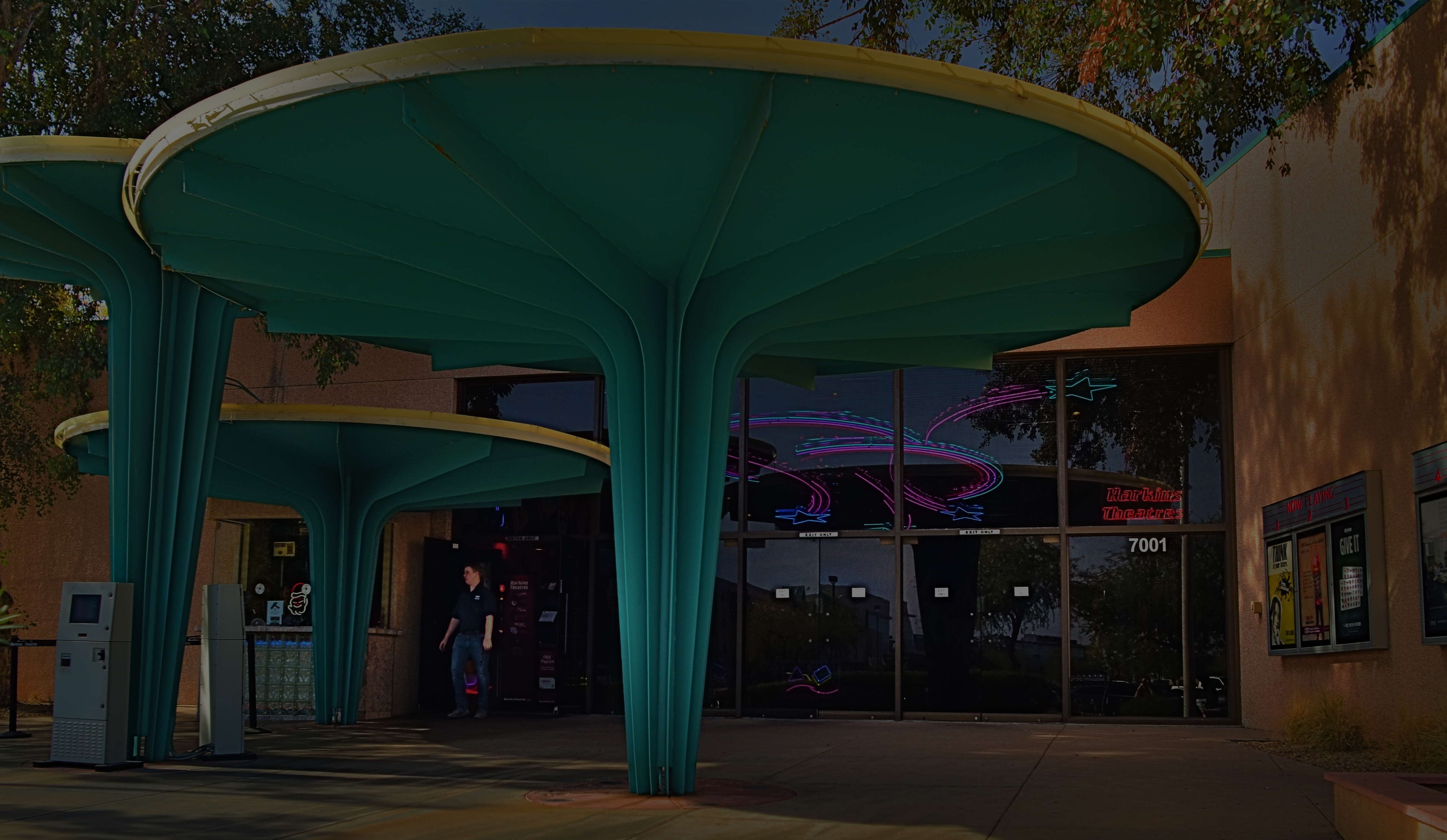
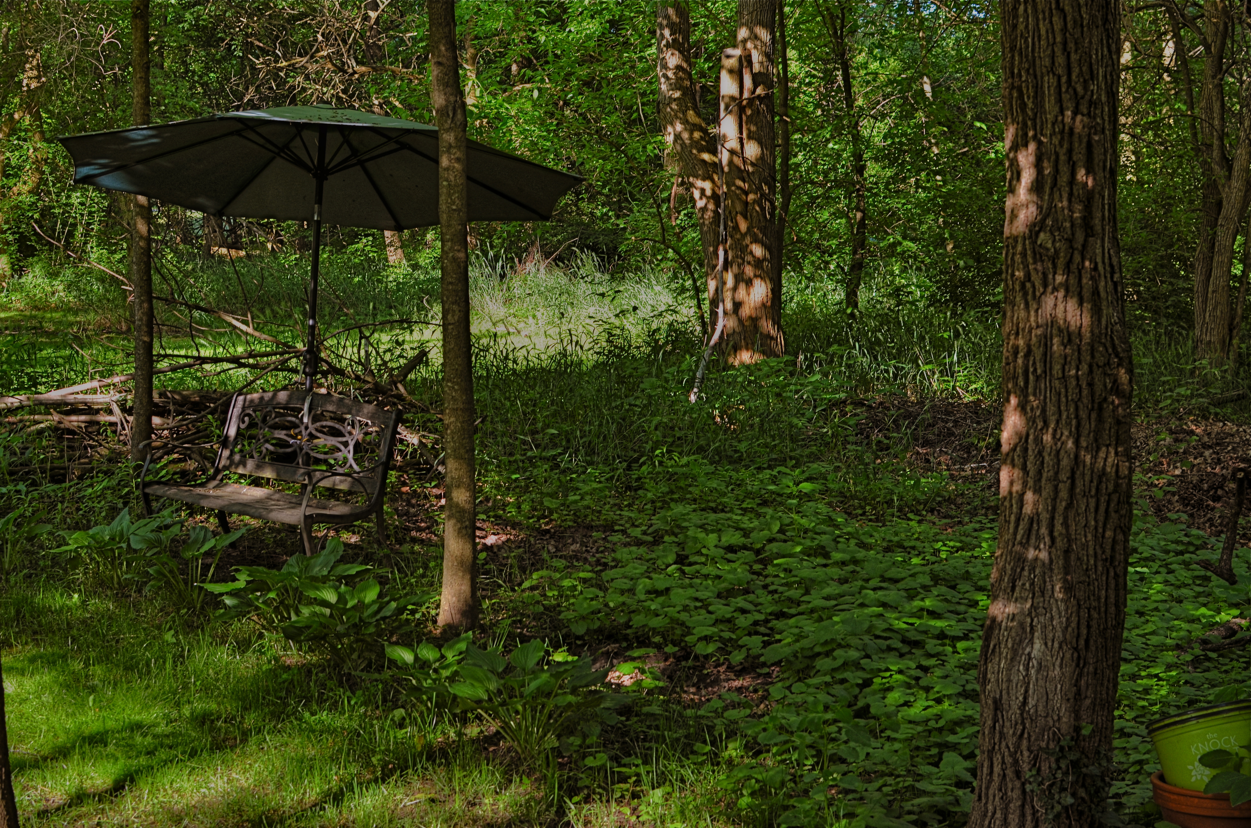
THE DIAL-BACK

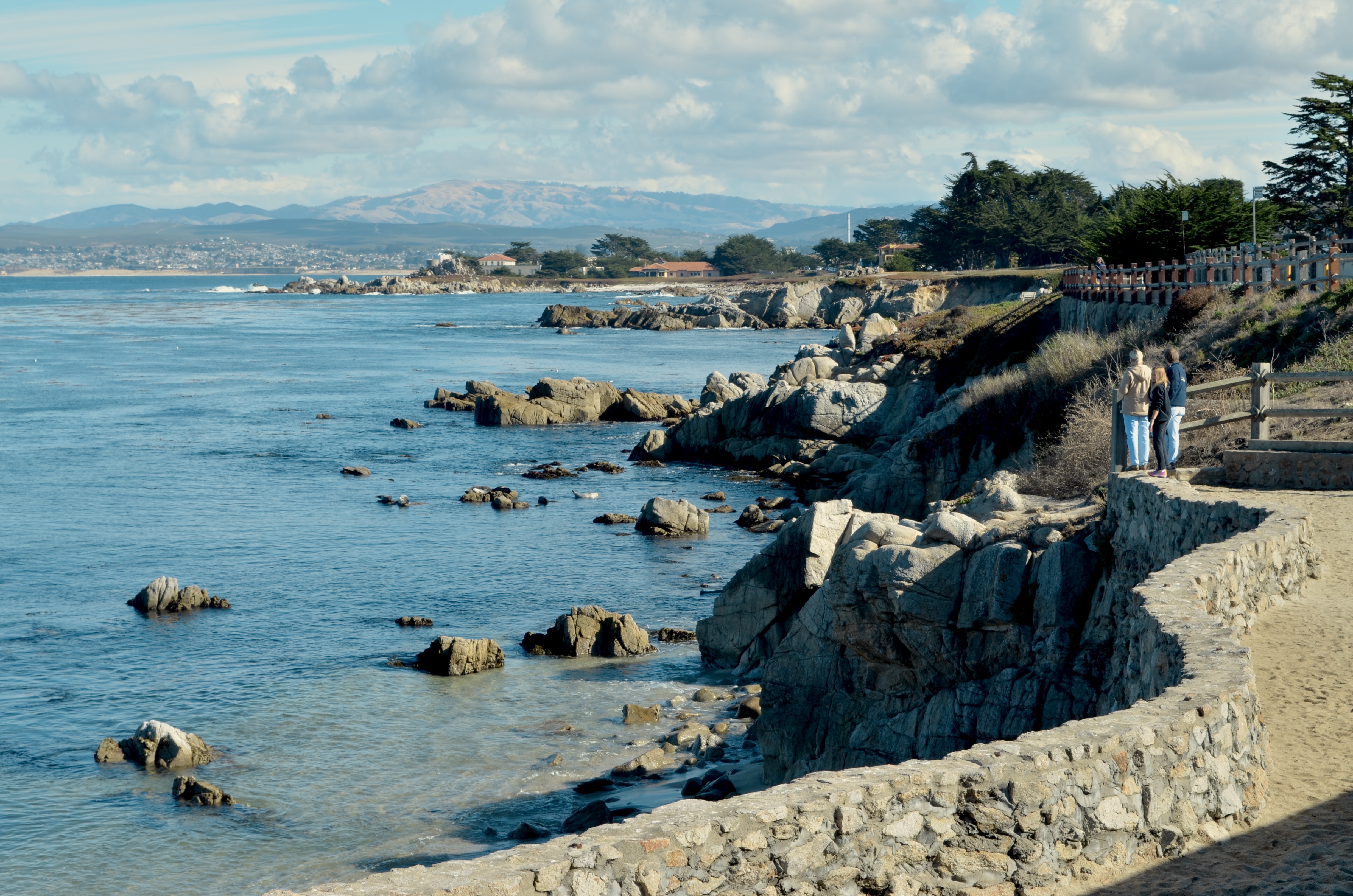
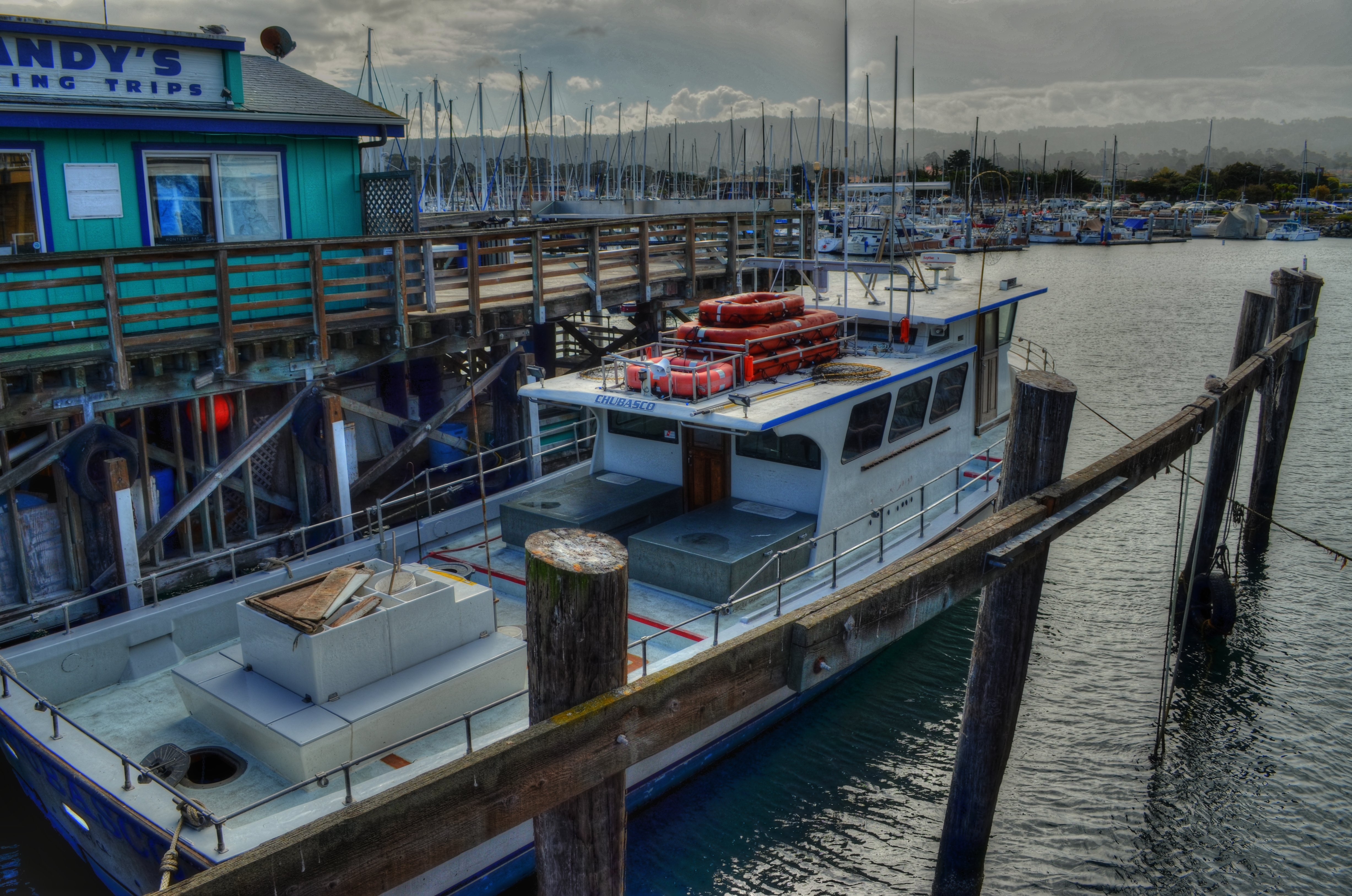
Lover’s Point, Monterey, California, 2012, original HDR mix. Ugh.
By MICHAEL PERKINS
ONE OF THE BIGGEST BENEFITS I’ve derived by overseeing this forum over the past nine years has been the great gift of being able to distance myself from my earlier work, to get far enough away from techniques I once embraced to regard them with a mixture of bemusement and horror. The shorthand for this sensation is a variant on the phrase “what was I thinking?”
The important thing is not to either completely repudiate or uniformly defend earlier versions of one’s photographic output, but, in evaluating each piece separately, to find that some work shows a shift in perspective, an evolution in the way of doing things. Absolute consistency over years is not only unlikely but unhealthy. Art can’t breathe in a vacuum.
Lately, in reviewing some images shot within the last decade, I have run head-on into a huge clutch of pictures that, although they may have been pretty balanced in the master shots, were absolutely overwrought in post-processing. It wasn’t a case of putting lipstick on a pig, but of slathering it onto a fairly attractive woman, or maybe like the cartoonist who had the habit of ending the sentences in every one of his dialog balloons with TWO exclamation points, regardless of the content. In many of these shots I seemed on some kind of quest for the ultimate rendering of detail, coupled with a love of the most extreme contrasting and color saturation. HDR was where I committed my gravest sins but I was gooping up pictures in other processes as well. For some reason, I was proceeding as if there were no image that could not be “improved” simply by tinkering a little longer with it. The results were, shall we say, uneven.
Once more on the soft pedal. The sadder-but-wiser remix from 2020.
Look at the way I processed a simple coastal vista from a trip I made to Monterey, California in 2012 (see top image). Man, you can count every damn grain of sand on that beach, cantcha? And how about all that stone texture, eh? And then there are the clouds, which, in my heavy-handed treatment, were transformed from fluffy accents to signs of impending doom. Whole thing appears a bit grim, as if the apocalypse is definitely coming any second, and, golly ned, kids, you’d better run for it. The second, dialed-back version from this year allows for a slight tweak in color balances and luminescence, but then it’s hands off the steering wheel. Which place would you rather head to for a relaxing holiday? One scene actually appears somewhat inviting, while the other is like El Greco after an evening of far too much wine.
Sometimes I think that photography, rather than being labeled a “profession” or a “hobby”, should be referred to as a “practice”, since the constant addition and subtraction of skills and experience is similar to what a doctor tries to do. Fortunately, no one died as a result of my artistic malpractice, although I feel a little sick myself facing up to my shortcomings. But on we go. I may not, in fact, be able to tell you, years later, what I was thinking during earlier versions of myself. I only hope I was thinking at all, and that the needle has moved just a little, from there to here.
LOVED INTO LONGEVITY

Winner and still champion from my personal library.
By MICHAEL PERKINS
SO MUCH OF THE GREATER WORLD SEEMS SO PERISHABLE under our present Great Hibernation that one’s mind goes naturally to things of more lasting value. The more that contemporary concepts of “permanence” vanish like smoke, the more the photographer in me values the artifacts of a life that still remain close at hand. Access to the fuller world is often denied me these days, but, here, inside the compound, there is a renewed opportunity to visually reassess the things I have carried with me over a lifetime.
This has led me to try to create what you might call formal photographic “portraits” of various ephemera around the house, from weathered old coats to favorite records to…books. For me, a person who has entertained a collector’s fetish with so many kinds of playthings and pastimes over the years, everything always seems to come back to books. The printed word, and the physical packages in which it came, harnessed my passion before music, before photography, before even romantic love. And, if we’re talking about a consistent source of comfort, books have acted as one of the most permanent and reliable anchors to earlier versions of myself. I leap between covers, and I vanish, emerging re-centered, fuller and finer than I was before the plunge.
In trying to photograph the oldest surviving book in my collection, I found a lot of techniques left something visually unsaid, delivering images that were too cosmetically clean, too charming. The book you see here has been with me in high times and low since 1963. It was probably the first hardback book that was truly mine, not one just plucked out of my parents’ library. For my picture, it needed to look traveled, well explored. It needed the historical gravitas of a few creases and stains, to look like a book that was important enough to be revisited and revered over a lifetime. After several attempts that looked, well, flat to me, I decided to go into my old trick bag and shoot it as an HDR. I had not used the technique for a while, since the acuity of current camera sensors has improved to the point where shooting and blending several bracketed exposures just to reproduce the full dynamic range of tones from dark to light was now as easy as squeezing off a snapshot. But in the case of my library’s longevity leader, I needed the over-accentuated detail that sometimes turned me (and others) against HDR: a look which would record and underscore every defect and scar, freeing them to speak a little louder. Another thing that argued for the technique: years prior, I had made a picture of my wife’s old 45 rpm record storage case, an item similarly, vigorously loved. HDR would deliver the warts-and-all portrayal I was seeking.
In the end I eschewed the full-tilt effect in favor of a milder blend called tone compression, boosting the detail but stopping short of making things too surreal. Finally, I had a picture that made the book look as if it had actually been used, rather than flawlessly archived. I had loved that book into longevity, and now, like the proud lines of survival etched on the face of a human subject, the tome was capable of fully flaunting its flaws.
Fabulously.
FROM CUSTOM TO STANDARD
Just a few clicks ago in time, I might have made multiple exposures of this scene, blending them later in HDR software for increased dynamic range. Now I do it all in-camera.
By MICHAEL PERKINS
DIGITAL PHOTOGRAPHY’S EXPLOSION IN THIS STILL-FRESH CENTURY has shown itself not to be about a single, big revolution but an ongoing cascade of small ones. As more and more shooters have shifted their emphasis away from film technology….itself, admittedly a fundamental earthquake of change, they have also had to constantly adapt to a continuous flow of refinements and reinventions in the digital realm. Nothing is static and nothing will ever again be in its final form. Things that were considered cumbersome and clumsy just a few seconds ago now are accomplished effortlessly. We move from custom to standard in the wink of an eye.
A prime example of this phenomenon is the rise and not-quite-complete fall of HDR, or High Dynamic Range photography, the practice of shooting several different exposures of the same subject and melding the best of all of them into one seamless composite through software. The need for such a solution arose from the inefficiency of early digital sensors, which caused light and dark extremes in an image to be either blown out or smothered in shadow. HDR was devised as a way to imitate how quickly the human eye can adjust to allow us to see everything in about the same degree of contrast. It doesn’t actually do that, but instead presents a ton of images of varying contrast to our brains so quickly that we imagine that we actually always see everything in balance. Early renditions of Photoshop did not address this problem, nor did the earliest cell phone cameras, and even traditional manufacturers like Nikon and Canon were years away from including HDR-like modes in their DSLRs, and so editing platforms like Photomatix, HDR Efx Pro, and Aurora HDR were created in the early 2000’s to specifically blend and tweak anywhere from two exposures on upward in a work flow that came to be known as “tone mapping”. The apps sold well and addressed a real niche within the photographic world. Transitions between light and dark seemed more elastic, and textures, from beach sand to wood grain, seemed to be rendered with greater emphasis.
HDR drew both praise and poison from the start, with some photographers subtly enhancing their work while others “over-cooked” the effect, delivering surreal palettes of day-glo color and gooey skin textures surrounded by strange halos and other unwanted artifacts. The result, as is occurring with greater and greater speed in the digital-web complex, was that, just as a revolution/solution for a real problem hit the market, others began almost immediately to concoct an antidote for the wonder drug…a fix for the fix. A few scant years later, manufacturers of both standard and phone-based cameras have their own HDR-like modes, which are both more limited in precision and hellishly convenient: digital camera sensors themselves are already in their second generation, with greater dynamic range already designed in: and uber-tools like Photoshop and Lightroom have become more supple in the quick adjustment of even single batches of images. Thus HDR has gone the regular developmental route seen that all tech has across history, from balky and bulky to sleek and instinctive. We learn to do more with less, and what was once custom equipment (like radios once were in automobiles) becomes standard (like seat belts in automobiles) but with even greater immediacy in the digital era. In my own work, after years of HDR love writ large, I now tend to solve 95% of the problems that used to dictate the use of HDR with simple in-camera moves, some of them as basic as exposing for the highlights and recovering the detail in the dark areas in post editing (as seen in the image above).
I was recently toying with an old Canon A1 SLR from the late ’70’s and marveling at the fact that its owners initially had to special-order (at considerable expense) a screw-on battery motor drive that had no other function except to assist forgetful users by winding the film on to the next frame. Obviously the winder unit was only in production for a few years until the same challenge was met with less hardware, fewer steps, and a lot less cash. And so it goes. All of which goes to say, as we frequently do in these funny papers, that gear is not the primary determinant in the creation of great photographs. If equipment does not currently exist to produce the results we want, we find a way to fake it until the lab boys make it. Technology follows inspiration. Art cannot happen if things go the other way.
PALLBEARING FOR HDR
HDR processing, initially touted as a more “real” look, is actually anything but.
By MICHAEL PERKINS
MANY OF THE TECHNOLOGICAL ADVANCES IN PHOTOGRAPHY, over the centuries, have been made as specific remedies to the limits of either cameras or recording media. Lenses and films were made faster, sharper, or more accurate because photographers were thwarted by the cramped parameters of the media. Such a cycle of malady-and-cure creates temporary and manic convulsions, fads if you like, along with solid, permanent improvements. Sometimes, as in the case of the now declining technique known as High Dynamic Range, or HDR, it’s easy to confuse a quick fix for a permanent one.
To review, HDR was an attempt to compensate for the limited range of light recorded by first-generation digital sensors, which effectively “read” extreme highlights or shadows, but were spotty in the mid-ranges, delivering only a portion of what the eye could detect. The solution was to take a bracket of anywhere from three to seven frames over a wide exposure range (grab your tripod, kids), then blend them, via software, to more consistently even out all values for a “balanced” or “natural” view. The other side-benefit of the process was a drastic amplification in detail.
HDR was immediately praised as having helped the photographer hurdle the last remaining barrier between the camera and real life. It quickly muscled its way into everything from amateur landscapes to commercial real estate, conferring prophet (profit?) status on authors like Trey Radcliffe, who soared to best-selling fame with books brimming with hyperbolic color and iridescent textures, every hobnail and brick in his goth HDR cathedrals registering the same, loud detail.
And that sameness, eventually, became the problem. Every part of every picture was now shouting. In the hands of many, HDR did not make images evenly modest: it made them uniformly garish. Too many HDR pictures were overripe, overcooked, as if the world were awash in day-glo gravy. Worse, the technique couldn’t work with live subjects or hand-held shots. Worse yet, in-camera HDR simulators in DSLRs and phone apps were virtually useless. Finally, if you actually liked photographing, you know, actual people, HDR made human flesh look like wet liver inside a tanning booth.
In the end, the problem HDR was created to address actually resolved itself, with second-gen camera sensors finally performing better along a wider range of light, delivering more even exposures right out of the camera. More importantly, photographers fell back in love with shadow, understatement, and mystery, satisfied that you don’t have to show everything to see everything. So, rest in peace, HDR. There now are better ways to keep it real.
I’M LOOKING THROUGH YOU
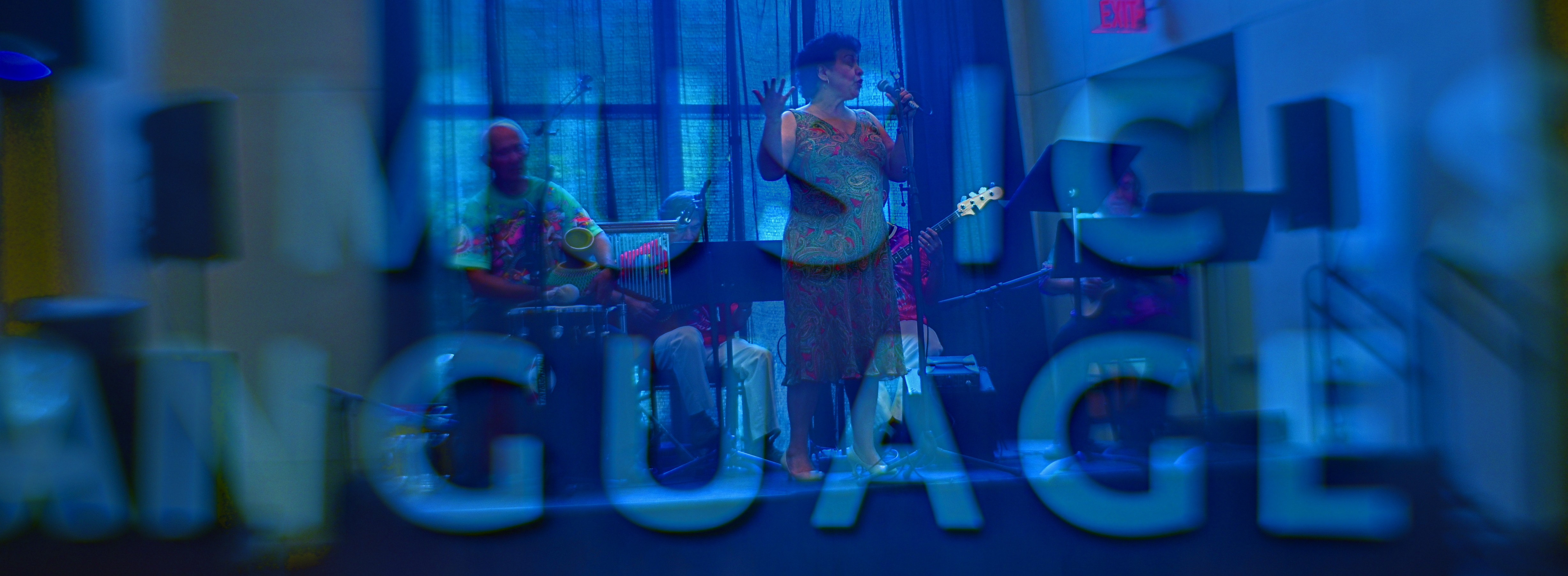
A double–exposure generated in Photomatix‘ “exposure fusion” mode, usually used to blend multiple exposures of the same subject, like the blending done in HDR programs.
By MICHAEL PERKINS
THERE IS A GROWING DEBATE OVER THE RECENT EMERGENCE of a process called exposure fusion, which has been touted as an alternative , if not a replacement for, High Dynamic Range or HDR processing. Which camp you fall into depends greatly upon what look you want in your final image, and both processes can be generated within a popular program call Photomatix.
So, first, a bit of review: HDR blends multiple frames of the same subject, shot at differing degrees of exposure, basically deepening the lighter values and rescuing detail in the darker ones. This means that you can potentially create a composite photo which “sees” the entire range of values in the same intensity, somewhat like your own eye (the ultimate camera) sees them.
Photomatix’ other main flavor, exposure fusion, takes the same multiple exposures and weighs every pixel in each of them for its value, letting some pixels from all exposures ” show through” in the final composite. The range of tones from light to dark is far less dramatic than in HDR, producing an image that strikes some as more natural. It’s worth noting that exposure fusion processes faster and easier than HDR and produces none of its annoying “halo” around the periphery of objects.
One additional fun aspect of exposure fusion, for me, is in its ease of use in creating montage, or controlled double-exposures, as well as same-subject composites. In the above shot, you’ll see a particularly clean amount of transparency between the musicians at a museum and a shot of part of a sign advertising its theme statement. Moreover, exposure fusion operates with several supple contrast and compression slider switches that make very minute adjustments in a snap.
The current HDR / Exposure Fusion “face-off” can only be resolved by actual users’ results, the only thing that matters in photography. Hey, if you made a piece of cowhide light-sensitive with a mix of lemonade and Lestoil and found a way to make a print with it, then mazel tov and God bless.
It’s always, and only, about the pictures.
THE LAST OF MANY GOODBYES
Scottsdale, Arizona’s gorgeous little art-house complex, the Camelview Theatre, on the afternoon of its final day, December 10, 2015.
By MICHAEL PERKINS
ON THE SPOCK SIDE OF OUR BRAINS, OF COURSE WE KNOW that there is nothing particularly magical about buildings per se. Stone and steel cannot, after all, generate memory or experience; they merely house the people who do. Still and all, the loss of certain edifices engenders a purely emotional response in us, perhaps because special things can no longer happen there, and the physical proof that any of it happened at all is being rendered, at least physically, into dust. That puts us in the realm of dreams, and that’s where great photographs are born.
When a place that is special to us is about to wink out of existence, everyone who used that place stamps it with their own stories. We went to school here. This is where I proposed to your mother. The bandstand was here, along this wall. So personal a process is this that our farewell photographs of these places can take on as many different flavors as the number of people who walked their halls. And, as a result, it’s often interesting to compare the final snaps of important places as filtered through the disparate experiences of all who come to reflect, and click, in the shadow of the wrecking ball.
I have attended many an opening at theatres, but I always make a point to attend their closings. Not the end of a certain film or engagement, but the final curtain on the theatres themselves. How best to see their final acts? As a quiet, gentle sunsetting, as with the above image of Scottsdale, Arizona’s Camelview theatre, shuttering in deference to a bigger, newer version of itself at the end of 2015? Or, in the colorful confusion of the venue’s final night, with crowds of well-wishers, local dignitaries and well-wishers crowding into the final screening?
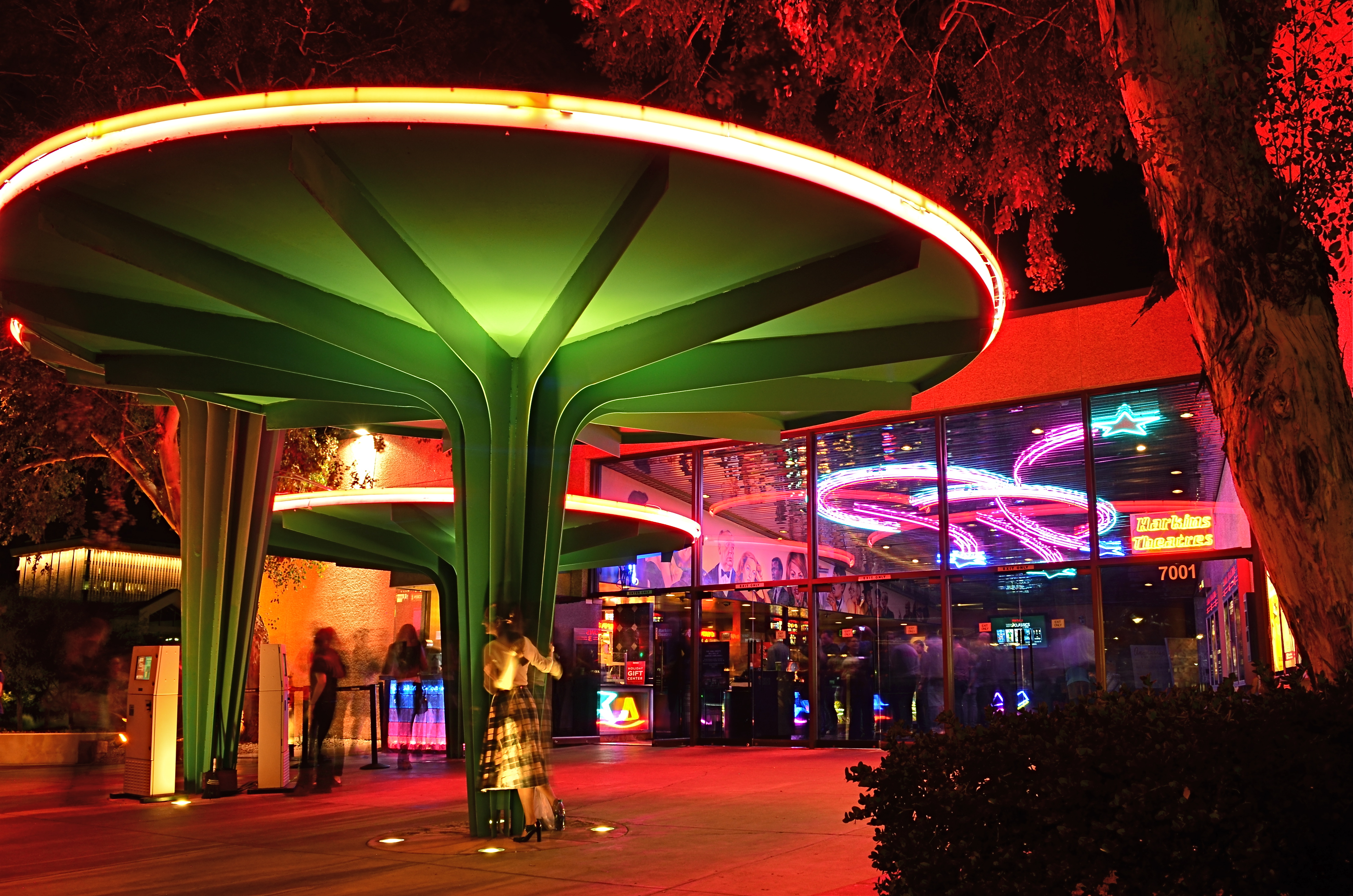
Later that same day: the Camelview’s last neon-lit night of glamour.
Each view projects my own feelings onto the resulting images, whether it be a golden dusk or a frenetic, neon-drenched, tomorrow-we-die send-off, complete with champagne and cheers. The introspective daytime shot has no teeming crowds or fanfare. The night, with its ghostly guest blurs (a result of the longer exposure) features people who are as fleeting as the theatre’s own finite run. Both are real, and neither is real. But they are both mine.
Buildings vanish. Styles change. Neighborhoods evolve. And photographic goodbyes to all these processes are never as simple as a one-size-fits-all souvenir snap. People, and memories, are too customized for that. As with movies themselves, there is always more than one way to get to the final fadeout.
BACKING OFF, BACKING AWAY
An early case of HDR madness on your humble author’s part. Yeah, nothing in nature looks like this. Ever.
By MICHAEL PERKINS
YOU MAY HAVE HEARD THE JOKE ABOUT THE COUNTRY PARSON WHO WAS IN THE HABIT of writing, in the margins of his sermon script, “Argument weak here. Scream like hell.” If he were a man of the camera instead of a man of the cloth, this instruction might have read, “photograph ineffective here. Over-cook everything.”
Choose your favorite post-editing workflow and chances are that you, or someone like you, have tried to rescue an indifferent image by pouring a few gallons of digital gravy over it, hoping to turn flank steak into filet. And you probably have your own personal folder of shame for the results of such attempts. Mine would fill up a small bookshelf. In the Library of Congress.
One of the hallmarks of the early digital age seems to be an affection for over-saturated color, as if we had had quite enough of natural tones, thank you, and were desperate to return to the earliest days of photographic color, when everything was played on the loud pedal. It’s kind of perverse, but it seems like, as soon as photographers outdistance an old technical barrier, they seem to get nostalgic for it and try to revive it. Why resuscitate daguerreotypes, pinhole cameras, high grain slow films, etc. Irony? Curiosity? Novelty? Who knows?
Whatever the motivation, the result has been a cornucopia of mobile apps that aim for an unnatural distortion of color values (spend ten minutes on Instagram for as many samples as you want) and the lo-fi or lomography movement toward cheap plastic toy cameras that can’t help but deliver hyped up hues (again, Instagram). There are also a number of HDR programs which tend to tempt people beyond their endurance when it comes to electrifying color even in an image’s shadows, making everyday like a day-glo version of your uncle’s golf togs and resulting in some pretty hideous excess (and yet, alas, such was I. See left).
What’s the new normal? Again, can’t tell you. It’s pretty certain, though, that we love cranking the color up to 11, whether it serves the photo or not. Backing off and backing away on the hue-mongous overkill takes real discipline. The amped-up image is fascinating in some kind of moth-to-the-flame way, but eventually it becomes like any other excess, in that it stifles, rather than frees, your art. No effect is so miraculous as to work in every situation. Eventually, it’s about what you’re seeing and saying.
EXTENDING THE INVITATION
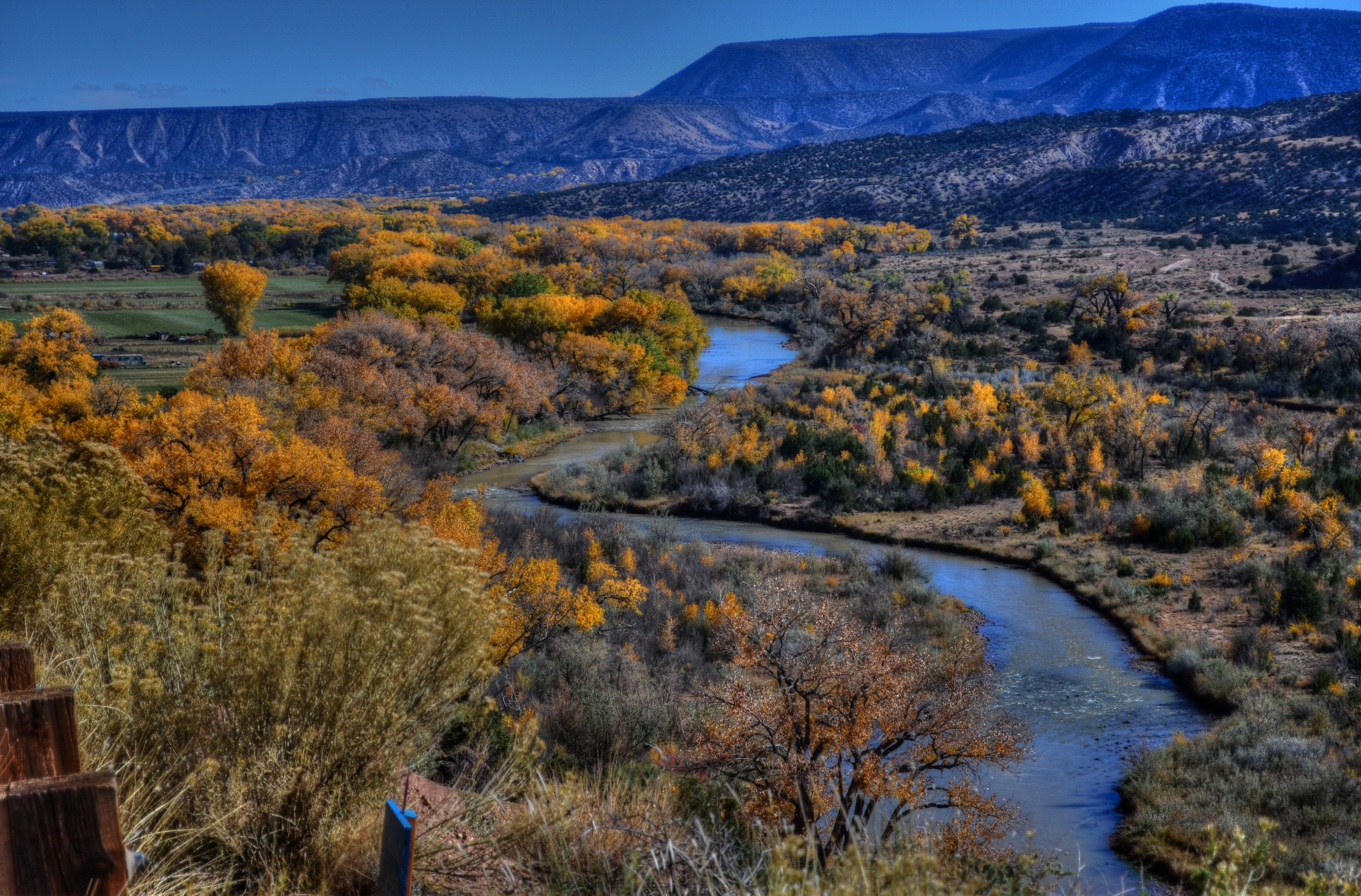
Sinuous, 2013. The river’s journey takes it, and your eyes, back “into” the picture.
By MICHAEL PERKINS
PHOTOGRAPHY AND PAINTING, DESPITE ENGAGING THEIR AUDIENCES IN VERY DIFFERENT WAYS, have retained one common aim over the centuries, at least when it comes to pictorial or scenic subjects. Both the photo and the canvas arrange their visual information on a two-dimensional surface, and both seek to draw the viewer’s eye into a depth that is largely illusionary. The cameraman and the painter both contrive to create the illusion that the distance from front to back in their works is as real as the distance from side to side.
In terms of simulating depth, some photographs benefit from both shadow and light, which alternatively “model” the information in an image, making it seem to “pop” in some faux-dimensional sense. But the best and simplest trick of composition is what we popularly term the “leading line”, information that trails from the front of the picture and pulls the viewer’s attention to an inevitable destination somewhere deeper back in the scene.
Putting a picture together this way ought to be the most automatic of instincts in the composition of a photograph, but it still is formally taught, as if it were less than obvious. In fact, it just means extending an invitation to someone to join you “in” the photograph.

Minutes Away, 2012. The girders give you a stick-straight diagonal from journey to destination.
Trails, paths, railroad tracks, lines of trees or phone poles….these are all examples of information that can start at one side of a photo and track diagonally to the “back” of the image, making the eye experience a kind of gravity, tugging it toward the place you want their gaze to end up. It is also the easiest way to force attention to a central subject of interest, sort of like inserting a big neon arrow into the frame, glowing with the words over here.
Leading lines are a landscape’s best friend, as well, since the best landscapes are arranged so that the focal point of the story is streamlined and obvious. Anyone who has ever shown too much in a landscape will tell you that what fails in the composition is that it allows the viewer to wander around the place wondering what the point of the picture is. The use of a powerful leading line gives the illusion of depth and corrals the eyes of your audience to the exact spot you need them to be for full effect.
Composition is the most democratic of photographic skills. It’s easy, it’s free, and anyone from a point-and-shooter to a Leica addict can use it effectively. Bottom line: there are great things happening in your pictures. Invite the people inside.
NORMALEYE GALLERY UPDATE: HOME, HOME ON THE “RANGE”
A two-exposure HDR image with more emphasis on content than processing.
By MICHAEL PERKINS
HISTORY BUFFS WHO HAVE EXHAUSTIVELY RESEARCHED THE HELLISH ANIMOSITY OF THE AMERICAN CIVIL WAR, a conflict which sowed seeds of resentment that bear bitter fruit to this very day, may have some small grasp of the vitriolic divide between those who espouse High Dynamic Range (HDR) photography and those who believe its practitioners are in league with Beelzebub. Pro-HDR factions believe those who resist this magical art should be forced to declare themselves Amish on the spot, while the opposite camp believes that all cameras that shoot HDR should be pulverized and used as landfill in Hades. We’re talking irreconcilable differences here.
When HDR first came to my attention, I welcomed it, as many others did, as a way to get around a long-standing problem in exposure….how to modulate between blackout and whiteout in extremely contrasty situations in which a single exposure would either blow out the sky through the window or bury the corners of an interior in blackness. My first attempts with it were exciting, as I tried to shoot frames bracketed across a three or five shot range of exposures, then smooth out the drastic differences between light and dark in the final image. The idea of using HDR for a sci-fi look or a painterly effect never appealed to me. I was really trying to use it to make my pictures replicate more closely the adjustment between light and dark that the eye makes instantaneously.
Over the last five years, however, as I review images I’ve made with HDR software. First, I use the program less with each passing year, and second, I no longer use it to retrieve “lost” tones in dark or light areas of an image. The program I have used since day one, Photomatix, has two main choices, Detail Enhancement and Tonal Compression, and, at first, I worked almost exclusively with the former. For wood grain, stone texture, botanical detail and cloud contrast, it’s remarkably effective. However, it’s also easy to produce images which are too dark overall, and accentuate noise in the individual images. Overcook it even a little and it looks like a finger painting done with hot lava. It thus actually works against the original “looks more like reality” objective.
On the other hand, producing the blended image in the Tonal Compression mode retains most of the sharp detail you get in Detail Enhancement without the gooey consistency. It has fewer attenuating controls, but as I go along, I find I am using it more because it simply calls less attention to itself. In either mode, I have made a conscious effort to throttle the heck back and under-process as much as I can. I’m just getting sick of shots that announce “hey, here comes an HDR photo!” two blocks ahead of its arrival.
I’m also in the middle of a back-to-basics phase based on getting things right, in-camera, in a single frame, and learning to be more accepting of dark and light patches rather than artificially mixed goose-ups of rebalanced tones. Anyway, as of this posting, I’ve taken down the original selection of images that was in the HDR gallery tab at the top of this page and loaded in a new batch that, while certainly not a “final” word on anything, shows, I think, that I’m still wrestling with the problem of how best to use this technology. Give them a look if you can, and let me know your thoughts on the use of HDR in your own work. We all have to figure out our own way to be home, home on “the range”.
WHAT SIZE STORY?
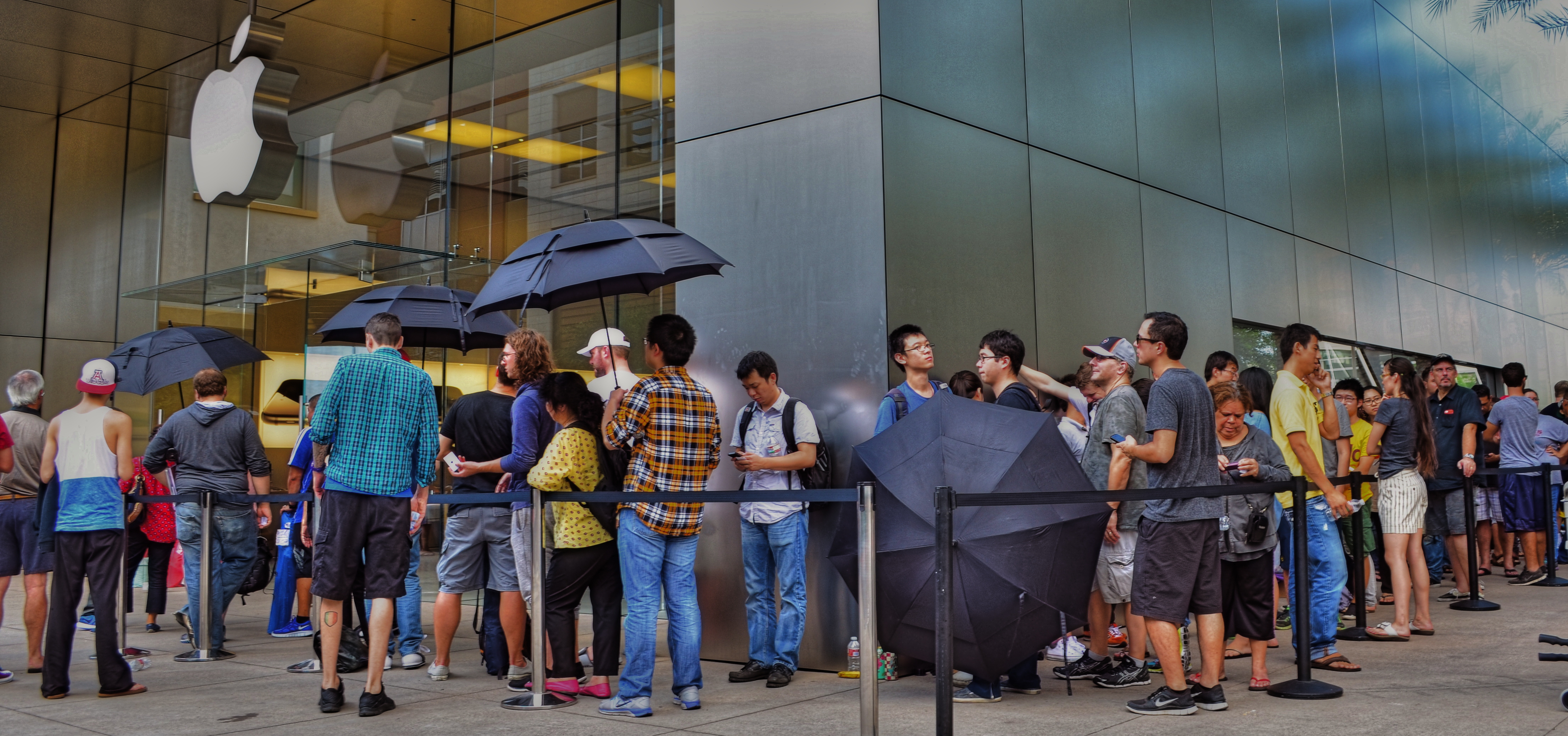
iPhone 6 debut at Apple Store in Scottsdale, Arizona, September 19, 2014. Sometimes the story is “the crowd…”
By MICHAEL PERKINS
IN THE EARLY 1950’s, AS TELEVISION FIRST BLINKED INTO LIFE ACROSS AMERICA, storytelling in film began to divide into two very clearly defined camps. In theatres, desperate to retain some of the rats who were deserting their sinking ships to bathe in cathode rays at home, movie studios went for stories that were too big to be contained by the little screen, and almost too big for theatres. You remember the wider-than-thou days of Cinemascope, VistaVision, Todd-Ao, Cinerama and Super-Panavision, as well as the red-green cardboard glasses of 3-D’s first big surge, and the eye-poking wonders of House Of Wax, Creature From The Black Lagoon and Bwana Devil. Theatres were Smell-O-Vision, True Stereophonic Reproduction and bright choruses of Let’s Go Out To The Lobby sung by dancing hot dogs and gaily tripping soda cups. Theatres was Big.
The other stories, the TV stories, were small, intimate, personal, compact enough to cram into our 9-inch Philcos. Tight two-shots of actors’ heads and cardboard sets in live studios. It was Playhouse 90 and Sylvania Theatre and The Hallmark Hall Of Fame. Minus the 3,000 Roman extras and chariot races, we got Marty, Requiem For A Heavyweight, and On The Waterfront. Little stories of “nobodies” with big impact. Life, zoomed in.
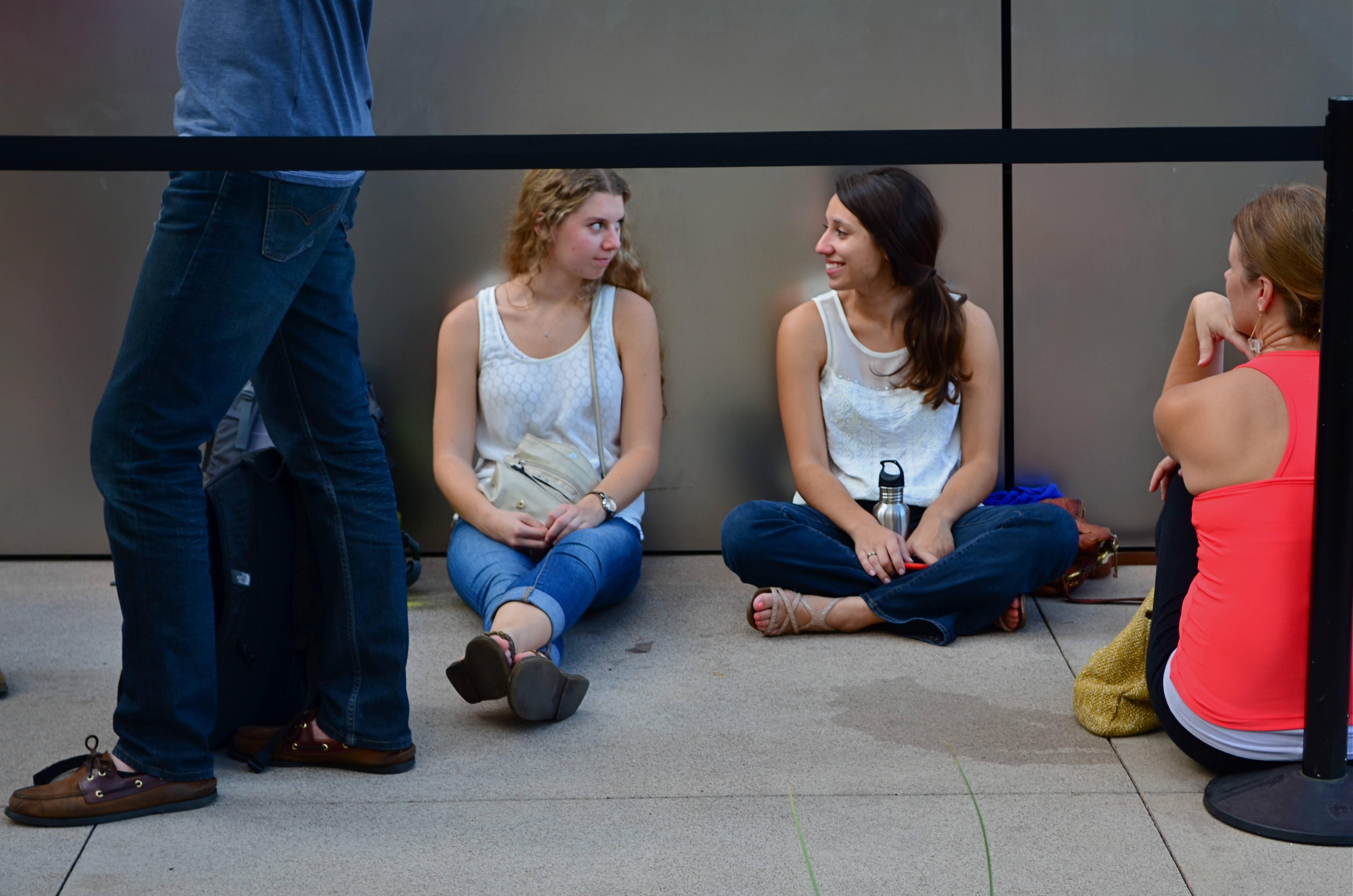
…but, within that crowd, there are “little” stories.
For photographers, pro or no, many stories can be told either in wide-angle or tight shot. Overall effect or personal impact. You can write your own book on whether the entire building ablaze is more compelling than the little girl on the sidewalk hoping her dog got out all right. Immense loads of dead trees have been expended to explore, in print, where the framing should happen in a story to produce shock, awe or a quick smile. I like to shoot everything every way I can think of, especially if the event readily presents more than one angle to me.
The release of the new iPhone 6, which dropped worldwide today, is a big story, of course, but it consists of a lot of little ones strung together. Walk the line of the faithful waiting to show their golden Wonka ticket to gain admission to the Church of Steve and you see a cross-section of humankind represented in the ranks. Big things do that to us; rallies, riots, parties, flashmobs, funerals….the big story happens once a lot of little stories cluster in to comprise it.
Simply pick the story you like.
Remember, just like the phone, they come in two sizes.
REAL PHONIES
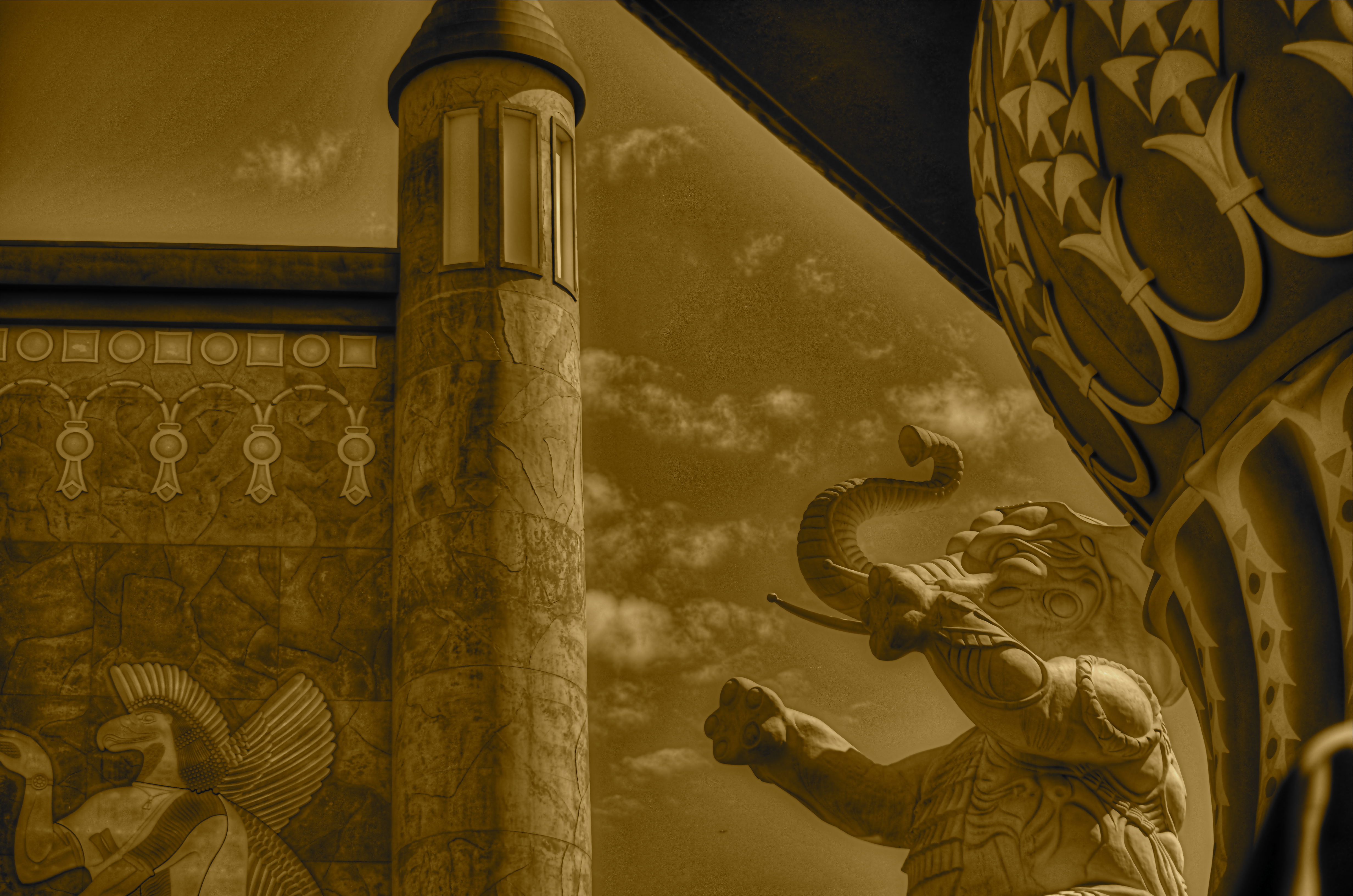
Reality check: a retail mall in Hollywood, doubling as a tribute to D.W. Griffith’s Intolerance. huh?
By MICHAEL PERKINS
“You’re wrong. She is a phony. But on the other hand you’re right. She isn’t a phony because she’s a real phony. She believes all this crap she believes.”
—Truman Capote, Breakfast At Tiffany’s
THE ABOVE REFERENCE TO MISS HOLLY GOLIGHTLY, she of the powder room mad money, also applies very neatly to Hollywood, California. The official kingdom of fakery has been in the business of fabricating fantasy for so long, it actually treats its hokum as holy writ. Legends and lore become facts of life, at least our collective emotional life. Dorothy’s ruby slippers (even though they were originally silver) draw more attention than actual footwear from actual persons. Wax figures of imaginary characters are viewed by more people than will ever examine the real remains of wooly mammoths at the La Brea Tar Pits. And, when it comes to the starstruck mini-Vegas that is the nexus of Hollywood Boulevard and Highland Avenue, even a fake of a fake seems like a history lesson.

The gang’s all here: Griffith’s original 1916 Babylon set for Intolerance.
Hollywood and Highland is one grand, loud, crude note of Americana, from its out-of-work actors sweating away in Wookie suits in front of the Chinese theatre to its cheesy Oscar paperweights at the souvie shops. This small stretch of carnival, high-caloric garbage chow, and surreal retail is a version of a version, a recreation of a creation, a “real phony” rendition of cinema, defined by its resurrection of the great gate of Babylon, which anchors a multi-level mall adjacent to the Dolby Theatre, the place where all those genuine cheesy paperweights are given each year. The gate and the two enormous white elephants that flank it are a partial replica of D.W. Griffith’s enormous set for the fourth portion of his silent 1916 epic Intolerance. The full set had eight elephants, an enormous flight of descending stairs, two side wings, and a crowd that may have originally inspired the term “cast of thousands”. That’s how they did ’em back in the day, folks. No matte paintings, no CGI, no greenscreen. We gotta build Babylon on the back set, boys, and we only got a week to do it, so let’s get cracking.
The original set, which stood at Hollywood and Sunset, was, by 1919, a crumbling eyesore and, in the city’s opinion, a fire hazard. Griffith, who lost his shirt on Intolerance, didn’t have the money to demolish it himself, and eventually it fell into sufficient disrepair to make knocking it down more cost-effective. Hey, who knew that it might make a great backdrop for a Fossil store 2/3 of a century later? But Hollywood never balks at the task of making a fake of a fake, so the Highland Center’s ponderous pachyderms overlook throngs of visitors who wouldn’t know D.W. Griffith from Merv Griffin from Gryffindor, and the world spins on.
Photographing this strange monument is problematic since nearly all of it is crawling with people at any given moment. Forget about the fact that you’re trying to take a fake image of a fake version of a fake set. Just getting the thing framed up is an all-day walkabout. So, at the end of my quest, what did I do to immortalize this wondrous imposter? Took an HDR to ramp up an artificial sense of wear and tear, and slapped on some sepia tone.
But it’s okay, because I’m a real phony. I believe all the crap I believe.
Hooray for Hollywood.
RESTORING THE INVISIBLE
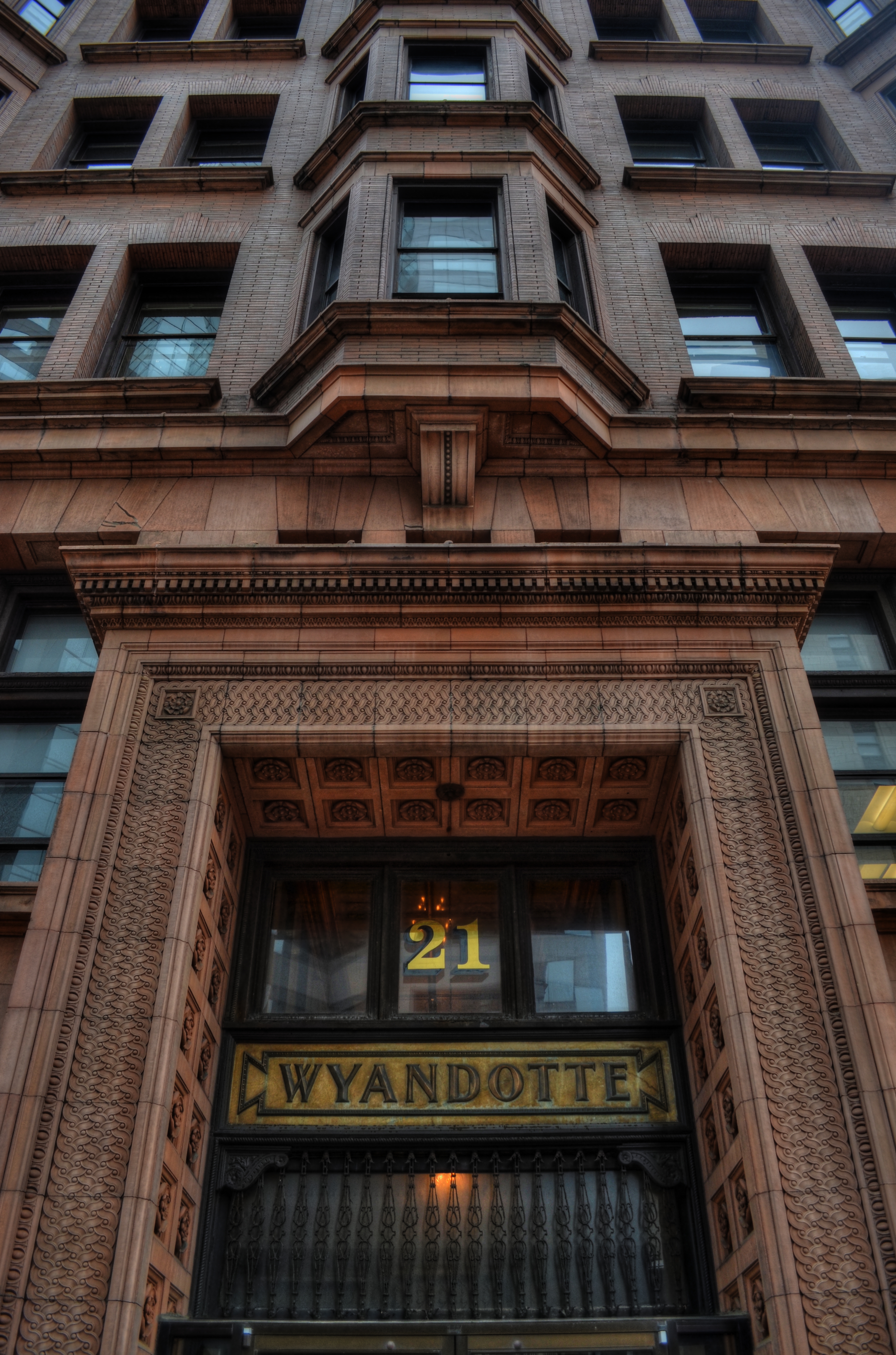
as[e The Wyandotte Building (1897), Columbus, Ohio’s first true skyscaper, seen here in a three-exposure HDR composite.
PHOTOGRAPHY IS ONE OF THE BEST RESPONSES TO THE DIZZYING SPEED OF CONTEMPORARY EXISTENCE. It is, in fact, because of a photograph’s ability to isolate time, to force our sustained view of fleeting things, that image-making is valuable as a seeing device that counteracts the mad rush of our “real time” lives. Looking into a picture lets us deal with very specific slices of time, to slowly take the measure of things that, although part of our overall sensory experience, are rendered invisible in the blur of our living.
I find that, once a compelling picture has been made of something that is familiar but unnoticed, the ability to see the design and detail of life is restored in the viewing of that thing. Frequently, in making an image of something that we are too busy to notice, the thing takes on a startlingly new aspect. That’s why I so doggedly pursue architectural subjects, in the effort to make us regard how much of our motives and ideals are captured in buildings. They stand as x-rays into our minds, revealing not only what we wanted in creating them, but what we actually created as they were realized.
In writing a book, several years ago, about a prominent midwestern skyscraper*, I was struck by how very personal these objects were…to the magnates who commissioned them, to the architects who brought them forth, and to the people in their native cities who took a kind of ownership of them. In short, the best of them were anything but mere objects of stone and steel. They imparted a personality to their surroundings.
The building pictured here, Columbus, Ohio’s 1897 Wyandotte Building, was designed by Daniel Burnham, the genius architect who spearheaded the birth of the modern steel skeleton skyscraper, heading up Chicago’s “new school” of architecture and overseeing the creation of the famous “White City” exposition of 1893. It is a magnificent montage of his ideals and vision for a burgeoning new kind of American city. As something thousand walk past every day, it is rendered strangely “invisible”, but a photograph can compensate for our haste, allowing us the luxury of contemplation.
As photographers, we can bring a particularly keen kind of witnessing to the buildings that make up our environment, no less than if we were to document the carvings and decorative design on an Egyptian sarcophagus. Architectural photography can help us extract the magic, the aims of a society, and experimenting with various methods for rendering their texture and impact can lead to some of the most powerful imagery created within a camera.
*Leveque: The First Complete Story Of Columbus’ Greatest Skyscraper, Michael A. Perkins, 2004. Available in standard print and Kindle editions through Amazon and other online bookstores.
THE TORQUOISE TIME TRAVELER
The wondrous Wiltern Theatre in Los Angeles. A three-exposure HDR to amplify time’s toll on the building’s exterior.
by MICHAEL PERKINS
SHE HAS WITHSTOOD THE GREAT DEPRESSION, A WORLD WAR, DECADES OF ECONOMIC UPS & DOWNS, and half a dozen owners (some visionaries and some bums), and still, the sleek green/blue terra-cotta wedge that is the Wiltern Theatre is one of the most arresting sights in midtown Los Angeles. From her 83-year old perch at the intersection of Western Avenue and Wilshire Boulevard, the jewel in the lower half of the old Pelissier building still commands attention, and, for lovers of live music, a kind of creaky respect. The old girl isn’t what she used to be, but she is still standing, as the same house that once hosted film premieres in the days of Cagney and Bogart now hosts alternative and edge, with pride.
And she still makes a pretty picture, lined face and all.
Opened in 1931 as a combination vaudeville house and flagship for Warner Brothers’ national chain of film theatres, The Warner Western, as it was originally named, folded up within a few years, re-opening in mid-Depression L.A. as the Wiltern (for Wilshire and Western) operating virtually non-stop until about 1956. As a vintage movie house, it had been equipped with one of the most elegant pipe organs in town, and enthusiasts of the instrument built a small following for the place for a while with recitals featuring the instrument. By the 1970’s, however, economies for larger-than-life flicker palaces were at an all-time low, and the Wiltern’s owners tried twice themselves to apply for permission to blow her down. Preservationists got mad, then got busy.
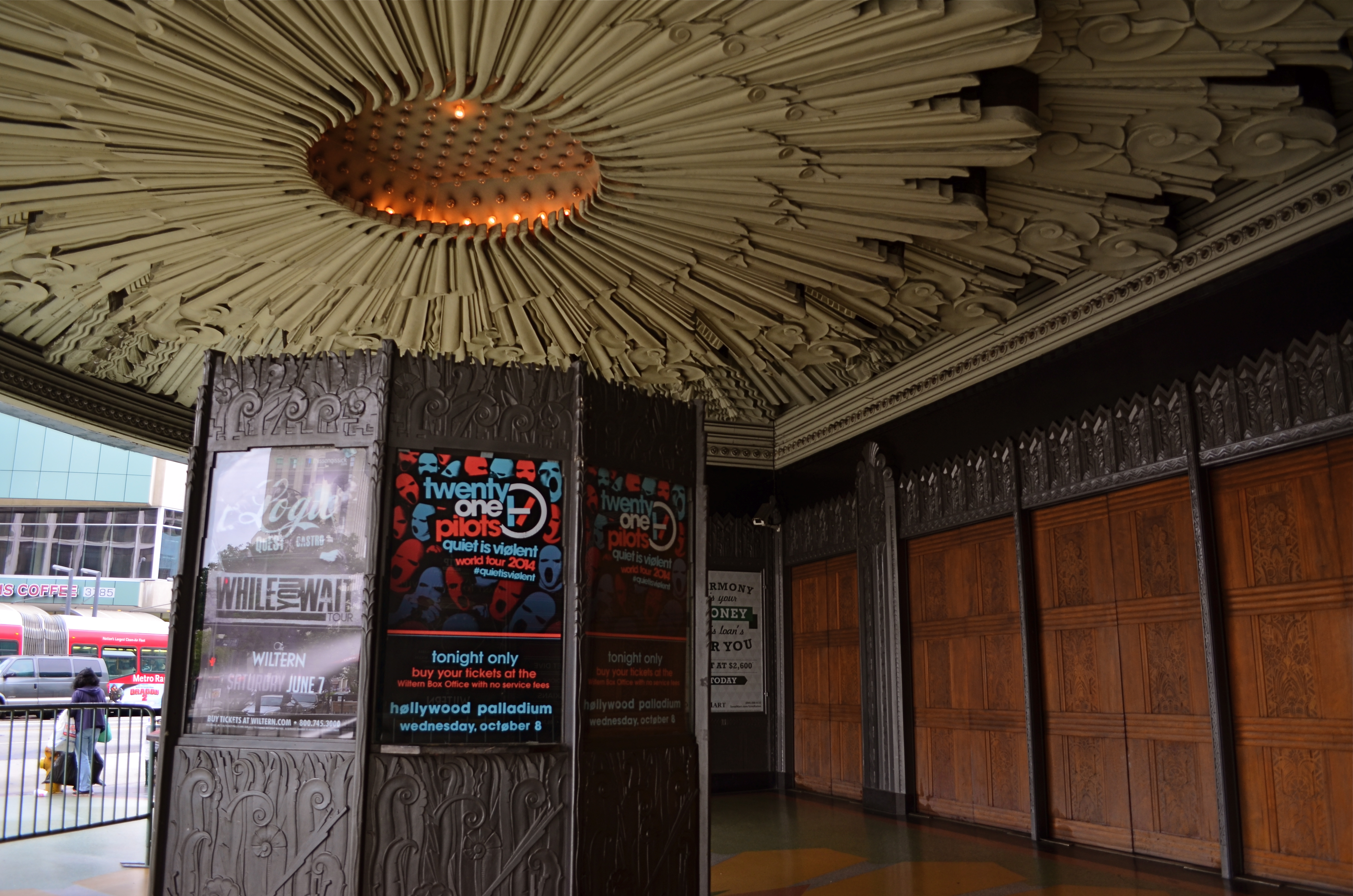
The Wiltern’s ticket kiosk sits under a plaster canopy of Deco sunrays. 1/40 sec., f/3.5, ISO 100, 18mm.
Restoration began in the 1980’s on the Pelissier building in general, but the Wiltern, with its ornate plaster reliefs and murals, had been so neglected over the years that its turnaround was slower. It was finally reborn in 1985 as a live performance theatre, losing some seat room but newly able to stage everything from brain-blaster garage rock to Broadway road productions and ballet.
I shot the Wiltern with three HDR frame, all f/5.6, with exposure times of 1/60, 1/100. and 1/160, and blended the final image in Photomatix to really show the wear and tear on the exterior. HDR is great for amplifying every flaw in building materials, as well as highlighting the uneven color that is an artifact of time and weather. I wanted to show the theatre as a stubborn survivor rather than a flawless fantasy, and the process also helped call attention to the building’s French Deco zigzags and chevrons. For an extra angle, I also made some studies of the glorious sunburst plaster ceiling over the outside ticket kiosk. It was great to meet the old girl at last, and on her own terms.
HIGH DYNAMIC RAGE
HDR, used here to recover a few dark details in this somewhat contrasty ladnscape. Far from perfect, but I can live with this.
By MICHAEL PERKINS
THE INTERNET HAS A UNIQUE WAY OF TURNING AN IFFY LOOKING MOLE INTO TERMINAL SKIN CANCER, that is, fanning small sparks into raging infernos by squaring and cubing people’s discontents until they appear monumental. In photographic circles, this phenomenon has made the process known as High Dynamic Range, or HDR a hot potato. Whereas just a few years ago this technique sparked input from people who found it “kind of helpful” or “just not for me”, the current intensity of dialogue on the subject now characterizes HDR as either the greatest tragedy since Ben Affleck got cast as Batman or the miraculous equivalent of mother’s milk.
What has made the average shooter feel like they he has to side with either Mommy or Daddy in a custody battle for the soul of picture-taking? Jeez H. Loueeze. HDR, which is actually just a tool, and thus good or bad depending on how it’s used, has become an enormous bone of contention, with both sides of the debate hurling burning tar balls at each other, safe within the knowledge that they alone possess Real Truth.
Uh….okay, fine.
How’s this for Real Truth: processing in the digital age is no different from the burning, dodging, manipulation and filtering of the analog era, and, somehow, photography has survived both the modest and excessive uses of these and countless others for over two centuries. HDR’s original stated purpose was to modulate the tones of extremely contrasty subject matter, rendering a smoother transition between really light and really dark values to produce a picture that seemed to more accurately reflect how the human eye compensates for contrast. It was concocted as a workaround for one of the optical barriers that cameras are always striving to overcome.
This may have been taken inside a chapel, but not even Jesus could save this one. Gooey and creepy.
So what do you expect humans, always the “X” factor in any art, to do with any new tool? Answer: Anything they damn well please. Of course some people are going to produce beauty while others produce sludge. Of course some will use it to mask or slap a band-aid on badly conceived images. And, of course decent HDR processing platforms will be imitated by cheap apps created in Hacky McHackmore’s Dad’s garage and selling for $1.99.
I have had my own uneasy romance with HDR going back several years. I have found it to be a nice way to tweak color, an intensifier for detail and grain in things like stone and wood, and, yes, a way to dramatize contrasts in superkeen ways. I have also been guilty of slathering it on in the desperate hope that I can “rescue” a shot with it, and have been horrified at the way it makes human skin look like it was hosed down in molten Crayolas. Sometimes I have used it to make things more natural, while, at other times, I have taken advantage of its special talent for making things unearthly. And even when I have made the most inane use of HDR, the planets have, amazingly, continued on their daily orbits. In the words of the not-too-great Bobby Brown, it’s my prerogative.
The intense hater-ama currently being mounted against HDR might better be aimed at what makes its misuse all too predictable: the fact that human judgement is variable, unpredictable, and sometimes, twisted. If there’s a photo process that can eliminate that from the pitcher-taking mix, I’d love to see it. In the meantime, HDR is no more harmful (or salvational) than any other processing platform. If there’s a flaw, it’s inside the skull of the guy pressing the button.
Always has been, always will be.
HERE COMES THE NIGHT
Letting the shadows be the shadows.1/100 sec., f/1.8, ISO 250, 35mm.
By MICHAEL PERKINS
FOR SOME PHOTOGRAPHERS, THE END OF A CALENDAR YEAR MEANS BUSTING OUT THE “BEST OF” LISTS, and, certainly,for people with a certain level of skill, that’s a normal instinct. I am always far too horrified by how many losing horses I put in a given year’s race to try to find the few who didn’t go lame, wander off the track, or finish last, so I confine my year’s-end computations to lists of what I tried, and whether I got close to learning anything. For 2013, one bulletin emerges:
I like the dark. A lot.
That is, a simple head count of shots taken this year reveal that I was outside, after supper, at nearly every opportunity. And yes, with mixed results. Always and forever will them results be mixed, amen. If my results were in a Waring blender, going at full “puree” speed, they could not be more mixed, okay?
But for some reason, the quest took me back into a renewed appreciation of shadows, shades, a lack of light. I probably embraced the missing information and detail that the dark represents more joyfully than I have in many years. And that’s something of a journey, since, if I had any kind of post-processing crack habit recently, it was the mania to rescue more and more of that detail, whether in High Dynamic Range photos, Exposure Fusion photos or Tone Compression photos. For a while, I was acting like your Grandpa the first week he owned his new Magnavox (“…hmm, needs a little more green….no, now the horses look purple….let’s add some red…”).
What’s left out is as vital as what’s shown. 1/50 sec., f/1.8, ISO 640, 35mm.
Maybe 2013 was the year I pulled back a bit and just let darkness be, let it express the unknown and the unknowable. Photography is always at least partly about what you don’t show, not depicting the world as a giant Where’s Waldo overdose of texture and detail. In ’13, I spent a lot more time shooting night shots at the technical limit of my camera, but did not fiddle about much further afterwards. I was interested in “getting as much picture into the click” as possible, but what couldn’t be achieved with faster lenses or mildly enhanced ISO just got left out of the pictures. I feel like it was a year of correction, with me playing the part of a new teen driver has to learn to correct for over-steer.
The whole thing is about remembering that technique is not style. What you have to say is style. The mechanical means you use to get it said is technique. Learning to execute a technique is like mastering the workings of a camera. It does not guarantee that your results will be revelatory or eloquent. That means that falling in love with the consistent polishing of processing is a danger, since you can begin to love it for its own sake. Technique says “Look what I can do!”. Style says, “but, is this what I should be doing?”
Anyway, whatever I presently think is essential for my growth will, eventually, become just one more thing that I do, and will be supplanted by something else. That said, a good year in photography should not end with the collection of a pile of hits, but an unafraid assessment of the misses.
That’s where the next batch of good pictures will come from, anyway.
DEPTH OF FEELING
By MICHAEL PERKINS
OFTEN, THERE ARE ONLY SCANT MOMENTS TO DETERMINE HOW TO “USE” PEOPLE IN YOUR PHOTOGRAPHS. The decision as to how prominently a person figures in the overall scheme of a given image is frequently made on the fly, and your result will reflect whether that person is an element of the picture or a select feature.
Of course, you can wind up with wonderful photos either way, which is one of the most attractive aspects of picture making. This is all multiple choice, and there is no wrong answer. Also, if the answer was right for you, chances are that it will be so judged by others. Your conviction carries the picture to its desired audience, if you will.
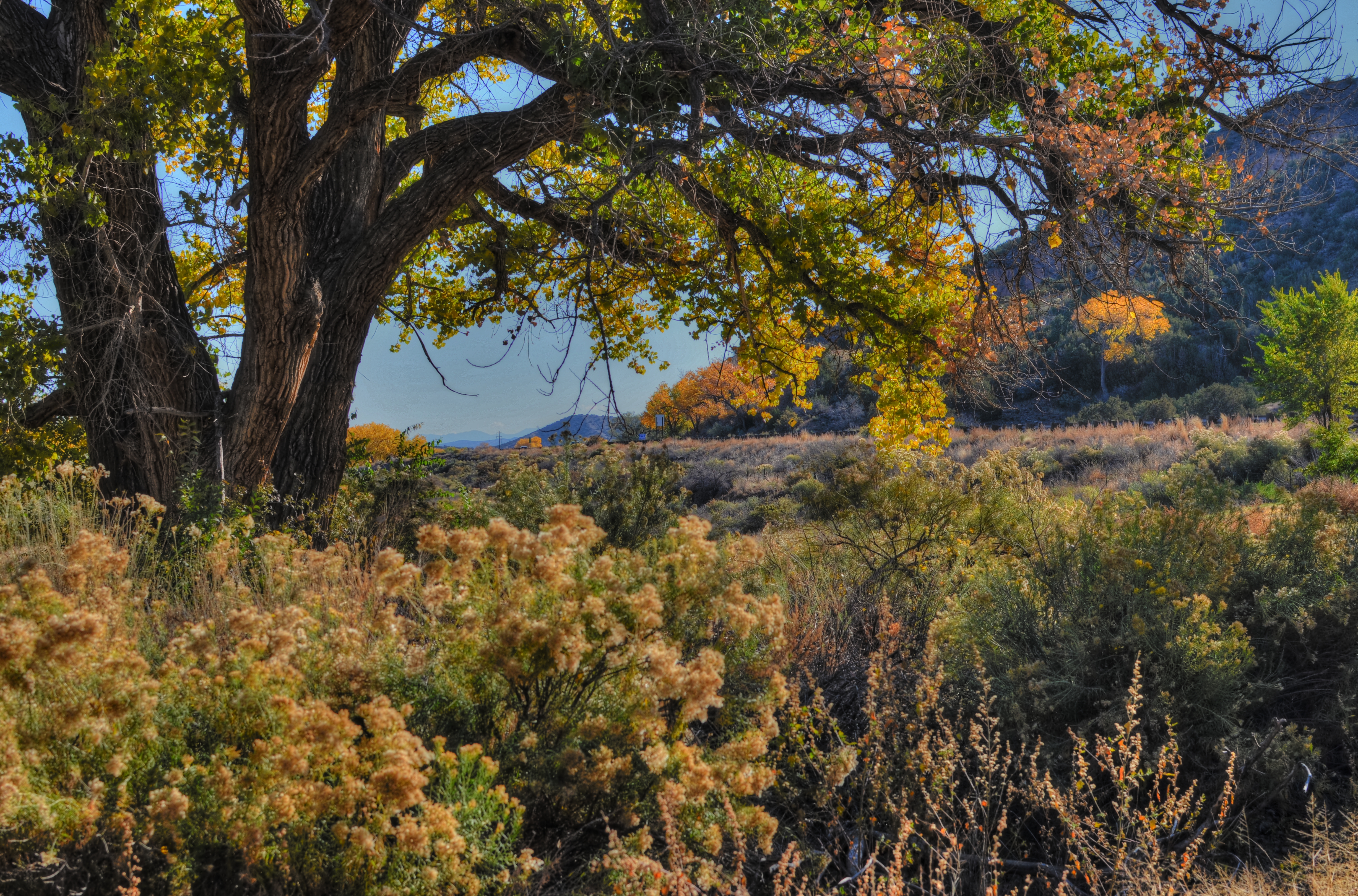
This October, I fell into a virtual pot of gold on a trip to visit friends in rural New Mexico, since the entire countryside was awash in a gilded flood of yellow with the turn of the leaves. You could literally point the camera at a trash can, and, if it was next to a cottonwood tree, the thing became a palace. As a midwestern kid who has spent nearly fifteen years in the Arizona desert, I was long overdue for the richness of the autumnal palette, and I got a little drunk on it all. I wanted to immortalize every tree, shooting generally at small apertures to get as much sharp detail as possible.
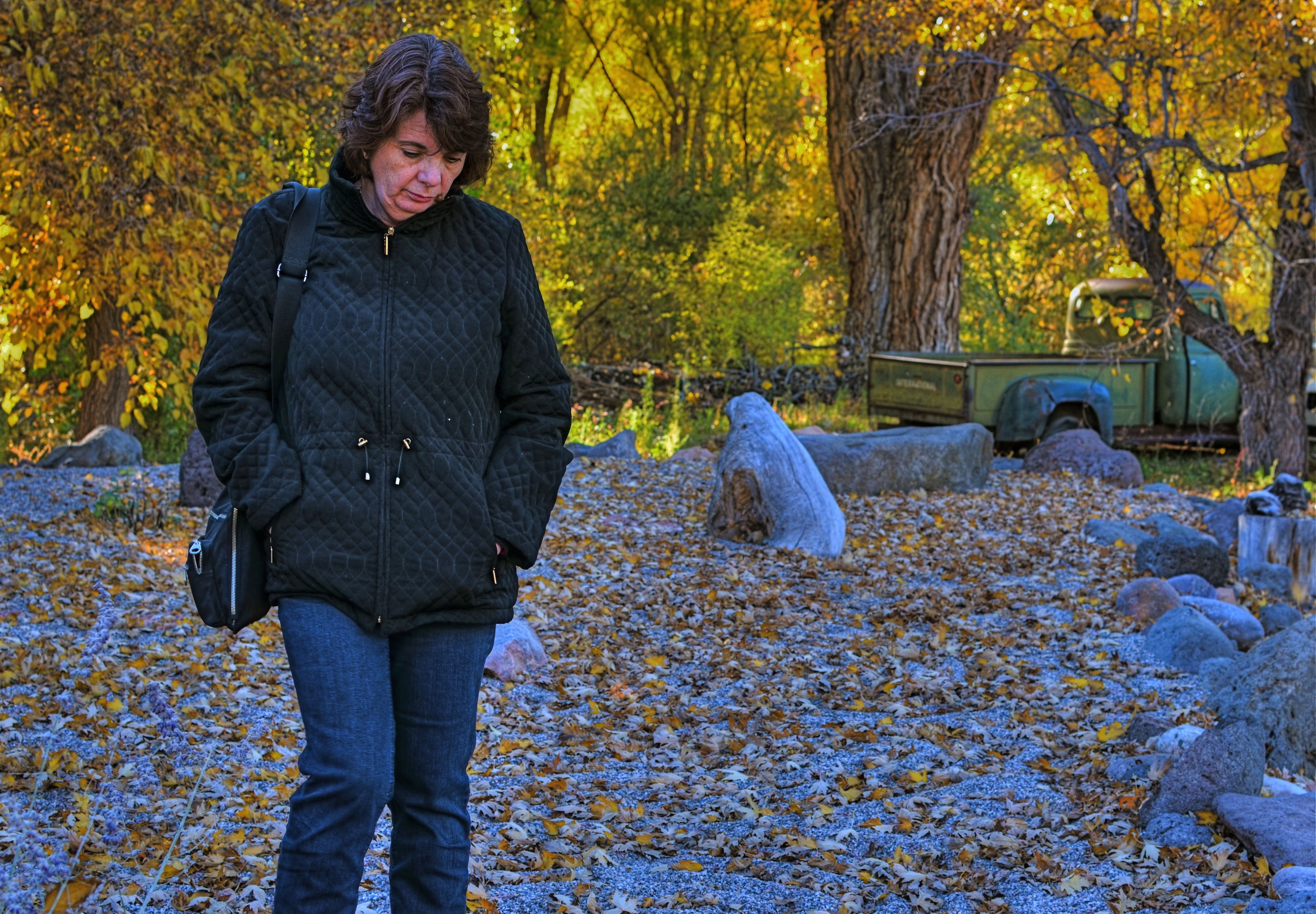
1/80 sec., f/5.6, ISO 100, 35mm.
That’s what I was doing in the side yard of a roadside gallery when my wife Marian wandered outside for a brief walk, so the first few frames I shot showed her and the background in about the same focus. Just for variety, I re-focused on mostly her at f/5.6, slightly softening the foliage beyond so it wouldn’t fight with her for the viewer’s attention. In that one frame, she morphed from element to feature, and all that color was put at her service, so to speak. As an afterthought, I made a dupe of the image, lightened it by about a third, then blended the two in Photomatix, since HDR processing also accentuates detail, giving me an even sharper contrast between her sharpness and the softer background. It wasn’t a big bump, processing-wise, just the bow on the box.
Experimental “light field” cameras, once perfected, may make such planning moot, since images taken with this very different technology allows the photographer to redo the depth of field on an image after it has been taken. For now, however, it’s a decision of the moment.
Again, part of the fun.
Related articles
- Depth of Field (mariatobon.wordpress.com)
QUICK STUDY
Don’t think you’re paying me a compliment to say that this “looks like a painting”. Or a cabbage. Or a hammer. It’s a picture.
By MICHAEL PERKINS
THE INCREASINGLY COMMON USE OF THE WORD “PAINTERLY” AS A GENERIC COMMENT ON CERTAIN KINDS OF PHOTOGRAPHIC IMAGES has got me grinding my teeth, as it perpetuates the use of a term that is absolutely meaningless. Almost as meaningless as noting, or caring, at this late date, whether elements of painting are present in photos. This argument goes back so far that I feel compelled to provide the following “Cliff’s Notes” in order to compress 150 years of bickering into a compact format. Presenting:
A COMPLETE CHRONOLOGY OF PHOTOGRAPHIC “TRUTH”
a) We are just as good as painting.
b) No seriously, we are.
c) Who said that? We are so not like painting, which is old and tired.
d) Well, we’re a little bit like it, but we kinda feel weird about it.
e) Wow, I’d love to photograph that painting.
f) Man, I’d love to layer paint on that photograph.
g) Hey, I found a way to make my photographs look like paintings!
Enough already. We never praise a painting by saying it looks “Photo-ish”, so why make the opposite comment? What visual flavor makes any image fall on either side of an arbitrary line, and who the $%#&! cares? The only comment that could possibly matter is to remark that something is “a great picture”, but even that is superfluous. Does it speak? Did it work? Is there something there? Was anything amplified, simplified, defined, revealed in said picture?
This kind of semantic drift persists because, amazingly, some people don’t think photography is miraculous enough without being laden with little linguistic Christmas ornaments that display their acumen and intellect. These are the same people who fret that processing is “cheating” and that expensive cameras make better pictures than cheap ones, and it’s a disservice to any authentic discussion, like the fact that those who wield brushes and those who wield Nikons can both exalt, or denigrate, the human experience.
You don’t have to paint me a picture. You just have to tell me a story.
Related articles
- Blending painterly elements with photography (flickr.net)
BLACKTOP GYPSIES
Low overhead? Hey, we invented it. A parking lot, some pumpkins, and opportunity. For the merchants and you.
By MICHAEL PERKINS
RETAIL CHAINS ARE STARVATION FOR A PHOTOGRAPHER, a barren field where nothing grows, at least visually. America used to be a place where, in our business doings, our petticoat showed a bit; a certain raw vitality showed through our saggy banners, our improvised displays, our homespun marketing. It’s no wonder that the photojournalists of the Great Depression or the choniclers of the Lower East Side of the early 1900’s made poetry out of our back-of-the-truck veggie stands, our horse-drawn pushcarts, our roadside tag sales. There was texture there. There was the real drama of struggle, and it was a pictorial gold mine.
Of course it’s not all gone, and we are not, uniformly, Wal-Mart Nation. Not yet.
As picture makers, we have so much more to work with looking at the human, the risky, the uncertain in our do-it-yourself capitalism. There are stories in it. There are real people on the front lines of the culture to watch and capture. It’s also a hell of a lot more fun than trying to find drama in the grand opening of, say, Kwikie Mart # 3425.
Look Around, See If You Like Anything, I’m Almost Done With My Lunch….
And picture opportunities, created by the blacktop gypsies of our time, are still setting up shop across the country…..six days in a Target parking lot to sell fireworks, four hours in a church driveway to hawk cakes and pies, three weeks in a vacant lot to peddle Christmas trees. And then there are the fairs, the craft shows, and the garage sales, those stubborn little machines of mercantile faith. You can’t not grab gold in these fields.
There may be a great epic just waiting to be shot inside a massive wholesale warehouse, but I prefer my drama smaller, and a little more on the human side. Show me a guy trying to make a buck against all odds and I’ll show you a picture.
Or make you one.
A CHANGE IN PRESCRIPTION
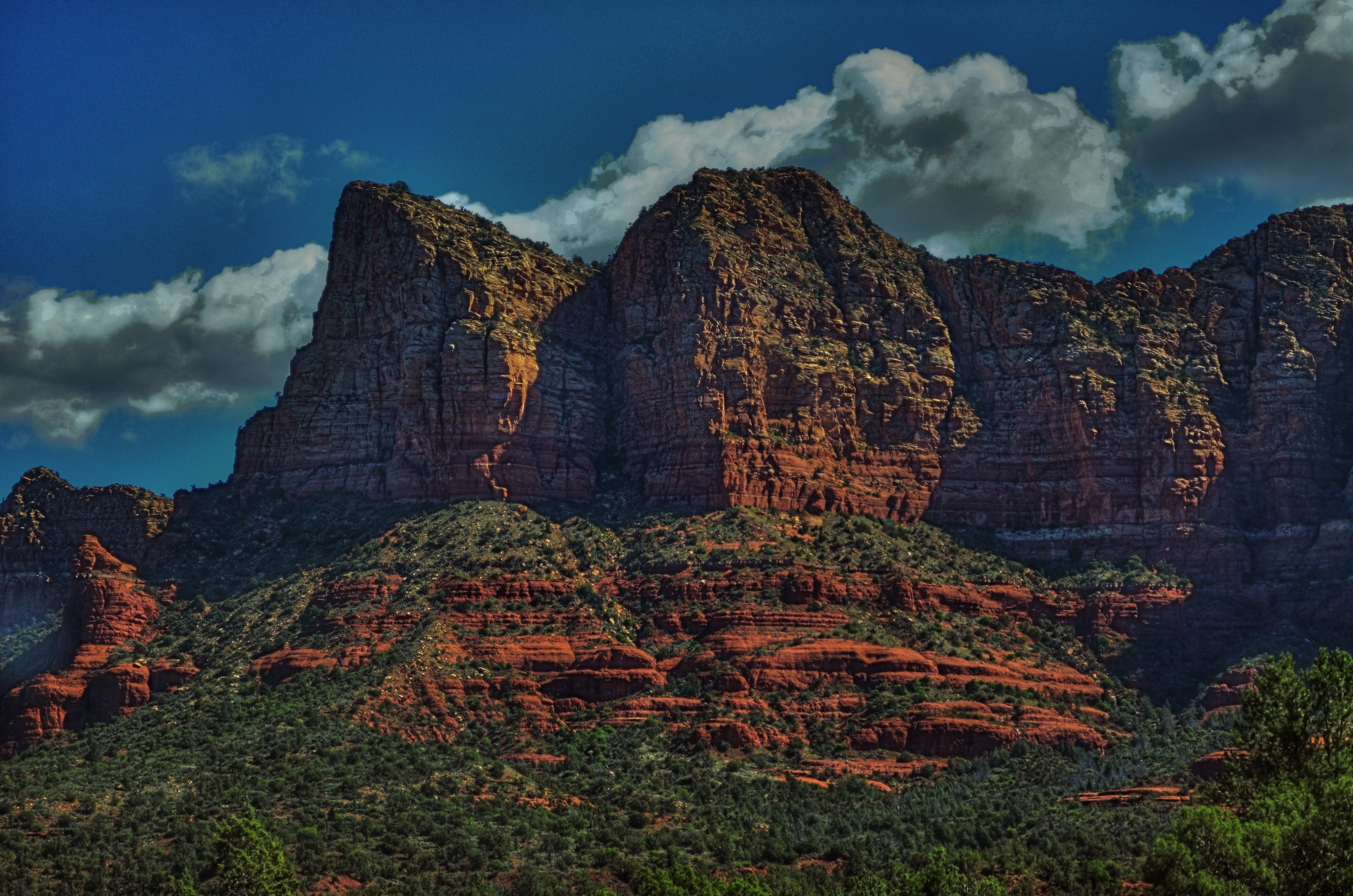
Sedona Bluffs, 2013. HDR can be your best friend when rescuing detail and shadow on subjects like this. But it will make your Aunt Hilda look like the Portrait of Dorian Gray.
By MICHAEL PERKINS
THERE IS AN OLD STORY ABOUT AN IRISHMAN WHO FINDS AND RUBS A MAGIC LAMP. Upon emerging from said lamp, the genie tells the boyo that he can have three wishes. For his first, he asks for an everlasting pint, a beer glass that will endlessly refill every time he drains it, forever. “Try it out”, says the genie, whereupon the lad gulps down several draughts, each one replenished in an instant. “This is grand!” he shouts. “All right, now”, reminds the genie, “what about your other wishes?” “Oh, that’s easy”, says the Irishman, “just give me two more of these.”
High Dynamic Range, or HDR processing is a little like those two unused wishes. You can fall in love with the effect of using it without pausing to see if it makes sense to use it, or see what else is out there on the horizon.
HDR can be the photographic equivalent of a crack habit, especially when you first test-drive it. Rescuing information from shadows, accenting detail to ever-crisper levels, tweaking colors to Peter Max-imums…..it’s all pretty stunning, and, like the 98-pound weakling in the Charles Atlas ads, the drama is best seen in “before and after” comparisons. And then there follows The Great Period Of Overcompensation, that heady phase in which you turn everything you shoot into a psychedelic fever dream. It’s garish, sometimes cartoonish, but eventually you get to a point where you want to throttle back and just use HDR as a tool instead of a magic paint box. It can’t be a style all by itself, but it can amplify your own style, extend your reach. Ground Control To Major Tom….
This blog has always been a discussion of why we do things rather than a tutorial on how to do them. It’s the decisions that we make with technology that matter, more than the technology itself, so we talk about judgements, motivations, intentions. In that vein, I’ve updated the HDR gallery tab of the blog with all new images, in an attempt to chronicle where I am with this process today. I originally intended the galleries to do this….to be a visual track on what I thought important to try in a given period. We are,literally, different photographers every day we wake up, so it’s absurd to think that any technique, approach, or magic wish will work for us equally well forever. The patient still has needs, but he requires a periodic change in prescription.
So settle back with an endless pint and give us a look.
The pictures may not work for you, but, hey, if the beer’s cold, it’s not a total loss.
Follow Michael Perkins on Twitter @Mpnormaleye.
Related articles
- HDR Photography: craze or crazy? (homesandlandofmontreal.wordpress.com)
A TALE OF TWO KINGS
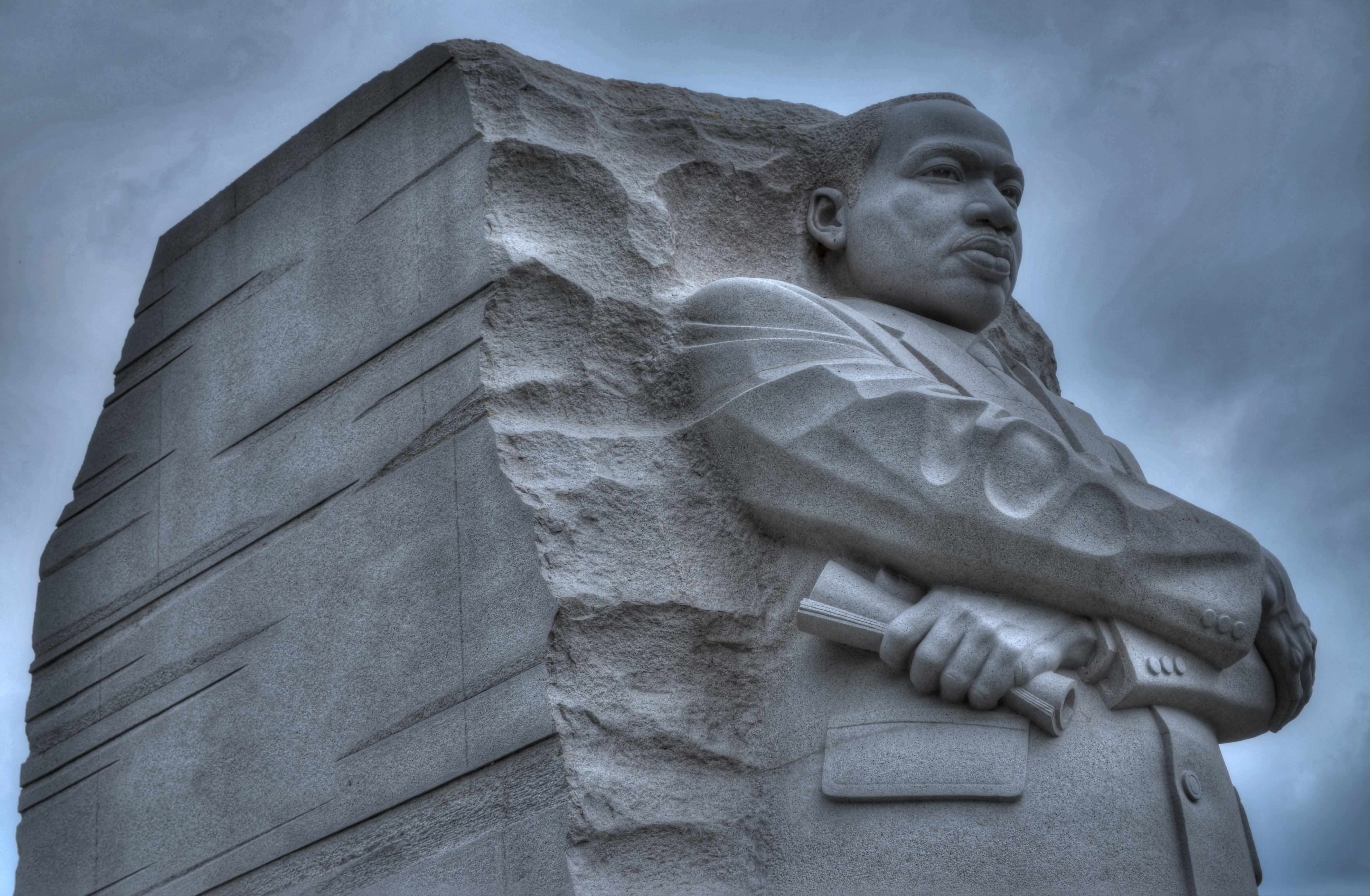
A determined Martin Luther King, Jr. stares forward into the future at the newly dedicated MLK Memorial on Washington’s National Mall. Fusion of three exposures, all with an aperture of f/5.6, all ISO 100, all 48mm. The shutter speeds, due to the high tones in the white statue, are 1/200, 1/320, and 1/500 sec.
By MICHAEL PERKINS
DEATH PERMANENTLY RENDERS REAL HUMAN BEINGS INTO ABSTRACTIONS. With every photo, formerly every painting, drawing, or statue of a renowned person, some select elements of an actual face are rearranged into an approximation, a rendering of that person. Not the entire man or woman, but an effect, a simulation. The old chestnut that a certain image doesn’t do somebody “justice”, or the mourner’s statement that the body in the casket doesn’t “look like” Uncle Fred are examples of this strange phenomenon.
Nothing amplifies that abstraction like having your image “officially” interpreted or commemorated after death, and, in the case of the very public Dr. Martin Luther King Jr., Washington’s National Mall offers two decidedly contrasting ways of “seeing” the civil rights pioneer. One is more or less a tourist destination, while the other is muted, nearly invisible amongst the splendors of the U.S. Capitol. Both offer a distinct point of view, and both are, in a way, incomplete without the other.
The official MLK memorial, opened in 2011 as one of the newest additions to the Mall, stands at the edge of the Tidal Basin, directly across a brief expanse of water from the Jefferson Memorial. Its main feature shows a determined, visionary King, a titanic figure seeming to sprout from a huge slab of solid stone, as if, in the words of the monument, “detaching a stone of hope from a mountain of despair”. Arms folded, eyes fixed on a point some distance hence, he is calm, confident, and resolute. This gleaming white sculpture’s full details can best be captured with several bracketed exposures (fast shutter speeds) blended to highlight the grain and texture of the stone, but such a process abstract’s King even further into something out of history, majestic but idealized, removed.
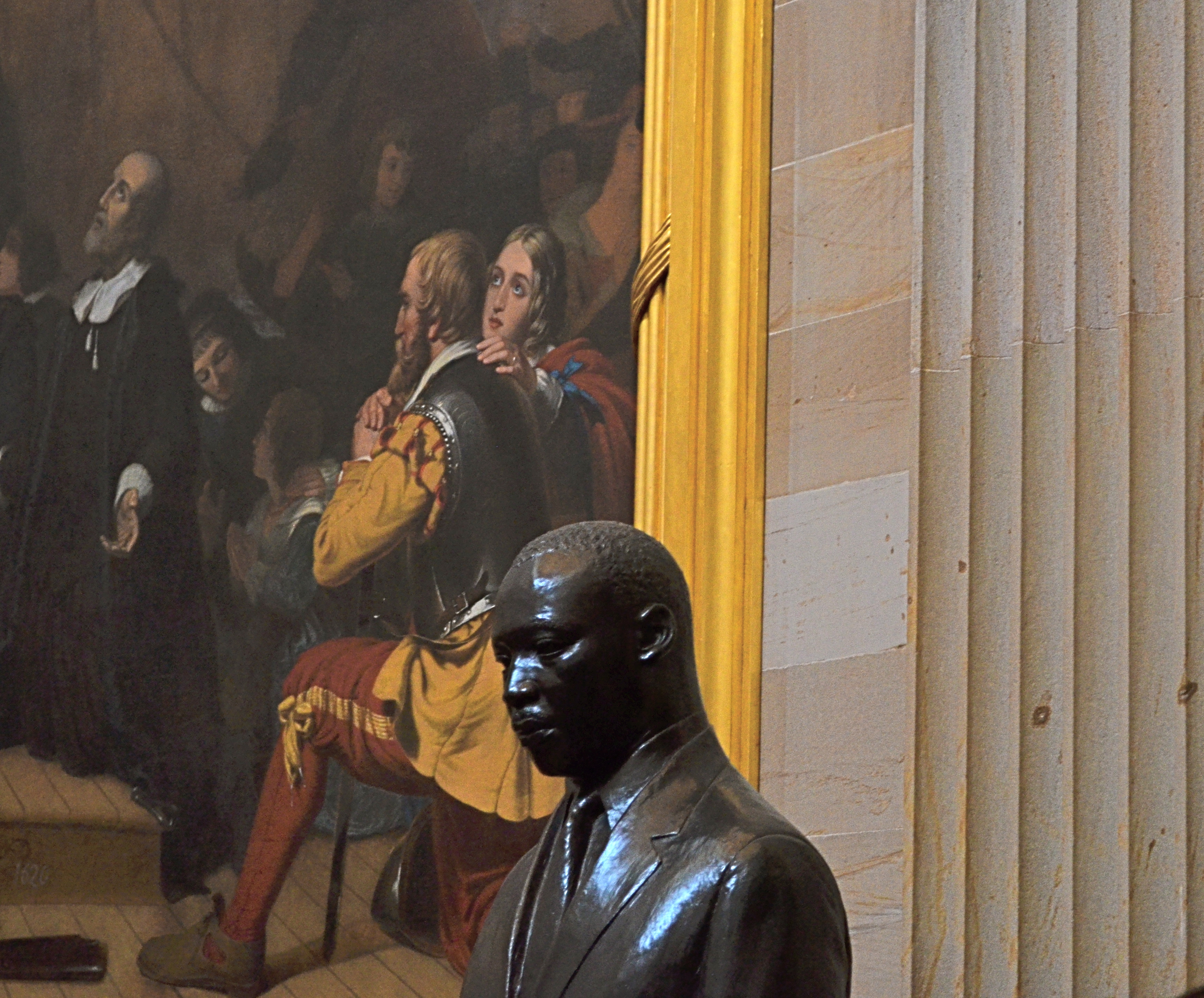
Another view: a somber bronze bust of Dr. King in the U.S. Capitol rotunda, flanked by the painting The Embarkation Of The Pilgrims. 1/30 sec., f/5.6, ISO 640, 55mm.
The contrast could not be greater between this view and the bronze bust of King installed in 1988 in the rotunda of the Capitol building. This King is worried, subdued, straining under the weight of history, burdened by destiny. The bust gains some additional spiritual context when framed against its near neighbor, Robert Weir’s painting The Embarkation Of The Pilgrims, which shows the weary wayfarers of the Mayflower, bound for America, on bended knee, praying for freedom, for justice. Used as background to the bust, they resemble a kind of support group, a congregation eager to be led. Context mine? Certainly, but you shoot what you see. Inside the capitol, light from the dome’s lofty skylights falls off sharply as it reaches the floor, so underexposure is pretty much a given unless you jack up your ISO. Colors will run rich, and some post-lightening is needed. However, the dark palette of tones seems to fit this somber King, just as the triumphant glow of the MLK Memorial’s King seems suited to its particular setting.
Death and fame are twin transfigurations, and what comes through in any single image is more highly subjective than any photo taking of a living person.
But that’s where the magic comes in, and where mere recording can aspire to become something else.
Follow Michael Perkins on Twitter @mpnormaleye.
