SERVING UP SOME NUTS
The Haves And The Have-Nots (2017)
By MICHAEL PERKINS
COMPOSITION IN PHOTOGRAPHY WOULD BE A SNAP (sorry) if the camera actually possessed not just an eye, but also a brain. But that’s where you come in.
When the human eye takes in a scene, the brain automatically ranks all the information within it, basically making a composition of priority. We “see” some things and “don’t see” others, based on how our grey matter ranks the importance of everything in our field of vision. A camera cannot make these fine decisions: it merely makes a light record of what it’s pointed at. That accounts for the fact that our “perfect” landscape, the one we ourselves recalled from the first day of vacation, comes back, in a mere photo, complete with electrical wires, distracting signs, junk near the beach, and any other number of things our brains filtered out of the original viewing experience.
Last Man Standing (2017)
Composition is thus a matter of our deliberately arranging things by priority, making an argument for our audience to Look Here First, Only Look Here, Give Greater Weight To This Over That, or any other messaging we desire. In sales terms, it’s what pitchmen call Asking For The Order. Simply, composing a photograph means setting the terms of engagement for the viewer’s eye.
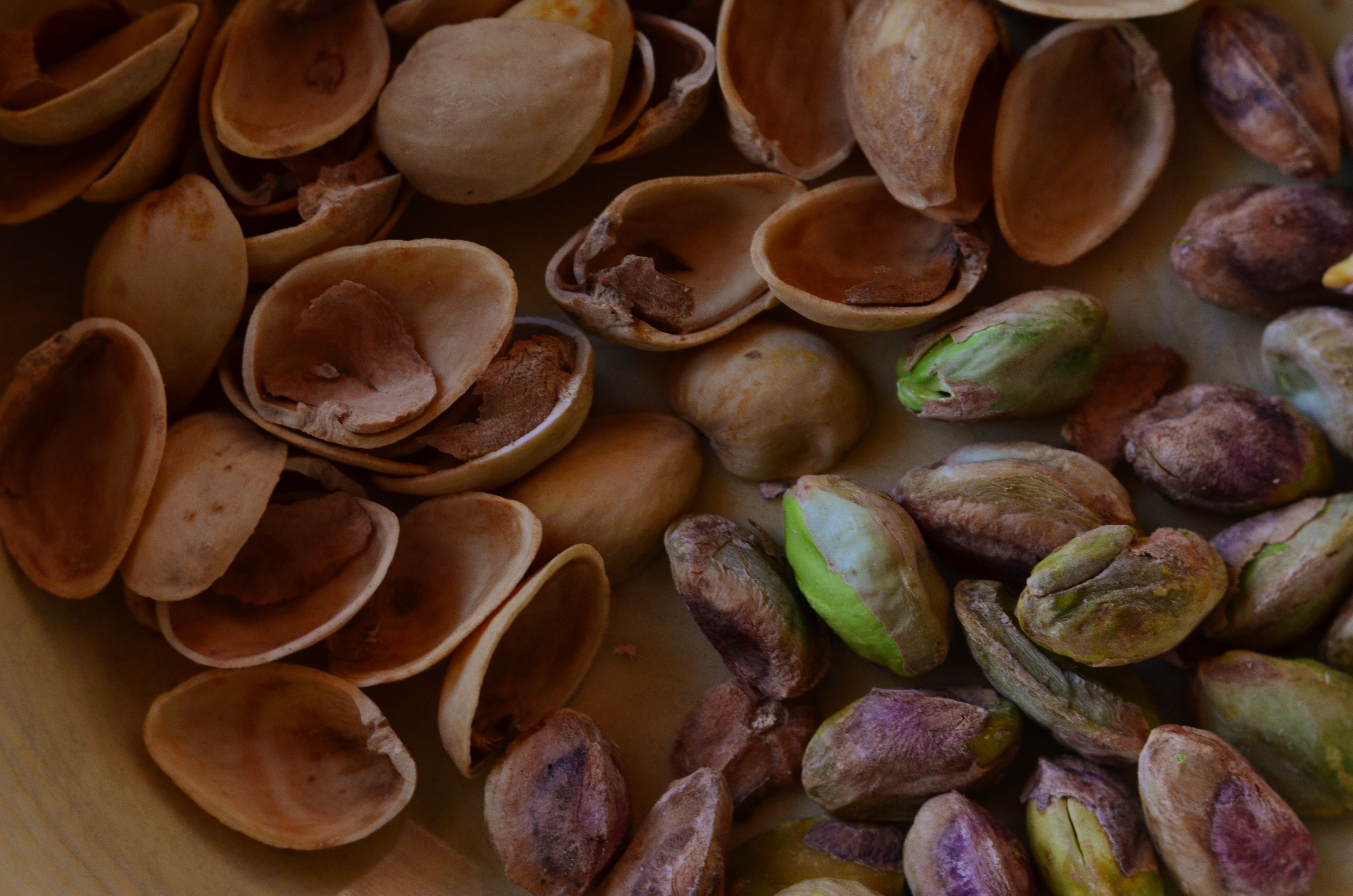
With still-life photographs, the shooter has the greatest degree of control and responsibility. After all, our subject is stationary, easily moved and arranged to our whim. You pretty much are lord of your domain. That being said, it’s wise to use this luxury of time and control to envision as many ways as possible to convey your message. The image at the top of this page, for example, is crowded, but the nut shells and the unshelled nuts are a study in textural contrast. There’s lots of color and detail, with one side being somewhat blanched while the other is rough and complex. That’s one way of making the image.
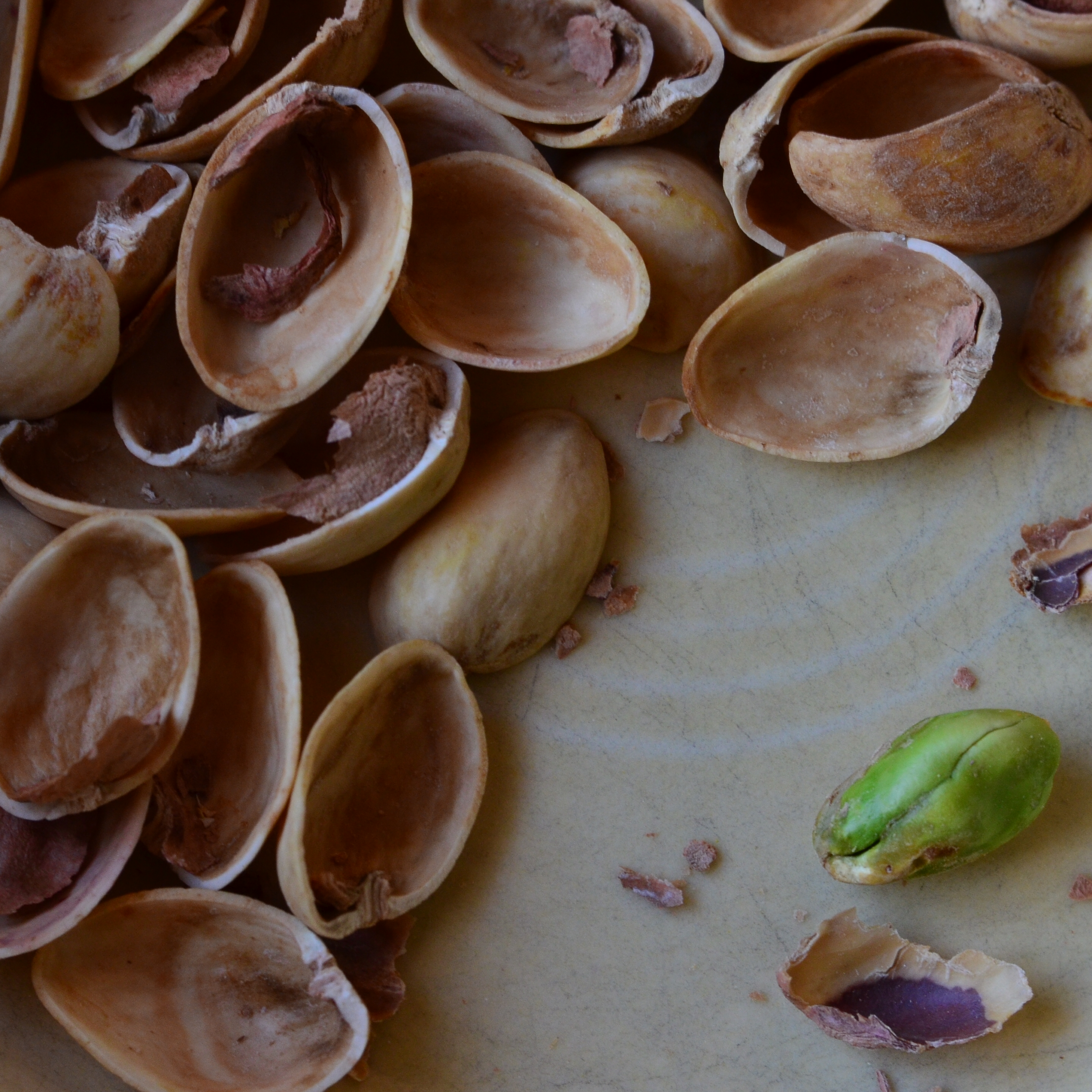
For comparison, in the second frame, the terms of engagement are completely different. The pile of shells at left is more sharply contrasted with the single nut at right. The nut carries the only vivid color in the image; it’s an outlier, a misfit…maybe the last man/nut standing? The simplification of the composition lets it breathe a little, allowing the viewer to speculate, invent. Are the shells symbolic of a mound of nuts that have already been polished off in some grand snacking orgy? Why was one lone nut left to tell the tale? And so on.
Change the arrangement of subjects in a scene and you’ve changed the terms of narration, or even insisted that there is no narration, just patterns, light, or abstraction. Whichever path you choose, no composition comes to the camera “ready to eat”, as it were. You have to tell your camera’s mechanical eye what to see, and how to see it.
GOING NEGATIVE

Negative space is your best friend when trying to establish scale.
By MICHAEL PERKINS
I got plenty of nothin’, and nothin’s plenty for me. —Ira Gershwin, Porgy and Bess
I BELIEVE THAT MANY PHOTOGRAPHS ARE IMPROVED BY THE SIMPLEST OF MATH OPERATIONS: addition and subtraction. Look at nearly any image you’ve created that “worked” and you can see that there is not one more thing in the image than there needs to be. Something told you to either supply or eliminate elements in the composition until the impact of the picture was maximized. Realizing the reverse effect is pretty easy as well, although not as much fun. If there is one tree too many or one object too few in the frame, you can sense the imbalance in your near-miss pictures. And man, does that hurt.
 We used to refer to open areas of a picture as “blank” space, and were often talked out of using it at all by various A-B-C composition tutorials that told us that large expanses of sky could kill a good landscape. Today, we refer to this unused real estate as “negative” space, but we are now more inclined to see it as well, a positive thing. The take-home from this is, simply, that no technique should be universally ruled out, or ruled in, for every image. Truth is, there are times when not filling the frame with stuff, or selectively making use of negative space boosts the wattage of what you’re trying to say.
Instead of “negative” space, I prefer the term “secondary space”, since what you’re really doing is mapping your pictures into zones of the things that should be of primary interest and those that should complement those things without competing with them. Landscapes are the easiest way to demonstrate this. In the image at left, I wanted to accentuate the distance between the foreground tree and the background mountain. Framing the two elements to merely overlap gave no sense of space, and, in color, actually made the photo busy and hard to read. There seemed to be no primary object in the frame. Composing so that some sky intervened to the right of the tree and the top of the mountain re-established the sense of distance and kept the textures of both objects from fighting with each other.
Secondary space need not be empty. It can take the form of a texture, be it a body of water, cloud formations, a flooring pattern, or a stone wall. The idea is to use the space to support, but never upstage the primary space. Sometimes what you need to complete an image is nothing. You just have to stick the nothing in the right place.
WAIT FOR IT…..
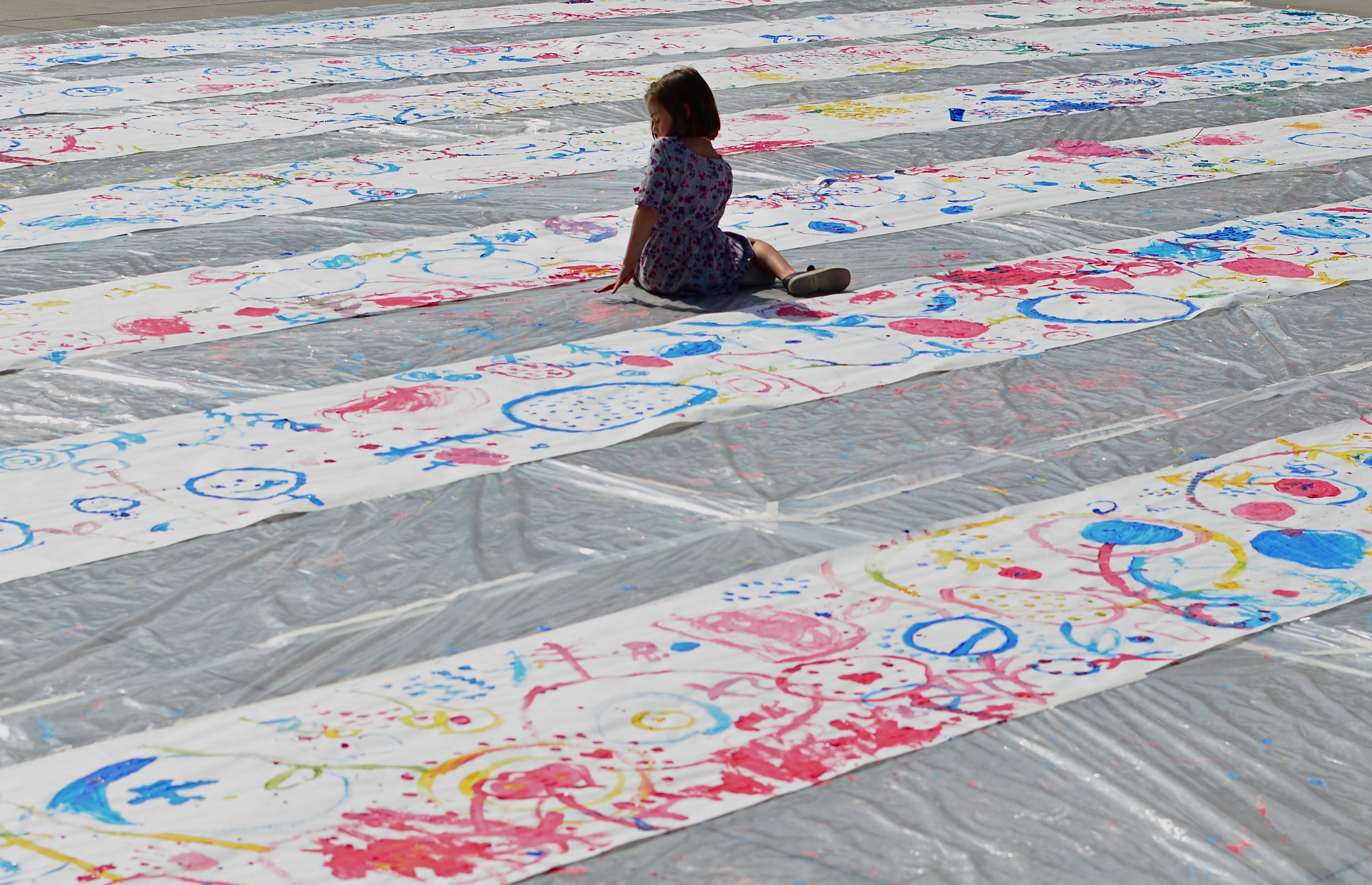
She came from nowhere, and saved the day: 1/1000 sec., f/5.6, ISO 100, 35mm.
by MICHAEL PERKINS
SUNDAY MORNINGS AT THE LOS ANGELES COUNTY MUSEUM OF ART ARE A GAGGLE OF GIGGLES, a furious surge of activity for, and by, little people. Weekly craft workshops at LACMA are inventive, inclusive, and hands-on. If you can cut it, fold it, glue it, paint it, or assemble it, it’s there, with booths that feature encouraging help from slightly larger people and smiles all around. It is a fantastic training ground as well for photographing kids in their natural element.
A recent Sunday featured the rolling out of long strips of art paper into rows along one of the common sidewalks, with museum guides on bullhorn exhorting the young to create their own respective visions with paint and brush. The event itself was rich in possibility, as a hundred little dramas and crises unfolded along the wide, white canvasses. Here a furrowed brow, there an assist from Mom. Fierce concentration. Dedication of purpose. Sunshaded Picassos-in-waiting weighing the use of color, stroke, concept. A mass of masters, and plenty of chances for really decent images.
Most of these events are as fast as they are furious, and so, during their brief duration, you can go from photographic cornucopia to….where did everybody go? Sometimes it’s over so quickly that it’s really tempting to treat the entire thing like low-hanging fruit: a ton of kids pass before your eyes in a few minutes’ time, and you have only to stand and click away. Thing is, I’m a lifelong believer in arriving early and leaving late, simply because the unexpected bit of gold will drop into your lap when you troll around before the beginning or after the end of things. In the case of this museum “paint-in”, the participants scampered on to the next project in one big sweep, leaving their artwork behind like a ruined battlefield. And then, miracle of miracles, one lone girl wandered into the near center of this huge Pollack panorama and sat herself down. The event was over but the vibe was revived. I whispered thank you, photo gods, and framed to use the paintings as a visual lead-in to her. It couldn’t have been simpler, luckier, or happier.
When the “stage” on public events is being either set or struck, there are marvelous chances to peer a bit deeper.People are typically relaxed, less guarded. The feel of everything has an informality, even an intimacy. And sometimes a small child brings the gift of her spirit into the frame, and you remember why you keep doing this.
CAUSE AND EFFECT

Sun Pennants, 2014. 1/400 sec., f/5.6. ISO 100, 35mm.
By MICHAEL PERKINS
THERE’S NOTHING WORSE THAN COMING HOME FROM A SHOOT realizing that you only went halfway on things. Maybe there was another way to light her face. Did I take a wide enough bracket of exposures on that sunset? Maybe I should have framed the doorway two different ways, with and without the shadow.
And so on. Frequently, after cranking off a few lucky frames, we’re like kids walking home from confession, feeling fine and pure at first, and then remembering, “D’OH! I forgot to tell Father about the time I sassed my teacher!”
Gridlight, 2014. 1/200 sec., f/5.6, ISO 100, 35mm.
Too Catholic? (And downright boring on the sins, by the way..but, hey) Point is, there is always one more way to visualize nearly everything you care enough about to make a picture of. For one thing, we are always shooting either the cause or the effect of things. The great facial reaction and the surprise that induces it. The deep pool of rain and the portentous sky that sent it. The force that’s released in an explosion and the origin of that force. When we’re there, when the magic of whatever we came to see is happening, right here, right now, we need to think up, down, sideways for pictures of all of it, or as many as we can capture within our power….’cause once you’re home, safe and dry, it’s all different. The story perishes like a soap bubble. Shoot while you’re there. Shoot for all the story is worth.
It can be simple things. I saw the above image at one of the lesser outbuildings at Taliesin West, Frank Lloyd Wright’s legendary teaching compound in Scottsdale, Arizona. An abstract pattern made from over-hanging strips of canvas,used as makeshift shade on a path. But when I reversed my angle and shot the sidewalk instead of the sky, I saw the effect of that cause, and it appealed to me too (see left). One composition favored color, while the other seemed to dictate black & white, but they both could serve my purpose in different ways. Click and click.
It bears remembering that the only picture that is guaranteed to be a failure is the one you didn’t take. Flip things around. Re-imagine the order, the role of things. Go for one more version of what’s “important”.
Hey, you’re there anyway.…..
A SQUARE DEAL
By MICHAEL PERKINS
Symmetry is key with square compositions.
I WAS AT THE MORGAN LIBRARY IN NEW YORK earlier this week, combining a museum tour with a photo shoot, when I came upon an exhibit which featured one of the earliest Kodak consumer prints, with the image contained inside a circle, rather than the rectangular frames most of us remember. It reminded me that the very formatics of picture-making were, for a long time, dictated by the physical dimensions of either camera or film, and that, suddenly, we are free to make photographs of any proportions we choose, anytime, everytime.
It’s really an amazing liberation, and, as an ironic consequence, some photographers are choosing to return to the framing formats that they used to decry as too limiting, subjecting themselves to the extra discipline of staying within a boundary and adjusting their compositional priorities thusly. This has made for a kind of revival of the square image, and there seem to be some distinct advantages to the trend.
Shooting on the square means calling attention to the center of an image, to using symmetry to your advantage, and to paring your composition to its bare essentials. The negative space used in landscape or portrait modes can still work within a square image, but the subject, and your use of it, must be just right. Squaring off means calling immediate attention to your message, and making it all the stronger, since there’s nowhere else for the eye to go.
Andrew Gibson, writing for the website Digital Photography School, explains the visual appeal of the square:
Using the square format encourages the eye to move around the frame in a circle. This is different from the rectangular frame, where the eye is encouraged to move from side to side (landscape format) or up and down (portrait format). The shape of the frame is a major factor.
It’s odd to think of freeing up your photography by voluntarily working within a more restrictive format. And, unlike the old days of square-only shooting, the effect is largely created “after the click”, by re-composing through creative cropping. But the additional mindfulness can really boost the power of your images.
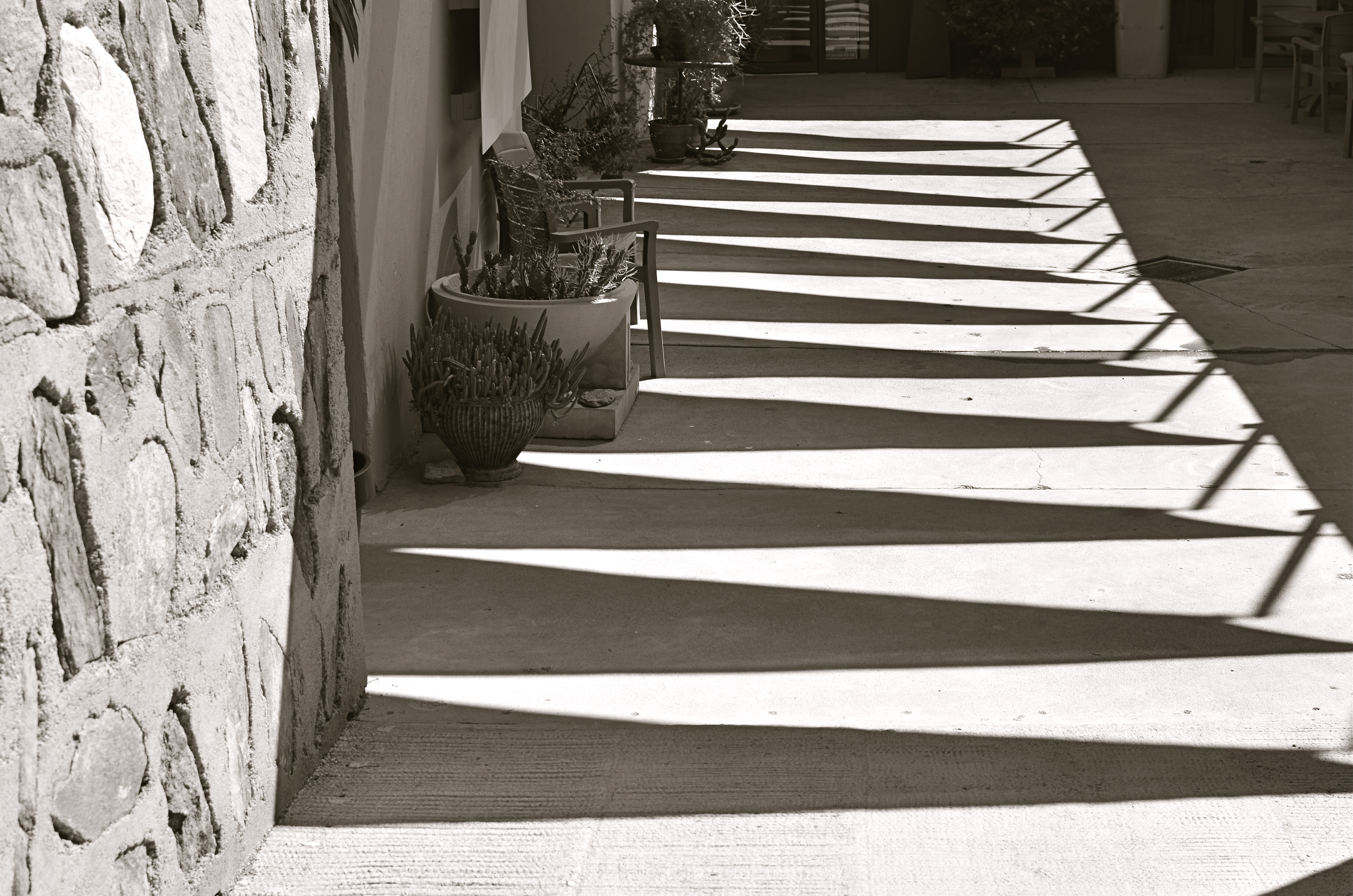
GOING (GENTLY) OFF-ROAD
By MICHAEL PERKINS
WHEN YOU’RE BEHIND THE WHEEL, SOME PHOTOGRAPHS NAG THEIR WAY INTO YOUR CAMERA. They will not be denied, and they will not be silenced, fairly glowing at you from the sides of roads, inches away from intersections, in unexplored corners near stop signs, inches from your car. Take two seconds and grab me, they insist, or, if you’re inside my head, it sounds more like, whatya need, an engraved invitation? Indeed, these images-in-waiting can create a violent itch, a rage to be resolved. Park the car already and take it.
Relief is just a shutter away, so to speak.
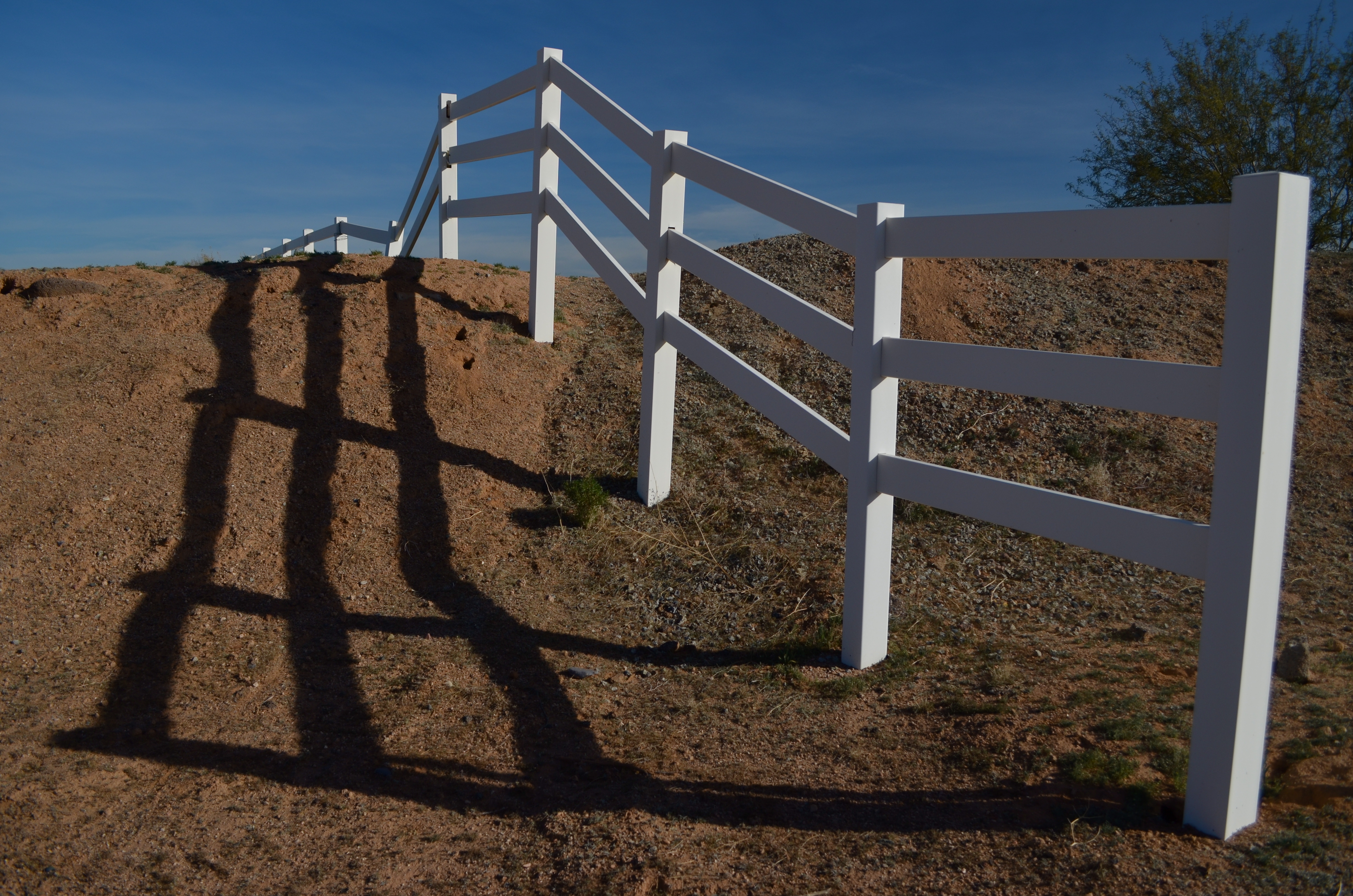
Wait too long and the light will break: 1/800 sec., f/5.6, ISO 100, 18mm.
The vanishing upward arc and sinuous mid-morning shadows of this bit of rural fencing has been needling me for weeks, but its one optimal daily balance of light and shadow was so brief that, after first seeing the effect in its perfection, I drove past the scene another half dozen times when everything was too bright, too soft, too dim, too harsh, etc., etc. There was always a rational reason to drive on.
Until this morning.
It’s nothing but pure form; that is, there is nothing special about this fence in this place except how light carves a design around it, so I wanted to eliminate all extraneous context and scenery. I shot wide and moved in close to ensure that nothing else made it into the frame. At 18mm, the backward “fade” of the fence is further dramatized, artificially distorting the sense of front-to-back distance. I shot with a polarizing filter to boost the sky and make the white in the wood pop a little, then also shot it in monochrome, still with the filter, but this time to render the sky with a little more mood. In either case, the filter helped deliver the hard, clear shadows, whose wavy quality contrasts sharply with the hard, straight angles of the fence boards.
I had finally scratched the itch.
For the moment….
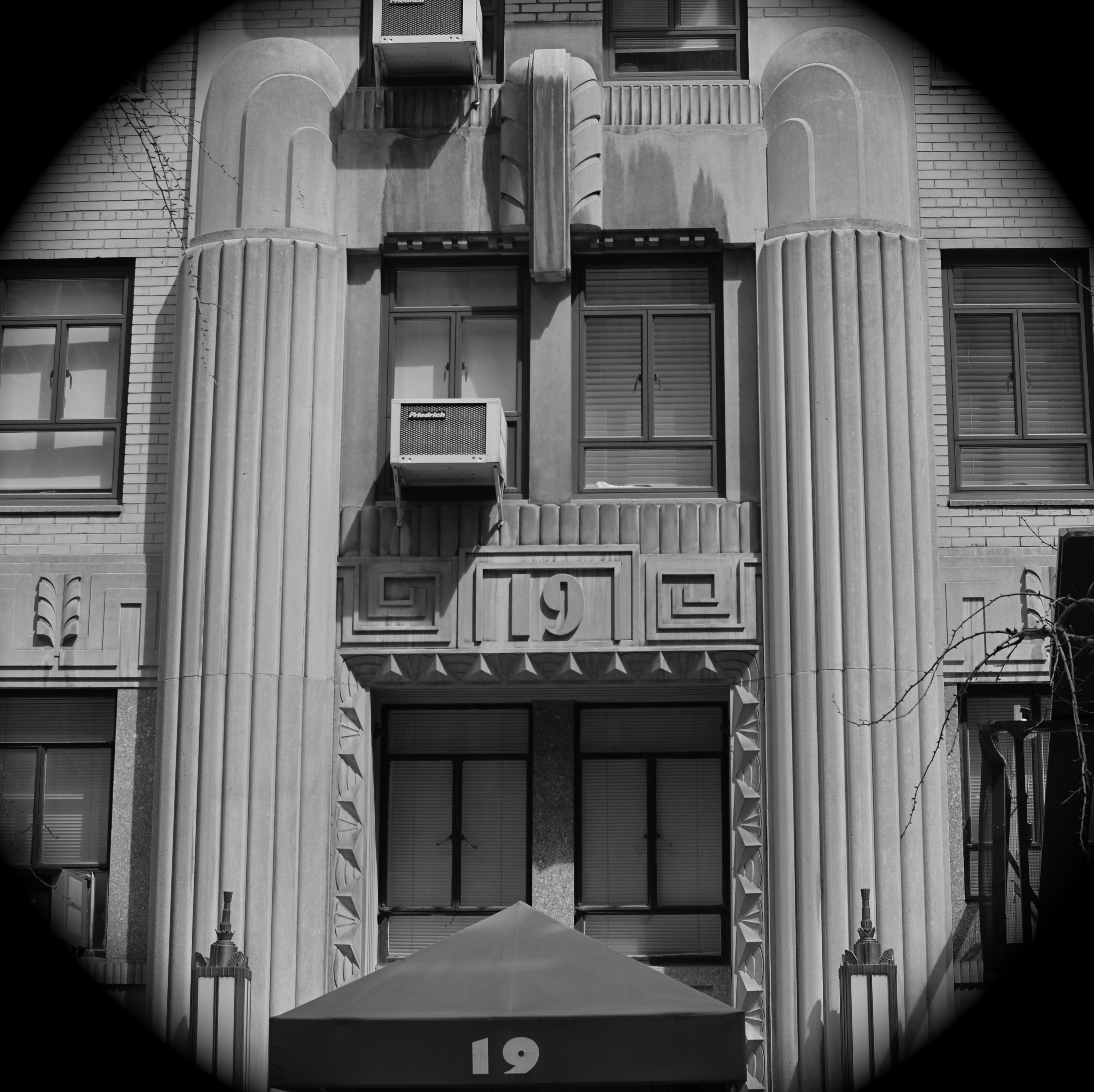
CROP YOUR WAY TO SUCCESS
By MICHAEL PERKINS
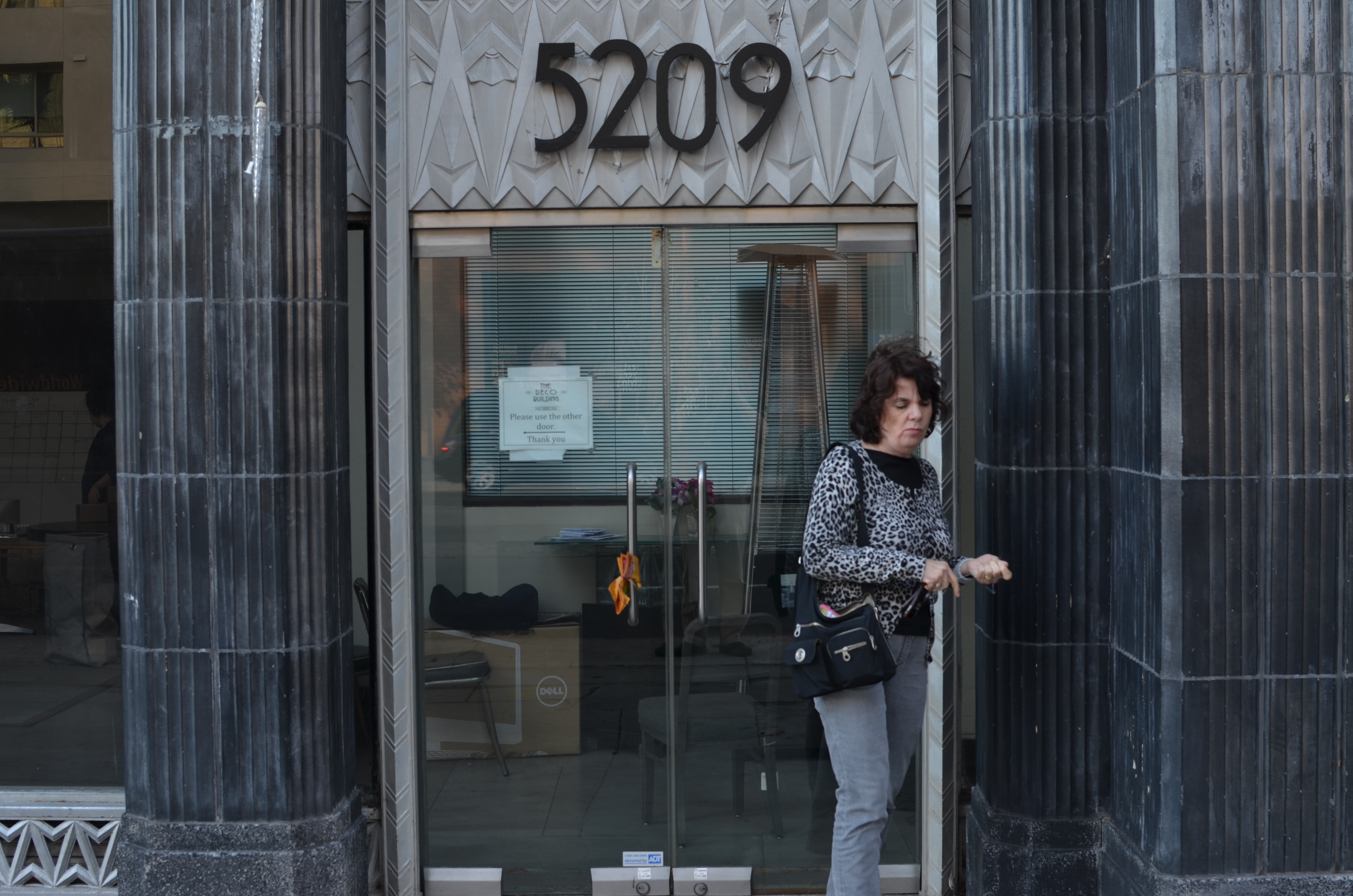
Whoops, I wasn’t ready. 1/100 sec., f/5.6, ISO 100, 35mm.
THOSE OF US WHO HAVE LOGGED SOME TIME IN THE WAITING ROOMS OF PEDIATRICIANS can recall struggling through the “Hidden Pictures” page of Highlights For Children magazine. I would love to tell you that I always found 100% of cartoonist John Gee’s camoflaged squiggles by the time the receptionist invited me into the examining room. But I would be lying.
That said, there are many times when, as photographers, we play the same game with our images, especially the ones in the “doesn’t work” pile. Loving at least the idea behind what we were originally after, we pore over every pixel in the frame, repeating the vain mantra there must be a picture in here somewhere. Often, the photo simply returns to the Hall of Shame despite our best efforts to redeem it. Sometimes, the crop tool is your unexpected best friend.
I recently looked at a failed candid of my wife outside one of my favorite buildings in Los Angeles, the “Deco” Building (real name) at the corner of La Brea and Wilshire near the museum district. A combination of wind and facial expression had spoiled the quickie portrait, but the address panel over Marian’s head contained something I could use if I re-purposed the picture.
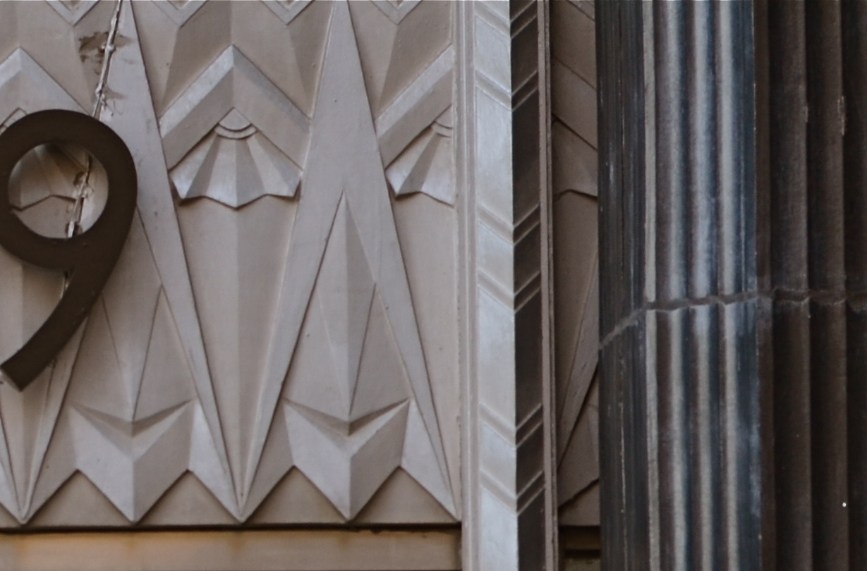
I gave the above shot a severe haircut and wound up with this. Hmm, maybe this was all the picture I needed in the first place.
In the space of a few inches of the building’s entrance was a miniature representation of the best features of the entire building; its wild pattern of chevrons and zigzags. I had already done a master shot of about 90% of the front of the place, but a study of its details started to sound appealing. Cropping away more than 2/3rds of the original shot reduced the sharpness a little, but since I always shoot at the highest file size possible, I just squeaked by.
For a moment, I found that I had redeemed all those failed sessions with Highlights.
Watch out, New York Times crossword. You’re next.
DO SOMETHING MEANINGLESS

The subject matter doesn’t make the photograph. You do. A pure visual arrangement of nothing in particular can at least teach you composition. 1/400 sec., f/5.6, ISO 100, 35mm.
By MICHAEL PERKINS
SHOOT WHAT YOU KNOW. SHOOT WHAT YOU LOVE. Those sentences seem like the inevitable “Column A” and “Column B” of photography. And it makes a certain kind of sense. I mean, you’ll make a stronger artistic connection to subject matter that’s near and dear, be it loved ones or beloved hobbies, right? What you know and what you love will always make great pictures, right?
Well….okay, sorta. And sorta not.
I hate to use the phrase “familiarity breeds contempt”, but your photography could actually take a step backwards if it is always based in your comfort zone. Your intimate knowledge of the people or things you are shooting could actually retard or paralyze your forward development, your ability to step back and see these very familiar things in unfamiliar ways.
Might it not be a good thing, from time to time, to photograph something that is meaningless to you, to seek out images that don’t have any emotional or historical context for you? To see a thing, a condition, a trick of the light just for itself, devoid of any previous context is to force yourself to regard it cleanly, without preconception or bias.
Looking for things to shoot that are “meaningless” actually might force you to solve technique problems just for the sake of solving, since the results don’t matter to you personally, other than as creative problems to be solved. I call this process “pureformance” and I believe it is the key to breathing new life into one’s tired old eyes. Shooting pure forms guarantees that your vision is unhampered by habit, unchained from the familiarity that will eventually stifle your imagination.
This way of approaching subjects on their own terms is close to what photojournalists do all the time. They have little say in what they will be assigned to show next. Their subjects will often be something outside their prior experience, and could be something they personally find uninteresting, even repellent. But the idea is to find a story in whatever they approach, and they hone that habit to perfection, as all of us can.
Just by doing something meaningless in a meaningful way.
FRAGMENTING THE FRAME
1/160 sec., f/5.6, ISO 100, 35mm.
By MICHAEL PERKINS
I HAVE MADE A CONSCIOUS EFFORT, IN RECENT YEARS, TO AVOID TAKING A “STRAIGHT SHOT” OUT OF, OR THROUGH A WINDOW, of using that rectangle or square as a conventional means of bordering a shot. Making a picture where a standard view of the world is merely surrounded by a typical frame shows my eye nothing at all, whereas the things that fragment that frame, that break it into smaller pieces, bisecting or even blocking information…..that’s fascinating to me.
This is not an arbitrary attempt to be “arty” or abstract. I simply prefer to build a little mystery into my shots, and a straight out-the-window framing defeats that. My showing everything means the viewer supplies nothing of his own. Conversely, pictures that both reveal and conceal, simultaneously, invite speculation and encourage inquiry. It’s more of a conversation.
Think about it like a love scene in a movie. If every part of “the act” is depicted, it’s not romantic, not sexy. It’s what the director leaves out of the scene that fires the imagination, that makes it a personal creation of your mind. Well-done love scenes let the audience create part of the picture. Showing everything is clinical….boring.
With that in mind, The Normal Eye’s topside menu now has an additional image gallery called Split Decisions, featuring shots that attempt to show what can result when you deliberately break up the normal framing in and out of windows. Some of the shots wound up doing what I wanted: others came up short, but may convey something to someone else.
As always, let us know what you think, and thanks for looking.
Related articles
- Framing Framing Framing!!! (destynimcbeth.wordpress.com)
CUE THE CUMULUS
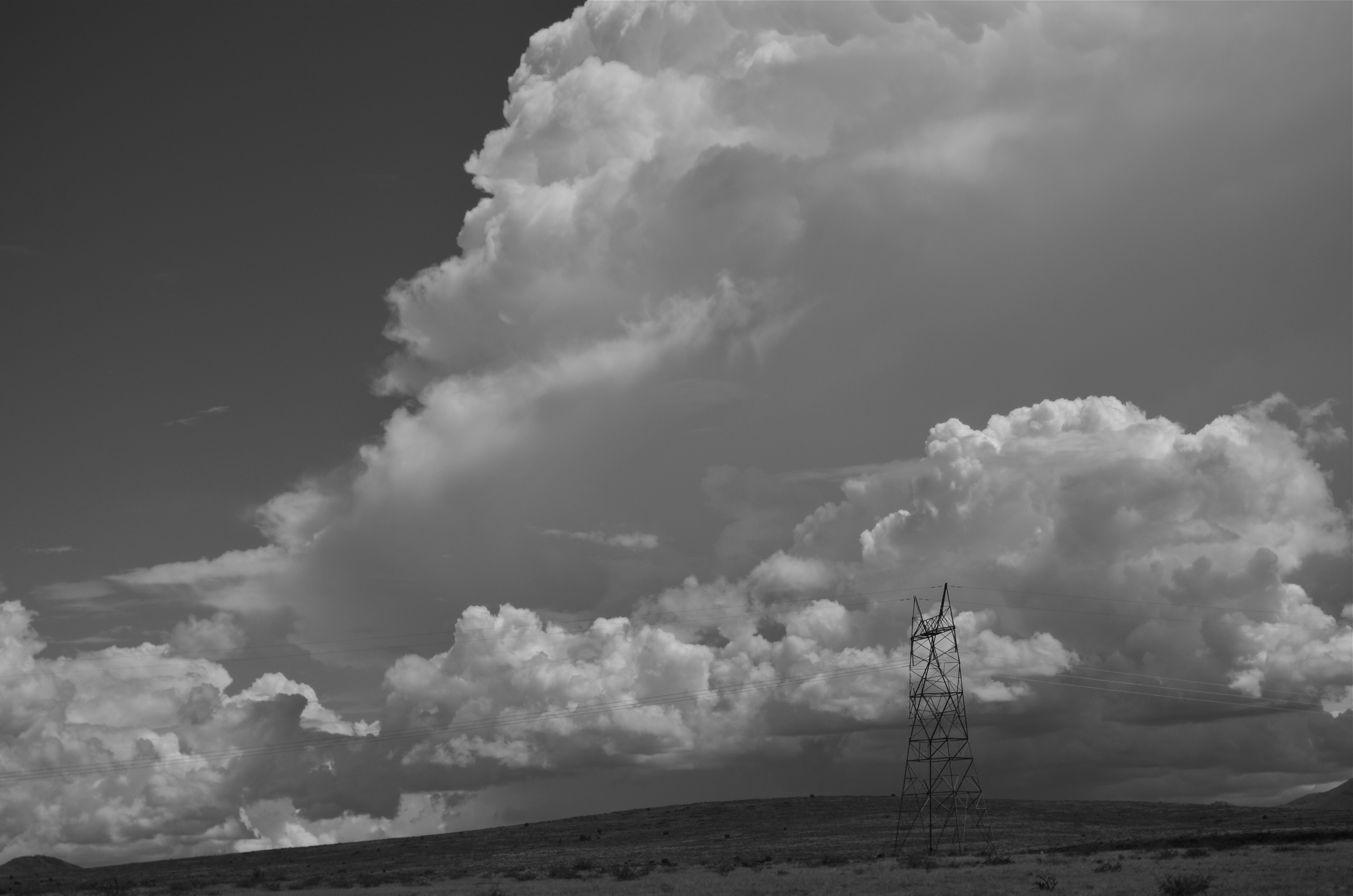
“Relay”, Black Canyon City, Arizona, 2013. 1/500 sec., f/8, ISO 100, 55mm.
By MICHAEL PERKINS
AMERICA’S SOUTHWESTERN STATES COME EQUIPPED WITH SOME OF THE MOST SPECTACULAR SCENERY TO BE HAD ANYWHERE ON EARTH; jutting crags, yawning canyons, vast valleys, and more sky than you’ve ever seen anywhere. Photographically, the mountains, mesas and arroyos deliver on drama pretty much year-round, while the sky can be an endless expanse of, well, not much, really. Compositionally, this means rolling the horizon line in your framing pretty far toward the top, crowding out a fairly unbroken and featureless ocean of blue….except for more humid summer months, when cloud formations truly steal the scene.
It’s true: as the storm season (sometimes called the “monsoon”, for reasons that escape me) accompanies the year’s highest temperatures in desert regions, rolling, boiling billows of clouds add texture, drama, even a sense of scale to skies in Arizona, Utah, New Mexico, and California. It’s like getting free props for whatever photographic theatre you care to stage, and it often makes sense to rotate your horizon line back toward the bottom of the frame to give the sky show top billing.
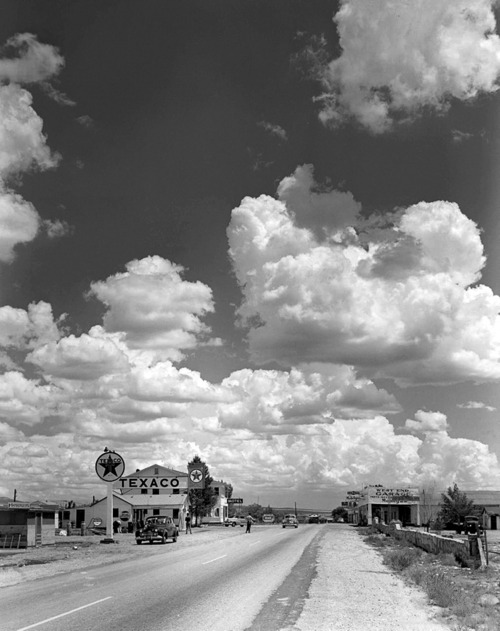
Andreas Feininger’s masterful staging of Arizona skies for Life Magazine. Copyrighted image.
Early photographers often augmented the skies in their seascapes and mountain views by layering multiple glass negatives, one containing ground features, the other crammed with “decorator” clouds. The same effect was later achieved in the darkroom during the film era. Hey, any way you get to the finish line. Suffice it to say that the harvest of mile-high cloud banks is particularly high in the desert states’ summer seasons, and can fill the frame with enough impact to render everything else as filler.
I still marvel at the monochrome masterpiece by Life magazine’s Andreas Feininger, Texaco Station, Route 66, Seligman, Arizona, 1947, which allows the sky overhead to dwarf the photo’s actual subject, creating a marvelous feeling of both space and scale. I first saw this photo as a boy, and am not surprised to see it re-printed over the decades in every major anthology of Life’s all-time greatest images. It’s a one-image classroom, as all the best pictures always are. For more on Feininger’s singular gift for composition, click the “related articles” link below.
Big Sky country yields drama all along the America southwest. And all you really have to do is point.
Follow Michael Perkins on Twitter @MPnormaleye.
Related articles
- Photography Monograph (conordoylephoto.wordpress.com)
AND, I QUOTE:
“Sticking The Landing”, cover image for my first book, Juxtapositions (2007). 1/160 sec., f/5.2, ISO 100, 24mm.
By MICHAEL PERKINS
MY FIRST TRY AT ANTHOLOGIZING SOME OF MY PHOTOGRAPHS INTO A BOOK, done about half a dozen years ago, wound up looking like the jokey definition of a camel as “a horse built by committee”. That is to say, it was an exuberant mess, crammed with about ten times too many stylistic flourishes and, I can admit now, a complete lack of editorial judgement. Entitled Juxtapositions, it was an attempt to write a book about photography while also feeling I had nothing important to impart on the subject.
How’s that again?
Looking to spark thought about the eternal truths or universal experiences of making pictures, I passed on the idea of explaining or even captioning any of my own images, relying for text solely on quotations from the greats in the field, from Ansel Adams to DIane Arbus and back again. I was fascinated by how many of the same problems and experiences were common across the entire two centuries of photographic experience, and I hoped I had chosen shots that illustrated just how common those sensations really were, even in the work of an admitted amateur. I still like the idea of the book, but I’d like to find the gee-whiz geek who designed it (me) and slap him around for a while. It would make it easier to thumb through the wretched thing now.
There still may be a way to take the concept again and do it up properly, and at some time I may strap my Icarus wings back on to do it, this time flying a little farther away from the sun. In the meantime, however, I continue to collect the quotes themselves, and to compare the experience of picture-making as it’s seen and felt across various minds and times.
Errol Morris, the Oscar-winning director of the documentary Fog Of War, recently made a great addition to the literature on photography with his wonderful book Believing Is Seeing. It’s an intelligent examination of the visual biases we bring to the act of picture viewing, adding our own mental filters to what the photographer is trying to convey. However, the best quote in this very excellent work comes not from Morris himself, but from a somewhat obscure museum curator named Helmut Gernsheim, who has uttered, in just 59 words, precisely the sentiment that drives me to celebrate photography and to spend many, many more words trying to explain why.
Behold a jewel:
Neither camera, nor lens, nor film determine the quality of pictures; its is the visual perception of the man behind the mechanism which brings them to life. Art contains the allied ideas of making and begetting, of being master of one’s craft and able to create. Without these properties no art exists and photographic art can come into being. —Helmut Gernsheim, 1942, curator
There is a reason we are all here on these pages, a sweet madness that drives us forward from here to make something true. We don’t always bag our prize. But, somewhere deep inside ourselves, we really do understand what that prize is.
Follow Michael Perkins on Twitter @MPnormaleye.
Related articles
- Photography Quotes by Photographers (sarapoyfairphotography.com)
GRAND BALLET
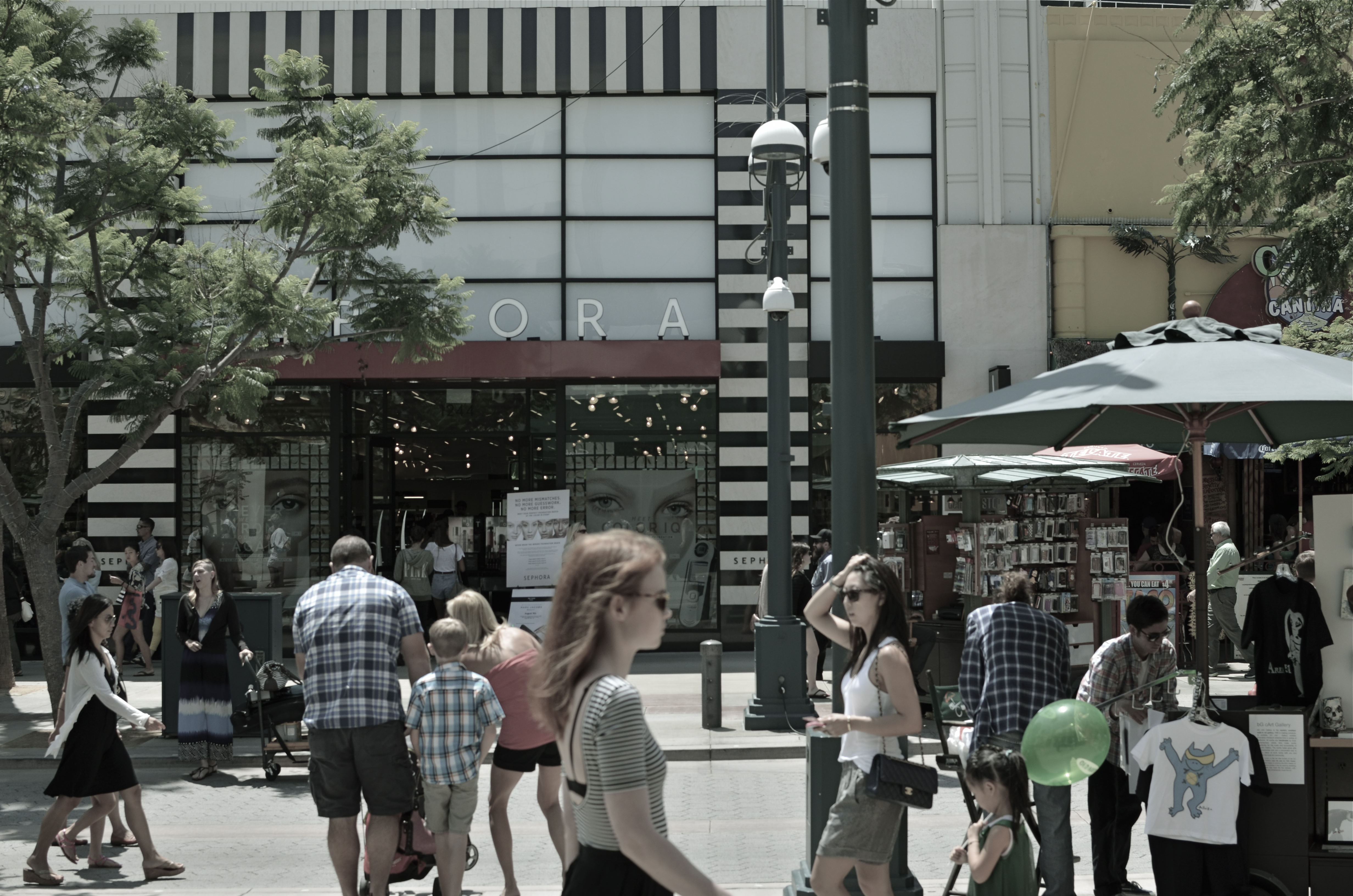
Third Street Promenade, Santa Monica, 2013.
By MICHAEL PERKINS
SOMETIMES THROWING EVERYTHING INTO THE POT MAKES FOR BETTER STEW. Yeah, of course a simple bowl of tomato soup can be elegant, understated. But so can pitching every stray ingredient into the mix and hoping the carrots play nice with the asparagus. Matter of taste depending on one’s mood.
Henri Cartier-Bresson placed his camera at the intersection of “now” and “next”.
So it goes with street photography. Some insist that isolating a single story, a singular face, a tightly framed little drama is the way to go. And that is certainly true much of the time. But so can casting a wide net, framing a grand, interactive ballet of conflicting lives and destinations. It’s like the concentrated, two-man drama of Waiting For Godot versus the teeming crowd scenes of The Ten Commandments. Both vibes come from the street. Just depends on what story we’re telling today.
From the work of Henri Cartier-Bresson, the great street photog of the mid-20th century, I learned to love the seeming randomness of crowds and their competing destinies. HCB was a genius at showing that something wonderful was about to happen, and I love to see him capturing the moment before there even is a moment. His still images fairly beg to be set into motion: you are dying to see how this all comes out. If HCB is new to your eye, I beg you, seek him out. His work is a revelation, a quiet classroom of seeing sense.
I have posted both quiet stories and big loud parades to these pages. Both have their appeal, and both demand a discipline and a selective eye, which means I have a few light years’ worth of learning before me in both areas. That’s the great thing about art. You can’t get done. You can be on the way, but you will not get there. Not if you’re honest with yourself.
For the viewer, myself included, you have to go beyond “snap looking” which is the audience’s equivalent of “snapshooting”. Some images require that you linger, just as some wines are to be sipped instead of guzzled. Slowing down when viewing a frame is the best tribute to whatever pauses the photographer took in creating it in the first place. This picture business is truly a shared project between creator and user.
Gosh, I feel all brotherly and warm-hearted today.
Sort of an urge to be part of the crowd.
Follow Michael Perkins on Twitter @MPnormaleye.
Related articles
- Henri Cartier-Bresson (estone6.wordpress.com)
- The decisive moment (photovide.com)
SPLIT INFINITIVES
Consignment Shop, Manhattan. 1/80 sec., f/5.6, ISO 100, 35mm.
By MICHAEL PERKINS
IF YOU’RE OLD ENOUGH TO REMEMBER WHEN USE OF THE WORD “AIN’T” LABELED YOU AS A GRAMMATICAL LOWBROW, you may also recall the snooty disdain reserved for a verbal construction called the split infinitive. A simple infinitive involved following the preposition “to” with an action verb, such as “go”. To split the infinitive, the writer or speaker inserts an adverb between the two words for an extra boost of emphasis. Thus, in the most famous split infinitive ever, Gene Roddenberry invited Star Trek viewers
to boldly go where no man has gone before.
Nice, right? A little extra drama. A slight bending of the rules that delivers the goods.
Photography has a formal “grammar” about composition that also begs for a kind of “split infinitive”. Strictly speaking, compositions are supposed to be simple, clean, uncluttered. A perfect line of visual data from top to bottom, left to right. A picture frame, if you will, an organized way of seeing.
Attractive yes, even desirable, but a must? Nope. Life itself, as we observe it everyday, is far from a series of perfect frames. Lines of sight get broken, fragmented, blocked. Nature and light conspire to take that flawless composition and crash it, refract it, photobomb it until it resembles, well, life. And yet we often try to take pictures that show the very opposite of the sloppy, imprecise nature of things.
We try for “perfection” instead of perfect concepts.
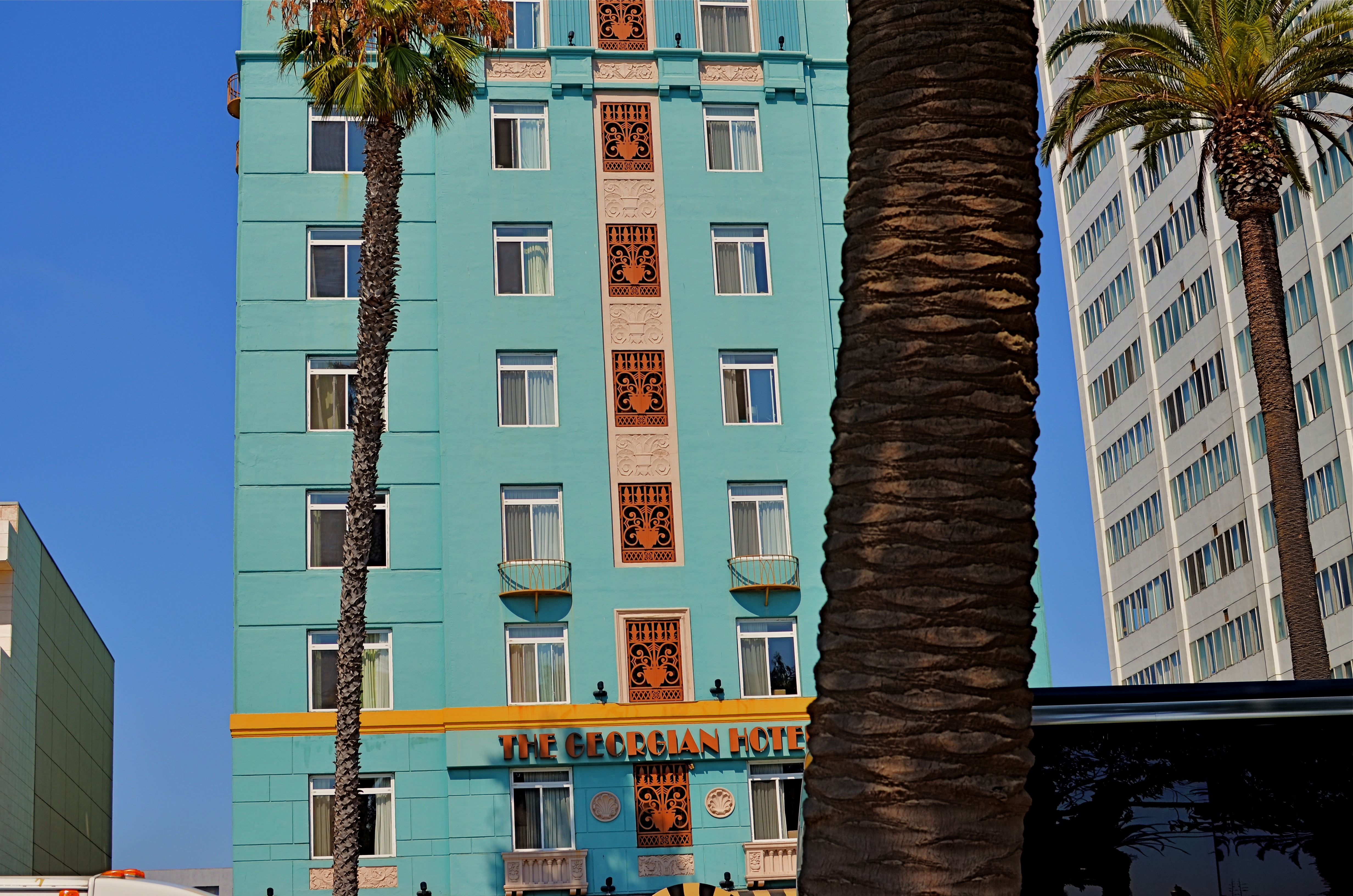
Georgian Hotel, Santa Monica, CA. 1/60 sec., f/5.6, ISO 100, 35mm.
Reviewing images for the last several years, I find that I am taking more compositions on their own terms, with light poles, weird reflections, broken planes of view and shadows all becoming more welcome in my final photos. I still labor to get a clean look when I can. But I also make peace with elements that used to doom a photo to the dustbin.
Street scenes especially can better reflect the visual chaos of busy cities if everything isn’t “just right”. It’s really hard (at least in my case) to tear out the mental hardwiring of a lifetime and take a picture that may be more abstract or cubist than I ever thought I could allow myself to be. Maybe it’s a function of aging, but things seem to be relaxing in my approach. Don’t get me wrong. I’m still Alpha Male enough to want to bring everything in a frame under my unswerving control. I just don’t get blood pressure when circumstances force me to unclench my iron fist once in a while.
It’s a process.
To see, yes, but, in allowing my visual infinitives to be occasionally split, it means learning to differently see.
Follow Michael Perkins on Twitter @mpnormaleye.
Welcome to our newest followers. Check out their mad genius at:
“C” NOTES (THOUGHTS ON POST #100)
Hey, we’re all just trying to catch light in a box. Use any box you have, just grab something, like, say, the Empire State Building. 1/320 sec., f/5.6, ISO 100, 35mm.
By MICHAEL PERKINS
SOMETHING THAT LIVES IN THE NETHER WORLD BETWEEN A DIARY AND A PHILOSOPHIC SCREED, at the intersection of passion and obsession. That’s the no-man’s-land I aimed this blog at 100 posts ago, today. From Day One, The Normal Eye was, and remains, an attempt to get beyond the mere technical doing of a photograph and scratch away at the ticket of techtalk to reveal why I was trying to capture a given idea inside a box.
There are, and have ever been, far better teachers on a purely technical level than I can ever hope to be. And, let’s face it, knowing just the metadata on a shot is no guarantee that something magical will happen, just as high-end cameras don’t guarantee high-concept images. No, the only thing I’m expert at, in any way, is judging my own intentions, in hungering after a visualization of what I feel in my bones.
All of you patient ones out there already know me, because your dad or your corny uncle or your nerdly, bookish kid is just like me. I am “that guy”. I have always been that guy. The guy who pipes up, in completely unrelated conversations, with the observation that “it’s so cool what the light is doing right now”. The guy who comes back from a family gathering with, strangely, no pictures of the family whatever, but a killer shot of what everyone concurs is a colorful shmear of…something. The guy who is so busy looking for “the moment” that he forgets to be in the moment.
Guilty, guilty, guilty, and, ouch, guilty.
Funny thing is (and this is the mainspring that drives The Normal Eye), I’m almost as excited about where I’ll fail next than where I’ll succeed. If less than half of the pictures out of a new batch doesn’t make me groan, what the hell was I thinking?, then I’m not working hard enough, and certainly not reaching far enough. Nothing artistically good comes from a place of safety, and repeating your past choices doesn’t repeat your past successes.
Those of you who have done me the great honor of reading and following this mess have my undying gratitude. And as for those who have taken the extra time to comment as well, thanks for becoming the most vital link in the chain. Bloggers may be doomed to forever shout off the edge of a cliff, but it’s a real Robinson Crusoe moment when some man (or woman) Friday actually shouts back. Thank you, one and all.
As far as there are clearly stated goals for any enterprise such as this (except to keep on going), I can faithfully pledge to keep the process as honest as possible, and to let my inner child, the brat who first picked up a camera, to shout down the rational adult, who unlike the kid, occasionally forgets that this is all supposed to be about discovery, and wonder. If I lose track of that, the whole game is up. I also hope to act as a better conduit to the best work going on in photography today, in these pages and through my Twitter feed @mpnormaleye. The great news: the golden age of photography is happening here, now. Everything that has gone before, while amazing, is mere prologue to what is on the way.
That is pretty damned exciting.
So thanks for where this has taken us so far, and please sign up for another hitch. I can’t promise I’ll dazzle you. But I do promise I’ll be dazzled.
After all, it’s so cool what the light is doing, right now.
Where’s my box?
follow Michael Perkins on Twitter @mpnormaleye.
THE GRADUAL REVEAL
A cosmic disaster on a tabletop far, far away. 1/40 sec., f/5.6, ISO 400, 35mm.
by MICHAEL PERKINS
CREATING FANTASY IMAGES ON A TABLETOP IS A LITTLE LIKE WATCHING YOUR GRANDMA IN THE KITCHEN, if your grandma (like mine) was the “I-don’t need-no-recipe”,a dash here, a pinch there kind of cook. Sometimes I think she just kept chucking ingredients into the pot until it was either the right color or the correct thickness. All I know is, when she was done, it “ate pretty good”.
I use the same approach when I am building compositions from scratch. You’re not sure what the proportions are, but you kind of know when you’re done.
One of the photo sharing sites that I recommend most enthusiastically is called UTATA, a site which promotes itself as “tribal photography” since it require a certain level of communal kick-in from all its members, posing workshop assignments and themes that take you beyond merely posting your faves. Operating in tandem with its self-named Flickr group, UTATA is about taking chances and forcing yourself, often on a deadline, to see in new ways. If it sounds like homework, it’s not, and even if you have no time to work the various challenges, you’ll still reap a vast wealth of knowledge just riffing through other people’s work. Give it a look at http://www.utata.org.
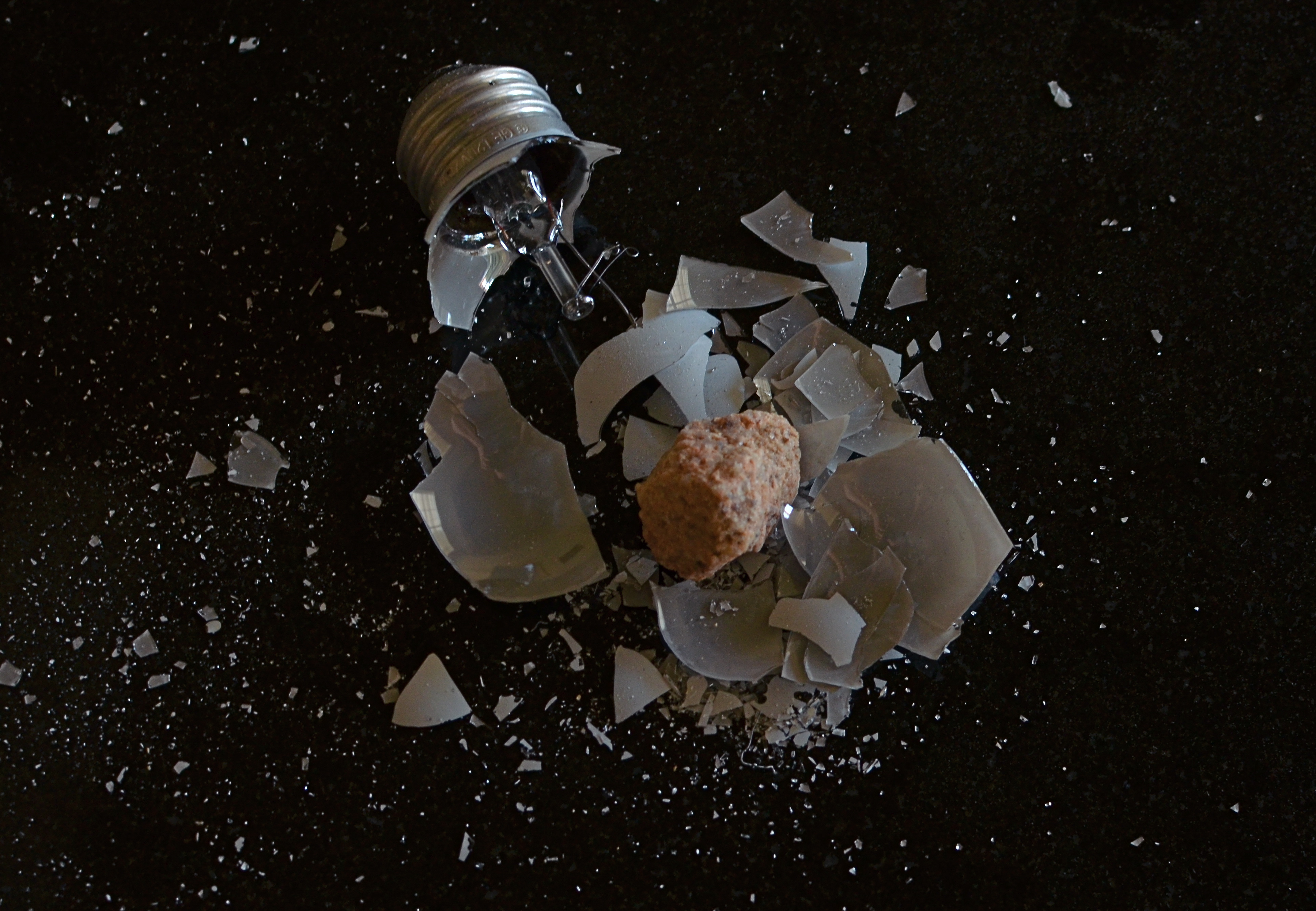
One of the site’s recent so-called “weekend projects” was to photograph anything that in any way depicted broken glass. No special terms beyond that. Cheap glass, wine glass, churchy stained glass, pick your texture, pick your context. I decided to so something with a shattered light bulb, but with a few twists. Instead of just breaking the bulb and shooting a frame, I opted to place the bulb in a food storage bag, then hammer it until it burst. Due to the sudden release of pressure when light bulbs are breached, they don’t just crack, they sort of explode, and, given the chemical treatment of the glass, there is a lot of pure white dust that accompanies the very fine glass particles. Breaking the bulb inside the bag allowed me to retain all that sediment, then make it more visible by pouring the bits out onto a black, non-reflective surface…in this case, a granite tile that I use to model product shots on.
I already liked the look of all the atomized white dust across that dull blackness, rather like a “star field”, or a cluster of debris, scattered across a vast void in space. The effect was taking shape, but the “garbage cook” inside my head was still looking for one more ingredient. The great thing about building a fantasy visual is that it doesn’t have to make “sense”….it just needs visual impact sufficient to register with the gut. If the micro-fine bits of the bulb represented some kind of space catastrophe, where was the cause? Inner stresses, like volcanoes, rupturing the Mother Bulb asunder like the planet Krypton? No, wait, what if something collided with it, some asteroid-like something that spelled doom for Planet G.E.? A quick trip out to the back yard gave me my cosmic cataclysm….I mean chunk of quartz, and the rest was just arrangement and experiment.
What does it all mean? Heck, what does beef stew mean? Making a picture can be like gradually adding random veggies and spices until something tells you it’s “soup”. And with tabletop fantasies, you get to play God with all the little worlds you’ve created.
Hey, over a lifetime, plenty of other people will take turns blowing up your work.
Why not you?
follow Michael Perkins on Twitter @MPnormaleye.
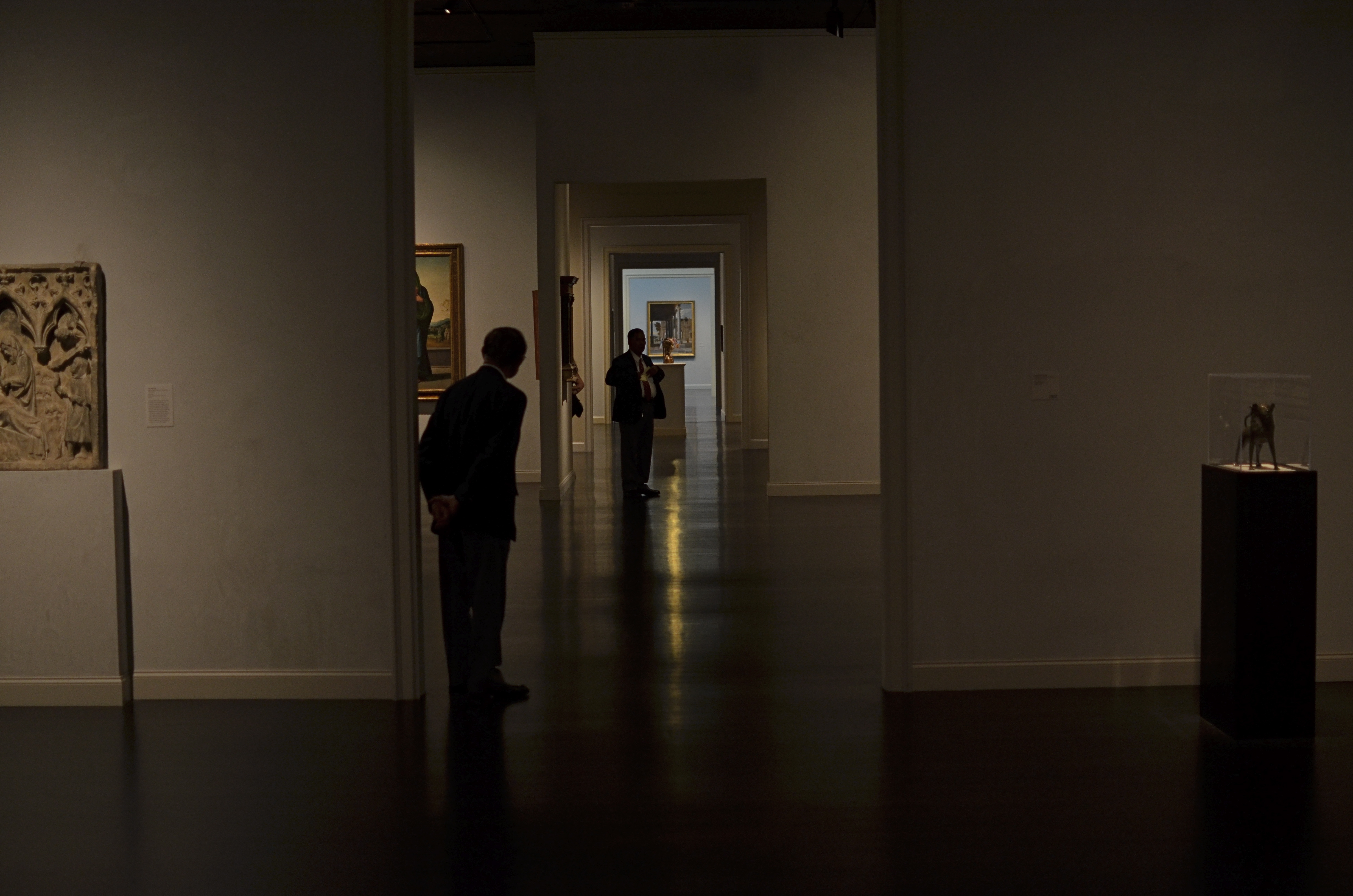
INNER SPACE, OUTER MIND
There really was a nice exhibit on display the day I took this at LACMA in Los Angeles. But this arrangement of space was arguing louder for my attention. 1/160 sec., f/1.8, ISO 320, 35mm.
By MICHAEL PERKINS
IF YOU VISIT ENOUGH MUSEUMS IN YOUR LIFETIME, you may decide that at least half of them, seen as arranged space, are more interesting than their contents. It may be country-cousin to that time in your childhood when your parents gave you a big box with a riding toy inside it, and, after a few minutes of excitement, you began sitting in the box. The object inside was, after all, only a fire engine, but a box could be a mine shaft, a Fortress of Solitude, the dining car on the Orient Express, and so on.
Spaces, divided, bisected, hidden, revealed. Art in itself.
And so with museums.
I truly do try to give lip service to the curated exhibits and loaned shows that cram the floors and line the walls of the various museums I visit. After all, I am, harumph and ahem, a Patron Of The Arts, especially if said museums are hosting cocktail parties and trays of giant prawns in their hallowed halls…I mean, what’s not to like? However, there are times when the endless variations on just a room, a hall, a mode of lighting, or the anticipatory feeling that something wonderful is right around the next corner is, well, a more powerful spell than the stuff they actually booked into the joint.
Spaces are landscapes. Spaces are still lifes. Spaces are color studies. Spaces are stages where people are dynamic props.
Recently spinning back through my travel images of the last few years, I was really surprised how many times I took shots inside museums that are nothing more than attempts to render the atmosphere of the museum, to capture the oxygen and light in the room, to dramatize the distances and spaces between things. It’s very slippery stuff. Great thing you find, also, is that the increased light sensitivity and white balance controls on present-day cameras allow for a really wide range of effects, allowing you to “interpret” the space in different ways, making this somewhat vaporous pursuit even more …vaporous-y.
In the end, you shoot what speaks to you, and these “art containers” sometimes are more eloquent by far than the treasures they present. That is not a dig on contemporary art (or any other kind). It means that an image is where you find it. Staying open to that simple idea provides surprise.
And delight.
follow Michael Perkins on Twitter @mpnormaleye.
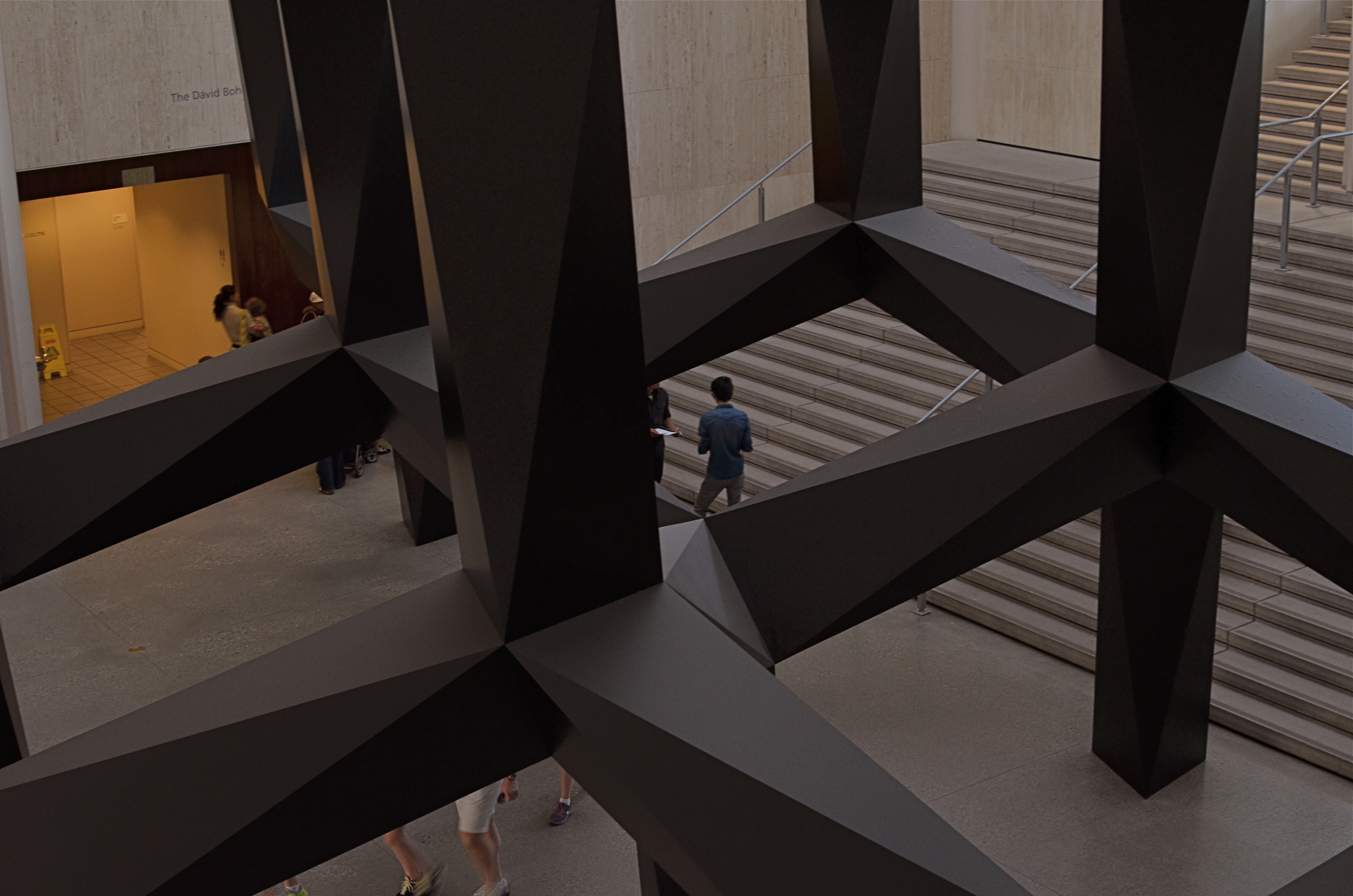
MUTATION
Okay, this has a LOT of processing. Love me or hate me based on whether it worked. 1/500 sec., f/1.8, ISO 100, 35mm.
BY MICHAEL PERKINS
NOT CONTENT TO BE AN ART ON ITS OWN TERMS, PHOTOGRAPHY IS ALSO CONSTANTLY RE-INTERPRETING ALL THE OTHER ARTS AS WELL. Ever since imaging fell out of the cradle in the early 1800’s, several of us have always been looking at the works of others and saying, “eh, I can probably do something with that.”
Yeah, not too presumptuous, right? And the trend has continued (some say worsened) to the present day. Half the time we are creating something. The other half of the time we are tweaking, mocking, honoring, loving, hating, shredding, re-combining, or ragging on somebody else’s work. Are these mashups also art? Are we co-creators or just cheesy thieves?
And does it matter?
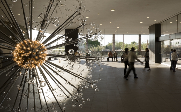
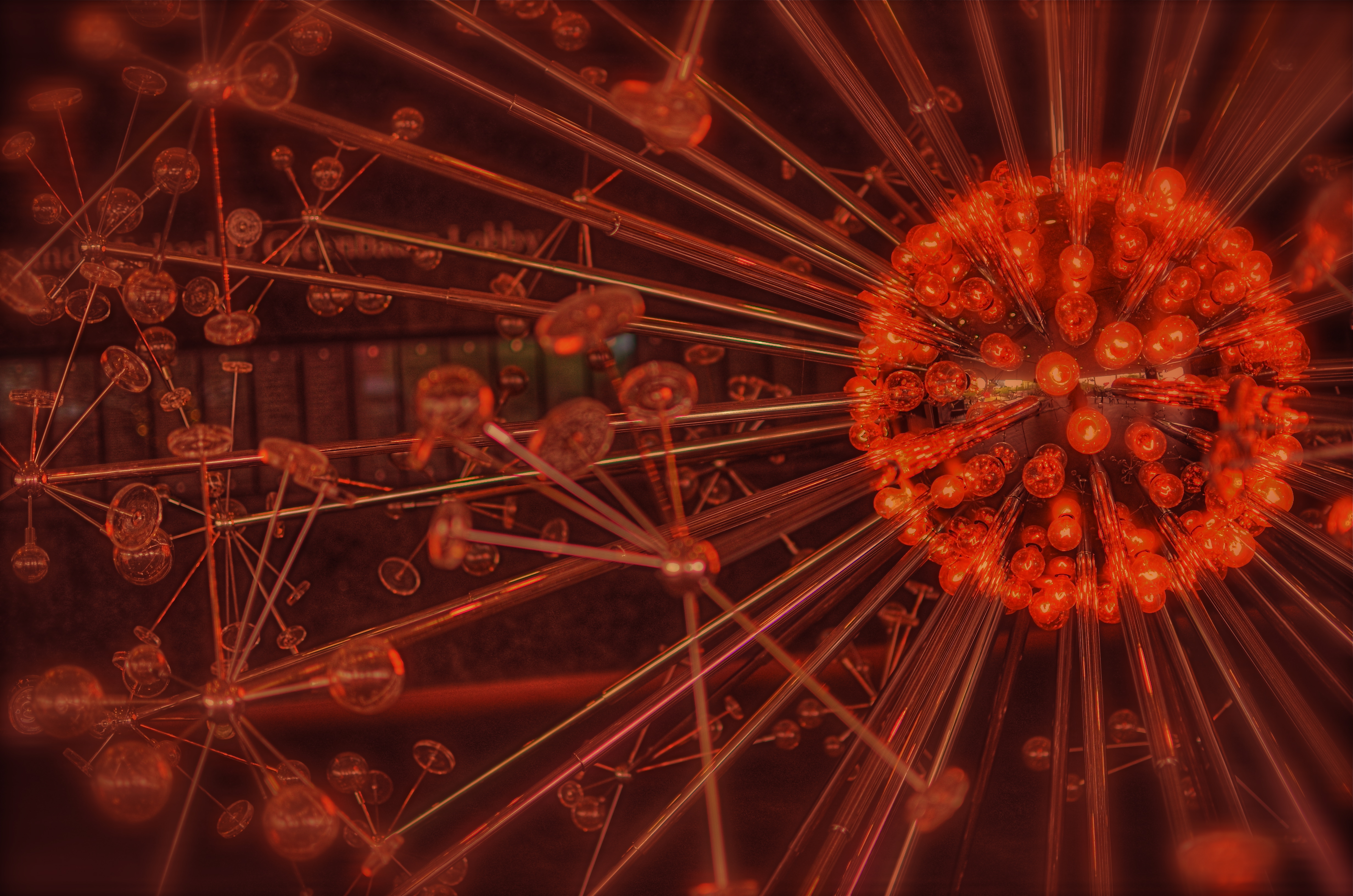
The Last Scattering Surface as it appears in the lobby of the Phoenix Art Museum.
The Phoenix Art Museum greets customers with a stunning original sculpture in glass and plexi right at the entrance to its ticket lobby. A huge installation of light bulbs, mirrored surfaces and reflective discs, Josiah McIlheny’s The Last Scattering Surface resembles a brightly burning orb (planet? asteroid? dwarf star?) surrounded by jutting rods that carry the central sphere’s light along “rays” to a series of circular satellites (moons? craft? debris?) Like many examples of pure design it is both everything and nothing, that is, it is mutative based on your observation. So, in a way, as in the manner of a photographer, you are already a participant in the co-creation of this object just by looking at it. Does this mean that it’s less theif-ish to go ahead and mutate the man’s work?
Well, there’s probably a lively back-and-forth on that.
For my own “take”, I wanted to remove the background walls, visitors, ambient blurry light from other junk, to isolate this nova-like work in “space”. I only had one frame that I liked from my short blast of shots, so I duped it, slammed the contrast real light/real dark on the pair, and did an exposure fusion in Photomatix. Adding a little edge blur and a re-tinting to the composite gave me the look of an interstellar explosion.
I freely advertise that I am making a semi-original re-mix on a completely original work. It’s not much more radical than shooting with a filter on the lens, or choosing black and white for a color subject, and yet, it always feels funny to try and make something beautiful that was beautiful in the first place.
But art is supposed to be about starting conversation, so consider this mine.
I just did my talking with a box instead of a mouth.
follow Michael Perkins on Twitter @ mpnormaleye.com
IT TAKES A THIEF

In this composition, people become mere design elements, or props. To get this look, a single exposure was duped, the two images were re-contrasted, and then blended in the HDR program Photomatix for a wider tonal range than in “nature”.
By MICHAEL PERKINS
THE GREAT STREET PHOTOGRAPHERS OF OLD WERE ALL WILY, SLY THIEVES, capturing their prey in emulsion. Yes, I know that the old superstition isn’t literally true. You can’t, in fact, imprison someone’s soul inside that little black box. And yet, in a sense that is very personally felt by many of our subjects today, we are committing an “invasion” of sorts, a kind of artsy assault on the self. Oddly, the same technique that gets you admired when you successfully capture a precious quality of someone else’s face makes you despised when you’re sneaking around to get my picture. Whether street shoots are inspired or reviled is largely a matter of who is being “violated”.
We’ve all heard about Henri Cartier-Bresson, covering the bright chrome trim of his Leica with black electrical tape, the better to keep his camera “invisible” to more of his subjects, as well as the through-the-overcoat candids shot on the New York subway by Walker Evans. And then there is the real risk to personal safety, (including being arrested, jailed, and physically threatened) undertaken by Robert Frank when taking the small-town shots for his legendary street collection, The Americans in the 1950’s. And while most of us aren’t risking incarceration or a punch in the snoot when framing up a stranger, sensitivity has accelerated, as cameras have proliferated into the millions, and personal privacy has, in the digital era, been rendered moot.
Every street shooter must therefore constantly re-negotiate the rules of engagement between himself and the world at large. Is the whole of society his canvas, or is he some kind of media criminal, seeking to advance his own vision at the expense of others’ personhood? I must admit that, at times, I tire of the endless calculation, of the games involved in playing “I’m-here-I’m-not-really-here” with individuals. When my fatigue reaches critical mass, I pull back…..way back, in fact, no longer seeking the stories in individual faces, but framing compositions of largely faceless crowds, basically reducing them to design elements within a larger whole. Malls, streets, festivals…the original context of the crowds’ activities becomes irrelevant, just as the relationship of glass bits in a kaleidoscope is meaningless. In such compositions, the people are rendered into bits, puzzle pieces…things.
And while it’s true that one’s eye can roam around within the frame of such images to “witness” individual stories and dramas, the overall photo can just be light and shapes, arranged agreeably. Using color and tonal modification from processing programs like Photomatix (normally used for HDR tonemapping) renders the people in the shot even more “object-like”, less “subject-like”(see the link below on the “Exposure Fusion” function of Photomatix as well). The resulting look is not unlike studying an ant farm under a magnifying glass, thus a trifle inhuman, but it allows me to distance myself from the process of photostalking individuals, getting some much-needed detachment.
Or maybe I’m kidding myself.
Maybe I just lose my nerve sometimes, needing to avoid one more frosty stare, another challenge from a mall cop, another instance of feeling like a predator rather than an artist. I don’t relish confrontations, and I hate being the source of people’s discomfiture. And, with no eager editors awaiting my next ambush pic of Lindsey Lohan, there isn’t even a profit motive to excuse my intrusions. So what is driving me?
As Yul Brynner says in The King & I, “is a puzzlement.”
(follow Michael Perkins on Twitter @mpnormaleye and on Flickr at http://www.flickr.com/photos/mpnormaleye)
Related articles
FIND THE OUTLIERS
Not the kind of space you’d expect to see in a visually crowded suburban environment. And that’s the point. 1/320 sec., f/8, ISO 100, 18mm.
By MICHAEL PERKINS
EVERY TIME MY WIFE AND I TRAVEL, A STRANGE PHENOMENON OCCURS. We will be standing on the exact same geographic coordinates, pointing separate cameras in generally the same general area. And, invariably when she gets her first look at the pictures I took on that day, I will hear the following:
Where was THAT? I don’t remember seeing that!? Where was I?
Of course, we see differently, as do any two shooters. Some things that are blaring red fire alarms to one of us are invisible, below the radar, to the other. And of course we are both right. And valid. Admittedly, I do seem to come back with more strange, off-to-the-side-of-the road oddities than Marian does, but that may be due more to my wildly spasmodic attention span than any real or rare “vision”. Lots of it comes because I consciously trying to overcome the numbing experience of driving in a car. I have to work harder to take notice of the unconventional when repeatedly tracking back and forth,day after day, down routine driving routes. Familiarity not only breeds contempt, it also fosters artificial blindness. The “outliers” within five miles of your own house should glow like fluorescent paint….but often they seem cloaked by a kind of habit-dulled camo.
Once detected, outliers don’t quite fit within their neighboring context. The last Victorian gingerbread home in a clutch of tract houses. The old local movie theatre reborn as a Baptist church. Or, in a place like Phoenix, Arizona, where urban development is not only unbridled but seemingly random, the rare “undeveloped” lot, crammed between more familiar symbols of sprawl.
The above image is such an outlier. It’s about an acre-and-a-half of wild trees bookended by a firehouse,
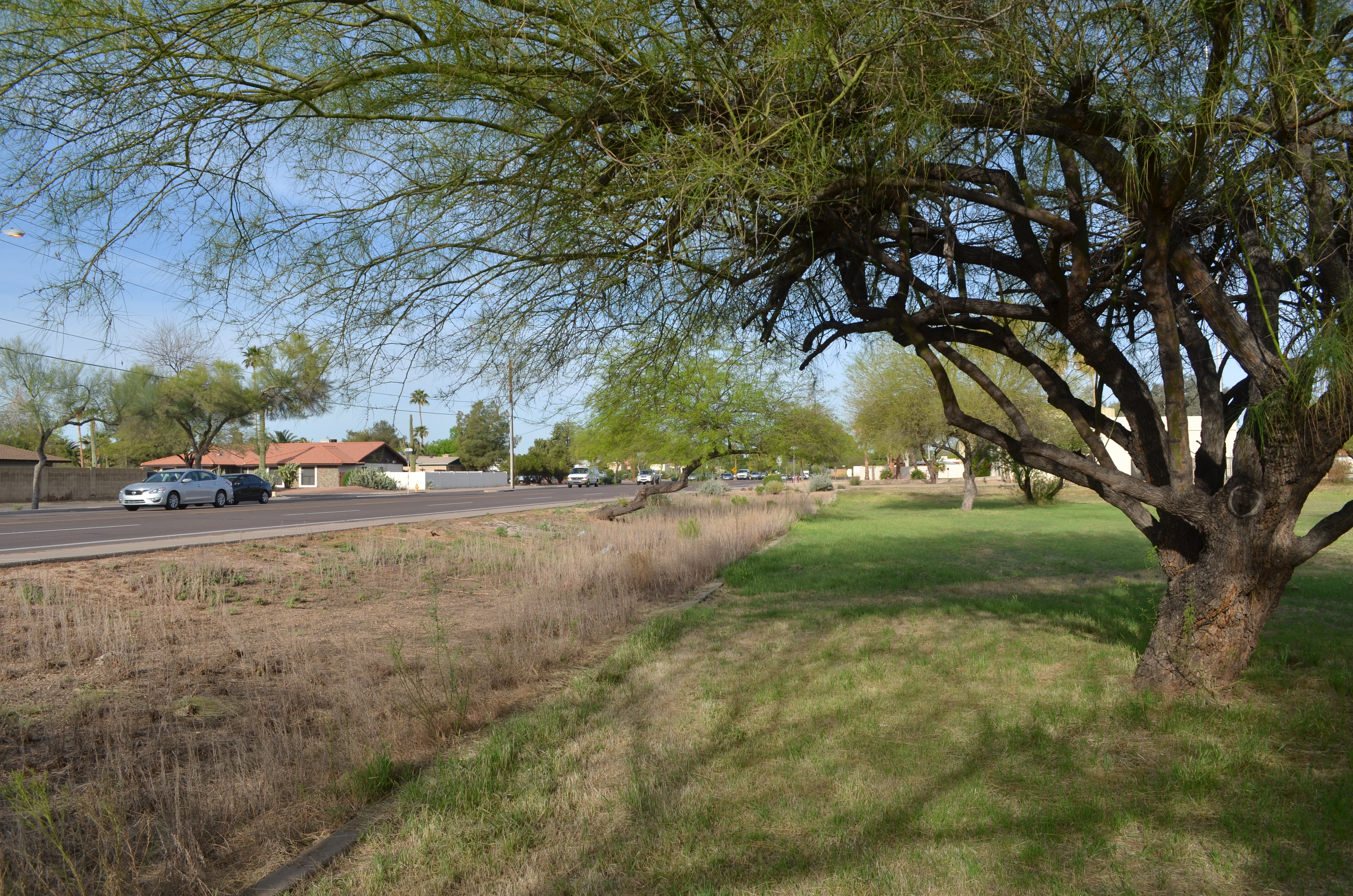
The sprawl-laden neighborhood that surrounds my “enchanted forest” Hey. it”s all about the context.
a row of ranch houses, and a busy four-lane street. Everything else on the block screams “settled turf”, while this strange stretch of twisted trunks looks like it was dropped in from some fairy realm. At least that’s what it says to me.
My first instinct in cases like this is to get out and shoot, attempting, as I go, to place the outlier in its own uncluttered context. Everything else around my “find” must be rendered visually irrelevant, since it adds nothing to the image, and, in fact, can diminish what I’m after. Sometimes I also tweak my own color mix, since natural hues also may not get my idea across.
Even after all this, I often find that there is no real revelation to be had, and I must chalk the entire thing up to practice. Occasionally, I come back with something to show my wife. And I know I have struck gold if the first thing out of her mouth is, “Where is THAT?”
To paraphrase the old proverb, behind every great man is a woman who rightfully asks, “Do you know what you’re doing?”
Sometimes I have an answer….
AFTER-IMAGE

Old friends, or echoes of the old friends that once filled them. 1/320 sec., f/2.5, ISO 100, 35mm.
By MICHAEL PERKINS
WITHOUT GETTING TOO OVERLY OOKY-SPOOKY, I believe that photographers are witnesses to, well, ghosts. Specializing in the visualization of what might be (as near as our next frame), we are also retro-witnesses, or mediums, if you will, using found objects to call back the spirit of things that are no longer here. “If these walls could talk”, we instinctively remark as we walk into Notre Dame, Independence Hall, or Ellis Island, and yet, we think we are merely being poetic when we utter that phrase.
Are we?
Objects give up their secrets slowly, and in these posts I have often gone back to my fond desire to resurrect at least the essence of the owners of those objects, re-capturing people in the things they held, kept, cherished, wore to pieces, loved to death. We use every atom of our imagination trying to inch forward toward some revelation yet-to-be….a way to will a picture into being. But we are surprised to find ourself also trying to conjure forth echoes. And yet some of the most moving portraits we can produce show no people at all. I’m sure you have found this to be true.
Somebody’s rest spot..but whose? And how long ago?
For reasons I don’t quite understand, chairs resonate especially for me. They’re personal. They’re social. Deals are struck in them; stories are told, babies are soothed, pauses are taken, contemplation occurs. Lives pass.
For you, it might be other things that are left behind, but still ringing with the echoes of people. Books. Clothing. Cars. They can be anything, but whatever their strange stories, you can often hear them, and that makes them far from “empty”. Cameras record everything that can be seen and lots of things that can only be sensed. They may be only machines, but in the hands of dreamers they are divining rods.
Your houses are haunted, and in a good way.
Call the spirits forth.
Related articles
- Between objects and life (thehindu.com)
