DON’T MESS WITH MR. IN-BETWEEN
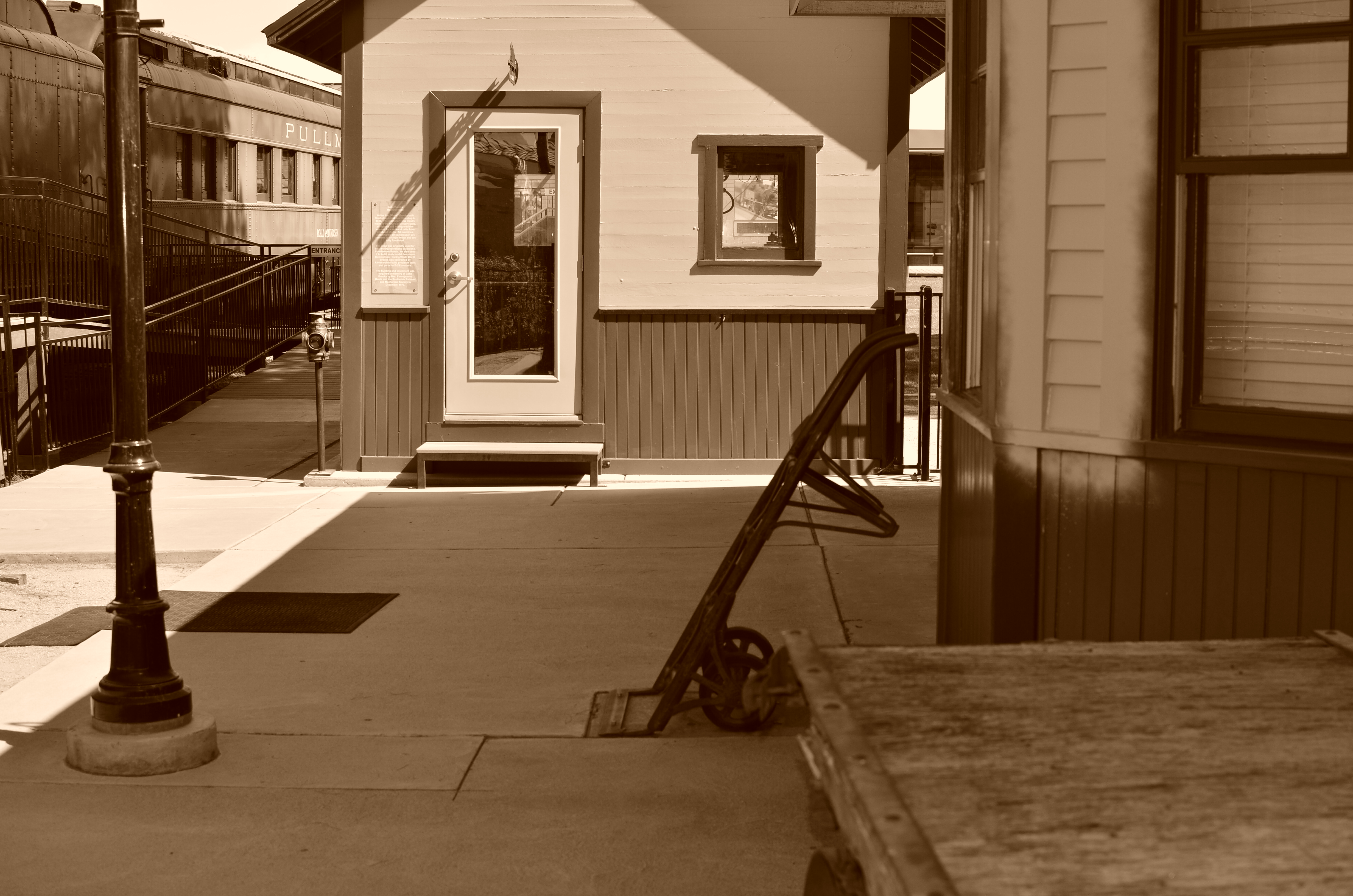
The light on this railroad depot was not as harsh or contrasty as seen here: I merely liked it better that way.
By MICHAEL PERKINS
PHOTOGRAPHY ALWAYS SEEMS TO BE ABOUT TWO THINGS THAT ARE POLAR OPPOSITES. On one hand, we have labored mightily for nearly two hundred years to make our little boxes reproduce as full a representation of the range of tone in nature as possible, to ape the eye to a clinical certainty. On the other hand, we love to distort that reality for specific purposes…..call it abstraction, minimalism, or your own favorite buzz word. We extol the natural look and revere the unnatural in nearly the same breath.
Originally, there wasn’t much in the way of attenuation between light and dark in photographs. Black was blackblackblack and white was whitewhitewhite (yes, I read a lot of e.e. cummings as a child). Better films eventually led to a greater variance in shades and nuances, and pioneering work by Uncle Ansel and other Big Saints produced exhaustive studies on precisely how many shades of grey could be delivered in a carefully crafted photograph. But even as we can now easily produce images with great variances in light and dark, some pictures are still served better by going back to clean, simple boundaries for values.
Hard, high-contrast blacks and whites are killers of texture but they are great modelers of dimension. A cube with stark differences between its light and dark sides takes on the more tangible feel of a solid object occupying space, and that extra degree of dimensionality helps in the success of certain compositions.
The above image was originally far more nuanced than the altered version you see here, but, as a very basic arrangement of shapes in space, I like the picture better without too much midrange value. It helps the faux nostalgia feel of the subject matter as well, even though it might be altogether wrong for a million other subjects. The unscientific answer is, you know it when you see it.
One thing is for sure. Even when we look for the ring of truth in our images, turn out that there’s more than one ring tone. Decide what you need for a specific image. Maximized selection of tools is the most single important part of making a picture.

Reblogged this on O LADO ESCURO DA LUA.
September 29, 2015 at 7:51 AM