DEFINING SPACE
The use of an extreme wide-angle lens, like this fisheye, need not generate the bendy look of “barrel distortion”. It’s all in the composition.
By MICHAEL PERKINS
VISIT ENOUGH TOURIST SITES and you will eventually encounter the challenge of capturing very large objects, trying to squeeze the whole of a cathedral or a canyon into a single frame. Using a wide-angle lens is the first instinct, of course, but since even a 35mm is considered a wide-angle of sorts, there are any number of choices that all have their own pluses and minuses.
The lower the millimeter number, of course, the wider the lens. Simple enough on the surface, but you still have to decide what kind of wide you prefer. Each lens has slightly different coverage and properties, with the “super-wides” adding their own distinctive traits to the space you’re trying to capture. The two main properties you’ll notice most are barrel distortion and dimensional exaggeration, both of which will affect your lens choice for a given shooting situation.
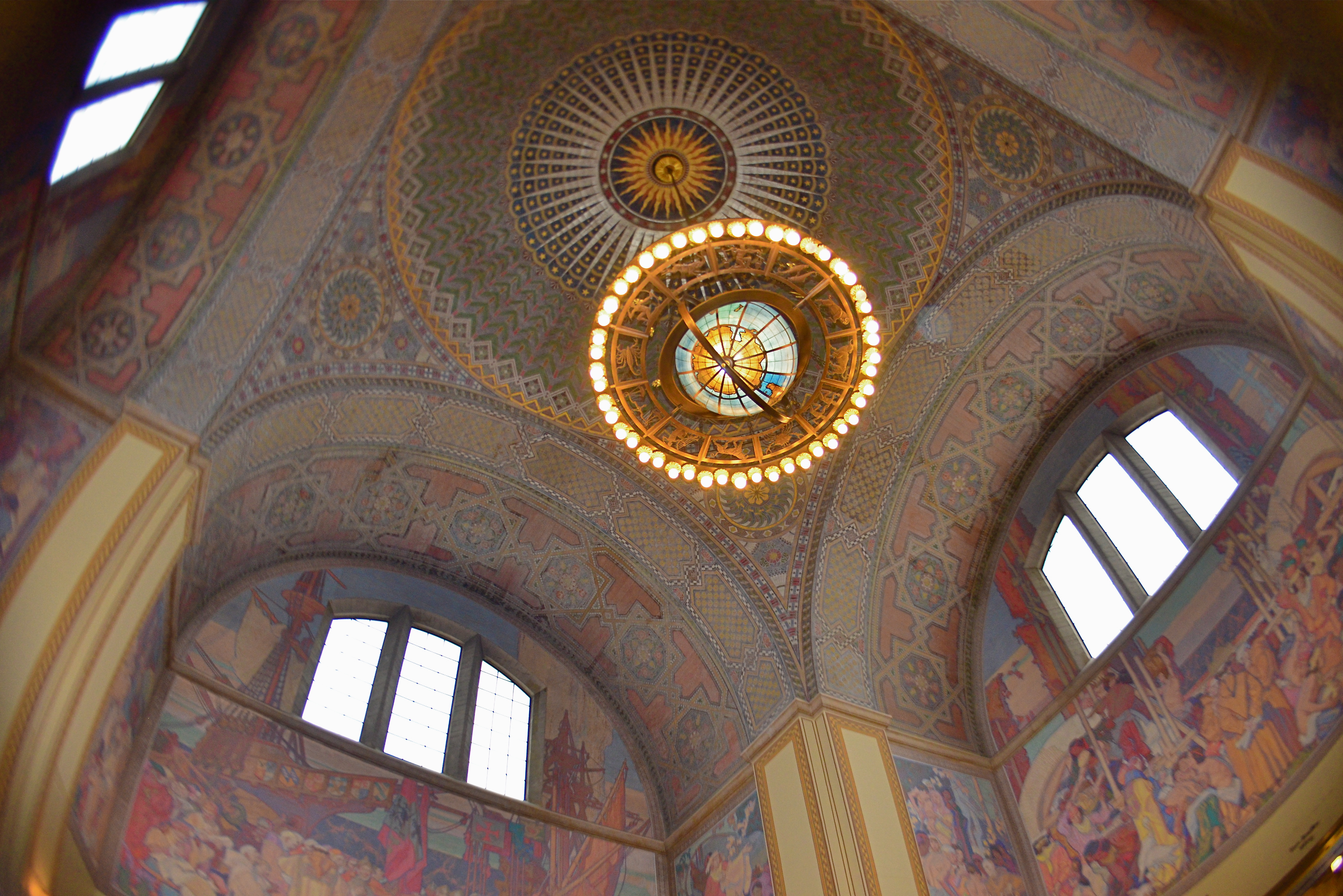
Let’s look at barrel distortion. Lenses wider than about 24mm can make straight walls appear to bend outwards like the sides of a barrel, creating an unreal, and, for some, somewhat claustrophobic appearance most associated with the ultimate width of a fisheye (something around 8mm). The effect is that of a world cramped into the inside of a snow globe, and, depending on what look you’re going for, it can either be marvelous or miserable. It’s marvelous, for example, if you want to suggest tremendous depth in a shot.
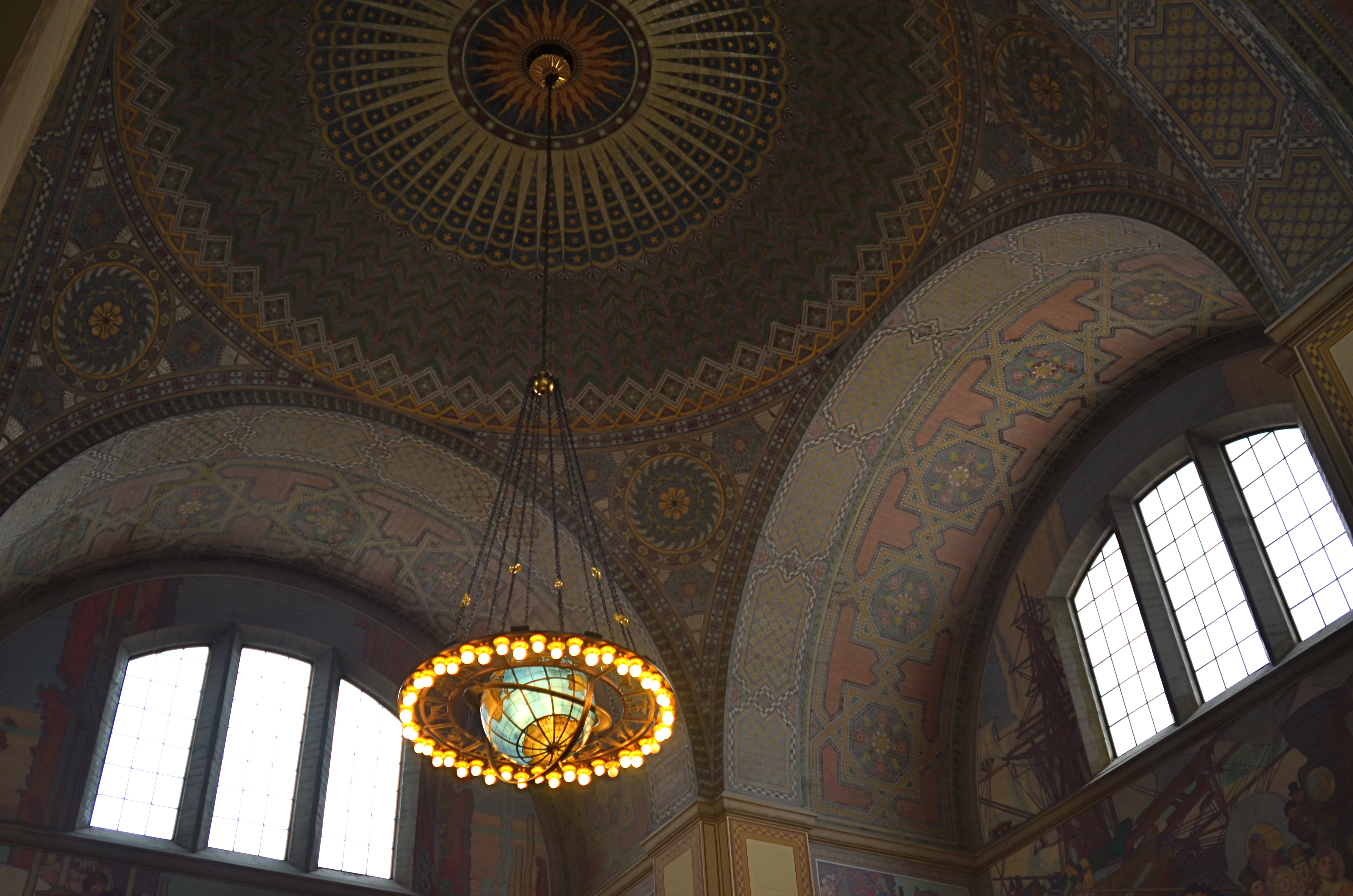
A more modest wide-angle, like this 24mm delivers more conventional dimensions, but not as much coverage.
And that’s dimensional exaggeration, the other key trait of a super-wide, in which the perception of distance from front to back is greatly hyped, making a deep space look even deeper. Shooting a cavernous area like the inside of the rotunda at the Los Angeles Central Library, as seen in the frame at top, you may want to suggest vastness, and a fisheye, such as was used here, does that superbly. All I’ve done to defeat the accompanying barrel distortion is to crop away the original frame edges. Of course, using a more conventional focal length like a 24mm, as seen directly above, shows all dimensions in a much more natural way, but they sacrifice coverage area, revealing less of the ceiling and sides and creating the sensation that the shot is not inclusive of enough information. In the case of both lenses, how you frame and where you stand will produce significant variations on how you render the space.
Photography is about what to fill the frame with, of course, but it also involves some planning as to how technology does that best, based on the tools at hand and what they’re equipped to do.
DON’T MESS WITH MR. IN-BETWEEN
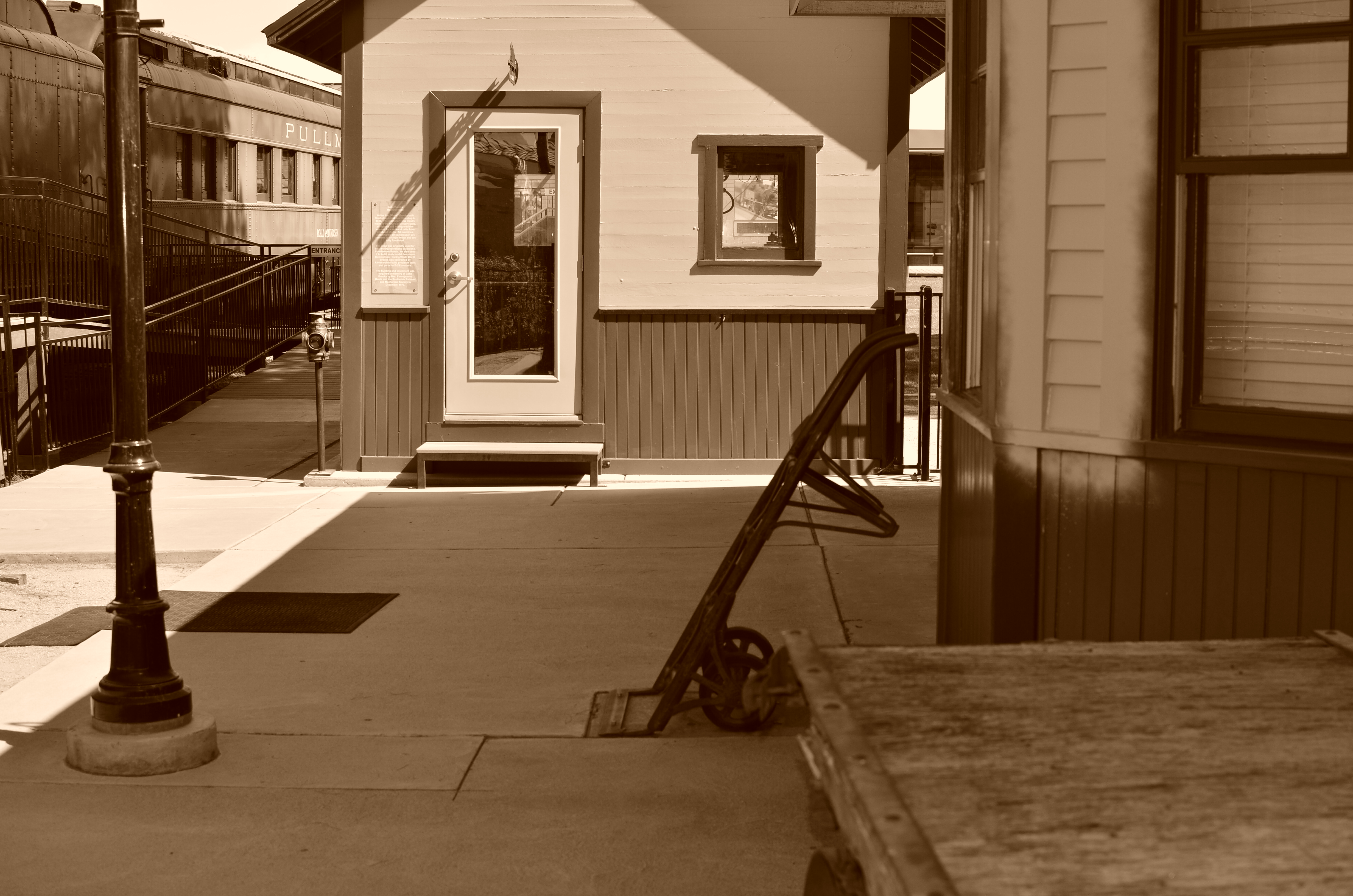
The light on this railroad depot was not as harsh or contrasty as seen here: I merely liked it better that way.
By MICHAEL PERKINS
PHOTOGRAPHY ALWAYS SEEMS TO BE ABOUT TWO THINGS THAT ARE POLAR OPPOSITES. On one hand, we have labored mightily for nearly two hundred years to make our little boxes reproduce as full a representation of the range of tone in nature as possible, to ape the eye to a clinical certainty. On the other hand, we love to distort that reality for specific purposes…..call it abstraction, minimalism, or your own favorite buzz word. We extol the natural look and revere the unnatural in nearly the same breath.
Originally, there wasn’t much in the way of attenuation between light and dark in photographs. Black was blackblackblack and white was whitewhitewhite (yes, I read a lot of e.e. cummings as a child). Better films eventually led to a greater variance in shades and nuances, and pioneering work by Uncle Ansel and other Big Saints produced exhaustive studies on precisely how many shades of grey could be delivered in a carefully crafted photograph. But even as we can now easily produce images with great variances in light and dark, some pictures are still served better by going back to clean, simple boundaries for values.
Hard, high-contrast blacks and whites are killers of texture but they are great modelers of dimension. A cube with stark differences between its light and dark sides takes on the more tangible feel of a solid object occupying space, and that extra degree of dimensionality helps in the success of certain compositions.
The above image was originally far more nuanced than the altered version you see here, but, as a very basic arrangement of shapes in space, I like the picture better without too much midrange value. It helps the faux nostalgia feel of the subject matter as well, even though it might be altogether wrong for a million other subjects. The unscientific answer is, you know it when you see it.
One thing is for sure. Even when we look for the ring of truth in our images, turn out that there’s more than one ring tone. Decide what you need for a specific image. Maximized selection of tools is the most single important part of making a picture.
