UP FROM DARKNESS
By MICHAEL PERKINS
(AS YOU READ THIS, I, along with most inwardly inclined photographers, am spending the final days of the present calendar year trying to make some sense of whatever images I’ve attempted over the past twelve months. But I’m only partly interested in compiling so-called “best of” lists, since it’s really up to other eyes to decide whether any one group of my pictures can collectively be called successful. Simply, I can’t really judge how well I’ve done. Not alone, anyway.)
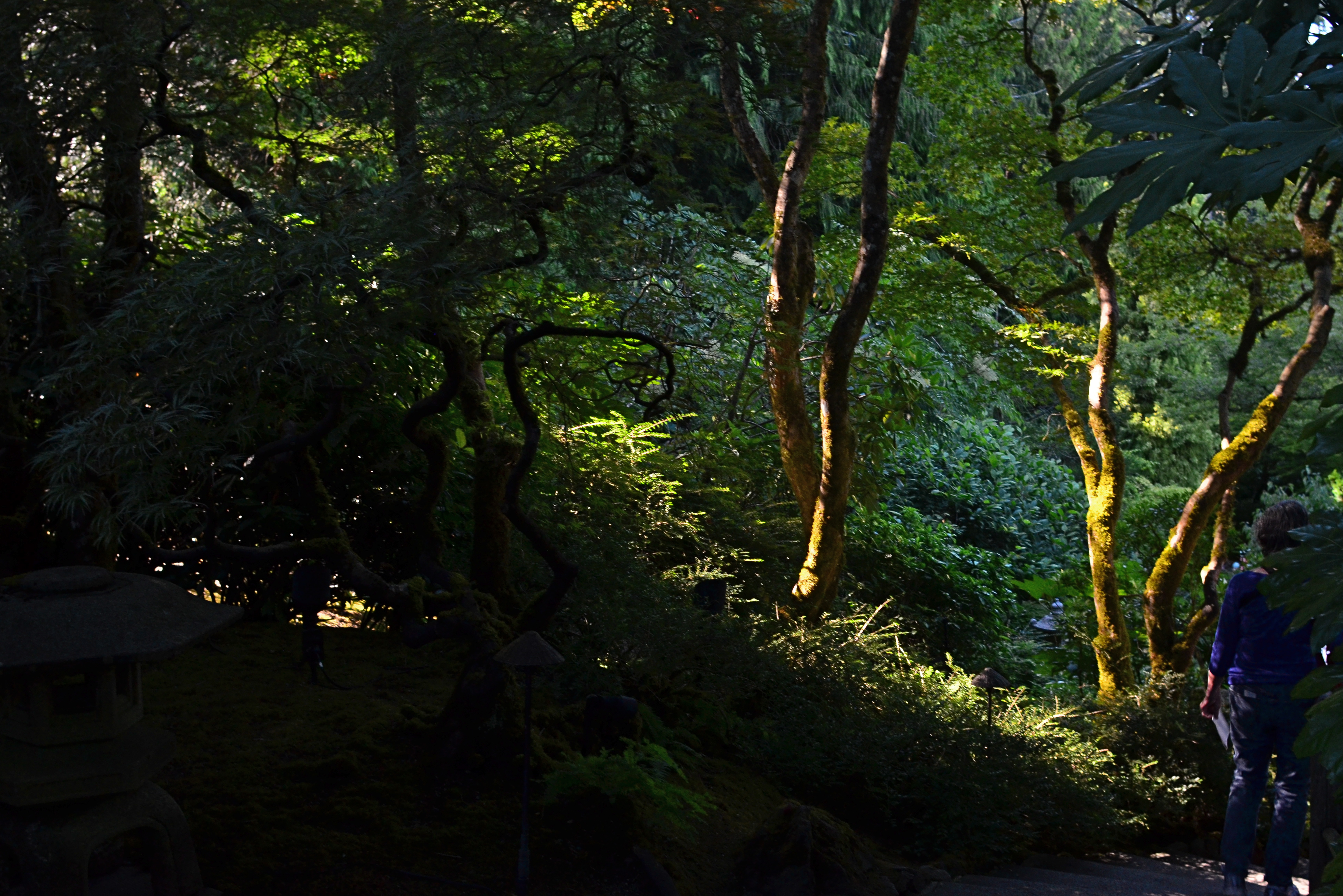
What I try to do instead is to determine if pictures from a given year arced or tended in a particular direction. One thing I have noticed about my work is that it seems to fall, generally, into subject years and light years……groups of shots that are either centered on what I shoot or the conditions under which I do so. 2018 seemed far and away to be about making compositions of light rather than capturing locales.
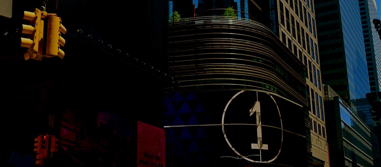
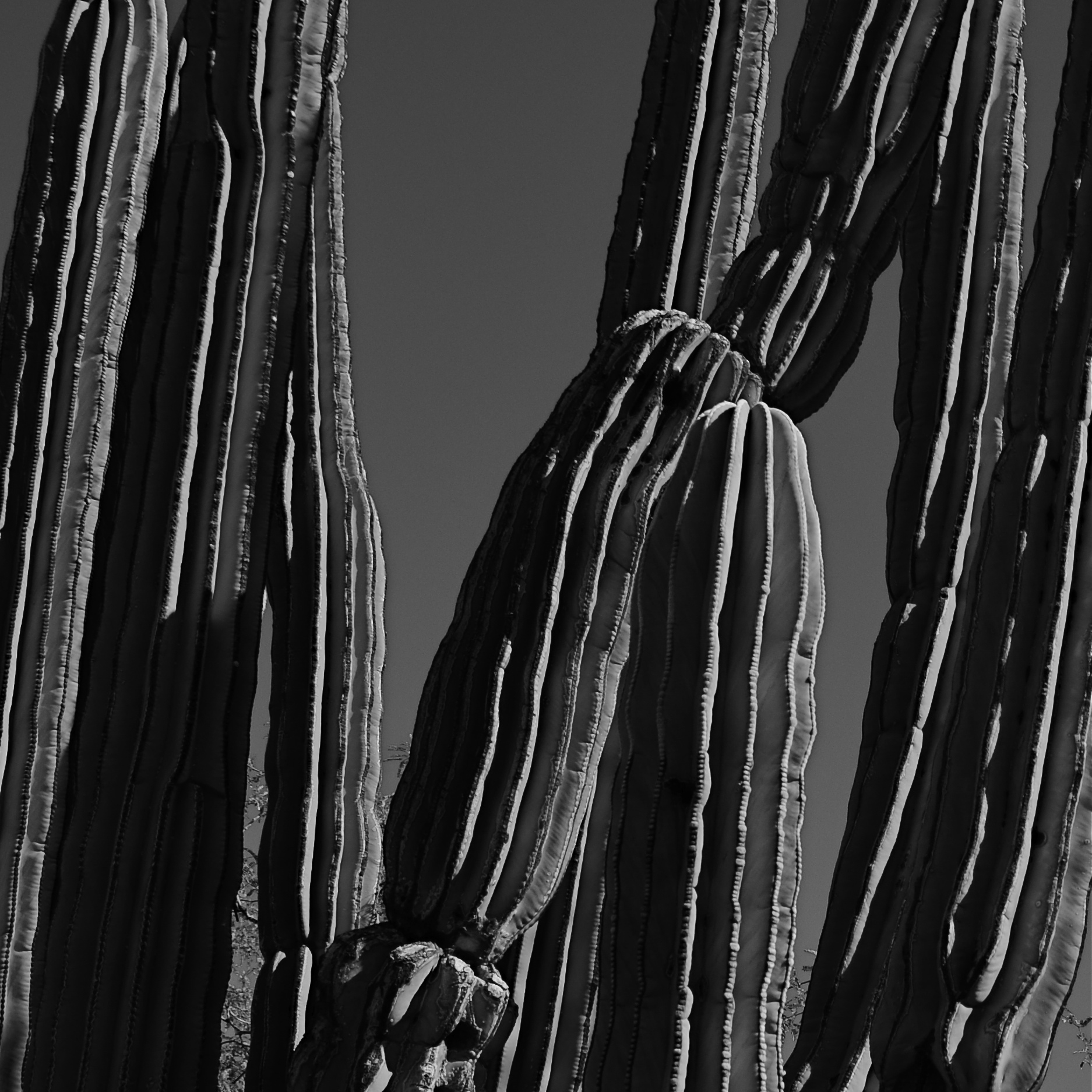
Going For The One, 2018
In more than a few photographs over the past year, I almost seemed to be dragging brighter surfaces out of solid darkness…..but only just enough to make a few details register, leaving significant portions of the finished image lingering in shadow….deliberately under-defined. I have always liked this chiaroscuro, or “Rembrandt” light effect, but this year, I seemed to be aggressively embracing it.
The shot seen here, then, is not meant to explain the building I was shooting, but to reduce it to a pure instance of color, light and design. In a different situation, the picture might have been more reportorial, but in this case, the arrangement of line and pattern was the entire goal of the photo. So, at the end of 2018, no photographic “greatest hits” list for me, just a trend line showing that my curiosity is tracking in a certain measurable direction. Photography is just as much about attempts as it is about achievements. At different junctures, we value one over the other.
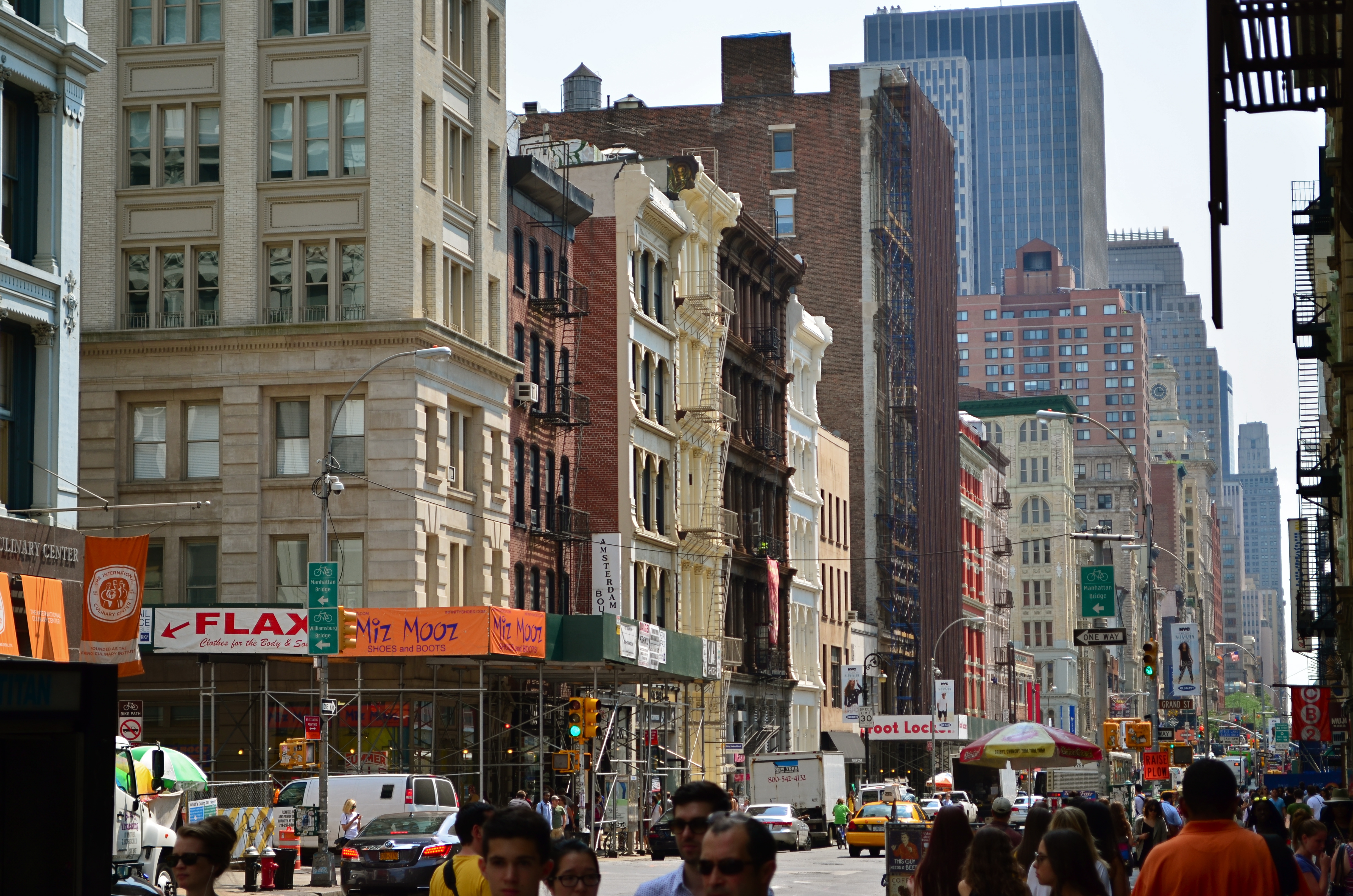
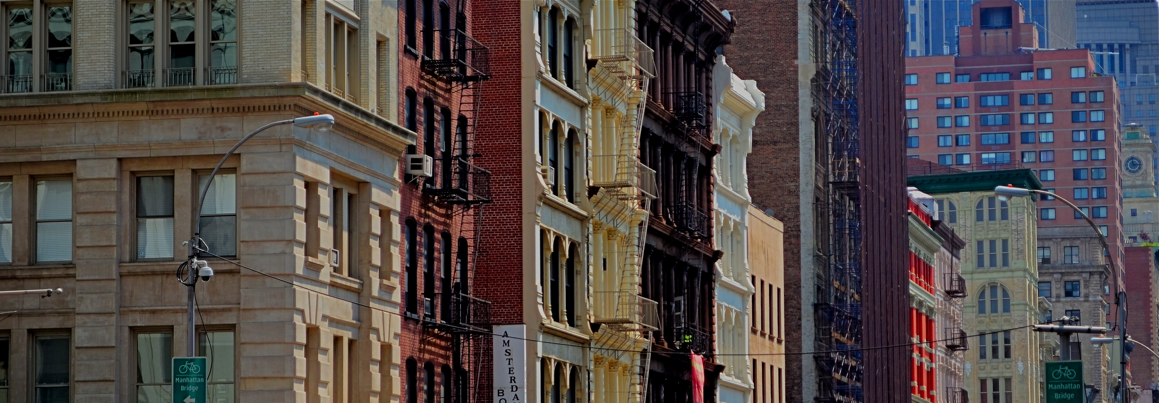
NARROW PALETTES
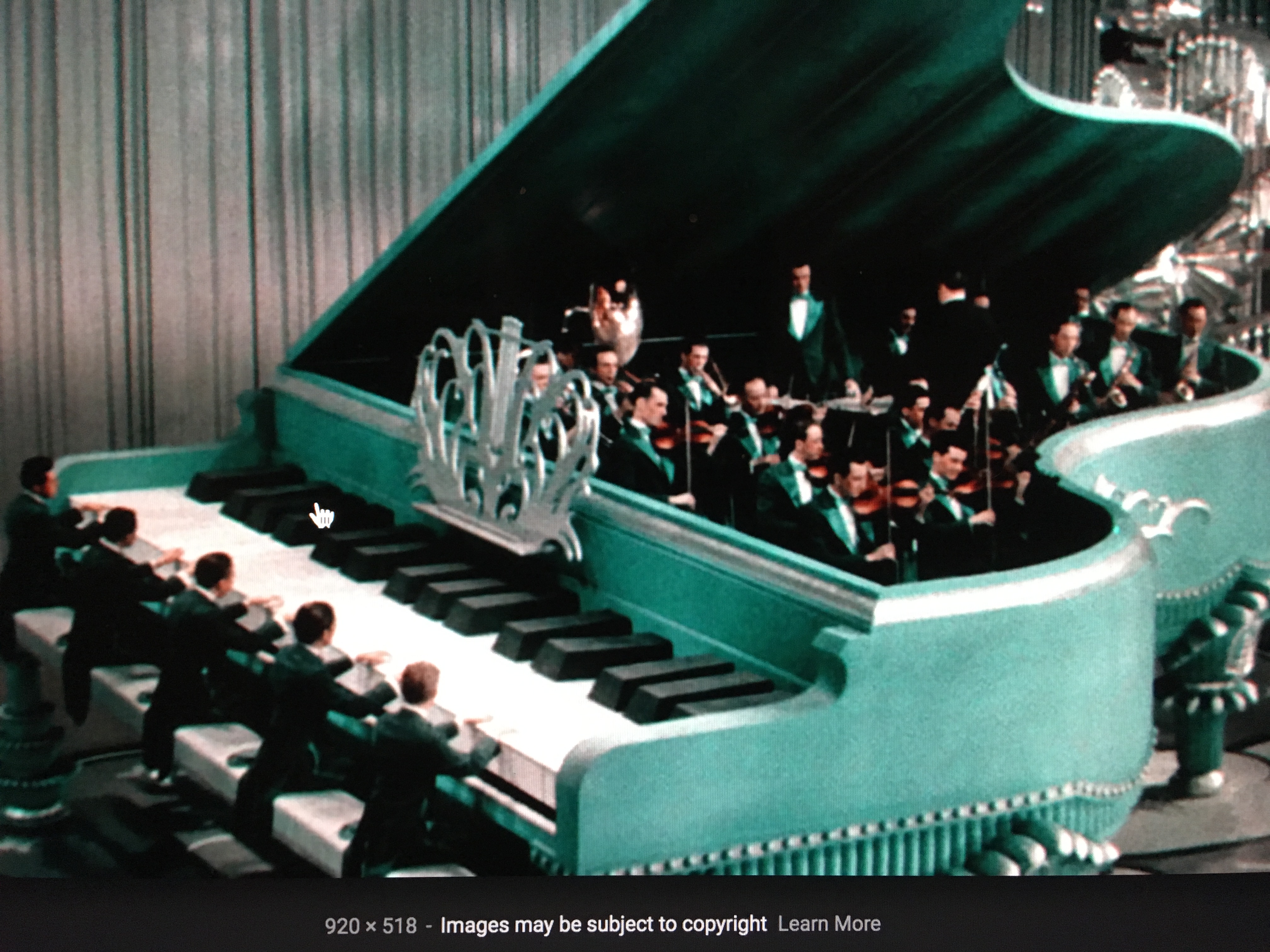
An early example of two-strip, or “red-green” Technicolor as seen in The King Of Jazz (1930)
By MICHAEL PERKINS
I’M A HUGE FAN OF THE EARLIEST VERSION of the classic Technicolor film process, the so-called “two-strip” technique from the 1920’s, which simultaneously exposed two separate frames of black and white film of a single subject, one strip through a green filter, the other through a red one. Combined in the lab, the composite image simulated most of the colors of nature that contained either red or green, but absent the third layer of blue/cyan which would be added in the more advanced three-strip Technicolor process, the one which became the industry standard by the early ’30’s. Two-strip features like Mystery Of The Wax Museum or The King Of Jazz are a kind of object lesson for photographers in learning to work with narrow color palettes. The message: do the most with what you’ve got.
Every shooter encounters situations, most of them dictated by changes in available light, which severely limit the full spectrum of reproducible color. We might eagerly embrace the warmth of the two daily “golden hours” that bathe most bright hues in gold. We might bemoan cloudy days, which can drain everything of saturation or contrast. We might have to make adjustments when shade makes our cameras read light at the wrong color temperature, giving our images “the blues”. Whatever the challenge, photographers make myriad choices about color in a single minute, and, unlike the early technicians at Technicolor, they don’t necessarily see a faithful rendering of “reality” as Job One. How “natural” do we want to present color, and how do we define that word, anyway? Is color a determinant of comfort, tension, revelation, drama? Do we intentionally choose hues that either conceal or reveal?
Deep sunset, as seen in the above image, is one situation in which nature itself narrows the color palette. All yellows and reds tend to morph into orange. All blacks, browns and grays migrate to blues. Middle tones head for the hills. Contrast jumps off the meter. Subtlety takes a vacation. Suddenly, as in the case of the old two-strip Technicolor, you’re forcing very few colors to do the work of many….to deliver a version of the world rather than a faithful reproduction of it.
Color processes since the beginning of photography have embraced the idea that you could either reflect reality or, in the pursuit of a great picture, bend it a little.
Or more than a little.
Or a hell of a lot more.
OF CLEARINGS AND COVER
By MICHAEL PERKINS
“LOST IN THE WOODS”. “DEEP IN THE FOREST”…conjure your own phrase for the sensation of entering, and being swallowed by, dark, mysterious places. Realms of shadow, primordial laboratories in which both dreams and nightmares are brewed. In other words, sites where photographers can wax poetic. Or crash and burn.
Forested areas are both challenge and opportunity for shooters, since they are seldom subject to the same laws of composition or exposure as subjects shot out in the open. Mastering light in woodsy settings can be a crusade in its own right: details can melt into dark murk or be completely blown out in sudden shafts of sunlight. I have produced more mushy, indecipherable messes with more cameras in more forests than I care to count, in pictures which inadvertently produce more mystery than they reveal, as in “what’s this supposed to be?”
I can come a lot closer to coherence when I work with partial clearings rather than dense woods, working with simpler compositions that suggest the feel of the forest from its near edge rather than its center. Exposure becomes a more streamlined process as well.
Also, since the emphasis in such a shot is on mood rather than detail, even the basics of focus can become, well, negotiable, as seen here. But then, almost anything in the making of a photograph is. Or should be. My point being that, when the taking of a picture fails, it can be because the photographer is trying to execute too many things at once. Eliminating some of those things until the image becomes manageable can be, like walking out of a dark forest, a profound relief.
PALLBEARING FOR HDR
HDR processing, initially touted as a more “real” look, is actually anything but.
By MICHAEL PERKINS
MANY OF THE TECHNOLOGICAL ADVANCES IN PHOTOGRAPHY, over the centuries, have been made as specific remedies to the limits of either cameras or recording media. Lenses and films were made faster, sharper, or more accurate because photographers were thwarted by the cramped parameters of the media. Such a cycle of malady-and-cure creates temporary and manic convulsions, fads if you like, along with solid, permanent improvements. Sometimes, as in the case of the now declining technique known as High Dynamic Range, or HDR, it’s easy to confuse a quick fix for a permanent one.
To review, HDR was an attempt to compensate for the limited range of light recorded by first-generation digital sensors, which effectively “read” extreme highlights or shadows, but were spotty in the mid-ranges, delivering only a portion of what the eye could detect. The solution was to take a bracket of anywhere from three to seven frames over a wide exposure range (grab your tripod, kids), then blend them, via software, to more consistently even out all values for a “balanced” or “natural” view. The other side-benefit of the process was a drastic amplification in detail.
HDR was immediately praised as having helped the photographer hurdle the last remaining barrier between the camera and real life. It quickly muscled its way into everything from amateur landscapes to commercial real estate, conferring prophet (profit?) status on authors like Trey Radcliffe, who soared to best-selling fame with books brimming with hyperbolic color and iridescent textures, every hobnail and brick in his goth HDR cathedrals registering the same, loud detail.
And that sameness, eventually, became the problem. Every part of every picture was now shouting. In the hands of many, HDR did not make images evenly modest: it made them uniformly garish. Too many HDR pictures were overripe, overcooked, as if the world were awash in day-glo gravy. Worse, the technique couldn’t work with live subjects or hand-held shots. Worse yet, in-camera HDR simulators in DSLRs and phone apps were virtually useless. Finally, if you actually liked photographing, you know, actual people, HDR made human flesh look like wet liver inside a tanning booth.
In the end, the problem HDR was created to address actually resolved itself, with second-gen camera sensors finally performing better along a wider range of light, delivering more even exposures right out of the camera. More importantly, photographers fell back in love with shadow, understatement, and mystery, satisfied that you don’t have to show everything to see everything. So, rest in peace, HDR. There now are better ways to keep it real.
HOLDING HANDS IN THE DARK
By MICHAEL PERKINS
ONE THING OF WHICH THE PHOTOGRAPHIC COSMOS IS NOT IN SHORT SUPPLY IS THE SELF-PORTRAIT. What might have been a specialized kind of image-making just a few scant years ago is now, in the mobile era, a flat-out obsession. We snap ourselves being happy, being moody, eating a cheeseburger, or giving that cheeseburger a thumbs up with friends, etc, etc. We make more photographs than ever of our faces, and, it could be argued, say less and less in the process.
I think that a good self-portrait, if it is to say or imply anything true about the life behind the face, requires a little prep time, or at least a pre-conceived notion of what one is trying to reveal about that person. That said, I think our concept of a selfie is, at the very same time that it’s overdone, is also far too narrow. Simply speaking, there are other parts of our physical envelope that convey information about who we are and what we’ve been in the world. The hands, for example.
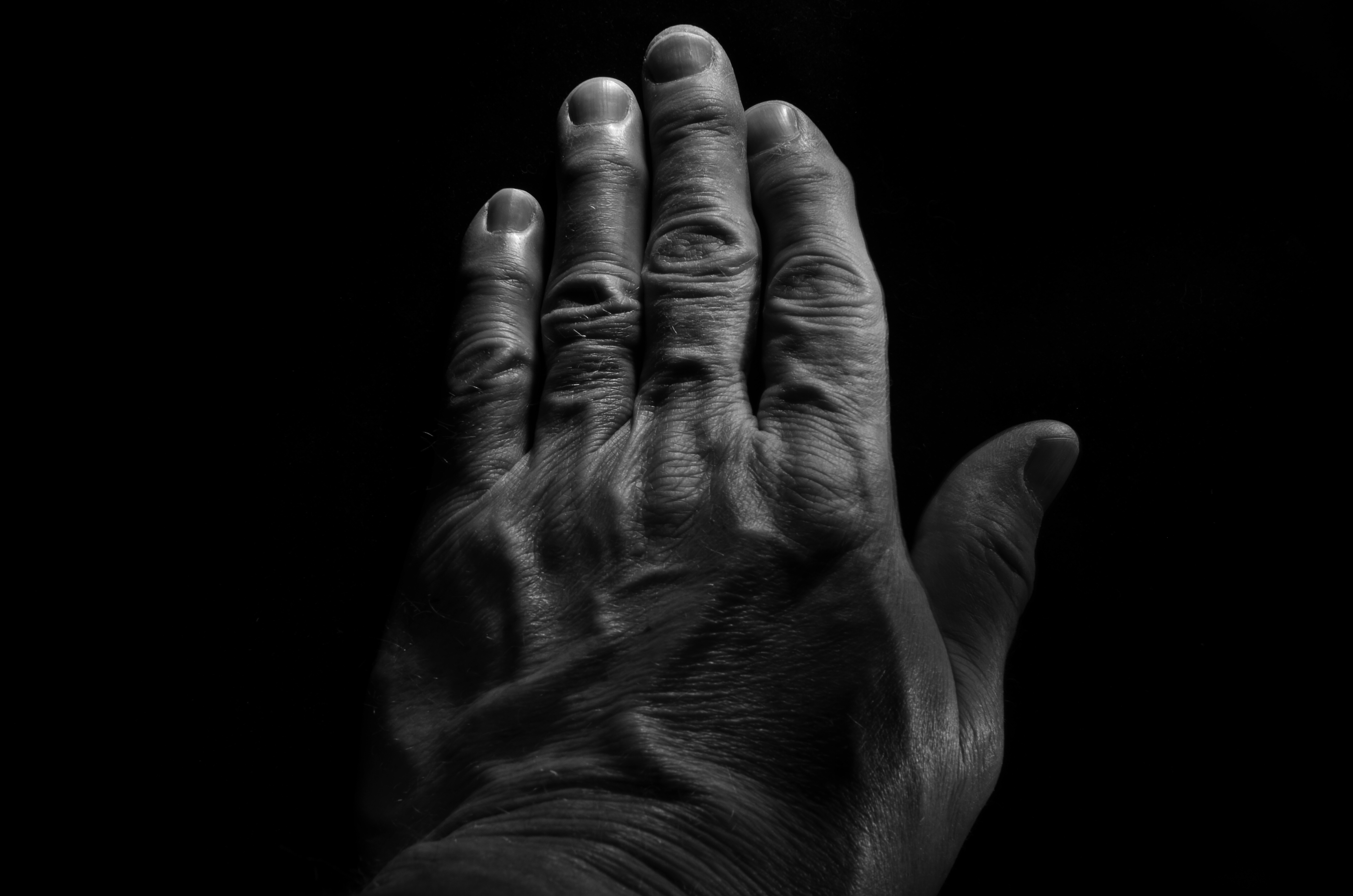
Pax Humana (2017). Hand-held LEDs used to “light-paint” in the dark can create interesting textures in human skin. 18 sec., f/16, ISO 100, 35mm.
If the eyes are the window to the soul, the fingers are the foot-soldiers who carry out the orders that the soul dreams up. The mind behind the face can certainly shine through a good facial portrait, but consider that the hands are the real agents of change in a person’s life. They lift: they move: they put plans into action. Moreover, hands bear the traceable time-stamps of all that agency. Each wrinkle and scar is a document of both deliberate action and unforeseen consequence. Hands belong in any serious study of a person’s life, no less than the face. The trick, as with photographing every other subject, is in getting the image you want.
I find, for example, that normal room light keeps a lot of fine detail from registering in an image, since human skin is highly reflective, causing the grain of the skin to wash out. One way to get around that is to use light painting, a technique we’ve discussed here before. Set up your composition and focus with the camera on a tripod in normal light, then leave everything in place until nightfall and make the image in a completely darkened room while experimenting with a range of exposure times. Your only illumination will be a small hand-held LED, such as a miniature key chain flashlight….nothing wide-beam or super-powered. Use a wireless remote to trigger your shutter, then “write” light paths over the hand, slowly tracking the LED over small areas until all have been “hit” before the trigger snaps back shut.
In the above example, I wanted greater contrast between the hills and valleys of my knuckles, veins, etc., and I wanted to minimize the shine-making effect of the light, so I lit from an angle, sideways from the tips of the fingers. That bumped up the pores and hairs into starker relief as well. Two things to remember: using short stabs of light, that is, turning the LED rapidly on and off, is better than a continuous beam, since you can pinpoint the effect more precisely. Also, using a very small aperture (f/16 here) provides maximum depth of field and enhanced detail. Other than that, it’s truly trial-and-error. This frame, as an example, is one of forty attempts, so it’s not a project you do on the fly. But this, I feel, is my hand, my real hand, its labors and history in full view. And it’s as much a portrait as any face can ever provide.
ON ITS OWN TERMS
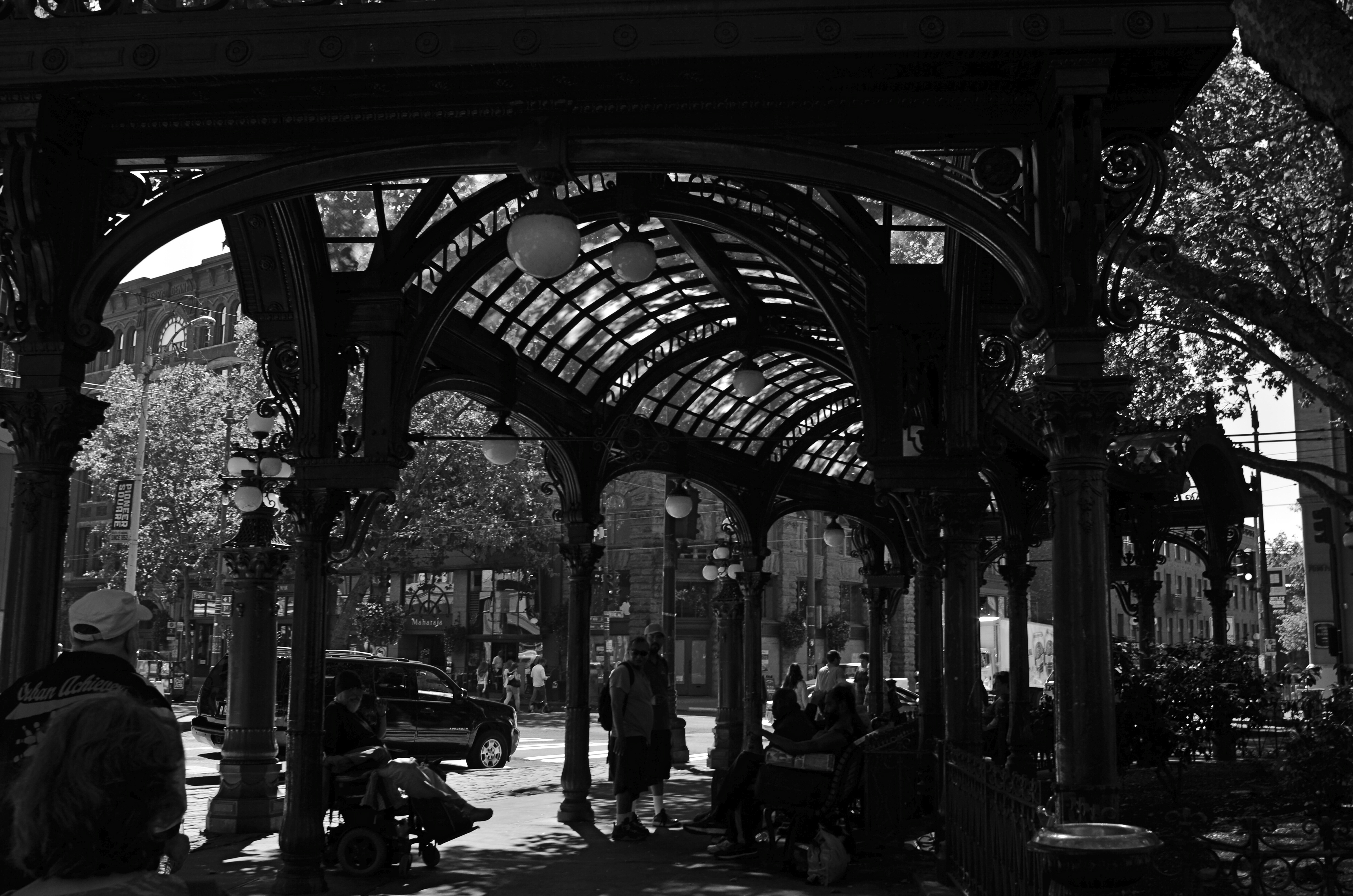
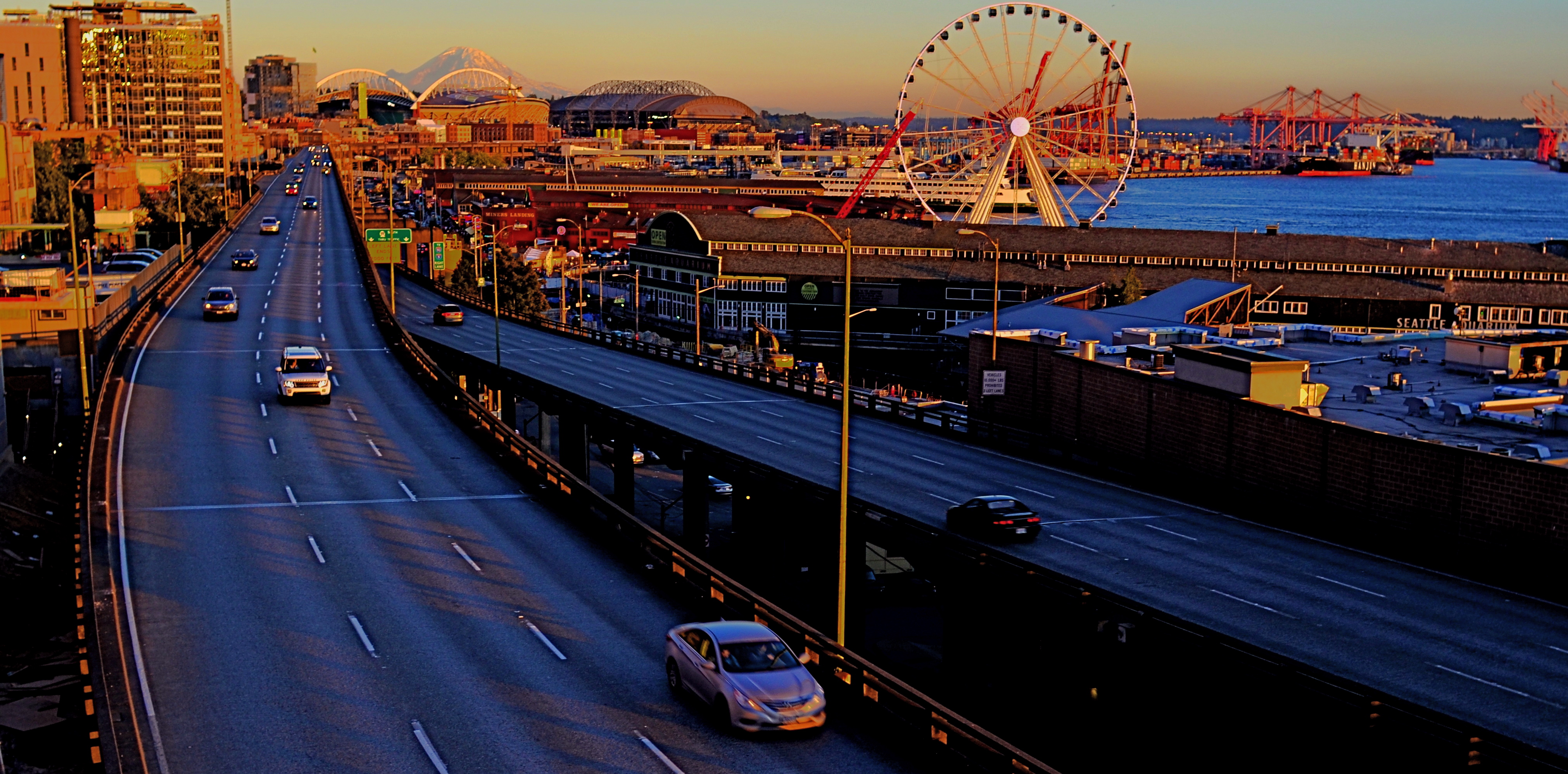
Gaslight Reverie (2016). Local characters convene under an aging arch in downtown Seattle.
By MICHAEL PERKINS
ONE OF THE FIRST EDITORIAL TRUTHS THAT PHOTOGRAPHERS LEARN is that just pointing and recording is not photography. The marvelous device which was designed to arrest time in its flight and imprison it for future reference is truly effective for setting down the facts of a scene….details, textures, dimensions, etc. But, once the shooter is bent upon making any kind of statement…amplifying, clarifying, commenting….then the unadorned data of reality may prove to be a set of chains holding him earthbound. Every picture has it own terms, its own rules of engagement. And sometimes that means moving mere reality to the second chair.
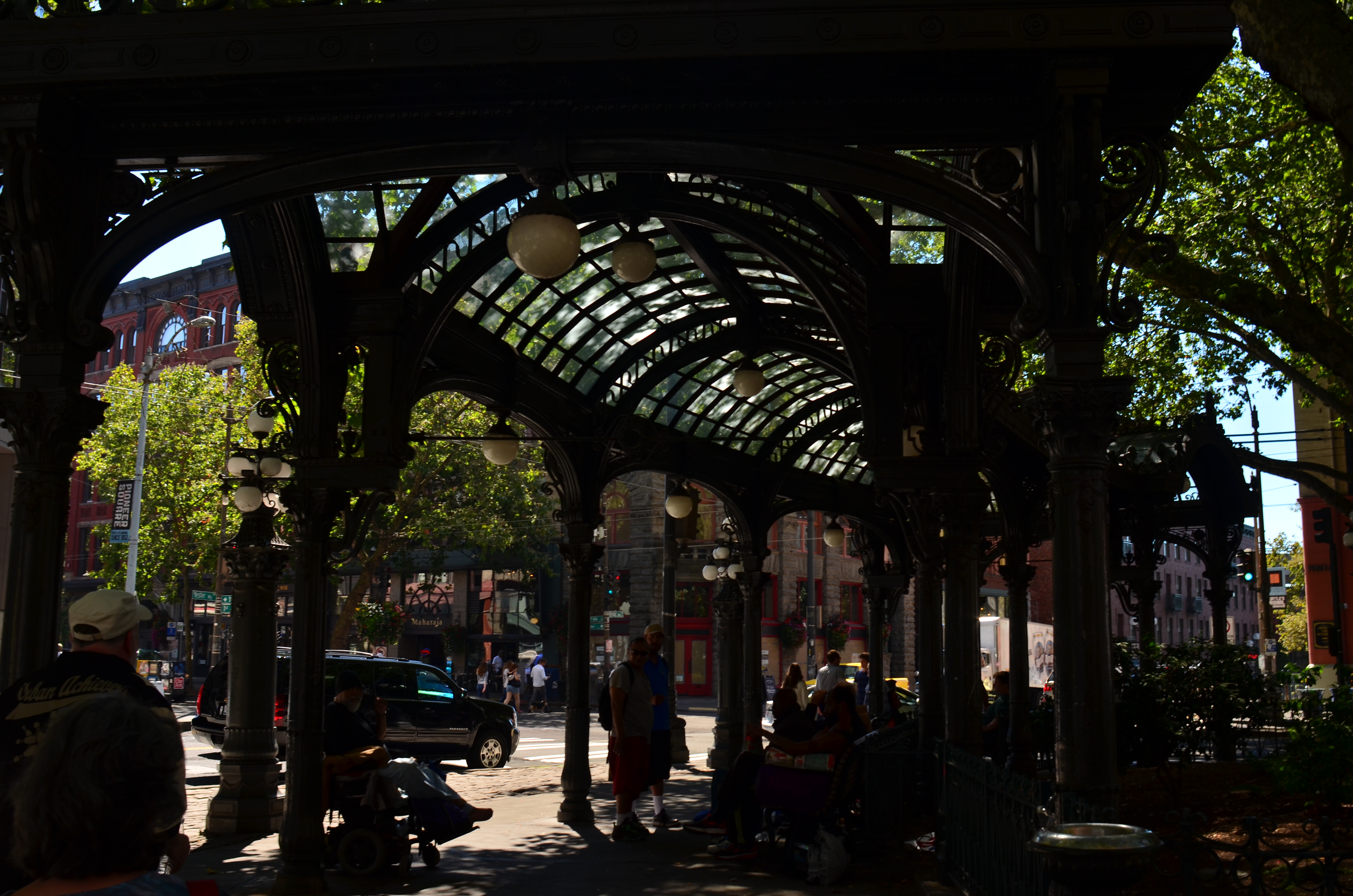
The same shot in color is a bit too charming.
Things that are only recorded are, to a degree, raw, in that they contain important information and extraneous data that might keep an image from being, well, a photograph. A deliberate act. Consider the purest form of “factual” photography, a reconnaissance flyover photo. Seen in its basic “real” state, the colllection of shapes, shades, and wiggles makes little sense to the observer. It needs the help of an interpreter to ferret out the pertinent narrative. Yes, this squiggle is a river. This grey smear is the warehouse. These scratchy cross-hatches are railroad lines. Photographs need to shaped so they can be interpreted. Sometimes this means, for lack of a more grammatical phrase, “including something out.”
There are many ways to achieve this, but, in the interest of brevity, I often find that a simple switch from color to monochrome goes a long way toward streamlining an image. Hues can be distractions, slowing the eye in its pursuit of a picture’s best impact. It prettifies. It luxuriates in tonal shifts, details, textures. Black and white can cut the busier parts of an image in half and convey a starkness (at least in some settings) that color can find problematic. Amping up the contrasts in black & white, eliminating many middle tones, can purify the image even further.
In the above comparison, a neighborhood in Seattle which is, in effect, its local Skid Row, is far more charming, far less gritty in the color rendering than in the mono version. Of course, the choice between the two approaches is made based on what you want to achieve. The same evaluation in a different situation dictates a different choice. Maybe.
Photography is not reality, and, if it were, it would never have flowered into an art, because reality is essentially dull. To make a picture, you have to determine the specific terms for that picture….what weight it wants to carry. Then it starts to become a photograph.
EDITING WITH LIGHT
By MICHAEL PERKINS
THE ETERNAL TUG OF WAR IN PHOTOGRAPHY SEEMS TO BE the pull between extremes of revelation and concealment. Toggling between the strategies of showing almost everything and showing nearly nothing, most shooters arrive at some negotiated mid-point which describes their own voice as a visual narrator. Shuttling between the two extremes, shooters have to decide how much information is appropriate not only for their overall style, but in each specific shooting situation.
Managing light in the moment, rather than trying to re-balance values after the picture is made, affords the most crucial control you will ever exercise over your subject. We tend, as beginners, to shoot things where there is “enough light”, growing ever more discriminating about the kind of light we prefer as we mature in our approach.
Down Into (2016). 1/40 sec., f/5.6, ISO 500, 24mm.
One of the most fruitful exercises for me has been those rare occasions in which I have had the luxury to remain in one area over a span of several hours, discovering the nuanced variations that prevail from minute to minute in a single setting. Many times, I have begun this process with an initial concept of the “ideal” lighting for a shot, then, through comparison, rejected that in favor of a completely different strategy. It’s strangely thrilling to come home completely satisfied with an image, even though it’s the dead opposite of the way you originally conceived it.
Waiting for the right light may be more time-consuming, but it is the cheapest, easiest, and surest way to control composition. If one particular lighting situation reveals too much in the shot, diluting the impact of your visual message, waiting for shadows to deepen and for bright spots to shift can make your photograph urge the eye more effectively toward the center of your “argument”. In the image seen above, I could not have sold the idea of a gradual walk from high left to lower right without the light actually working as a kind of directional arrow. A fully lit forest might have been lovely, and was, in fact, available to me just an hour earlier. But by the late afternoon, however, the partial dark helped me edit excess information out of the shot, and, in comparing the two approaches, I like the “less” version better.
Part of getting the shot you want is often learning to see, and edit out, the parts you don’t want, a process which is better when you wait for the “best”, rather than the “correct” light for right here, right now.
OF TATTOOS AND STENCILS
By MICHAEL PERKINS
IN CITIES, ONLY A SMALL PORTION OF THE DAY’S NATURAL LIGHT actually makes it all the way to the street unbroken. You can almost think about it like rain, in that it drips, slithers, drains, and channels its way downward through a dense maze of structures and barriers. Along the way, that light is bisected, sliced, stenciled and tattooed by the surfaces it interacts with, stretching shadow patterns, glinting, ricocheting, stretching.
Glass, especially, constantly reshapes light, filtering it into delicate lattice-works and spectral spiderwebs, sifting it through windows, transoms, doors, windshields, storefronts. It reveals and conceals, crawling across buildings like an ever-changing sundial of shapes and schemes. Photographing the same hunk of glass on the hour can be like visiting a dozen different worlds, spread out like fanned playing cards over the course of a single day.
Light illuminates, making it a force that acts upon other objects, but it is almost more marvelous when it, itself, is acted upon, creating an endless choreography and echo of its colors and contours. It’s part of the great interactive ballet of cities, this push and pull between light and darkness. Sometimes you get a nearly kaleidoscopic effect from something very simple, like the etched glass in the revolving door seen above, which stamped a different snowflake of shapes onto the pavement at every turn and swivel.
If you’re given to experiment (or daydreaming), your own tabletop can become a tremendously valuable laboratory on the effect of light. Just grab the simplest object handy, be it an apple or a book, and arc a source of light from one side of it to the other. Imagine yourself a self-propelled sun and watch how easily you can create change in your private solar system. The actual design of such an exercise isn’t crucial, but making yourself mentally slow down, becoming aware of the tiny effects perpetually swimming about you, is invaluable. Photographs rise at the hands of some pretty small phenomena. Magnifying your gaze puts more images within your reach.
SOFTER AND QUIETER
By MICHAEL PERKINS
THE MEANING OF THE WORD NOISE HAS, IN RECENT YEARS, been expanded beyond its familiar role as an audio term, extending its usage into our visual vocabulary as well. A key shift in photo terminology, as film converted to digital, has been the re-purposing of the word to denote a degradation in quality, with noise replacing grain as the way to describe a less-than-pristine image. Same idea, different wording.
And now, in recent years, I have heard the word used even more widely to denote weaknesses in a composition, describing a picture with too much information or distraction as “noisy”. In a recent post on the blog PhotographyMad.com, you find the following citation:
Often a photo will lack impact because the main subject is so small it becomes lost among the clutter of its surroundings. By cropping tight around the subject you eliminate the background “noise”, ensuring the subject gets the viewer’s undivided attention.
I personally would extend this metaphor to include not only the subject matter within a frame but its color range as well. That means, simply, that too many colors in an image might dilute the effect of a shot as much as the density of its elements, and extends the idea of noise to encompass anything that lessens the communicative power it has for the viewer.

Deflowered (2016). 1/50 sec., f/4, ISO 100, 35mm.
In the above shot, the idea of the composition was to convey the bits of orange peel as some kind of spent or withered flower. I didn’t decide, in advance, to eat an orange in a yellow bowl, but I believe that the same peels in a red bowl might have hardened the look of the shot by calling attention to contrast instead of content. Keeping the entire composition to a two-tone color range (along with a decidedly shallow depth-of-field to reduce the texture detail) rendered it nice and soft. Of course there are a million ways to conceive this image; I just chose this way.
Noise is not merely a technical registration of visual or audio distortion. I think the word has real value if you’re looking to streamline your images. Just think noise=clutter.
Then turn down the volume.
CUT YOUR LOSSES
By MICHAEL PERKINS
ANYONE WHO’S SLOGGED THROUGH MORE A FEW OF THESE DISPATCHES knows all too well that I am a passionate preacher for shooting images completely on manual, not because it’s a more “pure” form of photography (and thus deserving of nobility and praise), but because I prefer to exercise as much personal control as possible. This, again, is not a quality judgement, since amazing pictures are made every day with the use of either complete or partial automodes. I just feel that I, personally, learn more by trying more, and manual settings place so much direct pressure on me to innovate and experiment that even my gross failures serve as education.
Sometimes. And other times they’re well, just gross.
The mode known in Nikon as Aperture Priority (“Av” on Canons) is the only semi-auto mode I use with any regularity, and always because I make an educated guess, before going on a shoot, about what conditions will likely prevail. AP allows you to manually dial in your aperture on those occasions when you want a uniform depth of field in everything you’re shooting, with your camera metering light on the fly and providing the shutter speed you need for a correct exposure. AP tend to be a rare bird for me because, in many cases, I am not shooting so fast that I can’t pause at least a few seconds between frames to dial in every exposure factor. However, there are cases when the technology gives you a decided edge.
Landscapes, especially in rapidly variable weather, call upon the shooter to react to conditions that could last, at best, for only seconds at a time. When skies are crystal clear and you have ample time to set up a shot, then, by all means, rely on your own experience shooting on full manual. If, however, you are moving and shooting quickly from dark to medium to extreme light and back again, then you might consider AP as a way to cut your reaction time in half. At this point, full manual may be costing you shots rather than making them better.
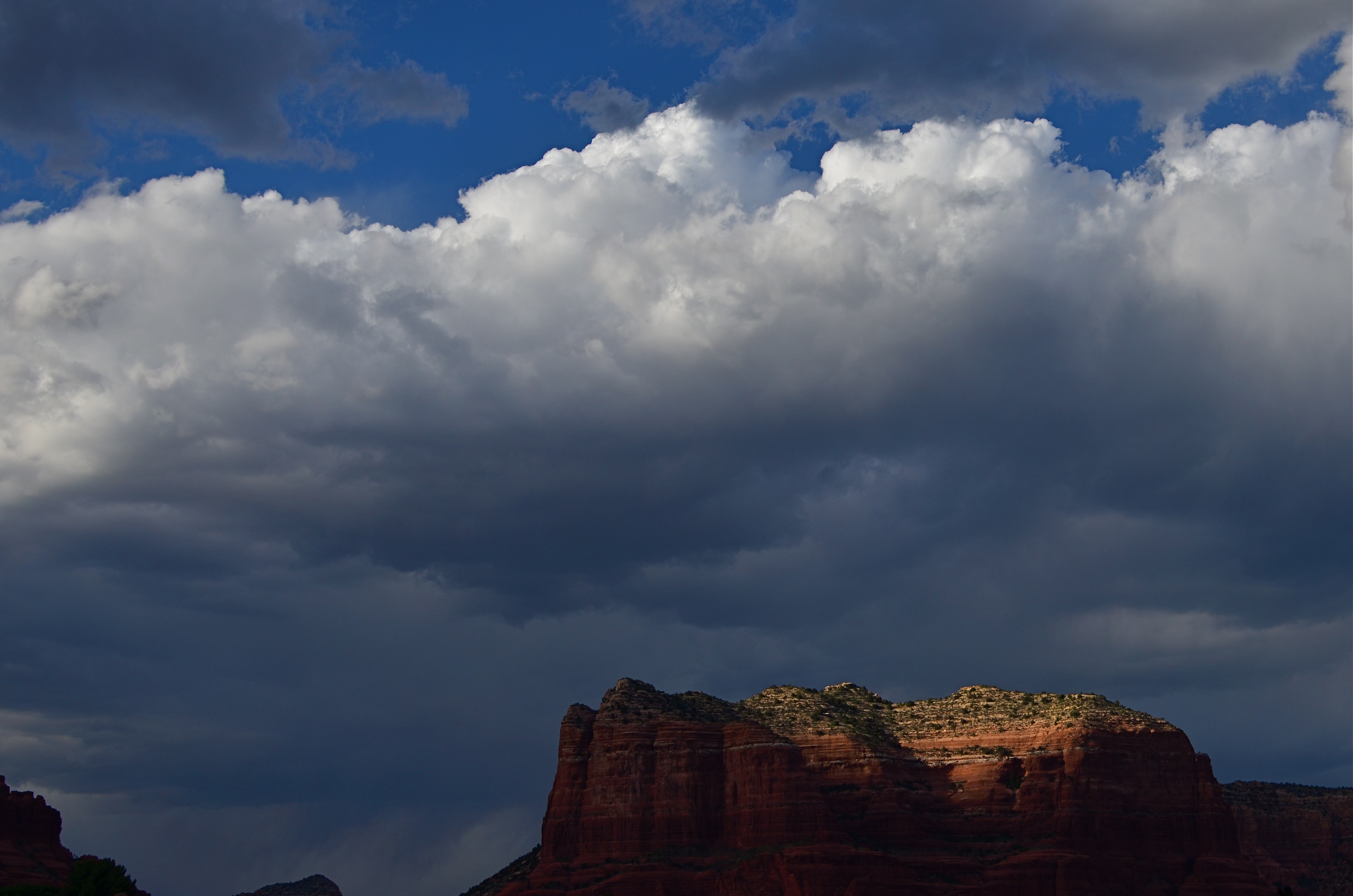
Last Embers (2016), taken on Nikon’s Aperture Priority setting. 1/640 sec., f/6.3, ISO 100, 35mm.
On the day the above image was taken, the town of Sedona, a miraculous array of red-tinged mountains in northern Arizona, was colored variously by a swiftly shifting broken cloud cover. One moment, the crest of a butte might take on a crimson glow, then be swallowed in shadow just moments later, with the gulch next door temporary hyper-lit in the same fashion. The clouds over Sedona were also backed by a decent headwind, shortening the stretches between scene changes even more. Moreover, the sunlight added a ton of contrast to the clouds themselves, making the sky a more attractive compositional component, with typically indistinct shapes rendered more sharply (because contrast is sharpness, right?).
As a result, the combination of light you see in this shot lasted exactly fifteen seconds, so, if I had paused to shoot a couple of trial frames on manual, just to try to nail the lighting, I likely would have missed this moment completely. Again, at this point, assist modes ain’t a compromise; they’re strategy.
The best practice is to anticipate, as much as possible, where you’ll be shooting and what the “game on the ground” is likely to be. Fashion shooters, journalists and other pros swear by Aperture Priority as insurance against lost shots. You may almost certainly find that to be true for some situations yourself . But the name of the game is Get The Picture, so, at the end of the day, the mode that makes you smile is the “right” mode. And don’t let nobody tell you no differnt.
TONAL RECALL
Desert still-life, take one. High contrast, simple color scheme.
By MICHAEL PERKINS
IF YOU WANT TO GET ALL MYSTICAL AND OOKY-SPOOKY ABOUT PHOTOGRAPHY, you can almost talk yourself into the idea that pictures kind of force their way past you on the way to their eventual best form. And, yes, I can hear your eyes rolling back in your head at the notion that an image is somehow destined to be created, that it emerges from your process almost despite you, like a rock that is pushed up through the earth by shifting tectonic plates. However, I have taken a handful of such pictures over a lifetime, as, no doubt, have you yourself, pictures that seemed to keep coming forth even beyond your first false steps until they reached their fullest expression.
Gee, is that incense I smell? Ommmmmm….
What I’m fumbling for here is a shared experience, and I do think that every photographer has had a semi-magical instance in which a photo almost taunts you to figure out how to make it work. Even in the best shots, there are moments of aching regret, maybe years down the path, that, had one or more things gone differently in the picture, it might have been eloquent or consequential. I truly believe that this very “so near, yet so far” quality is what keeps us in the hunt. After all, for the hunter, it’s the tiger he hasn’t been able to bag that calls louder than the ones already mounted over the mantel. So with photos. We are always singing the blues about the one that got away.
A monochrome re-mix from months after the original was snapped.
That’s why I’m a big believer in thinking of images as never really finished. They are, at best, preliminary studies for something else, picture that we still need to grow in order to complete. We lay them down, dissect them, re-shoot, re-imagine, and re-edit them. If you bend your thinking around, you can become comfortable with the fact that everything is a dress rehearsal for something that hasn’t arrived yet.
One of the starkest demonstrations of this fact is shots that were originally conceived as color images but which were later re-thought in monochrome. Nothing accentuates or streamlines your choices like shaving your tonal palette to the bare minimum. And, in the same vein, nothing makes you surer (or more unsure) about an image than reducing it to its simplest terms.
I think that, even as we are constantly expanding our arsenal of visual techniques, seeing them as growing, living things, so too we must think of our images as points on an evolutionary line, rather than final product.
TERMS OF ENGAGEMENT
A very soft color cel phone original becomes a stark “box”, suggested solely by a pattern of black and white bands.
By MICHAEL PERKINS
ABSTRACT COMPOSITIONS AREN’T MERELY A DIFFERENT WAY OF PHOTOGRAPHING A SUBJECT: they are, in many cases, the subject itself. Arrangements of shape, shadow and contrast can be powerful enough to carry the weight of a picture all by themselves, or at least be an abbreviated, less-is-more way of suggesting objects or people. And in terms of pure impact, it’s no surprise that photographers who, just a generation ago, might have worked exclusively in color, are making a bold return to black and white. For abstract compositions, it’s often the difference between a whisper and a shout.
Cartoonist Frank Miller sculpts solid space out of a mix of black and white rays.
I find it interesting that the medium of comics, which has long been defined by its bold, even brutal use of color, is also experiencing a black & white resurgence in recent years, with such masters as Frank Miller (Batman: The Dark Knight Returns) rendering amazing stuff in the most starkly monochromatic terms. Likewise, the army of apps in mobile photography has reminded young shooters of the immediacy, the power of monochrome, allowing them to simulate the grain and grit of classic b&w films from Tri-X to Kodalith, even as a post-production tweak of a color original.
You know in the moment whether you’ve captured a conventional subject that sells the image, or whether some arrangement of forms suggestive of that subject is enough. In the above shot, reducing the mild color tonal patterns of a color original to bare-boned, hard blacks and loud whites creates the feel of a shaded door frame..a solid, dimensional space. The box-like enclosure that envelops the door is all there, but implied, rather than shown. As a color shot, the image is too quiet, too…gentle. In monochrome, it’s harder, but it also communicates faster, without being slowed down by the prettiness of the browns and golds that dominated the initial shot.
There are two ways to perfect a composition; building it up in layers from nothing into a “just-enough” something, or stripping out excess in a crowded mash-up of elements until you arrive at a place where you can’t trim any further without losing the essence of the picture. Black and white isn’t just the absence of color: it’s a deliberate choice, the selection of a specific tool for a specific impact.
STAKES IN THE GROUND
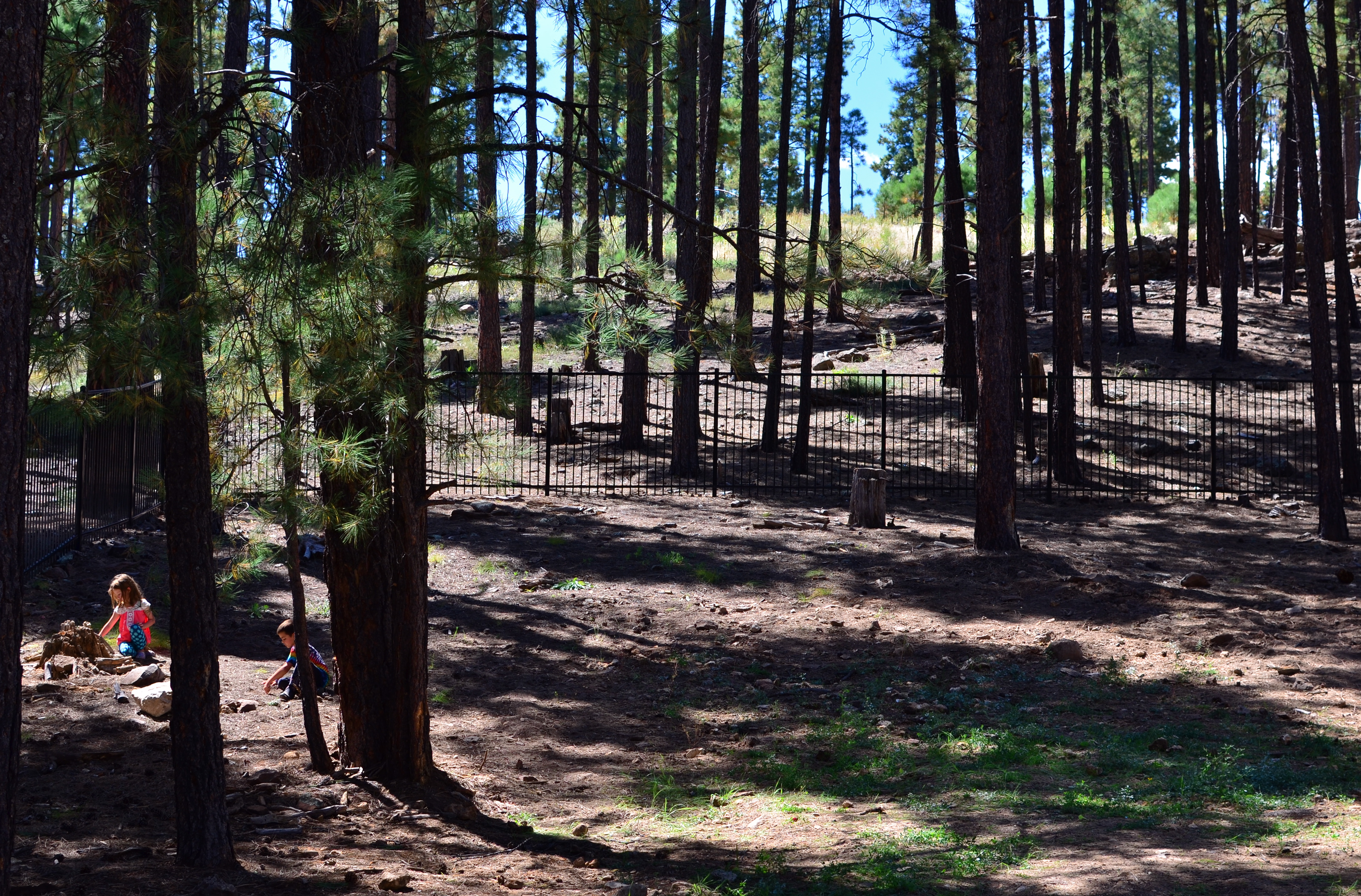
We Seemed To Be The Entire World, 2015. 1/60 sec., f/5.6, ISO 100, 35mm.
By MICHAEL PERKINS
NO DOUBT YOU KNOW WHAT IT FEELS LIKE TO SEE A PICTURE IN YOUR MIND that, for some reason, doesn’t make it into the camera.
It’s maddening. That fumbling few inches between success and failure that cannot always even be sensed during the taking of an image, but which, somehow, is as wide as a river gorge once the picture comes out. Dammit, you saw it. More importantly, you felt it. But something in perhaps a technically perfect photograph fails to engage, and the thing just can’t close the sale.
Going further with the metaphor of salesmanship for a moment, there are pictures which, in a manner of speaking, don’t “ask for the order”. They don’t effectively say, here is the main point of interest. Look here, then there. The best photos are triptychs in that they have a sense of inevitable direction. Your eye senses where to travel with the frame.
In the above forest scene, I nearly failed to provide that impetus because, in my first few shots, I was overly centered on getting the contrasty elements of the picture from fighting each other. Some trees came out like silhouettes. Some parts of the forest floor were way too bright. Somewhere along the line, I had decided that the picture was about solving those purely technical problems. Check those items off, I thought, and you’d have a real nice nature scene, or so it seemed at the time. Only one lucky thing intervened to change my mind and save the picture.
This comes under my general belief that most of the things you need to fix a composition are mere inches away from where you’re already standing. In this case, I moved a bit to the left of several trees and two small children swung into view, both of them representing a dynamic dollop of color in an overly bland palette of shades. Suddenly the picture was about these kids stealing away, inhabiting a quiet, separate world, their size dwarfed by the pines while giving measurable scale to the entire woods. They had found a complete reality away from everyone, and it would be easy to show that. Cropping to have them enter the frame at the bottom left corner helped direct the eye where I needed it to go first. Start here, and then look beyond.
It’s helpful to regularly dissect the pictures that almost had enough story to sell themselves. What stakes could I have pounded into the ground to mark the outline of the idea? Where did I fail to lay out the territory of the story?
It’s all about getting that image from your mind into the camera. That’s everything. That is, ever and always, the problem to be solved.
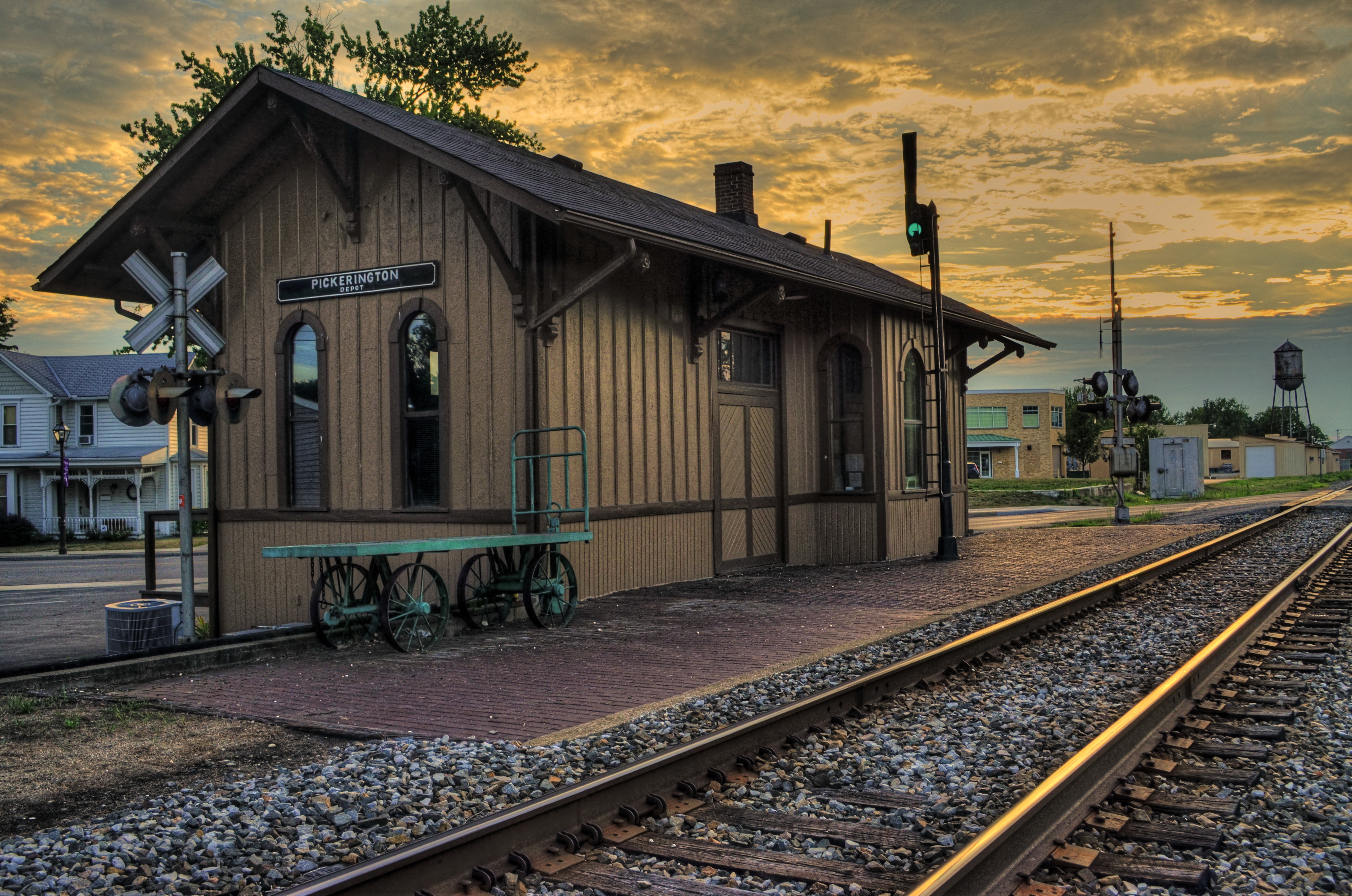
DON’T MESS WITH MR. IN-BETWEEN
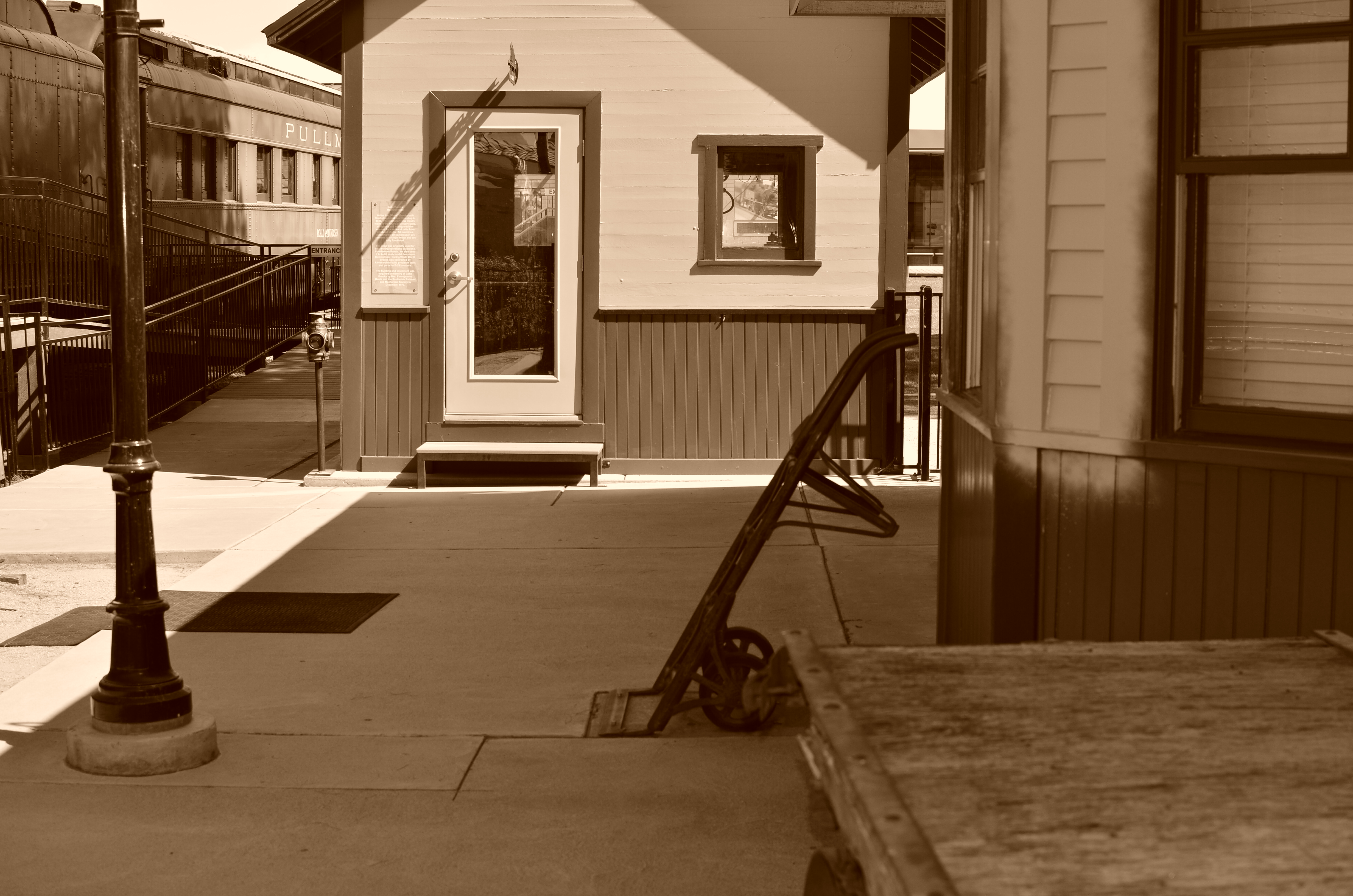
The light on this railroad depot was not as harsh or contrasty as seen here: I merely liked it better that way.
By MICHAEL PERKINS
PHOTOGRAPHY ALWAYS SEEMS TO BE ABOUT TWO THINGS THAT ARE POLAR OPPOSITES. On one hand, we have labored mightily for nearly two hundred years to make our little boxes reproduce as full a representation of the range of tone in nature as possible, to ape the eye to a clinical certainty. On the other hand, we love to distort that reality for specific purposes…..call it abstraction, minimalism, or your own favorite buzz word. We extol the natural look and revere the unnatural in nearly the same breath.
Originally, there wasn’t much in the way of attenuation between light and dark in photographs. Black was blackblackblack and white was whitewhitewhite (yes, I read a lot of e.e. cummings as a child). Better films eventually led to a greater variance in shades and nuances, and pioneering work by Uncle Ansel and other Big Saints produced exhaustive studies on precisely how many shades of grey could be delivered in a carefully crafted photograph. But even as we can now easily produce images with great variances in light and dark, some pictures are still served better by going back to clean, simple boundaries for values.
Hard, high-contrast blacks and whites are killers of texture but they are great modelers of dimension. A cube with stark differences between its light and dark sides takes on the more tangible feel of a solid object occupying space, and that extra degree of dimensionality helps in the success of certain compositions.
The above image was originally far more nuanced than the altered version you see here, but, as a very basic arrangement of shapes in space, I like the picture better without too much midrange value. It helps the faux nostalgia feel of the subject matter as well, even though it might be altogether wrong for a million other subjects. The unscientific answer is, you know it when you see it.
One thing is for sure. Even when we look for the ring of truth in our images, turn out that there’s more than one ring tone. Decide what you need for a specific image. Maximized selection of tools is the most single important part of making a picture.
ABSOLUTES
This image isn’t “about” anything except what it suggests as pure light and shape. But that’s enough. 1/250 sec., f/5.6, ISO 100, 35mm.
By MICHAEL PERKINS
THE POPULARLY-HELD VIEW OF THE HISTORY OF PHOTOGRAPHY makes the claim that, just as video killed the radio star, camera killed the canvas. This creaky old story generally floats the idea that painters, unable to compete with the impeccable recording machinery of the shutter, collectively abandoned realistic treatment of subjects and plunged the world into abstraction. It’s a great fairy tale, but a fairy tale nonetheless.
There just is no way that artists can be regimented into uniformly making the same sharp left turn at the same tick of the clock, and the idea of every dauber on the planet getting the same memo that read, alright guys, time to cede all realism to those camera jerks, after which they all started painting women with both eyes on the same side of their nose. As Theo Kojak used to say, “nevva happennnned…”
History is a little more, er, complex. Photography did indeed diddle about for decades trying to get its literal basics right, from better lenses to faster film to various schemes for lighting and effects. But it wasn’t really that long before shooters realized that their medium could both record and interpret reality, that there was, in fact, no such simple thing as “real” in the first place. Once we got hip to the fact that the camera was both truth teller and fantasy machine, photographers entered just as many quirky doors as did our painterly brothers, from dadaism to abstraction, surrealism to minimalism. And we evolved from amateurs gathering the family on the front lawn to dreamers without limit.
I love literal storytelling when a situation dictates that approach, but I also love pure, absolute arrangements of shape and light that have no story whatever to tell. As wonderful as a literal capture of subjects can be, I never shy away from making an image just because I can’t readily verbalize what it’s “about”. All of us have photos that say something to us, and, sometimes, that has to be enough. We aren’t always one thing or the other. Art can show absolutes, but it can’t be one.
There is always one more question to ask, one more stone to turn.
UNDER A DARKENING SKY
Dark skies, old-school way: a red 25 filter in front of a DSLR.
By MICHAEL PERKINS
SOMEONE HANDIER WITH A SLIDE RULE THAN ME RECENTLY OBSERVED that the raw numerical totals, on photo sharing sites, had shifted in favor of mobile images over those taken with more conventional cameras. In other words, the war was over, and the phones had won, at least in the sheer tonnage of uploaded images. Not sure that I yet regard that assertion as divine revelation, but the fact is that, as mobiles become a bigger component of overall photography, a second shift in technique will also continue, that between conceptualizing and compensation.
Dark skies on a cel phone with the addition of a “red sensitivity” app effect.
By conceptualizing, I mean the system, for traditional photographers of planning their shots before the shutter clicks, choosing settings, pre-editing the composition in the frame, any kind of advance prep. By compensation, I mean the emphasis, with mobiles, on adding filters and fixes after the click, technically learning how to make the most of what you were able to get.
One rather fun element I like to play with at present is the two approaches to high contrast black & white, especially the “black sky” effect which can force foreground objects to pop with greater drama. Shooting out in the Arizona desert for years, I have more frequent use for this effect than I might in more, well normal areas of the country. Traditional approach to this with a DSLR, of course, is the attachment of a red filter. You have to grope around for the right exposure, since you might lose the equivalent of two stops of light, depending on the situation, but it’s a great look. So that’s for us “conceptualizing” folks. See an example up top of the page.
The “compensation” peeps, who might have done their original shot on a phone, in color, is often referred to in apps as “red sensitivity” which adds the dark-sky look as it converts the shot to black and white. Usually you can only tweak the intensity of the effect (sometimes brightness as well), but it delivers a fairly good facsimile of the DSLR’s red filter, albeit with a little black lint kind of texture to the skies that you can usually get rid of with a noise reduction slider in your computer. The results, as you can see off to the left, are fairly acceptable.
If you’re shopping for filters beyond those in your own camera native app, consider adding one that includes red sensitivity. It’s one more “compensation” tool that’s nice to carry in your back pocket.
THE LONG AND SHORT OF IT
This original frame was just, um, all right, and I kept wanting to go back and find something more effective within it.
By MICHAEL PERKINS
THE INTRODUCTION OF THE FIRST PANORAMIC CAMERAS in the 1840’s can be seen as a freeing-up of the camera frame, a way to more accurately depict the entire field of view open to the human eye. And, of course that’s true. However, the first panos were also an early attempt by photographers to deliberately direct and orchestrate not only what you see, but how they want you to see it. Let’s concede that the western mind tends to absorb information in linear fashion. We read from left to right, we scan the horizon, and so forth. So making a photograph that instructs you to interpret horizontally is fairly natural.
So the first panos seem like a fairly modest extension of our visual bias. But think about the fundamental change that represented. Suddenly, photographers were saying, there are no rules except the rules I dictate. I decide what a frame is. I arrange not only the information inside the frame, but the frame itself. By re-shaping the box, I re-shape what you are to think about what’s in the box. That’s revolutionary, and today’s shooters would be wise to be mindful of that wonderful power.
I am fond of making what I will generously call “carved” panoramics, shots that began as standard framings but which I have cropped to force a feel of left-to-right linearity. Unlike standard panoramics, the shots were conceived and made with a very different compositional strategy, not necessarily trying to tell a horizontal story. However, on review, some stories-within-stories contain enough strong information to allow them to stand as new, tighter compositions in which the new instruction to the viewer’s eye is quite different from that in the original.
Change the frame, change the message.
The full shot seen at the top of this page may or may not succeed as a typical “urban jungle” snap, in part because it contains both horizontal and vertical indices that can pull the eye all over the place. Since I wasn’t amazed by the shot itself, I decided to select a horizontal framing from its middle real estate that purposely directed the eye to laterally compare the facades of several different buildings stacked tightly down the street. Full disclosure: I also re-contrasted the shot to make the varying colors pop away from each other.
The result still may not be a world-beater, but the very act of cutting has re-directed the sight lines of the picture. For better or worse, I’ve changed the rules of engagement for the photograph. When such surgeries work, you at least fix the problem of extraneous clutter in your pictures, making them easier to read. Then it’s down to whether it was a good read or a beach read.
Hey, the box can’t fix everything.
POCKET PALS
A color shot converted in the app Alt-Photo, using its simulated red filter for super-contrasty monochrome.
By MICHAEL PERKINS
QUICK, DO YOU KNOW WHO MADE THE HAMMER IN YOUR KITCHEN DRAWER? Let’s assume that it’s not a Sears Craftsman, but something you bought on the spot when you just needed, like, a hammer. Yeah, I’ll wait.
Follow-up question: does your off-brand Thor-wacker drive nails any less efficiently than a Sears? Or is it really all in the wrist?
In photography, sometimes tools is just tools. Cellphone apps comprise one of the the most glutted product markets ever, and, while some products do rise to the top and/or international prominence, there are gobs of different players out there to help us solve the same old problems, i.e., composition, exposure, color range, special effects. Those are the basics, and you need not be loyal to any predominant type-A app when, by the time I type the rest of this sentence, forty more guys will have served up their own solution for the exact same need. Go with what works. Add, subtract, adopt, dump, delete, and adore as needed.
Most cel camera apps, toolwise, are closer to a Swiss Army knife than a scalpel, blunt instruments that either apply an effect all-on or all-off. Single click, caveman-level stuff. Still, even the casual cel photog will pack a few of them along to do fundamental fixes on the go, and I recently noticed that I had acquired a decent, basic utility belt of bat-remedies, including, in no particular order:
Negative Me. Just what it says. Converts positive images to negative. Not something you’ll use a lot, but..
Simple DOF. A quick calculator that measures near, far and infinite sharpness based on distance, aperture and lens.
Fused. Instant double exposures, with about ten different blending formulas.
Soft Focus. Sliders for sharpness, brightness, color saturation. Instant glamor for portraits.
Timer Cam. Get in the photo.
Instants. Genuine fake Polaroid borders around your landscape or square images. Because we can’t give up our hipster groove.
AltPhoto. Best simulations of older classic film stocks from Kodachrome to Tri-X, as well as red filter, toy camera and antique effects.
Tilt-Shift Focus. Narrow the sharp areas in your images from a pinpoint to a basketball.
Flickr. Direct link to the mother ship
Pic Stitch. Framing templates for collages of two or more images. Drag and drop simplicity.
Use of these gimcracks ranges from the (yawn) occasional to the (yes!) essential, and your mileage may vary. Thing is, it’s truly a buyer’s (and user’s) market out there. Gather your own gold and click away.
OPEN ALL NIGHT
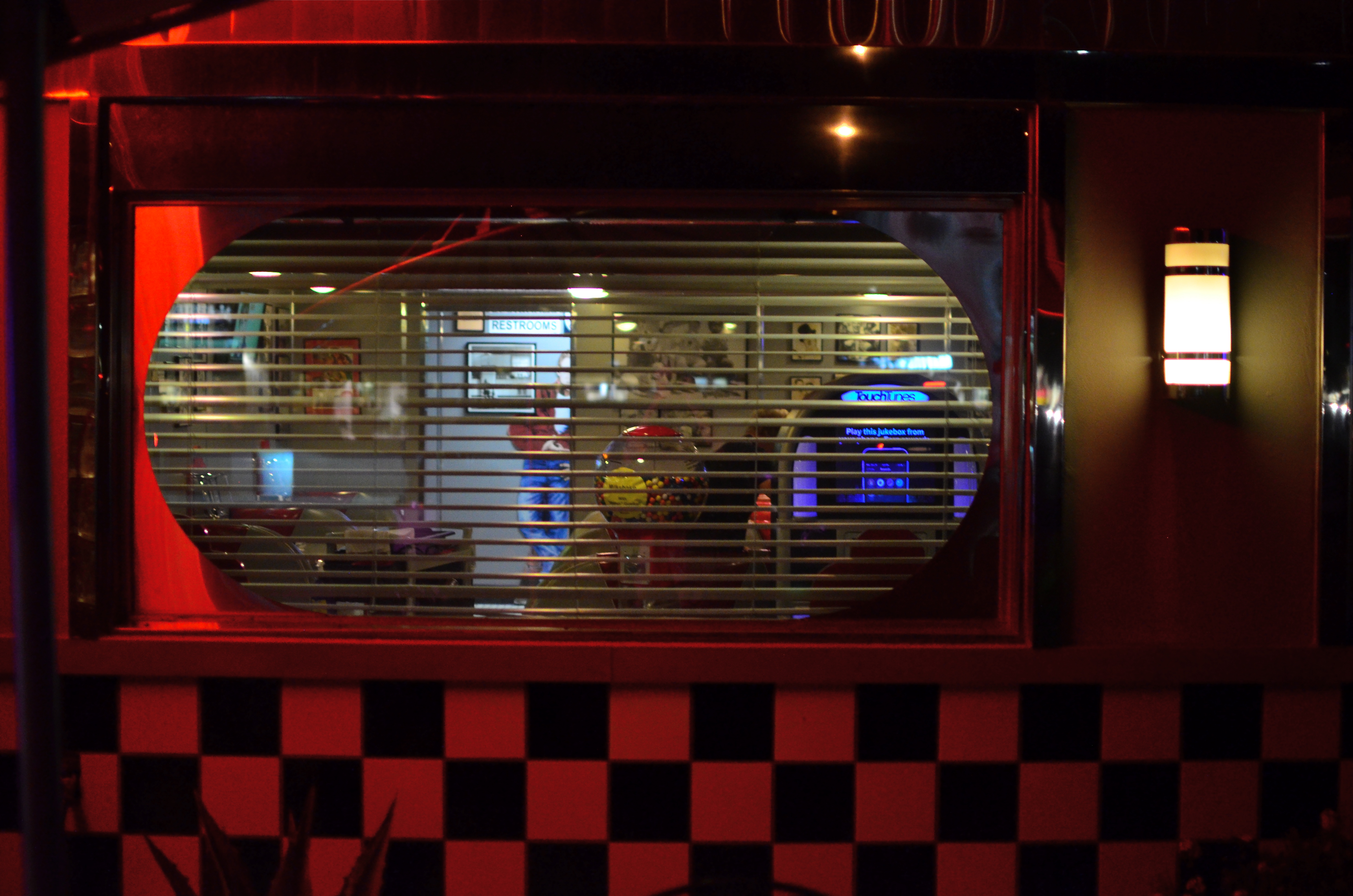
Diner-Vision, 2015.
By MICHAEL PERKINS
WHICHEVER SHIFT YOU WORK, YOU ARE FOREVER A STRANGER TO THOSE who work the other side of the workday. And while the majority of us generally fit into the standard 9 to 5 job template, millions of us have our body clocks regularly flipped upside down, our days cloaked in darkness, our brains awake while the city at large sleeps. That means that at any moment, half of us have little comprehension of how the other half lives. There’s a story in that.
And stories need pictures.
Pictorially speaking there has always been a bit of a black market mindset about the night-time, a nether world for some, a regular hangout for others. And with good reason: photography, in its infancy, had to ply its trade largely in sunlight, avoiding scenes which required either too much time, too much prep, or too much patience with slow recording media. But now we live in a very different world, armed with digital computers that look suspiciously(!) like cameras, but which react to light with an efficiency unseen in the entire history of photography.
Capturing the night is no longer a rare technical achievement, and we are really only at the front end of a steadily rising curve of technical enhancement in the area of light sensitivity, with no end in sight. Finally, darkness is something that uniquely colors and reveals reality instead of cloaking it in mystery. There is no longer an end to the shooting day. The image above is by no means an exceptional one, shot with a prime lens open to f/1.8 and a sensor that can deliver manageably low noise even at ISO 1250. More importantly, it is a handheld snap, shot at 1/30 sec…..all but unthinkable just a dozen years ago.
The new golden age of night photography is already apprehended by the youngest generation of shooters, since many of them can’t recall a time when it was a barrier to their expression. And, for those of us longer of tooth and grayer of beard, there is the sensation of being free to wander into areas which used to be sealed off to us. Sun up, sun down, it’s always time to take a picture.
Suddenly your eye is like a great downtown deli.
We’re open all night folks. We never close.
RAZOR’S EDGE
Sharpness should be achieved in your intial shot by use of contrast and color, not “dialed up” in post-editing. 1/160 sec., f/8, ISO 100, 22mm.
By MICHAEL PERKINS
THE AVAILABILITY OF PHOTO PROCESSING TOOLS, TO ARTIST AND BEGINNER ALIKE, in the digital era, has created a kind of unfortunate slingshot effect, as all suddenly achieved freedoms tend to. Once it became possible for Everyman to tweak images in a way that was once exclusively the province of the professional, there followed a trend toward twisting every dial in the tool box to, let’s be honest, rescue a lot of marginal shots. Raise your hand if you’ve ever tried to glam up a dud. Now raise your hand if you inadvertently made a bad picture worse by slathering on the tech goo.
Welcome to the phenomenon known as over-correction.
It’s human nature, really. Look at Hollywood. Suddenly freed from the confines of the old motion picture production code in the 1960’s, directors, understandably, took a few years to make up for decades of artistic construction by pumping out a nude scene and/or a gore fest in everything from romantic comedies to Pink Panther cartoons. Several seasons of adolescent X-rated frolics later, movies settled down to a new normal. The over-correction gave way to a more mature, even restrained style of film making.
Am I joining the ranks of anti-Photoshop trolls? Not exactly, but I am noting that, as we grow as photographers, we will put more energy into planning the best picture (all energy centered before the snap of the shutter), and less energy into “fixing it in post”. If you shoot long enough and work hard enough, that shift will just happen. More correctly designed in-camera images equals fewer pix that need to be dredged from Dudland.
Look at the simple idea of sharpening. That slithery slider is available to everyone, and we all race after it like a kid chasing the Good Humor truck. And yet, it is a wider range of color and contrast, which we can totally control in the picture-taking process, which will result in more natural sharpness than the Slider Of Joy can even dream of. As a matter of fact, test my argument with your own shots. Increase your control of contrast or color and see if it doesn’t help wean you off the sharpen tool. Or expose your shots more carefully in-camera rather than removing shadows and rolling off highlights later. Or any other experiment. Your goals, your homework.
The point being that more mindful picture-making will eliminate the need for many crutch-like editing tweaks after the fact. And if that also makes you a better shooter overall, isn’t that pretty much the quest?
