UNTRUE-TO-LIFE
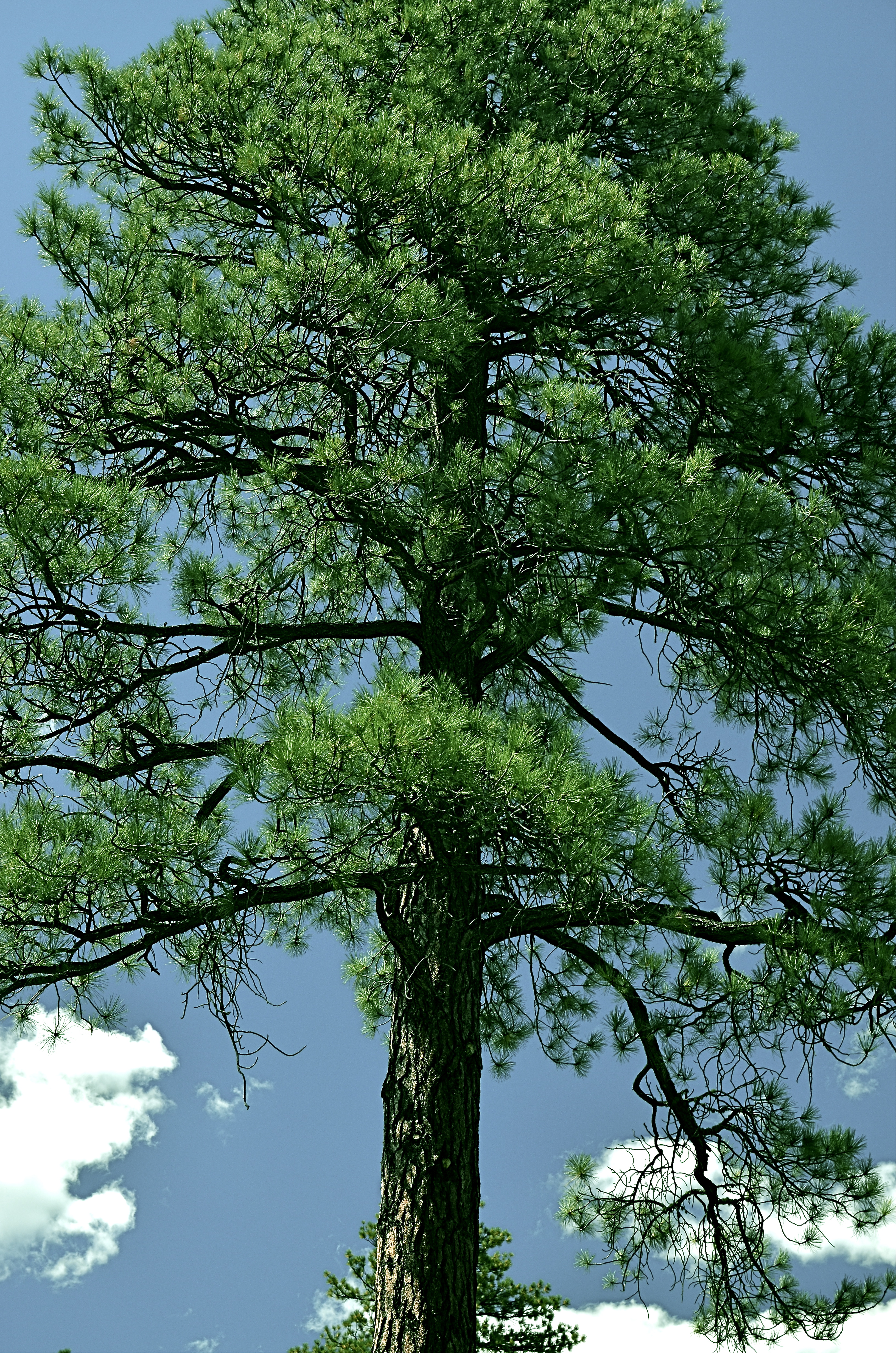
Go Green: A Flagstaff pine with all the brown values tuned out.
By MICHAEL PERKINS
I VOLUNTEER AT A MUSEUM WHICH SERVES, IN LARGE PART, SCHOOL TOURS. And, in trying to explain the color choices made by varying cultures on the depiction of everything, from flowers to animals, I frequently ask my groups if anyone has ever colored something with a “different” crayon. Not “the wrong color”, just a different crayon, a choice resulting in a purple squirrel or a brown rose. I usually get at least a few “yeses” on the question, and, when I probe further as to what went into their decision, I almost always get one child who says, simply, “I just like it that way.”
At this point, I realize that at least one person in every mob will always be thinking of color as a choice, rather than as a right/wrong answer. In my early school days, teacher often handed out the same mimeographed picture to all thirty of us, expecting all thirty to produce precisely the same results: green grass, blue skies, yellow honeybees. Strangely, we kind of expected the same of ourselves. It was comforting to hand in a “correct” piece of art, something guaranteed to please, a safe shortcut to a gold star.
In photography, we start as witnesses to color, but should never remain slaves to it. The present generation of shooters, born and bred in iPhone Land, know that changing your mind and your thinking on color is just an app away, and why not? The same force that has finally democratized photography worldwide is also legitimizing any and every kind of artistic choice. With billions of uploads each day, uniformity of style is worse than a lifelong gig as a worker ant, and as uninteresting.
Color is as big a determinant in interpretation as any other choice that a photographer makes, and can result in subtle shaping of the mood of your work. The above tree was originally captured in natural color, but I thought the overall design of the tree was served by one tone fewer, so I reworked everything into three values….blue, green, and black. I believe that the central trunk hits with more impact as light and dark shades of emerald, and the conversion of the pine needles to a more severe shade gives me some of the directness of monochrome. Of course, you might reach a completely different conclusion, but we’re beyond right or wrong here, aren’t we?
The mimeograph is dead, and with it, solid notions of color assignment. Fewer rules means fewer obvious signposts, but that’s why there’s more than one crayon in the box, innit?

Leave a comment