SMUDGES OF MEMORY
By MICHAEL PERKINS
AS A METHOD OF INFORMATION STORAGE, the human mind leaves a lot to be desired. We take comfort in the belief that our inner vaults contain flawless, “official” versions of our accumulated experiences, but, in time, we realize that our memories are, at best, unreliable narrators, and, at worst, bald-faced liars. Our master files, our records of “what really happened” are as riddled with drop-outs, jump cuts, and gravy stains as any other account that has been told and retold over time. Small wonder that the devices we use to aid our recollections, such as photographs, can, themselves either reveal or conceal varying editions of “the truth”.
When you pair imperfect beings with even more imperfect machines tasked with documenting the big deals in their lives, you get inaccuracy piled on inaccuracy. When we are feeling generous, we label the inaccuracies “interpretations”. When we more clinical, we call them “flawed”. Thing is, there are many parts of our lives that no longer exist in the physical universe, or are at least placed beyond our reach. Many of these parts have left no trace in the world except the images made of them. Our actual vacations, long gone, are supplanted in memory by our pictures of those vacations, eventually becoming that experience in a much more real sense than whatever fragmented mental archives exist of the true event. The pictures remain static, and thus seem permanent, fixed, but over time they will be judged against the changing context of our faulty inner files.
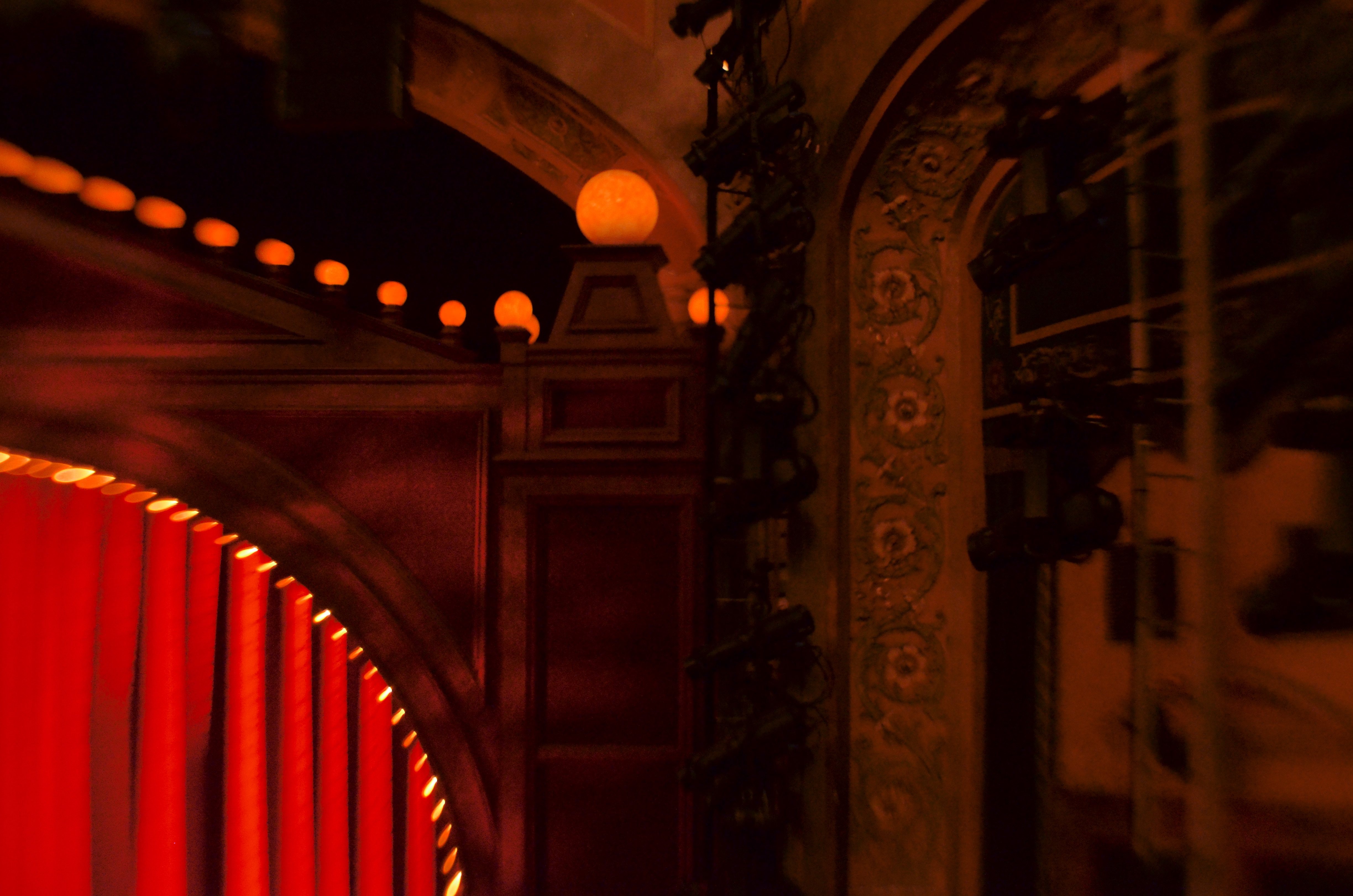
In the present era, when many of the things that we have captured in cameras are, for the moment, physically unavailable to us, the symbolic power of pictures of events past is amplified greatly. The image seen here, deliberately shot to be a bit dreamy, is open to multiple interpretations beyond the restricted scope of the original location. I know, mentally, that it was taken inside a Broadway theatre, but I can no longer swear to the name of the actual venue or what I saw there. In the absence of the fullness of my own memory, this picture has now become all theatres, in all cities, at all points in time. And while it looks like that’s what I was going for at the time, the point is that even the events that I believe I clearly remember are victims of my own brain decay over time, with the pictures I made of them expanded in their value, since they are now open to wider and wider impact as symbols. The pictures are less about what happened and more about the magic of what I prefer to have happened. The hard, clean line of reality is supplanted by the smudge of memory.
That is the amazing elasticity of a photograph. It is both truth and lie, symbol and substance. Photography is an art because it is so magically malleable, because an image can bear the personal stamp of its creator, no less than a statue or a painting. Designed to immortalize parts of our world, they do precisely that, often having a life of their own beyond the physical limits of the things they were used to depict. If that’s not art, what is?
RADICAL RE-ASSIGNMENT
By MICHAEL PERKINS
YEARS AGO, A BROAD STUDY ON HOW OUR BRAINS INTERPRET COLOR included an experiment in which the familiar hue “cues” stored in our brains were upended, much to the dismay of selected test audiences. In one such experiment, an assortment of familiar foods had their native colors radically reassigned, resulting in green beef, pink peas, turquoise potatoes, and so forth. In many cases, the test group found that the meal, which they had been informed had been prepared from highest-quality ingredients, was simple inedible. Merely changing the color of something “known” had rendered it alien.
 Almost immediately after mastering the accurate rendering of color, which took decades, photographers began deliberately toying with “wrong” representations of color in various film, and later, digital processes, the object being to challenge how we digest what we see, and to re-imagine the familiar as the strange. One such method which has survived to the present day is infrared photography, in which, through either filters or re-engineered sensors or both, we reconfigure cameras to “see” the light wavelengths that are typically invisible to the naked eye. The results, which can reverse the object-shadow relationship and freakishly re-color skies and landscapes, are the stuff of dreams.
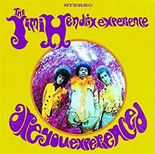
One of the best-known infrared images (which is also shot with a fisheye lens, for double freakiness) is the cover of the classic Are You Experienced? album by Jim Hendrix (see insert at left). The average DSLR can be rigged to shoot infrared, and the web is a-slosh with tutorials on how to shortcut and/or cheat if you don’t want to do costly camera conversions or arcane calculations.
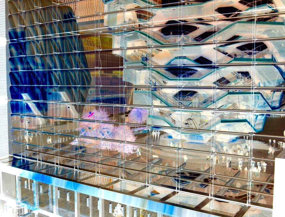
Hudson Yards And Vessel, 2019. A fake infrared created with the free phone app Negative Me.
My own cheapo-cheapo alternative to true infrared has been in the use of phone apps like Negative Me, which renders a fake negative of any image shoved through it. This achieves the first part of infrared, in that it reverses the relationship between an object and its shadows or textures. Sending that image back to your phone allows for all the color tweaking and contrast enhancement you’d use for any image, depending on how deranged/extreme you want the result to be, aping another aspect of true infrared. There are people who love the look of monochrome infrared, and, for those folks, I’d recommend skipping the phone adjustment of the negative image completely just sending it back to your main suite of processing software to either re-color or convert to mono, since that seems to preserve sharpness and allow for finer-tuning. As with many app-PC-laptop conversions, the fewer copies of copies of copies you can avoid, the better. For the record, the image seen here was master-shot on a DSLR, sent to my phone, sent to Negative Me, sent back to my phone image file, tweaked, sent to Facebook, then sent back to Photos for Mac. A long way around the horn, admittedly, and yet it’s still passable, in that it doesn’t look any more unreal than you’d expect.
As with the green steaks, you may decide that you don’t have a lot of, um, appetite for the infrared look at all. Even better: doing a quickie mock-up of what a real infrared might look like could save you time, trouble and dough on a pricey experiment. Or, like me, you might decide that you use this kind of effect just enough to justify doing a “not bad” version of it for cheap. In any event, just have fun.
And remember, no dessert until you finish your pink peas.
THE MERENESS OF REALITY
By MICHAEL PERKINS (author of the new image collection “FIAT LUX”, available through NormalEye Press)
LIKE PHOTOGRAPHS THEMSELVES, THE REMARKS INTENDED AS COMPLIMENTS for photographs are often crippled by cliche, as we struggle to appreciate not only what an image looks like but what we believe it ought to look like. “It’s so realistic” and “looks just like a postcard” are two of my favorites, along with “nice color” or “you must have a really good camera”, but one of our well-worn go-to’s is, to me, head and shoulders above the rest: “the picture looks better than the real place/person/thing”. In that one sentence is the entire tug-of-war our minds wage between the province of the photographer and that of the painter.
In a painting, we know that fallible/biased human hands are not rendering “reality”, but a subjective amplification of it. Who knows if the trees were really that green, or the mountain that drenched in sun, and who cares? We stipulate that we are looking at an interpretation. There is no accusation of manipulation or fakery, since the painter’s perspective is baked into the process of painting. He doesn’t have to add, “at least that’s how I see it” because we all accept those terms of engagement.
The camera, however, is quite another thing.
Upon The Field Of Honor, 2020. f/1.8, 1/20 sec., ISO 200, 50mm.
Despite over nearly two hundred-plus years that demonstrate how very subjective photography is, we have a hard-wired reflex to see the camera as the agent of creativity, the soulless, unerring recording instrument which is the arbiter of all that is “real”. When the personal input of the photographer, like that of the painter, is introduced, we adopt different words to judge the results, many of them unflattering. We label the picture a “trick”, a “fake”, “manipulated” and, the latest insult in the critical lexicon, “post-processed”, as if any attempt at personalizing or idealizing a view of the world is untrustworthy, non-genuine. To say a picture looks “better than the real thing” is to somehow suggest that it is something less than the real thing, not more. Certainly, some painters have been tarred with the same brush, but not to the extent that photographers typically are. In fact, photographs are, as Picasso said of art in general, “a lie that makes us realize truth”. We create images that escape the mereness of reality on the road to something more essential about the condition of being human.
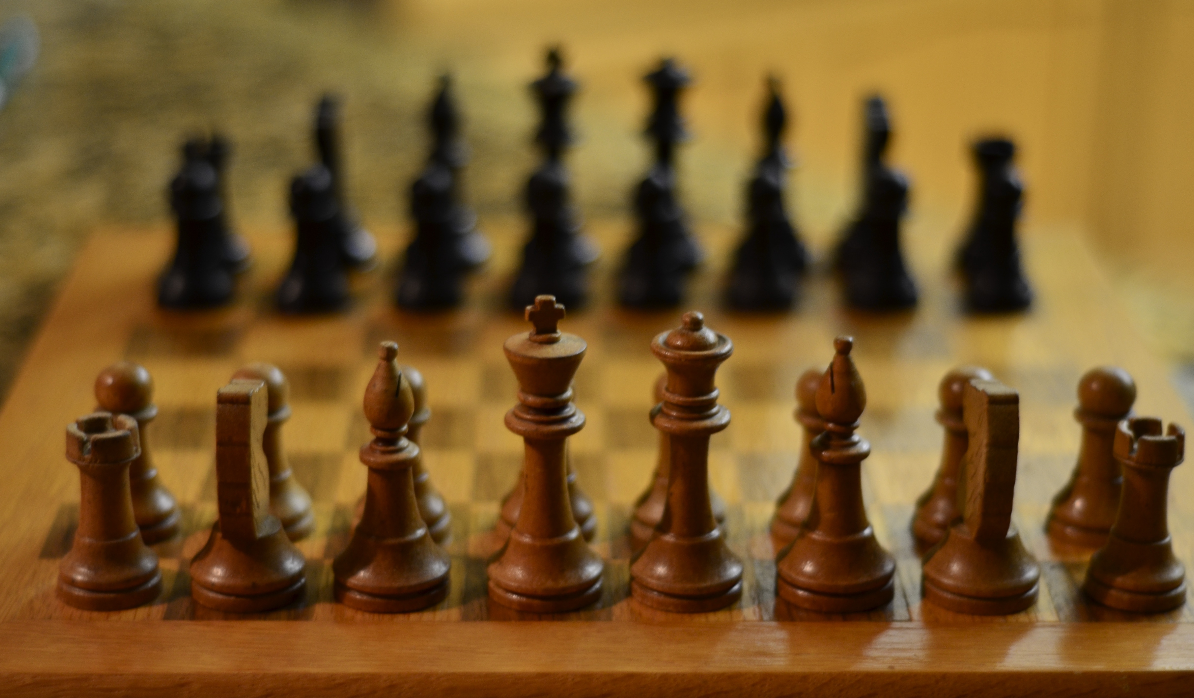
My grandfather’s old chess set, pictured here, is, in reality, pretty wrecked, bearing the scars of hundreds of skirmishes with many vanquished foes. Now, I could make a photograph that depicts all that detail, and it might be engaging, even touching as a comment on the fragility of objects. But in this frame, I’m approaching the white and black armies as real combatants, using selective focus to re-visualize them as mythic stand-ins for the legions who face off in actual battles over the broad span of history. The same focus scheme is designed to render everything else around them as fuzzy, immaterial. The fight, not little pieces of wood, is the so-called”reality”, and everything around it melts into obscurity. This is a picture planned like a painting is, a deliberate as-I-see-it denial of actuality in search of a different reality….my own. Like painters, photographers are looking for a verity that is occasionally “better” or “worse” than the real thing. Because if all you want of a camera is for it slavishly to perform a recording function, like a seismograph or a thermometer, then all photographers are obsolete and need to take up a different hobby.
Like painting.
MAN-MADE MELIES
By MICHAEL PERKINS
THERE MAY BE LIMIT to what the human mind will devise In the way of diversion during times of forced solitude, such as our current Great Hibernation, but thankfully I haven’t yet bumped my nose up against that particular ceiling. And while photogs are taught to make pictures out of damn near anything, you begin, under quarantine, to rethink even that minimalistic criterion. The term “make-work” springs to mind. That, along with “desperate.”
But as long as I’m making pictures of something/anything, I can feel less guilty about not being able to, for example, master sourdough bread baking. Subject-wise, I’ve been trying, lately, to crank out something that is vaguely environmental in aspect, since our failure to serve or even consider nature seems to be at the root of so many of our current woes. Sooo….time for that “make-work” ethic to kick in.
The project began as a simple capture of a recent Supermoon, which is fairly easy with my “bird camera”, a Nikon Coolpix 900, a hybrid superzoom bought to help stalk all things winged but also handy for handhelds of heavenly bodies.
My lunar capture took mere seconds, but it was long enough to conjure a memory of the classic 1903 George Melies film A Trip To The Moon, one of the very first special effects movies. The prehistoric flicker contains the iconic image of the dismayed face of the “man in the moon”, seconds after an Earth spaceship lands squarely in his eye, and, moonsnap in hand, I commenced working on my own version.
.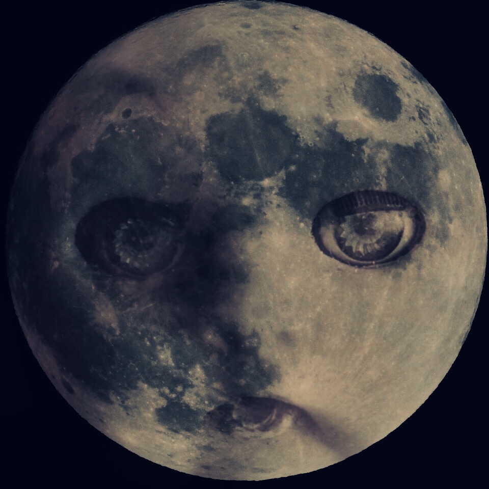
I wondered what a concerned, even sad version of that face would look like, as if the moon were desperately entreating us all to get our act together. I finally decided to re-use a closeup of one of my wife’s antique dolls, which had the right balance of sentiment and creepiness, and blended the two pieces on a phone app appropriately named Fused.
And so, an act of improvised lunacy, along with another slow night, goes into the record books. Turns out that even quarantine can yield to the images inside your skull. You no doubt have similar visions swimming around inside your brain pan at this point, and now is the perfect moment to summon them forth.
FROZEN FLOWS
Pep Ventosa’s images are actually stacks of many frames of the same subject, taken from different angles and layered into a composite.
By MICHAEL PERKINS
MOST OF STILL PHOTOGRAPHY IS BASED ON EDITING CHOICES, on the selection of one key instant which stands in for an entire experience. The frozen moment when a runner breaks the tape. The isolated frame of one flap’s worth of an eagle’s descent. Single pieces of seconds that symbolize the complete flow of time. Still images are not really expected to show everything that happens in a scene, from Beginning to End, the way motion picture images are. And yet, there are always groundbreaking visionaries who can create astounding exceptions to that rule. Pep Ventosa is such an artist.
In your first view of Ventosa’s images of carousels, streetcars, or monuments, you could be forgiven for thinking you were looking at an impressionistic painting, a kind of lively Picasso-style mashup of viewpoints melded together in a single frame. But his work is completely photographic; it just comes packed with way more information than you encounter in a normal image. Because they aren’t images at all, but layers of images, sometimes hundreds of them, all taken at up to 360 degrees of difference from each other and blended artfully into composites. The actual concept is simple. Pep chooses a common part of an object or scene that he establishes as a center (like the carousel platform at left), and then rotates himself and his camera around that point to shoot multiple “takes” on a single scene, all shot at slightly different angles. Imagine yourself walking all the way around a tree and shooting frames during every part of the circuit. He then calls upon his lifelong experience in both film and digital darkrooms to give all those layers different levels of prominence, sculpting the color and the detail that will be both active and passive in the final composite. What he winds up with could be called a frozen movie, since his resulting photos are a recording of long sequences of activity, different in result from, say, a time exposure, but with the same intent.

Coke Crystal, 2020. My own tabletop adaptation of Pep’s technique.
Just as the cubists tried to create static paintings that included all the different ways of viewing an object married into a single canvas, Pep Ventosa is freeing the photographic process from having to choose one “decisive moment” of a subject to use a static format (the print) to suggest movement in time. And while he really has no equal in the way that he manages this process, he has begun to inspire others to do their own mini-Peps with still life or tabletop images, with far fewer building blocks of, say, a dozen or so exposures assembled in programs like Photoshop that are universally available.
In the image of a Coca-Cola drinking glass seen at left, I shot about 18 frames, merely rotating the glass a bit between shots and keeping the camera on a tripod triggered by a remote. I was careful not to let the central core of the glass move too far left or right, using it as the anchor for the project, allowing the embossed script on the outside of the glass, as well as the shadows created by its vertical ribs, to flow into shapes that simply could never be rendered in a single image. I’m just starting to get a feel for what kind of subject matter will work best with the process, starting small, rather than heading for the local skyscraper, where the rotating process would be reversed, with the building staying constant while I circled around it.
In either small or large cases, what Ventosa has done (and something which is damned hard to achieve in photography’s third century) is to say, in a completely original fashion “oh, you thought you knew what a picture was…..but how about this?” In the making of photos, as in any other visual art, there can be no more important question.
DE-PURPOSED, RE-PURPOSED
Next We Visited The Transportation Exhibit, 2020
By MICHAEL PERKINS
HOW TO FEEL OLD, EXAMPLE #473: Sending a photograph of a “shirt pocket” A.M. transistor radio from the early ’60 to a friend, only to have said friend’s grandson ask him what the object is.
We often talk in these pages about context and how that can shape an image. If people have context for the subjects you depict, or understand how they relate to other things in their experience, they interpret the picture in a certain way. I know that thing, I use it everyday. Remove that context, however, making the subject a kind of associative free-spot, not tied to any particular memory or use, and the object loses its meaning. It’s unanchored, and can mean anything the photographer intends. My friend shouldn’t be surprised that my old radio is meaningless in his grandson’s experience. But if I am a photographer who’s chosen to re-purpose that radio in a context of my own making, my options are wide open.
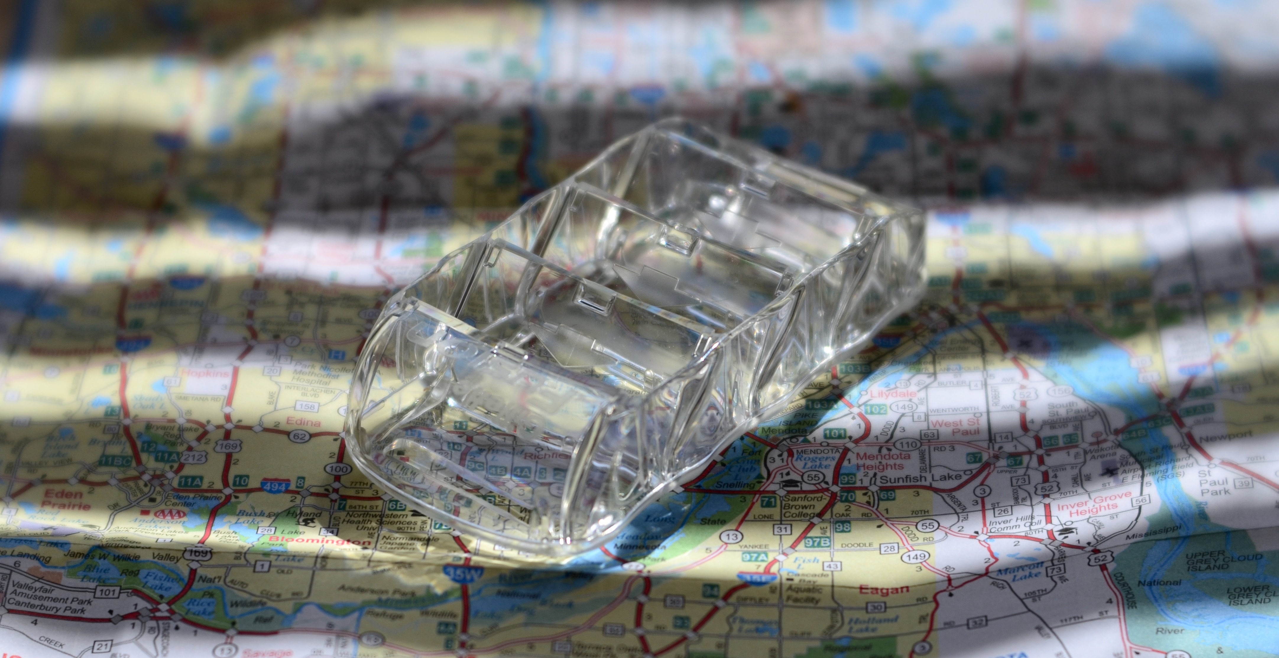
The “futuremobile” in its original context.
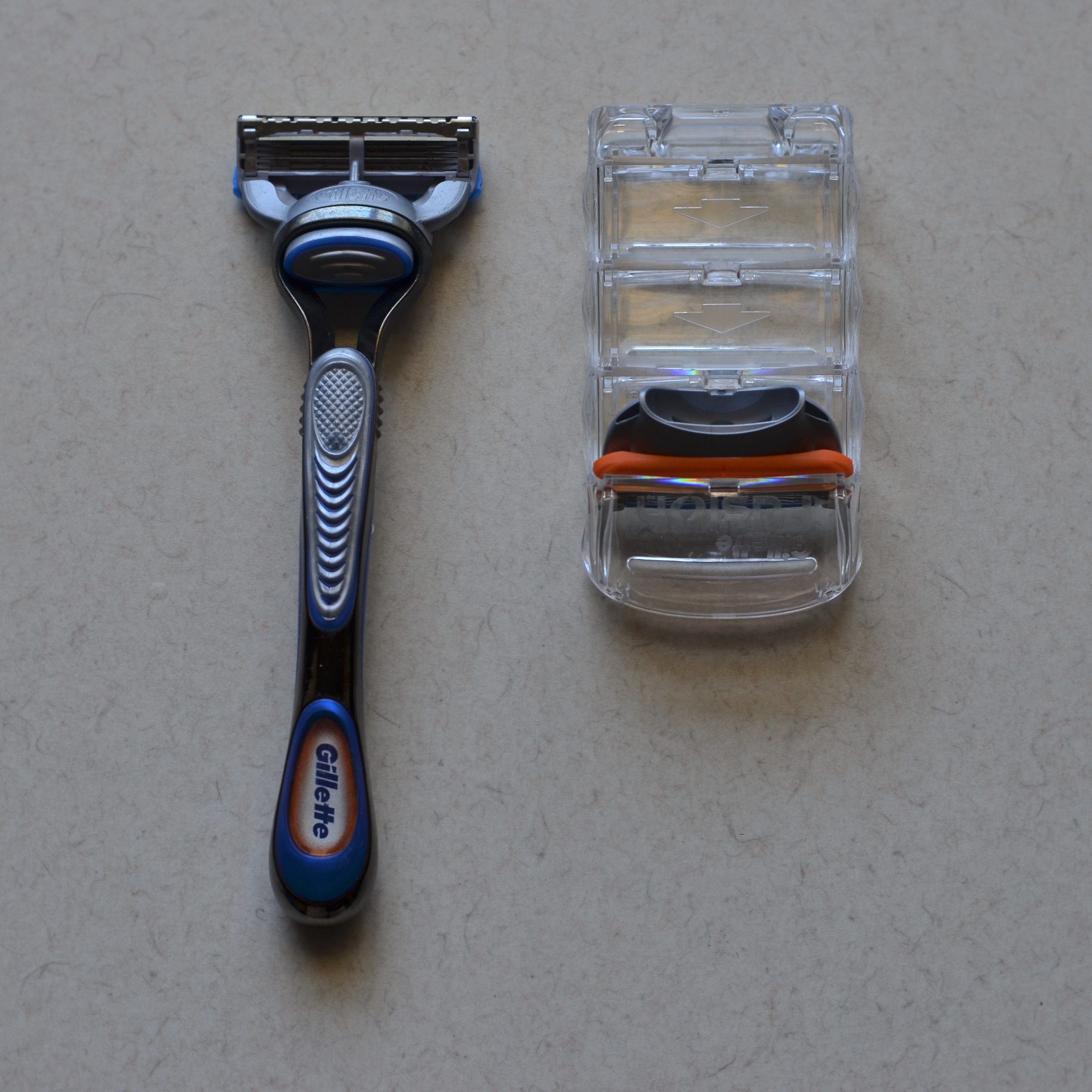
Most things in our world are designed to do one thing. For example, a piano is never asked to do the work of a crescent wrench. But, the argument could be made, if you somehow don’t know what a piano is for, I can photographically tell you it is… a crescent wrench. The clear object in the above photo is designed for one task only…to hold and help dispense razor blade cartridges (see left). Its context is so narrow that, as soon as I remove it from my bathroom sink, it is already without a visual frame of reference. I can thus abstract it in nearly any way I want…for example, suggesting that it’s a futuristic concept car in a world’s fair. Yes, it’s a fairly silly exercise, but I show it here not to demonstrate how marvelously inventive I am but how inventive it’s possible to be, once an interesting thing is de-purposed and then re-purposed by the photographer’s eye.
What is macro photography, if not an attempt to make us see things in a completely different way, to make a creepy bug look like a marvel of engineering or a garden flower a self-contained universe? We don’t really consider to what extent we are constantly re-purposing things with our cameras. Even adjustment in white balance or lighting are attempts to impose our own perception onto reality…..again, to take it out of one context (the sky is always blue in the afternoon) and re-frame it in another (not today: today the sky is magenta). For me, the ultimate complement is not, “oh, what a pretty picture” but “I never looked at it that way.” Because photography begins as a mere documentary craft, but ripens, in the right hands, into an interpretive art.
CURIOUSER AND CURIOUSER
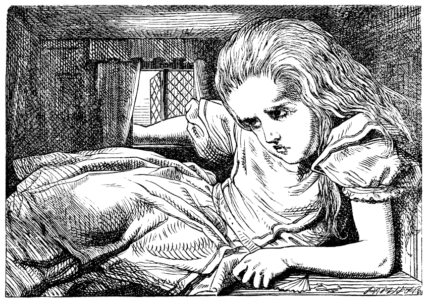
“we gotta get outta this place…”
By MICHAEL PERKINS
IN READING ALICE IN WONDERLAND as a child, I tried to imagine myself in the heroine’s place as she was buffeted about between strange creatures and bizarre environments. I wasn’t sure how I would react to a talking White Rabbit or an infant who turned into a pig at a moment’s notice, but I felt that, if I had to improvise while being alternatively enlarged and shrunk, as poor Alice was, that I would be ingenious enough to master my situation. All those “eat mes” and “drink mes” would have been tough to manage, for sure, but my natural explorer’s spirit would, I was confident, prevail in the end.
The current international cabin fever has made me think a lot of Alice lately, both Tiny Alice, being swept away in a torrent of her own tears, and Overgrown Alice, straining at the cramped limits of a house she has outgrown. You can see where I’m going with this. As photographers, we often are outwardly biased. The next great picture is somewhere “out there”. We are just one mile and a quick left turn from something stunning, and, in most cases, it’s beyond our own back yard (apologies here to Dorothy Gale as well). Add a forced quarantine into the formula, however, and we feel, at some point, like Overgrown Alice, thrusting a hand out the window of a micro-house. We fear there’s “nothing to shoot”. Our typically cheery disposish becomes dark and churlish. We start to watch daytime TV and bake.
Doing more with less un-shrinks the house.
Overgrown Alice’s constantly morphing dimensions made her constantly re-evaluate her world by the latest shifting data, with the very special challenge of being crushed by its shrinking confines. Photographers who are locked inside are likewise forced to re-think their relationships to objects in their environment…to re-contextualize everything. A flower under the macro lens becomes an entire botanical garden. Objects too familiar to be noticed under normal conditions become fascinating examples of design and pattern when seen from a different angle or distance. Anything and everything can become completely new because we have been forced, through either genius or boredom, to change our perceptions. A web search of the phrase cabin fever photography has become a major trender in recent months, and with good reason. We can’t go out to shoot as we’d prefer: we have to turn the camera further in. In so doing, we find ways to get more and more out of less and less. We discover, as we must regularly do as photograpers, that our relationship with the world must be as flexible as Alice in all her sizes, to guarantee perpetual refreshment of how we see. We gotta get curiouser and curiouser.
THE DEAR (RECENTLY) DEPARTED
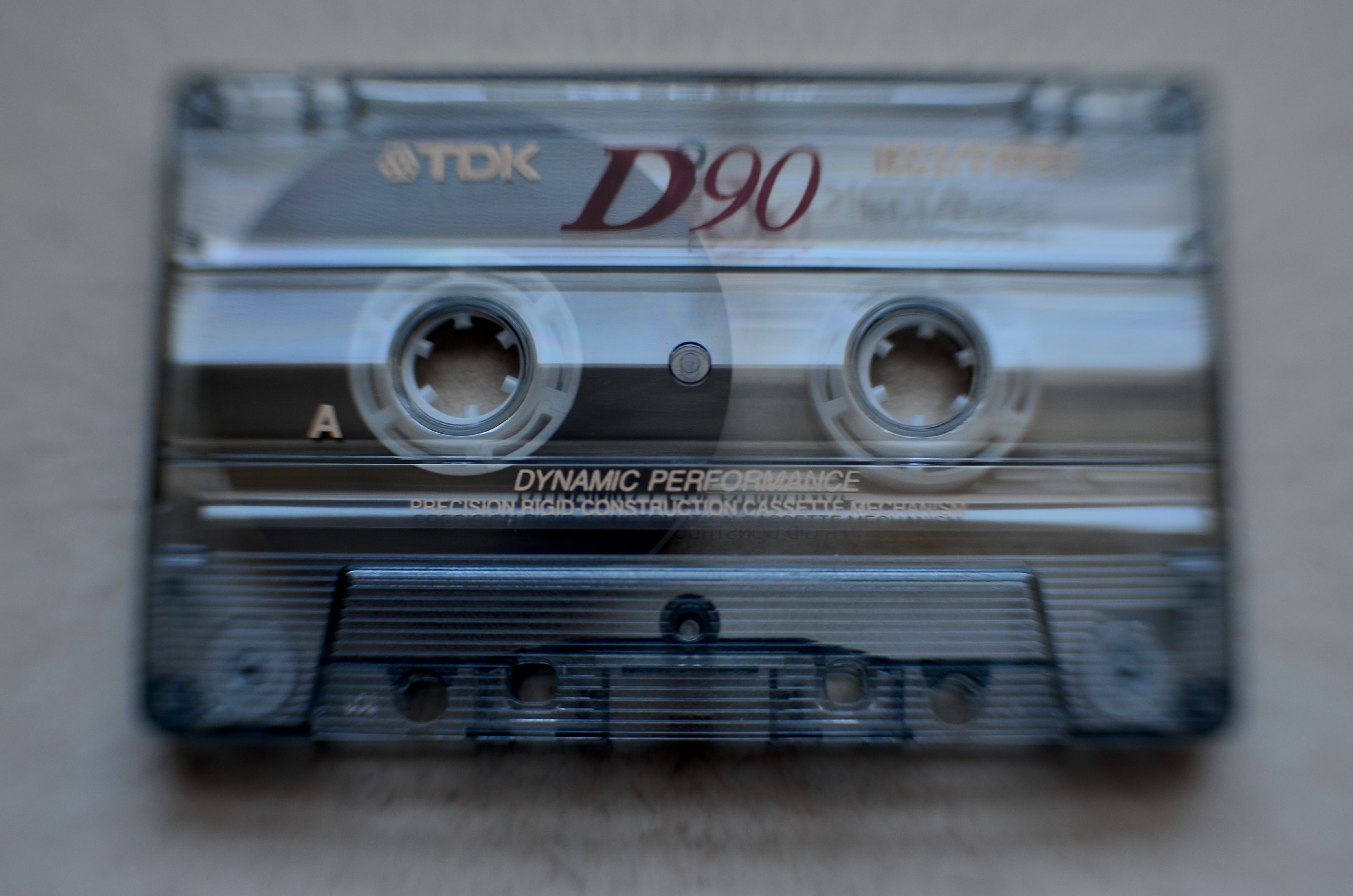
Anna Logg’s Greatest Hits, 2020
By MICHAEL PERKINS
REFLECTION TAKES A KIND OF MENTAL TALENT. Others would say that it takes humility. Or wisdom.
But mostly, it takes time.
Looking back is not a speedy process. First, it helps for us to personally advance to the point where certain things are in the past, since the distancing of ourselves from the immediacy of events invites and facilitates our thoughtful analysis of them. Perspective requires distance, a way to separate ourselves from the blindness of our immediate environment. The questions then become obvious: what did all that stuff mean? Which parts of it can I learn from? Does it all deserve to go away?
The process of reflection in photography also waits, if you will, for enough time to pass, allowing the artist to re-evaluate things, to take a second crack at trying to understand them. Once an experience floats far enough away from us, we are free to either appreciate it anew or merely release it as less than essential. The dear departed, once we get far enough away from them, become open to interpretation by many means, the camera among them. Everyday objects can tend to be invisible, because we mainly see only their use. With time, we can often re-visit them, seeing new elements in their design, the context of why they were important in the first place, or other considerations.
Think Andy Warhol’s Campbell’s soup can.
By forcing a conversation about a seemingly banal object, forcing it into “serious” art galleries as an important thing, Warhol made us look at why we consume things, as well as what we would, going forward, consider “art”. Lately, in the age of the Great Hibernation, many photographers are picking through the accumulated stuff of their immediate environment, looking for something from which to craft images. In so doing, we’ll inevitably stumble across things we have forgotten, or simply don’t consider anymore on an everyday basis. Some of these objects have only recently drifted out of the flood of impressions that make up our daily world, like the cassette seen here. How could anything have been more ubiquitous at the height of its popularity? What could be anymore superfluous than it is now? And yet…
Using the camera and our increasing distance from familiar things can free those things from their popular associations. They can become our soup can, sparking some interesting questions. Why did we use this thing? Why did it not last? And now that it is, truly, just a thing, what can we learn about ourselves by looking at it from a new direction? This is not as ridiculous a rainy-day project as it seems. We still visit places whose famous sites are so over-photographed that we have to labor to say anything new about them, to, in effect, make the Eiffel tower our Eiffel tower. The whole idea of re-visualizing dear, recently departed is really part of the same exercise, done one cassette at a time.
JUST GIMME SOME KIND OF SIGN
A sign of determination?
By MICHAEL PERKINS
WE’VE ALL SEEN THEM: signs, designed for a set purpose, repurposed by accident or intention into very different messages. They are everywhere: the “deer crossing” warning that is riddled with shotgun holes: the speed limit posting that gets spray-painted a few mph higher than what the law allows: the red diamond where the word “racism” is added to the word “stop”. For photographers, observing the environment is more than adding our own interpretation: it’s also noticing the way messages are modified by others, and chronicling the effect of it all.
Humans are highly adaptive, and if a sign isn’t working for them, they’ll set about to make it right, or at least put it in sync with their view of the world. But not all these revisions are vandalistic in nature. Certainly signs are morphed as pure commentary, but they are also messages of urgency, protests against official injustice, cries for help. In all cases, to show them in photographs is to acknowledge the passions behind the revisions.
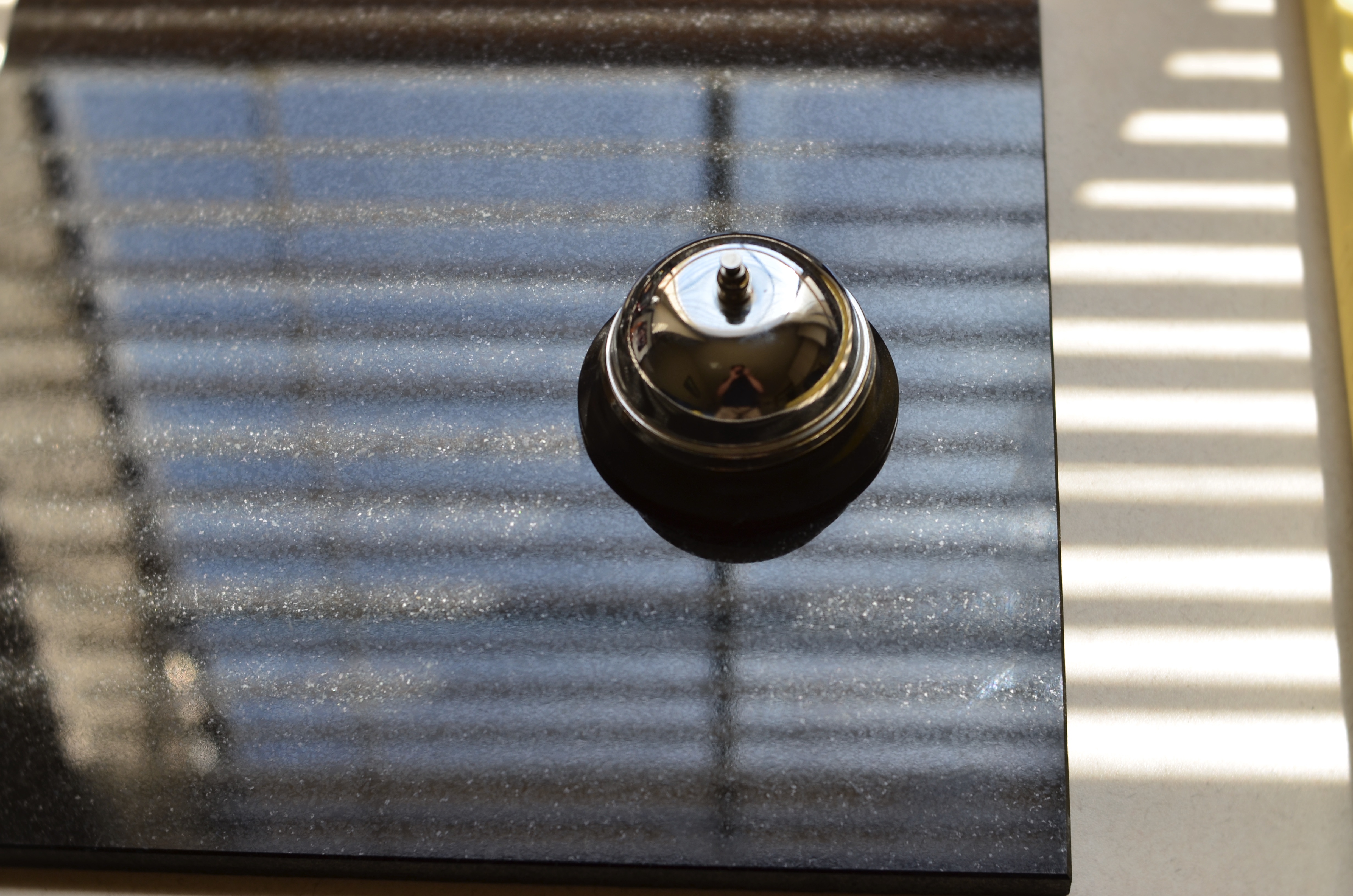
And then there are the signs that nature itself takes a hand in reshaping. Wear and tear can render warnings and advisories ironic, even useless. Is a stencil symbolizing a handicapped parking space subject to reinterpretation, once it’s been weathered into abstraction, as seen here? If a safety zone sign is smashed by one careless car too many, are we seeing a good argument for further civic action? Street photography is partly about people and partly about how people fit (or don’t fit) into the infrastructures of their lives. Sometimes, of course, we can try a little too hard to make sense of it all. I recall, decades ago, during the making of one of my many ill-advised student films, falling in love with a particular EXIT sign and deciding that I should shoot enough movie film to edit a shot of it into multiple mileposts of my magnum opus. Sadly, the movie in question didn’t have much to conceptually hold it together beyond the occasional popping-up of the word EXIT between sequences. Truly, if I were hooked up to a polygraph I could prove that I remember nothing else about the project. However, I can still see that sign in my dreams/nightmares. Sometimes the magic works and sometimes it doesn’t.
All of which is to merely say that no sign registered by our cameras is ever just about what it “says”. It’s always evaluated within the context of what we want to say….or want to avoid saying. That is, we can never just take signs at their word. In the right hands, they have so much to say beyond that.
REDUCTION DIET
Recharging The Centrifuge, 2020
By MICHAEL PERKINS
PHOTOGRAPHY’S FIRST HALF-CENTURY OR SO can be seen as a road race with the world of painting, with both runners trying to outpace each other in “realistically” depicting the world. The camera, being an actual recording machine, was first reviled, later praised as a more reliable chronicler of the actual world. Painters, in reaction, quit the reality playing field, inventing new, more abstract forms of expression like Impressionism, and left the documentary work to photogs. Or so everyone assumed.
After 1900, photographers, too embraced the idea that mere “reality” was overrated and developed their own very individualistic ways of making images, introducing the first manipulations of film, light, lenses, printing techniques and composition. Freed from the stricture of merely capturing a scene, shooters began to propose alternative visions, to interpret the world in very subjective ways. Today, one’s photographs can be as tightly naturalistic or as loosely abstract as one pleases, with some of the most impactful pictures being the ones that seem to be about nothing in particular. These “absolute” compositions, basic arrangements of color and light, may not be storytelling images in the same way that a war photo or a news snap are. They not only don’t provide explanations, they don’t even require them. The terms of engagement for such photographs are stark and simple: they’re pictures because we say they’re pictures, and they either grab you or they don’t.
My own training in photography manifested itself as a need to exercise control, to execute well and follow the rules of technique faithfully. However, my idea of getting a picture “right”, which might easily have stopped at just technical precision, has, thankfully, continued to crawl forward toward the kinds of absolutes I described before. Pictures that just are, such as the one shown here, pose a problem for me, since I have to leave the safety of things I know that “work”, entering a realm where I’m not sure where the paths are. I truly love what happens when I relax my grip on the old reliable truths and let things just happen, but it’s also a bit like walking in space: my tether could break, and I could be cast adrift.
The first time I heard someone, in speaking of one of my photographs, ask, “what’s that supposed to be?” I was stung, nervous. The question is, of course, ridiculous, as if there were only one way to represent the world, with every other way somehow counted as wrong. But the camera is not (and never was), a mere measuring and recording instrument. Over the centuries, it has been whatever we have asked of it, a seismograph of our own undulating curiosity. We learn to see by learning its operations. We learn to listen by shutting out every other sound except our own clear voice.
NIGHT OF DARK SHADOWS
By MICHAEL PERKINS
THE FIRST DAYS OF PHOTOGRAPHY MUST HAVE SEEMED LIKE A REALM OF CONJURED DREAMS, as technology first enabled man to snatch instants from the flowing continuum of time. This grabbing and freezing process, the notion of stopping history and imprisoning it on a plate, involved a great deal of experimentation, as the very rules of exposure were being drafted on the fly. At first, both optics and recording media were slow to drink in light, meaning that calculating the precise duration for which to uncap the lens was, in the period before mechanical shutters, largely a matter of guesswork. Thus was born the world’s first photographic “aritifacts”, the blurred smears of things or people that kept moving during prolonged exposures. The Reverend H.J.Morton, writing for the Philadelphia Photographer in 1865, summed up the surreal experience of finding ghosts lurking in an otherwise frozen scene:
A beautiful picture lies smiling before the lens, when a cow gets up slowly and walks away deliberately, giving us a fine landscape with a continuous cow of many heads, much body, and centipedian legs.
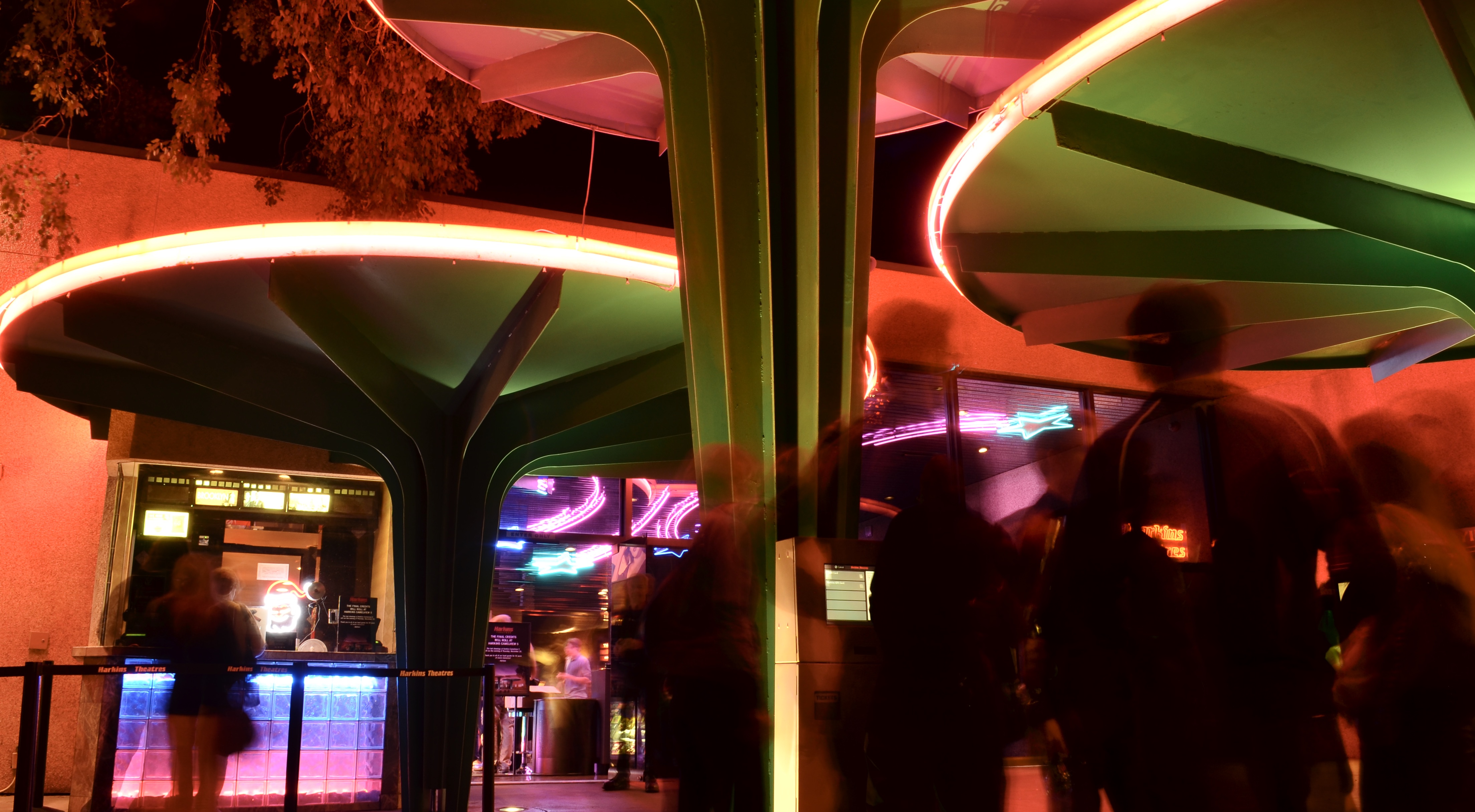
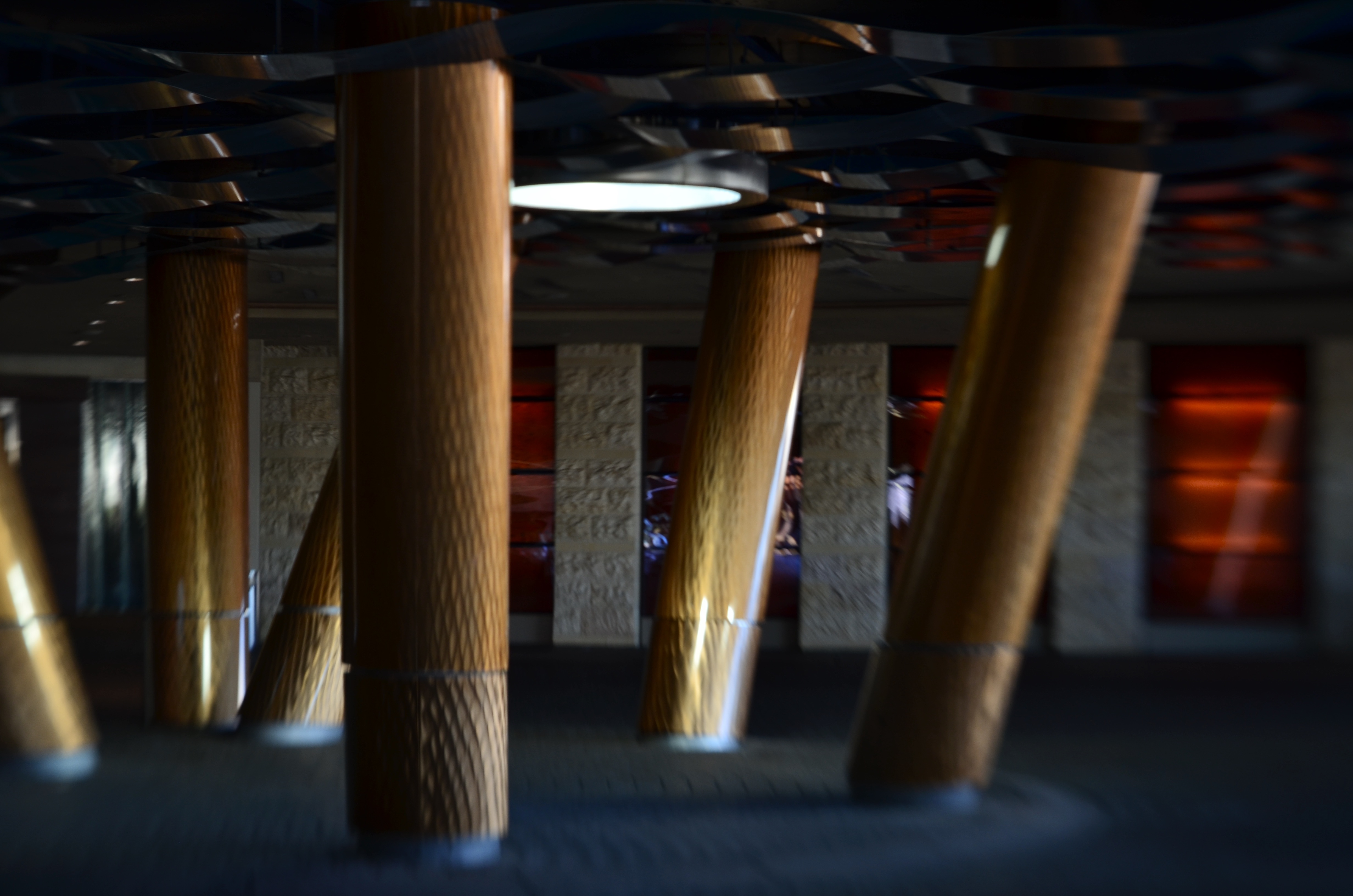
Cinema Inverite, 2015
Today, with the lightning-fast response that is built into even the simplest cameras, that cow can only be summoned in a deliberate time exposure, typically with the camera mounted on a tripod. It’s fair to say that our motives for making these kind of images has changed over the years, again, mostly due to technological advances, including vibration suppression, wider ISO ranges, and enhanced noise reduction (which works hand-in-glove to clean up high-ISO pictures). Fact is, there are fewer instances than ever before in which long exposures are needed, unless we utilize them to generate the very artifacts that we used to wish we could eliminate. As one example, everyone eventually creates at least one “light trail” photo, letting cars zoom through a long exposure largely unseen while leaving the glowing paths of their headlamps hanging mystically in the air. And there are certain collapsed studies of long durations which can only be appreciated by prying the lens open for a few extra beats. In the case of the above image, I was photographing the final night before the closure of a local art cinema, which would soon be razed to make room for a bigger cineplex with more screens, more room, and far less charm. I felt as if a lot of Spirits Of Cinema Past were in attendance, and so mounted a tripod to turn the customers themselves into passing shadows, just like the many spectres that had flickered across the theatre’s screens over the decades. And that’s the strange time-travel feature of photography: one era’s annoyance is another era’s cherished effect.
I seldom use my tripods any more, but having recently inherited one from a departed friend, I find myself recalling the days when it was my near-constant companion, a reverie which, in turn, sent me searching back for the theatre images. Making pictures is about harnessing the light with whatever lasso we have handy. As we grow, we learn to do more with less, creating in seconds what used to require elaborate forethought. But all that really means is that, as we improve, we are freer to focus on the picture, rather than the mechanics of making one. That means choices….and yes, even the choice to do conjure ghosts if the fancy strikes us.
DESIGNS OF DESTINY
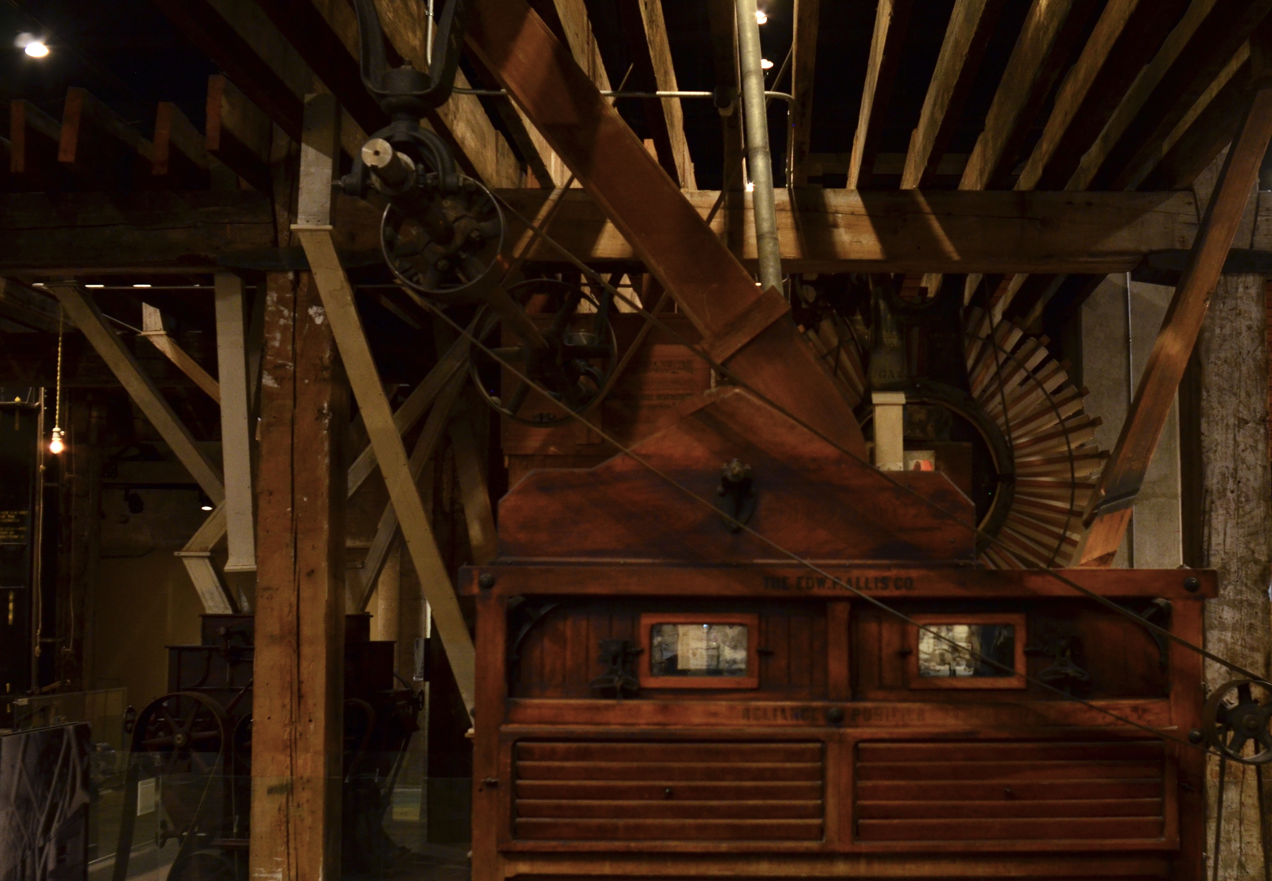
What is this? And, for the purpose of pure photography, does it even matter (see answer below..)?
By MICHAEL PERKINS
PATTERNS ARE KIND OF A PHOTOGRAPHIC ABSOLUTE, in that they require no context for comprehension in an image. We needn’t explain such arrangements of negative and positive space, such as the latticework of a single snowflake: their mere existence is story enough. We find endless fascination in the spirals within the heart of a flower, the alternating light and shadow inside a stairwell. Of course, we can certainly take the time to remark further about them, but the best photographs of patterns go way beyond our ability to justify them with mere words. In a visual medium, they are their own best testimony.
Other patterns resist interpretation for the reason that they are clearly of another time, so far removed from our own present-day experience as to be meaningless to us beyond their shape and contours. We can view mosaics from a vanished culture, but are prevented from deciphering their symbols: we find a flute from centuries past but can’t read the notated music that was intended to be played on it. In more recent terms, the technology that remade the planet during the industrial revolution of the nineteenth century has left behind a rusting legacy of devices which speak very little as to their original functions. Masses of gears, wheels and belts which once were the stuff of everyday existence now need captions to even be comprehended by our eyes. Thus, as visual subjects, their patterns are so obsolete as to be abstract, presenting merely a mixture of textures and tones to our contemporary cameras.
The world is moving so quickly that even the wildly speculative “future” gizmos seen at the World’s Fairs of the 1960’s already need auxiliary context to be fully appreciated. In one respect, as purely visual artists, we are actually freed by this phenomenon. When a thing becomes unanchored from its original purpose, the photographer can assign any purpose to it that he pleases. The object is nothing, and so, paradoxically, it can be everything. Consider the mass of machinery in the above shot. Were I not to tell you its original use, would you recognize it as part of the machinery to be found in a flour milling facility from the 1800’s? Does knowing or not knowing that fact detract from its impact as an image? Are you all right with patterns that are truly absolute, scenes that are merely themselves, and nothing more?
You are always in charge of what you want your pictures to say. You can record events and people at face value, or you can imbue them with additional meaning. Or no meaning whatsoever. The camera is thus just a servo-mechanism. It’s not in charge of saying what the world is. That power, that responsibility, has always been yours and yours alone.
Neat, innit?
FROM SYMBOL TO ICON
60 years of the Wright stuff.
By MICHAEL PERKINS
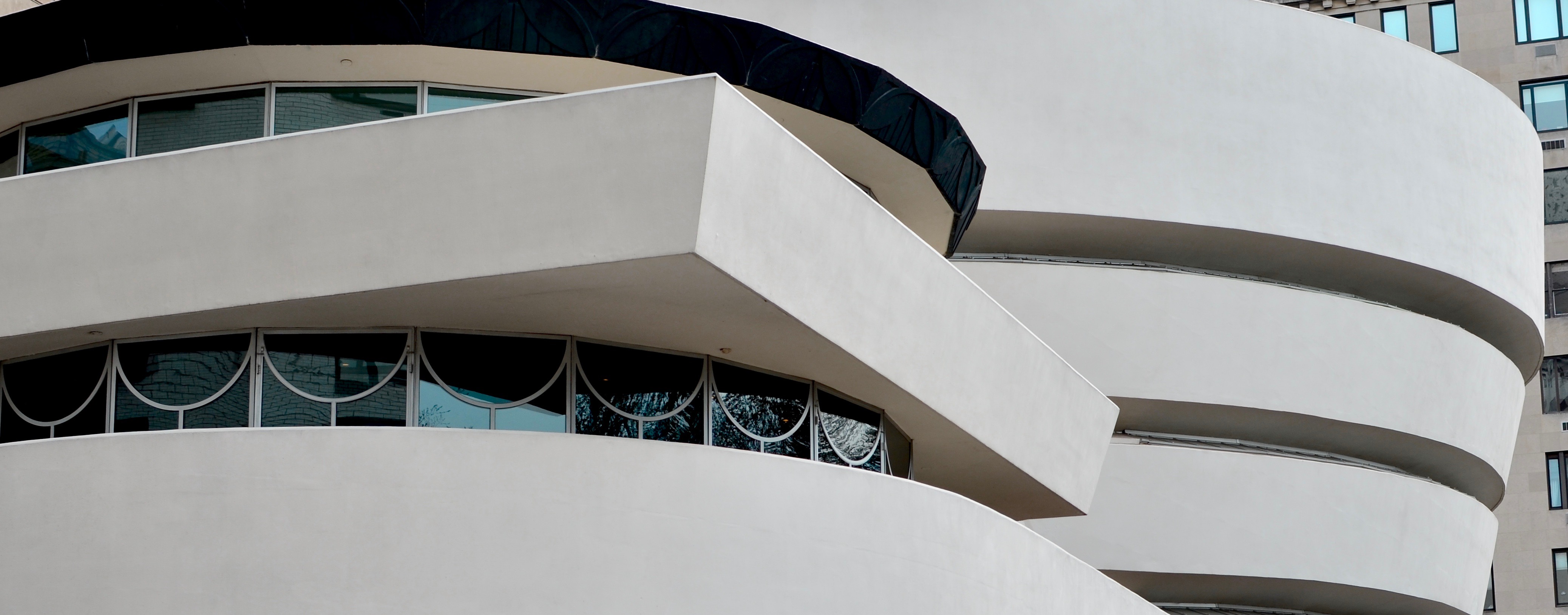
HOW MANY SECONDS DID IT TAKE FOR YOU TO IDENTIFY THE EDIFICE seen in the above image? I’m guessing that your response time was predictably brief. That’s the power of a photographic icon, a power which redounds to the benefit of all interpretive photographers. At the time of this post’s publication, it is exactly sixty years since the opening of Frank Lloyd Wright’s final masterpiece, New York’s Guggenheim Museum. In those six decades, the “Gugg” has more than delivered on its promise to provide a unique setting for the most adventurous art of the age. But in the process, it has also become a piece of art, a statement no less resonant than the thousands of paintings and sculptures it has housed.
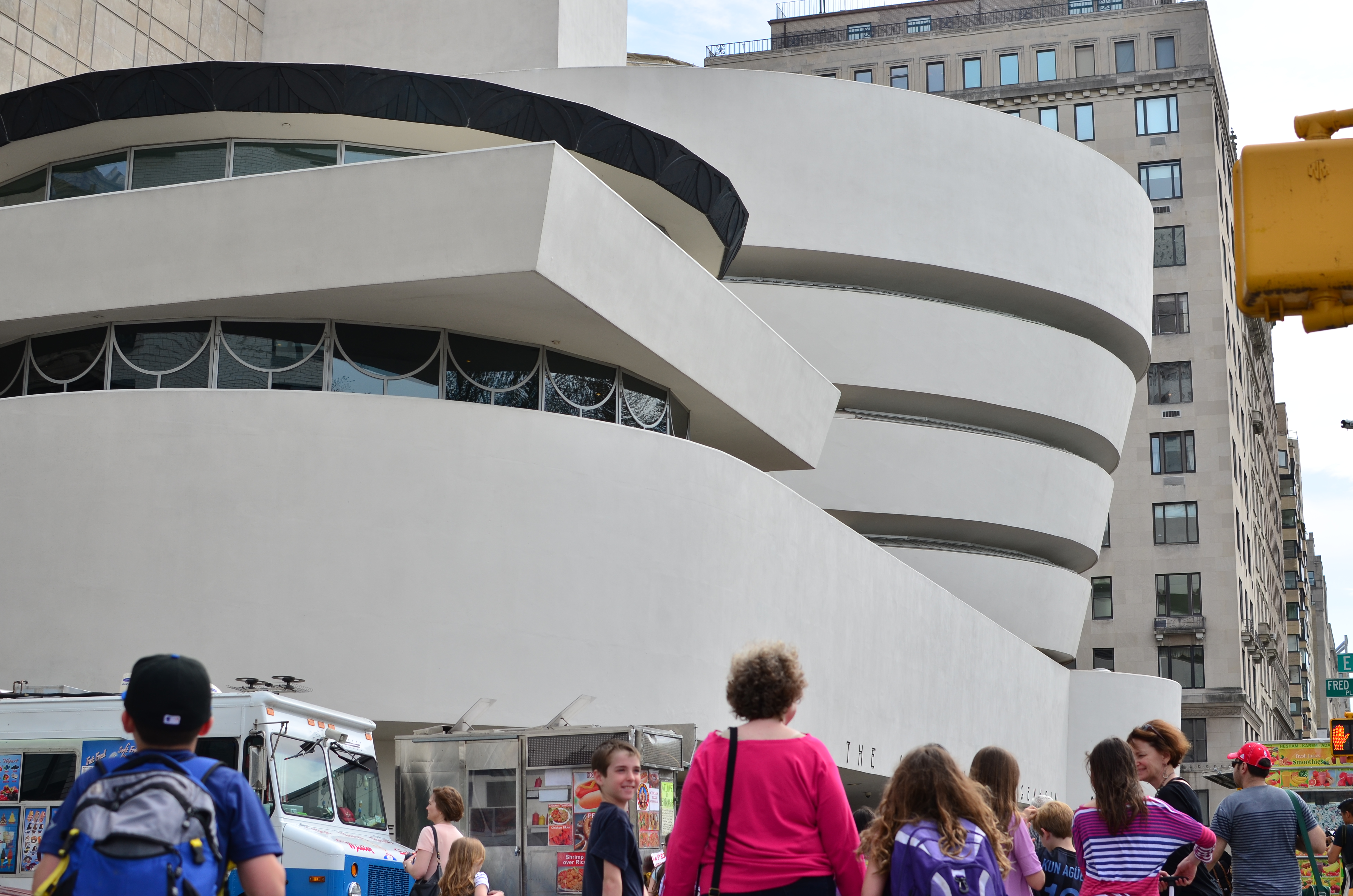
A conventional street view of the Guggenheim.
We’ve often written here, as many have, of the challenge of photographing things that, over time, nearly the entire world seems to have snapped. Make your own list: the Eiffel Tower, the Pyramids, the Empire State, Big Ben, all names linked with objects or sites which fully meet any criteria for an icon. These things are so very familiar that, some billions of images into the game, they can become static as subject matter, resistant to revealing anything new about themselves. We admire the postcard view of a place and work to replicate it endlessly, almost making it meaningless. And yet, with the right approach, even a weathered subject can be reborn inside your camera.
In the case of the Guggenheim, a place which stores art is itself an art masterpiece, almost to the point of eclipsing the works that are showcased within it. Its outward form is one of a handful of things that is so recognizable that it resists stasis. It can, visually, be almost endlessly reinterpreted, if we look for the correct idea. It can be simplified to a collection of light and dark planes: it can be negativized, filtered, cropped almost to abstraction (as we have here), reimagined from any angle, and serve as an unmistakable cue to our collective brains. Certainly a simple photographic recording of the building in its natural state (the post card shot), as seen in the small inset image, is effective, because the structure itself is so objectively powerful. However, that same view can be sliced almost to the dimensions of a view through a mail slot and it will still communicate what it is, still generate strength. That’s what an icon can do for photography: become the gift that keeps on giving.
The Guggenheim was created specifically as a home for various mid-century art movements that had no official home within the conventional museum community of the Eisenhower era. Its design passed through many hands before completion, which happened after the deaths of both Frank Lloyd Wright and Solomon Guggenheim. Even after substantial revision and interference from people who frankly should never have been allowed admission to the place, the “Gugg” emerged with its essential elements intact, so far advanced as a public space that even now, sixty years on, it seems as if it’s just arriving for the first time. Some icons not only indelibly define themselves but also the times that created them, with a permanence that continues to feed the imaginations of other artists looking to craft their own visions. One critic once described the museum as a birthday cake. Perhaps that’s its magic: an occasion of joy, alight with illumination, imbued with the power to grant your every wish.
LIP SERVICE
The Elder Speaks His Truth, 2016
By MICHAEL PERKINS
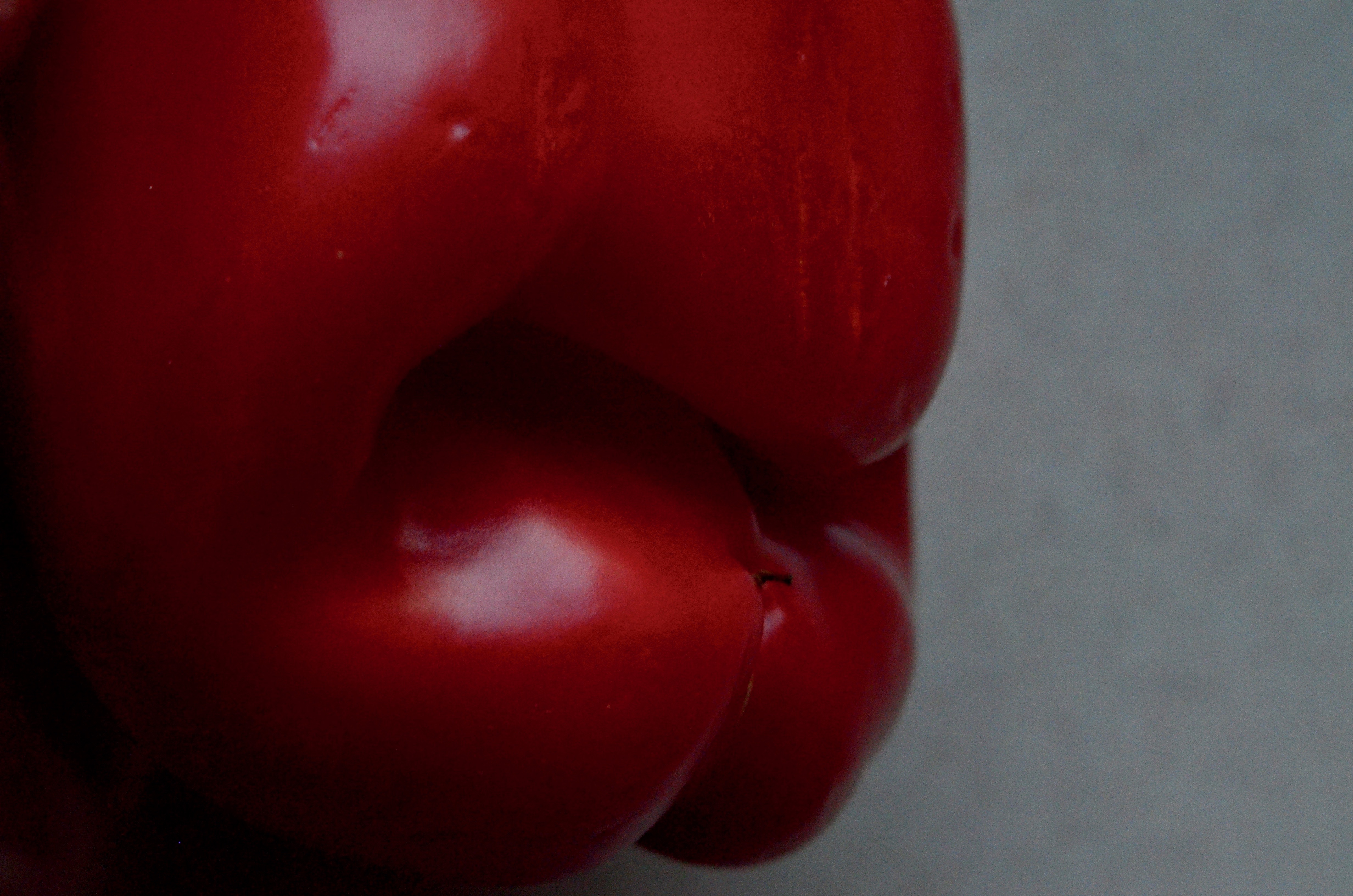
PRIOR TO AROUND 1920, photographs of objects were generally naturalistic recordings of objects as they were popularly perceived in the actual world. Apples were shot to resemble apples, trees to emulate trees, and so forth. Techniques that had served photography in the nineteenth century, which favored the same objective rendering of things in the same way that painters did, persisted until generally after the First World War, after which both camps began to question whether reality was, indeed, the only way to portray the world. Some shooters began to veer away from any painterly softness or interpretation, declaring focal sharpness and documentary truth over the dreamy qualities of the canvas. Others, however, took another page from paint’s playbook, opting to see compositions as arrangements of light or shapes, and nothing more. Everyday objects were filtered through a new way of seeing, and the ordinary was drastically reconsidered beyond the act of mere recording. Photographers began to also be interpreters.
A Weston Pepper.
One of the most stunning examples of this new freedom were Edward Weston’s “pepper” images of the 1920’s, a series that re-envisioned vegetables as new somethings that were reminiscent of abstract nudes. Weston’s monochromes were, first and foremost, compositions of line, absent the context that the normal world typically afforded. Suddenly, shapes were absolute: the photograph didn’t have to be about anything: it merely was, in much the same way that modernist paintings re-framed the way people saw faces, bodies, architecture. Some were shocked, even frightened by the newfound freedom Weston and others were championing, while others felt liberated. As ever, the best photographs sparked the best arguments.
I was reminded recently what a simple revolution can be created by such a minor warping of the visual sense when I unpacked a pepper that I felt could have escaped from Weston’s own garden. The gnarly thing seemed, even before my memory had made a connection back to his work, like a ripe, red set of lips, something between the cartoon kiss of a Jessica Rabbit and the Rolling Stones’ lascivious logo. The curviness of the pepper proved too seductive for me to just start immediately carving it up for salad, so I attached a macro lens and started to take a tour around the thing. At one angle, the vegetable almost looked like a mouth in profile, but with perhaps the faintest suggestion of an overall crimson face as well. The entire exercise took about three minutes, after which the pepper dutifully kept its prior appointment with my homemade balsamic dressing. The one fun takeaway was reminding myself that, no offense to reality, but it’s fancy that makes photographs.
Just think what kind of portrait I could make from a rutabaga with attitude.
APP(T) PUPIL
By MICHAEL PERKINS
IT WAS PRETTY COMMON, just a few years ago, to find a county fair or amusement park that boasted its own “old-timey” photo booth, a space where families could don historic costumes and pose for a simulated sepia daguerreotype. It was the start of a trend that continues to the digital age, in which the bulky, balky technology of Photography Eras Past becomes romanticized as an effect to be applied to contemporary images. Or, to put it in practical terms, everything old is new again….in an app.
Faking the past via digital doctoring can provide a unique aspect to a newly-taken snap, or it can just produce what I call the “that’s cool” effect, which masks the general purpose of the original and drowns it in gimmicky goop. But the temptation to tweak is strong: apps are cheap (or free) and it takes mere minutes to determine if a given one will add anything to your work beyond mere novelty. One such example is the wide selection of faux tintype emulators available at a click.
The tintype (which was actually exposed on iron plates coated with dried collodion) was never as sharp as its predecessor, the glass-plate daguerreotype, but it was so simple to take and process by comparison that it effectively liberated the camera from the studio, sending field photographers in tented wagons out across the country to shoot every aspect of American life, including, notably, the battles of the Civil War. Eventually paper positives and celluloid film spelled the technology’s doom, but it’s uneven textures and tones continue to evoke a vanished world.
Allowing a tintype app to use your mobile’s camera increases your creative control.
I very seldom use tintype apps after I’ve taken a shot. It seems as if I’m admitting that the image somehow wasn’t enough, that it needed “help” of some kind. I prefer to take pictures from within the app itself, allowing it to use my phone’s camera. The idea is to conceive of the picture beforehand as benefitting from the tintype effect, to pair its “look” with its intention. The tonal range and uneven detail of the tintype can be thought of as another kind of abstraction, and your choice of narrative need not be limited to picturing Uncle Fred as Buffalo Bill. As with so many apps, actual practice can make the difference between a tool and a toy.
UP FROM DARKNESS
By MICHAEL PERKINS
(AS YOU READ THIS, I, along with most inwardly inclined photographers, am spending the final days of the present calendar year trying to make some sense of whatever images I’ve attempted over the past twelve months. But I’m only partly interested in compiling so-called “best of” lists, since it’s really up to other eyes to decide whether any one group of my pictures can collectively be called successful. Simply, I can’t really judge how well I’ve done. Not alone, anyway.)
What I try to do instead is to determine if pictures from a given year arced or tended in a particular direction. One thing I have noticed about my work is that it seems to fall, generally, into subject years and light years……groups of shots that are either centered on what I shoot or the conditions under which I do so. 2018 seemed far and away to be about making compositions of light rather than capturing locales.
Going For The One, 2018
In more than a few photographs over the past year, I almost seemed to be dragging brighter surfaces out of solid darkness…..but only just enough to make a few details register, leaving significant portions of the finished image lingering in shadow….deliberately under-defined. I have always liked this chiaroscuro, or “Rembrandt” light effect, but this year, I seemed to be aggressively embracing it.
The shot seen here, then, is not meant to explain the building I was shooting, but to reduce it to a pure instance of color, light and design. In a different situation, the picture might have been more reportorial, but in this case, the arrangement of line and pattern was the entire goal of the photo. So, at the end of 2018, no photographic “greatest hits” list for me, just a trend line showing that my curiosity is tracking in a certain measurable direction. Photography is just as much about attempts as it is about achievements. At different junctures, we value one over the other.
TRIBUTE OR THEFT?
By MICHAEL PERKINS
THE WORD “APPROPRIATION” HAS BECOME A PERMANENT PART OF THE ACTIVE VOCABULARY OF VISUAL ARTS, and I am never consistently sure how I feel about it.
Like the term “found object”, things labeled as “appropriated” from other works seem to cast a shadow over photography, or over its potential for originality. Can the artist ever really produce a thing that is completely new? And if so, does it make him dishonest to re-use something that’s been any part of someone else’s work? Can you generate an image that shows, for example, a frame from a motion picture that someone else directed? How about a random glimpse of a frozen moment from a television show? Are those who admire a painting in a gallery and snap an image of it plagiarists? Additionally, the entire web-era issue of intellectual property complicates the question even further. Even if a photographer’s motives in “appropriating” are artistically pure, is he/she creating a tribute….or perpetrating a theft?
I have seldom dipped my toe into this particular swamp, mostly since I want to create work that is as personally unique as possible. I certainly love the idea of “standing on the shoulders of giants”, but I don’t like to think that it’s because I’m too weak to walk under my own power. So let’s analyze an instance in which I try to straddle both sides of the tribute/theft debate.
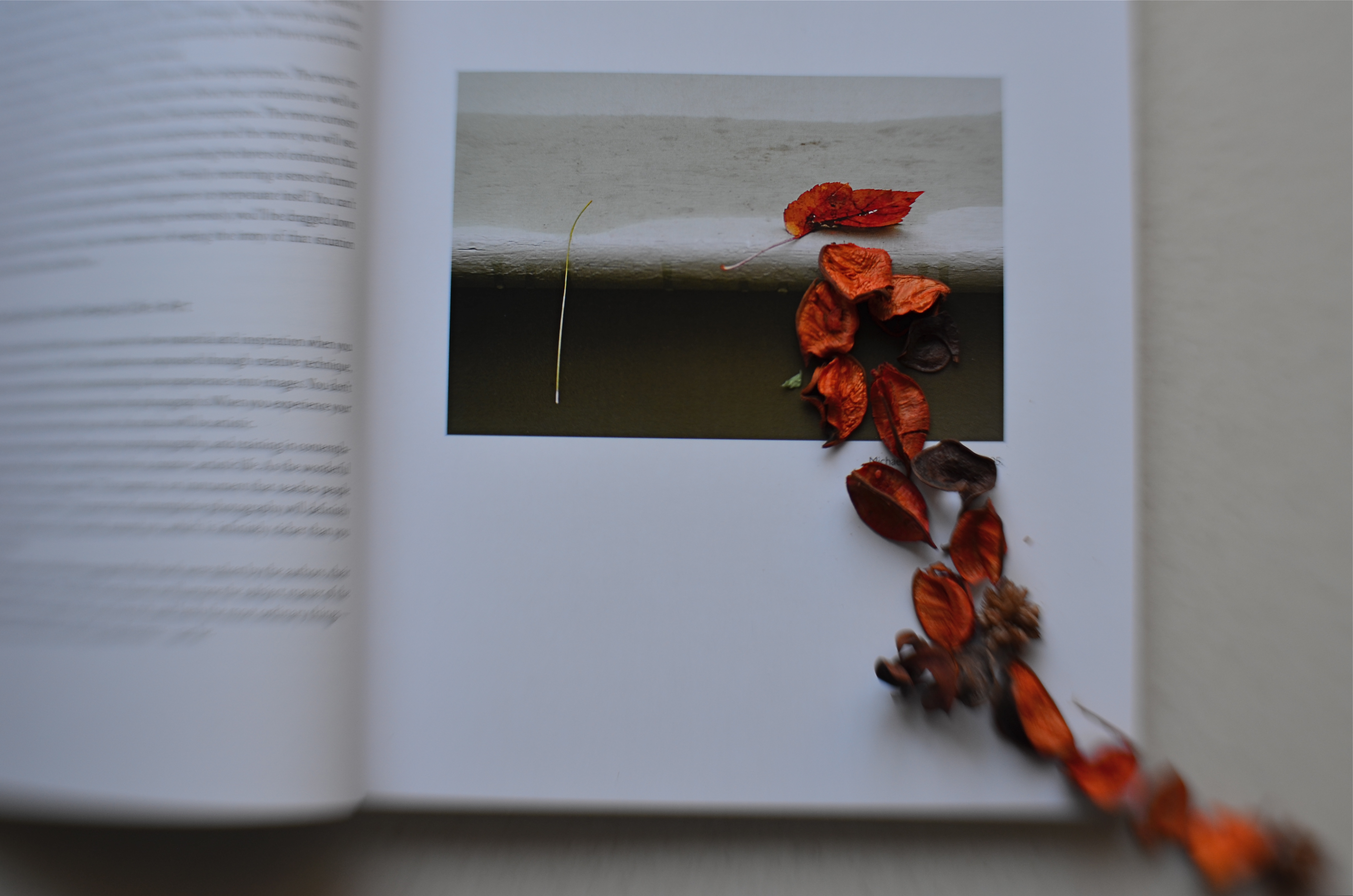
What you see here is a most particular exercise with a very specially selected image. The original picture, as seen within the page frame, is an illustration from The Practice Of Contemplative Photography by Andy Carr, a book designed to train the reader’s eye to see in less conventional ways, to examine the gulf between conception and perception. The authors, Andy Carr and Michael Wood, have deliberately set forth a series of exercises created to force photographers to develop alternatives method of seeing. What I glean from this is that they don’t want to hold any single photographic approach as sacred….perhaps even those they themselves put forward as artists.
The composite image seen here is an attempt to take Michael Wood’s beautiful picture, a minimalist shot which shows a single orange leaf balanced on a ledge, and imagine what kind of picture might be a visual sequel to it. I used a Lensbaby Sweet 35 optic to keep the original photo’s sharp focus on his leaf, which, as it trails down the stream of added orange potpourri pieces, transitions to softness….as if, in a dream, the leaves might be seeming to erupt out of the page. So, if you’re keeping score, the starting photograph is shown in the context of the book in which it originally appeared, with added objects that I have arranged for a new overall photo-creation of my own. Please note that in every single posting of this picture, I have given specific credit to the original artists/authors, and represented it as an appropriation, the use of elements not my own for a re-imaging that is my own. I would never seek credit for the original Wood image: it did serve, of course, as a springboard for something else. And, if at some time, I am asked by said creator to remove any and all traces of my composite from public platforms, I would acquiesce immediately.
Ever since Warhol began making silkscreens of photographs shot by other artists, which he then showed as Warhol “works”, this argument has mostly led to…..more arguments. And, as stated, I seldom find myself in this particular playpen. It’s simply too tough to be sure of all my motivations.
Still….
CHECK THOSE ABS
By MICHAEL PERKINS
IT SEEMS ODD to hear someone refer to part of their photographic output as “abstract”…..as if the rest of their work somehow isn’t. I guess it depends on what you believe the word ” abstract” means, as well as what is meant by other words like, say, “reality”. For me , the whole discussion seems overthought. To my mind, all photography, all art is “abstract”.
 To abstract something is to extract it from its original context, to re-frame it, take it from one form and paste it into another. And there is no way not to do that with a photograph. We don’t show reality. We show shards, fragments, selectively sliced slivers of time. Even if we take great care to take a no-frills, documentary approach to the recording of an image, once we click the shutter, we have abstracted that moment from reality, making an editorial choice to pluck away this instant versus all others.
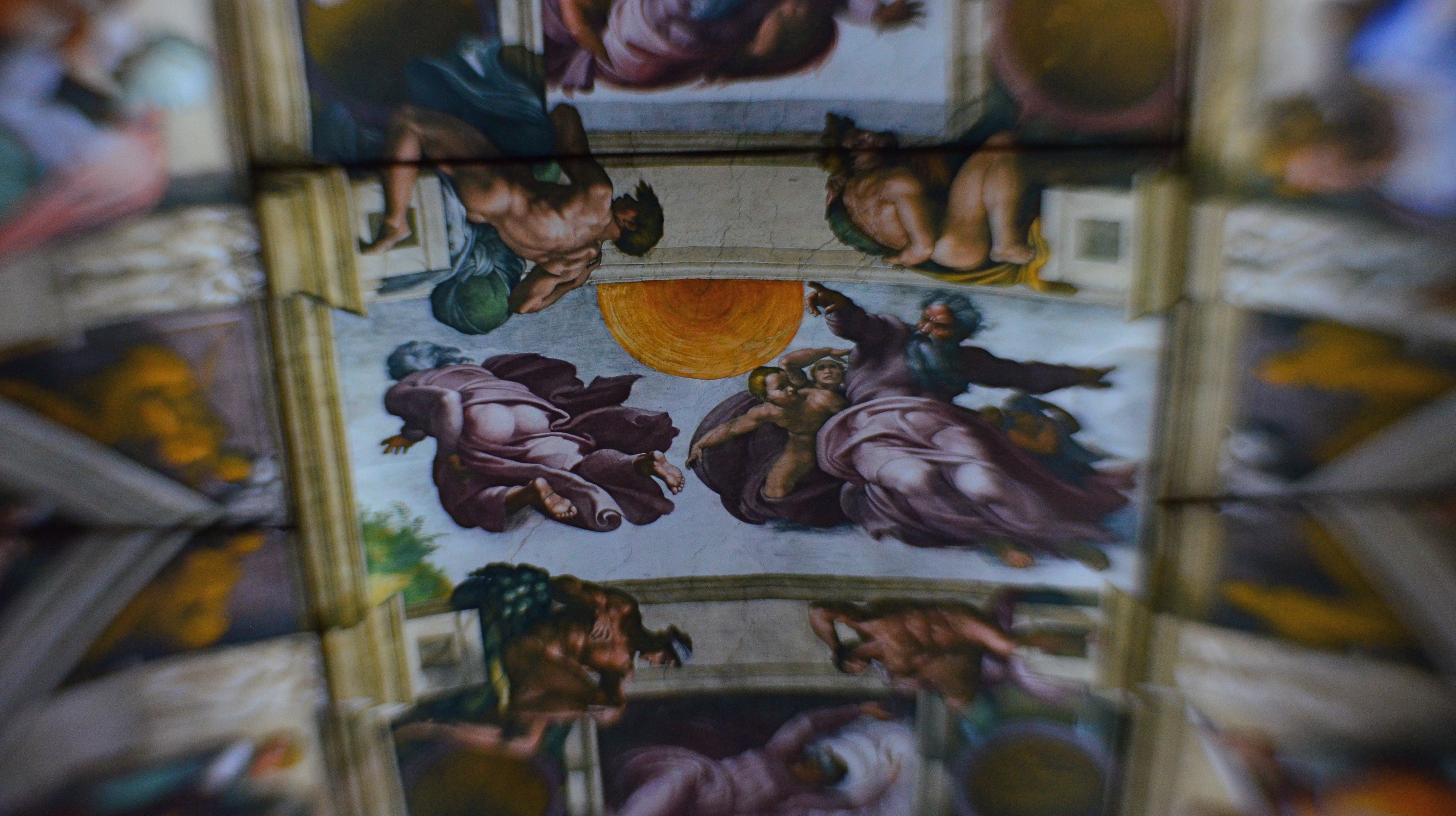
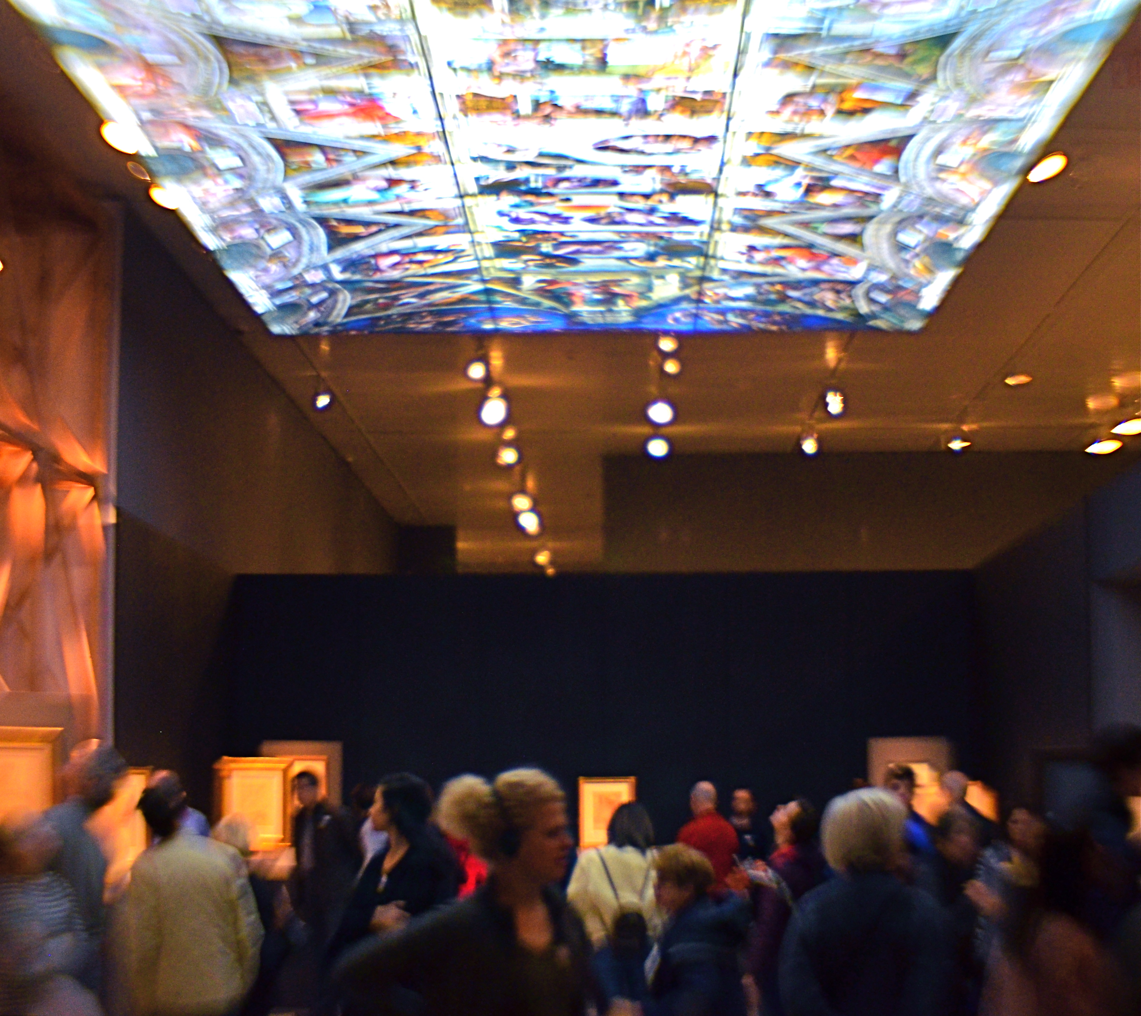
One way to illustrate this process is to consider the image at the top of the page, which represents a virtually endless chain of abstraction. Thinking backwards from this photo of a museum exhibit:
In the beginning, God creates man, an abstraction of himself. Then Michelangelo creates an abstraction of God (and a lot of other Biblical superstars) by depicting Him in the act of creation, even as he (the painter) is also abstracting representations of the Creator’s creatures. Centuries later, art historians take selective pictures of Michelangelo’s massive abstractions on the ceiling of the Sistine Chapel, abstracting them further by using selected excerpts as book illustrations. Inspired by those books, curators in Manhattan create an exhibit honoring Michelangelo’s ceiling by reproducing it as a miniature, assembling a replica composed of dozens of backlit transparencies suspended over guests at the Metropolitan museum in an artificial abstraction of the original Sistine frescoes. Finally, using a selective-focus art lens in 2017, I abstract those same guests to blobby smears of color and make editorial choices about which single panel in the faux-ceiling exhibit to shoot in sharp focus, thus hinting that it’s somehow more important than all the others.
Photographs snatch away parts of the real. To use a camera is to abstract that reality. Every snap of the shutter is a calculation of choice. Therefore choose wisely.
INSIDE THE OUTSIDE
By MICHAEL PERKINS
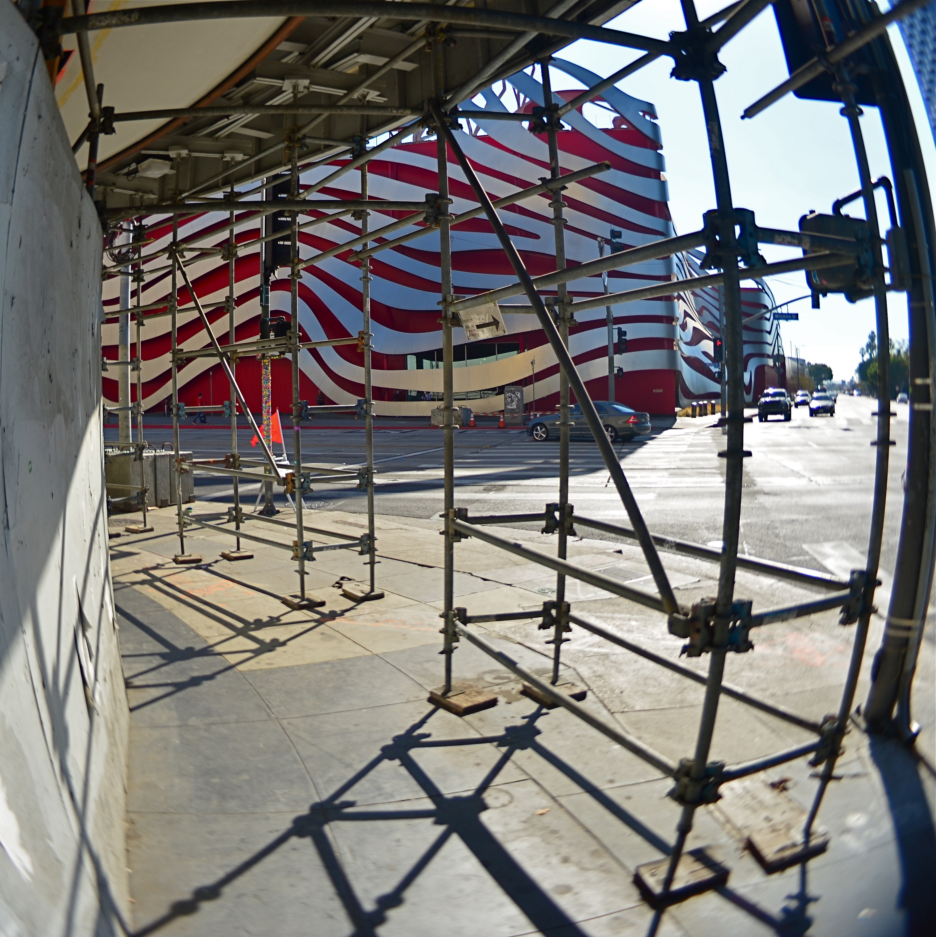
Los Angeles’ Petersen Automotive Museum, as seen from Fairfax Boulevard.
IT’S HARD TO ATTRACT ATTENTION IN HOLLYWOOD, a town that shouts in five dimensions, a million colors, and four thousand decibels about almost everything. Here, in the town that hype calls home, design always swings for the fences, and Subtle Is For Sissies. Small wonder, then, that photographers, who typically love to play top this with their peers, find that Tinseltown and greater L.A. are already at gold medal status in playing the very same game. I’ll see your weird, and raise you two weirders.
As a street shooter in Hollywood/L.A., you routinely witness the bizarre being passed off as the normal. As a consequence, the very act of visually commenting on this mad sensual overdose can make even your most prosaic shots seem like a trip through the looking glass. Words like stately, venerable, or traditional seem oddly out of place in the town that invented fourteen-story billboards and the Walk of Fame. Using a camera to say something new about it all can be a fool’s errand, or at least, a mental obstacle course.
Whenever I visit Los Angeles, I am constantly looking for some kind of reversal pattern, a way to treat the most outrageous visual artifacts on their heads. I don’t always succeed. I did, however, have fun trying, recently, to come up with a new way of seeing a very strange building, the Peterson Automotive Museum, located at the intersection of Wilshire Boulevard and Fairfax Avenue, the outside of which has undergone a very radical facelift in recent years. From afar, the building seems to be a wild, untethered series of curves and swoops, a mobius strip of red and steel spaghetti floating in space in an abstract suggestion of motion. It’s a stunning bit of sculpture that actually is a wrap-around of the original, far more conventionally-shaped museum building beneath it.
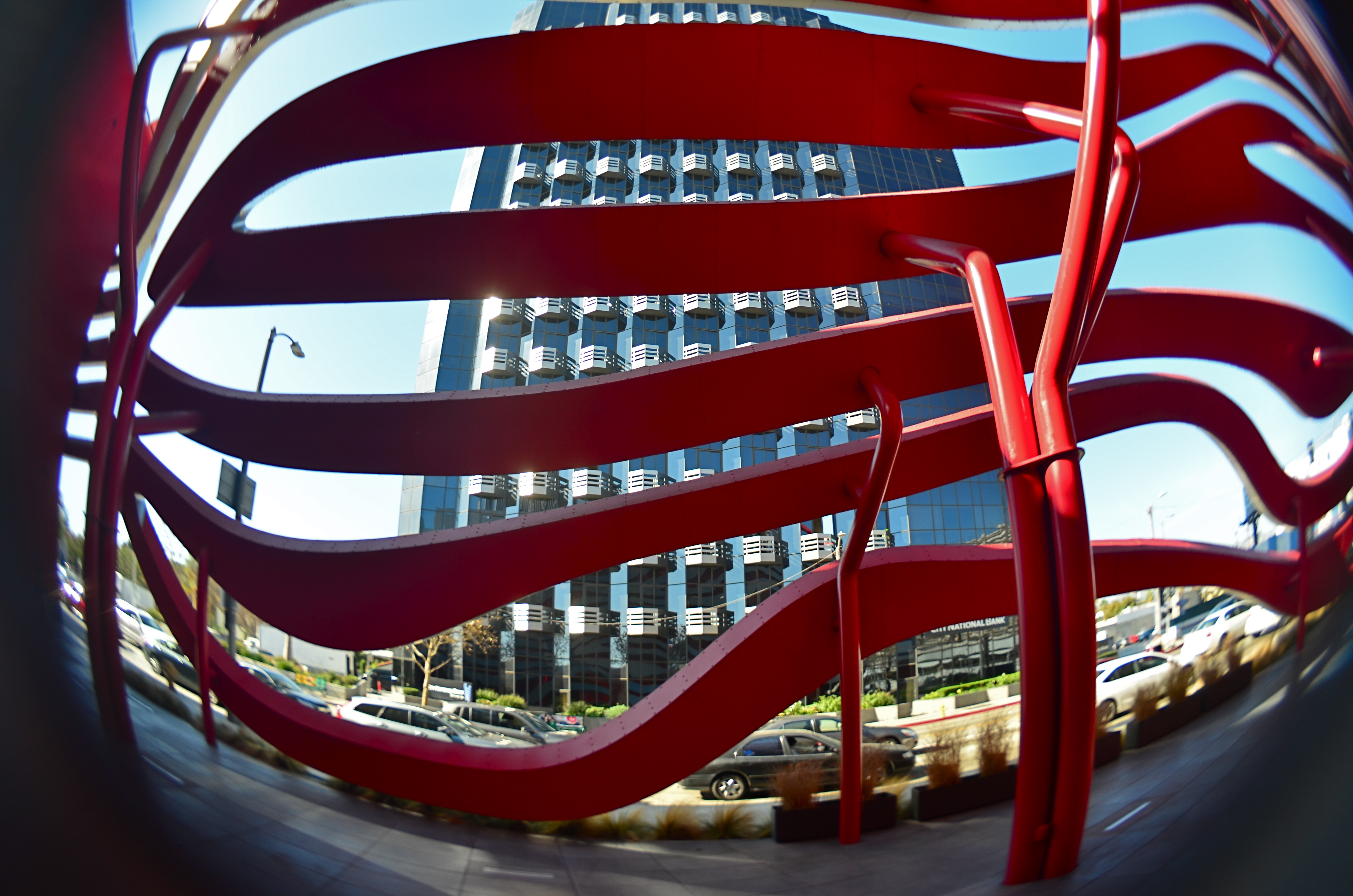
Inside the Petersen’s exterior facade, looking out.
And, as it turns out, that’s the way to reverse-engineer a photo of the museum, since it’s possible to walk behind the swirly facade and into a shadow-and-color-saturated buffer space that exists between it and the underlying structure. From inside said space you can view the outer bands as a peekaboo grid through which you can view neighboring buildings and local traffic, rather like looking between the slats of some big psychedelic set of venetian blinds. And that’s where I stood when taking the above shot with a Lensbaby Composer Pro lens with a fisheye optic, the aperture set at about f/5.6 to render the whole thing somewhat soft and dreamy. I’ll see your two weirders and raise you one bizarre.
ROLL-PLAYING
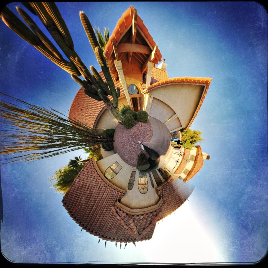
A typical “small planet” effect created in the phone app Rollworld.
By MICHAEL PERKINS
MANY OF THE APPS BEING PEDDLED as post-production fixes for mobile photographs are one-trick ponies, limited in their range. This is less so than it once was, with new apps adding progressively more features, but there are still tons of single-purpose processes out there, gobbling up phone storage with apps that perform one task well. Want a second task? Download another app.
The fun part for me is to discover that, while a given app may have been created to solve a particular problem, it can also be used creatively to do something completely different. Take the example of the now-cliched creation of so-called “small planet” pictures, in which a standard landscape is spiraled into a ball shape, with its various tree and buildings now looking like features on a self-contained world, rather like the illustrations in The Little Prince. This process was once a somewhat complicated one, but, like almost everything else in the digital world, it’s been shorthanded to a few clicks and sliders in apps like Rollworld, which is not only cheap but insanely simple to use.
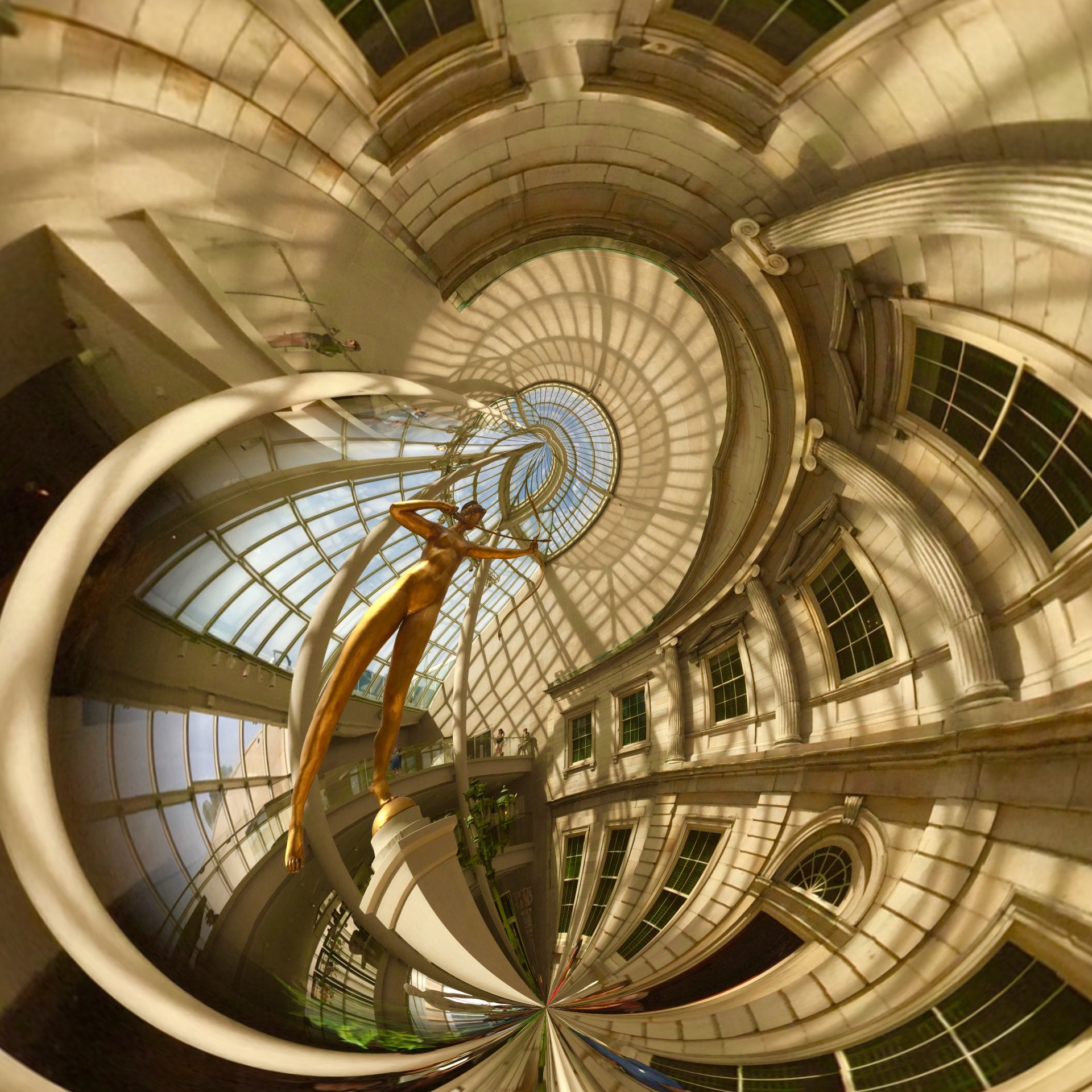
A DSLR image uploaded into a celphone and remixed in the Rollworld app.
If you approach the use of such a specialized app in the simplest way, you’ll produce your five or ten little planet images (see photo at upper left corner), get the novelty boiled out of your blood, and then move on to something newer and shinier. However, Rollworld and programs like it can be a nice creative tool beyond their most obvious trick. The various sliders in RW let you not only roll your original linear image but control how it rolls, allowing a kind of folding-in, folding-out distortion. You can thus completely abstract even the most mundane cityscape into a symmetric pattern of textures, maximizing small things or relegating prominent features to the background. Other Rollworld sliders allow you to determine the tightness or looseness of the roll, to control the angle of the pitch, even swipe features from one part of the image across parts of the others to mirror or multiply specific items into a better symmetry. Call it Kaleidoscope-in-a-box.
I even import some of my standard DSLR images from various websites like Flickr (see above right) into my phone so they can be processed by the app as well. One problem: You want to save your end product at the highest possible file size. Even at that, some of them will only display well on monitors or the web, and may be too small for good resolution when printed out. This is a major problem with phone images in general: they are still designed, for the most part, to be outputted to other phones and screens.
The idea here is that many apps are capable of giving you more than the advertised effect if you play a little. It takes so little time and effort to experiment that you quickly build experimentation into your typical workflow. And that can only help you grow faster as a photographer.
