READING THE ROAD

By MICHAEL PERKINS
COMPOSITION IN PHOTOGRAPHY IS NEVER MERELY A MATTER of rearranging the deck chairs on the good ship Take-A-Snap. Yes, at first, there is the frame to be dealt with, and with that, the crucial decisions on what stays in and what gets left out. And then there is the front-to-back and side-to-side staging of the image, the visual coding you build into the picture to tell your viewer where to look and how to prioritize what he sees, a process influenced as well by contrast, depth of field, and other shooting settings.
But there is another crucial way to instruct the viewer’s eye on how all this information ranks within itself, and that is the decision to shoot in either color or monochrome. It’s true that, merely by landing on one or the other, you haven’t added or subtracted any visual elements that weren’t already in the frame. That is, you didn’t stick in four more trees or yank out the ocean shore. However, pictures in these two opposing modes convey information in distinctly different ways, and so both will confer certain qualities on the objects in the frame based on how the eye takes in that information. This can either make your picture pop with dimension or sink into murk.

Color assigns a rank to things and relegates objects to either shadow or light, foreground or background. Monochrome does this as well, but in a far subtler manner, meaning that some color shots which are clear in their message might appear muddled or muted when rendered in black and white. Conversely, something which is direct and contrasty in mono might appear either weakened or magnified in color.
In the case of the two renderings seen here, the tangly busy-ness of the color shot (top) seems, in monochrome (above), to make a very dense photo much harder to read. There is so much texture in the color version that just becomes mushy in grayscale, so that the mono version does nothing to simplify the shot….quite the opposite. The Color/No Color decision can either make or break even a well-balanced composition by making the “look here” rules for the viewer too ambiguous or unclear. Reading the room can help pictures communicate cleanly.
BURDEN OF PROOF
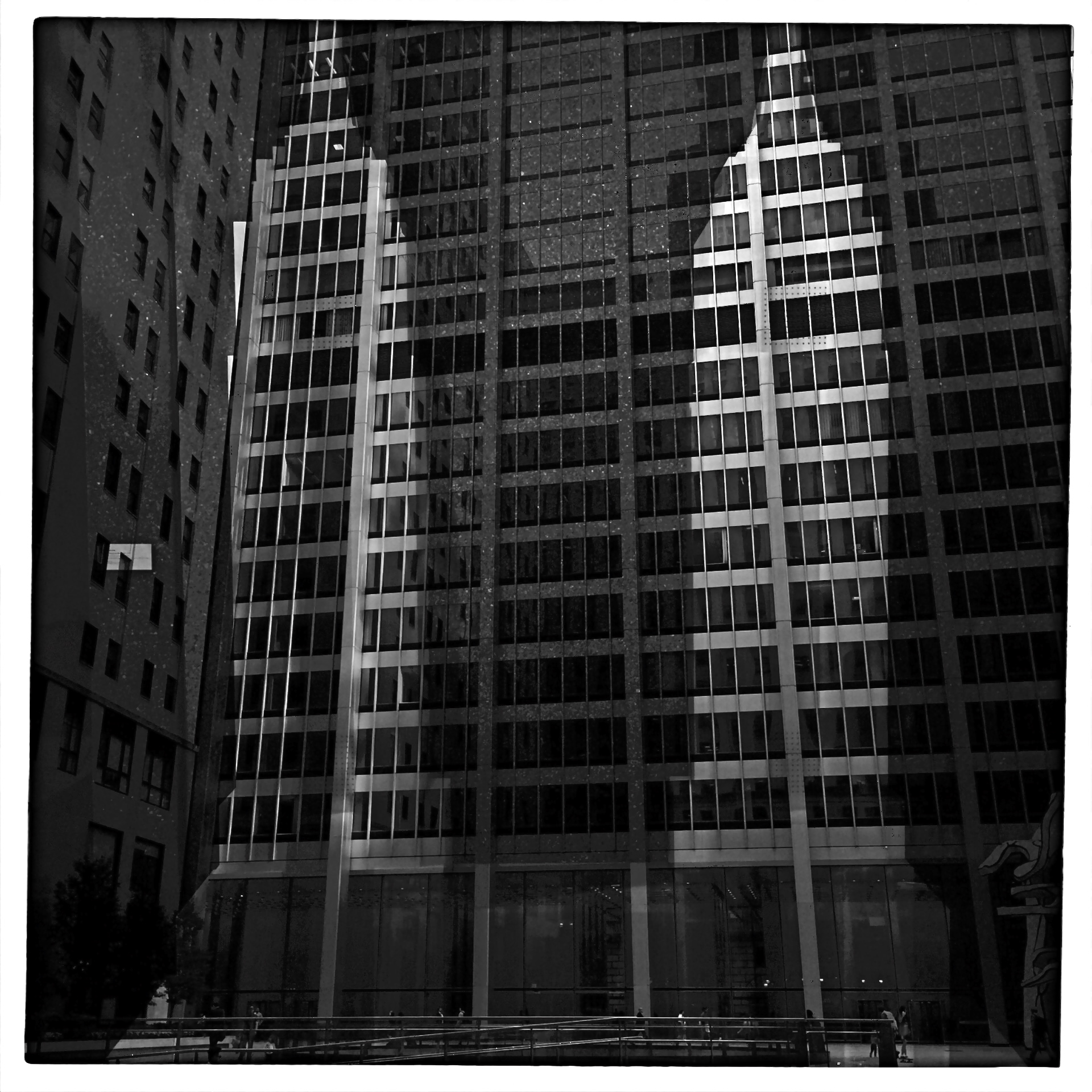
Reverse Shadows (2015) Originally conceived in color, later converted to black and white. Luckily, it worked out, but, shooting this image anew, I would execute it in monochrome from start to finish. Every story has its own tonal rules.
By MICHAEL PERKINS
THE WORLD OF PHOTOGRAPHY’S EMBRACE OF COLOR, which now seems instinctual and absolute, is actually a very recent thing. The arrival of color film stock targeted to the amateur market barely reaches back to the 1920’s, and its use in periodicals and advertising didn’t truly begin to outdistance color illustration until well after World War II. Color in so-called “serious” or “art” photography existed on the margins until half-way through the 1960’s, when hues, like every other element of the contemporary scene, gloriously exploded, creating a demand for color from everyone, amateur to pro. The ’60’s was also the first decade in which color film sales among snapshooters surpassed those of black and white.
Today, color indeed seems the default choice for the vast majority of shooters, with the “re-emergence” or “comeback” of black and white listed among each year’s top photo trend predictions. The ability to instantly retro-fit color images as monochrome (either in-camera or in-computer), has allowed nearly anyone to at least dabble in black & white, and the tidal wave of phone apps has made converting a picture to b&w an easy impulse to indulge.
And yet we seem to be constantly surprised that black & white has a purpose beyond momentary nostalgia or a “classic look”. We act as if monochrome is simply the absence of color, even though we see evidence every day that b/w has its own visual vocabulary, its own unique way of helping us convey or dramatize information. Long gone are the days when photographers regarded mono as authentic and color as a garish or vulgar over-statement. And maybe that means that we have to re-acquaint ourselves with b&w as a deliberate choice.
Certainly there has been amazing work created when a color shot was successfully edited as a mono shot, but I think it’s worth teaching one’s self to conceptualize b&w shots from the shot, intentionally as black and white, learning about its tonal relationships and how they add dimension or impact in a way separate from, but not better than, color. Rather than consistently shooting a master in color and then, later, making a mono copy, I think we need to evaluate, and plan, every shot based on what that shot needs.
Sometimes that will mean shooting black and white, period, with no color equivalent. Every photograph carries its own burden of proof. Only by choosing all the elements a picture requires, from color scheme to exposure basics, can we say we are intentionally making our images.
THE COLORS OF DREAMS
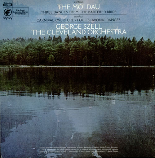
I will never know the name of the stock photographer at Columbia Records who shaped me with this image. But I know his genius.
By MICHAEL PERKINS
ONE OF THE TRICKIER PARTS OF BEING MY AGE is that I have been carrying around certain creative influences inside my skull for so many consecutive decades that their origins often blur. Who said it? Where did I brush up against that angle, that idea? Where did I see it? Book? Movie? Conversation? Who brought me into contact with this treasure? Inspiring mentor? Loving teacher? Teaching lover?
Of course, it can be argued that what you walked through the door to discover matters more than the door itself.
Maybe. But for me, the door and the room it leads to are two halves of one whole.
For most of my life, I have been fascinated by the intentional “un-realing” of color, the hypnotic spell of hues that weren’t “that way in nature”, but, through interpretation, could add drama and impact, even magic to the final version of an image. About a week ago, I was reminded of one important reason why I feel that way.
Researching composer Bedrich Smetana’s gorgeous musical love poem to his homeland, The Moldau, I set eyes on an image that I had not seen for over forty years; the cover photograph for a recording of Moldau by George Szell and the Cleveland Orchestra that I purchased in the 1970’s. My own copy of the original LP is long gone, but I still own a reissue of the performance, music that afforded my teenage self a serenity, a dream quality, a magic that travels within me to this day. In true “multi-media” fashion, I never listened to the original album without its cover within clear sight, its blue-green image of a soft-focus lake and forest quieting my nerves, inducing the music’s spell again and again.
One one level I knew that the colors in the photograph were not “natural” in the strictest sense, but they were nonetheless hypnotic. Through them, I saw Smetana’s homeland, its villagers, its folks rituals, and the beautiful river Vlatava. For me, the picture was the music, and the music was the picture. Energy flowed seamlessly from one conception of beauty to the other.
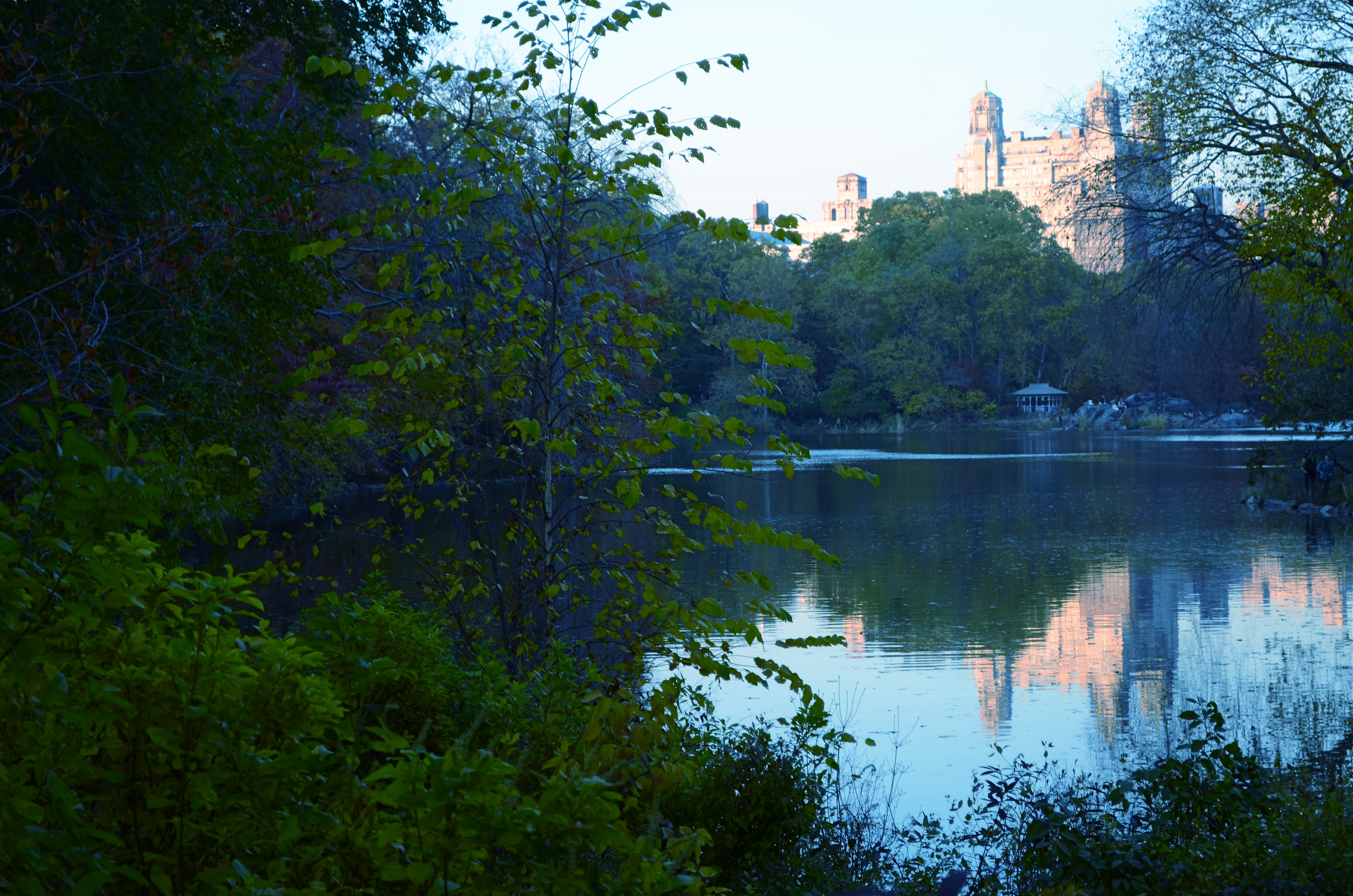
The Lake, Central Park West, NYC., 2011. 1/80 sec., f/5.6, ISO 160, 50mm.
Some of my own work, naturally, strives for this quality, the ability of a photograph to unchain the mind, to allow feelings to flow, to allow color to be abstracted, just like language or music. Some will call it influence, others imitation. I prefer to think of it as respect. And while I will never know the name of the stock photographer whose image was probably slapped onto The Moldau’s album cover as a clerical afterthought, I love it when I see his work leak through my fingers, if only a little.
Shade your dreams however you like.
And let the music surrender its colors.
Follow Michael Perkins on Twitter @MPnormaleye.
