TOGGLING BETWEEN TRUTHS
By MICHAEL PERKINS
If you can’t do it right, do it in color.——-Ansel Adams
THE MAN MANY REGARD AS THE JEDI MASTER OF PHOTOGRAPHY could be said to have had a sizable blind spot when it came to his preference for monochrome over the course of his long career. Part of his distrust of color came from the fact that black and white afforded him a degree of fine technical control that emerging color systems of his time could not yet rival. Another part of his bias stemmed from the fact that he accepted that mono was a departure from reality, a separate realness that he could manipulate and interpret. In his time, color was closer to mere recording; garish, obvious, and, for him, the opposite of art.
By contrast, the world we live in has been dominated by color images for so long that we can easily develop our own prejudice regarding its opposite….that is, to see monochrome as less than, as if, by choosing not to use color, we are somehow shortchanging our art, performing with one hand tied behind our backs, doing more with less. Of course, black and white photography is in no immediate danger of dying out, proving that it has a distinct and definable purpose as a storytelling medium. Further, mono can, in fact, engender its own counter-snobbery, as if certain kinds of work are more “authentic” because we purposely limit our tonal palette, like writing a minimalist melody. Both views, when taken to extremes, can cause creative paralysis, since there is no way to prove or disprove either argument’s rightness or wrongness. There is only the pictures.
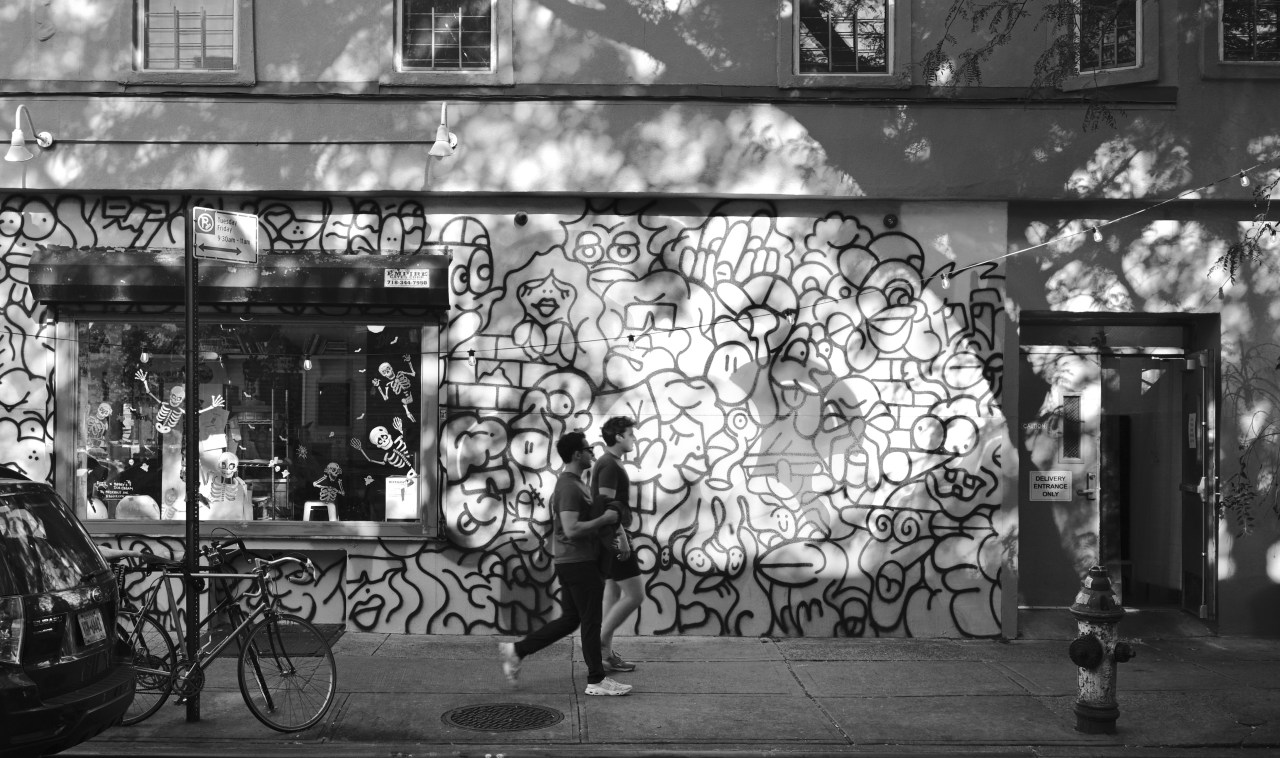
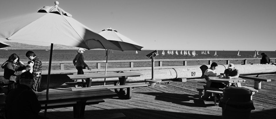
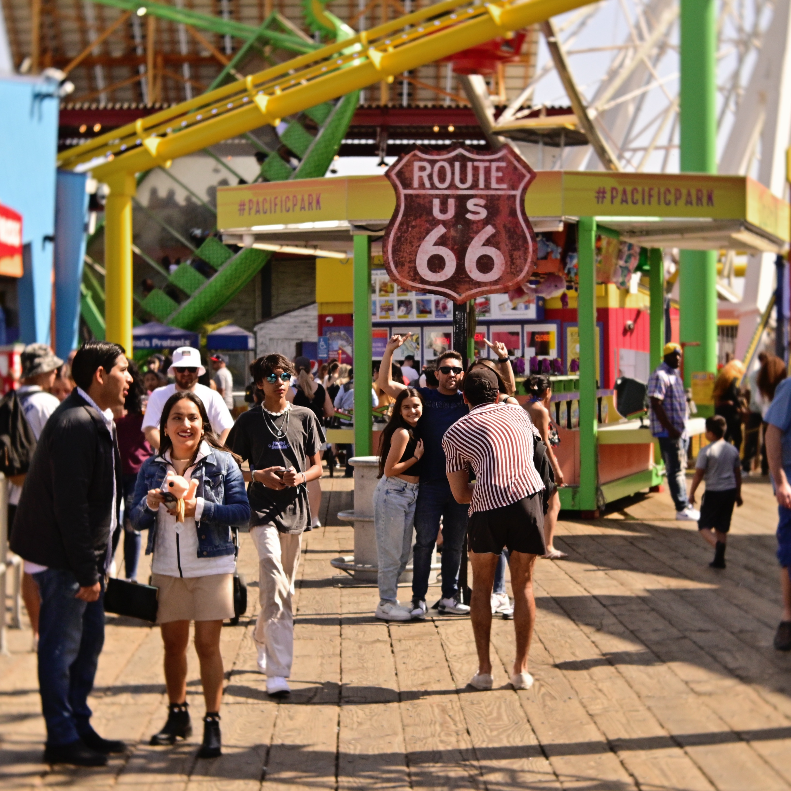
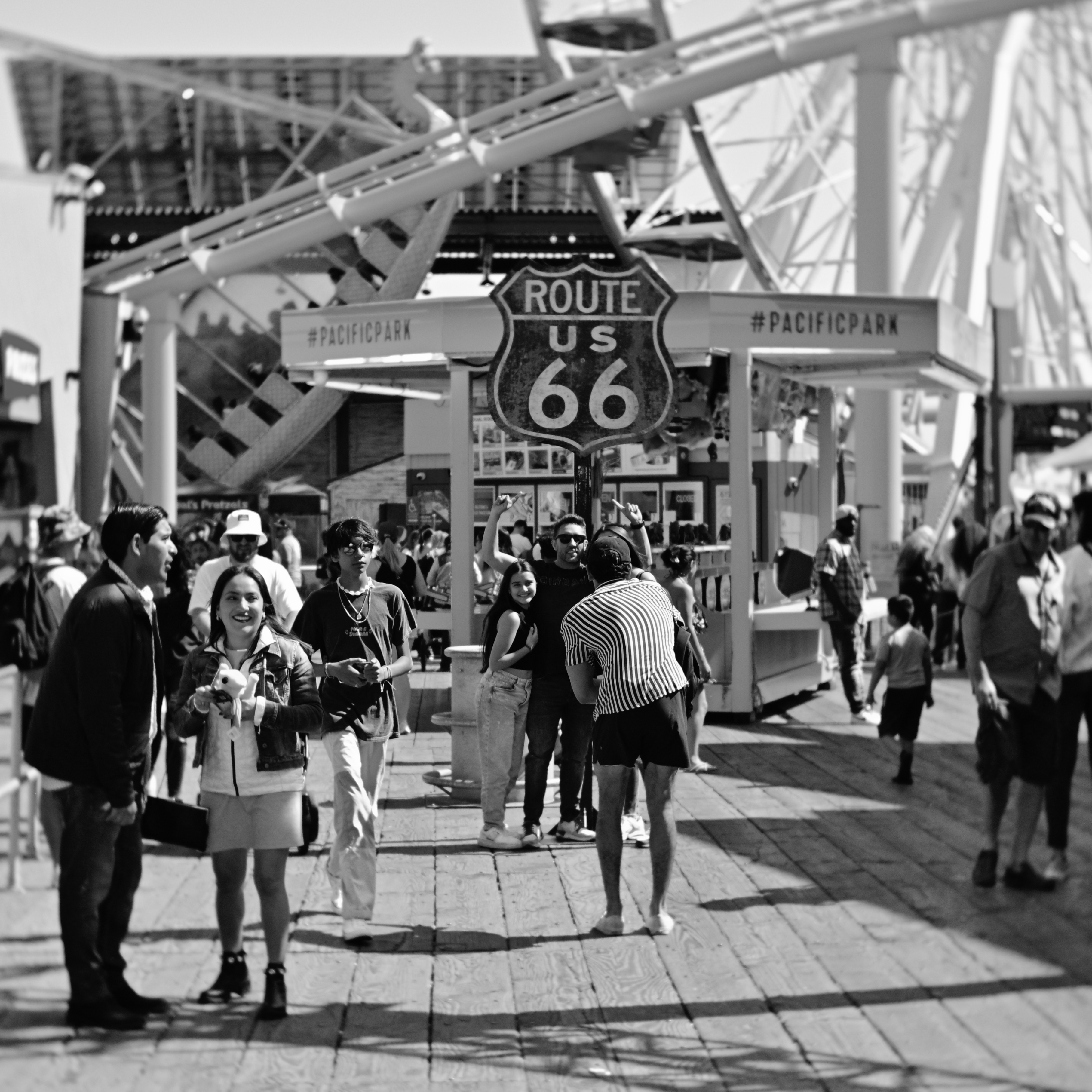
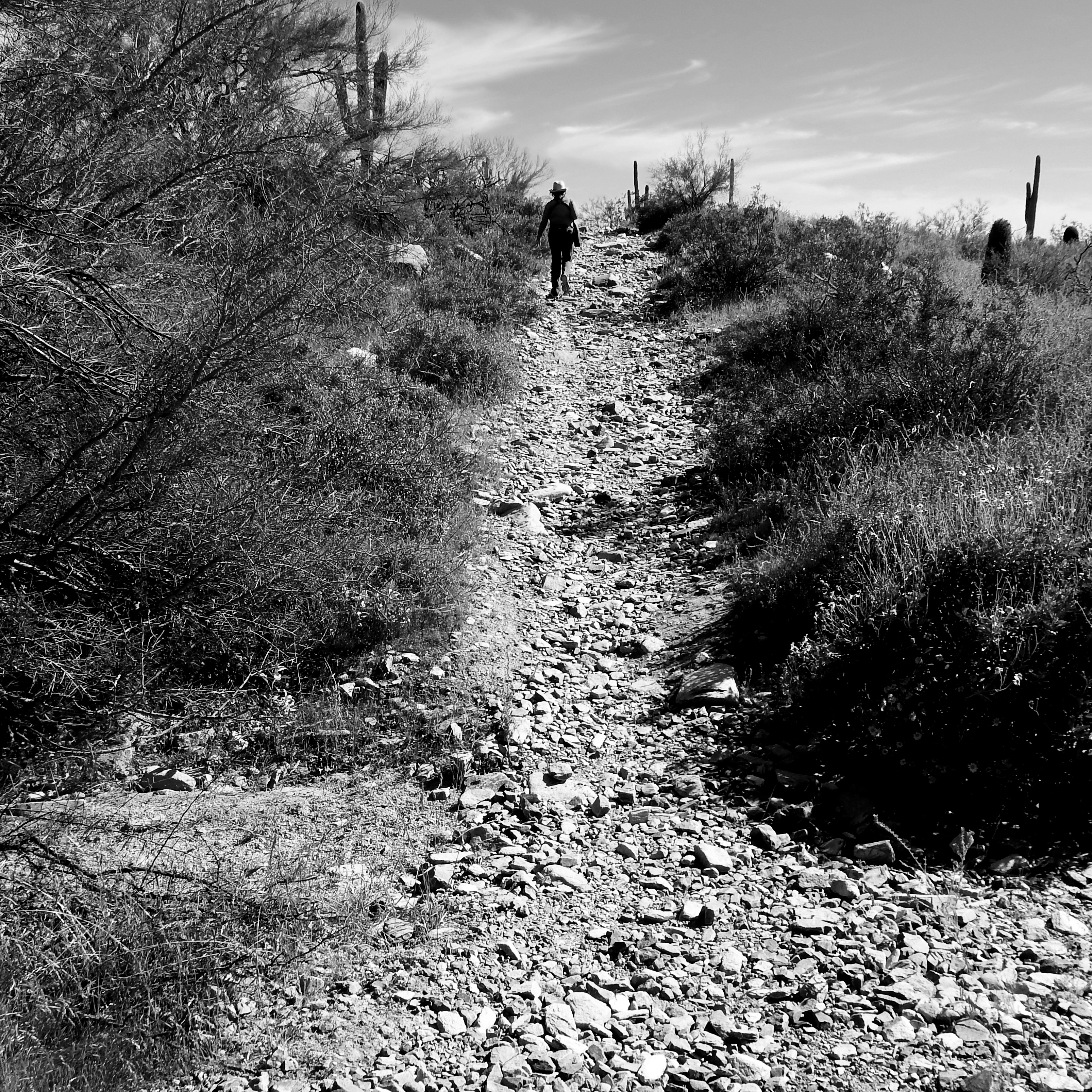
Mono image taken as one of three rapidly snapped frames, each one using a different pre-assigned preset in real time.
Over the past few years, I, like many, have tried to provide myself with several choices when capturing an image in real time. With a number of different film emulations pre-assigned to my camera, it’s easy to erase risk by just clicking from one such custom setting after another, taking the same scene in, for example, a faux Fuji transparency style, a simulated Kodachrome look-alike, and a custom monochrome profile reminiscent of classic Tri-X film. I don’t always elect to do this much coverage on a shot, but there are times when I worry about whether I’m making the right decision in the moment, and so I find the extra coverage reassuring, as if I’m improving the odds that something will work out. There is plenty of room in the photographic world to accommodate more than one kind of visual “truth”, and the most creative of us must be willing to toggle between them with flexibility and ease.
FUNCTION OVER FORM
By MICHAEL PERKINS
PHOTOGRAPHY BEGAN MAINLY AS A MEANS TO DEPICT THINGS, to faithfully document and record. Those things tended to be fairly concrete and familiar; a landscape, a building, a locomotive, portraits, events. Later, when painting freed itself from such strictly defined subject matter, veering into ever more abstract and impressionistic areas, photography, too, found itself exploring patterns and angles that were less “about something”, tableaux that were interesting as pure form.
The industrial age created many installations and factories whose purpose was not clearly obvious at first glance, but as vast collections of pipes, ducts, platforms, and gear that, unlike commercial objects, didn’t at once reveal what their function was. They weren’t contained in stylish cabinets or hidden behind alluring packaging. They just were, and they just did. The arrival of abstract industrial photography was the perfect means for merely admiring the contour and texture of things, without the need for context or explanation. Edward Steichen, Walker Evans and other giants saw and exploited this potential.
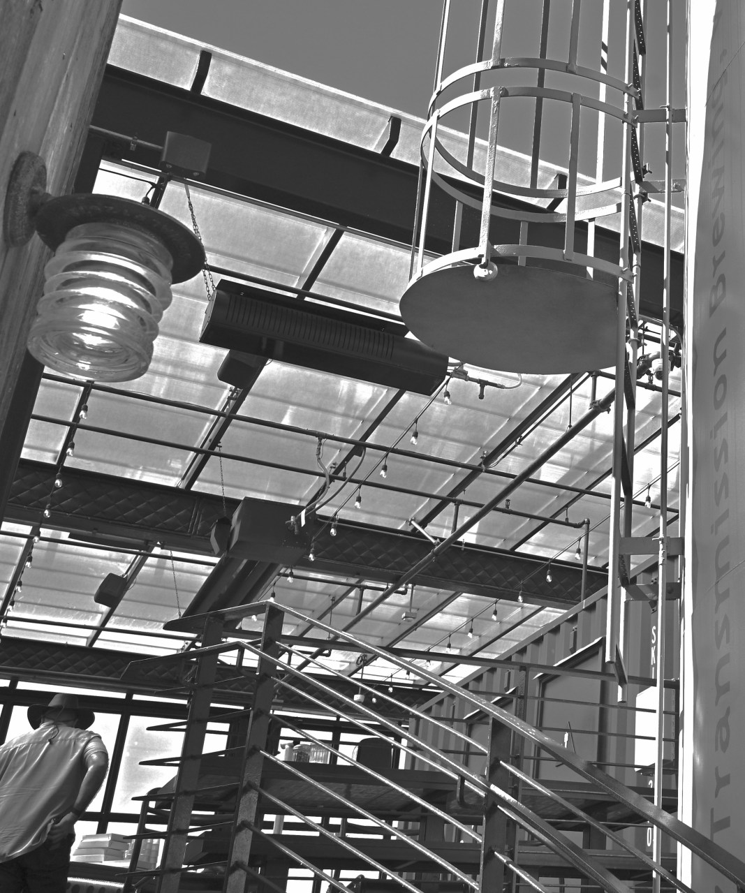
That Day At The Plant, 2025
I find myself still drawn to the same aesthetic, as I enjoy walking into complex structures whose use is not immediately obvious. It’s not so much an attempt to imitate those earlier creators of pure form photography as it is to rediscover their joy in the doing. It’s an homage, but it’s also me trying to have a subject affect me in the same way it did for those who went before me. And, of course, with its refusal to use tone to explain or contextualize things, I prefer to do this work in black and white.
In the end, it’s just one more way to look at things, a way to shake up your expectations. You can’t surprise anyone else if you can’t surprise yourself. Forcing yourself to see in new ways, to reconfigure the rules for what a “picture” is, provides stimulation, and that, in turn, invites growth.
HUE MONGOUSNESS
By MICHAEL PERKINS
THE LAST MONTH OF SPRING and the first month of summer in Ventura County, California are termed by the locals as “May Gray” and “June Gloom” for their long stretches of solidly overcast days. During that extended time-out from the area’s typically limitless supply of sunshine, I tend to experiment with variations on monochrome, given that the quality of color becomes flat and dull. There’s nothing blander to the eye than a beach town on a cloudy day.
This temporary cooling of hues usually has me playing with b&w contrast as well, since it, too is in short supply in May and June. But sixty days of gray is finally too much for my soul to bear, and I revert to in-camera color settings designed to spice up mere reality…to, in essence, fake the effect of true sunlight.
To this purpose, there are the scads of custom online settings “recipes” that shooters offer to cheat one’s way into splendor. One such sim that has made it onto my camera’s preset buttons is a fairly good fake of Fuji Velvia 100 slide film, which is a vital tool during Ventura’s annual dip into ick. As seen here, it’s really flattering to foliage and skies, if a bit surreal when it comes to reds and yellows.
Thing is, humans armed with cameras are humans that come predisposed to seek the sun, and thus open to breaking out the Crayolas to dose up on a little ersatz atmosphere. Is it enhancement? Sure. Is it “cheating” as my wife terms anything photographic beyond a straight-from-the-camera shot (including cropping)? Who knows? Who cares? Cameras are interpretive tools, not mere recording devices, and one man’s fudged workaround is another man’s miracle.
AT THE CORNER OF “WHAT THE” & “WHERE THE”
By MICHAEL PERKINS
PHOTOGRAPHS ARE AS MUCH ABOUT CONDITIONS AS OBJECTS. The first grand age of picture-making was chiefly about documenting the physical world, recording its everyday features like waterfalls, mountains, pyramids, cathedrals. The earliest photographs were, in that way, mostly collections of things. Next came the birth of photographic interpretation, in which we tried to record what something might feel like as well as what it looked like. Conditions. Sensations. Impressions.
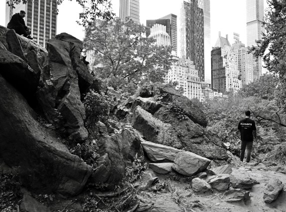
One thing that will invariably send me grabbing for a camera is when two seemingly disparate things create a unique relationship just by been juxtaposed with each other, as in the image you see here. The cheek-by-jowl relationship between the imposed order of Manhattan and the sacrosanct green space of Central Park has always been, to me, the ultimate study in contrasts. Acres of trees, lawns, playing fields, lakes, rolling hills, footbridges, and walking paths surrounded by a yawning, jutting canyon of steel and stone; the logic of the engineer yielding to the dreamy randomness of Nature.
The crags seen here just yards away from the skyscrapers of Central Park West look less like rock formations than the debris left after a war, as if the towers just beyond were somehow spared from an aerial bombardment. The contrast between order and chaos (and our shifting definitions of both of those terms) could hardly be sharper; so stark that, after shooting several frames of the scene in color, I decided that monochrome might better sell the entire idea of selective destruction, almost like unearthing an archived newsreel. The man on the upper left edge of the frame and the one standing alone in the gap between the rocks and the buildings both, to me, resemble the morning-after teams that might tour the damage a the previous night’s raid, salvaging what they can from the wreckage. Thus do photographs of things become documents of conditions, of the intersection between “what the” and “where the”. It’s a strange, and occasionally wondrous, juncture in which to find oneself.
New year-end galleries! Click on the tabs at the top of the page for new 2024 image collections.
ONE-ARMED PHOTOGRAPHY
By MICHAEL PERKINS
COLOR HAS NOW BEEN THE DEFAULT PLATFORM FOR NEARLY EVERY PHOTOGRAPHER FOR SO LONG that many (not all) of us tend to think of monochrome as some kind of deficit, that “real” pictures must, reasonably, be in color. It’s as if, having once put sugar on our corn flakes, we can’t imagine downing a bowl without that sweetness hit, or that trying to tell an effective story in a mono image is like tying one arm behind our backs. MONSTROUSLY HUGE DISCLAIMER: this is NOT the belief of millions of us who still shoot in black and white. I am grading a BIG cultural curve here….
To me, the two mediums are like recipes. One uses a sumptuously wide variety of spices, accents and seasonings to create a rich, full-bodied dish. The other uses a small list of ingredients, but can also result in intense flavor. Neither has a culinary edge or skillbragging rights over the other. In the use of monochrome, it’s all down to approach, which, for me, at the advanced age of 768, means calling on memories from when shooting that way was simply the only feasible choice.
That Wednesday At The Wharf, November 2024
Color was already in rapidly increasing use when I first crawled out of the photographic womb, but the default usage, globally, was still too mono. It was cheaper, for one thing. Also, there were many more people walking around who had trained when there was no other way to go, and their habits informed those of people like me, who were newbies at the time. So, now, when I deliberately conceive a b&w shot, I ask myself what, in that shot, I can achieve without color, or, more precisely, what impact mono will deliver for me that color would needlessly complicate or distract from. I find that if I ask myself, if I were forced to shoot this in mono, how would I make the picture work? Or, more pointedly for fossils of my vintage, how did I use to approach this?
There is nothing more counter-intuitive than a subject like the seaside. There is just so much that scrams at you to “capture it all”, or, in other words, grab every shade and hue of color. But, the fact is, once upon a time, I went to beaches with a basic Kodak and Verichrome film and somehow made at least some pictures that I was happy with. Can I still do that? Photography is a wonderful creative experience because of its blend of scientific surety (if you press this, the camera will do this), and the uncertainty involved in making anything aspiring to art (is this the right approach? Are my instincts correct?). What keeps the whole thing exciting is in trying to get the confidence/anxiety mix just right.
Or understanding that not everything’s black and white.
Unless you want it that way.
BLANK CANVASES
By MICHAEL PERKINS
I GENERALLY STEER CLEAR OF THE WORD “ABSTRACT“, since, like many other terms of art, it has been bludgeoned, by misuse and repetition, into a blunt instrument, rather than the surgical tool it might have been. If the word means, as one dictionary has it, something “disassociated from any specific instance” or, in another, as “expressing a quality apart from an object“, then it actually becomes a fairly accurate way of defining what happens when one art beholds another. We take the object away from its original context, or redefine it in our own terms. We begin to personally possess it, using words or pictures to say, “I know what this was ‘supposed’ to be . This is what this is to me.”
In this way, a person with a camera can approach any subject, regardless of its “actual” history, as if it were a blank canvas.
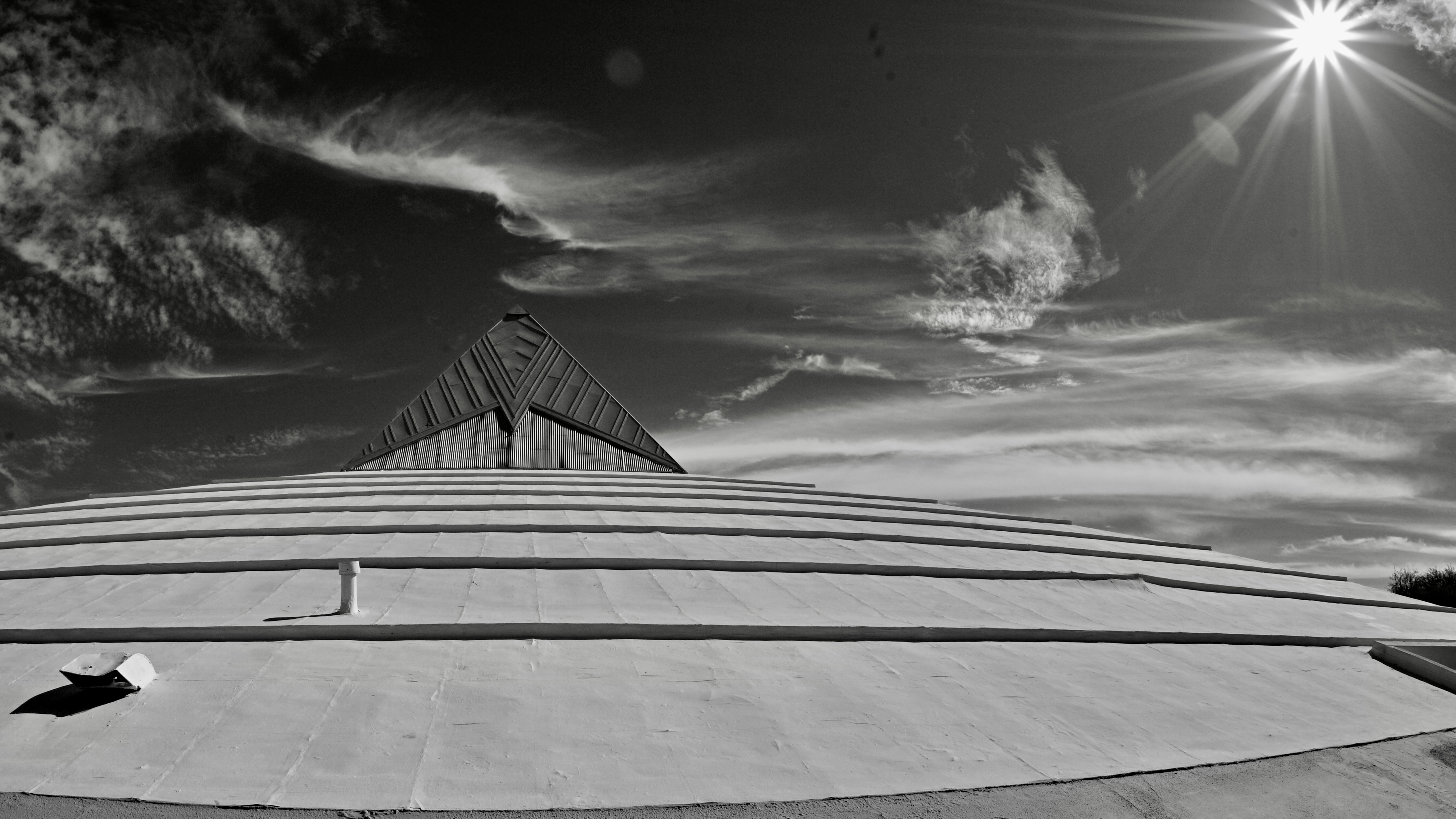
I approach the building seen here in exactly that way. Originally, it was a church of some kind, and by “some kind” I mean of the ooky-spooky, not-of-this-world variety. Hey, no judgement. The pyramid cap up top was deemed significant in some way in the overall design, but, as the place had long since been de-sanctified and put to other purposes by the time I first encountered it, the intent of the creator(s) has been lost to me….hence the “blank canvas”. The structure has no history at all, at least as far as my eye is concerned, freeing me to assign any meaning (or no meaning) to it pretty much at will.
Strategy-wise, part of the making of this image is an attempt to tie the building to something ethereal or mystical, leading me to shoot in monochrome for mood and using an f/16 aperture to convert the midday sun from a blinding glob to a multi-pointed starburst. I also decided to jack the contrast to extreme levels and darkened the insanely bright Arizona sky into something foreboding, imbuing the passing clouds with a bit of menace. The result? A temple? An alien mother ship? A gateway to another dimension? Your rules and your choice. The structure, as I came upon it, meant nothing to me, and so I got to determine its meaning. Or “a” meaning. And that, to me at least, is abstraction. Or maybe it was just a way to kill fifteen minutes while waiting on my wife. Or maybe I live in a world in which both things are true.
DETAILS, DETAILS
By MICHAEL PERKINS
MOST OF THE LOUDEST ARGUMENTS ABOUT THE USE OF COLOR in photography have, over the past sixty years or so, been turned on their heads. Before color film became the dominant medium for amateur shooters, roughly after WWII, elites within the fine art community, that is, the people operating at the Ansel Adams level of control and command, frequently debated whether color was of any value at all. Part of their argument stemmed from the primitive processing technology of the time, which made many photographers feel that color either exaggerated reality to an intolerable degree, or, worse, that really great color work looked flat or inaccurate in magazines or prints.
As I say, though, two thirds of a century can make a big difference, and for some time now, color has been such a prevalent default choice that it’s the decision to work in monochrome that is now questioned. Certainly b&w has not vanished from the earth, but, while it was thought of as a medium of imagination and fine control before color, it is now seen by some as limiting, “less than”. And that’s too bad.
Black and white invites speculation, an additional layer of interpretation on the part of the viewer. He or she must supply, out of their own imagination, something which is not stated in the original. Nearly everyone has some mental concept of colors, personal palettes so ingrained that we can seem to “see” them even when they are not shown to us in an image. That is, we have an internal way of visualizing color where there is none.
I keep detailed presets for both color and mono shots stored in my camera, so that I can switch back and forth between modes with very little delay. As a result, some of the images I shoot in color have an almost 100% compositional convergence between the b&w and color versions (see examples here), giving me the ability to shoot and evaluate quickly in the field, while the subject is before me in real time. If a subject is important to me, I nearly always ask myself whether it is better served in one medium or the other, and usually shoot it in both as a mental insurance policy against my own indecision. I mention the presets because I believe that sculpting the precise degree of contrast, sharpness, etc. in camera is far superior to merely desaturating a color shot later in post-processing.
Eventually, it’s freeing to arrive at a place where neither color or mono are “givens” for every situation but have to earn their use in each particular frame. All tools can be used for anything, but no tool will work for everything.
COLOR AS REAL ESTATE
By MICHAEL PERKINS
OCCASIONALLY YOU SEE ARTICLES PROCLAIMING THAT THE SELECTIVE DE-SATURATION OF COLOR IN PHOTOS is “finished”, that the process ran the entire gamut from novel to creative to “over it”, and that nothing fresh or new can be accomplished in what should now be considered a fad. I don’t know why some of us are perpetually in the pronouncement business, but I think it’s (a) short-sighted and (b) unhelpful to go around telling people what tools are or are not au courant. It’s also the opposite of the way art develops in the mind.
Just as the use or absence of color over an entire frame is a fundamental creative choice, so must the partial use of it. Rather than think of an image as having one color scheme that operates from end to end, I prefer to think of color as part of a multi-use piece of real estate, with multiple choices to be made as you walk the entire area. Color may be just what this lot needs, but not the yard next to this house. Every piece of visual real estate must be independently “developed”, whether in coordination with the overall picture or as a specialized visual traffic cop directing the eye for specific reasons.
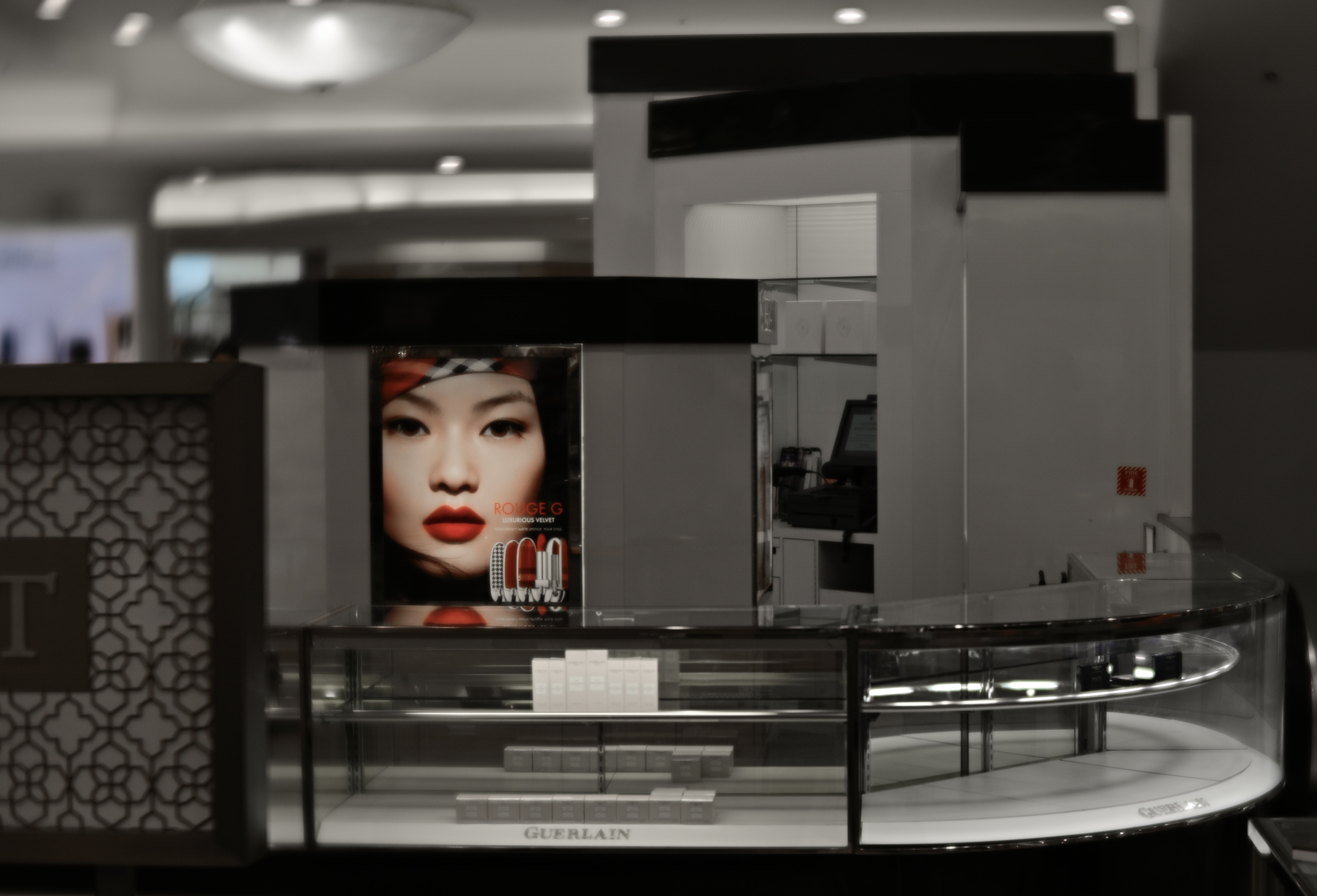
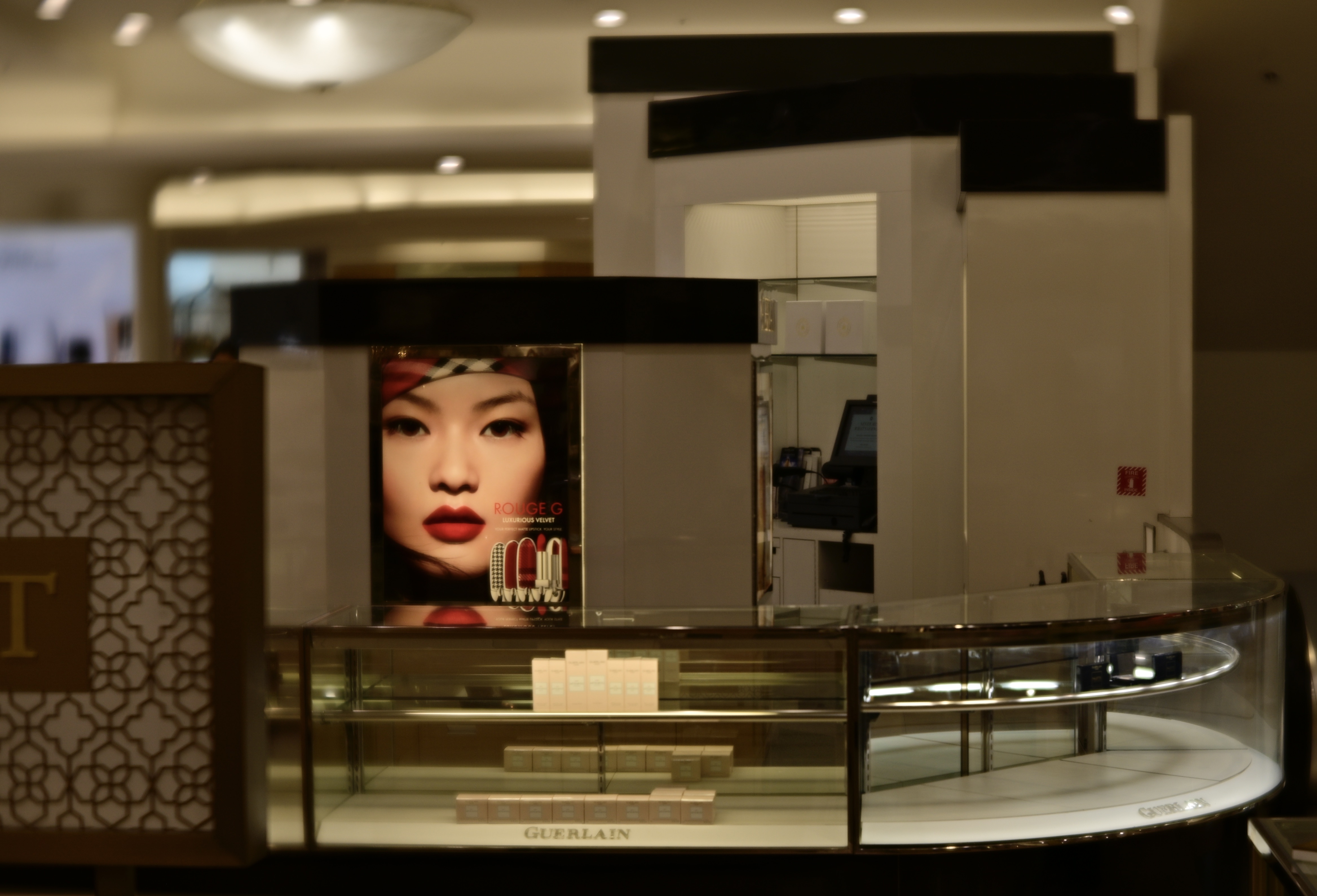
In the top image, the department store counter surrounding the advertisement is nearly empty, due to the area being almost totally closed down (stock situations, apparently). The exposure time was fast and the ISO was low and so the ambient color framing the ad was decidedly warm. Other than that, the color doesn’t serve much of a purpose as either narrative or atmosphere, so in the second version, all attention was centered on the model’s face, which carries more raw information than the rest of the frame. I think the picture is more immediate with the change, or at least more so than either a full-color or monochrome version would be.
Look, I get it. Photographers, no less than the writers of articles and op-eds, can get into the habit of seeing things in polar opposites. Still, anytime you refer to your method on a photo as “something I always do” or “something I never do“, you’re limiting yourself needlessly. And when it comes to making pictures, there are enough boundaries imposed on us naturally without our arbitrarily installing more.
ALPHA / OMEGA
By MICHAEL PERKINS
I USED TO THINK THAT ONE CLEAR DIFFERENCE BETWEEN AMATEUR AND PROFESSIONAL PHOTOGRAPHERS was that the amateurs recorded almost exclusively happy things, while the professional chronicled life’s grimmer moments as well. The “ams” were weighted on the side of weddings and birthdays, while the “pros” also threw funerals and war into the mix. Of course, I now see that as a gross over-simplification, albeit one which applies less and less with the aging of our world.
I do believe that the average shooter still hauls his/her camera out mostly to freeze incidents of joy, but, to a greater degree, all of us occasionally turn our gaze on the failures of the human animal as well, with raw physical destruction, intended or not, as a huge pictorial draw. When people (or their dreams) fail, there is often a spectacular visual result. Smashed walls. Craters. Wanton destruction. In such pictures we catch ourself in the act of discarding or destroying things that, in some way, represent dreams that have ground to a halt.
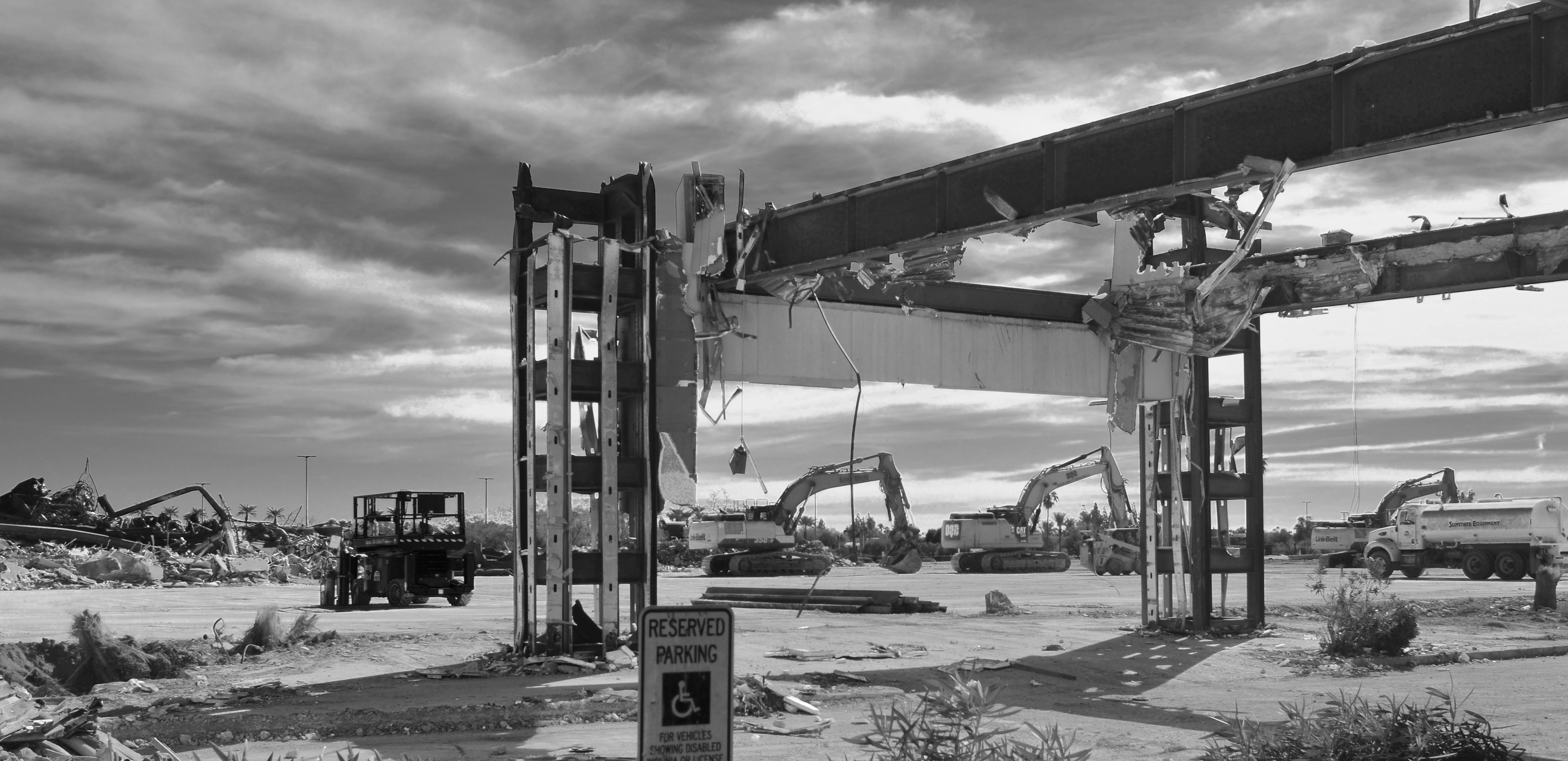
All across the world, the willing disassembly of our various infrastructures, such as this image of an old mall being wiped out of memory, is something of a cultural apology, an admission that, sorry, this just doesn’t work for us any longer. The amateur in us would gladly have snapped this place forty years ago, say, at its grand opening. The pros among us, or at least the growing number of us that are thinking more and more like citizen journalists, want to document the moment the vision perishes of old age, or just plain irrelevance. In the case of this particular place, the ground is merely being cleared for what will be a bigger, newer version of the same fake-community concept that gave rise to what’s being torn down, so, lesson not learned.
We always are interested in the ribbon cuttings, the alphas of things: however, in creating a record of the omega phase, of the end of the trail of those things, we are doing more than just making “sad” pictures. We are making a document of hope and loss, and all the temporary realities sequenced between those two historical brackets.
THE MONTH I GOT MONO
By MICHAEL PERKINS
MY FIRST DAYS AS A PHOTOGRAPHER occurred just after color film had almost completely supplanted black and white for daily use. Certainly, many snapshots and news images were still shot on b/w, but, as my father was a slide shooter all the way, I cut my teeth on Kodachrome and Ektrachrome and what NBC used to call “living color”. I was also heavily influenced by View-Master travel reels and scenic mags like Arizona Highways, and so, again, not a lot for the mono side of my infant brain to feed upon.
Later on, as I educated myself on the Old Masters, I grew to appreciate grayscale at its finest, but still tended to shoot primarily in color, with the exception of the odd side project. With that in mind, it occurred to me recently that, while I had done several lengthy shooting walkabouts over the years in order to speed up my learning curve with various bits of gear, I had seldom, if ever, done a long stretch purely in black and white. A newly acquired camera seemed the perfect time to give myself mono for a month.

One thing which interested me in expanding my visualization in b&w was that the latest cameras can do so much more than just shoot “without color”. Grayscale can be so much more nuanced than merely the absence of hue, and today’s in-camera settings can allow more attenuation in contrast, sharpness and tone than was ever possible in the past. Another selling point was the ability of most recent full-function cameras to place a complete custom configuration of settings at your fingertips by, essentially “storing” them on a dial-able slot in the mode wheel (U1, U2, U3 modes for Nikon, C1, C2, C3 for Canon, and so forth) This allowed me to quickly shoot with both sides of my brain when needed, dialing between, say, manual mode (in full color), and a U1 mode pre-programmed with every little flavor ingredient I want in a mono shot.
The take-home is just this: the mere increase in ease of operation made me shoot more, and with greater enthusiasm, in black & white than I would typically ever do. With just a little prep, my eye got used to consistently composing for what mono does best, getting me used to thinking primarily in that particular tone palette. And, although I know that many prefer merely to take a master shot in color and convert it to mono later on at their whim, I believe that deliberately conceiving a grayscale shot in-camera is a distinctly different experience, one which is helped greatly with the use of electronic view-finders, which let you see precisely what the sensor sees.
Going forward, I will probably budget more mono shots into my overall output than I ever have before, all through the expedient of using the camera to, well, get out my own way. And, as I frequently assert, reducing the steps and hassle between conception and execution is the true superhighway to better pictures.
READING THE ROAD

By MICHAEL PERKINS
COMPOSITION IN PHOTOGRAPHY IS NEVER MERELY A MATTER of rearranging the deck chairs on the good ship Take-A-Snap. Yes, at first, there is the frame to be dealt with, and with that, the crucial decisions on what stays in and what gets left out. And then there is the front-to-back and side-to-side staging of the image, the visual coding you build into the picture to tell your viewer where to look and how to prioritize what he sees, a process influenced as well by contrast, depth of field, and other shooting settings.
But there is another crucial way to instruct the viewer’s eye on how all this information ranks within itself, and that is the decision to shoot in either color or monochrome. It’s true that, merely by landing on one or the other, you haven’t added or subtracted any visual elements that weren’t already in the frame. That is, you didn’t stick in four more trees or yank out the ocean shore. However, pictures in these two opposing modes convey information in distinctly different ways, and so both will confer certain qualities on the objects in the frame based on how the eye takes in that information. This can either make your picture pop with dimension or sink into murk.
Color assigns a rank to things and relegates objects to either shadow or light, foreground or background. Monochrome does this as well, but in a far subtler manner, meaning that some color shots which are clear in their message might appear muddled or muted when rendered in black and white. Conversely, something which is direct and contrasty in mono might appear either weakened or magnified in color.
In the case of the two renderings seen here, the tangly busy-ness of the color shot (top) seems, in monochrome (above), to make a very dense photo much harder to read. There is so much texture in the color version that just becomes mushy in grayscale, so that the mono version does nothing to simplify the shot….quite the opposite. The Color/No Color decision can either make or break even a well-balanced composition by making the “look here” rules for the viewer too ambiguous or unclear. Reading the room can help pictures communicate cleanly.
MORE IS LESS IS MORE
A color master shot that I later converted to mono, an operation which is perfectly suitable in many occasions.
By MICHAEL PERKINS
THE ARC OF MY EARLY CHILDHOOD PARALLELS ALMOST PERFECTLY the photo world’s universal switch to color, with my earliest images still rendered in living monochrome, and pictures from my teens giving way to the bold hues made possible by cheaper and faster consumer films. That switch meant a profound change in how one could evaluate light and shadow through the viewfinder, because for the first time, even as you saw your subject in color, you could safely assume that your final picture would more or less look the same.
Think about it what a change that was. If your first rolls were shot in mono (as is still the case with some photo students), you actually had to frame in color, even while you trained your brain to “see” in black and white. After some practice, you might be reasonably sure of how the tonal balance of your work might register once it was rendered in shades of gray, but you couldn’t be certain until you had the results in your hand. And while lab manipulation, including processes like dodging and burning, were possible, the universe of “post-production”-oriented photographers was much, much smaller than is the case today, meaning most of us got….what we got.
The post-processed mono conversion. Would I have made different decisions had I been mastering in black and white?
Things are much easier for monochrome fans today because, not only is it simple to shoot in black & white on purpose on nearly any camera, previews on LCDs and electronic viewfinders (EVFs) allow you to compose in mono as well. EVFs are even more of a revelation for people coming from DSLR or traditional rangefinders, because you are looking at precisely what the sensor is seeing, making for a smaller gap between your conception of the shot and what you actually get. Since moving to a mirrorless camera, I have become quite spoiled by this extra measure of control. Never mind the fact that, in the Stone Age, I had to wait three days for film to be returned from the processor just to learn how many shots I’d botched. Now both the waiting and the botching are distant memories.
And we have a question from audience: why not just shoot in color all the time, and convert shots to mono as needed (see examples, above)? Well, because you have a more pronounced mindfulness about what will work in mono when you preview and plan in mono, just as you have a better record of what happened from keeping a diary during a trip than in trying to reconstruct your memories later. Or such is my experience. The point is that deliberately doing a day’s shoot in black & white can teach you patience, restraint, and how factors other than color can determine the drama or impact of a shot. But photography is all about how many different roads there are to Oz. As long as you eventually get to the Wizard, it’s all good.
PLAYING IN THE RIGHT KEYS
Listening For The Lark, 2022. A monochrome conversion from a color master shot.
By MICHAEL PERKINS
SOME OF OUR PHOTOGRAPHS CERTIFY THEMSELVES TO US AS “RIGHT” OR “WRONG” over time, not registering instantly as either keepers or pitchers, but slowly making the case for their final disposition. These are the truly tricky shots, the ones whose success or failure is not readily apparent upon first, or second, or even fifth glance. Such images go in and out of the workflow bin again and again, sometimes over years, while we decide whether we recognize them as our own offspring.
Sometimes it means we partially embrace a shot, loving it in spite of a slight technical miscalculation or a composition that’s slightly off. Other times, we trust/mistrust our original intention, which is French for “what was I thinking?”. In recent years, as I’ve returned to the tonal range of my first days as a shooter, I often stick pictures in the “still under consideration” pile over the choice of whether to re-render them in monochrome. I often think of color and b/w as two different arrangements of the same theme, or maybe a song played in one of two very distinct keys.
The color original.
Since mono was the default of my earliest days, I naturally learned to shoot in it first. Once color became the go-to for most photography, I deferred to that. I don’t intentionally shoot my master shots in mono because it means pre-empting a choice that I might want to exercise later. You can easily go from color to no color, but,…. well you know the argument, and so that seems to mark me as a conversion person. Black and white is a choice, but not if you had no other choice in the first place, right? Mono has its own tonal vocabulary and creates a separate mood or priority of light than color. And for that reason, as well as the need to weigh and re-weigh my options pretty much forever, many of the pictures I can’t decide to love or hate hinge on the strengths and weaknesses or the two tonal “keys”.
Is color more bold, or can a more dramatic statement be made in its absence? Does monochrome tantalize, tease the appetite for more information, stimulate the imagination, and does it do so more effectively than a garish explosion of hue? Which of the two modes is, for me, in this particular instance, more “authentic”? And is that what I even want in the first place?
There are lots of images which cry out to be completed, to have their case file marked “closed” with a final determination of their value. But if art is about forcing flexibility where some would favor rigidity, then it’s probably a desirable thing for us not to rush to judgement on some of our pictures. Maybe they came into the world fully formed, and maybe not. But maybe, after all, it’s us who need to become more complete, in a variety of ways.
WHO SHALL I SEND?
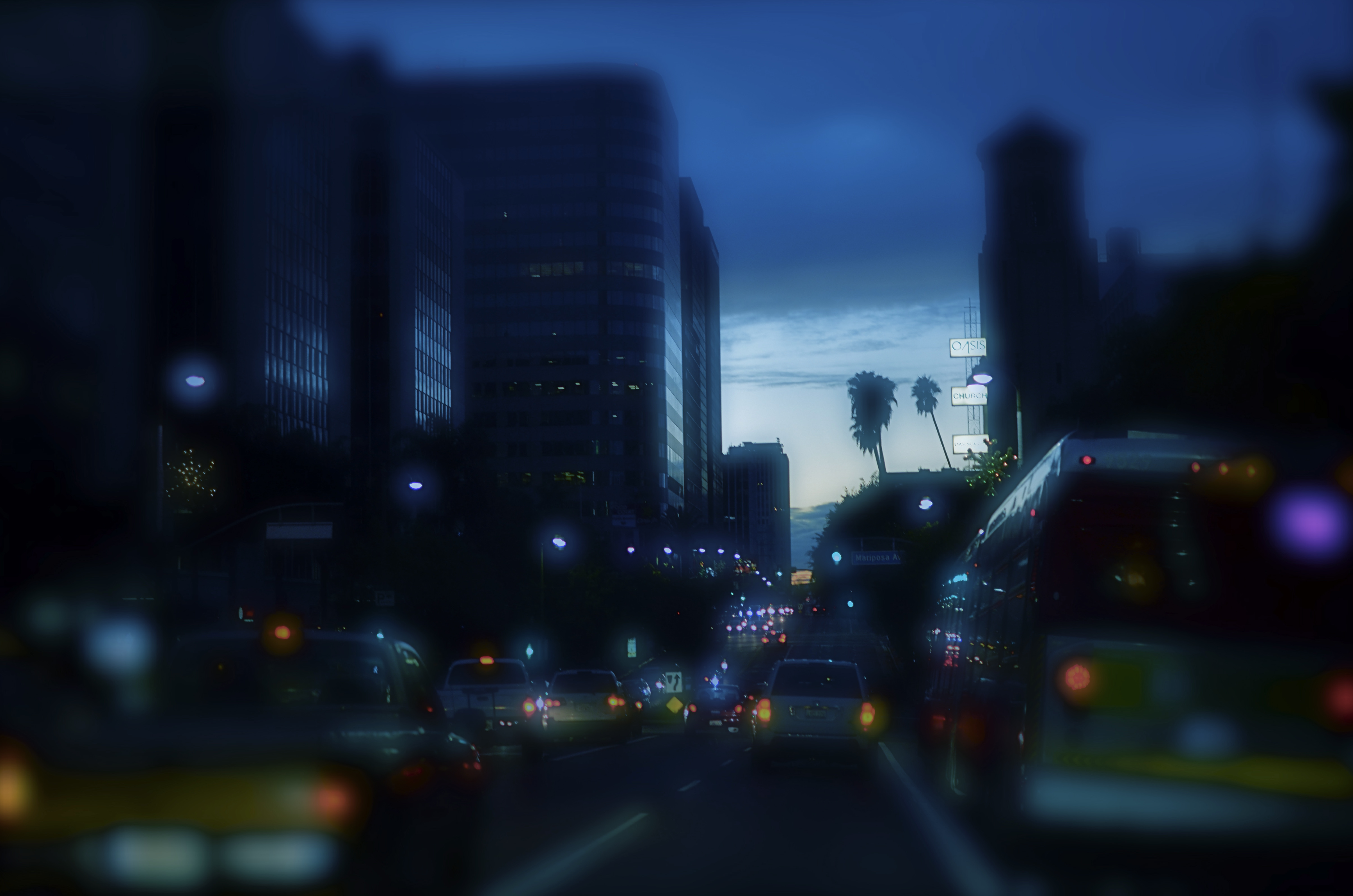
Central Los Angeles, 2013. Is color the right “messenger” for this night shot, or will the monochrome version, seen below, do the job more effectively?
By MICHAEL PERKINS
COMMUNICATION IS ABOUT TAILORING MESSAGES WITH THE MESSENGERS THAT DELIVER THEM. In conveying ideas and information, we work both to shape its content, and to send it under the care of the correct carrier. Some messages are best transmitted in pure sonic terms, fitting the formatics of, say, radio or telephone. Other have truer impact in visual media. And within the overall scope of visual media, in that special folder marked “photography”, we make additional choices. Because, even after we’ve chosen a still image to get our point across, there remain more specific decisions within that folder that may enhance the delivery of our idea. And the most fundamental of those decisions revolves around the simple choice of color/no color.
There certainly must be a reason why, more than 75 years into the era of convenient and available color media, many photographers still deliberately choose monochrome as their primary messenger. It can’t be merely for the novelty or nostalgia that it can evoke. Indeed, black and white is much, much more than the mere absence of the full color spectrum. We need to weigh this choice just as carefully as we do exposure or focus, because there is something about either option that describes an aesthetic, a way of seeing the world. You can probably recite the various claims yourself: color is more “natural” or “realistic”: b&w is more journalistic, authentic: mono streamlines the impact of an image, simplifying its readability without distraction: color allows the fine-tuning of mood. And so on.
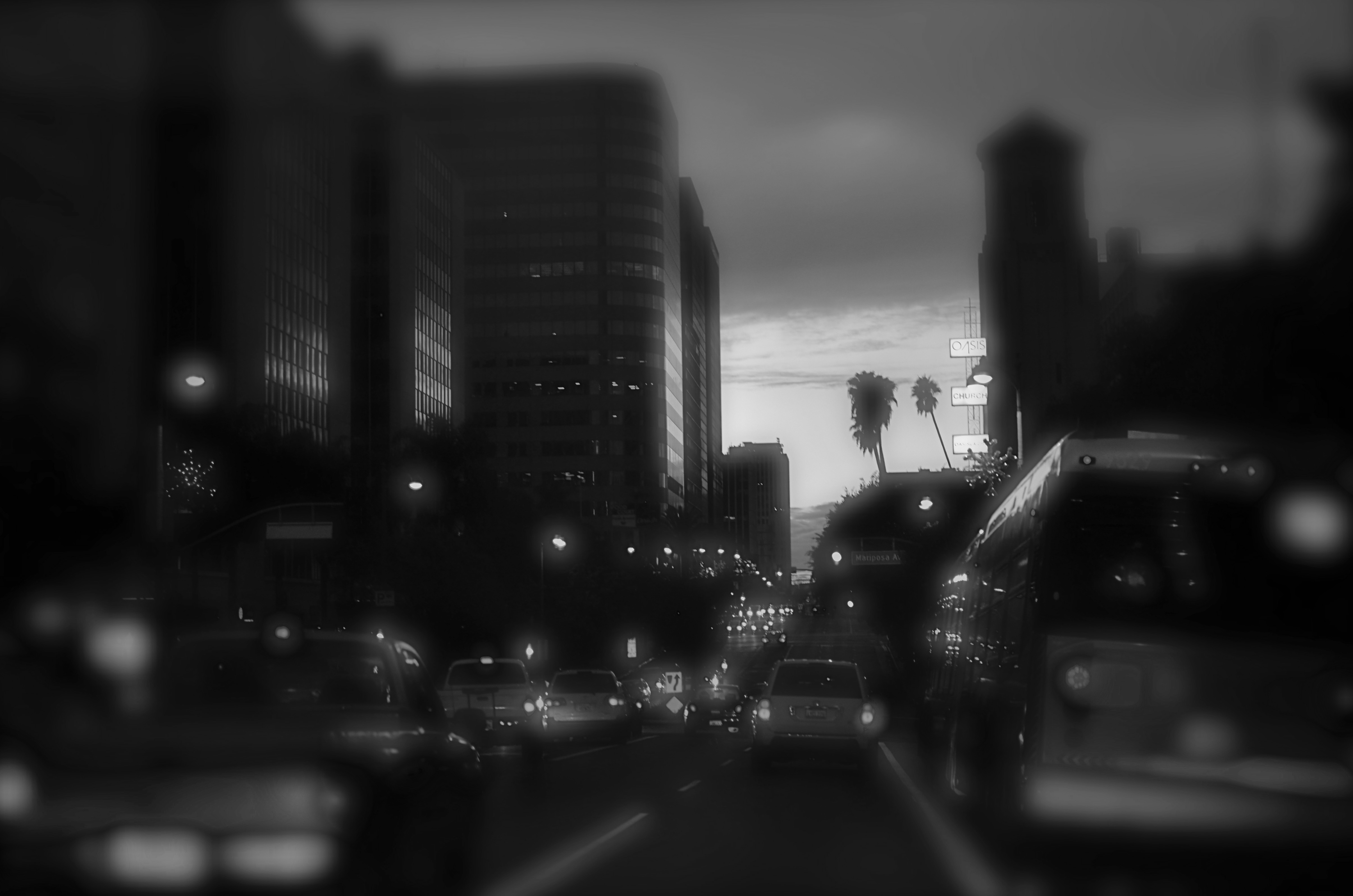
Is the absence of color here equal to the absence of impact?
Some of us shoot in mono as a default, while others master their images in color and make postmortem decisions to desaturate them in post. Some of us have returned to film, solely to reacquaint us with earlier colorless versions of our camera eye. Even in the age of full-color graphics in any and all publications, part of our monkey memory still imparts a certain authority to black and white, disdaining color as too “pretty” or decorative. The argument is endless.
My point here is that, since our cameras and apps can now make anything look like, well, anything, we need to examine the message we’re trying to transmit and match it as perfectly as we can to the messenger that best gets the idea across. We need to, as with the kings and emperors of old, ask not just about what we want to convey, but “who shall I send?”. We have more choices available to us than any other generation across the vast history of photography. We never need to weaken the power of our images by dressing them up in the wrong suit.
COLOUR MY WORLD (OR NOT)
By MICHAEL PERKINS
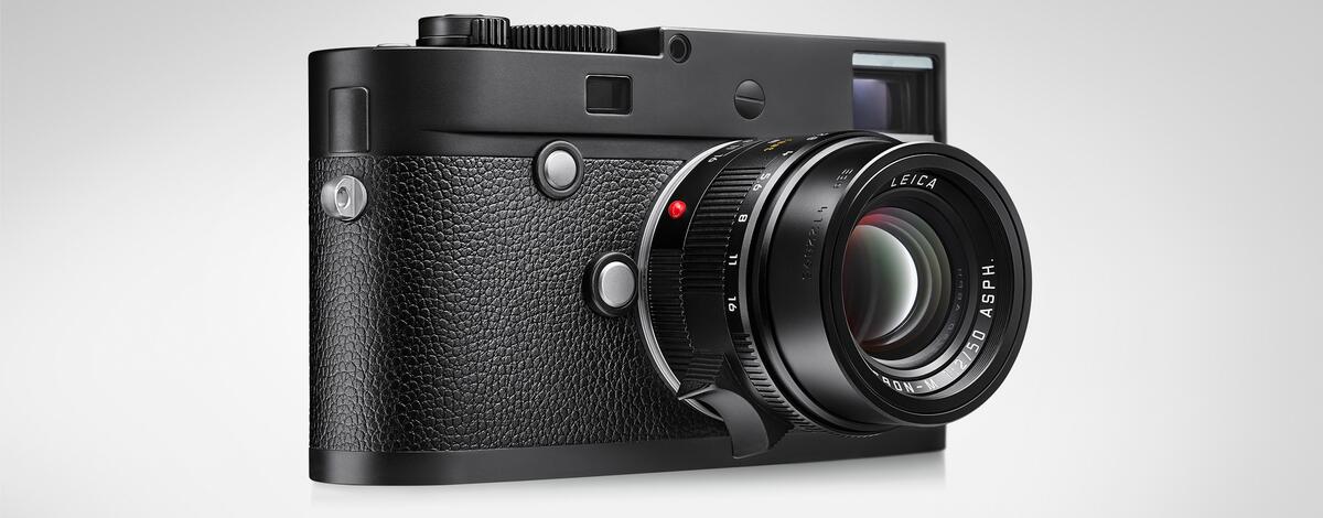
This camera costs $8,995 and cannot, will not ever, take a color image. How many would you like?
EVERY PHOTOGRAPH EVER CREATED BY A DIGITAL CAMERA, regardless of subject, technique or approach, begins as the very same thing: a black-and-white image. Even in an era of saturated and custom-manipulated color, our cameras originally create everything in tones of grey. Aesthetically speaking, that’s about as hard-wired a bias toward monochrome as you can imagine. And this means exactly what, and to who?
The science of how this happens is all rather basic, at least in the horrendously oversimplified way I’m going to explain it. In addition to the camera’s pixel-covered sensor, that assigns tonal value for a photo file in black and white, there is, in most cameras, a second sandwich layer, called a Bayer filter array, that combines with the sensor to assign color to those tones. This all happens without many of us giving it much thought, since black and white, at least mentally, is no longer the default mode for most of us, merely an effect that we achieve either by changing a setting on the camera’s shooting menu or converting color shots to b/w in post-production after the fact.
Where this gets interesting is when an affection for both mono and technical perfection meets the niche camera market, resulting in the creation of cameras that shoot nothing but black-and-white, inciting some wags to intone, “at last!” while many others query, “what are you, nuts?” Those who vote with the skeptics point to the fact that the pro-sumers who opt for such a machine, such as Leica’s M10 Monochrom, will part with nearly nine thousand clams for the privilege of enjoying one less feature than even the cheapest camera delivers. Wait, they say. You took something away from the camera and you’re charging more for it? Well, I gotta bridge I wanna sell ya…
On the pro-sumer’s side of the argument is the trickier, tech-ier underbelly of the issue. Turns out that the Bayer array actually degrades your images, reducing the amount of light that gets to the final file, compromising both sharpness and ISO performance in low-light situations. That in turn means that removing the Bayer array from the camera boosts its fidelity in a significant way, resulting in less loss in both cropped images and enlargements. Do these benefits register as must-haves for the average shooter? Does the romance of shooting in black-and-white only, which, as we’ve pointed out, used to be the default status of all cameras way back when, still have the allure that it once did, and for how many consumers? This is the part of the program where you do your own math and makes your own choice.
Now, let’s be honest. I love me some elite toys, especially the ones I would never, in a million years, actually purchase. I love $3,000 direct-drive analog turntables mounted in virgin-forest koa. I love $500 counter-top appliances that only de-vein and parboil jumbo shrimp. But the turntable can’t make my old Black Sabbath albums any better musically (nothing can, sadly), not can the shrimp gadget confer Wolfgang Puck status on my random kitchen meanderings. Could I take better pictures (whatever that phrase means) with the most technically advanced camera on the planet? Only if I can take good pictures with anything, from a cigar box pinhole to a NASA telescope. And, if you spend years failing to develop the eye for making pictures that connect with people, it takes more than a $9,000 bandaid to make that not be so.
ADDITION BY SUBTRACTION
BY MICHAEL PERKINS
“THE EYES HAVE IT” went the old maxim, a phrase which was a kind of bookend to another chestnut about the eyes being the “window to the soul”. Both sayings relate to most of our earliest photographic training, with scads of manuals and tutorials dictating that all portraits must focus (literally) primarily on the eyes, even at the expense of sharpness in the remainder of the picture. This rule has also been enshrined in the eye detection focal systems of even the most rudimentary cameras.
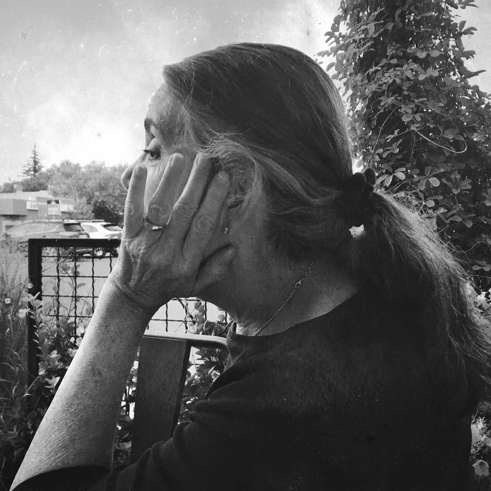
All of which has served us well, apparently, during these days of the Great Hibernation, when masks have concealed many clues to our personality, even as they have protected us against contagion. Indeed, in many social situations, the eyes have become almost the sole messenger for people’s inner thoughts, intentions, moods. And depending on how you view the situation as a photographer, that’s either maddeningly frustrating or grandly intriguing. Still, the idea of making a formal portrait of a person while they are masked hasn’t really occurred to me as a legitimate means of measuring the self of said person. I am always waiting for the gauze to come off, for the “complete” person to be revealed.
That’s why, recently, I was truly surprised when, out of about a half dozen snaps of my wife Marian as she visited with a friend, I chose the one with the least amount of her face in view as my favorite. There’s was something…call it mystery, call it minimalism…about the way her hand momentarily fanned across her features in much the same area that a mask might cover. Why was this interesting? Why is anything interesting? The point was that her eyes were, indeed, a perfectly reliable barometer of her mood, prompting me to ask, how much face is enough face for a portrait? Are we more fascinated by what is left out of a picture? And, if so, are there many more remarkably veiled faces to be explored before the Age Of The Mask fades away?
TONAL TOSS-UPS

BY MICHAEL PERKINS
THE MOST SIGNIFICANT ADVANCE IN PHOTOGRAPHY OVER THE PAST SEVENTY-FIVE YEARS, at least for me, is the fact that everyone, regardless of gear or budget, shoots in color as a baseline default. I am old enough to remember when the opposite was still true, when most people shot primarily in monochrome, either because of the cost, or the slow speed of color film, or the fact that labs were still not great at delivering natural polychromes, or, in some circles, because the medium’s artists disdained color as too brash or distracting. The digital era completed the conversion to color as the starting place for a master shot, in that the camera will always shoot that way unless you deliberately tell it not to.
And that’s a choice I don’t fully understand. I always make every master shot in color and then decide which of those will be more effective without it. Because then my choices are unlimited, whereas, if I’m forced to shoot masters in mono, I can’t second-chance the shot back into color later. Even more confusing to me are the high-art cameras that are manufactured to shoot black-and-white only, cameras that are typically twice as expensive as ones that shoot in both formats. It’s like paying twice as much for a steak that someone’s already taken two bites out of.

Most of all, I like grappling with certain shots. I dig the inner quarrel that goes on as to whether color will complete or compete with a picture’s power. Some color images have an immediacy that is simply too muted in b&w, but there are times when the message of a picture will be diluted if something too loud or pretty fights with it for dominance. That’s why they put more than one foot pedal on pianos.
For instance, the “before” and “after” versions of this storefront have been haunting me for several weeks now, and I still can’t declare a clear winner. Is the contrasting mixture of bolder colors a comment on the changing phases within a business block over time, or does the removal of color call more attention to texture and shadow? I consider that the practice of mastering a photograph in color, for many years a luxury, remains my favorite control option today. In a medium where messages are measured by so many factors, the color/no color decision might, at least on occasion, be the most important call a shooter can make.
THE YEAR OF UPHILL WALKING
By MICHAEL PERKINS
LIKE MANY, I WOULD HAVE A HARD TIME pinpointing the first photograph I shot after formally going into the Great Hibernation of 2020. The designated do-or-die date for heading ourselves into the bunker was fairly elastic, person-to-person, with some of us taking cover early in the spring, while others were forced to stay in-pattern for longer. I can determine, from the very type of pictures I took in this strange year, which were shot After The Before Times, but it would be mere guesswork to say that this image or the other was the first “confinement” photo per se.
But I can detect a change in the subject matter and viewpoint of those first days. I will always recall the realization that, as my world proceeded to shrink, my photography would become more introspective. This meant that my reaction to the sudden flood of spare time was, at least on good days, to luxuriate in the freedom it gave me; the leisure to select, to plan, to choose in the process of making pictures. As a consequence, in reviewing the year’s photographic yield, I find myself not so much choosing “favorites” or “bests” from the thousands of snaps I took in quarantine, but instead looking for the truest depictions of where my head was, and still is. This is all to say that I resisted getting in a year-to-year contest of some sort with myself over technique or skill and tried to concentrate on emotional accuracy.
Running Up That Hill, March, 2020
This picture is not technically distinctive by any measure, nor is it particularly original, but it is true to where I was when I made it. In what could be called The Year Of Uphill Walking, it projects that struggle to just keep climbing, across rocky, barren terrain, in anxious anticipation of what may lie over the next horizon, and without the blandishment or warmth of color. No destination is sure, or even promised; no arrival time is predicted; only the journey itself exists. If I had to deliberately try to show what 2020 felt like, I couldn’t have found a more appropriate visual metaphor than this picture. This is not me being a superb planner of shots. This is me, months after the fact, marveling that some measure of this madness somehow organically made it into my camera. I never went out formally looking for a way to give expression for my feelings; I merely let the process happen through me, to be a barometer of what I thought it important to see and record.
Maybe that’s the way I should always make pictures. Sometimes I think I understand my process and other times I feel like it’s leading me around by the nose. I hope to re-discover genuine hope in 2021, but, if I…we, have to settle for less, I pray that I’ll at least find a way to tell stories about how that felt. And I hope I’ll remember how to put one foot in front of the other.
CHROMEDOMES
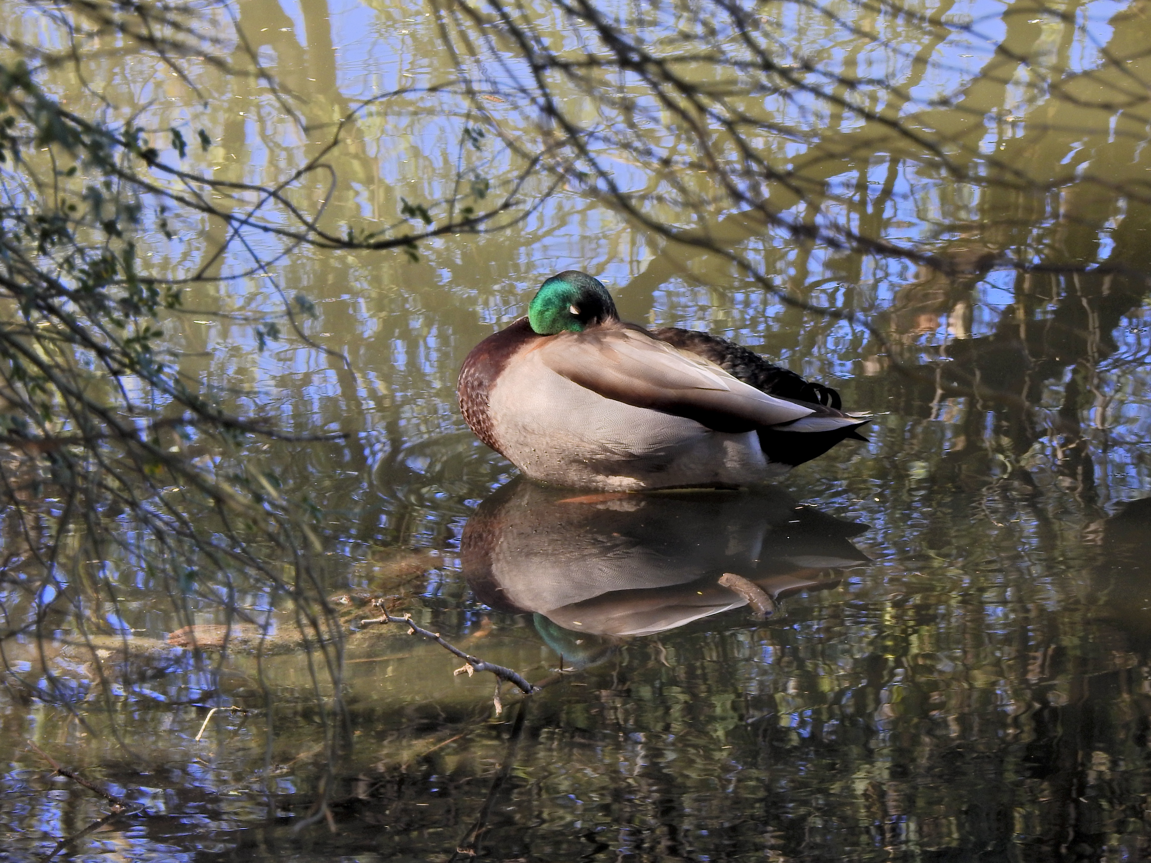
This color original is lovely, but the multiple hues on the water seem to fight with the duck for attention.
By MICHAEL PERKINS
THERE IS FAIRLY SOLID CONSENSUS, among those who teach the basics of photographic composition, that the path to success lies in reducing a picture to its simplest terms. Removal of extraneous distraction, proper placement of a subject within a frame, depth-of-field calculations…all these techniques work toward a common goal; to help the eye engage the photo efficiently, to lock onto its essential story without being confused or deflected toward something less important. Often a cleaner composition is just a matter of cropping, or merely limiting the number of elements contending for the viewer’s attention.
But there is one approach to basic composition that may not be instinctive to us all, and that’s the role that color plays in our pictures.
Color is the current instinctive default for most of our photos. It took a long time for it to be technically capable of taking that mantle from monochrome, which was, by necessity, the palette that shooters painted on for over a century. Color is seductive, and seems like a more “realistic” medium for our very personal universes of family and friends. However, in the composition of any picture, it must be reckoned with as another object in the frame, no less than a tree or a cloud. It is one more thing in there that demands our notice, and, for many images, it certainly earns that attention. However, color can become the message of a picture, not just the way the picture is rendered, drawing off the viewer’s eye in exactly the same way as extra props, extraneous scenery or other clutter can.
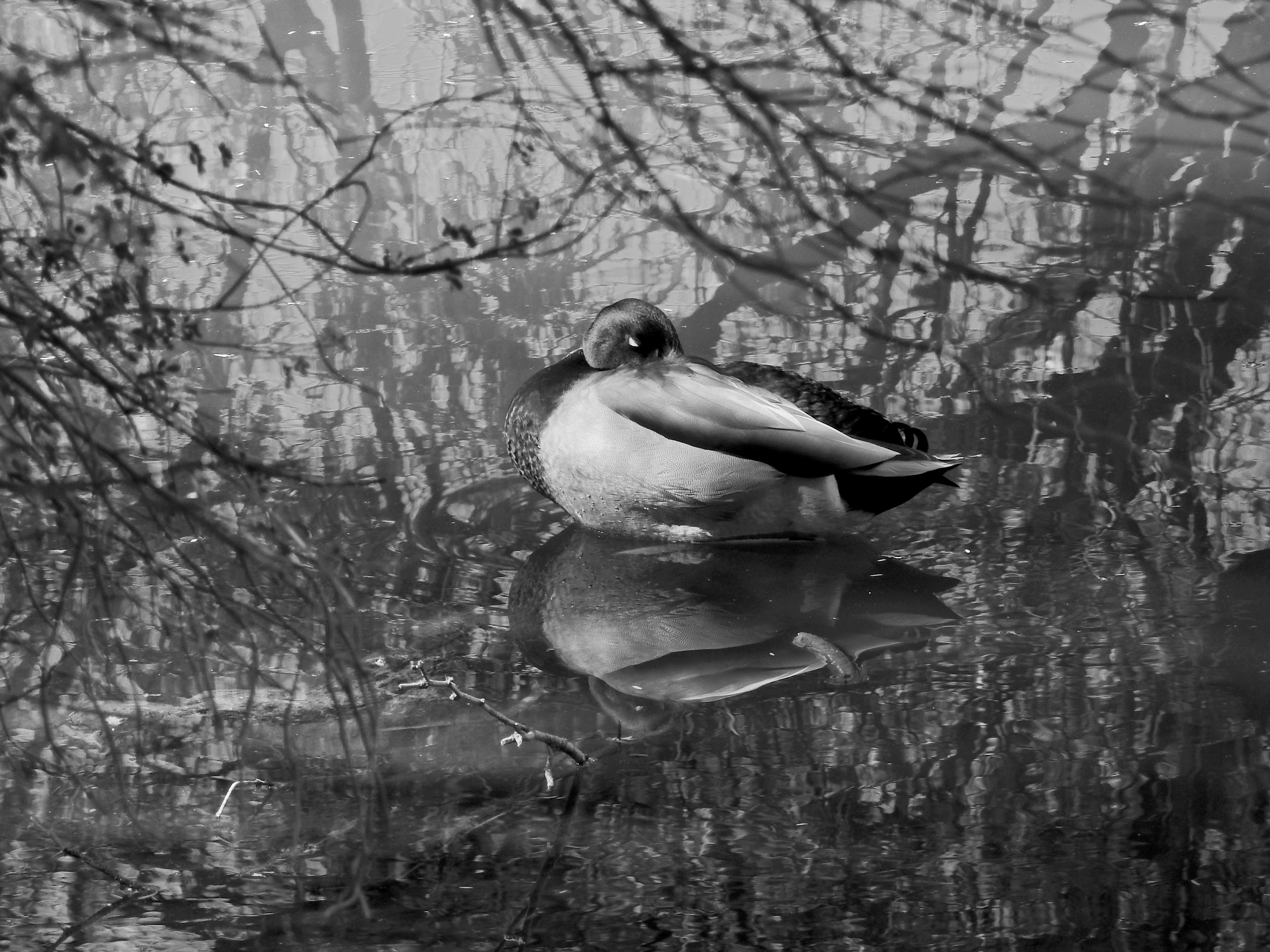
Neutralizing the reflective hues on the water can make the center subject a bit more prominent.
Some would argue that black and white is more nuanced and subtle in the rendering of emotional directness, or texture, or contrast when compared to color, and yet some of us think of monochrome as somehow incomplete or unfinished. Try telling that to several dozen Pulitzer winners, some of whom, admittedly, worked before color was practical (and therefore not a real option), along with others who continued to choose b&w even after it became the minority medium. And this is not about unilaterally choosing sides, forever pitting the Kodak Tr-X crowd in a pitched battle against the Fuji Velvia cadre. It’s only about choosing the right tool for every picture, and not getting so locked into the global color default that you refuse to peer into the opposite camp. I continue to master every shot in color to this day, but a full fifth of my final output consists of mono conversions, with modern post-processing giving me every bit as much control over the results as in the old darkroom days (as seen in the illustrations). The best course, I believe, is to form the habit of looking at all your pictures both ways. Often, you will just stick with the color original, because it works. And other times you will play in the other playground because, for some pictures, that works.
Color is an object within your pictures, no less than a mountain or a chair. Think of it as another piece of visual furniture fighting for dominance in the frame, and deal with it accordingly. Monochrome is not photography’s simpler, poorer step-kid. Sometimes, it can be the pride of the family.

HUE AND HUE ALONE
A monochromatic, and yet full color, image.
By MICHAEL PERKINS
MOST DISCUSSIONS ABOUT PHOTOGRAPHY begin with a body of commonly held terms, the basic and uniform names given to things. Such common ground is vital if we’re to understand each other. I can’t expect you to hand me a hammer if I ask you for a wrench. And so we base all our conversations about making images on words that mean generally the same to all of us….focus, aperture, exposure, etc. Makes sense, doanit?
And yet, over the years, we can disagree on what some of those words even mean, and that can slow down discourse.
Take the word monochrome. Most simply translated from the original Greek word monochromos, it means “having one color”, just as a monopod is a one-legged tripod. Seems a simple enough concept, and yet, in recent years, photographic journals, camera manufacturers and, Lord save us, blogs have increasingly begun to define the word as something that is color-less…that is, black-and-white. I know, seems like a really nit-picky point to raise in these complicated times of serious issues. And yet, if we allow imprecise speech to creep into our communications, we eventually get discourse which is imprecise as well.
Black-and-white, or grayscale is monochrome, but not all monochrome is black and white. The image seen here consists of varying tones of a single color, and so, strictly speaking, it is monochromatic, but is certainly not grayscale. Since photography was exclusively b&w for almost a century before films could produce a complete range of hues, we tend to think of the medium as being divided into two eras, Before Color and After Color. However, shooters who worked nearly their entire careers in grayscale, or, let’s say, a good 2/3 of an Ansel Adams’ lifespan, black-and-white was not “colorless” but a kind of color all its own, as legitimate as blue or red or whatever have you. Under the present understanding of these things, however, my image of a warm orange railway bench would be summarily tossed out of any image sharing site that defined itself as monochrome-themed. And that would be wrong.
Yes, I know……
Can’t you think of anything else to obsess over on a Sunday morning, old man?, I hear you moaning. Well, yes, yes I can. However, a 400-word treatise on why my poached eggs were runny at breakfast wouldn’t exactly leave readers riveted either, so, for the moment, let’s not call a wrench a hammer, and let’s not pretend that only grayscale is monochrome.
Share this:
February 28, 2021 | Categories: Commentary, Opinion | Tags: Color, Monochrome | Leave a comment