ART VS. ARTIFACT
By MICHAEL PERKINS
PHOTOGRAPHY HAS NOW ARRIVED AT A TRULY STRANGE PLACE. It’s no big bulletin that modern processing and phone apps now allow us to simulate the various visual defects and flaws we used to summarily reject from our images, deliberately including them in our pictures as design elements. Things to be desired.
Features to make the picture better.
????? Let’s take this out of the realm of photography for a moment to see how truly insane it is.
One of the more ridiculous gimmicks of the digital age in audio (which is, let’s face it, free of the scratch and hiss of analog recordings) was to put both these sources of annoyance and noise back into CDs. Hip-hop has been particularly egregious in the inclusion of crackle and scratches into tracks, as if these effects conferred some kind of authenticity on the results. It’s like a guy who gets a chin scar in a woodshop accident, then tells women at bars that he got it in a knife fight. Fake life, fake cred.
Back to photos, where downloadable apps let you slather on filters that simulate photos which appear damaged, ravaged by time, poorly exposed, marred by light leaks, or ruined as the result of faulty film processing. Now, think about this: we have become the first generation of photographers who think it is creative/profound/cute to make our pictures look bad on purpose, to make images that our predecessors would have (rightly) rejected as marred, imperfect, wrong.
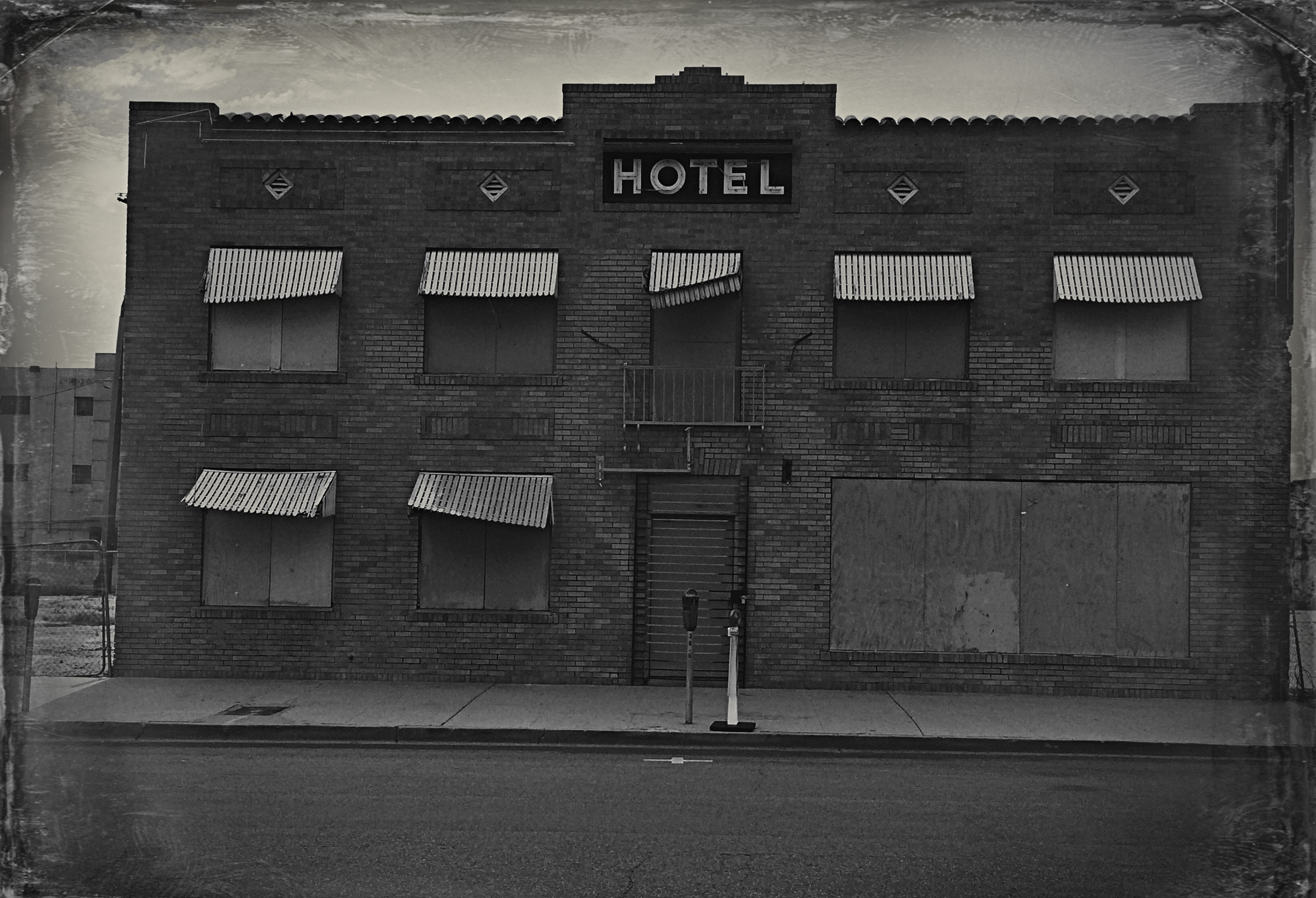
Is this photo anything, or did I just keep dress it up in a funny party hat?
I took this image on a cel phone, then processed it through the app Alt Photo to simulate a daguerreotype. I did it mostly as an experiment, but then, in a moment of weakness, I posted it on image sharing sites where, so far, it has garnered over 5,000+ hits. Here is the problem: I can no longer determine whether my essential image has any merit, or whether its popularity is solely due to the effect. That bothers me. I feel that any attention or approval this photo has achieved has happened, well, dishonestly. I get the fun aspect: I enjoyed it, as a novelty, a lark, but the thought of anyone taking it seriously disturbs me. And I am angry at myself for giving into the temptation to put it out there.
Gimmicks aside, photography means something. Making a picture means something. And technical crutches that draw attention from that process are just cheap card tricks. Distractions. What an interesting problem: as a consequence of our technical cleverness, we are now locked in an eternal struggle between art and artifact.
THE GREAT RIDDLE
By MICHAEL PERKINS
IT’S FORTUNATE THAT NONE OF US HAS ANY IDEA WHAT APPEALS TO OUR VIEWERS, or else everything we do would revert to a dull formula. If it was possible to predict which of our creations would establish a connection with other hearts and minds, wouldn’t our human nature tempt us to churn out clumsy duplicates of that creation again and again? You see this at craft shows where “artists” hawk dozens of copies of the same image to anyone who passes by, customizing only the frames and enlargement sizes. The first version of the idea was “art”; the cannily repackaged remakes are merely marketing.
With this in mind, the act of putting photographs on the web via various sharing sites is often a puzzling process, since I have no way of knowing whether anything I regard as “successful” will total even one view, and since the pictures I regard as merely “all right” may resonate in a fashion that I never foresaw. Again, I have no control over any of this, which makes it both gratifying and, well, stupefying.
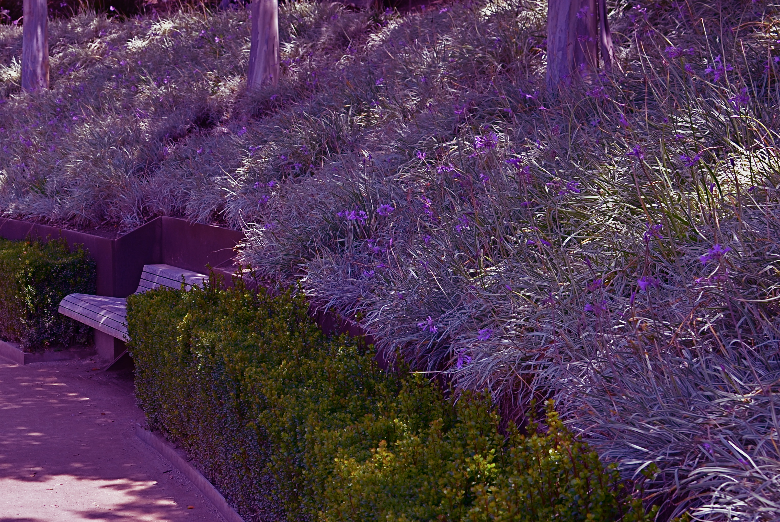
Dream Gardens, Los Angeles (2013). 1/250 sec., f/5.6, ISO 100, 35mm.
You’re looking at the runaway champ photo for total views in my entire Flickr photostream. To me, it’s a bit of whimsy at best, and, if I am totally truthful, an attempt at a partial “save” on what started out to be a rejected image. Backstory: the massive and visually busy central gardens at Los Angeles’ Getty art campus are wonderful to walk through, irresistible to shoot, and a nightmare to capture. If you do the cliché overhead “master shot” of the entire area from, say, two stories in the air, you get something which generally work. However, trying to get a sense of the densely landscaped details at ground level is a fool’s errand. This shot represents a kind of surrender, as it was an attempt to create a quiet composition along one of the more sparse sections of one footpath. Even so, what you’re seeing here is a paring-away of more than half the original frame. There was just too much visual information to work with.
The psychedelic rework on the color is yet another sign that I am not truly comfortable with what I am doing, but it at least represents an attempt to create an “otherness” with the image, to take it out of the normal world. This strategy gave me a picture I could live with, but hardly one I would point to with pride. The verdict from every one else? 5,000 % more eye traffic than the next most popular picture I’ve ever posted on the web, and no sign of slowing. And yet, I know that if I intentionally take another picture like this, it won’t become part of a “series” or a “school of thought”, merely me trying to cash in on a great riddle.
We use our photography to make a case for our various visions to an unknown jury, but, in most cases, we sort of “get” what worked about a picture. But when mysteries like these occur, we can merely
a) be grateful
b) say goodnight, Gracie.
I am reminded about an old bit where Billy Crystal “imitated” famous people by cutting out the mouths of big posters of various icons, then sticking his own lips where theirs should be and “speaking” for them. I fell on the floor as he took his place behind a huge image of Albert Einstein, and in his best Catskills accent, kept repeating, “WHO KNEW? WHAT DID WE KNOW??”
What, indeed.
Follow Michael Perkins on Twitter @MPnormaleye.
FEWER TOYS, MORE TOOLS
This is Nikon’s “High-Key” effects mode. It’s a cheap gimmick, and you paid for it, even though (a) it is not High Key and (b) you can easily make this shot yourself. 1/30 sec., f/2.8, ISO 1250, 35mm.
By MICHAEL PERKINS
MANY OF THE “ENHANCEMENTS” OFFERED BY TODAY’S MAJOR PHOTO GEAR MANUFACTURERS ARE, IN FACT, OBSTACLES to learning how to take responsibility for making pictures. The automatic bells and whistles that are being engineered into today’s cameras seems to send the message: you don’t have to think too hard. Push the button and we will provide (and predict) the results.
It may be fabulous for convenience, but it’s lousy news for the experimentation and personal risk which are required for great photography to occur.
We live in a time of short cuts, of single-button solutions for every creative problem. We have modes for that. Low light, too much light, a day at the beach, a day in the snow, a closeup, a landscape? Guaranteed results at the dial-up of an automode. Hey, you’re an artist. No need to obsess about all that techno-whatsis. Your camera will determine the results. Just dial up what you want: it’s all automatic. You need hardly be there.
Does anyone really believe that anything of artistic value can evolve from machines being in charge? When’s the last time a computer created a novel of staggering impact? Who is taking the picture here…..you or your camera?
Fully automatic, aperture priority and shutter priority are all good basic tools, and wonderful work is done in all three modes as well as full manual. But there is a huge leap between these settings and the gaudy, gimmicky “effects” modes that are increasingly larding up cameras with novelty and diversion.
Let’s take a look at some of the prime offenders. Are these toys necessary?
NIGHT VISION: If you want a picture to look like you took it while on combat recon in a forward area of Afghanistan, go for this option. Boosts your ISO up to 25,600 so you can get some image on the sensor, even in utter blackness, loaded with grain and visual muck. And why? Useless.
COLOR SKETCH: Concerts your original image into an “arty” rendering, minus the shadows, attenuating tones, or subtlety. Looks just like a classy artist knocked out a masterpiece with his box of charcoals! Fools no one except perhaps extremely learning-challenged chimps. If you want to be a painter, fine, then do it, but let’s stop calling this an enhancement.
MINIATURE EFFECT. Okay, so you can’t afford a real tilt-shift lens to create the illusion that your aerial shot of Paris is really a toy-sized tabletop model, so let’s take your photo and throw selective parts of it out of focus. That should be good enough. We’ll now allow a five-minute pause here for the exactly two times you’ll ever care about making a picture like this.
SELECTIVE COLOR. De-saturate portions of your original for dramatic effect. This is the opposite of the images of a century ago, when people, before color film, added selective hues to monochrome images…for dramatic effect. Only thing is, drama should already be in the picture before you apply this gimmick, hmm? Like many effects modes, this one tempts you to use it to fix a photo that didn’t tell its story properly in the first place. And yes, I have sinned in this area, sadly.
SILHOUETTE. The camera makes sure your foreground subjects are dark and have no detail. In other words, it takes pictures exactly the way your Aunt Sadie did with her Instamatic in 1963. Oh, but it’s so artistic! Yes, cameras always make great art. All by themselves.
HIGH KEY or LOW KEY. This used to mean lightening or darkening of selected items done by meticulous lighting. Now, in Camera Toyland, it means deliberately under-or-overexposing everything in the frame. See earlier reference to your Aunt Sadie.
As far as what should be built into cameras, I’m sure that you could compose your own wish list of helpful tools that could be available as quick-dial aids. My own list would, for example, include the moving of white balance choices from the screen menus to the mode dial. Point is, for every ready-made effect that you delegate to the camera, you are further delaying the education that can only come from doing things yourself. If you want a happy picture, make one, rather than taking a middling one and then dialing up the insertion of a magical birthday cake in the middle of the shot after the fact.
As point-and-shoots are eventually replaced by smartphones and DSLRs position themselves to remain competitive as least on the high-end portion of the market, there seems to be a real opportunity for a revolution in camera design….away from toys and in favor of tools.
follow Michael Perkins on Twitter @mpnormaleye.
BLUE ON THIRD AVENUE

The cyanotype option in Nikon’s monochrome posting menu makes this in-camera conversion from color easy. 1/80 sec., f/5.6, ISO 160, 18mm.
By MICHAEL PERKINS
COLOR IS LIKE ANY OTHER COMPONENT IN LIGHT COLLECTION AND ARRANGEMENT, which is, really, what we are doing. Seen as a tool instead of an absolute, it’s easy to see that it’s only appropriate for some photographs. Since the explosion of color imaging for the masses seen in the coming of Kodachrome and other early consumer films in the 1930’s, the average snapper has hardly looked back. Family shots, landscapes, still life arrangements….full color or go home, right?
Well….
Oddly, professional shooters of the early 20th century were reluctant to commit to the new multi-hued media, fearing that, for some novelty-oriented photographers, the message would be the color, instead of the color aiding in the conveying of the message. Even old Ansel Adams once said of magazine editors, that, when in doubt, they “just make it red”, indicating that he thought color could become a gimmick, the same way we often regard 3-d.
In the digital age, by comparison, the color/no color decision is almost always an afterthought. There are no special chemicals, films or paper to invest in before the shutter clicks, and plenty of ways to render a color shot colorless after the fact. And now, even the post-processing steps involved in creating a monochrome image need not include an investment in Photoshop or other software. For the average shooter, monochrome post-processing is in-camera, at the touch of a button. Straight B/W and sepia and even what I call the “third avenue”, the blue duotone or cyanotype, as I’ve used above.Do such quickie options worsen the risk of gimmick-for-gimmick’s sake more than ever? As Governor Palin would say, “you betcha”. Google “over-indulgence”, or just about half of every Instagram ever taken, as evidence.
Hundreds of technical breakthroughs later, it still comes down to the original image itself. If it was conceived properly, color won’t lessen it. If it was a bad idea to start with, monochrome won’t deliver the mood or the tone changes needed to redeem it. Imagine the right image, then select the best way to deliver the message. Having quick fixes in-camera aren’t, initially, a guarantee of anything but the convenient ability to view alternatives. In the photo above, my subject was just too warm, too pretty in natural color. I thought the building itself evoked a certain starkness, a cold, sterile kind of architecture, that cyanotype could deliver far better. The shadows are also a bit more mysteriously rendered.
At bottom, the shot is just a study, since I will be using it to take far more crucial pictures of far more intriguing subjects. But the in-camera fix allows you to analyze on the fly. And, since I got into this racket to shoot pictures, and not to be a chemist, I occasionally like a fast thumbs-up, thumbs-down verdict on something I’ve decided to try in the moment.
Giving yourself the blues can be a good thing.
(follow Michael Perkins on Twitter @ mpnormaleye)
Related articles
- Toning my Cyanotype with Haritaki (altlab2011.wordpress.com)
- Beyond Color (piaffephotos.wordpress.com)
PULL DOWN THE NOISE
by MICHAEL PERKINS
PHOTOGRAPHY OFTEN SPEAKS LOUDER IN A SOFTER VOICE. Think about it. If you accept the idea of visual information as a sort of “sound”, then it’s easy to see why some images don’t make a direct connection with viewers. They are busy, overloaded with information, or, in this metaphor, noisy, loud. Cachophonous. Chaotic. Too many “sounds” competing for attention. In a visual image, “noise” can be anything that keeps anyone from hearing the “voice” of your image. To be seen more clearly, pictures need to go soft, in order to be heard louder.
That usually means simplifying the image. Shaping its tone, its framing, its central message. In photography, we all make the mistake of trying to show everything, and, in the process, creating an overdose of data that sends the viewer’s eye wandering all around the picture, trying to find something, anything, to focus on. We present a three-ring circus where just one would be more than adequate.
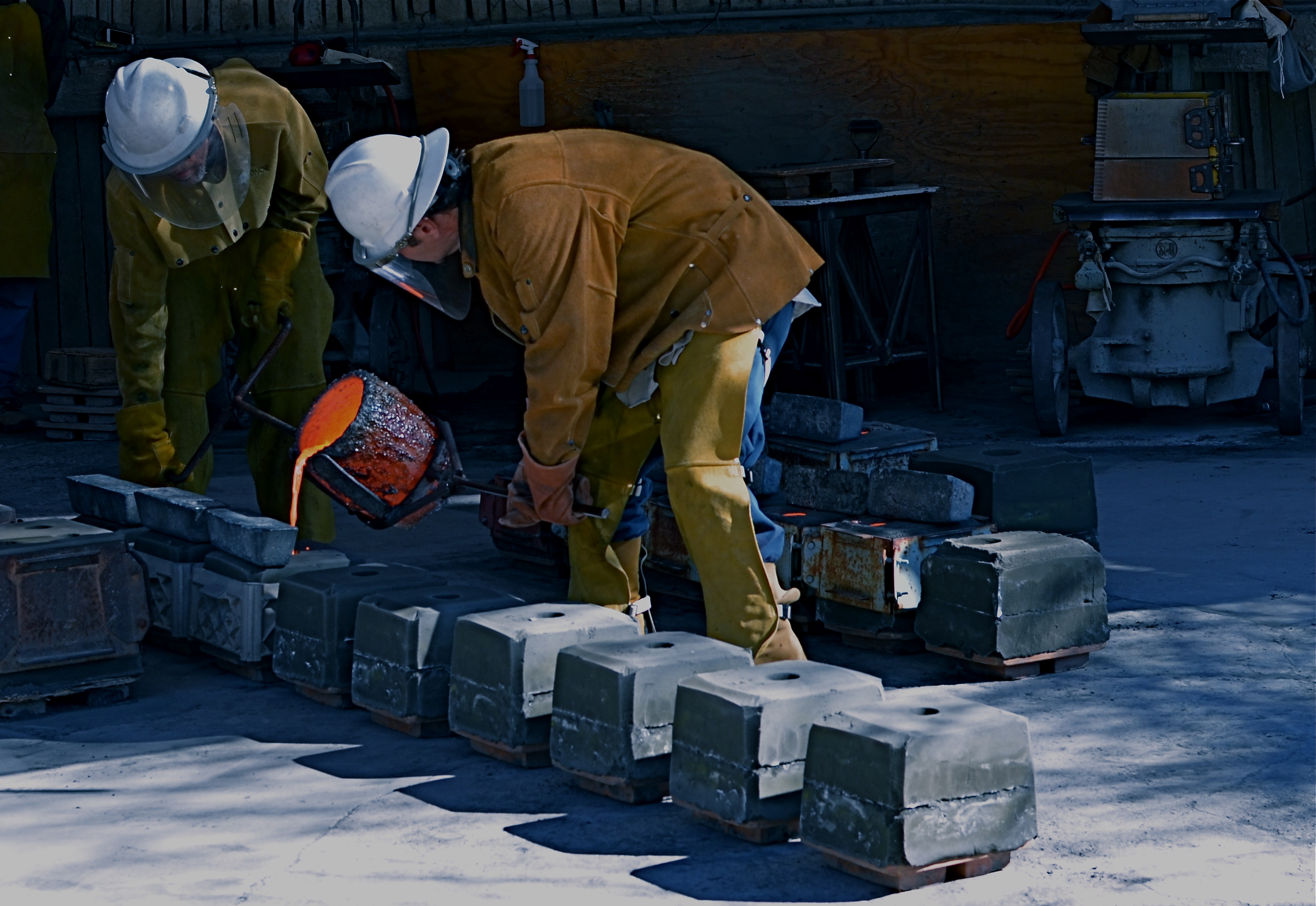
A “perfect” exposure would have inhibited the drama inherent in this situation. So we made it more imperfect.
On a recent trip to an art studio in Paradise Valley, Arizona, I was lucky enough to be present when artisans were pouring molten bronze into decorative molds for all us green “touristas”. Capturing the scene “as is” was easy, as I had plenty of time to calculate exposure and lighting. As a result, I got a lot of “acceptable” pictures good enough for the average postcard, but their storytelling quality was only so-so, since they were almost too full of color, detail and people/props. In the moment, I merely recorded a group of people in a crowded shop doing a job. The tonal balance was “perfect” according to the how-to books, as if I had shot the images on full auto. In fact, though, I had shot on manual, as I always do, so where was my imprint or influence on the subject? The pictures weren’t done.
Back home, when my brain had time to go into editor mode, I realized that the glowing cup of metal was the only essential element in the pictures, and that muting the colors, darkening the detail and removing extra visual clutter was the only way that the center of the shot could really shine.
With that in mind, I deepened the shadowy areas, removed several extraneous onlookers and amped up the orange in the cup. Seems absurdly simple, but as a result, the image was now a unique event instead of a generic “men at work” photo. The picture had to use a softer voice to speak louder.
Great picture? Not yet.
But, hey, I’m still young.
Best thing about the creative process, unlike banking, building or brain surgery, is the luxury of do-overs. And doing over the do-overs, over.
Related articles
- On the Nature + Purpose of Photography (statenislandstories.wordpress.com)
HANDS OFF. SORT OF.
By MICHAEL PERKINS
THERE SHOULD BE CURATED SHOWS AT MUSEUMS ALL OVER THE WORLD JUST FOR SNAPSHOTS. It’s already a known fact that images taken in an impulsive instant are among the most emotionally immediate in history. What these billions of “shooting from the hip” pictures share is the uncompromised commitment of hitting that button, and letting what happens, happen. Of course, back in the day, many of us had no choice in the matter, especially with our earliest cameras. Sadly, sometimes the box was too dumb, too seized up in tech cramps to guess what we wanted. Today, however, we can’t blame the camera anymore if we fail to live in the moment. They are world-class enablers. If we didn’t get the shot, we need to be smarter.

Sometimes you gotta shoot ’em quick and hope. Available light and less of it every second: 1/200, f/8, ISO 100, 20mm.
And, to be fair, we are smarter, even in those just-shoot-it-moments. The amazing complexity of today’s captures on automatic modes has saved us the trouble, more than at any time in history, of having to put on the twin hats of physicist and chemist. That should mean scads of instances when we can truly trust our instincts and hand the dirty work off to the camera with a reasonable hope of getting what we were after.
Now, in the modern world, comes the tricky part.
We may now know too much, compared to the cavemen we were in the earliest days of photography. And, once we begin to comprehend the totality of tweaking, calculation, and post-processing that are available to “rescue” more of our shots, it’s amazingly hard to avoid availing ourselves of all of it. We can remove the tiniest mote of dust, conveniently wipe out the crummy telephone wires, erase the ex-girl friend at the wedding. Trickier still, if we shoot on manual mode, we can practically think the process to death, essentially bleeding the adventure and spontaneity out of at least some images that we should just shoot.
There will always be shots that are so complete in themselves that continuing to fiddle with them before shooting will just have a diminishing return, little gifts of the moment that are so nearly perfect already that you could render them lifeless by trying to “perfect” them. Important: this is not an argument for super-gluing your mode dial to the auto position, since that can also create a string of acceptable exposures that fall short of being compelling pictures.
The balance, the aggravation, and eventually, the joy, lies somewhere in the middle.

Once the sun starts to set in Arizona, you’re racing the light to the horizon, so he who hesitates is lost. Shot on the fly at 1/160 sec., f/11, ISO 100, 18mm.
This is the kind of sunset that only becomes possible near the end of the rainy season (a relative term!) in the Sonoran desert. You get more days with at least some clouds overhead, breaking the mega-blue monotony of the southwestern sky. And you get wonderful gradations of color as the last light of day vanishes over the horizon. In this image, that light was changing, and leaving, rapidly. Not a lot of time to weigh options, but a perfect place to flail away and maybe get something. This was not shot on auto mode, but I made a very quick, simple calculation in manual, and kept the prep as brief as possible. Later on, I was tempted again to go on tinkering, considering a lot of little “fixes” to “improve” my result. To my eventual satisfaction, I sat on my hands, and so what you see is what I got…no frills, no fuss, no interfering with my self.
It would probably be a great exercise to compile your own personal museum exhibit of the best pictures that you successfully left alone, the captures that most validate your instincts, your impulse, your artistic courage. And, certainly I would love to see them linked back to this blog, as conversation between all of us is what I value most about the project.
Go for it.
Related articles
- Getting Started: How to Hold Your Camera (nikonusa.com)
