THE HOP-ON POINT
By MICHAEL PERKINS
PHOTOGRAPHY AT ITS MOST EFFECTIVE, is a pure and wordless kind of storytelling, virtually limitless and astoundingly efficient. Using a visual shorthand, that is, the static image stolen in an instant, we can suggest any narrative, past, present or future. Our tales not only feed off the storyteller’s intent but also off of what the viewer interprets. We can make anything mean anything. If stories are a constantly moving parade, we determine where the “hop on” and “hop off” points in it will be.
We do this by controlling the frame.
We make very intentional choices in a photographic frame. What is included is vital, but so is what is deliberately excluded, since both choices spark the imagination. We are, in effect, having a conversation, a debate over those choices with our audiences. Why did we show this and not that? Is this thing important because it naturally occurred in the picture, or am I making it important because I placed it there? And what do I think about what the photographer decided to leave out?
As the aforementioned parade of existence passes, the photographer’s hop-on point for the eye can supply context, showing connection between one thing and another…..or it can editorially destroy context, forcing us to see a thing in isolation, on its own terms. Consider, for a moment, the….. thing in the above image. Where did I get it? What was its purpose versus other things in its “world”? Can you, the viewer, assign it a new association that, for you, works just as well as the original?
All this discussion, all this interpretation, all these individual conceptions of what a thing “is”…all abetted by assembling the frame and than adding and subtracting within it. We talk a lot in these pages about the various sciences of photographic measurement…..exposure, light, apertures…. but I think composition outranks them all. Sure, know how to harness the tools that will help you record your message. But first, figure out what the hell you’re talking about.
And where you want your passengers to hop on.
HAPPY-EN-STANCE
By MICHAEL PERKINS
IT’S FAIR TO SAY that photographers are occasionally the worst possible judges of what will save or spoil a picture. Try as we may to judiciously assemble the perfect composition, there are random forces afoot in the cosmos that make our vaunted “concepts” look like nothing more than lucky guesses. And that’s just the images that actually worked out.
All great public places have within them common spaces in which the shooter can safely trust to such luck, areas where the general cross-traffic of humanity guarantees at least a fatter crop of opportunity for happy marriages between passersby and props. At Boston’s elegant Isabella Stewart Gardner Museum, the surrounding walls of the central court are the main public collecting point, with hundreds of visitors framed daily by the arched windows and the architectural splendor of a re-imagined 15th-century Venetian palace. The couple seen here are but one of many pairings observable in a typical day.
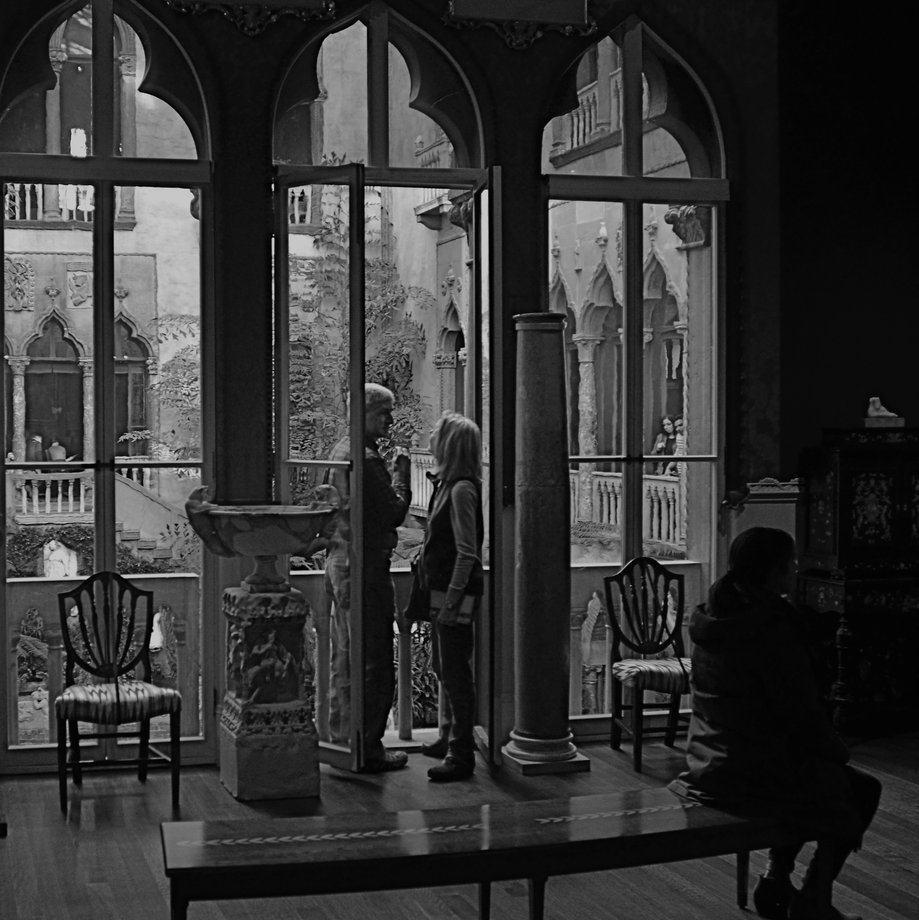
The pair just happens to come ready-made, with enough decent luck assembled in one frame for almost anyone to come away with a half-decent picture. The size contrast between the man and the woman, their face-to-face gaze, their balanced location in the middle arch of the window, and their harmony with the overall verticality of the frame seem to say “mission accomplished”. I don’t need to know their agenda: they could be reciting lines of Gibrhan to each other or discussing mortgage rates: visually, it doesn’t matter. At the last instant, however, the seated woman, in shadow just right of them, presents some mystery. Is she extraneous, i.e., a spoiler, or does she provide a subplot? In short, story-wise, do I need her?
I decide that I do. Just as it’s uncertain what the couple is discussing, it’s impossible to know if she’s overhearing something intimate and juicy, or just sitting taking a rest. And I like leaving all those questions open, so, in the picture she stays. Thus, what you see here is exactly one out of one frame(s) taken for the hell of it. Nothing was changed in post-production except a conversion to monochrome. Turns out that even the possibility of budding romance can’t survive the distraction of Mrs. Gardner’s amazing legacy seen in full color, and the mystery woman is even more tantalizing in B&W. Easy call.
As we said at the beginning, working with my own formal rules of composition, I could easily have concluded that my picture would be “ruined” by my shadowy extra. And, I believe now, I would have been wrong. As photographers, we try to look out for our own good, but may actually know next to nothing about what that truly is.
And then the fun begins….
THAT’S THE SPIRIT
By MICHAEL PERKINS
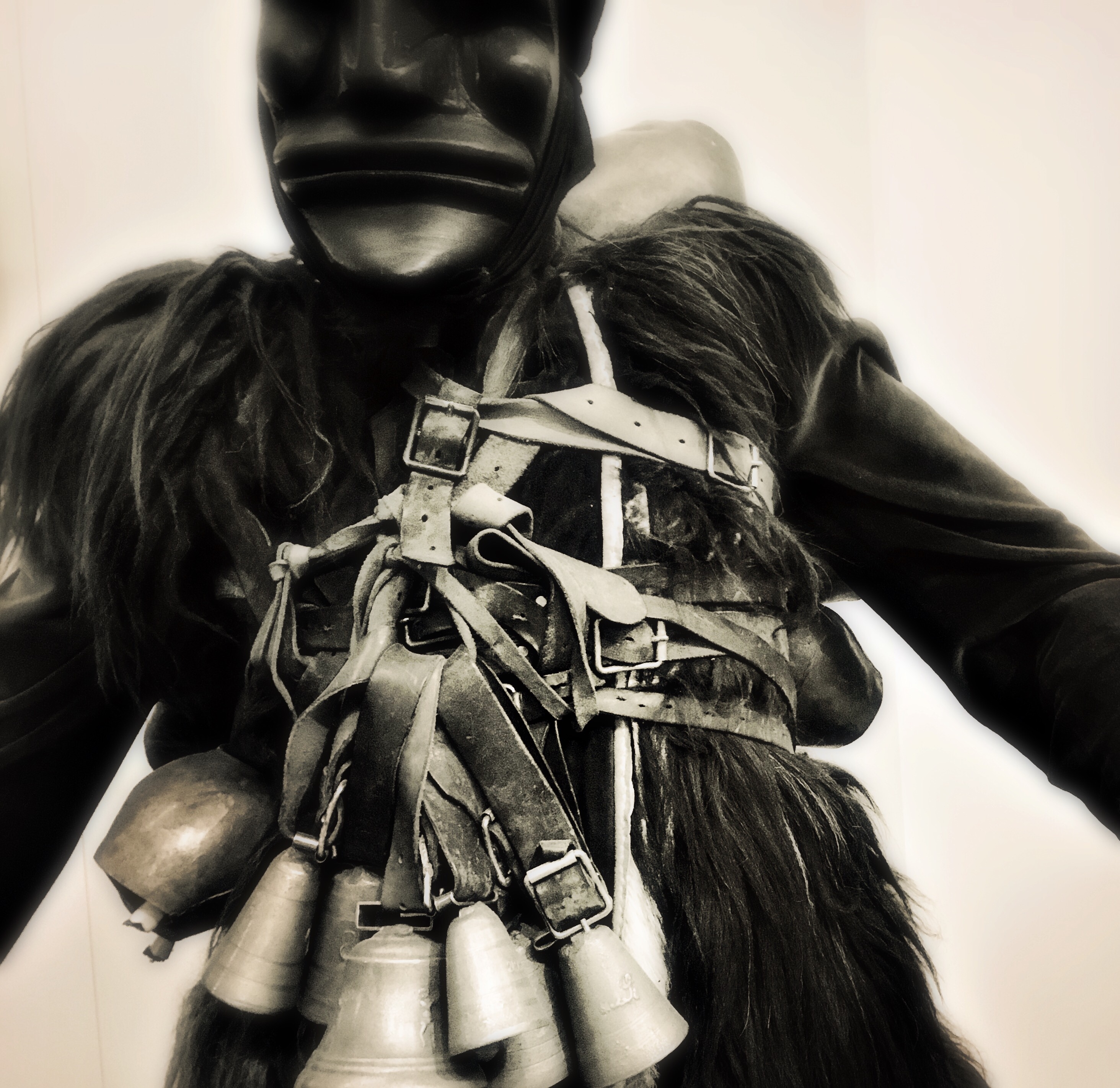
JACOB MARLEY, THE RUEFUL GHOST of Dickens’ A Christmas Carol, refers to the manacles and links that trail behind him as “the chain I forged in life”, and indeed, as the years wear on, one can certainly feel the accumulated weight of one’s own “ponderous” train, its clanking amplified to even greater force during the holiday season.
Certain cycles of the year speak louder to our memories than others, whether they mark anniversaries of loss, joy, sacrifice, devotion, or any other emotional life trophies. And the visual arts, including photography, tap into and amplify these feelings in everything from the pages of the calendar to snapshots of dear ones both present and absent.
Both present and absent. Living and dead. Still here and almost gone. Ghosts and survivors. Marley and Scrooge. The photographer can sometimes almost feel the collision of past and present within a single image, as if each force is grappling for control of the picture’s message.
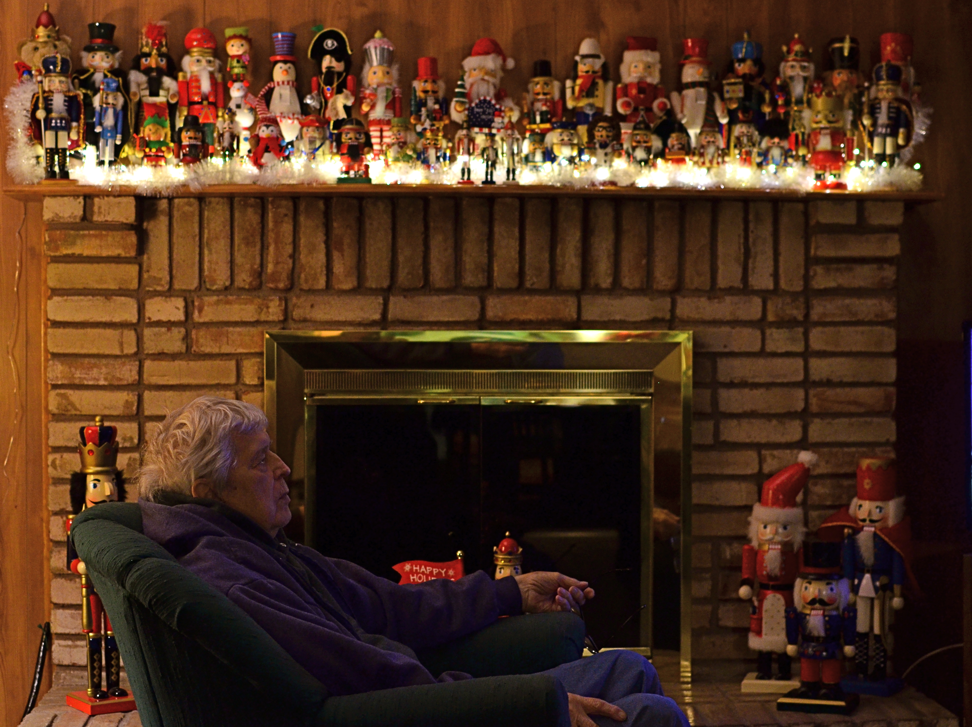
In the above photograph, I was initially looking to steal a candid of my father as he watched some television. It should have been a simple task, but, when your father is still here at 88, the faces of those no longer here echo in his every feature. To add to the density of emotion, you have the fact that he’s seated beneath a mantle fairly buckling under the weight of a third of a century’s worth of well-curated nutcrackers. Thus, even though she’s dodged having her picture taken at this particular moment (a well-honed skill), my mother is present here as well.
And so, decisions, decisions: I could have made my father look over in my direction, maybe even coaxing a smile from him, but I liked his weary look of detachment, as if the years were a kind of Marley chain dragging him earthward. I also could have cropped out the nutcrackers, simplifying the overall frame. But the “ponderous” tonnage of memory the figures symbolize would have been wasted, so they stay.
Photographs can only rarely be snapped in their most complete form, and certain times of year prove too layered with history to make for so-called “simple” pictures. Maybe it’s the different way we see on certain days. And just maybe it’s a ghostly presence, a glimpse of the chain we forged in life.
LEADING THE WITNESS
 By MICHAEL PERKINS
“MEN ARE NOT INTERESTED“, said Jerry Seinfeld, “in what’s on tv. Men are interested in what else is on tv.”
The joke conjures up an image of some remote-happy goof in a man-cave endlessly clicking through channels in search of something ever better than what he already has. And it’s true, which makes it all the funnier. It also speaks to how all humans, both men and “not men”, view photographs, and how shooters can play to that propensity.
All photos, sliced as they are out of the continual flow of time, come with an implied sense of what went before the click and what’s to come after it. Trying to use the information from a stilled moment of time to mentally supply those two temporal bookends is an ever-fascinating game between photographer and viewer. What happened just before this? What will happen next?
In composing a frame, the photographer uses all the tools at his command to influence his audience’s assessment, including the simple device of leading lines, which can be used to direct the viewer’s eye wherever the artist wants it to go. LLs are usually effective in drawing you deeper “into” a picture that obviously only has two dimensions. Think train tracks at the front of the picture, receding toward the horizon. These lines tell you that you are being asked to go somewhere, and that you should be curious about what’s waiting for you there.
Leading lines can also go from what is shown in the picture to what is implied, asking you to speculate, as in the case of the above frame, what’s around the next bend, or, in Seinfeldian terms, “what else is on tv”. It’s a strange fact that, no wonder what may be shown within a photo, the most fascinating thing to the viewer’s mind, at least, may be the stuff that was left out of it. We all want what we can’t have, and knowing that very human thing can empower a photographer to much more effectively control the frame.
SETTING THINGS STRAIGHT
By MICHAEL PERKINS
ONE OF THE MOST ELUSIVE EFFECTS IN ARCHITECTURAL PHOTOGRAPHY would seem to be the one most easily achieved: the look of a straight line, the foundation upon which an orderly image is built. However, the human eye is often more unreliable than assumed when it comes to reading and identifying that which is supposed to be “straight.”
We’ve all been confounded by optical illusions that present lines that are not, objectively, straight at all, even though our brains, based on our interpretation of the visual data, say they must be. However, we tend to dismiss this sensation as trickery, something we don’t have to sweat about in making a “real” picture. And that is probably a mistake.
Based on what kind of architectural design you’re shooting, what lens you choose, even where you stand, a straight line, either horizontal or vertical, can seem to bend or lean, making our “factual” images less than trustworthy.
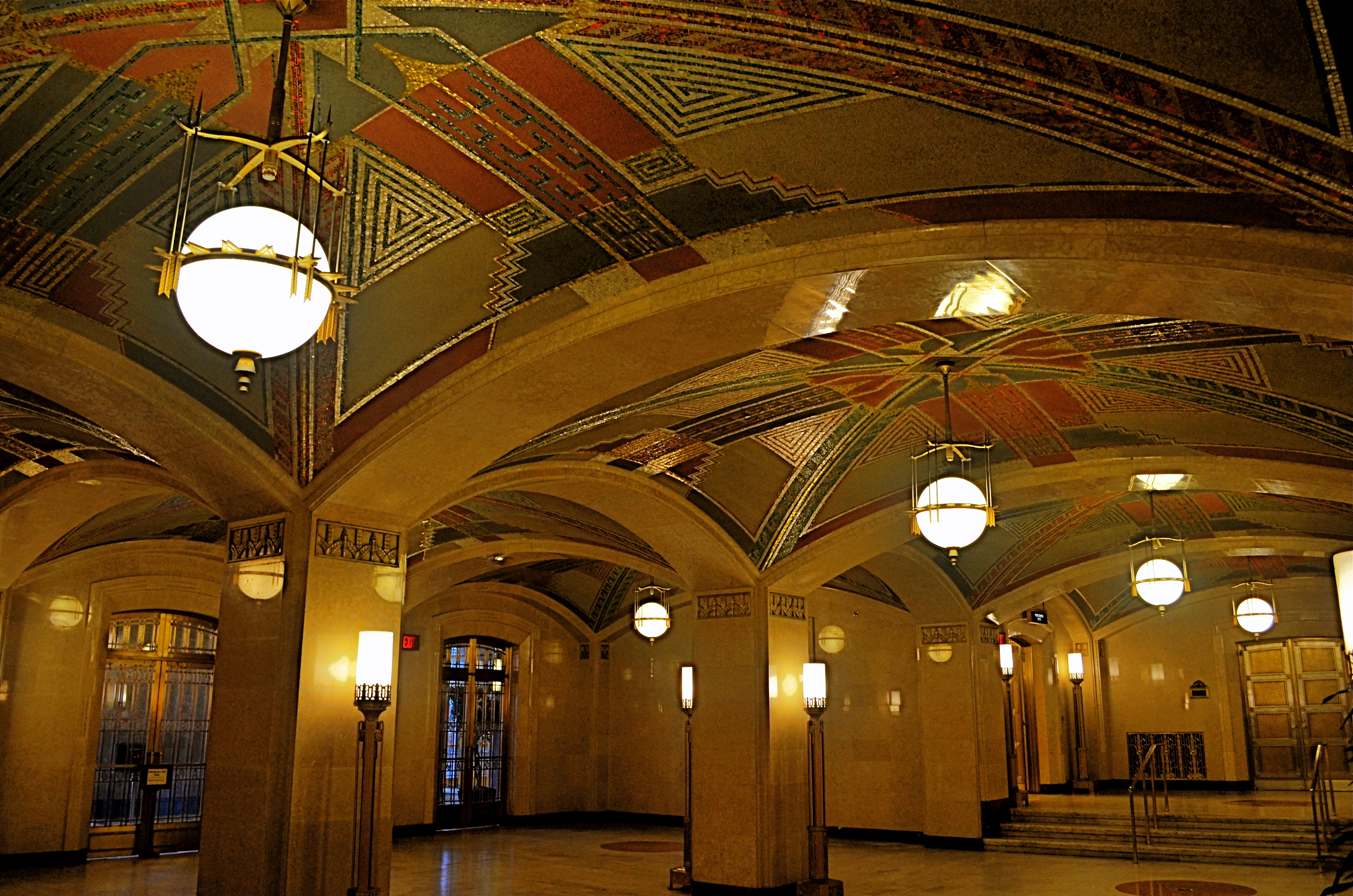
Even setting up a shot on a carefully calibrated tripod and a bubble level can produce a result that looks as if it was manipulated. Of course, based on what look you desire, you may regard geometric reality as irrelevant, and deliberately engineer ” unreality” into a photograph. That’s why we make a distinction between taking a picture and making one.
As an example, the picture seen above was taken super-wide, at 18mm, to intentionally exaggerate the size of the room, making some verticals bow in while others register normally, and playing stretchy with the ceiling arches and floor horizon. The idea here was to distort the already extreme Art Deco accents and give them an extra funhouse quality. Shooting with a more conventional focal length like 35 or 50 mm would have made for straighter lines, but would also have sacrificed every other effect achieved at 18mm.
Bottom (straight or crooked) line: dimensions and angles are suggestions, not commandments. But it’s a lot easier to break rules creatively once you understand how they work.
REVERSAL OF FORTUNE
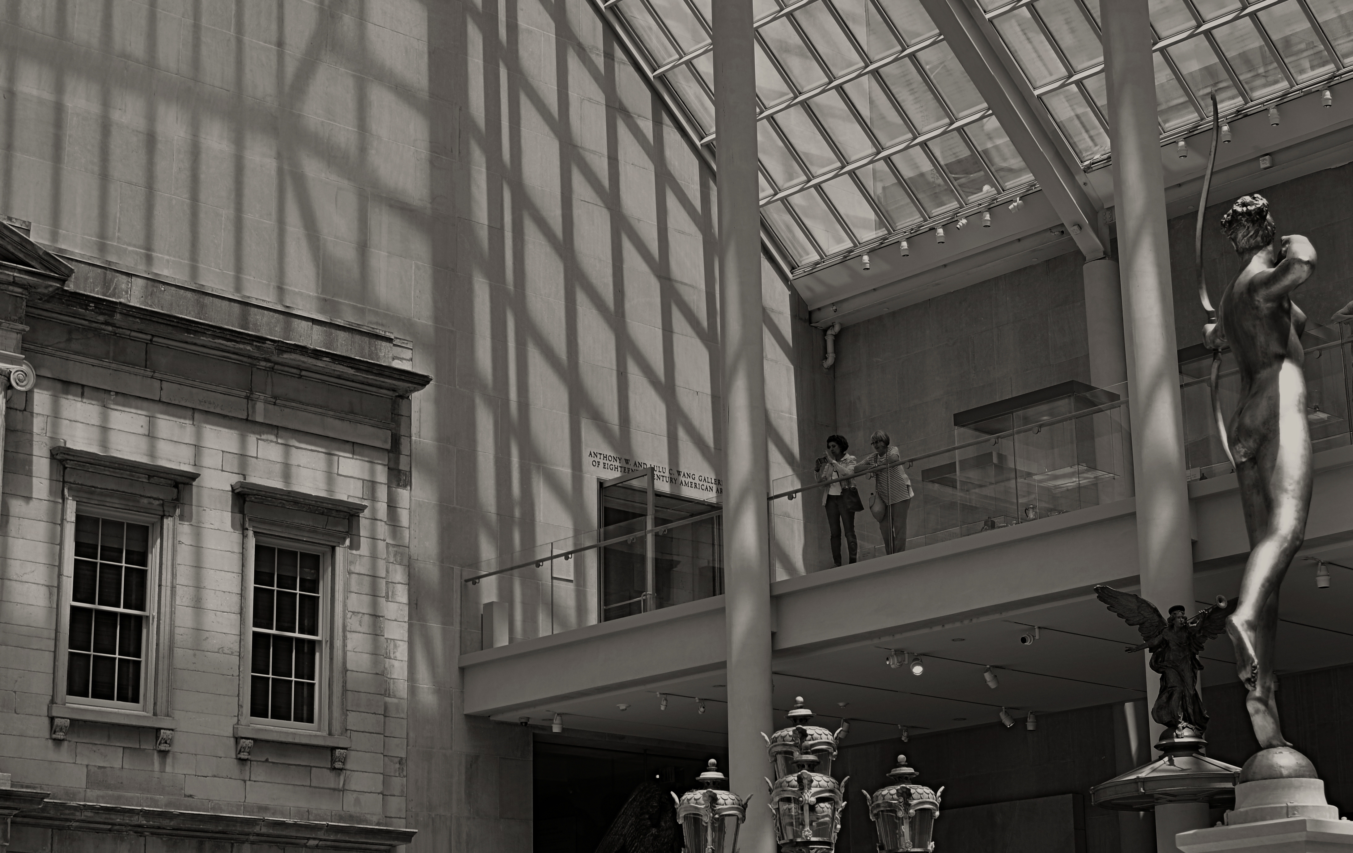
Spaces like this vast sculpture gallery beg to be visualized from as many angles of view as possible, Diana hunts from the right edge of the frame.
By MICHAEL PERKINS
ANYONE WHO HAS EITHER STUDIED OR DABBLED IN CANDID PHOTOGRAPHY has heard Henri-Cartier-Bresson’s term “the decisive moment”, which refers to that heat-lightning instant when the best possible photograph of a situation or sensation can be made. Of course, you don’t have to really believe that there is a single such moment, and many do not. There may be any one of thirty possible frames to be extracted from even the simplest human subjects, but we seem to always be looking for that salient, isolated image that defines it for all time.
Cartier-Bresson’s pursuit of the decisive moment is usually thought of with regard to photographing human activity, but there is also a mindset about photographing places that there can be a “superior” or “best” angle to view them from. That is why landmarks and monuments yield so many pictures that are so much the same. We all shoot the Eiffel Tower the way that everyone else before us has shot it…..because? Well, there’s a great question.
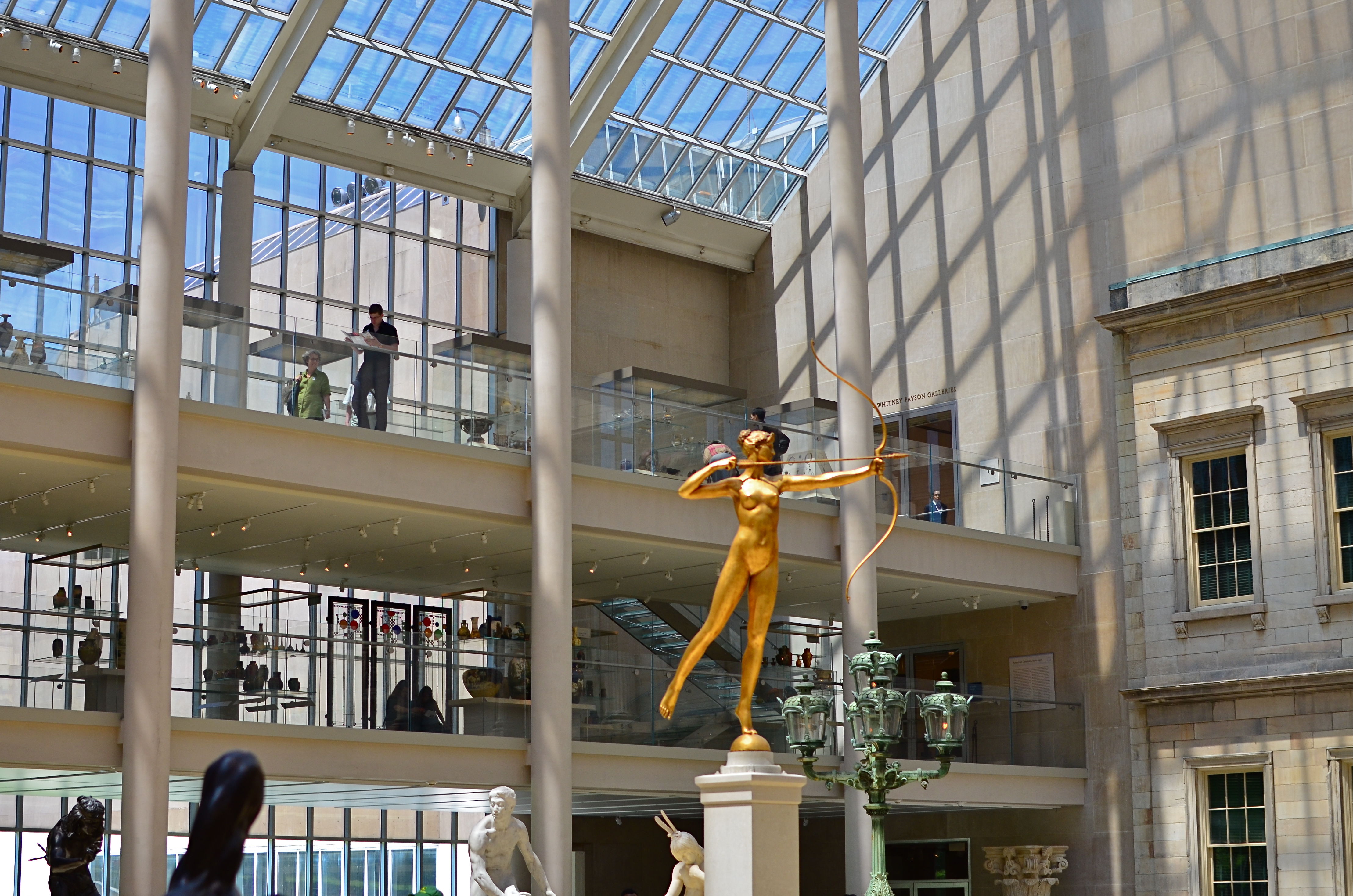
My original, “official” angle on the exact atrium. Diana holds center stage.
Do we think of earlier images of the tower as a standard of some kind that we only certify by imitation? Is our mind eager to catalogue things in their “proper” orientation? Are we only interesting in what things are “supposed” to look like? Ideally, we should be making pictures to authenticate our own visions, not to rubber-stamp those generated before us. And yet, with famous places, it’s often a case of human see, human ape.
We have to teach ourselves to photograph places as if we were the first to ever point a camera at them. It’s not that hard a habit to cultivate, really. Crank yourself around 180 degrees and take the reverse angle. Move six inches to the left and frame the most obvious part of the cathedral, ruins, or palace out of your composition. It might yield nothing, and then again, it might add enough freshness to the image to overcome what I refer to as “tourist fatigue”.
The above image from the sculpture plaza at the Museum of Modern Art in New York is a near reverse of the more conventional view in the smaller color shot at left, which I first featured in the post Put Yourself Out There a while back. In one shot, the Diana statue is center stage. In the other, she is relegated to the edge of the frame, acting as a pointer toward the rest of the photograph’s information. Extra cost in terms of time to get this very different composition? Ten seconds.
It’s not that re-imagining a subject is that hard. It’s that we so seldom question our first imagining of things, often settling for the first, technically successful image we get. And that first image, as we often learn, might only be a dress rehearsal for the real show.
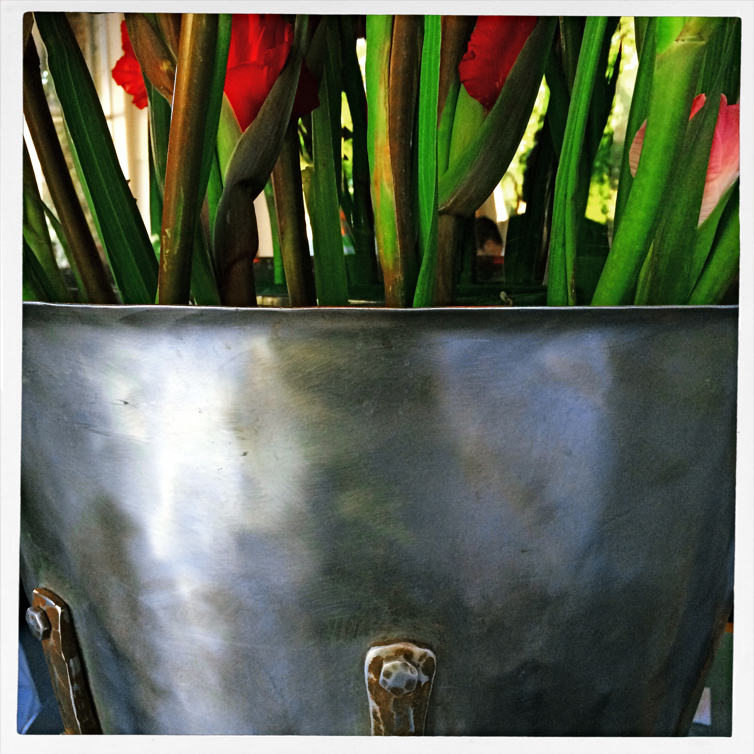
PARAMETERS
By MICHAEL PERKINS
A PHOTOGRAPHER’S IMPACT IS ONLY PARTIALLY CREATED BY WHAT HE CHOOSES TO RECORD. That is, whatever his subject, be it banal or magnificent, his choice of what to shoot is only, at best, half of what makes or breaks his picture.
The other half of the miracle comes not from mastery of light, aperture, gear or conditions. It is in the frame, and what he includes or excludes from it. Landscape mode, portrait mode, big crop or little crop, the frame is the final determinant of how well the image argues for itself. The legendary director of photography for the New York Museum Of Modern Art, John Szarkowksi, expresses this idea for all time in his wonderful book The Photographer’s Eye:
To quote out of context is the essence of the photographer’s craft. The photograph’s edge defines content. The photographer edits the meanings and patterns of the world through an imaginary frame. This frame is the beginning of his picture’s geometry.
Consider, for a moment, the most vital, most inspiring images you’ve ever seen. Now imagine them cropped two inches wider, four inches to the left, five inches higher. The visual terms of engagement would be completely re-ordered. And what would be the result? Would you draw different conclusions, make different assumptions, experience a diminished ( or enhanced) sense of mystery?
The frame, and the choices the photographer makes in its design, is more decisive in the success of a picture than any other single factor. Technically imperfect photos become world-beaters every day simply because the frame is eloquent. And it also follows that a well-crafted bit of exposure can be dulled or blunted by a frame that is carelessly drawn.
The above image represents a choice, the drawing of a visual boundary. The top of the flowers and the objects surrounding the bucket aren’t missing because I shot too close, they’re deliberately excised because I made a deliberate decision that they didn’t add anything to the story I was trying to tell. You can disagree about whether I made the correct choice, but the making of that choice was as important (actually more important) than the subject itself.
Photographs have visual parameters, since we can’t make images big enough to include all of our experience. There are limits on the dimensions of what we show, and intelligent use of those boundaries can transform our work in marvelous ways.
SQUARE STORIES
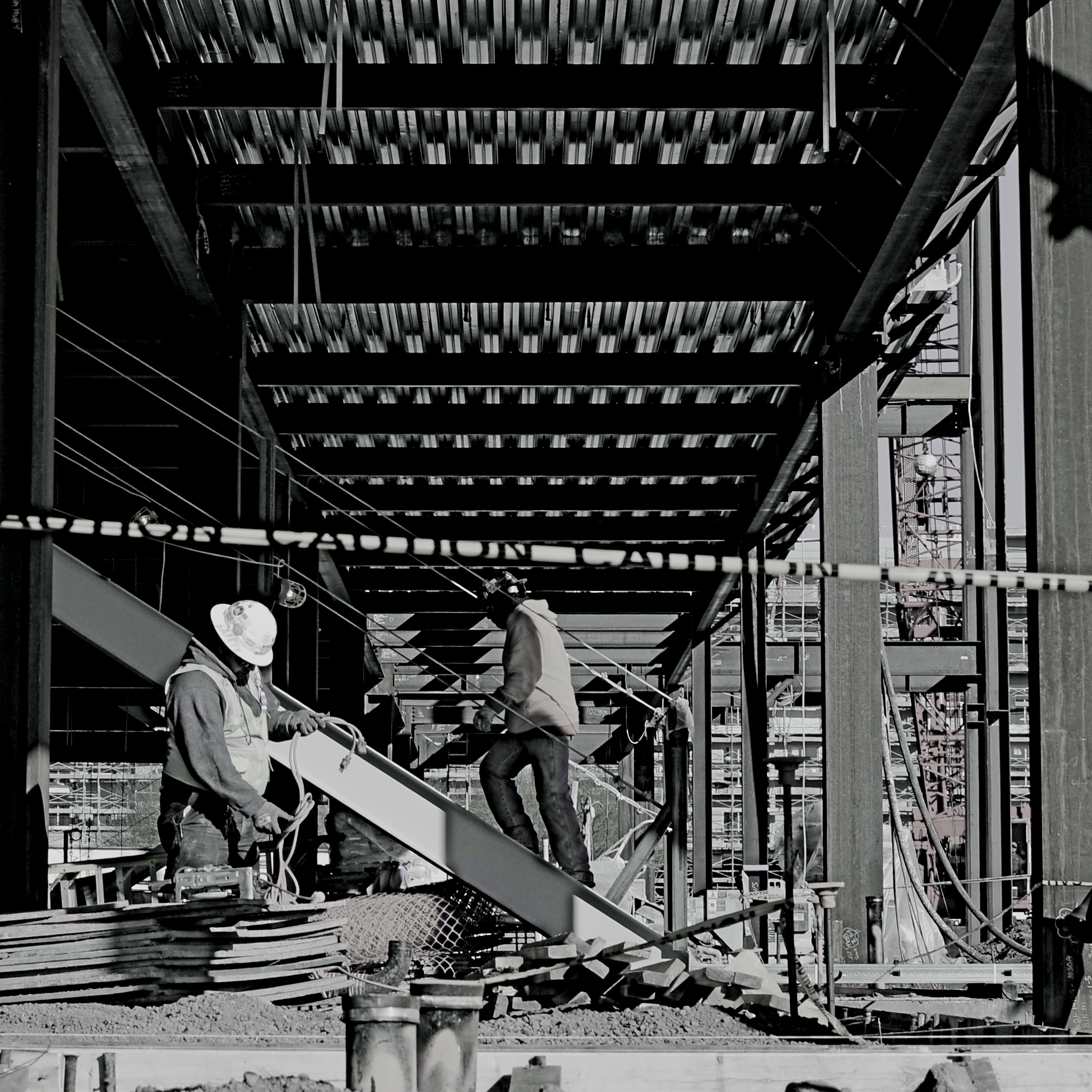
Overhang, 2015.
By MICHAEL PERKINS
BETTER PHOTO HISTORIANS THAN ME WOULD BE ABLE to pinpoint the precise moment in time when the landscape-sized image first eclipsed the square image for most photo shooters. I’d tackle the search myself, but it’s late, and I’m about a martini and a half too far into relax mode, so there it is. But, regardless of the exact instant it first began to wane, the square is back, and bigger than ever, its refreshed use as a distinct mode of composition greeted like a revelation, rather than a return. Cool beans.
The unilateral quadrangle (I get wordy when I drink) managed to barely survive on the periphery of photography, even as the square-centric Polaroid print nearly wobbled out of existence, then came back, as hipsters in the lo-fi movement revived the use of instant print cameras. Then cel phones began offering a pre-selectable square setting for their cameras, and that became a thing. But the biggest boost for the square’s comeback came with a thing called Instagram. You may have heard about this quaint little app. I understand the developers made a few bucks on it.
Still, we are pretty universally conditioned to envision pictures in either “landscape” or (flip this up on its side) “portrait” modes, so much so that director Wes Anderson garnered as much press for his use of the old anamorphic aspect ratio in The Grand Budapest Hotel as he did for the movie’s content. Strangely, the square-format photograph is, upon its return, a bit of a retro novelty.
Composing a shot in roughly 1/3 less space than a landscape frame is a challenge, simply because we have fallen out of the habit for a few decades, but it does have a certain elegance. Lately, I have tried to use the square to effectively tell stories that I traditionally saw in vast or wide scenarios. Construction projects are one such case, in that they seem to call for wide angles and far reaching vistas, what we might call scope. The above image is my attempt to express most of what goes into a building project in what some would call cramped quarters. The main story elements, that is, the action, the range of tone, the compositional depth, are all present, but confined within the quadrangle. Of course, with a DSLR, I can’t start with a square, but I can envision where in the shot the best square is, and crop to it in post-processing.
Composing for a given dimension is a discipline, and, as such, it is valuable as a practice tool, since photographers should always be visualizing every possible way to get their story told. The square may be a prison. But it also may be an answer. The end result is what matters most.
WHEN TEXTURE IS THE TALE
By MICHAEL PERKINS
THOSE WHO BELIEVE THAT SUBJECT MATTER IS KING IN PHOTOGRAPHY ARE FACED OFF in an endless tennis match with those who believe that only impressions, not subjects, are the heart of the art. Go away for fifty or sixty years and they are still volleying: WAP! a photograph without an objective is a waste of time! WAP! who needs an object to tell a story? Emotional impact is everything! And so on. Pick your side, pick your battle, the argument isn’t going anywhere.
Thing is, my assertion is that you don’t actually have to choose a side. Just let the assignment at hand dictate whether subject or interpretation is your objective. There are times when the object itself provides the story, from a venerable cathedral to an eloquently silent forest. And there are times when mere color, light patterns, or texture are more than enough to tell your tale.

Set Your Face Like Flint, 2014. Shot wide at 18mm, cropped to square format. 1/100 sec., f/5.6, ISO 100.
I find, for example, that texture is one of my best friends when it comes to conveying a number of important things. The passage and impact of time. The feel and contour of materials, as well as the endless combinations and patterns they achieve through aging and weathering. A way to completely redefine an object by getting close enough to value its component parts instead of viewing it as a whole. This is especially true as I try to refine my approach to images of buildings. I find that breaking the overall structure into smaller, more manageable sections helps to amplify texture, to make it louder and prouder than it might be if a larger scene just included the entire building among other visual elements. Change the distance from your story and you change the story itself.
This Massachusetts barn has tons of character whether seen near or far, but if I frame it to eliminate anything but the raw feel of the wood, it demands attention in a completely different way. It asks for re-evaluation.Contrast the rough-sawn wood with the hard red of the windows,and, again, you’ve boosted the effect of the coarser texture. Opposing textures create a kind of rudimentary tug-of-war in a picture, and the more stark the contrasts, the more dramatic the impact.
Traditional, subject-driven story telling will dictate that you show the entire barn, maybe with surrounding trees and a rolling hill or two. Abstracting it a little in terms of color, distance and texture just tell the story in a distinct way. Your camera, your choice.
GREAT DAY IN BROOKLYN
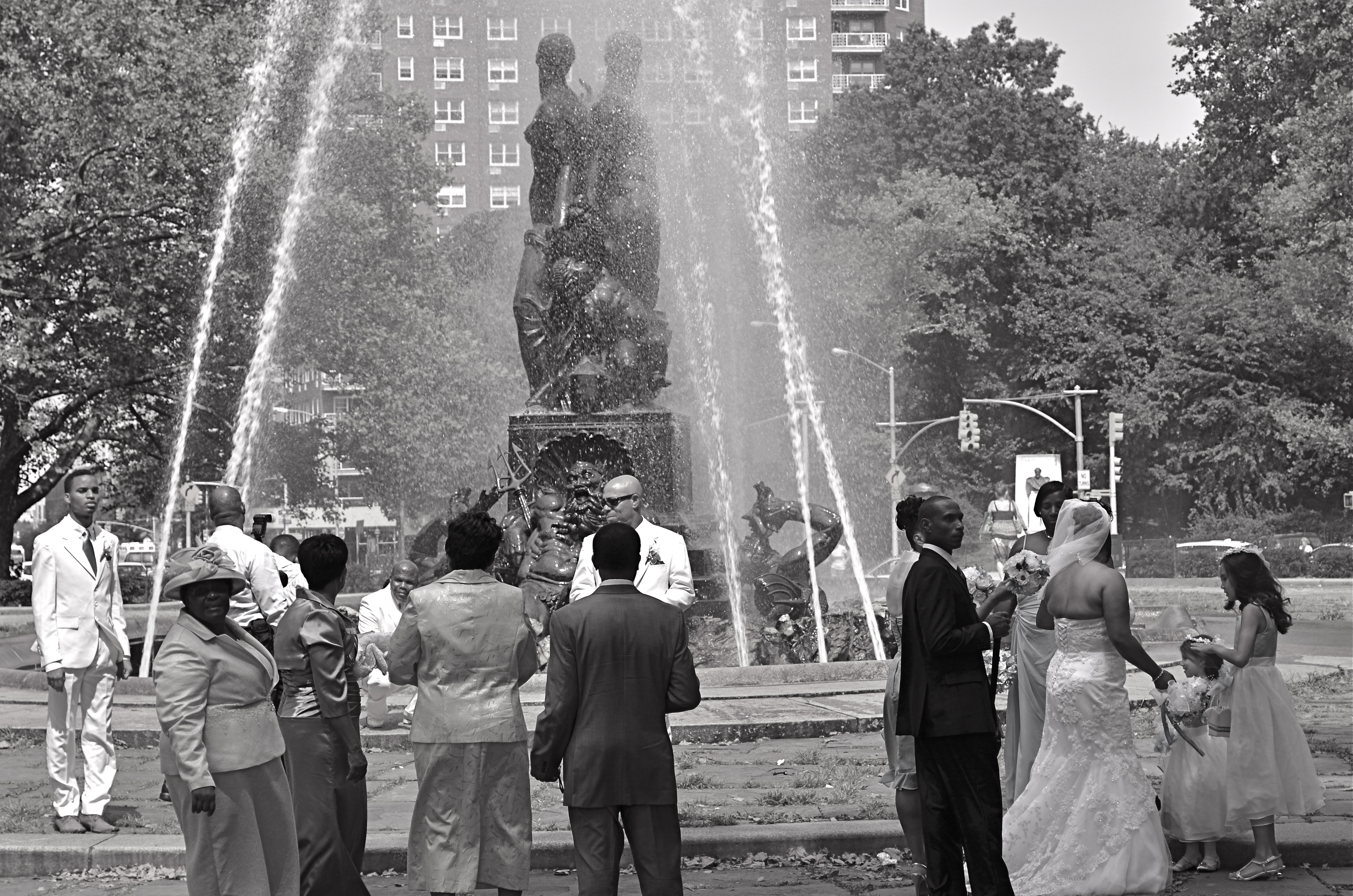
Wedding Party, 2012.
By MICHAEL PERKINS
IT STARTED OFF AS WHAT IS CURRENTLY REFERRED TO AS A FAIL: I was clicking away throughout the park areas in Brooklyn’s Grand Army Plaza, trying to make some kind of epic composition out of the beautiful Bailey Foundation near the war memorial arch. It features several heroic figures standing on the prow of a ship, under which can be seen several mythical denizens of the deep including Neptune himself. It’s a strong piece of sculpture, crowning a plaza that was designed by the great Frederick Law Olmstead, the mastermind behind Manhattan’s Central Park, and I should have been able to do something with it. Something.
Problem with the fountain is the water itself, which, instead of a wonderfully flowing cascade is something between a Jacuzzi shower head and a resort sprinkler system. Its renders the statuary nearly impossible to get in focus, and sends refracted rainbows and hotspots dancing gaily into your lens. Suddenly the impulse of a moment is a day’s work, and, just as I was beginning to check this particular world wonder off my to-do list, in moved the people you see here.
I don’t shoot weddings but the group you see here was, in fact, a shoot of a wedding, something else altogether, since there is a more relaxed dynamic than will ever be present during an actual ceremony. Photographically, rehearsals are more fruitful than actual play performances, and, in that vein, wedding prep holds more pictorial potential, for me, than weddings with a capital W. There is a looser feel, an air of celebration that somehow gets starched out of the final product. Do I stand here? You want me holding the flowers? Shouldn’t the tall people be at the back? Best thing of all, these folks were already taking direction from their “official” photog, so I was the last thing on their mind. There’s no better role at a wedding than that of The Invisible Man.
My glorious fountain had been reduced to a prop, which means the wedding party saw its potential, as I had. The difference is, they gave me what I hadn’t been able to find for myself.
A picture.
BALLET OF HORROR
By MICHAEL PERKINS
THERE USED TO BE A MOVEMENT IN FINE ARTS CALLED THE “ASHCAN SCHOOL”, WHICH SOUGHT TO SHOW POWER AND BEAUTY in banal or even repellent urban realities. It posed a question that continues to stoke debate within photography to this day: how much should art engage with things that are horrible? Is the creative act vital when it shows us ugliness? More importantly, is it vital because it shows us these things? And, if we choose to depict beauty to the exclusion of the ugly, is our art somehow less authentic?
The whole matter may come down to whether you see photography as a constructed interpretation of the world, kind of a visual poem, or as a sort of journalism. Of course, the medium has been shown to be wide enough for either approach, and perhaps the best work comes from struggling to straddle both camps. A world of gumdrops and lollipops can be just as pretentious and empty as a world constructed exclusively of the grisly, and I think each image has to be defined or justified as a separate case. That said, finding a ying/yang balance between both views within a single image is rare.
Falling, as I did, under the influence of landscape photographers at a really early age, I have had to learn to search for a kind of rough ballet in things that I find disturbing. I’m not saying that it’s hampered my work: far from it. Look at it another way: as a missionary, you can plant crops and build hospitals for your village, but you still have to address the area’s cholera and dysentery. It’s just a part of its life.
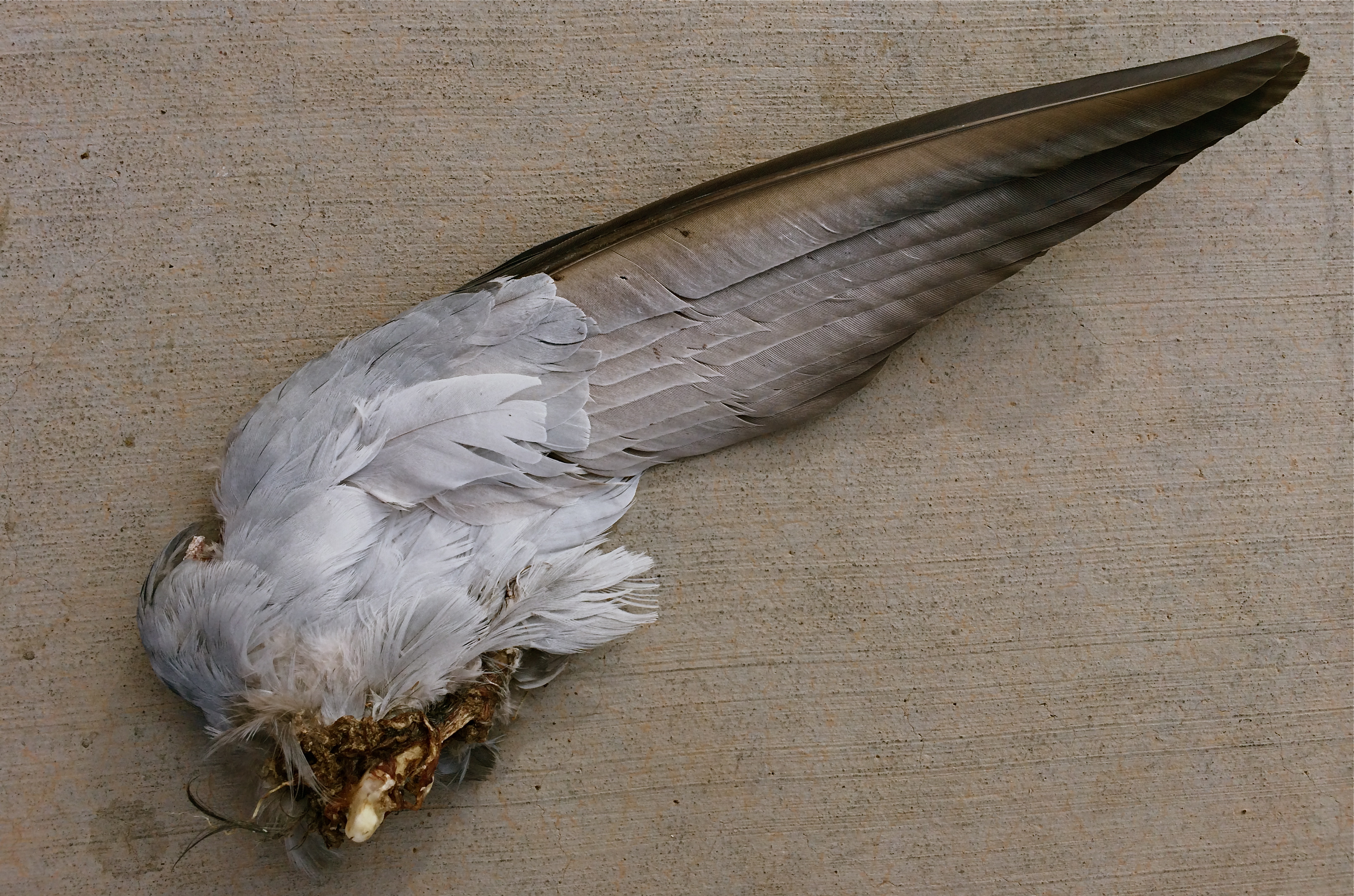
Death On The Wing: 1/900 sec., f/2.2, ISO 32, 4.12mm
The image above was pretty much placed right in my path the other day as I walked to enter an urban drugstore, and, as horrified as I was by the likely origin of this savage souvenir, I had to also acknowledge it as a Darwinian study of beauty and design. The virtually intact nature of the wing, contrasted with the brutal evidence of its detachment from its owner, made for an unusual transition from poetry to chaos within a single image. Many might ask, how could you make that picture? And it’s a hard question to answer. Another question that would be just as difficult to answer: how could I not?
Certainly, I won’t be entering this in Audubon magazine’s annual photo contest: it’s also no one’s idea of cutest kitty or beautiful baby. But it is one of the most unique combinations of sensation I have ever seen, and I did not want to forget it, nightmares and all. Because we live, and take pictures in, the world at large.
Not just the world we want.
NOTHING IS REVEALED
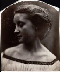
Julia Margaret Cameron, 19th-century self-portrait pioneer, currently on exhibit at the Metropolitan Museum Of Art.
By MICHAEL PERKINS
THE TITLE OF THIS POST IS ONE OF MY FAVORITE LINES IN ALL OF BOB DYLAN’S PRODIGIOUS OUTPUT, coming from The Ballad Of Frankie Lee And Judas Priest, on the John Wesley Harding album. I often pop the phrase into casual conversations where it’s clear that more heat, rather than light, has been generated. Nothing to see here, folks. No new ground has been broken. No fresh truth has been unearthed.
Nothing is revealed.
This phrase came back to me a while back when looking at the raw statistics for Instagram, which indicates that, currently, over 90,000,000 images on the foto-share service currently bear the hashtag “#me”. Call them selfies, call them an epidemic of narcissism, call them banal.
But don’t, for the love of God, call them portraits.
How has it come to this? How can merely pointing a phone camera back at your own punim, and saturating it with distortion and over-amped flash, pass for a telling testament to who you are, what you dream, what you represent in the world?
Of course, the tselfie tsunami does none of these things. It actually puts distance, if not actual barriers, between your real self and the world, by creating some lifeless avatar to ward off true discovery of yourself by, well, anyone. By comparison, even the four-for-a-quarter snaps of antique photo booths are searing documents of truth.
Photography’s evolution is illuminated by the great masters who stepped in front of their own cameras
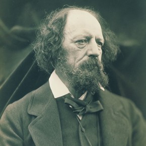
Julia Margaret Cameron, Portrait Of Alfred Lord Tennyson
to try to give testimony, recording innovative, penetrating evidence of who they were. Currently, a show featuring one of the medium’s greatest pioneers in this area, Julia Margaret Cameron, is packing them in at New York’s Metropolitan Museum of Art, and with good reason. Cameron’s attempts to capture herself in not only natural but fantastic settings led the way for interpretive portraitists from Richard Avedon to Annie Liebowitz. Along the way, she learned what to look for, and immortalize, in the faces of others, including Alfred Lord Tennyson, Charles Darwin, Robert Browning, and other bright lights of the 19th century.
Oddly, none of her work was done by crooking her arm 90 degrees back toward her booze-flushed face at a kegger and saying “cheese.”
I’ve written before, in these pages, of the real value of self-portraits as a teaching tool and experimental lab for photographic technique. By contrast, “Selfies” are false faces created to keep the world away, not invite it in. And they remind us, courtesy of Bobby D., of the three worse words of insult that can ever be aimed at any photograph, anywhere:
Nothing is revealed.
Follow Michael Perkins on Twitter @mpnormaleye.
Related articles
- Portraits by Julia Margaret Cameron, One of Photography’s Early Masters, on Display at the Met (muirhousepubs.wordpress.com)
- Julia Margaret Cameron: Pioneer of Modern Glamour Photography? (bigthink.com)
THREE STRIKES AND YOU’RE…IN?
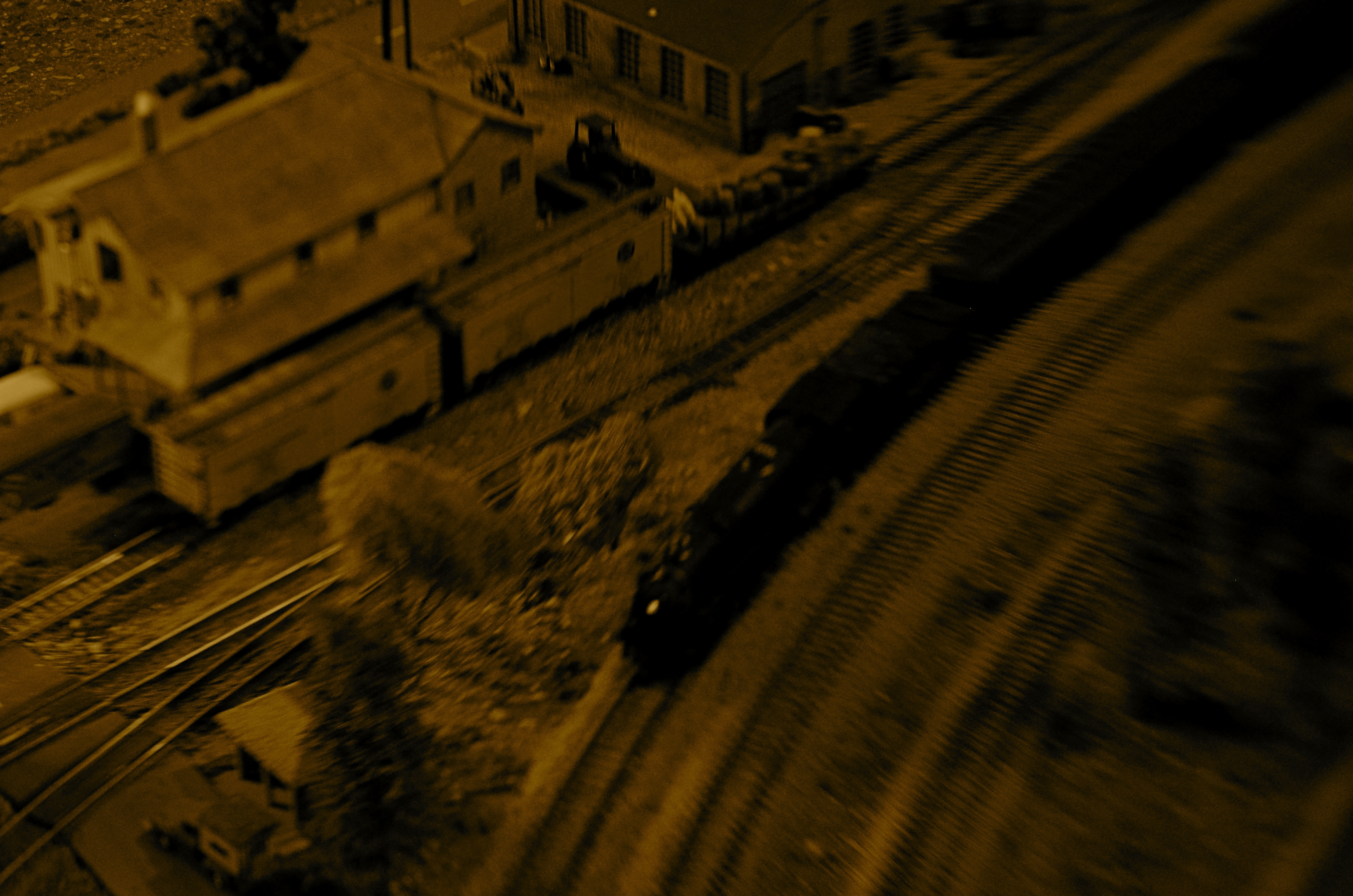
“Wreck Of The Old ’87”. Wreck is right. 1/80 sec., variable depth of field created with a Lensbaby attachment, ISO jacked to 640, 35mm.
By MICHAEL PERKINS
WHEN SORTING MY IMAGES INTO KEEPERS AND CLUNKERS, I ALWAYS SUFFER THE SAME BIAS. Whereas some people might be too eager to find reasons why a picture should be inducted into the former group, I nearly always search for reasons to toss them into the latter one. I always know right away what I’ve failed to achieve in a given frame, and its flaws glow like safety orange in my brain to the point where I not only can’t credit myself for the photo’s stronger elements, I can no longer even see them. I therefore consign many pictures to the rubbish heap, a few of them prematurely.
Usually, however my first call is the right one. I very seldom revisit a picture I initially disliked and find something to redeem it. So it was kind of headline news when I recently “saved” a photo I had originally (and wisely) savaged. Hell, I’m still ambivalent, at best, about it, but I can’t truly classify it as an outright Lost Child anymore.
It came from a random day of practice I had undertaken with a Lensbaby, one of those effects lenses designed to give you the ability to manually throw parts of your image out of sharp focus, in fact to rotate around and create various “sweet spots” of sharpness wherever you want to. I don’t use the thing a lot, since it seems, on some level, damned silly to put defects into your pictures on purpose just to convince yourself you are, ahem, an artiste. But, all work and no play, etc. etc., so I was clicking away inside a dimly lit building at a railway museum in which a huge layout of miniature train dioramas is a regular attraction. I seemed to be going out of my way to create a picture that would normally be “three strikes and you’re out”…..that is:
poorly lit, and loving it
poorly focused, otherwise known as, sure, I meant to do that, and
a half-baked attempt to make something fake appear real.
Only one of the shots sparked my interest at all, purely because it seemed to contain a sort of… mystery. So many dark corners. So many unexplained details. A very disorienting, dreamlike quality that had to have jumped into the camera without any help from me. It looked both hyper-real and utterly false, simultaneously fearsome and fascinating. Again, this all happened in spite of, not because of, any action on my part. I added no post-processing to the shot, except to desaturate it and slather on a layer of sepia. Other than that, I left it in its original sloppy, random state.
And then I decided it was still junk and forgot about it for a few months.
Just why I have, in recent days, tried to rehabilitate my thinking about it is anyone’s guess. Like I sad at the top, I look for reasons to reject my work, not excuse it. This has little to do with modesty. It’s just an admission that control is so much a part of my make-up that I recoil from images where I seem to have absolutely relinquished that control. They scare me a little.
But they thrill me a little too. And, as Vonnegut says, so it goes.
Perhaps the best thing is to maintain the Keepers and Clunkers piles, but add a third, labeled “Not Really Sure”.
Follow Michael Perkins on Twitter @mpnormaleye.
Related articles
- Peering Through a Shaft of Light (johnbee.ca)
SPLIT INFINITIVES
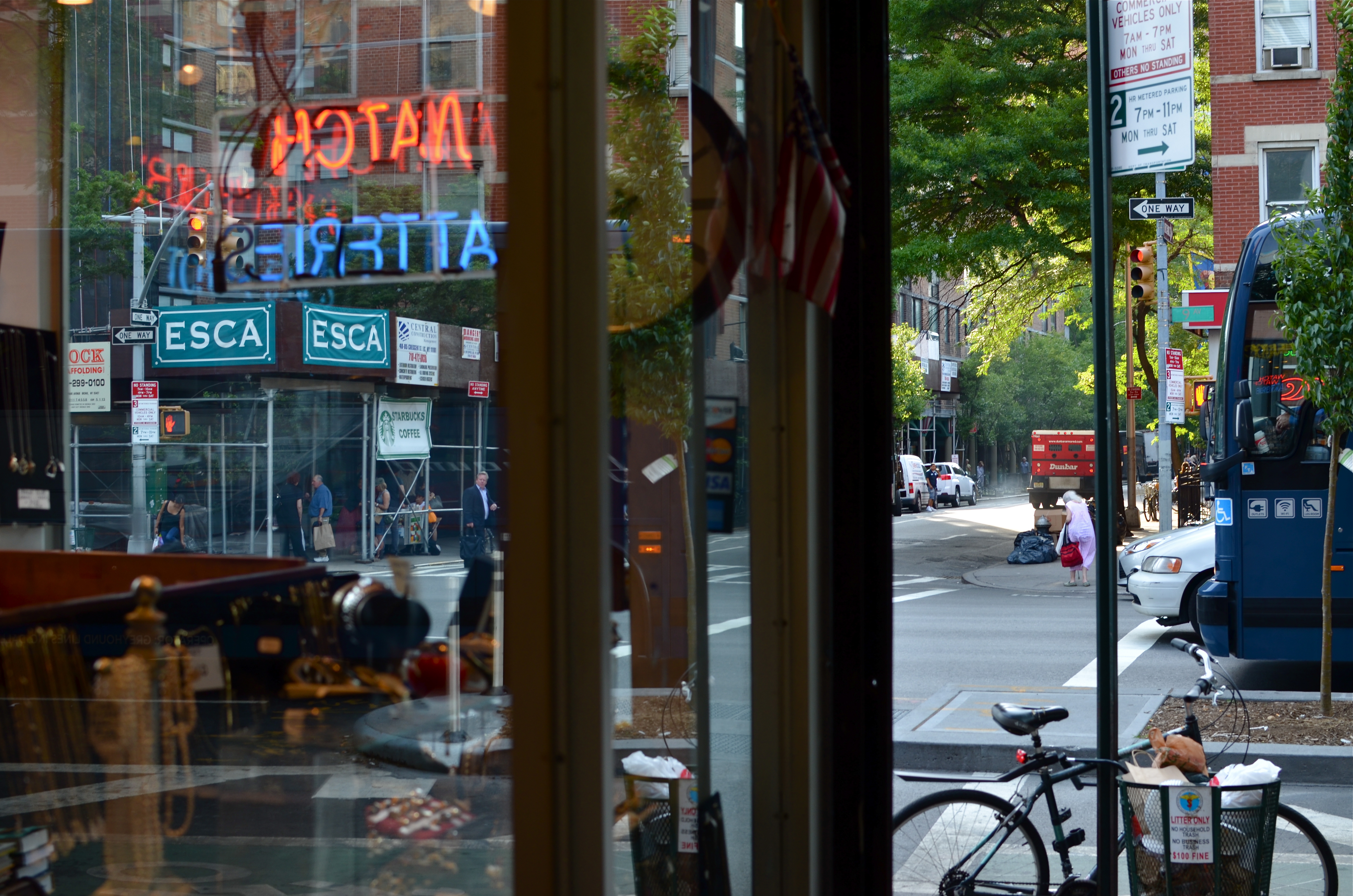
Consignment Shop, Manhattan. 1/80 sec., f/5.6, ISO 100, 35mm.
By MICHAEL PERKINS
IF YOU’RE OLD ENOUGH TO REMEMBER WHEN USE OF THE WORD “AIN’T” LABELED YOU AS A GRAMMATICAL LOWBROW, you may also recall the snooty disdain reserved for a verbal construction called the split infinitive. A simple infinitive involved following the preposition “to” with an action verb, such as “go”. To split the infinitive, the writer or speaker inserts an adverb between the two words for an extra boost of emphasis. Thus, in the most famous split infinitive ever, Gene Roddenberry invited Star Trek viewers
to boldly go where no man has gone before.
Nice, right? A little extra drama. A slight bending of the rules that delivers the goods.
Photography has a formal “grammar” about composition that also begs for a kind of “split infinitive”. Strictly speaking, compositions are supposed to be simple, clean, uncluttered. A perfect line of visual data from top to bottom, left to right. A picture frame, if you will, an organized way of seeing.
Attractive yes, even desirable, but a must? Nope. Life itself, as we observe it everyday, is far from a series of perfect frames. Lines of sight get broken, fragmented, blocked. Nature and light conspire to take that flawless composition and crash it, refract it, photobomb it until it resembles, well, life. And yet we often try to take pictures that show the very opposite of the sloppy, imprecise nature of things.
We try for “perfection” instead of perfect concepts.
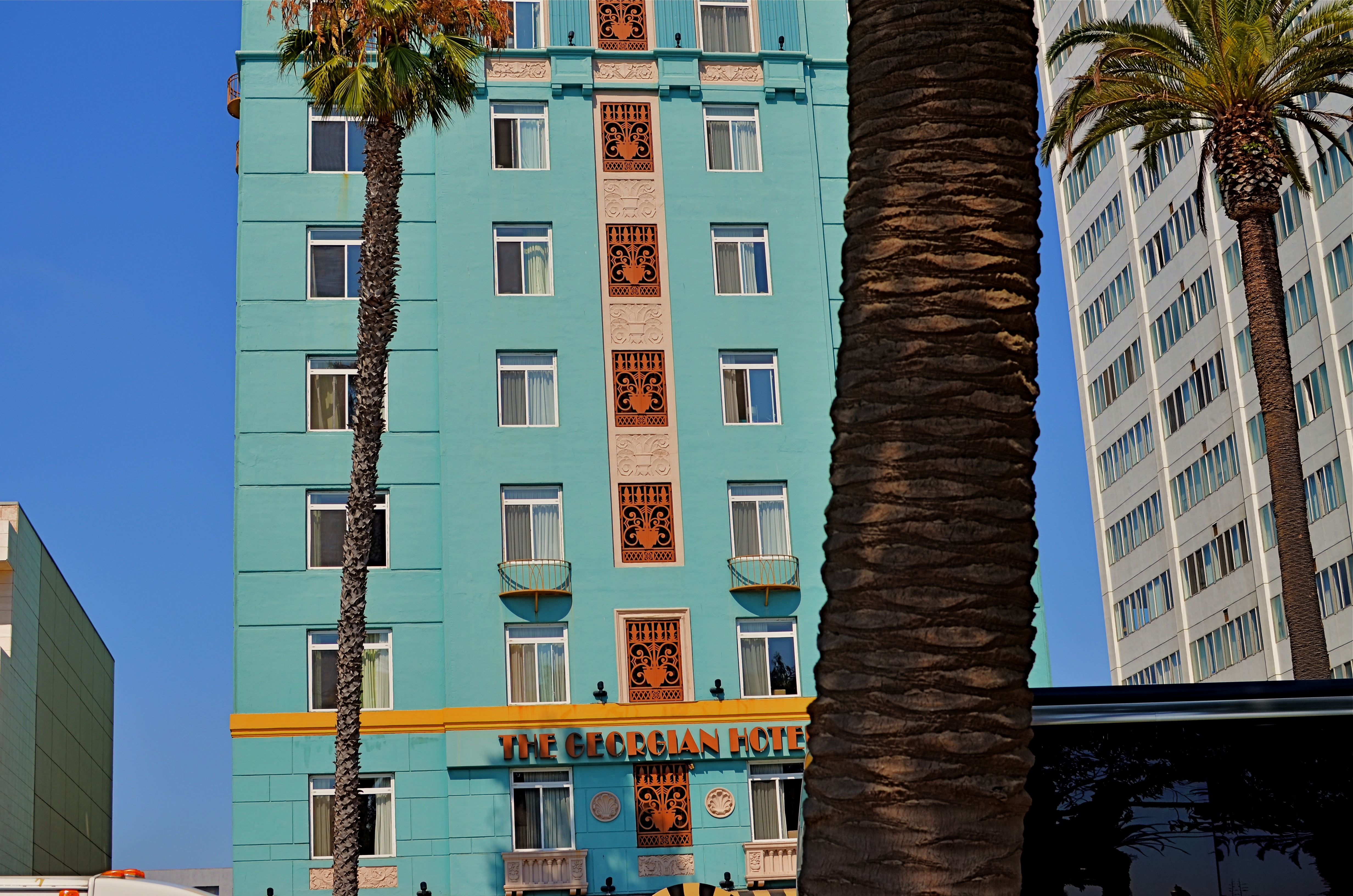
Georgian Hotel, Santa Monica, CA. 1/60 sec., f/5.6, ISO 100, 35mm.
Reviewing images for the last several years, I find that I am taking more compositions on their own terms, with light poles, weird reflections, broken planes of view and shadows all becoming more welcome in my final photos. I still labor to get a clean look when I can. But I also make peace with elements that used to doom a photo to the dustbin.
Street scenes especially can better reflect the visual chaos of busy cities if everything isn’t “just right”. It’s really hard (at least in my case) to tear out the mental hardwiring of a lifetime and take a picture that may be more abstract or cubist than I ever thought I could allow myself to be. Maybe it’s a function of aging, but things seem to be relaxing in my approach. Don’t get me wrong. I’m still Alpha Male enough to want to bring everything in a frame under my unswerving control. I just don’t get blood pressure when circumstances force me to unclench my iron fist once in a while.
It’s a process.
To see, yes, but, in allowing my visual infinitives to be occasionally split, it means learning to differently see.
Follow Michael Perkins on Twitter @mpnormaleye.
Welcome to our newest followers. Check out their mad genius at:
REVELATION OR RUT?
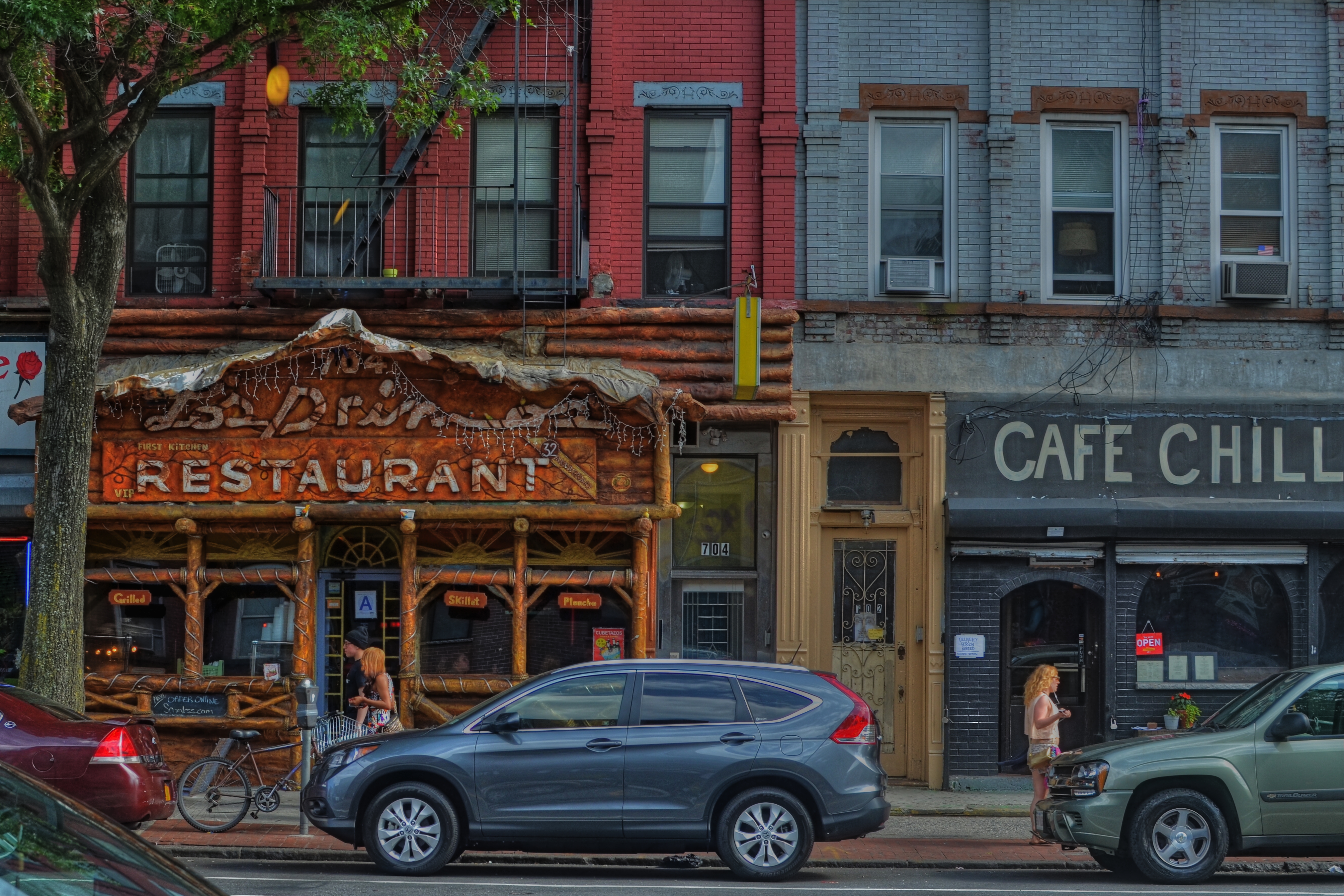
Cafe Chill, Brooklyn, 2013. 1/200 sec., f/5.6, ISO 100, 35mm.
By MICHAEL PERKINS
IT’S OFTEN DIFFICULT FOR PHOTOGRAPHERS, UNDER THE SPELL OF A CONCEPT, TO KNOW WHETHER THEY ARE MARCHING TOWARD SOME LOFTY QUEST or merely walking in circles, their foot (or their brain) nailed to the floor. Fall too deeply in love with a given idea, and you could cling to it, for comfort or habit, long after it has yielded anything remotely creative.
You might be mistaking a rut for revelation.
We’ll all seen it happen. Hell, it’s happened to many of us. You begin to explore a particular story-telling technique. It shows some promise. And so you hang with it a little longer, then a little longer still. One more interpretation of the shot that made you smile. One more variation on the theme.
Maybe it’s abstract grid details on glass towers, taken in monochrome at an odd angle. Maybe it’s time exposures of light trails on a midnight highway. And maybe, as in my own case, it’s a lingering romance with dense, busy neighborhood textures, shot at a respectfully reportorial distance. Straight-on, left to right tapestries of doors, places of business, upstairs/downstairs tenant life, comings and goings. I love them, but I also worry about how long I can contribute something different to them as a means of telling a story.
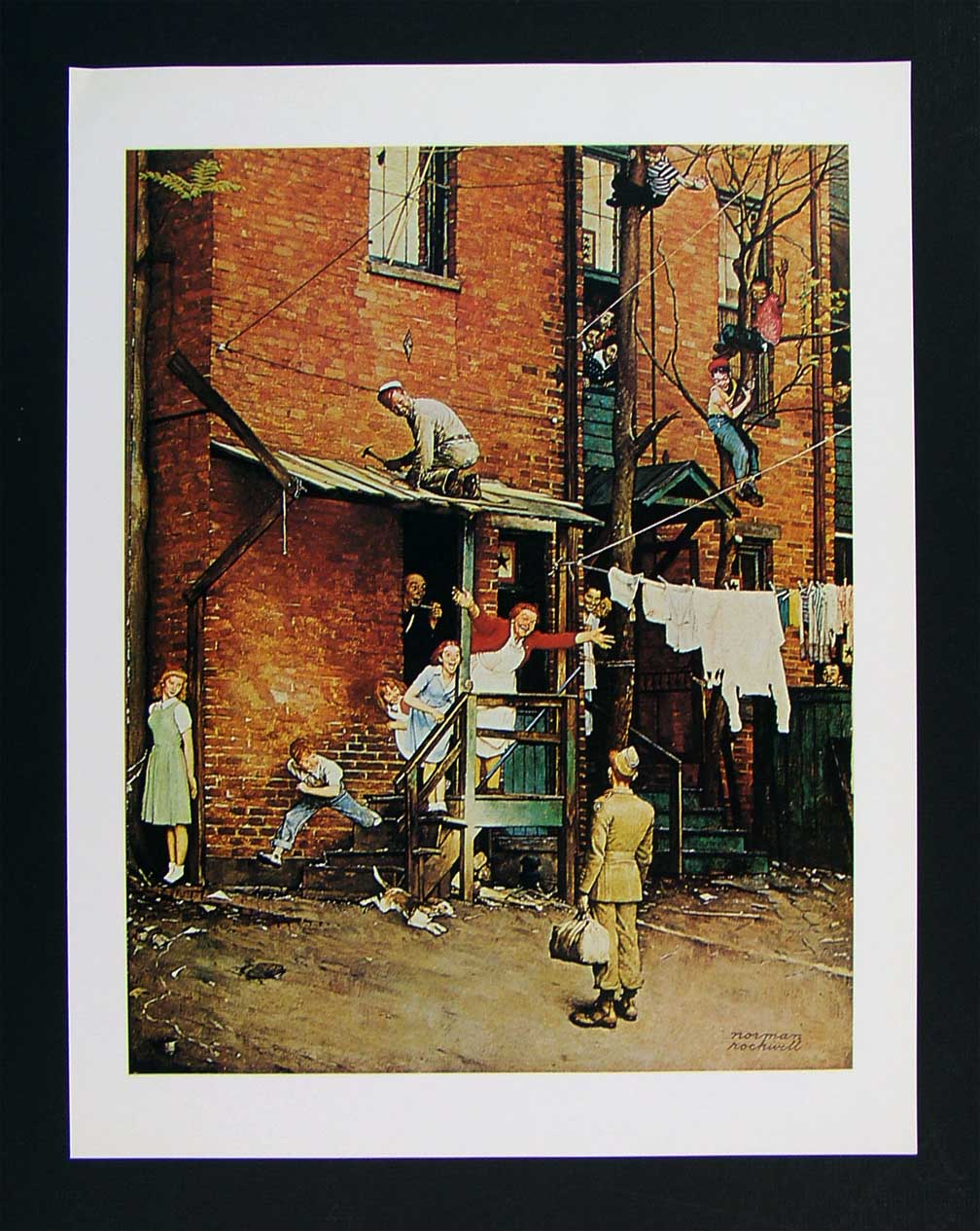
As staged as a Broadway show, Norman Rockwell’s idealized neighborhoods are still alluring in their appeal.
- The bustling tenement neighborhoods of early Norman Rockwell paintings appealed to me, as a child, because the frames were teeming with life: people leaning out of windows, sitting on porches, perching on fire escapes, delivering the morning milk…they were a divine, almost musical chaos. But they were paintings, with all the intentional orchestration of sentiment and nostalgia that comes with that medium. Those images were wonderful, but they were not documents…merely dreams.
That, of course, doesn’t make them any less powerful as an influence on photography.
When I look at a section of an urban block, I try to frame a section of it that tells, in miniature, the life that can be felt all day long as the area’s natural rhythm. There are re-gentrified restaurants, neglected second-floor apartments, new coats of paint on old brick, overgrown trees, stalwart standbys that have been part of the street for ages, young lovers and old duffers. Toss all the ingredients together and you might get an image salad that captures something close to “real”. And then there is the trial-and-error of how much to include, how busy or sparse to portray the subject.
That said, I have explored this theme many times over the years, and worry that I am trying to harvest crops from a fallow field. Have I stayed too long at this particular fair? Are there even any compelling stories left to tell in this approach, or have I just romanticized the idea of the whole thing beyond any artistic merit?
Hopefully, I will know when to strike this kind of image off my “to do” list, as I fear that repetition, even repetition of a valid concept, can lead to laziness….the place where you call “habit” a “style”.
And I don’t want to dwell in that place.
PARADOX
Where is the main story here? Far away, or up close? 1/60 sec., f/1.8, ISO 400, 35mm.
By MICHAEL PERKINS
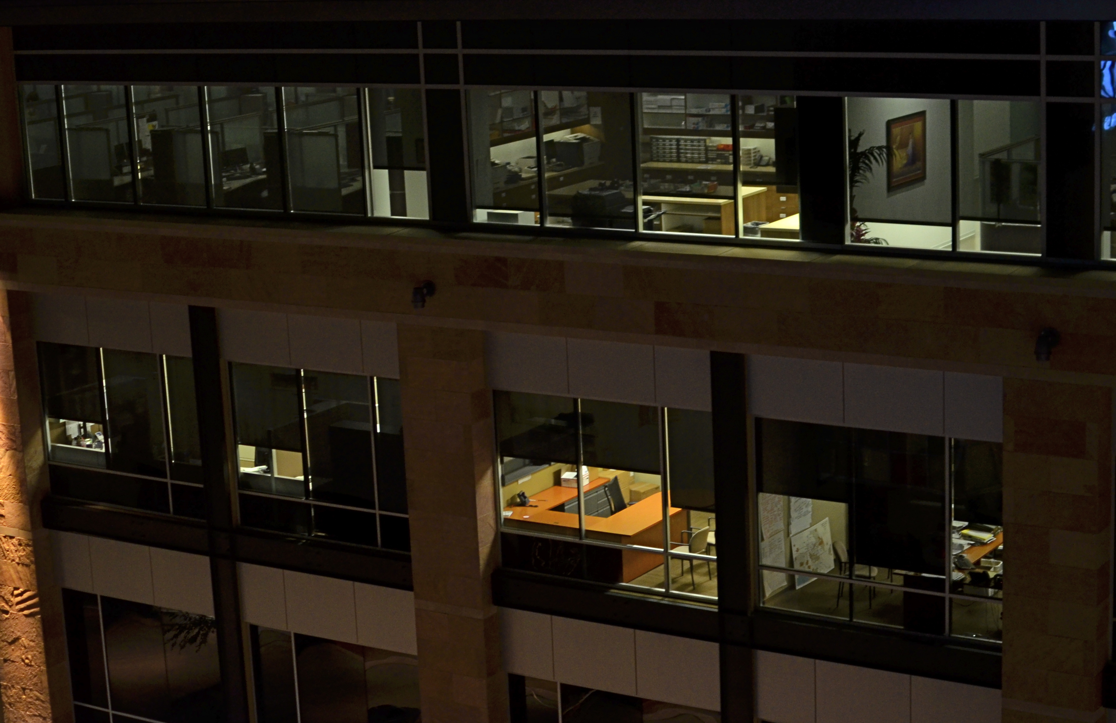
EVERY SET OF VISUAL ELEMENTS, CAPTURED AT OPPOSITE EXTREMES, DELIVERS A COMPLETELY DIFFERENT SET OF STORY RESULTS. For photographers, the everlasting tug-of-war, involving “what to shoot?” is usually between “how close” and “how far away”? Even the lenses we buy, along with their unique properties, reflect this struggle between the intimate tale, told by a close-up, versus the saga, drawn from a vast panorama. There is a season, turn turn turn, for all kinds of image-making, and it’s no great revelation that many shooters can look at the same grouping of components and get remarkably different results.
Had I come upon the cluster of office cubicles seen in the image above on, say, day “A”, I might have been inclined to move in close, for a personal story, a detailed look at Life In The Office In This Modern World, or how worker #3456 left behind his umbrella and half a tuna sandwich. As it turned out, however, it was day “B”, and instead I saw the entire block of spaces as part of an overall pattern, as a series of lives linked together but separate, resulting in the more general composition shown here. I was shooting wide open at f/1.8 to retrieve as much light, handheld, as quickly as possible, to use the surrounding darkness to frame all the visual parts of the scene as boxes-within-boxes, rather than a single cube that warranted special attention.
Next time I’m up to bat with a similar scene, I could make the completely opposite decision, which is not a problem, because there never is a wrong decision, only (usually) wrong execution. And, yes, I realize that, by shooting empty offices, I dodged the whole ethical bullet of “should I be spying on all these people?”, otherwise known as Street Photographers’ Conundrum # 36.
I love wrestling with the paradox of how close, how far. There can be no decisive solution.
Only the fun of the struggle.
Welcome to our newest followers. Check their work out at :
http://www.en.gravatar.com/glennfolkes85
POP’S MAGIC PICTURE BOX (Father’s Day 2013)
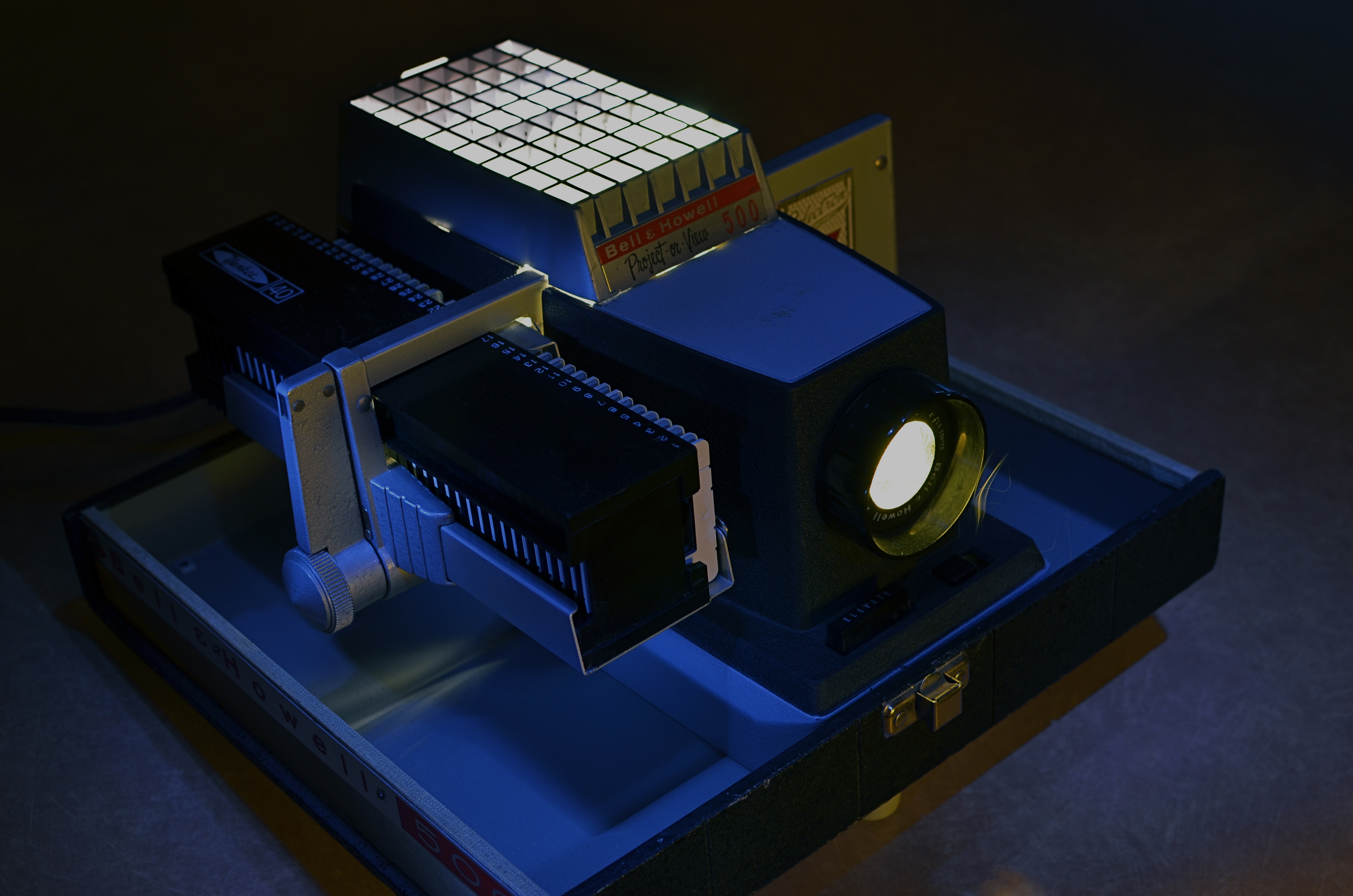
Magic in the darkness: my father’s Bell & Howell 500 projector, circa 1963. Image time-exposed and selectively light-painted in absolute dark. 10 sec., f/5.6, ISO 100, 35mm.
By MICHAEL PERKINS
YEARS AFTER, AS A YOUNG BOY, I FIRST SAW KODACHROME SLIDES PROJECTED ONTO OUR LIVING ROOM WALL, I learned that the first popular projectors had actually been called “magic lanterns” How right they were, and what an incredible spell these flashes of color and light wove for a little boy breathless in the familiar, yet miraculous dark.
It wasn’t that, as a family, we didn’t have dozens of albums crammed with traditionally processed prints of our most treasured moments. It’s just that, in the shadows, those clear, color-soaked images, half a wall in size, took on a life of their own. Bigger. More immediate. And as communal as a trip to the theatre. Only this was our theatre….our lore, our legend, writ large, compelling somehow in its size and scale.
Father’s Day is always a poignant time for me, since my life is insanely blessed. For me to be in the last third of my own life, and to still have the author of so many of my dreams still on the scene, still available to teach and direct my visions, as he did so ably then….well, it’s everything, that’s all.
As a father myself, I learned that it’s not always possible to transmit your passions to your children. Sometimes they don’t want to follow dear old Dad into whatever passionate pursuits he’s chosen for his own life. The fact that, sometimes, your kids “get” what even a part of you is really about is amazing, and, in the case of my father, I was lucky enough to be struck by the same lightning that hit him when it came to the graphic image….drawn or painted, realized in solid space in sculpture, or frozen on film. Photographs to him were another way of teaching himself to select, to edit, to choose something magical to depict or interpret, and he let me be the sorcerer’s apprentice.
Early into the Christmases of my adolescence, the power of our family albums was left in the dust as our memories began to shine and glow in our living room with the arrival of Dad’s new Bell & Howell 500 slide projector. It was Cinemascope, Cinerama, and the video wall from The Jetsons all in one, and I was mesmerized. The arrival of every yellow, flat box of new Kodak slides, all the way from the regional processing plant in Findley, Ohio, was like the reveal of a stage magician. I had caught the fever. I wanted to make pictures, too.
I wanted to make pictures like his.
The best statement I can make, all these years later, about the wonder of projected images was expressed several years ago on the Mad Men TV series, when adman Don Draper has the chance to make a fictional pitch to Eastman Kodak on how to market and name its new series of home slide projectors. And, even though our home projector used a “cube” tray instead of the wheel on Kodak’s “Carousel”, the magic was the same. Draper’s pitch began with the very essence of family memory:
“In Greek, ‘nostalgia’ literally means ‘the pain from an old wound’.
It’s a twinge in your heart, far more powerful than memory alone.
This device isn’t a spaceship, it’s a time machine. It goes backward and forwards, and it takes us to a place where we ache to go again.
It’s not called ‘The Wheel’. It’s called ‘The Carousel’ It lets us travel the way a child travels…around and around and back home again.
A place where we know we are loved. “
On this Father’s Day, as on every other, my heart is filled with memories and gratitude for the love that created them, but also a special thanks for a father who taught me the adventure, the patience, the joy of making an image. Armed with his trusty Kodak Pony 828, he taught me how to celebrate the triumphs and live with the failures, and, most importantly, to always go back to the well for another try. As both a photographer and graphic artist, he showed me that the concept is all, that it’s worth fighting for, worth worrying about, worth loving as your own special treasure.
Thanks, Dad. I love you.
Follow Michael Perkins on Twitter at MPnormaleye.
Related articles
- The best product placement in the TV shows (brandsandfilms.com)
- It’s a Magic Lantern (wordwenches.typepad.com)
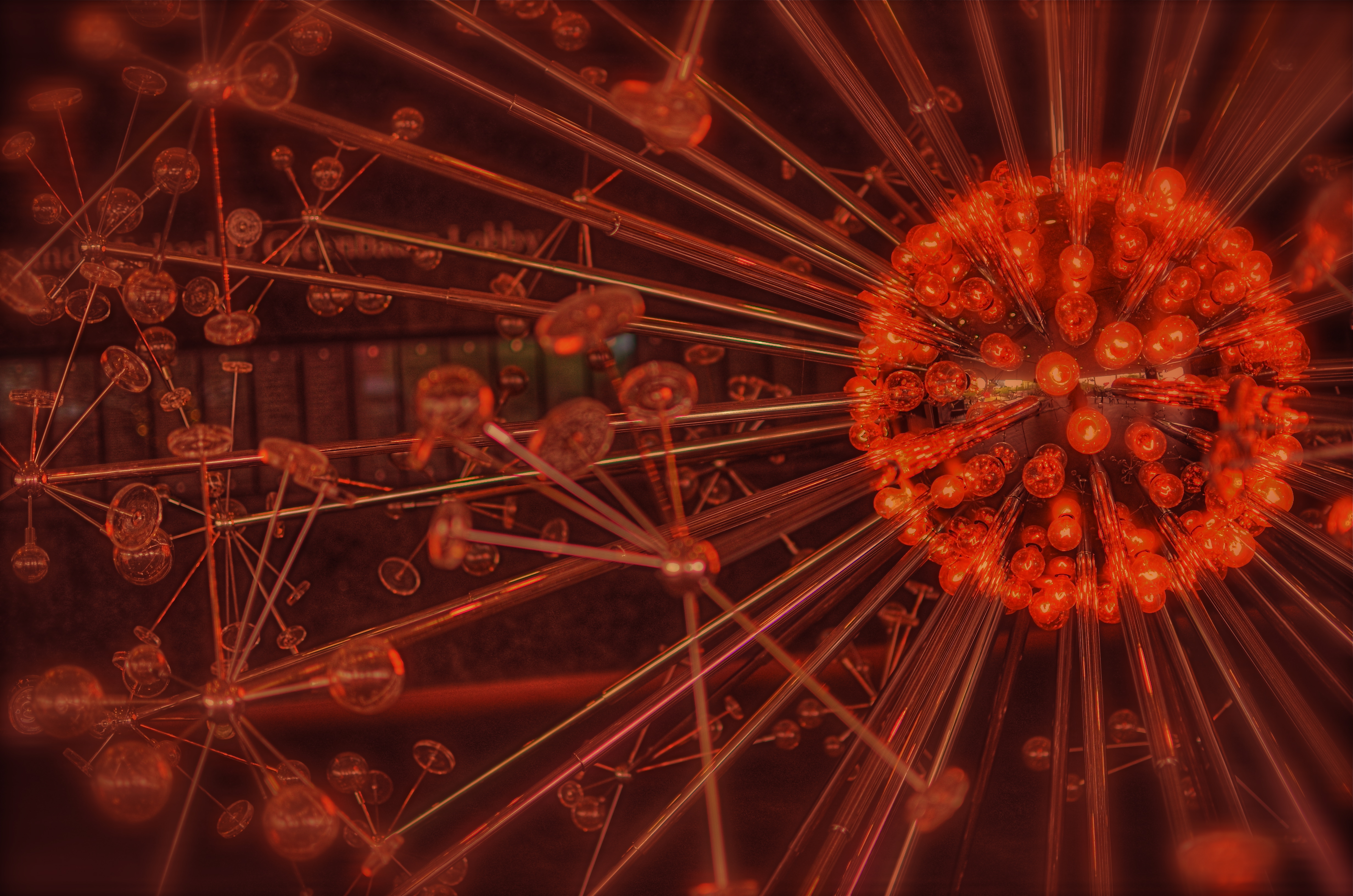
MUTATION
Okay, this has a LOT of processing. Love me or hate me based on whether it worked. 1/500 sec., f/1.8, ISO 100, 35mm.
BY MICHAEL PERKINS
NOT CONTENT TO BE AN ART ON ITS OWN TERMS, PHOTOGRAPHY IS ALSO CONSTANTLY RE-INTERPRETING ALL THE OTHER ARTS AS WELL. Ever since imaging fell out of the cradle in the early 1800’s, several of us have always been looking at the works of others and saying, “eh, I can probably do something with that.”
Yeah, not too presumptuous, right? And the trend has continued (some say worsened) to the present day. Half the time we are creating something. The other half of the time we are tweaking, mocking, honoring, loving, hating, shredding, re-combining, or ragging on somebody else’s work. Are these mashups also art? Are we co-creators or just cheesy thieves?
And does it matter?
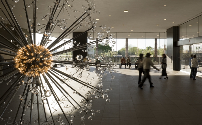
The Last Scattering Surface as it appears in the lobby of the Phoenix Art Museum.
The Phoenix Art Museum greets customers with a stunning original sculpture in glass and plexi right at the entrance to its ticket lobby. A huge installation of light bulbs, mirrored surfaces and reflective discs, Josiah McIlheny’s The Last Scattering Surface resembles a brightly burning orb (planet? asteroid? dwarf star?) surrounded by jutting rods that carry the central sphere’s light along “rays” to a series of circular satellites (moons? craft? debris?) Like many examples of pure design it is both everything and nothing, that is, it is mutative based on your observation. So, in a way, as in the manner of a photographer, you are already a participant in the co-creation of this object just by looking at it. Does this mean that it’s less theif-ish to go ahead and mutate the man’s work?
Well, there’s probably a lively back-and-forth on that.
For my own “take”, I wanted to remove the background walls, visitors, ambient blurry light from other junk, to isolate this nova-like work in “space”. I only had one frame that I liked from my short blast of shots, so I duped it, slammed the contrast real light/real dark on the pair, and did an exposure fusion in Photomatix. Adding a little edge blur and a re-tinting to the composite gave me the look of an interstellar explosion.
I freely advertise that I am making a semi-original re-mix on a completely original work. It’s not much more radical than shooting with a filter on the lens, or choosing black and white for a color subject, and yet, it always feels funny to try and make something beautiful that was beautiful in the first place.
But art is supposed to be about starting conversation, so consider this mine.
I just did my talking with a box instead of a mouth.
follow Michael Perkins on Twitter @ mpnormaleye.com
THE EASIEST ABSTRACTION
By MICHAEL PERKINS
YOU’VE HEARD THE JOKE ABOUT THE WRITER WHO TAGGED A NOTE TO A FRIEND BY SAYING, “If I’d had more time, I’d have written you a shorter letter”. That line speaks volumes about how we increase the power of communication by leaving things out. Just as great books are not so much written as re-written, so photographs often gain in eloquence when everything but the essence of the message is pared away.

You already know a tree “goes with” this reflection..but is it needed to complete the image? 1/500 sec., f/5.6, ISO 100, 35mm.
It means being your own best editor, and, to do that, you have to be able to hate on your own work a little bit. Tough love and all that. Spare the picture and spoil the image. No sacred cows, just because they are your cows. There is no avoiding the fact that no real art comes about unless you take direct, often brutal action, to overcome the imperfections of a raw first effort. You have to intervene, again and again, in the shaping of your conception.
You can probably infer from all this that I am no fan of automodes, or of any other abdication of responsibility that lets a device, for Pete’s sake, dictate the outcome of image-making.
A few basic truths to keep before you:
Your camera is a machine with an eye attached.
You are an eye with a brain attached.
One of you is supposed to be in charge.
Guess which one.
When we merely snap a scene, freezing an arrangement of whatever we see in frame, we are only making a record. Creativity comes with abstraction, of exploring what is beyond the obvious cause-and-effect. The standard approach to showing things should actually be called the “average” approach. Look, here’s a tree, and, below, here is its shadow. Behold, here’s a scenic object next to the water, and, in the water, a reflection of that object. This simple reproduction of “reality” involves craft, to be sure, but something that falls short of art. Abstracting, adding or taking away something, and actively partnering with the viewer’s imagination take the photograph beyond a mere recording.
And that, boys and girls, is where the “art” part comes in.
Take away even a single obvious element and you change the discussion, for better or worse. Does the tree always have to be accompanied by its shadow? Does the mountain and its reflection always need to be presented as a complete “set”? It’s interesting to take even the “perfect” or “balanced” shots we cherish most and again take the scissors to part of them. Can the picture speak louder if we trim away the obvious? Can the image turn out to be something if it just stops trying to be everything?
The easiest abstractions come from changing small things, and editing can often, oddly, be an act of completion. Pictures taken in the moment are convenient, but too many images are trusted to the ease of leaning on automodes, and almost no photo is fully realized “straight out of the camera.” Believe this if you believe nothing else: nothing truly excellent ever results from putting your imagination in neutral. You have to decide whether you or the machine is the principal picture-taker.
That decision decides everything else.
Follow Michael Perkins on Twitter @mpnormaleye
IT’S NOT EASY BEIN’ GREEN

This is the desert? A Phoenix area public park at midday. There is a way around the intense glare. 1/500 sec., f/5.6, ISO 100, 35mm, straight out of the camera.
By MICHAEL PERKINS
FOR YEARS I HAVE BEEN SHOOTING SUBJECTS IN THE URBAN AREAS OF PHOENIX, ARIZONA, trying to convey the twin truths that, yes, there are greenspaces here, and yes, it is possible for a full range of color to be captured, despite the paint-peeling, hard white light that overfills most of our days. Geez, wish I had been shooting here in the days of Kodachrome 25. Slow as that film was, the desert would have provided more than enough illumination to blow it out, given the wrong settings. Now if you folks is new around here, lemme tell you about the brilliant hues of the Valley of the Sun. Yessir, if’n you like beige, dun, brown, sepia or bone, we’ve got it in spades. Green is a little harder to come by, since the light registers it in a kind of sickly, sagebrush flavor….kind of like Crayola’s “green-yellow” (or is it “yellow-green”?) rather than a deep, verdant, top-o-the-mornin’ Galway green.
But you can do workar0unds.
In nearby Scottsdale, hardly renowned for its dazzling urban parks (as opposed to the resort properties, which are jewels), Indian School Park at Hayden and Indian School Roads is a very inviting oasis, built around a curvy, quiet little pond, dozens of mature shade trees that lean out over the water in a lazy fashion, and, on occasion, some decorator white herons. Thing is, it’s also as bright as a steel skillet by about 9am, and surrounded by two of the busiest traffic arteries in town. That means lots of cars in your line of sight for any standard framing. You can defeat that by turning 180 degrees and aiming your shots out over the middle of the pond, but then there is nothing really to look at, so you’re better off shooting along the water’s edge. Luckily, the park is below street level a bit, so if you frame slightly under the horizon line you can crop out the cars, but, with them, the upper third of the trees. Give and take.
There is still a ton of light coming down between the shade trees, however, so if you want any detail in the water or trees at all, you must shoot into shade where you can, and go for a much faster shutter speed….1/500 up to 1/1000 or faster. It’s either that or shoot the whole thing at a small f-stop like f/11 or more. In desert settings you’ve got so much light that you can truly dance near the edge of what would normally be underexposure, and all it will do is boost and deepen the colors that are there. There will still be a few hot spots on projecting roots and such where the light hits, but the beauty of digital is that you can click away and adjust as you go.
It’s not quite like creating greenspace out of nothing, but there are ways to make things plausibly seem to be a representation of real life, and, since this is an interpretive medium, there’s no right or wrong. And the darker-than-normal shadows in this kind of approach add a little warmth and mystery, so there’s that.
It was “yellow-green”, wasn’t it?
Hope that’s not on the final.
(follow Michael Perkins on Twitter @mpnormaleye)
