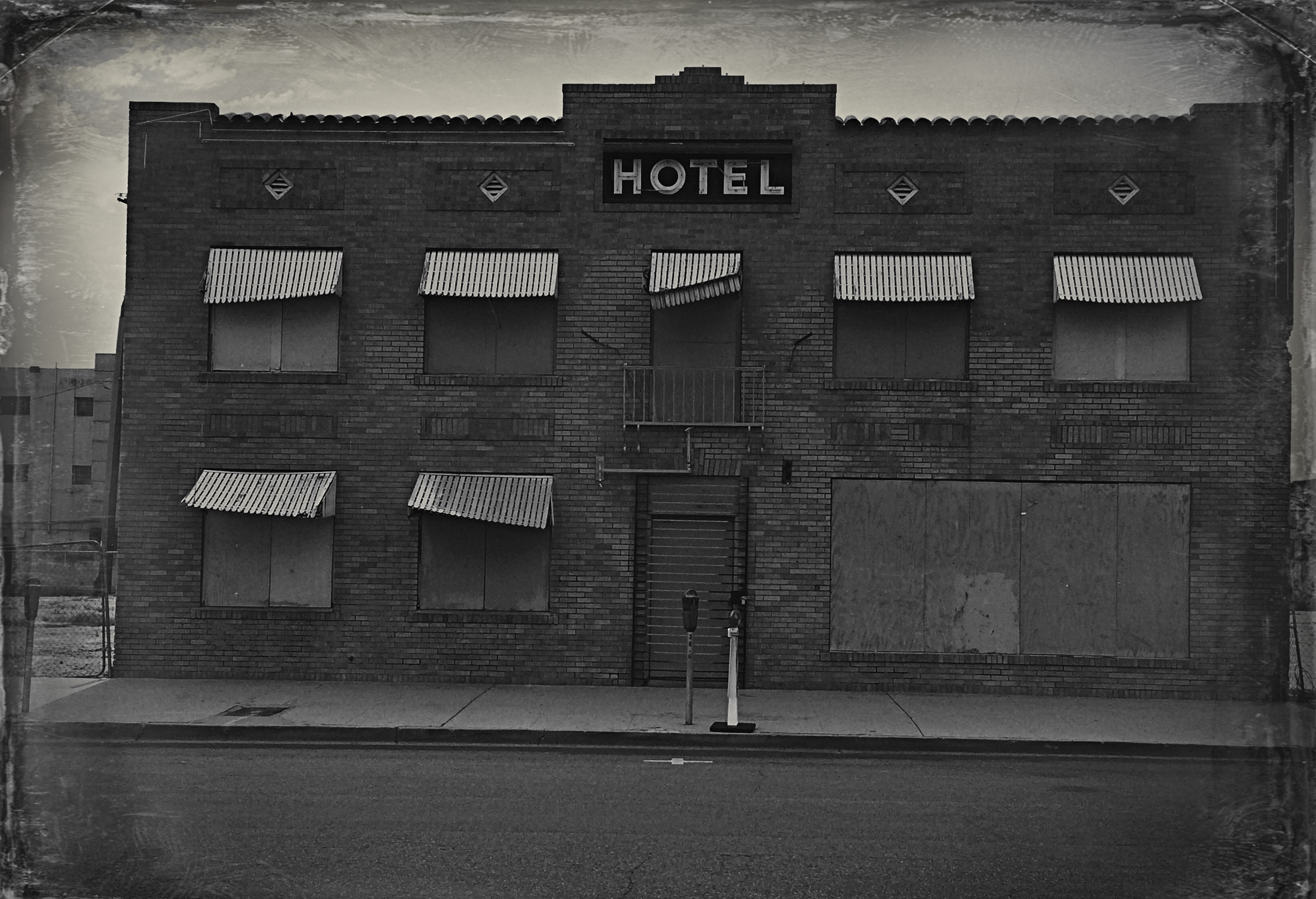
DISTORTION WITH DISTINCTION
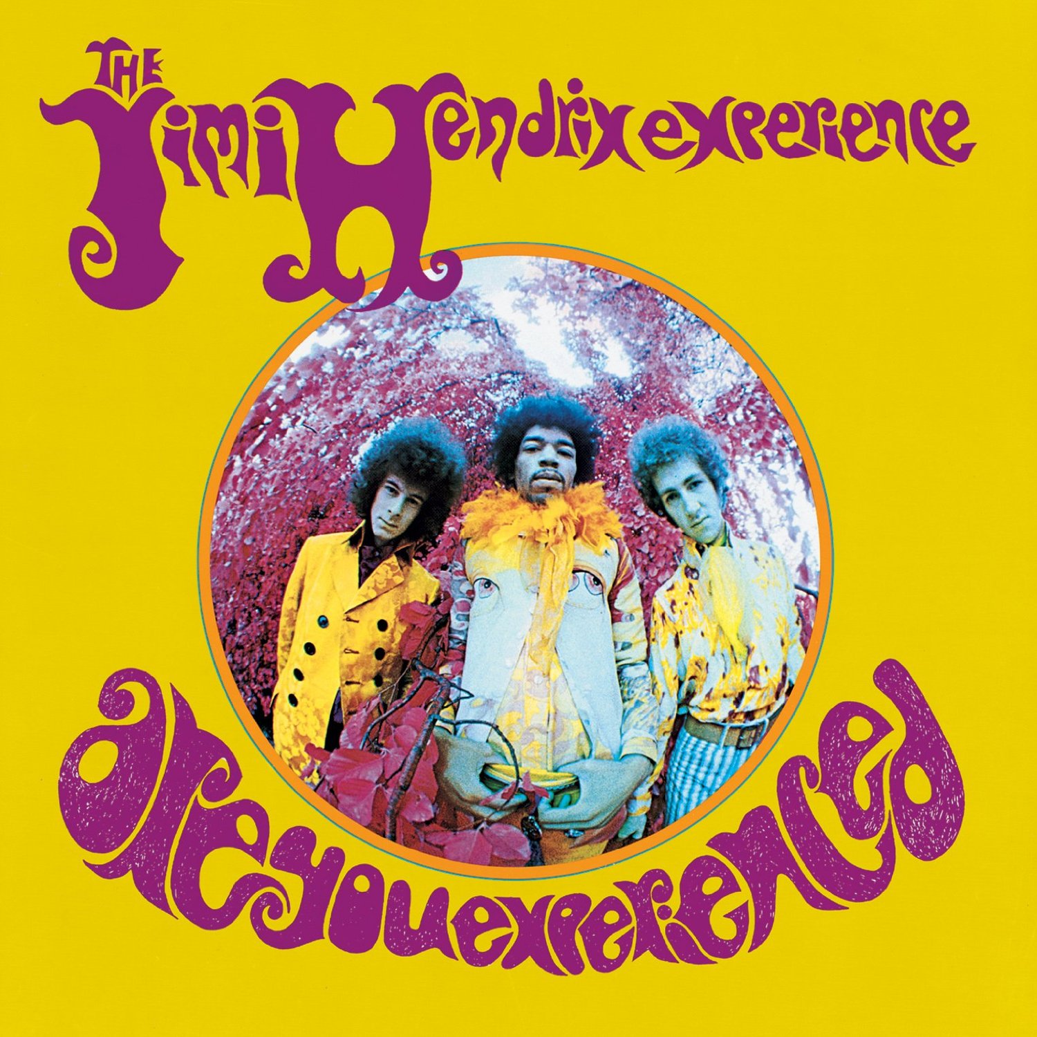
Perhaps the most famous “fisheye” image in pop culture.
By MICHAEL PERKINS
THE FISHEYE LENS, that ultra-wide hunk of glass whose images seem inscribed within a circle rather than a rectangle, have earned a bit of a bad rap among serious photographers over the years, perhaps because of either mis-use or over-use.
Let’s face it: of all the optical effects available to the average shooter, the fisheye shot is one of the most dramatic in its distortion of reality. It’s almost guaranteed to make your image about the look, which is where content starts to matter less than mere novelty.
Fisheye fever saw its peak in the swinging ’60’s, when such shots were intended to suggest a kind of sensory dislocation, the visual equivalent of a psychedelic state. The cover of Jim Hendrix’ Are You Experienced was perhaps the most popular example of such “weird-for-weird’s-sake” photography, with main subjects sitting at dead center, surrounded by severe barrel distortion that radiated out toward the edge of the circle, making even close objects seem distant as they softened into a haze of chromatic aberration at the extremes. Far out, man.
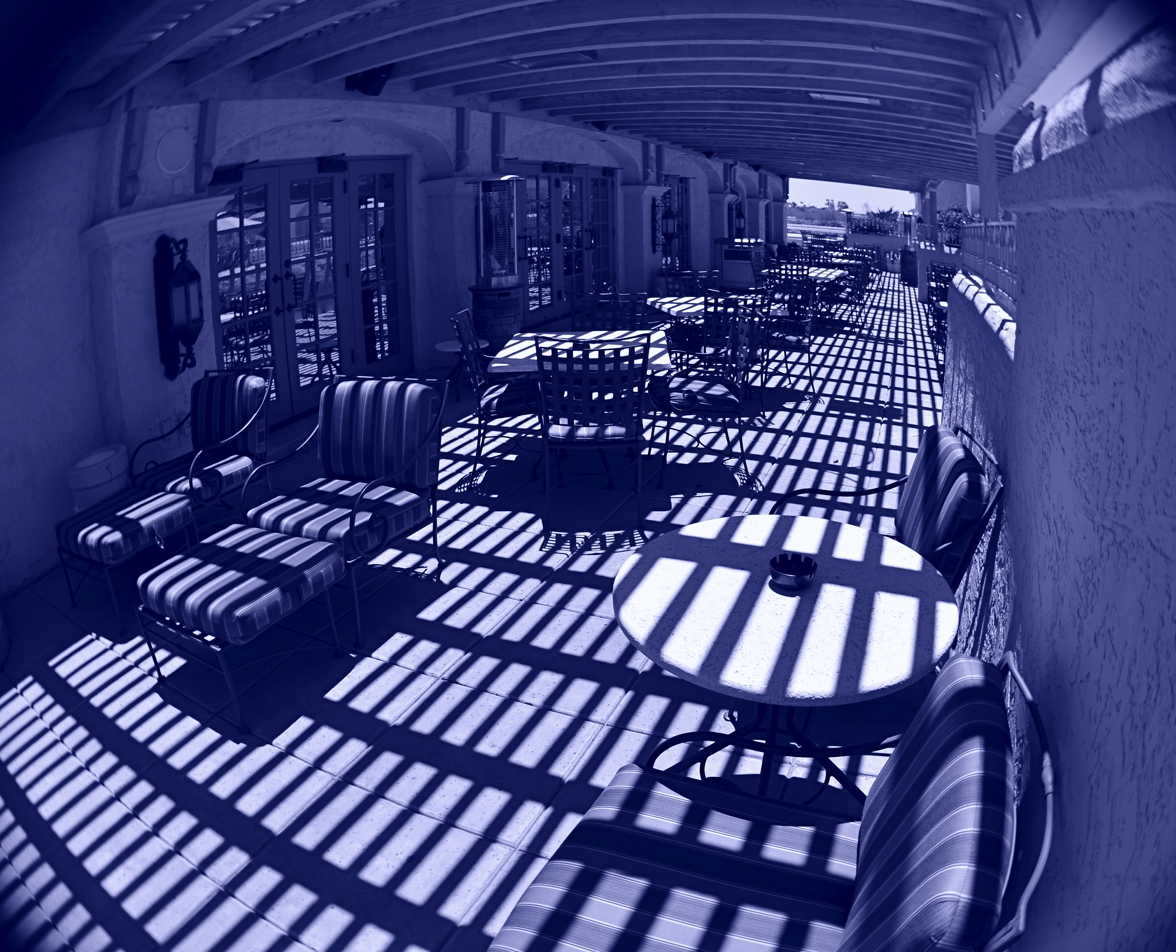
Cyan Veranda (2016). Curbing the extremes of the fisheye effect with composition and angle. This shot was made with a Lensbaby fisheye optic installed in a Lensbaby Composer Pro lens assembly, far less expensive than the classic “dedicated” fisheye.
These kaleidoscopic pictures tend to render such arbitrary boundaries as walls and horizon lines moot, and telegraph the photographer’s message that it’s all about getting your freak on. However, I think that fisheyes, when used like other wide-angles, can add graduated elements of distortion and distance exaggeration that need not be the only visual message in an image. Making a left or right edge the “center” of the shot, for example, can reduce the intense bending-in, while raising the camera up or down can render a horizon line almost normal, with a little tweaking for dramatic effect.
Ultra-wide images need not be all about the patented fisheye “look”, which can be, frankly, fatiguing, just as shooting in hazy focus or HDR might, were you to do nothing else. It’s the point at which an effect ceases to be a tool and starts to actually put barriers between your subject and your viewer, which is seldom good. What is good is that a “dedicated” fisheye (one which cannot deliver a standard image), still one of the most expensive pieces of glass available, is no longer a mandatory investment, since even lo-fi film cameras, entry-level art lenses and even phone apps can create the look cheaply and quickly, allowing one to dabble without adding on a second mortgage (beware the poor quality in the truly cheap ones, however). Optical tricks are, well, just that. Optical techniques can amplify, rather than disguise, your visual messages.
MORE TOOLS IN MORE HANDS

Shot one inch away with Lensbaby macro converters, accessories for the company’s 35mm lens, amazingly priced at about $49.95.
By MICHAEL PERKINS
THE CELL PHONE CAMERA’S IMPACT ON PHOTOGRAPHY HAS BEEN SO SUDDEN AND FAR-REACHING that its full impact has yet to be fully measured. Within a decade, the act of making a picture has been democratized to a greater degree than at any other time in the history of the medium. It’s as if, overnight, everyone was given the ability to leap tall buildings in a single bound. Goodbye, Superman, hello, Everyman. The Kodak Brownie’s introduction prior to 1900 gave the average human his first camera. The cell phone is like the Brownie on steroids and four shots of Red Bull.
It’s more than just giving millions of people the ability to take a photo. That part had been done before, dozens of times. However, no other camera before the cell has also obliterated the number one obstacle to picture-making on this scale: cost. The cost of film. The cost of marketing and sharing one’s work quickly, and with uniform quality. The cost of artistry, with support apps allowing people to directly translate their vision into a finished product without investing in gear that, just a few years ago, priced most people out of the creative end of the market.
Most significantly, there is the cost saved in time. Time learning a technique. Time speeding past the birth pains of your creative energy. you know, those darn first 10,000 hours of bad pictures that used to take years of endurance and patience. The learning curve for photography, once a gradually arching line, is now a dramatic, vertical jump into the stratosphere.

A cell-app simulation of the film-based platinum printing process.
These insane leaps in convenience and, for the most part, real technical improvement occur across all digital media, but, in the cel phone, their impact is spread across billions, not mere millions, of users. Simulate a particular film’s appearance? Done. Do high-quality macro or fisheye without a dedicated lens running into the hundreds? Yeah, we can do that. Double-exposures, selective focus, miniature effects, pinhole exposures, even remote auxiliary lighting? Go fish. It’s all there.
And when cells raise the ante, traditional cameras have to up their game just to survive. The shot at the top of this page comes from a pair of Lensbaby macro converters up front of the company’s Sweet 35 optic, a shot that would only have come, a few years ago, from a dedicated macro lens costing upwards of $500. Lensbaby’s version? $49.95. And now, with less than a decade in the effects lens biz for DSLRs, Lensbaby makes macro, fisheye and other effect lenses for cells. A rising tide raises all boats.
I could make a list of the areas where the optics and outputs of cell phones are still behind conventional camera optics, but if this post is ever read more than a year past its publication, the future will make a liar out of me. Besides, that would put me on the same side as the carpers who still claim that film is better, more human, or “warm”, as the vinyl LP hipsters like to say. Your horse is nice, but it can’t outrun my Model T.
Part of photography’s appeal since day one has been the knowledge that, whatever era you live in, it’s a sure bet that some geek is slaving away in a lab somewhere, trying to make your sleek, easy, “latest thing” seem slow, clunky and over with. We’re never done. Which means that we’re always just beginning.
Cool.
THE GENTLE WELCOME
By MICHAEL PERKINS
But soft! What light through yonder window breaks? —Shakespeare
OKAY. AS IT TURNS OUT, IN THE ABOVE LINE, ROMEO WAS ACTUALLY RHAPSODIZING about his main squeeze, rather than ideal photographic conditions. Still, I often think of the quote when a sudden shaft of gold explodes from behind a cloud or a sunset lengthens shadows, just so. I have lots of But, soft! moments as a photographer, since light is the first shaper of the image, the one element that defines the terms of engagement.
Selective focus on the cheap: image made with the economical Lensbaby Spark lens. 1/40 sec., f/5.6, ISO 100, 50mm.
After light, for me, comes focus. Where it hits, where it peaks, where it falls off, and how all these aspects shape a composition. Soft or selective focus especially seems more intimate to me, a gentle welcome to share something special between picture and viewer. In recent years, focus has become almost as fine-tune-able as light itself, with the introduction of new, affordable alternatives to expensive “tilt-shift” lenses, which allow the selective blurring of elements within the frame. For example, the revolutionary Lensbaby products are now helping shooters make their own choices on where the focal “sweet spot” should occur in a picture, and at a fraction of the cost of a true tilt-shift. It’s a fiscal shortcut that makes it possible for almost anyone to learn how to create this effect.
Focus on the Lensbaby Spark is achieved by squeezing the lens bellows until focus registers wherever you want to place it.
Some Lensbabies can run to several hundred dollars and have precise systems for dialing in the part of a photograph that will, through sharp focus, attract optimum attention to a subject, gently blurring the image on all sides around that point. However, for those with steady fingers and shallow pockets, the company’s gateway drug, coming in at around $90, is the Lensbaby Spark, a springy bellows lens that snaps onto your DSLR in place of a regular lens and can be compressed around the edges to place the focal sweet spot wherever you want it.
The Spark takes more muscle control and practice than the more mechanical Lensbaby models, but it’s a thrifty way to see if this kind of imaging is for you. Just squeeze the fixed f/5.6, 50mm lens until the image is sharp at the place you want it, and snap. Some DSLRs allow the Spark to be used on aperture priority, but for most of us, it’s manual all the way, with a lot of trial-and-error until you develop a feel for the process. The company also sells several insert cups so that you can choose different apertures. Pop one f-stop out, pop another one in.
For those of you who like to custom-sculpt focus and light, the gauzy, intimate effect of the Lensbaby will in fact be a gentle welcome. Finally, it’s one more component that could be either toy or tool. Your shots, your choice.
SEISMOGRAPHY
Symphonie Kinetique, 2015. Handheld in-camera manipulation, in real time, of the iPhone’s on-board pano app.
By MICHAEL PERKINS
I THINK THAT, FOR YOUNG AND EMERGING PHOTOGRAPHERS, there’s a greater natural comfort in coloring outside the lines, bending or breaking rules of the medium just to see what happens, regardless of the warnings of user’s manuals or procedurals. This is completely normal, and is, in fact, healthy for the art overall, as every age’s young turks shake the process up and keep us more hidebound shooters from imprisoning photography in a crust of habit.
Phone-based apps play directly to this “what the hell, let’s try it” tendency in the newbie. By their very nature, apps allow people to achieve in a second what used to take years of formal training and painstaking darkroom effort to achieve. This creates the feeling that anything is possible, and that, with the instantaneous feedback loop of digital, there is nothing to be risked or lost by trying.
Whenever I get a new app, I try to figure out what it can produce when used completely counter-intuitively, that is, by going in the direct opposite of its “correct” use. Call it a procedural hack if you will, taking one of the most available effects, the iPhone’s on-board panorama app, as a prime example. Now we all know how the app is supposed to work. You pan evenly and slowly from left to right across a scene and a lot of separate vertical “planks”, all of which are individual exposures, are stitched together by the software to give the appearance of a continuous image. You are instructed by the app when to slow down, and given a guide arrow as you pan that keeps you pretty much on an even horizon. And that’s all you’re supposed to be able to do.
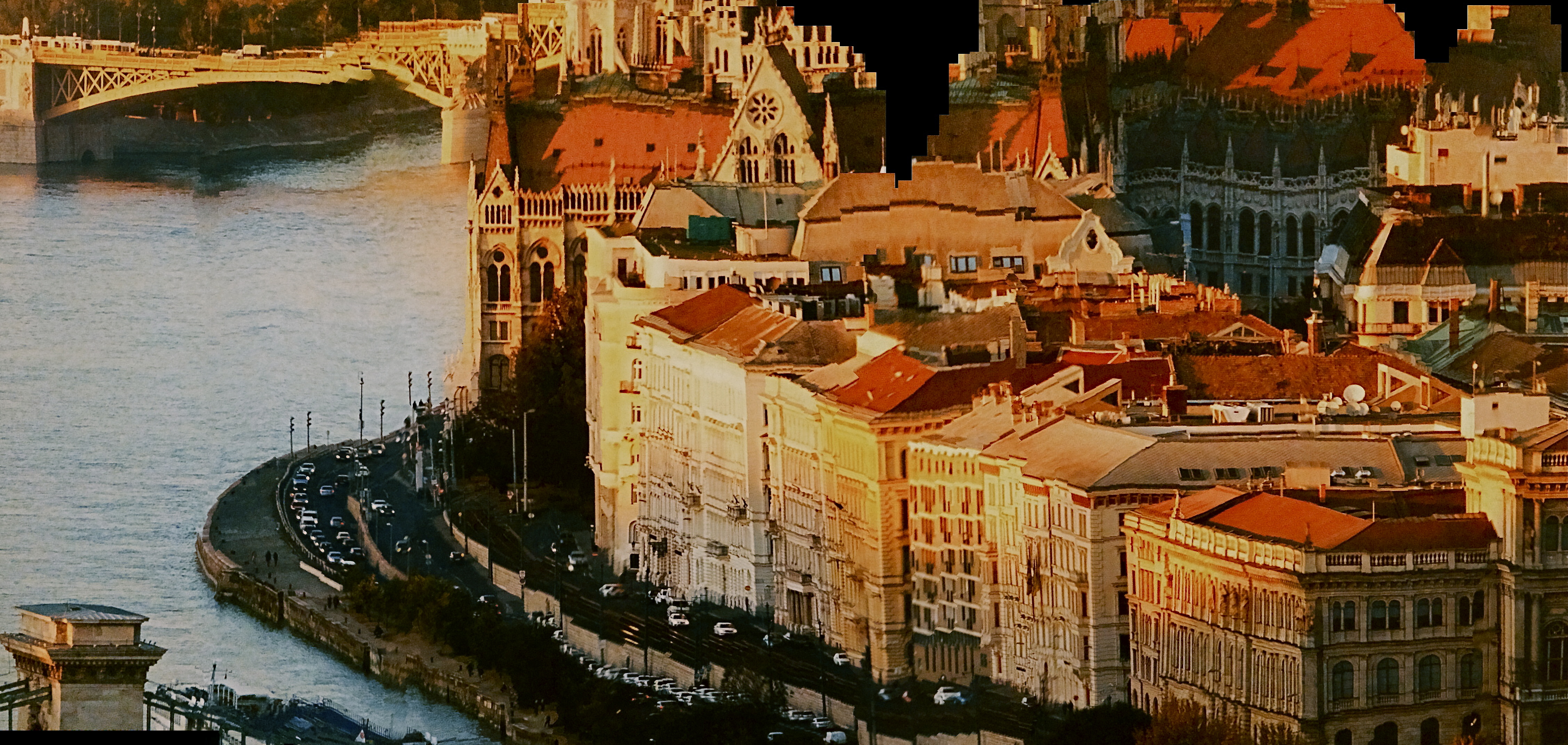
The Fall Of Europe, 2015. Same technique applied to a wall-mounted photo mural.
Of course things can go wrong, and watching how they go wrong is what started me on an experiment. If, for example, someone walks through your shot while you are panning, he may appear in only a few of the “planks”, as a warped, disembodied sliver of his leg or arm, or be stretched like taffy across part of the frame. Thing is, this gives you a neat interpretational option for panos that you want to appear surreal. The idea is to deliberately throw those individual planks out of alignment.
Here’s how it works: as you pan, shift your up-down axis either side of that arrow’s horizon guideline. Go gently if you want things to undulate in a smooth wave. Jerk it around a bit of you want to create a seismographic effect, with sharp high-low spikes in your subject. I should note here that this requires a lot of experimentation to get the overall look that you want.
In the top image, I wanted to suggest the kinetic energy of musical dynamics in a static image, so I warped the piano keys out of alignment with each other, as if Salvador Dali had painted the keyboard. In the second image, I used the camera to scan a mounted mall mural, allowing me to work with a still image that I could tweak to suggest a collapsing building or an earthquake. Either of these images are easy to do with nothing more than your iPhone’s pano tool, and the effects can be dramatic. So love your apps, but love them enough to imagine what fun it can be to make them misbehave.
PUT ‘ER IN REVERSE
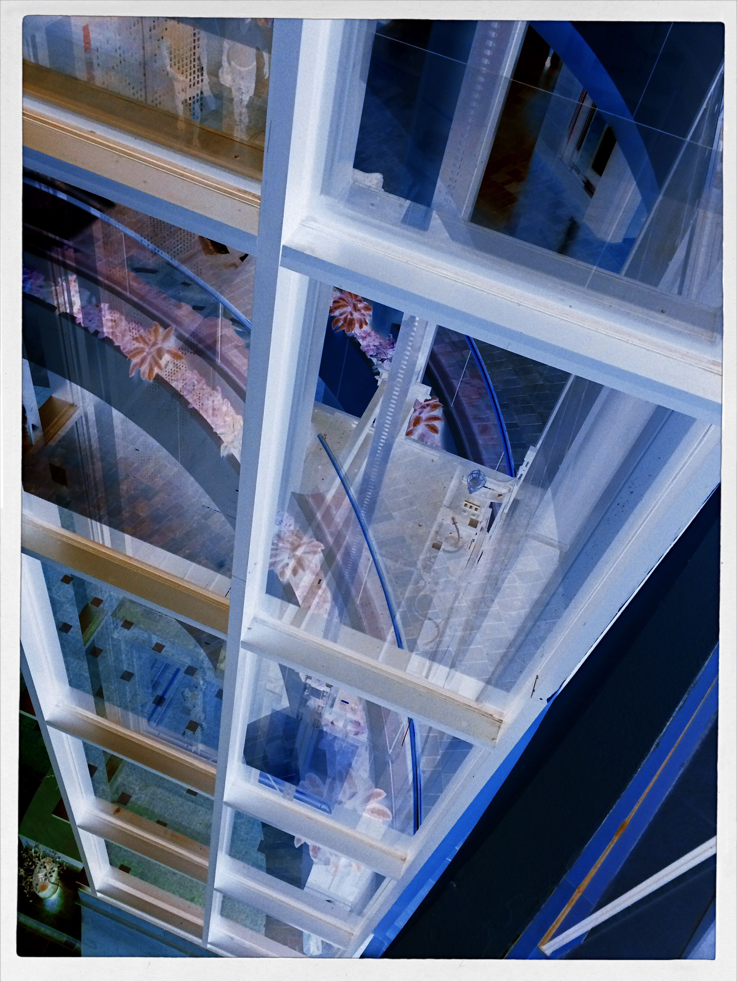
A glass elevator at a shopping mall, converted to a negative, then a fake Technicolor filter in a matters of seconds, via the phone app Negative Me.
By MICHAEL PERKINS
THERE ARE MANY WAYS TO FORCE YOUR AUDIENCE TO SEE THINGS ANEW, to strip away their familiar contexts as everyday objects and create a completely different visual effect. The first, and most obvious form of abstraction we all learned in our cradle, that of rendering a subject in black and white. Some early photographers spent so many years in monochrome, in fact, that they actually regarded early color with suspicion, as is it was somehow less real. The moral of the story is: the photograph demonstrates the world that you dictate, shown strictly on your own terms.
Abstraction also comes about with the use of lenses that distort distances or dimensions, with re-assignment of color (green radishes, anyone?), and by compositions that extract subjects from their natural surroundings. Isolate one gear from a machine and it becomes a different object. Magnify it, light it differently, or show just a small portion of it, and you are taking it beyond its original purpose, and into abstraction. Your viewer is then free to re-interpret how he sees, or thinks, about that thing.
One swift gift of the post-digital world that I find interesting is the ability, through apps, to render a negative of any image with a click or swipe, then modifying it with the same color filters that you might apply to a positive photo. This affords an incredible amount of trial-and-error in a remarkably short space of time, and better yet, you’re out in the world rather than in the lab. Of course, negatives have always been manipulated, often to spectacular effect, but always after it was too late to re-take the original picture. Adjustments could be made, certainly, but the subject matter, by that time, was long gone, and that is half the game.
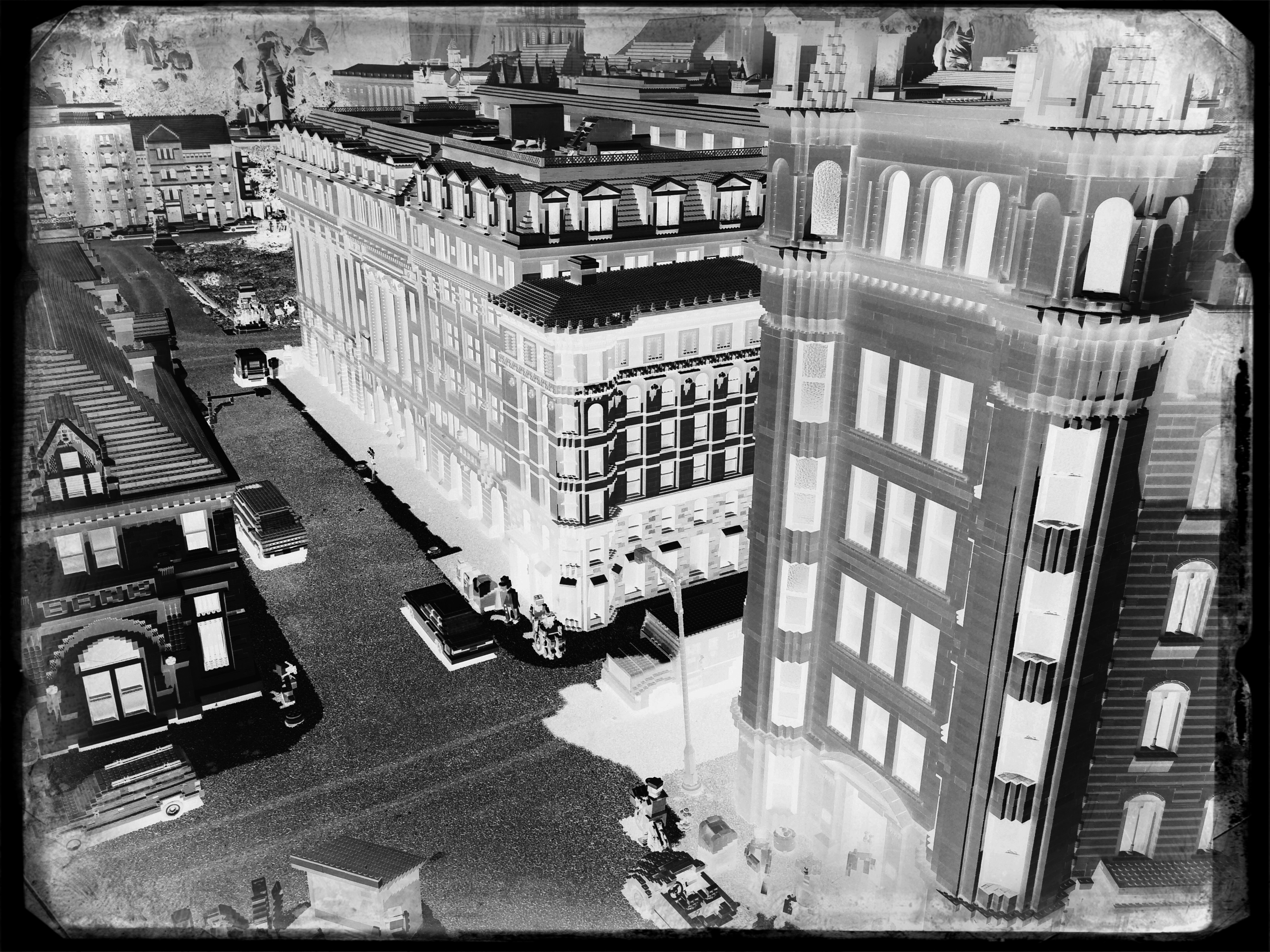
The eerie look of a an aerial reconnaissance photo, here applied to a city model at Legoland.
Reversing the color values in a photograph is no mere novelty. Sometimes a shadow value can create a stunning design when “promoted” to a lead value with a strong color. Sometimes the original range of contrast in the negative can be made more dramatic. And, occasionally, the reversal process renders some translucent or shiny surfaces with an x-ray or ghostly quality. And, of course, as with any effect, it can just register as a stupid novelty. Hey, it’s a gimmick, not a guarantee.
“Going negative”, as they say in the political world, is now an instantaneous process, allowing you the most flexibility for re-takes and multiple “mixes” as you combine the neg with everything from toy camera effects to simulated Technicolor. And while purists might rage that we are draining the medium of its mystery, I respectfully submit that photographers have always opted for fixes that they can make while they are in the field. And now, if you don’t like the direction you’re driving, you can put ‘er in reverse, and go down a different road.
CHANGE YOUR ATTITUDE
By MICHAEL PERKINS
PHOTOGRAPHY IS OFTEN A GAME OF INCHES, a struggle in which outcomes vary wildly based on small, rather than large issues. Early photographers learned this the hard way, since their limited gear forced them to innovate composition and exposure with tiny tweaks that slowly but gradually added more refined skill to their work and better performance from their equipment. Ernest Haas’ great quote that a wide-angle lens is just as close as taking three steps backward still holds true. What has changed is that we have a greater tendency to think that we need more tech to make better pictures. That concept, simply, is poppycock.
For years, the option of a zoom lens was out of the question for the average photographer. The consumer-level zooms that existed were often optically inferior to standard or wide-angle glass (as testified to by Annie Leibowitz and other heavyweights), and so composition was acquired by physically closing or widening the actual distance between yourself and your subject. This is not to say that zooms didn’t eventually prove amazing tools, because they have. However, they demonstrate and instance in which tech has automated, and thus eliminated, an extra step of mindful concentration that used to reside solely in the photographer’s brain. This can lead, over time to an over-reliance on the gear to bring everything home, something it cannot ever do.
Learning to simply maximize the effect of whatever you have up front of the shutter is the easiest, and yet most overlooked aspect of many people’s work. We’d spend a lot less time lugging and swapping lenses if we knew how far we could push whatever we’ve got attached at the moment, and, indeed, masters like Scott Kelby, author of the best-selling Digital Photography Book series, has several “why change lenses? hunks of glass like the 18-200mm that can get him through an entire day without a swap. This works because he works a little harder at exploiting everything his gear can do.
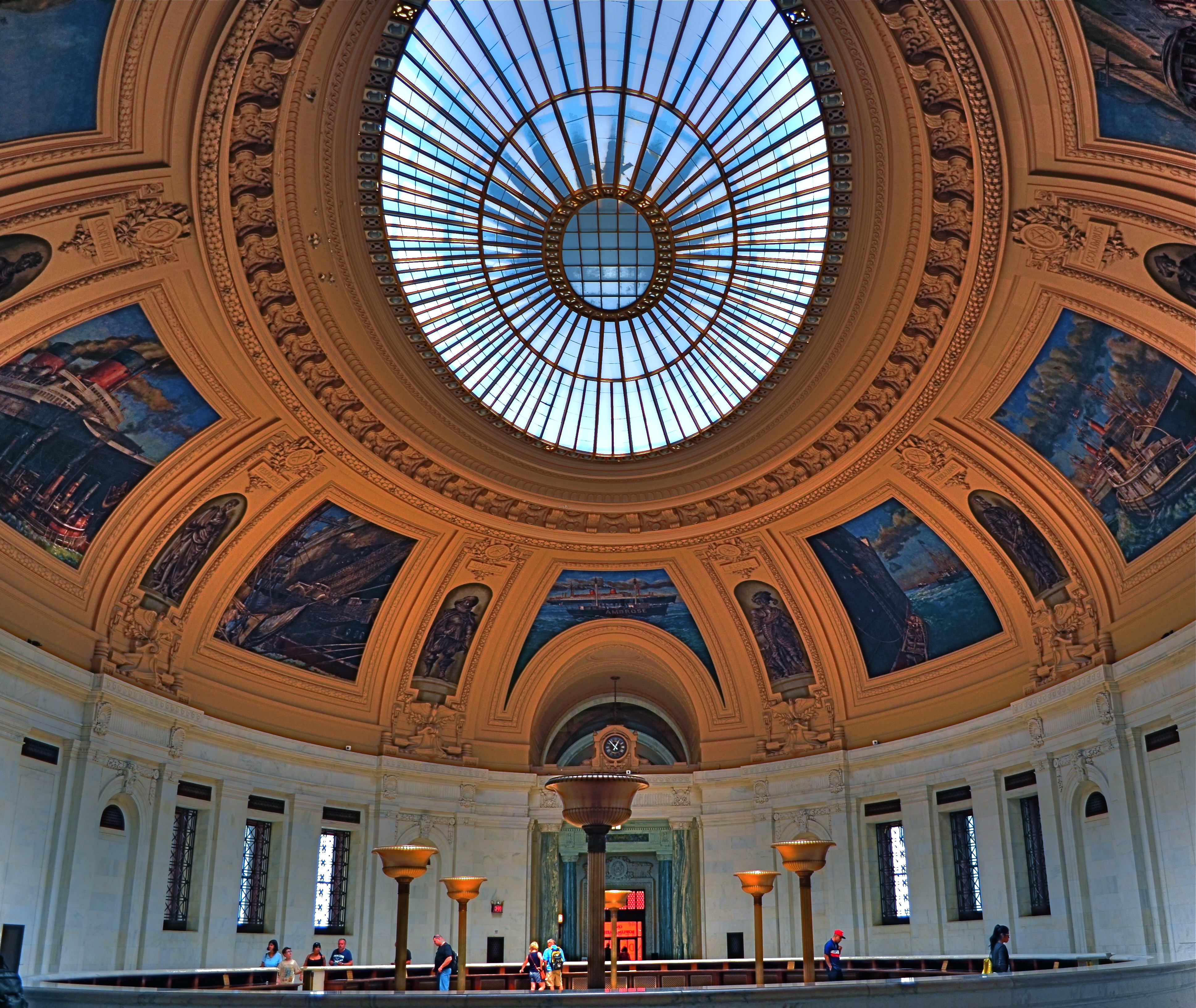
Wide-angle lenses deliver a variety of effects beyond just width.
Consider the above image. It’s taken at 18mm, but, because I arched the shot upwards, instead of maintaining a level horizon line, I forced the lens to do a little more of what it was originally designed to do….exaggerate dimensions and distances. The development of wide-angle lenses was, after all, pursued by shooters who wanted an enhancement, an interpretation, and not a recording, of reality. As such, the wide-angle in this shot over-accentuates the most prominent feature of this room within the old U.S. Customs building in Manhattan…its amazing murals. It also creates an illusion of vastness, front-to-back, in a room that is already pretty huge. And this is all done by pivoting my head upward about 30 degrees.
The game of inches is the great equalizer in photography between pro and amateur, because it gives the advantage to those who plan the best, see the most, and think the widest. And you don’t need a closet full of geegaws to do that.
YA BIG SOFTIE
These uber-cupcakes didn’t look nearly seductive enough in reality, so I added a gauzy layer in SoftFocus and a faux Technicolor filter in AltPhoto.
By MICHAEL PERKINS
ONE OF THE MOST FREEING THINGS about digital photography, especially in the celphone era, has been the artificial synthesis, through aftermarket apps, of processes that used to require lengthy and intricate manipulation. Much has been written about various apps’ ability to render the look of a bygone film stock, an antique lens, or a retro effect with just a click or swipe. The resulting savings in time (and technical trial and error) is obvious in its benefit, as more people shoot more kinds of images in which the shooter’s vision can be realized faster, perhaps even more precisely, than in the days of analog darkrooms.
Okay, now that the sound of traditionalists’ heads exploding subsides, on to the next heresy:
The creation of the so-called Orton technique by Michael Orton in the 1980’s was a great refinement in effects photography. The idea was simple: take two images of a subject that are identical in every spec except focus, then blend them in processing to create a composite that retains rich detail (from the sharp image) and a gauzy, fairy-tale glow (from the softer one). The result, nicknamed the “slide sandwich”, was easy to achieve, even for darkroom under-achievers. The most exacting part was using a tripod to guarantee the stability of the source images. Looked nice, felt nice.
Early on in digital, editing suites like Photomatix, designed to create HDR chiefly, also featured an option called Exposure Fusion, which allowed you to upload the source images, then tweak sliders for the best blend of sharp/no sharp. And finally, here come the soft-focus phone apps like Adobe Photoshop Express, Cool Face Beauty, Camera Keys, and yes, Soft Focus, allowing you to take just one normally focused shot and add degrees of softness to it.
Caveat emptor footnote: not all these apps (and there are many more not cited here) allow you to begin at a “zero effect” start point, that is, from no softening to some softening. They start soft and get softer. Also, most allow basic tweaks like brightening and saturation, but that’s about it. If you want to add contrast or something sexier, you may have to head back to the PC.
The important thing about softening apps are: (1) they save time and trouble in the taking of the source image, of which you only need one (which can be handheld now), and (2) they don’t so much as soften the master image as layer a gauzy glow over top of it.You either like this or you don’t, so, as Smokey says, you better shop around. Gee-whiz factor aside, the old rule for gimmicks still applies: tools are only tools if you like and use them
SHADOWS AS STAGERS
The idea of this image is to highlight what lies beyond the window framing, not the objects in front of it. Lighting should serve that end.
By MICHAEL PERKINS
THOSE WHO ADHERE TO THE CLASSIC “RULE OF THIRDS” system of composition often suggest that you imagine your frame with a nine-space grid super-imposed over it, the better to help you place your subject in the greatest place of visual interest. This place is usually at the intersection of several of these grid lines, and, whether or not you strictly adhere to the “thirds” system, it’s useful to compose your shots purposefully, and the grid does give you a kind of subliminal habit of doing just that.
Sometimes, however, I find that the invisible grid can be rendered briefly visible to become a real part of your composition. That is to say, framing through silhouetted patterns can add a little dimension to an otherwise flat image. Leaving some foreground elements deliberately underlit is kind of a double win, in that it eliminates detail that might read as clutter, and helps hem in the parts of the background items you want to most highlight.
These days, with HDR and other facile post-production fixes multiplying like rabbits on Viagra, the trend has been to recover as much detail from darker elements as possible. However, this effect of everything being magically “lit” at one even level can be a little jarring since it clearly runs counter to the way we truly see. It’s great for novel or fantasy shots, but the good old-fashioned silhouette is the most elemental way to add the perception of depth to a scene as well as steering attention wherever you need it. Shadows can set the stage for certain images in a dramatic fashion.
Cheap. Fast. Easy. Repeat.
SOMETIMES THE MAGIC WORKS…

Early morning in L.A., shot through a hotel wind with a polarizing filter up front of the lens.
By MICHAEL PERKINS
THE DIGITAL ERA IN PHOTOGRAPHY HAS SMASHED DOWN THE DOORS TO WHAT WAS ONCE A FAIRLY EXCLUSIVE CLUBHOUSE, a select brotherhood (or sisterhood) of wizards who held all the secrets of their special science. The wizzes got great results and created “art. The rest of us slobs just took snapshots.
Today, the emphasis in photographic method has shifted from understand, study and do, to do, understand and, maybe study. We are now a nation of confident what-the-hellers. Try it, and if it don’t work, try something else. In some ways, this is a shift away from intellect and toward instinct. We are all either a little less technically aware of why the magic works, or completely indifferent to the underlying processes at work. You can all huddle together and decide whether this is a good thing.
Which, by way of introduction, is a way of saying that sometimes you do something that flies in the face of science or sense and it still works out. To illustrate, let us consider the humble polarizing filter, which, for me, is more important than many of the lenses I attach it to. It richens colors, cuts reflections, and eliminates the washed-out look of shots taken in intense daylight sun, as well as taming the squinty haze caused by smog. Or, if you want the Cliff’s Notes version, it makes skies blue again.

Without the filter, also through the window. Haze City.
Now there is a “proper” way to get top results with a polarizer. Make an “L” with your index finger and thumb, finger pointing straight up. UP in this example is the position of the sun overhead, and your thumb, about 90 degrees opposed to your finger, roughly represents your camera’s lens. The closer to 90 degrees that “L” is, the more effective the filter will be in reducing glare and boosting color. Experts will tell you that using a polarizer any other way will deliver either small or no results. That’s it. Gospel truth, science over superstition, settled argument.
That’s why I can’t explain the two pictures in this post, taken just after sunrise, both with and without the filter. In the first, seen at left, Los Angeles’ morning haze is severe, robbing the rooftop image of contrast and impact. In the second, shown above, the sky is blue, the colors are intense and shadows are really, well, shadows. But consider: not only is the sun too low in the sky for the filter’s accepted math to work, I am standing inside a hotel room, and yet the filter still does its duty, and all is right with the world. If I had followed and obeyed package directions, this shot should not have worked. That means if I were to pre-empt myself, defaulting to what is scientific and “provable”, and ignoring my instinct, I would not even have tried this image. The takeaway: perhaps I need to preserve just enough of the ignorant noobie I once was, and let him take the wheel sometimes, even if the grown-up in me says it can’t be done.
The yin and yang wrestling match between intellect and instinct is essential to photography. Too much science and you get sterility. Too much gut and you get garbage. As usual,the correct answer is provided by what you are visualizing. Here. Now. This moment.
AS DIFFERENT AS DAY AND NIGHT
By MICHAEL PERKINS
PHOTOGRAPHY OFTEN PRESENTS ITSELF AS A SUDDEN, REACTIVE OPPORTUNITY, a moment in time where certain light and compositional conditions seem ripe for either recording or interpreting. In such cases there may be little chance to ponder the best way to visualize the subject at hand, and so we snap up the visualization that’s presented in the moment. It’s the kind of use-it-or-lose-it bargain we’re all acquainted with. Sometimes it yields something amazing. Other times we do the best with what we’re handed, and it looks like it.
Having the option to shape light as we like takes time and deliberate planning, as anyone who has done any kind of studio set-up will attest. The stronger your conception to start with, the better chance you have of devising a light strategy for making that idea real. That’s why I regard light painting, which I’ve written about here several times, as a great exercise in building your image’s visual identity in stages. You slow down and make the photograph evolve, working upwards from absolute darkness.
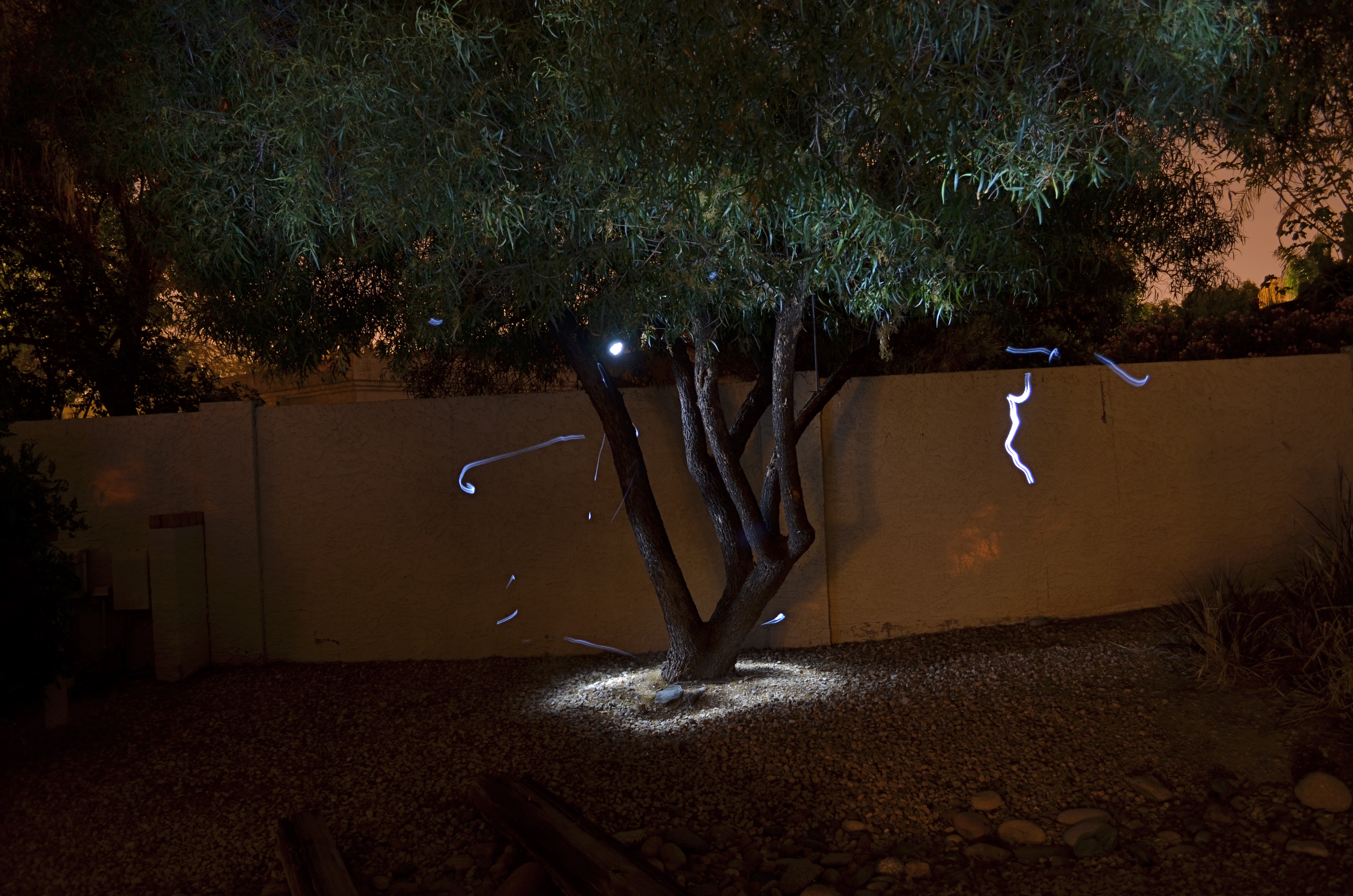
Shock-Top, 2014. Light-painted with a hand-held LED over the course of a six-second exposure, at f/5.6, ISO 100, 35mm.
To refresh, light painting refers to the selective handheld illumination of subjects for a particular look or effect. The path that your flashlight or LED takes across your subject’s contours during a tripod-mounted time exposure can vary dramatically, based on your moving your light source either right or left, arcing up or down, flickering it, or using it as a constant source. Light painting is different from the conditions of, say, a product shoot, where the idea is to supply enough light to make the image appear “normal” in a daytime orientation. Painting with light is a bit like wielding a magic wand, in that you can produce an endless number of looks as you develop your own concept of what the final image should project in terms of mood. It isn’t shooting in a “realistic” manner, which is why the best light painters can render subjects super-real, un-real, abstract or combinations of all three. Fact is, the most amazing paint-lit photos often completely violate the normal paths of natural light. And that’s fine.
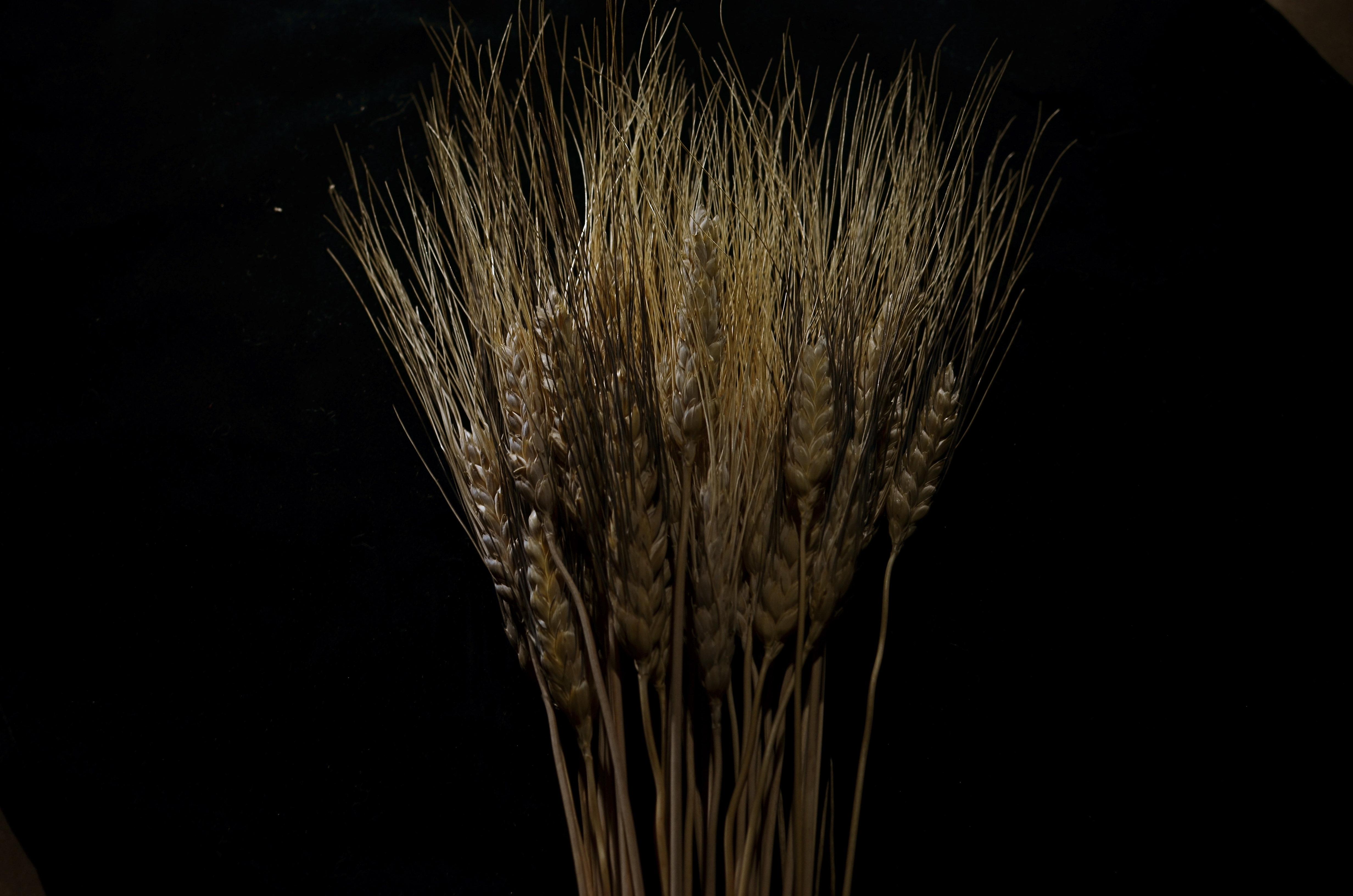
In light painting, I believe that total darkness in the space surrounding your central subject is as important a compositional tool as how your subject itself is arranged. As a strong contrast, it calls immediate and total attention to what you choose to illuminate. I also think that the grain, texture and dimensional quality of the subject can be drastically changed by altering which parts of it are lit, as in the shock of wheat seen here. In daylight, half of the plant’s detail can be lost in a kind of brown neutrality, but, when light painted, its filaments, blossoms and staffs all relate boldly to each other in fresh ways; the language of light and shadow has been re-ordered. Pictorially, it becomes a more complex object. It’s actually freed from the restraints of looking “real” or “normal”.
Developed beyond its initial novelty, light painting isn’t an effect or a gimmick. It’s another technique for shaping light, which is really our aim anytime we take off our lens caps.
REAL PHONIES
Reality check: a retail mall in Hollywood, doubling as a tribute to D.W. Griffith’s Intolerance. huh?
By MICHAEL PERKINS
“You’re wrong. She is a phony. But on the other hand you’re right. She isn’t a phony because she’s a real phony. She believes all this crap she believes.”
—Truman Capote, Breakfast At Tiffany’s
THE ABOVE REFERENCE TO MISS HOLLY GOLIGHTLY, she of the powder room mad money, also applies very neatly to Hollywood, California. The official kingdom of fakery has been in the business of fabricating fantasy for so long, it actually treats its hokum as holy writ. Legends and lore become facts of life, at least our collective emotional life. Dorothy’s ruby slippers (even though they were originally silver) draw more attention than actual footwear from actual persons. Wax figures of imaginary characters are viewed by more people than will ever examine the real remains of wooly mammoths at the La Brea Tar Pits. And, when it comes to the starstruck mini-Vegas that is the nexus of Hollywood Boulevard and Highland Avenue, even a fake of a fake seems like a history lesson.

The gang’s all here: Griffith’s original 1916 Babylon set for Intolerance.
Hollywood and Highland is one grand, loud, crude note of Americana, from its out-of-work actors sweating away in Wookie suits in front of the Chinese theatre to its cheesy Oscar paperweights at the souvie shops. This small stretch of carnival, high-caloric garbage chow, and surreal retail is a version of a version, a recreation of a creation, a “real phony” rendition of cinema, defined by its resurrection of the great gate of Babylon, which anchors a multi-level mall adjacent to the Dolby Theatre, the place where all those genuine cheesy paperweights are given each year. The gate and the two enormous white elephants that flank it are a partial replica of D.W. Griffith’s enormous set for the fourth portion of his silent 1916 epic Intolerance. The full set had eight elephants, an enormous flight of descending stairs, two side wings, and a crowd that may have originally inspired the term “cast of thousands”. That’s how they did ’em back in the day, folks. No matte paintings, no CGI, no greenscreen. We gotta build Babylon on the back set, boys, and we only got a week to do it, so let’s get cracking.
The original set, which stood at Hollywood and Sunset, was, by 1919, a crumbling eyesore and, in the city’s opinion, a fire hazard. Griffith, who lost his shirt on Intolerance, didn’t have the money to demolish it himself, and eventually it fell into sufficient disrepair to make knocking it down more cost-effective. Hey, who knew that it might make a great backdrop for a Fossil store 2/3 of a century later? But Hollywood never balks at the task of making a fake of a fake, so the Highland Center’s ponderous pachyderms overlook throngs of visitors who wouldn’t know D.W. Griffith from Merv Griffin from Gryffindor, and the world spins on.
Photographing this strange monument is problematic since nearly all of it is crawling with people at any given moment. Forget about the fact that you’re trying to take a fake image of a fake version of a fake set. Just getting the thing framed up is an all-day walkabout. So, at the end of my quest, what did I do to immortalize this wondrous imposter? Took an HDR to ramp up an artificial sense of wear and tear, and slapped on some sepia tone.
But it’s okay, because I’m a real phony. I believe all the crap I believe.
Hooray for Hollywood.
THE RIGHT WAGON
Cheap fisheye adaptors are a mixed bag optically, but they can convey a mood. 1/40 sec., f/11, ISO 100, 18mm.
By MICHAEL PERKINS
I ONCE HEARD AN OLD PHOTOGRAPHER SPEAK OF CREATIVE CHOICES AS “picking the right wagon to haul your goods to market”. By that, he meant that format, film, frame size, lens type or aperture were all just means to an end. If one wouldn’t take your wagon all the way to a finished picture, use another. He had no special sentiment or ironclad loyalty to any one tool, since there was, and is, only one real goal in any of photography: get the image you came to get.
It’s often hard to remember that simple rule, since we tend to associate the success of certain pictures with our pet camera, our sweet spot aperture, our favorite hunk of glass. But there’s also a knack to knowing when a particular tool that is wrong, wrong, wrong for almost anything might, for the project at hand, be just perfect.
I have one such tool, and, on rare occasions, the very properties that make me generally curse it as a cheap chunk of junk can make me praise it as just what the doctor ordered. It’s an Opteka 0.35, a screw-on lens adapter that simulates (to put it kindly) at least the dimensions of a true fisheye, without the enormous layout of dough, or, sadly, the optical precision of a true dedicated lens. It’s fuzzy at the edges, regardless of your aperture. It sprays chromatic shmears all over those edges, and so you can’t even dream of sharpness beyond the third of the image that’s in the dead center of the lens. It was, let’s be honest, a cheap toy bought by a cheap photographer (me) as a shortcut. For 99% of any ulta-wide imaging, it’s akin to taking a picture through a jellyfish bladder.
But.
Mood over reality. 1/125 sec., f/11, ISO 100, 18mm.
Since the very essence of fisheye photography is as a distortion of reality, the Opteka can be a helping hand toward a fantasy look. Overall sharpness in a fisheye shot can certainly be a desired effect, but, given your subject matter, it need not be a deal breaker.
In the case of some recent monochrome studies of trees I’ve been undertaking, for example, the slightly supernatural effect I’m after isn’t dependent on a “real” look, and running the Opteka in black and white with a little detail boost on the back end gives me the unreal appearance that is right for what I want to convey about the elusive, even magical elements of trees. The attachment is all kinds of wrong for most other kinds of images, but, again, the idea is to get the feel you’re looking for…in that composition, on that day, under those circumstances.
I’ve love to get to the day when one lens will do everything in all instances, but I won’t live that long, and, chances are, neither will you. Meanwhile, I gotta get my goods to market, and for the slightly daft look of magickal trees, the Opteka is my Leica.
For now.
DON’T SETTLE FOR REALITY
By MICHAEL PERKINS
IN PHOTOGRAPHY, WE FIRST LEARN HOW TO CONTROL LIGHT WHEN THERE IS A PRETTY GOOD SUPPLY OF IT. Our baby-step pictures are usually taken in the middle of the day, where it’s easier to over-expose than under-expose the shot. The sun is out and it’s a constant resource. We may step in and out of a shadow or need to fill a few gaps with flash, but mostly the issue of light is about managing something you have a big bunch of.
Once we venture into night shots, light becomes a precious commodity, like water in the desert. The equation is flipped. Now we’re struggling to get enough illumination to shape a shot, or sometimes just save it. We can shoot in the reduced light that’s on hand, but it takes a little more orchestration. Move into time exposures and the terms of engagement change again, with the ability to play God with the physics of things.
Shot in complete darkness and selectively light-painted with a handheld LED. Exposed for 73 seconds at f/4.5, ISO 100, 18mm. The light streaks are “wrong turns” with my flashlight. Oops.
And then there’s light painting, selective hand illumination during long exposures, where the aim is suddenly beyond the merely real. In fact, light painting is about deliberately manipulating mood and atmosphere, of bringing a magical quality where none exists. It also is the kind of low-light photography with the least predictable results, and the highest possible failure rate. You are constantly in uncharted waters, since no two exposures come out even remotely alike. You’re flying blind with your eyes open.
I have recently begun to head outdoors to re-imagine trees in these artificial, fantasy-flavored “light compositions”, in an effort to lend heft to subjects that, in daylight, would register pretty low on the wow meter. Over the years, I have honed my technique with tabletop light painting in controlled interiors, but if I get one exterior shot in thirty that I can live with, that’s an amazing day, er, night.
I don’t have any wisdom to impart on these shots, since their value is so crazy subjective. You do it until you like it, that’s all. But do yourself a favor sometime and do wade in. You might catch the fever, or you may experience the urge to hurl your tripod over the neighbor’s wall like a javelin of rage.When you don’t have enough light, you’re kind of in free fall.
But even if you don’t stick the landing, it ain’t fatal.
ART VS. ARTIFACT
By MICHAEL PERKINS
PHOTOGRAPHY HAS NOW ARRIVED AT A TRULY STRANGE PLACE. It’s no big bulletin that modern processing and phone apps now allow us to simulate the various visual defects and flaws we used to summarily reject from our images, deliberately including them in our pictures as design elements. Things to be desired.
Features to make the picture better.
????? Let’s take this out of the realm of photography for a moment to see how truly insane it is.
One of the more ridiculous gimmicks of the digital age in audio (which is, let’s face it, free of the scratch and hiss of analog recordings) was to put both these sources of annoyance and noise back into CDs. Hip-hop has been particularly egregious in the inclusion of crackle and scratches into tracks, as if these effects conferred some kind of authenticity on the results. It’s like a guy who gets a chin scar in a woodshop accident, then tells women at bars that he got it in a knife fight. Fake life, fake cred.
Back to photos, where downloadable apps let you slather on filters that simulate photos which appear damaged, ravaged by time, poorly exposed, marred by light leaks, or ruined as the result of faulty film processing. Now, think about this: we have become the first generation of photographers who think it is creative/profound/cute to make our pictures look bad on purpose, to make images that our predecessors would have (rightly) rejected as marred, imperfect, wrong.
Is this photo anything, or did I just keep dress it up in a funny party hat?
I took this image on a cel phone, then processed it through the app Alt Photo to simulate a daguerreotype. I did it mostly as an experiment, but then, in a moment of weakness, I posted it on image sharing sites where, so far, it has garnered over 5,000+ hits. Here is the problem: I can no longer determine whether my essential image has any merit, or whether its popularity is solely due to the effect. That bothers me. I feel that any attention or approval this photo has achieved has happened, well, dishonestly. I get the fun aspect: I enjoyed it, as a novelty, a lark, but the thought of anyone taking it seriously disturbs me. And I am angry at myself for giving into the temptation to put it out there.
Gimmicks aside, photography means something. Making a picture means something. And technical crutches that draw attention from that process are just cheap card tricks. Distractions. What an interesting problem: as a consequence of our technical cleverness, we are now locked in an eternal struggle between art and artifact.
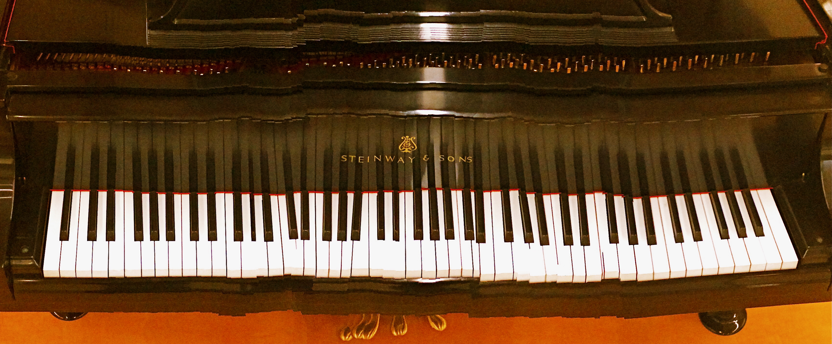
“EFFECT” VS. “EFFECTIVE”

Panoramic shots like this are no longer a three-day lab project, but an in-camera click. But what is being said in the picture?
By MICHAEL PERKINS
THERE ISN’T ANYTHING EMPTIER THAN THE PERFECT EXECUTION OF A FLAWED IDEA. And in the present effects-drenched photographic arena, where nearly any texture, color, or conception can be at least technically realized, we need, always, to be making one crucial distinction: separating what we can do from what we should do.
The basic “fixes” which come natively loaded in even the most basic cameras (filters, effects, nostalgic slathers of antique colors) suggest a broad palette of choices for the photographer looking to extend his reach through what is basically an instantaneous short cut. Fine and dandy, so far. Who, after all, wants to labor for hours to augment a shot with a particular look if that effect can be achieved at the touch of a button? Certainly no one gets into photography anymore with the understanding that they will also have to act as a chemist, and creativity need not be the exclusive playground of the scientifically elite. We all agree that the aim of photography always has and always should be the placing of all tools in as many hands as possible, etc., etc.
But waita seccint. Did I say the world tool? ……(will the recorder read that last part back….?……”placing of all tools in as many…”)… yep, tool. Ya see, that word has meaning. It does not mean an end unto itself. A fake fisheye doth not a picture make. Nor doth a quickie panorama app, a cheesy sepia filter, nor (let’s face it) the snotty habit of saying “doth”. These things are supposed to supplement the creative moment, not be a substitute for it. They are aids, not “fixes”.
This comes back to the earlier point. Of course we can simulate,imitate, or re-create certain visual conditions. But what are we actually saying in the picture? Did we use the effect to put a firm period at the end of a strong sentence, or did we use it as a smoke bomb to allow us to exit the stage before the audience gets wise to the fakery?
One of the original objections to photography, as stated by painters, was that we were handing off the actual act of visual artistry to a (gasp!) machine. A little hysterical, to be sure, but a concern is still worth addressing.
There is a soul in that machine, to be sure.
But only if we supply it.
THREE STRIKES AND YOU’RE…IN?

“Wreck Of The Old ’87”. Wreck is right. 1/80 sec., variable depth of field created with a Lensbaby attachment, ISO jacked to 640, 35mm.
By MICHAEL PERKINS
WHEN SORTING MY IMAGES INTO KEEPERS AND CLUNKERS, I ALWAYS SUFFER THE SAME BIAS. Whereas some people might be too eager to find reasons why a picture should be inducted into the former group, I nearly always search for reasons to toss them into the latter one. I always know right away what I’ve failed to achieve in a given frame, and its flaws glow like safety orange in my brain to the point where I not only can’t credit myself for the photo’s stronger elements, I can no longer even see them. I therefore consign many pictures to the rubbish heap, a few of them prematurely.
Usually, however my first call is the right one. I very seldom revisit a picture I initially disliked and find something to redeem it. So it was kind of headline news when I recently “saved” a photo I had originally (and wisely) savaged. Hell, I’m still ambivalent, at best, about it, but I can’t truly classify it as an outright Lost Child anymore.
It came from a random day of practice I had undertaken with a Lensbaby, one of those effects lenses designed to give you the ability to manually throw parts of your image out of sharp focus, in fact to rotate around and create various “sweet spots” of sharpness wherever you want to. I don’t use the thing a lot, since it seems, on some level, damned silly to put defects into your pictures on purpose just to convince yourself you are, ahem, an artiste. But, all work and no play, etc. etc., so I was clicking away inside a dimly lit building at a railway museum in which a huge layout of miniature train dioramas is a regular attraction. I seemed to be going out of my way to create a picture that would normally be “three strikes and you’re out”…..that is:
poorly lit, and loving it
poorly focused, otherwise known as, sure, I meant to do that, and
a half-baked attempt to make something fake appear real.
Only one of the shots sparked my interest at all, purely because it seemed to contain a sort of… mystery. So many dark corners. So many unexplained details. A very disorienting, dreamlike quality that had to have jumped into the camera without any help from me. It looked both hyper-real and utterly false, simultaneously fearsome and fascinating. Again, this all happened in spite of, not because of, any action on my part. I added no post-processing to the shot, except to desaturate it and slather on a layer of sepia. Other than that, I left it in its original sloppy, random state.
And then I decided it was still junk and forgot about it for a few months.
Just why I have, in recent days, tried to rehabilitate my thinking about it is anyone’s guess. Like I sad at the top, I look for reasons to reject my work, not excuse it. This has little to do with modesty. It’s just an admission that control is so much a part of my make-up that I recoil from images where I seem to have absolutely relinquished that control. They scare me a little.
But they thrill me a little too. And, as Vonnegut says, so it goes.
Perhaps the best thing is to maintain the Keepers and Clunkers piles, but add a third, labeled “Not Really Sure”.
Follow Michael Perkins on Twitter @mpnormaleye.
Related articles
- Peering Through a Shaft of Light (johnbee.ca)
