SILENT NIGHT
By MICHAEL PERKINS
IN THE CHRISTMASES OF MY CHILDHOOD, homes were less frequently garnished on their outsides, with most of the houses in my neighborhood sporting little more in the yard than a few slim strings of lights or the occasional lawn Santa. Our current emphasis on LED-coated exteriors and rolling light shows lay far in the future in the Eisenhower era, leaving the family tree to perform most of the heavy lifting as the visual emblem for the holidays. Our own system was simple: string the lights and lay on the ornaments in a fully lit room, with the tree positioned before the house’s biggest window: then, after everyone had scampered out onto the front yard, deputize Dad to douse the house lights and plug in the tree, launching its social debut to street view. That collective moment of “aww” was, for me, worth the entire holiday.
In photographing Christmas as a much older child, while I do admire all the pyrotechnics required to give every house the full Clark Griswold treatment, I tend to make pictures of trees as seen through front windows, framed by shadows, devoid of drama, as quiet as a silent movie, the one centerpiece delivering its visual message in a muted, almost personal tone. It’s the time of year when sentiment and habit are so closely intertwined as to be indistinguishable from each other, and thus there are so many things that we always do because we’ve always done them. One thing I seek in a picture is permanence, the impression that what’s right in that one image is in some way right for all time. That means that, at Christmas, I look for sights that could have sprung from any or all Christmases over the decades. It’s remarkably comforting in a world that has become so comfortable with tumult and noise to deliberately try to show stillness.
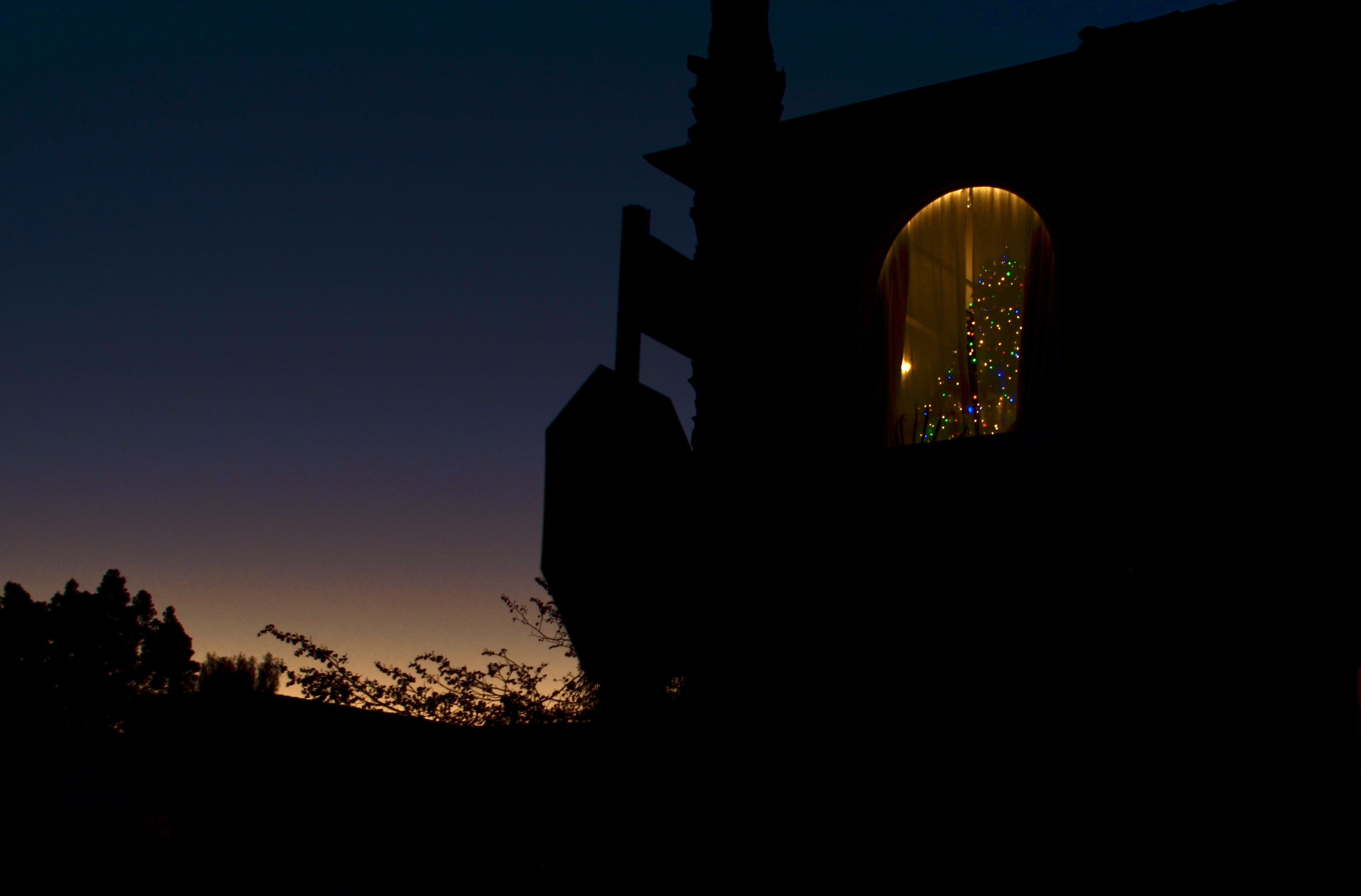
This particular window, in central Los Angeles, required a bit of patience. Between trying to nail the correct blend of twilight and dark in the surrounding sky and tracking the occupant’s nightly decision to either draw or open the drapes, I walked by the place for several consecutive nights before I saw what I was after. Upon clicking the shutter, I may or may not have completely reverted to boyhood and uttered an “Awww” aloud, but I certainly said it in my heart, as I tried to in this picture.
Be safe. Be well. Be here next year.
THE ENGINEERING OF DESIRE
By MICHAEL PERKINS
EACH HOLIDAY SEASON OF EVERY YEAR since The Normal Eye was launched over a decade ago, we have had some nostalgic fun recalling the glory days of the Eastman Kodak Company, the people who first took photography from a science nerd’s hobby to a global pastime, and the unique way that they influenced Christmastime gifting habits for over a century. Through an incredible, sustained campaign of persuasion that equated good times with the photographic chronicling of every major human event, Kodak cemented its relationship with its customers in a way that gave all other advertisers a key lesson in what one marketer would dub “the engineering of desire”.
Kodak was a film company that chiefly succeeded by appearing to be a camera company. In effect, the constant refinements in their cameras were a mere investment in the film side of the firm. Better, easier devices removed any resistance to taking more pictures, and thus purchasing more film. And, at Christmas, the company made the most of its relationship with its customers, using the occasion to create more users and make existing users consume at an ever-higher rate. There were several names for this ingenious marriage of form and function, and one of its most illustrious monickers was “Instamatic”.
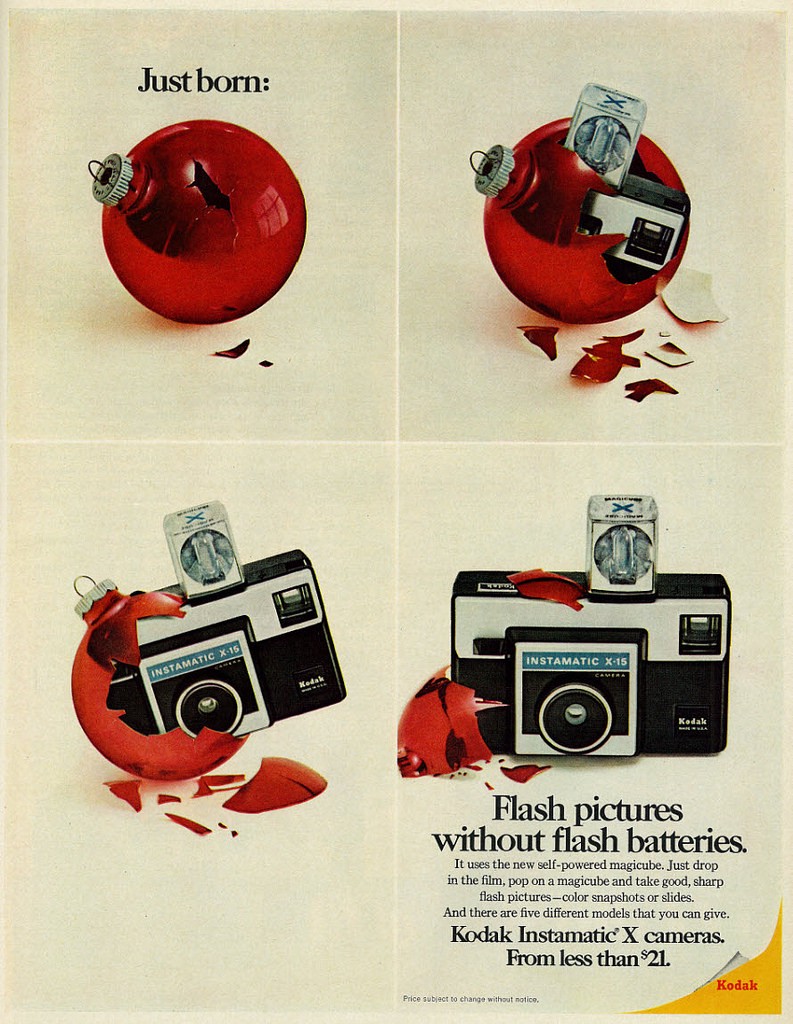
The introduction of the Instamatic camera line in the early 1960’s was as big a leap forward for Kodak as the debut of its first Everyman camera, the Brownie, had been in the 1890’s. Like the Brownie, the Instamatic was a major advance in ease of operation. Designers Dean Peterson and Alexander Gow’s new cartridge-loaded film(which was simply dropped intact into the camera body) eliminated users’ long-time aversion to threading, and potentially ruining, traditional roll film. Its slim design made it easier to stash and carry. Its eventual use of self-contained flash “cubes” got rid of the bulk and mess of extended add-on flash guns and red-hot bulbs. And its fixed-focus lens and single shutter speed made it the world’s first true point-and-shoot.
The only challenge that remained lay in selling the new design to the public, and when the Instamatic was introduced in 1963 at a price point of $16 dollars and made the star of its Christmas campaigns for the year, the deal was sealed, to the tune of over fifty million Instamatics sold in the camera’s first seven years of production. Positioned as a cute newborn chick “hatched” just in time for your “morning-of” memories (as seen in the above ad), the Instamatic made as major an impact on the amateur market as have the cellphone cameras of today, in that they took more uncertainty out of the process of making pictures by ensuring better and more consistent results. Which is still the way you sell a ton of cameras, as you allow more and more people to get on with getting their shot on. Or, to re-frame the old “fishing” adage: Take a man’s picture and he has one picture for one day. Teach him to make his own pictures, and you’ll keep selling him everything else associated with that process forever.
STUMBLING IN

Nice house, decent shot, but not quite the fantasy look I wanted for this subject. So, into the Nikon “retouch” menu we go (see next image).
By MICHAEL PERKINS
JUST AS SOME PAINTERS PRIDE THEMSELVES on producing works that “look just like a photograph” there are photographers who love it when someone tells them their image “looks just like a painting.” Both arts borrow strongly from each other, each envies what the other does, and, in pages such as this one, spend altogether too much time worrying about it. Still, if your foot is predominantly in one camp, it’s fun to occasionally dip a toe into the other, just to see what it feels like.

The “pencil sketch” effect created in-camera, via Nikon’s retouch menu. Cool, but now a little too much like a drawing. Almost there (go to next image)……
In trying to use photos to idealize certain subjects, to, in effect, make them better visually than they may be in mere reality, I’ve tried lots of tricks, many of them just novelty effects and some of them useful tools. You have to judge their effectiveness one picture at a time. Recently I went back to an in-camera look that most Nikons have contained in their “retouch” menus for years, mostly because it never seemed to deliver quite what I wanted. In the “color sketch” mode, you make a second copy of a master shot that is mostly just the outlines of the objects and people within, losing a lot of interior detail within the image and making it look as if you whipped it up with, yeah, okay, a set of colored pencils. I had created occasional copies with the effect over the years but never fell in love with it. Please forgive me, but the word sketchy is the only one that applies, and not in a groovy way. Over the years, I mostly forgot that the effect existed, along with several others that Nikon gave me without asking me if I wanted them (!)
Recently, however, I have been reworking several pictures of homes I considered to be nearly in a fantasy category, old designs so fanciful and fussy that they’d look at home in a fairy tale or a Hobbit community. I wanted some extra quality of unreality mixed into their post processing, and so was taking multiple exposures of the same house and tweaking them in exposure fusion programs like Photomatix, which allows you to blend a custom mix of both pictures together with sliders, almost like working on a movie dissolve that’s frozen in the middle. I found that mixing a pencil-sketch tweak with the original shot it was derived from made for an interesting look. A controlled amount of detail, a lot of color patches that looked as if they were washed on by a brush, and a super-sharpening of the peripheral lines. I had stumbled into something useful.

Final composite of original and sketch images, hand-mixed as an “exposure fusion” in Photomatix.
The result is part photo, part painting, and controllably surreal. It almost recalls those lovely artist renderings that architects used to produce as previews for investors in the early days of acrylics…the kinds of “coming soon” illustrations you saw in sales brochures. And, even though it’s certainly like birthday cake, in that a little of it is more than plenty, it’s fun to just make some pictures that are solely about process, not to try to hide a lousy picture, but to explore what happens when you kick Papa Reality out of the room and just get down on the floor with the other kids and play.
JUST ‘CAUSE
By MICHAEL PERKINS
SEARCH ANY ONLINE PHOTO SHARING PLATFORM and it’s pretty easy to compose a quick list of the categories into which the site’s submissions fall. You’ll see the usual suspects, ranked in order of their appearance, from Sunsets, Landscapes and Kids to Animals, Seascapes and Macro, and so on into the night. However, if I’m honest (and I am, if you catch me on the right day), I’d have to confess that a significant number of my own images more accurately belong under a heading no one actually creates, a category called I Really Like What The Light Is Doing Now.
It always strikes me odd that classifications should exist in art at all. Such appelations are largely the work of clerical people, who decided, long ago, that pictures are supposed to be about something. They are expected to be narrative or explanatory in nature, documents of specific places or experiences. A permanent record of something concrete (or cement, if that’s your preference). Thing is, at some level, many of us fell in love with photography because of magic, not reason. We felt a thrill at doing this and watching that happen. Wait, if I turn it this way, wow, look at that. That’s not the thought pattern of a bean counter. That’s the wonder of a child encountering a new toy.
Every time someone produces what you might call an “absolute” photograph, something that is only about itself and nothing more, the dreaded “A”-word (abstract!) is trotted out and pasted all over the work like some kind of biohazard warning. In fact, making a picture just because I Really Like What The Light Is Doing Now is perfectly sufficient unto itself. Let’s not forget that being able to capture light in a box is not only a flat-out miracle, but, in terms of history, a fairly recent one. Being overawed with joy at just that process alone is still totally appropriate. Emotionally, when it comes to the process of making pictures, we’re still at the baby steps stage, regardless of how sophisticated we currently believe ourselves to be.
The only thing more tedious than trying to corral photos into categories is making photographers feel like they need to explain them, as if that’s even possible. My favorite title for a picture (and the most popular world-wide) is “untitled”, and, even though I apply titles to most of my work, such captions are deliberately constructed as mere snarky wordplay and do not convey any information, much less explain, the pictures. In the same spirit, if I encounter a person whose first reaction to an image is “what’s that supposed to be?”, I stop showing them any pictures thereafter. If I knew what it was supposed to be, I’d take one picture, one time, nail it, and move on. I’m only interested in the pictures I haven’t yet figured out how to make.
Subject matter is a tidy way for some people to divide art into easily sortable bins, and that’s not how the best pictures get made. We need to concentrate less on the bin and more on the stuff that falls to the floor outside it, and to notice, above everything else, What The Light Is Doing Right Now. Celebrating the magic is the only way to ensure that we’ll make more of it in future.
2021: ODYSSEY OF ANOTHER KIND
By MICHAEL PERKINS
THE 1968 RELEASE OF STANLEY KUBRICK’S 2001: A Space Odyssey is generally recognized as a kind of fork in the road for science-fiction cinema, a point beyond which tales of space travel ceased to be the exclusive domain of bug-eyed monsters and disintegrator rays. Certainly, space films would continue to be made with the kiddie market in mind, but Stan’s Cinerama epic demonstrated that, for all time, that such movies could, actually, be about something.
Something wonderful.
Perennial oddball/control freak that he was, Kubrick resisted early requests to preserve the models and props that had contributed to “the ultimate trip” (as it was billed in the Age of Aquarius) by either ordering MGM to warehouse the things or see that they were destroyed, apparently out of a belief that the movie’s mystery would be diminished the more that audiences saw what lay back of the miracle. The missing pieces, of course, were thus catapulted, by this decision, to Holy Grail status among collectors, and discoveries of the original treasures remained few and far between for nearly half a century.
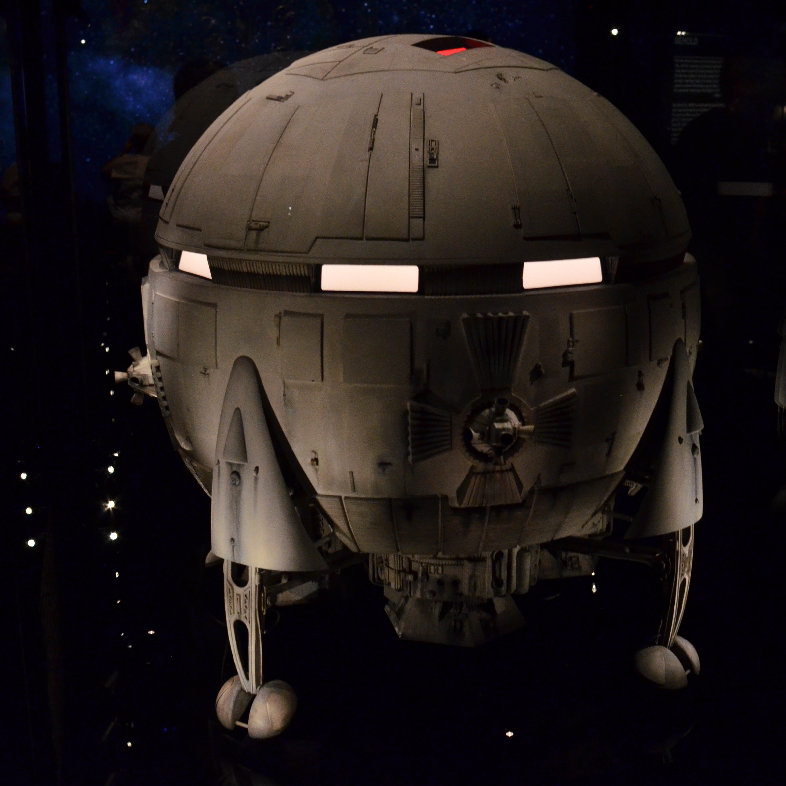 The lone surviving model of the Aries 1-B Lunar Landing Shuttle, produced for Stanley Kubrick’s 2001: A Space Odyssey, fully restored and on permanent display at the newly opened Academy Museum of Motion Pictures in Los Angeles ( Image by the author )
With the 2021 opening of the new Academy Museum of Motion Pictures in Los Angeles, however, 2001 fans have been given one of their first-ever chances of actually gazing upon one of the movie’s key players….a surviving model of the Aries 1-B landing module that carries earth scientists to the lunar surface to see, ya know, what all this “monolith” business is about. The prop’s strange post-film voyage begins with Kubrick apparently trading it to an art teacher in Hertfordshire, England in exchange for lessons for one of his children. As a consequence, before surfacing at an auction in 2015, the Aries model had spent some forty years in said teacher’s garden shed. The catalog in which the model appeared caught the attention of director Christopher Nolan (Batman trilogy, Inception, etc) and some guy named Tom Hanks, who contacted Kubrick’s original special effects wizard Doug Trumbull, who, in turn, verified the authenticity of the find. Hanks and Nolan then proceeded to pool $344,000 to purchase the model.
From there, since, as Hanks remarked, “I didn’t have room for it in my living room” it was decided that the shuttle was at least as vital to the history of Hollywood as Dorothy’s ruby slippers, and so it was turned over to the curators-to-be for the museum being built by the Academy of Motion Picture Arts & Sciences (where Hanks sits on the board of trustees), who disassembled it, cleaned off scabs of ancient glue with cotton swabs and razor blades, restored missing components, even studied drawings of kits for submarines and tanks, both of which were idea sources for Trumbull’s design crew. Finally, the now-pristine model was artificially made un-pristine again, the better to simulate the worn/used patina it had in 2001, allowing the Aries 1-B to again trigger memories of The Blue Danube as visitors imagined it descending slowly to the lunar surface.
The protection of photographic history is part creation, part re-creation, part curation, and part sacred duty. Or as the Hal 9000 so eloquently put it, “I am putting myself to the fullest possible use, which is all I think that any conscious entity can ever hope to do…”
WHICH R ARE YOU?
By MICHAEL PERKINS
VENERABLE BUILDINGS ARE VIEWED THROUGH SEVERAL AESTHETIC PRISMS OVER TIME, and so, as a consequence, photographs of them also fall under different general themes. To my eye, architecture is a visible testimony of so many things human: our relationship to each other: the myths and beliefs that we hold sacred: our own ambition: our way to contextualize ourselves in history or in space. And when I try to decide how to photograph a building, I tend to see it through three distinct filters, or what I call the three “R”s: reference, reverence and relevance.
Reference covers the image of a place from the original artist’s renderings and sketches through its opening phase, as we imagine how this new thing is designed to “fit in” to its hosting surroundings, which, themselves, figure in its original depictions. Reverence comes later on, as we idealize a structure out of context, long after its original neighborhoods or uses have faded. In this “post card” phase, we regard the building for itself, perhaps attempting to protect or restore it.
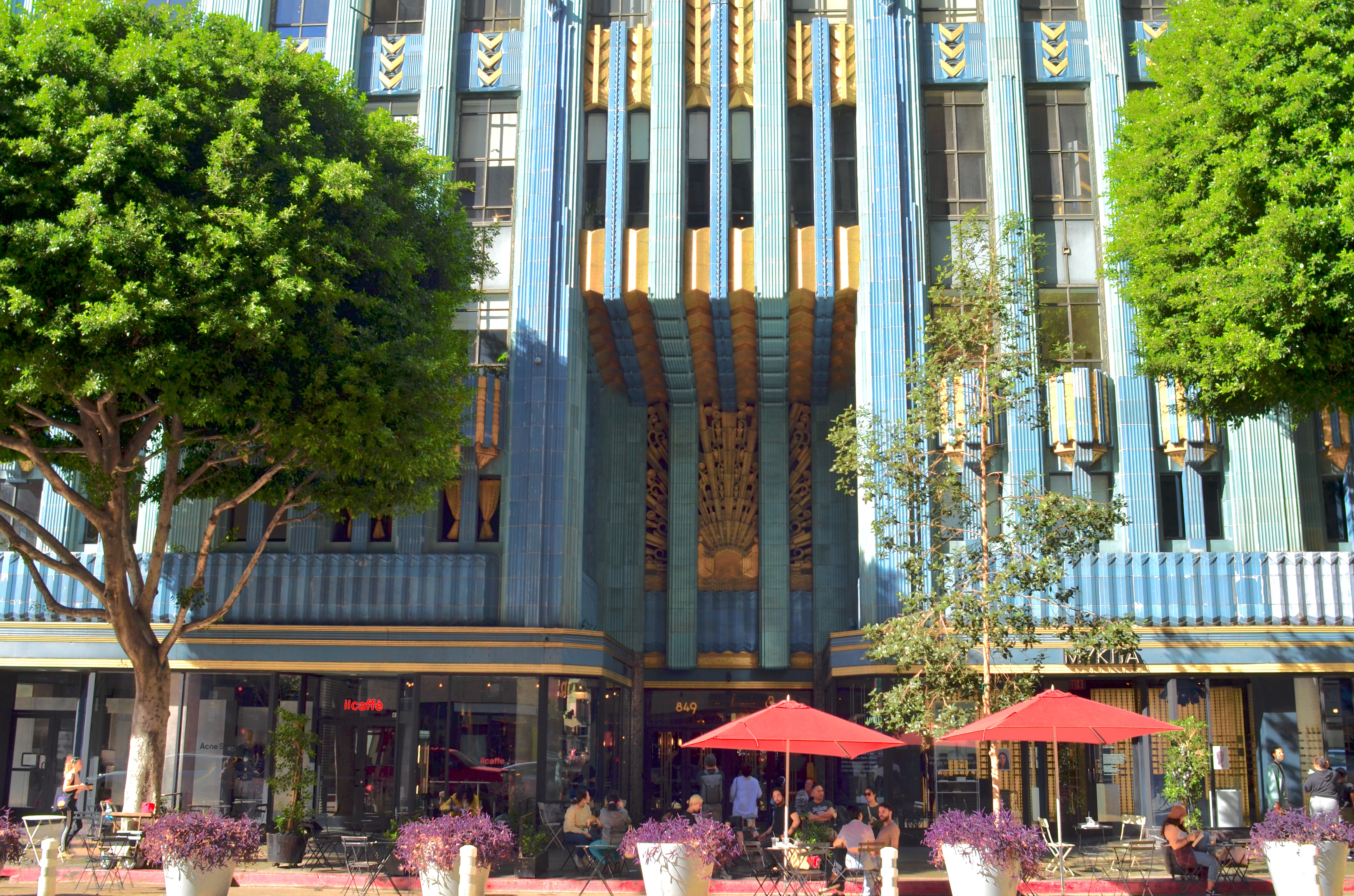
The aqua and gold terra-cotta of 1930’s Eastern Columbia Building, reborn in downtown L.A.
The third R, relevance, comes even later in the edifice’s life, perhaps post-rehab, as we happily welcome it back into daily use and re-apply the scale, objects and people that will anchor it to its second life, the same kind of use-context that was seen in the reference phase.
In finally checking Los Angeles’ 1930 Eastern Columbia Building off my life-list a few weeks ago, I found myself toggling between the reverence and relevance mindsets, taking idealistic images of the tower’s features in isolation from everything around it, and, in the case of this photo, showing it alive with people and activity, as part of the neighborhood. In the end, even though I have seen thousands of idealized images of the EC (the city’s most photographed building, and one of the most renowned Art Deco treasures in the country), I prefer this view, since it places it in a vital (that is, living) setting.
We make buildings for so many reasons, but, in all cases, we make them to be used, not merely adored. The Eastern Columbia, host to two of the country’s largest retailers until the 1960’s, emerged from its banishment years to enter life anew as multi-million dollar lofts to the the stars, its resurrection well in rhythm with the rise of the entire central L.A. “Broadway” district. That makes it relevant once more, and so the camera should always chronicle its elements of what America has always loved best: a second chance. It “R” the best way to treasure a space.
THE GRAPHICS OF GRIEF

By MICHAEL PERKINS
MY PHOTOGRAPHY DOES NOT FOCUS ON HORROR, nor does it have despair as a factory default. I don’t set out at the start of the day to use my camera to prove that life is worthless. Quite the opposite, in fact. Certainly, I realize that my own native need to depict hope in my creative work will render me quaint, even naive in the eyes of many. However, that persistent bias toward beauty, toward uplift, does not mean that I shy away from visualizing the things that make life difficult. As always, it’s in the balance between the two extremes that we manage to be most honest in the pictures that we make.
The universality of grief, as it’s enveloped the entire world in recent years, can be crushing, and yet deciding to express that grief in photographs can be daunting. Can we just glibly shoot weeping mourners at graveside and say we’ve told the complete story of our communal losses? Can we restrict our commentary to merely depicting statistics, tables, charts? Can we veil our tears behind symbolic images? How can we use the camera to show something that is so internal, so personal, so individual?
Looking over my work from the end of 2019 to the present (or late ’21, at this writing) I don’t see a lot of deliberate attempts to “show” the damage the pandemic has done to us…that is, nothing purely reportorial. You can’t “cover” a global nightmare the way you’d cross town to “cover” a building on fire or document a collapsed highway. Everyone creates their own visual contours to these kinds of feelings, and any attempt to cram them into a ready-made template will fall short.
And then there’s another idea that occurs to me.
Perhaps my way of walking out of this crater is through images of hope, to make my camera a defiant force for not allowing the darkness to prevail. Maybe the persistence of ugliness demands that at least some art embrace the light, to affirm our need to go on, to actually insist on doing so.
We could all fill huge portfolios of pictures that merely symbolize the burden of our times, such as the shot seen above, which, ironically, actually predates the crisis. But where are the pictures that proclaim that “my heart will go on”? Are those to be thought of as hopelessly sentimental, and thus dismissable? Is our only concept of “reality” a mosaic of misery? I believe the world of photography is wide enough for many voices to be heard, and I refuse to certify the mere recording of tragedy as the only official story worth telling, even in these times. My camera is my tool for finding a path out of the shadows, and I trust myself to make pictures that acknowledge horror while showing what forces are needed to counter it.
OF DREAMS AND DUST
By MICHAEL PERKINS
IN A WORLD THAT SO SURGICALLY SORTS ALL MORTAL PLAYERS into winners and losers, it seems inevitable that we would devise systems by which the ”L”s might aspire to join the “W”s….some kind of schooling or preparation that transforms some of us, the one who are coal, into The Anointed, the ones designated to be Diamonds. Often, that sorting process comes in the form of commercial consumption, and one of its Meccas is Hollywood.
A photographer on the loose in Tinseltown becomes aware early on that all its shops and attractions, all its tour stops and theme parks, are actually one big Academy Of Making It, a huge machine that models the behaviors of the Chosen, a tutorial on how to persuade the Choosers to ask you into the club. And the most obvious cues occur at retail level.
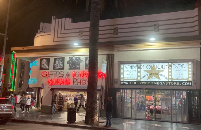
Across every souvenir stand and shirt shoppe, the message is clear: winners buy this: winners wear these. If you don’t see anything here that looks like your look, your look is wrong. Hollywood purports to be about dreams, but it is also about nightmares, like the fever dream of not belonging to The Crowd, of not being plucked out of the chorus.
Whether the scenes we encounter on our streets are of victory or despair, the camera bears witness to the ongoing emotional high wire act. Hollywood is a uniquely American construct, which, like this all-night souvenir stand, encompasses both our desires and our defeats in the single act of selling us stuff…symbols, myths, ways of keeping score. It’s a special kind of envy-driven loneliness that’s also an industry that feeds on itself.
TAKING THINGS FOR GRANT-ed
By MICHAEL PERKINS
“PHOTOGRAPHERS, ESPECIALLY AMATEUR PHOTOGRAPHERS, WILL TELL YOU that the camera cannot lie” wrote a columnist for Lincoln, Nebraska’s Evening News in 1895. “This only proves that photographers, especially amateur photographers, can…for the dry plate can fib as badly as the canvas, on occasion.” All of which is to restate the obvious, that the manipulation of images is as old as images themselves, and that, even when a picture does actually tell the truth, the healthy skepticism persists that tomfoolery, if not actually perpetrated in this particular case, lurks ever nearby.
Faked photos emerged in the nineteenth century as soon as photography itself was out of the cradle, and by the time the world was rounding the corner into the 1900’s, successful hoaxes were perpetrated along two main tracks: profit and propaganda. The very fact that people regarded the camera as an objective machine with no particular axe to grind, a mere recording instrument, if you like, gave credence to outright lies created with a growing variety of tweaking techniques. Propaganda proved an obvious growth medium, as governments attempted to massage the historical record to win hearts and minds, a practice brought to the level of art by both Hitler and Madison Avenue in the century that followed. Likewise, profit loomed large, as companies marketed images that the public wished were real, blurring the line between dreams and documents in the service of sentiment or fantasy.
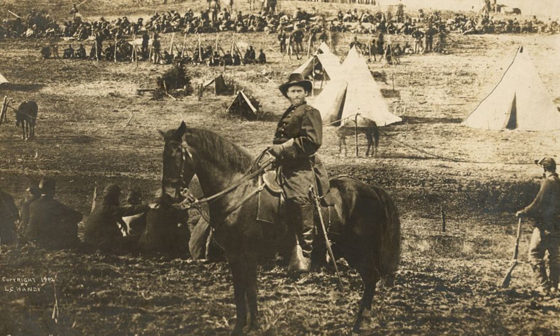
Both the motive to influence and the desire to cash in converge in this image, one of the best-selling photos of the late 1800’s, which purports to show General U.S. Grant heroically astride his horse surveying a roundup of Confederate prisoners at City Point near Richmond in 1864. Following the death of the pioneering Civil War photographer Matthew Brady, his nephew L.C. Handy came into possession of most of his uncle’s negative masters, and began reproducing them to the custom order of many who had, just a short time before, served in the conflict. The picture is striking, mythic, and an unmitigated fake. In fact, it is not a single picture at all, but a composite that combines Grant’s head (from an original Brady portrait), the body of Major General Alexander McCook, and a third image of the prisoners, who were actually photographed at a separate battle that took place hundreds of miles away from City Point. Handy copyrighted the composite and made a small fortune marketing it.
It took decades for the fraud to be detected, after sleuths discerned that, among other inconsistencies, the officer’s body is that of a one-star general (Grant was a three-star by that time) and that the body markings on his horse do not match those of Cincinnati, Grant’s favored mount in 1864. The point is that today’s photographers certainly have no fewer scruples than did the old masters when it comes to fakery, and that, at least today, we are aware of the tools that can be employed to stretch or scar the truth, and accept photography as an interpretative art, for good or ill, rather than merely a means of documenting events. Caveat emptor.
ON THE FACE OF IT
By MICHAEL PERKINS
I HAVE ALWAYS HAD A VIOLENT ALLERGIC REACTION TO PHOTOGRAPHERS WHO SPEAK IN ABSOLUTES, rigidly regulated by rules and procedures, especially as regards gear. Any opinion piece or analysis that contains the phrases “alway do” or “never do” have a perverse effect on me. It’s like telling Adam and Eve that they can eat from any tree in the garden except, you, know that one. It makes the apples on said tree start to seem like they might be the most delicious in the world.
Same with telling people that a set piece of kit or a certain approach will “always” result in a miraculous image. One thing that the digital era has achieved is the increasing rarity of this kind of guidance. In the film era, we were told in no uncertain terms what good and bad focus was, what constituted a “correct” composition. Today, we’re in more of an “anything goes” arena, with people finding freedom in a more experimental frame of mind. And one of the areas where this is most in evidence, since we are more fascinated by faces than ever before here in Selfie World, is in all types of portraiture.
Does this lens make by eye look too fat?
Formal studios used to dominate portrait work to such a degree (hey, we get out of class for an hour…it’s PICTURE DAY!) that a kind of holy writ of thought held sway on the “best” lenses to use to capture someone’s personality. Now, with an insane variety of apps packed in our pockets, the concept of portraiture has been freed from the photo mills of the past, as is the idea of how best to present human features. Whereas amateur photographers used to use a certain hunk of glass consistently for every kind of face, say something in the 85 to 105mm range, extreme wide-angles from 8 to 18mm are now just as much in use.
One of the reason for this shift is that cellphone cameras, at least basic ones, tend to shoot in the wider focal lengths that were once considered “wrong” or unflattering, since they can create distortion in the middle of the subject’s face depending on the distance. However, some people have used just this look to purposefully sculpt their facial contours, to play stretch-and-shrink with their given proportions in order to make their faces look longer or slimmer or to accentuate other elements. On the other end of the spectrum, zooms used to looked down upon by some for portraits because it could be harder to blur out backgrounds at smaller apertures, but now, since most digital images are really only a starting point ahead of post-snap tweaks anyway, even that problem can be solved more easily than in days past.
For years I heard primes in the 35-50mm range touted as the so-called “normal” lenses, since they were supposed to “see” the face at the same proportions as the human eye, or “normally”. But do I use them exclusively? Heck, I don’t use anything exclusively anymore. And neither does anyone else. The days of the didactic “never do” and “always do” tutorials are long gone, with a great portrait defined by nothing more than your own satisfaction. Finally.
FLEETING GLORY

By MICHAEL PERKINS
THE CURRENT CONTROVERSIES OVER WHO SHOULD OR SHOULD NOT BE HONORED in public art will continue to be a key point of emotional engagement, whatever one’s traditions, beliefs, or politics. This is not the forum for discussing any of the motives or agendas behind these debates. Still, as photographers, the rise or fall of certain monuments is an alert for all parts of the process to be documented. We shoot wars, uprisings, rituals, and customs of every kind, and we need to chronicle these shifts in culture when they occur, regardless of how it affects us personally.
I am always pushing the idea that photography must serve as a document for every age, and our present contention over memorials and statues is merely more proof of the need for that service. I come from a town named after Christopher Columbus, and so the present-day reevaluation of his historical role has already had consequences in that town’s civic rhythm, notably the removal of a huge statue of the explorer from the town’s City Hall complex, a site it’s occupied since 1955. As of this writing, the fate of two more somewhat less imposing sculptures remains in limbo, including the one shown here, which is located on the grounds of the State House in the heart of downtown. Photographing these things need not be a commentary. It can be important merely in terms of time measurement, of the “before” and “after” status of a place or people.
“Heroes” are often as much crafted and created as they are naturally forged, and many a minor figure in history has outlasted his/her actual impact after being immortalized in marble by someone else who needs him/her as a symbol, for any variety of reasons. Making a picture of these memorials, especially when they may be on the way out, is no more a “statement” than shooting a frame of an historic hotel just before the swing of the wrecking ball. Good, bad, or indifferent, these things in our public squares are reference points for our daily existence, and images of them are an effective way of visually contextualizing them in time.
My favorite image of the Statue of Liberty is one taken of just the lady’s head and shoulders, which stood at the 1878 Paris International Exposition before the entire work was crated up and shipped to New York. In a very real sense, it was part of France’s daily walkabout life long before it was a feature in ours. Until it wasn’t.
Heroes will be crowned and decommissioned for as long as mankind persists. The things that either certify or disqualify them across the generations is one kind of memory. Photographs bear neutral witness to the changes in what we hold important, and, for that reason alone, pictures need to be made.
LAST NAMES AND OTHER FACES
By MICHAEL PERKINS
WHEN I WAS A CHILD, SEVERAL PICTURE BOOKS depicted the fronts of houses as if they were faces, with the windows roughly reminiscent of eyes, the roofline acting as a kind of hairdo, the door as the nose/mouth region, and so forth. One memorable Disney cartoon called The Little House gave benevolent and malevolent expressions to various buildings based on their role in the story. Skyscrapers always seemed to threaten: tidy, small cottages endeavored to charm. And so on.
I still think of the fronts on houses to be faces of a sort, or at least the house’s version of the public personas that we all adopt, the expressions we choose to present to the street as our visual signature. I love the design and detail choices that make a house’s face welcoming, or at times repellent, to those who stroll by. Additionally, when I can, I love to photograph neighborhoods where there is enough space between homes to allow for a kind of “last name” or second face for a house, based on what the less-than-primary things that are arranged there might hint at.
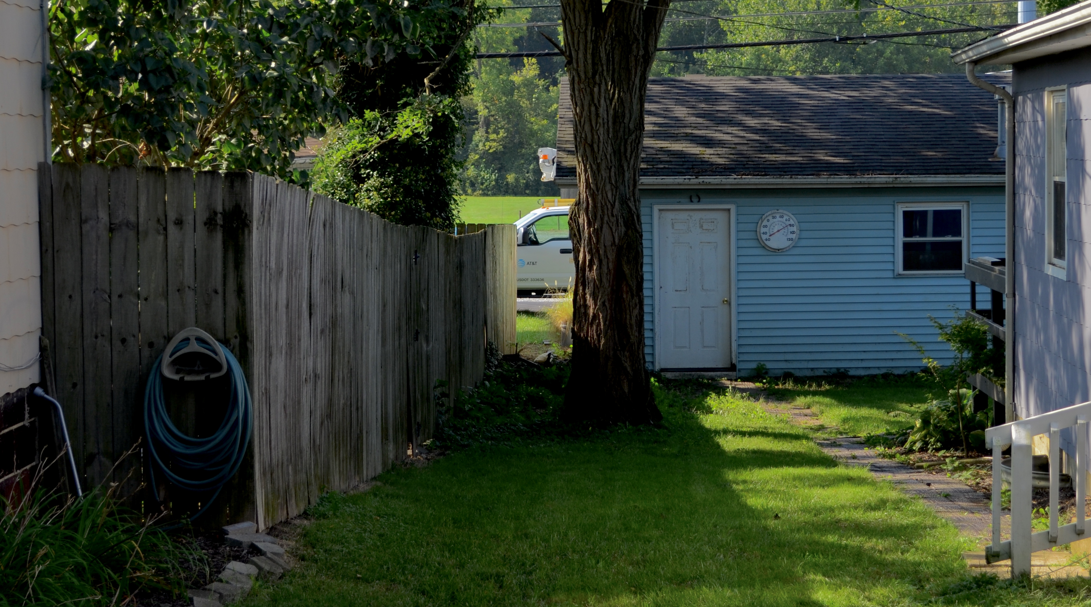
78 In The Shade, 2021
Such areas are often just a storage area for tools, from coiled garden hoses to rakes or wheelbarrows. Sometimes it features a backup building like a recessed garage or a shed. In these in-betweeny free-flowing spaces between homes, various gardening attempts might be made, unfinished projects may linger in limbo, or the space might merely be a small play area. In many cases, as in the above image, it also serves as a sneak peek to the neighboring streets that exist in their own special reality just beyond the rear of the lot.
The places we call home reveal more to the wandering camera than we suppose. Sometimes our attempt to protect our privacy from public view is, in effect, more revelatory than the chummiest welcome mats or bright flowers. Cameras help us in deciphering the codes by which we choose to engage with the world at large. The purely visual elements of those codes reward an extra second of a photographer’s curiosity.
MANY ROADS TO WHERE
By MICHAEL PERKINS
HAVING ALTERNATIVELY SHOT BOTH STILLS AND VIDEO OVER A LIFETIME, and changing which of the two formats most suit what I’m trying to convey, I have a running debate with myself concerning whether I am better suited to work in one platform versus the other. In terms of personal development as a photographer, my life basically resembles a sandwich of decades, in which my earliest and latest years were the bread layers defined by “stills”, with a shorter filler layer of years consisting of mostly moving images. Some years I’m a bread guy and other years I’m a filling guy.
Here’s the take-home: when it comes to helping me examine human behaviour, there is something about a still photograph that affords a little helpful analytical distance. The onrushing fluidity of the moving image annihilates everything but the present: everything is so completely now. In contrast, the act of pulling a moment out of time’s flow, and freezing it, allows the viewer to imagine both past and future in a very crucial and personal way. Stills “decode” in a very specific fashion: either something has just happened or something is about to happen. That leaves certain information visually unrevealed, with the viewer supplying it himself, in effect collaborating with the shooter.
Would this image work better as one in a series of frames, i.e., a video? Or can I effectively tell my tale in this manner?
Over time, there are subjects that I certainly can’t conceive having done with a still image, thus the home-movie phase of my early years as a family man. Complete reportage was Job One as kids were teething and blowing out birthday candles, and, at the time, motion pictures seemed like the perfect tool. Later, after I entered middle age, I found myself looking for a way to create images that invited introspection and interpretation, and so I returned to stills, and haven’t wandered since. At the moment of this writing, I can confess that, in order to shoot video with cameras I’ve owned for over ten years, I’d have to consult the user manual to even recall how to go about it. In an internet-dominated image marketplace replete with video formats that are constantly altering the course of the zietgeist, am I missing out? Did I know something at twenty-five that I no longer “get” at seventy?
There are a million different roads available in photography: it can never be just one thing, and so there cannot be an absolute “right” or “wrong” way to go about it. My loooong vacation from video is not a knock against it as an expressive medium. It’s more like choosing a different paintbrush or switching from oils to acrylics. And yet I love to hold this endless debate just to check my thinking, the ultimate object being the correct selection of tools for where I need to be right now.
STRIKE A POSE
By MICHAEL PERKINS
STREET PHOTOGRAPHY IS GENERALLY ABOUT CAPTURING PEOPLE in their most natural element, freezing the more narratively interesting samples from their daily activity. In theory, the format really offers a fairly infinite number of quick examinations of virtually every trait and pursuit, promising a lot of visual variety in the depiction of the human condition. However, over the last twenty years or so, an increasing number of pictures of people on the street seem to be about more and more of the same thing: fixating on our phones.
You must have noticed by now that random images of people on the street are, in more cases than ever before, pictures of them watching screens. Texting. Tweeting. Dialing. Reading. In a world in which we do more of our private business out in public, our engagement has gone further and further inward, ever more insular, isolated. This is not a critique of the value of these precious devices, or a wish that they somehow be magically uninvented. My point is that their ubiquitous use presents fewer opportunities for exploration of human behavior by the street photographer, since, even though our phones are holding us spellbound, the way we look when we’re on them is, well, boring.
This 21st-century “look” is a strange sort of update of the facial aspect of photography’s first era in the 1800’s. In a time when exposures took a long time and people were just beginning to formulate their relationship to this invasive eye known as a camera, people tended to look frozen, solemn, as if they were only reluctantly granting admittance to the blasted thing. They stood at attention, staring blankly, their faces a cipher. Later on, we learned to love the camera, to mug and model and talk to it, a habit that still shapes our candids at intimate moments or the tidal wave of selfies we create.
On the street, however, that is to say, on our way to something else (all our various something elses), we are facially as lifeless as a Victorian-era farmer posing for his first daguerreotype. Thus the man in this image, already physically alone by virtue of the space he occupies, is doubly isolated by his further act of pulling away into his phone. A key part of him, a part that has always been a basic element of street shooting, is simply not available.
Does this trend alarm you? Do you find yourself approaching street work in a fundamentally different way because of it? Or is the job of a photo-observer to merely record what he sees, or in many more cases, what he sees being withheld?
M&Ms
By MICHAEL PERKINS
OVER THE YEARS, I HAVE FILLED PAGES OF THIS LITTLE HOMETOWN NEWSPAPER with confessional accounts of my weaknesses in many areas of photography, with special emphasis on my underdeveloped skill with landscapes. To say that I need improvement in this area is, on the Captain Obvious scale, somewhat akin to breaking the hot bulletin that Batman has anger issues. And yet we soldier on.
It’s hard to look out upon a vast mountain vista or a yawning canyon and think in terms of simplicity. At least in my own case. I initially came to the visual arts as an illustrator, influenced by artists that I can only call “completists” in that they drew intricate compilations of every leaf, stone and speck within a scene, a technique that my infant brain referred to as “realistic”. It follows, then, that as I segued into photography, my instinct was to go for that illustrative look, with tons of detail, and a broad panoramic sweep. It drew me to grand subjects and wide, wide lenses.

Occasionally, this has served me well, but more often it gave me a severe case of Too Much Picture, frames that were so drowned in detail and visual information that I was challenged to tell succinct, clear stories in landscape form. There was always plenty to look at, but I wasn’t developing a real instinct for what a viewer should look at first, or should regard as the central narrative focus of a picture. My sense of composition still fell too often into the “get everything in there” side of the fence. I produced well-focused pictures of scenes that were always okay, but seldom compelling.
These days, I fight to make the simplest framings that I can. I struggle to present one main idea and make everything else in the image subservient to that idea, or at least to get out of its way. The frame seen here is done quite differently than I might have made it as a younger man. The forked cactus at the center has been designated as the main messenger of the picture, with everything else reduced in definition or importance. In the past, I might have tried to expose the picture uniformly, with every spine, frond and branch in the same brightness or color intensity. Now I am far more likely, in this case, to expose just for the central open space and leave the surrounding halo frame in shadow….the idea being to let some things have louder voices in a picture than other things. I have done the same thing with selective focus, using blur or softer resolution to force attention onto the primary feature in the picture.
I still have a lot of work to do, but at least I have moved from my original habit of giving all elements in a landscape equal status to trying to, if you like, direct eye traffic to greater effect. It’s a struggle for balance between the picture’s M&Ms, or the major and minor messengers for that particular photograph. It’s not an exact science. Hell, it’s not even an exact art. But it’s the only way I can shoot landscapes if I want to escape the dreaded gravitational pull of Planet Postcard.
TUCKAWAYS AND TAKEAWAYS
By MICHAEL PERKINS
MY GRANDMOTHER’S NEIGHBORHOOD STREETS were separated by alleys that ran between the rows of the area’s back yards, and, as a consequence, I have only a few memories of her actually walking between the fronts of houses along the main streets. Whether it was her hardscrabble childhood in Ohio coal country or her lifelong belief that people were always stupidly discarding perfectly good stuff, she always walked to market, the local drug store, or various friends’ places by way of the alleys. And if there is such a thing as a Bargain Junk God, it spoke to her along these paths, and so, we children were accustomed to her dragging home various treasures over the years, from scraps of lumber to fixable umbrellas to an entire kids’ swingset, complete with “glider”, which we adopted as our own.
Years later, armed with various cameras, I tend to channel her a bit.
Because people continue to throw away perfectly good stuff.

Every time I shortcut through an alley, I find at least one thing that may be in the process of being chucked out, or moved to make space, or replaced by something new, or just plain forgotten about…things that can, on occasion, make neat little narrative pictures. Take this self-contained coffee “business”, for example. It sits behind a strip mall in Scottsdale, Arizona, giving off strange vibes about its history, a history that, who knows, may not yet be complete. Is it an operating wheeled cafe? Was it put out to pasture when someone had a better idea or a bigger budget? Is the trailer to be repurposed, sold, or just headed for the scrapheap? At this moment in time all these plot lines are possible, and all conjectures are equally valid or equally nuts.
The speculation continues. What exactly IS “native” coffee? Is it just a name, or an actual niche market? Is the window just covered up with wood for protection, or is it, as the term goes “boarded up”? Is the trailer merely being parked here until its next day of operation, or are all of the Native Coffee fans of the world plumb out of luck? Funny thing is, all that daydreaming is fired by exactly one hasty exposure, made out of my car window as I trekked through A Place I’ll Never Be Again for God Knows What Reason, If Any. A picture may not literally be worth a thousand words, but it is often worth a thousand “what if” guesses about what’s happened or what’s about to happen. Photography locks in moments and frees the mind to story-tell. It’s enough to make me wish that Grandma, whom, it should be noted, actually bought me my first camera, had dragged a Leica home down the alley.
Just once.
THE KINDEST CUTS

This master shot begins as a merely okay bird picture with a whole lot of empty real estate in it. Not bad, but…..
By MICHAEL PERKINS
LEGENDARY DIRECTOR FRANK CAPRA LIKED TO TELL THE STORY of how he pulled one of his classic films back from the brink of catastrophe, by heading back to his office after a disastrous preview and literally throwing the first two reels into the studio incinerator. The shortened movie, Lost Horizon, went on to become one of his greatest triumphs.
I recall that story every time I attempt to crop away the visual fat from a flawed image, inside of which I suspect there might be a usable picture. Sometimes all I get for my trouble is a worse flop, but occasionally, I will find that a frame is one third, or one fourth, or fifty percent redeemable if I just wield the scissors with complete abandon. The first shot you see here illustrates my point.
Having shot dozens of pictures of egrets in every conceivable setting, I found that this particular bird was not really earning his sizable part of the real estate. Was it the pose? The exposure? A comparison to better captures on other days? Whatever the reason, I found myself more interested in the near-shore waters he was walking in than in anything he himself was doing. The water wasn’t filled with dramatic splashes or tidal ebbs, but was instead a slow, undulating kind of roll that created playful, elliptical games with the light. At that point, the whole mission of the image changed.

Literally cutting the egret off at the knees makes this a completely different picture.
After a series of partial “bird-ectomies”, in which I attempted to keep various portions of the egret’s body in the frame, I just reduced him to a pair of legs, and let the water take over as the star of the show. Again, it was a case of a usable inner picture, eclipsed by being just one of many components in a larger scene, becoming liberated by slicing away all other distractions. The result is hardly a masterpiece, but I prefer the repurposed version over the mediocre original. Turns out that most photographs don’t veer all the way to the two extremes of Really Amazing or Really Appalling, existing somewhere between the two poles. Like Capra, you have to be willing to burn the first two reels to get right to the action.
BABY, YOU CAN DRIVE MY CAR
By MICHAEL PERKINS
OVER TIME, PHOTOGRAPHY ACTS AS A VISUAL SEISMOGRAPH, tracking the jagged line between ourselves and the things we encounter in the world. The objects and conditions that we regard as “everyday”, and thus somewhat ordinary, are actually in flux all the time, as is our relationship to them. In making pictures of the world that surrounds us, we are always documenting how we, and the things we either carry or leave behind, are changing the terms of our engagement with one another.
In The Corral For Keeps, 2021
Consider the automobile, a thing that is at once a utility, a medium for art, an environmental threat, a source of nostalgic glamour, and dozens of other things that wax and wane alongside us as we weave our way through our lives. There is, simultaneously, nothing more mundane and nothing more amazing than a car. It is a thing we made and which we are constantly remaking, and now, may also be a thing we are desperate to unmake.
All of this process, whether we are journaling our changing attitudes towards cars or carbs, creates opportunities for the visual artist. Photographs create a timeline, and, in so doing, graphically map the highs and lows of our loves/hates for everything that we encounter on a daily basis. The fact that we may now be entering the age of the Unmaking Of The Auto is cause for sadness, relief, and memory, but, above all, it is a new canvas upon which the photographer can re-interpret this strange relationship.
The idea here is not to set everyone out to catalogue every car on the road. The thing is, any part of our daily life that regularly changes in relation to ourselves can feed our imagination and yield great pictures. For some of us, that’s a building. For others, the evolution of a favored face over time. Your journey, your agenda. Cars are only things among other things, after all. And yet, through our lenses and eyes, they become part of a narrative about us at our most personal. And the best narratives make the best photographs.
WHO SHALL I SEND?
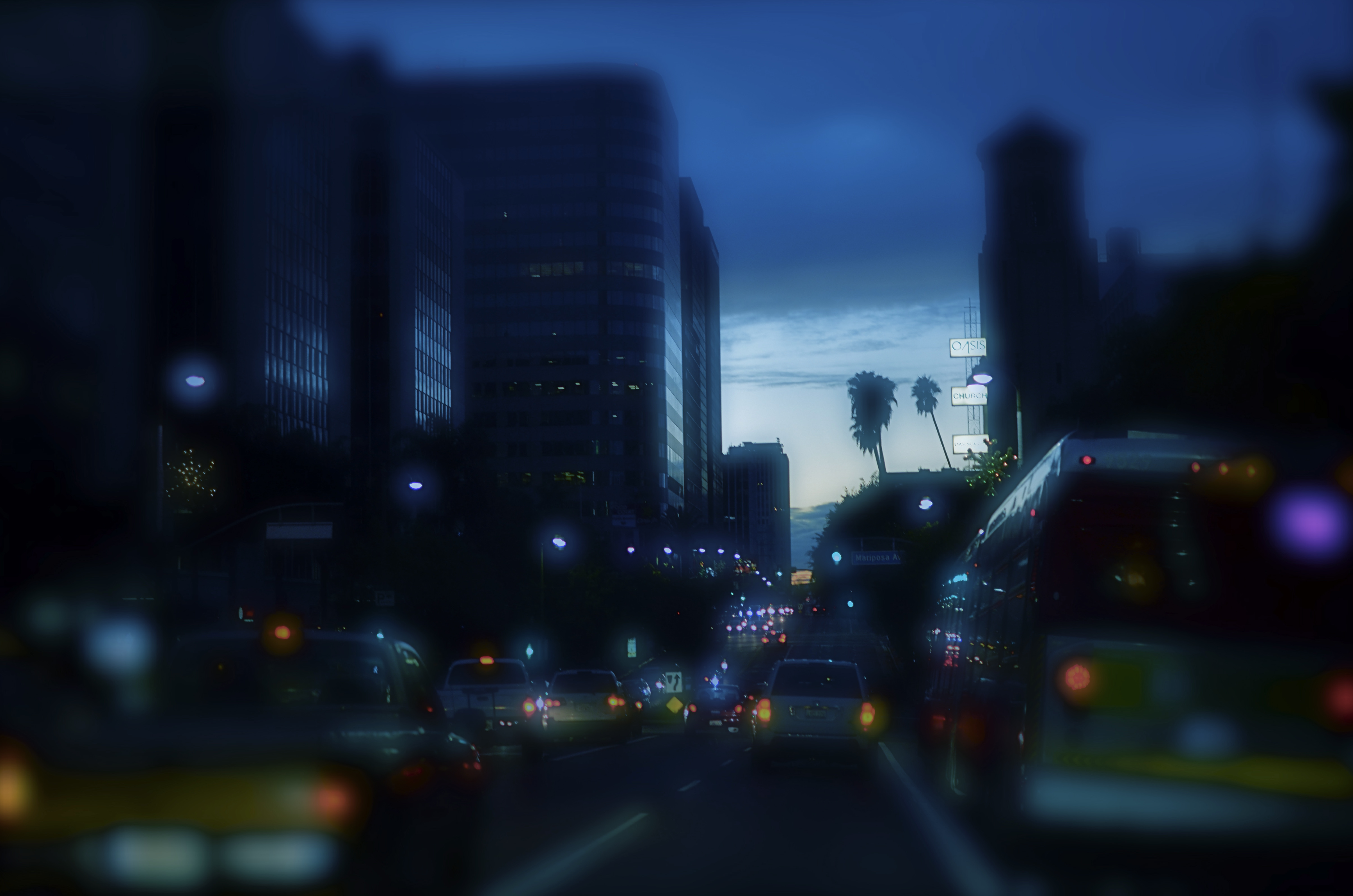
Central Los Angeles, 2013. Is color the right “messenger” for this night shot, or will the monochrome version, seen below, do the job more effectively?
By MICHAEL PERKINS
COMMUNICATION IS ABOUT TAILORING MESSAGES WITH THE MESSENGERS THAT DELIVER THEM. In conveying ideas and information, we work both to shape its content, and to send it under the care of the correct carrier. Some messages are best transmitted in pure sonic terms, fitting the formatics of, say, radio or telephone. Other have truer impact in visual media. And within the overall scope of visual media, in that special folder marked “photography”, we make additional choices. Because, even after we’ve chosen a still image to get our point across, there remain more specific decisions within that folder that may enhance the delivery of our idea. And the most fundamental of those decisions revolves around the simple choice of color/no color.
There certainly must be a reason why, more than 75 years into the era of convenient and available color media, many photographers still deliberately choose monochrome as their primary messenger. It can’t be merely for the novelty or nostalgia that it can evoke. Indeed, black and white is much, much more than the mere absence of the full color spectrum. We need to weigh this choice just as carefully as we do exposure or focus, because there is something about either option that describes an aesthetic, a way of seeing the world. You can probably recite the various claims yourself: color is more “natural” or “realistic”: b&w is more journalistic, authentic: mono streamlines the impact of an image, simplifying its readability without distraction: color allows the fine-tuning of mood. And so on.
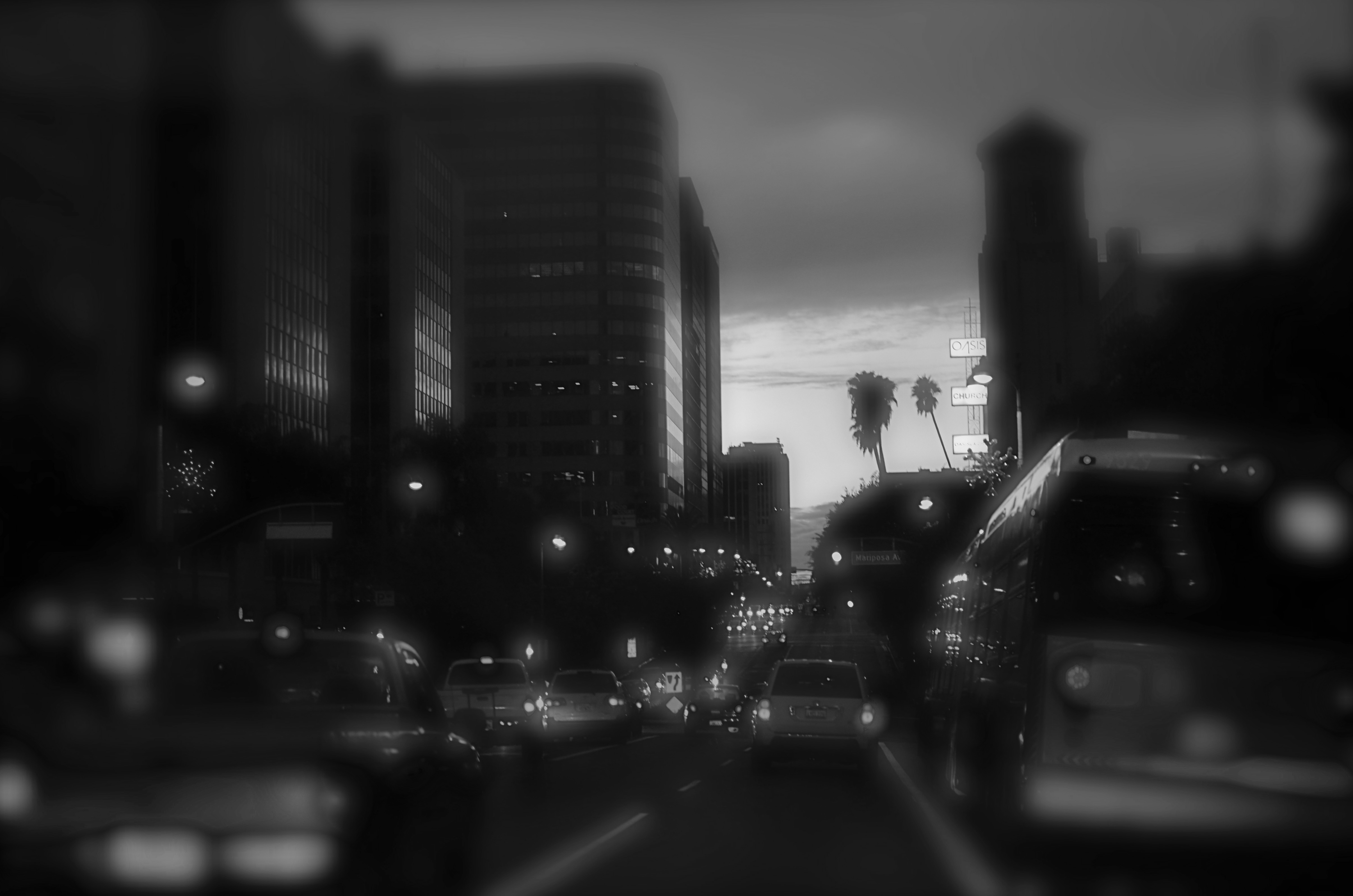
Is the absence of color here equal to the absence of impact?
Some of us shoot in mono as a default, while others master their images in color and make postmortem decisions to desaturate them in post. Some of us have returned to film, solely to reacquaint us with earlier colorless versions of our camera eye. Even in the age of full-color graphics in any and all publications, part of our monkey memory still imparts a certain authority to black and white, disdaining color as too “pretty” or decorative. The argument is endless.
My point here is that, since our cameras and apps can now make anything look like, well, anything, we need to examine the message we’re trying to transmit and match it as perfectly as we can to the messenger that best gets the idea across. We need to, as with the kings and emperors of old, ask not just about what we want to convey, but “who shall I send?”. We have more choices available to us than any other generation across the vast history of photography. We never need to weaken the power of our images by dressing them up in the wrong suit.

HOORAY. DAMN.
By MICHAEL PERKINS
I DON’T UNDERSTAND THE CONCEPT OF AN IMPULSE PURCHASE. Everyone who buys things (so…everyone) has some code in their DNA that dictates how they go about the process, and I know that, for some, there is a virtually unbroken space of time between I Want It and I’ll Take It.
I don’t know what that’s like.
Every purchase I make, great or small, is, for me, a matter of exhaustive research, self-reproach, deliberation, and/or paralysis. And right now I’m experiencing all of those things to an excruciating degree, because right now, like, this week, I’m about to purchase a camera.
I buy cameras not when I want them (which is all the time), nor when I first need them (which is when most sensible people might do so), but only after my current camera is literally disintegrating in my hands, or about the time I am desperate for a replacement. The result of this desperation is an intense program of investigation of all products and their respective claims. I search endlessly for the best functions, price, performance and reliability, but not just for reasons connected to the making of photographs. I mostly do all this homework so I will ensure that it will be a long, long time before I have to go through all this agony again anytime soon.
Wait, does this come in full-frame, too?
This approach, of course, drains any potential enjoyment out of the project, with dread replacing anticipation and fear of failure subbed for excitement..or what I call the hooray-damn syndrome. It’s sick…that is, it makes me literally ill, with many a temptation to chuck the entire task and maybe attempt surgery on my old camera, or perhaps sacrifice a goat over the gravesite of George Eastman.
This is typically the portion of the program where someone in the audience raises a hand and remarks, diplomatically, “wait…that’s not normal, is it?”
Well, I can only speak for myself, of course, but I suspect that all my agita and itchy rashes are not, strictly speaking, what I’m supposed to be feeling. And yet, wading through the goopy internet soup of conflicting reviews, opinion-makers, influencers and, let’s face it, plain old cranks is enough to make me regard organ donation as a seaside romp versus selecting a damn camera that works.
Part of this dilemma lies with the manufacturers, of course, who market features and options with as much aggression as they do the basics of their devices. It’s a little like saying that a car manufacturer gives as much weight to the floor mats and cupholders as they do to the engine or transmission. Cameras are so loaded with toys that add to the flash of their newest models that it’s easy to drown in effects that one may seldom, if ever, use, when the main idea of the purchase is making pictures, which, when all is said and done, is not that bloody complicated. We say we came for the steak, but we often reach for our wallets at the first sound of the sizzle.
Maybe my buying anxiety is just another version of my wanting, throughout my life, to reduce the chance that I’ll make the wrong decision…in anything…where I’ll live, what I’ll work at, which toothpaste to use, or whatever. I’d love to know what an impulse purchase feels like. If I did, I’d have someone take a picture of me making one.
If I could only decide which camera to use…
Share this:
December 26, 2021 | Categories: Uncategorized | Tags: Commentary, Equipment, Humor | Leave a comment