STREAMING KILLED THE THEATRE STAR?
By MICHAEL PERKINS
AS YOU READ THIS, ANYONE WITH A KEYBOARD AND THE MINUTEST CONNECTION TO THE ENTERTAINMENT BIZ is crapping bricks over the sale of Warner Brothers to yet another new owner, (of which there have been more than a dozen), regarding said merger/sale as the death knell for theatrical movies in the Golden Age Of Streaming. This mass panic ignores the fact that “going to the movies”, as a regular practice, has been heading for Dodo-land for decades, and that, sorry folks, but things change and evolve. We will always love storytelling, but we will constantly be revising the delivery system we choose to use. Ask the 1920’s studio heads that predicted that “talkies” were a passing fad.
For me, the major sensory delight of going out to a film has been gone for some time, being intertwined as it was with the atmosphere engineered into the theaters built in the first third of the 1900’s. The over-the-top grandiloquence, the overkill raised to a the status of a science, immersed the moviegoer in rich fantasy worlds that provided vivid escape even before the curtain went up (yes, Virginia, there were curtains) and the overture began (and, yes, Virginia, there were overtures, as well). We had a deep, profound crush on the places where movies were shown, a crush that was trampled underfoot in the back half of the twentieth century, as those miraculous movie palaces were replaced with bland boxes, mere assembly halls equipped with projectors. They were certainly places we went to see movies, but they ceased to be…. theaters.
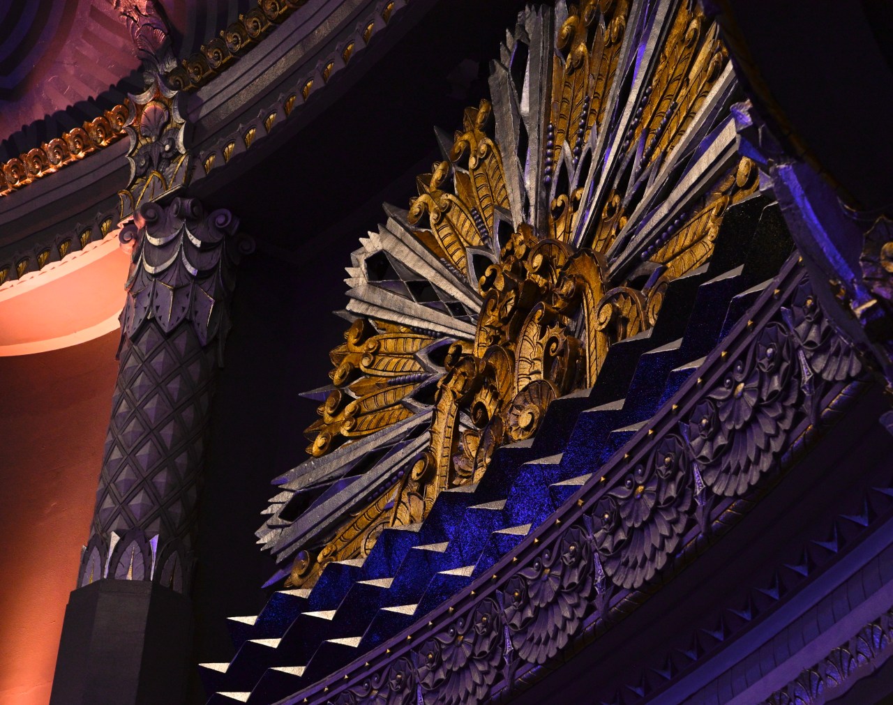
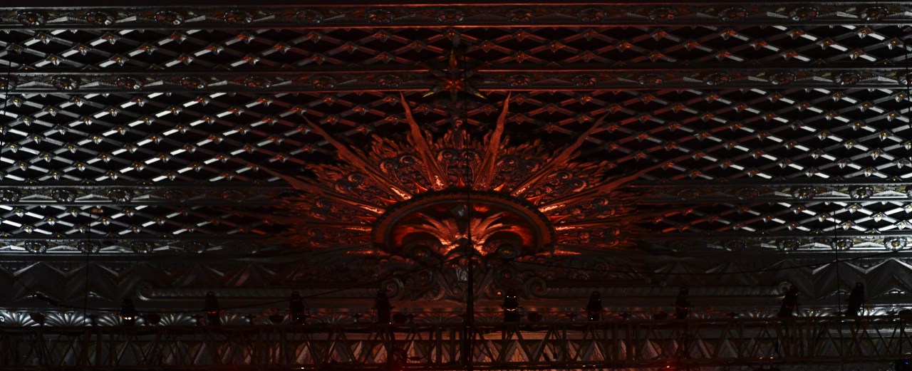
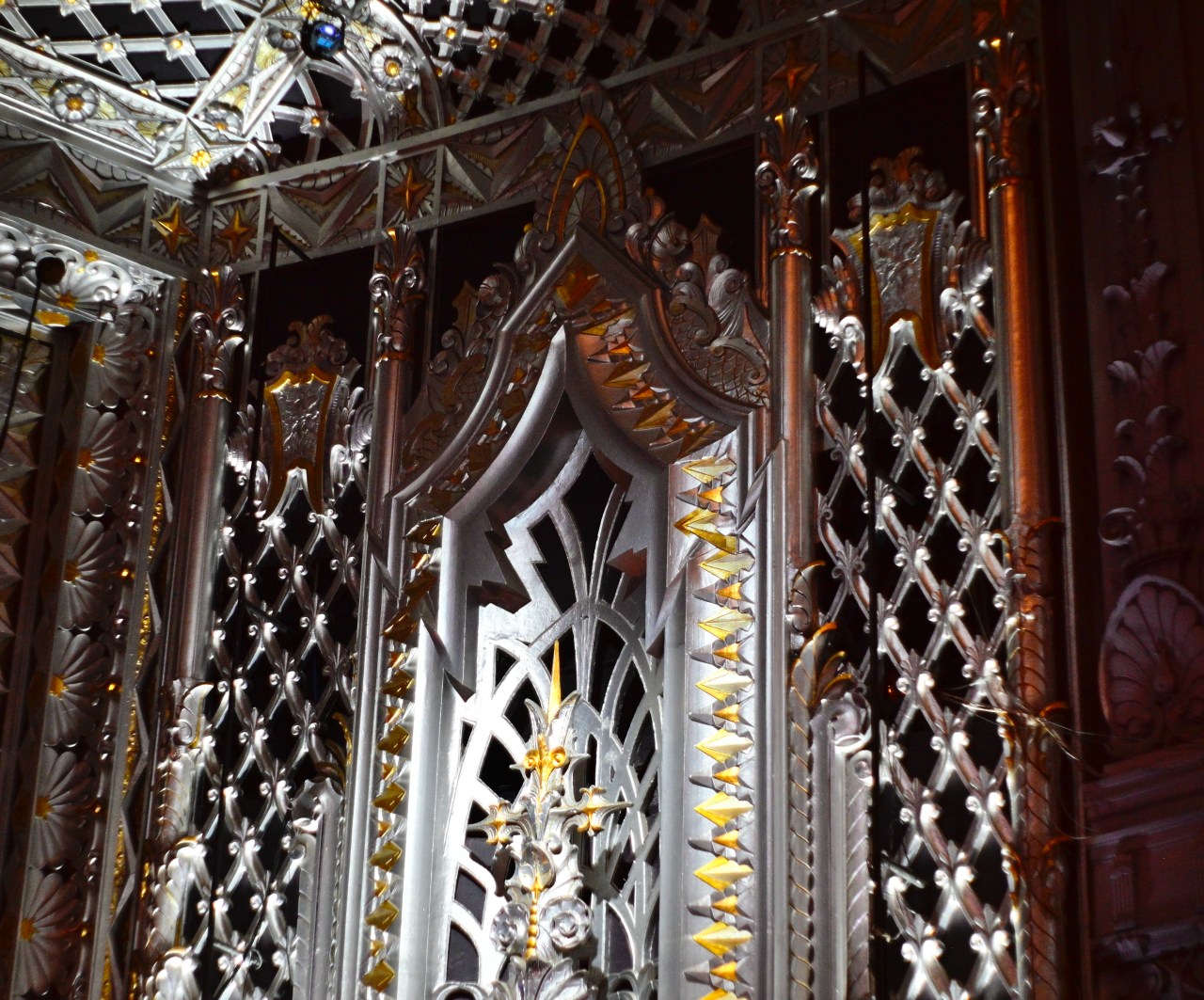
I live near Los Angeles now, and being a frequent day-trip visitor, I have inherited a plethora of dozens of grand old movie houses that, in the town that perfected make-believe, have been allowed to age into the 2000’s, repurposed either as subdivided multi-screen complexes, playhouses, or live performance venues. It’s the kind of legacy that has long since vanished from much of the heartland, and, as a photographer, I get a little drunk with power at the chance to walk their halls and document their dreamscapes. The images here are from a medium-sized 1930 cinema called the Saban, which hosts any and every kind of entertainment event at its original location on Wilshire Boulevard in Beverly Hills. I love movies, and I always will. I also used to love where I went to love movies. Now, late in the game, I have more chances than ever to leaf through the scrapbook of that romance. Mergers be damned, it really wasn’t streaming that killed the theatre star; that particular murder has a hundred different authors.
I WAS JUST IN THE NEIGHBORHOOD ANYWAY…
By MICHAEL PERKINS
CROOKS AREN’T THE ONLY PEOPLE WHO RETURN TO THE SCENE OF THE CRIME. Photographers have the same neurotic habit of going back to the place where things went wrong. Only, instead of a “crime”, it’s the scene of a picture that we (a) loused up the first time (b) loused up the second time, (c) might look better with a different camera/exposure/lens or (d) is just some infernal, unsatisfiable itch that we must scratch or go crazy.
This building is one such place. I don’t know why it is filed in my fevered brain under “unfinished business”, but it is.
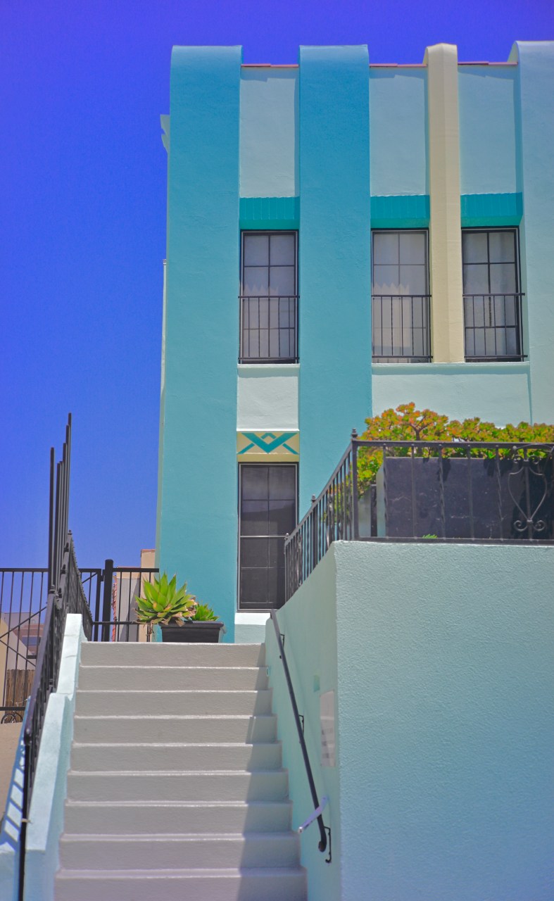
This apartment block is just one street away from the home of a dear friend in central Los Angeles, so I have probably made the short pilgrimage to it for at at least ten years’ worth of visits. Part of its attraction is that it’s one of the only original Art Deco structures left in the neighborhood. Another part of it is the utter simplicity of its design, as is its clean teal tone. I’ve been snapping it for so long now that a complete folder of my collected shots of it could easily serve as a time-line on my own development as a photographer, as I’ve taken a crack at it through every phase, fad and infatuation I’ve endured over those ten years.
I’ve taken it with wide-angles and telephotos, primes manual lenses and fully automatic exposure. I’ve given it the lo-fi treatment with both cheap plastic and pricey Lensbaby art lenses. I’ve done full-on frontal shots of the entire building, distorted fisheye angles from the corners and sides, time exposures just after sunset with its windows all aglow and, as seen here as vertical slices designed to abstract it to pure shape. I think I’m done. However, I’ve said that many times before.
It’s frustrating enough to get a single pass at a place or subject, such as a snap of a tourist location you’ll never re-visit. It’s frustrating in a different way to have unlimited access to something that you can’t quite seem to nail, not matter how many swings you take. I was not blessed with a natural bent toward humility. However, thanks to photography, it’s closer to second nature for me. If I live long enough, I might just finish growing up. Or finally get The Picture of this wretched building.
THE FOUR SISTERS
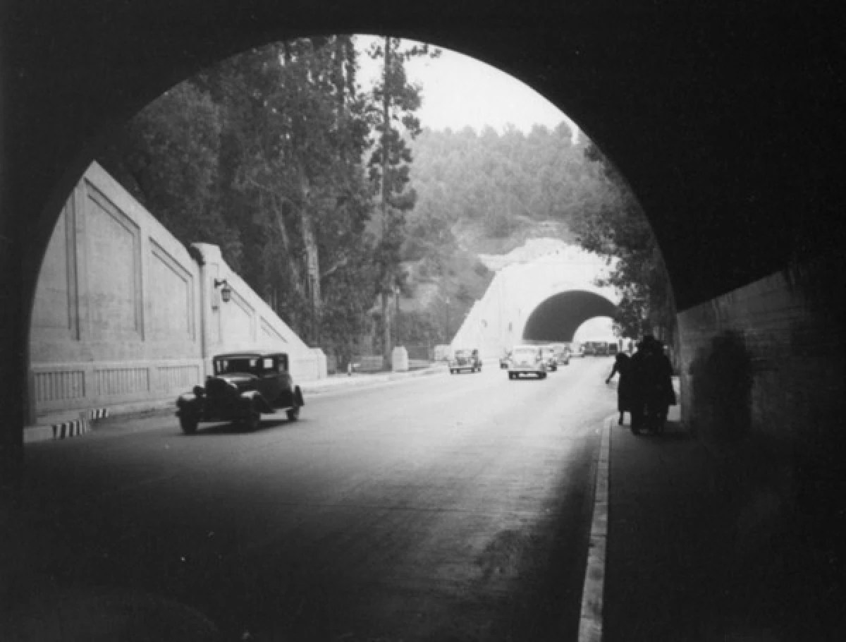
The Figueroa Tunnels connecting L.A. and Pasadena, soon after their opening in the 1930’s.
By MICHAEL PERKINS
LOS ANGELES IS CONSTANTLY IN THE ACT of obliterating its past; a term like “Old L.A” applies as much to a 1985 Blockbuster Video as a 1926 bank building in a town that, like the movie industry it hosts, tends to frequently “strike the set” and start again from scratch on a nearly daily basis. That’s why, for photographers (especially newly-arrived ones) finding infrastructure that is older than your family dog can be a touch task. Recently, however, I got my first look at such a fabled structure by merely driving up to it. And through it. Or through them.
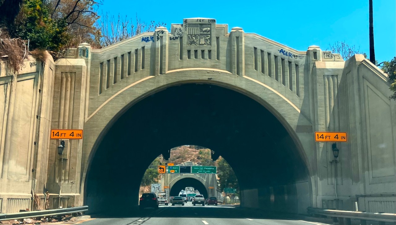
The view through one of the four tunnels to its neighbor, along with local traffic signage, July 2025.
The first major highway linkages between downtown Los Angeles and nearby Pasadena were hard-won affairs, as the rugged hills of Elysian Park blocked the city’s Figueroa Street from direct entry to the smaller town, forcing north-south traffic to cross a bridge over the Los Angeles river, creating huge daily bottlenecks. And as was the usual case with many physical obstacles in the 20th century, it seemed like a “dynamite” idea to simply blast a roadway through the hills, not for just one tunnel, but for four. Engineer Merrill Butler, who also designed many other landmark crossings and tunnels throughout greater L.A., cranked out the first three of these beauties beginning in 1931, with a fourth, the longest at 755 feet, arriving after 1936 as yet one more way to direct and relieve traffic flow. Each was a gentle Deco arch design with streamlined support wings, custom “coach lights” and, at the keystone of each, an abstract sculpture of the Los Angeles city seal.
The shot you see here is a true snapshot, in that, not having motored through Pasadena for a long spell, I had completely forgotten that the tunnels were a feature of the last leg into town. Before I could reach any of my formal gear, we’d already entered the first tunnel, and so I managed to grab images of the proceeding three with my iPhone, anticipating the extremely wide lens default of the camera by waiting almost until entry to attempt to fill the shot with just the structure and very little of the surrounding sky, roadside and terrain. I love my first glimpses of sites in L.A. that were once fundamental to the growth of the city (the Arroyo Seco Parkway, built after the tunnels opened, actually does the heavy lifting on local traffic flow now) and have, almost by chance, been allowed to hang around and age into venerability. The camera’s function as time-traveler cum time-freezer is magical, and I value the gifts it yields.
THE CASE FOR REINCARNATION
By MICHAEL PERKINS
ONE OF THE HALLMARKS OF A MATURE SOCIETY is a healthy respect for its own history. When a nation is busy a-borning, doing anything “for the ages”, from physical infrastructure to laws to philosophy, can get lost in the blur of just…becoming. The dust of Now is just swirling too madly to get a good view of what can, or should, be made to last. Change is so rapid that it becomes its own religion. Preserving, protecting, salvaging things….that comes later.
American, a country that has always surged forward too quickly to allow ourselves much of a backwards glance, was always more about building than keeping. Things that became outmoded or obsolete were quickly consigned to the national scrapheap. As a result, we only recently have begun to place a premium on conservation, on re-purposing our past. And nowhere is that more evident than our cities, where signs that read “soon, on this site” usually mean that something old must first be destroyed. We have taken a long time learning to give things second lives. Including ourselves.
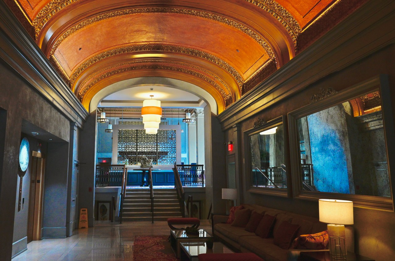
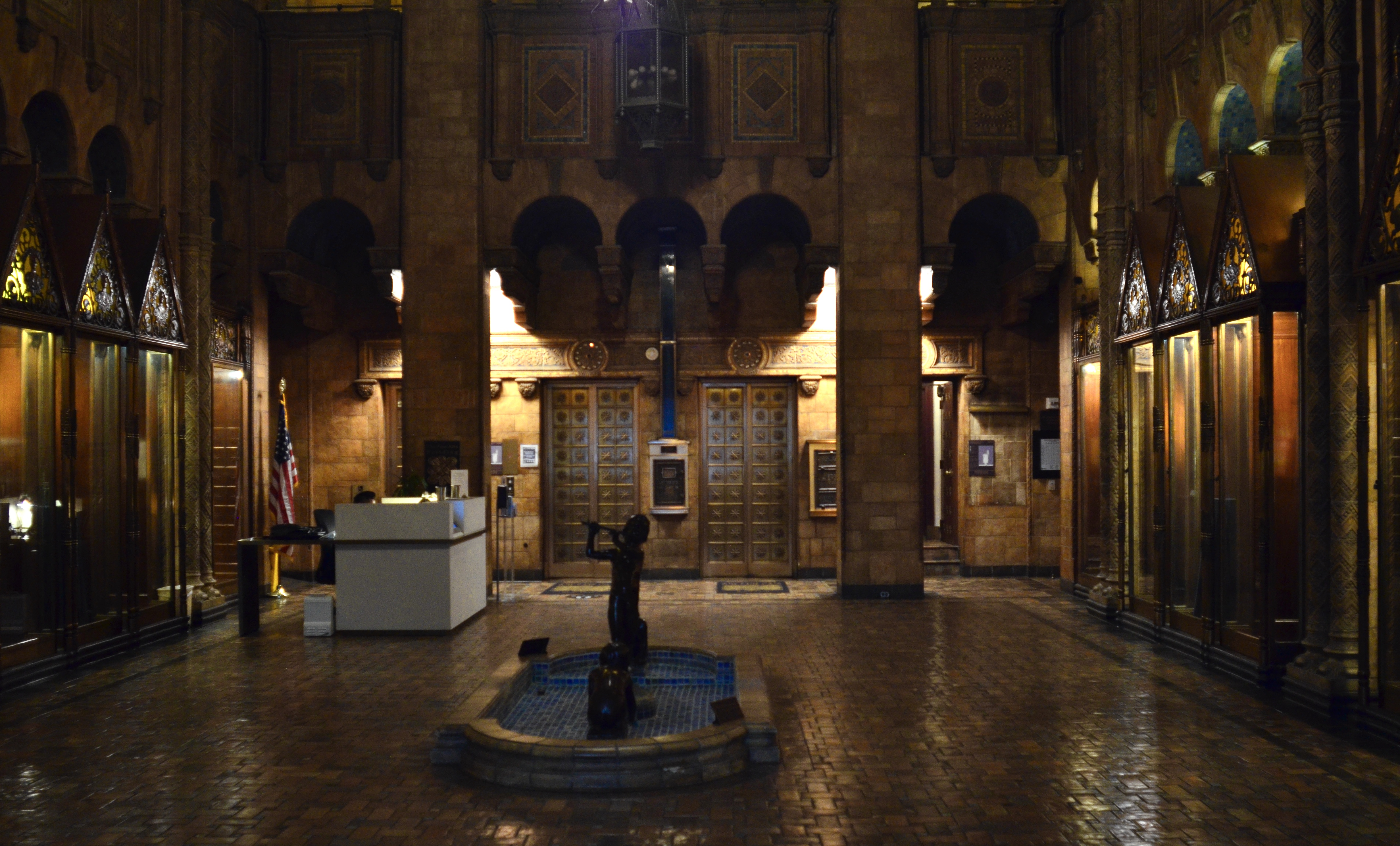
The foyer of the restored Citizens Building, a 1917 bank-turned-condo community in Columbus, Ohio.
I have a special affection for the urban spaces that get “saved”, that are lucky enough to survive the wrecking ball and shine forth anew, escaping the fate of so many things we mistakenly label “improvements”. Not everything old is immortal, certainly, but not everything new is magical, either. I love to take my camera to renovations, grand re-openings, conversions. It is a great privilege to see, in a place’s original design or materials, what its creators did. In the case of the above image, taken inside a 1917 bank in Columbus, Ohio that’s been recently reborn as luxury urban condominiums, one sees many original features that brought beauty and elegance to a financial institution that work perfectly well, thank you very much, as features in a residential building. I document these small victories because they are still too rare. I long to demonstrate, for as many eyes as I can, that “past” need not mean “dead”. As our country, or any young country, grows up, it’s easier to see what seemed invisible when we were young and in a hurry. That’s true of ourselves no less than of our creations.
NEW ANGELS
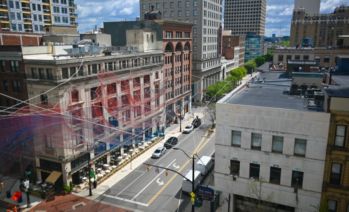
Current, a rope and cord art installation in Columbus, Ohio, created by “fiber artist” Janet Echelman
By MICHAEL PERKINS
FOR ME, ONE OF THE MOST EXCITING TRENDS IN URBAN DESIGN, in the twenty-first century, is not the latest generation of skyscrapers or town plazas, but a bold new redefinition of the concept of public art. Where once it was sufficient to plop down a statute of some wartime general near the county courthouse, commissioned works now make mere sculpture look as primitive as cave paintings. We have evolved past the commemorative earthbound seraphim that once graced our parks, to flights of fancy that connect and shimmer from the air. It is an age of New Angels, and Janet Echelman is one of its patron saints.
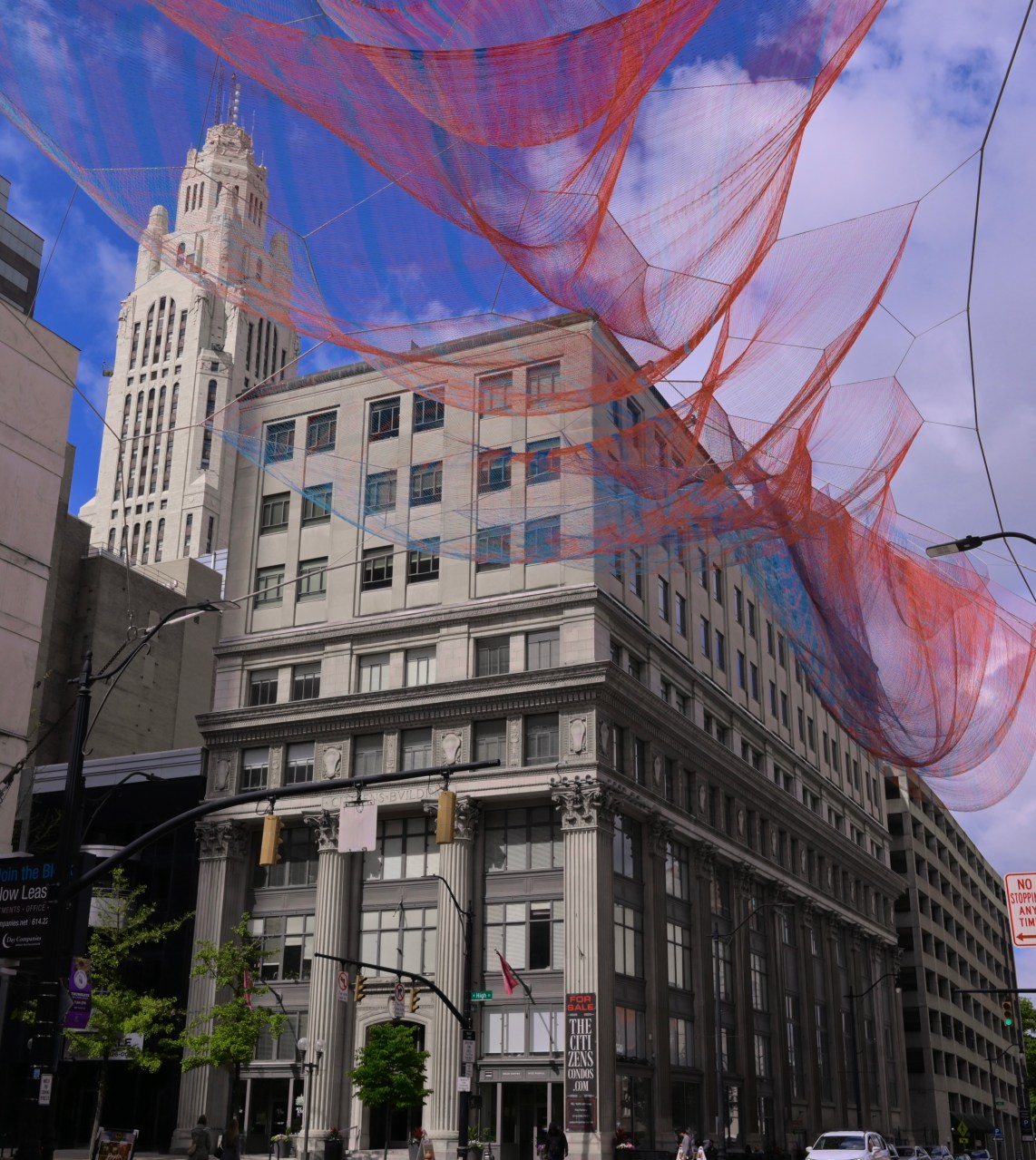
Echelman, a Guggenheim fellow and Harvard graduate, who refers to herself as a “fiber artist”, is, in fact, an altogether new kind of sculptor. Instead of being grounded on pedestals, her arrangements of shimmering color, created by mixtures of fiber, netting and rope, hang in suspension over cityscapes like vast spider webs, refracting the rainbow and generating waves of shifting hues depending on changes in sunlight, wind or the angle of view. Some of her creations are billowing circles and cones that resemble a whirlwind of cyclone; others look like sky-bound rivers, curling and twisting into tributaries of red and blue. Each is uniquely tailored to its specific location in cities like San Francisco, Vancouver, Seattle, and a half-dozen other cities around the world. They are, simply, magnificent, and the best challenge for any photographer, since they appear vastly different under varying conditions.
I first saw one of her works while working at Arizona State University, where Her Secret Is Patience floats like a phantom hot air balloon near the school’s Cronkite School of Journalism. And just this spring, I was thrilled to see her first work to be floated over an entire intersection, 2023’s Current, which spreads across the meeting of High and Gay Streets in Columbus, Ohio, anchored to the tops of buildings at the crossing’s four corners. Commissioned by a local real estate developer as a kind of front porch for his refurbished bank building (now housing deluxe condos), Current can be seen from any approach within a four-block distance of the area, an irresistible advertisement for the regentrification of the neighborhood. Janet Echelman is but one voice in a rising chorus that demands that public art re-define itself for a new age. That age will not only withstand controversy but actively court it, just as any art, including photography, needs to do.
THE STRAIGHT (AND TALL) SKINNY
By MICHAEL PERKINS
EVERY TIME OVER THE PAST TWENTY-FIVE YEARS that I have strayed from my home in the American southwest and headed back to my mid-Ohio roots for family visits, I am struck by a stark difference in the general arrangement of architectural space between the two regions, or at least a difference that I myself perceive. It would be a monstrous over-generalization to say that legacy houses, out west, tend to be horizontal in orientation while midwestern houses in older towns tend toward the vertical. I have absolutely no empirical data to back up this impression, only the way that it strikes my photographer’s eye.
Western dwellings strike me as variants on the basic ranch house design, with many homes arranged from left to right, many without basements or attics. Midwestern homes, by contrast, seem to be narrow and high, resembling a brick turned up on end. I tend not to actively notice this distinction unless I am back home, trying to compose frames in which several buildings cluster together to suggest an entire town or street. My hometown of Columbus, Ohio, which is a sprawling city composed of many legacy neighborhoods, boasts a ton of “tall-and-skinny” sectors from the Short North to German Village to outlying villages like Pickerington or Reynoldsburg. In many of these neighborhoods in which, unlike say a city like Brooklyn, houses need not be crunched and crowded together like a row of brownstones, the brick shape still often predominates, setting up a strange contrast between wide, deep yards and narrow, stretched headstones of design.
Sometimes the look of a small town can actually seem like the view between gravestones. And, in the rural areas where the local cemetery is actually cheek-by-jowl to to the residential districts, the connection is even more compelling. I walk these Midwestern streets, once as inevitable as breath to me, and realize that not only my physical address, but I, myself, have undergone deep, deep change. And that, in turns changes the pictures I envision.
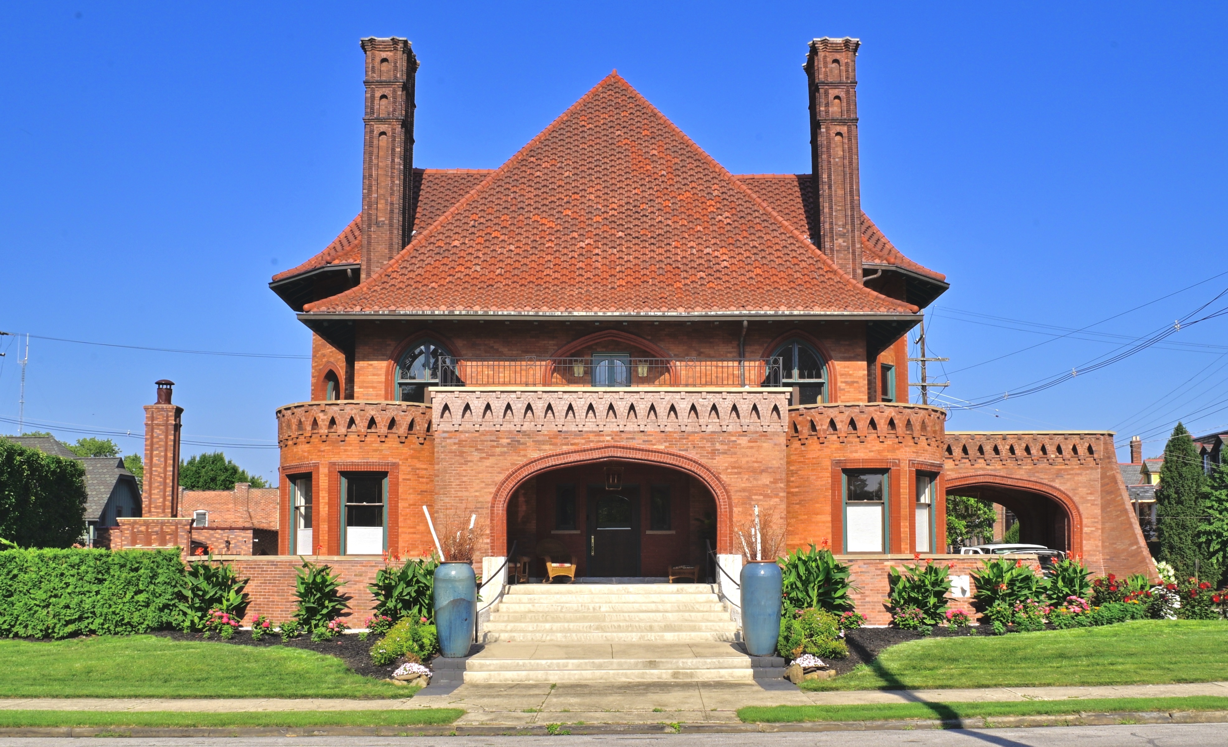
OF SIGNATURES AND LEGACIES
By MICHAEL PERKINS
THE PROPERTY AT THE NORTHWESTERN CORNER OF GOODALE PARK, in the “Short North” district of Columbus, Ohio has, over the past 117 years, served as private residence, office building, daycare center, fraternal lodge for commercial travelers, nursery school, and alcoholics’ recovery center. Incredibly, every one of these uses has been housed by the very same structure, a bizarre relic of the golden age of robber barons locally known as “the Circus House”.
And with good reason.
By 1895, Peter Sells was one of the founders of the nationally famous “Sells Brothers Quadruple Alliance, Museum, Menagerie, Caravan and Circus”, and so was, in terms of the Victorian age’s pre-mass-media entertainment scene, a very rich man, and eager to be seen as such. Engaging one of the nineteenth century’s hottest architects, Frank Packard (creator of many of Columbus’ iconic structures, both public and private), Sells ordered up a mishmash of styles he and his wife Mary has seen during a recent trip to California, with elements of Moorish, High Gothic Victorian, Mission Revival and other flavors melding into a sprawling, three-story mansion that eventually swelled to 7,414 square feet, hosting twelve rooms, four bedrooms, five full bathrooms, and two half-baths. And there was more: the Sells’ servants’ quarters, a carriage house erected just to the west of the main house, weighed in at an additional 1,656 square feet, larger than most large private residences of the time.
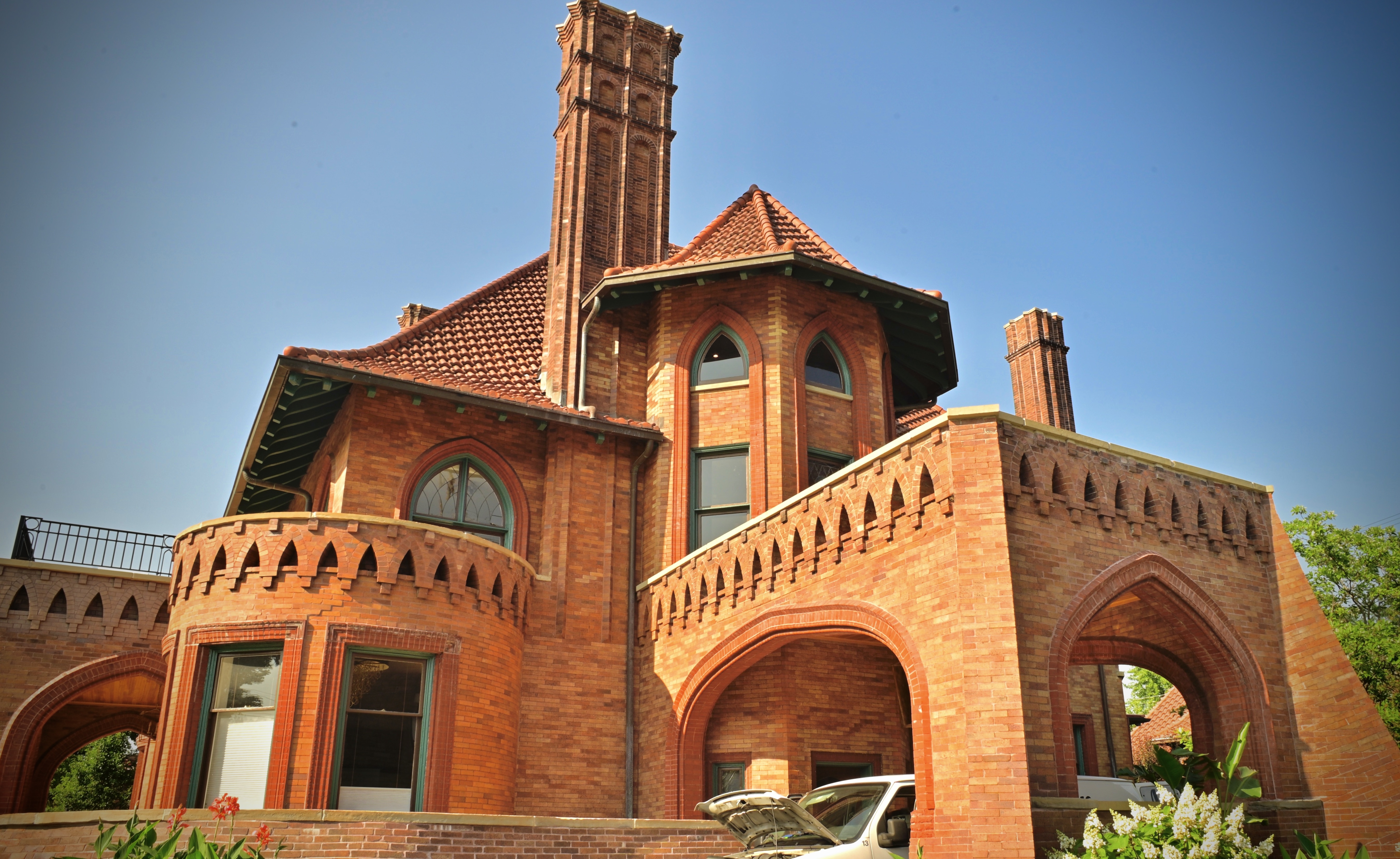
For the photographer, the Circus House is more than a bit…daunting. Capturing the strange curvatures of its twin turrets, its swooping, multi-angled roof, its jutting twin chimneys or its scalloped brick trim (suggesting, some say, the bottom fringes of the roof of a circus tent), all in a single frame, is nearly impossible. For one thing, circling the structure, one finds that it looks completely different every ten feet you walk. This seems to dictate the use of a “crowd it in there” optic like a wide-angle lens, which further exaggerates the wild bends and turns of the thing, making features like the huge porte-corchiere loom even larger than they appear in reality.
Finally I decided to be at peace with the inherent distortion of a wide lens, as if it were somehow appropriate to this bigger-than-life space. Like the best circus, the Sells house has many things going on at once, often more than even the average three-ring managerie. Architecture as a kind of personalized signature, long after its namesakes have faded into history, creates a visual legacy that photographers use to chart who we were, or more precisely, who we hoped to be.
THROUGH A GLASS, DARKLY
Handheld, manual through-the-front-window exposure of the interior of Los Angeles’ Fine Arts Building.
By MICHAEL PERKINS
SHOW ME A SOLID LOCKED DOOR and I’ll tell you what I’m imagining as to what lies beyond it.
Show me a locked door with a pane of glass in it, and I’ll tell you what my next photograph will be.
We’ve all been on our share of historic urban tours in which really great buildings are viewable only as exteriors. Many sites that used to be everyday places of business are now at least partially protected from the prying peepers of passersby (alliteration fans rejoice!), usually by barring access to their interiors. And it seems to also be true that the juiciest lobbies and entries are described by the tour guides with the phrase, “unfortunately, we can’t go inside..but you can peep through the glass..”
Well, peeping is great, as far as it goes, but, since I’m packing a camera anyway, I always decide to add to my ever-growing go-for-broke file of near misses and happy accidents and snap something, anything. The potential in the gamble is often a bigger thrill than the actual results, but, oh, well.
Here we see the interior of the venerable Fine Arts Building, which opened in downtown Los Angeles in 1927. The outside of the place is a grandiose beaux-arts birthday cake of excess, and the builders were no more restrained when it came to the lobby, some of which, being multi-storied, is cut off from view here. But what delights within immediate eye-shot! I was jammed flat up against the glass to fend off reflections and glare and set my trusty old Nikkor 24mm manual prime for ISO 800 at 1/50th of a second. Since I was some distance from the rear lobby wall, I could shoot wide open at f/2.8 and focus on infinity. Some lights were on, but luckily they were indirect, and so, were not rendered too glow-y or globb-y by the extreme aperture. The whole thing was a matter of some fifteen seconds, and luckily the tour group had only moved on a few yards by the time I was done.
I am a firm believer that you louse up 100% of the shots you don’t try, so I always have a whatthehell attitude toward any flops or flukes. Because a barrier can be the end of an experience, or just the gateway to the rest of it.
WHICH R ARE YOU?
By MICHAEL PERKINS
VENERABLE BUILDINGS ARE VIEWED THROUGH SEVERAL AESTHETIC PRISMS OVER TIME, and so, as a consequence, photographs of them also fall under different general themes. To my eye, architecture is a visible testimony of so many things human: our relationship to each other: the myths and beliefs that we hold sacred: our own ambition: our way to contextualize ourselves in history or in space. And when I try to decide how to photograph a building, I tend to see it through three distinct filters, or what I call the three “R”s: reference, reverence and relevance.
Reference covers the image of a place from the original artist’s renderings and sketches through its opening phase, as we imagine how this new thing is designed to “fit in” to its hosting surroundings, which, themselves, figure in its original depictions. Reverence comes later on, as we idealize a structure out of context, long after its original neighborhoods or uses have faded. In this “post card” phase, we regard the building for itself, perhaps attempting to protect or restore it.
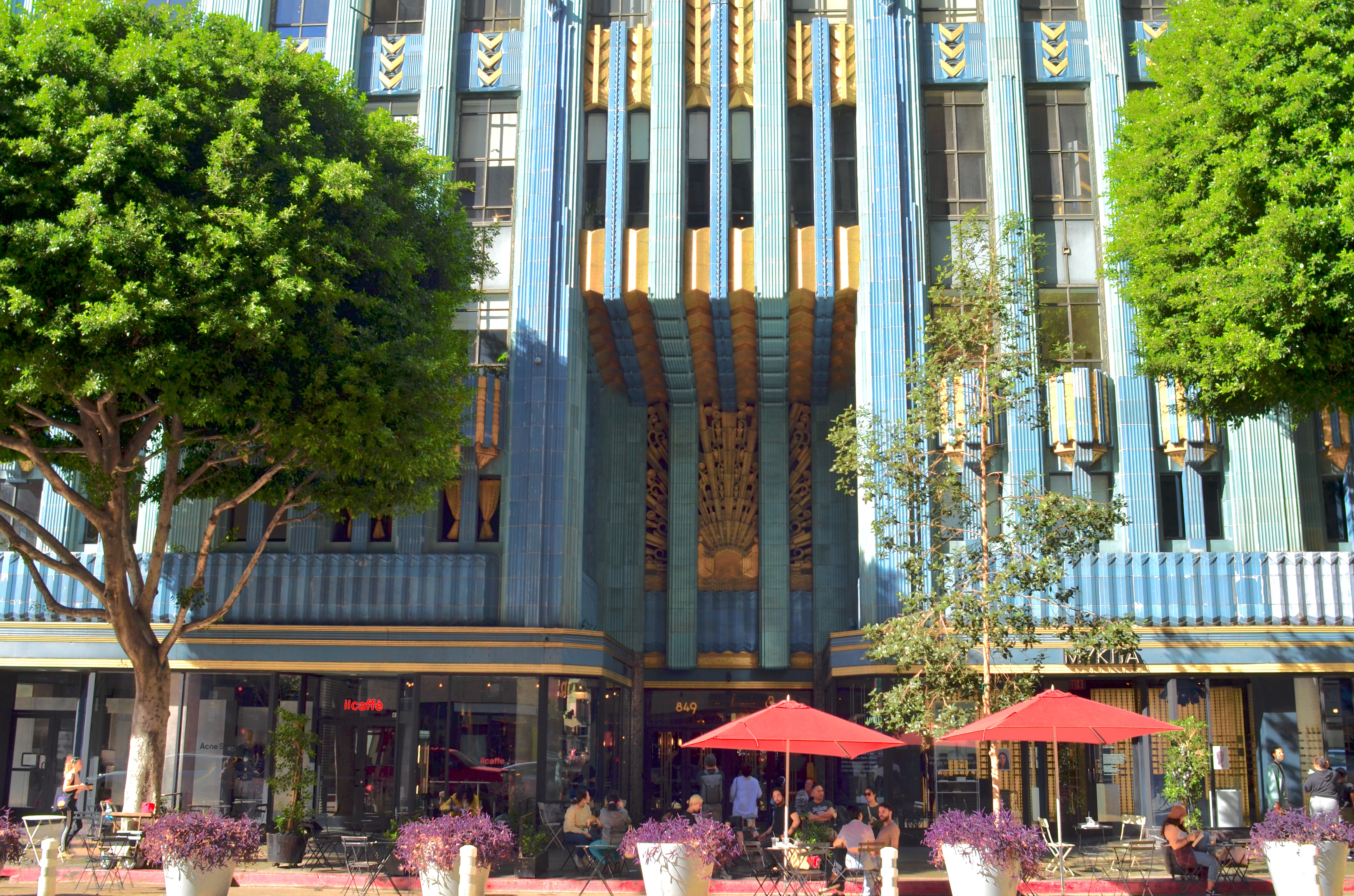
The aqua and gold terra-cotta of 1930’s Eastern Columbia Building, reborn in downtown L.A.
The third R, relevance, comes even later in the edifice’s life, perhaps post-rehab, as we happily welcome it back into daily use and re-apply the scale, objects and people that will anchor it to its second life, the same kind of use-context that was seen in the reference phase.
In finally checking Los Angeles’ 1930 Eastern Columbia Building off my life-list a few weeks ago, I found myself toggling between the reverence and relevance mindsets, taking idealistic images of the tower’s features in isolation from everything around it, and, in the case of this photo, showing it alive with people and activity, as part of the neighborhood. In the end, even though I have seen thousands of idealized images of the EC (the city’s most photographed building, and one of the most renowned Art Deco treasures in the country), I prefer this view, since it places it in a vital (that is, living) setting.
We make buildings for so many reasons, but, in all cases, we make them to be used, not merely adored. The Eastern Columbia, host to two of the country’s largest retailers until the 1960’s, emerged from its banishment years to enter life anew as multi-million dollar lofts to the the stars, its resurrection well in rhythm with the rise of the entire central L.A. “Broadway” district. That makes it relevant once more, and so the camera should always chronicle its elements of what America has always loved best: a second chance. It “R” the best way to treasure a space.
THE INEXHAUSTIBLES
By MICHAEL PERKINS
“A ROSE IS A ROSE IS A ROSE“, wrote Gertrude Stein, asserting that a thing is merely itself, and nothing else. It’s a classic quote, but a sentiment which is belied by any kind of interpretative art. For the painter, the poet, the photographer, or the sculpturer, the physical limits of an object are merely the jumping-off point to one’s personal way of depicting or describing. Certainly, in one sense, a rose is “merely” a rose. However, in the hands of an artist, it is always, potentially, on its way to being everything else.
Photographers instinctively know that they are not mere recorders of “reality”, that, in their hands, subjects are exaggerated, emphasized, abstracted. We make images of roses, certainly, but also the rose-pluses, the rose-minuses, the rose absurd, the rose imagined. This ability to tailor the showing of things to our ever-evolving sense of their meaning to us allows us to approach even the most over-documented things with fresh eyes.
It may be that nearly everyone with a camera who’s walked the streets of Paris has, somewhere in their portfolio, a shot of the Eiffel tower. In some ways, the challenge of trying to say anything new about what we might consider an “exhausted” subject is irresistible: we sort of dare ourselves to do a fresh take on it. The thing is, our depiction of these celebrated places, once we have trained our eyes, is actually unbound, or inexhaustible. It is only how well we have developed the muscles of our imagination that determines how many gazillions of personal Eiffels can exist.
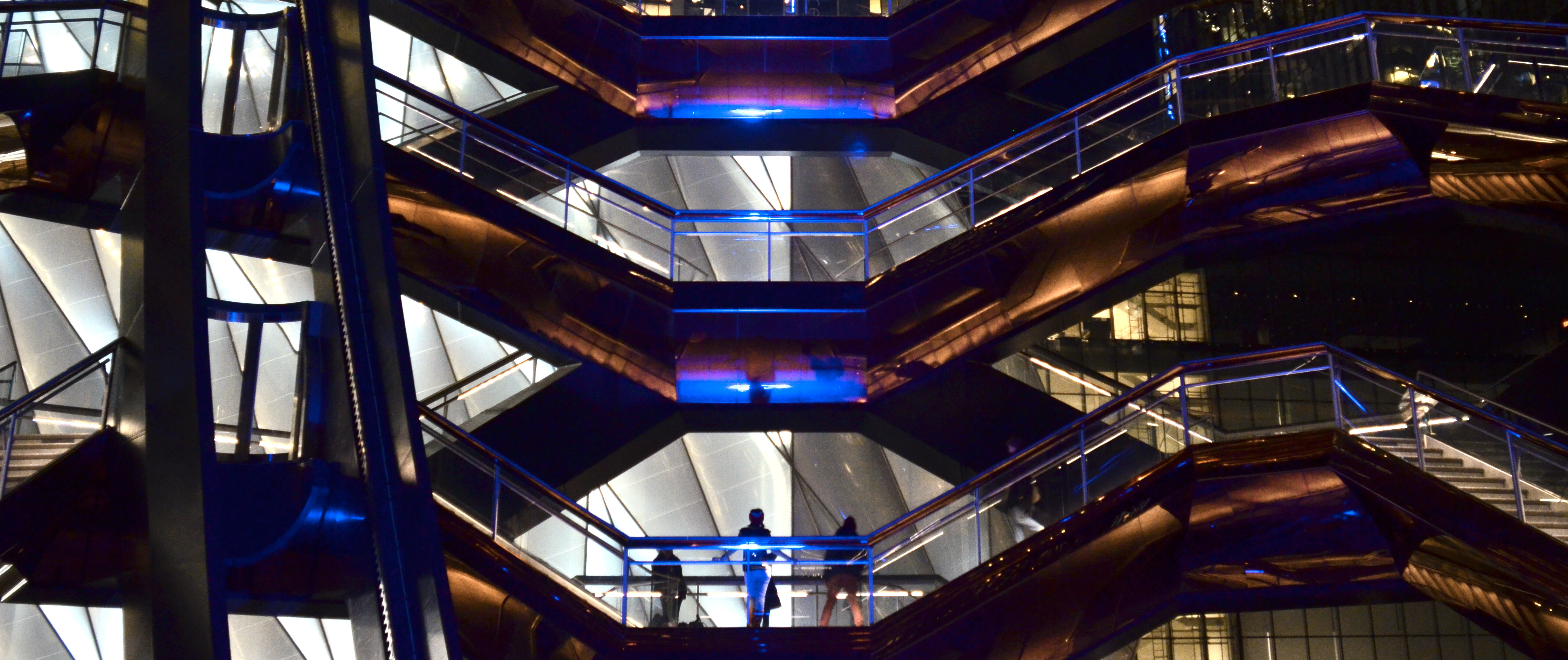
The image here of a small selected vista from within the sixteen-story layout (2500 steps, 154 flights of stairs, 80 separate landings) of New York City’s Vessel shows, if nothing else, that there can never truly be a “typical” view of the structure. The visual story changes every few feet or so, depending on where you are standing, and even multiple frames taken from the same vantage point just minutes apart from each other will yield vastly different results, since light, color and the arrangement of visitors is not static. This is great news for anyone who might doubt that they could make a personal picture of something so overwhelmingly public or famous. My point is that you can’t not produce something personal of it, because, for photographic purposes, not only this object, but nearly everything, is inexhaustible.
It’s not that the many millions of images taken of a famous place over time may not seem remarkably consistent, in that they almost replicate each other. It’s that such a result is not predestined, any more than any other photograph we attempt is. Change something in the eye of the beholder, and you may discover that even the eternal rose is, well, something other than a rose. Sometimes.
A SYMPHONY IN AQUAMARINE
By MICHAEL PERKINS
A DRIVE DOWN OCEAN AVENUE IN SANTA MONICA, CALIFORNIA, directly opposite the town’s fabled Pacific Park (and that glorious neon pier entrance), is usually a slow and stately one, given the nonstop traffic along the city’s main artery, which is itself a major link to the Pacific Coast Highway. The streets are regularly clogged with visitors, a given in a city that, only a hundred years ago, was a sleepy bedroom community far enough away from Hollywood Proper to be thought of as an exclusive (and slightly shady) getaway for the rich and famous.
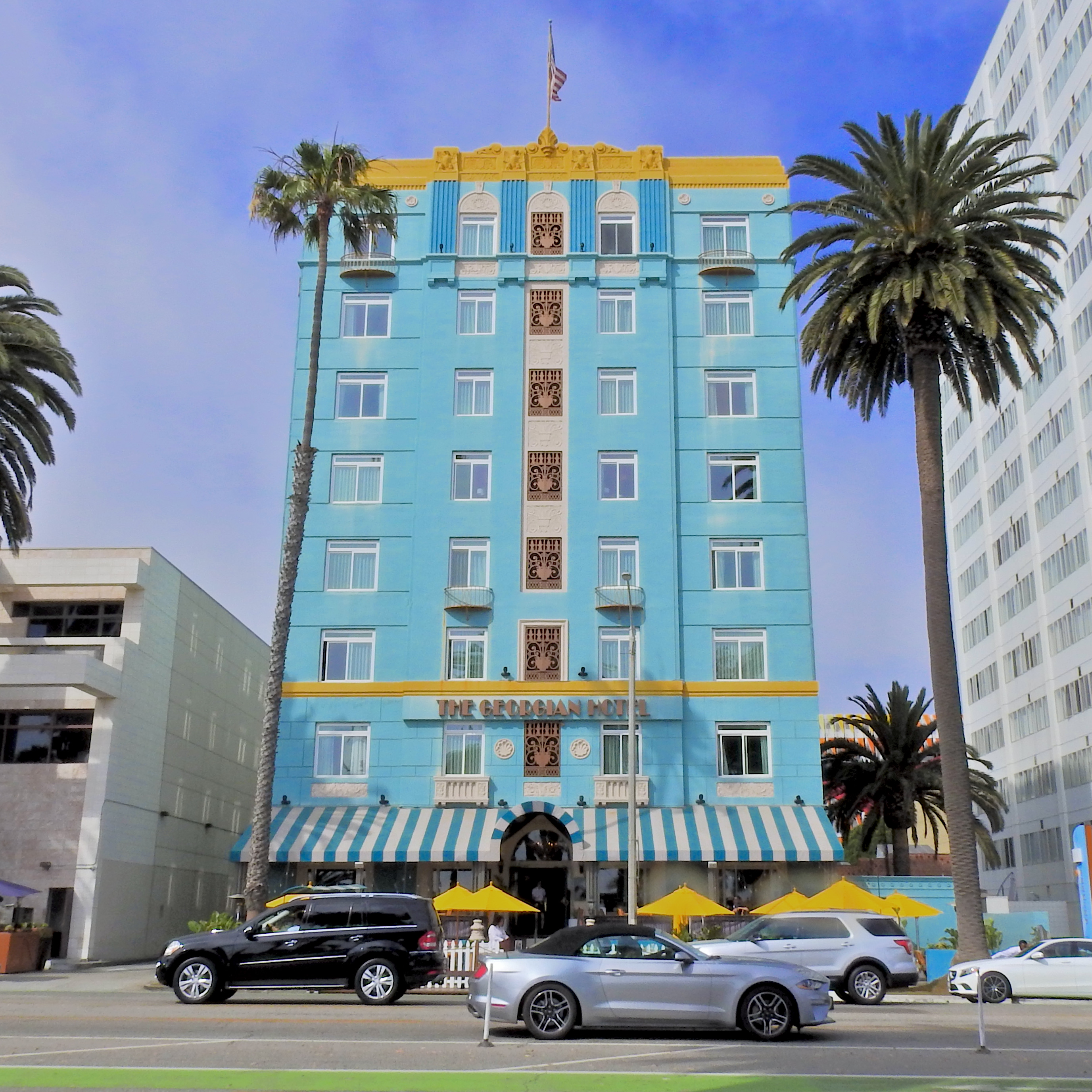
The Georgian Hotel, Santa Monica, California, July 3, 2021
One of SM’s most venerable architectural citizens is the gloriously Deco-rative Georgian Hotel, which, during the waning days of Prohibition, gained notoriety as a glamorous go-to for those seeking a little under-the-table taste. In the California of the late 1920’s, Santa Monica was still not long past its days as a tiny Chinese-Japanese fishing village, with the site of the hotel surrounded by a small forest, and….not much else. The Georgian’s formal 1933 opening coincided with the return of legal liquor, which confirmed its status as a chic retreat for the film community, with the likes of Clark Gable and Carole Lombard enjoying the ocean views alongside occasional clandestine stays from Al Capone and Bugsy Siegel. The hotel came to be the visual signature of the town’s full entry into the 20th century, and of the non-stop westward sprawl from L.A. that would continue to transform the waterfront for decades to come. By 2000, this elegant symphony in aquamarine attained monument status, and underwent a multi-million dollar restoration, guaranteeing its survival to the present day.
Photographing what I call a First-Tier-Postcard attraction, a place that everyone feels they simply must check off their bucket lists, doesn’t often result in anything new being done, beyond merely recording one’s “take” of it. In some ways, famous places are the most challenging things to shoot, since you’re in competition with the entire world in your desire to say something personal or unique. But, as this summer marks almost twenty years since the last time I photographed the Georgian, I recently approached the task with as much “just do it” zen energy as possible. It continues to delight and fascinate me with its quiet elegance, and its ability to evoke a world that has largely vanished, even as it’s been joined by other brighter, brassier neighbors over the years. Sometimes it’s just a privilege to be standing where so much magic has happened, and to take comfort that, to a degree, some of the old spell persists.
SWEET CLAUSTROPHOBIA
By MICHAEL PERKINS
ENOUGH WITH THE FLOWERS.
Give the birds a rest. Put the quiet trails and placid sunsets on pause.
I want my skyscrapers back.
Yes, I’ve dutifully done my photographic confinement therapy, like everyone else whose worlds have shrunk during the Great Hibernation. I’ve lovingly lingered over the natural world, embraced the tiny universes revealed by my macro lenses and close-up filters. I’ve properly marveled at the wonder of simple things, patiently revealed in the quiet composure of a more inward kind of photo-therapy.
It was needful. It was even helpful. Hell, on a few days, it was essential. But instead of steady, slow inspirations into the deepest reaches of my lungs, I now long for shallow, quick breaths, terse inhalations of monoxide, stolen as I dash across a crowded crosswalk. I want to dodge things. I want to run for a train. I need to see the infinite collision of brick, stone, and steel textures all fighting for my visual attention in a mad crush.
I want to hear noise.
I can make myself comfortable, even modestly eloquent, shooting the splendors of the natural world. God knows we have placed too many barriers of estrangement from our inheritance in field and flower. But I have known, since I was a child, that my soul synched perfectly to the unnatural world, the arbitrary creation of we wicked, weak bipeds, with an affection that is every bit the equal to that which I feel for a tree or a blossom.
I see the same geometry and design in our crude imitations of nature as in the contours of the rose or the patterns within a cactus flower, and I’m not embarrassed to say that the spires, arches, bridges and alleyways that map our densest interactions give me an electric thrill. I should also add that I am not typical within my family, where there are far more Thoreaus, all centered on their respective Waldens, than there are Whitmans, who see glory in even the failed strivings of the urban experiment. I take comfort in my sweet claustrophobia, and I make no apology for the fact that my photography breathes its fullest in cities.
There were, of course, millions for whom, during the Horror, cities were a cruel prison, and I absolutely get that. As the Eagles said, we are all just prisoners of our own device. Artists can create a heaven or hell in any setting, as witness the miraculous faith of prisoner poets or the inventive tinkering of a Robinson Crusoe. Confinement is largely a matter of geography or physical constraint, but, as we have all spent a long year discovering, it can be overcome by a refusal of the mind to remain locked into a particular place.
Still.
I have not yet completed my slow trip back to the hunting grounds where my cameras talk loudest to me. Like the start of our communal imprisonment, it will come in layers, in a million tiny shards of re-discovery. But it will come. My cities will be restored to me. My flowers and birds and bugs will always be celebrated as the protectors of my sanity, of the need to take my art inward from time to time. But right now, I need to get out on the streets, and see what’s up.
THE HOUSE I LIVE IN
By MICHAEL PERKINS
FRANK LLOYD WRIGHT OFTEN EXPRESSED THE BELIEF THAT, in architecture, “form and function are one”, that, in the best designs, what a thing is used for will generally dictate its appearance. And while it does seem to hold true that sports stadiums do look like places where sports are played, or that churches look like places where people worship, I’m not always sure, as a photographer, that I agree with FLLW that the form/function rule applies in all structures. I have a lifelong love for images of personal dwellings, places that, all too often, look ill-suited to house humans at all, as if, indeed, there was no conscious link between form and function. In many cases, we live in basic containers that just are, with how we live in them dictating their form almost as an afterthought or improvisation, draped as they are with the stuff we’ve accumulated over a lifetime.
Indeed, it’s how the infinitely adaptable human retrofits his house from the inside out that makes it look like somebody actually lives there, rather like a window looks more window-ish once someone hangs drapes in it. Urban living is littered with enclosures that will, sadly, never look like anyone’s domicile, and it’s only the personal things that spill outward from within that give them any visual identity or distinction at all. Thus, when I’m walking through a neighborhood, I pay less attention to the well-tailored or manicured houses and more attention to the littered ones, the ones where things are randomly hung or hammered into place, the houses where makeshift repairs or ill-performed additions are in evidence. Houses that otherwise seem as if they were extruded from a Play-Doh Fun Factory can become personalized by what is strewn in front of them, left in the yard, tacked on as a footnote. It is that randomness, that refusal to conform, that makes houses human, and thus ripe for picture-making.
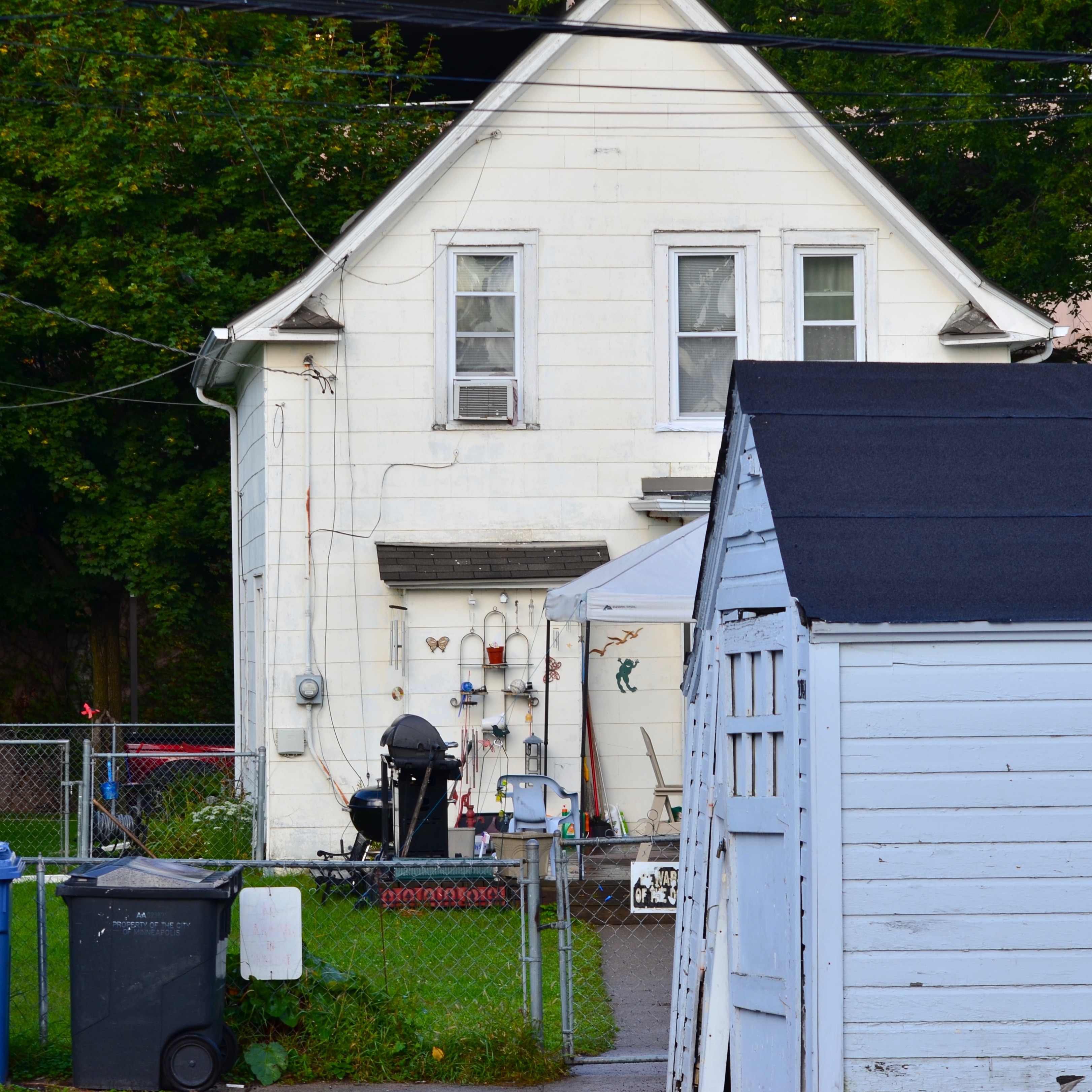
We Call It Home, 2019
In the image you see here, the house speaks eloquently about the most important things in its owners’ lives. It’s an outward barometer of their hobbies, pastimes, daily chores. The structure itself might never have struck anyone, from the architect to the builder, as unique, but as its true identity has been assembled, layered over it, its messages are all clear and direct. Wright was correct that buildings should reflect the purpose for which they were built. However, when they fail that task, design-wise, the way they are actually used will explode out of them, in a million different cues and clues over a million billion neighborhoods, in a visual shorthand that photographers will forever delight in decoding.
THE LOVELY BONES
Oversized marble columns support the high lobby ceiling at 195 Broadway, former New York home of AT&T.
By MICHAEL PERKINS
195 BROADWAY IN LOWER MANHATTAN is one of hundreds of buildings that might escape your notice upon your first walk through the city’s financial district. Less garish than its gothic neighbor, the Woolworth Building and a lot shorter than its big-shouldered brethren, the 29-floor landmark doesn’t shout for attention. Its true beauty emerges when you walk inside the somewhat restricted lobby, take the measure of the “bones” of its regal inner structure, and breathe in its storied history. Completed in 1916 after AT&T moved its American headquarters from Boston to New York, 195 was the strong, silent type of skyscraper….functional, neo-classic, but restrained, understated. As a largely urban photographer, I try to keep track of structures that have outlasted several uses and landlords, carrying their essence forward through decades of shifting styles and fashions. It’s the totality of what has made them last that makes them interesting to me, more than any single fillip or ornament.
But ornament, as a visual metaphor for the new (20th) century of American technological dominance, was built into 195 Broadway from the start, both inside and out. Paul Manship, the sculptor whose public works, like the golden Prometheus statue at Rockefeller Plaza, still dot the Manhattan map, created one of his first major works, The Four Elements, as bronze relief’s on 195’s lower facades, his love of Greek and Roman mythology weaving itself into the Moderne movement (later re-dubbed as Art Deco). Architect William Bosworth took the Doric columns which usually adorned the outside approaches of other buildings and brought them into 195’s lobby, all 43 of them, their wondrous marble reflecting a variety of colors from the teeming parade of streetside traffic. And sculptor Chester Beach used the same lobby to commemorate the building’s role as one half of the first transcontinental phone line in 1915 with Service To The Nation In Peace And War, a bronze relief of a headphone-wearing hero standing under a marble globe of the Earth, bookended by classic figures and flanked by lightning bolts.
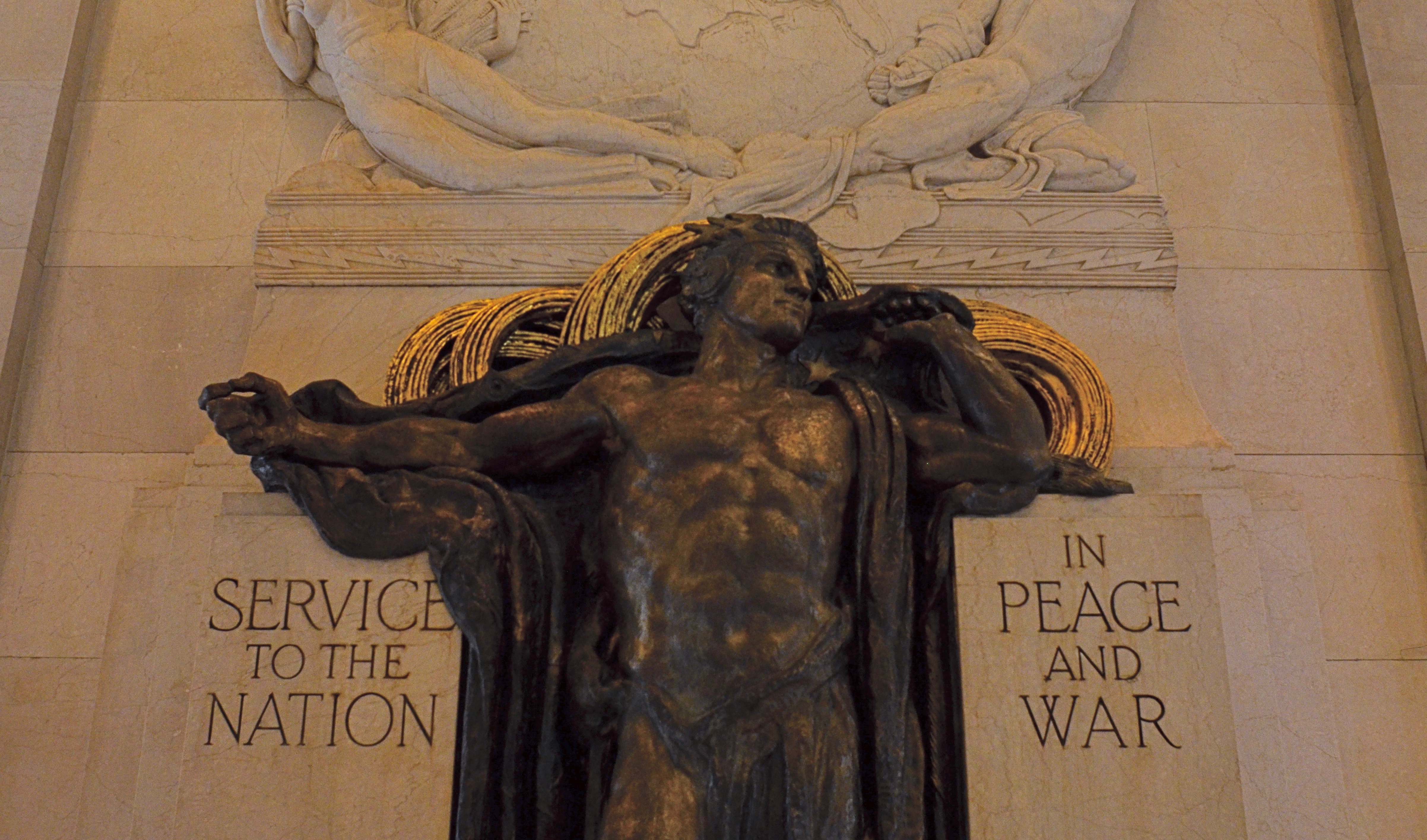
195’s lobby marks the origination point of the first transcontinental telephone line.
195’s long run includes the titles like the Telephone Building, the Telegraph Building, the Western Union Building, as well as appearances in popular culture, like its portrayal of Charlie Sheen’s office building in Wall Street. Sadly, a few of its most salient features have moved on, like the gilded 24-foot tall winged male figure originally known as Genius Of Telegraphy, which topped the pyramidal roof of the tower on the west side of the building until 1980, when it followed AT&T’s relocation to Dallas, Texas. However, the remaining treasures of 195 Broadway are still a delight for both human and camera eyes. Good buildings often present their quietest faces to the street. But look beyond the skin of the survivors, and marvel at the solid bones beneath.
IT’S A JIGSAW OUT THERE
By MICHAEL PERKINS
AS A PHOTOGRAPHER, IT SEEMS TO ME that a municipality only qualifies as a “real” city when it becomes nearly impossible to visually identify its beginnings. Neighborhoods may begin as unified civic signatures with coherent visual styles, but let fire, war, hard times or earthquakes add their input, and those same streets start to look like jigsaws with the pieces chosen from different puzzles. It’s a nightmare for urban planners but a treasure trove for the camera.
As they age, cities become visual collision points between good intentions and unintended consequences, with parts of one era being grafted onto fragments from another. Absent a bomb or natural disaster, few streets are completely destroyed by time, just evolved into a crazy-quilt jumble of bygone trends, deaths, and rebirths.
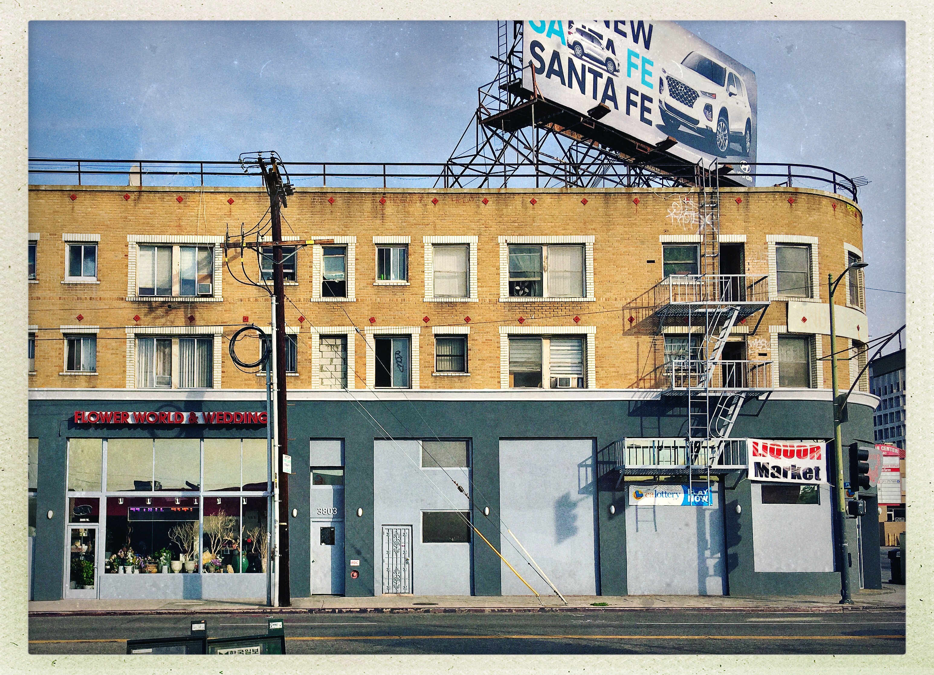
This image shows a typical block in Los Angeles’ Koreatown district, with residential, retail and undefined space co-existing in a single building, following the general rule for the neighborhood that everything should be re-purposed and then re-re-purposed pretty much forever. Things get old. Things break. Ownerships and administrations change. Priorities shift. Some parts of buildings disappear, others are re-imagined, still others are absorbed into other visions.
This urban recycling has real benefits. As an area with the densest population concentration in all of Los Angeles county, there is no space in Koreatown to waste, and thus many priceless remnants of the Art Deco movement which might have fallen to the wrecking ball in other sectors of L.A. were saved and re-used when the neighborhood transitioned from an entertainment district to a residential and commercial area in the 1960’s. Like most of the city at large, Koreatown’s streets are living exhibits, laboratories involving all of the different “Los Angeleses” that have existed throughout the last century. And as with “real” cities in general, part of the new way for the various Koreatown’s is always marbled with what Paul McCartney calls “my ever-present past”. creating unique photographic opportunities in the process. Essentially, cameras were born to bear witness to this amazing cross between architecture and archaeology, this irreconcilable argument between competing jigsaw puzzles. It’s part of the Big Picture we all seek.
OSCAR’S CRADLE
By MICHAEL PERKINS
HOLLYWOOD IS ONE OF THE SELECT LOCALITIES in the world’s largest democracy where royalty is not only tolerated but slavishly sought after. The crown (or crowns, plural) transfer from the recently fallen to the newly anointed with predictable regularity, but the ritual is always the same: we love the common people (they’re just like us!) until they are lucky enough to escape our ranks, after which we, in turn, adore them, despise them (who do they think they are?), forgive them, and adore them anew.
In terms of photography, the camera seeks out ever new lovers, nearly all of them human, and therefore fleeting. A careful study of Tinseltown, however reveals that the true royalty, the royalty that endures, is the real estate. And even in a town where “reality” is defined by whether you shoot on location or on the back lot, Hollywood harbors plenty of actual places where actual events actually occurred. Some are on the bus tours (Marilyn Monroe slept here), while others require a bit more digging. One of the industry’s most prestigious addresses is smack dab in a section so spectacularly tacky that, by virtue of merely being merely ostentatious, it seems positively muted.
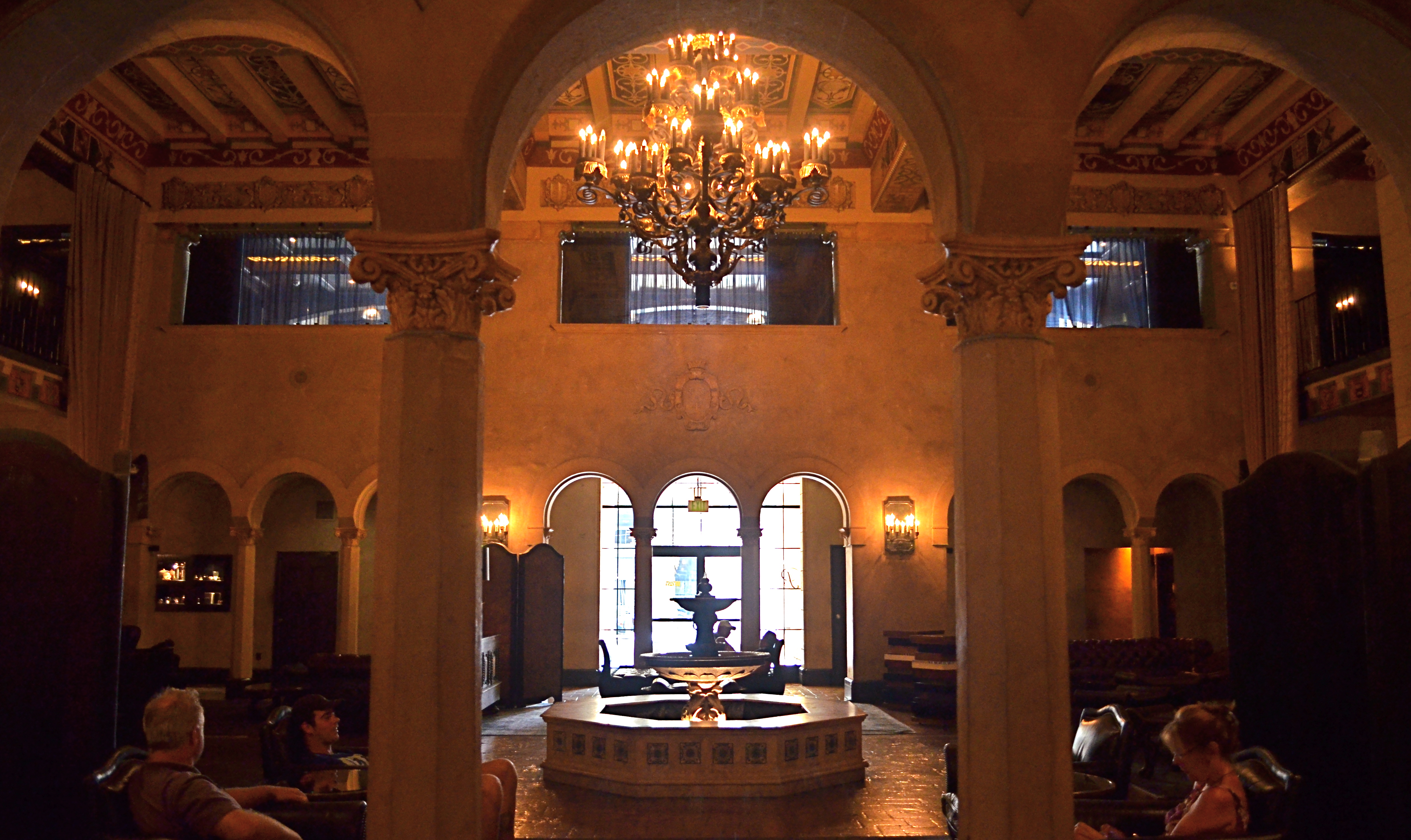
The Hollywood Roosevelt Hotel (named in memory of Teddy, not Franklin) survives in legend not because it served as a studio or corporate cradle for the film industry, but because it was the first time the town turned out to honor….itself. Then make an annual habit of it. Hey, if you want modesty, live in Des Moine, okay?
The Roosevelt earned its filmic pedigree from the get-go, financed in 1926 by a group that included MGM chief Louis B.Mayer and screen idols Mary Pickford and Douglas Fairbanks (two-fourths of the founding quartet behind United Artists Pictures, along with Charlie Chaplin and director D.W. Griffith). Two years later, the hotel hosted a modest little dinner for 270 guests to fete honorees of the newly organized Academy of Motion Picture Arts & Sciences, some three months after the actual awards had been handed out, and minus the nickname “Oscars”, which would come about four years later.
Over the decades the Roosevelt and its across-the-street neighbor the Chinese Theatre (which opened within months of the “R”‘s premiere) saw a fairly staid business district transformed into “Hollywood & Highland” (trade mark)…. Sucker Bait Central, a day-glo drag whose countless souvenir stops, IMAX pleasure palaces, low-rent novelties and neon knock-offs raised tackiness to the status of a religious movement. Meanwhile, the hotel’s crazy-quilt architectural style (‘Spanish Colonial Revival’…and, yes, there will be a test later), with its coffered ceilings, mid-century pool cabanas and wrought-iron chandeliers, was just fake-elegant enough to pass for average in a town renowned for its, er, flexible relationship with “class”. Rolling through the years with an occasional ownership transfer and the odd walk-on in movies like Beverly Hills Cop II and Catch Me If You Can, the Roosevelt has recently offered lodging as a contest prize on ABC’s Jimmy Kimmel Live!, and landed landmark status as Los Angeles Historic-Cultural Monument #545.
The Roosevelt’s photographic riches lie chiefly in its extremely dark main and elevator lobbies, its still-regal pool area and the legendary Cinegrill Lounge. The lobbies, at least for handheld shots, require high ISOs, slow shutter speeds and wide apertures. Flash may not be verboten but you won’t like the result, trust me. Indeed, the soft gold afforded by natural light washing into the murk from outside brings out the warmth of the Spanish textures, and adds a little tonal nostalgia to the scene. All things together, the Roosevelt stands as a monument to real occurrences, some of them fairly historically significant, in The Town That Invented Phony. And that’s the main challenge in Hollywood: if you can fake sincerity, the rest is easy.
THE INVISIBLE MIDDLE
By MICHAEL PERKINS
 GIVEN THAT JOB ONE, FOR A PHOTOGRAPHER, is maximizing his ability to see, it’s worth considering how we unconsciously condition our eyes not to see….to, in a way, confer a sort of invisibility on whole big chunks of the viewable world. It’s not that those chunks can spontaneously vanish on their own: it’s that we, in the act of managing the everyday flood of sensory information, prioritize some data above others. The lowest priority data effectively becomes invisible.
Cities provide an interesting example of this phenomenon, which I term the Invisible Middle. The upper stories of the buildings in a metropolitan are clearly noticed as “treetops”, clusters of skyscrapers easily apprehended from a distance. Equally visible are the bottom, or street-level layers of cities, the door-to-door sequences of businesses that parallel our daily journeys, the very stuff of habit. By contrast, the details of urban life from just above our line of sight all the way up to the spires and crowns of the skyline can become phantom acreage, something our schedule doesn’t demand that we notice.
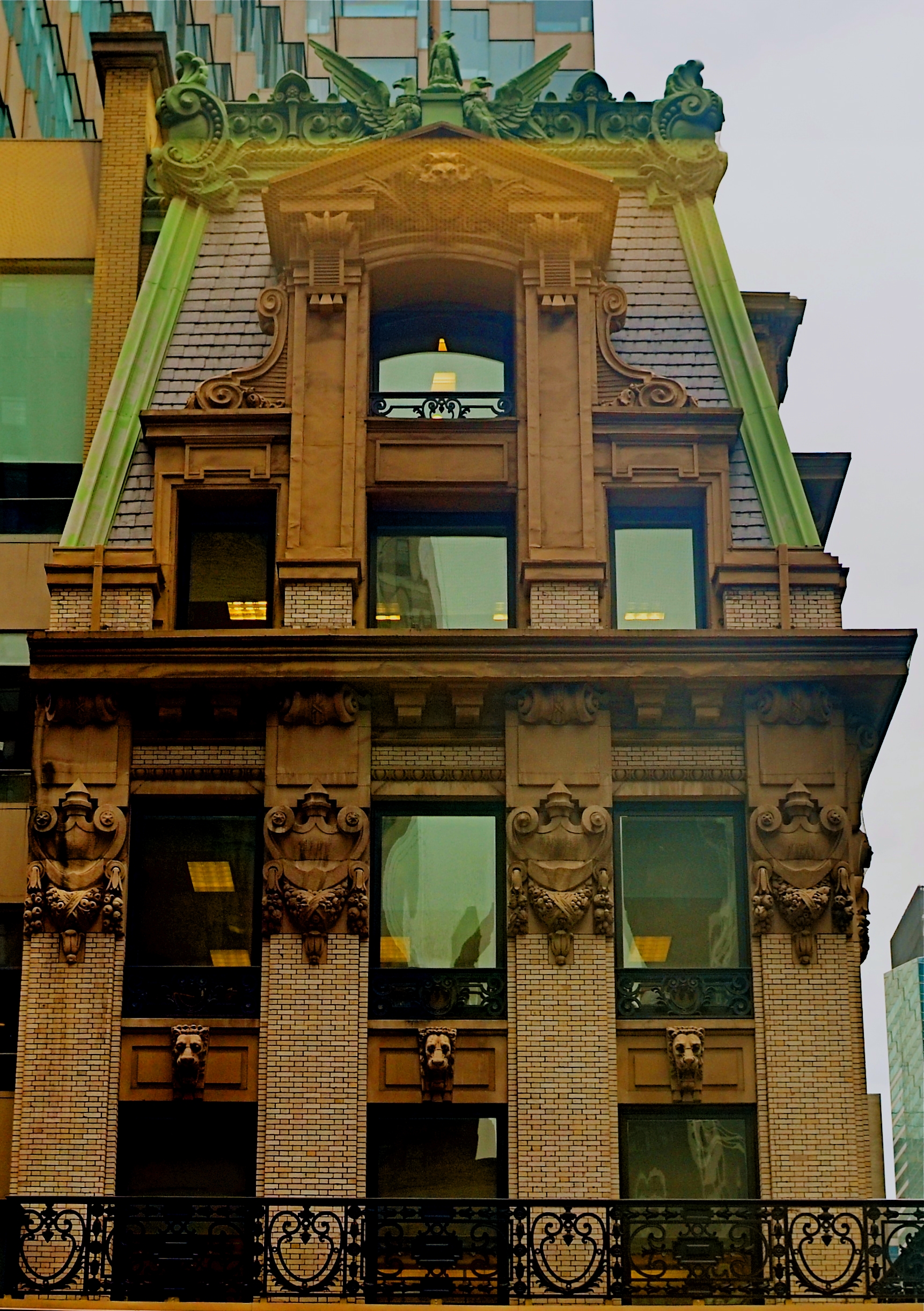
As one example, the building shown here, 452 Fifth Avenue in New York City, presents a magnificent face to anyone lucky enough to be in a position to crane their neck just a few extra floors above street level. Built in 1902, when a ten-story building was still a big deal in Manhattan, the Knox Building, named for Edmund Knox and the hat factory that made him a millionaire, was an anomaly from the start. Knox decided not to engage just any architect, but to hire John Hemenway Duncan, the man who had designed both the memorial arch at Brooklyn’s Grand Army Plaza and Grant’s Tomb, an act slightly akin to hiring Frank Lloyd Wright to build you a 7-11. Decades later, however, having survived years of attempts to raze it, the Knox landed on the National Registry, and in the 1980’s, got a new glass tower wrapped around it to make it the crown jewel of a major midtown banking complex. If one of Mr. Knox’ hats were still available, giving it a tip would be an apt gesture of respect.
This particular view was chiefly available to me because I was seven floors up in the building on the other side of Fifth Avenue. Vantage point gave me access to this part of the city’s Invisible Middle, but, more importantly, it left my eye hungry for more, and just a little more trained as to the complete range of places to cast my gaze. Because of this lucky accident, I may, in future, also do other good things….on purpose.
BOOK BINDINGS
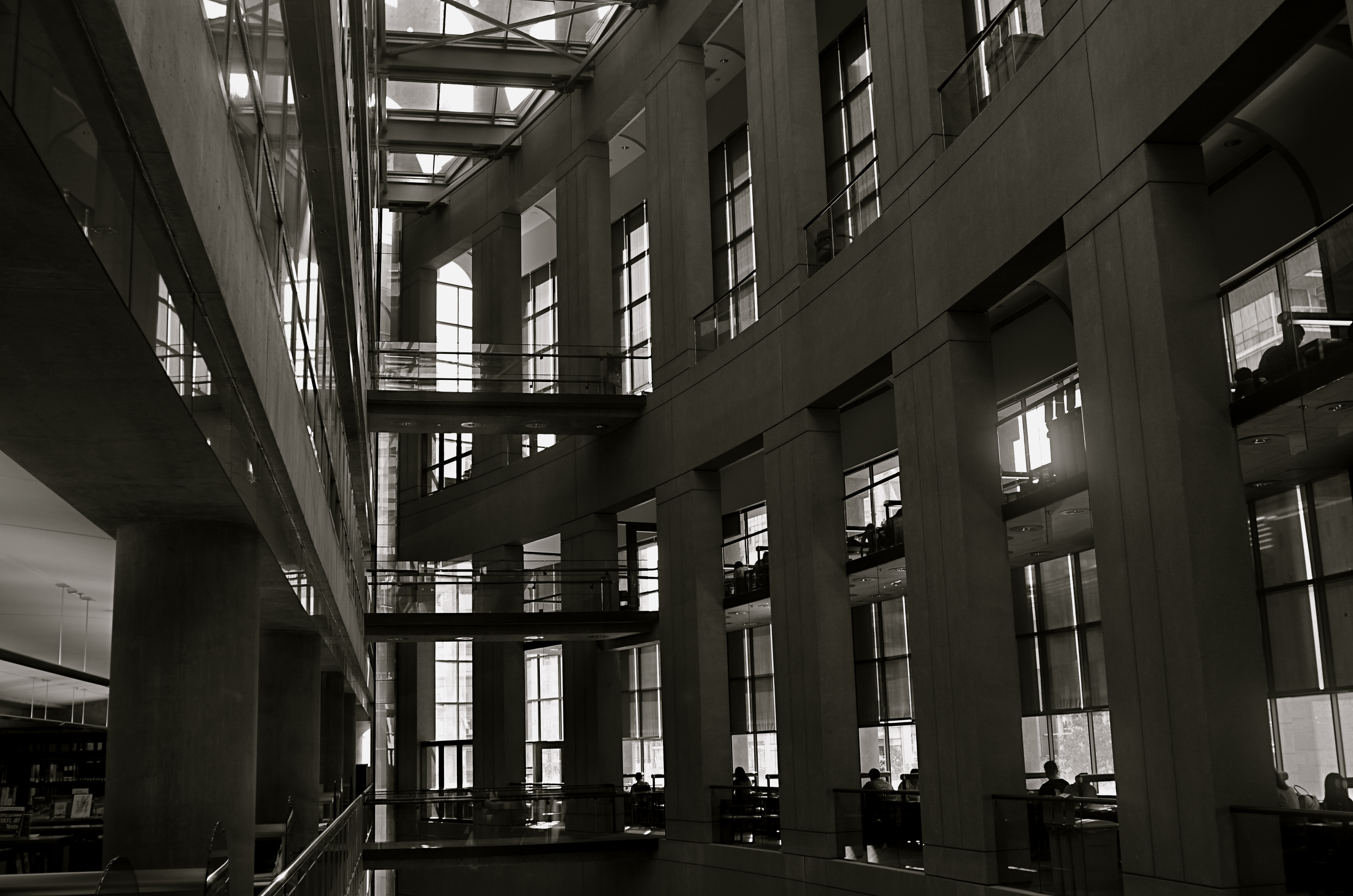
The future: In the grand atrium at Vancouver’s public library (opened in 1995).
By MICHAEL PERKINS
THE BUILDING YOU SEE HERE may not, on first glance, match your sensory memory of what a “public library” is supposed to look like. However, step into this amazing complex on West Georgia Street in Vancouver and you will certainly see, from every angle of its curvy vastness, the public….buzzing away at research, cozying next to comfy reads in cafes, tucked away in private warrens of study and solitude.
The venerable past: the mezzanine at the central branch of the Metropolitan Library in Columbus, Ohio (opened in 1907).
One of photography’s functions is to chronicle the public space that mankind creates, and how it occupies that space. And visually, there can be no greater illustration of the changes in how that space is defined than in the architectural evolution of public libraries. More than mere warehouses for books, libraries were the first common gathering places in our young republic, no less important than legislatures or marketplaces. Indeed, we built many libraries to be brick and mortar celebrations of learning, grand, soaring temples to thought, arrayed in oak clusters, dizzying vaults, sprawling staircases, and mottoes of the masters, wrought in alabaster and marble. To see these spaces today is to feel the aspiration, the ambitious reach inside every volume within the stacks of these palaces.
The library, in the twenty-first century, is an institution struggling to find its next best iteration, as books share the search for knowledge with a buffet of competing platforms. That evolution of purpose is now spelled out in new kinds of public space, and the photographer is charged with witnessing their birth, just as he witnessed the digging of the subways or the upward surge of the skyscraper. New paths to fortune are being erected within the provocative wings of our New Libraries. Their shapes may seem foreign, but their aim is familiar: to create a haven for the mind and a shelter for the heart.
There are legends to be written here, and some of them will be written with light…..
FACE FRONT
By MICHAEL PERKINS
HUMANS HAVE A DEFINITE ANTHROPOMORPHIC BIAS when it comes to faces. From dancing Disney flowers to Pixar office lamps, we tend to project our features onto nearly every kind of object or entity. And, as a photographer, I fall prey to that selfsame bias, especially when it comes to making pictures of buildings.
It’s isn’t much of a stretch, really. Windows become eyes. Doors assume the role of both noses and mouths. Overhangs and pitched rooves take on the appearance of eyebrows. And so on. For a variety of reasons, I tend to position houses in the same way I might shoot the most basic human portrait. Eyes facing straight toward the camera, face centered in the shot. No arty angles, no three quarter views. As clinical as a mug shot, or, in architectural terms, the plainspoken exposition of Walker Evans’ studies of houses and businesses in days of the New Deal.
And, like the aforementioned mug shot, I tend to frame the picture as close as I dare without sacrificing either context or impact. Again, the human face is the template, with the same decisions to be made about cropping. Do you need the top of the hair, the width of both ears? Should the shot stop at the bottom of the chin? Below the shoulders? Does any surrounding information add to the selling of the picture?
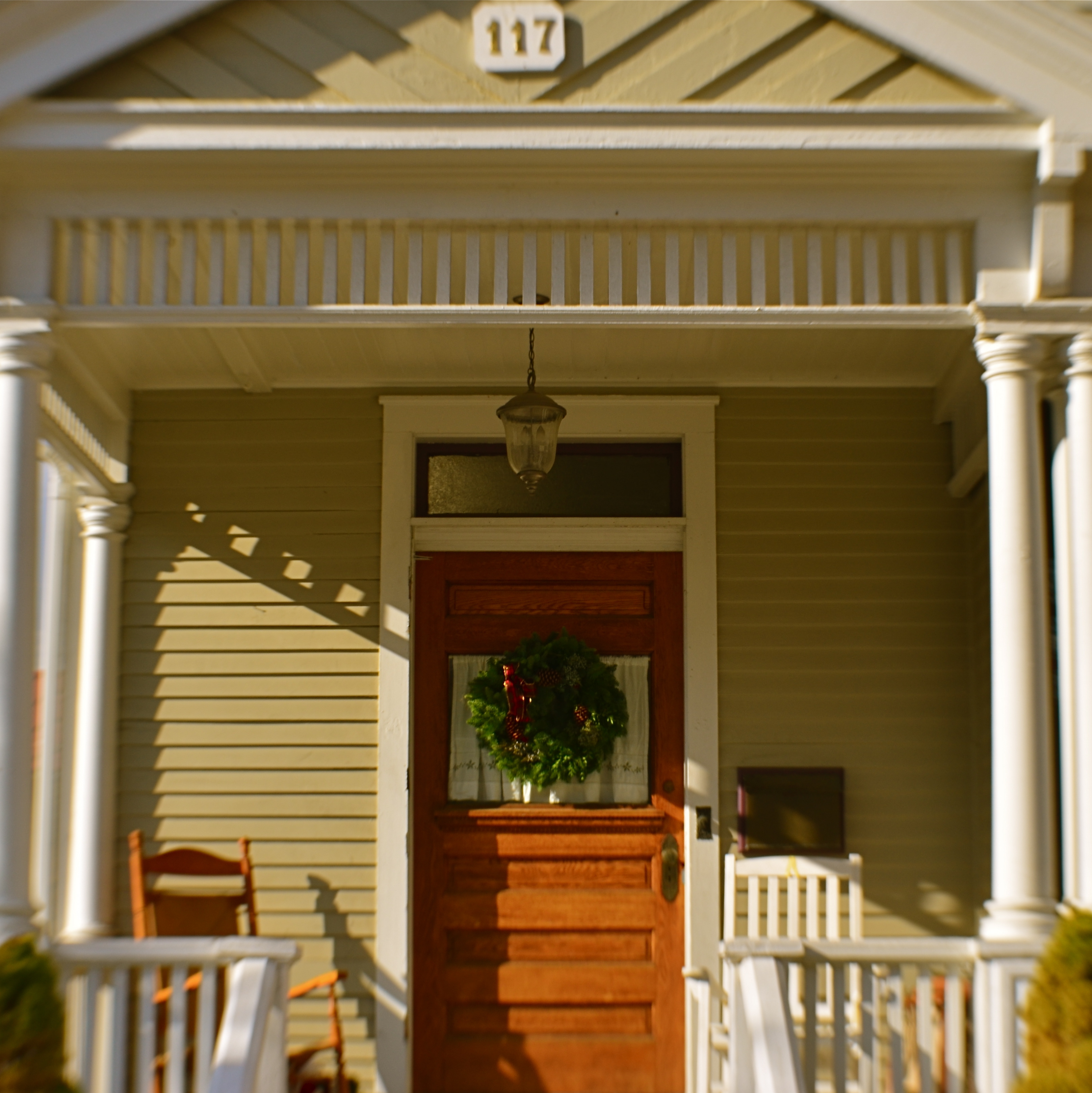
Does the traditional rectangular framing of the house in the top shot feel roomy, or merely loose? Is the square re-cropping of the same image, seen just overhead, simplified, or cramped? If the front of a building truly has the same potential impact as that of a face, it would follow that a building study might benefit from the same compositional criteria. That means that, like a face, a building has to earn every inch it occupies within the frame.
INSIDE THE OUTSIDE
By MICHAEL PERKINS
Los Angeles’ Petersen Automotive Museum, as seen from Fairfax Boulevard.
IT’S HARD TO ATTRACT ATTENTION IN HOLLYWOOD, a town that shouts in five dimensions, a million colors, and four thousand decibels about almost everything. Here, in the town that hype calls home, design always swings for the fences, and Subtle Is For Sissies. Small wonder, then, that photographers, who typically love to play top this with their peers, find that Tinseltown and greater L.A. are already at gold medal status in playing the very same game. I’ll see your weird, and raise you two weirders.
As a street shooter in Hollywood/L.A., you routinely witness the bizarre being passed off as the normal. As a consequence, the very act of visually commenting on this mad sensual overdose can make even your most prosaic shots seem like a trip through the looking glass. Words like stately, venerable, or traditional seem oddly out of place in the town that invented fourteen-story billboards and the Walk of Fame. Using a camera to say something new about it all can be a fool’s errand, or at least, a mental obstacle course.
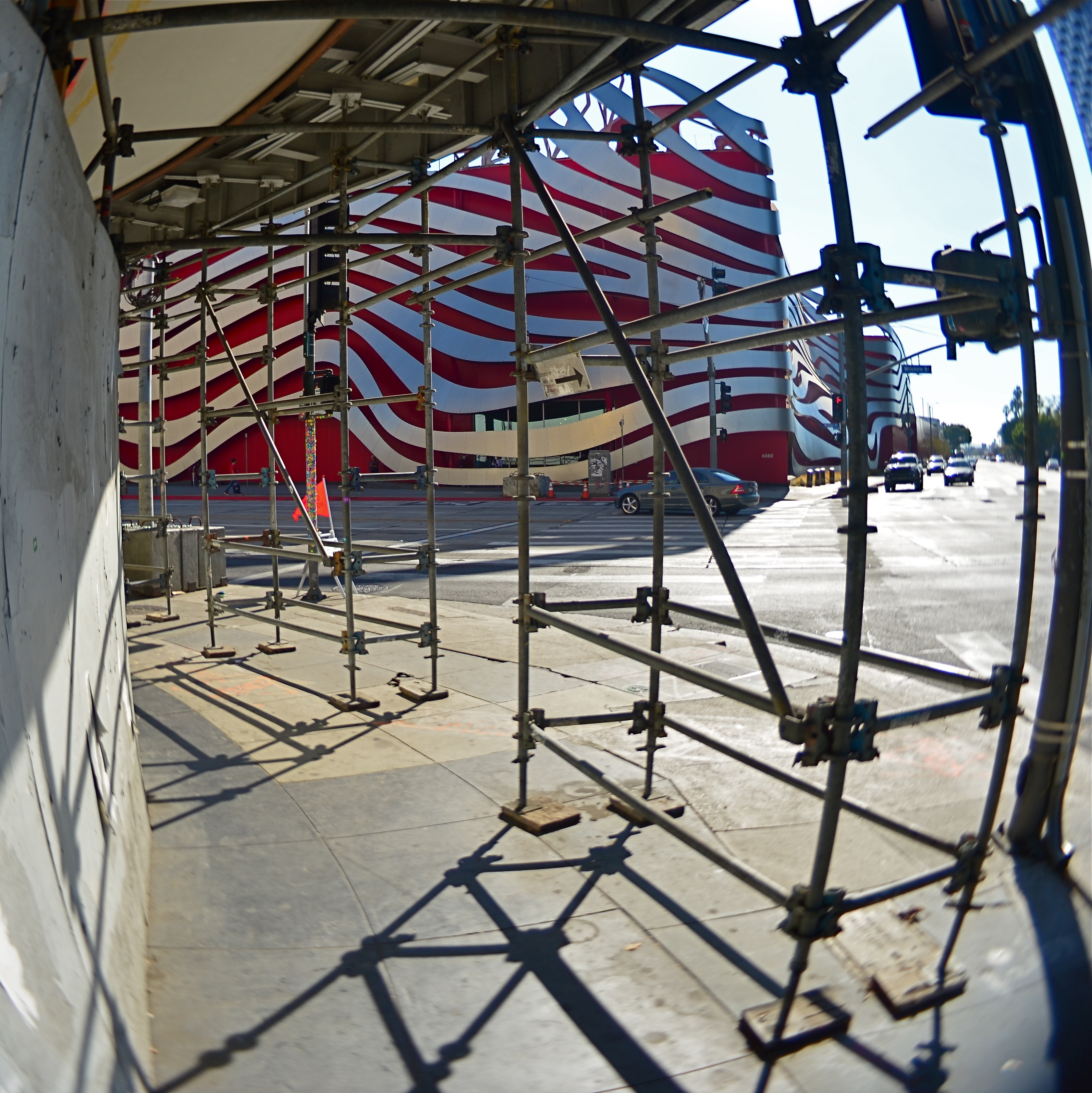
Whenever I visit Los Angeles, I am constantly looking for some kind of reversal pattern, a way to treat the most outrageous visual artifacts on their heads. I don’t always succeed. I did, however, have fun trying, recently, to come up with a new way of seeing a very strange building, the Peterson Automotive Museum, located at the intersection of Wilshire Boulevard and Fairfax Avenue, the outside of which has undergone a very radical facelift in recent years. From afar, the building seems to be a wild, untethered series of curves and swoops, a mobius strip of red and steel spaghetti floating in space in an abstract suggestion of motion. It’s a stunning bit of sculpture that actually is a wrap-around of the original, far more conventionally-shaped museum building beneath it.
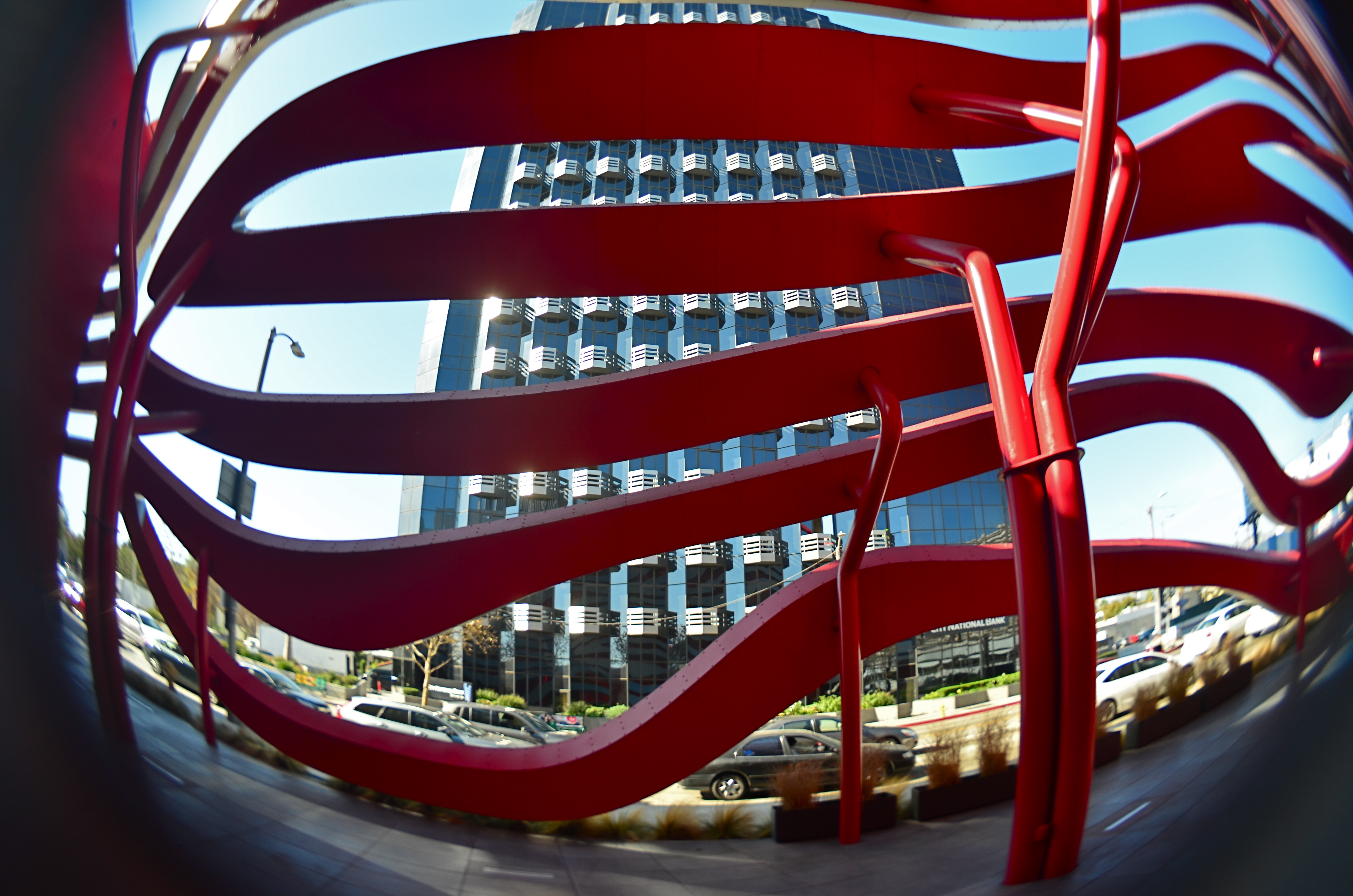
Inside the Petersen’s exterior facade, looking out.
And, as it turns out, that’s the way to reverse-engineer a photo of the museum, since it’s possible to walk behind the swirly facade and into a shadow-and-color-saturated buffer space that exists between it and the underlying structure. From inside said space you can view the outer bands as a peekaboo grid through which you can view neighboring buildings and local traffic, rather like looking between the slats of some big psychedelic set of venetian blinds. And that’s where I stood when taking the above shot with a Lensbaby Composer Pro lens with a fisheye optic, the aperture set at about f/5.6 to render the whole thing somewhat soft and dreamy. I’ll see your two weirders and raise you one bizarre.
