By MICHAEL PERKINS
IN THE PRACTICE OF PHOTOGRAPHY, it’s often difficult to know when a simple composition will serve as the best overall tool for an effective narrative. We all heard something from our ninth-grade science teacher about the shortest distance between two points being a straight line, and some of that directness, expressed as an image that gets to the point without needless visual distractions or detours, certainly applies to some of our best work.
But then again…
Some pictures certainly suffer from an overabundance of detail. The eye can get lost on its way to the main point of the photograph; competing components of equal appeal can wrestle each other for dominance in a scene; and, of course, excessive clutter can defuse a photo’s impact altogether. Imagine a large Where’s Waldo? panorama in which, to your frustration, you just never manage to find Waldo at all.
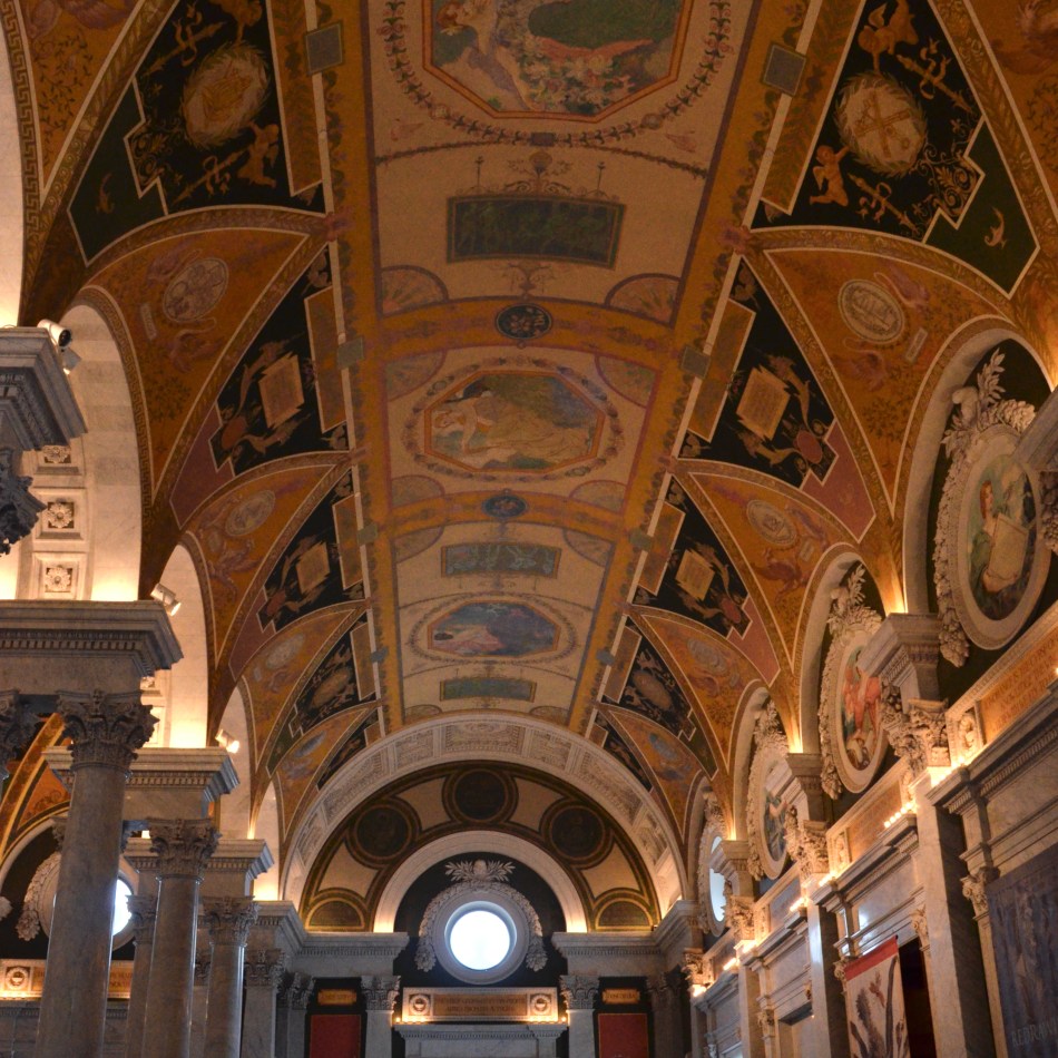
That said, there are subjects which are busy, busy, busy, but which might actually lose their power if you tried to tidy them up or streamline them. Consider the above shot of a hallway inside the Library of Congress. Here is a place where no one even considered the minimalist credo that “less is more”. Indeed, this magnificent building is about majesty, power, prestige, officialdom, if you will. It means to shout loud and proud. It is an expression of an empire, an edifice to the grandeur of the ideas contained within its walls. Simple and spare just won’t cut it for such a place, and a photograph taken of it needs to respect that.
Even in places that boast this level of ornamentation, however, you can take small steps to prevent your viewer’s eye from being overwhelmed. An even, bright exposure, for example, with nothing lurking in shadows to trick your viewer into going on a scavenger hunt; sharp focus from front to back to allow all the detail to be prominently displayed; and the use of whatever leading lines might be in the structure, to keep the eye moving in as close to a single direction as possible, emphasizing depth and scale.
The old “keep it simple, stupid” rule does, indeed serve photographers well in scads of cases. But for those few occasions where busier is better, go full-tilt boogie and really ladle it on. The knack of knowing when to say “how much” and when to say “too much” is some of the best editorial education you can ever treat yourself to.


PATHS AND PURPOSES
The Rebel (2021)
By MICHAEL PERKINS
THE JOURNEY OF THE INDIVIDUAL IN SOCIETY courses along two diametrically opposed paths. Both roads can impel the spirit toward ends that are both cherished and loathed. One fork cruises through the innumerable ranks of the predictable, taking the individual along prescribed patterns of conformity; the other travels the more arduous road to individuality, a complete realization of the unique self. Both paths have their positive and negative aspects; both seem attractive or repellent at different times in our lives. And both have a visual signature for the photographer.
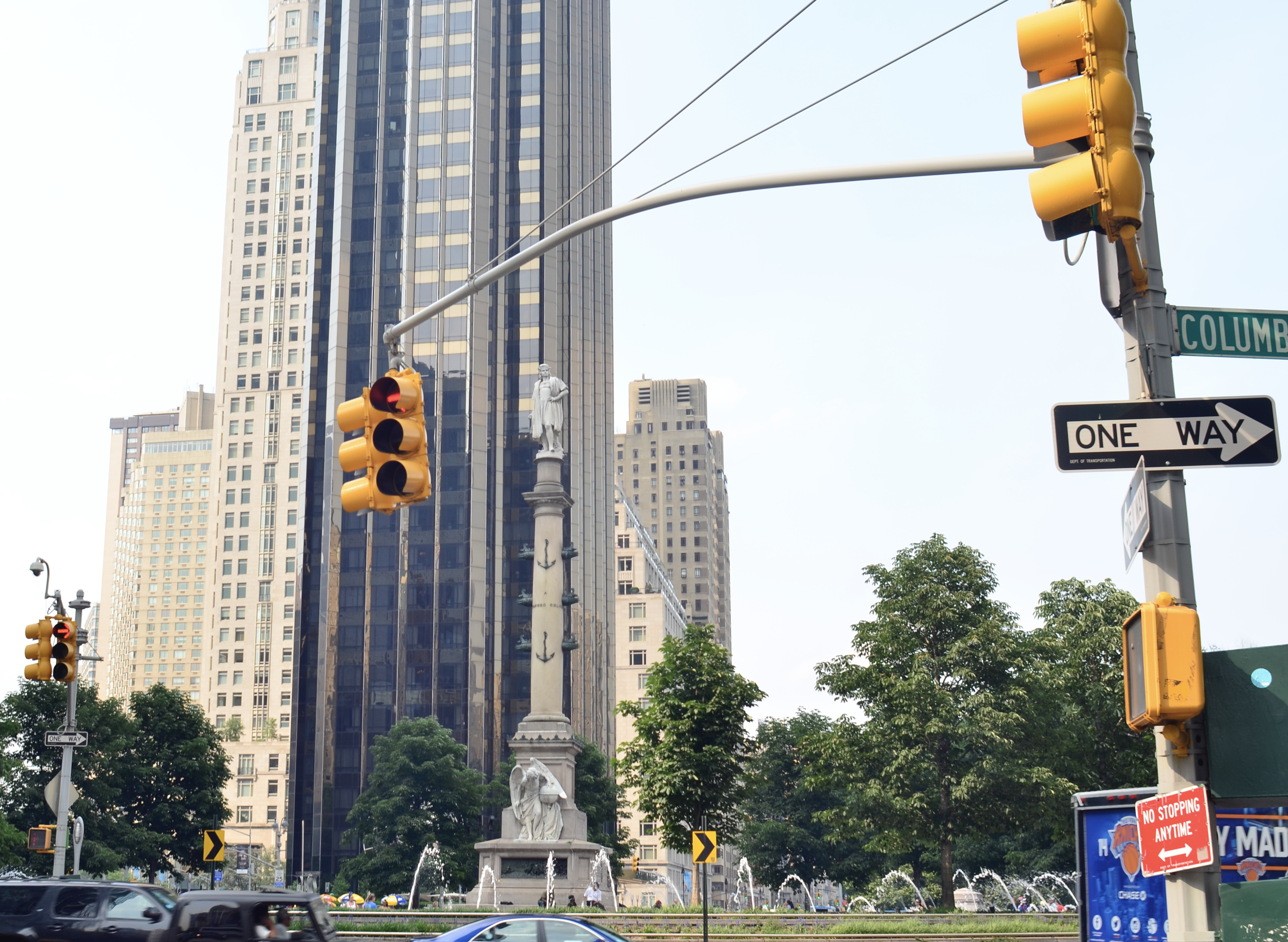
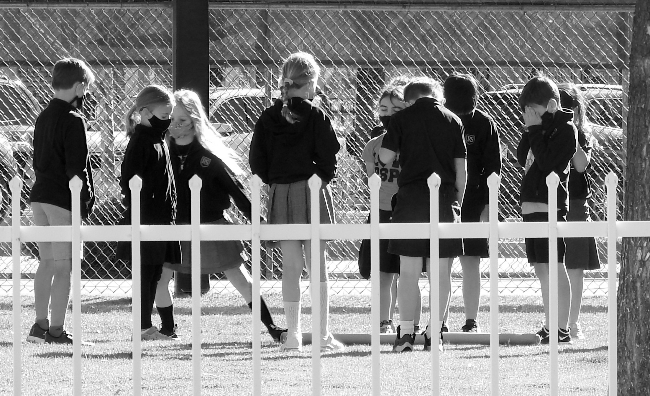
Conformity is perhaps the easier of the two paths to trace, evoking row after row of identical work cubicles or endless blocks of lookalike dwellings. It leaves its visible track in the way we close ranks or join organizations; the kinds of gatherings that offer us protection or anonymity. Our photographer’s eye readily tags the look of the collective, the joiner society.
The path toward individual expression is a little more abstract, as there are as many ways to stand out or apart as there are human hearts in the world. How do we choose to leave the rutted path? What means do we employ in improvising a personal life signature? How is our rebellion in the name of a more sculpted self visually measured?
It can be something simple, like being the only kid that wears bunny slippers to symphony rehearsals. A bumper sticker that’s guaranteed to provoke comment. Or, as seen above, a little public space that we convert to private space with a paper lantern, a wind chime, or a bird feeder. Making photographs of the way we go along to get along is measuring the patterns of our agreement (maybe even our surrender), and that creates one kind of picture. Framing up the stories that we tell out of our very own storybook gives us another result completely. Both kinds of images are educational. Both are commentary. And if we’re really lucky, both can be compelling.
Share this:
Posted by Michael Perkins | April 21, 2021 | Categories: Uncategorized | Tags: Commentary, Street Photography | Leave a comment