THE SECOND PASS
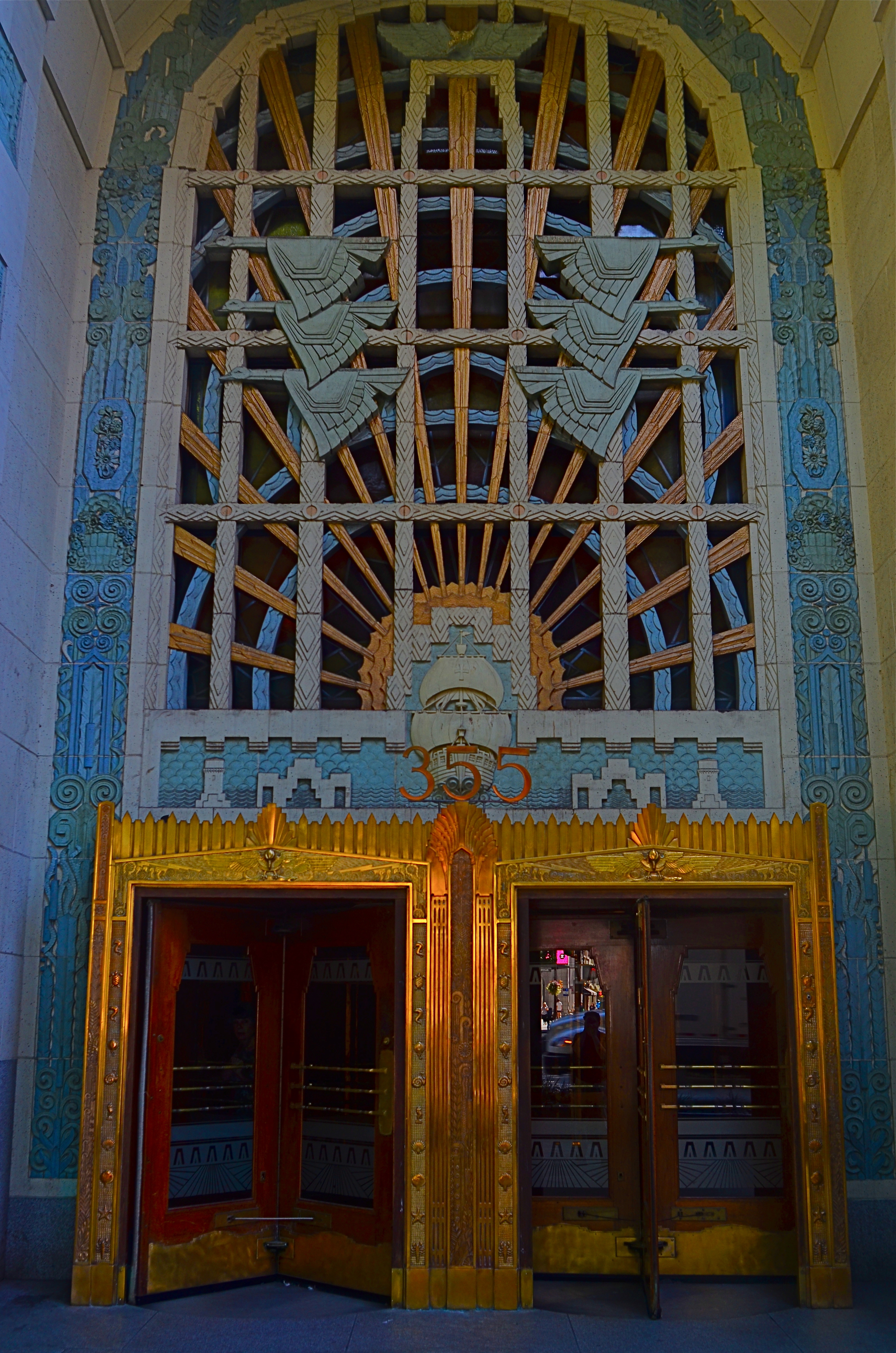
Vancouver’s amazing Marine Building, a Deco freak’s feast, in early morning (flat) light.
By MICHAEL PERKINS
SOME VISUAL SUBJECTS ARE SO RICH IN POTENTIAL that they evolve from a few essential shots to what, for lack of a better term, passes for a photo “essay”. Such extended coverage of buildings, countries and people used to be common in the heyday of the picture magazine, with up to a dozen pages of images strung together with narrative links in the pages of Life, Look and their many imitators. It’s a great format to work in once you discover a worthy candidate. But, in practical terms, it can be a little like working a checklist.
I document a lot of Art Deco architecture, since it embodies history, abstraction, illustration, design, and fantasy, all in one big fat buffet. That means I spend a lot of time dodging passersby on sidewalks and lingering in lobbies long enough to make the security personnel twitchy. Deco is all about the splendor of detail, some of which can only be revealed by patiently moving from door to grille, elevator to stairway, entrance to entrance, and looking for light that will bring that detail into bold relief.
I used the word checklist a while back because you are often working one in your mind, ticking off the various items as you wander around the site. Gotta do the mezzanine. Need a shot of the ceiling. Did I catch those wall sconces? Thing is, we tend to think of those little check marks as meaning, I’m done here. Moving on….when, in terms of what changing light does to these buildings within a short span of time, we should be actually be thinking, okay, I’ve done the preliminary work. Should go back and check this again in a while. Deco, especially, is rife with reliefs and murals made from a wide variety of materials, many of which will register color and shadows very differently at different times of day. You have to think in terms of “Take One, Take Two”, rather than in the snapshot mentality of “nailed it.”
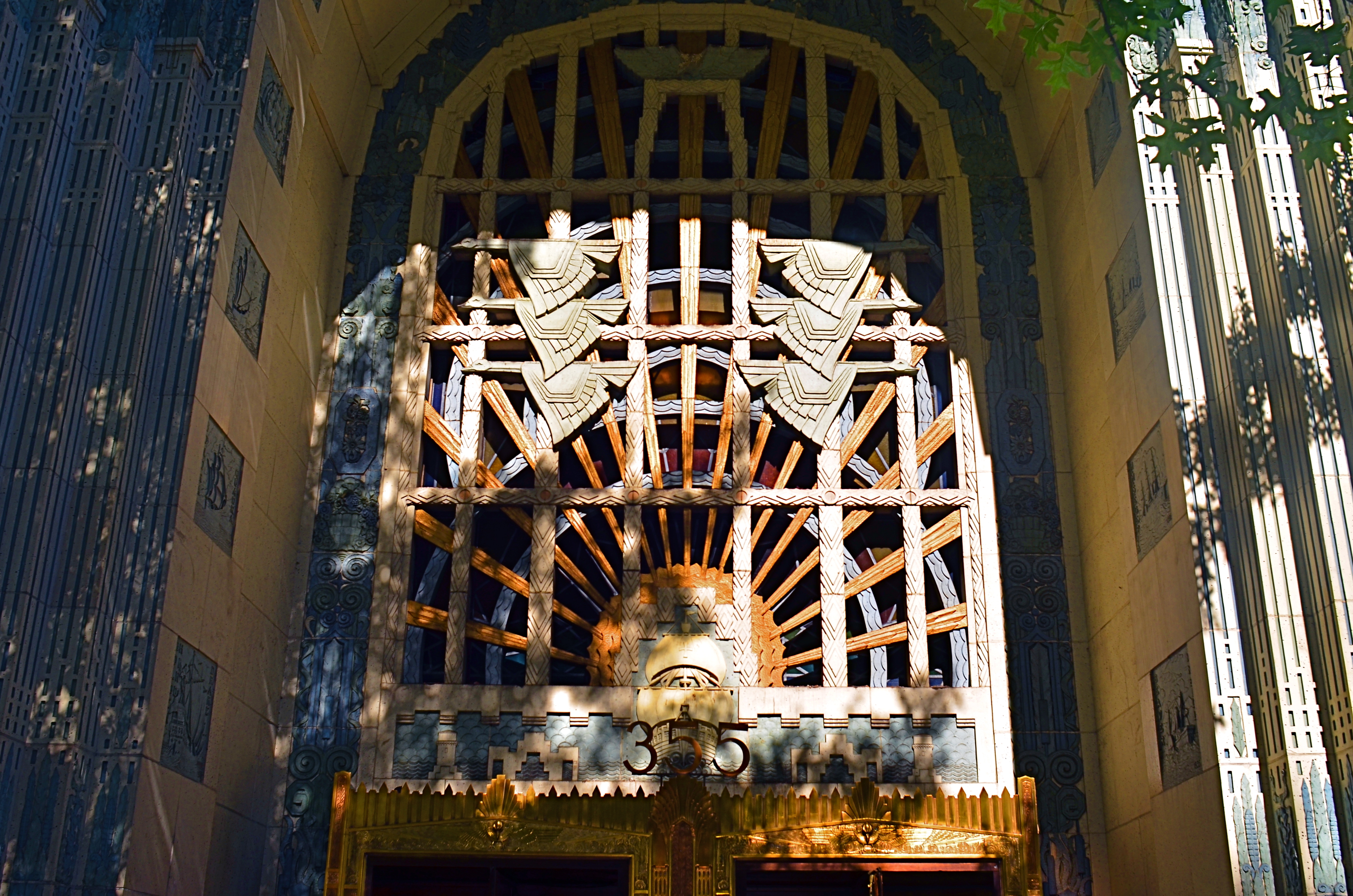
The same entrance just a few minutes later. The sun has climbed in the sky and created dramatic contrasts in all surfaces.
The images you see here, of the entrance to Vancouver’s magnificent Marine Building (read all about it here) were shot just twenty minutes apart. The top shot shows light landing on the door and its surrounding niche fairly flatly, almost sideways. However, within minutes, as seen in the second shot, the sun has climbed high enough in the sky to blast away at the center of the space, throwing the overhang of the arch into deep shadow. This change intensifies the contrast between raised and flat surfaces and makes the exterior terra-cotta (a material in which the colors are baked right in) more vivid. It also is projecting shadows like crazy. Which version is better? Not the point. It’s about editing choices and being reluctant to think that there is one “official” way to shoot something.
I could show similar changes to the lobby, with light softly entering the stained glass over the door, then crashing through it like a golden ray just minutes later. The point is, exposure is time plus light, and, when tackling a large essay-type project, it’s important to do more than one visualization on key elements. It’s the difference between grabbing a souvenir and creating a keepsake.
ROAD FOOD
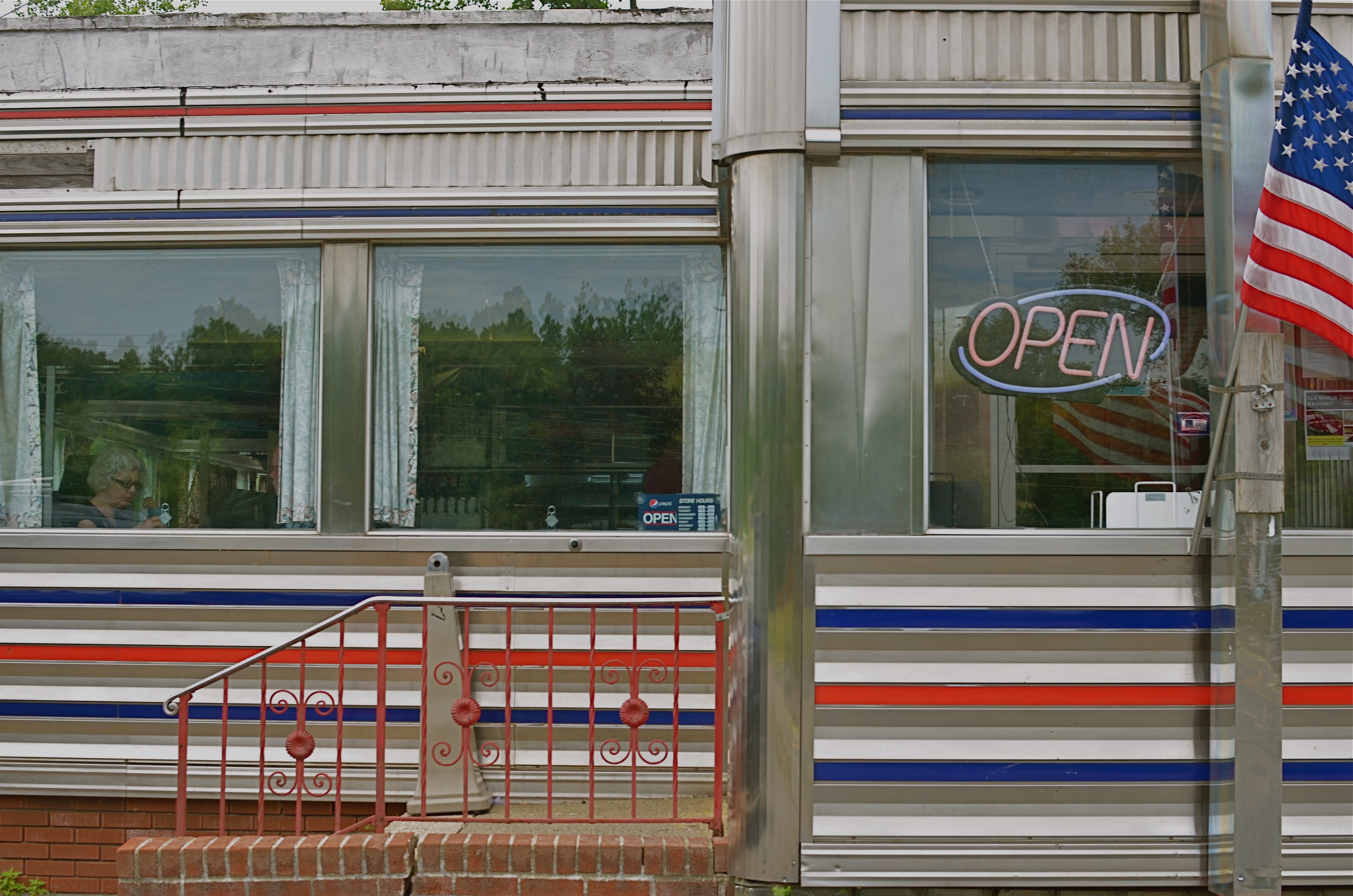
West Taghkanic Diner, Ancram New York, 2014. 1/60 sec., f/5.6, ISO 100, 35mm.
By MICHAEL PERKINS
Truck Driver: Give me some more of this poison you call coffee.
Waitress: I notice you’re on your third cup…
Truck Driver: I like your sugar.
They Drive By Night, Warner Brothers, 1940
AMERICANS CERTAINLY DID NOT INVENT THE IDEA OF STOPPING OFF FOR CHOW “ON THE WAY” TO WHEREVER. The roadside taverns and eateries that dot the globe in the spaces between village and town are the stuff of worldwide legend. Call it the “ye olde inn” tradition. However, in the 20th century, we Yanks did our bit in contributing to the romance of road food. Hey, you’re motoring across the country in your new Ford/Buick/Merrie Oldsmobile anyway, so you need some kind of, let’s call it grub infrastructure, laid out along the route.
Mind you, these won’t be the same restaurants where Grandma and the kids tuck in of a Sunday supper. We leave the linens to the landed gentry: simply paper napkins here, bub. The best “joints” actually resemble trailers more than restaurants, with the menu ranging from non-poisonous to “not bad”, but not much wider. Diners and dives don’t pull down Michelin stars and Zagat raves. But they do shape our traveling, and photographic, experiences. And now that we’re beyond the first great Golden Age of Motoring (maybe the only one, come to think of it), photo-documenting these decaying munch museums is a must.
Hey, doll, any more at home like you?
I love the curvy chrome and Deco streamlining that forms the shell of many joints. I love them even more in their present state of slow disintegration,when the streamlining isn’t too straight, the chrome gives off an apologetic, latter-day patina, and all the angles don’t quite square up. My photographer’s eye likes these temples of makeshift cuisine because they are cheap and cheesy. They’re vulgar and obvious in their blinky, half-dead neon, kitschy colors and over-ripe graphics, and as Sinatra used to sing, that’s America to me. Love it.
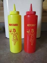
Some of my favorite joints are far more dinosaur than diner, but, when you can squeeze off a frame or two of their fading glory, and amble inside for a five dollar cheeseburger deluxe, heck, boyo, that’s a combo plate you can’t even get at the Ritz. And if I could ever find the dazzling dame who modeled for the drawing of a waitress on the side of all those millions of ketchup squeeze bottles, that would be love at first sight.
Talk about your latter-day Mona Lisa. With fries.
CROP YOUR WAY TO SUCCESS
By MICHAEL PERKINS
Whoops, I wasn’t ready. 1/100 sec., f/5.6, ISO 100, 35mm.
THOSE OF US WHO HAVE LOGGED SOME TIME IN THE WAITING ROOMS OF PEDIATRICIANS can recall struggling through the “Hidden Pictures” page of Highlights For Children magazine. I would love to tell you that I always found 100% of cartoonist John Gee’s camoflaged squiggles by the time the receptionist invited me into the examining room. But I would be lying.
That said, there are many times when, as photographers, we play the same game with our images, especially the ones in the “doesn’t work” pile. Loving at least the idea behind what we were originally after, we pore over every pixel in the frame, repeating the vain mantra there must be a picture in here somewhere. Often, the photo simply returns to the Hall of Shame despite our best efforts to redeem it. Sometimes, the crop tool is your unexpected best friend.
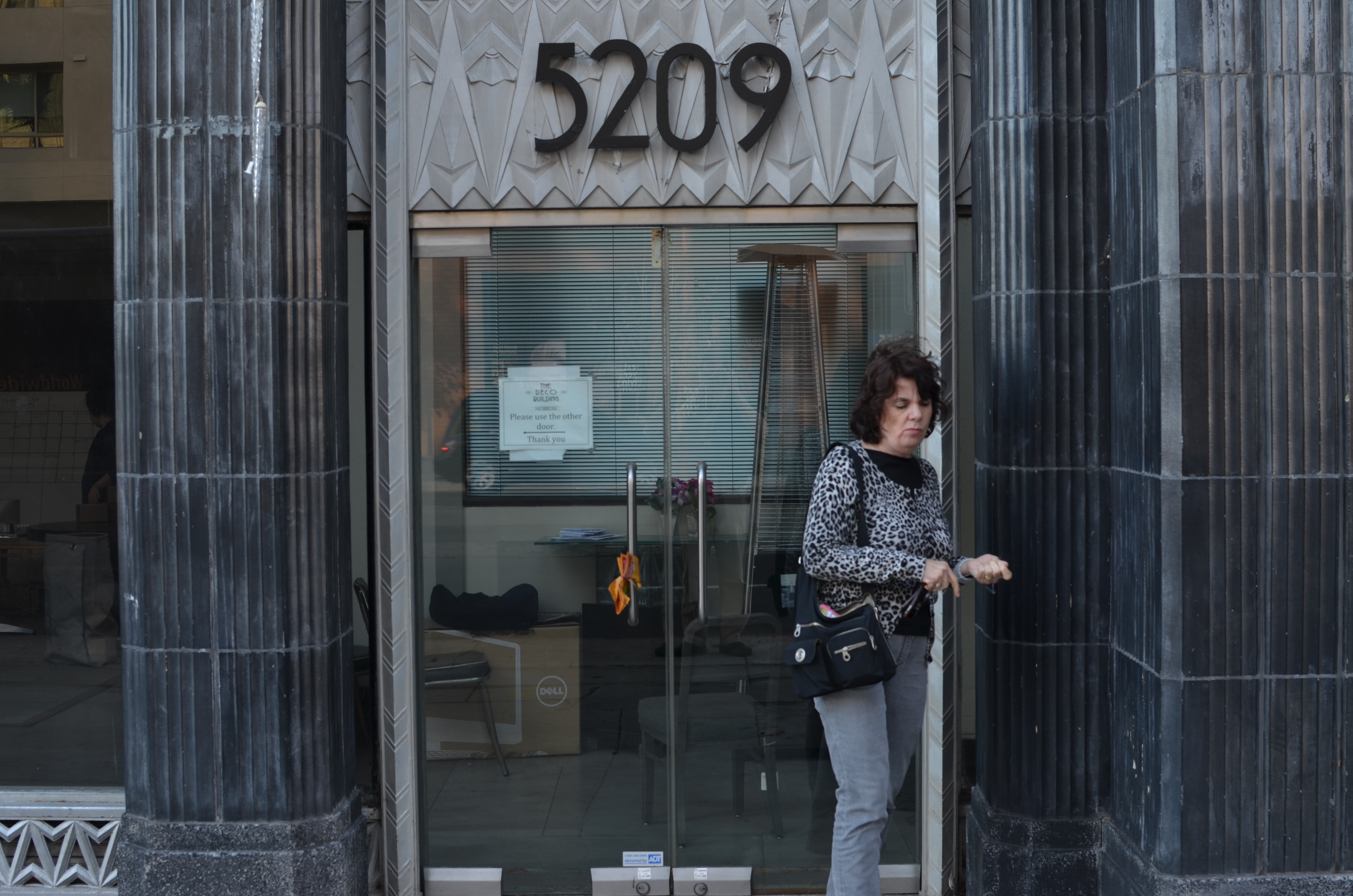
I recently looked at a failed candid of my wife outside one of my favorite buildings in Los Angeles, the “Deco” Building (real name) at the corner of La Brea and Wilshire near the museum district. A combination of wind and facial expression had spoiled the quickie portrait, but the address panel over Marian’s head contained something I could use if I re-purposed the picture.
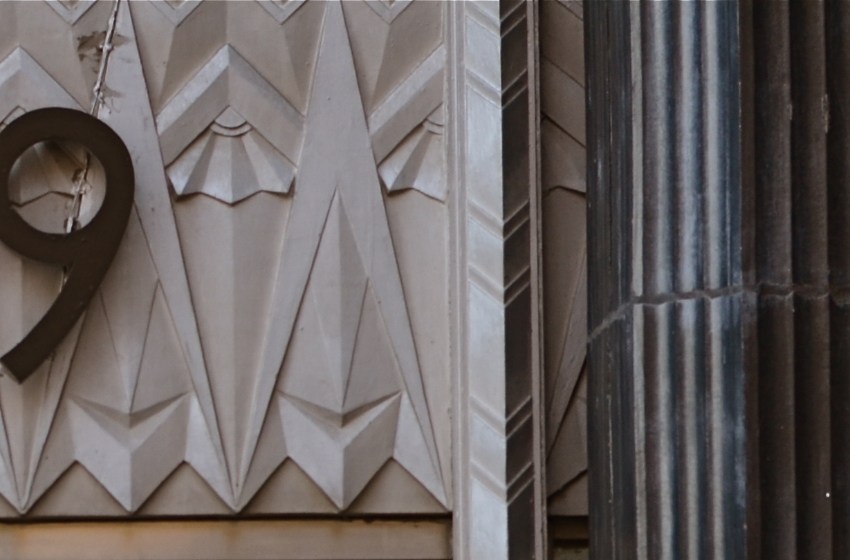
I gave the above shot a severe haircut and wound up with this. Hmm, maybe this was all the picture I needed in the first place.
In the space of a few inches of the building’s entrance was a miniature representation of the best features of the entire building; its wild pattern of chevrons and zigzags. I had already done a master shot of about 90% of the front of the place, but a study of its details started to sound appealing. Cropping away more than 2/3rds of the original shot reduced the sharpness a little, but since I always shoot at the highest file size possible, I just squeaked by.
For a moment, I found that I had redeemed all those failed sessions with Highlights.
Watch out, New York Times crossword. You’re next.
RISING TO THE OCCASION
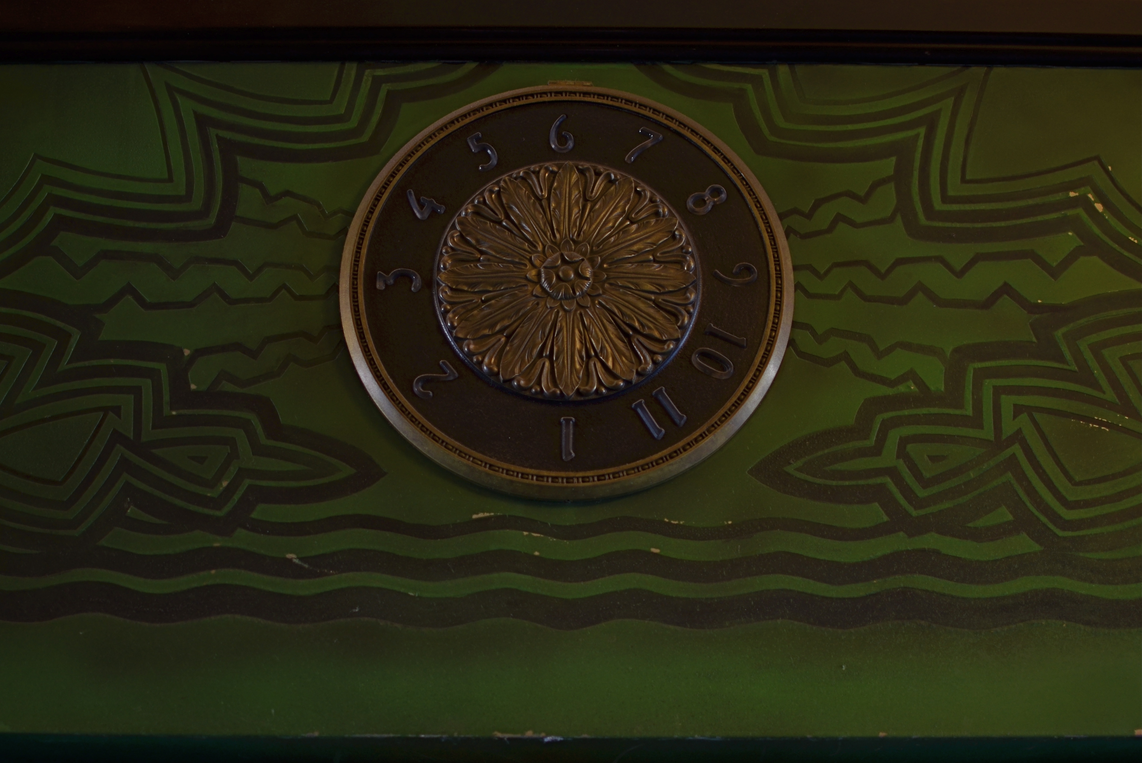
The Desmond building’s elevator floor indicator, circa 1928. 1/40 sec., f/1.8, ISO 100, 35mm.
By MICHAEL PERKINS
LOS ANGELES USED TO BE COMPOSED OF MANY PEOPLE LIKE RUBEN PARDO, the balding, beaming driver of the elevator at the Desmond building at 5500 Wilshire Boulevard. Once upon an urban time long, long, ago there were people who specialized in guiding, in fact, feeling the rise and fall of elevators in cabs they manually controlled. They were the unofficial greeters of their buildings, as familiar with the fortunes of the tenants and clients of their respective towers as the counterman at a diner.
Once, these ascension specialists were turned out in resplendent uniforms befitting their twin duties as both concierge and mechanic. Epaulets. Braided cords. Hats that earned the word “snappy”. Gloves. And always, the inextinguishable smile that Ruben still radiates to all, from the edgy curators of the Desmond’s second floor Gallery “A” to its street level Fed Ex workers to the Deco lovers who float into his lobby to admire his peacock-bedecked elevator doors and the warm mahogany wood of his stately 6×8 foot cab, all original from 1928.
And always, there is the science of measuring the distance between the floors himself, knowing when the car is level, waiting for the right moment to sweep back the flexible cage door that protects his passengers. Watch your step, sir. Turn right and go to the end of the hall, ma’am. Press the button to call me if you finish early, and I’ll come up and get you.
Mr. Pardo has seen Desmond’s descend into the ashes of yesterglory, and now, is still around to see new leases beginning to give the old girl a facelift in one of L.A.’s biggest comeback neighborhoods. Everything old is new again, and, as the crowds start coming back, he is ready.
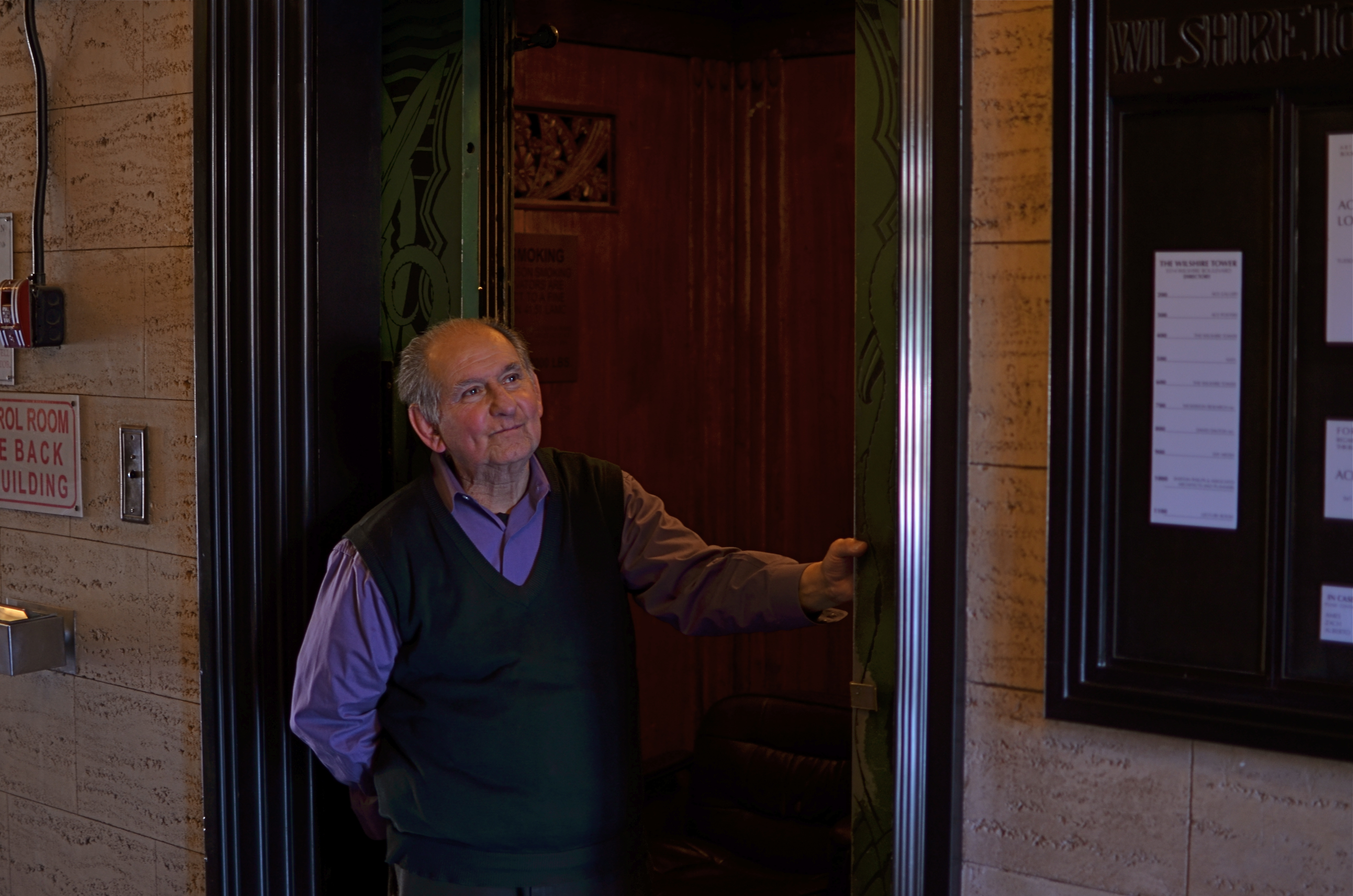
Don’t do the joke about his job having “its ups and downs”: he’s heard it. Ruben Pardo at his post at the Desmond’s elevator. 1/40 sec., f/1.8, ISO 100, 35mm.
I asked Ruben, after thirty-seven years on the job, if he would mind posing for me before his cab. “I’ll just look out toward the street”, he said, and he was right. Mid-morning sun from Wilshire lit his smiling face to perfection as he stood next to his beloved car. It was the look of someone who is doing exactly what he wants to do, a rare thing in a world where we hurry to throw things away, to surge on to we don’t know what. Ruben has earned his little vertical sliver of sky, and he’ll take you up there anytime, himself.
Whenever you’re ready.
