THE HOUSE I LIVE IN
By MICHAEL PERKINS
FRANK LLOYD WRIGHT OFTEN EXPRESSED THE BELIEF THAT, in architecture, “form and function are one”, that, in the best designs, what a thing is used for will generally dictate its appearance. And while it does seem to hold true that sports stadiums do look like places where sports are played, or that churches look like places where people worship, I’m not always sure, as a photographer, that I agree with FLLW that the form/function rule applies in all structures. I have a lifelong love for images of personal dwellings, places that, all too often, look ill-suited to house humans at all, as if, indeed, there was no conscious link between form and function. In many cases, we live in basic containers that just are, with how we live in them dictating their form almost as an afterthought or improvisation, draped as they are with the stuff we’ve accumulated over a lifetime.
Indeed, it’s how the infinitely adaptable human retrofits his house from the inside out that makes it look like somebody actually lives there, rather like a window looks more window-ish once someone hangs drapes in it. Urban living is littered with enclosures that will, sadly, never look like anyone’s domicile, and it’s only the personal things that spill outward from within that give them any visual identity or distinction at all. Thus, when I’m walking through a neighborhood, I pay less attention to the well-tailored or manicured houses and more attention to the littered ones, the ones where things are randomly hung or hammered into place, the houses where makeshift repairs or ill-performed additions are in evidence. Houses that otherwise seem as if they were extruded from a Play-Doh Fun Factory can become personalized by what is strewn in front of them, left in the yard, tacked on as a footnote. It is that randomness, that refusal to conform, that makes houses human, and thus ripe for picture-making.
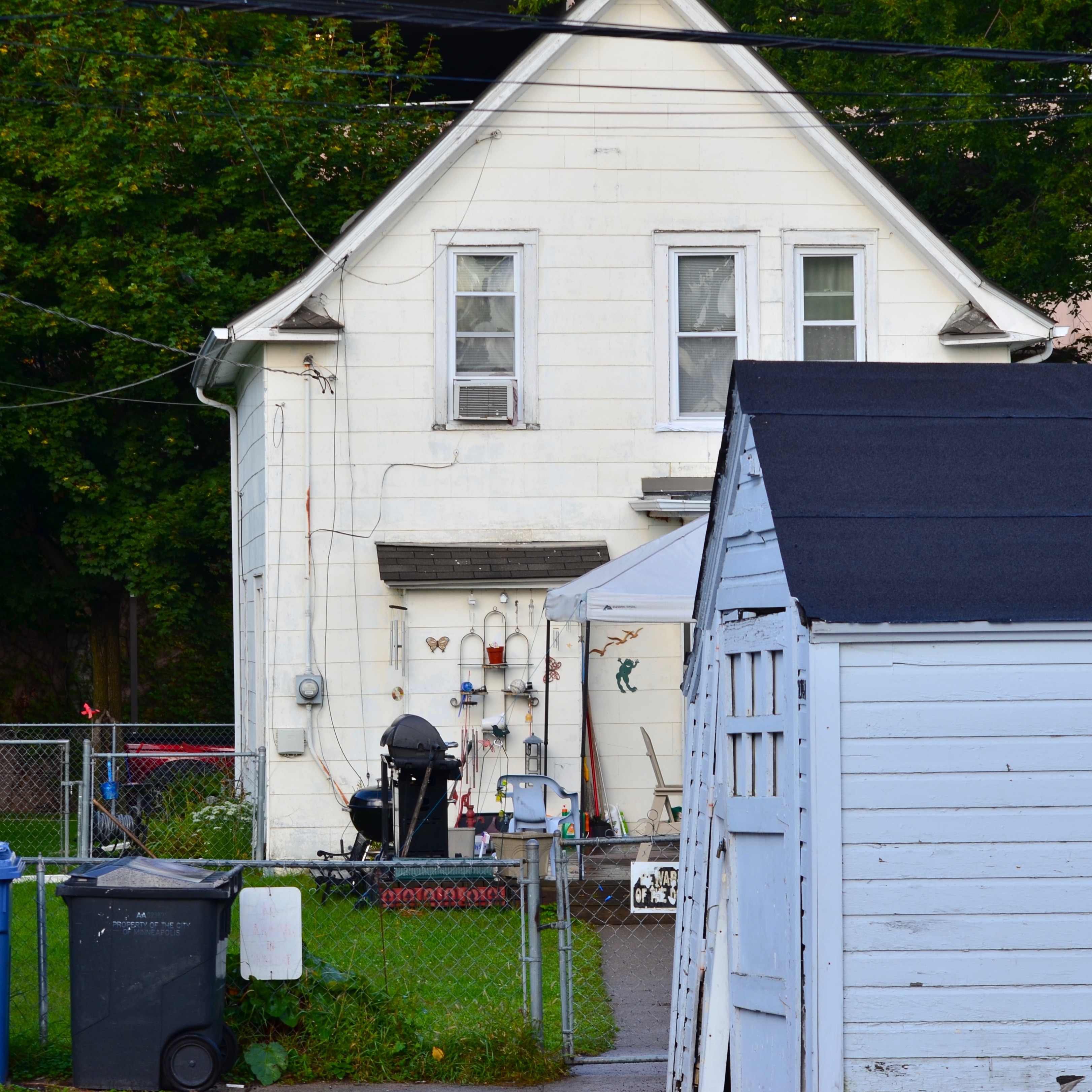
We Call It Home, 2019
In the image you see here, the house speaks eloquently about the most important things in its owners’ lives. It’s an outward barometer of their hobbies, pastimes, daily chores. The structure itself might never have struck anyone, from the architect to the builder, as unique, but as its true identity has been assembled, layered over it, its messages are all clear and direct. Wright was correct that buildings should reflect the purpose for which they were built. However, when they fail that task, design-wise, the way they are actually used will explode out of them, in a million different cues and clues over a million billion neighborhoods, in a visual shorthand that photographers will forever delight in decoding.
THE SHOW STARTS AT THE CURB
By MICHAEL PERKINS
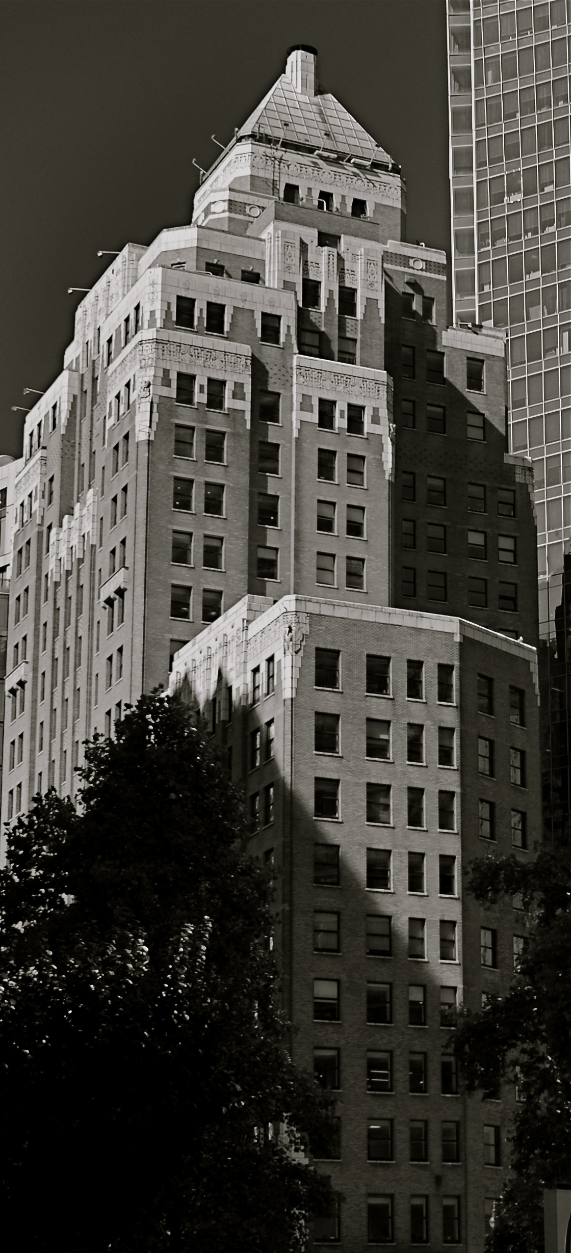
URBAN ARCHITECTURE IN THE EARLY 20th CENTURY convulsed our sense of what a “proper” building should be, with a seismic shift in aesthetics from the staid and respectable design of the Victorian age. It’s no coincidence that this revolution occurred at the very same time that the age of mass media washed over the world, as the dictates of print advertising were supplemented with the promotional energies of movies, radio, and, eventually, television. Cities whose businesses were born in this loud, aggressive crucible of modern advertising would drastically change the way those businesses competed for our attention. Structures from the 19th century sometimes bore advertisements on their exteriors, from signs to posters. Structures in the emerging 20th century were advertisements….their design screaming out their intentions with neon, explosions of color and extremes of design. In a real way, whatever show was inside the stores truly began at the sidewalk.
It’s show time. Again.
Photographers are still scrambling to chronicle the vanishing echoes of this design surge, which was most vividly expressed in the streamline, moderne, and Art Deco movements. Function dictated form: a boutique selling hats might actually look like a hat: a photo shop might design its storefront to resemble an enormous camera. Even banks went from the quietly dignified Doric columns and Romanesque scrolls of the Gilded Age to the bizarre Aztec-meets-Moorish-meets-Hollywood mishmashes of the the Jazz Age, with every place of business screaming for your eye. All of this proves catnip to photographers, who now experience pangs of nostalgia for the bold and brassy looks that predate their own lifetimes. Give me a blinking, blaring mass of zigzags and chevrons and I am in some kind of Busby Berkeley fever dream. Especially with theatres.
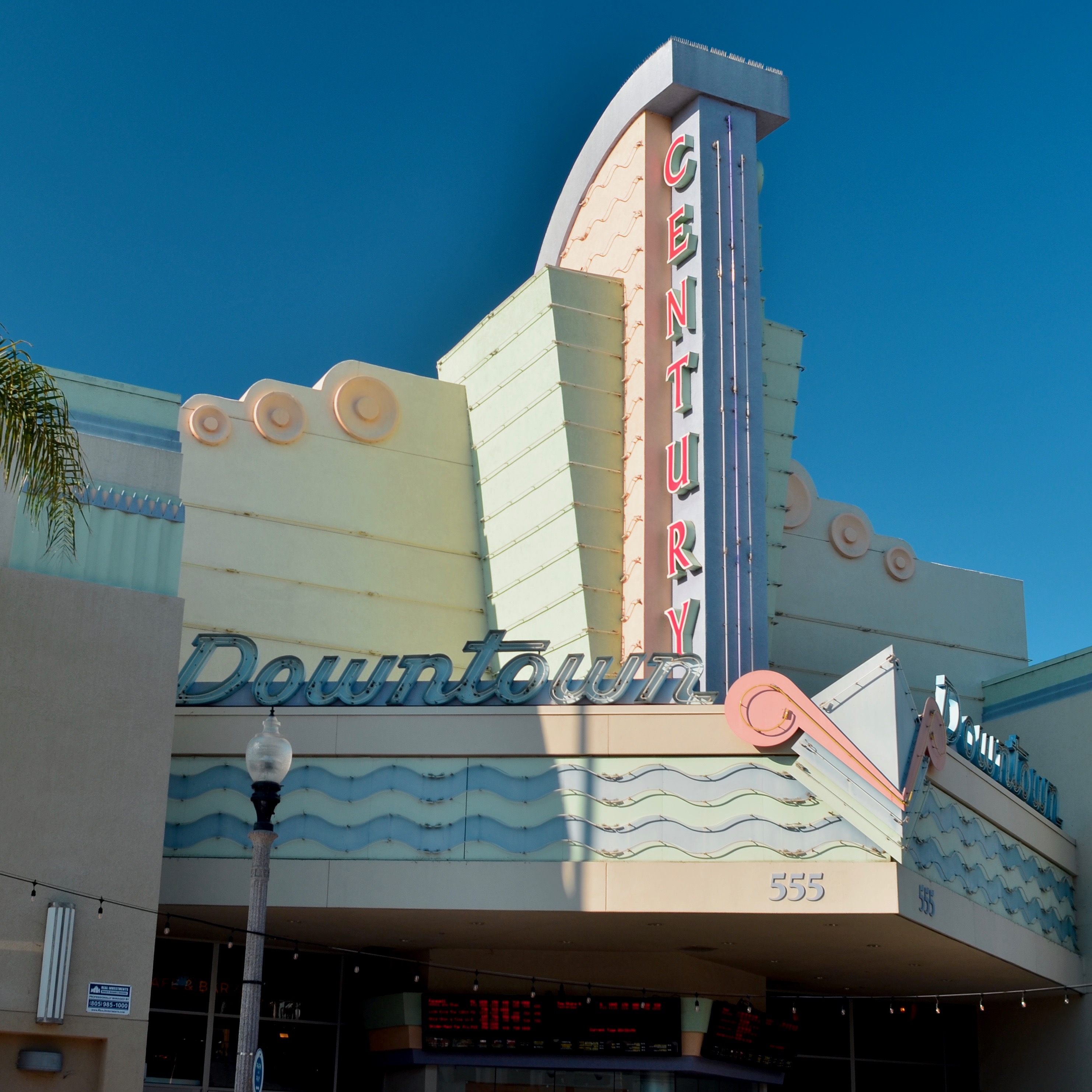
Many of the world’s old neighborhood bijous have gone down to dust, others converted to street corner churches, antique shops or themed cafes. And of those that do survive, some still actively celebrate their original functions, and thus are among my favorite things to shoot. The image seen here is of downtown Ventura, California’s Century theatre. The structure is particularly delightful, its soft pastels dreamily gleaming in the warm light of this charming seaside town. California as a whole, perhaps because of its direct connection to the film industry, has seemed to have salvaged a greater number of these little jewel boxes than is typical for other parts of the USA, although they, too, have seen many such houses crushed under the heel of what passes for progress. In any event, I can be counted upon to stop, stare, drool and shoot when encountering one of these picture palaces. Because the old theatre program billings, in which features were preceded by cartoons, newsreels, shorts or travelogues, left out an important first step….that “show” that starts at the curb.
SIGNS OF WHAT TIMES?
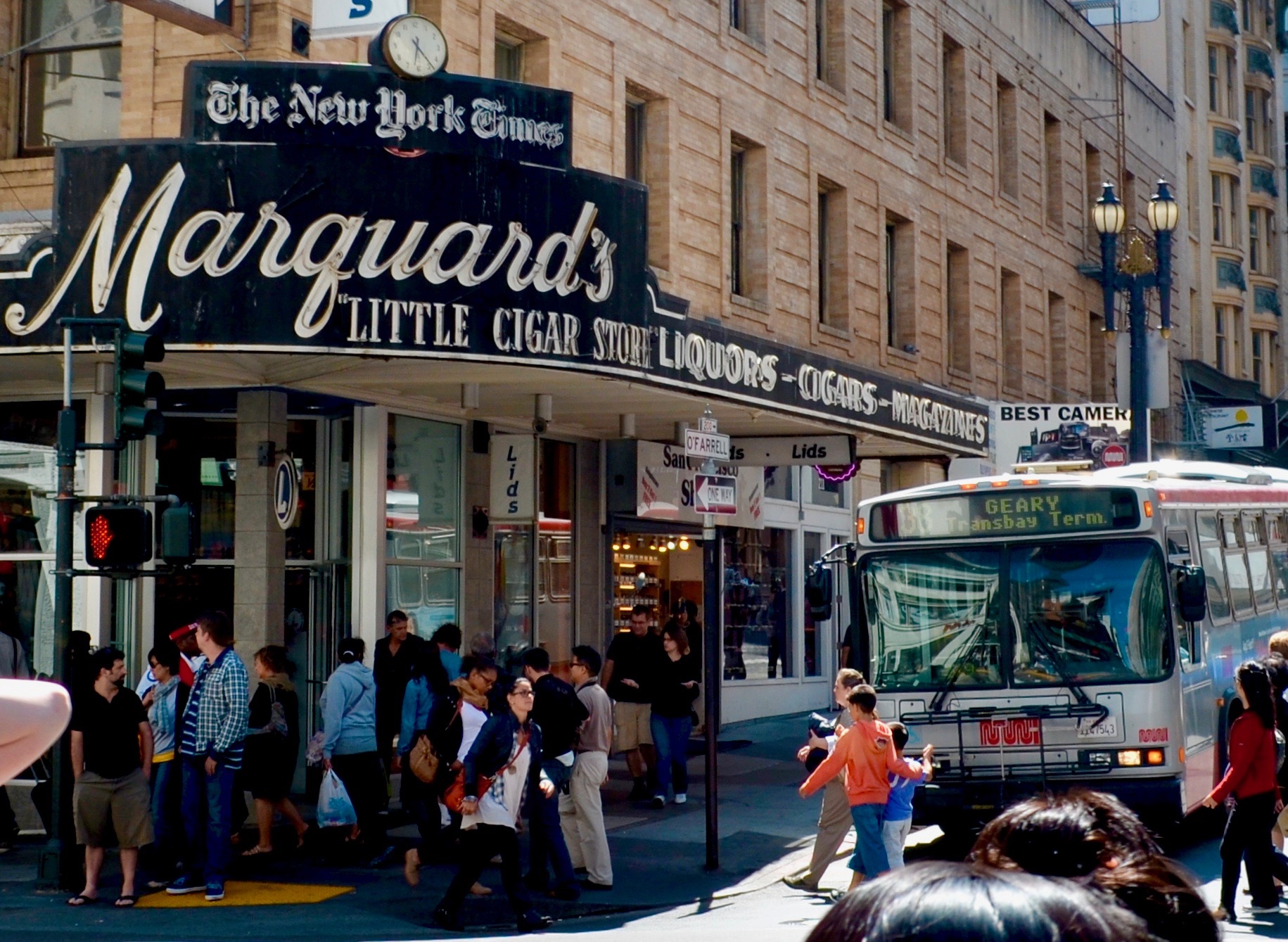
Close, but no cigars: the historic Marquard’s Smoke Shop sign in San Francisco has outlasted the shop itself.
By MICHAEL PERKINS
EVEN IN A WORLD BENT UPON WORSHIP OF THE NEW, not all of the past is erased all at once. The destruction of the old may indeed seem inevitable, but sometimes it is gradual, even incomplete. And when the inexorable crush of progress is even partially slowed, photography gains entry to the process of change, and can bear witness.
Neighborhoods come and go: businesses close: eras end. Still, the architectural and aesthetic footprint of fashions and trends can linger long after their original animus has faded. What’s left in view are signs, buildings, old faces in new places, strange survivors left alone on blighted blocks. On this site will soon stand…..
The old ways are debated by civic groups and historical societies, with the value of what we were weighed against the forward surge of new needs. What deserves to be preserved? What should already have been dismantled? Opportunities for the photographer are obvious. We make a record. We give testimony. And when things must depart, we prevent their being forgotten, at least not for lack of evidence.
For nearly 100 years, San Franciscans in the heart of the Bay City’s business and tourist energy stopped at Marquard’s Little Cigar Store at the corner of O’Farrell and Powell for their morning paper, a bottle of spirits, or a pack of smokes. The neon sign announcing these delights was erected sometime in the ’20’s and stayed until Danny Ortega, who first climbed a ladder behind the counter to wait on customers while in early grade school, finally threw in the towel in 2005. At that point, the demolition of the store’s wraparound entrance seemed like a foregone conclusion. But local preservationists, eager to preserve the look, if not the function, of the old neighborhood, managed to get landmark status for at least the sign. What would henceforth happen beneath it would be up to the new leaseholders….in this case, a hat store whose smaller “LIDS” announcement can be seen in the 2012 image seen here. Several more years later, the neon tubing visible in this shot was also removed, still leaving most of the gloriously garish Marquard’s overhang intact, including its very West Coast promotion of the New York Times. This kind of half-a-loaf solution is becoming far more common in American cities, many of which are laden with buildings that can continue to cosmetically charm or educate, even as their original functions are either obviated or re-tooled. Movie theatres become live performance venues. Department stores become law schools. And cigar stores become landmarks, reminders of who we were just a few scant minutes ago.
I always feel privileged to photograph places that have been even partially saved from the wrecking ball. First, because it’s as close as I’ll ever get to the original local energy that birthed them. But more importantly, because, without the testimony of photographs, yesterdays become obliterated at ever greater speeds. Certainly taking just a little more time to properly say our goodbyes takes work. But as with any bittersweet task, there’s a little smile accompanying the tears.
THE LOVELY BONES
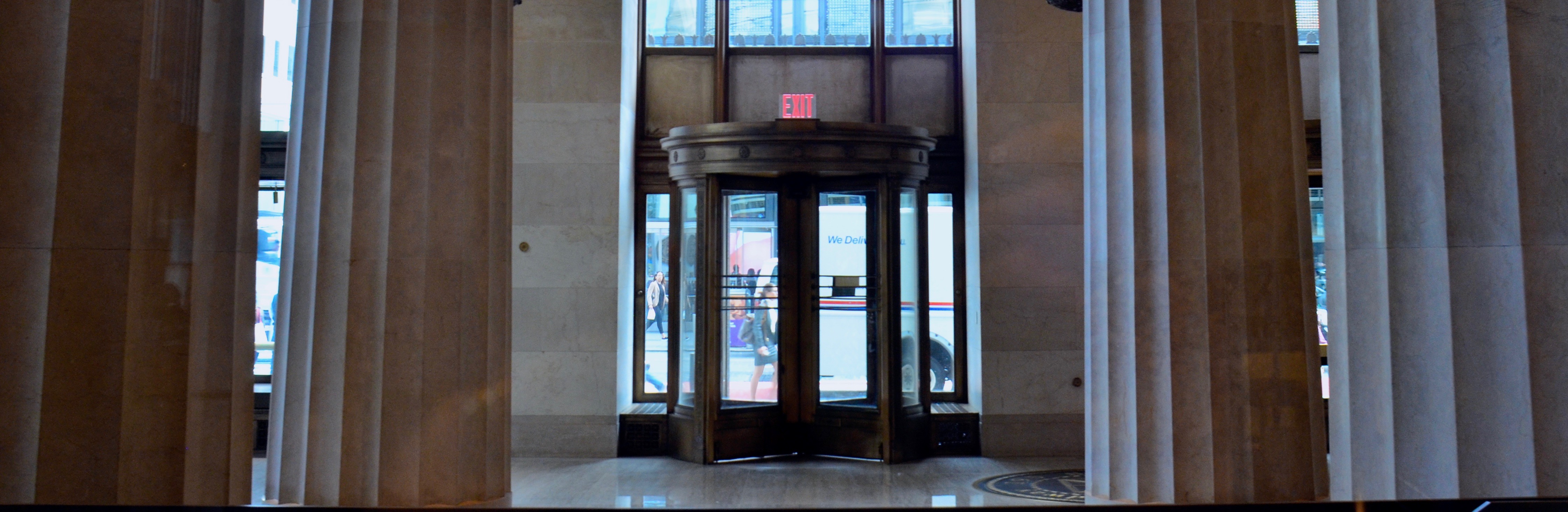
Oversized marble columns support the high lobby ceiling at 195 Broadway, former New York home of AT&T.
By MICHAEL PERKINS
195 BROADWAY IN LOWER MANHATTAN is one of hundreds of buildings that might escape your notice upon your first walk through the city’s financial district. Less garish than its gothic neighbor, the Woolworth Building and a lot shorter than its big-shouldered brethren, the 29-floor landmark doesn’t shout for attention. Its true beauty emerges when you walk inside the somewhat restricted lobby, take the measure of the “bones” of its regal inner structure, and breathe in its storied history. Completed in 1916 after AT&T moved its American headquarters from Boston to New York, 195 was the strong, silent type of skyscraper….functional, neo-classic, but restrained, understated. As a largely urban photographer, I try to keep track of structures that have outlasted several uses and landlords, carrying their essence forward through decades of shifting styles and fashions. It’s the totality of what has made them last that makes them interesting to me, more than any single fillip or ornament.
But ornament, as a visual metaphor for the new (20th) century of American technological dominance, was built into 195 Broadway from the start, both inside and out. Paul Manship, the sculptor whose public works, like the golden Prometheus statue at Rockefeller Plaza, still dot the Manhattan map, created one of his first major works, The Four Elements, as bronze relief’s on 195’s lower facades, his love of Greek and Roman mythology weaving itself into the Moderne movement (later re-dubbed as Art Deco). Architect William Bosworth took the Doric columns which usually adorned the outside approaches of other buildings and brought them into 195’s lobby, all 43 of them, their wondrous marble reflecting a variety of colors from the teeming parade of streetside traffic. And sculptor Chester Beach used the same lobby to commemorate the building’s role as one half of the first transcontinental phone line in 1915 with Service To The Nation In Peace And War, a bronze relief of a headphone-wearing hero standing under a marble globe of the Earth, bookended by classic figures and flanked by lightning bolts.
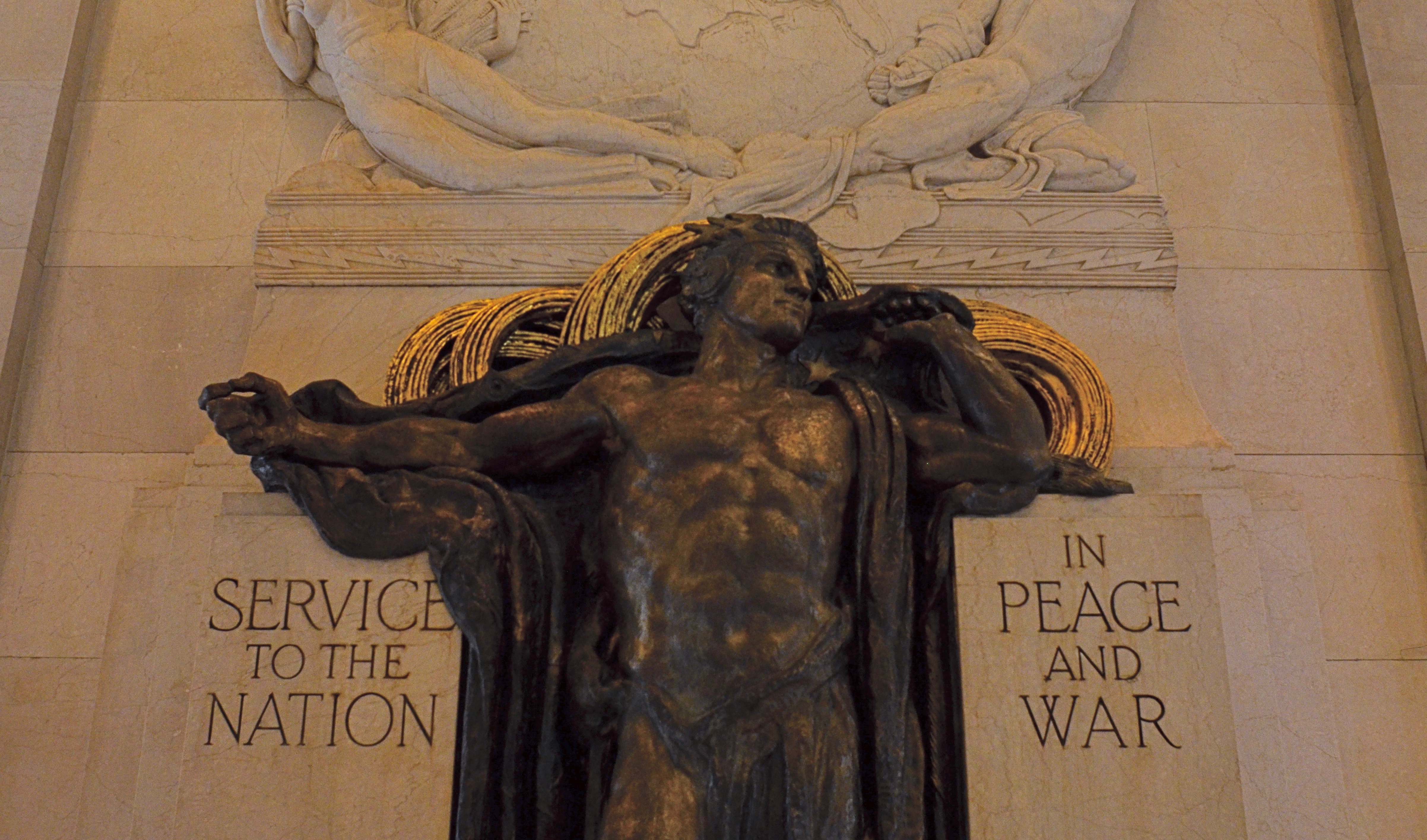
195’s lobby marks the origination point of the first transcontinental telephone line.
195’s long run includes the titles like the Telephone Building, the Telegraph Building, the Western Union Building, as well as appearances in popular culture, like its portrayal of Charlie Sheen’s office building in Wall Street. Sadly, a few of its most salient features have moved on, like the gilded 24-foot tall winged male figure originally known as Genius Of Telegraphy, which topped the pyramidal roof of the tower on the west side of the building until 1980, when it followed AT&T’s relocation to Dallas, Texas. However, the remaining treasures of 195 Broadway are still a delight for both human and camera eyes. Good buildings often present their quietest faces to the street. But look beyond the skin of the survivors, and marvel at the solid bones beneath.
CONFER GRACE
By MICHAEL PERKINS
NO ONE EVER INTENTIONALLY DESIGNS SOMETHING TO BE UGLY. There has never been an artist’s or architect’s rendering that shows a project, from a city park to a shopping mall, as anything but ideal. Drawings created to excite investors and planners are consistently festooned with bright, broad sidewalks, strolling families (with their dogs), and bowers of flowers. When you see a sign saying, “coming soon on this site”, it’s always a sunny day.
Of course, once the dedication ribbon is cut, reality intervenes. Neighborhoods rise and fall. Things wear out. The cool things that were to be built during “phase two” get un-funded. The dream of the possible becomes the dreariness of the actual. And photographers are there to measure the distance between those extremes.
Sadly, merely making images of what has gone wrong in modern life is almost a default for many shooters, and their predictably bleak work reflects that. Creating pictures of decay or failure is certainly easy, almost a cynical cop-out, as if seeing the ugliness in things is somehow more honest, more “authentic”. I can understand taking that bait. I have taken that bait. But I think photographers need to struggle to confer grace on things as well, to try to show how things might have worked out. Yes, there’s a lot of drama to be had in documenting what went wrong. But, at one point in the process, before the beginnings of things, people invested faith in what they were creating, a faith that said that things would be generally better Once This Thing Is Completed. Pictorially, trying to portray potential, especially wasted potential, is far tricker.
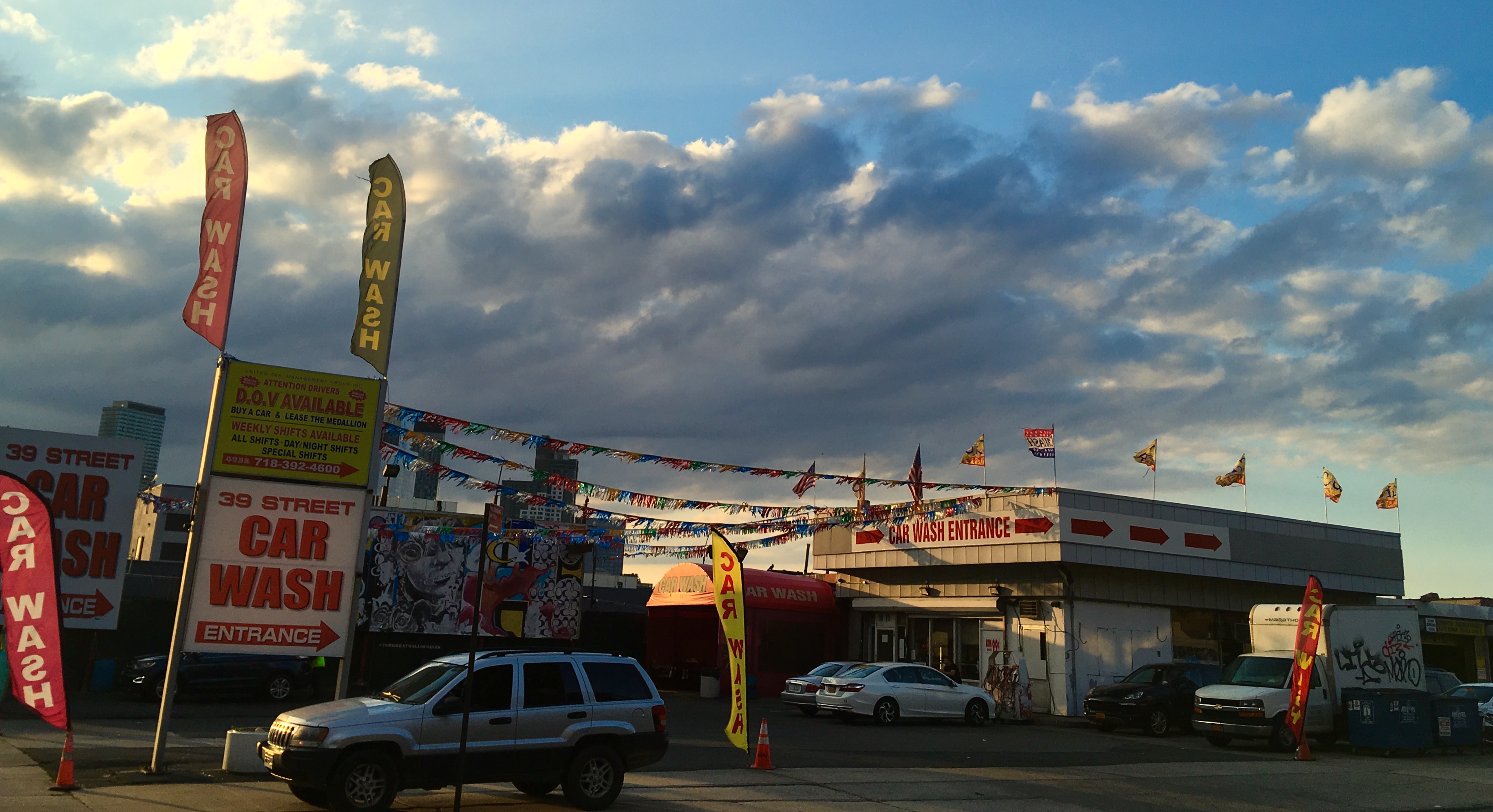
As to the image shown here, I’d like to say it was the result of some marvelous act of planning, but the fact is, the entire scene, bathed in the deep golds of dusk, was seen and seized in an instant. I remember being struck by the feeling that this kind of light was so miraculous that it could confer nobility on even a car wash in a shopworn neighborhood, and that a momentary break in the clouds had given the reds and yellows the hyper-saturated look of an old, slow film stock like Kodachrome. Again, all these impressions registered inside a few seconds, and I went for it. The result reminded me that, once, someone thought this car wash would at least be neat, or efficient, or attractive. Sometimes that dream is totally submerged in the crust of What Happened Later. But I feel compelled to search for it anyway, to confer grace on what the dreamers saw. After all, under the skin, we’re all in the same game.
OSCAR’S CRADLE
By MICHAEL PERKINS
HOLLYWOOD IS ONE OF THE SELECT LOCALITIES in the world’s largest democracy where royalty is not only tolerated but slavishly sought after. The crown (or crowns, plural) transfer from the recently fallen to the newly anointed with predictable regularity, but the ritual is always the same: we love the common people (they’re just like us!) until they are lucky enough to escape our ranks, after which we, in turn, adore them, despise them (who do they think they are?), forgive them, and adore them anew.
In terms of photography, the camera seeks out ever new lovers, nearly all of them human, and therefore fleeting. A careful study of Tinseltown, however reveals that the true royalty, the royalty that endures, is the real estate. And even in a town where “reality” is defined by whether you shoot on location or on the back lot, Hollywood harbors plenty of actual places where actual events actually occurred. Some are on the bus tours (Marilyn Monroe slept here), while others require a bit more digging. One of the industry’s most prestigious addresses is smack dab in a section so spectacularly tacky that, by virtue of merely being merely ostentatious, it seems positively muted.
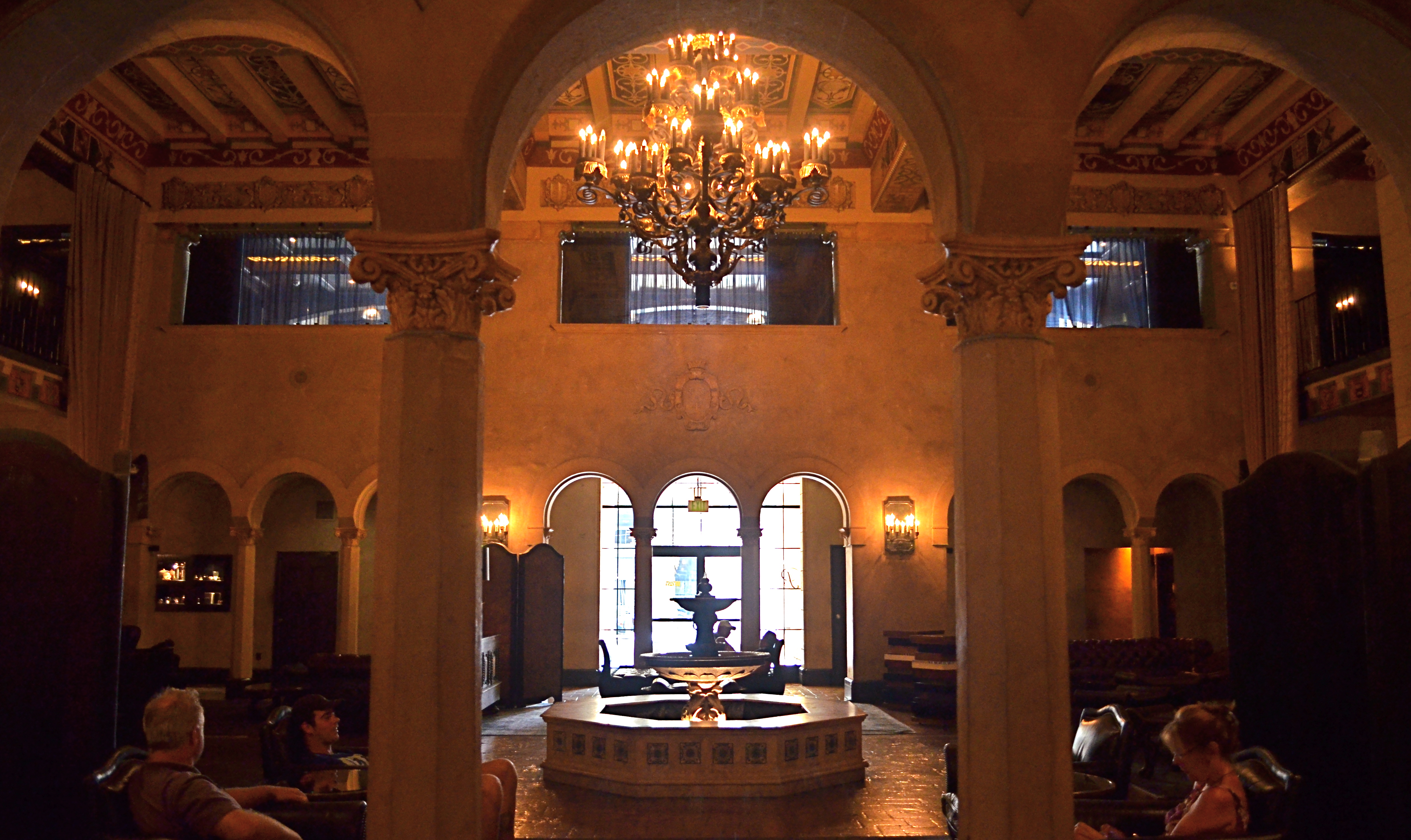
The Hollywood Roosevelt Hotel (named in memory of Teddy, not Franklin) survives in legend not because it served as a studio or corporate cradle for the film industry, but because it was the first time the town turned out to honor….itself. Then make an annual habit of it. Hey, if you want modesty, live in Des Moine, okay?
The Roosevelt earned its filmic pedigree from the get-go, financed in 1926 by a group that included MGM chief Louis B.Mayer and screen idols Mary Pickford and Douglas Fairbanks (two-fourths of the founding quartet behind United Artists Pictures, along with Charlie Chaplin and director D.W. Griffith). Two years later, the hotel hosted a modest little dinner for 270 guests to fete honorees of the newly organized Academy of Motion Picture Arts & Sciences, some three months after the actual awards had been handed out, and minus the nickname “Oscars”, which would come about four years later.
Over the decades the Roosevelt and its across-the-street neighbor the Chinese Theatre (which opened within months of the “R”‘s premiere) saw a fairly staid business district transformed into “Hollywood & Highland” (trade mark)…. Sucker Bait Central, a day-glo drag whose countless souvenir stops, IMAX pleasure palaces, low-rent novelties and neon knock-offs raised tackiness to the status of a religious movement. Meanwhile, the hotel’s crazy-quilt architectural style (‘Spanish Colonial Revival’…and, yes, there will be a test later), with its coffered ceilings, mid-century pool cabanas and wrought-iron chandeliers, was just fake-elegant enough to pass for average in a town renowned for its, er, flexible relationship with “class”. Rolling through the years with an occasional ownership transfer and the odd walk-on in movies like Beverly Hills Cop II and Catch Me If You Can, the Roosevelt has recently offered lodging as a contest prize on ABC’s Jimmy Kimmel Live!, and landed landmark status as Los Angeles Historic-Cultural Monument #545.
The Roosevelt’s photographic riches lie chiefly in its extremely dark main and elevator lobbies, its still-regal pool area and the legendary Cinegrill Lounge. The lobbies, at least for handheld shots, require high ISOs, slow shutter speeds and wide apertures. Flash may not be verboten but you won’t like the result, trust me. Indeed, the soft gold afforded by natural light washing into the murk from outside brings out the warmth of the Spanish textures, and adds a little tonal nostalgia to the scene. All things together, the Roosevelt stands as a monument to real occurrences, some of them fairly historically significant, in The Town That Invented Phony. And that’s the main challenge in Hollywood: if you can fake sincerity, the rest is easy.
A GENTLER EDGE
Storefront (2016). Details are used sparingly in the central building, even less crucial in the rest of the frame.
By MICHAEL PERKINS
CHOICES ABOUT FOCUS MIGHT JUST BE AMONG THE MOST IMPORTANT DECISIONS that a photographer will face. Clarity, sharpness, precision, call it what you might, focal crispness is a crucial determinant in the creation of an image, no less than light and subject matter. And it’s one of the easiest factors to manage, available to any one from the humblest point-and-shooter to master technicians on the Hubbell telescope.
This urban shot seems to call for a sharp look overall.
There is a tendency for us to mentally default to an idea of “sharpness” when we hear the word focus, as if the only way to faithfully reproduce reality is strict adherence to that standard. But photography has never really been about reality, any more than painting or prose. We can’t help but add some small interpretive something to the process of making a picture, even if we believe a machine is largely in charge of the process. Amazingly, with very little effort, we can change the perception of an image by tiny adjustments in what is clear and what remains hazy or soft, straying selectively from the arbitrary sharpness standard.
Some subjects are rendered too coldly, too clinically, when subjected to razor focus, so that what you may gain in documentary detail you lose in intimacy, or in that undefinable feeling of being close. Applying this line of reasoning to my personal affection for architecture, there are buildings where the hard look of precision is perfectly suited to the subject; jutting skyscrapers, massive bridges, towering monuments, and the like. But put me in a small town, where the entire space feels sealed off from time itself, and the look, at least for me, becomes softer. Details take a back seat to feelings, and the harsh light of midday gives way to a soft, dreamy haze at late afternoon. The secrets of side lots, alleys and back yards become scavenger hunts. In both the big and small cities, focus is the key element in the creation of the image. And, also, in both cases, an advance visualization of the final result dictates exactly the degree of focus required.
Lenses and cameras possess wonderful technical properties that can deliver a slew of exotic effects. Still, with virtually no expense or fuss, a smarter mastery of focus is a decisive, even dramatic factor in helping a photograph develop its most effective language.
MY LITTLE SLICE OF HEAVEN
Away From It All, Brooklyn, N.Y., 2016
By MICHAEL PERKINS
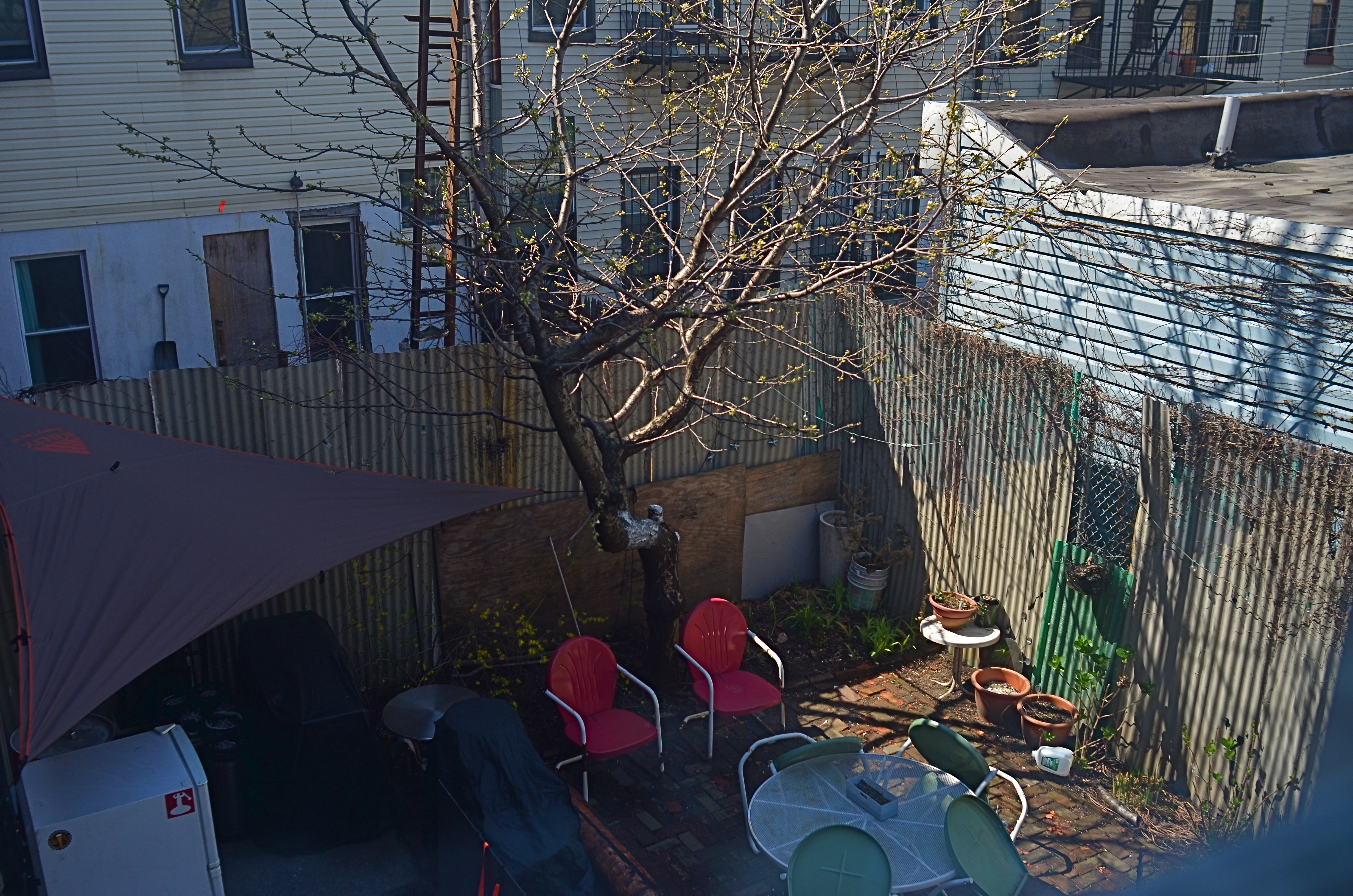
URBAN ENVIRONMENTS ARE MEAT GRINDERS, greedily chomping maws that mulch and mash humans into manageable shapes and sizes, compacting lives into spaces too small for the average burrowing rabbit and crushing a few millions dreams in the process. And the endless flow of stories that result from this struggle, for photographers, show Man trying to steer clear of the maw, or at least salvage a few limbs as he does battle with it.
Life in cities is about small words with big import. Safety. Shelter. Privacy. Relief. Escape. Dreams. Prayers.
Territory.
Photographic sagas in cities begin and end with the demarcation of personal boundaries. Over here, this is mine. Over there, yours. This is how I identify the mineness. With decorations. With ritual. With color, context, property. I live in the city, but I say on what terms. Cross this line and the city ends. And I begin.
The story of how people in cities define their personal space is a tremendous drama, and, often, a fabulous comedy as well. In the above photo, taken across the endless track of backyard spaces in a Brooklyn neighborhood, space is, obviously, at a premium. But it’s how I fill it that defines me. The little crush of chairs and tables is not so much a patio as it is a healthy exercise in self-delusion.
My little slice of heaven.
Next year, I might get a barbecue.
When the Drifters sang of cities in Carole King’s amazing song, “Up On The Roof”, every city dweller already knew the words. I leave all that rat-race noise down in the street. And every person who walks cities with a camera knows how to identify, and bear witness to, all those little rooves. Or patios. Or pink porchlights.
People need their space, and photographers will always be on hand to show exactly what they came up with.
Just picture it.
DEM DARN DONT’S
By MICHAEL PERKINS
THE GLIB REMARK THAT YOU HAVE TO LEARN ALL THE RULES IN LIFE BEFORE YOU CAN BREAK THEM is maddeningly true, at least for me. Early on in my foto-fiddling, I was eager to commit all the world’s accumulated photographic do’s and don’ts to memory, like a biblical scholar nailing scripture passages, and shooting as if to enshrine those stone-written truths in art. I used words like always and never to describe how to make pictures in a given situation. I kept the faith.
And then, when I suddenly didn’t, my stuff stopped being pictures and started being photographs. Absolutes of technique are good starting places but they usually aren’t the best places to stick and stay for life. And at this point in my personal trek (seventh-inning stretch), I feel the shadow of all those do’s and don’ts swirling about like little guardian angels, but I worry first and foremost about what makes a given image work.
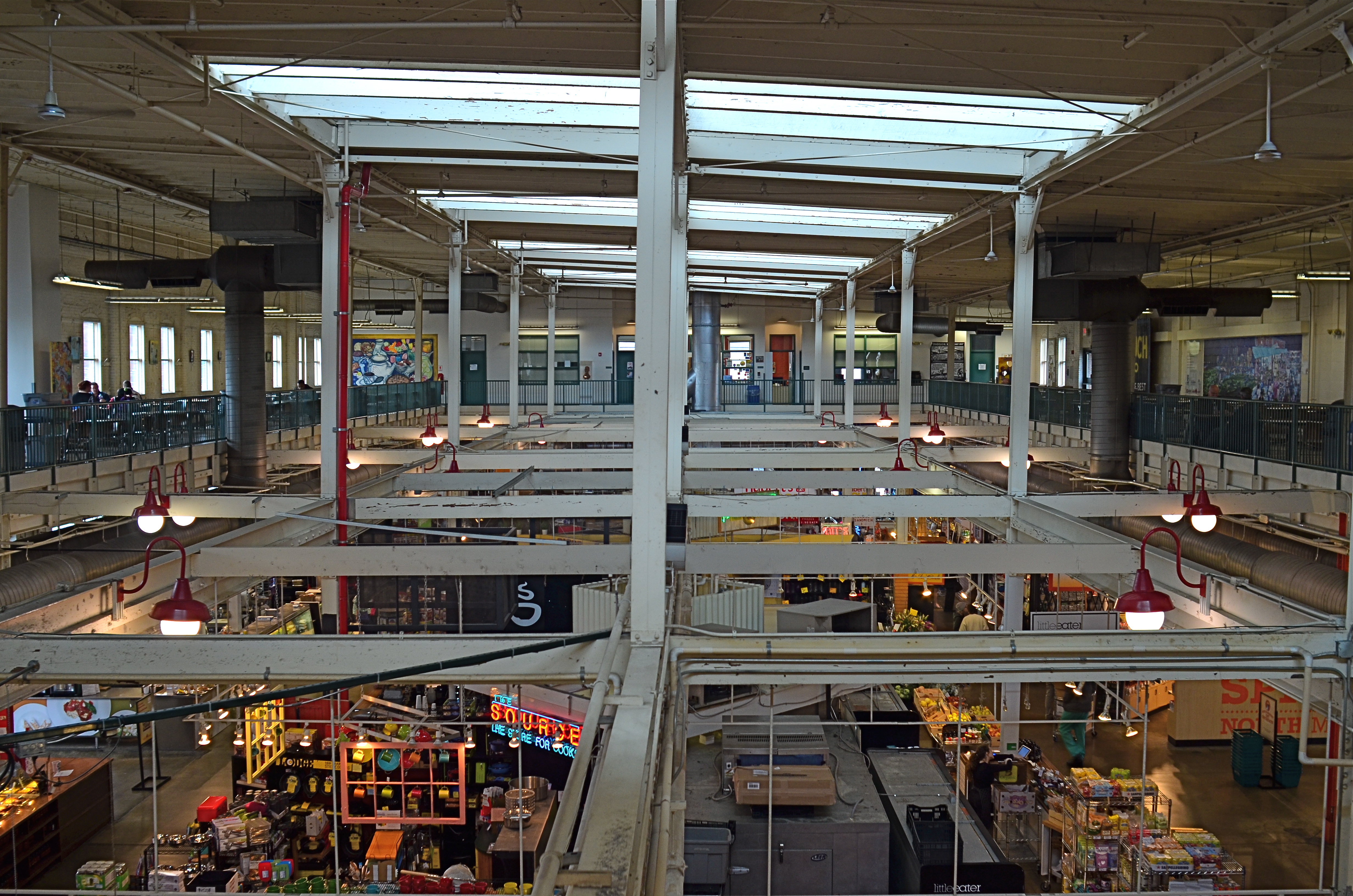
North Market, 2016. Straight out of the camera at 1/40 sec., f/5.6, ISO 200, 24mm.
You no doubt have many pictures you’ve made which you simply like, despite the fact that they flaut, or even fracture, the rules. The above image, shot earlier this week at a multi-floor urban marketplace/eatery, struck me for two reasons. First, because of how many basic rules of “proper” composition it clearly violates; and secondly, just how much I don’t care, because I like what it does. To illustrate my point, I’ve provided citations from an article titled Principles Of Composition to cite specific ways that the photo is, well, wrong.
Have A Strong point of interest. Well, there isn’t any particular one, is there? Lots of conflicting stuff going on, but that’s the natural rhythm of this place. It’s a beehive. One man’s clutter is another man’s full “pulse of life”, and all that.
Don’t place the horizon line, or any strong vertical or horizontal lines, right in the middle of a picture. And make sure the lines aren’t tilted. Okay, well, since there is a distinct difference between the “level-ness” of the crossbeams over the lower floor and the slanted lines of the skylight above, there really isn’t a way to make the entire picture adhere to the same horizontal plane. However, the off-kilter sagginess of the old building actually lends it a little charm , unless I’m just drunk.
Keep compositions simple, avoiding busy backgrounds that distract from your subject. Granted, there are about five different sub-pictures I could have made into separate framings within this larger one, but that would defeat the object of overall bustle and sprawl that I experienced looking out over the entire scene. Sure, some compositions get so busy that they look like a page out of Where’s Waldo?, but certain chaotic scenes, from Grand Central Terminal to Picadilly, actually reward longer, deeper viewing.
Place a subject slightly off-center rather than in the middle of a photo. Yeah, well, that’s where that “strong point of interest” rule might have helped. Sorry.
Do these deviations mean the image was wrong, or wrong for certain circumstances? Every viewer has to call that one as he sees it. Me, I am glad I decided to shoot this scene largely as I found it. It needed to work with natural light, it needed to be shot wide and deep, and it needed to show a lot of dispirate activity. Done done and done. I heard all the rules in my head and chose the road not taken.
Or taken. I forget which.
INTERACTIONS
All Around The Town, 2015. 1/50 sec., f/5.6, ISO 320, 24mm.
By MICHAEL PERKINS
IT’S FAIRLY EASY TO FIGURE OUT WHERE TO TAKE YOUR CAMERA if you are trying to visually depict a vibe of peace and quiet. Landscapes often project their serenity onto images with little translation loss, and you can extract that feeling from just about any mountain or pond. For the street photographer, however, mining the most in terms of human stories is more particularly about locations, and not all of them are created equal.
Street work provides the most fodder for storytelling images in places where dramatically concentrated interactions occur between people. One hundred years ago, it might have been the risk and ravage of Ellis Island. On any given sports Sunday, the opposing dreams that surround the local team’s home stadium might provide a rich locale. But whatever the site, social contention, or at least the possibility of it, generates a special energy that feeds the camera.
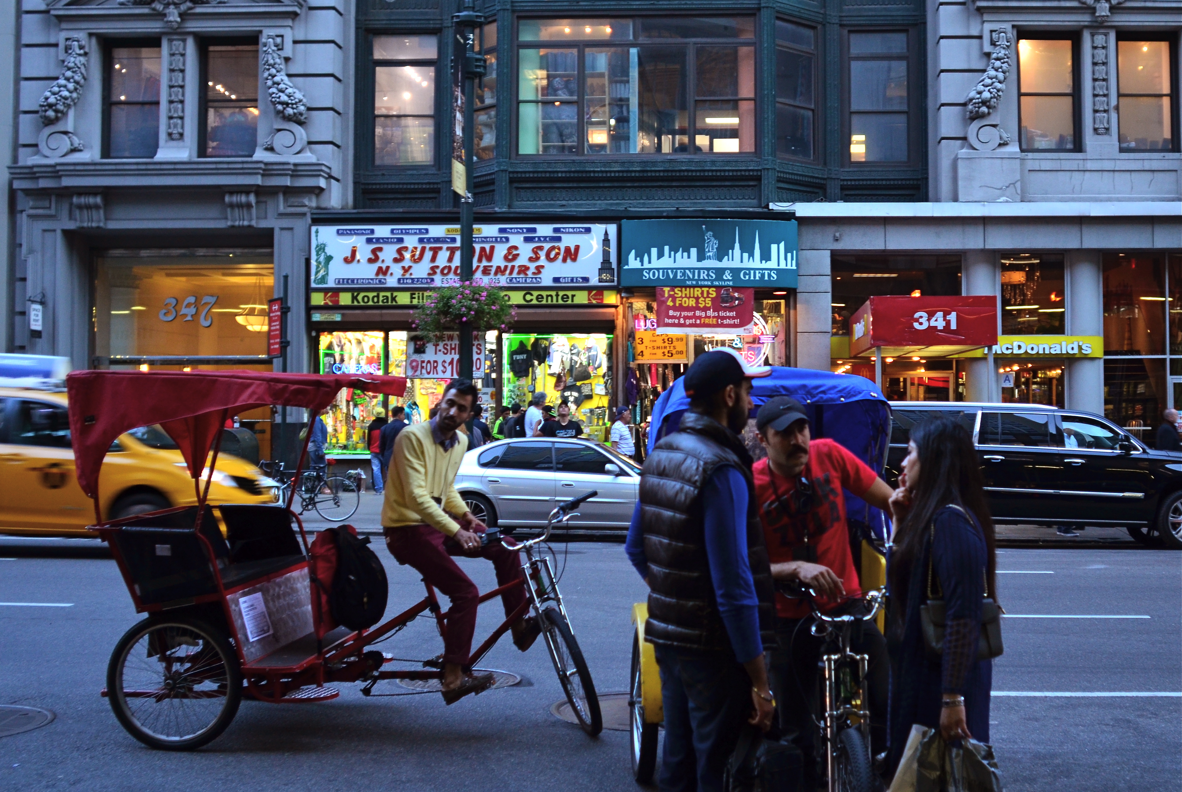
In New York City, the stretch of Fifth Avenue that faces the eastern side of the Empire State Building is one such rich petri dish, as the street-savvy natives and the greener-than-grass tourists collide in endless negotiation. Joe Visitor needs a postcard, a tee-shirt, a coffee mug, or a discounted pass to the ESB observation deck, and Joe Hometown is there to move the goods. Terms are hashed over. Information slithers in and out a dozen languages, commingling with the verbal jazz of Manhattan-speak. Deals are both struck and walked away from. And as a result, stories flow quickly past nearly every part of the street in regular tidal surges. You just pick a spot and the pictures literally come to you.
At Their Posts, 2015. 1/50 sec ., f/5.6, ISO 500, 24mm.
In these images, two very different tales unfold in nearly an identical part of the block. In the first, bike rickshaw drivers negotiate a tourist fare. How long, how far, how much? In the second, two regulars demonstrate that, in New York, there is always the waiting. For the light. For parking. For someone to clear away, clear out or show up. But always, the waiting. These are both little stories, but the street they occur on is a stage that is set, struck and re-set constantly as the day unfolds. A hundred one-act plays a day circle around those who want and those who can provide.
Manhattan is always a place of great comings and goings, and here, in front of the most iconic skyscraper on earth, those who haven’t seen anything do business with those who’ve seen it all. Street photography is about opportunity and location. Some days give you one or the other. Here, in the city that never sleeps, both are as plentiful as taxicabs.
CHOCK-A-BLOCK
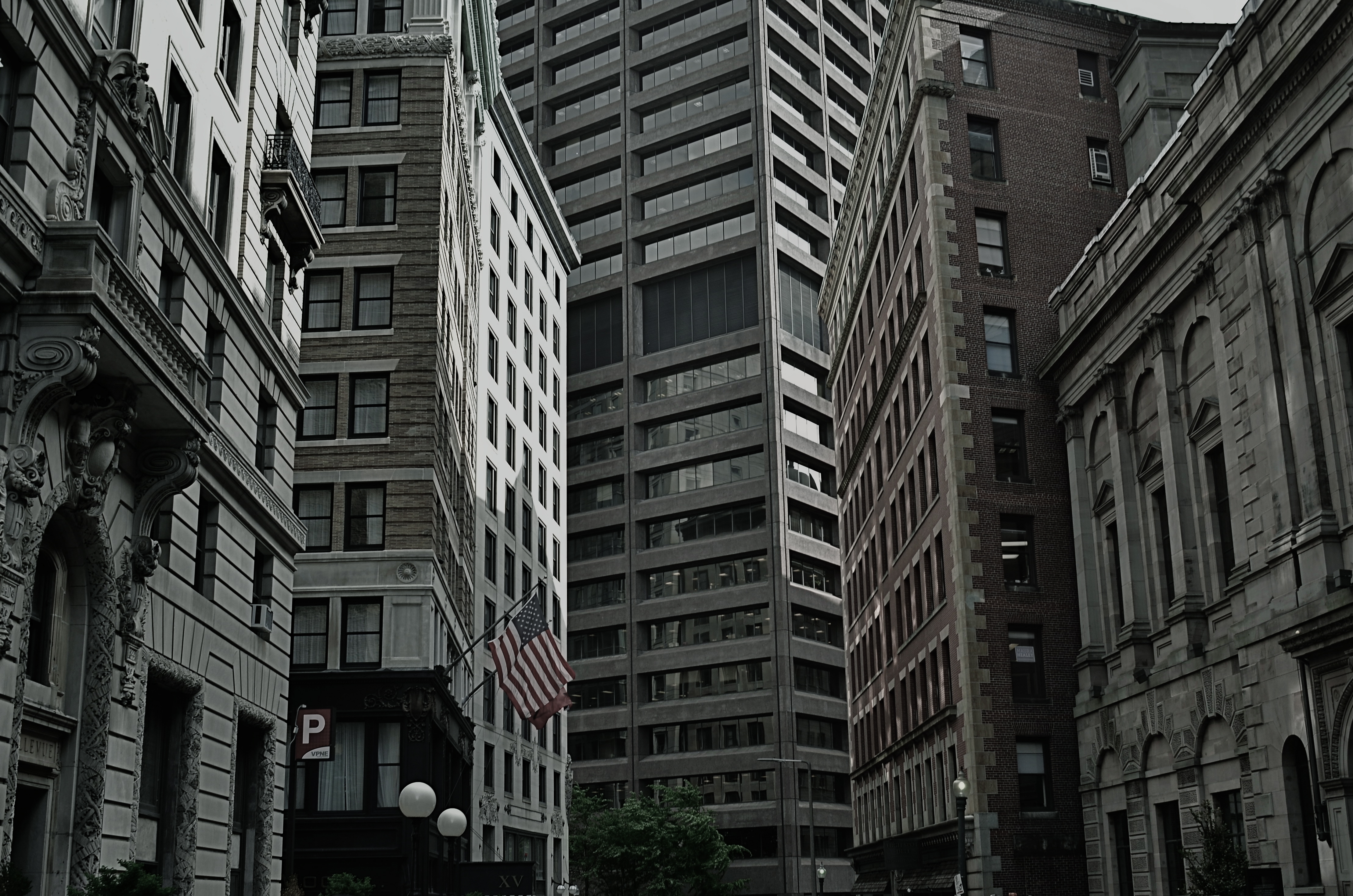
Yes, you could find a more frustrating job than making city maps for Boston streets. But you’d have to look hard….
By MICHAEL PERKINS
WHEN WE THINK OF URBAN BLOCKS, IT’S NATURAL TO THINK of those blocks as regular rectangles, well-regulated, even streets that run at direct parallels or hard right angles to each other. And while there certainly are cities with such mathematically uniform grids, some of the most interesting cities in the world don’t conform to this dreamy ideal in any way. And that means opportunities for photographers.
We’ve all seen street scenes in which the left and right sides of the road vanish directly toward the horizons, like staring down the middle of a railroad bed. But for the sake of dramatic urban images, it’s more fun to seek out the twisty mutants of city design; the s-and-z curves, the sudden zigzags, the trapezoids and triangles which signify confusion to cabbies and pedestrians but which mean good times for photogs. Let’s face it; snapping pictures of orderly things gets old fast. The very nature that makes us idealize “rightness” also makes us want to photograph “wrongness.”
That’s why I love to shoot in towns where the city was laid out with all the logic of the Mad Hatter on speed, those streets that seem barely coherent enough to admit the successful conduct of trade. Cities where locals and visitors alike curse the names of the urban planners, if there ever had been planners, if there ever had been a plan. A grand collision of avenues and alleys that looks like a kid whose teeth are crowding together in a greedy orthodontist’s dream fantasy. In such cities, including Manhattan, Pittsburgh, San Francisco, Boston and many others, “order” is a relative term. There are precious few neat streets vanishing back to infinity, politely lined by cooperative structures queueing up parallel to the curb. And that’s my kind of living, breathing… chaos.
As a mild example, consider the Boston street shown above, on which nearly every building seems slightly askew from every other building, sitting on foundations that jut out at every conceivable angle and plane. It’s a grand, glorious mess, and a much more interesting way to show the contrasting styles that have sprouted in the neighborhood over the centuries. It’s reality that looks like an optical illusion, and I can’t get enough of it.
A straight line may be the shortest distance between two points, but it’s also the least interesting. Go find cities that make no sense, God bless ’em.
MODEL CITIZENS
Cities can suggest any place, any time, even within your most familiar neighborhoods.
By MICHAEL PERKINS
THE ROLE OF THE URBAN PHOTOGRAPHER IS TO REKINDLE OUR RELATIONSHIP to our cities, to ignite a romance that might have gone cold or fizzled out. We grow up inside the buildings and streets of our respective towns one day at a time, and, while familiarity doesn’t always breed contempt, the slow, steady drip of repetitive sequence can engender a kind of numb blindness, in that we see less and less of the places we inhabit. Their streets and sights become merely up, down, in, out, north side or east side, and their beauty and detail dissolve away before the regular hum of our lives.
An outside eye, usually trained on a camera, is a jolt of recognition, as if our city changed from a comfy bathrobe into a cocktail dress. We even greet images of our cities with cries of “where’s THAT????”, as if we never saw these things before. The selective view of our streets through a camera, controlling framing, context, color and focus, enchants us anew. If the photog does his job properly, the magic is real: we truly are in new territory, right in our own backyards.
A city with iconic landmarks, those visual logos that act as absolute identifiers of location, actually are easier for the urban photographer, since their super-fame means that many other remarkable places have gone under-documented. Neighborhoods are always rising and falling, as the Little Italys fade and the Chinatowns ascend. Yesterday’s neglected ghetto becomes today’s hip gallery destination. Photographers can truly rock us out of the lethargy of daily routine and reveal the metropolis’s forgotten children in not only aesthetic but journalistic ways, reminding us of problems that need remedy, lives that plead for rescue.
The photographer in the city is an interpretive artist. His mantra: hey, townies, you ain’t seen nothin’ yet.
9/11/15: THE NEW, NEW COLLUSSUS
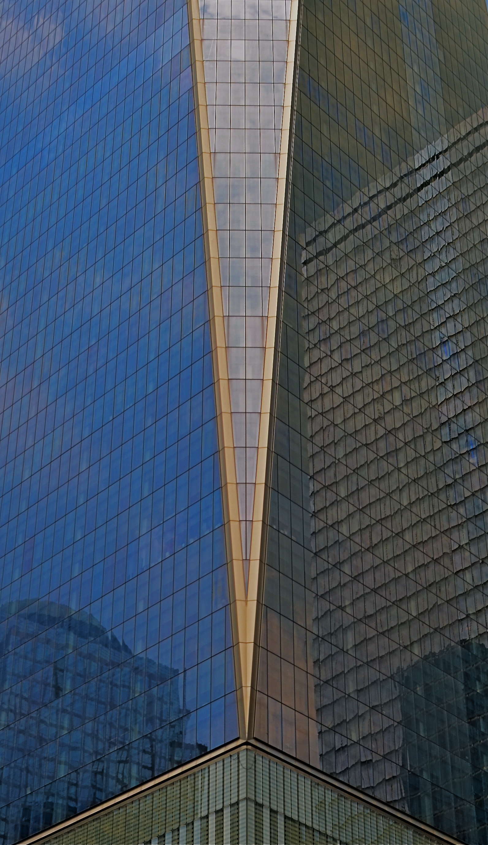
Icoceles, 2015. Up close or far away, the World Trade Center is a show unto itself.
By MICHAEL PERKINS
THE SKYLINE OF NEW YORK CITY, if you think about it a bit, is almost like a bar graph in steel and stone.
Just as higher and lower bars on a business graph chart the successes and failures of a company or stock, so do the vertical surgings above Manhattan island track the ebb and flow of energy, of the life flow of the most amazing metropolis on earth. And for photographers, the Apple’s skyline is always news. Someone is moving up. Someone else is moving down, or over. There’s always a new kid on the block, and that means that the photographic story of New York must be re-imagined yet again.
New York buildings create context for themselves and for the city at large, as the fresh arrivals jostle in and try to mingle with their more historically landed neighbors. That process is always exciting, but the rebirth of the part of lower Manhattan scarred and scorched by the hateful events of 9/11/01 brings more than just a new crop of jutting profiles. It brings one of the most powerful symbols of resurrection in the modern age. To paraphrase the song lyric, America proved, on that most battered of battlegrounds, that, if we could make it there, we could make it anywhere, and the nation at large stood a little taller with the arrival of the new World Trade Center.
Cameras now idealize that which is already miraculous, and WTC One, visible from anywhere in the city, will create its own photographic history, or, rather, make it irresistible for photographers to try to write it themselves. Postcard views, neighborhood contrasts, abstractions, souvenir snaps…all will be the story and none will be the story, at least not the whole story. New York is always ready for her close-up, but the challenge is always, are you good enough to shoot her best side?
Photographers visit New York to size themselves up in their own bar graph of pass/fail/maybe. Like everyone who ever stepped off a Port Authority bus fresh off the farm, they ask themselves: am I good? According to whom? Compared to what? Can I make something last as I create images of a city that not only never sleeps, but never even slows down?
“Autumn in New York. It’s good to live it again….”
ARCHITECTS OF HOPE
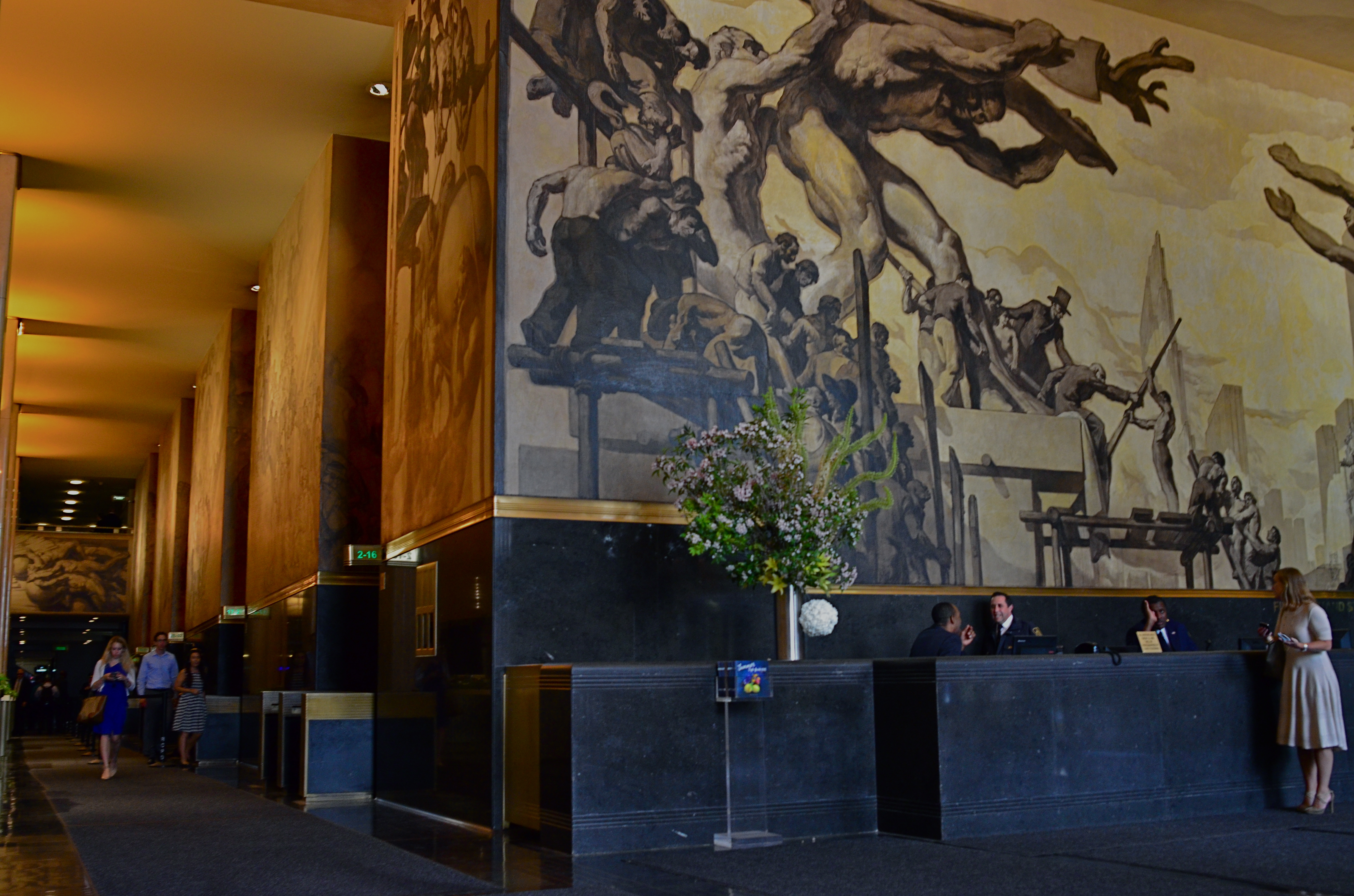
Part of Jose Maria Sert’s soaring mural American Progress (1937) above the main information desk just inside the entrance to 30 Rockefeller Plaza.
By MICHAEL PERKINS
THE EROSION AND COLLAPSE OF THE GREAT AMERICAN URBAN INFRASTRUCTURES of the 20th century is more than bad policy. It is more than reckless. It is also, to my mind, a sin against hope.
As photographers, we are witness to this horrific betrayal of the best of the human spirit. The pictures that result from this neglect may, indeed, be amazing. But we capture them with a mixture of sadness and rage.
Hope was a rarity in the early days of the Great Depression. Prosperity was not quite, as the experts claimed, “right around the corner.” And yet, a strategy arose, in private and federal project alike, that offered uplift and utility at the same time. People were put to work making things that other people needed. The nation erected parks, monuments, utilities, forests, and travel systems that turned misery to muscle and muscle to miracle. Millionaires used their personal fortunes to create temples of commerce and towers of achievement, hiring more men to turn more shovels. Hope became good business.
One of the gleaming jewels of the era was, and is, the still-amazing Rockefeller Plaza in New York, which, in its decorative murals and reliefs, lionized the working man even as it put bread on his table. The dignity of labor was reflected across the country in everything from newspaper lobbies to post office portals, giving photographers the chance to chronicle both decline and recovery in a country brought only briefly to its knees.
Today, the information desk at 30 Rockefeller Plaza, home of NBC studios, still provides a soaring tribute to the iron workers and sandhogs who made it possible for America to again put one foot in front of the other, marching, not crawling, back into the sunlight. It still makes a pretty picture, as can thousands of such surviving works across the country. Photographing them in the current context of priceless inheritance offers a new way to thank the bygone architects of hope.
THAT’S YOUR QUEUE
By MICHAEL PERKINS
AS CONVENIENT AND SIMPLE AS MANY PANORAMIC APPS AND TECHNIQUES HAVE BECOME OF LATE, there are many ways to accent a wide linear line of photo information within a standard camera frame. With images shot in very large file sizes these days, (even without shooting in RAW), plenty can be cropped from a photograph to produce the illusion of a wide composition with no loss in quality. It’s the pano look without the pano gear, and it’s a pretty interesting way to do exposition on crowds.
I first started noodling with this in an effort to save images that were crammed with too much non-essential information, most of them random streets shots that were a little busy or just lacking a central “point”. One such image was an across-the-street view of the area around the Chinese Theatre in Hollywood. Lots of building detail, lots of wandering tourists, and too much for a coherent story. Lopping off the top two-thirds of the frame gave me just the passing crowd, an ultra-wide illusion which forced the viewer to review the shot the way you’d “read” a panel in a comic strip, from left to right.
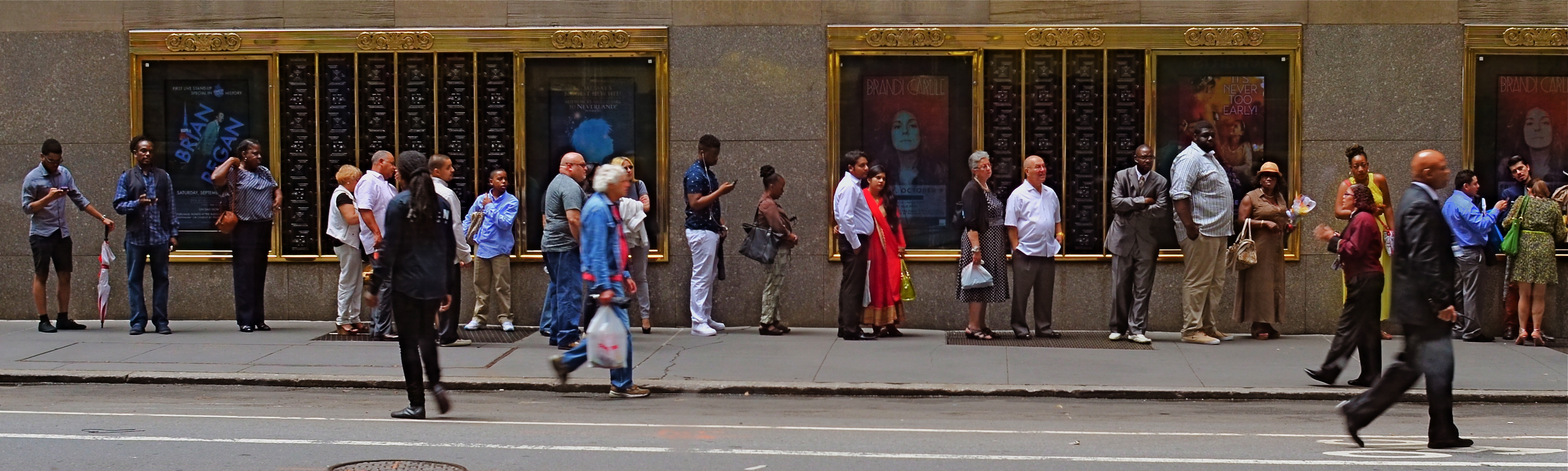
Tickets, Please, New York City, 2015.
Lately, I’ve been looking for a purer version of that crowd, with more space between each person, allowing for a more distinct comparison between individuals. That is, short guy followed by tall woman followed by little kid followed by….you get the idea. Then, last week, I happened upon the ideal situation while shooting randomly through a window that looked out on the 51st street side of New York’s Radio City Music Hall: a long line of folks waiting to pre-purchase event tickets. The space between them and the street rhythm shown by a few out-of-focus passersby was all the composition I needed, so in the editing process I once again aced the top two-thirds of the picture, which had been taken without zoom. A bit of light was lost in shooting through the window, so I added a little color boost and texturizing in Photomatix (not HDR but Tone Compression settings) and there was my pseudo-pano.
It’s a small bit of cropping choreography, but worth trying with your own street shots. As as is the case with many images, you might gain actually strength for your pictures the more ruthlessly you wield the scissors. Some crowd shots benefit by extra context, while others do fine without it. You’ll know what balance you’ll need.
HEADSTONES
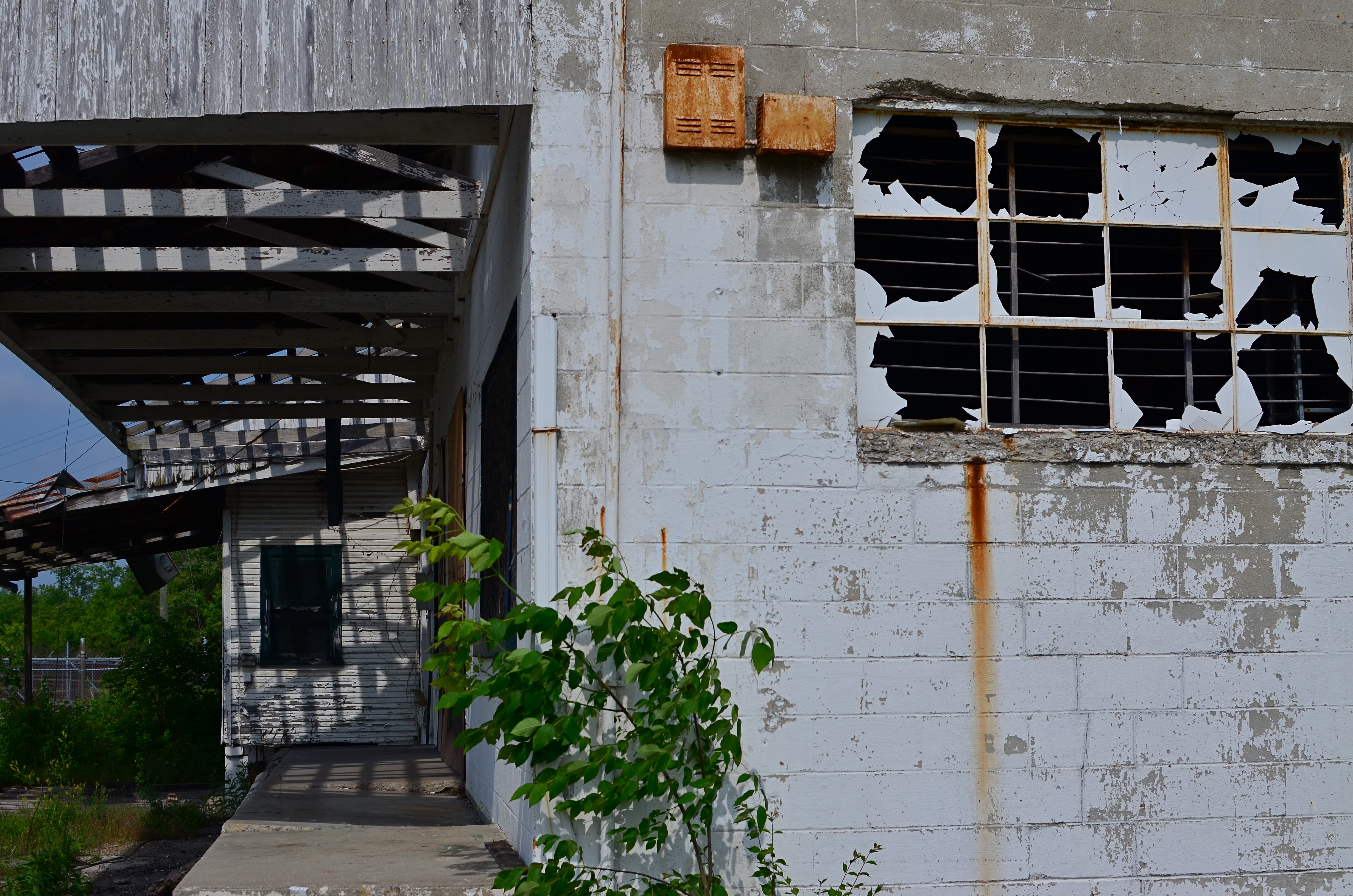
This hulk was once someone’s idea of progress and prosperity.
By MICHAEL PERKINS
IF ARCHITECTURAL PROJECTS, AT THEIR BIRTHS, REPRESENT A KIND OF FAITH, then the demise of buildings likewise signals a sort of death, a loss of belief, an admission of failure. Our new societies break ground on developments in one generation only to see them wither to silence in the next, a cycle of boom and bust that somehow has become the rhythm of modern life.
Viewing the ruins that result from all our once-bright industrial dreams through the lens of a camera creates a peculiar kind of commentary, less specific but more emotionally immediate than a written editorial or essay. The first uses of photography as chronicles of urban life were largely neutral, merely recording city vistas, monuments, cathedrals, scenic wonders. It took the aftermath of World War One and the Great Depression to infuse architectural photos with the sting of commentary, as if the photographer was asking, what have we done? What is all this for?
In the 1930’s, there was a quick segue from the New Deal’s programs for documenting relief programs to a new breed of socially activist shooters like Walker Evans and Margaret Bourke-White, who showed us both the human and architectural faces of despair. Suddenly closed businesses, shabby tenements, and collapsed infrastructures became testimony on what we were doing wrong, of the horrific gap between our dreams and our deeds.
In every town across America, photographers continue to search for the headstones of our lost hopes, the factories, foundries, and dashed ventures that define who we hoped to be, and how things went wrong. It’s not a photography of hopelessness, however, but a dutiful reminder that actions have consequences, for good or ill. Turning our eyes, and lenses, to the stories left behind by the earlier versions of ourselves is a way of measuring, of keeping score on what kind of world we desire. The headstones bear clear inscriptions. Deciphering them is the soul of photography.
25, 50, T, B
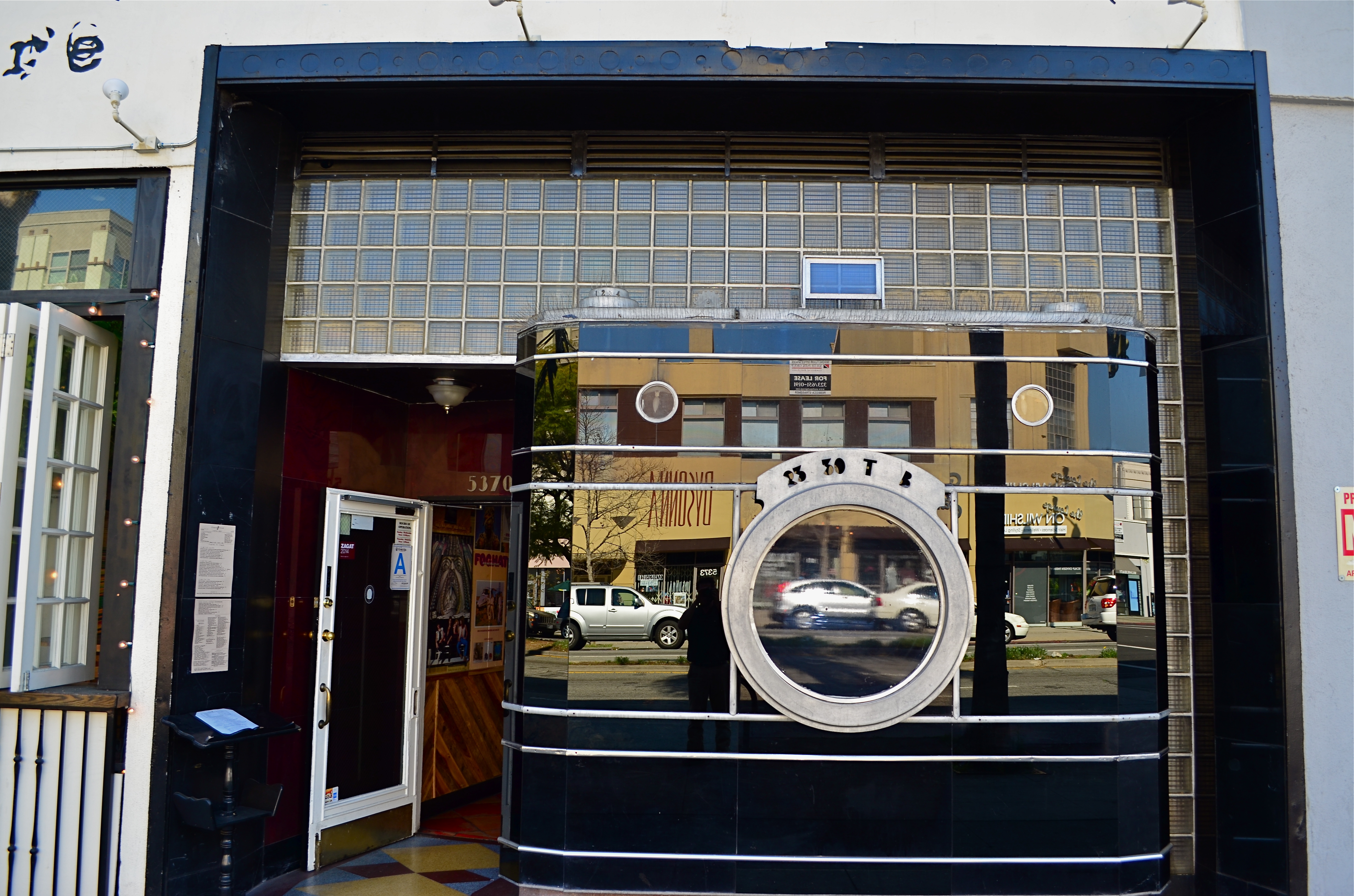
The remaining facade from Los Angeles’ historic Darkroom camera shop at 5370 Wilshire Boulevard.
By MICHAEL PERKINS
THERE IS A PART OF WILSHIRE BOULEVARD IN LOS ANGELES that I have been using for a photographic hunting ground for over ten years, mostly on foot, and always in search of the numerous Art Deco remnants that remain in the details of doors, window framings, neighborhood theatres and public art. Over the years, I have made what I consider to be a pretty thorough search of the stretch between Fairfax and LaBrea for the pieces of that streamlined era between the world wars, and so it was pretty stunning to realize that I had been repeatedly walking within mere feet of one of the grand icons of that time, busily looking to photograph….well, almost anything else.
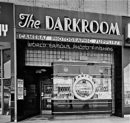
The Darkroom in its Kodachrome days.
A few days ago, I was sizing up a couple framed in the open window of a street cafe when my composition caught just a glimpse of black glass, ribbed by horizontal chrome bands. It took me several ??!?!-type minutes to realize that what I had accidentally included in the frame was the left edge of the most celebrated camera in all of Los Angeles.
Opened in the 1930’s, the Darkroom camera shop stood for decades at 5370 Wilshire as one of the greatest examples of “programmatic architecture”, that cartoony movement that created businesses that incorporated their main product into the very structure of their shops, from the Brown Derby restaurant to the Donut Hole to, well, a camera store with a nine-foot tall recreation of an Argus camera as its front facade.
The surface of the camera is made of the bygone process known as Vitrolite, a shiny, black, opaque mix of vitreous marble and glass, which reflects the myriad colors of Los Angeles street life just as vividly today as it did during the New Deal. The shop’s central window is still the lens of the camera, marked for the shutter speeds of 1/25th and 1/50th of a second, as well as T (time exposure) and B (bulb). A “picture frame” viewfinder and two film transit knobs adorn the top of the camera, which is lodged in a wall of glass block. Over the years, the store’s original sign was removed, and now resides at the Museum of Neon Art in Glendale, California, while the innards of the shop became a series of restaurants with exotic names like Sher-e-Punjab Cuisine and La Boca del Conga Room. Life goes on.
True to the ethos of L.A. fakes, fakes of fakes, and recreations of fake fakes, the faux camera of The Darkroom has been reproduced in Disney theme parks in Paris and Orlando, serving as…what else?….a camera shop for visiting tourists, while the remnants of the original storefront enjoy protection as a Los Angeles historic cultural monument. And, while my finding this little treasure was not quite the discovery of the Holy Grail, it certainly was like finding the production assistant to the stunt double for the stand-in for the Holy Grail.
Hooray for Hollywood.
THE ROMANCE OF RUIN
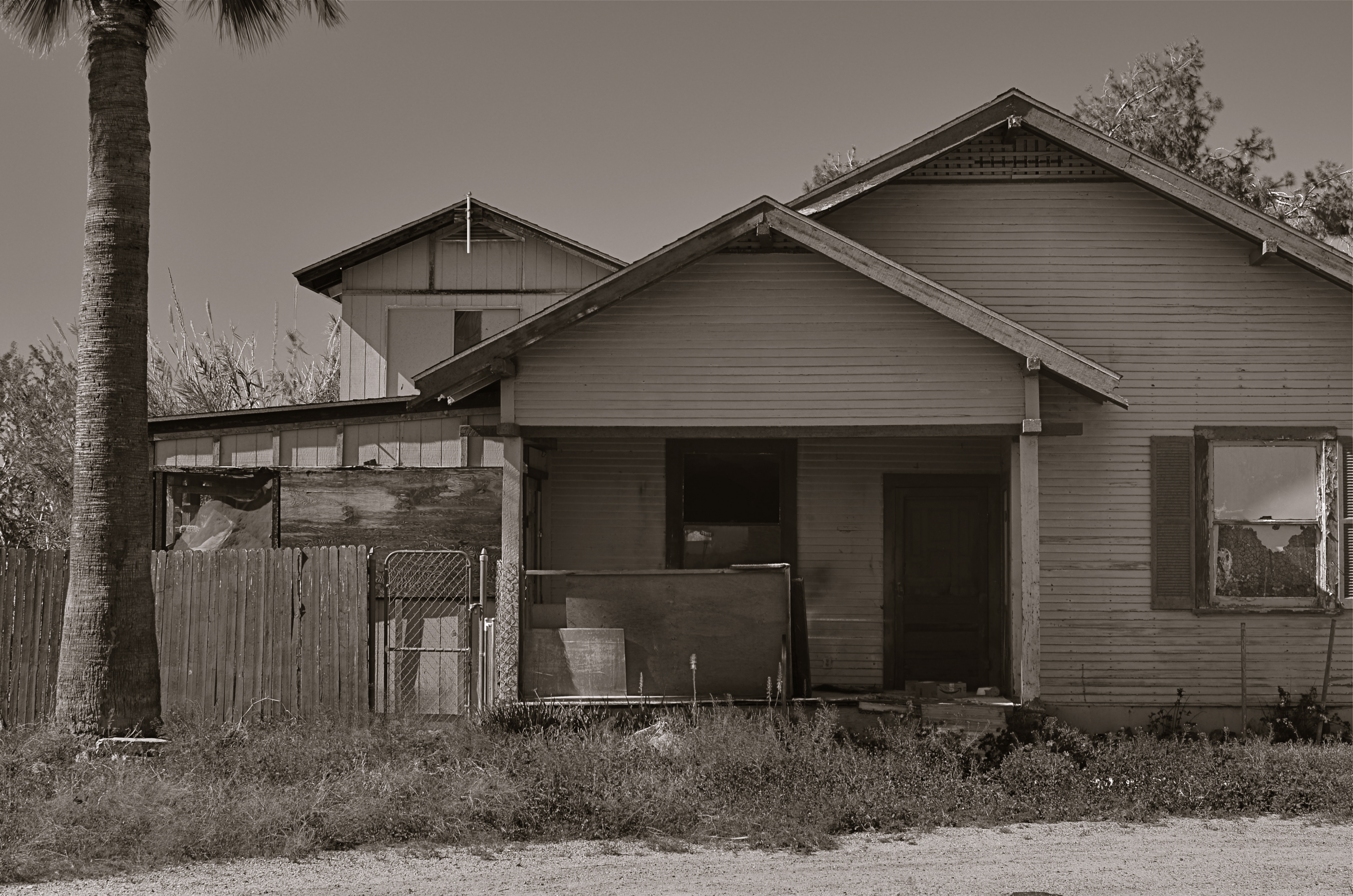
The honeymoon is, indeed, over.
By MICHAEL PERKINS
I TYPICALLY SHY AWAY FROM USING OR CREATING PHOTOGRAPHS as illustrations of work in another medium. Writers don’t try to caption my images, and I don’t presume, for the most part, to imagine visuals for their works. As both photographer and writer, I am sympathetic to the needs and limits of both graphic and written mediums. And still, there are rare times when a combination of events seem to imply a collaboration of sorts between the two means of storytelling. I made such an attempt a while back in these pages, in the grip of nostalgia for railroads, and so here goes with another similar experiment.
 Last week, during a blue mood, I sought out, as I often do, songs by Sinatra, since only Frank does lonely as if he invented the concept, conveying loss with an actor’s gift for universality. I stumbled across a particularly poignant track entitled A Cottage For Sale, which I sometimes can’t listen to, even when I need its quiet, desolate description of a dream gone wrong. So, that song was the first seed in my head.
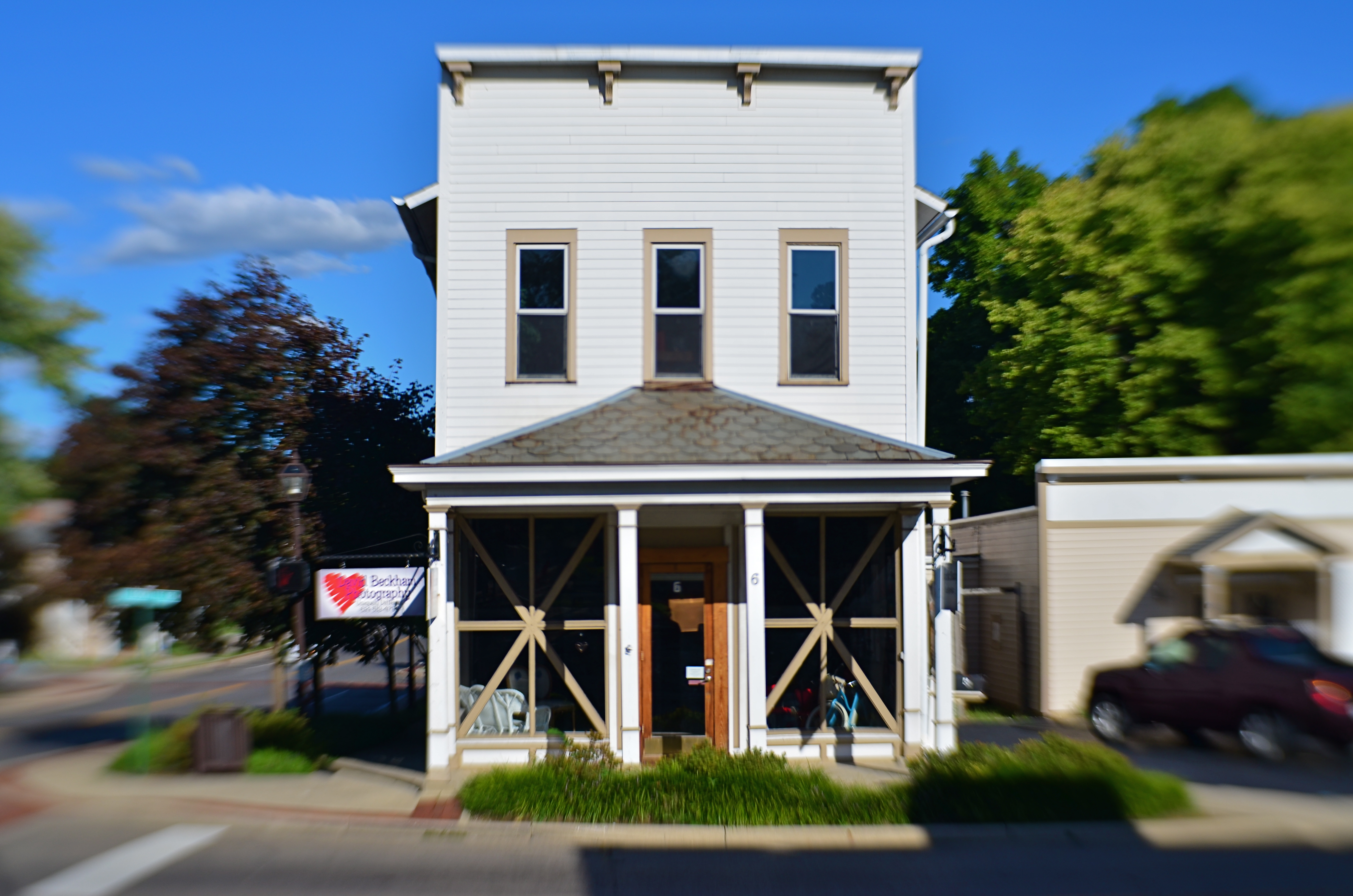
Seed two came a few days later, when I was shortcutting through one of those strange Phoenix streets where suburban and rural neighborhoods collide with each other, blurring the track of time and making the everyday unreal. I saw the house you see here, a place so soaked in despair that it seemed to cry out for the lyrics of Frank’s song. Again, I’m not trying to provide the illustration for the song, just one man’s variation. So, for what it’s worth:
Is lonely and silent, the shades are all drawn,
And my heart is heavy as I gaze upon
A cottage for sale
Where you planted roses,the weeds seem to say,
“A cottage for sale”.
But when I reach a window, there’s empty space.
But no one is waiting for me any more,
The end of the story is told on the door.
A cottage for sale.
YOU’RE GREAT, NOW MOVE, WILLYA?
Marquee Marks, 2015. Do I need people in this to suggest urban life?
By MICHAEL PERKINS
ONE OF MY FAVORITE SONGS FROM THE ’40’s, especially when it emanates from the ruby lips of a smoking blonde in a Jessica Rabbit-type evening gown, conveys its entire message in its title: Told Ya I Love Ya, Now Get Out! The hilarious lyrics speak of a woman who acknowledges that, yeah, you’re an okay guy, but don’t get needy. No strings on me, baby. I’ll call you when I want you, doll. Until then, be a pal and take a powder.
I sometimes think of that song when looking for street images. Yes, I’m aware that the entire sweep of human drama is out there, just ripe for the picking. The highs. The lows. Thrill of victory and agony of de feet. But. I always feel as if I’m cheating the world out of all that emotional sturm und drang if I want to make images without, you know, all them people. It’s not that I’m anti-social. It’s just that compelling stuff is happening out there that occasionally only gets compromised or cluttered with humans in the frame.
Scott Kelby, the world’s biggest-selling author of photographic tutorials, spends about a dozen pages in his recent book Photo Recipes showing how to optimize travel photos by either composing around visitors or just waiting until they go away. I don’t know Scott, but his author pic always looks sunny and welcoming, as if he really loves his fellow man. And if he feels it’s cool to occasionally go far from the madding crowd, who am I to argue? There are also dozens of web how-to’s on how to, well, clean up the streets in your favorite neighborhood. All of these people are also, I am sure, decent and loving individuals.
There is some rationality to all this, apart from my basic Scrooginess. Photographically, some absolutes of abstraction or pure design just achieve their objective without using people as props. Another thing to consider is that people establish the scale of things. If you don’t want that scale, or if showing it limits the power of the image, then why have a guy strolling past the main point of interest just to make the picture “human” or, God help us, “approachable”?
Faces can create amazing stories, imparting the marvelous process of being human to complete scenes in unforgettable ways. And, sometimes, a guy walking through your shot is just a guy walking through your shot. Appreciate him. Accommodate him. And always greet him warmly:
Told ya I love ya. Now get out.

INVITATION TO THE DANCE
Seattle Street Stomp, Sunday Night (2016)
By MICHAEL PERKINS
PHOTOGRAPHY REACTS TO SHIFTS IN HUMAN BEHAVIOR, in that it both reports and creates the news. Let people surge or sparkle in any particular direction, and the camera will shift with them, for good or ill. Photographers are camp-followers by nature, and instinctively sniff out the Next Big Thing, the Next Medium Thing, even the next Is This A Thing? in search of subject matter.
There is, at this writing, a wealth of story-telling to be done in the rebirth of American urban centers, and it’s more than just stopping by the hottest new part of town. Suddenly, it’s about the complete reversal of the systemic desertion of cities that began right after World War II, with a new generation sizing up thousands of Spielbergian burbs and finding them wanting. Moreover, urban cores are being not just renovated but embraced, not merely as this year’s megatrend but as this age’s new answer. In city after city, we are coming home, transforming our idea of “a life” to define walkable neighborhoods, an explosion in the arts, dense diversity, and locally owned businesses. It’s a great time for cities, and a great time to be a photographer.
All of human activity, from ritual to celebration, social interaction to creativity, is being re-cast in urban terms, with block after block being claimed in the name of re-use and re-purpose. It’s greener, it’s groovier, and it is rich with visuals, as the barn dance becomes the street stomp and the dead warehouse becomes the very alive coffee-house. Most importantly, children are being born into places where they can walk to real shops versus driving to unreal chains. Something is up, and it’s not merely generational, and the camera has a role in all of this.
A role and a say.
Share this:
September 25, 2016 | Categories: Americana, Cities, Commentary, Neighborhoods | Tags: City Life, Street Photography, Urban Trends | Leave a comment