YOU’VE HAD AN EFFECT ON ME
By MICHAEL PERKINS
“FULL–FUNCTION” CAMERAS (I try not to call them “real”) have made several concessions to the invasion of the mobiles over the last decade, adding features that tweak or sweeten images after they are taken, in the manner of cel-camera apps. The most commonly used functions, like cropping or straightening, have been joined over the years by monochrome converters, fisheye-like distorters, and selective color effects, which allow the user to desaturate discrete parts of a picture for a part-color, part B&W composite. Occasional use of these DSLR tweaks, as with those in App World, can yield interesting results. Their over-use, however, can erase the thin wall between tool and gimmick.
Effects oftimes go beyond merely enhancing a shot to loudly calling attention to themselves, and thus upstaging said shot completely. Of course, if you want to establish a personal style that always expresses itself in sepia tone or double exposures, by all means rock and roll and Godspeed. Generally speaking, though, special effects have the greatest impact when they are the spice, and not the meat in the recipe.
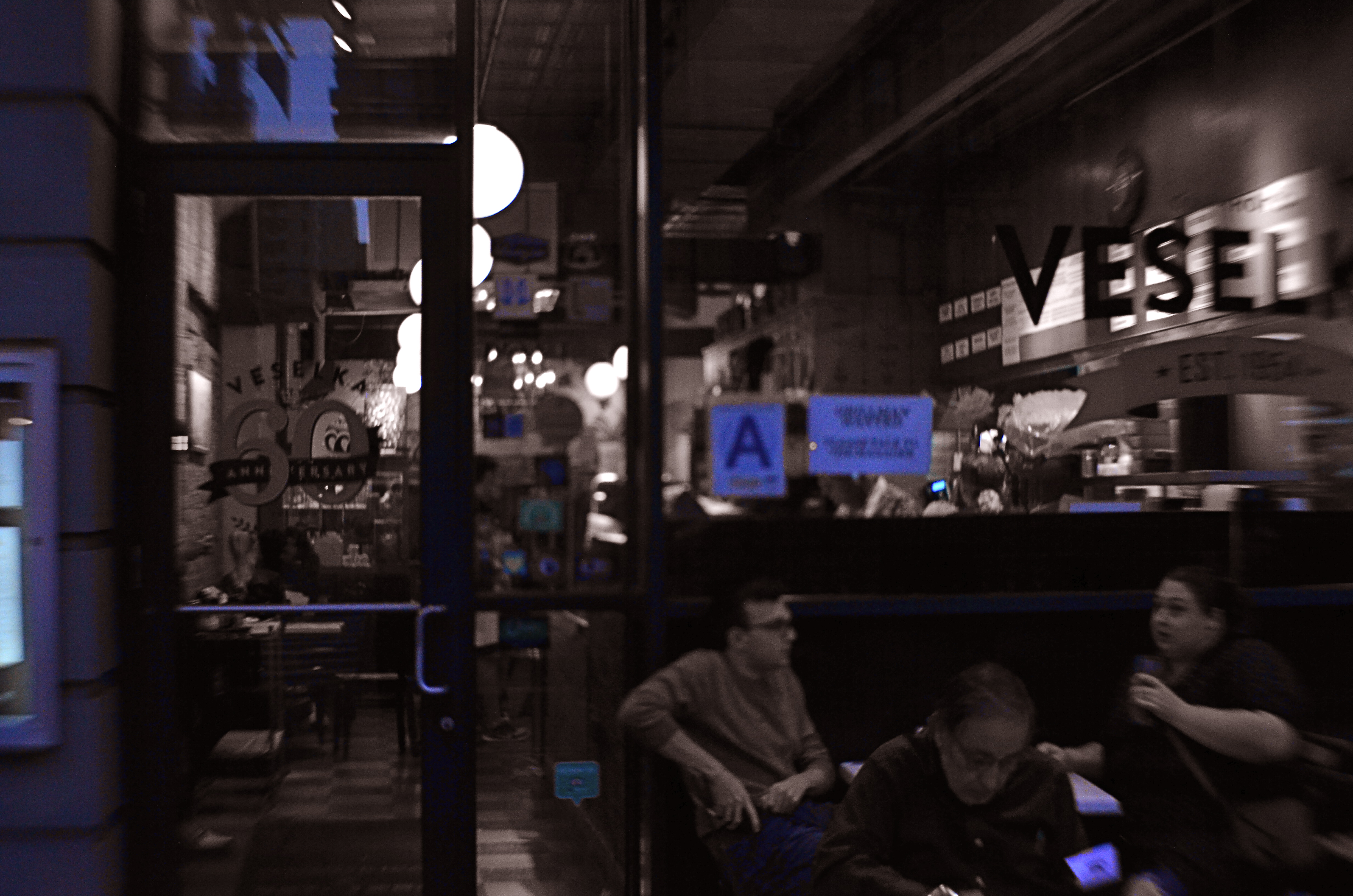
Later, At Veselka’s, 2018
One that I keep playing with, trying to decide if it’s truly useful, is the aforementioned selective color. Desaturating only parts of an image is tricky, because the monochrome elements must work in at least some way with the remaining chroma, lest the color/no color ratio be jarring. Remember, you merely want your viewer to get the impression that something has been subtly improved in the picture, not drastically rehauled.
In the restaurant scene shown here, night had already rendered most of the darkened areas as nearly grey already, so converting that to b/w wasn’t a stretch. I took out the reds from various neon signs and the ambers and yellows caused by my camera’s misreading of the light temperature, and elected to keep the blues, in an attempt to use them as an extension of the blacks and grays. Whether I think I succeeded depends on which day I view the result, but my intention was to add just a flavor of mood to a photograph that was essentially mono.
I think the best way to avoid going wrong with the use of a post-processed effect is to begin with a picture that’s already 99% of what you were going for……using the tools to give a “pretty good” image a nudge, rather than a shove. As in photography in general, it’s a game of inches.
WHEN AND WHERE FOR WHAT AND WHY
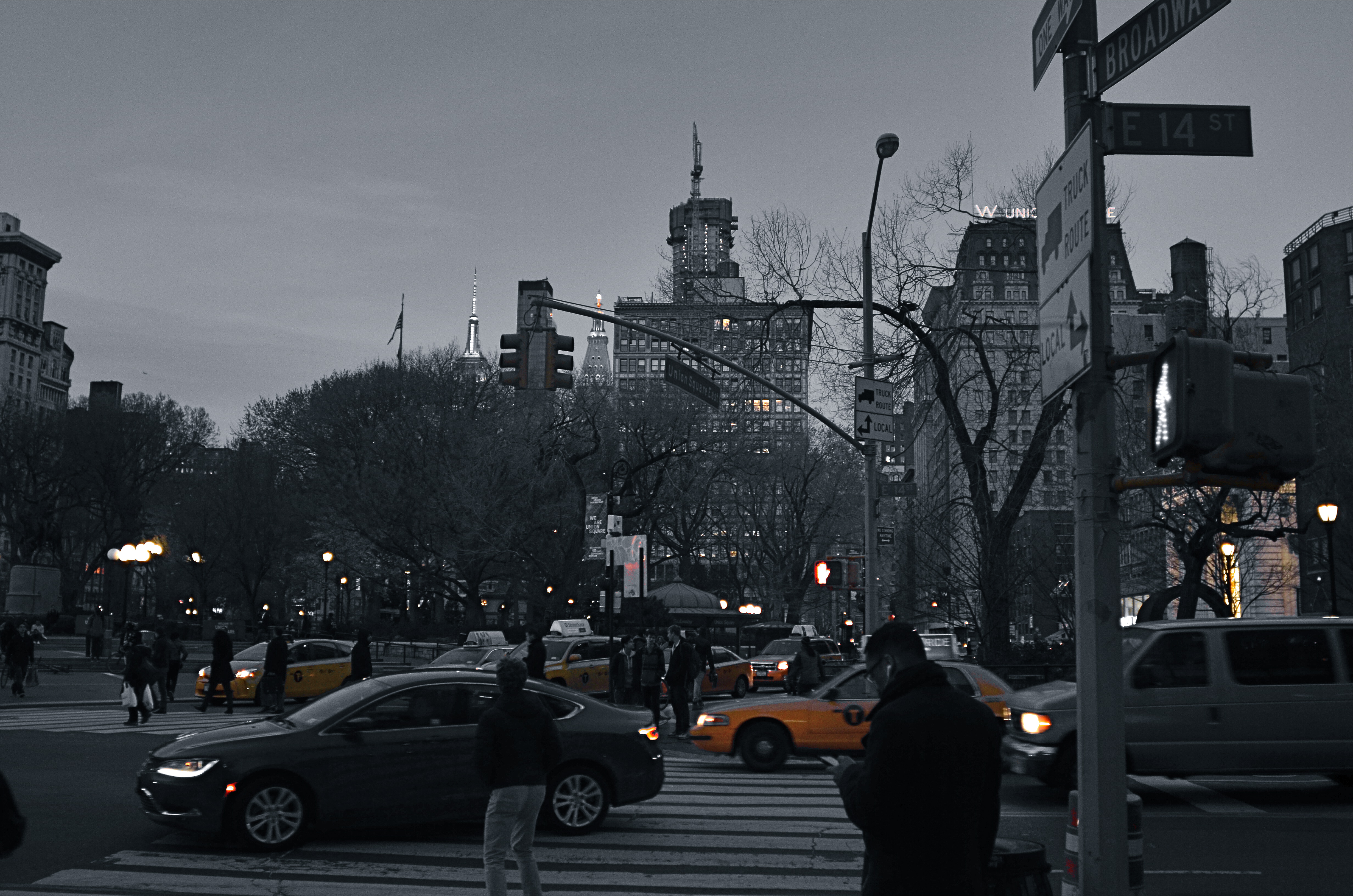
Manhattan yellow cabs in a grey street scene. A classic selective desaturation effect.
By MICHAEL PERKINS
THE SHEER NUMBER OF PHOTOGRAPHERS IN THE WORLD pretty much insures that not too many of us are artistically, um, unique. If there was ever a time in the history of the medium when it was nearly impossible to develop a style free of influence (good or bad), it’s now.
That doesn’t make originality impossible. But it does mean that, when one of us evolves a new way of doing things, the speed of adoption means there’s about a half a global second before innovation becomes cliche. And the worldwide online community likewise switches its evaluation of an idea from “brilliant!!” to “hackneyed” within an ever shorter cycle.
One of the tricks that only really came to the fore in the early days of digital editing is the look of selective de-saturation of color. The technique was originally met with great enthusiasm, but to hear the wags that whine and howl around the web, you should now sooner be caught dead rather than use it.
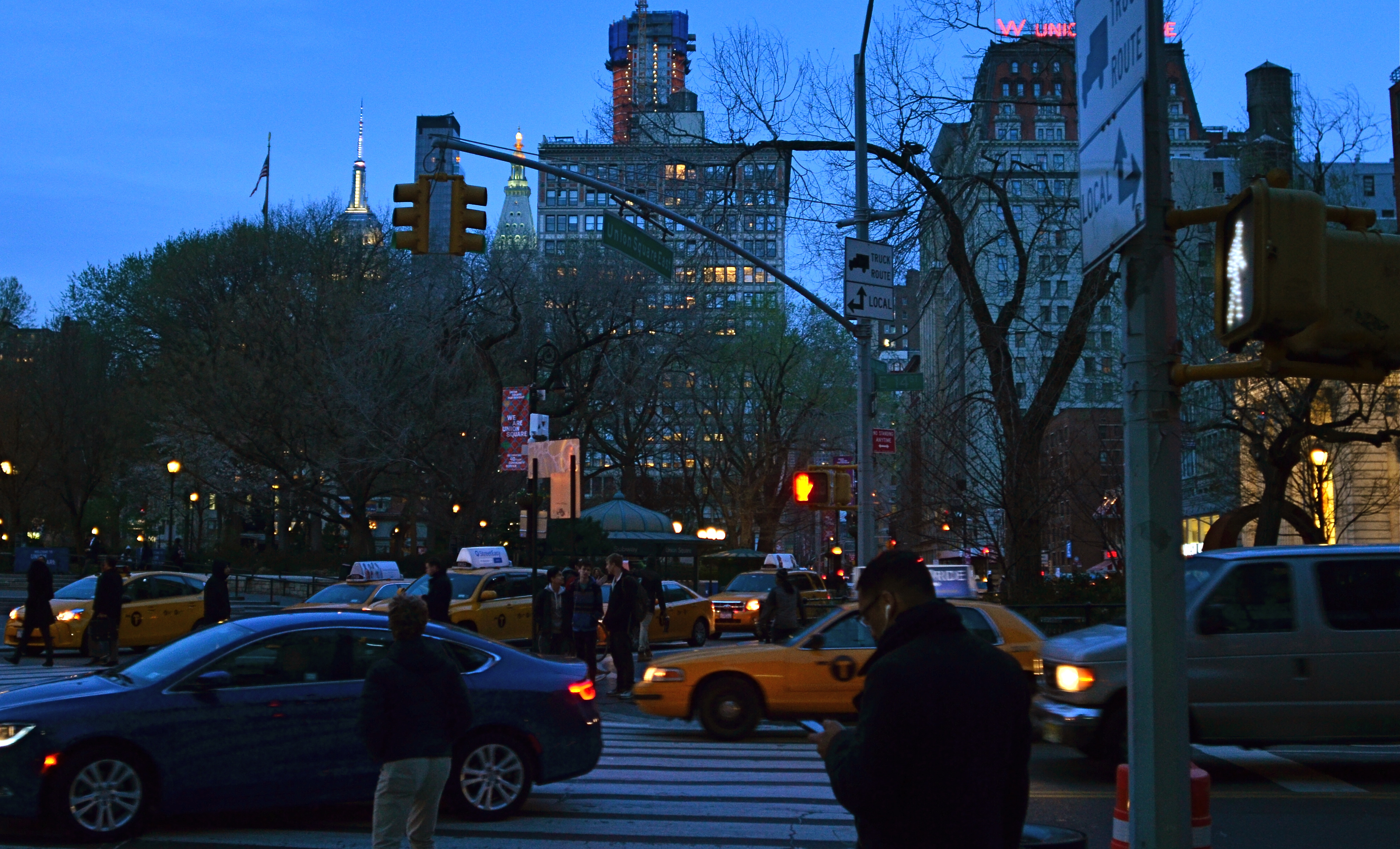
Same scene as above, in natural color. Which version sells the story the best?
Only, it’s not a given technique, per se, that becomes a drag, only its over-use or abuse. Think of canvas art for a moment. No one ever complains that “everybody uses oils to paint!” because it ain’t the pigment that separates the greats from the grunts. It’s what you do once you pick up that brush.
I steer away from partially desaturated shots because, while they can be real attention -getters, I myself don’t encounter many instances where I feel that they will actually help one of my pictures work better. The choice between monochrome and full color is, itself, fraught with a lot of mental measurement, meaning that you have a 50/50 chance in the making of an image to choose the wrong way to make it. Then there are color to b&w conversions, some of which really destroy the power of a photo. All this is before we get into the rather exotic decision of whether to make a picture “part” color.
Let’s say that there’s something to be gained by killing off all but the signature Manhattan cab yellow, as seen in the top image of NYC’s Union Square. Okay. It’s certainly technically easy to bring that off, but first you have to get beyond the initial “hey, that’s cool” sensation and ask, very critically, “what else am I giving away to nearly eliminate all the color in this image? Is the color of the dusky sky worth anything? How about the red glow of neon, the amber of lit windows, the darkening skin and fabric tones of passersby?
Lots of techniques fall or rise on whether they add or subtract from the image’s overall selling power. You have to learn when and where to do what…and to know why.
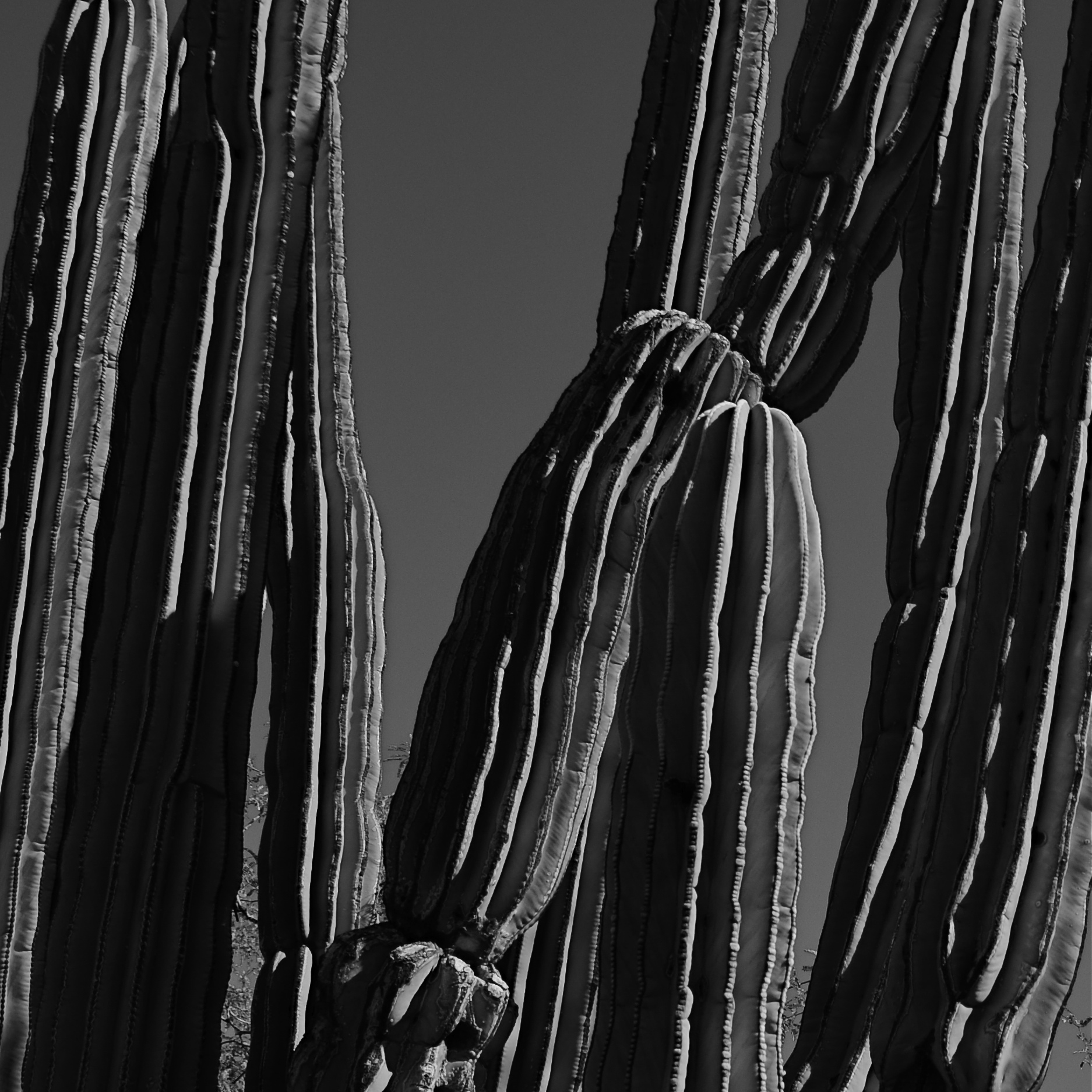
TONAL RECALL
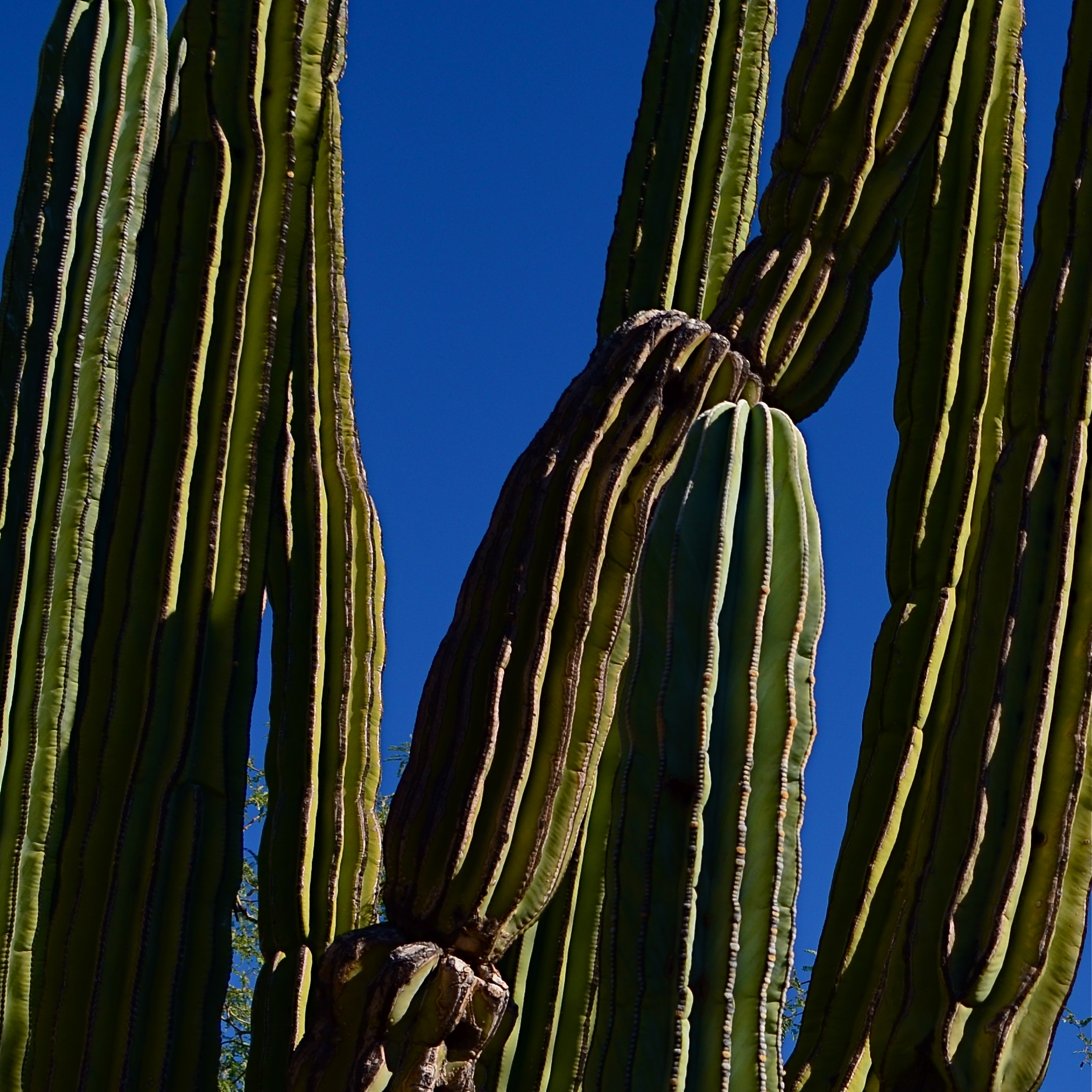
Desert still-life, take one. High contrast, simple color scheme.
By MICHAEL PERKINS
IF YOU WANT TO GET ALL MYSTICAL AND OOKY-SPOOKY ABOUT PHOTOGRAPHY, you can almost talk yourself into the idea that pictures kind of force their way past you on the way to their eventual best form. And, yes, I can hear your eyes rolling back in your head at the notion that an image is somehow destined to be created, that it emerges from your process almost despite you, like a rock that is pushed up through the earth by shifting tectonic plates. However, I have taken a handful of such pictures over a lifetime, as, no doubt, have you yourself, pictures that seemed to keep coming forth even beyond your first false steps until they reached their fullest expression.
Gee, is that incense I smell? Ommmmmm….
What I’m fumbling for here is a shared experience, and I do think that every photographer has had a semi-magical instance in which a photo almost taunts you to figure out how to make it work. Even in the best shots, there are moments of aching regret, maybe years down the path, that, had one or more things gone differently in the picture, it might have been eloquent or consequential. I truly believe that this very “so near, yet so far” quality is what keeps us in the hunt. After all, for the hunter, it’s the tiger he hasn’t been able to bag that calls louder than the ones already mounted over the mantel. So with photos. We are always singing the blues about the one that got away.
A monochrome re-mix from months after the original was snapped.
That’s why I’m a big believer in thinking of images as never really finished. They are, at best, preliminary studies for something else, picture that we still need to grow in order to complete. We lay them down, dissect them, re-shoot, re-imagine, and re-edit them. If you bend your thinking around, you can become comfortable with the fact that everything is a dress rehearsal for something that hasn’t arrived yet.
One of the starkest demonstrations of this fact is shots that were originally conceived as color images but which were later re-thought in monochrome. Nothing accentuates or streamlines your choices like shaving your tonal palette to the bare minimum. And, in the same vein, nothing makes you surer (or more unsure) about an image than reducing it to its simplest terms.
I think that, even as we are constantly expanding our arsenal of visual techniques, seeing them as growing, living things, so too we must think of our images as points on an evolutionary line, rather than final product.
MIDDLEHUES
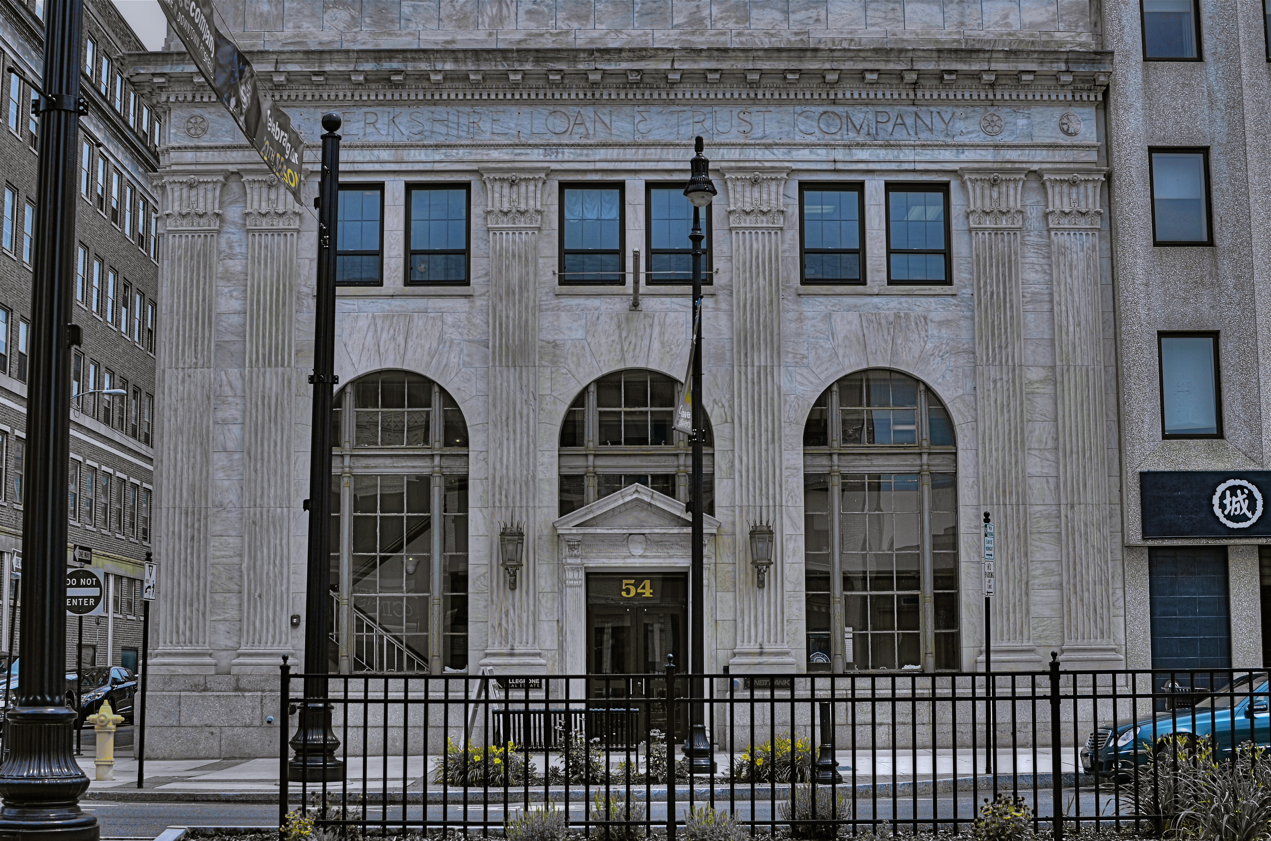
Surety And Security, 2014. Image made using Nikon’s in-camera “selective color” effect, programmed to highlight blue and gold hues only. Note the bluish undertones that show up in the “white” building.
By MICHAEL PERKINS
I FIND IT AMUSING THAT THERE IS SO MUCH PRISSY FRETTING, in the present photographic age, about the manipulation of images, as if there is, or has ever been, a “pure” photography that comes full-born from the camera like Athena sprang from Zeus’ forehead. This is, of course, nonsense.
There never was a time when photographers simply pressed the button and settled for whatever dropped into their laps by chance. The history of the medium is a clearly traceable timeline of the very interpretive technique and, yes, manipulation that tracks, like this blog, the journey from taking a picture to making one.
It’s not what you apply to an image, it’s whether the application is the entire point of the picture. Does your conception have solid, original value, over which you then impose a supplementary effect or a boost in emphasis? Or are you merely popping apps and pushing buttons in order to disguise the lack of essence in picture, to whitewash a rotten fence if you will?
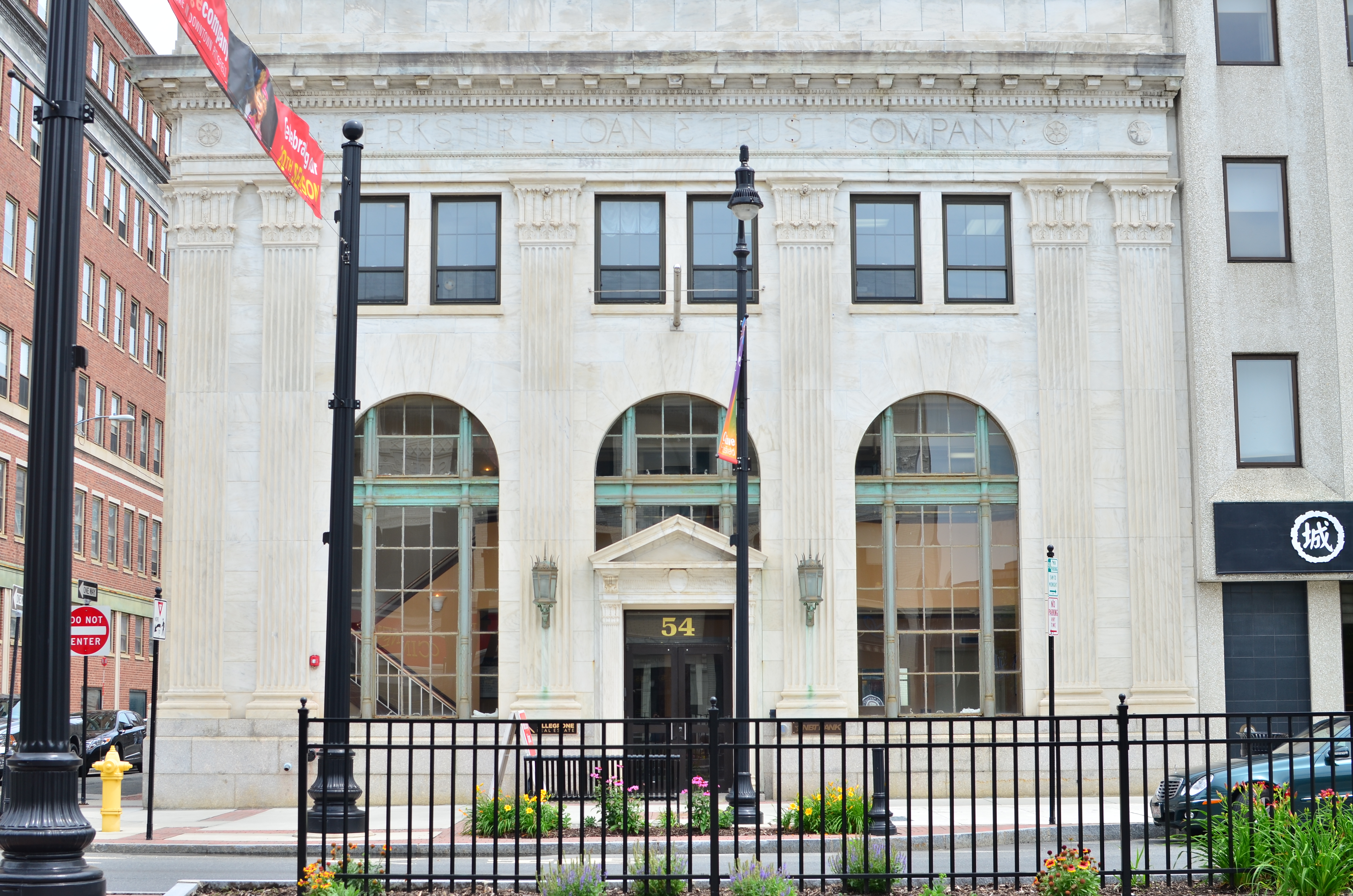
The original full-color image.
The reason I raise all this again is that an in-camera effect usually called “selective color”, now available on many DSLRs, has reminded me of the first days of color photography, which of course was no color at all, except that which was applied through tinting and painting after a monochrome image had been made. Depending on the individual artisan, the hues in these pictures tended to be either a soft wash of faint pastel or a raging rouge of rosy reds, but, most frequently, only selected parts of the image were colored at all, perhaps an attempt to dramatize particular elements of the composition. It was anything but natural, but, in advance of the development of actual color film, it produced some interesting results.
Jump to today’s cameras and the selective color option. You shoot your original image, select it, then zoom in on parts of it to both locate and choose up to three colors that will be featured in a copy of the image. All other tones will be desaturated, leaving you with a part monochrome, part color version of your original, which remains unchanged in a separate file. The effect, as in the past, can dramatize and isolate key parts of your picture, even giving a strange dimensional feel to the photo, but it can take some practice to get the result that you want.
For example, selecting the red of a single car on a crowded street will also catch the same red in other cars’ tail lights, the corner traffic signal, and a neon sign in a building at the end of the block, so be sure you can live with all of that. Also, in some seemingly “white” buildings, shadows or reflected light (as well as aging impurities in some materials) will show some faint shades of color in this process, so that the blue that you said okay to for the corner mailbox will also pick up slight bluish casts in the marble of the bank next door. In the above image, I also made a second, darker copy of the altered image, then blended the two copies in a tone compressing program, to further accentuate the building textures and contrasts.
Bottom line: there is black and white, there is full color, and there is the uber-cool playland in what you could call the middlehues. It’s not cheating to enhance a good picture. It’s only cheating when you use effects to mask the fact that you didn’t take the picture right in the first place.
