COMP RULE #1 (There is no #2)
Lots to see here. Maybe too much.
By MICHAEL PERKINS
IN BEGINNING FORMAL INSTRUCTION IN PHOTOGRAPHY, students are typically steeped in whole systems of procedure on the creation of a composition. In this pursuit, we’ve all trudged through swamps of techno-sludge, from “golden triangle” to “rule of thirds” to “leading lines”, along with dozens of other schemes for organizing visual information within the frame. Many of these credos are, in fact, valuable in training the eye to prioritize the data in their pictures and streamline their effectiveness, and I applaud their use. What irks the semanticist within me, however, is when these tips are referred to as rules. That’s when things wander into the weeds.
This is not mere finicky wordplay on my part; first, the idea of the word “rules” being applied to something as mutative as art makes no sense to me. It is in the defiance of accepted norms that art fully triumphs, and photography cannot breathe if it’s drowning in its own catechism. I understand that we humans love to list things, to map steps out in order of perceived importance. However, when it comes to arranging the photographic frame, I contend that all the approaches we learn about are merely that…approaches, and that, were I to grudgingly use the word rule in regard to composition, that there would only be one: engage the eye.
What else is there? Photographs begin as one person’s vision sent forth with the aspiration of becoming a shared experience. To that end, everything is about grabbing the viewer’s eye and effectively saying, here is where I want you to look; here is the order of importance among the things in this picture. All of the tricks taught about composition are merely a means to acheiving, by many roads, this one objective. Use whatever graphs, spirals, force perspectives or focus tricks you like, or mix them all together; if they don’t result in a conversation between you, the picture and the audience, then you have nothing except mere technical mastery. And just as there are paintings that are more expert in execution than in emotional effect, there are millions of wondrous exposures that communicate nothing.
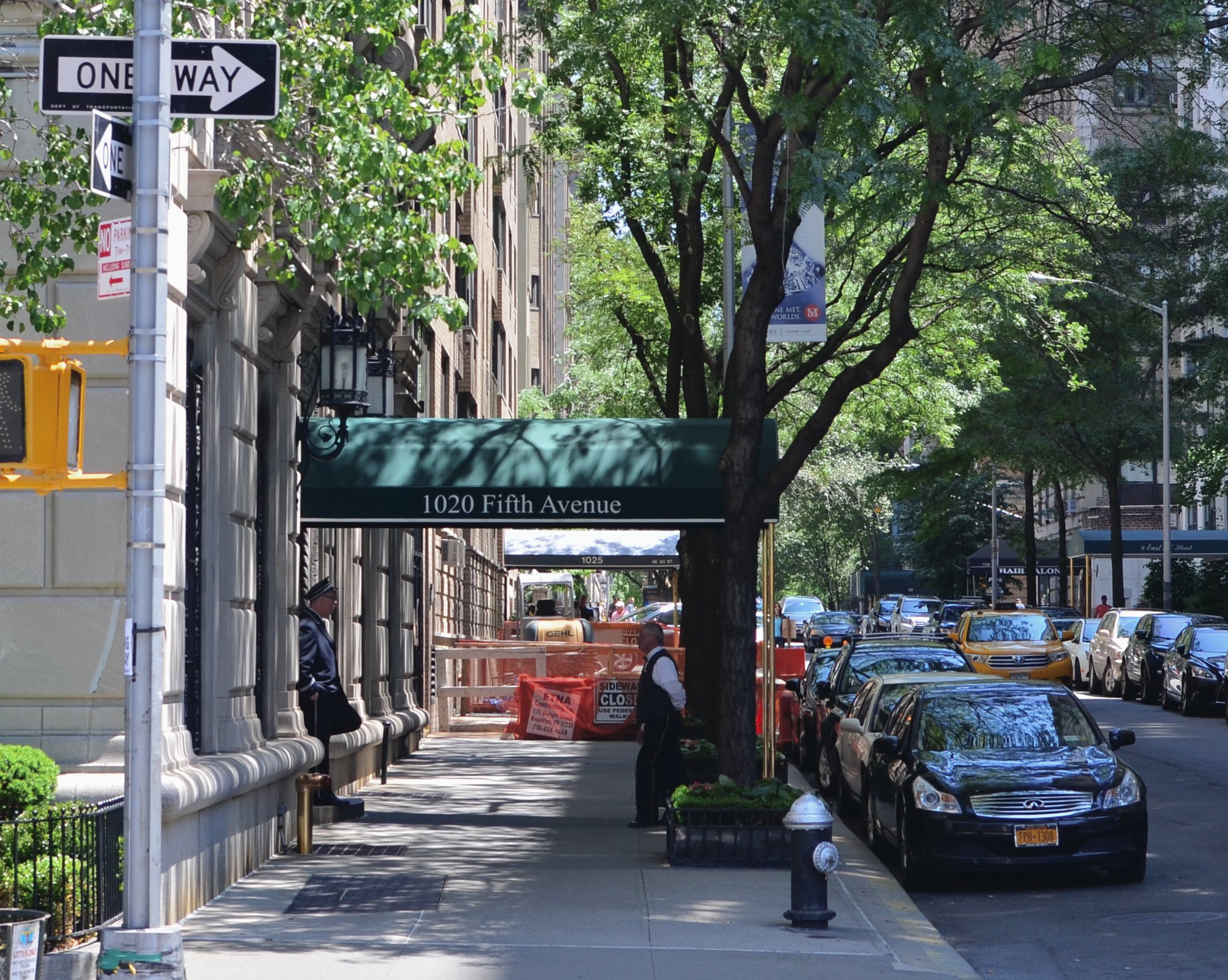
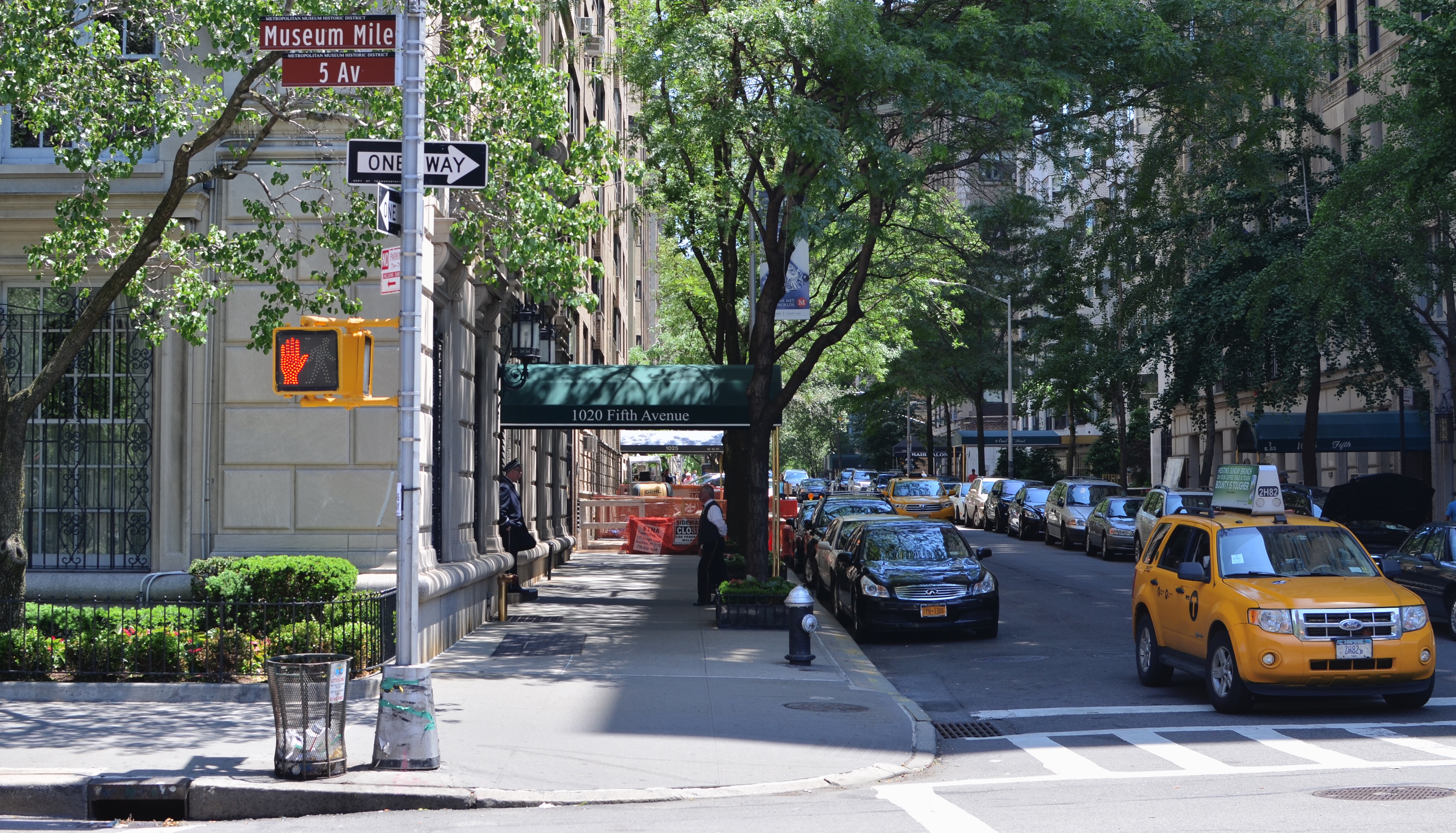
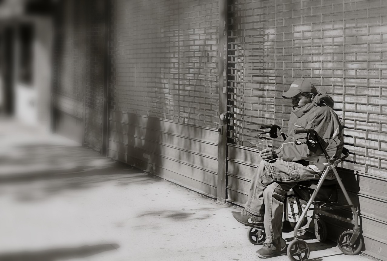
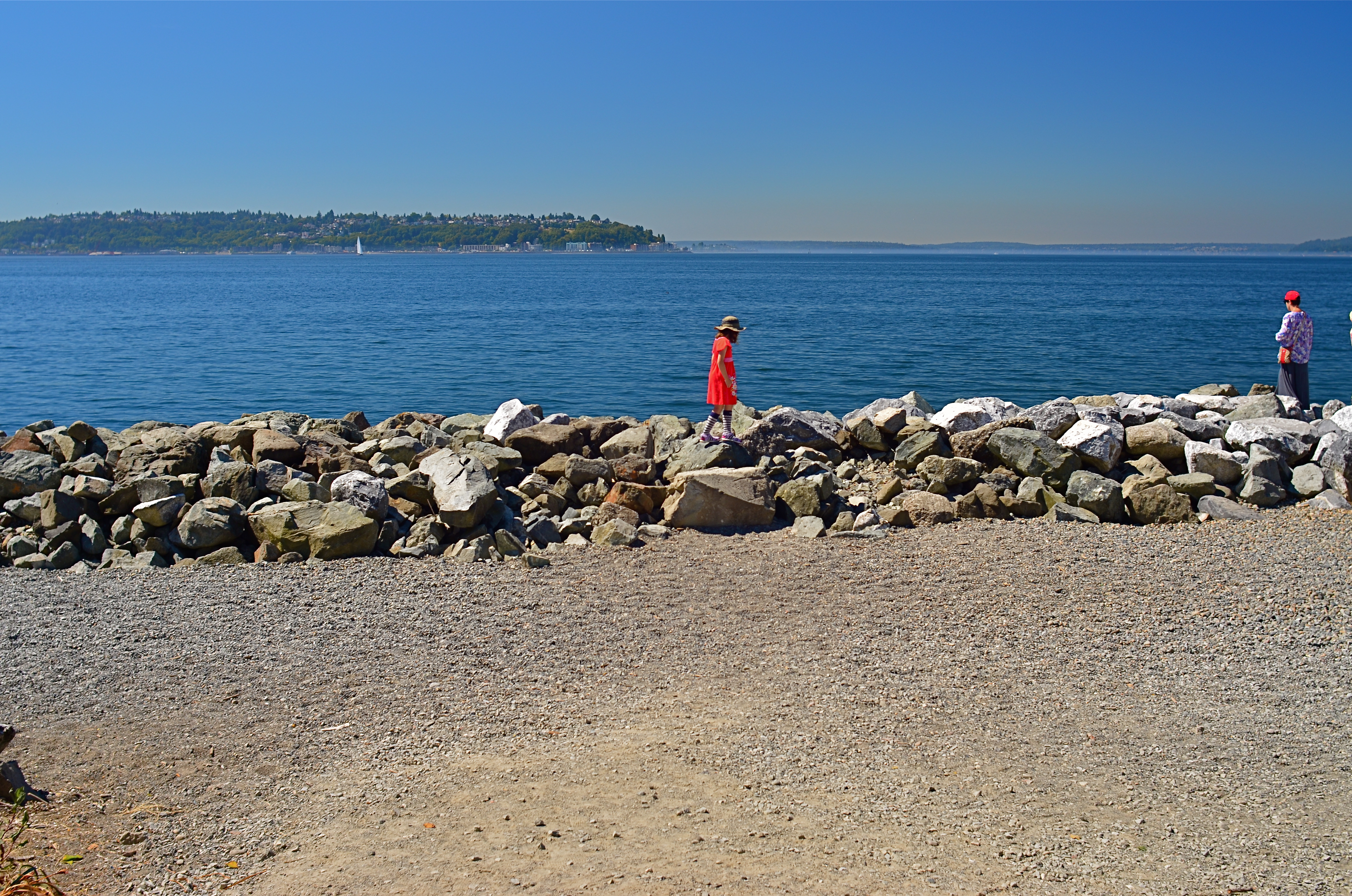
In the inset above, the original of a street scene image is an attempt to express the size and energy of an urban neighborhood. There’s nothing technically wrong with the picture, but, after looking at it for several weeks, I decided that the energy of the shot lay not in the car traffic or even the height of the buildings, but in the conversation between the two men at left. In the cropped version of the shot, seen directly above, this relationship is pushed to the foreground, without losing the feel of the city’s busy energy or scope. Certainly, basic compositional rules might have pronounced the first shot “balanced”, but it’s the deliberate intervention taken to create the tighter version that is an act of composition. And, of course, this is not meant to hold my own work out as an example to be followed. It’s just an illustration of the point that rule-breaking is where pictures begin, not where they go to die. Even though a picture is mounted on a wall with the help of a hammer and nail, no one would argue that either the hammer or the nail is what makes the picture compelling. Engage the eye, and you will have faithfully executed the only compositional “rule” that matters.
PARING AWAY THE BROWN SPOTS
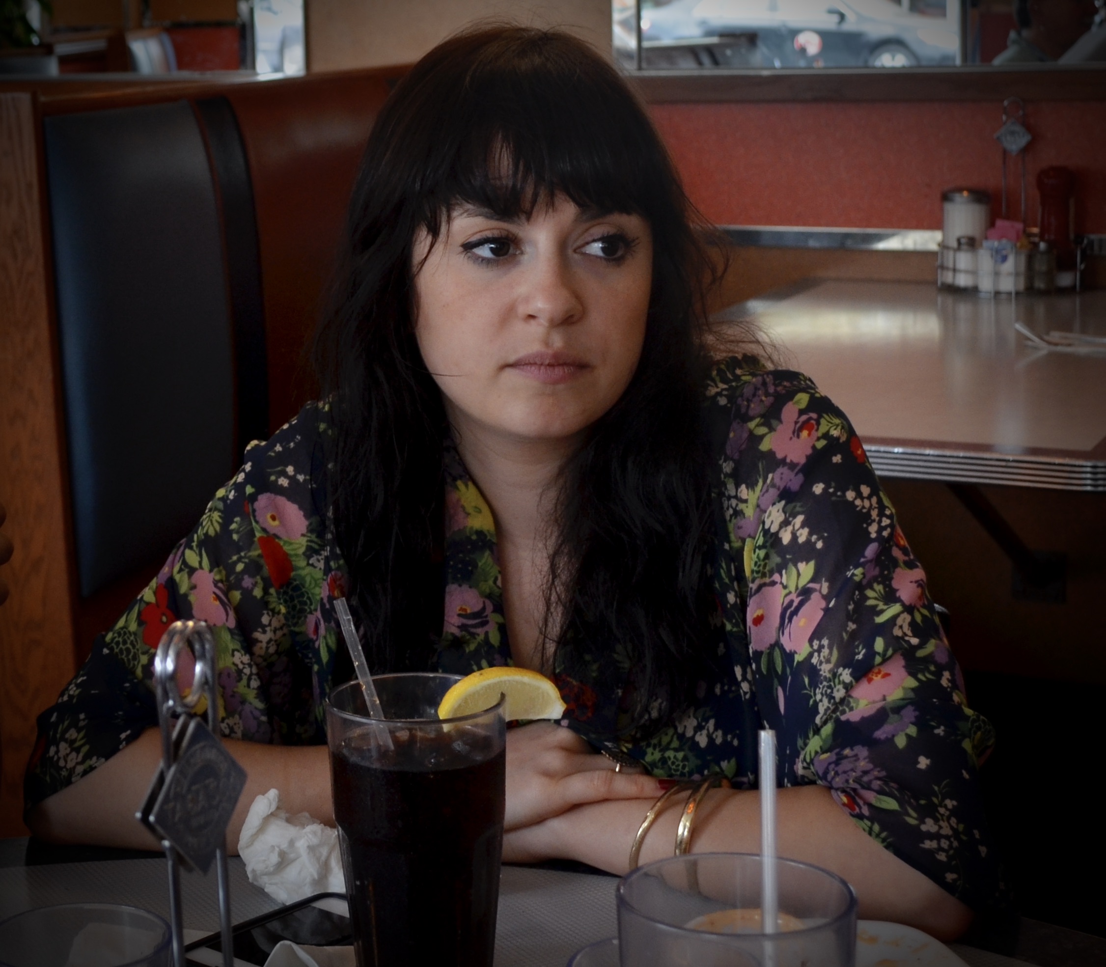
What was originally a general scene in a cafe cropped down to a decent candid.
By MICHAEL PERKINS
I’M A BIG FAN OF THE PRACTICE of distancing yourself from photographs that didn’t immediately connect with you. Some of our images just don’t register with us at first glance, however, in many cases, they can be approached with a fresh eye if you just shove them in a shoebox (digitally speaking) for a time, giving them a second hearing somewhere down the road.
Of course, once you get down that road, you may conclude that your first impression was correct, and that something in the picture was off, or just ineffective. But then there are the late-arriving miracles, the photographs that had to wait until your mind was right to reveal their best truths, eliciting some reaction like “that’s not so bad, after all.” In other words, the ones you’re now glad you didn’t delete in a fit of initial disappointment. The late bloomers.
Often I find that a simple cropping reveals that there really was a decent picture in there all the time, but that it was being eclipsed by all the extra dead space, props or distractions that were also captured in the moment. In such cases, the entire apple wasn’t rotten; it merely needed a few brown spots to be pared away. The trick is to think of cropping not as an admission of failure but as an opportunity.
Few of us have the chops to perfectly frame a great story in an instant. There are a few among us with that talent, and they are the ones enshrined in museums and textbooks. The rest of us can often capture a great picture within a larger picture, however, and in eliminating the fluff and filler we actually redeem it instead of writing it off as defective. One old-school photo editor was famous for telling his shooters to “crop ’til it hurts”, revealing his own belief that, if you kept wielding the scissors without mercy, good pictures would often be freed from the junk that surrounded them. Taking an understandable amount of ownership in our own work, we can often become overly attached to the first version of a project. We protect it like a young mother who cries the first time her baby gets his hair cut. But while great pictures are often “taken” (see earlier remark about the people in museums), many more are revealed by merely peeling away a few dead leaves.
The candid seen here retains less than 50% of the content that surrounded it, which originally included additional people and most of the interior of a good-sized cafe. Given the chance to add all that other clutter back in, I would issue a hard “no” and be grateful for having hacked at the task until I found the real essence of the picture. You have no doubt experienced the same Christmas-morning unwrapping thrill in your own pix. We need to remember that what comes out of the camera is often just the first draft of history, and that helping the best part of it be amplified is not cheating, or “making the best of a bad situation” but staging, directing our dramas for the audience’s best experience.
SQUARING UP YOUR SHOT
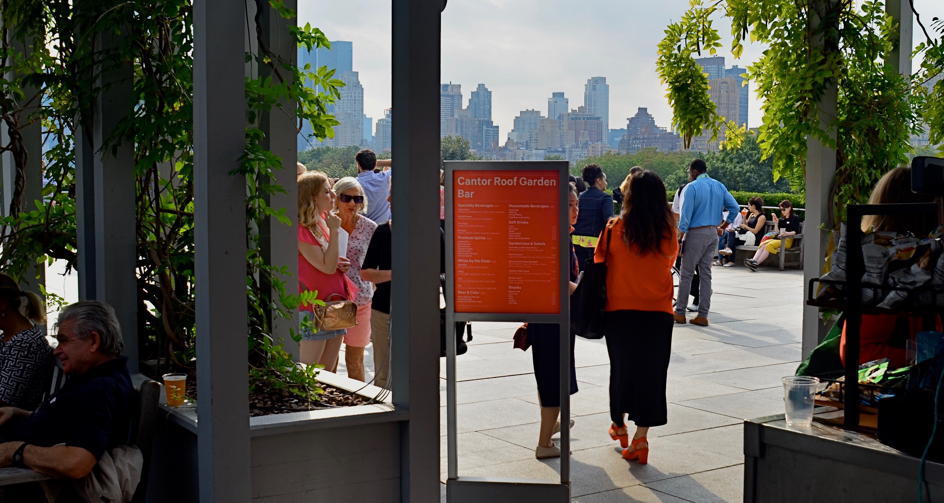
Master shot, taken at the entry to a roof garden atop the Met museum in Manhattan.
By MICHAEL PERKINS
IN THE PRESENT PHOTOGRAPHIC ERA, the default frame for composition is, with some notable exceptions, a rectangle, the 3-to-2 ratio that is the descendant of Oscar Barnack’s first 35mm Leicas of the late 1920’s. Most of us have been taught to automatically compose in this format, a hard-wired habit that informs our entire concept of how to fill a frame. The “notable exceptions” I refer to are the square films that have accompanied the return of instant photography, the lomography movement with its square-framed analog film formats, and, by virtue of a built-in app choice, the mobile phone. Strangely, some of the most sophisticated cameras on the market do not allow you to shoot an original square image: the shot must be captured in a 35mm equivalent and cropped later. But that’s a rant for another day.
The thing is, if you don’t typically investigate square composition, you are robbing yourself of an important tool, or, more specifically, you are allowing yourself to always see subjects in the same “frame” of mind. There are distinct advantages to creating a square composition, not the least of which is that it forces the viewer to take in your picture’s information in a distinct way. While shots that are wider than tall are marvelous for any number of reasons, they do, in effect, invite the viewer to scan an image linearly, that is, to look left to right and back again. By contrast, the square reinforces its equal dimensions, almost forcing the eye into a continuously circular sweep of the contents. I hear people complain that a square just “doesn’t give me enough room to get everything in”: however, I would counter that argument by contending that, in many 3/2 compositions, there is a wealth of visual information that not only is not needed, but actively distracts the eye from the most interesting parts of the photograph. Think of a glass of ice tea that, over time, actually has more volume in it, due to melted ice, than was originally poured into the glass. More liquid, but a greatly diluted flavor.
The problem is not that many square images aren’t being made…far from it. It’s that they are, in many cases, being re-made from rectangular originals, in the editing process. We have to shoot wide and edit square. But therein may lie the best way for us to start seeing what a square composition can do, not merely to define the space of a picture, but to invite the viewer into it more efficiently. And it’s easy and cheap to do it.
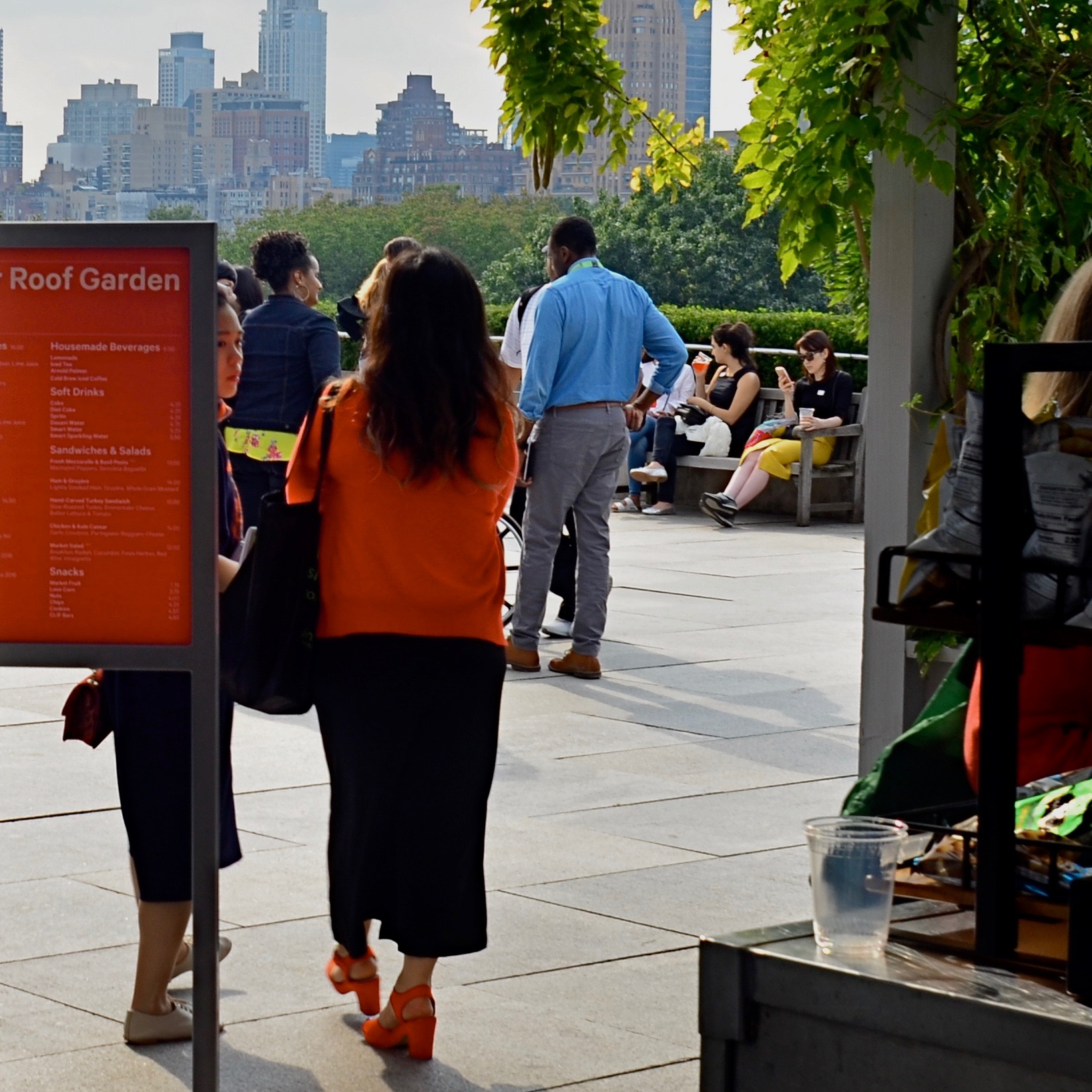
The above image recomposed as a square shot. Net loss or net gain?
Try this: select a series of wide master shots that you feel fairly strongly about, dupe work copies of them, and then crop new compositions within the copies. Junk the ones that don’t work and do as many re-takes as you see fit. Did any of the cropped images emerge as stronger without all that extra stuff you originally felt you had to include? And even if they did not, that’s also a good thing. The mere fact that you’ve begun to intentionally look for pictures within pictures means you’ve entered a new phase of your vision as a photographer. We’re certainly used to thinking of pictures that “came out pretty good’ as final or complete, but it’s a good thing to think of them instead as workable drafts. In the wider shot seen ay top, I successfully conveyed that people were stepping onto the roof of the Met museum in NYC, but I also got a lot of things in the shot that aren’t necessary to the telling of that story. The main tellers in the picture are the two women, who, like us, have just arrived. They are our surrogates or guides. Cropping actually makes the red of the sign in front of one of the women cry for your attention, guiding you to the women even as it partly conceals one of them. Additionally, the same top to bottom space that they occupy also shows part of the skyline that borders Central Park. The front to back scale of the shot says “on the roof, in the city”, at some distance.”
So judge for yourselves, as you would with your own pictures. Did anything I took away in cropping diminish the impact of the picture? Does the lower frame now feel open, cramped, or, in Goldilocks fashion, about right? Is there an appropriate emotional distance from the subject, or a welcome intimacy with it? Is there, in short, an overall net gain for the narrative power of the image once it’s been cropped? And most importantly, even if this experiment fails (with the wider picture still being stronger), haven’t I already begun to see every picture in at least two fundamentally different ways? New ways of seeing are among the most powerful tools in a photographer’s kit. The world of cameras may indeed default to a rectangle, but that doesn’t mean our brains need to follow suit.
WHAT DID I MEAN BY THAT?

A “night” conversion of a shot originally shot in bright midday light.
By MICHAEL PERKINS
YOGA TEACHERS, AT THE START OF CLASS, often invite their students to “set their intention” for the session, making at least part of what is largely a physical effort a partially mental one as well. Said intention need not be the achievement of world peace or the eradication of disease, of course. Often, just deciding that you’re going to exit the hour with a clearer brain than you entered it is plenty. The idea is chiefly to form the habit of pre-planning the experience, of asking yourself “what do I expect from this?” It’s also the best kind of mental conditioning for the making (rather than the taking) of photographs.

An original daylit image from the same shoot.
Even in the most casual snapshot, there is at least an instant in which “intention” is set and a plan is executed. There is, truly, no such thing as a pure photographic accident. Certainly, you may not have sufficient time or technique to make a shot work out, but just because you weren’t able to get what you set out to get, your intention was established. Some instantaneous judgement call that “this might make a good picture” is in operation, always.
The trick over time for improving one’s success rate is thus twofold: first, to close the gap between what you envision and what you can deliver, and, second, developing the means to, through processing and editing, rescue or even re-set your intention for a given picture. In normal-people circles, this process is called “changing your mind”. Seriously, what is post-processing in most cases but a renegotiation of your original intention? What photographer willingly accepts the ideal of “straight out of the camera” if it means that his/her vision actually goes straight into the sewer? When Ansel Adams called the photographic negative “the score” and the print “the performance”, he was, in fact, asserting that exactly half of a photograph’s destiny is decided after the click of the shutter, something that, thankfully, is a more universally embraced belief in the digital era, which, not incidentally, has placed more control within the reach and budget of billions of users, a control that means choices. Let’s be clear, however: this is not about “saving” bad pictures. It’s about polishing the gems.
One of the simplest ways I myself re-juggle the intention of a shot is in the light relationships. The image you see in the thumbnail here is an original from a series of shots I took on a gorgeous Saturday morning in spring of 2015, conditions which perfectly served the picture of the church as I first envisioned it. The sunlit version emphasizes detail and a very light color scheme. By comparison, the reprocessed version (above) is practically what movie folks used to call “day for night”…that is, shooting during the day in such a way that resembles night, but preserves discernible information in a way that true night shooting obscures. The color scheme is very deep, and nearly all detail is sacrificed except that of the front of the building, which is made to appear as if it were illuminated by the warm light of a setting sun. The shift of the intention exchanges the effect of all that fine detail for the impact of understatement. More to the point, I don’t need to show the grit of every stone or the grain of every slab of wood to make the picture work, and so what is paramount in a day-lit shot becomes expendable, even excessive, in the nighttime version.
Again, even in the most reactive of snaps, all photographers know what they are going for. If they get some of it ahead of the click, with the rest of it recoverable through processing, why are those tweaks any less of a “setting” than the shooter’s original choices of aperture or shutter speed? Can the precious purity of SOOC (straight out of the camera) actually make us abandon pictures that might, with a little encouragement, make the finals? And why should that be?
TO BE CONTINUED
By MICHAEL PERKINS
AFTER YEARS OF STALLING AND DREAD, I just this week consigned my old desktop to the dustbin, and, at this writing, am taking a few days to reflect before its bright, shiny successor takes its place in my cluttered workspace. Normally, I wouldn’t even register the time blip between one computer and another, because, really, they’re just things, right?
But this seems different, only because this particular gizmo became the extension of almost everything I endeavored to do as a photographer over the last ten years. When I first inboxed the old girl, I was still teetering between film-dominant and digital-dominant work. Photoshop was a series of way-expensive DVDs that you bought at “the computer store”, a term which, then, still meant Gateway and Radio Shack. Cel phones were equipped with cameras that produced images that looked like bad xeroxes viewed through a mosquito net. “Mirrorless” meant a bathroom with no place to check your hair and makeup. “Raw” was how your guru liked his vegetables.
When my now-euthanized kerputer was new, the average shooter was only passingly familiar with online post-processing, the “digital darkroom” that was quickly revolutionizing how images were shot, tweaked, transmitted, and published. The art of photo editing, in some quarters, became more about fixing a photo than taking it, with many editorial decisions about the picture on Page One being made by young Turks who had never held a camera in their hands. In my case, my computer took me into new areas of control and refinement, even as I strove to create most of my magic in-camera. I traveled through new lands with names like HDR, Lomography, and There’s An App For That. Most importantly, the blog you’re now reading was born on that now-obsolete device, as well as the means for illustrating and editing my personal journey from taking pictures to making them.
And so, yeah, I’m just moving from one tool to a newer version of that tool, just as I once moved on from my childhood piano to the one I play now. But, even though you may own many bikes during your lifetime, you hold a special place in your heart for the one you learned to ride on.
But it is, finally, about the ride, not the vehicle, just as photography is about normalizing the eye, not mastering a particular camera.
So let’s get pedaling, and see where this road goes.
YOU’VE HAD AN EFFECT ON ME
By MICHAEL PERKINS
“FULL–FUNCTION” CAMERAS (I try not to call them “real”) have made several concessions to the invasion of the mobiles over the last decade, adding features that tweak or sweeten images after they are taken, in the manner of cel-camera apps. The most commonly used functions, like cropping or straightening, have been joined over the years by monochrome converters, fisheye-like distorters, and selective color effects, which allow the user to desaturate discrete parts of a picture for a part-color, part B&W composite. Occasional use of these DSLR tweaks, as with those in App World, can yield interesting results. Their over-use, however, can erase the thin wall between tool and gimmick.
Effects oftimes go beyond merely enhancing a shot to loudly calling attention to themselves, and thus upstaging said shot completely. Of course, if you want to establish a personal style that always expresses itself in sepia tone or double exposures, by all means rock and roll and Godspeed. Generally speaking, though, special effects have the greatest impact when they are the spice, and not the meat in the recipe.
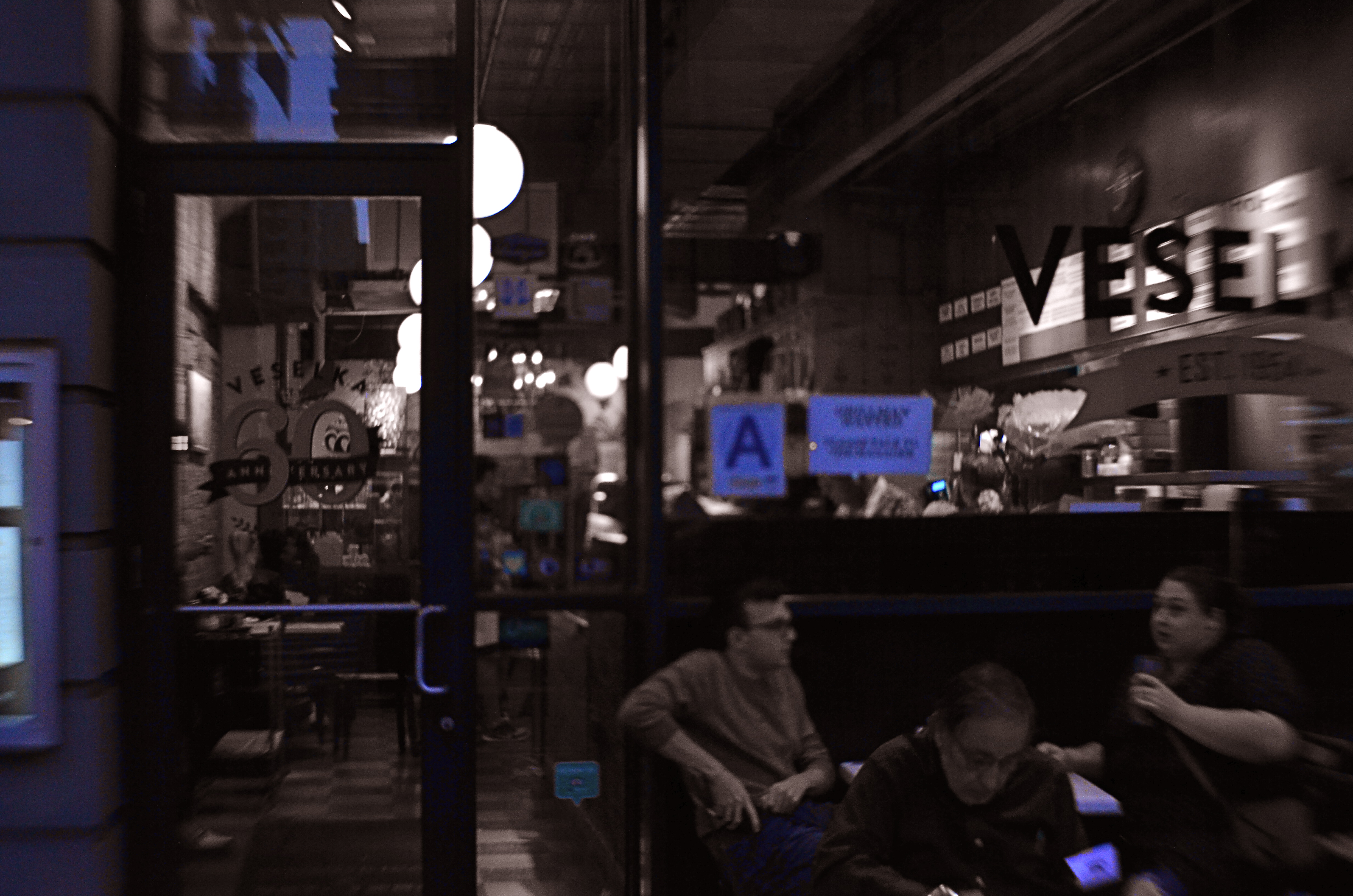
Later, At Veselka’s, 2018
One that I keep playing with, trying to decide if it’s truly useful, is the aforementioned selective color. Desaturating only parts of an image is tricky, because the monochrome elements must work in at least some way with the remaining chroma, lest the color/no color ratio be jarring. Remember, you merely want your viewer to get the impression that something has been subtly improved in the picture, not drastically rehauled.
In the restaurant scene shown here, night had already rendered most of the darkened areas as nearly grey already, so converting that to b/w wasn’t a stretch. I took out the reds from various neon signs and the ambers and yellows caused by my camera’s misreading of the light temperature, and elected to keep the blues, in an attempt to use them as an extension of the blacks and grays. Whether I think I succeeded depends on which day I view the result, but my intention was to add just a flavor of mood to a photograph that was essentially mono.
I think the best way to avoid going wrong with the use of a post-processed effect is to begin with a picture that’s already 99% of what you were going for……using the tools to give a “pretty good” image a nudge, rather than a shove. As in photography in general, it’s a game of inches.
PARING AND SPARING
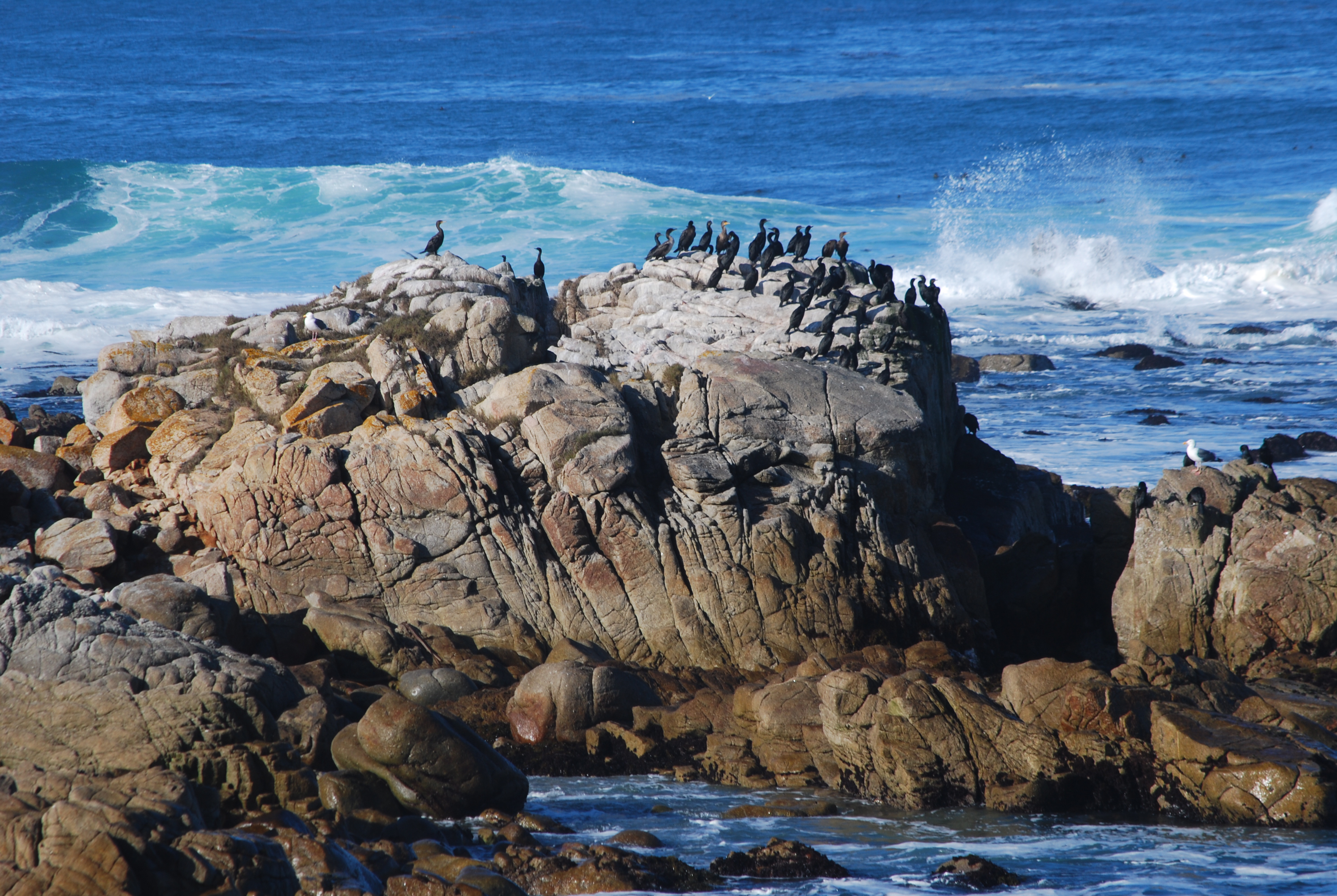
Standard landscape composition. Lots of….well, everything.
By MICHAEL PERKINS
ALL REAL ESTATE IN A PHOTOGRAPH IS PRIME REAL ESTATE.
Space within a composed frame must be earned. Every element that doesn’t strengthen or streamline a picture’s narrative power is detracting from it. Remembering this simple rule makes editing as easy as it is essential.
It’s usually true that you add something to an image by taking something away from it. This can seem counter-intuitive when shooting landscapes, epic-sized collections of scenic…stuff, where wide-angle lenses rule the roost and it seems to just make sense to crowbar as many trees, mountains, and waves as possible into the scene, as if more will automatically be better. However, the same thing is true of vast vistas that is true of smaller ones: there are few photographs which are uniformly strong from top to bottom, end to end. You have to find the strongest core within the larger picture and pare the rest away.

The tighter shot lurking within.
I call attention to this because, slow learner that I am, I can often spend years coming to the conclusion that one of my pictures has been weakened or held back by a hyper-abundance of information. The topmost shot, an original from a 2008 trip to Carmel, California, is a case in point. None of the visual elements are particularly wrong: it’s more like they are simply too plentiful. There’s just too much sky, sea, and stone…..that is, far more than is needed to sell the story.
Worse, the grouping of birds at the center of the frame, which is potentially strong enough to economically make smarter use of all those other elements, is being buried under all the surrounding… padding. The eye is being asked what to prioritize as it wanders its way through too much picture. By comparison, in the second shot, reframed as a mostly horizontal composition with the birds bumped up to prominence, the picture is now telling the eye what to see.
Which only serves to illustrate that what is left out of an image is just as important as what is left in it. Just like you can muck up a story with too many plot lines, you can get in a picture’s way by making its narrative take too many detours. Say what you have to say in the cleanest way possible, and then drop the mic.
EVERYTHING IN ITS PLACE
By MICHAEL PERKINS
EVERY PHOTOGRAPH REMOVES SOMETHING from its original context, extracting it from its proper place in the world at large. In the act of placing things in a frame, the photographer excludes whatever else once surrounded that thing, so that, in the final result, a vast valley is reduced to one tree in one part of one meadow. Our mind stipulates to the supporting reality of whatever was extracted, and we either approve or disapprove of the shooter’s arbitrary editorial choice in composing the frame.
And so pictures often annihilate an object’s “origin story”, since we can’t often search them to view what something “came from”. Objects in a photograph merely are, with little obvious evidence of what they used to be. Sometimes that means that, when we do see where something originated, a picture of it can seem exotic or strange. And, as photographers, we can train ourselves to find that one view of a thing that has been, in effect, under-explored.
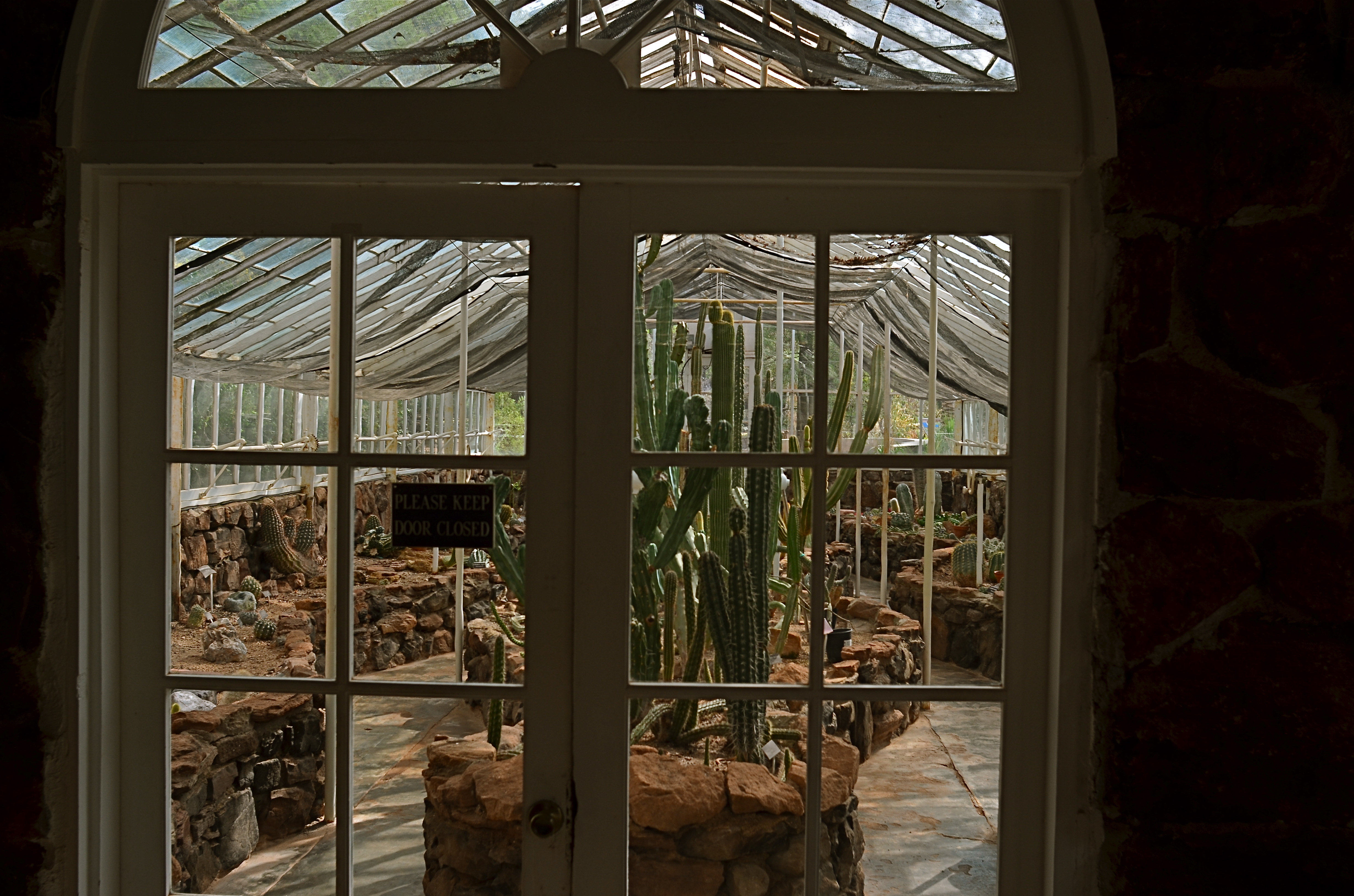
1/125 sec., f/5.6, ISO 100, 24mm.
In the above picture, something that we tend to think of as being organically “born” in a natural setting (i.e., a cactus) is shown being deliberately farmed within a controlled environment (i.e., a greenhouse). It looks a little wrong, a bit strange…..certainly not typical. And yet, an interesting picture can be made from the scene, simply because we never see a cactus’ origin story, given that most photographs don’t select that story within their frames. This picture really doesn’t display its information in an original fashion: it’s the thing, in this particular context, that makes the photograph seem novel.
As always, the choices made inside and outside the frame of a photograph set the narrative for it. It’s therefore the most important choice a photographer can make.
ROLL-PLAYING
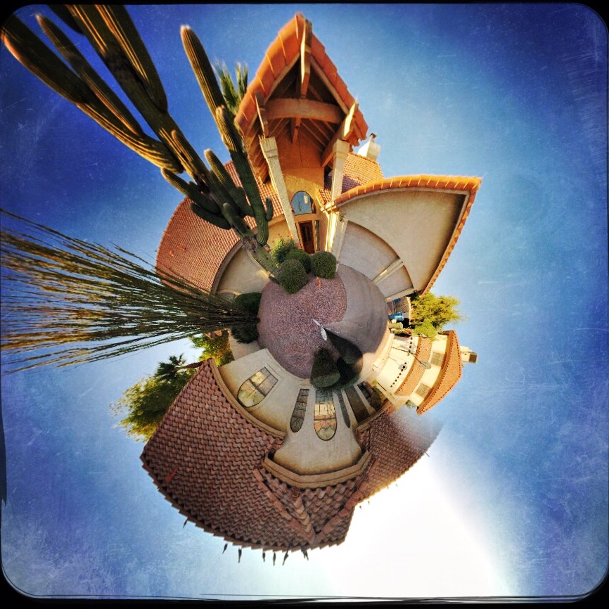
A typical “small planet” effect created in the phone app Rollworld.
By MICHAEL PERKINS
MANY OF THE APPS BEING PEDDLED as post-production fixes for mobile photographs are one-trick ponies, limited in their range. This is less so than it once was, with new apps adding progressively more features, but there are still tons of single-purpose processes out there, gobbling up phone storage with apps that perform one task well. Want a second task? Download another app.
The fun part for me is to discover that, while a given app may have been created to solve a particular problem, it can also be used creatively to do something completely different. Take the example of the now-cliched creation of so-called “small planet” pictures, in which a standard landscape is spiraled into a ball shape, with its various tree and buildings now looking like features on a self-contained world, rather like the illustrations in The Little Prince. This process was once a somewhat complicated one, but, like almost everything else in the digital world, it’s been shorthanded to a few clicks and sliders in apps like Rollworld, which is not only cheap but insanely simple to use.
A DSLR image uploaded into a celphone and remixed in the Rollworld app.
If you approach the use of such a specialized app in the simplest way, you’ll produce your five or ten little planet images (see photo at upper left corner), get the novelty boiled out of your blood, and then move on to something newer and shinier. However, Rollworld and programs like it can be a nice creative tool beyond their most obvious trick. The various sliders in RW let you not only roll your original linear image but control how it rolls, allowing a kind of folding-in, folding-out distortion. You can thus completely abstract even the most mundane cityscape into a symmetric pattern of textures, maximizing small things or relegating prominent features to the background. Other Rollworld sliders allow you to determine the tightness or looseness of the roll, to control the angle of the pitch, even swipe features from one part of the image across parts of the others to mirror or multiply specific items into a better symmetry. Call it Kaleidoscope-in-a-box.
I even import some of my standard DSLR images from various websites like Flickr (see above right) into my phone so they can be processed by the app as well. One problem: You want to save your end product at the highest possible file size. Even at that, some of them will only display well on monitors or the web, and may be too small for good resolution when printed out. This is a major problem with phone images in general: they are still designed, for the most part, to be outputted to other phones and screens.
The idea here is that many apps are capable of giving you more than the advertised effect if you play a little. It takes so little time and effort to experiment that you quickly build experimentation into your typical workflow. And that can only help you grow faster as a photographer.
BINGE / PURGE
 By MICHAEL PERKINS
I AM STILL IN PAIN, several days after the most aggressive photographic housecleaning I’ve endured in years, the ruthless removal of years of deadwood from a photo-sharing site on which I’ve parked way, way too many wayward pictures. This was, finally, the week to toss away the old moose head in the attic, the day to tearfully admit that you no longer fit into your varsity jersey. Hail and farewell, parting is such sweet sorrow. Goodbye and good riddance.
OVERHEARD DURING MY EDITING/DELETING PROCESS
Oh, My Gawd…
What even is that?
Well, that certainly didn’t work…..
Nothing wrong with this one…..except the lighting, aperture, and composition…
Seriously, what the hell is that?
Lots of this concentrated cringing over pix of yesteryear speaks to my old acronym SLAGIATT, or Seemed Like A Good Idea At The Time, the simple truth that what you believe is profound at the time of the shutter click will strike you as reeking fish wrap several miles down the pike. We do outgrow, update, and disown old ideas, hopefully replacing them with better ones.
To take it a bit further, if a significant number of your old images don’t make you want to reach for the bilge bucket, one of two things is true. (1) You are already God’s messenger, the one true Messiah of photography (unlikely), or (2) you are so mired in habit and false comfort that the way you shoot is the way you always shot and the way you will always shoot. Given those choices, it may be preferable to regard at least some of one’s work the way Jack Nicholson’s Joker riffed through Vicki Vale’s portfolio, i.e, “crap…..crap….crap…” It hurts, but it’s healthy.
Every binge must have a purge, and the gluttonous output of the digital age guarantees one sure truth: they can’t all be gems. I hate having to disown my kids as much as the next shooter, but part of learning is learning to fail, admitting that at least some of those kids will never Get Into A Good School, Settle Down With Someone Nice, and Start Giving Us Some Grandchildren. If for no other reason than to help us know excellence when we see it, we need to be able to fearlessly label all the loves we have lost.
SLAGIATT
Lighting A, Concept D…
By MICHAEL PERKINS
I CALL IT NO–FUNDAY, the painful exercise of poring over photographs that I once considered “keepers” and now must reluctantly re-classify as “obviously, I’m an idiot.” For any photographer, self-editing one’s output is just the kind of humiliation one needs to keep on shooting, if only to put greater distance between one’s self and one’s yester-duds.
To make the shame of disowning my photographic spawn even worse, I find that, more often than not, technical failure is usually not the reason I’m lunging for the delete button: it’s the weakness of the conception, a basic lifelessness or lack of impact that far outweighs any errors in exposure, lighting, even composition. In other words, my worst pictures are, by and large, bad because they are well-executed renditions of measly ideas.
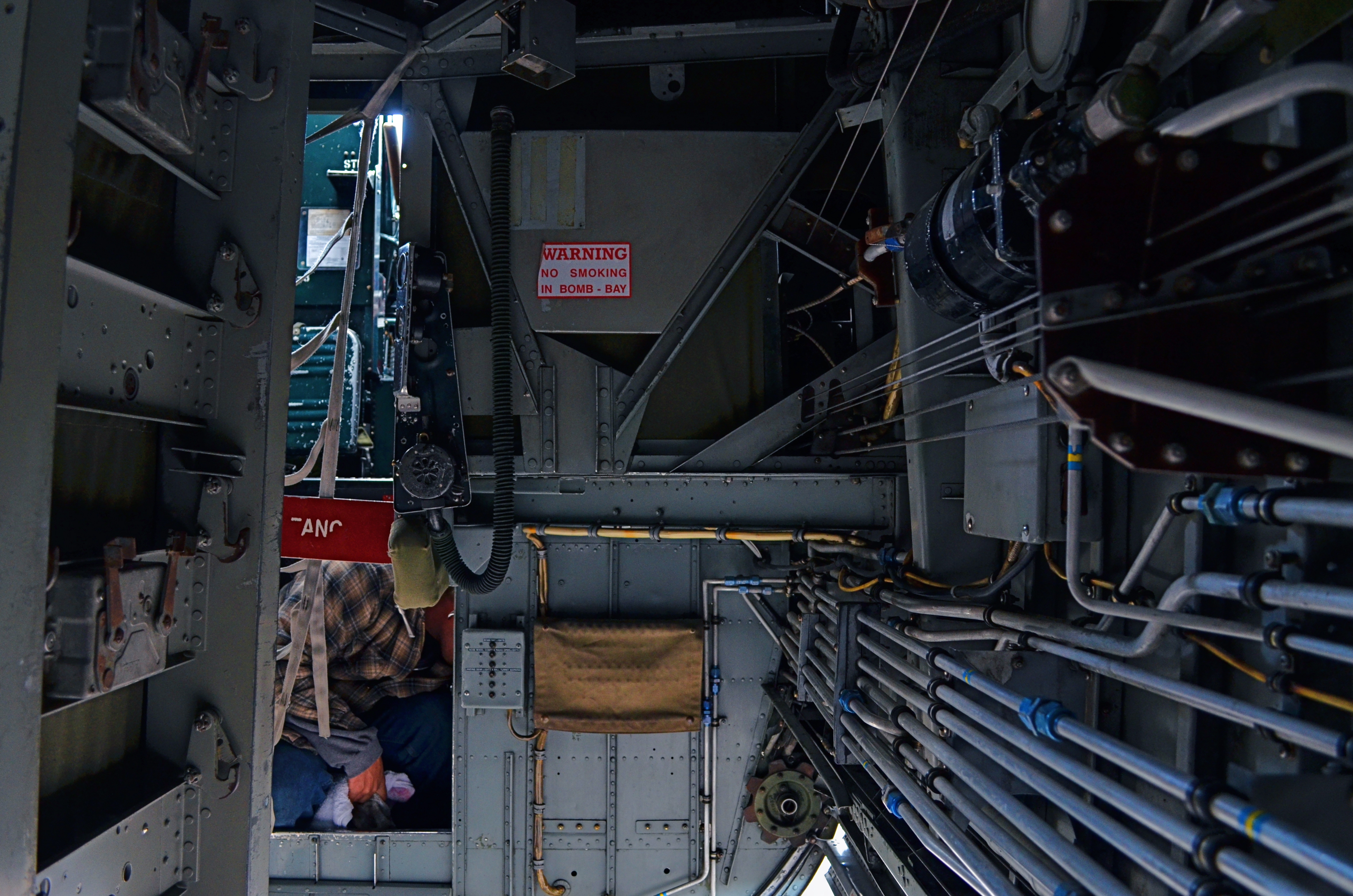
In my mental filing cabinet, I refer to these images under the acronym SLIGIATT, or Seemed Like A Good Idea At The Time. The image above is a perfect example. This shot, taken inside the underbelly of a WWII bomber, presented a ton of lighting challenges, but I spent so much time tweaking this aspect of it that I neglected to notice that there just isn’t a picture here. It tells no story. It explains nothing. It’s just an incomprehensible jumble of old equipment which lets the eye wander all over the frame, only to land on…..well, what exactly? But, boy howdy, it is well-lit.
SLIGIATT photos are, of course, necessary. You have to take all the wrong pictures to teach yourself how to create the good ones. And mere technical prowess can, for a time, resemble quality of a sort. But technique is merely craft, and can be had rather easily. The art part comes in when you’re lucky enough to also build a soul into a machine. As Frankenstein figured out, that’s the difference between being God and playing God.
TEN NO’s AND A YES
By MICHAEL PERKINS
THERE ARE CERTAINLY MANY MORE PICTURES BEING TAKEN than there are great pictures taken. That’s as it should be. Anything at which you wish to be excellent only comes about once you’ve learned what not to do, and that means lots of errors, lots of images that you feel compelled to destroy almost as quickly as you’ve created them. You must, must, must, take all the bad pictures right alongside the good ones. At first, the garbage will outnumber the groceries.
And then, some day, it doesn’t.
We all have pictures that worked out that we almost didn’t take in the first place.
I am an A.B.S. (Always Be Shooting) shooter. I mean, I make myself at least try to make a picture every….single…day. No excuses, no regrets, no exceptions. Reason? I simply don’t know (and neither do you) where the good pictures are going to come from. For me to give myself permission not to try on a given day means I am risking that one of those potentially golden pictures will never be born. Period period period.
In a way, I often think photo technique guides from years gone by had things backwards. That is, they often made suggestions of great opportunities to take great pictures. You know the list: at a party: on a vacation: to capture special moments with loved ones, etc., etc. However, none of these traditional “how-to” books included a category called “just for the hell of it”, “why not?”, or, in the digital era, “whattya got to lose? You’re shooting for free!” These days, there are virtually no barriers to making as many pictures as you want, quickly, and with more options for control and creativity, both before and after the shutter click. So that old “ideas” list needs to be re-thought.
To my thinking, here’s the one (yes, I said ONE) suggestion for making pictures, the only one that matters:
TAKE THE SHOT ANYWAY.
And to purify your thinking, here’s my larger list, that of the most commonly used excuses not to shoot. You know ’em. You’ve used ’em. And by doing so, you’ve likely blown the chance at a great picture. Or not. You won’t know, because you didn’t TAKE THE SHOT ANYWAY. Here are the excuses, in all their shameful glory:
I haven’t got the right lens/camera/gear. There’s not enough light. I don’t do these kinds of pictures well. I don’t have my “real” camera. There’s nothing to take a picture “of”. Everyone takes a picture of this. I’ll do it later. It probably won’t be any good. There are too many people in the picture. There isn’t enough time.
Train yourself to repeat take the shot anyway, like a mantra, whenever any of these alibis spring into your head. Speed up your learning curve. Court the uncertain. Roll the dice. Harvest order from chaos. Stop waiting for your shot, your perfect day, your ideal opportunity.
Take the shot. Anyway.
WORKS IN PROGRESS
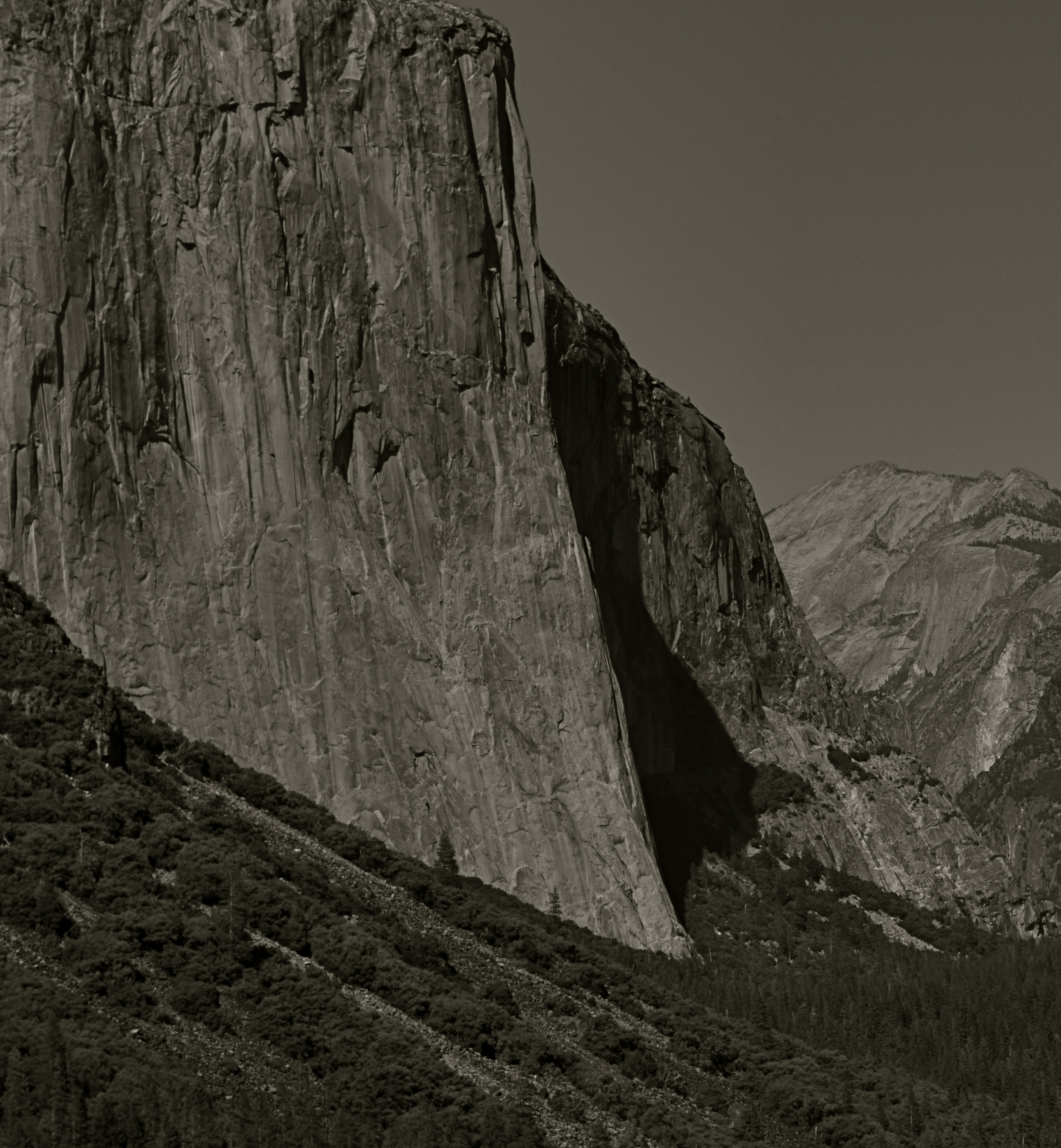
This view of El Capitan in the Yosemite Valley has been annually tweaked with various editing tools since being taken in 2012.
By MICHAEL PERKINS
IN REVIEWING YOUR PAST PHOTOGRAPHIC WORK, you are bound to find shots that you have, for lack of a better term, outgrown. Unpack that word, and what you’re really seeing is the passage of time since you originally visualized a picture, along with the immense distance your eye and mind have traveled en route to the present day. Thus you are both benefitting and suffering from the luxury you enjoyed in being allowed to freeze time. You have not only immobilized a moment, but you have also preserved a record of what your “best practices” were at the time.
This painful but necessary re-assessment applies not only to the techniques used to create the initial image, but, in the incredibly speedy evolution of post-processing, all editing systems as well. Quite simply, if a picture is worth taking, it is worth fighting for…first by being as mindful and deliberate as possible in the taking, and then in a constant re-evaluation of how best to enhance its impact through editing. Therefore, if the first commandment of photography is Always Be Shooting, the second should probably be Never Stop Processing.
The above image is an example of this continuing dialogue. it was originally taken in 2012 and I have revisited it at least annually since then. At the time I first shot it, it was part of a three-shot bracket of exposures that were originally blended in an HDR program to try to get about the same degree of detail in both highlights and shadows….a look which can look great if done with a maximum of understatement, but which often winds up looking like an old Yes album cover under black light. From HDR, I moved on to a series of detail-enhancing programs which were more natural-looking, but still failed to deliver the punch I got from viewing the scene on-site. In one iteration, I added enhancement to a single shot alone, rather than a combination of all three bracketed images. And in 2016, I went back to the trio, mixed this time in an Exposure Fusion blender. And there’s no end in sight.
Ansel Adams, of course, famously re-visited his master negatives with up to a dozen re-mixed versions of the same scenes over decades, re-thinking his own revolutionary “zone system” for measuring exposure for every single particle of a subject, then mastering its application in the lab via burning, dodging and other means of print manipulation. I don’t work with those particular (and essentially film-based) techniques for several reasons, most of them economic. However, that still leaves me plenty of editing choices, with more gimcracks coming online every day.
Point is, pictures that are truly worth working for are also worth re-thinking, and a growing array of tools can give photographers endless ways to re-mix the hits. Of course, you will eventually come to a point where enough is enough. Historically, it’s a good thing that the Pope gave Michelangelo a deadline, or else he’d still be up on that ceiling.
FIXES ON THE FLY
Original DSLR shot with too much color, too much information, and no effective way to isolate the seated man within the frame.
By MICHAEL PERKINS
ONE UNDENIABLE ADVANTAGE MOBILE OR PHONE CAMERAS HAVE OVER THEIR DSLR FOREBEARS is the ability to combine easy shooting and easy editing in the same small package. This adds convenience on top of convenience, allowing mobile pictures to be captured and refined in the field, with DSLR’s more generally tethered to PCs for their post-production editing.
Even more frustrating is that many basic phone cameras have a wider variety of processing options, even without the use of after-market apps, than come in a DSLR’s “retouch” menu, creating a greater disconnect between the “deliberate” editing of the late-film/early digital camera and the “instinctual” editing of phono-photography.
Recently, DSLRs have made it easier to wirelessly send their images to phones’ email inboxes, but, across several manufacturers, the process is far from sleek. But when you can send images taken with the superior lenses and larger file sizes of a DSLR to your phone, you can easily send those emailed items on to your favorite in-phone app for tweaks that can be done on the fly, with more tricks than your “real” camera allows. It also permits you to do radical re-mixes of yesteryear’s shots with today’s tech. Old photos can get a facelift with a lot less bother than if they go through a Photoshop-type workflow.
To illustrate: the top shot, a DSLR original, was way too busy. Jutting walls, extra people, over-bright colors…plenty to remove if the seated man at the front was to draw any central interest. Cropping and de-saturating in my Mac’s editing program was easy enough, but I wanted to further isolate him from the monotonous textured wall behind him.
The same DSLR image with selective focus added via a phone-based app.
The lens I used in the original wasn’t equipped to render different levels of sharpness within the same focal plane, but my phone had a handy app that did precisely that, and that’s where we went next.
Emailing the image to my phone was fast, as was forwarding the picture in the email to be saved as a camera roll image. From there, I sent the picture to an app called Analog Cam, which included a partial diffuser tool, allowing me to gradually blur everything in the focal plane except the man, as you see in the lower frame. Finally came a transfer from the app to a posting on Flickr. Thus with a few extra steps, I gained the flexibility I didn’t have when I shot the original, allowing me to save, salvage and send from one location.
The emphasis for mobile cameras is much more on post-shutter fixing than is the case with a standard camera. That said, there’s no reason why you can’t shoot on one and use the convenience of the other to get the result you want.
TIED FOR FIRST PLACE
By MICHAEL PERKINS
EVERY PHOTOGRAPH IS DISCUSSED LONG BEFORE IT IS VIEWED, with an inner dialogue between shooter and subject that is held, however briefly, ahead of the shutter click. Sometimes, at a fortuitous intersection of talent and luck, that is the end of the discussion; other times, there will be additional chats between the first version of an image and its maker, a talk that can be endlessly debated in the processing and editing phases. And, of course, based on those results, photographs finally make their arguments to the world at large.
The bulk of those discussions focus on what the center, or the essence of a picture should be. Were all elements in balance right out of the camera…in which case, frame it and hang it, case closed? Or (and what is far more likely), did we find that essence at all? Was it compromised, watered down, by faulty composition? Did we make a weak lighting choice here or there? Did execution weaken the effect?
Usually, there is a clear component within a photograph that cries here I am a little louder than all the other parts of it. But sometimes, there are two or more pieces which feed on each other, boost each other’s effectiveness. In such cases, instead of one primary piece and a lot of secondary or extra pieces, you find two things in the photo that are basically tied for first place. When one thing in a picture feels diminished without interacting with another, both elements deserve to stay.

Mrs. Lin’s Summer Bonnet (2016)
The picture at the top seems, to me, to be just such a case. The floral shop and its faceless proprietor seem somehow married to each other, two halves of a whole. And, while I can conceive of making two separate pictures from the master shot in which either the shop’s inventory or the saleslady are in solo starring roles, they truly do seem interdependent, so I declare a tie, and they both go to the finals.
Thus the discussion on what to include in the picture has gone on for at least two layers, with layer one being the planning of the photo, and layer two being the editorial decision to keep both flowers and florist on equal footing in the final image. Look over your own pictures and you will no doubt find several of these “tied for first place” compositions. It can seem counter-intuitive to have more than one main point in an image. But the image itself will tell you, unmistakably, when that actually make the most sense.
THE RIGHT PICTURE IN THE RIGHT FRAME
Horseshoe Bay, BC. The standard “post-card” scenic viewpoint.
By MICHAEL PERKINS
COMPOSITION IN PHOTOGRAPHY, FOR MANY OF US, CAN OFTEN INVOLVE NOTHING MORE than finding a thing we want to capture and getting it all in the frame. Click and done. It’s only later that we sometimes realize that we should have, shall we say, shopped around for the best way, from angle to exposure, to get our quarry in frame. Or even look for a better frame.
The same scene as viewed from a shop window, cropped to classic “View-Master” format.
One of the first tricks I learned in travel photography was from the old scenic shooters who created the travel titles for View-Master Reels, who always thought in terms of framing to maximize the image’s 3-d effect. For a start, since they were working in square format, they automatically had less real estate in which to compose. Secondly, they had to shoot in “layers”, since the idea was to have subject matter in multiple planes, for example, overhanging shade tree right at the front, a tourist midway into the shot, and Mount Rushmore at the back. They also learned to position things just inside the frame’s edge, what was called the “stereo window” to accentuate the sensation of looking into the photograph.
Thing is, all of these compositional techniques work exactly the same in a flat image, and can draw the viewer’s eye deeper into a picture, if used creatively. Certainly you can’t go wrong with a great exposure of a beautiful view. But experiment as well with things that force your audience to peer intently into that view. The image at the top is standard post-card, and works well enough. However, in the shot at left, in taking ten seconds to slip inside a gift shop that also looks out on the same view, I’ve tried to show how you can get an atmospheric framing that both accentuates depth and provides a bit more of a sense of destination. It all depends on what you’re looking to do, of course….but it makes sense to develop the habit of asking yourself how many different ways are available to tell the same story.
Editing a solid portfolio of shots can only begin with lots of choices. Hey, you’re there, anyway, so develop the habit of envisioning multiple versions of each picture, and weed out what doesn’t work. Remember again that the only picture that absolutely fails is the one you didn’t try to make.
(LESS THAN) PRIME OPPORTUNITY
To Susan On The West Coast Waiting (2016). Shot from over 50 feet away with a 24mm wide-angle prime, then cropped nearly 70% from the original frame.
By MICHAEL PERKINS
EVERY DAY-LONG SESSION OF TRAVEL PHOTOGRAPHY dictates its own distinct rules of engagement. You can predict, to some degree, the general trend of the weather of the place where you’ll be staying/playing. You can pre-study the local attractions and map out at least a start-up list of things you might like to shoot. And you can choose, based on all your other prep, the equipment that will work best in the majority of situations, which keeps you from carting around every scrap of gear you own, saving reaction time, and, possibly, your marriage.
All well and good. However, even assuming that you make tremendously efficient choices about what lens you’ll most likely need on walkabout, there will be the occasional shot that is outside the comfort zone of said lens, something that it won’t do readily or easily. In such cases, the lens that would be perfect for that shot is likely forty miles away, back at your hotel. And here’s the place where you can pretty much predict what I advise.
Take the shot anyway.
The original composition.
I tend to work with a 24mm prime f/2.8 lens when walking through urban areas. It just captures a wider field within crowded streets, allowing me to grab most vistas without standing in the path of onrushing traffic (a plus) or spending a ton of time re-framing before each shot (a pain). This particular 24 was made in the ’70’s and is both lightning fast and spectacularly sharp, which, being a manual lens, also saves time and prevents mishaps.
24mm, to me, produces a more natural image than the wide end of the more popular 18-55 kit lenses being sold today, since there is less perspective distortion (straight lines remain straight lines). However, since it is a wide-angle, front-to-back distances will appear greater than they are in reality, so that things that are already in the distance seem even more so. And, since it is also a prime, there is no zooming. In the case at left, I wanted the girl’s bonnet, dress and presence on those rocks, but, if I was going to get any picture at all, plenty of other junk that I didn’t need would have to come along for the ride.
You deal with the terms in front of you at the time. Without a zoom, I either had to take the shot, with the idea of later cropping away the excess, or lose it altogether. There are times when you just have to visualize the final composition in your mind and extract it when it’s more convenient. Simply capture what you truly need within a bigger frame of stuff you don’t need, and fix it later. It’s a cornball cliché, but the only shot you are guaranteed not to get is the one you don’t go for. And this is also a good time to remember that it’s always smart to shoot at the biggest file size you can, allowing for plenty of pixel density even in the aftermath of a severe crop.
You can’t pre-plan all the potential pitfalls out of a photo vacation. Can’t be done. Come as close as you can, and trust your eye to help you rescue the outliers down the road.
But take the shot.
WHEN AND WHERE FOR WHAT AND WHY
Manhattan yellow cabs in a grey street scene. A classic selective desaturation effect.
By MICHAEL PERKINS
THE SHEER NUMBER OF PHOTOGRAPHERS IN THE WORLD pretty much insures that not too many of us are artistically, um, unique. If there was ever a time in the history of the medium when it was nearly impossible to develop a style free of influence (good or bad), it’s now.
That doesn’t make originality impossible. But it does mean that, when one of us evolves a new way of doing things, the speed of adoption means there’s about a half a global second before innovation becomes cliche. And the worldwide online community likewise switches its evaluation of an idea from “brilliant!!” to “hackneyed” within an ever shorter cycle.
One of the tricks that only really came to the fore in the early days of digital editing is the look of selective de-saturation of color. The technique was originally met with great enthusiasm, but to hear the wags that whine and howl around the web, you should now sooner be caught dead rather than use it.
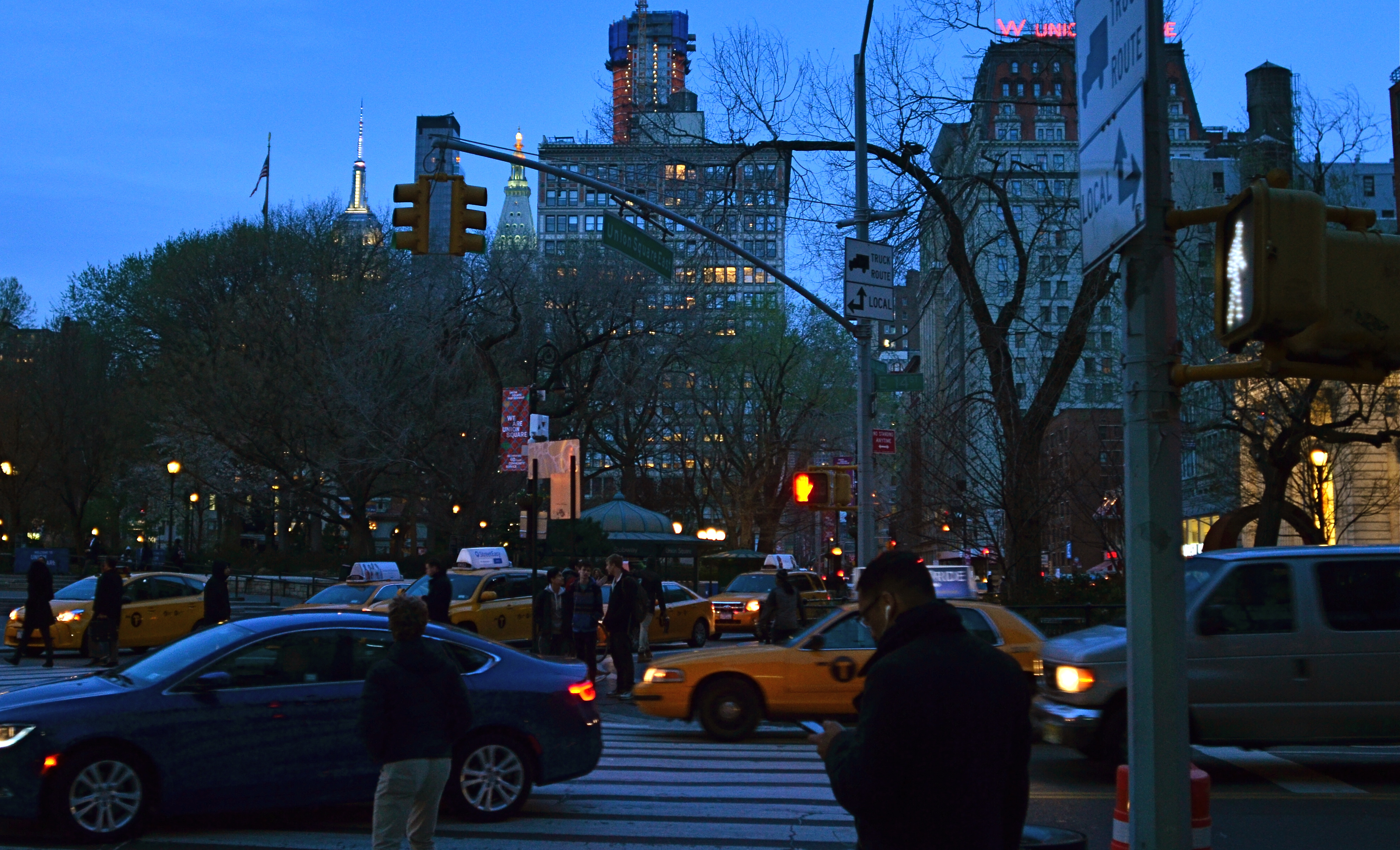
Same scene as above, in natural color. Which version sells the story the best?
Only, it’s not a given technique, per se, that becomes a drag, only its over-use or abuse. Think of canvas art for a moment. No one ever complains that “everybody uses oils to paint!” because it ain’t the pigment that separates the greats from the grunts. It’s what you do once you pick up that brush.
I steer away from partially desaturated shots because, while they can be real attention -getters, I myself don’t encounter many instances where I feel that they will actually help one of my pictures work better. The choice between monochrome and full color is, itself, fraught with a lot of mental measurement, meaning that you have a 50/50 chance in the making of an image to choose the wrong way to make it. Then there are color to b&w conversions, some of which really destroy the power of a photo. All this is before we get into the rather exotic decision of whether to make a picture “part” color.
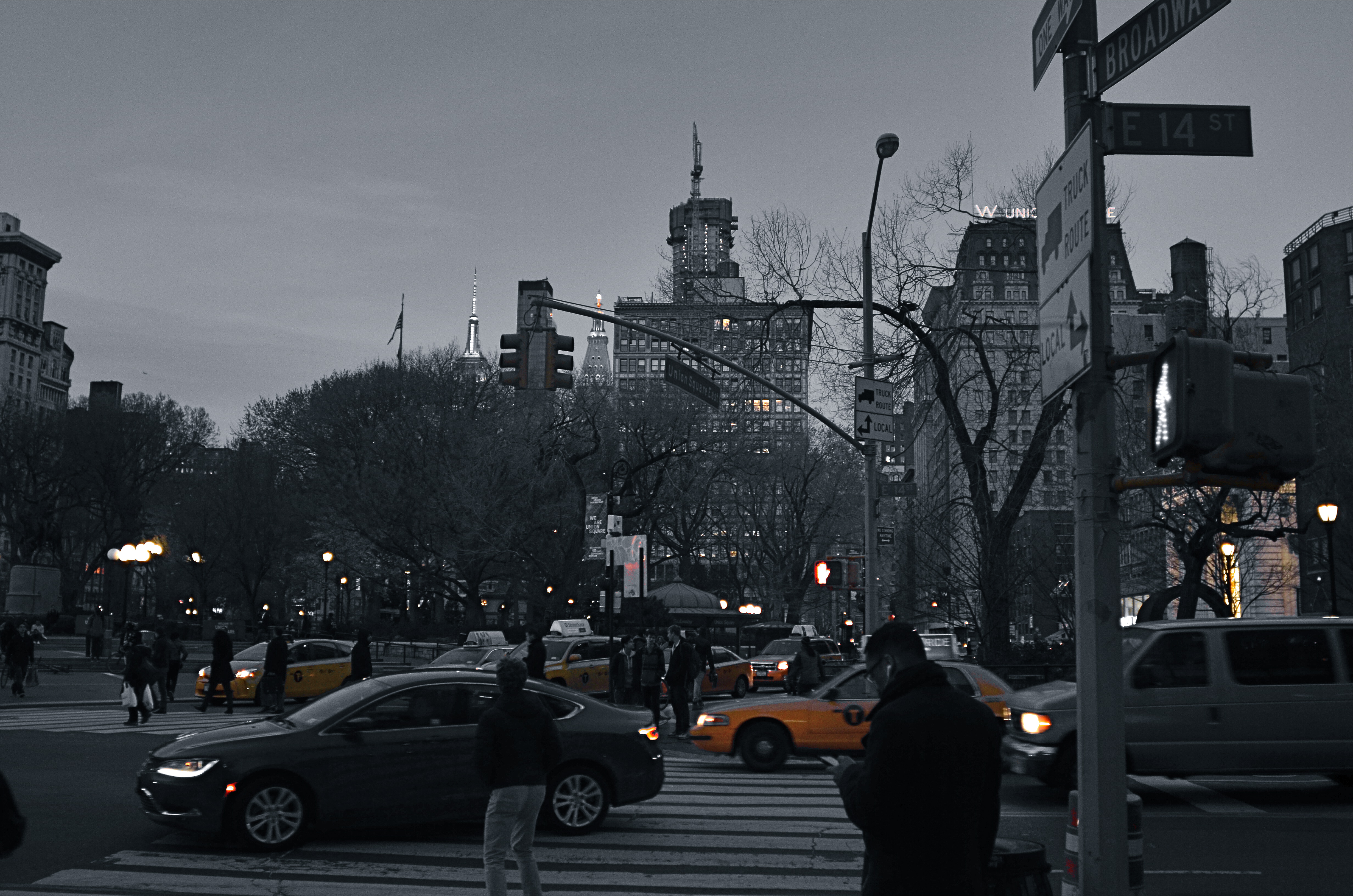
Let’s say that there’s something to be gained by killing off all but the signature Manhattan cab yellow, as seen in the top image of NYC’s Union Square. Okay. It’s certainly technically easy to bring that off, but first you have to get beyond the initial “hey, that’s cool” sensation and ask, very critically, “what else am I giving away to nearly eliminate all the color in this image? Is the color of the dusky sky worth anything? How about the red glow of neon, the amber of lit windows, the darkening skin and fabric tones of passersby?
Lots of techniques fall or rise on whether they add or subtract from the image’s overall selling power. You have to learn when and where to do what…and to know why.
CUES AND CLUES
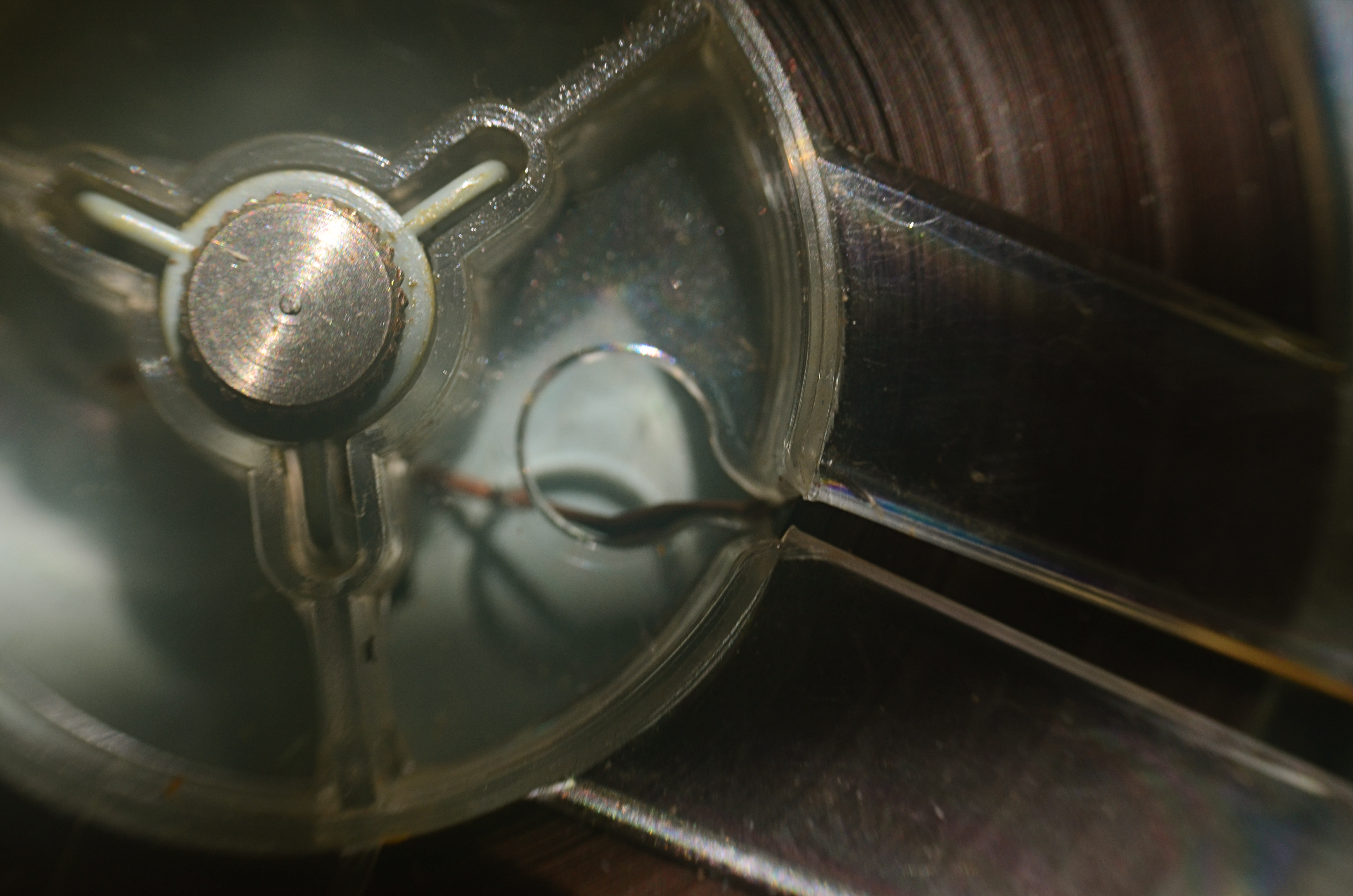
Good Morning, Mr. Phelps (2016). How little of a tape recorder need be shown to convey a sense of that object?
By MICHAEL PERKINS
SAY THE WORD “MINIMALISM” TO SOME PHOTOGRAPHERS, and you conjure visions of stark and spare compositions: random arrangements of light blobs, stray streaks of shadow, or scattered slivers of light, each conveying mood more than content. For some, these images are a kind of “pure” photography, while, for others, they are, to use a nice word, incoherent. Part of us always wants a picture to be, in some way, about something, and the word minimalism is charged, positively or negatively, depending on whether that “narrative thing” happens.
I actually associate minimalism with the formal storytelling process, but doing so with the fewest elements possible. It seems like a natural evolution to me, as I age, to make pictures talk louder with fewer parts. Simple cropping shows you how much more you can bring to an image by taking more of it away, and, with closeups and macro work, the message seems even clearer. Why show an entire machine when a cog carries the same impact? Why show everything when suggesting things, even leaving them out entirely, actually amps up the narrative power of a photograph?
Of course there are times when mere shape and shadow can be beautiful in themselves, and it doesn’t require a lot of windy theorizing to justify or rationalize that. Some things just are visually strong, even if they are non-objective. But minimalism based on our impressions or memory of very real objects, from a pocket watch to a piece of fruit, can allow us to tell a story with suggestions or highlights alone. If something is understood well enough, just showing a selectively framed slice of it, rather than the thing in its entirety, can be subtly effective and is worth exploring.
In the above image, you certainly understand the concept of a tape recorder well enough for me to excise the device’s chassis, controls, even half of its reel mechanism and still leave it “readable” as a tape recorder. You may find, upon looking at the picture, that I could have gone even farther in simplifying the story, and in your own work, you can almost certainly suggest vast ideas while using very small bits of visual information. Knowing the cultural cues and clues that we bring with us to the viewing process tells you how far you can stretch the concept.

THE SNARE OF CHEAP REWARD
By MICHAEL PERKINS
SOCIAL NETWORKS HAVE PRODUCED TWO PROFOUND EFFECTS in the world of photography, one essentially beneficial, one essentially harmful. Certainly the ease with which photographs are instantly publishable on every conceivable distribution platform is a boon to communication and art. In one sense, every photographer has the potential to have his/her work seen: the world is now a gallery. However, that very same effortless global forum has the potential to flood the world with images that are ill-conceived, trite, lazy, or just plain banal. The world’s shooters are fully woke, for sure, but the world’s editors have joined the ranks of Rip Van Winkle.
Photographers before the web era were hemmed in by more stringent parameters of quality than is typical of the digital age. In professional circles, editors rejected 90% of a shooter’s work to select the small number of shots that would pass through the narrow neck of available publication platforms. At the same time, cost and technical barriers kept the total number of people who could even be photographers artificially low. The result was an exclusive club limited to only the best people and their best work.
As for the amateur market, people’s good and bad personal pictures had no practical publication platform beyond albums, slide trays and shoeboxes. Good and bad pictures alike seldom traveled beyond one’s own inner circle. Now consider the present landscape: no picture needs remain private or unpublished. Taking pictures is cheap, fast, and technically effortless, as is the kick of instant gratification as we click to make our images the world’s instantaneous and universal property. Equally fast counter-clicks deliver the drug of instant approval through reflexive “likes”, keeping us addicted to the entire feedback loop.
However, just making pictures available does not guarantee that anyone will actually see them. In fact, much of what we’e done on social media is create a vast dumping ground for nearly everything we shoot, a belt of data bits girding the earth like an orbiting loop of space garbage. Art is not improved merely through the generation of tonnage. More is usually less, and even our best work may be hidden in plain sight.
The lifelong perfecting of our own seeing eye, along with a fiercely developed and objective editor’s sensibility, is the only thing that can produce great photographs in an age where excellence and mediocrity are rewarded exactly the same. Social media will continue to snare us with the promise of cheap reward regardless of the quality of our work. The only cure for this slouching toward sloppiness is in ourselves. We need to love ourselves a lot less and love true excellence a lot more.
Share this:
September 10, 2018 | Categories: Commentary, editing, Opinion, P.O.V., Uncategorized | Tags: Flickr, Instagram, Social Media | Leave a comment