THE BLUE AND THE GREY
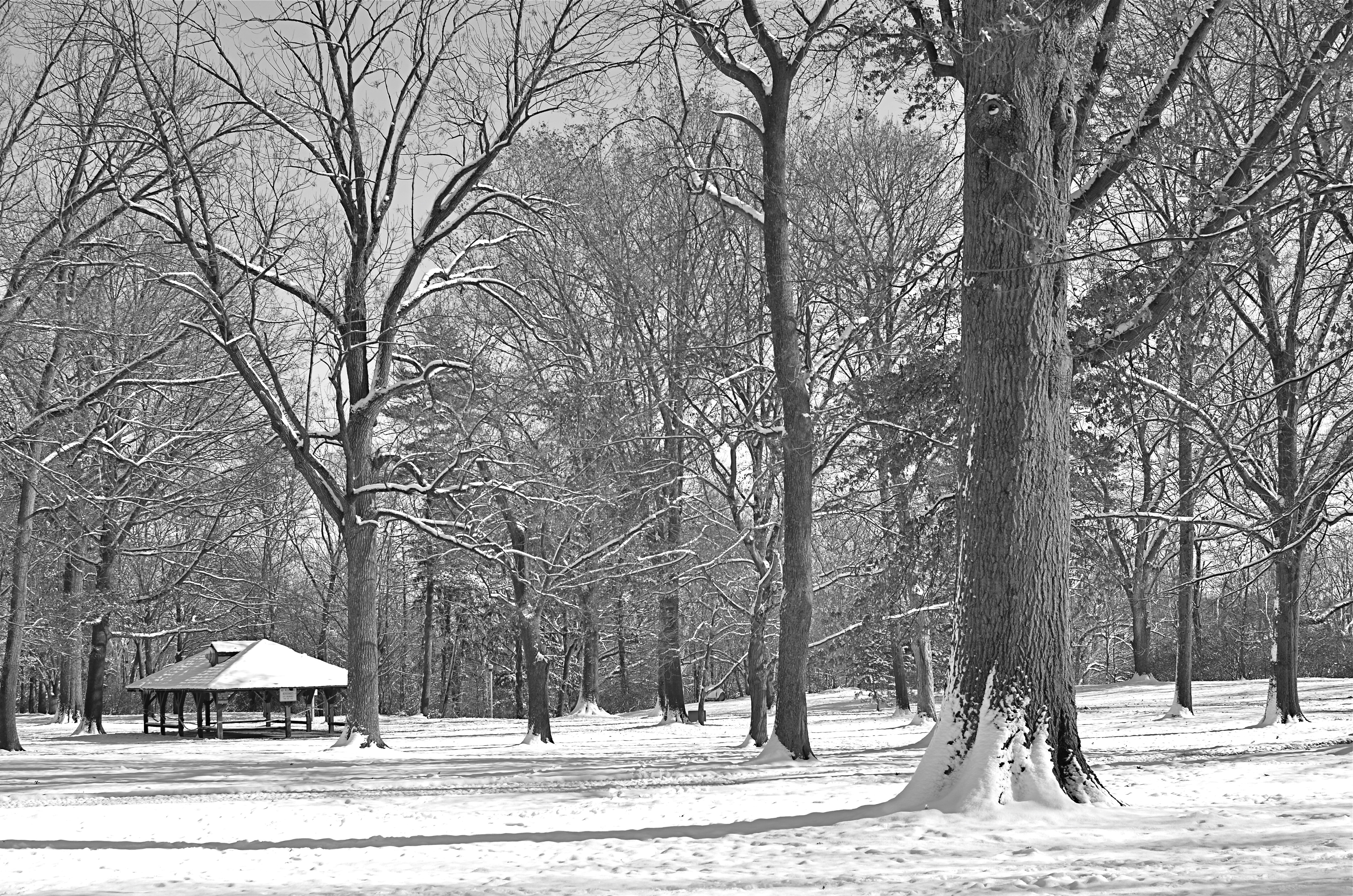
A decent winter scene, a bit too charming in its full color original, converted in-camera to straight monochrome. Now, however, it’s too bland.
By MICHAEL PERKINS
ONE OF THE GREAT BENEFITS OF DIGITAL PHOTOGRAPHY, other than its ease and affordability, is the speed at which it allows you to make comparative value judgements on images in the field. Even as digital darkrooms make it ever easier to change or modify your vision after the fact, today’s cameras also allow you to choose between several versions of a photograph while its subject is right at hand. This is an amazing mental and artistic economy, and it’s another reason why this is the absolute best time in history to be making pictures.
Many of us who made the transition from film have a lifelong habit of “bracketing”, taking multiples of the same image over a range of exposure rates to ensure that we are “covered” with at least one keeper in the batch. Others have already adopted the equivalent habit of taking several different frames with a sampling of varying white balances. I also find it helpful to use today’s in-camera filters to instantly convert color shots to three other monochrome “takes”….straight black and white, sepia and cyanotype. It’s a way to see if certain low-color subject matter will actually benefit from being reworked as duotone, and knowing that fact extra fast.
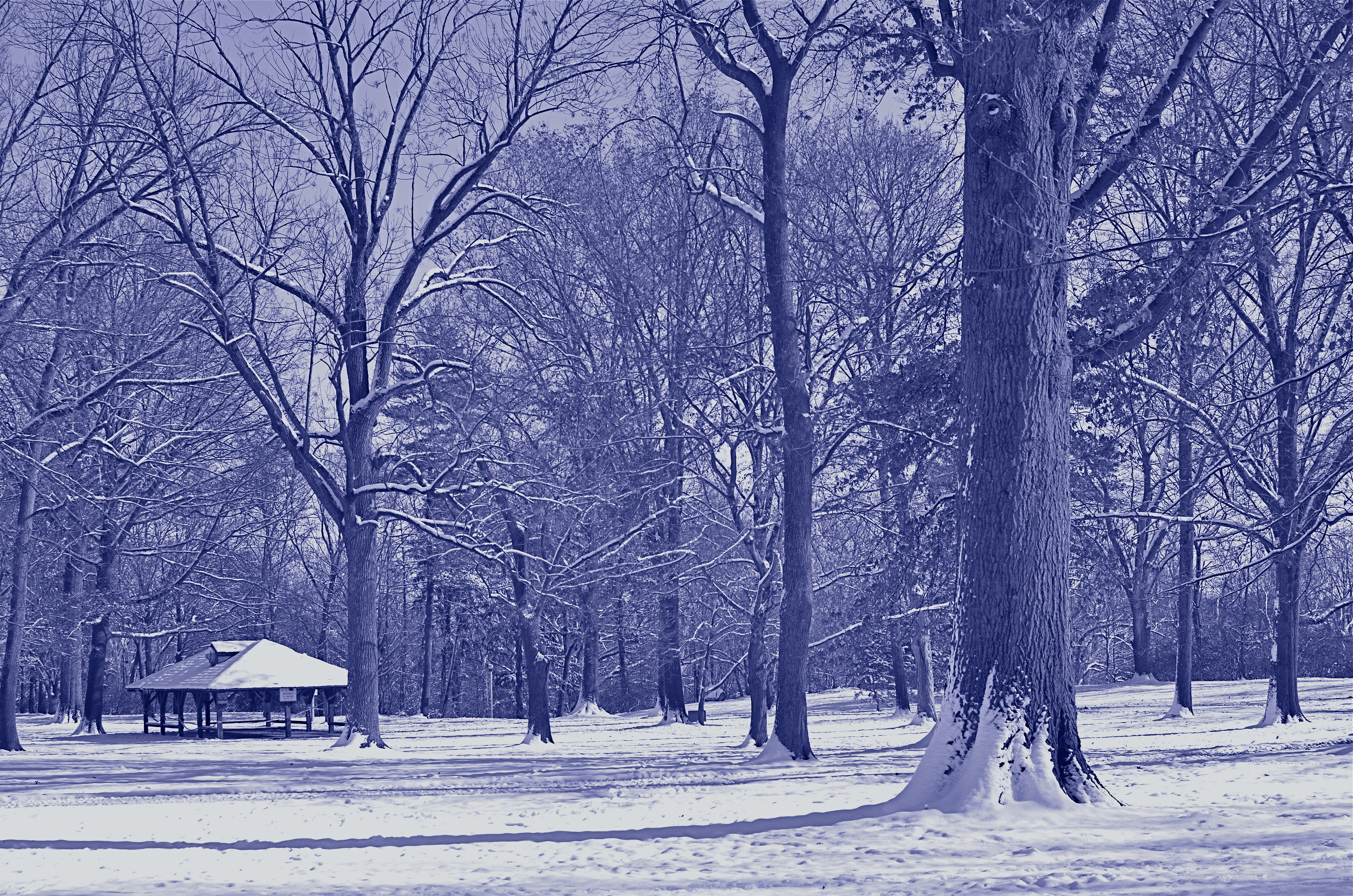
Another in-camera conversion, this time to cyanotype. This one says “winter” to me. 1/320 sec, f/5.6, ISO 100, 35mm.
Color or its selective elimination is one of the easiest tools to wield in photography. In the case of the series shown in this post, I decided that the winter scene was a little too warm and cheery in full color, a little flat in straight B&W, but properly evocative of winter’s severity in cyan. The choice was quick, and I still had the color master shot that I could choose to massage later on.
Shooting fast, that is, at the speed of your mood or whim, is a remarkable luxury, and exploiting it to the max is easy with even the most elementary camera. And anything that converts more “maybe” shots to “yes” is my idea of a good time.
I’ll have a Blue Christmas, thank you.
Related articles
- 5 Good Photography Habits to Start Today (digital-photography-school.com)
I’M DREAMING OF A ‘CHROME CHRISTMAS
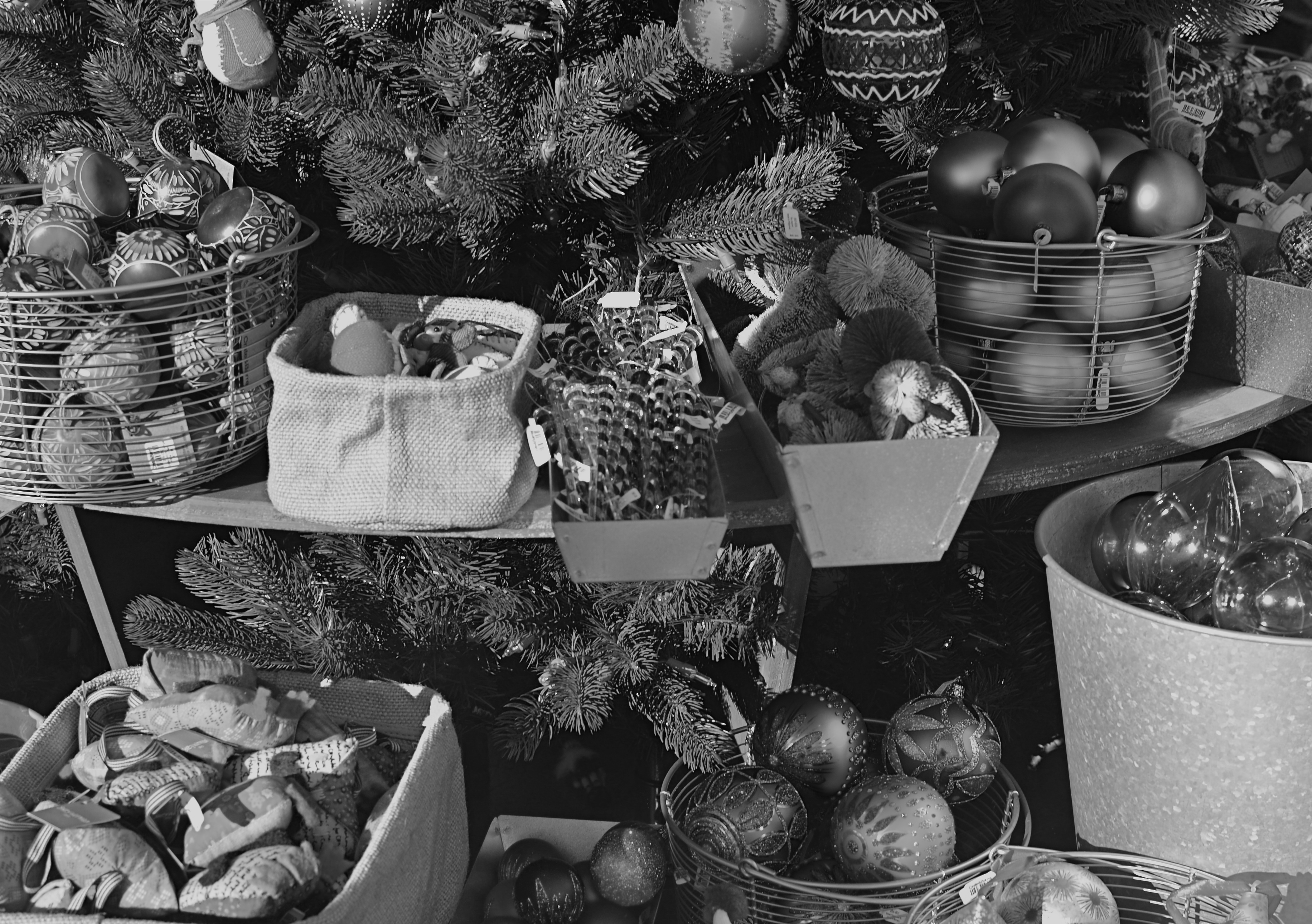
All The Trimmings, 2013. 1/160 sec., f/5.6, ISO 100, 35mm.
By MICHAEL PERKINS
IF YOU HAVE BEEN ON THE PLANET FOR MORE THAN FIFTY CHRISTMASES, your holiday memories (at least those frozen in family snapshots) will include more than a few black and white images. Some families made the switch to color photography earlier than others, but, at least until the mid-1960’s, for millions of us, more than a few “our best tree ever” photos were shot in monochrome. A little web research or family album-browsing can illustrate just how well beloved memories were captured by millions of us, long before Kodachrome became the visual currency of family folklore.
It’s interesting to note that, with the universal availability of not only simple cameras but post-processing apps, there’s been a sort of retro-fed love of b&w that’s refreshing, given that we are, once again, admitting that some subjects can be wonderfully rendered in a series of greyscale tones. Certainly the general marketing and depiction of the season is a color-drenched one, but many new photographers are re-discovering the art of doing more with less, or, more properly, seeing black and white as an interpretation of reality rather, as in the case of color, as a recording of it.
Observing the season out in the American West, thousands of miles from loved ones, I find that my holiday shots are increasingly journalistic or “street” in nature, since I am viewing and interpreting other people’s Christmases. The contours and designs of retail become a vibrant source of stories for me, and black and white allows me to shoot at an emotionally safe distance while calling special attention to texture and detail.
Depending on whether you’re showing the splendor of food and presents or evoking some Dickens-era urban grit, some subjects will come up flat or drab in black and white, given our very specific memory cues as to what Christmas should “look like”, so getting the desired result may be elusive. But, of course, if photography was easy, everyone would do it.
Oh, wait, everybody does do it.
Thing is, you always add another voice to the creative conversation. That’s the best part of both photography and the holidays.
No way is best but your way.
Related articles
- Photography 101: Shooting in Black and White (dailypost.wordpress.com)
JUST SAY THANK YOU
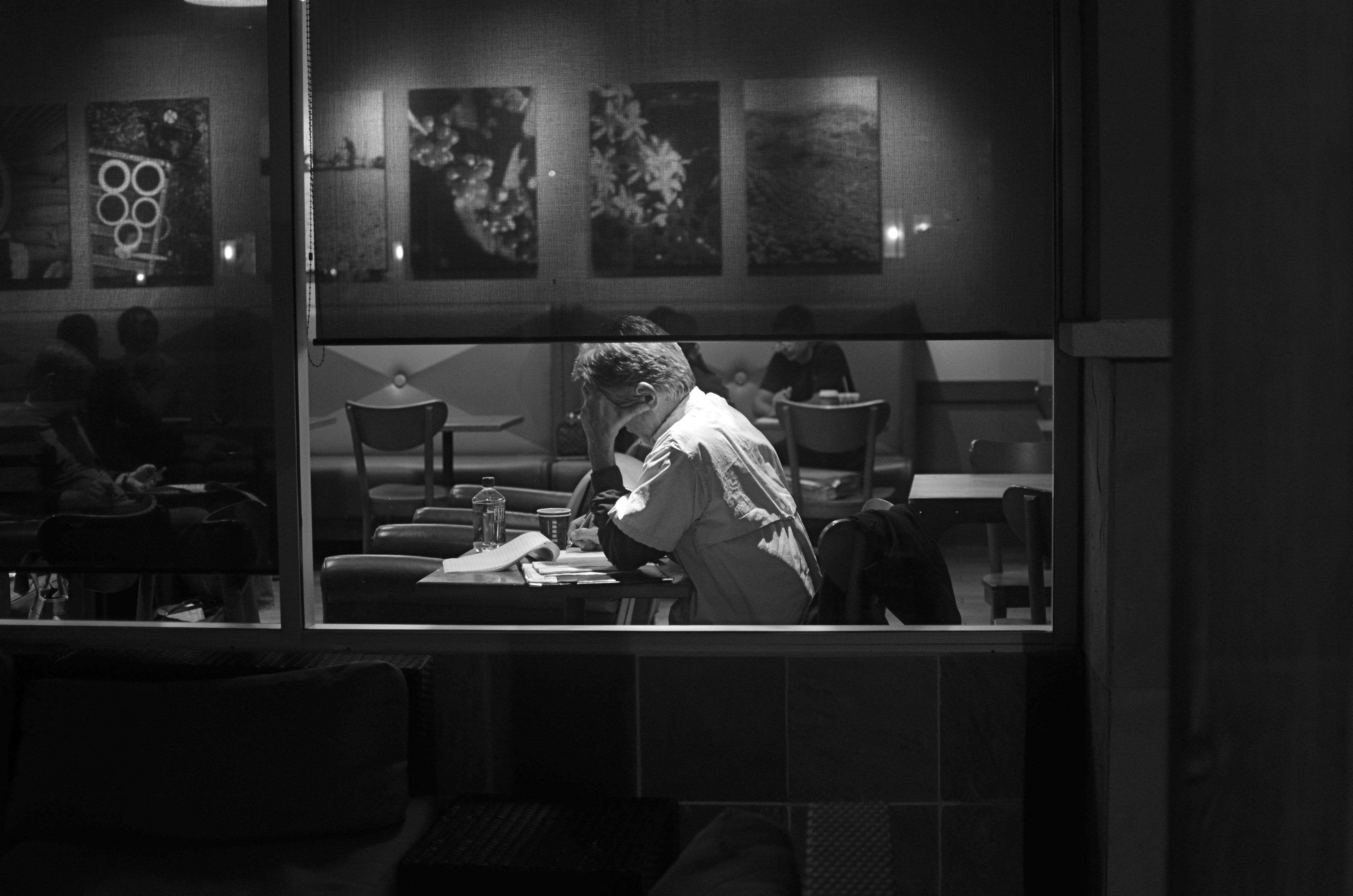
The All-Nighter: 1/60 sec., f/1.8, ISO 800, 35mm.
By MICHAEL PERKINS
PICTURES HAPPEN WHEN YOU’RE OUT TRYING TO TAKE “OTHER” PICTURES. Pictures happen when you didn’t feel like taking any pictures at all. And, occasionally, the planets align perfectly and you hold something in your hand, that, if you are honest, you know you had nothing to with.
Those are the pictures that delight and haunt. They happen on off-days, against the grain of whatever you’d planned. They crop up when it’s not convenient to take them, demanding your attention like a small insistent child tugging at your pants leg with an urgent or annoying issue. And when they call, however obtrusively, however bothersome, you’d better listen.
Don’t over-think the gift. Just say thank you….and stay open.
This is an overly mystical way of saying that pictures are sometimes taken because it’s their time to be taken. You are not the person who made them ready. You were the person who wandered by, with a camera if you’re lucky.
I got lucky this week, but not with any shot I had set out on a walkabout to capture. By the time I spotted the scene you see at the top of this post, I was beyond empty, having harvested exactly zip out of a series of locations I thought would give up some gold. I couldn’t get the exposures right: the framing was off: the subjects, which I hoped would reveal great human drama, were as exciting as a bus schedule.
I had just switched from color to monochrome when I saw him: a young nighthawk nursing some eleventh-hour coffee while poring over an intense project. Homework? A heartfelt journal? A grocery list? Who could tell? All I could see, in a moment, was that the selective opening and closing of shades all around him had given me a perfect frame, with every other element in the room diffused to soft focus. It was as if the picture was hanging in the air with a big neon rectangle around it, flashing shoot here, dummy.
My subject’s face was hidden. His true emotion or state of mind would never be known. The picture would always hide as much as it revealed.
Works for me. Click.
Just like the flicker of a firefly, the picture immediately went away. My target shifted in his chair, people began to walk across the room, the universe changed. I had a lucky souvenir of something that truly was no longer.
I said thank you to someone, packed up my gear, and drove home.
I hadn’t gotten what I originally came for.
Lucky me.
related articles:
- Crop and turn a bad picture into a good one (weliveinaflat.wordpress.com)
PLEASE PLAY WITH YOUR FOOD
Verdant, 2013. 1/60 sec., f/5.6, ISO 500, 35mm.
By MICHAEL PERKINS
PHOTOGRAPHIC STILL-LIFES ARE THE POOR MAN’S PRACTICE LAB. All the necessary elements for self-taught imaging are plentiful, nearby, and generally cheap. As has been demonstrated perpetually across the history of photography, the subjects themselves are only of secondary importance. What’s being practiced are the twin arts of exposure and composition, so it doesn’t matter a pig whistle whether you’re assembling a basket of oranges or throwing together a pile of old broken Barbie dolls. It’s not about depicting a thing so much as it is about finding new ways to see a thing.
That’s why an entire class of shooters can cluster around the same randomly chosen subject and produce vastly different viewing experiences. And why one of the most commonly “seen” things in our world, for example, food, can become so intriguingly alien when subjected to the photographer’s eye.
Shooting food for still-life purposes provides remarkably different results from the professional shots taken to illustrate articles and cookbooks. “Recipe” shots are really a way of documenting what your cooking result should resemble. But other still-life shots with food quickly become a quest to show something as no one else has ever shown it. It’s not a record of a cabbage; it’s a record of what you thought about a cabbage on a given day.
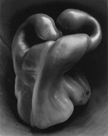
Edward Weston, Pepper # 30 (1930).
Many books over the years have re-printed Edward Weston’s famous black-and-white shots of peppers, in which some people “saw” things ranging from mountain terrain to abstract nudes. These remarkable shots are famous not for what they show, but for what they make it possible to see. Food’s various signature textures, under the photographer’s hand, suggest an infinite number of mental associations, once you visually unchain the source materials from the most common perception of their features.
As the head chef around my house, I often pick certain cooking days where I will factor in extra time, beyond what it takes to actually prepare whatever meal I’m planning. That additional time is reserved so I can throw food elements that interest me into patterns…..on plates, towels, counters, whatever, in an effort to answer the eternal photog question, is this anything? If it is, I snap it. If it’s not, I eat it (destroying the evidence, as it were).
Either way, I get what I call “seeing practice”, and, someday, when a rutabaga starts to look like a ballerina, I might be ready. Or maybe I should just lie down until the feeling passes.
Follow Michael Perkins on Twitter @MPnormaleye.
Related articles
- Is Food Art: Notes from a Food Photographer (okramagazine.org)
TAKING / BRINGING
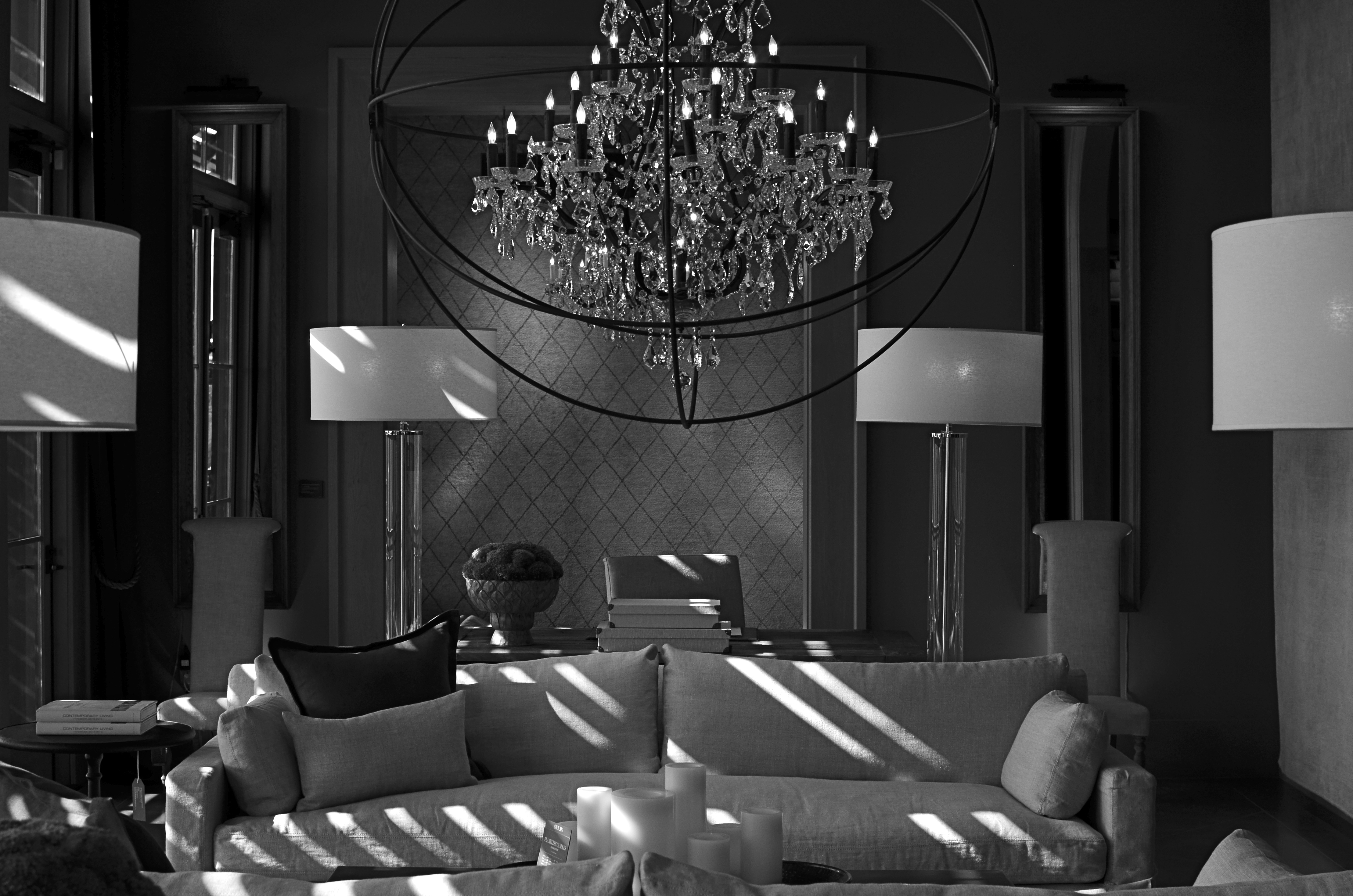
The Room Where Nothing Happens. Or Not. 1/100 sec., f/5.6, ISO 160, 35mm.
By MICHAEL PERKINS
INTELLECTUALLY, I KNOW THAT PHOTOGRAPHS DON’T NECESSARILY HAVE TO BE “ABOUT”, well, anything, but that doesn’t stop the 12-year-old photo newbie deep inside me from trying to produce images with “meaning” (yawn). Some reason to look. A subject. A story line. A deliberate arrangement of things for the purpose of communicating…something. Itchy and twitchy within my artist’s skin as I always am, I am never more out of my element than when I make a picture that is pure composition and form, a picture that has no reason to exist except that I wish it to.
As I get older, I get looser (no G.I. tract jokes about the elderly, please), and thus making what you might call “absolute” images gets easier. I just had to learn to give myself permission to do them. Unlike Atget, Brassai, and half a dozen early pioneering photographers, I don’t have to take pictures to earn my bread, so, if I capture something that no one else “gets” or likes, my children will not starve. Still, the act of making photographs that carry no narrative is far from native to me, and, if I live to be 125, I’ll probably learn to relax and really do something okay by about 93.
The process can be a head-scratcher.
The above image is an “absolute” of sorts, since I have no emotional investment whatever in the subject matter, and have nothing to reveal about it to anyone else. The arbitrary and somewhat sterile symmetry of this room, discovered during a random walk through a furniture store, just struck me, and I still cannot say why. Nor can I explain why it scores more views on Flickr over some of my more emotional work by a margin of roughly 500 to 1. A whole lot of people are seeing something in this frame, but I suspect that they are all experiencing something different. They each are likely taking vastly varied things from it, and maybe they are bringing something to it as well. Who knows what it is? Sense memory, a fondness for form or tone, maybe even a mystery that is vaguely posed and totally unresolved.
“Even though there are recognizable objects making up the arrangement, the result is completely abstract.There isn’t a “human” story to tell here, since this room has never been inhabited by humans, except for wandering browsers. It has no history; nothing wonderful or dreadful ever happened here. In fact, nothing of any kind ever happened here. It has to be form for its own sake; it has no context.
I liked what happened with the very huge amount of soft window light (just out of frame), and I thought it was best to render the room’s already muted tones in monochrome (it wasn’t a big leap). Other than that, it would be stupid to caption or explain anything within it. It is for bringers and takers, bless them, to confer meaning on it, if they can. As I said earlier, it’s always a little scary for me to let go of my overbrain when making a picture.
Then I remember this is supposed to be about feeling as well as thinking.
***Deep breath***
Next.
Follow Michael Perkins on Twitter @MPnormaleye.
Related articles
- First Critique (cohensrphotography.wordpress.com)
NO CLEAR “BLACK AND WHITE” ANSWER
Hey, He’s just not that into you: In-camera monochrome, on a Nikon d5100: 1/200 sec., f/5.6, ISO 100, 35mm. Street photography sometimes benefits from a limited tonal range.
By MICHAEL PERKINS
SHOOTING IN BLACK AND WHITE, BEFORE THE DIGITAL ERA, WAS AN ACTIVE, RATHER THAN A PASSIVE CHOICE. You had to decide, before loading your camera, what an entire roll of film would be able to capture in terms of color/no color. There was no way to change your mind until that roll was completed and replaced. As you pre-chose film speed, light sensitivity, or special processing considerations, you also committed, before Frame One, to a single tonal option.
If you are really getting long in the tooth, you can remember when monochrome was the default choice for most of your film shoots. Economy was one factor, and, for certain shooters, including many of the pros, there was a lack of confidence that color films could render nature reliably. Giants like Adams, Edward Weston and others eschewed color throughout most of their careers, since they feared that either garish emulsions or the limits of extant printing processes would betray them in a way that black and white would not. And of course, in a world in which post-processing meant the skillful manipulation of a negative and the mastery of print-making, monochrome was simply an easier beast to tame.
Wow, are we ever in a different place.
Today, we can change our “film speed”, light sensitivity, and every kind of color emphasis frame-by-frame, and for many of us, color is our first choice, with many monochrome images post-processed from shots that were originally multi-hued. Photoshop and countless other programs allow us to have it all, with endless nuanced permutations from a single capture. Black and white is now often an “effect”, an after-thought derived later rather than sooner in our thought process. Oh, look what happens when I push this button. Cool.
Shot in color, de-saturated in post. A boring shot in color becomes super-bland when rendered in monochrome. Blame the shooter, not the mode.
Most users’ manuals for today’s cameras, especially DSLRs, actually advise converting color images to b&w in “post” rather than enabling the camera’s picture controls to shoot monochrome in the first place. The prevailing opinion seems to be that results will be better this way, since processing offers finer-tuned controls and choices, but I take issue with that, since I believe that color/no color as a choice is best made ahead of the shutter click, no less than choices about aperture or DOF. You need to be thinking about what black & white can bring to your shot (if anything) as part of your pre-shoot visualization. The tonal story in a picture is simply too important for you not to be planning it beforehand.
The quality of in-camera monochrome modes for both Nikon and Canon are both perfectly adequate to give you a workable image versus converting the shot later with software, and that’s good, because getting the shot right in the moment is better for the result than infinite knob-twiddling after the fact. Monochrome is a tool for telling a story or setting a mood. It makes sense that its use be tied to what you are trying to achieve as you are planning it….not slathering it on later as an oh-this’ll-be-keen novelty. That’s Instagram technique, not photographic technique.
One great habit to retain from the days of film: anticipate your need, and shoot according to that need. Plan ahead. “Fix it in the lab” only works for shots with slight imperfections, frames in which the concept was sound enough to warrant painting away a few flaws. Going to black and white to save an iffy shot is a Hail Mary pass at best.
As as we all know, you don’t always get what you pray for.
That’s the truth. In black and white.
Follow Michael Perkins on Twitter @MPnormaleye.
Related articles
- Capturing Texture in Black & White Photography (jdgilchristphotography.wordpress.com)
- Black and White used like Color (atmtxphoto.com)
BLUE ON THIRD AVENUE

The cyanotype option in Nikon’s monochrome posting menu makes this in-camera conversion from color easy. 1/80 sec., f/5.6, ISO 160, 18mm.
By MICHAEL PERKINS
COLOR IS LIKE ANY OTHER COMPONENT IN LIGHT COLLECTION AND ARRANGEMENT, which is, really, what we are doing. Seen as a tool instead of an absolute, it’s easy to see that it’s only appropriate for some photographs. Since the explosion of color imaging for the masses seen in the coming of Kodachrome and other early consumer films in the 1930’s, the average snapper has hardly looked back. Family shots, landscapes, still life arrangements….full color or go home, right?
Well….
Oddly, professional shooters of the early 20th century were reluctant to commit to the new multi-hued media, fearing that, for some novelty-oriented photographers, the message would be the color, instead of the color aiding in the conveying of the message. Even old Ansel Adams once said of magazine editors, that, when in doubt, they “just make it red”, indicating that he thought color could become a gimmick, the same way we often regard 3-d.
In the digital age, by comparison, the color/no color decision is almost always an afterthought. There are no special chemicals, films or paper to invest in before the shutter clicks, and plenty of ways to render a color shot colorless after the fact. And now, even the post-processing steps involved in creating a monochrome image need not include an investment in Photoshop or other software. For the average shooter, monochrome post-processing is in-camera, at the touch of a button. Straight B/W and sepia and even what I call the “third avenue”, the blue duotone or cyanotype, as I’ve used above.Do such quickie options worsen the risk of gimmick-for-gimmick’s sake more than ever? As Governor Palin would say, “you betcha”. Google “over-indulgence”, or just about half of every Instagram ever taken, as evidence.
Hundreds of technical breakthroughs later, it still comes down to the original image itself. If it was conceived properly, color won’t lessen it. If it was a bad idea to start with, monochrome won’t deliver the mood or the tone changes needed to redeem it. Imagine the right image, then select the best way to deliver the message. Having quick fixes in-camera aren’t, initially, a guarantee of anything but the convenient ability to view alternatives. In the photo above, my subject was just too warm, too pretty in natural color. I thought the building itself evoked a certain starkness, a cold, sterile kind of architecture, that cyanotype could deliver far better. The shadows are also a bit more mysteriously rendered.
At bottom, the shot is just a study, since I will be using it to take far more crucial pictures of far more intriguing subjects. But the in-camera fix allows you to analyze on the fly. And, since I got into this racket to shoot pictures, and not to be a chemist, I occasionally like a fast thumbs-up, thumbs-down verdict on something I’ve decided to try in the moment.
Giving yourself the blues can be a good thing.
(follow Michael Perkins on Twitter @ mpnormaleye)
Related articles
- Toning my Cyanotype with Haritaki (altlab2011.wordpress.com)
- Beyond Color (piaffephotos.wordpress.com)
