READY FOR HIS CLOSE-UP
By MICHAEL PERKINS
AS THE FIRST MEMBER OF HIS IMMIGRANT FAMILY TO BE BORN IN THE UNITED STATES, Robert Cornelius (1808-1893) grew up in a world in which the word photography was not yet a part of the general vocabulary. The infant art of preserving static images for posterity was, at Cornelius’ birth, still the exclusive domain of tinkerers and hobbyists, a universe away from the global obsession it would become within a few short decades. He himself did not even take a photograph on his own until he was nearly thirty years of age.
However, once he did, he became legend.
Or, rather, his face did.
Trained in chemistry, young Robert began his career apprenticed to his silversmith father, and so was well acquainted with various plating processes by 1831, when the photographer Joseph Saxton asked him to prepare the coating on a daguerreotype plate. Daguerreotypes were the medium that preceded film as the dominant technique for making pictures in the early 19th century. Silvered plates were polished to a mirror-like sheen, then treated with fumes that made the plate light-sensitive: after exposure, additional mercury vapor and a bath of various chemicals were applied to arrest the light-recording process, and the plate was dried. The plate Cornelius delivered to Saxton allowed him to record the earliest known photograph made in America up to that time, an image of a Philadelphia high school building.
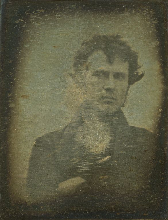
Robert Cornelius, Self-Portrait, 1839
Robert caught the picture-making bug himself shortly thereafter, joining with a local chemist to perfect the daguerreotype medium, and, by 1839, posed in front of his own camera for what is commonly thought to be the first intentional portrait of a human (as well as the first self-portrait) taken outside of Europe. The slow exposure rates of daguerreotypes required Cornelius to sit motionless for up to fifteen minutes.
Cornelius briefly operated one of the first full-time portrait studios (years ahead of the New York salon of Matthew Brady) but made his fortune largely with his other inventions, including an improved system that helped replace the need for whale oil in lamps. It’s said that he actually thought little of his place in photographic history until his selfie was featured in an exhibition marking Philadelphia’s centennial in 1876 and he was celebrated by a new generation eager to chronicle an accurate timeline of the new art.
Robert Cornelius happened upon photography almost by accident, and yet, because he also modified and improved exposure times for images (along with other refinements), is a vital link in its evolution, as well as the godfather of all those billions of moody, sexy snaps we now employ so effortlessly (and endlessly) as we present ourselves to the greater world.
COLOR AS REAL ESTATE
By MICHAEL PERKINS
OCCASIONALLY YOU SEE ARTICLES PROCLAIMING THAT THE SELECTIVE DE-SATURATION OF COLOR IN PHOTOS is “finished”, that the process ran the entire gamut from novel to creative to “over it”, and that nothing fresh or new can be accomplished in what should now be considered a fad. I don’t know why some of us are perpetually in the pronouncement business, but I think it’s (a) short-sighted and (b) unhelpful to go around telling people what tools are or are not au courant. It’s also the opposite of the way art develops in the mind.
Just as the use or absence of color over an entire frame is a fundamental creative choice, so must the partial use of it. Rather than think of an image as having one color scheme that operates from end to end, I prefer to think of color as part of a multi-use piece of real estate, with multiple choices to be made as you walk the entire area. Color may be just what this lot needs, but not the yard next to this house. Every piece of visual real estate must be independently “developed”, whether in coordination with the overall picture or as a specialized visual traffic cop directing the eye for specific reasons.

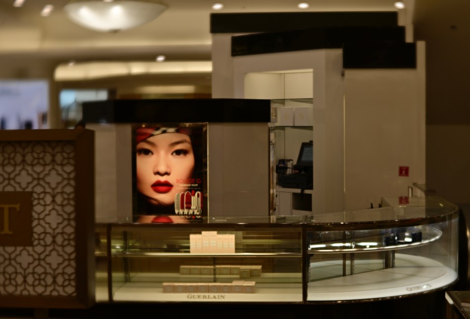
In the top image, the department store counter surrounding the advertisement is nearly empty, due to the area being almost totally closed down (stock situations, apparently). The exposure time was fast and the ISO was low and so the ambient color framing the ad was decidedly warm. Other than that, the color doesn’t serve much of a purpose as either narrative or atmosphere, so in the second version, all attention was centered on the model’s face, which carries more raw information than the rest of the frame. I think the picture is more immediate with the change, or at least more so than either a full-color or monochrome version would be.
Look, I get it. Photographers, no less than the writers of articles and op-eds, can get into the habit of seeing things in polar opposites. Still, anytime you refer to your method on a photo as “something I always do” or “something I never do“, you’re limiting yourself needlessly. And when it comes to making pictures, there are enough boundaries imposed on us naturally without our arbitrarily installing more.
SHOOTING BLIND(S)
By MICHAEL PERKINS
OVER MANY YEARS, I’VE FASHIONED A SERIES OF STILL-LIFE COMPOSITIONS on a white formica counter that is just inside an eastern-facing window in my writing room. The light from dawn to at least mid-morning is intense and warm, strong enough to provide ambient illumination for nearly anything staged near it. Fine-tuning can be accomplished with either a twist or a roll of the slatted window blinds. It’s a simple set-up, and one which is great for short-notice projects.
Slats the way, uh huh, uh huh, I like it…..
The usual rule to be observed, at least in conventional picture-making, is to place the staged tableaux out of the direct path of the shadow patterns created by whatever position the blinds are in. However, over time, I’ve become used to doing exactly the opposite, to giving the shadows a starring role in the images, letting their grids and line fall wherever they may. I don’t always let them pIay directly over the subject, but I notice that, when I do, they add an extra sensation of depth, which is handy since I am sometimes shooting directly overhead, baking a certain amount of flatness into the images. Also, the light-then-dark-then-light gridding boosts colors and textures in some areas while muting them in others, and so, with a few quick adjustments I can get a lot of different looks across a brief series of exposures.
Am I adhering to a “style” or attempting a “signature” with these shots? Probably nothing so intentional. I just love seeing what happens when I shake up the usual formulas (formulae?). In any event, you’re invited to judge the results for yourself by clicking on the topside tab for my newest mini-gallery of shots entitled “Color Inside The Lines” or merely by clicking here.
Hey, the deliberate assembly of a tabletop still-life is already an artificial construct, a fantasy. One more element either way just tweaks the fun a bit more.
ALPHA / OMEGA
By MICHAEL PERKINS
I USED TO THINK THAT ONE CLEAR DIFFERENCE BETWEEN AMATEUR AND PROFESSIONAL PHOTOGRAPHERS was that the amateurs recorded almost exclusively happy things, while the professional chronicled life’s grimmer moments as well. The “ams” were weighted on the side of weddings and birthdays, while the “pros” also threw funerals and war into the mix. Of course, I now see that as a gross over-simplification, albeit one which applies less and less with the aging of our world.
I do believe that the average shooter still hauls his/her camera out mostly to freeze incidents of joy, but, to a greater degree, all of us occasionally turn our gaze on the failures of the human animal as well, with raw physical destruction, intended or not, as a huge pictorial draw. When people (or their dreams) fail, there is often a spectacular visual result. Smashed walls. Craters. Wanton destruction. In such pictures we catch ourself in the act of discarding or destroying things that, in some way, represent dreams that have ground to a halt.
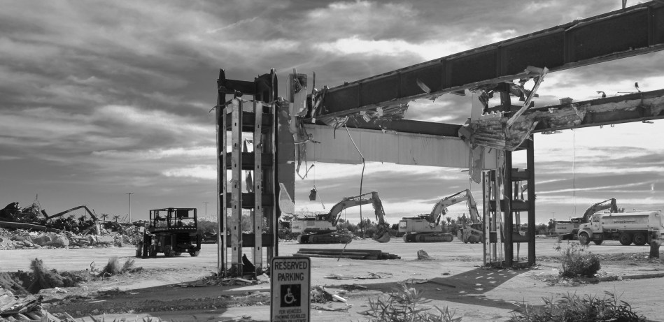
All across the world, the willing disassembly of our various infrastructures, such as this image of an old mall being wiped out of memory, is something of a cultural apology, an admission that, sorry, this just doesn’t work for us any longer. The amateur in us would gladly have snapped this place forty years ago, say, at its grand opening. The pros among us, or at least the growing number of us that are thinking more and more like citizen journalists, want to document the moment the vision perishes of old age, or just plain irrelevance. In the case of this particular place, the ground is merely being cleared for what will be a bigger, newer version of the same fake-community concept that gave rise to what’s being torn down, so, lesson not learned.
We always are interested in the ribbon cuttings, the alphas of things: however, in creating a record of the omega phase, of the end of the trail of those things, we are doing more than just making “sad” pictures. We are making a document of hope and loss, and all the temporary realities sequenced between those two historical brackets.
SKETCHPAD PSYCH

A 2012 HDR mix of five bracketed exposures, my attempt to rescue additional detail from the dark areas.
By MICHAEL PERKINS
HAVING BEEN AN ILLUSTRATOR LONGER THAN I HAVE BEEN A PHOTOGRAPHER, I have long since learned to live with “the gap”, that unbridgeable space in the arc of creation between conception and execution. We’d love our art to be a closed loop, with an unbroken line from our original idea to our final product, but that gap, that realm of uncertainty and unrealized dreams, is stubborn, and keeps the circle from completely closing. In pencilling a notion on a sketchpad, I had to become resigned to the fact that, once I began inking the pencil lines, something indefinable would be lost in translation.
Being okay with the gap has kept me sane in the making of photographs.
Regardless of our training, practice, equipment or eye, we can never deliver images that fulfill 100% of our dreams. We work like mad over a lifetime to make the gap smaller, and in our best moments we nearly manage it. Ironically, it’s the pictures with the bigger gaps that really get our attention and sharpen our perception. The raw, gnawing irritation of knowing exactly how we failed is the only road to better images. Like an illustrator, we enter into a lifetime “sketchpad psych”, an acceptance that the devices we use to extend our senses (brushes, cameras, etc.) will never perform to perfection. Some of this is because, maddeningly, our internal conception of our own original ideas is never actually “finished”.

Same five images, remixed in 2022 with an exposure fusion process.
These two images, both blended from five bracketed exposures, from super-dark to super-bright, were “mixed” a decade apart. Now, beyond the fact that, given modern tech’s more sophisticated ability to record wild swings in contrast, I probably would not even approach the master shot in the same way today, it’s sobering to realize how much my conception of “correct” processing has shifted in a mere ten years. The top take is classic HDR, very heavy on the details, along with the slightly garish color palette and overall brassiness of that process. The bottom version is done with the same software, but using exposure fusion. A lighter tone over all, one that’s absent the micro-fine particles of things like woodgrain or wall texture. The first process changes everything in the picture all at once, while the second gives you a bit more control over individual elements, along with the option of understatement.
Both versions have their points, but in classic sketchpad psych, neither is a complete rendering of what I saw in the moment, but rather, an artfully constructed compromise. Some days, close is as close as you can get. The only cure is to turn over the page on the sketchpad and start drawing again. Here the graphic artist and the photographer can agree on the same two-word mantra: next time.
THE WAY IT USED TO COULDA MIGHTA OUGHTA
By MICHAEL PERKINS
COMBINE A NEW SERIES OF MOVES TO GENERATE AN EFFECT, and you are likely making art. Reduce the making of that same effect to a predictable rote series of steps with a uniform outcome, and you are likely making craft. Photography is a series of calculations: a certain adherence to rules will give you a solid framework in which to create. Slavish service to those same rules will make that framework a cage and imprison your vision within the confines of mere habit.
The comedian Lenny Bruce was famous for saying, “If I do something more than once, it’s a bit”, meaning a routine, to merely be recreated or played back, on demand….the opposite of creativity. I make mention of this because I fear that my own satisfaction with routines…how reliably they work, how comfortingly familiar they are…..can creep into my photography and replace all the vital blood in its veins with concrete. It’s an insidious trap. Repetition can act as a kind of sedative. Feels great in the moment, but soon you’re sleepwalking through the process. Photos become mere product. You can actually feel when all of your picture-making habits start morphing from a protective roof to a crushing winepress.

Fan Dancer, 2022
One remedy I try, to shake things up in these moments of torpor, is changing out gear to something, anything that I don’t think will work at all, or which may at least force me, through partial misuse of it, to think less habitually. Think of it as the difference between lighting a fire with a match or witching one up out of damp sticks. In the picture seen here, one of dozens I’ve made over time of the steeplejack daredevils who climb up and trim super-high palm trees in the southwest, I was actually forced to use a 300mm manual focus telephoto that was attached to the only camera I could reach in time for a shot. The nearest “appropriate” alternative was half a house away, and, meanwhile, this guy was hauling away the debris from his job at a good, er, clip. That meant making an attempt with something that was zoomed in way too far in relation to the distance between him and me. It meant focusing on the fly with a 1970’s lens barrel that is not exactly greased lighting. Oh, and to make things interesting, I could go no further open than f/4.5, so there would also be shutter speed fiddling to factor in. None of it should have worked.
Oddly, the minimal information forced on me by the close-at-hand framing, which now had eliminated all other context of size or place, actually made the worker’s crooked arm counter-balance the frond fan in an almost Asian fashion. A shy little Geisha gardener? I liked it. Could I do it again, on purpose? Not the point, really. What made me alert enough to maximize my opportunity in this case was the sheer uncertainty of the whole attempt. Now, all I have to do in future is resist saying, in the future, “whenever I shoot this kind of image, I always, always….”
Or else, in Lenny’s words, I’m just doing a bit….
COLOR COMMENTARY?
A Day’s Work, 2022 (original color master shot)
By MICHAEL PERKINS
A PARTICULARLY MISCHIEVOUS FRIEND OF MINE, when asked by his small child why all older films and pictures seemed to be in monochrome, decided to tell the kid that the world simply was in black and white back in those days, as if the planet at some later point finally ripened and a fuller palette of hues became the New Normal. The con might have actually worked, if my friend’s child had not, in fact, been far more intelligent than his father.
Thing is, we still think of earlier photographs as defining a world of little or no color. We may logically know that this cannot be true, and yet, when we compare mono and early color snaps of the same subjects, or see the hues restored to pictures that were made in color but often printed in b&w, there is a bit of a disconnect. And even after all of that, we learn to either use or withhold color in our work based on our concept of which subject matter “deserves” it. For some shots, we think of monochrome as somehow more incisive, interpretative.
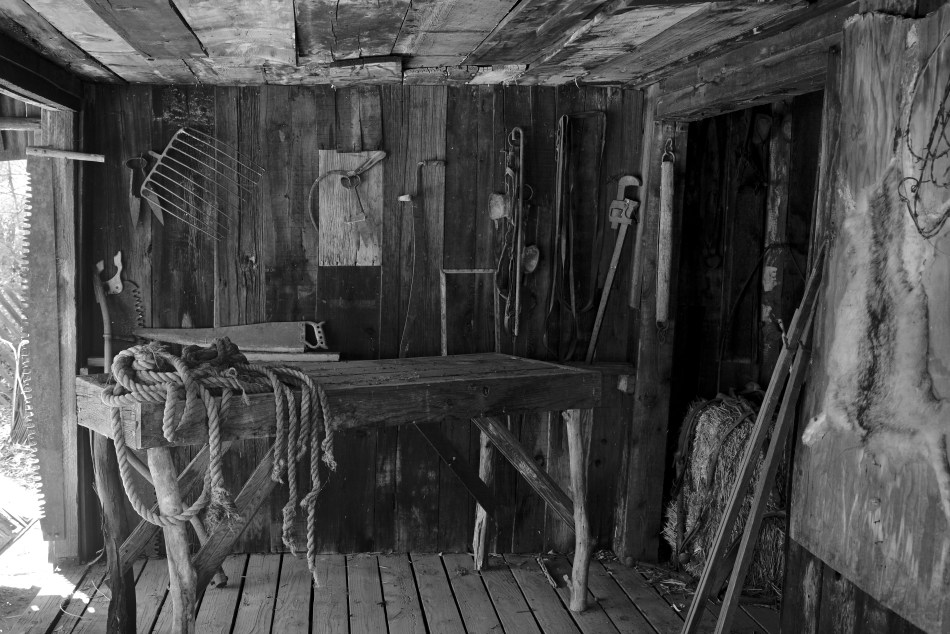
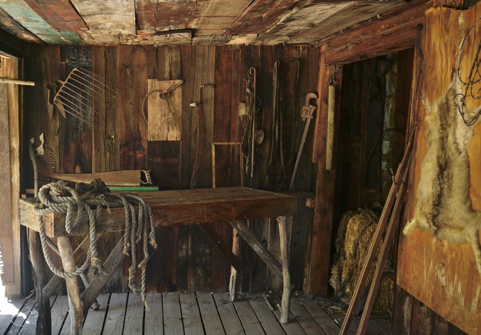
A Day’s Work, 2022 (mono conversion)
Those of us who study photo history are well aware of b&w’s emotive power to showcase things that are haunting, stark, spare. We carry the grayscale images of the Dust Bowl and the Depression in our minds, unsparing, grim testimonies to human suffering that are etched in monochrome. Does this mean that some subjects deserve a kind of reverse color commentary, that they will always be more effective with a narrower variety of tones?
The ragged farm workshop seen here is, itself, a re-creation, a deliberately staged tableau assembled inside an enormous desert arboretum, a tribute to bygone settler days. The color master shot certainly contains all the texture and contrast appropriate to the exhibit, but I am still slightly more drawn to the mono conversion. But why? Does it please me that it almost looks like a Walker Evans or Arnold Rothstein assignment for a New Deal agency? Does it become more “authentic”, and, if so, in what way? And being that I’m photographing a replica, is my choice of tonal range a replica as well? A well-meaning tribute? A cute fake?
Or, as Alfred says, “What, me worry?”
I keep posing these questions as if they have definitive answers, when, in fact, the only thing that makes a photograph valid is the feeling it conveys (or fails to convey). It’s fun to spin the various arguments around their generation, as if it’s important, but the one thing that “qualifies” a technique in a picture is whether it worked, whether or not it made a connection beyond the photographer himself. The rest is merely debate.
Things are not always black and white.
Except when they are.
THE INSTANT IT DOESN’T CLICK
By MICHAEL PERKINS
THE POLAROID COMPANY’S DEATH/RESURRECTION SAGA OF THE 2010’s is the kind of Cinderella story that warms the heart and quickens the emotions among photographers of all ages. Culturally iconic but financially destitute camera company bellies up after 60 years! Plucky, artsy underdogs rescue legendary brand! Instant cameras are back! Admittedly, the return of the rainbow-banded square film in the white box has all the elements of a classic fairy tale.
Minus the happy ending.
Instead, the success of the reborn Polaroid, including its Life-Saver-Flavored cameras and its muy espensivo film, is more like the tale of what might have been, but isn’t, yet. The new Polaroid film is nowhere near the equal of the original formula, even though the New Owners get an A for effort for having to reverse-engineer it from scratch, after Old Polaroid dismantled the machinery and ate the recipe used for making it. They also deserve credit for at least partially reviving interest in older, better Polaroid cameras (the SX-70, as one example) by doing nuts-up restorations of them in order to stoke interest for the revived film.
And yet.
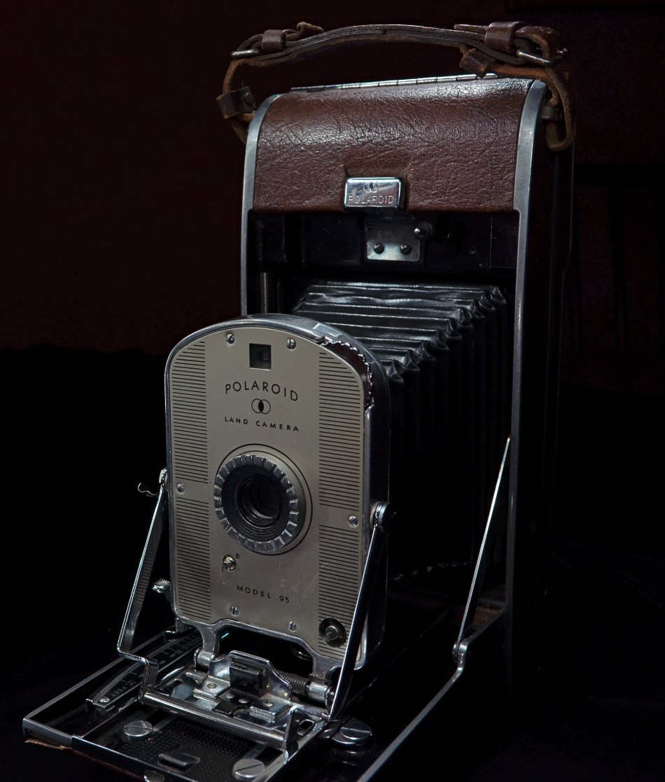
Them wuz the daze: Edwin Land’s first-ever Polaroid, the Model 95 (1948)
Over ten years into their quest, the re-booted Polaroid has yet to produce a camera that is much better than a glorified point-and-shoot, opting instead to merely celebrate the fond experience of producing an in-hand print quickly. As but one example, the marketing emphasis on their various “Duochrome” films (Red-and-white, Blue-and-White, even Green-and-White monochrome emulsions) is on the unexpected, the random. It’s basically the Lomography philospophy of “hey, this is so loose and free, ‘cuz we don’t know what will come out, if anything!”, an outlook which is novel for those who want their picture-taking to be an explosion of pure spontaneity rather than something that can be deliberately planned or predictably delivered. In their original incarnation, Polaroids were the stuff of serious art installations, a la the Andy Warhols of the world. Now they are soft, murky souvenirs of the last boho rave or teen sleepover you attended. It ain’t the same.
To be fair, other instant camera makers have produced units with features that give the shooter finer control over the results (including even baseline cameras from Instax.Fujifilm), and there is even a smaaaaalllll market for things like the 3d printing of instant camera backs which can be fitted onto high-end camera fronts, like that of the Mamiya RZ67. But the main highway of the instant pic market moves on the twin tracks of novelty and nostalgia, something Edwin Land never targeted directly during Polaroid’s original golden era.
Instant cameras are a blast. I like playing with them. But that play is ultimately frustrating and expensive. In its second life, the new Polaroid corporation has a long way to come before it earns the name it purports to honor. And if Mark Twain were alive today to compare the two instant eras, he might repeat his old phrase that they constitute “the difference between lightning…and the lightning bug”.
WHO’S IN CHARGE HERE? DEPENDS..
By MICHAEL PERKINS
THE OLD ADAGE ABOUT LIFE BEING WHAT HAPPENS WHILE YOU’RE BUSY MAKING PLANS also seems like a perfect fit for the act of photography. Certainly we love to take bows for our best work, and to let the myth persist that what’s hanging on the wall is exactly what we were going after in the first place. Well, I use the word “myth”. I actually mean “convenient lie”.
The scientist in us loves to keep alive the belief that we are in charge of our lives, that all our great results are the inevitable outcome of brilliant foresight and faultless planning. But the photographer side of us, the more instinctual half of our nature, knows how much luck and randomness figure into the mix. Yes, we came back with a great shot of C, but only after our “perfect” concepts of A and B fell flat.
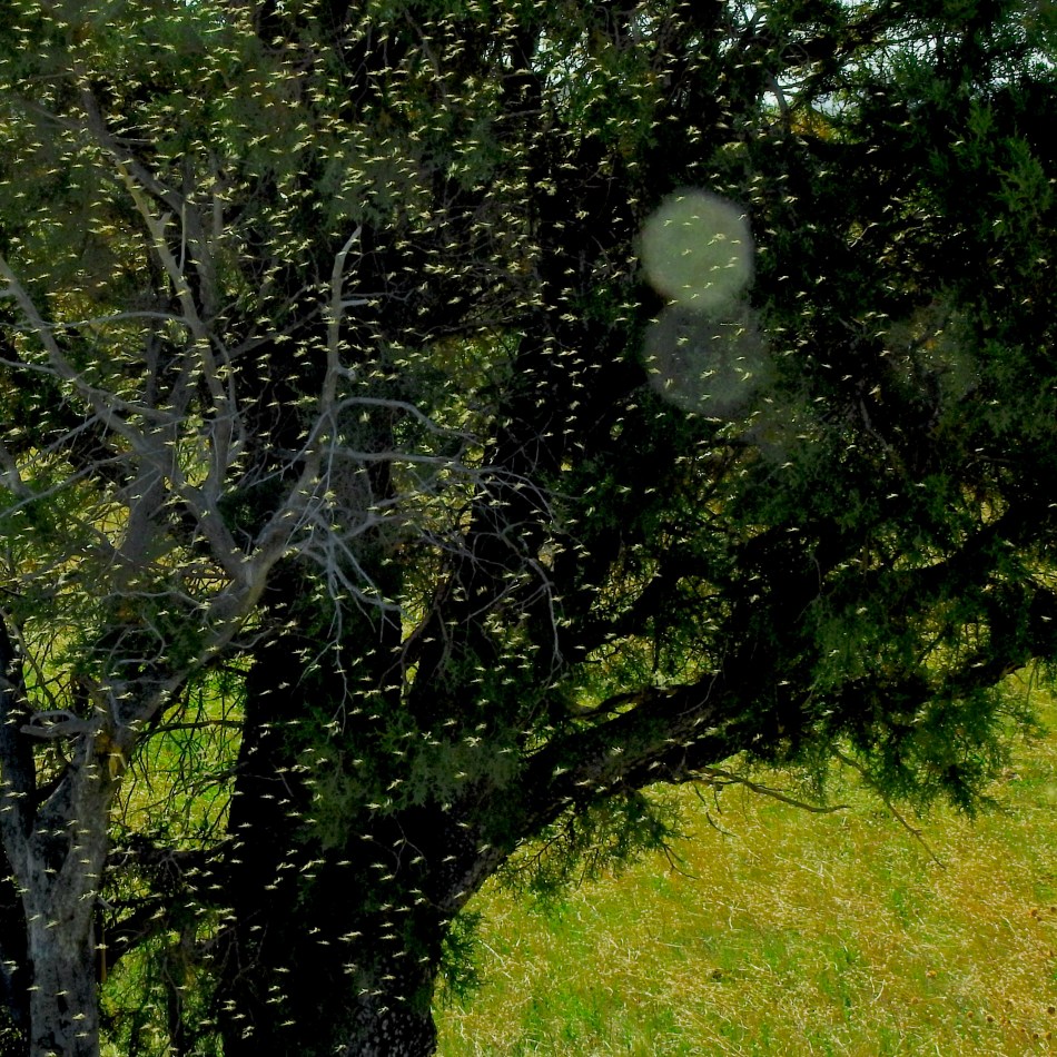
Several weeks ago, I went birding with a small group into a marshy area near Show Low, Arizona. The water was all part of a reclamation project that created the illusion of a large pond/small river in what is typically semi-desert, and the entire local landscape was transformed, because of the extra moisture, with reedy banks, plentiful supplies of yellow-headed and red-winged blackbirds, and, well, bugs. A bleeding swarm of infinitesimal insects which are a huge Happy meal for the flycatchers in the area, but which also fill the hair, eyes and mouths of any, well, non-birds in the area.
Which is where my plan A fell apart.
Yes, O logical side, we will, as expected, be taking pictures of shorebirds and the shores that host them. Easy call. But, oof, here comes the photographer side, the instinctual guy, who now wants to make a bug picture. But how? Everything is awash in early morning sun, which renders the swarm all but invisible. They are so thick that they may make even carefully focused pictures look soft, as if I had a diffusion filter attached to my lens. The only way, then, to at least suggest the look of the plague was to aim at the darkest thing I could find, which turned out to be a small copse of free-standing trees further inland from the water and standing in their own shade. At least I had enough of a picture to suggest my new, revised main message, to wit: man, there’s a &%$ton of bugs here.
And so it goes. Planner Me begins with a startup scheme. No-Plan Me eventually straggles with another viewpoint. And the eternal question of “who’s in charge here” for a given picture changes on a whim, or around whatever might be, sorry, bugging me at the moment.
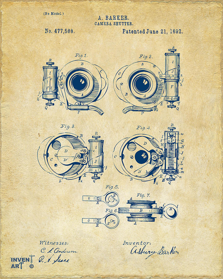
OF ASTRONAUTS AND APERTURES
By MICHAEL PERKINS
THE VERY FIRST CAMERAS IN SPACE were not cutting-edge, ground-up tech crafted by NASA engineers, but the personal gear of the earliest astronauts, like John Glenn’s $40 Ansco Autoset in 1962 and Wally Schirra’s more sophisticated Hasselblad 500C a few years later. Taking documentary pictures in flight was originally little more than an afterthought, with the Canaveral gearheads gradually introducing more and more after-market modifications to make the pilots’ cameras perform more reliably in space. Hasselblad, in particular, was the closest thing to an official NASA camera from Mercury and Gemini missions clear up to the first Apollo moon landing in 1969, producing the iconic images we most associate with the space program.
With the first space shuttle flights in 1981, however, a shift to the 35mm format occurred, as Nikon became the dominant brand for the second phase of NASA’s first golden age. Dozens of mods were developed, transforming the company’s best prosumer film cameras into truly space-ready gear. More than half a dozen different models were reworked by the Nikon/Kennedy Center brain trust to answer challenges that were unique to zero-g, the bulkiness of astronaut gloves and helmets, or the punishing thermal extremes unique to life in orbit.
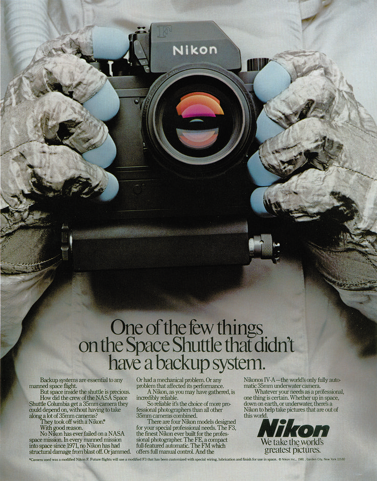
As an example, the Nikon F3, seen in the above magazine ad, saw, among its tweaks, a greatly enlarged viewfinder (since helmets prevented an astronaut from putting his eye right up against the camera) a detachable, heavy duty battery pack to automatically advance and rewind film (still an “add-on” feature for most cameras at the time), pre-loaded film magazines (capable of snapping up to 250 frames per roll) and early versions of both aperture priority and auto-focus (since early pictures taken by the astronauts were either underexposed or blurry). Other, less obvious fixes, like the removal of leatherette trim (the gases in the glue could leach out into the cabin air in weightless conditions) and the invention of a kind of pot-holder “space pouch” to encase the cameras so that they wouldn’t freeze during extra-vehicular activity, were also hatched. Several of NASA/Nikon’s key innovations were adapted later for general consumer cameras, while other workarounds, like the arbitrary redesigning of switches or the removal of reflective enamel, were of no value to John Q. Snapshooter.
Today, the shuttle-era Nikons are the subject of a great degree of study by engineers who value them for their ingenuity, as well as important links in the chain of photography’s onward advancement over time. They also fetch astronomical prices (sorry) at auction. Best of all, we have them. Unlike the Hasselblads that documented the Apollo missions (which had to be left on the lunar surface to counter the weight added to the cargo bays by the accumulation of moon rocks), the shuttle Nikons booked a round-trip ticket home.
BEARING WITNESS
By MICHAEL PERKINS
IN READING A RECENT ARTICLE ON THE CHANGING PHOTOGRAPHIC TECHNOLOGY involved in covering conflicts in the 21st century, from satellites to cell phones to drones to surveillance video, my mind rolled back to the man that, in my younger years, defined not only what it was to be a war photojournalist, but, indeed, how I would specifically visualize the war in Vietnam….that is, through the eyes of a grunt on the ground with a camera. In the days when Life magazine was the premier photo-news weekly (in an era fairly crowded with such publications), Larry Burrows’ (1926-1971) covers and feature articles on all aspects of our tragically doomed crusade in Southeast Asia were the final word on how, if not why, the fight was being waged. His work was tragic, audacious, and strangely empathetic in a way heretofore unseen in combat journalism. He simply changed the terms of the conversation.
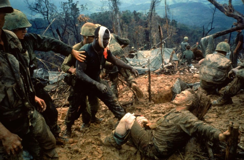
Burrows was already a seasoned veteran by the time Life sent him to Vietnam, having begun his career with the Associated Press in 1947, logging hundreds of thousands of miles in battle sites that included Suez, Lebanon, Cyprus and Central Africa, and earning a reputation for both incisive vision and daring among his peers. Moreover, he enjoyed respect across all grades and ranks of fighting men. Burrows was more than a mere reporter on America’s most troubled war; he was also something of an emotional interpreter, reading the ravaged faces and psyches of the men tasked with trying to extract the U.S. from a bottomless swamp of death. The image you see here, known to many editors as “Reaching Out”, reveals little purely military information, but profoundly nails the gut-wrenching realities of shared sacrifice and loyalty in a way that no written editorial or spoken protest could. And yet, Larry Burrows knocked off this kind of eloquence on a daily basis. Like any great photographer, he made it look effortless.
Burrows died in 1971 alongside fellow photojournalists Henri Huet (AP), Kent Potter (UPI), and Keisaburo Shimamoto (Newsweek) when their helicopter was shot down over the Ho Chi Minh Trail in Laos. In remembering Larry, Life editor Ralph Graves said “I do not think it is demeaning to any other photographer in the world for me to say that Larry Burrows was the single bravest and most dedicated war photographer I know of.”
The group’s communal remains were buried underneath the Newseum building in Washington, D.C., where they remained until the facility, fallen on hard economic times, closed for good in 2019, at which time they were disinterred, and, at this writing, remain temporarily at the Defense POW/MIA Accounting Agency, awaiting a new and hopefully permanent burial place. Once more, Larry Burrows is on the ground, surrounded by the men and women who entrusted him with their stories.
ABOUT FACE
By MICHAEL PERKINS
MANY PHOTOGRAPHS BEGIN AS ONE THING AND FINISH AS QUITE ANOTHER, there being many micro-phases, each mere parts of seconds in length, between conception and execution. We can be absolutely certain what we think we want at the start of the process, and just as certain, by the end of it, that we were wise to abandon our original plan.
The best test of whether we finally “got it right”, to my mind, is that the final image seems to be what I can only call inevitable; that is, once it’s been taken, it’s hard to imagine it having been done any other way. It’s similar to the reaction we sometimes get when we hear the original working title of a novel, or are told who else had been up for a key role in a now-classic movie…the “of course” moment.

Lots of visual information here. Too much, as it turns out…
The picture seen here was originally a story of scale, with the woman at left merely employed as a prop to help contextualize the sprawling space in a very wide shot, about 24mm. To be honest, I had originally taken almost no notice of her facial features (including the fact that she is quite strikingly beautiful), her body english, or any mood that she might be projecting. In fact, she is so much at the far end of the frame as to be Silly-Putty-stretched a bit by the lens. But at the time I was actually more interested in the play of light patterns playing through the ceiling and onto the tiles than the feelings she displayed.
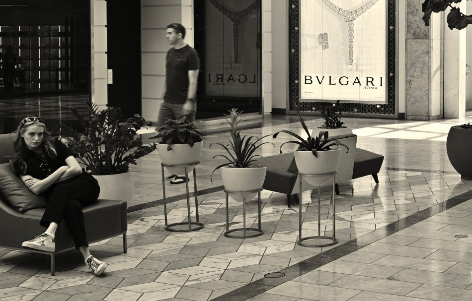
With a radical crop, the woman’s more prominent placement makes the picture a better story.
Then I chimped the shot on my monitor and saw that face. A face suggesting a whole smorgasbord of feelings, from boredom to impatience to longing, to, well, you name it. Meaning that anything you could name is already suggested by that face: it’s what you bring to it, as well as what you can take from it that creates a bond between shooter and audience. Suddenly, the importance of everything else in the frame just fell away. The picture, from that point on, had to be about her. A severe crop gave me just enough context to her right to anchor her in time and space, but now she was the story, the reason for the frame. The final picture had become, in essence, inevitable.
Photography is a constant flow of critical choices, and none of the decisions I made for this picture in any way confers masterpiece status on it. But even in a medium-effective photo, there are ways to push the image toward a truer version of itself. It’s a game of inches.
THE MONTH I GOT MONO
By MICHAEL PERKINS
MY FIRST DAYS AS A PHOTOGRAPHER occurred just after color film had almost completely supplanted black and white for daily use. Certainly, many snapshots and news images were still shot on b/w, but, as my father was a slide shooter all the way, I cut my teeth on Kodachrome and Ektrachrome and what NBC used to call “living color”. I was also heavily influenced by View-Master travel reels and scenic mags like Arizona Highways, and so, again, not a lot for the mono side of my infant brain to feed upon.
Later on, as I educated myself on the Old Masters, I grew to appreciate grayscale at its finest, but still tended to shoot primarily in color, with the exception of the odd side project. With that in mind, it occurred to me recently that, while I had done several lengthy shooting walkabouts over the years in order to speed up my learning curve with various bits of gear, I had seldom, if ever, done a long stretch purely in black and white. A newly acquired camera seemed the perfect time to give myself mono for a month.
One thing which interested me in expanding my visualization in b&w was that the latest cameras can do so much more than just shoot “without color”. Grayscale can be so much more nuanced than merely the absence of hue, and today’s in-camera settings can allow more attenuation in contrast, sharpness and tone than was ever possible in the past. Another selling point was the ability of most recent full-function cameras to place a complete custom configuration of settings at your fingertips by, essentially “storing” them on a dial-able slot in the mode wheel (U1, U2, U3 modes for Nikon, C1, C2, C3 for Canon, and so forth) This allowed me to quickly shoot with both sides of my brain when needed, dialing between, say, manual mode (in full color), and a U1 mode pre-programmed with every little flavor ingredient I want in a mono shot.
The take-home is just this: the mere increase in ease of operation made me shoot more, and with greater enthusiasm, in black & white than I would typically ever do. With just a little prep, my eye got used to consistently composing for what mono does best, getting me used to thinking primarily in that particular tone palette. And, although I know that many prefer merely to take a master shot in color and convert it to mono later on at their whim, I believe that deliberately conceiving a grayscale shot in-camera is a distinctly different experience, one which is helped greatly with the use of electronic view-finders, which let you see precisely what the sensor sees.
Going forward, I will probably budget more mono shots into my overall output than I ever have before, all through the expedient of using the camera to, well, get out my own way. And, as I frequently assert, reducing the steps and hassle between conception and execution is the true superhighway to better pictures.
SCENE OF THE CRIME

By MICHAEL PERKINS
PHOTOGRAPHERS WHO TRAVEL FREQUENTLY FIND THEMSELVES DOING QUICKIE PIVOTS when it comes to tour destinations. Spontaneous choices to Check Out The Cliffs or Let’s Do The Ruins are often fed by group whims as well as by our own, the result being that you don’t always have the luxury of having the “perfect” lens on hand when you decide to hit someplace in the heat of the moment. And we all stipulate that, under such conditions, what we get, picture-wise, is what we get. In the words of the old hod-rod racers, you run what you brung.
And so, the other day, I found myself swept along with a small party to take in a lovely lake park near Show Low, Arizona, where the sunset was said to be marvelous. All reports were true, and fortunately I had along a very sold “Old Reliable”, my Nikkor 24mm f/2.8, a war-torn survivor from the ’70’s that’s built like a tank and is sharp as a diamond, and so, as you can see up top, you get pure loveliness with a minimum of adjustment or fuss. After several days’ practice, you could be in a coma and still come home with decent stuff.
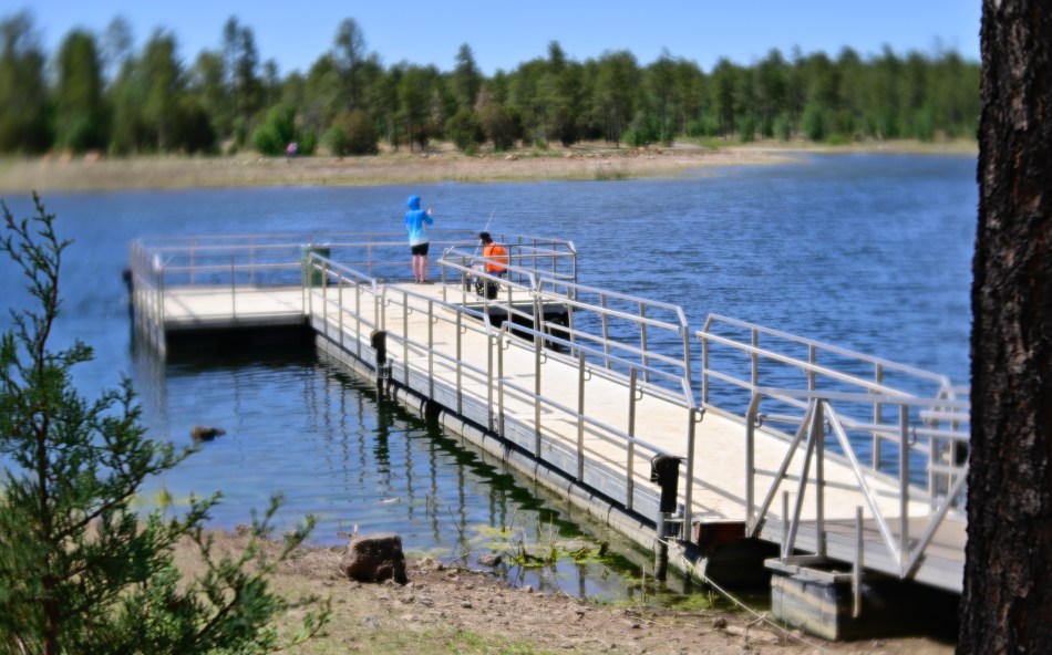
However, I later suffered my usual bout of WhatMighta-ism and wondered what other glass could have given me a slightly dreamier quality. On our last morning before heading home, then, we took one more walking loop around the lake’s perimeter at the scene of the original crime, the aluminum walk-out fishing dock shown in the first image. This time I was sporting a Lensbaby Velvet 56, which models itself after some of the glamour portrait glass once popular in the golden days of Hollywood. The lens adds a soft glow at apertures wider than about f/4, placing a layer of haze over a basically focused shot and buffing away the sharper contrasts and detail for what is lazily called a “painterly” look. For this take, I didn’t have the gorgeous golden-hour light of the earlier shot, but I did get the daydream effect I had wondered about, even with mid-day Arizona light, which is harsher than a German schoolmistress.
Traveling photogs often find themselves in a take-it-or-leave-it take on random subjects, with reasons ranging from The Tour Bus Won’t Wait or We Weren’t Even Supposed To Be Stopping Here to We Won’t Be Back This Way Again. However, on those rare occasions when the option of a second approach presents itself, I heartily recommend scratching that itch and exorcising that nasty What Mighta-ism from your fevered brain.
YANKING OUT STUMPS
By MICHAEL PERKINS
OVER ITS FIRST TEN YEARS, THE NORMAL EYE HAS TRIED TO REFRAIN from commenting on all but the most essential technical advancements in the making of photographs. This, as we’ve often stated, is a forum about intentions and ideas rather than gear. It’s one thing to offer thoughts on the transition from analog to digital, a shift that’s fundamental and lasting in its effect, while it’s quite another to write at length on the introduction of the latest gizmo or feature, faddish things that will age poorly if they are remembered at all over time.
With that in mind, the impending transition away from the mechanical shutter, something that’s been forecast and fretted over for nearly a decade, is a case of something that will be of substantial consequence to anyone with a camera for years to come. The reason the shutter was invented in the first place was because it improved outcomes for photographers and made the entire process simpler and more precise, thus meeting the criterion for any technical advancement, that it helps us get out of our own way and spend more time taking pictures and less time getting ready to do so. Cameras get better when we spot the stumps in the way of where we want to build the highway and yank them out.
At this writing, Summer of 2022, the Nikon Z9, the first professional camera to be manufactured without a mechanical shutter of any kind, has been on the market for less than a year, but is likely to be followed soon, initially in the premium-price class. Many current cameras have offered the choice of either mechanical or electronic shutters for several years, but the Z9 is the first to eliminate the mechanical option entirely. This can clearly be seen as the latest in a line of progression that began with mirrorless cameras, and their elimination of the bulk and complexity (spelled: fail-ability) of the SLR mirror box.
With the box gone, it was logical to assume that the mechanical shutter and eventually the physical shutter button itself would be next to march to the gallows, since they are the final two components that feature moving parts, hence parts that can wear out and render a camera obsolete years ahead of its time. More importantly, the remaining problems in sensors that had thus far justified a mechanical shutter have been solved, meaning sleeker cameras for which shutter systems can evolve from mere focus lock and click servos to a wide menu of programmable aids, all while saving space and keeping more cameras out of the repair shop.
The change will not be overnight, but the genie is definitely out of the bottle, and, if you are reading this post years from now from our archive, you might wonder why we were making such a fuss about something so obvious. Cameras work best when they present the fewest obstacles between What I See and What I Get. The shutter originally served this function, removing a lot of stumps on the road to better pictures. Now it’s time for it to hang up its jersey. Or curtains.
Hey, I just heard that. It’s “curtains” for the shutter.
Get it?
Hello?
Is this thing on?
READING THE ROAD

By MICHAEL PERKINS
COMPOSITION IN PHOTOGRAPHY IS NEVER MERELY A MATTER of rearranging the deck chairs on the good ship Take-A-Snap. Yes, at first, there is the frame to be dealt with, and with that, the crucial decisions on what stays in and what gets left out. And then there is the front-to-back and side-to-side staging of the image, the visual coding you build into the picture to tell your viewer where to look and how to prioritize what he sees, a process influenced as well by contrast, depth of field, and other shooting settings.
But there is another crucial way to instruct the viewer’s eye on how all this information ranks within itself, and that is the decision to shoot in either color or monochrome. It’s true that, merely by landing on one or the other, you haven’t added or subtracted any visual elements that weren’t already in the frame. That is, you didn’t stick in four more trees or yank out the ocean shore. However, pictures in these two opposing modes convey information in distinctly different ways, and so both will confer certain qualities on the objects in the frame based on how the eye takes in that information. This can either make your picture pop with dimension or sink into murk.

Color assigns a rank to things and relegates objects to either shadow or light, foreground or background. Monochrome does this as well, but in a far subtler manner, meaning that some color shots which are clear in their message might appear muddled or muted when rendered in black and white. Conversely, something which is direct and contrasty in mono might appear either weakened or magnified in color.
In the case of the two renderings seen here, the tangly busy-ness of the color shot (top) seems, in monochrome (above), to make a very dense photo much harder to read. There is so much texture in the color version that just becomes mushy in grayscale, so that the mono version does nothing to simplify the shot….quite the opposite. The Color/No Color decision can either make or break even a well-balanced composition by making the “look here” rules for the viewer too ambiguous or unclear. Reading the room can help pictures communicate cleanly.
CURTAIN CALL

By MICHAEL PERKINS
PHOTOGRAPHERS DOCUMENT THE THOUSANDS OF PERFORMANCES AND RITUALS, from theatre to sacraments, that define human existence. They vary in language, music and format to an amazing degree: some are ornate, others simple. However, none are so exotic as our very last performances, those staged for us after we pass from this world.
The etiquette of death, the forms and symbols that we regard as “appropriate” or “reverent”, are, in themselves, a kind of show business, complete with their own exclusive cues, costumes and production values. Part of this strange pageant is an attempt to make the living feel comforted in times of grief or terror, since we know, all too well, that mere inches of random fate separate the mourners from the dearly departed. With luck, we feel oddly satisfied when things look “just so”, even as the images that mark these final acts can later strike us as eerie instead of elegant, banal rather than dignified.

I can never quite excuse my photographic expeditions in cemeteries over the years. Am I a ghoul, suffering some kind of Addams Family fixation with the morbid? Or am I merely looking at all this visual lore as the bizarre attempt at closure that it is? Perhaps it’s just the terribly strange juxtaposition of shapes, shadows, textures and artistry that’s produced in this most unlikely of dramas. And then there is the choice, for a photographer, of hue and tone. Is more hope expressed in color? Are the muted shades of monochrome more respectful?
I can’t say that walking through graveyards is a “guilty” pleasure, or any pleasure at all. At best, it’s like visiting the weirdest nation on the planet, Shakespeare’s Undiscovered Country. Everyone is, or at one point, will be, in the club, and so sizing up the visual totems of our eventual addresses is both fascinating and frightening. And what pictures all that confusion can make….
‘CUZ I WANNA, THAT’S WHY
The mysteries of photography reveal themselves equally well in either analog images (like this one) or digital shots.
By MICHAEL PERKINS
THERE ARE NO RATIONALLY DEFENSIBLE “REASONS” TO SHOOT FILM. Every technical argument for abandoning digital and re-embracing analog has been answered, and everything that the film experience delivers, in terms of results, can be duplicated or simulated with greater control, speed and economy in the digital domain.
But here’s the fun part: YOU ALSO DO NOT NEED TO JUSTIFY YOUR DESIRE TO SHOOT FILM. Just admit to yourself that it’s an emotional choice or a matter of nostalgic curiosity. Just getting to this point can be very freeing, since you finally can see the flaws in the most commonly “reasoned” claims made about film, including the following ones, taken verbatim from various film fan sites:
Old Cameras Are Fun To Collect So are stamps, and you don’t have to dust, repair or make additional purchases of supplementary supplies just to own them
Analog Cameras Provide Insight Into How Photos Are Taken So will any camera ever made. Turns out that the mystic secrets of imaging weren’t somehow rendered unknowable once we started storing pictures on pixels.
Film Photography Forces You To Be More Meticulous So does placing limits on settings or shooting conditions on any camera you have. Hell, just shooting in manual is like going to grad school. Just slow down, take your gear off auto, and push yourself.
Developing Photos Can Be A Very Satisfying Experience So can learning to fashion horseshoes or making your own sourdough bread. The unsatisfying part of processing your own shots is measured in costly materials, errors in developing, a messy house (or angry spouse, or both), and the occasional chemical burn.
Film Teaches You A Lot About Light And Color As will any diligent amount of study with nearly any camera. Again, there is nothing exclusively instructional about the film process. The novelty and unpredictability of it can be charming, but only up to a point.
With Film You Never Know What’s In Store For You Meanwhile, you do know that you will pay cash money for every rationed shot you take, good or bad, whereas, once you buy a digital camera, you’re basically shooting unlimited images for free.
Film Photography Can Be Turned Into An Artistic Pursuit As can origami, music, poetry, or even making owl decorations out of jute and driftwood. So?
The Future Of Film Is Uncertain Film is eventually going away, so you’d better shoot some quick, or else you’ll miss out on what all of your other your cool friends are already enjoying without you, because you’ve probably been whiling away your time going through bins in vinyl record stores.
Bottom line: you only need utter one sentence to explain why you shoot film.
Say it with me:
‘Cuz I wanna, that’s why.
Art needs no argument or alibi, merely desire. So make pictures in your own way, just without all the cute rationales. Because rationales and creativity are a bad mix.
COSTUMED REVEALS
By MICHAEL PERKINS
THE SEE-SAW ACT THAT PHOTOGRAPHY PERFORMS between camouflage and revelation is one of the more tantalizing dynamics of the art. That we can both expose and conceal within a single image is what, in my opinion, actually makes a photograph an artistic expression. Originally conceived merely as a device for recording information, mirroring reality if you will, the camera is actually as coy as a strip-tease artist. You must read pictures for both positive and negative information.
Portraits are ways of expressing how we individually see a person, as well as an invitation to others to either identify or distance themselves from that very individual impression. It is not, by its very nature, an historic document. I was reminded of this recently when doing some background research on my favorite painting, Madame X, John Singer Sargent’s portrait of an American ex-patriot who had burst upon the social scene in nineteenth-century Paris. Not only are his preliminary studies of the woman remarkably distinct from each other, but further study shows that portraits of the same woman done by other artists of the period may as well be of five different people. All are accurate. All are true.

And so with photos. Gone is the pressure of making one official image of a person to mark their time on the planet, a feature of many early portraits where subjects might be photographed but a single time during their entire life. Now we have several hundred cracks at our favorite people over decades, none of them truly definitive or even typical. In my own case, I have photographed the woman shown here, a master teacher on my weekly birdwatching walks, literally dozens of times over the past decade, and each of the images revealing something vastly different about her character, making her now gentle, now stern, now aged, and now utterly ageless. I keep coming back to her because her eighty-plus years serve her like a kaleidoscope, serving up infinite refractions of her upon each new sitting. What I reveal in one frame I will conceal in the next. In one shot I am celebrating her longevity, while in yet another I am lamenting her fragility.
Even without much trying, you are going to take lots of pictures of the people you love over time. Make those multiple “takes” work for you, talk to you, keep you curious. You will learn that the camera costumes even as it reveals, and that those subtle variations, like variations in autumnal shades, will all be alien from each other, and will all, to one degree or another, ring true.
MORE IS LESS IS MORE

A color master shot that I later converted to mono, an operation which is perfectly suitable in many occasions.
By MICHAEL PERKINS
THE ARC OF MY EARLY CHILDHOOD PARALLELS ALMOST PERFECTLY the photo world’s universal switch to color, with my earliest images still rendered in living monochrome, and pictures from my teens giving way to the bold hues made possible by cheaper and faster consumer films. That switch meant a profound change in how one could evaluate light and shadow through the viewfinder, because for the first time, even as you saw your subject in color, you could safely assume that your final picture would more or less look the same.
Think about it what a change that was. If your first rolls were shot in mono (as is still the case with some photo students), you actually had to frame in color, even while you trained your brain to “see” in black and white. After some practice, you might be reasonably sure of how the tonal balance of your work might register once it was rendered in shades of gray, but you couldn’t be certain until you had the results in your hand. And while lab manipulation, including processes like dodging and burning, were possible, the universe of “post-production”-oriented photographers was much, much smaller than is the case today, meaning most of us got….what we got.
The post-processed mono conversion. Would I have made different decisions had I been mastering in black and white?
Things are much easier for monochrome fans today because, not only is it simple to shoot in black & white on purpose on nearly any camera, previews on LCDs and electronic viewfinders (EVFs) allow you to compose in mono as well. EVFs are even more of a revelation for people coming from DSLR or traditional rangefinders, because you are looking at precisely what the sensor is seeing, making for a smaller gap between your conception of the shot and what you actually get. Since moving to a mirrorless camera, I have become quite spoiled by this extra measure of control. Never mind the fact that, in the Stone Age, I had to wait three days for film to be returned from the processor just to learn how many shots I’d botched. Now both the waiting and the botching are distant memories.
And we have a question from audience: why not just shoot in color all the time, and convert shots to mono as needed (see examples, above)? Well, because you have a more pronounced mindfulness about what will work in mono when you preview and plan in mono, just as you have a better record of what happened from keeping a diary during a trip than in trying to reconstruct your memories later. Or such is my experience. The point is that deliberately doing a day’s shoot in black & white can teach you patience, restraint, and how factors other than color can determine the drama or impact of a shot. But photography is all about how many different roads there are to Oz. As long as you eventually get to the Wizard, it’s all good.
