PALLBEARING FOR HDR

HDR processing, initially touted as a more “real” look, is actually anything but.
By MICHAEL PERKINS
MANY OF THE TECHNOLOGICAL ADVANCES IN PHOTOGRAPHY, over the centuries, have been made as specific remedies to the limits of either cameras or recording media. Lenses and films were made faster, sharper, or more accurate because photographers were thwarted by the cramped parameters of the media. Such a cycle of malady-and-cure creates temporary and manic convulsions, fads if you like, along with solid, permanent improvements. Sometimes, as in the case of the now declining technique known as High Dynamic Range, or HDR, it’s easy to confuse a quick fix for a permanent one.
To review, HDR was an attempt to compensate for the limited range of light recorded by first-generation digital sensors, which effectively “read” extreme highlights or shadows, but were spotty in the mid-ranges, delivering only a portion of what the eye could detect. The solution was to take a bracket of anywhere from three to seven frames over a wide exposure range (grab your tripod, kids), then blend them, via software, to more consistently even out all values for a “balanced” or “natural” view. The other side-benefit of the process was a drastic amplification in detail.
HDR was immediately praised as having helped the photographer hurdle the last remaining barrier between the camera and real life. It quickly muscled its way into everything from amateur landscapes to commercial real estate, conferring prophet (profit?) status on authors like Trey Radcliffe, who soared to best-selling fame with books brimming with hyperbolic color and iridescent textures, every hobnail and brick in his goth HDR cathedrals registering the same, loud detail.
And that sameness, eventually, became the problem. Every part of every picture was now shouting. In the hands of many, HDR did not make images evenly modest: it made them uniformly garish. Too many HDR pictures were overripe, overcooked, as if the world were awash in day-glo gravy. Worse, the technique couldn’t work with live subjects or hand-held shots. Worse yet, in-camera HDR simulators in DSLRs and phone apps were virtually useless. Finally, if you actually liked photographing, you know, actual people, HDR made human flesh look like wet liver inside a tanning booth.
In the end, the problem HDR was created to address actually resolved itself, with second-gen camera sensors finally performing better along a wider range of light, delivering more even exposures right out of the camera. More importantly, photographers fell back in love with shadow, understatement, and mystery, satisfied that you don’t have to show everything to see everything. So, rest in peace, HDR. There now are better ways to keep it real.
THE MAN IN THE ROUND CUBE
 By MICHAEL PERKINS
NOTHING IS SO TIMELESS as something whose time has come and gone.
Once a thing… a style, a design element, a fashion, an idea…has outlasted its original context, becoming truly out of sync with the world, it can become visually fascinating to the photographer. Instead of forward-looking, it’s dubbed “retro”. Rather than radical, it becomes something no one can ever remember having been excited about, like looking at Carol Brady’s shag haircut 25 years on.m
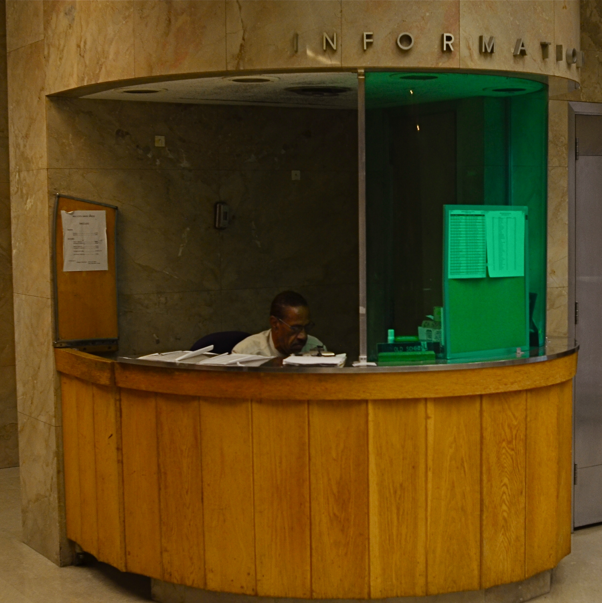
The information booth in the frame shown here is one such anomaly, so odd a fit in the building that it’s part of (the California state capitol annex) that it wrenched my attention away from a pretty good tour. The wing the booth is part of, built from 1949 to 1952, is, generously speaking, as dull as dishwater, indistinguishable from most generic government buildings, a box of sugar cubes.
But the booths are something else again.
Far from the typical marble-block, cage-and-window, bank teller enclosure many public servants call home, the booth is curved wood and glass, sounding a faint echo of Art Deco which extends even to the aluminum letters that spell out INFORMATION. And yet, at present, the modernity of the original design is now itself antique, its lonely occupant looking as if he were banished to his post rather than assigned.
The lighting within the booth is so minimal that the poor man’s features are nearly swallowed in deepening shadow: he looks like a recreation in some museum diorama about What Offices Will Look Like In The Future!!!, as strange to view as “modern” renderings of someday space rockets as seen from 1950. And then there’s the insect-repellant visor green on half of the glass, which is there, I assume, to protect Mr. Info from harsh gamma rays(??). The entire effect is one of loneliness, of, again, the evidence of a time (or a man) whose time has come and gone. And that calls, in my world, for a picture.
RIDING THE SLIDER
By MICHAEL PERKINS
ONE OF THE MUST–HAVES during the golden age of component stereo was the graphic equalizer, a panel on the front of many hi-fi receivers that divvied up the audible spectrum into five zones, allowing the discriminating audiophile to create a custom low-midrange-hi mix of frequencies by adjusting each zone’s vertical slider switch. It gave a clear representation of the desired fidelity curve. It was visual. It was visceral. Most importantly, it was cool, man.
The “slider” is also, for me, a frame of reference for my photography, since it gives me a mental picture of where I’m at along the track from work that’s left-brained (precision-driven, analytical) and right-brained (instinctual, reactive, emotional). The slider almost never travels to either extreme in the making of pictures, but veers closer to one or the other in a custom e.q.’d mix between rational control and total abandon. This is becoming more common with photographers in general than at any time in the past. When it came to crafting an image, we almost always asked about the how of things. Now many more of us also ask about the why.
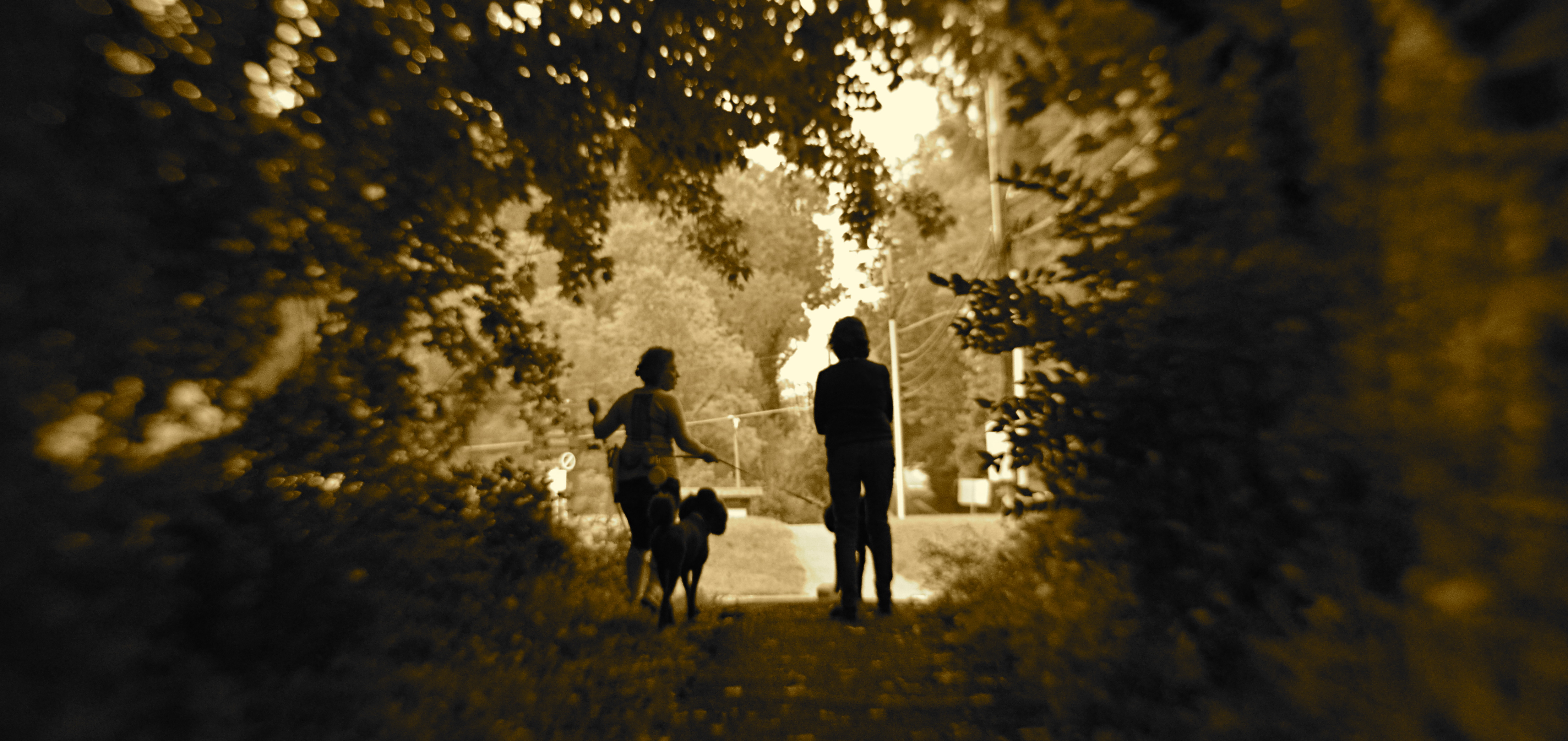
The above image is illustrative of this balancing act. In walking behind the two women emerging from a forest at the end of their dog walk, I was never going to have a lot of time to formally set up any one shot…..not unless I was willing to interrupt the ladies’ together time, which seemed counter-intuitive at best. Optically, I was shooting with a selective-focus lens, designed to be sharp at the center, then progressively softer at the edges. Additionally, I decided to under-expose both women, eliminating all detail and reducing them to silhouettes. This meant that I had to wait until they were fairly centered in the clearing at the edge of the woods, one of the only reference points I would have for sharp focus, the backlighting of their forms, and any suggestion of depth.
And so you have a shot which is neither all-rational nor all-instinctual but a mixture of the two, the slider’s mid-point between preparation and improvisation. Total adherence to the left brain can produce shots which are technically precise but emotionally sterile. Working too much on the right side can yield pictures that are chaotic or random. Learning to jockey the slider is at least as important a skill as either composition or conception.
POST STARTS NOW
By MICHAEL PERKINS
THE POST–PROCESSING REVOLUTION wrought by the introduction of Photoshop in 1988 has so profoundly influenced the act of picture-making that many shooters think of the program as half of a complete two-step process of photography. In Step One, you shoot the image. In Step Two, you fix it.
However, being conversant with more of the menu options built in to nearly every level of camera in use today can mean solving most “post” dilemmas without resorting to Photoshop’s full suite of solutions. Just as you change lenses less the more you understand what lenses can be stretched to achieve, you can avoid the extra step of computer-based tweaking the more you understand what’s already available while your subject, your shooting conditions and your mental presence are all in play. Some would argue that such adjustments would be more finely attenuated working with a RAW file in Photoshop than by fixing flaws in-camera with a JPEG, and you have to decide where you come down in that debate.

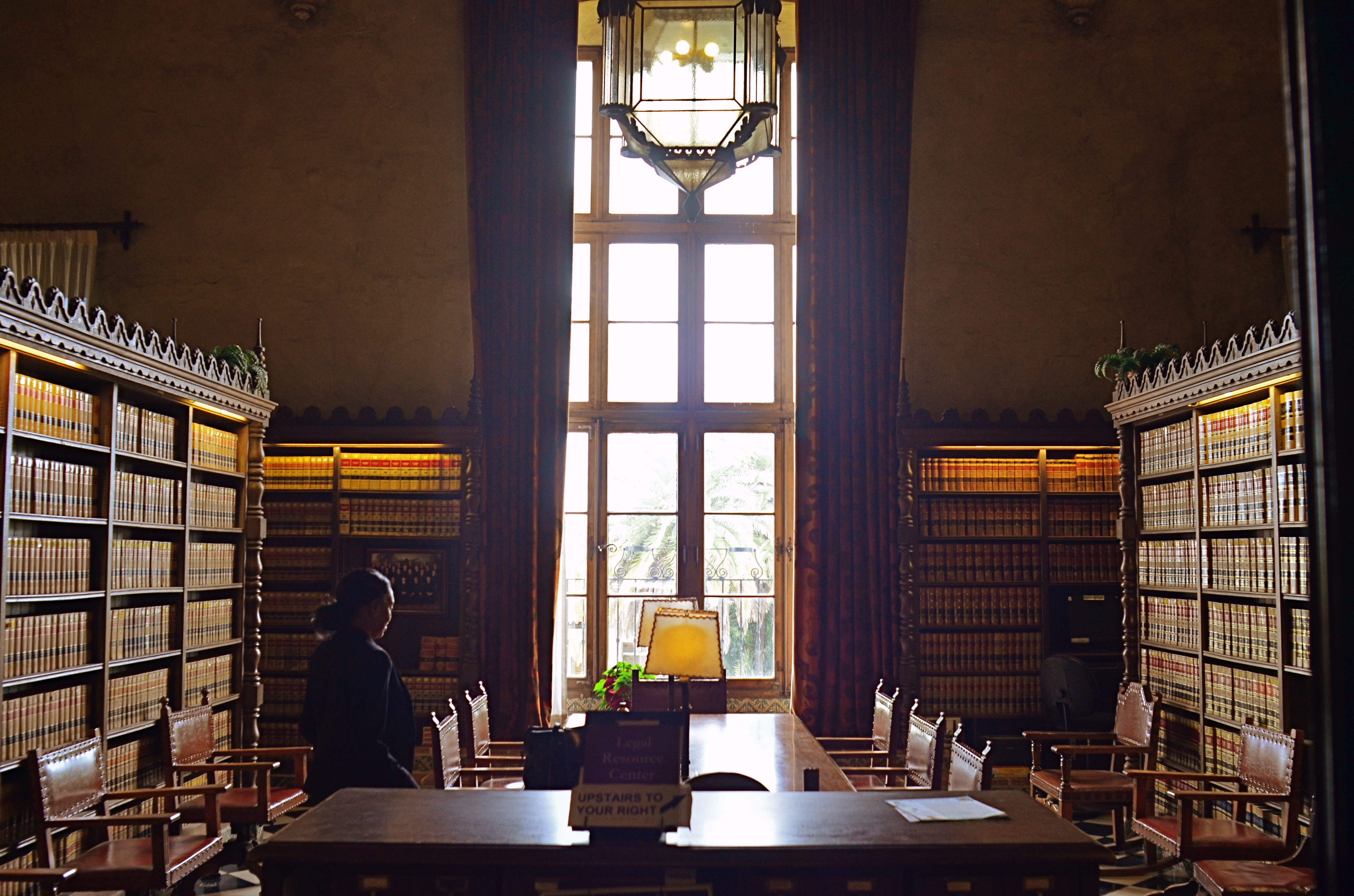
The original shot suffers from the “blues“.
Let’s take color as one example. A great many photographs with off-kilter values are corrected in Photoshoppish apps, yet can be quite satisfactorily fixed in-camera. White balance settings allow you to pre-program a number of light temperature pre-sets that make your camera “see” colors as if they are occurring in sunshine, shade, or a variety of artificial light sources. But even if you shoot everything on the “auto” white balance setting and get the wrong colors occasionally, there is still a way to repair the damage without resorting to Photoshop. What Nikon and Canon both call color balance allows fairly fine-tuned adjustments to get the hues to look either (a) more like you saw it, or (b) the way you wish it had looked.
The shot at top, adjusted with Nikon’s color balance option, produced the warmer look in the bookshelves that would have resulted if the light coming through the window had been warmer. In the original image, taken with an auto white balance setting, the camera, far from “guessing wrong”, actually recorded the room light as it appeared in reality, since the sky was severely cloudy and was a little blue in cast. However, with the in-camera color balance tweak, no Photoshop intervention was required. Moreover, I could check my work while in the moment, a handy thing, since tours were moving in and out of the room all day, meaning that, if I wanted to shoot the room (nearly) empty, I had to work fast.
Digital photography’s original bragging point over film was the ability to shoot, fix, and shoot again rather than rely on the darkroom to rescue tragically few of our miscalculations. Working our in-camera menus for all they’re worth helps deliver on that promise.
SAVING FACE

Faces are selves served up in slices.
By MICHAEL PERKINS
YOU WOULD SUPPOSE that sustained, intimate contact with a photographic subject would inevitably lead to a superior, if not perfect rendering of that subject in an image. And supposing further that said subject is a person, you’d assume that one’s close bond with the subject couldn’t fail to produce the ultimate visual depiction of that person….a glimpse into their very essence.
Or so you’d suppose.
There is a reason why so many shooters pursue the same faces, many belonging to dear friends or loved ones, over a lifetime of picture-making….never quite able to reduce a face to its essence or its definitive “version”. It’s not that they don’t yet know enough about that particular arrangement of shapes and features. It’s that they know too much to settle for any single interpretation of them.
No sooner does the face of the Dear One display a given mood or aspect than it shifts like an active weather front to a completely different mix of elements. Faces are selves arrested in mid-flight, and, being in constant motion, rob us of the picture we originally set out to capture, only to bestow a fresh one on us. The “new” person we now see is, certainly, the same individual, but changed enough that we are off on a completely different mission, visually speaking. That is both frustrating and fulfilling.
The slices of persona that we freeze in the camera are just that: shifting glimpses. That means that, unlike pictures of monuments or mountains, they can’t be “done” in any permanent way. Add to this the change in how we all relate to each other over time, and it makes perfect sense to refresh our view of the most familiar faces an infinite number of times.
LET’S TALK ABOUT YOU

We don’t need no stinking rules….
By MICHAEL PERKINS
SINCE ITS LAUNCH IN APRIL OF 2012, The Normal Eye has tried to convey the infinite joy I’ve derived from a life behind the camera, that ever-present sense of anticipation and wonder each time the shutter clicks. And judging from the wonderful stories you have shared with TNE over the years, that wonder is infectious, feeding off each fresh discovery in technique and approach. The magic kicks in every time you turn a new corner and Learn. Just. One. More. Thing.
This forum has been an attempt to capture what happens when we first take our cameras off “automatic”, making those stumbling, uncertain first steps toward full responsibility for our shots. At first, it may be something as simple as a different aperture. Then it’s a slight departure from our comfort zone on composition. After that, perhaps a counter-intuitive approach to focus, or exposure. Eventually, our eyes and hands hunger for more and more independence, and a completely different kind of picture-making begins. We evolve from those who merely hit the button (and hope) to those who hunger to learn about all the other buttons, on our cameras and in our heads, that are dying to be engaged.
I’ve seen this engagement in your remarks, for which I truly thank you. I’ve learned from your websites and portfolios. I’ve marveled at how you’ve seized control of your art, step by step, resulting in a complete rubbishing of the rules and conventional wisdom. And I’ve delighted at the order you’ve harvested from chaos, the eloquence of those who have taught themselves to see anew.
This page, and my own work, have been nurtured by your boldness. You have, in fact, emboldened me. Together, we have all established a broad, bright line between (as our masthead says) taking pictures and making them, regardless of whether we wield a light-leaking Holga or a wallet-killing Leica, a cardboard pinhole or a DSLR. The Normal Eye continues to be dedicated, then, to teaching all of us to trust ourselves, and those stubborn little voices inside that insist that you really, no really, should just shoot the picture.
And see what happens.
LAUNCH DAY
The journey of a million photos begins with a single snap. Phoenix, Arizona, December 22, 2015.
By MICHAEL PERKINS
GIVEN THAT FAMILY HOLIDAYS ARE THE MOST OBVIOUS AND LONG-STANDING of motivations for capturing images, it would probably be safe to guess that Christmas Day has launched more photographers, over the decades, than any other single date on the calendar. Not that we ever had much choice.
As the world’s first super-sized photo gear supplier, the Eastman Kodak Company had barely tiptoed into the 20th century when it began to craft ad campaigns that tied the Happiest of Days with the Best Way To Make Memories. Print ads encouraged families not to merely experience holiday joy but to freeze-frame it with a camera. Don’t have one yet? What a great gift idea! See our full-color flyer…
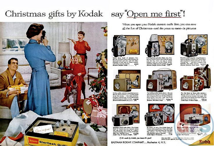
Mom looks pretty put-together for five in the morning. Great shot of the matching pajamas..and guns.. for the kids.
About a year ago, I began an annual tradition in December posts of The Normal Eye by showcasing color magazine ads from Kodak’s longest-running promotion, the “Open Me First” campaign of the 1950’s and ’60’s, which put forth the idea that the good times can’t really start unless (a) you’ve received a Kodak camera for Christmas, and (b) loaded it and used it to chronicle all the other “ordinary” presents as they’re unwrapped. The ads always gave you an additional nudge by showing Dad or Mom snapping away as the kids tore into their loot, along with a mini-catalogue photomontage of Kodak’s latest year-end offerings. Remember slides and movies? Heck, remember prints?
This year, I’m also linking to one of the company’s most heartwarming TV ads of the period, entitled “Turn Around”. Watch it here, and, I warn you, keep the Kleenex close. You’ll need it.
My first camera was also a Christmas gift, and while that doesn’t count as a legitimate “birth of a great photographer” origin story, it did serve as launch day on a habit that has never ceased to thrill, surprise, and challenge me. Without that first little 620 box camera, I might be filling the pages of this blog with thrilling stories of Marlins I Reeled In Off The Keys or Great Wood-carvers I Have Known. As it turns out, I’m pretty happy right here.
Merry Christmas.
UNREAL, MAN
Not a “real” or natural exposure, to be sure, but the look is intentionally idealized, in effect a fantasy. HDR is great for this. But not for everything.
By MICHAEL PERKINS
ONE OF THE MOST POPULAR IMAGING PROCESSES OF RECENT YEARS, and one which has produced either moderation or mutilation in millions of photographs, is HDR, or High Dynamic Range processing. Conceived as a way around the problem of how to evenly illuminate a scene tracking from very light to very dark, HDR initially seemed a godsend. Too big a range from the brightly lit windows of the cathedrals to the shadows behind its altar? Take three or more shots with a variety of exposures, and use the HDR software to level out the highs and bring up detail in the lows. Blend into a final composite, and, presto, you can see everything (and here’s the big pitch) just like your eye does.
Now, it’s true that your eye reacts almost instantly to changes in light, adjusting on the fly to render both dark and light areas “read-able” at it moves through a scene. So, it seems logical to make images where all that tonal adjustment is frozen in a single frame. Thing is, though, your physical eye is not the only thing that “sees” a photograph. Your brain, with its vast archive of information on how things look “real”, may not interpret a tone-mapped image, with its even range of light, as a natural one.
Another thang: not all of the images in a composition have the same visual weight as story elements. The man in the foreground of a portrait is more important than the wooden bureau ten feet behind him, so why should they receive the same amount of illumination? Additionally, even if I can rescue the detail of the bureau’s fine wood grain, should our eye be drawn to it as much as we want it to be drawn to the man’s weathered face? HDR can create a fantasy re-balancing of tones as they are seen in life, and some of us have used it like neon Play-doh, creating images that are closer to black-light posters in a hippie’s bedroom than an approximation of reality.
One of the gallery tabs on this blog was originally named HDR to act as a kind of disclaimer, as if to say, yes, I know this is not reality. I chose to interpret my subject in this way on purpose. Recently, that tab has also been renamed Idealizations, since that word even more accurately describes that the images within are deliberate manipulations. I may be more restrained in their use than a few years ago (and in fact, I rarely use them at all, these days), but they should be labeled as genetically modified super-grapes, not fresh produce. In the meantime, the gallery content itself is also completely new, so, even if you have visited them before, I’d appreciate your opinion on how I presently apply the process, or indeed, if I even should.
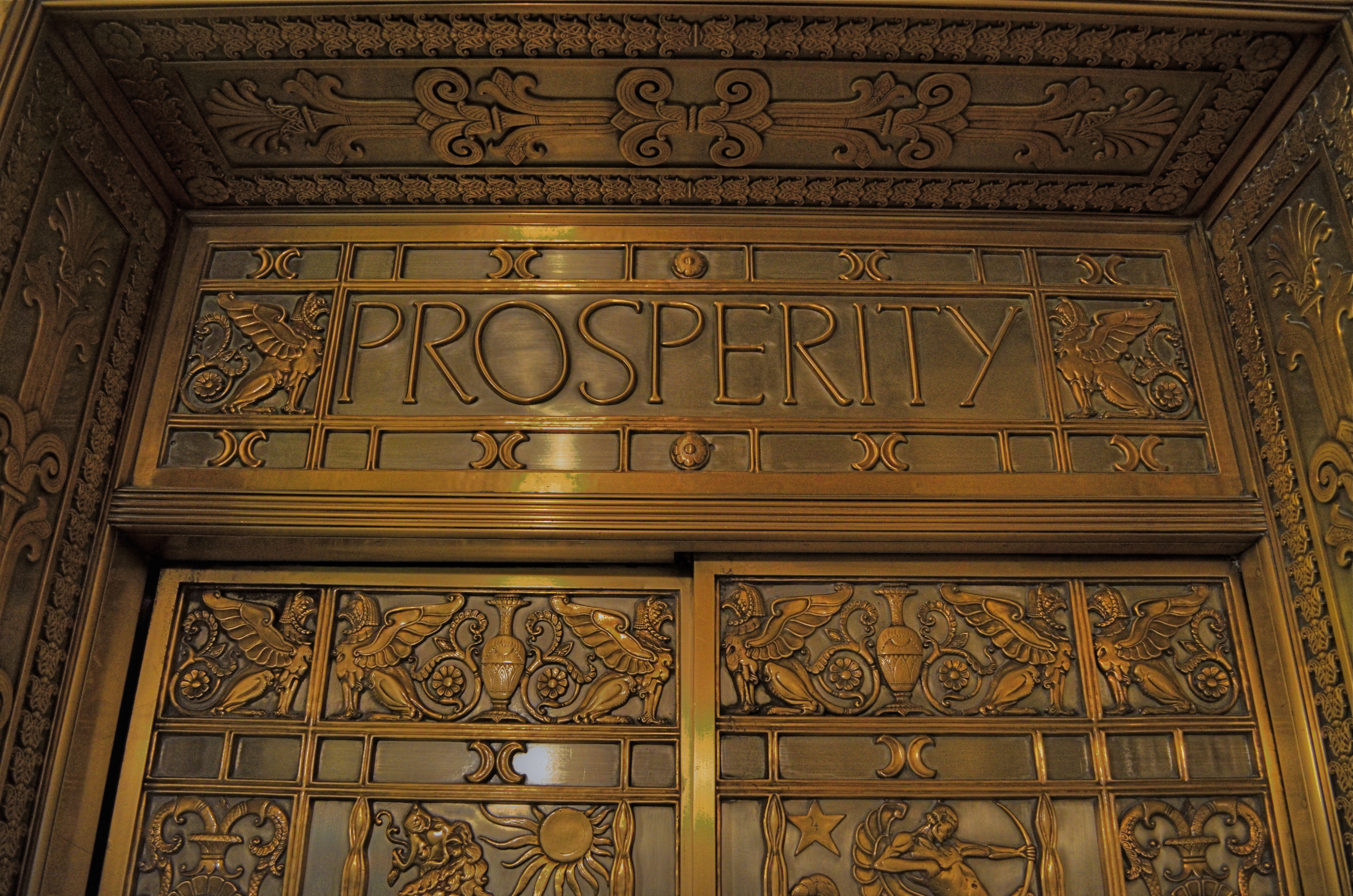
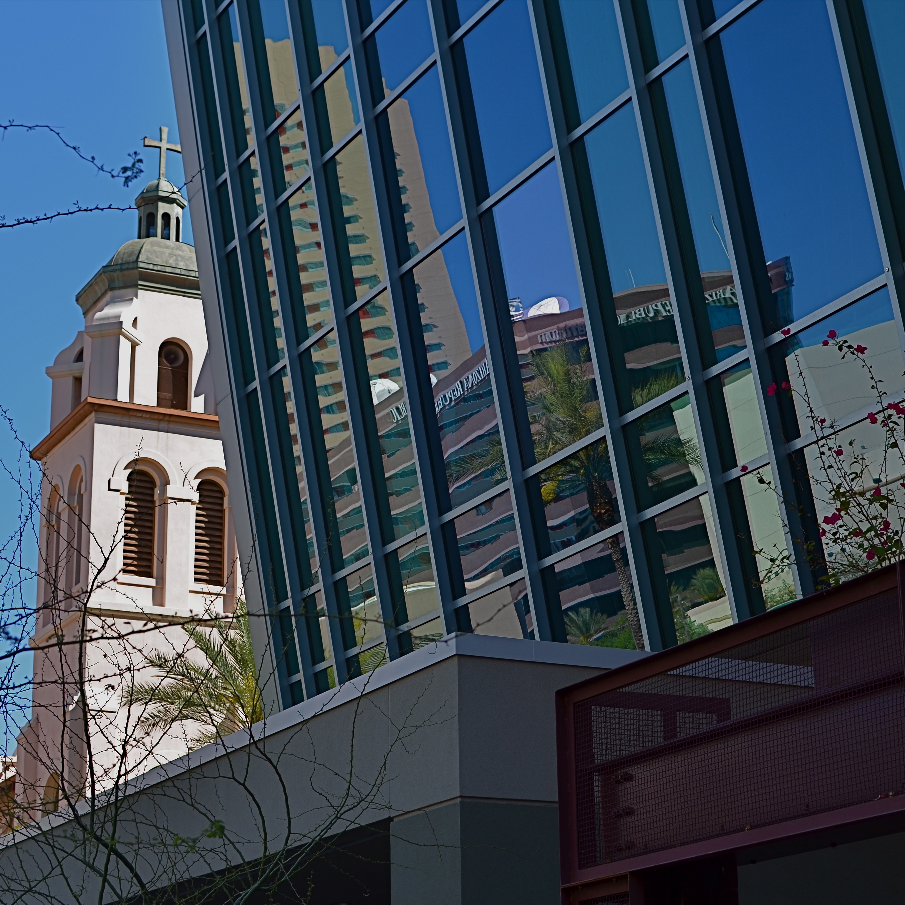
LET’S ALL GO TO THE LOBBY
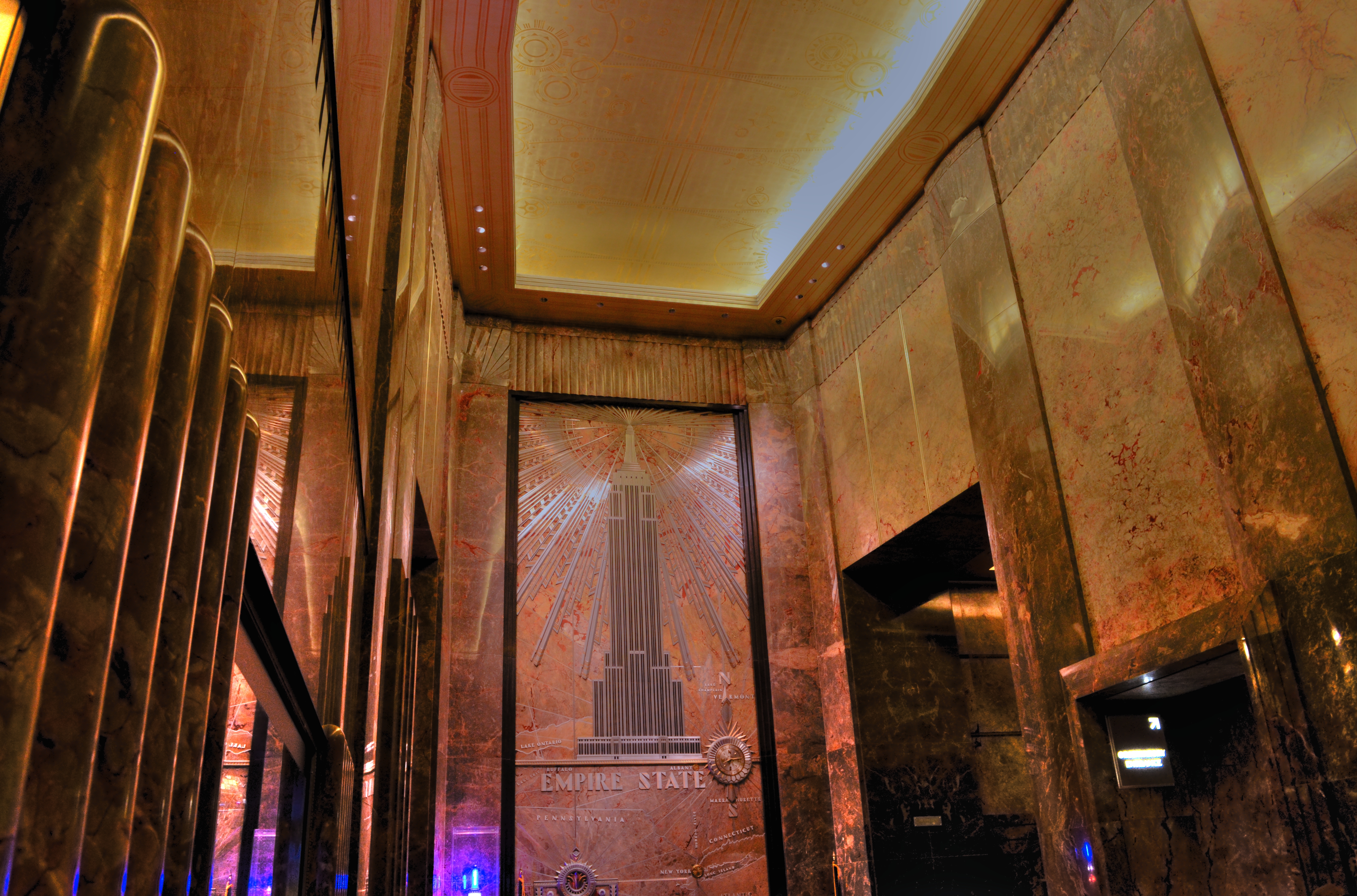
Big Dreams, Big Walls: The elegant lobby of the Empire State Building, NYC.
By MICHAEL PERKINS
THE FIRST GOLDEN AGE OF THE SKYSCRAPER IS TRULY ONE OF THE MOST SUSTAINED PERIODS of garish grandeur in American history, and, for photographers, it’s an embarrassment of riches. However, walking in the country’s towering monuments to self and substance, it’s important to remember that only half the story is told in the sweep and scope of their gaudy exteriors. In many cases, the ego-driven lords of commerce who commissioned these urban headstones wrote their legends just as loudly inside their palaces’ lobbies and vestibules.
Even the door of this elevator cab in Columbus, Ohio’s Leveque Tower can take on a sense of higher purpose.
Lobbies created during the ‘scraper craze are every bit as extreme as their hosts’ outer skins, but in a more personal way, since they are the common space where actual people live and work. The scale of person-to-building is demonstrated more dramatically than when one views a tall spire from four blocks away. Also, in grand propagandistic style, the ideals of the sponsoring person or company become part of the decor and design, with words like prosperity, integrity, health, industry or happiness gracing crests, plaques, mailboxes and elevator cabs. If the outside of the structure celebrates how beautiful a building can be, the lobbies of those same places celebrate how wonderful a person can become.
Friezes, murals, mozaics, statuary, and custom lighting all make grand lobbies a rich hunting ground for photographers, even as they often pose some real challenges for all but the fastest lenses. Still, the rewards are great, and, as time moves on, the very act of documenting these urban leviathans becomes downright crucial, given the dodgy luck of urban evolution. Today’s taken-for-granted treasure is tomorrow’s pile of salvage (I needed to slide that in on the fiftieth-anniversary of the destruction of New York’s Penn Station, one of the most savage acts of urban desecration in the history of this country).
So, when it comes to great buildings, go ahead and judge a book by the cover. But take the time to leaf through some of the chapters as well.
EQUILATERAL
Framing within a square allows for a completely different kind of compositional tension in your shots.
By MICHAEL PERKINS
IT RECENTLY OCCURRED TO ME THAT THERE IS AT LEAST A “MINI-GENERATION” OF YOUNG PHOTOGRAPHERS who have never shot a single picture on a conventional camera. I’m talking 12-20-year-olds that may have created every shot of their relatively young shooting life on a mobile device. This is notable, because the concurrent tsunami of traffic routed to Instagram, Snapchat and other apps means that many of these new shooters have also made a ton of their images in the square format. That in turn means that, unlike many photographers using more traditional gear, they are comfortable framing up the world in this unique fashion, and that presents a creative challenge for everyone else making pictures.
For various reasons spanning most of a century, the square, which spent a long time as the default frame for all of photography, faded for a while from the 60’s through the early 2000’s. Social media and the lo-fi plastic toy camera craze have brought it back, and, with it, a very distinct way of seeing, especially if you’re out of practice with it.
For one example, many photographers are comfortable with locating their biggest point of interest dead center in a square, in a way that they never would be in a landscape frame. Certainly there is the temptation to bring all eyes right to the point of a picture, and symmetry is a great way to do it. I myself “discover” squares in pictures that were executed in wider dimensions, which is to say that I finally saw how little of the original information was really needed to make the point. In other words, a more formalized kind of cropping.
Today’s cel phones encourage people to experiment since the square format can be preselected as well as click-cropped to a perfect square after the fact. For me, it’s returning to a frame that I began with, shooting 620 medium-format square snaps in my youth.It was only after I began shooting movies and slides that I became drunk with power at “all that extra room”, whether I knew what to fill it with or not. Now, having returned to a bit of film work in those older cameras, I am now to the point where I look for a reason to compose in a square, just to see if I can get the narrative impact I want in the more restricted space. It’s like trying to creatively decorate a studio apartment.
If you haven’t worked in the unilateral dimensions of the square in a while, digital-era cameras make it easy to shoot a ton of stuff in a short space of time, speeding your comfort curve, and seeing how this alternate system can shape your sense of composition is great training, faster and cheaper than ever before.
ADMISSION
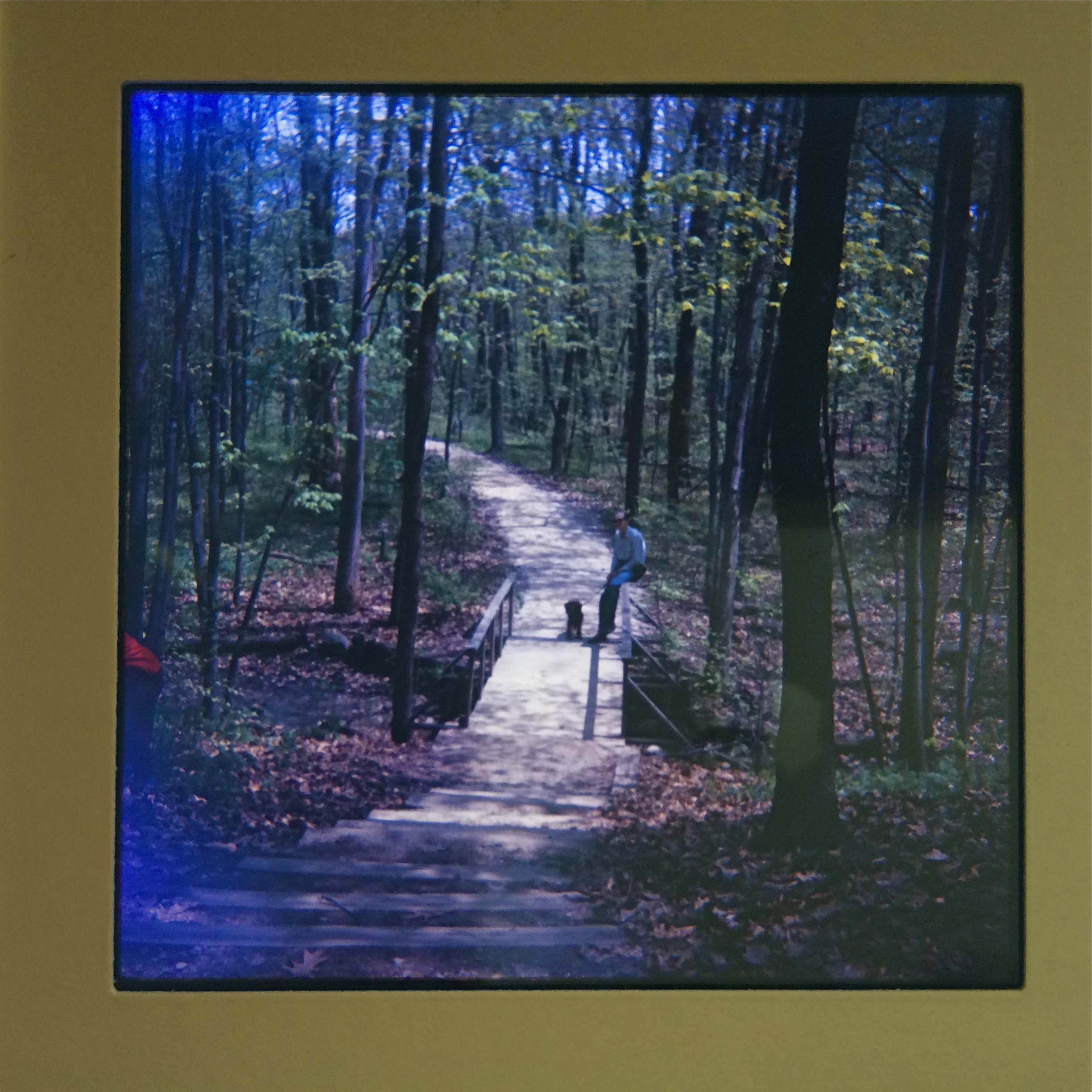
One of my first slides fom 1965. Only after they were processed did I realize they were too big for our family projector.
By MICHAEL PERKINS
I CAN NEVER MARK MY FATHER’S BIRTHDAY (today, April 23) without certifying, once again, that I would not presently be a photographer without his intervention. Note that I used the word intervention, not influence. That’s not to say that, as a boy, I didn’t learn a lot about composition or visualization by watching him tackle a shoot. Far from it. But it was in one simple act of support that he truly kept my first foray in photography from flickering out like so many youthful whims.
And it was done for the cost of a box of oatmeal.
My first camera, a cheap plastic Imperial Mark XII, has been detailed in these pages before. Simply stated, it was okay as a toy, hopelessly inadequate as an optical instrument. At the time I received it as a present (approximately age 13), this reality was lost on me. I was drunk on the thought that I could snap off masterpieces at will, as I supposed Dad did with his Kodak Pony 828. It didn’t take long for me to realize that (a) this, um, modest (pronounced crappy) little box could not deliver what I saw, and (b) changing that was going to mean taking a lot of awful pictures, at substantial cost to a kid budget bordered by redeemed soda bottles and a weekly allowance of $1.
My ignorance was so boundless that I thought that I would simply follow my father into his chosen format, 35mm slides. I loved seeing a blank wall awash with color, and couldn’t wait to claim my own real estate on his Bell & Howell 500 projector. Thing is, I was shooting 620 roll film, so, although the local photo shop faithfully followed my instructions, returning my shots as slides, the images measured (2″ by 2″ square ), unsqueezable into any standard projector. Suddenly, I was stranded. My pictures weren’t prints, and, as slides, couldn’t even be viewed. I felt like a man without a country. Dad’s response: let’s see else we can to do.
Yanking the shade off an old table lamp and unscrewing the bulb, he cut a hole in the bottom of a Mother’s Oats carton wide enough for the shaft of the lamp, connected lamp to box, and re-attached the bulb. Inside the box, he inserted a lining of aluminum foil to maximize the bulb’s meager brightness, then cut a hold in the box lid equivalent to the size of one of my slides. Across the opening, he taped a sheet of mylar, the matte-textured plastic that, as a draftsman, he always had around the house, so that the “hot spot” of the bulb would be diffused across the entire surface of the slide. Power on, mount a slide up top, and presto, a custom-built viewer that allowed me to at least see, if not magnify or project, my images. I was astonished.
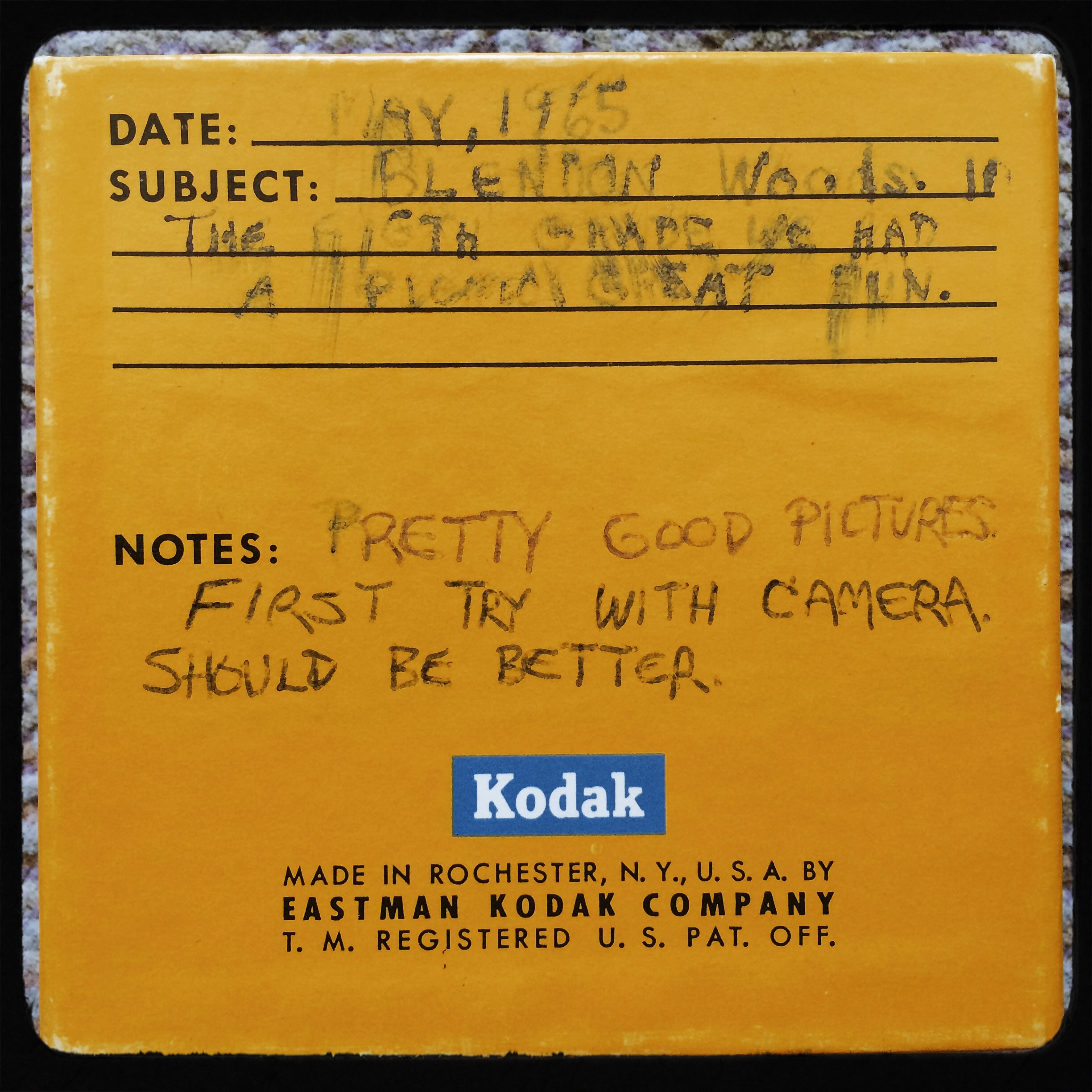
Program notes on my first box of slides, referencing the “great fun” of my eighth-grade picnic at Blendon Woods (sure, sure), and the remark that the pictures “should be better”. Amen, brother.
It wasn’t that he had solved all of my problems: it was that he had legitimized my photographs as something worthy to look at. He had, in fact, granted me admission to “the club”, the elite group of grownups who took their work seriously, and would do anything to enjoy and learn from them. I was no longer a kid whimsically playing with a toy. I was a photographer.
In that simple bit of tinkering, he kept me from abandoning something that had disappointed me, converting my initial frustration back into enthusiasm. It was also a valuable lesson in how to recover from a setback, an admonition: this isn’t the last time you’ll mis-calulate, or fail. But it ain’t fatal. Just keep going.
I did. I have. Fifty years on, my finger’s still on a shutter. And, amazingly, he, at this writing, is still around to repeat that marvelous wisdom.
Just keep going.
SIMPLIFY, SIMPLIFY
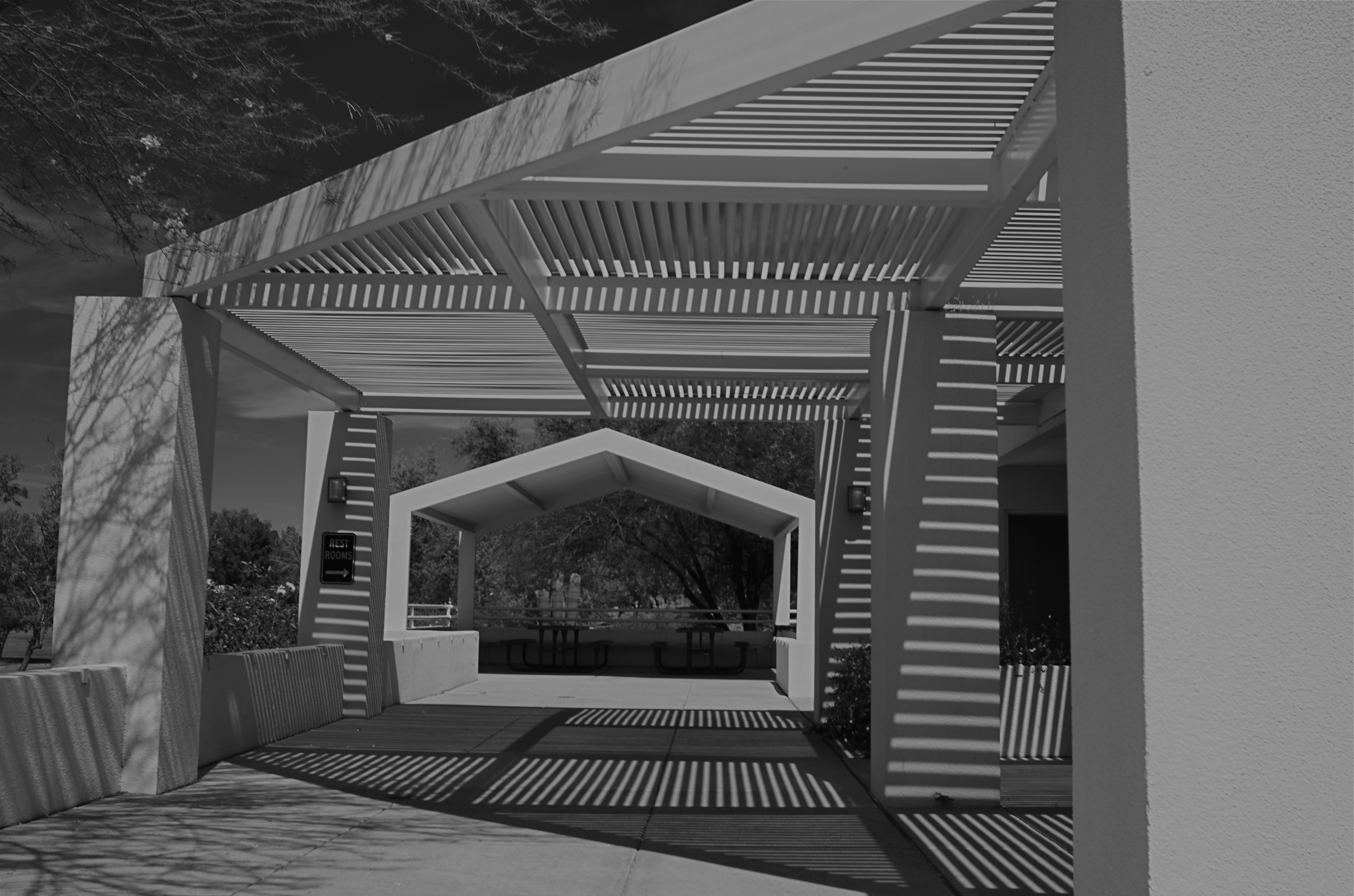
Apertures, 2015
By MICHAEL PERKINS
COLOR PHOTOGRAPHY WAS NOT UNIVERSALLY WELCOMED at its initial introduction, and was even actively avoided for the most part by the likes of Ansel Adams and Edward Weston, who mistrusted the technology of early color reproduction as garish, unnatural. While the amateur world largely lauded color as more “real”, Ansel & co. countered, between clenched teeth, “that ain’t the point”. Their argument: black and white was an artistic interpretation of reality, not a reproduction of it, whereas color was erroneously assumed by the public to be a more accurate record, even though it also suffered from its own biases and excesses. Some of the early masters never really came to be at peace with color, although they shot in it, and did foresee a time when photographers would choose it over b&w not for novelty’s sake, but because of what a particular project demanded.
I sometimes begin planning a shot in color, only to find that it provides too many choices for the eye. That is to say, all tones will register as distinctly different from each other, and this may make for too much information, blocking the clarity of the photo’s design. The result may be beautiful, but it may also diminish the impact of the final picture. In these cases, it’s worthwhile to at least work up a monochrome vision of my shot to see if it communicates more directly.
In a situation like the above pattern of shades and light shafts, color gives you brilliant blues and off-whites for the darks and lights, and a real hodge-podge of hues in all the crannies of the metal grids. However, rather than de-saturate the color to make b&w, I found it better to shoot the master image in black and white, using a red filter and a polarizer to maximize contrast, forcing all the dark and light shades into two hard-line general values. This forces the design to be the primary attention-getter, eliminating the distraction inherent in a full raft of colors. That is, if the deepening composition of gridwork is the main message of the photo, then it makes sense to get the color out of the way of that story and see if it helps.
In the end, Uncle Ansel had it all psyched out:
When I’m ready to make a photograph, I think I quite obviously see in my mind’s eye something that is not literally there in the true meaning of the word. I’m interested in something which is built up from within, rather than just extracted from without.
Yeah, what he said.
ONE IS THE LONELIEST NUMBER
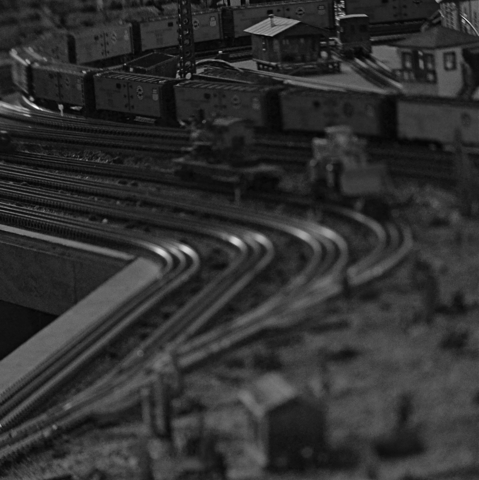
Midnight In The Switch Yard, 2013. Shot with a $90 Lensbaby tilt-shift attachment (don’t call it a lens). 1/60 sec., f/5.6, ISO 100, about 50mm.
By MICHAEL PERKINS
EVER SEE A MASSIVE KITCHEN WHICH STILL SEEMS STRANGELY CRAMPED, all because its counter space is crammed with too many single-task devices? You know what I mean. The congestive collection of chromed, shiny gadgets that perform really cool things, but only one thing,apiece. The bread machines. The Olive-coring pokey gizmos. The cheese slicers. Many of them were last year’s hot under-the-tree item, and just as many are soon consigned to the attic, the garage, or (sob) the garage sale. Some people approach cooking as if it’s an art. Others see it as all about the widgets.
You see where I’m heading. Some of these same kind of people, once they buy a camera, amass a mountain of photographic toys, all over-specialized, all amazing in their way, in the service of making pictures. Lots of these playthings have a kind of World’s Fair/Oh Wow novelty quality to them, and, in the short term, are mesmerizing. Few of them transform, or even form, your style as a photographer.
I’ve written before of the “tilt-shift” attachments commercially sold under the name Lensbaby. Mount one on your camera body and you can pivot the lens head up, down, or sideways to selectively keep sharp focus in parts of your images, choosing which parts to fuzz out of focus. Lensbabys are a cheap alternative to a dedicated tilt-shift lens, just as many lens adapters are a cheap alternative to a dedicated fisheye. In both cases, they deliver acceptable (not good) versions of effects that most people will only use occasionally. They are hard to use precisely and require a ton of practice to deliver the desired result. Oh, and did I mention that it has a fixed f/5.6 aperture? Good times. Like threading a needle in the dark? You’ll love Lensbaby.

Long Life, 2014. Shot with a $.99 iPhone tilt-shift app. Making a bad picture on purpose needn’t be expensive.
Lensbaby has benefited from the fact that (a) most of us want to do some kind of freaky thing occasionally, and (b) most of us won’t do the freaky things with enough regularity to justify shelling out, as the French say, ze beeg bux. But witness the speed of technology. Now, instead of investing anywhere from $90 to $350 for a Lensbaby, itself a cheapo compromise from a real tilt-shot lens, you can purchase an iPhone tilt-shift app for (wait for it) $0.99.
That’s a scant seven years after the introduction of the first Lensbaby, and, although the apps obviously don’t address the needs of DSLR cameras, you run into two inconvenient truths. (1) Most people will never desire this particular photo effect regardless of what camera it’s achieved on, and (2) the niche for tilt-shift photography, even for DSLR shooters, is smaller than the list of high school chess club presidents who also became prom kings.
The point? When it comes to a single-function photo toy,wait until the technology delivers that puppy to you at the bottom-line price. One is the loneliest number, speshfully when it comes to paying large coin for a mere novelty.
SOMETHING FROM NOTHING
By MICHAEL PERKINS
THE EVERLASTING CIVIL WAR BETWEEN ARTISTS THAT BEGAN IN THE TWENTIETH CENTURY, the aesthetic wrestling match between natural depictions of subjects and deliberate abstraction of them, will probably rage as long as mini-pundits like myself can crawl to the keyboard to contribute their own particular chicken scratchings on the subject. Painting kinda started this argument, and, of course, photography has kept fanning the flame. You gotta admit, that, whatever your philosophy, it’s fun to walk through galleries and watch people on either side of the brawl wrinkle their noses and furrow their brows trying to see something in the crap that the other team has hung on the walls. It’s New Yawk thin-crust versus Shee-cago deep-dish. It’s Ginger versus Mary Ann. It’s Connery versus Moore.
Thing is, there is a definite time in a photographer’s life when a picture is both a literal record of something in the “real” world and a cracked-mirror tweaking of it that makes that thing something else. The most obvious transfer is the one from color to b&w, whereby we decide that some tones are gaudy and others are truth-tellers, but to whom and why? Post-processing, which re-jiggers the balance of tones or the priority of colors, takes the process a step further, in that we are keeping the essence of the thing pictured but changing every visual element of it in some way. It’s still the thing but, same time, it’s no longer the thing.
Man, I’m starting to sound like a first-year graduate student teaching from his own book……
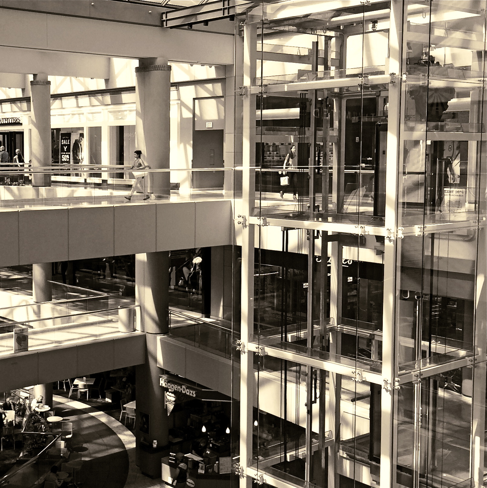
The image above was generally the result of trying to take a familiar thing (a multi-level mall) and erase most of its obvious visual markers. I found that if I obliterated the colors, signs and other details that cued my brain to see the mall in the standard fashion, then added a particular kind of monochrome (in this case, an app that replicated the old platinum process for making prints), the underlying structure, reduced to shadows, counter-shadows, and reflections, would allow the pattens in the frame to take center stage, minus the distractions of the “real” bits. It’s basically stripping things away until you have nearly nothing, and then adding back dabs until you have a different, hopefully new something.
Of course, the real test of whether this is anything would be if I could manage to get the image framed and mounted on a wall in one of those “argument” galleries, so that I could finally hear the one sentence that convinces artists that they just may be onto something:
“I don’t get it.”
COMPETING WORLDS
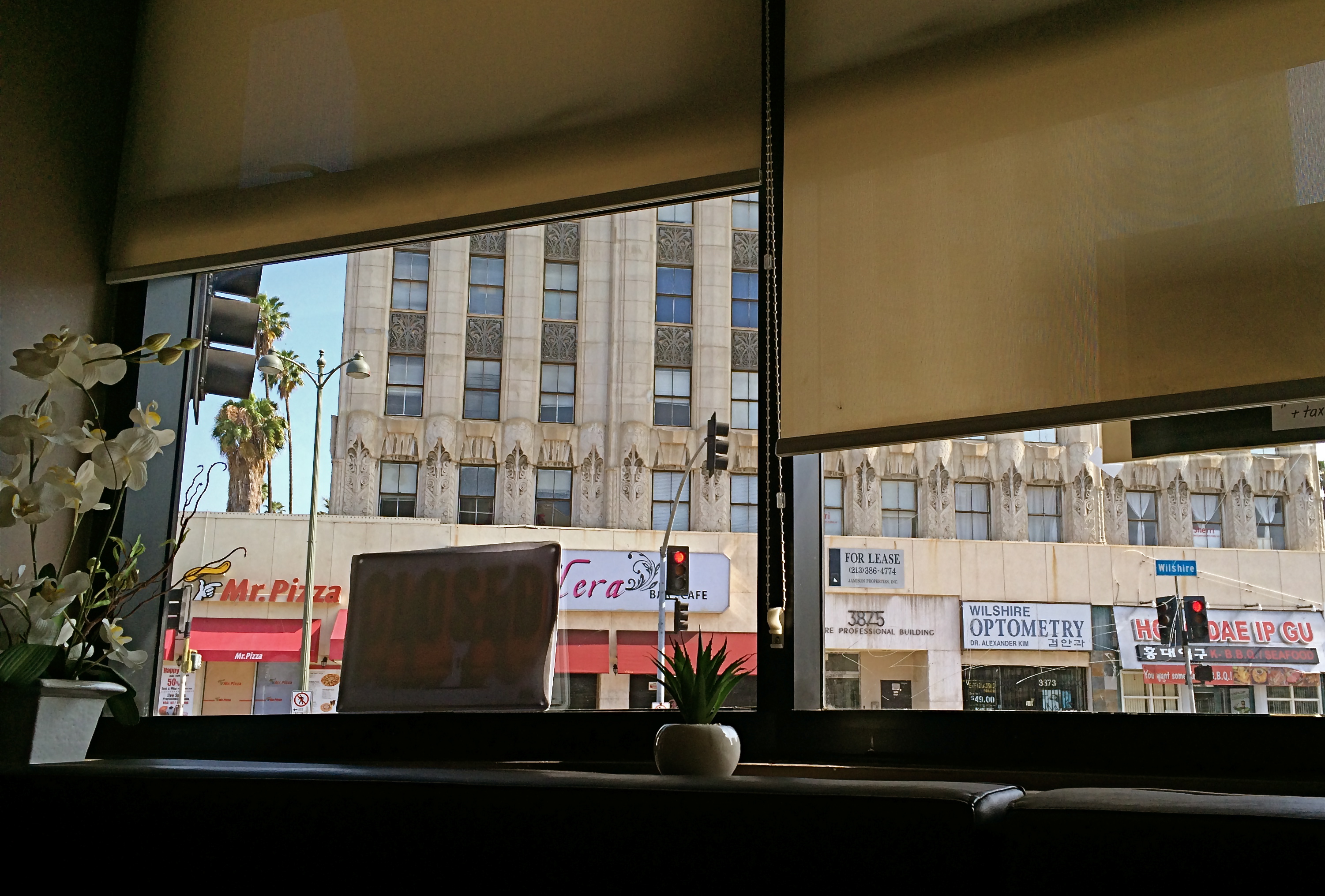
Using interior details as a customized “frame” for your shots of outside subjects can make your pictures less “pre-cropped”.
By MICHAEL PERKINS
I HAVE ALWAYS LIKED THE PHOTOGRAPHIC HIGH-WIRE ACT THAT RESULTS when shooters try to create balances between interior and exterior detail. It’s easy to shoot through a window, either looking in or looking out. And, in composing our subject, we often try to eliminate the framing created by the window itself, thinking of this as extraneous information, a natural cropping guide. Trim, if you will. And sometimes that is the best possible decision.
However, there are situations when a framing that melds inside and outside elements actually makes the shot, and the fun comes when you decide to compose a shot comprised of both kinds of information. Evenness of exposure becomes a significant problem, since there is usually a strong contrast between the two planes. Looking out a window, you have no big sweat exposing for the back yard, but, if you are also going to include the children looking longingly out at that yard from inside a room, challenges will arise.
In recent years, HDR has allowed photographers to shoot a bracketed series of shots with different exposure rates, blending them into a composite that at least allows detail and natural color in all areas of the frame. The look can quickly veer into surreal fantasy, however, so, if your goal is not to call attention to your technique (that is, appear as if you did nothing special at all) you may have to craft another solution.
If the contrasts between your inside world and your outside world are not too severe, you may be amazed at how automode shots on DSLRs and mobiles will deliver a fairly balanced exposure. This allows for more saved “on the fly” photos shot in the moment. If you have more advance time to prepare, you can invent your own lighting scheme and tweak things further. The thing to consider combining the competing worlds of in and out. It allows you to further customize the viewing experience, getting a fuller sense of a total scene, or even programming in some selective mystery.
And, hey, push comes to shove, you can always crop it later.
TERRA INCOGNITA
By MICHAEL PERKINS RANDOMNESS HAS STUBBORNLY ASSERTED ITSELF AS ONE OF THE MOST DECISIVE FORCES IN ALL OF PHOTOGRAPHY.One of the eternal struggles in our craft has been between our intense attempts to reduce the recording of light to a predictable science, and nature’s insistent pushback, allowing things that just happen to shape our results. I think most of our work as individuals is a constant wrestling between these two forces. One moment we fancy ourselves mastering all the variables that create images, and in the next we celebrate the wilding potential of just letting go, and actually celebrating the random effect. I find myself careening between the comfort of all the techniques I have accumulated over a lifetime, the so-called “guarantees” that I’ll capture what I’m looking for, and the giddy discovery that accidentals, or artifacts, somehow found themselves in my pictures despite my best efforts. The problem, for me, is learning to celebrate something wonderful that happened without my consciously causing it.
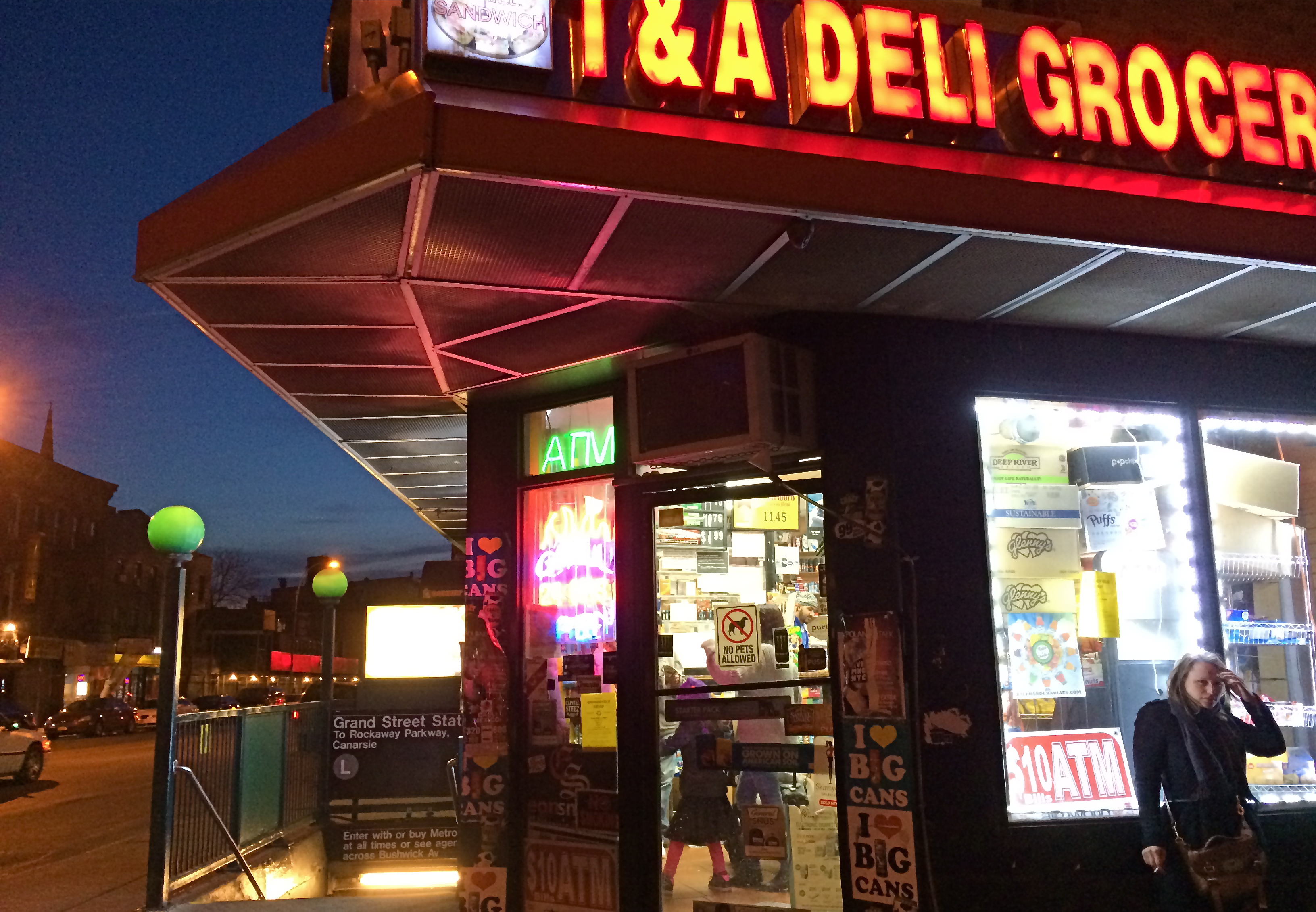
Brooklyn Bodega, 2014.
Phone cameras are forcing me to accept a little less control, since, even at their best, they can’t be managed in the way that standard DSLRs can. That leaves a certain number of results to chance, or, more exactly, to a display of the camera’s limits. One one hand, I’m grateful for the shots that I can “save” by using a mobile, since there will always be times that other types camera will be blocked, forbidden, or inconvenient. On the other hand, the results always make me wonder what else might have been possible if I had been completely at the helm in the making of the images. Some of the things I get “on the fly” with a phone camera are actually a bit magical, so that I actually love the things that are “wrong” with the picture. I’m sure this is part of the enjoyment that the lomography crowd derive from working with plastic toy cameras which create totally unpredictable results purely as a result of the camera’s shortcomings. In the above image, the garish register of nearly every color by my iPhone works well with the bizarre collision of dusk, neon, urban textures, even the overblown mystery of what’s going on inside the crazed little bodega shown here. The extreme wide-angle bias of the iPhone also has stretched things into exotic exaggerations of perspective, and the camera’s auto-boosted ISO produces a high level of noise. Does it all work? Yeah, pretty much. I don’t surrender control easily, but I’ve seen enough of the fortunate accidents of photographers from all over the world not to welcome nature’s interventions. I mean, after all, the idea that we’re actually in control is, at best, a pleasant illusion. We don’t really understand lightning, and yet, somehow, we’ve been given the ability to capture it in a box. Strange.
CHECK, CHECK, AND CHECK
By MICHAEL PERKINS
MOST OF US HAVE A MENTAL ROSTER OF UNFINISHED TASKS, a rolling inventory of things not yet achieved. The popular film featuring Jack Nicholson and Morgan Freeman as a pair of terminally ill men who devote their remaining time to their “someday” projects illustrates that we all have items, big or small, that we need to check off. However, when it comes to photographers, the roster gets a little more focused, since we all have dozens of unshot shots, if you will, swimming around in our heads. And the images we have yet to make are, let’s say, a little obsessively detailed in our minds. In that spirit, here’s what you might find in the notebooks of your favorite shutterbug, on any given day….to wit, a literal
BUCKET LIST
Points to consider for shoot
1. What kind of bucket? Zinc? Plastic?
2. Would adding a mop and brush make a stronger composition?
3. The light is hitting the left side of the bucket a little hot. Underexpose by a third of a stop.
4. What does the bucket say about us all as human beings? That we’re empty? All wet?
5. Patina vs. rust: make a decision.
6. Won’t be able to shoot the bucket in France as planned. Just shoot it on a cracked sidewalk in a rainstorm instead.
7. Just found out Steichen did a series on pails in 1937. Dammit!
8. If the bucket has bait in it, should I shoot the bait in RAW (sorry, it’s late)??
9. Just saw the first 400 frames. 83 and 367 are okay. The rest just look like pictures of a bucket.
10.Funny, my front door key doesn’t seem to work. Probably should call my wife…..
Of course, if the bucket deal works out, there’s another project I’ve always wanted to try. How about a photo essay on all of my “things to get at the grocery store” notes from over the years?
That’s right, a “list” list.
Say goodnight, Gracie.
FRAMES WITHIN FRAMES

Two people, two towers. Do you visually need anything else in this image?
By MICHAEL PERKINS
PHOTOGRAPHY AND PAINTING STILL HAVE ONE ESSENTIAL ELEMENT IN COMMON: that of the frame, the arbitrary perimeter that describes a special, limited universe of information. Everything within the frame is understood to be essential, special. Everything outside the frame is likewise understood to be irrelevant. If anything else were important, we argue, it would already be in the frame. If it is not in the frame, it does not matter.
This is the rule of engagement for photographers, and, as composers of our images, we wield the most important editor’s scissors in all of art. Through cropping and selecting, we decide what qualifies as the finalists for that frame, which elements we will trust to tell our story. You could make the argument that great pictures are not made, they are re-made, and, over a lifetime, we often rescue or reject images based on what we can exclude from them.
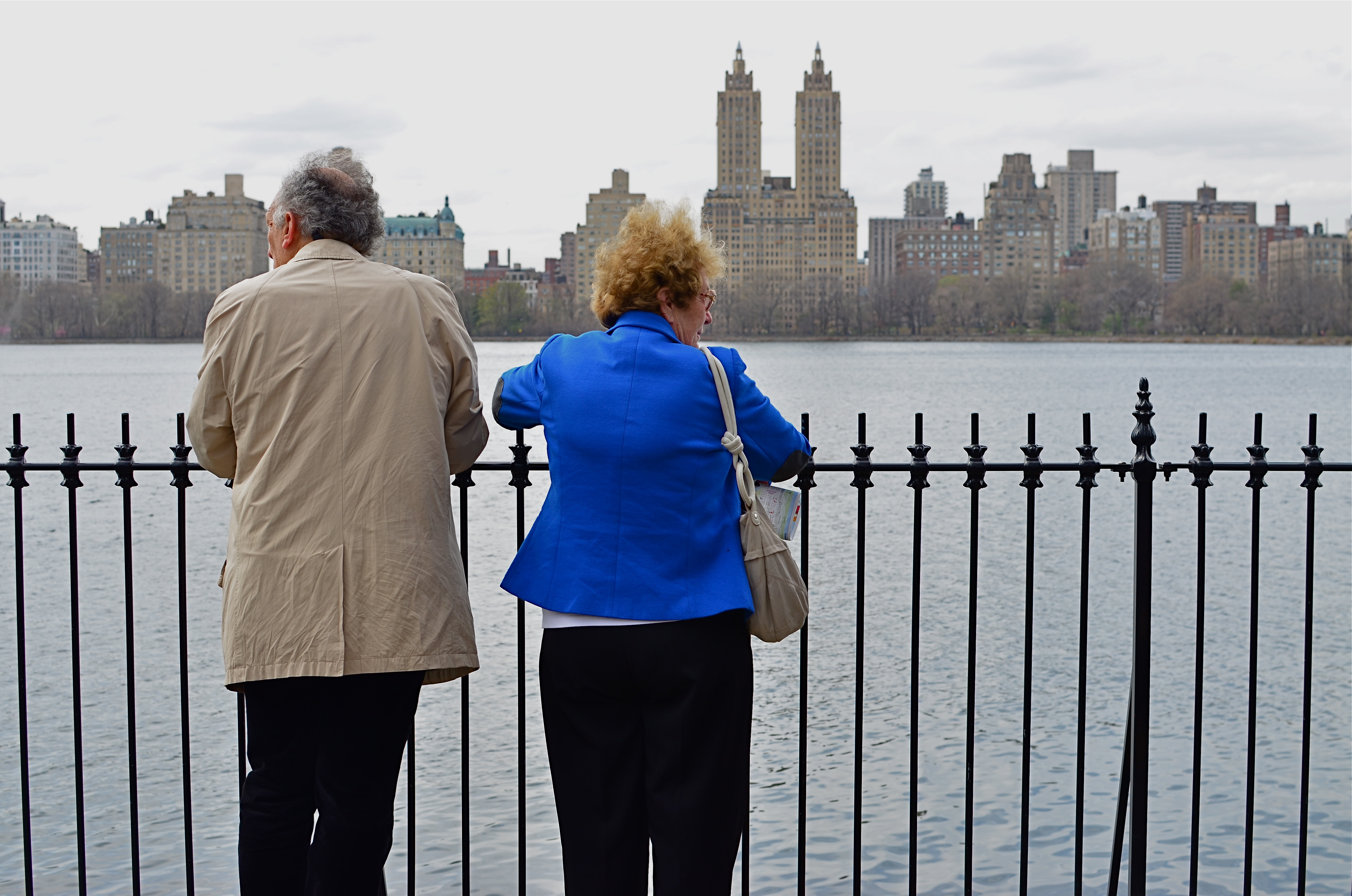
The above image before cropping. See anything here that you can’t live without?
Paring away unneeded information from a photograph allows its true voice to be heard. Things that were minor players in the larger composition are, snip, suddenly promoted to lead actors in the scene. Sometimes, of course, this process reveals that the picture was doomed to start with, since it’s obvious when you are cutting to the essence of, well, junk. Other times, however, we miraculously unveil a rose. Strangely, editing can occasionally become more important that exposure, aperture, or any other basic technical factor.
The edited image at the top of this page occupies less than half the
space of the original, yet, for all that loss, look how much has been gained. We now force a relationship between the two people and the two towers, as well as their relationship with each other. The distraction created by the wider skyline is now gone, and we are free to better direct how the image’s story will be seen and judged. Neither shot is a candidate for a Pulitzer, but we have actually done more by choosing less.
TRI, TRI AGAIN
By MICHAEL PERKINS
WHILE MANY “FILTER” APPS FOR SMARTPHONE CAMERAS MERELY ADD CARNIVAL EFFECTS TO PHOTOS, faking everything from poor processing to light leaks, some really intriguing work has been done by programmers who create “emulsion emulations”. That’s geek-talk for simulating the look and texture of certain old film stocks, making it possible to make a new-old picture freed from the film era’s messy chemicals and wizardly calculations. These instant touch-ups are still limited in scope, but in a real time shooting situation, they do offer you a wide variety of looks that may enable a good shot to graduate to a great one.

Straight out of the camera color original of a Manhattan street scene.
One such emulation, found on the excellent Alt-Photo app for iPhones, gives a great imitation of the look of the world’s most successful black & white film, Kodak’s beloved Tri-X. Introduced in the 1940’s as sheet film purely for professionals at about 200 ASA (ISO), Tri-X was adapted to popular camera sizes like 35mm and 120 in the ’50’s, and was amazingly popular with pros and ams alike, mostly because of what, by Eisenhower-era standards, was its blindingly fast speed. Consider that Kodachrome of the time was rated at a lowly 25 ASA and you can see why newshounds and magazine shooters flocked to Tri-X, as it made it possible to shoot in extremely low light with handheld settings. Fewer tripods and flash meant more mobility and versatility. Home run.
Same shot as above with the Alt-Photo app’s Tri-X filter.
By the 60’s, Tri-X went to 400 ASA, and many labs were able to offer “push” processing to over 3000, expanding its range even farther. As the film became nearly universal, so did its signature grain, a by-product of its light-hungry formula. Today, Tri-X is once again a mostly professional film, and the creators of phone apps are happy to offer a fairly good facsimile of its contrast and grain as a post-processing filter. I have begun to dabble in it for street subjects, particularly ones that appear too warm or welcoming in color. As with any of these effects, the Tri-X look is only right for certain shots. If the image itself is not strong or compelling to begin with, dabbing on the retro won’t bring forth a miracle.
But you knew that.

SPEED OF LIFE
By MICHAEL PERKINS
NEW YORK CITY HAS BEEN CALLED MANY THINGS: words like titanic, exciting, merciless, dizzying, dangerous, even magical spring to mind immediately. By comparison, fewer observers refer to the metropolis with words like peaceful, tranquil, or contemplative, and fewer still would ever label it slow. Manhattan may be lacking for modern subways, open space, or a cheap cup of coffee, but it’s never short on speed.
NYC runs on velocity the way other towns run on electricity: the entire metro is one big panicky White Rabbit, glancing at his pocket watch and screeching “I’m late!” As a consequence, anyone making photographs in the Apple has to factor in all that velocity, or, more precisely, decide how (or whether) to depict it.
Do you try, for example, to arrest the city’s rhythm in flight, freezing crucial moments as if trapping a fly in amber, or, as in the image above, do you actively engage the speed, creating the sensation of New York’s irresistible forward surge as a visual effect?
Fortunately, there is more than a century of archival evidence that both approaches have their own specific power. Pictures made in the precise instant before something occurs are rife with potential. Images that show things in the process of happening convey a sense of excitement and immediacy. Like the lanes in a foot race, speed has discrete channels that can reward varying photographic approaches.
Share this:
August 15, 2017 | Categories: Commentary, Composition, Conception, Documentary, Uncategorized | Tags: Street Photography, urban neighborhoods | Leave a comment