MERCY BOKEH
By MICHAEL PERKINS
PHOTOGRAPHS ARE NEGOTIATIONS between primary, secondary, and even tertiary levels of information, and how they will be arranged in a frame. You either feature or mute that information in order to direct attention to the primary story you’re trying to tell. The simplest example of this process is the selective focus engineered into many shots, with important details being rendered in sharpness while the rest of the competing data goes soft to help isolate the main message of the picture. In its simplest application this means a clearly focused foreground and a blurred background.
The blur used to be the eye’s clue that the information in that part of the picture was not a priority. Thinking in terms of portraits, for example, your subject is clearly defined, with the space behind it dulled or diminished. You make that choice by selecting your depth of field and shoot accordingly. However, recent trends in the making of a photograph have elevated the status of the blurs themselves to something that needs to be chosen, or shaped for artistic purposes. In other words, the part of an image that is inherently unimportant, by virtue of being out of focus, is now a source of attention as to what kind of blur is being created. This formerly fussy concept of bokeh is popping up in more and more advertising copy for the sale of lenses. A given piece of glass is now touted as having great bokeh, which somehow makes it more desirable than some other piece of glass.

I love the way this zoom focuses on foreground objects; its background textures, not so much.
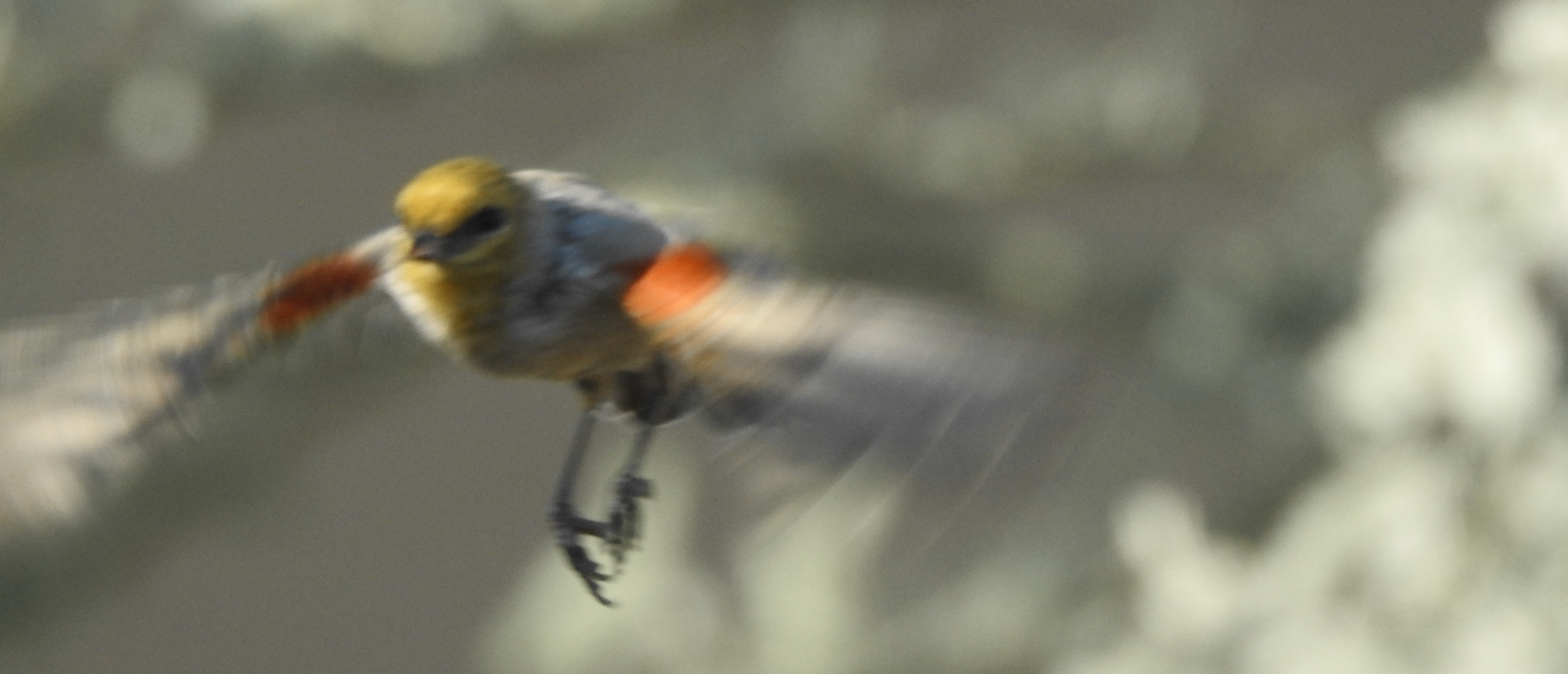
Bokeh is really nothing more than the quality of the shapes that occur when a particular lens breaks up light in its non-focused areas. Some people use the terms “buttery” or “geometric” or “dreamy” to describe the work of a given optic, and some lenses are actually marketed based on how this texture is rendered. I can only speak to this fascination from my own viewpoint, and so you have to plug in your own approach to photography, and whether the non-essential part of a picture is now, strangely, important to you.…important enough to influence your purchase of one hunk of gear over another. I admit that some bokeh acts as a beautiful backdrop to a foreground subject, but I also contend that, as seen in the above image, some lenses can actually render it in a way that is distracting, even irritating. However, whether I admire the swirls and ellipses of some forms of bokeh, I don’t see it as anywhere near as important as what I’m trying to feature in front of it. If all things in a frame are of equal importance, why not just shoot everything at f/11 and make sure it’s all recorded at the same sharpness?
I think that, in photography, as in many other art forms, we can become fascinated with effects rather than substance, and that, if you don’t know what you’re trying to get a picture to say, you can become more interested in how cool something looks instead of what a picture’s narrative is supposed to be. Bokeh can be lovely, but giving it too much prominence is a little like sitting in a theatre and intensely watching what the third Roman to the left is doing with his toga while Marc Antony is at center stage delivering his big speech. Things in a good picture must be arranged in a hierarchy, some priority of intentions, in order to communicate effectively. And if I have my choice between a bird and a blur, I will unapologetically choose the bird every time.
NEGOTIABLE
By MICHAEL PERKINS
ONE OF THE FIRST “COMMANDMENTS” that were once sacrosanct to newbie photographers was the concept of sharpness. We were taught to worship the resolution quotients of all lenses and to choose them based on arcane charts and bench tests that professed to certify perfection. Such data made us look askance at the glass we currently owned and to slobber over the newer, crisper glass that shone forth from the catalogues (or websites). Many of us broke the bank in this pursuit, abandoning perfectly fine lenses that didn’t live up to someone else’s holy absolute, chasing the little red wagon of sharpness right down the street to bankruptcy court.
Escape, 2020
But as it turns out, sharpness is only a must for some kinds of photographs, and (listen closely), only if we say so. Museums around the world are bursting with life-changing images that fall far below that arbitrary high water mark for resolution set by God-knows-what-secret-society, and, if you examine the whole range of images you personally regard as your “keepers” there will be compelling pictures within that stack that don’t pass the sharpness fantasy…..and yet work, and make their arguments powerfully and elegantly. Leaning too hard on any one commandment in photography, whether it be sharpness or exposure or composition, leads you away from spontaneity and into stultification. Work that has only to meet some arbitrary technical standard to be qualified as art can, of course, never aspire to be art at all.
The best path to satisfying photographs is to trust yourself in the moment, to hear the voice that says that it’s time to snap the shutter and go for broke, damn the results and the critics. The shot you see here is, yes, technically “imperfect”, as it was shot a bit slow for the speedy little bird’s sudden departure. My original plan was to cook up something poetic as he placidly sat on a perch, obligingly posing for my convenience. But he is a bird, and has a bird’s priorities and doesn’t give a ripe damn about mine, and so off he went. Now, I could waste a lot of space here rationalizing the whole result and saying that, of course, I planned it all along, only I didn’t. Like some of my other favorites pictures, it contains a generous kiss of good luck from the camera gods, and that’s okay. I could fret over the fact that if I’d had a faster, sharper lens, the bird’s body would be frozen in perfect register, but I’m not going to. I love it when a plan works out, but I also love it when something just happens.
Today’s emerging photographers have a much more relaxed attitude toward “rules” than we older shooters, and that, on balance, is a welcome change. It explains the entire “low-fi” and lomography movements which value shooting from the hip and the heart with minimal forethought, something that consciously chooses emotional verity over technical imperfection. And why not? What harm to bring more kinds of voices into the conversation? As I get older, I am more grateful for the choices that are negotiable, more likely to be labeled as “sometimes try” rather than “never do”. For a guy who can’t even manage to eat two consecutive hot dogs with the exact same condiments, I find that it’s a better way to, er, fly….
WHEN SHARP IS DULL

Heavy on the soft sauce, and yet, in the moment, I felt turning away from uber-sharpness was the right choice.
By MICHAEL PERKINS
THE CONCEPT OF SHARPNESS IN PHOTOGRAPHY IS AS OLD as photography itself, and remains one of the most sought-after qualities in lens performance. For many, it is the measure of the quality of a recorded image.But just because an idea is old doesn’t make it true. And so sharpness, at least to me, is just like any other element in a well-made picture. That is, it’s negotiable, not absolute.
At photography’s birth, sharpness made a strong argument for the mechanical accuracy of cameras. It was the main reason to trust a machine over the human eye, to choose recording reality with a mysterious box instead of rendering it with a paint brush. Many early lenses were, in fact, fairly soft, and so the “goal” of eventually perfecting sharpness became the impetus to develop better optics and to create a perpetual market for new advances among consumers. Built-in obsolescence.
But lenses are not merely recording devices, like seismographs or thermometers. They are tools, which, in the hands of vastly different users, can and should render vastly different results. Certainly it was always easy for manufacturers to sell users on the idea that sharpness, all by itself, was the thing that made a lens “good”, and to train those same users to want to upgrade constantly in some pursuit of precision. But at some point sharpness became optimized even in the cheapest lenses, with most cameras making images extremely crisp even at huge sizes and certainly as sharp or sharper than the acuity of even the healthiest human eye. Thing is, as this race for precision was afoot for over a century or more, some photographers also wanted to use that same precise gear to create things whose lack of ultra-sharpness was their appeal, their most effective means of communication. Movements in every culture began to emerge in which razor-keen focus was not the most desirable element, nor even, in some cases, a consideration at all. For these shooters, then and now, sharp was dull.
Only you can decide whether your pictures gain or lose by a traditional adherence to sharpness, just as all musicians do not play the same sheet music at the same uniform volume. Like anything else in your bag of tricks, focal faithfulness is a guideline, not a commandment. I know many who would reject the image seen at left as far too ill-defined, while others would embrace its deliberate softness as far more warm and intimate than a tack-sharp shot. Thing is, they are both correct under the appropriate circumstances. There are technical limits and better/poorer regions in even the best lens, and trying to completely eradicate softness from end to end of the frame is like looking for the perfect man/woman to spend your life with. Every piece of your equipment has things it does marvelously well and things it can never do. Know that information, and work it to get what you want. But don’t for a moment think the perfect lens is “out there somewhere”, just waiting for you to buy it and fix all the problems with your photography. We love shooting with these little boxes, but only when we think outside them do we really start making pictures that matter.
CITY (AND LIFE) LIMITS

Violet Cemetery, Pickerington, Ohio, 2019
By MICHAEL PERKINS
THERE ARE STILL PLACES ACROSS AMERICA where all the needs of life seem to be concentrated into very compact spaces. Small towns where the eating places, the living places, working places, worshiping places and dying places are all within a few blocks of each other, all of them viewable, knowable to everyone, all the time. The unchecked sprawl of modern life has left such villages behind, so isolated that they may as well be contained within a snow globe, their functions blended together like a box of inter-melted crayons. In such towns, photographs of a very different nature can be made.
The idea of a local main street moving seamlessly from the business section to residential houses to graveyards to a children’s playground now runs counter to the way we plan things. In little cities all functions orbit each other tightly, like animals sharing the same watering hole. Maybe some of these burgs were, originally, just that….replenishment stops, a place to change horses, grab a meal before heading back onto the trail, a collection point for outlying farms or ranches. In terms of the images that can be created in these out-of-the-way places, they are chronicles of a different kind of rhythm. They simply have to result in different kinds of pictures.
In traveling through such towns, I invariably stop at local churchyards. In a strange way, by containing the remains of our all too temporary shells, the yards themselves achieve a kind of permanence. Things go there and stay there. No one digs up a cemetery to build a supermarket. Its space remains apart, freed even more of the constraints of time than the towns which they occupy. And here, in the aftermath of the greatest interruptions we can ever face, there is order. A grave is just one more thing that falls to the human need to organize. To make sense of it all. We lay out parcels with a certain arbitrary logic. Grandpa is in section 3-A, while the mayor and his family are in 4-D, and so forth. Churches in such towns taper off into the sky with stiff steeples, and brick and marble perpetuate the illusion that everything in the area, in some way, lasts. In terms of technique for these oddly reassuring patches of quiet, I often will play around with selective focus, since that dreamy half-state seems to align with my interior dialogue. Our pasts are as strange in their own way as our presents, and the standard rules for picture-making are vaporous, like ghosts.
Small towns are often liberally dotted with antique stores, as if objects themselves have need of a graveyard, a place to be collected beyond anyone’s needs or desires. The way we say farewell to things is often impossible to measure visually, but we carry cameras along wherever we go, because, well, you never know. When life’s various elements slip away there is often nothing to mark their passage. And yet sometimes there is just a little. And sometimes we can see it. And steal it. And hoard it.
GIVE AND TAKE

This 185mm handheld zoom shot followed the Reciprocal Rule, and yet still looks a bit soft in spots. Nothing’s perfect.
By MICHAEL PERKINS
YOUR PERSONAL APPROACH TO PHOTOGRAPHY MAY BE MORE ABOUT how to creatively break rules rather than faithfully follow them.
Fair enough.
Your work may have become so instinctual or well-practiced that it might well feel as if there are no “rules”, since you so seldom get burned on the same things that others do. Or maybe you are so genuinely innovative that rules are more or less irrelevant to your style. Again, fair enough.
Bearing this in mind, we here at The Normal Eye seldom traffic in “ye musts” or “ye dare nots” because someone, somewhere will always make a sucker out of us by ignoring said commandments and suffering no heartache whatever.
That said, I have taken notice lately of an old recommendation that, whether you factor it into your photography or not, is worth a bit of discussion.
It’s the so-called Reciprocal Rule, although it’s at best a…recommendation. It largely applies to people who are using powerful zooms who are also looking to reduce image blur, and, boy howdy is it elementary. Basically the RR states that your shutter speed should always be at inverse proportion to your focal length. Shooting at 50mm? Use an exposure at least as quick as 1/50. Zooming all the way out to 300mm? Same system: start with a shutter speed of 1/300 as the slowest exposure benchmark. That’s it. Easy, peasy Aunt Loweezy.
Only nothing is ever that simple in real life, is it, kids?
The only reason the Reciprocal bears mentioning at all is because of the convergence of two main factors: the increasingly affordable crop of new, more powerful zooms, placing them in more and more hands: and the commensurate de-emphasis of tripods as a greater percentage of all images are shot handheld. In short, more of us are shooting at longer focal lengths than ever before, and fewer us are using pods as stabilizers. Thus, if you follow my decidedly fragile logic, there is a good chance that more of our telephoto images will contain some element of camera shake. Brighter minds than mine have done the math to illustrate just how much even minor movement is magnified as focal lengths increase. The Reciprocal Rule is supposed to address this, and it often does, although the shot at left is an example where it was utilized to the letter and still shows a little softness in the back half of the image. But even leaving my own iffy execution off to the side, there are other mitigating factors than can affect the relevance or effectiveness of the RR.
For one, you can adjust ISO so that your sensor gathers more light at quicker shutter speeds, in which case, even handheld, you could shoot fast enough to virtually eliminate shake. Then there’s the whole pick-your-position game involved in developing your own stance and grip. From sound geometric weight distribution to holding your breath, there’s a lot you can do to facilitate slower shutter speeds if you feel you need them. The option is far more trial-and-error, but if you’re the patient type, have at it. Finally, there is the luxury (still fairly recent) of owning lenses with built-in image stabilization, with which you can move the Reciprocal to the same musty corner of your mind occupied by the dates of your kids’ birthdays.
All of which goes to say that technology and technique can sometimes trump the need to adhere to photographic practices that were once sacrosanct, to turn yesterday’s “rules” into tomorrow’s “friendly suggestions”. Which, in turn, means making more pictures instead of making more mistakes.
WHO’S THERE?

The Information Desk, 2018
By MICHAEL PERKINS
FOR AN ART DEDICATED TO SHOWING THINGS, photography certainly involves itself with concealment.
It wasn’t always that way.
Its original, nineteenth-century mission, which coincided with the reshaping of the world by the Industrial Revolution, seemed to be all about showing everything…the ancient and modern wonders of the world, vanishing peoples, emerging cities, the geological mapping of the globe. Optical technology was bent upon making lenses more sensitive, more accurate. Likewise, recording media, from glass to metal to celluloid sought the same goal: verisimilitude. Then, as twentieth-century art movements became more introspective and less documentary, photography itself became more interpretive and less like….a camera? Abstraction spread into the snapping of pictures as it had in painting. And, eventually, like painters, shooters learned not only the art of revealing but the art of saying more by saying less. That which was once revealed became creatively hidden or underplayed, with the viewer entering into a kind of contest/game with the photographer. What does this look like to you?
I call this process additive subtraction, the means by which the storytelling potential of an image is actually enhanced by taking visual information away. This can be done by underexposing, cropping, the manipulation of depth-of-field, you name it. The point is that something is deliberately done in the composition of a picture which keeps us from seeing “everything”, from merely recording the scene. What is left can transform or mutate the original subject…make it tease, haunt, even lie. Interpretative photography is about imposing some part of one’s self onto the image, a nudge that asks the viewer to go on a hunt with us. Who’s there? What is that? Why is that? And, most importantly, who’s to say?
In recent years, I have been working with selective focus as a means of sculpting my storytelling. Setting depth-of-field usually is a front-to-back process, deciding whether sharpness will occur near or away from the lens. Selective focus works a little differently with different objects that are often in the same focal plane exhibiting different degrees of sharpness, forcing the viewer to head over to the precise compositional territory we wish to emphasize. This nudging of the audience’s attention can be done subtly or with the force of a baseball bat, and it takes a great deal of patience to master the lenses (most of them fully manual) that deliver the effect. In crowd shots, I find that a uniformly sharp image might make all faces appear equal, when, in fact, some carry their “messages” better than others. So why not control which faces are important, which stories matter more, and which ones just happened to be in the neighborhood when the picture was snapped? In the image seen here, the women at the center of the shot seemed to be having a conversation, while everyone else around the desk seems involved with solo tasks. Selective focus allowed me to turn the surplus people into props. They’re indistinct because, to me, the story works that way. Seconds later, of course, the human “center” of the image might shift in another direction completely. It’s purely subjective.
Photographs are always assumed to be letting us in on a secret, when, in fact, they may be hiding one (or several) from us….for good or ill, depending on your view. But that’s the thing: it’s your view, your method of talespinning. You set the terms. That’s another way of coming back to the subtitle of this blog….the difference between taking and making a picture.
WORLDS WITHIN WORLDS
 By MICHAEL PERKINS
THE SPIRITUALIST POET WILLIAM BLAKE FAMOUSLY EXPRESSED HIS DESIRE to explore life in its smallest detail, to, as he put it in his poem Auguries of Innocence, “see the world in a grand of sand / and a heaven in a wild flower / hold infinity in the palm of your hand/ and eternity in an hour”. It’s the kind of sentiment that makes me believe he might have made a great photographer.
It’s unlikely that Blake, who was also a wonderfully gifted graphic artist and who died in 1827, ever held a camera in his hand, but from the first generation of photographers there was a decidedly Blakeian urge to explore the world at the most intimate levels, engineering lenses that allowed maximum magnification and resolution of the vast stories lingering right under our noses. Today, as never before, macro photography is finally within the technical and financial reach of the many, allowing spaces that barely comprise inches to reveal the complexities that we stroll past without regard on a daily basis. And just as all of photography is about extracting pieces of reality from the larger flow of time, so macro is about drawing things out of their original settings, to dramatize the elegance of design and pattern, to create a separate stillness. That certainly is what appeals to me about shooting in the small world….the ability to take things so far out of their regular context that we are forced to consider them as if we were encountering them for the first time.
To be sure, close-up work comes with its own set of unique technical challenges, but what makes it worthwhile is its ability to deliver the shock of the new, to depict the eternities residing within Blake’s grain of sand. For many of us, this process of discovery reaches its fullest expression in floral or botanical subjects, since magnifying their contours is almost like a crash course in geometry or architecture. Petals, seeds, pistils, stamens, leaves…..all are rotating in their own incredible orbits as if they were bit players in Fantasia, fantastic ballets in which size (or rather the transformation of scales and sizes) really does matter. In terms of technique, even a practiced photographer can be frustrated by the special demands raised by magnification. Certainly light and focal relationships work differently, as well as stabilization of the image. Predictably, every error of movement or lens flaw is utterly exposed once everything is increased in size, resulting in a higher percentage of failed shots and near misses. Still, one’s first plunge into macro is like Alice’s initial entry into a realm where everyday objects magically shrink and expand without warning.
Blake, like all artists, understood that art transforms and re-translates all experience, re-defines how we view everything, allows us to show all ranges of life from dark to light, remarking in Auguries that “man was made for Joy & Woe / and when this we rightly know / thro the World we safely go” Photography gets the big things right…. by paying attention to the worlds within worlds. It really is a game of inches, sometimes atoms.
THEN AGAIN, WHAT DO I KNOW, ANYWAY?
By MICHAEL PERKINS
SHOOT ENOUGH PHOTOGRAPHS AND YOU’LL ESTABLISH SOME KIND OF STANDARD of acceptability for your images….the inevitable “keeper” and “failure” piles by which we measure our successes (or lack thereof).
Now, we could fill pages with reflections on just how rational we all are (or aren’t) when it comes to editing ourselves. It’s a learned skill, one that’s practically a religion to some and a virtually unknown process to others. Be that as it may. Let’s assume for the purposes of this exercise that we are all honest, conscientious and humble when it comes to dividing our pictures into wins and losses. Even granting us all that wisdom, we are often less expert about whether a photograph is “worthy” than we think we are. You’d think that no one would know whether we took a bad image that we ourselves. But you’d be wrong, and often, wrong by a country mile.
Just as we are never so purely objective that we can be certain that we’ve generated a masterpiece, we can be just as unreliable in declaring our duds. I was reminded of that recently.
I have a lot of reasons to regard a given picture as “failed”. Some have to do with their effectiveness as narratives. Some I disdain because they’re nothing more than the faithful execution of a flawed idea. But the pictures of mine that the waste can catches the most of are simple technical botches….pure errors in doing. I’m old enough to hold certain rules of composition, exposure or focus as sacred, and I’m quick to dump any image that contravenes those laws.
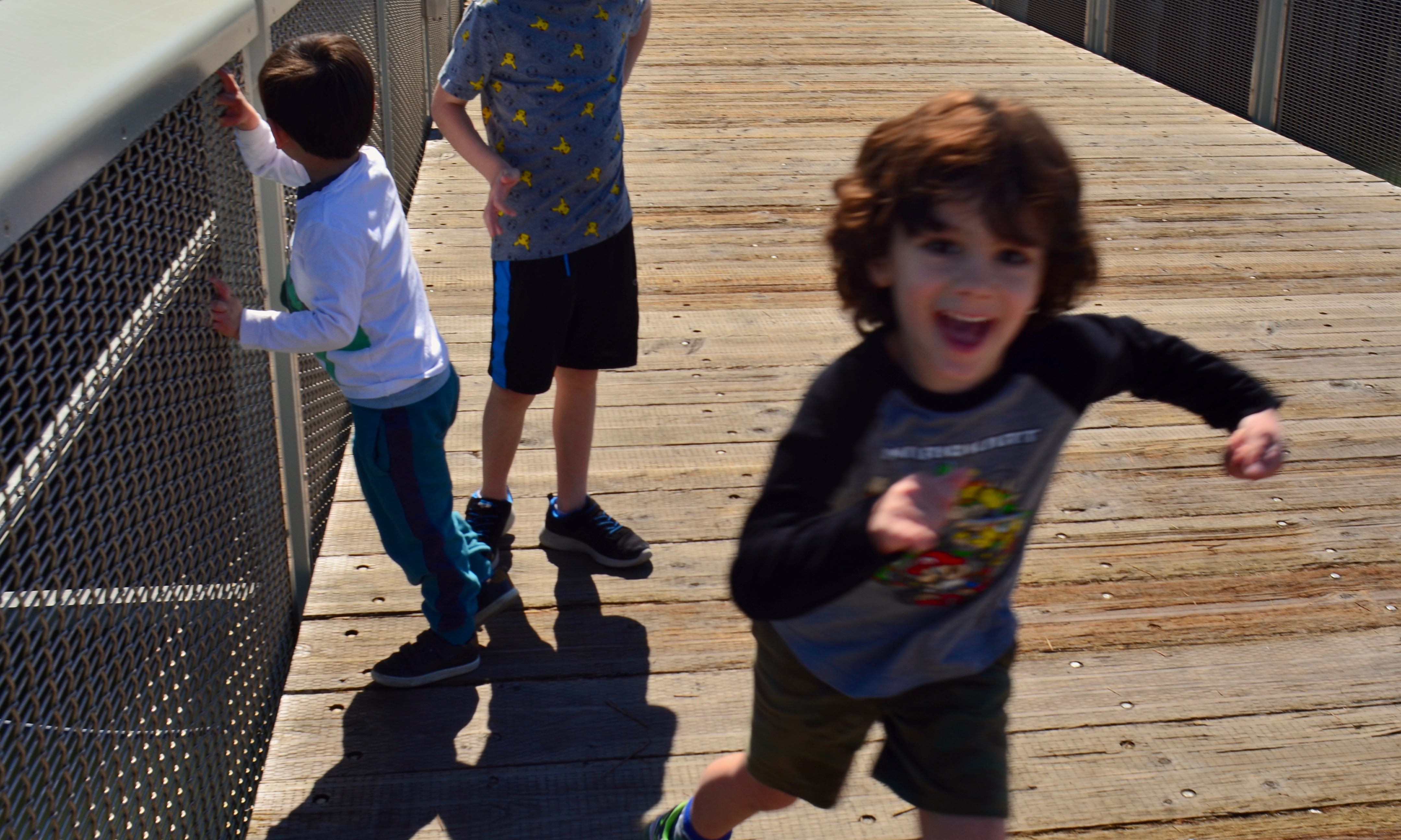
Here Comes Trouble, 2019
That’s why the picture you see here was originally something I had intended to hide from the mother of the manic young man in the foreground. I had attempted, one afternoon, to use a manual focus lens to track four very energetic boys, and in one shot their ringleader had made a sudden lunge at the camera that threw him into blur. Seemed like a simple call. I had blown the shot, and I was naturally eager to show his folks only my best work.
But the impact of the picture on the boy’s family was much more positive. Blurry or not, the picture captured something very true about the boy. Call it zest, enthusiasm, even a little craziness, but this frame was, to them, more “like him” than many of the more conventional shots I had originally chosen to show them. The real-ness of his face had, for his family, redeemed the purely operational imperfection that so offended me. To put it another way, my “wait, I can do it better” was their “this is fine just as it is.” Sadly, it was my wife who brought me to my senses and convinced me to move it to the “keeper” pile.
Which circles back to my first point. None of us absolutely know what our best pictures are. We do absolutely know the ones that connect to various audiences, but that may be a completely different pile of images from the ones we label as “right”. Passing or failing a photo largely on technical grounds would, over history, disqualify many of the most important pictures ever made. We have all emotionally loved things that our logical minds might regard as having fallen short. But, in photography as in all other arts, we’re often fortunate that logic is not the sole yardstick.
SOFT AND SHALLOW
By MICHAEL PERKINS
IN RECENT YEARS THERE HAS BEEN A MOMENTOUS SURGE in the number of photographic optics that market themselves as “art lenses”, as if all other lenses were, what….non-artistic? This murky term essentially denotes lenses that deliver customized or selective focal effects, such as the Lensbaby “sweet spot”, a partial area of sharpness, surrounded by soft blur, that can be placed, at will, at various parts of the frame. Other so-called “art lenses” produce unique patterns of bokeh, or blur artifacts, while yet others produce vignetting, or darkening around the outside corners of the image. Some of these lenses are great overall performers, while a number of them are either one-trick ponies or muy espensivo or both.
Thing is, if you possess a fast “normal” lens, such as a 35 or 50mm “prime”, you can already achieve some of the same effects of many over-hyped proprietary lenses in the “art” arsenal. Primes have but a single focal length and thus have no telephoto function. The photographer frames by physically moving closer to, or farther away from, his subject, by, in effect, “zooming with the feet”. Since their focal range is fixed, primes are extremely simple in their construction, and therefore extremely sharp. In addition, they often will open to at least f/2.8, with many rated at f/1.8 or even faster. And that’s where the arty focus fun starts.

Wide open to f/1.8, the 50mm prime used for this image creates an extremely shallow depth of field. And that can be good news for flattering pics of faces. Primes of this focal length are already prized as portrait lenses, since they produce faces with normal proportions, as opposed to the Silly Putty stretching you get with wide-angles. Add to that a fast prime’s ability to deliver a very buttery transition between sharpness and blur, and you have the potential for a very finely-tuned look. Notice that there is no real hard sharpness in the cat’s face beyond one eye and about one third of his face. The rest rolls off very softly. My point is that nearly any good prime can deliver this effect: it isn’t essential to invest in a custom piece of “art” glass to get it.
One caveat: shooting this far open, at this distance, your auto-focus may endlessly gyrate back and forth trying to find a place to lock in. My advice: go manual. At this DOF, you’ll have to practice with how to nail the focus, and I personally am driven bonkers trying to find the sharpness at f/1.4 or faster: the range is so very razor-thin. Even so, before you pony up for a lens that’s designed to deliver arty focus, play with the primes you already have. You may be delighted. The focus may be shallow, but the satisfaction can run deep.
LEADING THE WITNESS
By MICHAEL PERKINS
PHOTOGRAPHY IS GUILTY OF MANY AN UNTRUTH, simply by the very nature of how it mimics reality. And chief among these falsehoods is its assertion that it’s reproducing depth as well as length and breadth, that you’re not only looking at a photograph but into it as well. Compositional tricks employed to sell this illusion are as old as the medium itself, many employing the technique familiarly known as leading lines.
The phrase is practically an explanation in itself: two or more lines of some kind seem to originate near the foreword edge of the picture and trail inward, receding toward the “back” of the frame, usually toward a horizon line of infinity, at a point at which the lines seem to converge, like train tracks that grow closer as they fade into the distance. Leading lines can take the form of a spiral staircase, a winding stream, or some similar invitation for your eye to “buy into” the idea that the flat image is actually “deep”.
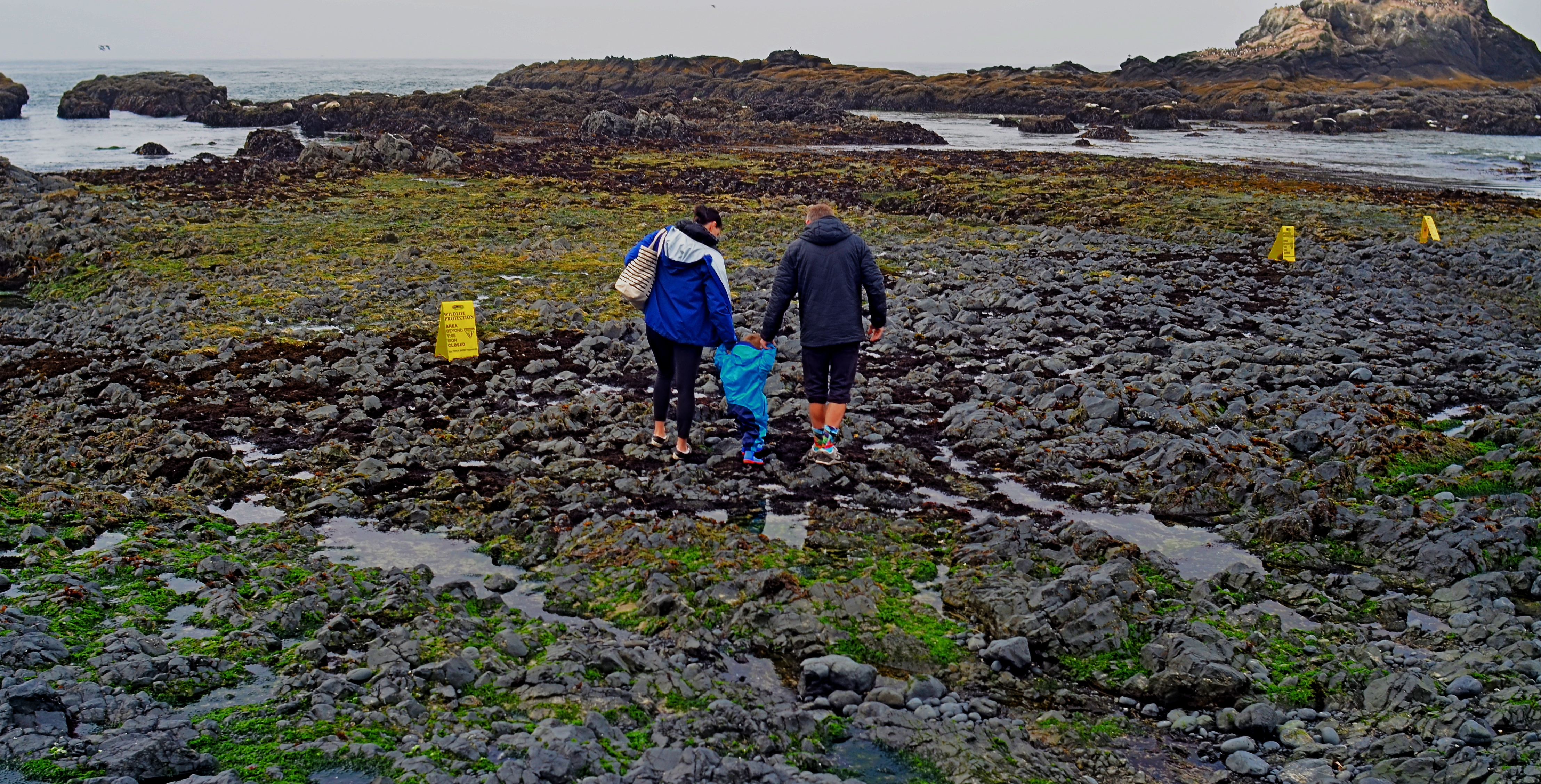
As surefire as leading lines can be, it’s also fun to experiment with other ways to convey the illusion of depth. The image seen here uses no obvious leading lines, and yet it achieves a reasonable effect of dimensionality. Several things can help “sell” the trick.
First and easiest is the choice of a 24mm lens. This optic qualifies as an “ultra-wide” and will always exaggerate the distance from front to back. Then there’s the detailed texture of rock and sand, whose particles shrink in size as the tide pool recedes toward the sea, and just as our mind knows it would in nature. As to focus, setting at infinity helps the eye look deeper into the shot, whereas just shooting only the family in sharpness might stop the audience at a shallower viewing point. Finally, the placing of the family at center and at the mid-point of the front-to-back distance means you have to “look into” the shot fairly deeply just to engage them, at which point your brain has already been dragged halfway to the rear of the shot.
And this is only one very elementary example of how you can effect the depth of a leading line image without….the leading lines. In some ways, photographic compositions are much like musical ones: both require orchestration and a willful conductor.
BOKEH ON A BUDGET
By MICHAEL PERKINS
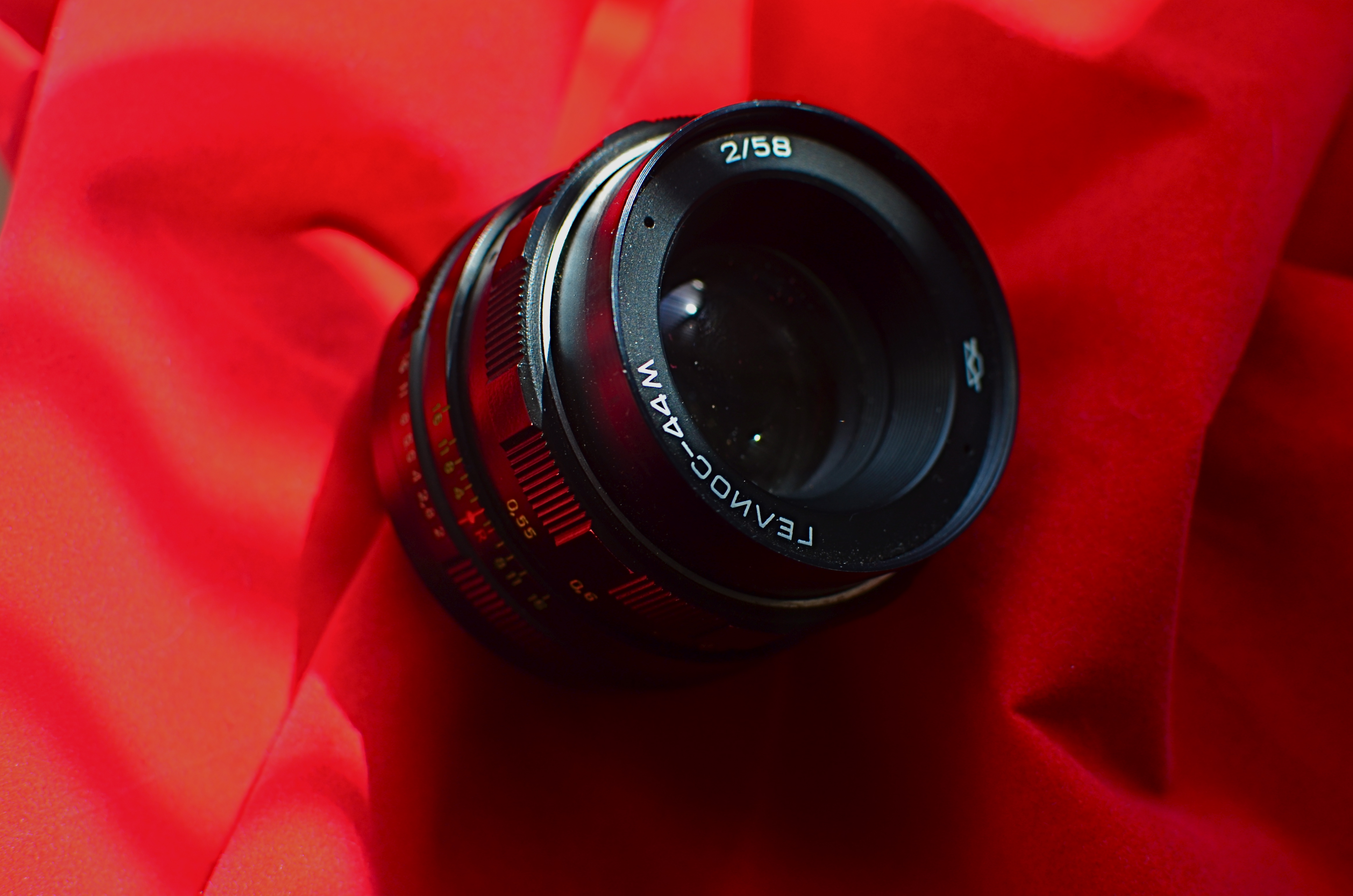
A Soviet–era Helios 44M.
THE EXCLUSIVITY AND ONE–UPMANSHIP which used to divide photographers into warring camps over lenses (it must be primes!) or cameras (I myself have always been a Leica man!) has met its match in yet another pompous arena of dubious distinction.
I’m speaking of the trendy and tawdry world of blur snobs.
You remember blur, right? All that stuff in your pictures that isn’t, you know, sharp? You wanted some of it in there to set your focused subject apart or pop it forward, so you set your depth of field appropriately. So we’re done now, right?
Wrong. Because you might not have the cool kind of blur in your pictures. Cool blur is called “bokeh”, because we said so, and its various swirls, refractions and currents means you must now master blur the way you once sought to master focus. The thing you once regarded as mere negative space is now incredibly artistic negative space. Or you’d better spend money until it is.
The world’s bokeh bullies eventually started to aggressively market glass guaranteed to deliver lots of it, for lots of dollars. The cool-blur movement revived interest in the 19th-century Petzval lenses, great, fast optics for portraits which, as a by-product of their slightly flawed design, delivered big-time swirly blur. Thing is, engineering new lenses to do that one “wrong” thing on purpose meant coughing up an astounding amount of scratch for a lens that is, essentially, a one trick pony. Repeat after me, children: hipness is never cheap.
Turns out that, instead of popping for anywhere from two to six hundred peppers for “cool insurance”, you can get the same effect from a lens that’s so globally plentiful that it can be had for under $35.00. Enter the humble Helios.

The Helios‘ “swirly” bokeh.
Helios lenses were among the most highly produced lenses in Soviet history, marching out of USSR factories pretty much non-stop from 1958 to 1992. They were based on several different Carl Zeiss Biotar designs, and, while mostly used on Russian SLRs, were also built for select Pentax models. One of the most popular, the 44M, seen here, was the kit lens for generations of cameras, shooting fully manual as a 58mm prime.
Shooting the Helio wide open at f/2, and with a decent separation between foreground and textured backgrounds, you’ll get a bokeh that looks like a gazillion little circles that spray into a swirl as they move toward the edge of the frame. As the rose image attests, it does look very nice, just not $600 worth of nice. You also need the patience of a brain surgeon to get used to nailing the focus. That and consistent access to large depositories of Crown Royal. But I digress.
Helios lenses are perfectly serviceable glass for general purposes, although they are a little soft at the open end. The Russian Federation, which, if you haven’t heard, is a little cash-strapped these days, is sitting on millions of these puppies, so prices are low, lenses can be easily adapted to most camera brands (mine came battle-ready for Nikon), and shipping is often free. For between 35 and 50 bucks, they’re an occasional guilty pleasure. On the other hand, hocking your houseboat or delaying heart surgery for the new toys marketed by the blur snobs to do the same thing is both needless and nuts.
RIDING THE SLIDER
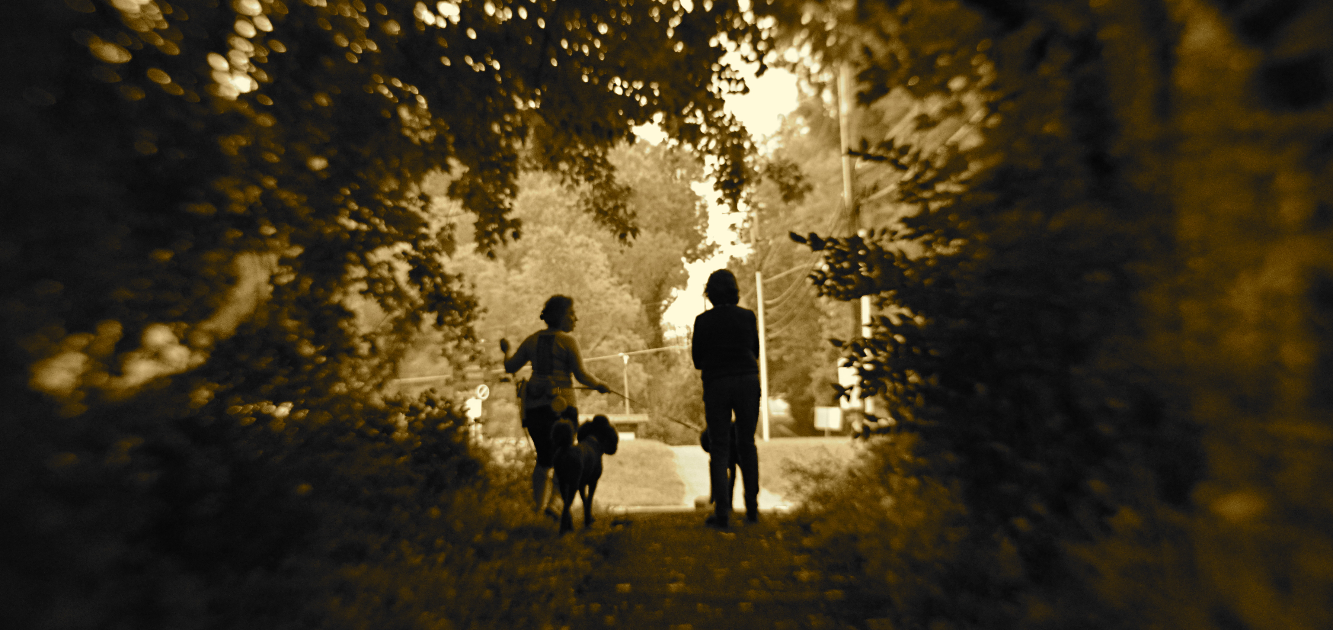
By MICHAEL PERKINS
ONE OF THE MUST–HAVES during the golden age of component stereo was the graphic equalizer, a panel on the front of many hi-fi receivers that divvied up the audible spectrum into five zones, allowing the discriminating audiophile to create a custom low-midrange-hi mix of frequencies by adjusting each zone’s vertical slider switch. It gave a clear representation of the desired fidelity curve. It was visual. It was visceral. Most importantly, it was cool, man.
The “slider” is also, for me, a frame of reference for my photography, since it gives me a mental picture of where I’m at along the track from work that’s left-brained (precision-driven, analytical) and right-brained (instinctual, reactive, emotional). The slider almost never travels to either extreme in the making of pictures, but veers closer to one or the other in a custom e.q.’d mix between rational control and total abandon. This is becoming more common with photographers in general than at any time in the past. When it came to crafting an image, we almost always asked about the how of things. Now many more of us also ask about the why.
The above image is illustrative of this balancing act. In walking behind the two women emerging from a forest at the end of their dog walk, I was never going to have a lot of time to formally set up any one shot…..not unless I was willing to interrupt the ladies’ together time, which seemed counter-intuitive at best. Optically, I was shooting with a selective-focus lens, designed to be sharp at the center, then progressively softer at the edges. Additionally, I decided to under-expose both women, eliminating all detail and reducing them to silhouettes. This meant that I had to wait until they were fairly centered in the clearing at the edge of the woods, one of the only reference points I would have for sharp focus, the backlighting of their forms, and any suggestion of depth.
And so you have a shot which is neither all-rational nor all-instinctual but a mixture of the two, the slider’s mid-point between preparation and improvisation. Total adherence to the left brain can produce shots which are technically precise but emotionally sterile. Working too much on the right side can yield pictures that are chaotic or random. Learning to jockey the slider is at least as important a skill as either composition or conception.
ART ON THE CHEAP(ER)
Conventional focus with a standard optical zoom lens.
By MICHAEL PERKINS
ONE OF THE GREATEST BONUSES OF THE APPS ERA IN PHOTOGRAPHY is how fast certain effects and processes in picture-making have moved from proprietary functions to discretionary ones. Certain “looks” which were the sole domain of well-funded professionals in the film era have been democratized to an insane degree, allowing many more of us to make images that required expensive gear or exhaustive training (or both) just a heartbeat ago.
Selective focus is but one such area. Manipulating sharpness within sections of an image used to be the stuff of cunning calculation and infinite patience…in both shooting and post-processing. Now it’s yours for the flick of a button. The app installs, you click the picture, and you massage the results. Minutes from start to finish. And manufacturers of conventional cameras have had to react to the immediacy of effects available in the mobile market, re-introducing art lenses and specialized optics (think Lomo and Lensbaby) that allow shooters to add “artifacts” or “classic film looks” to their work as they are shooting. At this rate, it’s only a matter of time before these proprietary (think expensive) art lenses become more discretionary (easier to use and cheaper).

Same subject, five minutes later, with a selective-focus “art lens”.
When focus or any other main element in picture-making becomes more flexible, people experiment more and more. That, in turn, increases the number of average shooters who produce more sophisticated work. It’s part convenience, part economics: once the ability to do something on an occasional whim is granted to more people through innovation or pricing, the exotic becomes the normal, and the entire art advances. Photography began as a tinkerer’s hobby, costly and clunky in its execution. However, once it solved those problems, it went viral (or whatever one went in the 1800’s). And now digital apps are leading the entire market toward another level of ease and affordability.
The two pictures you see here were both, in fact, taken with camera-based lenses….but, those lenses are both infinitely more affordable to me today than they might have been a generation ago…something driven in part by the digital apps revolution. That means I had the option of trying two vastly different focal approaches on the same subject with little more effort than it took to swap one lens out for another. I used standard optics for this exercise because, frankly, the acuity and control in most mobiles is still less than I’d prefer. But that will change, and quickly. In just a few evolutionary clicks from now, I will be able to do this exact same study within my phone….cheaper, faster, and with less baggage to lug around. Will I abandon my traditional lenses at that point? I honestly can’t say. But if I don’t, I hope I have a better reason than “that’s not the way we used to do it.”
VISUAL SHORTHAND

On The Barrelhead (2017). Given your mind’s files on what, visually, a “dollar” is, not much literal detail is needed to convey said object in a photo.
By MICHAEL PERKINS
ONLY A SMALL PERCENTAGE OF OUR MIND’S INNER LIBRARY OF ACCUMULATED DATA is at the top of our consciousness. Staying aware of everything we’ve learned in our lives, every minute of the day, would obviously lead to a mental train wreck, as the vital and the trivial created an endless series of collisions between what we need to know and what we need to know right now. The brain, acting as a wonderful prioritizing network, moves information to the foreground or tucks it toward the back, as needed.
The visual patterns we’ve developed over a lifetime are also at work in how we create and interpret photographs. We know in an instant when we’ve seen something before, and so we process known objects in a kind of short-hand rather than as something we’re viewing for the first time. This allows us to make camera images that are abbreviated versions of things we first encountered long ago, images that merely suggest things, rather than delineate them in full detail. Call it abstraction, call it minimalism, heck, call it a ham sandwich if that helps. It merely means that we can use our brain vaults to show parts of things, and count on our memories to recognize those things solely from the parts.
Focus is but one such way of supplying visual information to the brain, and its selective use allows the photographer to convey the idea of an object without “spelling it out”, or showing it in absolutely documentarian terms. In the image above, our collective memory of the contours and details of a dollar bill are so deeply ingrained that we don’t actually need to see all of its numbers, letters, and images in full definition. Focus thus becomes an accent, a way of highlighting some features of a subject while downplaying others.
It may be that, in photographing selective aspects of objects rather than showing their every detail, we are teaching the camera to act like the flashing fragments of memory that our mind uses to transmit information….that is, teaching a machine to see in the code that we instinctively recognize. Is all interpretation just an attempt to ape the brain’s native visual language? Who knows? All that we really have to judge an image by is the final result, and its impact upon other viewers like ourselves.
BLUR IS THE NEW SHADOW

Modern art lenses allow different parts of objects that are all in one focal plane to be selectively blurred.
By MICHAEL PERKINS
I’M INCREASINGLY FASCINATED BY PHOTOGRAPHS THAT SUPPRESS INFORMATION, choosing to selectively conceal details rather than merely delineate everything in the frame in the same exhaustively sharp detail. At the same time, I hate it when this technique is referred to as being “painterly”, as if, after all this time, photos are still striving for the same pedigree that daubers automatically inherit merely by picking up a brush. Photographs are not, and should not try to be, paintings, just as a shoe should not try to pass as a glove. Love the function of the art you have, and leave the mimicry to the mockingbirds.
The “painterly” tag used to be tied mainly to anyone shrouding their images in shadow, as if we were all bucking to be the next Rembrandt or Reubens. And certainly the use of darkness in photography creates a kind of mysterious minimalism, telling more by showing less. We linger over what’s left out of a photo, and the deliberate subtraction of detail simplifies a composition to its barest terms. When there is less to see, you eye goes like a laser to what remains. It’s a big, bright “this way, dummy” arrow pointing toward the heart of the picture.
In the same way, the current wave of photographers are using blur to punch up the impact of images. Any Google search of the phrase “blur my photos” unearths a wellspring of apps that allow any part of any frame to be selectively de-focused, in most cases (as happens with apps) after the picture is taken. Long regarded as the stuff of artifact or accident, blur is now being arranged, managed, and chosen as a tool to remove distracting detail from compositions, or to render them softer and more intimate. In the above image, separate elements of the structure, all of which lie generally in the same focal plane, can be selectively softened so that one can become dominant, while the other is abstracted. This particular shot is done with a Lensbaby Sweet 35 lens, which allows the “sweet spot” of focus to be rotated to any location the shooter desires, although there are many paths to similar results.
Both apps and lenses, which include newly reworked versions of old optics, offer a return to the randomness from which early photographers longed to escape. Lomography, the revival of flawed and cheap cameras from the film era, actually touts blur as a strength, an arty accent much to be desired. To be totally counter-intuitive about it, blur is edgy. Of course, some blur is just another kind of visual noise, and if it’s applied too carelessly or too much, it actually pulls the eye away from the main message of a picture. However, it’s thrilling just to see the sheer breadth of approaches that are suddenly available everywhere, most of them cheap, fast and easy. Blur can “sharpen” a picture just like darkness can “illuminate” one. It’s the new shadow.
2016: THE YEAR OF SEEING DIFFERENTLY

Isoceles’ Greatest Hits (2016). Our idea of what a photograph “is” must be constantly in play.
By MICHAEL PERKINS
IF YOU SPEND ENOUGH YEARS MAKING PICTURES, you will see, looking back over your shoulder, several visible mile markers indicating when something fundamental changed in how you went about the pursuit of the capture. It can be a simple time line from one camera or lens to the next, or a sequence of shifts in style or emphasis.
For some, it’s the leap from film to digital. For others, the moment when it seemed important to commit anew to monochrome, or the day when one’s work flow took on decidedly new features. For me, it’s always been those events or people who have allowed me to dramatically re-evaluate the process of seeing.
Poring over various things I attempted to do in 2016, I seem to be standing in a niche between how I have traditionally visualized subjects and how I’m aspiring to, marking a more dramatic evolution than I’ve experienced for a while. This change can be simply expressed as a different view of what’s “real” in a picture, brought on by my work with lenses that allowed focus to be more selectively manipulated within an image.
Some of this can be seen in images seen in the new page 20 for 16, clickable at the top of this one. Like other year-end summaries, it tries to cite examples of every type of photograph I attempted over the space of a year, from portraits to still lifes and everything in between. However, unlike most other years, the images have what I might call an evolving view of the role of sharpness; how it features in a composition, how much of it is essential, whether it is even needed at all, given the right conditions.
Some of these explorations in variable sharpness involved embracing a new crop of specialized lenses which either evoke the softer look of vintage glass or allow the shooter to place focus anywhere in the frame, and to any degree desired. However, at least one picture is the product of post-production apps applied to smart phone images, showing, if nothing else, that it’s probably the destination that matters more than the journey. Or not.
As an essential component in all photography, focus is a major determinant in that we think of as a “photograph”, and, in turn, what makes that photograph “real”. However, photography is not merely the recording of the actual but a visualization of the possible. It bridges the gap between tangible and potential. Merely unchaining sharpness, by itself, guarantees nothing in the way of order, and might merely produce chaos. Still, the moment when a particular choice can either enhance or enchant…. that’s we live for; that’s what we reach for.
Thank you again for your kind attention, your advice, and your enthusiasm….and Happy New Year.
FIXES ON THE FLY

Original DSLR shot with too much color, too much information, and no effective way to isolate the seated man within the frame.
By MICHAEL PERKINS
ONE UNDENIABLE ADVANTAGE MOBILE OR PHONE CAMERAS HAVE OVER THEIR DSLR FOREBEARS is the ability to combine easy shooting and easy editing in the same small package. This adds convenience on top of convenience, allowing mobile pictures to be captured and refined in the field, with DSLR’s more generally tethered to PCs for their post-production editing.
Even more frustrating is that many basic phone cameras have a wider variety of processing options, even without the use of after-market apps, than come in a DSLR’s “retouch” menu, creating a greater disconnect between the “deliberate” editing of the late-film/early digital camera and the “instinctual” editing of phono-photography.
Recently, DSLRs have made it easier to wirelessly send their images to phones’ email inboxes, but, across several manufacturers, the process is far from sleek. But when you can send images taken with the superior lenses and larger file sizes of a DSLR to your phone, you can easily send those emailed items on to your favorite in-phone app for tweaks that can be done on the fly, with more tricks than your “real” camera allows. It also permits you to do radical re-mixes of yesteryear’s shots with today’s tech. Old photos can get a facelift with a lot less bother than if they go through a Photoshop-type workflow.
To illustrate: the top shot, a DSLR original, was way too busy. Jutting walls, extra people, over-bright colors…plenty to remove if the seated man at the front was to draw any central interest. Cropping and de-saturating in my Mac’s editing program was easy enough, but I wanted to further isolate him from the monotonous textured wall behind him.
The same DSLR image with selective focus added via a phone-based app.
The lens I used in the original wasn’t equipped to render different levels of sharpness within the same focal plane, but my phone had a handy app that did precisely that, and that’s where we went next.
Emailing the image to my phone was fast, as was forwarding the picture in the email to be saved as a camera roll image. From there, I sent the picture to an app called Analog Cam, which included a partial diffuser tool, allowing me to gradually blur everything in the focal plane except the man, as you see in the lower frame. Finally came a transfer from the app to a posting on Flickr. Thus with a few extra steps, I gained the flexibility I didn’t have when I shot the original, allowing me to save, salvage and send from one location.
The emphasis for mobile cameras is much more on post-shutter fixing than is the case with a standard camera. That said, there’s no reason why you can’t shoot on one and use the convenience of the other to get the result you want.
A GENTLER EDGE

Storefront (2016). Details are used sparingly in the central building, even less crucial in the rest of the frame.
By MICHAEL PERKINS
CHOICES ABOUT FOCUS MIGHT JUST BE AMONG THE MOST IMPORTANT DECISIONS that a photographer will face. Clarity, sharpness, precision, call it what you might, focal crispness is a crucial determinant in the creation of an image, no less than light and subject matter. And it’s one of the easiest factors to manage, available to any one from the humblest point-and-shooter to master technicians on the Hubbell telescope.
This urban shot seems to call for a sharp look overall.
There is a tendency for us to mentally default to an idea of “sharpness” when we hear the word focus, as if the only way to faithfully reproduce reality is strict adherence to that standard. But photography has never really been about reality, any more than painting or prose. We can’t help but add some small interpretive something to the process of making a picture, even if we believe a machine is largely in charge of the process. Amazingly, with very little effort, we can change the perception of an image by tiny adjustments in what is clear and what remains hazy or soft, straying selectively from the arbitrary sharpness standard.
Some subjects are rendered too coldly, too clinically, when subjected to razor focus, so that what you may gain in documentary detail you lose in intimacy, or in that undefinable feeling of being close. Applying this line of reasoning to my personal affection for architecture, there are buildings where the hard look of precision is perfectly suited to the subject; jutting skyscrapers, massive bridges, towering monuments, and the like. But put me in a small town, where the entire space feels sealed off from time itself, and the look, at least for me, becomes softer. Details take a back seat to feelings, and the harsh light of midday gives way to a soft, dreamy haze at late afternoon. The secrets of side lots, alleys and back yards become scavenger hunts. In both the big and small cities, focus is the key element in the creation of the image. And, also, in both cases, an advance visualization of the final result dictates exactly the degree of focus required.
Lenses and cameras possess wonderful technical properties that can deliver a slew of exotic effects. Still, with virtually no expense or fuss, a smarter mastery of focus is a decisive, even dramatic factor in helping a photograph develop its most effective language.
COST ANALYSIS
By MICHAEL PERKINS
IT’S SAFE TO SAY THAT, TO DATE, MOST OF THE WRITINGS THAT COMPARE FILM PHOTOGRAPHY TO DIGITAL center on visual or aesthetic criteria. The grain of film, the value range of pixels, the differences in the two types of workflow, the comparative sizes of sensors, and so forth. However, in certain shooting situations, what strikes me as the main advantage of digital is crassly…..monetary.
It’s simply cheaper.
Now, that’s no small thing. Consider that, with film, a very real cost comes attached to every single frame, both masterpiece and miss. Now, try to compute how much film you must consume in order to travel from one end of a learning curve to the other in trying to master a new lens or technique. Simply, every shot on the way to “that’s it!” is a “damn, that’s not it”, and both cost money. Now recall those shoots where the conditions are so strange or variable that the only way to get the right shot is to take lots of wrong ones, and remember as well, that, after clicking off all those frames, you had to wait (with the meter running), until either the processor or your own darkroom skill even told you that you were on the wrong track.
Assume further that you screwed up several rolls of premium Kodachrome before stumbling on the right approach, and that all of those rolls are now firmly in the “loss” column. You re-invest, re-load, and hope you learned your lesson. Ca-ching.
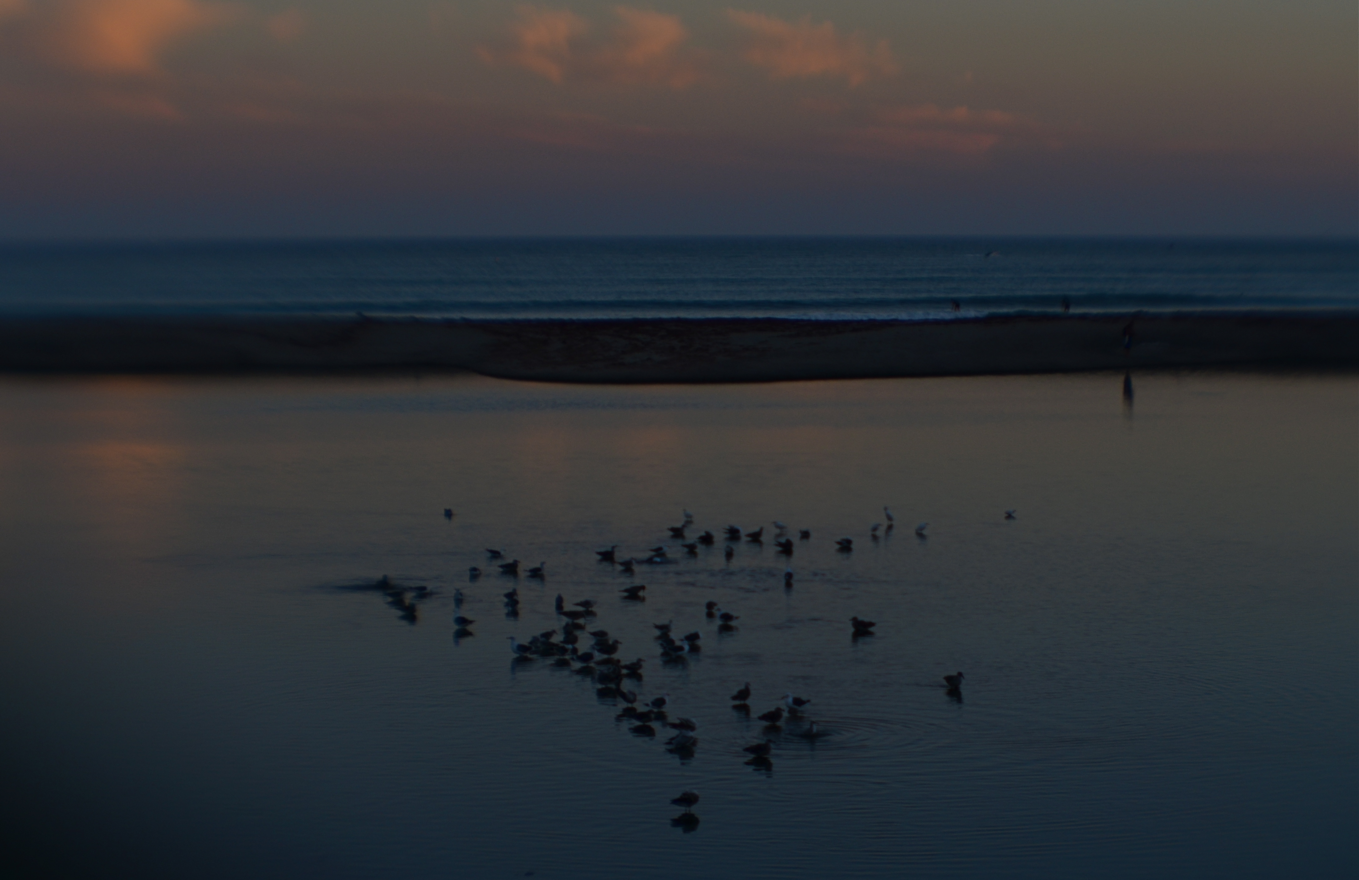
Doheny State Park Beach (2016). Shot at 1/125 sec., f/8, ISO 100, through a plastic 35mm lens.
The shot that you see above demonstrates why shooting in digital speeds up your practice time, at a fraction of the cost of film, while giving you feedback that allows you to adjust, shoot, and adjust again before the conditions in front of you are lost. What you see is a late dusk on a dark lagoon just inland of a stretch of ocean in Point Dana, California, strewn with waves of bathing birds and shifting pools of ripples. The pink of the clouds on the horizon will be gone in a matter of minutes. Also, I’m shooting through a narrow-gauge opening in a chain-link fence, causing dark vignettes on every other shot. Moreover, I’m using a plastic lens, making everything soft even softer, especially at the edges.
So add all these factor together and the emotional curve of the shoot is click-damn-click-whoops-click-click-damn. But, since it’s digital, the bad guesses come back fast, and so does the ability to adjust. Bottom line: I know I will likely walk away with something generally usable.
More importantly, photography no longer has the power to price so many of us out of the practice. That means that more images make it to completion, and, of course, that can also mean a global gallery flooded with mediocrity. Hey, I get that. But I also get a fighting chance at grabbing pictures that used to belong only to the guy who could afford to stand and burn twelve rolls of film.
And hope like hell.

PERFECT VS RIGHT
By MICHAEL PERKINS
OUR VERY HUMAN DESIRE TO MAKE OUR PHOTOGRAPHY TECHNICALLY FLAWLESS can be observed in the results you can glean from a simple Google search of the words “perfect” and “photos”. Hundreds of tutorials and how-tos pop up on how to get “the perfect portrait”, “the perfect family picture”, “the perfect sunset”, and of course, “the perfect wedding shot”. The message is all too clear; when it comes to making pictures, we desperately want to get it right. But how to get it right…that’s a completely different discussion.
One of my favorite selfies, even though I can’t justify it by any technical standard.
Because if, by “perfect”, we means a seamless blend of accurate exposure, the ideal aperture, and the dream composition, then I think we are barking up a whole forest of wrong trees. Mere technical prowess in photography can certainly be taught, but does obeying all these rules result in a “perfect” picture?
If you stipulate that you can produce a shot that is both precise in technique and soulless and empty, then we should probably find a more reasonable understanding of perfection. Perfect is, to me, a word that should describe the emotional impact of the result, not the capital “S” science that went into its execution. That is, some images are so powerful that we forget to notice their technical shortcomings. And that brings us to the second part of this exercise.
Can a flawed image move us, rouse us to anger, turn us on, help us see and feel? Absolutely, and they do all the time. We may talk perfection, but we are deeply impressed with honesty. Of course, in two hundred years, we still haven’t shaken the mistaken notion that a photograph is “reality”. It is not, and never was, even though it has an optical resemblance to it. It became apparent pretty early in the game that photographs could not only record, but persuade, and, yes, lie. So whatever you shoot, no matter how great you are at setting your settings, is an abstraction. That means it’s already less than perfect, even before you add your own flaws and faults. So the game is already lost. Or, depending on our viewpoint, a lot more interesting.
Go for impact over perfect every time. You can control how much emotional wallop is packed into your pictures just as surely as you can master the technical stuff, and pictures that truly connect on a deep level will kick the keester of a flawless picture every single time. The perfect picture is the one that brings back what you sent it to do. The camera can’t breathe life into a static image. Only a photographer can do that.
Share this:
May 28, 2017 | Categories: Aperture, Focus, P.O.V., Technique | Tags: Commentary, Composition, exposure, process | Leave a comment