SIGNATURE MOVE
By MICHAEL PERKINS
THE LINK BETWEEN CLASSIC CARS AND CALIFORNIA is an incredible, mythic bond, a marriage of American dreams. Even as we and the world are wondering, at least from an environmental standpoint, whether the romance has gone on for too long, even as we tearfully tender divorce papers to our old chrome-encrusted gas guzzlers, we Californians maintain a tearful love for What Was. It’s so easy to find a weekend show-and-shine in Cali that you might be tempted to think that God created strip mall parking lots solely so we’d have an easy way to stage seas of antique Fords and Chevys.
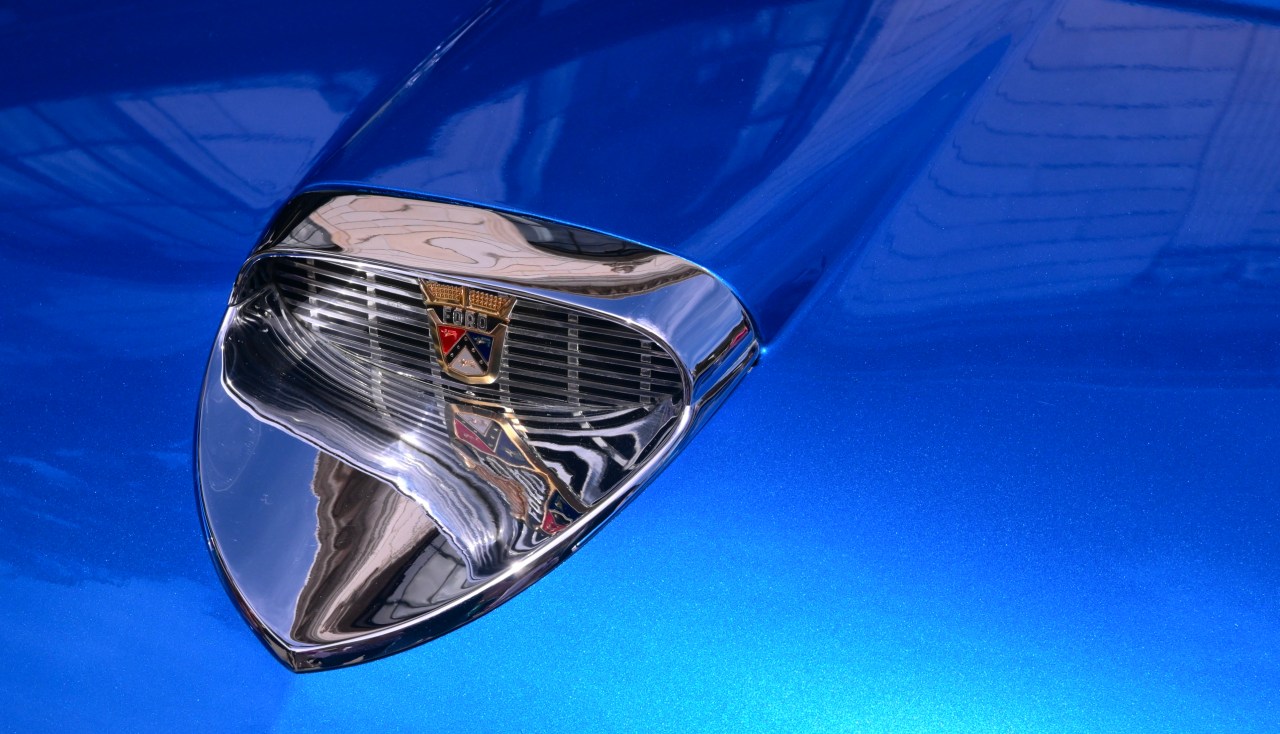
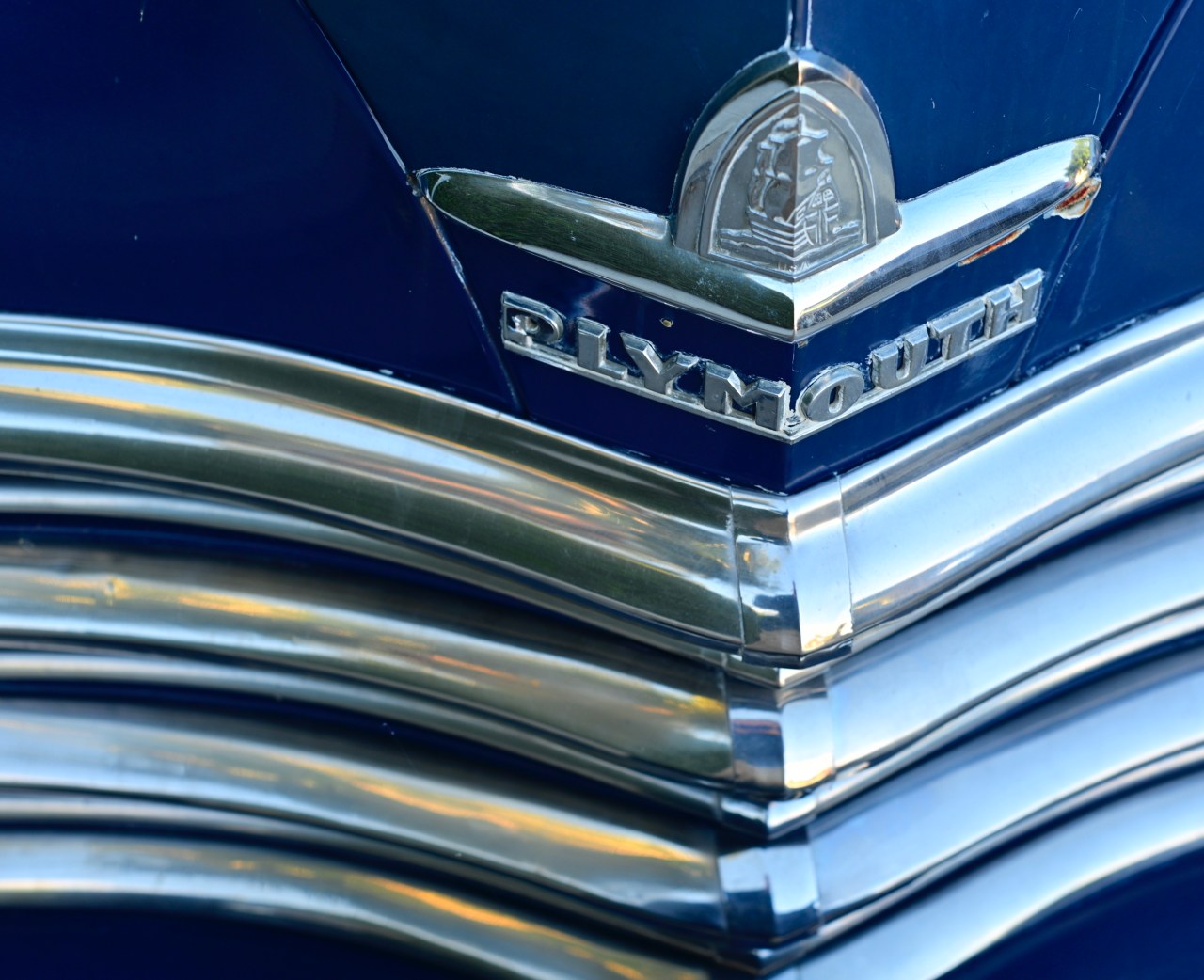
Awash in chrome, the classic logo badge from a 1958 Ford Fairline 500 Sunliner.
As a photographer, I find all this free-ranging power, color and style irresistible, but I’m fairly selective on what the sexiest portions of the entries are. It’s not the squeaky-clean, detailed engine compartments or the custom wheels, not even always the Cruise-Til-Ya-Drop cab appointments. For me, it’s the sheer elegance of the designer’s “signature” on the car, the badges, emblems, hood ornaments and company logos that grace the grills and hoods on the fronts of the cars. The car’s overall lines and contours are sinuous and sleek, to be sure, but it’s where the artist signed his name to his creation that encapsulates everything about the eras and ages that spawned these beauties.
It’s worth remembering that the first great designers of automobiles evolved from the companies that crafted luxury coachwork for horse-drawn carriages. The famous and now-bygone “Body By Fisher” emblem that was stamped onto the door sill plates of GM products for decades is, after all, the image of a coach, a nod to the Fisher family’s original blacksmith-based artisanal works. One of the hallmarks of automotive detailing, during the golden age of motoring, was the company name, branded on the front end with coats of arms, translucent plastic faux-stained glass, and Chrome, oh, my God, so much Chrome framing, well, everything. I dearly love to frame up entire classic cars, to glorify their every curve and cue from headlamp to tail light, but it’s in the small places where the company said, “we built this” that I can hear the roar of the engine, the whistle of the wind, and the squeal of the tires. Long ago, Zenith radios used to brag that “the quality goes in before the name goes on”, and, with classic cars, that signature speaks to excellence, pride, and, yes, a kind of immortality.
HOORAY FOR STANLEYWOOD
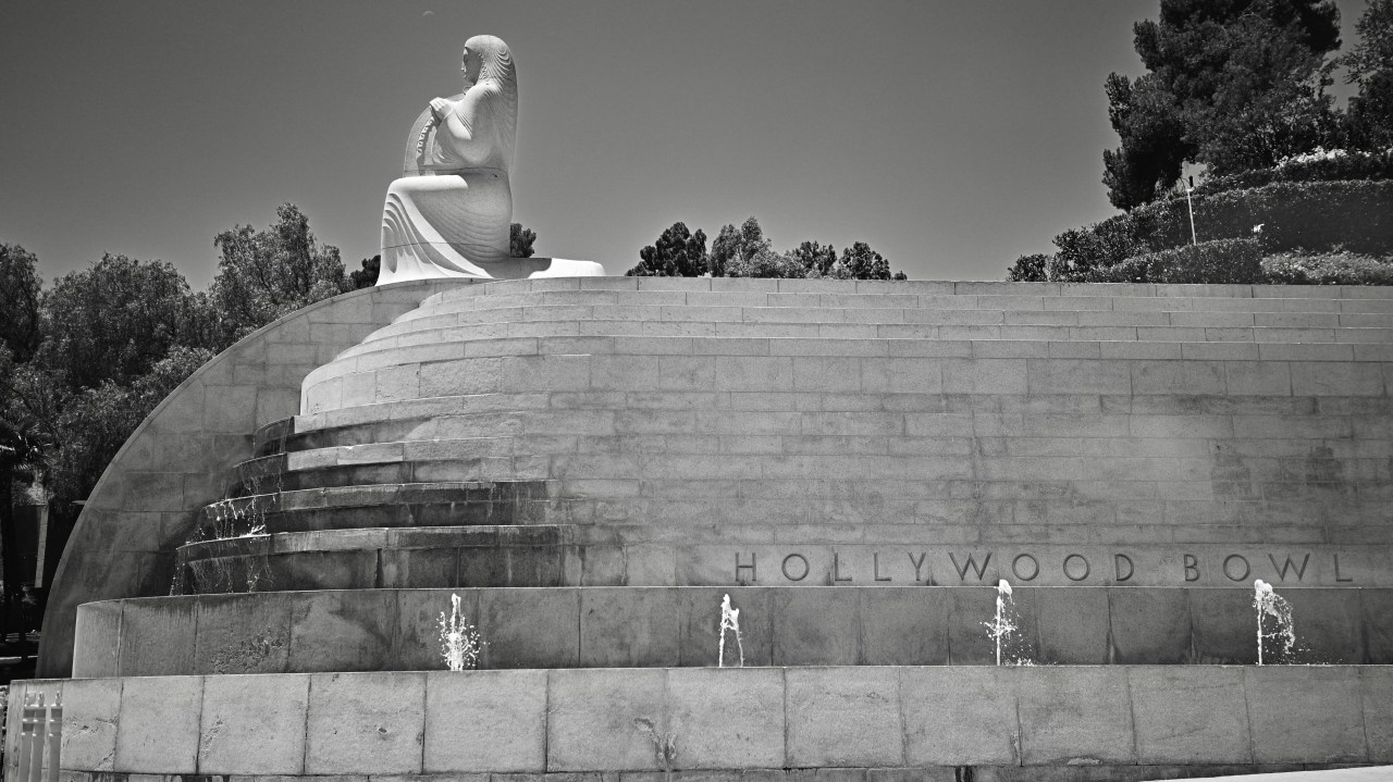
One of the figures of the three muses (Music, seen here), dance, and drama, created by sculptor George Stanley for the monumental fountain which serves as the entrance to the Hollywood Bowl in Los Angeles.
By MICHAEL PERKINS
LA LA LAND, BEING THE CHIEF MANUFACTURER OF DREAM IMAGES FOR THE WORLD, has seen, in its century-and-a-quarter history, many of those images flicker and be forgotten once the title THE END flickers off the screen. However, both in and out of the movies, Los Angeles at large has seen visual souvenirs of its various eras survive to become icons that outlast time, forever emblematic of a city that feeds on the frenetic energy of hope. These symbols of L.A. life are visited or seen by millions, their origins rendered irrelevant, as if they, like the mountains and the tar pits, have simply always been here.
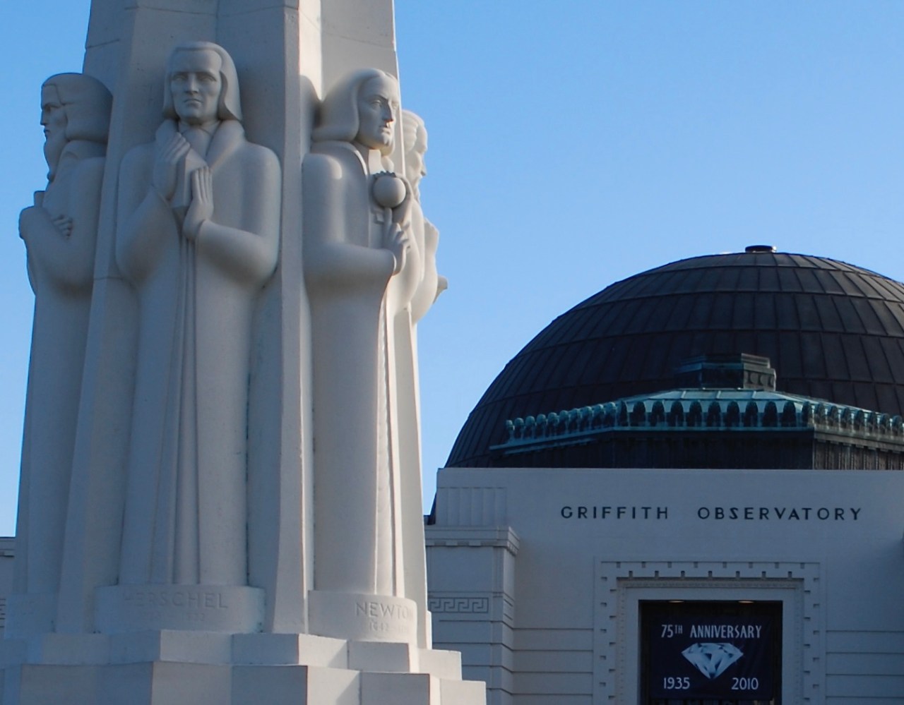
George Stanley’s sculpture of Sir Issac Newton (at right), taking its place among other sculptors’ tributes to great astronomers at the entrance to Griffith Observatory in L.A.
The names of some of the creators of these landmarks survive, and others, like sculptor George Stanley, morph into questions on Jeopardy or side entires on Wikipedia. But that’s a little ungrateful of us. as we adore the man’s works with no notion of the man himself. Like many Angelenos, George Maitland Stanley was an immigrant from within greater America, arriving in the 19-oughts from a small parish in Louisiana, growing up in the town of Watsonville near Monterey Bay. In 1923 he enrolled in L.A.’s Otis Art Institute, where he studied and later taught sculpture, before transferring to the Santa Barbara School for the Arts, where he was also on the faculty. George’s first major commission, and the one which made him renowned to this day, was the sculpting for the Oscar statuette, which he designed in 1927 from a sketch by an MGM executive and which can arguably claim to be the most famous sculpture in the world.
The first third of the twentieth century was an insane growth spurt for Los Angeles, and George Stanley had a literal hand in the symbology for some of its most enduring destinations. The circle of statues that celebrate the world’s essential astronomers, which graces the front entrance to Griffith Observatory, was a collective work, with a separate commission issued for each of the scientists on the plinth. Stanley sculpted the figure of Sir Issac Newton in 1934. Just six years later, he created yet another indelible marker of California culture, creating the streamlined Deco fountain that ushers concertgoers onto the grounds of the Hollywood Bowl. The triple sculpture that crowns three corners of the two-hundred-foot-side fountain base, depicts the three muses of Music, Dance and Drama, and stands over twenty-five feet tall. Situated just where freeway traffic exits the 101 and spills onto Highland Avenue, the fountain has become a kind of unofficial front gate for Hollywood itself.
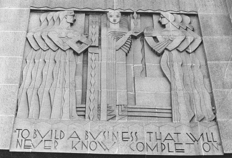
Stanley’s frieze for the entrance to Bullock’s Department Store on Wilshire Boulevard, 1929.
Stanley’s other works, some of which do not survive to the present day, include the dramatic frieze atop the main entrance to the majestic Bullock’s department store building, as well as some reliefs and murals at various churches scattered across the state. In a town that worships image, he created the visual signatures of many essential local landmarks, and photographers and historians alike have long realized that you cannot tell with story of Los Angeles without citing his elegant touch.
Did this article do it for you? Like, Share, Subscribe!
THE DIVINE’S IN THE DETAILS
By MICHAEL PERKINS
“IT HAD THE COOLEST CENTER CONSOLE….”
“REMEMBER THAT AMBER INDIAN HEAD AT THE FRONT OF THE HOOD?”
“THE ASHTRAY. IT WAS ALL CHROME. SO ELEGANT..”
I HAVE PHOTOGRAPHED CLASSIC CARS AT NEARLY EVERY KIND of human gathering, excepting perhaps funerals and coroner’s inquests, and I have come to the conclusion that, while designers labor mightily to create sexy, muscular or lean shapes for the entire outer conception of an automobile, it is in the tiniest touches where the fondest user memories reside. Despite the best efforts of the boys at the drawing boards, many cars tend to look alike, like a lot a lot alike, a problem which is further exacerbated when a particular model becomes so successful that it inspires rafts of imitators. No, for the photographer in me, it’s the features, the add-ons, the ups and extras, that burn brightest in my memory.
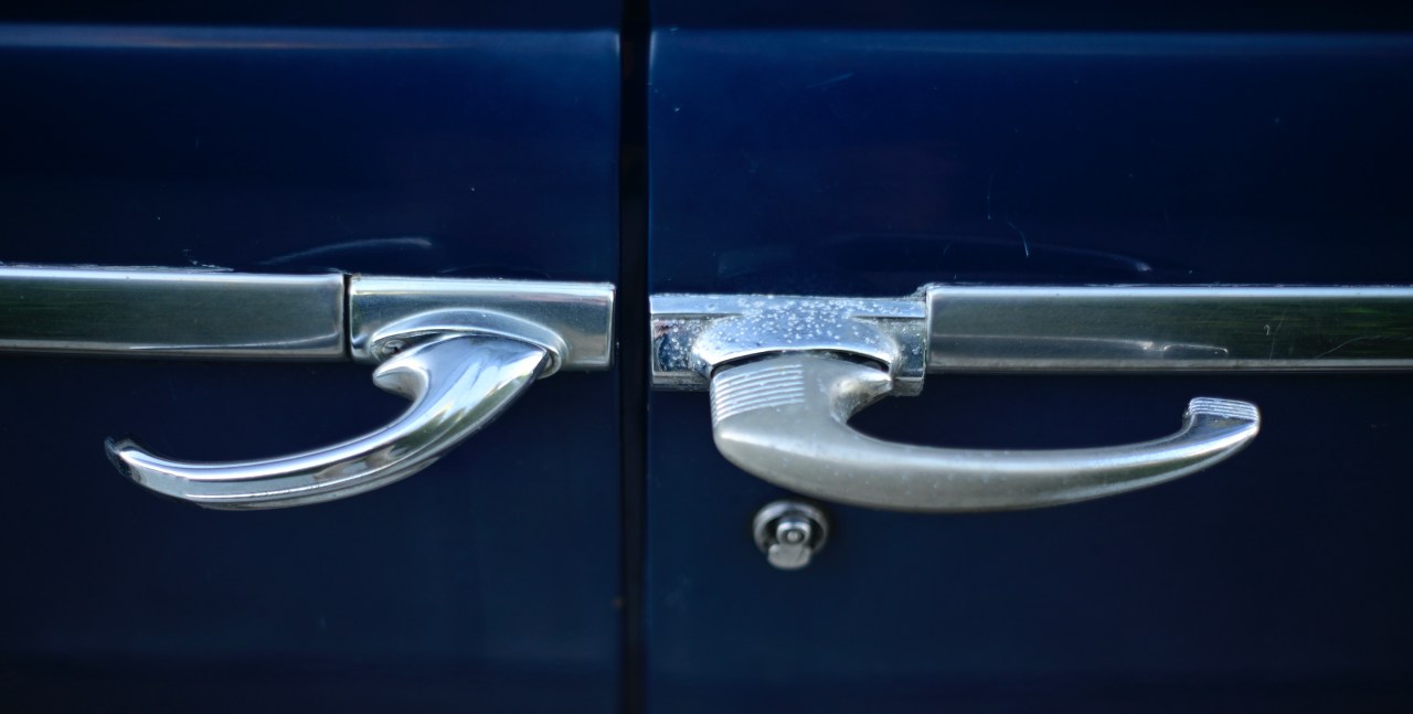
I recently discovered a 1948 Plymouth Special Deluxe parked about three blocks from my apartment. It may have made an occasional street appearance here and there in the past, but, in recent weeks, it’s out nearly everyday, even though its owners live across the street and have a garage. Yesterday, I set about to pore over every inch of the monster, and, after a few full-on shots, it again occurred to me that the more delicate fixtures, the trims, the small and elegant accents…in other words, the real emotional bait that snags the buyer in the showroom, was what I wanted most to document.
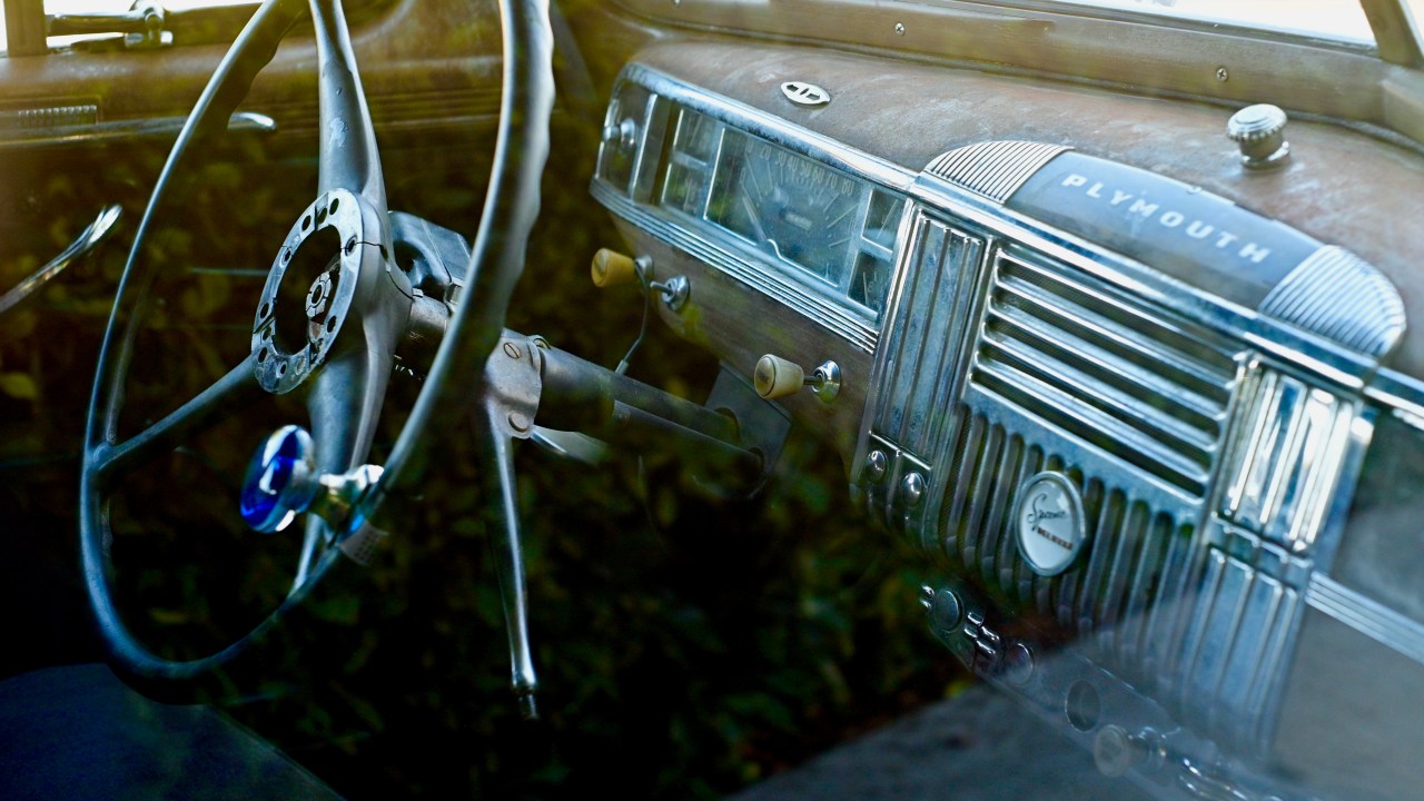
The ’40’s saw the first head-to-toe use of chrome trim, but on a far more modest scale than the rocket-to-mars fins and grilles of the ’50’s. Still, the accent on cars, even in the first post-war years, was on decoration for its own sake. Most accent items on a car add no real function or performance edge, just coolness, and that’s just jim dandy with me. It’s like a big loop running in my head which explains my affection for something beyond its merely practical value; I love it because I love it because I love it, etc. Creature comforts and pure style determine our attachment to things across our lives far more than their actual function or use. And that makes even the most commonplace ride as pretty as a picture.
BOTH SIDES, NOW
By MICHAEL PERKINS
THOSE OF US WITH ROOTS IN THE STONE AGE may recall the opening of the old Disney TV series Wonderful World Of Color, which consisted of a burstingly brilliant kaleidoscope, endlessly unfolding behind the show’s title card. It was a stunning way to display the infinite rainbow of hues of the early color network broadcast, echoing what everyone had seen when turning those little cardboard tubes filled with rattling bits of color glass; the hypnotic appeal of the symmetrical.
From ancient architectural frameworks to medieval tapestries to the intricately balanced frameworks of common spaces in the present day, we love to imitate the visual counter-balances seen in nature, such as the patterns within a flower, or the delicate web of design in a snowflake. And, as photographers, especially in an age in which anything can be manipulated or faked to our heart’s content, we are often seduced by the temptation to artificially impose that balance on our images, to make the world uniform and orderly. Why is this visual urge so strong?
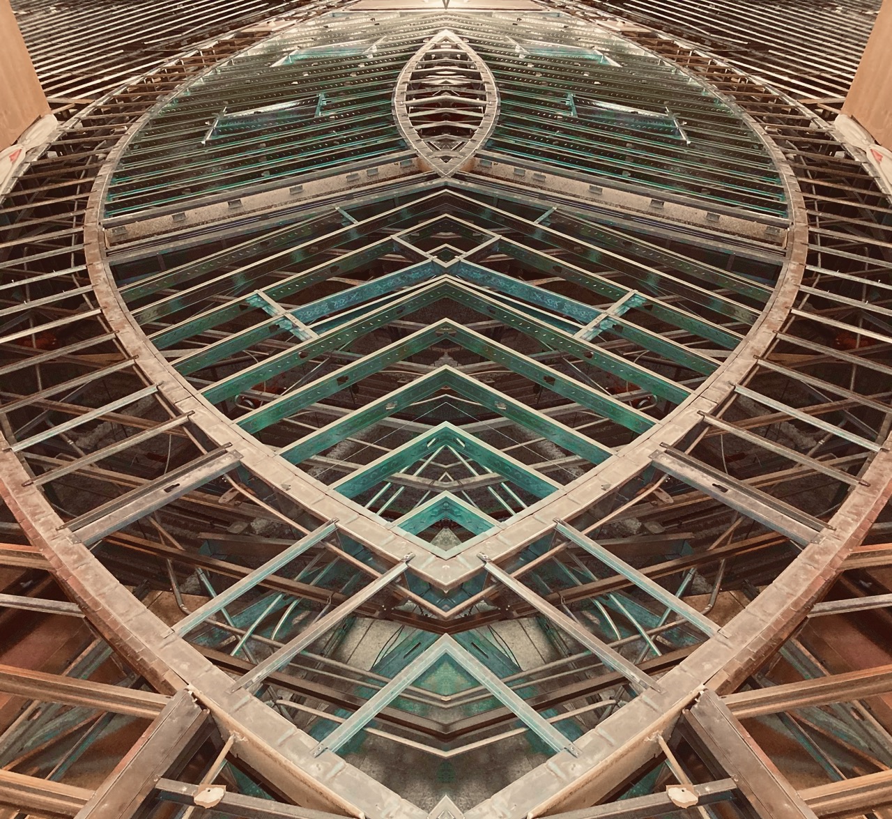
A genuine fake. Because reality is, you know, just reality…
Psychologists claim that humans take a kind of comfort from “balance”, feeling more rooted, in, for example, inside a church that has four matching wings conjoined by a central hub, or a wagon wheel, or a plaza built around a square mosaic. There are even studies that indicate that we think of symmetrical faces in other people as more attractive than non-symmetrical ones. Small wonder, then, that we deliberately simulate symmetry where none naturally exists. As in our younger days, when we first folded sheets of paper into fourths, then cut pieces out of them that, once unfurled, replicated the cuts four times in perfect opposition to each other, we use photographs not only as proof of natural balances, but as a jumping-off point toward the creation of Other Worlds, better ones with a neater, more mathematical precision. We play Creator, or at least Re-Creator.
Which to a say, in roundabout fashion (my usual method), that photographs are only marginally documentary in nature. They evolve from ideas that may or may not reflect the actual world. That’s why they aspire to art.
THE STRAIGHT (AND TALL) SKINNY
By MICHAEL PERKINS
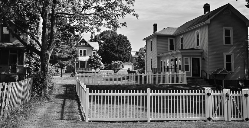
EVERY TIME OVER THE PAST TWENTY-FIVE YEARS that I have strayed from my home in the American southwest and headed back to my mid-Ohio roots for family visits, I am struck by a stark difference in the general arrangement of architectural space between the two regions, or at least a difference that I myself perceive. It would be a monstrous over-generalization to say that legacy houses, out west, tend to be horizontal in orientation while midwestern houses in older towns tend toward the vertical. I have absolutely no empirical data to back up this impression, only the way that it strikes my photographer’s eye.
Western dwellings strike me as variants on the basic ranch house design, with many homes arranged from left to right, many without basements or attics. Midwestern homes, by contrast, seem to be narrow and high, resembling a brick turned up on end. I tend not to actively notice this distinction unless I am back home, trying to compose frames in which several buildings cluster together to suggest an entire town or street. My hometown of Columbus, Ohio, which is a sprawling city composed of many legacy neighborhoods, boasts a ton of “tall-and-skinny” sectors from the Short North to German Village to outlying villages like Pickerington or Reynoldsburg. In many of these neighborhoods in which, unlike say a city like Brooklyn, houses need not be crunched and crowded together like a row of brownstones, the brick shape still often predominates, setting up a strange contrast between wide, deep yards and narrow, stretched headstones of design.
Sometimes the look of a small town can actually seem like the view between gravestones. And, in the rural areas where the local cemetery is actually cheek-by-jowl to to the residential districts, the connection is even more compelling. I walk these Midwestern streets, once as inevitable as breath to me, and realize that not only my physical address, but I, myself, have undergone deep, deep change. And that, in turns changes the pictures I envision.
THE ELEGANCE OF THE INVISIBLE
By MICHAEL PERKINS
PHOTOGRAPHY AND THE DECORATIVE ARTS SHARE A COMMON MISSION, which is to elevate the ordinary by re-imagining it, transforming things from invisible to elegant. Sometimes, of course, a sow’s ear cannot become a silk purse, no matter how much you fiddle with it, and not everything in the everyday can be glorified by the touch of a designer or shooter. Still, both disciplines can, often, confer some kind of absolute beauty on objects that we’ve been largely conditioned to ignore.
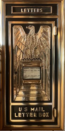
One of my favorite marriages of decorative arts and photography can be seen in the brief reign of what we now call Art Deco, although that term was coined decades after the movement sort of, well, moved on. Less extreme in its flowery ornamentation than its ancestor Art Nouveau, Deco gaily celebrated the furnishings of our daily lives, from parquet floors to wastebaskets to skyscrapers, making them some of the first industrially designed mass-produced objects of the Machine Age. meanwhile transforming consumption in the 1920’s and 30’s. At the same time, Photography was having its first Great Awakening, moving from a mere recording medium to an art form, one which, like Deco-designed works, could suddenly be copied and re-copied endlessly via film and print. The making of images that celebrated the ordinary as well as the extraordinary made for a unique amalgam of style and expression.
Just one look at a simple, typically invisible thing like a public mail drop box from the period (this one in daily use at the Hotel del Coronado in San Diego as of this writing) reveals a love of symmetry, of clean, budgeted lines, and a minimalist aesthetic that is about how a thing strikes you visually much more than what its actual function might be. Photographs can not only serve to capture these works before they vanish, but to do for them what they did for our most “normal” tasks, and that is to glorify them. Art Deco and photography have proven, over time, to be one of the happier marriages in the arts. And like all the best lovers, they never let the honeymoon end.
RE-BRANDING
By MICHAEL PERKINS
CITIES POSSESS THEIR OWN PROOF-OF-LIFE RHYTHMS, a steady cadence of dying and rebirthing, of collapse and resurrection. Like a sleeping body where you have to look carefully to see the passing of breath, towns of every type inhale and exhale, even if we are not paying close attention. One building comes crashing down, and we complain about the noise and mess. Another building rises on the same site, and we crab about how the sidewalk was re-routed. We learn not to see our cities breathing.
Photographers are people who teach themselves to see things that even they have, too often, passed by without noticing. When they preserve a moment between eras in cities, that’s a very valuable function. We document the old things we once valued; we chronicle the new things what we hope will have staying power. And our best pictures of cities can often be the precise moment that the past hands the baton on to the future. These are images of faith, hope, aspiration.
The proudest moments for a city is when it finally learns the value to be found in refitting the past, of carrying notes or accents of bygone days into new uses, slowing the tidal wave of obsolescence, if only a little. Sometimes we actually wake up to the fact that not everything old deserves to be swept aside, that there is such a thing as enduring value. Strive to be there when you see it happen.
ONCE MORE, WITH FEELING
By MICHAEL PERKINS
THE ESSENCE OF LIVING IN A CONSUMER SOCIETY is being regularly encouraged to discard the past, to believe, as did Henry Ford, that “history is bunk”, that, in the interest of selling more and more goods, any and every thing we might hold dear must, instead, be held in contempt, as tossable, replaceable, impermanent. We have now spent nearly two solid centuries living under that instinct, and, as they say, look where that got us. We are urged to discard the things we once loved so we can love their newer, sexier replacements.
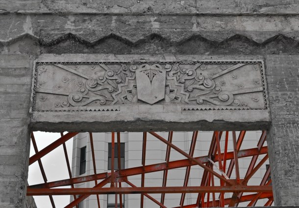
This puts photographers on perpetual alert, since part of our function is to mark transitions, those quick flips between the established and the endangered. Grand, sprawling coverage of the vanishings in our cities, for example, have been created by the likes of Eugene Atget, who documented the decline of old neighborhoods in 19th-century Paris, and his pupil Berenice Abbott, whose Changing New York project recorded the same shift in that city’s five boroughs in the early 20th. Photography is the only visual art that is responsive enough to try to keep pace with the accelerating rapidity of change, and even it falls short, in that things are going away faster than we can memorialize more than a small percentage of them.
It falls to the individual photog to select which transition stories to tell, where to spot both vital and trivial shifts in our love of things, as well as our crazed craving for the ever-new. Epic or incidental, all change is a commentary on our priorities. In the case of the above image, it signaled to me that someone in the ever-shifting mix of retail in Santa Monica’s Third Street Promenade thought that the shell of an old Art Deco building deserved to stand just a while longer, albeit gutted and repurposed throughout. The same building in a different area in a different time might have met a very different fate, but this one will fend off the executioner for a while longer. Consumer societies are hard-wired to chuck out the old in favor of the new, simply because it is new, or at least that’s been the pattern for a long, long time. The recent emphasis on “once more, with feeling”, stressing the repurposing of our material goods, deserves a chance as well, though; and that presents a universe of fresh opportunities for the making of pictures.
OF SIGNATURES AND LEGACIES
By MICHAEL PERKINS
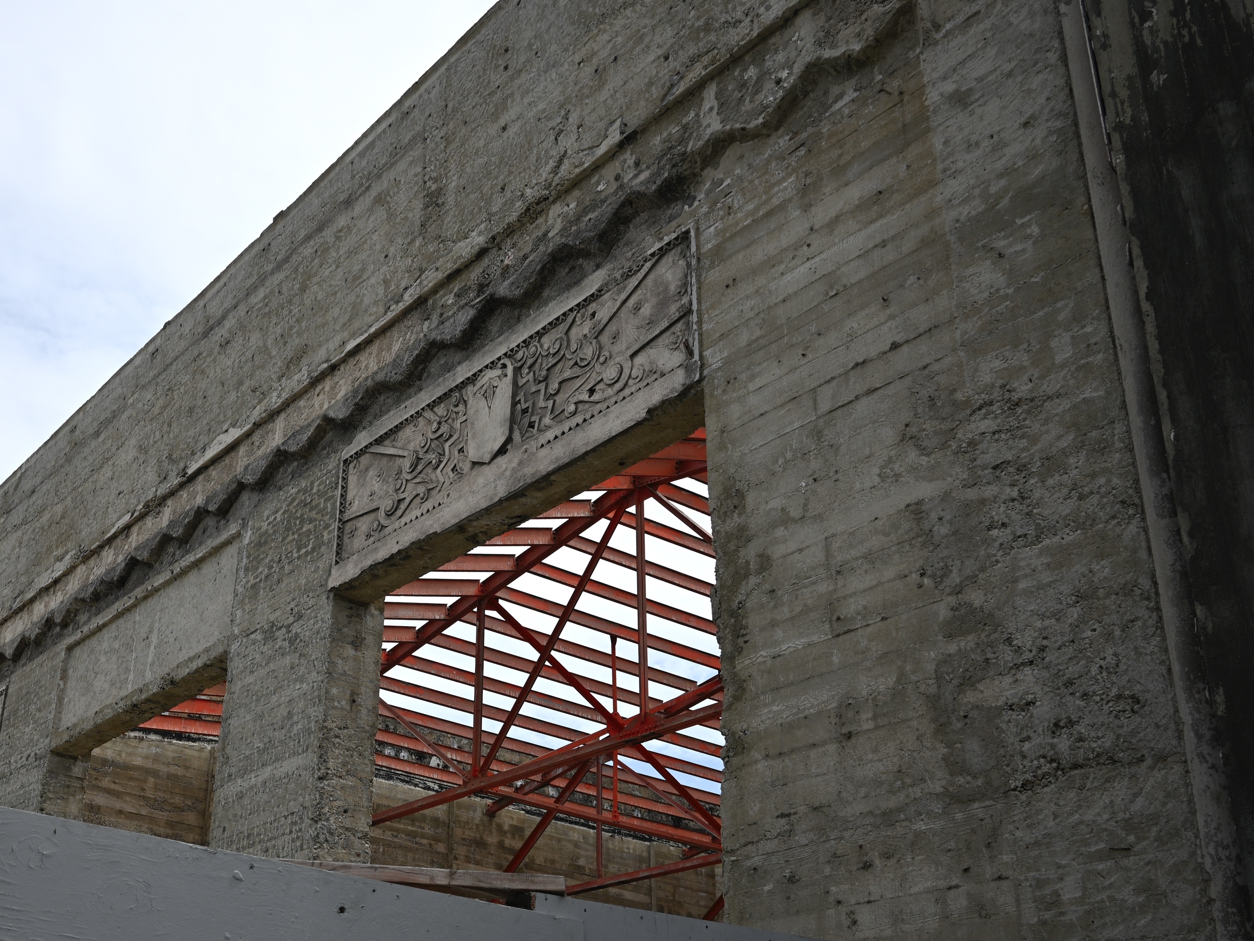
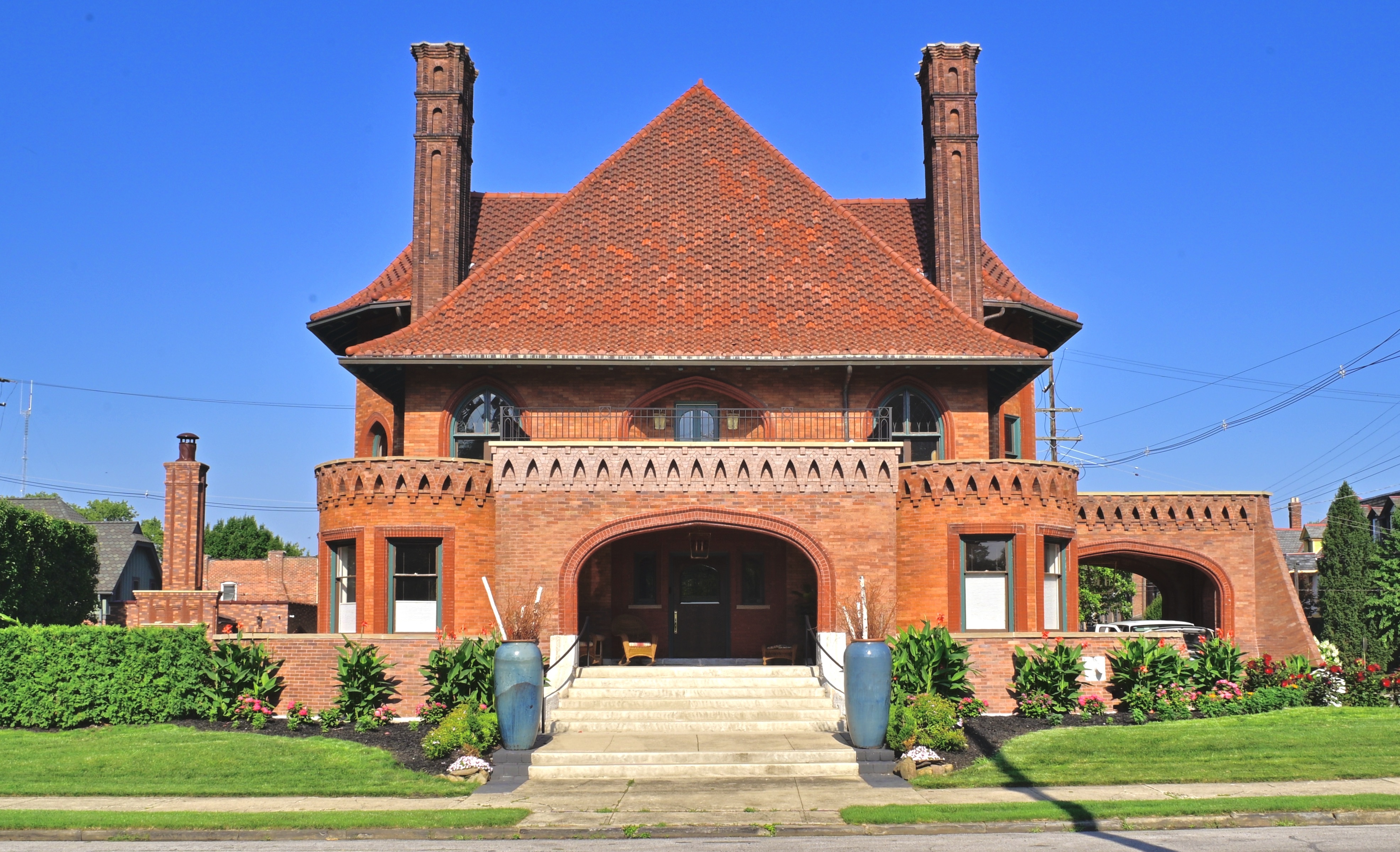
THE PROPERTY AT THE NORTHWESTERN CORNER OF GOODALE PARK, in the “Short North” district of Columbus, Ohio has, over the past 117 years, served as private residence, office building, daycare center, fraternal lodge for commercial travelers, nursery school, and alcoholics’ recovery center. Incredibly, every one of these uses has been housed by the very same structure, a bizarre relic of the golden age of robber barons locally known as “the Circus House”.
And with good reason.
By 1895, Peter Sells was one of the founders of the nationally famous “Sells Brothers Quadruple Alliance, Museum, Menagerie, Caravan and Circus”, and so was, in terms of the Victorian age’s pre-mass-media entertainment scene, a very rich man, and eager to be seen as such. Engaging one of the nineteenth century’s hottest architects, Frank Packard (creator of many of Columbus’ iconic structures, both public and private), Sells ordered up a mishmash of styles he and his wife Mary has seen during a recent trip to California, with elements of Moorish, High Gothic Victorian, Mission Revival and other flavors melding into a sprawling, three-story mansion that eventually swelled to 7,414 square feet, hosting twelve rooms, four bedrooms, five full bathrooms, and two half-baths. And there was more: the Sells’ servants’ quarters, a carriage house erected just to the west of the main house, weighed in at an additional 1,656 square feet, larger than most large private residences of the time.
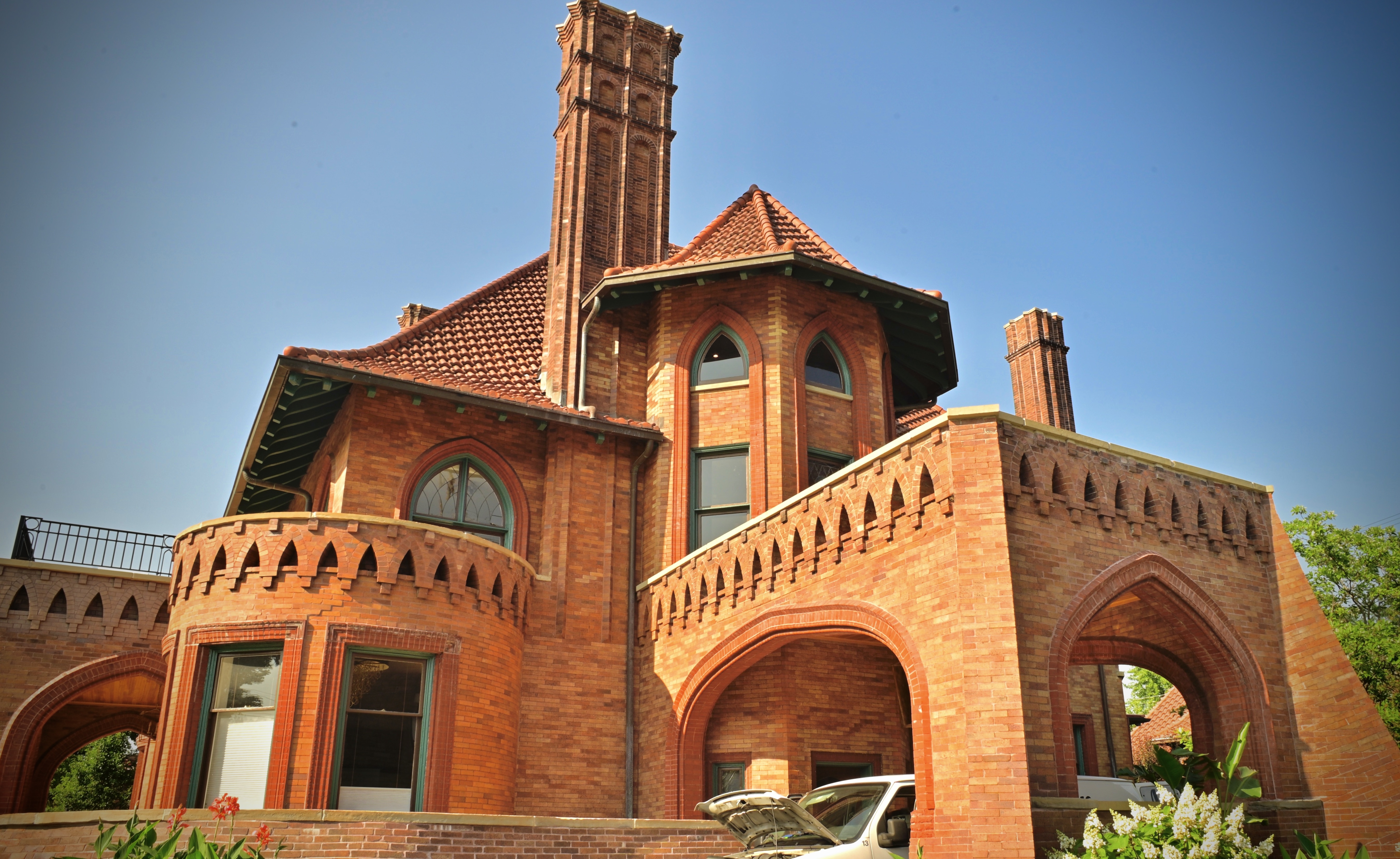
For the photographer, the Circus House is more than a bit…daunting. Capturing the strange curvatures of its twin turrets, its swooping, multi-angled roof, its jutting twin chimneys or its scalloped brick trim (suggesting, some say, the bottom fringes of the roof of a circus tent), all in a single frame, is nearly impossible. For one thing, circling the structure, one finds that it looks completely different every ten feet you walk. This seems to dictate the use of a “crowd it in there” optic like a wide-angle lens, which further exaggerates the wild bends and turns of the thing, making features like the huge porte-corchiere loom even larger than they appear in reality.
Finally I decided to be at peace with the inherent distortion of a wide lens, as if it were somehow appropriate to this bigger-than-life space. Like the best circus, the Sells house has many things going on at once, often more than even the average three-ring managerie. Architecture as a kind of personalized signature, long after its namesakes have faded into history, creates a visual legacy that photographers use to chart who we were, or more precisely, who we hoped to be.
THROUGH A GLASS, DARKLY
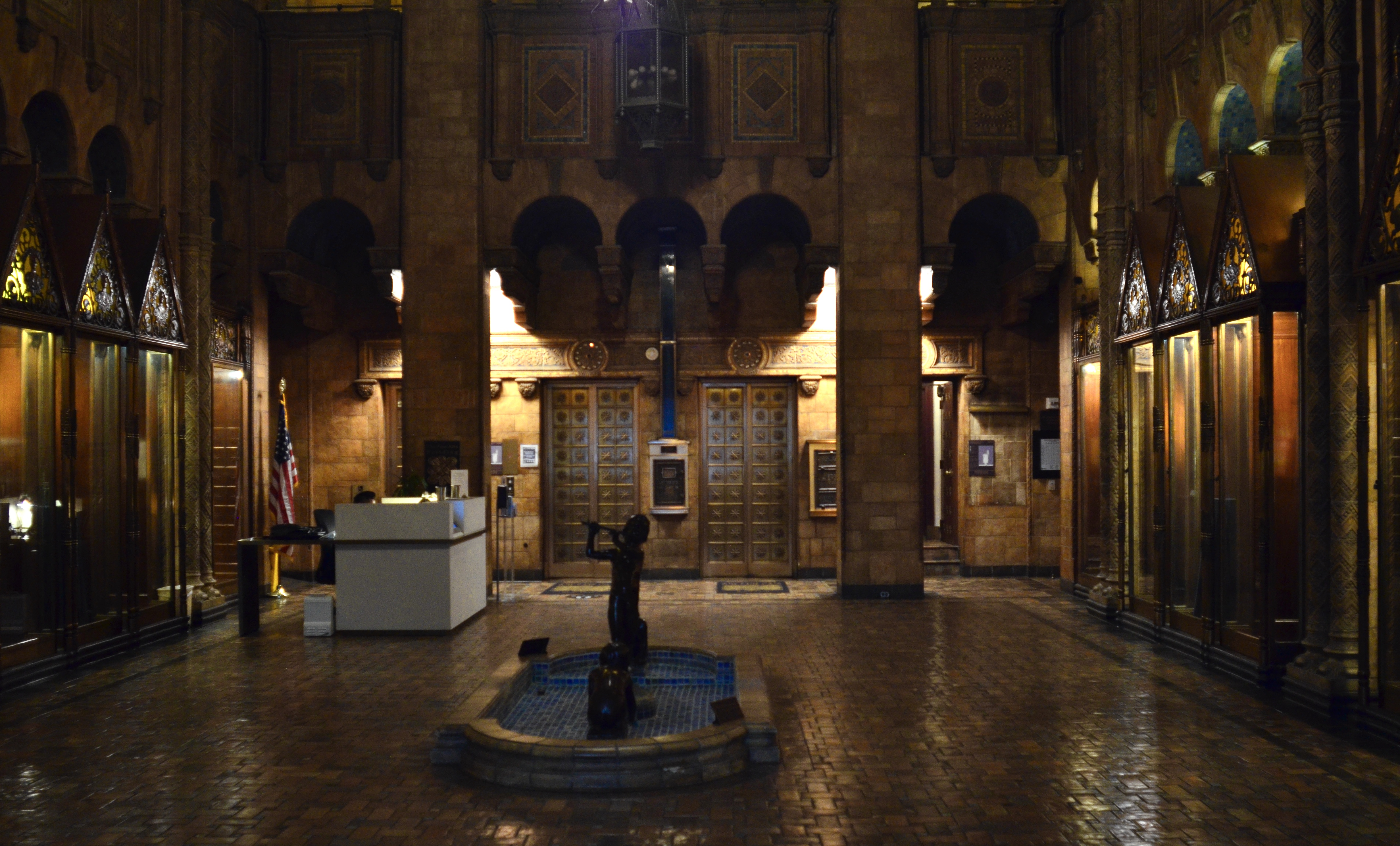
Handheld, manual through-the-front-window exposure of the interior of Los Angeles’ Fine Arts Building.
By MICHAEL PERKINS
SHOW ME A SOLID LOCKED DOOR and I’ll tell you what I’m imagining as to what lies beyond it.
Show me a locked door with a pane of glass in it, and I’ll tell you what my next photograph will be.
We’ve all been on our share of historic urban tours in which really great buildings are viewable only as exteriors. Many sites that used to be everyday places of business are now at least partially protected from the prying peepers of passersby (alliteration fans rejoice!), usually by barring access to their interiors. And it seems to also be true that the juiciest lobbies and entries are described by the tour guides with the phrase, “unfortunately, we can’t go inside..but you can peep through the glass..”
Well, peeping is great, as far as it goes, but, since I’m packing a camera anyway, I always decide to add to my ever-growing go-for-broke file of near misses and happy accidents and snap something, anything. The potential in the gamble is often a bigger thrill than the actual results, but, oh, well.
Here we see the interior of the venerable Fine Arts Building, which opened in downtown Los Angeles in 1927. The outside of the place is a grandiose beaux-arts birthday cake of excess, and the builders were no more restrained when it came to the lobby, some of which, being multi-storied, is cut off from view here. But what delights within immediate eye-shot! I was jammed flat up against the glass to fend off reflections and glare and set my trusty old Nikkor 24mm manual prime for ISO 800 at 1/50th of a second. Since I was some distance from the rear lobby wall, I could shoot wide open at f/2.8 and focus on infinity. Some lights were on, but luckily they were indirect, and so, were not rendered too glow-y or globb-y by the extreme aperture. The whole thing was a matter of some fifteen seconds, and luckily the tour group had only moved on a few yards by the time I was done.
I am a firm believer that you louse up 100% of the shots you don’t try, so I always have a whatthehell attitude toward any flops or flukes. Because a barrier can be the end of an experience, or just the gateway to the rest of it.
THE CURRENTS OF THESE STREETS
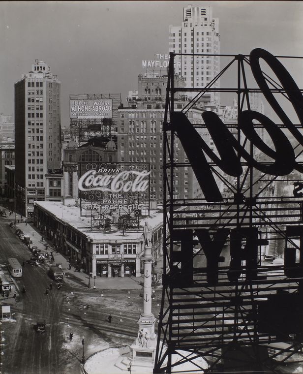
Berenice Abbott’s view of Columbus Circle, from her 1938 opus Changing New York
By MICHAEL PERKINS
WHEN IT FIRST APPEARED IN 1939, photographer Berenice Abbott’s comprehensive visual essay Changing New York had already weathered several years of bitter struggle over its content, a debate between Abbott’s New Deal-era sponsors at the Federal Art Project and her publisher, E.P.Dutton, over just what kind of book it should be. Berenice and her partner, writer Elizabeth McCausland, envisioned the tour of the the five boroughs as a documentary, at a time when the very term itself was new, with virtually no one agreed on what it even meant. Abbott’s idea for the book was to show skyscrapers and shacks, apartment towers and wharf warehouses, side-by-side, to illustrate the constancy of evolution, of a city that not only never slept but hardly ever slowed down. Meanwhile the Feds and Dutton had their own separate agendas, resulting in a fierce tug-of-war over the final configuration of CNY. In the end, Abbott was forced to severely modulate her vision. However, in the broad sweep of history, even her “mutilated” masterpiece proved essential, not only in the history of New York but in the development of photography as a fine art.
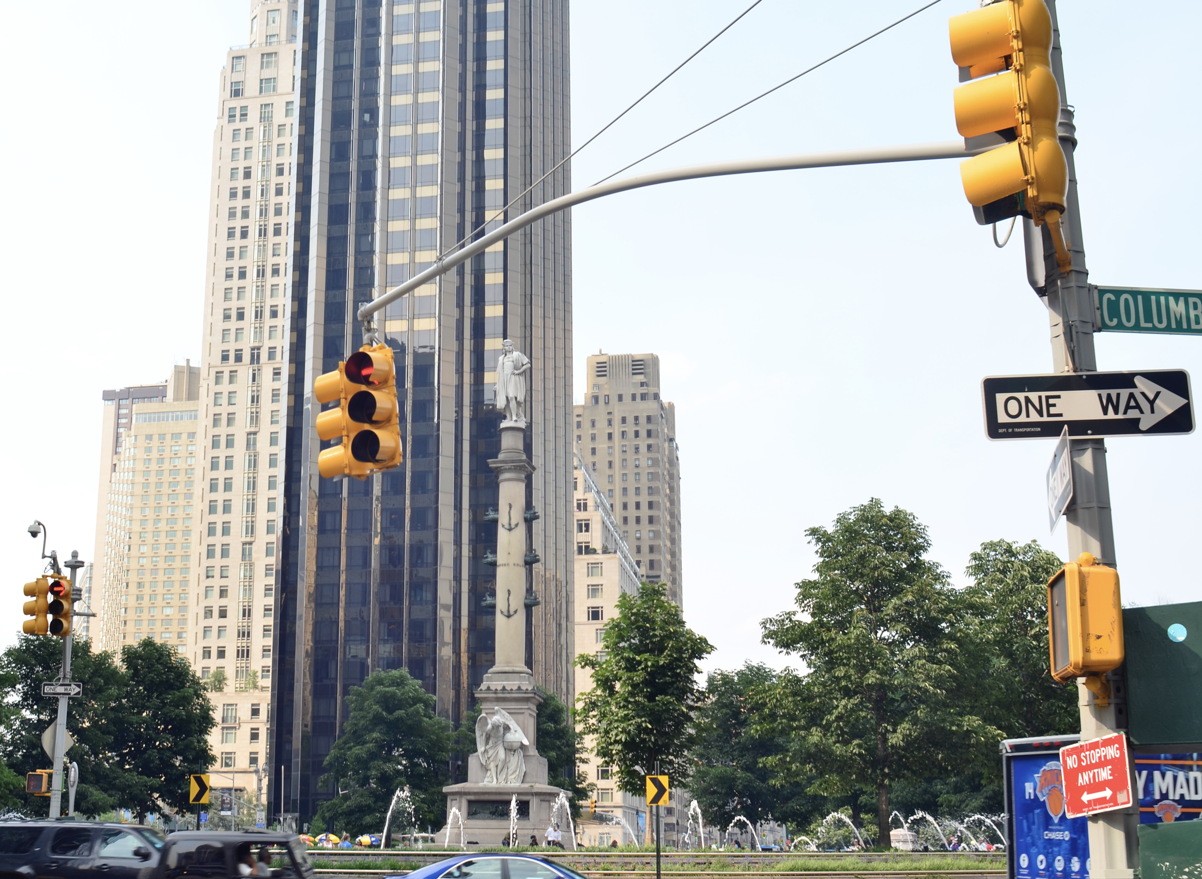
A 2015 view from the same angle. Goodbye, Coca Cola, goodbye Mayflower hotel.
Over the years, I have seldom been without a copy of Changing New York, which began as a collection of over 300 plates and was published with just under 100. Different “restored” or “complete” versions continue in print to the present day, and the reader is welcome to embrace Abbott and McCausland’s original sequence and text, or an exhaustive compendium of everything she shot, and draw his/her own conclusions. With the past year involving a lot of looking over my shoulder at my own accumulated photographic output, I recently found that, quite unintentionally, I have, over the last twenty years or so, made pictures of several of the very same street scenes that were covered in CNY, creating a very personal “before and after” comparison between the Manhattan of 1939 and that of today. In a few cases, many of the players….buildings, transport systems, street configurations…have remained remarkably stable. By contrast, a look at the two images of Columbus Circle shown here, Abbott’s from 1938 and my own from 2015, may as well be comparisons of the sun and the moon.
We tend to think of cities as static things, as fixed objects which are always “there”. And, in the case of a few mile markers like the Empire State or the Statue of Liberty, that’s certainly true. But in general, urban areas are being both created and destroyed every day, the currents of their streets ebbing and flowing. Abbott tried to demonstrate this in the New York of the Depression years, a time when convulsive social change, tremendous economic disparity and an uncertain future showed a city that had already begun to obliterate its pre-1900 past in the name of progress. Despite the art-by-committee compromises that Dutton and the FAP visited upon the first version of Changing New York, Berenice Abbott succeeded better than she could have known in giving us a detailed, unsentimental record of the way of cities in The American Century. And today, when we make our own pilgrimages to those same streets, we cannot help peering through her viewfinder in pursuit of our personal visions.
OH, THAT TOWERING FEELING
 By MICHAEL PERKINS
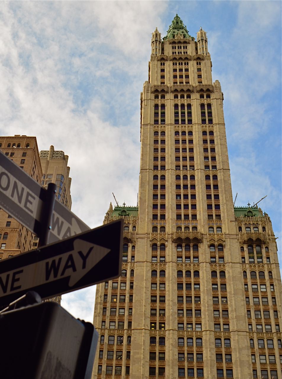
THE AMERICAN SKYSCRAPERS OF THE EARLY TWENTIETH CENTURY are the closet modern equivalent to the pyramids of ancient Egypt, in intention if not in design. Both types of structures are bids for immortality by powerful individuals looking to make a permanent record of their temporary successes, to proclaim I was here in bold characters and broad gestures.
Frank W. Woolworth, whose “five-and-dime” stores defined discount retail for generations, decided, in 1910, to essentially generate his own ludicrously overwrought headstone, which sprung, two years later, to the then-insane height of 792 feet, at 195 Broadway in lower Manhattan, catty-corner from the New York City Hall. Architect Cass Gilbert, whose beaux-arts styling suggested a transplantation of the values of old-world Rome and Greece to the USA, was contracted by Woolworth for the creation of his redolent redoubt, a project that effectively kick-started the first golden age of the American skyscraper and reigned as tallest building in the world for nearly seventeen years. Gilbert’s ongoing homage to classical architecture, seen in such landmarks as the U.S. Supreme Court building, resulted in a structure that resembled a gothic cathedral, minus the pesky God parts.
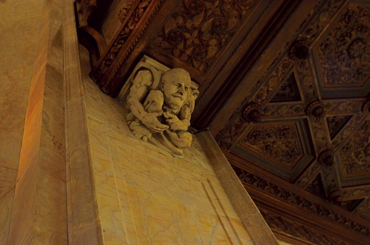
A cartoonish Frank Woolworth counts nickels and dimes, perched atop a pillar flanking his namesake building’s elevator lobby.
Indeed, the only “deity” enshrined in the Woolworth was Frank W., himself, his surname initial crowning dozens of doors and panels and his visage captured in the image you see here, a sculpted caricature of the magnate counting…what else?….coins (Illustrator Thomas Johnson also inspired similar carved likenesses of architect Gilbert and other key players in the tower project).
Open once more to guided tours in recent years (following a post 9/11 security lockdown), the Woolworth’s riot of rich woods, veined marble, stained glass and whimsical ornamentation are a treasure trove for photographers. To encourage your own visit, I’ve created a small gallery from my own, viewable by clicking the page tab marked The Wonderful Woolworth, seen at the top of this page.
In terms of technical specs, all images were shot handheld in existing light (flash would be worthless there, even were it permitted) with a manual 24mm Nikkor wide-angle shooting at apertures of either f/4 or f/2.8, shutter speeds from 1/13 to 1/60 of a second, and ISOs ranging from 1250 to 1600. But in terms of just being able to walk inside Cass Gilbert’s politely profane Edwardian birthday cake, you won’t need a camera to come away with some astounding memories.
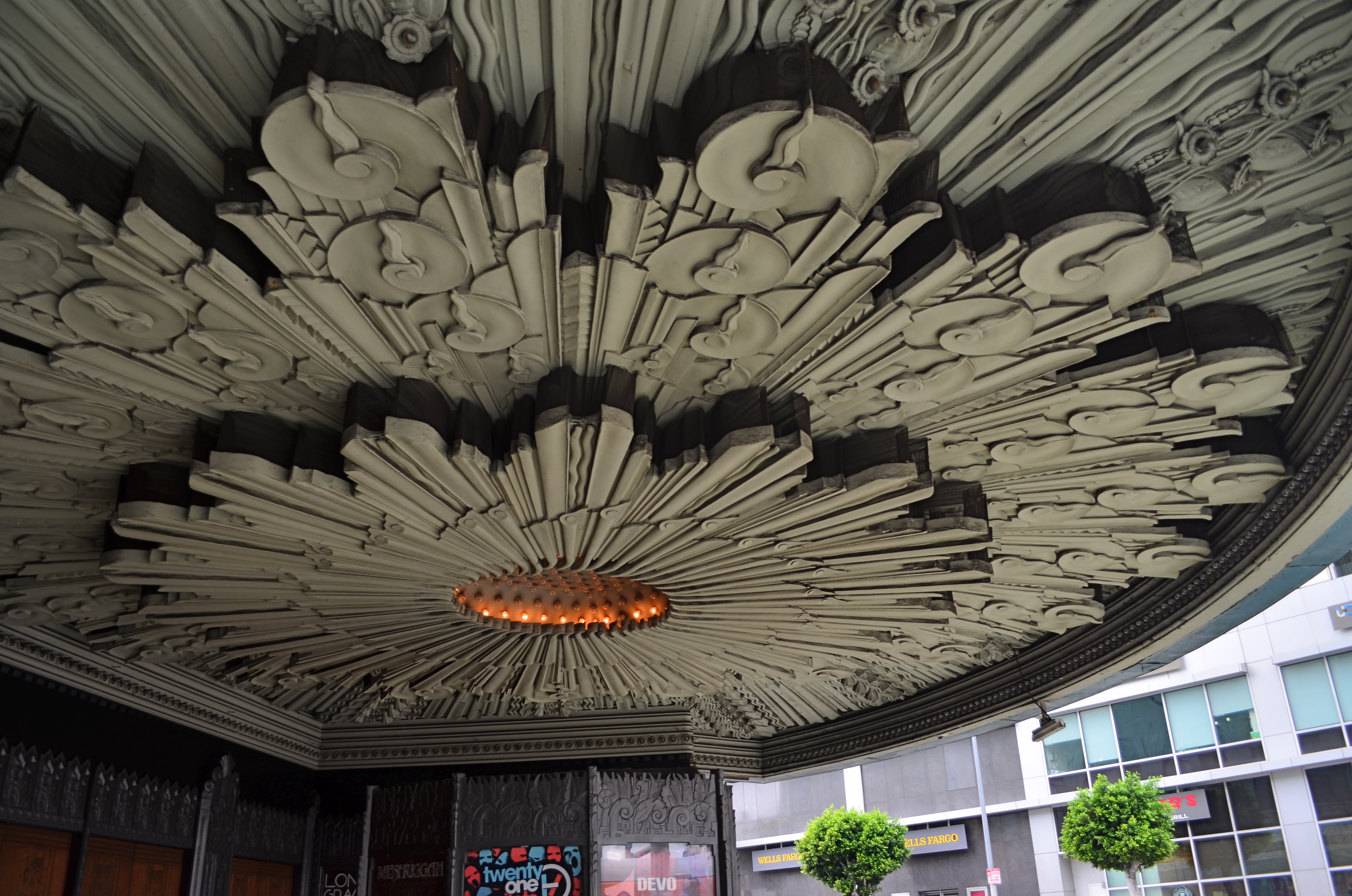
A SMALLER PIECE OF CAKE

Molder plaster designs line the underside of the marquee of Los Angeles’ Deco masterpiece, The Wiltern Theatre.
By MICHAEL PERKINS
IN A HOUSE CRAMMED WITH LUXURIANT COFFEE TABLE BOOKS ON PHOTOGRAPHY, my most lovingly thumbed volumes seem to center on studies of Art Deco architecture, a subject which provides me with endless enjoyment. Some books touch on overall moderne design, but most are specific reference works on the zigzags, chevrons, whorls and curves of buildings, clad in this seductive, streamlined celebration of style. Similarly, my travel plans over the years involve sticking pins in the globe to indicate the fattest troves of these buildings, mapping my strategies for someday capturing them inside a box. It’s a bucket list, if buckets had been designed by Walter Dorwin Teague or Norman bel Geddes.
The original framing of the above shot, complete with other distracting details.
Shooting Deco buildings can humble one, since the sheer volume of decorative accents in a single skyscraper could consume a coffee table book all its own. Deco may use fewer details or lines to suggest an idea compared to earlier eras, but it is still undeniably busy. Some truly extreme edifices, such as Los Angeles’ Pantages Theatre, can nearly give you claustrophobia. These places were certainly meant to be looked at, but, to our contemporary eye, trying to take them “all in” is a little like sending your eye on a three-day bender. This also means that, for photographers, trying to tell a complete story in a single image is pert nigh impossible.
To that thought, I have spent several years going over shoots of Deco buildings that originally involved, say, thirty to forty images, only to find that, even when I was trying to break these giant birthday cakes into smaller slices, there was still enough going on, even in the edited shots, to warrant a second, third, or even fourth “sub-cropping”. One such place, also in L.A., is the giant faux-jade tower known as the Wiltern Theatre, so named because it occupies a corner at the intersection of WILshire Boulevard and WesTERN Avenue. The place was originally the Hollywood capstone of the Warner Brothers theatre chain, and survives today as a live performance space (think alt-rock meets emo). Point a camera anywhere, and you’ll harvest a click-ton of exuberant, exploding ornamentation.
The large shot seen at the top of the page is but one section of the glorious molded plaster overhang beneath the Wiltern’s marquee. The inset image at left is the larger master shot, in which I originally thought I was keeping it simple by limiting the frame to the lower part of the front right corner of the building. Turns out that even this “tighter” composition was too busy, hence the more radical crop to a smaller part of the pattern. On the way to the final edit, I also flipped the design upside down to make it splay out more dramatically and converted the dull gun-metal green to blue for a little extra romance.
All of which seems to be yet another re-hash of the old “less is more” argument. Simplify, simplify, grab the stone from my hand, grasshopper, etc., etc. Art Deco is a style in which the devil (the delight?) is most definitely in the details. Some are so incredible that it seems a sin to have them vanish into large, comprehensive uber-shots of big buildings, rather than being given the loving attention they deserve. And certainly, for photographers, there are other such visual birthday cakes that are more appetizing if you simply cut yourself a smaller slice.
INVISIBLE CITIES
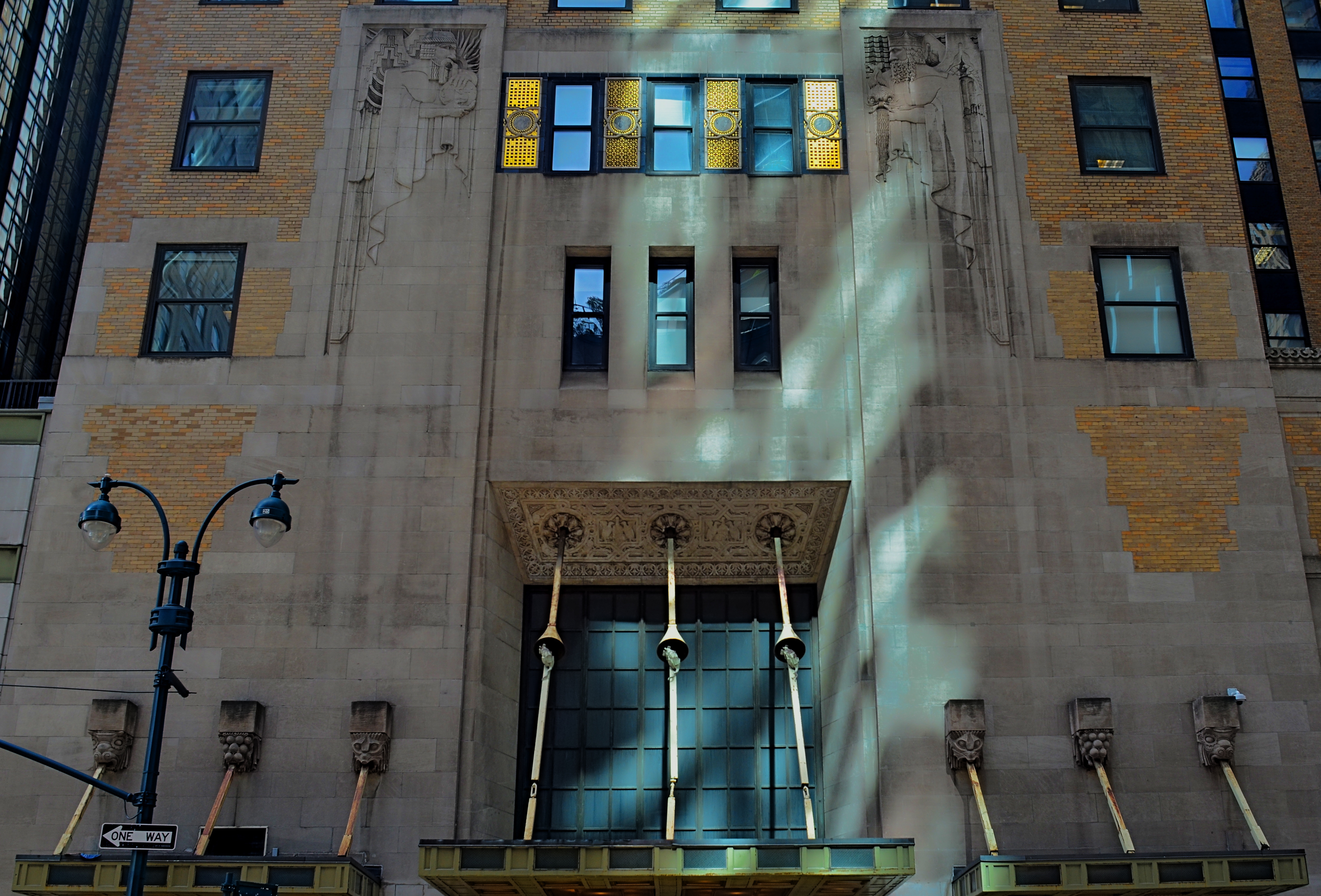
New York is one of the great treasure troves for lovers of Art Deco. This complex, along Lexington Avenue, is literally in the shadow of the Chrysler building.
By MICHAEL PERKINS
THERE IS, IN THE WORLD OF SPORTS, A PSYCHOLOGICAL EDGE known as the “home field advantage”, wherein a team can turn a superior knowledge of its native turf against its visiting opponent. The accuracy of this belief has never been conclusively proven, but it’s interesting to think on whether it applies to photography as well. Do we, for the purposes of making pictures, know our own local bailiwicks better than visitors ever can? Or is it, as I suspect, the dead opposite?
Familiarity may not breed contempt, but, when it comes to our seeing everything in our native surroundings with an artistic eye, it can breed a kind of invisibility, a failing to see something that has long since receded into the back part of our attention, and thus stops registering as something to see anew, or with fresh interpretation. How many buildings on the street we take into the office are still standouts in our mind’s eye? How many objects would we be amazed to learn are actually part of our walk home, and yet “unseen” by us as we mentally drift along that drab journey?
It may be that there is actually a decided “out-of-towner” advantage in visiting a place where you have no pre-conceptions or habitual routes, in approaching things and places in cities as totally new, free of prior associations. I’ve often been asked of an image, “where did you take that?” only to inform the questioner that the building in the picture is a half block from their place of business. The above image was taken on Lexington Avenue in Manhattan, not more than a half block and across the street from the Chrysler building. It is a gorgeous treasure of design cues every bit as symbolic of the golden age of Art Deco as its aluminum clad neighbor, and yet I could hold a contest amongst many New Yorkers as to where or what it is and never have to award the prize money. The Chrysler’s very fame eclipses its neighbors, rendering them less visible.
Perception is at the heart of every visual art, and the most difficult things to re-imagine are the ones which have ceased to strike us as special. And since everyone lives in a city that is at least partly invisible to them, it stands to reason that an outside eye can make its own “something new” out of everyone else’s “something old”. Realize and celebrate your special power as a photographic outlier.
GLASS DISTINCTIONS
It went “zip” when it moved and “bop” when it stopped,
And “whirr” when it stood still.
I never knew just what it was and I guess I never will.
Tom Paxton, The Marvelous Toy
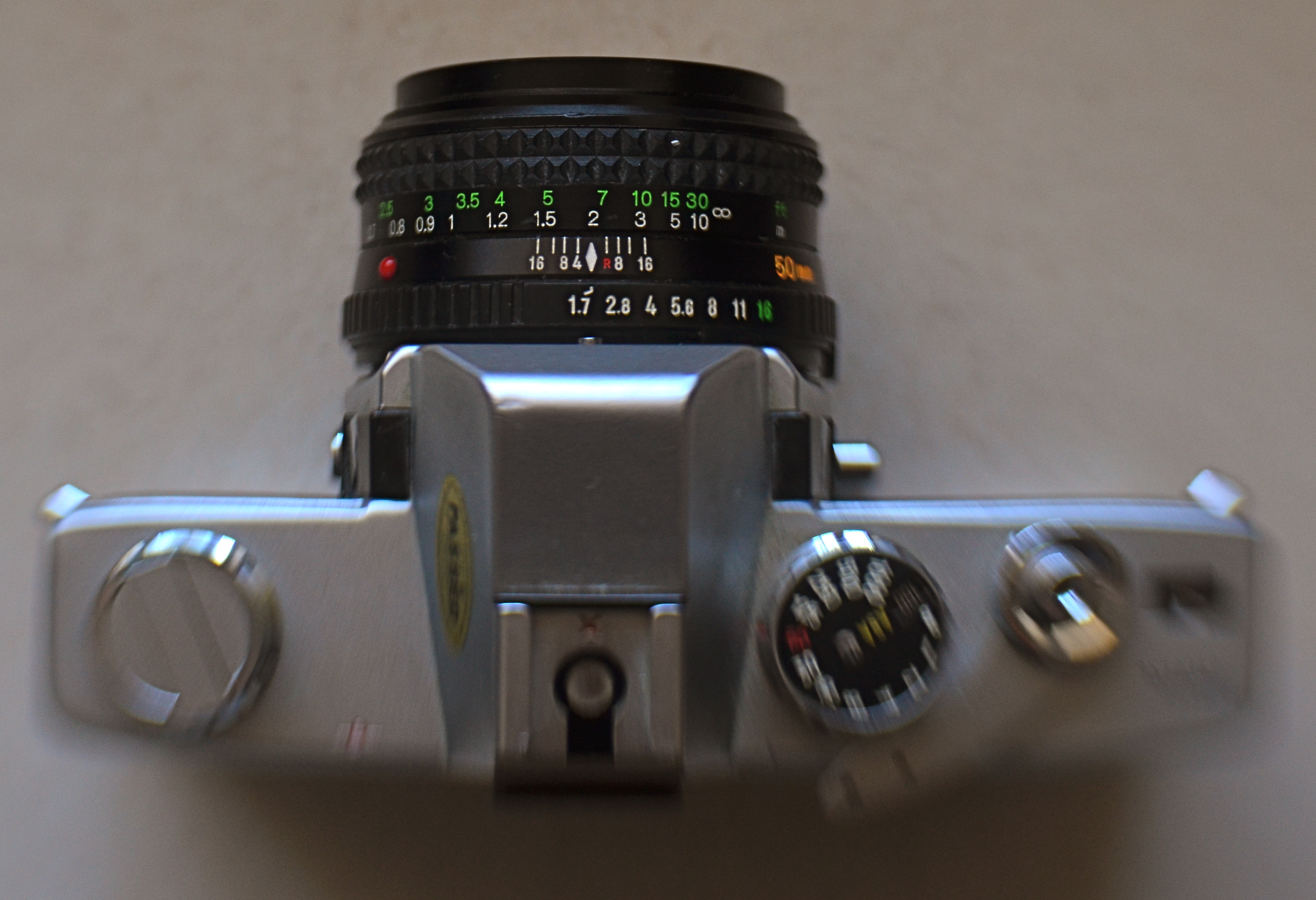
My antedeluvian Minolta SRT-500 camera body, crowned by its original f/1.7 50mm prime kit lens. Guess which part is worth its weight in gold?
By MICHAEL PERKINS
THERE ARE MORE OLD LENSES THAN THERE ARE OLD CAMERAS. There’s a reason for this. Bodies come and go like spring and fall dress collections. Lenses are the solid, reliable blue jeans that never go out of style. Lenses hold their value for decades, often selling for (or even above) their original asking prices. Bodies become landfill.
Many times, when people believe they have outgrown their cameras, they are actually just in need of glass that performs better. The importance of selecting a lens is as important in the digital age as it was in the film era. The eye through which you visualize your dreams has to be clear and precise, and so does the thinking that goes into its selection. That process, for me, breaks down into three main phases.
First, before you buy anything, raise a prayer of thanks for the Holy Internet. There is, now, not only no need, but also no excuse to buy the wrong lens. Read the manufacturer’s press releases. The reviews from both pros and amateurs nearest your own skill level. And be ecumenical about it. Read articles by people who hate the lens you think you love. Hey, better to ID a problem child before he’s living under your roof. Watch the Youtube videos on basics, like how to unpack the thing, how many parts it has, how to rotate the geetus located to the left of the whatsit to turn it on. Find out how light efficient it is, because the freer you are of flash units and tripods, the better for your photography. And, at this early shopping stage, as with all other stages, keep asking yourself the tough questions. Do I really need another lens, or do I just need to be better with what I already own (which is cheaper)? Will it allow me to make pictures that I can’t currently make? Most importantly, in six months, will it be my “go-to”, or another wondrous toy sleeping in my sock drawer?
Assuming that you actually do buy a new lens after all that due diligence, nail it onto your camera and force yourself to use it exclusively for a concentrated period. Take it on every kind of shoot and force it to make every kind of picture, especially the ones that seem counter-intuitive. Is it a great zoom? Well, hey, it might make an acceptable macro lens as well. But you’ll never know unless you try. You can’t even say what the limits of a given piece of glass are until you attempt to exceed them. Find out how well it performs at every aperture, every distance, every f/stop. Each lens has a sweet spot of optimum focus, and while that may be the standard two stops above wide open, don’t assume that. Take lots of bad pictures with the lens (this part is really easy, especially at the beginning). They will teach you more than the luck-outs.
Final phase: boot camp for you personally. Now that you have this bright shiny new plaything, rise to the level of what it offers. Prove that you needed it by making the best pictures of your life with it. Change how you see, plan, execute, edit, process, and story-tell. See if the lens can be stretched to do the work of several of your other lenses, the better to slim down your profile, reduce the junk hanging around your neck, and speed up your reaction time to changing conditions.
Work it until you can’t imagine how you ever got along without it.
LOOKS LIKE IT WORKS
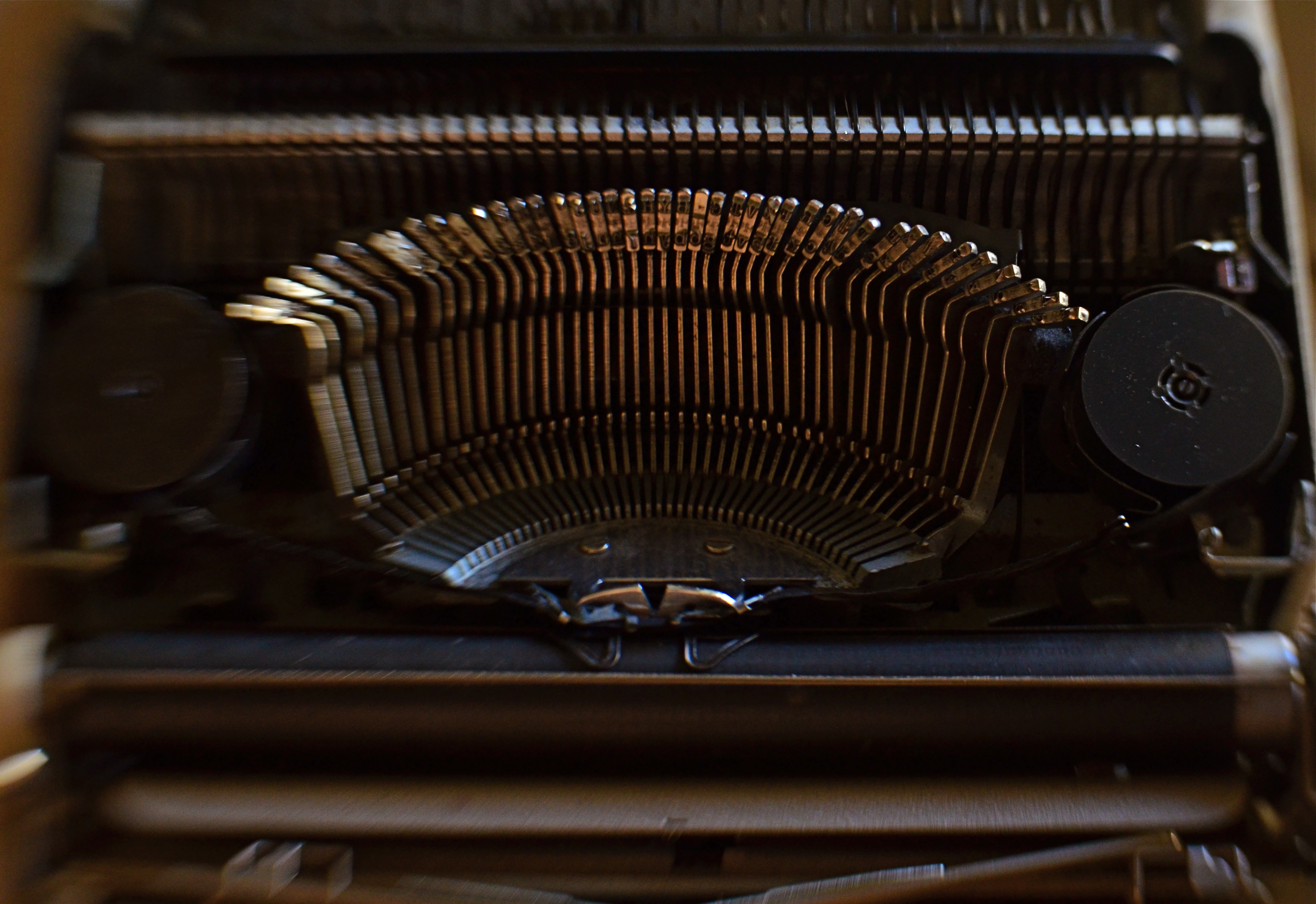
Ghost Writer In Disguise, 2016
By MICHAEL PERKINS
PHOTOGRAPHY OFTEN RE-DEFINES OUR PERCEPTION OF THE FAMILIAR, re-contextualizing everyday objects in ways that force us to see them differently. Nowhere is this more effective than in close-up and macro photography, where we deliberately isolate or magnify details of things so that they lose their typical associations. Indeed, using the camera to cast subjects in unfamiliar ways is one of the most delightful challenges of the art.
Product developers are comfortable with the idea that “form follows function”, that how we use a thing will usually dictate how it must be designed. The shapes and contours of the objects in our world are arrived at only as we tailor the look of a thing to what it does. That’s why we don’t have square wheels. The problem with familiar objects is that, as long as they do what they were designed to do, we think less and less about the elegance of their physical design. Photographers can take things out of this chain of the mundane, and, in showcasing them, force us to see them in purely visual terms. They stop playing the piano, and instead look under the lid at the elegant machine within. They strip off the service panel of the printer and show us the ballet of circuitry underneath.
It’s even easier to do this, and yields more dramatic results, as we begin to re-investigate those things that have almost completely passed from daily use. To our 21st-century eyes, a 1910 stock ticker might as well be an alien spaceship, so far removed is it from typical experience. I recently viewed a permanent wave machine from a beauty parlor of the 1930’s, sitting on a forgotten table at a flea market. It took me two full minutes to figure out what I was even looking at. Did I snap it? You betcha.
The study of bygone function is also a magical mystery tour of design innovation. You start to suss out why the Edisons of the world needed this shape, these materials, arranged in precisely this way, to make these things work. Zooming in for a tighter look, as in the case of the typewriter in the above image, forces a certain viewpoint, creating compositions of absolute shapes, free to be whatever we need them to be. Form becomes our function.
The same transformation can happen when you have seemingly exhausted a familiar subject, or shot away at it until your brain freezes and no new truth seems to be coming forth. Walking away from the project for a while, even a few hours, often reboots your attitude towards it, and the image begins to emerge. As Yogi Berra said, you can observe a lot just by watching.
LOOKING FOR AN OPENING
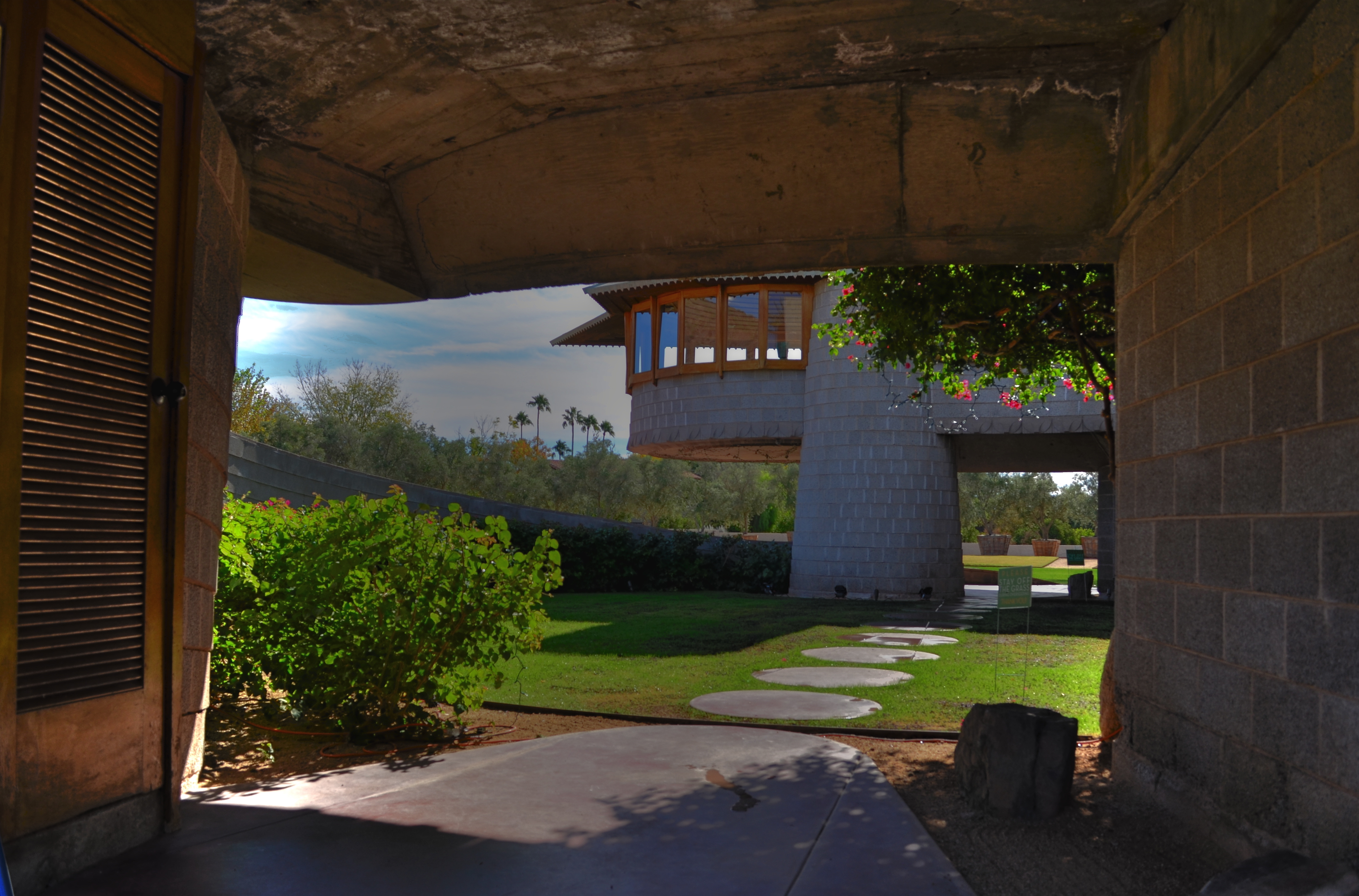
Entering a Frank Lloyd Wright home is like unwrapping a birthday present. The concrete walk ends in a circular ramp that rises to the left and around the David Wright house to create this wonderful open space.
By MICHAEL PERKINS
IF A HOME CAN BE SAID TO BE AN EVENT, then a door is the engraved invitation that bids you to witness that event. When you think about it, a door is the most crucial part of a house’s design, certainly its most deliberately provocative. It advertises and defines what lies within. It’s a grand tease to a mystery, the last barrier before you invade someone’s most personal space. It’s no wonder that entrances to places are among the most photographed objects on the planet. The subject is as inexhaustibly varied as the people who construct these lovely masks.
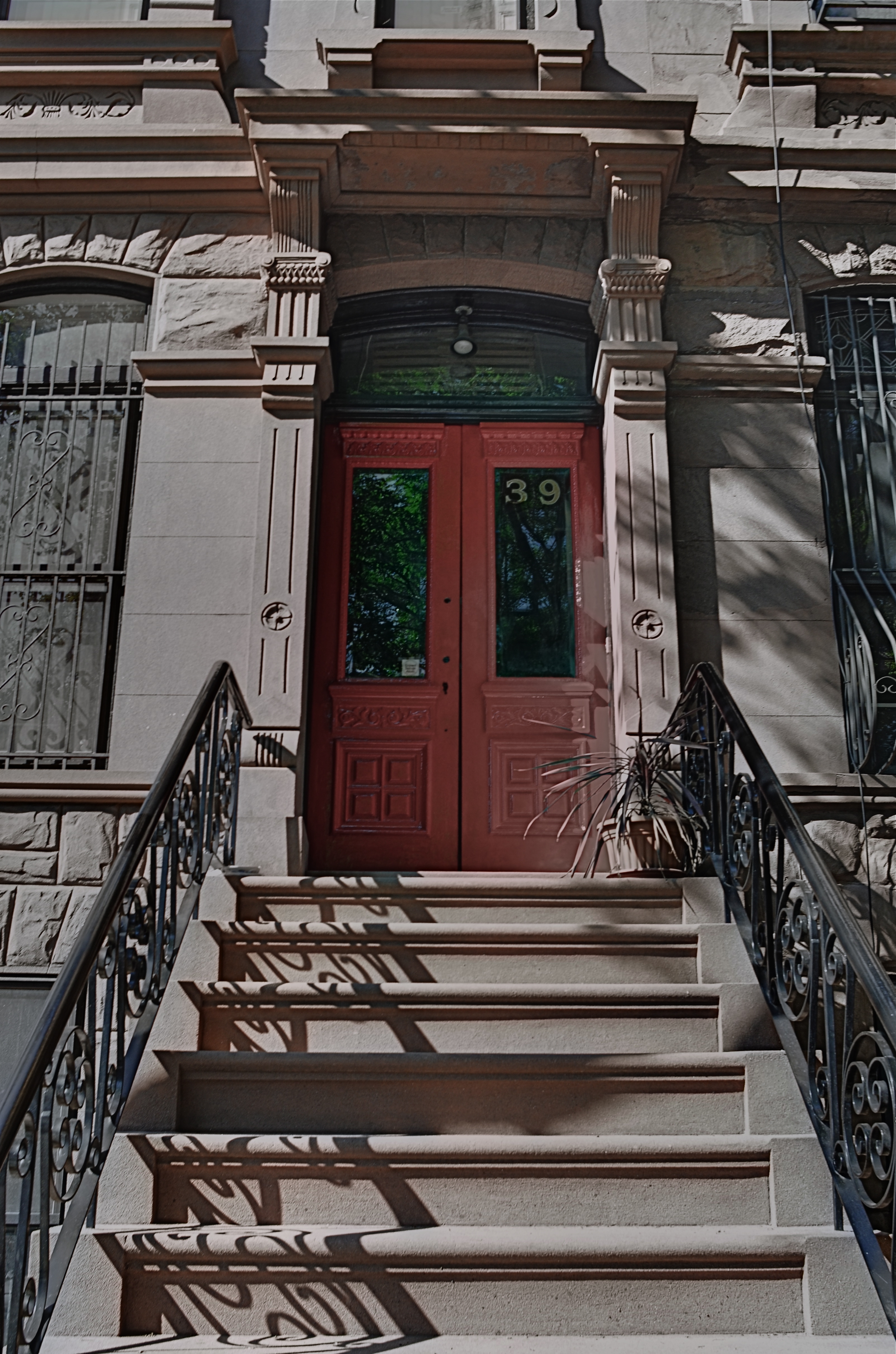
Doors are the first story tellers in a house.
Frank Lloyd Wright did more than create drama as you entered one of his houses; he actually enlisted you in generating your own wonder. Often the great man made you a little squirmy as you prepared to come inside, compressing door heights and widths to slightly uncomfortable dimensions. Pausing for a moment, you could almost feel like Alice after she ate the wrong cake, as if you might never be able to wriggle through the door frame.
Shortly after this ordeal, however, Wright would let the full dimensions of the inner house open suddenly and dramatically, as he does in the image above, taken at the home that he designed for his son David in Phoenix, Arizona. After ducking your head, you step into a court that has…no ceiling…since it ends in a ramp that both climbs around and supports a house that encircles you, creating an intimate courtyard that is both confined and limitless.
Doors make statements, almost boasts, about the wonder that lies just inches beyond them, and, like all generators of mystery, they are often most interesting when the question is never answered. Doors we never see beyond are often the most intriguing, like a woman behind a veil. When I invade a new neighborhood, my camera’s eye goes to doors before anything else. Sometimes the spaces they conceal don’t live up to the hype, but doors, these stage productions at the front of grand and humble abodes alike, offer something tantalizing to the eye.
A WONDROUS MESS
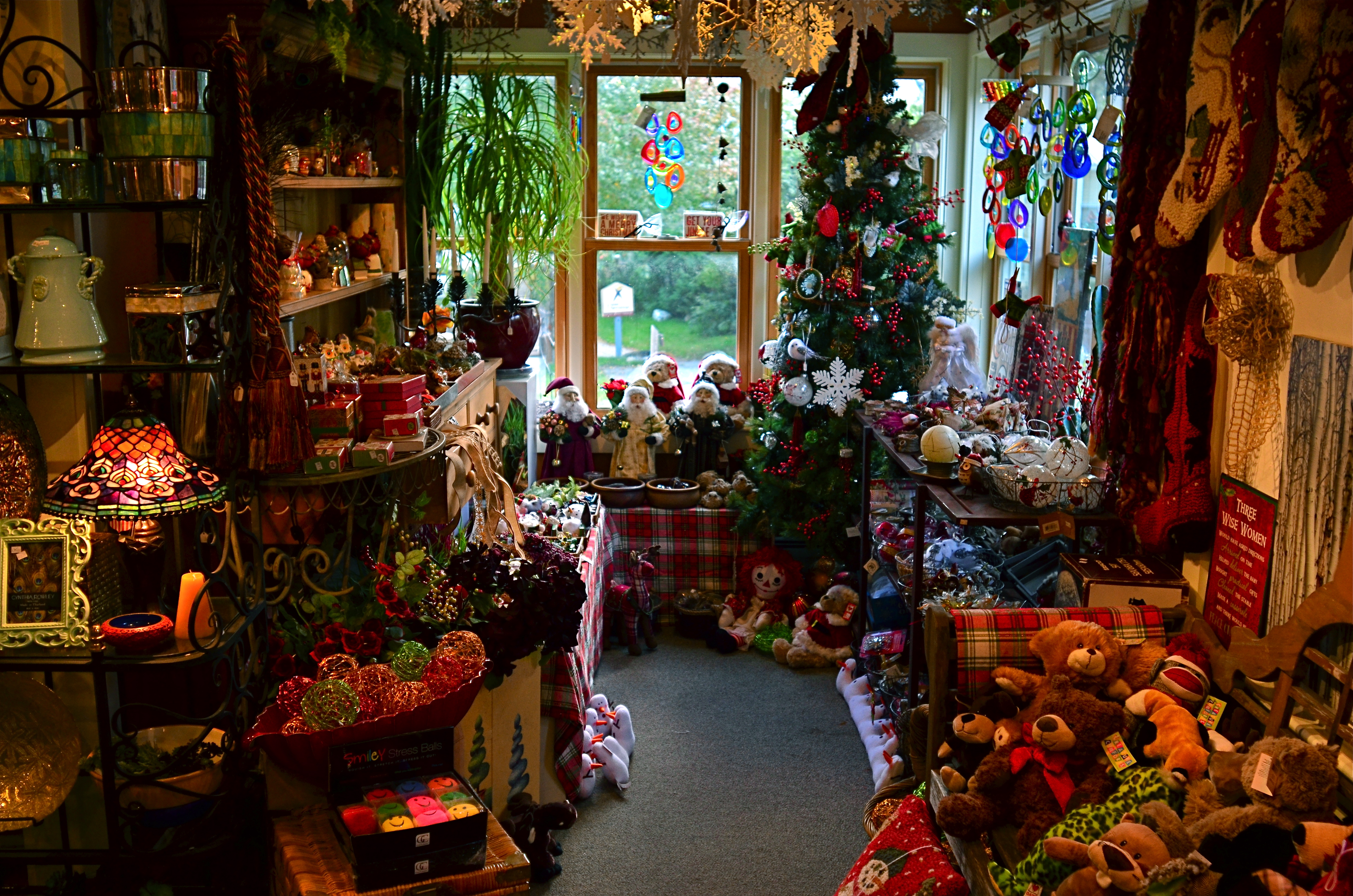
Too busy? Well, when it comes to seasonal shots, it’s a lot harder to say.
By MICHAEL PERKINS
Consulting the rules of composition before taking a photograph is like consulting the laws of gravity before going for a walk.
Edward Weston
PHOTOGRAPHERS LOVE TO COMPILE LISTS OF LAWS that must be obeyed to ensure the capture of great images. Bookshelves are jammed to fracturing with the collected works of wizards large and small who contend that all of this art stuff is really about craft, or adherence to techniques that are the equivalent of Einstein’s law. And, of course, with every fresh generation, a new slew of shooters come sneering along to deride this starched and stuffy discipline. All that matters, these young turks snigger, is my grand vision.
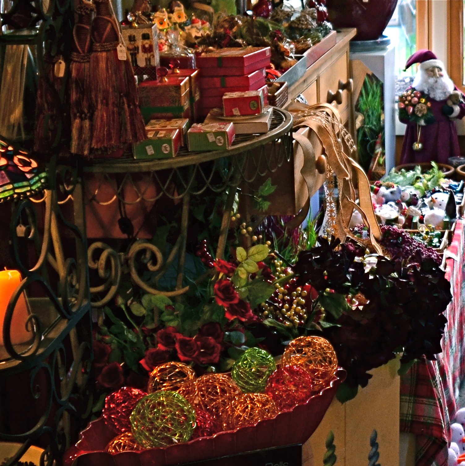
Worlds within worlds: many vast holiday scenes can be “subdivided with cropping.
Let me again re-state the obvious, which is that both viewpoints are correct and/or totally wrong. And since Mr. Weston has introduced the subject of composition, let us consider the special task of seasonal photos, specifically, arrangements of yuletide objects. The classic rule on still-life shots is that less is more, that it’s better to perfectly light and expose three pieces of fruit than whole baskets of the stuff. Meanwhile the festive, instinctual artist concedes that many holiday scenes are mad with detail and crammed with more, more, more…..and that’s okay.
The unique thing about Christmas decor is that in many cases, you not creating the compositions, but merely reacting to someone else’s creations…in nativity scenes, churches, and especially in retail environments. Obviously your local department store doesn’t adhere to the admonition “keep it simple”; quite the opposite. Seasonal trim in most stores is served up not by the spoonful but by the truckload. Anything less than overkill seems skimpy to many yuletide decorators, and so, if you favor basic subject matter, you’re either going to have to mount your own arrangements or selectively zoom and crop the more congested scenes. If, however, you already subscribe to the idea that more is better, then life gets easy fast.
Holidays come layered in much that is intensely personal, and that makes clean compositional judgements about “how much” or “how little” tricky at best. Just get the feelings right and let your regular rules relax into guidelines.
THROUGH A FUZZY CRYSTAL
Naysayers about the future of smartphone cameras are due for a major news flash.
By MICHAEL PERKINS
I GENERALLY STAY OUT OF THE PREDICTION BUSINESS, and with good reason. Anyone who sets himself up in the prophecy business had better keep his day job, a truth which has been demonstrated time and again by any number of junior league wizards who believe they know how to read the tea leaves in Tomorrowland. That’s why I have always kept the pages of The Normal Eye pretty free of excess doses of prognostication on what’s next or what’s inevitable regarding photography.
However, even though it’s foolish to cite specific equipment or inventions as “proof” that a new day has arrived, it’s often obvious when something of a tipping point is coming that will transform the entire process of making pictures. And I feel confident that we are now at one of those points as the latest smartphone cameras begin the blurring, if not the erasure, of difference between photography in mobile devices and photography from traditional gear, especially, for the first time, DSLRs.
The main gist of this tipping point is the ability of mobiles, finally, to allow for manual override of many camera functions that were, in earlier years, completely automated. Phone cameras in their original iteration were an all-or-nothing proposition, in that you clicked and hoped that the device’s auto settings would serve up an acceptable image. As for any kind of artistic control, you had to try to intervene after the shutter snap, via apps. It was the opposite of the personal control that was baked into DLSRs, and many photographers rightly balked at abandoning their Nikons and Canons for what was essentially a compact point-and-shoot.
But we are suddenly in very different territory now. The newest models by a variety of smartphone manufacturers will not only offer shooting apertures as wide as f/1.8, drastically increasing the flow of light to the camera’s sensors, but will also give shooters the option to either tap-customize a variety of shooting settings on-screen, or merely leave the device on full auto. The ability to override factory defaults is what separates the camera men from the camera boys, so this, in the words of Joe Biden, is a big &%$#ing deal. It means that many photographers who never even considered doing their “serious” shooting on a smartphone might at least mull over the option of leaving their full-function DSLRs at home, at least occasionally.
It would be foolish to predict the wholesale desertion of capital “C” Cameras by the shooting public, since such changes never come about for everyone at one time. Plenty of people continued to ride horses after the first flivvers rattled out of the factory. But there is certainly a major debate on the horizon about how much, and what kind of camera allows you to get the shot, easier and more of the time.
And getting the shot, as we know, is all that has ever mattered. All the rest is cheek music.
URBAN MIX
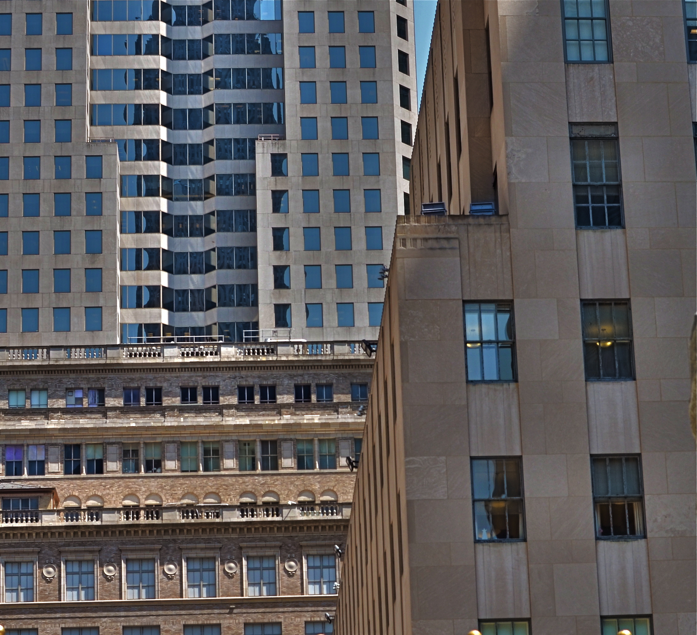
Competing architectural styles establish a natural rhythm of conflict in major cities.
By MICHAEL PERKINS
EACH MAJOR URBAN CENTER HAS ITS PHOTOGRAPHIC SUPERSTARS, those destination attractions that are documented to death by shooters great and small. Name the city and you can rattle off the names of the usual suspects. The landmarks. The legends. The here’s-proof-that-I-was-there vacation pictures. Meanwhile, the rest of the buildings within our super-cities, that is the majority of the remaining structures on most streets everywhere, remain under-photographed and, largely, unknown.
Part of the problem is our photographic viewpoint, which apes our human viewpoint. As drivers or pedestrians, we necessarily focus most our attention at events topping out at just about two stories above street level. This means we will almost certainly n0t see the mashup of architectural styles just outside our peripheral range. We don’t follow the visual line of buildings all the way up, either because we are walking, or because we don’t want to look like some out-of-town rube. But there is real drama in the collision of all those unseen details, and, if you’re interested in showing the city as an abstract design, some real opportunities.
I find that shooting toward the intersection of parts of three or more buildings amplifies the contrast between design eras, with doric columns and oak clusters crashing into International style glass boxes, overlayed with Art Deco zigzags. I shoot them with standard lenses instead of zooms to preserve the intensity of color and contrast, then create the final frame I want in the cropping. Zooms also tend to flatten things out, making buildings that are actually hundreds of feet from each other appear to be in single flat plane. Regular lenses keep the size and distance relationships relatively intact.
Importantly, I don’t shoot entrances, emblems, signage, anything that would specifically identify any one building, and I steer away from places that are recognizable in a touristy way. I’m not really interested in these buildings in their familiar context, but as part of a larger pattern, so I don’t want to “name” things in the image since it will draw away interest from other elements.
The city is a concrete (sorry) thing, but it is also a rich puzzle of design that offers almost infinite variety for the photographer. Best thing is, these compositions are just inches away from where you were bored to death, just a second ago.
