FADE TO (ALMOST) BLACK
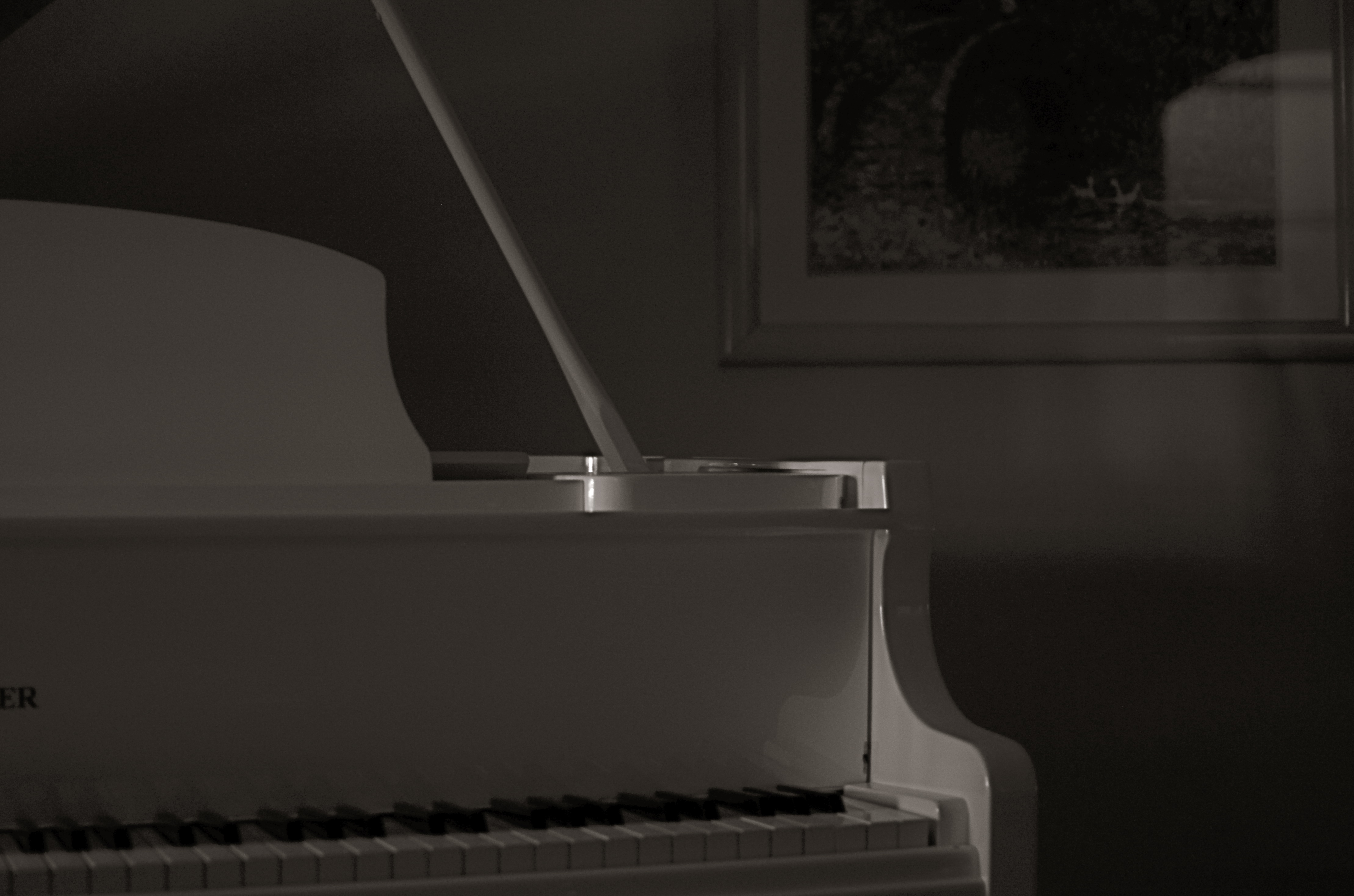
Sometimes a change in the technical approach to a shot is the only way to freshen an old subject. 1/40 sec., f/1.8, ISO 250, 35mm.
By MICHAEL PERKINS
I KNOW MANY PHOTOGRAPHERS WHO SUBJECT THEMSELVES TO THE DELICIOUS TORTURE, known to authors everywhere,as “publish or perish”, or, in visual terms, the tyranny of shooting something every single day of their lives. There are lots of theories afloat as to whether this artificially imposed discipline speeds one’s development, or somehow pumps their imagination into the bulky heft of an overworked bicep. You must decide, o seekers of truth, what merit any of this has. I myself have tried to maintain this kind of terrifying homework assignment, and during some periods I actually manage it, for a while at least. But there are roadblocks, and one of the chief barriers to doing shot-a-day photography is subject matter, or rather the lack of it.
I’ve shot in this space for years, and therein lies the challenge. 1/40 sec., f/2.2, ISO 250, 35mm.
Let’s face it: even if you live one canyon away from the most breathtaking view on earth or walk the streets of the mightiest metropolis, you will occasionally look upon your immediate environs as a bad rerun of Gilligan’s Island, something you just can’t bear to look at without having a wastebasket handy. Familiarity breeds contempt for some subjects that you’ve visited and re-visited, and so, for me, the only way to re-mix old material is to re-imagine my technical approach to it. This is still a poor substitute for a truly fresh challenge, but it can teach you a lot about interpretation, which has transformed more than a few mundane subjects for me over a lifetime of shuttering (and shuddering).
As an example, a corner of my living room has been one of the most trampled-over crime scenes of my photographic life. The louvered shades which flank my piano can create, over the course of a day, almost any kind of light, allowing me to use the space for quick table-top macros, abstract arrangements of shadows, or still lifes of furnishings. And yet, on rainy /boring days, I still turn to this corner of the house to try something new with the admittedly over-worked material. Lately I have under-exposed compositions in black and white, coming as near a total blackout as I can to try to reduce any objects to fundamental arrangements of light and shadow. In fact, damn near the entire frame is shadow, something which works better in monochrome. Color simply prettifies things too much, inviting the wrong kind of distracted eye wandering in areas of the shot that I don’t think of as essential.
I crank the aperture wide open (or nearly) to keep a narrow depth of field, which renders most of the image pretty soft. I pinch down the window light until there is almost no illumination on anything, and allow the ISO to float around at least 250. I get a filmic, grainy, gauzy look which is really just shapes and light. It’s very minimalistic, but it allows me to milk something fresh out of objects that I’ve really over-photographed. If you believe that context is everything, then taking a new technical approach to an old subject can, in fact, create new context. Fading almost to black is one thing to try when you’re stuck in the house on a rainy day.
Especially if there’s nothing on TV except Gilligan.
GIVE IT YOUR WORST SHOT

Are you going to say that Robert Capa’s picture of the D-day invasion would speak any more eloquently if it were razor-sharp? I didn’t think so.
By MICHAEL PERKINS
THE EARLY YEARNING OF PHOTOGRAPHERS TO MASTER OR EXCEED THE TECHNICAL LIMITS OF THEIR MEDIUM led, in the 1800’s, to a search for visual “perfection”. For rendering tones accurately. For capturing details faithfully. And, above all, for tight, sharp focus. This all made perfect sense in an era when films were so slow that people sitting for portraits had to have steel rods running up the backs of their necks to help them endure three-minute exposures. Now, mere mechanical perfection long since having become possible in photography, it’s time to think of what works in a picture first, and what grade we get on our technical “report card” second.
This means that we need no longer reject a shot on technical grounds alone, so long as it succeeds on some other platform, especially an emotional one. Further, we have to review and even re-review images, by ourselves as well as others, that we think “failed” in one way or another, and ask ourself for a new definition of what “failure” means. Did the less-than-tack-sharp focus interfere with the overall story? Did the underexposed sections of the frame detract from the messaging of what was more conventionally lit? Look to the left. at Robert Capa’s iconic image of the D-Day invasion at Normandy. He was just a little busy dodging German snipers to fuss with pinpoint focusing, but I believe that the world jury has pretty much ruled on the value of this “failed” photo. So look inward at the process you use to evaluate your own work. Give it your worst shot, if you will, and see what you think now, today.
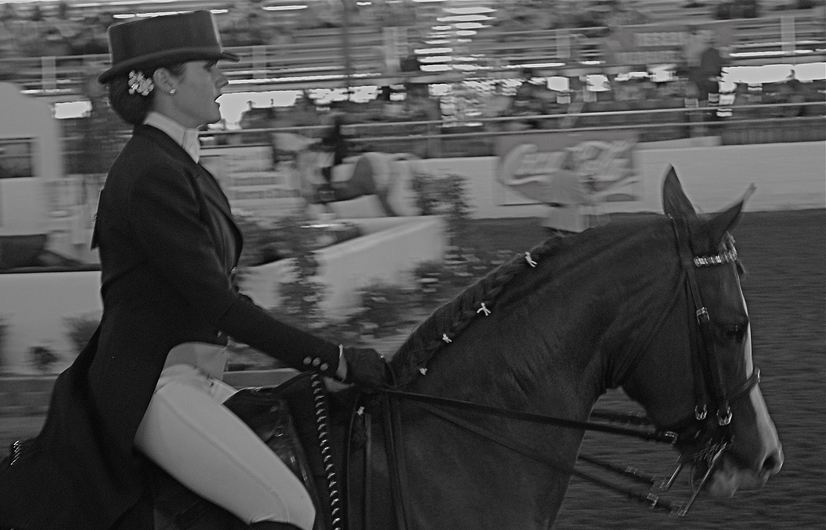
The Last Burst, 2008. 1/80 sec., f/5.6, ISO 800, 50mm.
The above image came from a largely frustrating day a few years back at a horse show in which I spent all my effort trying to freeze the action of the riders, assuming that doing so would deliver some kind of kinetic drama. I may have been right to think along these lines, but doing so made me automatically reject a few shots that, in retrospect, I no longer think of as total failures. The equestrienne in this frame looks as eager, even as exhausted as her mount, and the slight blur in both of them that I originally rejected now seems to work for me. There is a greater blur of the surrounding arena, which is fine, since it’s merely a contextual setting for the foreground figures, but I now have to wonder if I would like the picture better (given that it’s supposed to be suggestive of speed) if the foreground were completely sharp. I’m no longer so sure.
I think that all images have to stand or fall on what they accomplish, regardless of discipline or intention.We only kid ourselves into equating technical perfection with aesthetic success. Sometimes they walk into the room hand in hand. Other times they arrive in separate cars.
ANATOMY OF A BOTCH

This murky mess is barely tolerable in monochrome. 1/25 sec., f/3.5, ISO 1250, 18mm.
By MICHAEL PERKINS
THERE SHOULD BE A MIRROR-IMAGE, “NEGATIVE” COOKBOOK FOR EVERY REGULAR ONE PUBLISHED, since there are recipes for inedible failures, just as surely as there are ones for gustatory delights. It might be genuinely instructive to read an article called How To Turn A Would-Be Apple Pie Into A Shapeless Heap Of Glop or You, Too Can Make Barbecue Ribs Look Like The Aftermath Of A Cremation. So too, in photography, I believe I could easily pen an essay called How To Take Pictures That Make It Seem That You Never Touched A Camera Before.
In fact…..
In recent days, I’ve been giving myself an extra welt or two with the flagellation belt in horrified reaction to a shoot that I just flat-out blew.It was a walk through a classic hotel lobby, a real “someday” destination for myself that I finally got to visit and wanted eagerly to photograph. Thing is, none of that desire made it into the frames. Nor did any sense of drama, art, composition, or the basics of even seeing. It’s rare that you crank off as many shots as I did on a subject and wind up with a big steaming pile of nothing to show for it, but in this case, I seem to have been all thumbs, including ten extra ones where my toes should be.
So, if I were to write a negative recipe for a shoot, it would certainly contain a few vital tips:
First, make sure you know nothing about the subject you’re shooting. I mean, why would you waste your valuable time learning about the layout or history of a place when you can just aimlessly wander around and whale away? Maybe you’ll get lucky. Yeah, that’s what makes great photographs, luck.
Enjoy the delightful surprise of discovering that there is less light inside your location than inside the fourth basement of a coal mine. Feel free to lean upon your camera to supply what you don’t have, i.e., a tripod or a brain. Crank up the ISO and make sure that you get something on the sensor, even if it’s goo and grit. And shoot near any windows you have, since blowouts look so artsy contrasted with pitch blackness.
Resist the urge to have any plan or blueprint for your shooting. Hey, you’re an artist. The brilliance will just flow as you sweep your camera around. Be spontaneous. Or clueless. Or maybe you can’t tell the difference.
Stir vigorously and for an insane length of time with a photo processing program, trying to manipulate your way to a useful image. You won’t get there, but life is a journey, right? Even when you’re hopelessly lost in a deep dark forest.
************************
You could say that I’m being too Catholic about this, and I would counter that I’m not being Catholic enough.
Until I do penance.
Gotta go back someday and do it right.
And make something that really cooks.
THE MAIN POINT
By MICHAEL PERKINS
MAKING PICTURES, FOR ME, IS LIKE MAKING TAFFY. The only good results I get are from stretching and twisting between two extremes. Push and pull. Yank and compress. Stray and stay. Say everything or speak one single word.
This is all about composition, the editing function of what to put in or leave out. In my head, it’s a constant and perpetually churning debate over what finally resides within the frame. No, that needs something more. No, that’s way too much. Cut it. Add it. I love it, it’s complete chaos. I love it, it’s stark and lonely.
Can’t settle the matter, and maybe that’s the point. How can your eye always do the same kind of seeing? How can your heart or mind ever be satisfied with one type of poem or story? Just can’t, that’s all.
But I do have a kind of mental default setting I return to, to keep my tiny little squirrel brain from exploding.

Cat’s Eye Vortex, 2014.1/50 sec., f/2.2, ISO 800, 35mm.
When I need to clean out the pipes, I tend to gravitate to the simplest compositions imaginable, a back-to-basics approach that forces me to see things with the fewest possible elements, then to begin layering little extras back in, hoping I’ll know when to stop. In the case of the above image, I was shooting inside a darkened room with only an old 1939 World’s Fair paperweight for a subject, and holding an ordinary cheap flashlight overhead with one hand as I framed and focused, handheld, with the other hand. I didn’t know what I wanted. It was a fishing expedition, plain and simple. What I soon decided, however, was that, instead of one element, I was actually working with two.
Basic flashlights have no diffusers, and so they project harsh concentric circles as a pattern. Shifting the position of the flashlight seemed to make the paperweight appear to be ringed by eddying waves, orbit trails if you will. Suddenly the mission had changed. I now had something I could use as the center of a little solar system, so, now,for a third element, I needed “satellites” for that realm. Back to the junk drawer for a few cat’s eye marbles. What, you don’t have a bag of marbles in the same drawer with your shaving razor and toothpaste? What kinda weirdo are you?
Shifting the position of the marbles to suggest eccentric orbits, and tilting the light to create the most dramatic shadow ellipses possible gave me what I was looking for….a strange, dreamlike little tabletop galaxy. Snap and done.
Sometimes going back to a place where there are no destinations and no rules help me refocus my eye. Or provides me with the delusion that I’m in charge of some kind of process.
I SEE YOUR FACE BEFORE ME
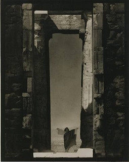
Edward Steichen’s amazing 1921 portrait of dance icon Isadora Duncan beneath a massive arch of the Parthenon in Greece, an image which recently surged to the top of my mind. See a link to a larger view of this shot, below.
By MICHAEL PERKINS
THE IMAGES SIT AT THE BOTTOM OF THE BRAIN, LIKE STONE PILLARS IN THE FOUNDATION OF AN IMMENSE TOWER.The structures erected on top of them, those images we ourselves have fashioned in memory of these foundations, dictate the height and breadth of our own creative edifices. Between these elemental pictures and what we build on top of them, we derive a visual style of our own.
In my own case,many of the pillars that hold up my own house of photography come from a single man.
Edward Steichen is arguably the greatest photographer in history. If that seems like hyperbole, I would humbly suggest that you take a reasonable period of time, say, oh, twenty years or so, just to lightly skim the breadth of his amazing career….from revealing portraits to iconic product shots to nature photography to street journalism and half a dozen other key areas that comprise our collective craft of light writing. His work spans the distance from wet glass plates to color film, from the Edwardian era to the 1960’s, from photography as an insecure imitation of painting to its arrival as a distinct and unique art form in its own right.
At the start of the 20th century, Steichen co-sponsored many of the world’s first formal photographic galleries, and was a major contributor to Camera Work, the first serious magazine dedicated wholly to photography. He ended his career as the creator of the legendary Family Of Man, created in the early 1950’s and still the most celebrated collection of global images ever mounted anywhere on earth. He is, simply, the Moses of photography, towering above many lesser giants whose best work amounts to only a fraction of his own prodigious output.
Which is why I sometimes see fragments of what he saw when I view a subject. I can’t see with his clarity, but through the milky lens of my own vision I sometime detect a flashing speck of what he knew on a much larger scale, decades before. The image at left recently rocketed to my mind’s eye several weeks ago, as I was framing shots inside a large government building in Ohio.In 1921, Steichen journeyed to Greece to use the world’s oldest civilization basically as a prop for portraits of Isadora Duncan, then in the forefront of American avant-garde dance. Framing her at the bottom of an immense arch in the ruins of the Parthenon, he made her appear majestic and minute at the same time, both minimized and deified by the huge proportions in the frame. It is one of the most beautiful compositions I have ever seen, and I urge you to click the Flickr link at the end of this post for a slightly larger view of it. (Also note the link to a great overview of Steichen’s life on Wikipedia.)
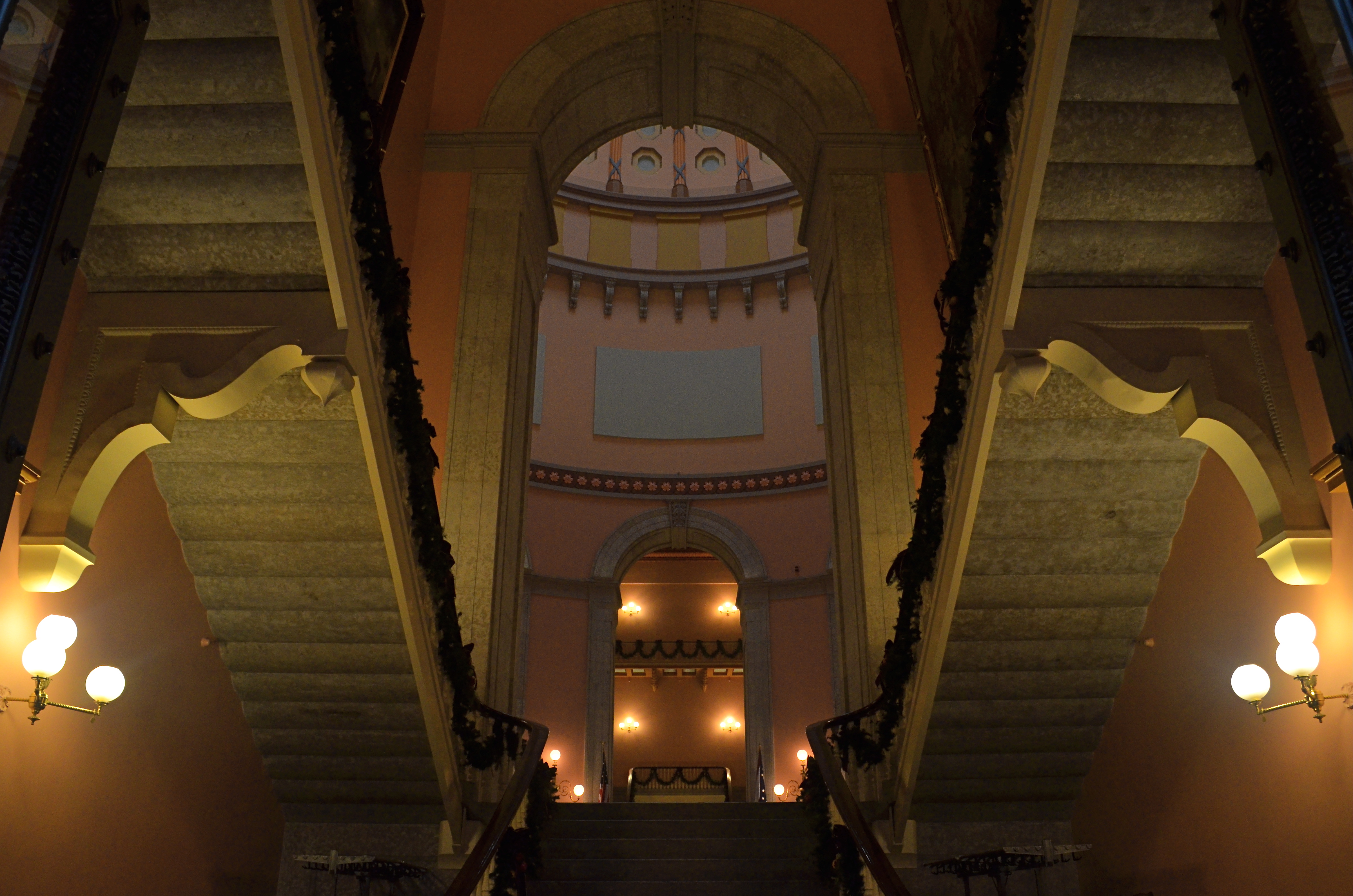
Uplighting creates a moody frame-within-frame feel at the Ohio Statehouse building, in a shot inspired by Edward Steichen’s images of massive arches. 1/30 sec., f/8, ISO 800, 18mm.
In framing a similarly tall arch leading into the rotunda of the Ohio Statehouse in Columbus, I didn’t have a human figure to work with, but I wanted to show the building as a series of major and minor access cavities, in, around, under and through one of its arched entrance to the central lobby. I kept having to back up and step down to get at least a partial view of the rotunda and the arch at the opposite end of the open space included in the frame, which created a kind of left and right bracket for the shot, now flanked by a pair of staircases. Given the overcast sky meekly leaking grey light into the rotunda’s glass cupola, most of the building was shrouded in shadow, so a handheld shot with sufficient depth of field was going to call for jacked-up ISO, and the attendant grungy texture that remains in the darker parts of the shot. But at least I walked away with something.
What kind of something? There is no”object” to the image, no story being told, and sadly, no dancing muse to immortalize. Just an arrangement of color and shape that hit me in some kind of emotional way. That and Steichen, that foundational pillar, calling up to me from the basement:
“Just take the shot.”
Related articles
- The Photograph as a Social Statement (halsmith.wordpress.com)
- Picture Imperfect (andrewsullivan.thedailybeast.com)
- http://www.flickr.com/photos/quelitab/5793648357/lightbox/
- http://en.wikipedia.org/wiki/Edward_Steichen
LOOK THROUGH ANY WINDOW, PART ONE
By MICHAEL PERKINS
THE COMMON THREAD ACROSS ALL THE PHOTO HOW-TO BOOKS EVER WRITTEN IS A WARNING: don’t let all the rules we are discussing here keep you from making a picture. Standardized techniques for exposure, composition, angle, and processing are road maps, not the Ten Commandments. It will become obvious pretty quickly to anyone who makes even a limited study of photography that some of the greatest pictures ever taken color outside the classical lines of “good picture making.” The war photo that captures the moment of death in a blur. The candid that cuts off half the subject’s face. The sunset with blown-out skies or lens flares. Many images outside the realm of “perfection” deliver something immediate and legitimate that goes beyond mere precision. Call it a fist to the gut.

The dawn creeps slowly in on the downtown streets of Monterey, California. A go-for-broke window shot taken under decidedly compromised conditions. 1/15 sec., f/3.5, ISO 640, 18mm.
Conversely, many technically pristine images are absolutely devoid of emotional impact, perfect executions that arrive at the finish line minus a soul. Finally, being happy with our results, despite how far they are from flawless is the animating spirit of art, and feeling. This all starts out with a boost of science, but it ain’t really science at all, is it? If it were, we could just send the camera out by itself, a heart-dead recording instrument like the Mars lander, and remove ourself from the equation entirely.
Thus the common entreaty in every instruction book: shoot it anyway. The only picture that is sure not to “come out” is the one you don’t shoot.
The image at left, of a business building in downtown Monterey, California was almost not taken. If I had been governed only by general how-to rules, I would have simply decided that it was impossible. Lots of reasons “not to”; shooting from a high hotel window at an angle that was nearly guaranteed to pick up a reflection, even taken in a dark room at pre-dawn; the need to be too close to the window to mount a tripod, therefore nixing the chance at a time exposure; and the likelihood that, for a hand-held shot, I would have to jack the camera’s ISO so high that some of the darker parts of the building would be the smudgy consistency of wet ashes.
Still, I couldn’t walk away from it. Mood, energy, atmosphere, something told me to just shoot it anyway.
I didn’t get “perfection”. That particular ideal had been yanked out of my reach, like Lucy pulling away Charlie Brown’s football. But I am glad I tried. (Click on the image to see a more detailed version of the result)
In the next post, a look at another window that threatened to hold a shot hostage, and a solution that rescued it.
Related articles
- 7 Ways to Inject More Creativity Into Your Photos (blogworld.com)
