DANCING IN THE DARK (PARTS ONE AND TWO)
 By MICHAEL PERKINS
UNDER-EXPOSURE, AS A MEANS OF DEEPENING OR SATURATING COLOR, has its supporters in every era of photography. At the same time, the deliberate act of starving an image of light will always strike some as “wrong”, as if there were only a single “right” way to make a picture. You pays yer money and you takes yer choice.
For the purposes of this little coffee talk, when I say “under-exposure”, I am not referring to accidental shots that result from shooting in a low-light situation. Those I call “mistakes” or “bad luck”. I’m speaking here of shots, often done in average or even ideal light, that are planned…for example, setting the camera a few f/stops slower than what would normally be considered “correct”(hate that word). Now, this may seem to be a fairly non-controversial choice, unless, of course, you open the whole thing up to debate, which is always trouble.
Turns out there are two distinct camps regarding under-exposure: those who prefer to expose the shot as normal, custom-crafting the darker shot in post, and those who would rather do everything in-camera. Some of the fix-it later crowd claim that digital, by itself, doesn’t produce good under-exposures the way that the old slide films did without some outside assistance. By contrast, the in-cammers, my home team, believe that not shooting in the moment results in too many opportunities lost. The subject is here, now. The lighting, which you can do almost anything with, is here, now. Your brain, and any active experimentation for not only the exposure strategy, but the strategy for every part of the capture process is here, in real time, now. I can’t imagine surrendering even a smidge of that control to hope you can, in effect, second-guess yourself later in the editing suite.
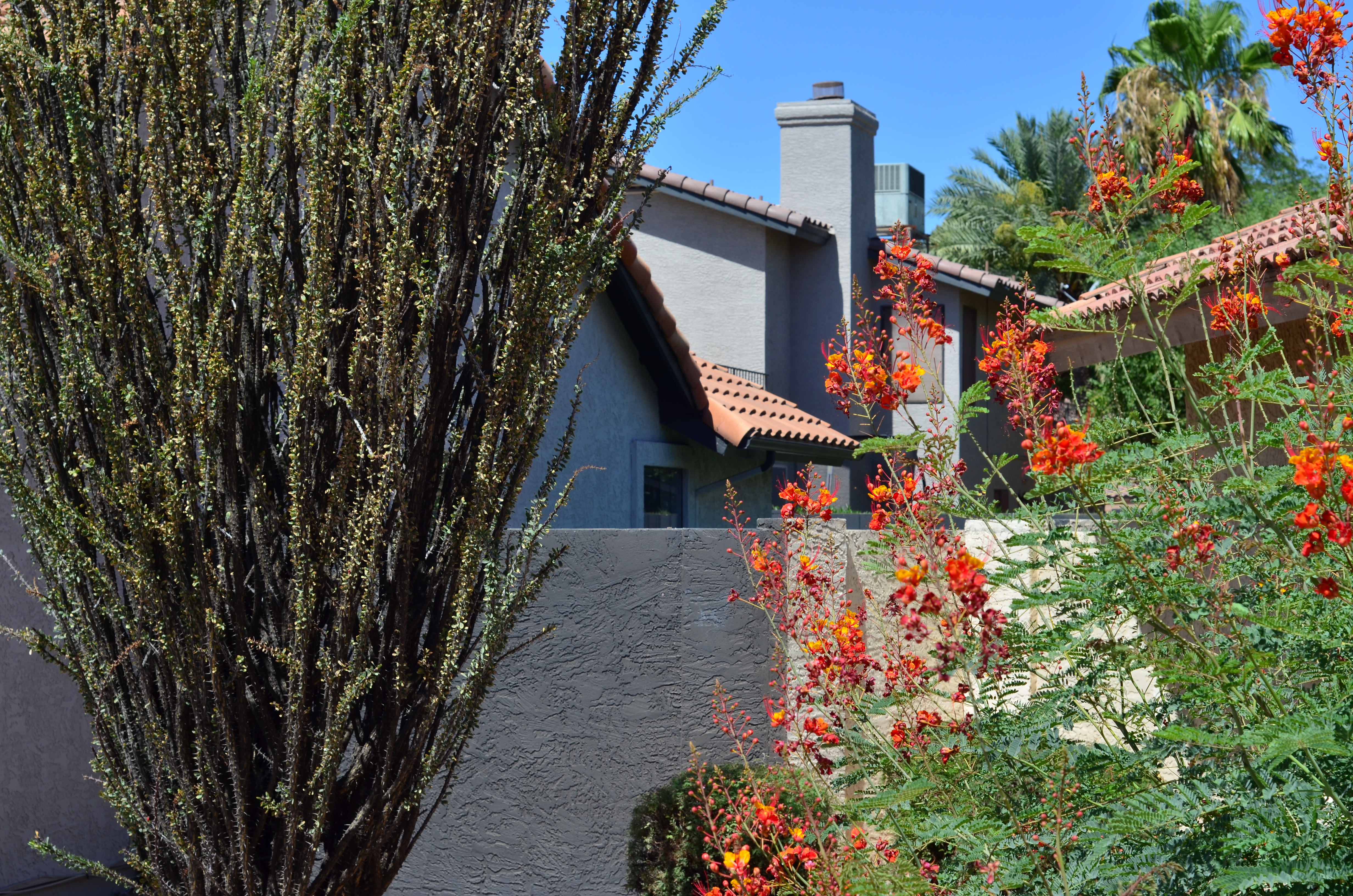
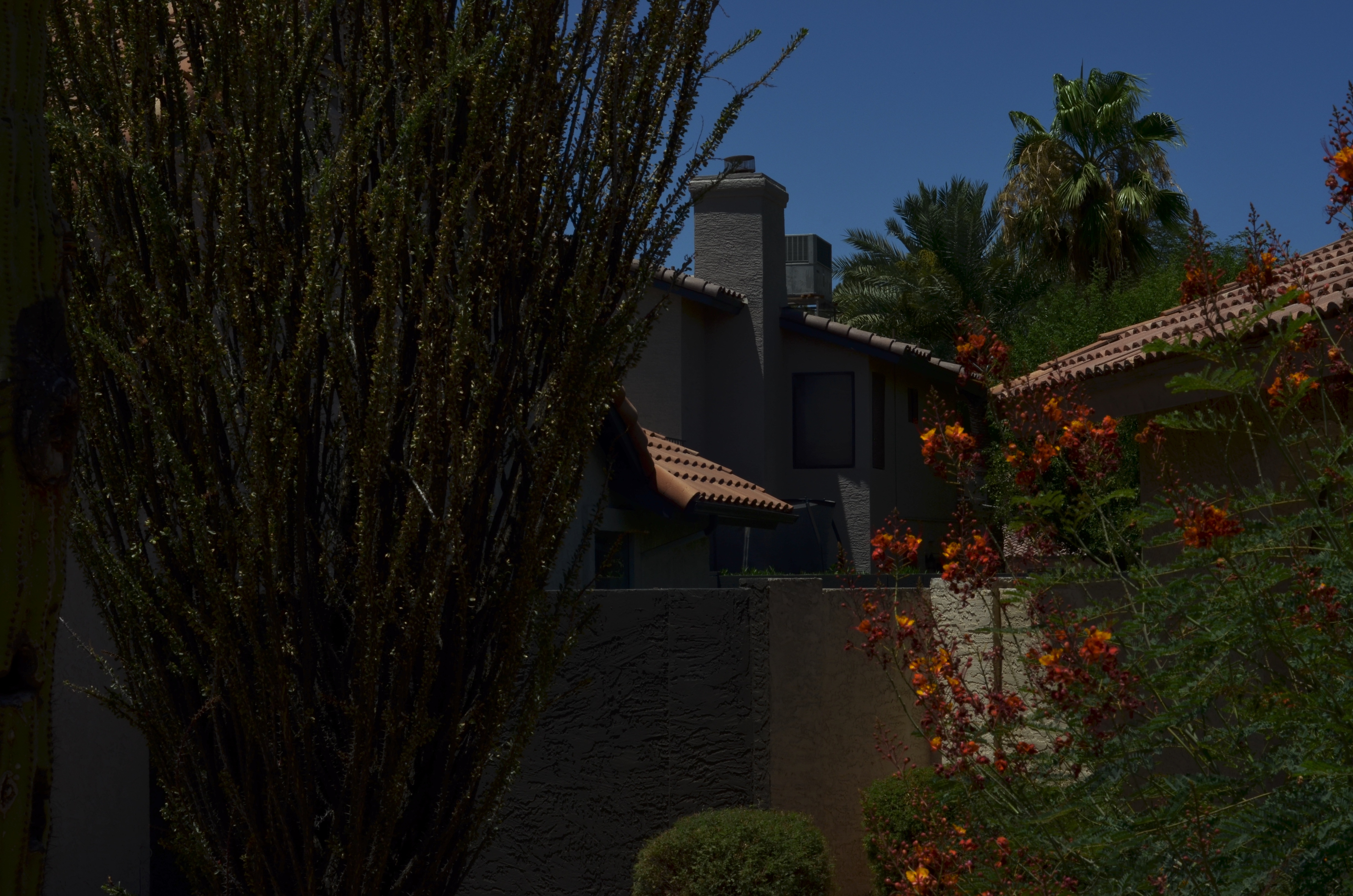 The two shots here were taken mere seconds apart in super-bright mid-morning Arizona sun. They are both manual exposures and are but two of about six frames done at different exposures, so that I would have plenty of choices were I to later sweeten any of them in the “lab”. The two shots posted here show how much control can be exercised. The lighter shot was taken at the acceptably front-to-back sharp aperture of f/5.6, at 1/400 sec., while the darker frame is closed down to f/16 (even sharper) at 1/500 sec. Both shots can be either darkened or lightened later, if need be, without any blow-outs in the brights or discernible noise in the lows, and you can see the pronounced difference in how the color values register. Again, I have no horse in this race: use what you want to get to the finish line, be it rain boots or cross-trainers. I just happen to like having the most control ahead of the click, and, in the digital age, I can shoot at any “film speed” with fewer errors and more immediate feedback than by glorifying either The Golden Age of Darkrooms or the Second Coming of Photoshop. Your mileage may vary….
GOING HALFIES
By MICHAEL PERKINS
IN A PERFECT WORLD, all our photographs would have their permanent address at the intersection of Flawless Technique Street and Great Message Boulevard. And while some do, magically, make it to this mystical crossroads, many others lose the paper the directions were scribbled on and wind up down some back alley.
Powerful narratives can arrive in perfect packages, sure. But not often and not with any predictability. Often we settle for one half of the ideal or the other. That “going halfies” choice determines what we regard as most important in our favorite images.
I would love to be able to achieve technical perfection every time I’m up to bat, but I’m not religious about raw precision….at least not the way I am about emotional resonance. Every one of you has a pile of pictures which are optically flawless and another pile of pictures that speak to your best intentions. Given an either/or judgement on which of these are your “keepers”, why wouldn’t you always, always choose the images that, regardless of various “flaws”, conveyed your mind and heart?
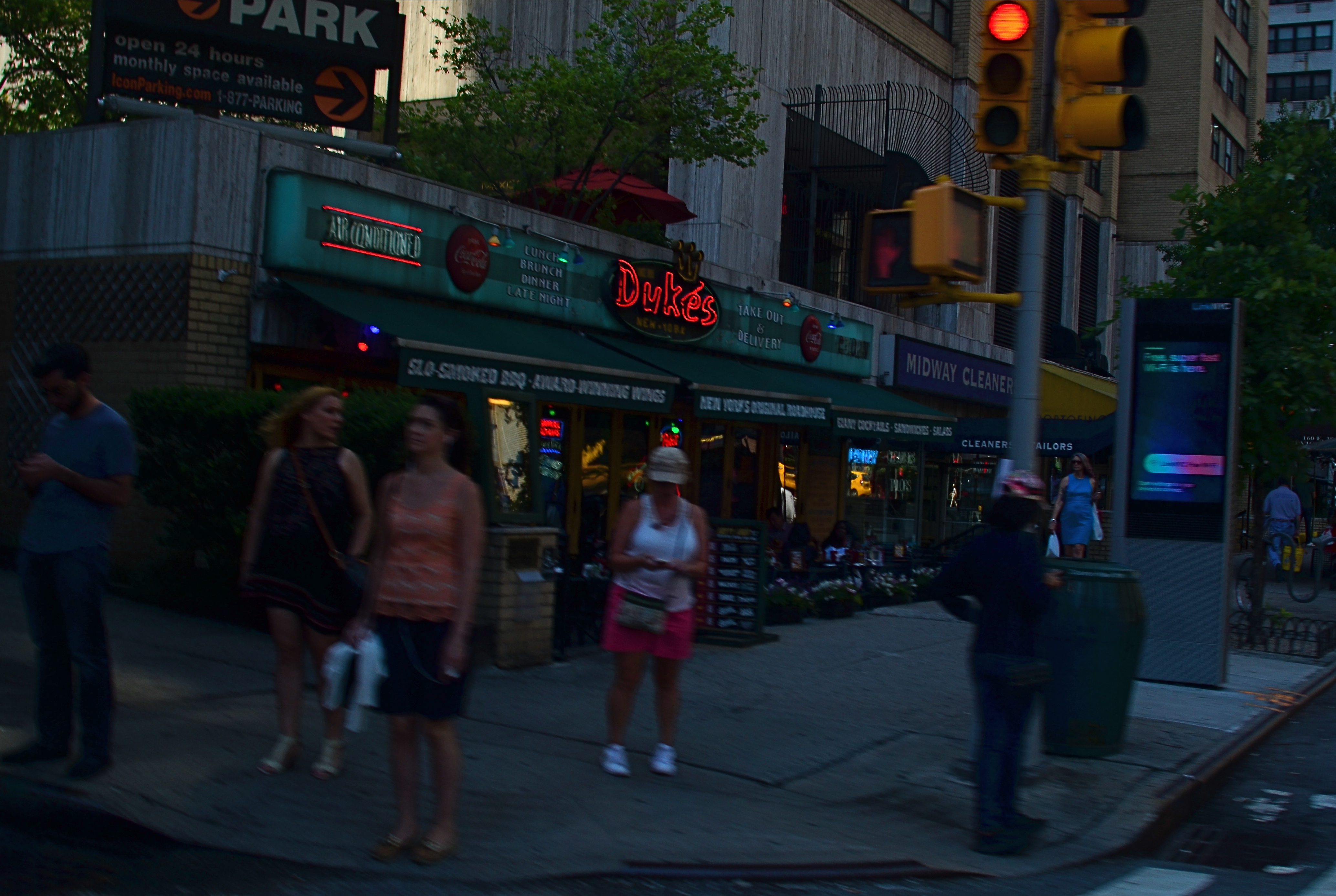
Down At Duke’s, 2018
Light, focus, aperture, even composition are tools, not ends unto themselves, and even the best photographers drop one or another of these techno-balls in some of their best work. But should we seriously disqualify an image merely on technical points? If the answer is yes, then half of the works that we collectively value as great must be stricken from the public record, and photography is merely a recording process, like the operation of a seismograph or any other instrument where precision trumps every other consideration. But if the answer is no, then a picture that fails one or more technical tests can stil be considered valid, so long as it is emotionally true.
I struggle with these choices whenever I produce a shot that has things “wrong” with it, but which is also an authentic register of where my mind was at the time it was snapped. Photos like the one seen here would fail many a judge’s test, depending on who’s doing the judging. It’s too dark. The shutter speed is way too slow, inviting blur. Some of the shadows swallow detail that might just be important. And yet I love this building, these people, this moment. In my defense, I had to decide in an instant whether to even attempt the picture, taken, as it was, from the back seat of an Uber lurching unevenly through the streets of Manhattan. Shooting on full manual, I had to anticipate fast changes in available light, the length of traffic signals, the process of shooting through glass with a filtered lens, and the occasional offensive/defensive maneuvers of the driver. In raw scoring, I just didn’t manage to master all of these variables in a technically perfect manner. And yet..
There has been a lot of talk lately about not letting the Perfect be the enemy of the Good, a phrase which says more about photography in ten words than I’ve said in this entire page. Rule one for shooters: don’t let the flawless be master over the real.
DRINK / SHOOT YOUR FILL
By MICHAEL PERKINS
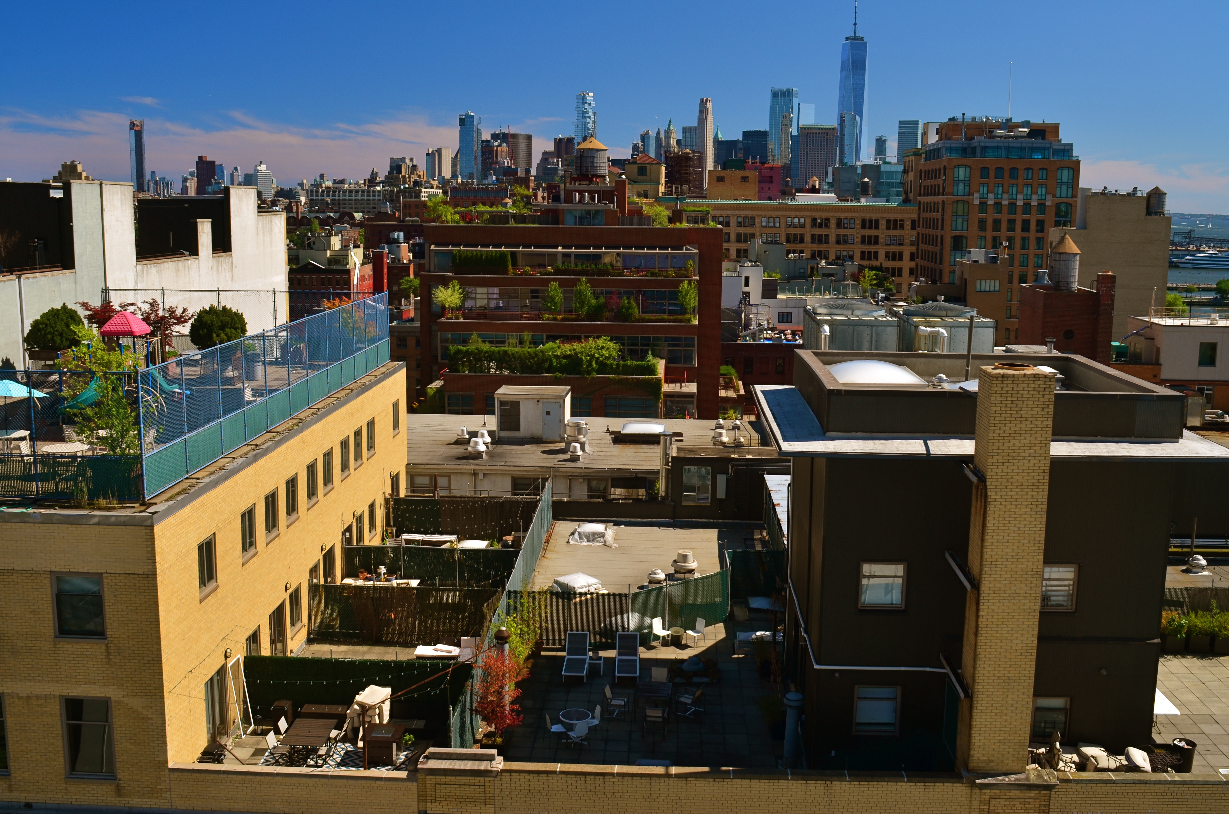
SHOOTING FROM A PROPRIETARY VIEWPOINT is the photographer’s equivalent of being invited to a wedding with an open bar. You try everything. Turns out you don’t really like Singapore Slings? Leave it on a tray and go back for the Jack and Coke.
It really is that simple. If you find yourself with a one-of-a-kind view, assume you’ll never be invited back and hit the subject with everything you’ve got. Change lenses. Up-end your normal method of working. Do something screwy. But do try it all. Hey, you’re on top of Mt. Fuji, right? So it’s not like you’re passing this way again next month. Go for broke.
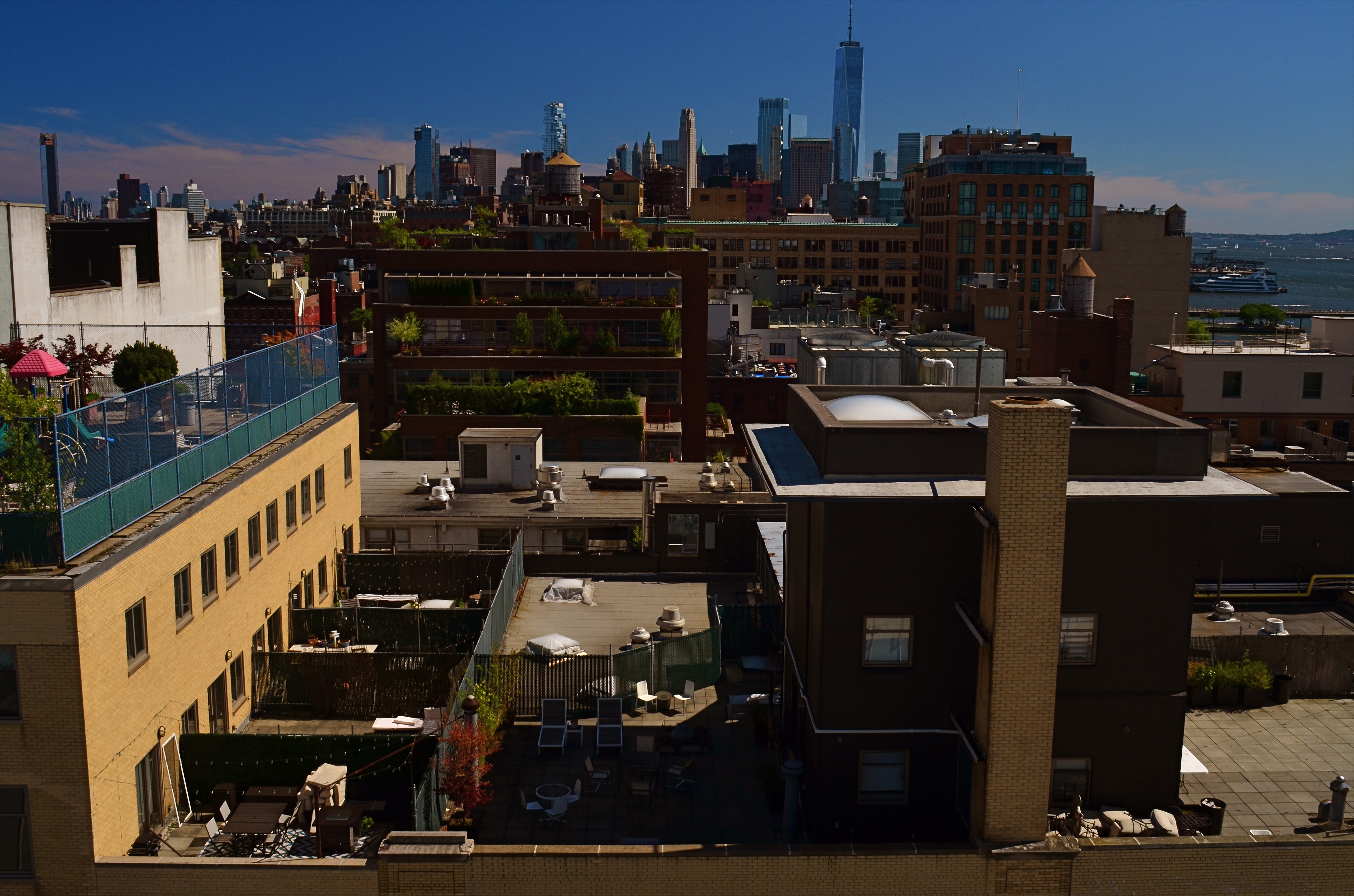
The Manhattan rooftop from which these samples were shot was a gift, and I knew it. I popped off dozens of frames in every direction with every combination of gear and settingscI could think of, simply because the vantage point would likely never be available to me in the future. Not anytime soon, anyway. One thing that’s always in the back of my mind when shooting in New York is the wonderful look of classic images shot in Kodachrome, the greatest but most temperamental film in history, now gone to that Big Darkroom In The Sky. Kodachrome had amazingly warm color saturation, but, all science-y talk aside, its “look” was probably due in large part to the fact that it was slooooww, just the equivalent of 100 ISO at its speediest. That means that, simply, many of us were underexposing it. By a lot. Anyway, I’m always out to craft my own Kodachromesque Manhattan, and I saw a chance to do so in this particular situation.
The two shots seen here were taken mere seconds apart from each other, both shot with a 24mm prime sporting a circular polarizing filter. The lighter one is f/8 at 1/60 sec., while the darker, more “day is done” image is deliberately underexposed at f/16, 1/160 sec. The combination of the smaller aperture and the filter doubles the intensity of all colors, but sacrifices someinformation in the shadier areas. I leave it to you as to what’s been gained and what’s been lost. The point is that I shot about eight other versions of this scene, erring on the side of too many choices in everything I aimed at that afternoon. Photography is not only apprehending where you are, but understanding just how briefly you’ll be there.
But, hey, it’s possible I’ll get a repeat invitation to this particular roof. Then again, I spilled my Jack and Coke all over the hostess on my way out, so you never can tell.
EMBRACING THE DARK, AND OTHER FLAVORS
By MICHAEL PERKINS
THERE IS A WHOLE SEPARATE WING OF THE PHOTOGRAPHIC ESTATE that values dark almost more than light. It’s a photography of near-night, work that suggests only the merest intrusion of illumination into a palette of black. An almost-nothing. A bleary, evanescent glimpse, a suggestion. Minimalism taken to the maximum.
Or, in other words, the dead opposite of the mindset of the majority of photographs made over time.
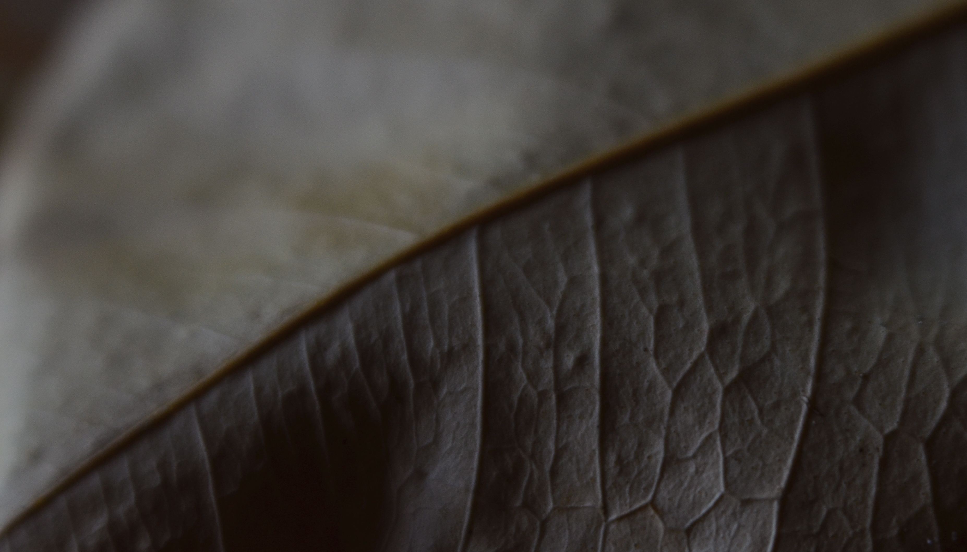
Phytomorphology 3 (2016). I could labor to make this image 100% accurate as to biologic detail, but do I need to?
For most of us, the camera was expected to get better and better at registering accurate detail in less and less light, giving us a reasonably balanced record of color and depth, a kind of realism, or at least documentation. This is the photography of the consumer, who was taught to want pictures in which everything is spelled out, obvious, apparent. Sunny Days, Natural Flesh Tones, Life As We Know It. The advance of the science of recording things with cameras seemed to suggest that well-lit meant well-realized, that we would eliminate murk and shadow in the name of clarity. We decided that those things which dealt in the dark basement of tones were “bad” pictures, defective in some basic way.
The development of art photography has often taken the opposite approach, with some artists going so far as to revive “dead” technologies like daguerrotyping, serigraphing, deliberate under-exposure, even purposeful degrading of the image (dragging negatives over ground glass, dancing on them, soaking them in bodily fluids) to get the look they desire, actually eliminating information from their pictures. Even the recent fad of lomography, which worships faulty cameras and errant processing, is indicative of the “dark” school. It doesn’t have to be in focus. It doesn’t have to be a picture “of” anything. And who made up these rules for composition, anyway?
Photography, as always, will not be reduced to a set of standards. Consumer products still try to steer customers toward predictable images, with most “how tos” listing simple steps for uniform results, or pictures that “look like photographs”. The dark worshippers, by contrast, are asking us to train our eyes to see what is not presented, as well as what is. Alright, they concede, we didn’t show everything. But you can supply the rest.
Finally, the camera remains essentially a mere servant, subject to the whims of its user. We cannot truly mechanize and regulate what comes from the eye or the soul. True art can never remain static, and any kind of creativity that doesn’t frequently threaten to break down into chaos may not be worth the effort.
WEIRD SCIENCE
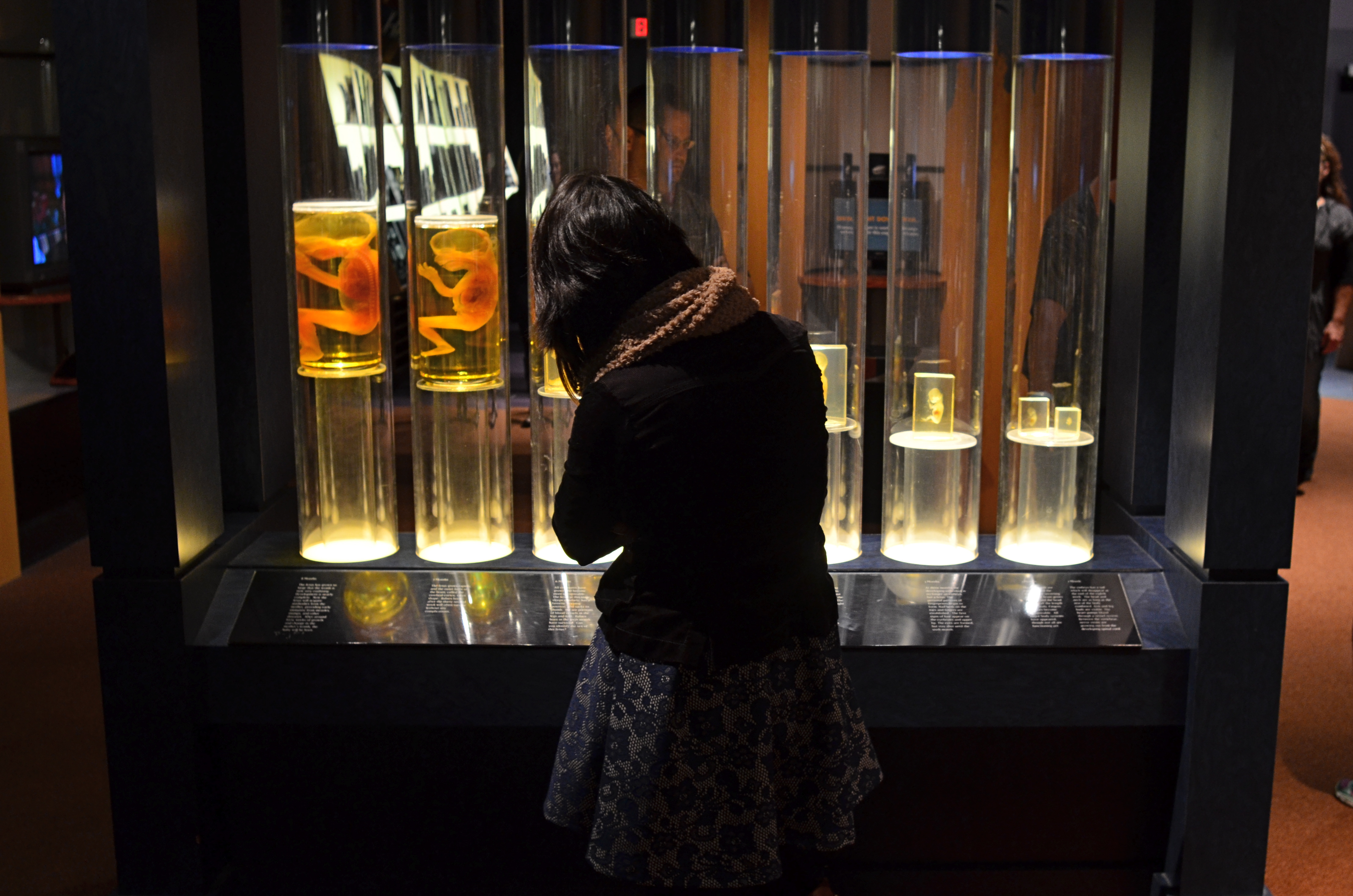
The fetal gestation timeline at Columbus, Ohio’s Center Of Science & Industry. 1/60 sec., f/3.5, ISO 500, 24mm.
By MICHAEL PERKINS
ONE OF THE RITES OF PASSAGE FOR SCHOOL KIDS IN COLUMBUS, OHIO IN THE 1960’s was a field trip to the Center of Science and Industry, or COSI, one of the nation’s first interactive tech museums, mounted before either the terms “interactive” or “hands-on” were common parlance. In those JFK-flavored days of early space exploration and Jetson-gee-whiz futurism, flying cars and picture phones seemed our inevitable legacy, and the Center’s exhibits often veered closer to the World’s Fair than the science fair, its dazzling displays often trumping pure enlightenment. A generation later, the sizzle lingers in the mind a little better than the steak. Something to work on.
Science was presented as something of a magic trick then, a sure and certain answer to all human needs and desires. But to my tween-sized mind, it also retained an air of mystery, something wondrously alien to my daily experience. Few of COSI’s exhibits from the time created more of a sense of wonder in me than an illuminated timeline of fetal gestation, with each crucial stage between embryo and newborn illustrated by a separately preserved specimen of a transitional human that never made it to the delivery room. As fascinating as the display was, it was also a little creepy, somewhat like, if you will, viewing pre-mummies from a colony of visitors from the future.
In a recent visit to the new COSI, now re-located to a larger, brighter HQ across from Columbus’ downtown riverfront, I was both amused and amazed to see that the timeline had been retained in nearly the same way I remembered it from 1964. Having survived to the era of iPhones and DNA mapping, its dim, the strange, amber-glow profiles still had a hypnotic effect on me, housed as they were in a dark, shadowy sector of the museum, sealed within a showcase that distorted the faces of passersby, even as it shrouded their bodies in mystery. For the shot you see here, I liked the strange juxtaposition of the exhibit’s clinical coldness with the form of a young visitor, casually viewing the timeline as if it were no more notable than a collection of butterflies. I shut the exposure down so that the case provided the only light, opened the lens as far as I dared for the right depth of field, and jacked the ISO slightly to compensate for the murky room ambience.
The COSI of the New Frontier years was always a place that could cast science in a distinctly optimistic light. In 2015, I hoped to re-imagine that magic through the insight of an additional fifty years of living. Mood in photography is created as much by what you conceal as by what you reveal, and trying to get that balance right is 90% of the game.
WORKING THE BLINDS
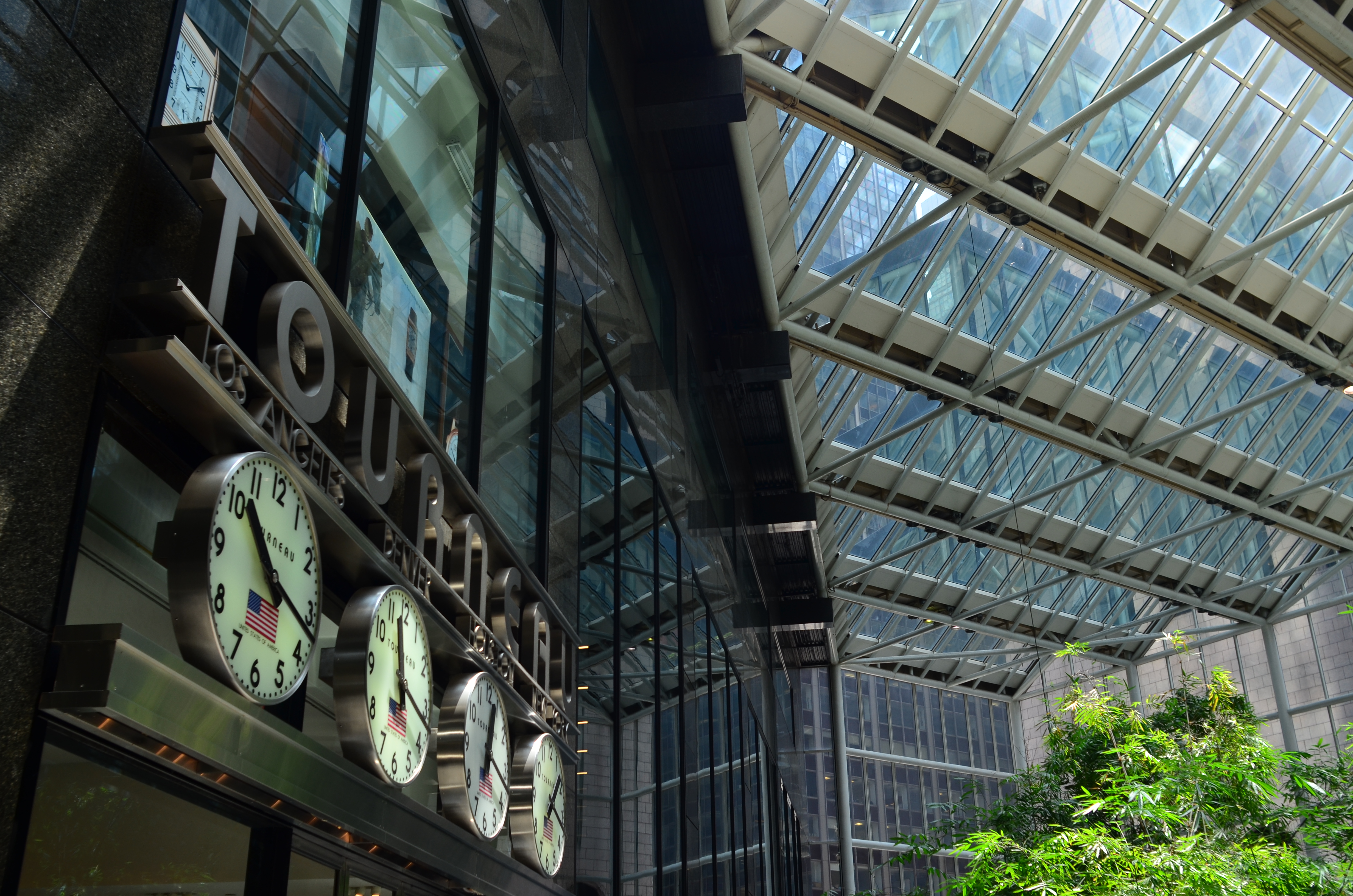
I love this building, but the real star of this image is light; where it hides, bounces, conceals, and reveals.
By MICHAEL PERKINS
ONE OF THE MOST CHALLENGING ASPECTS OF URBAN PHOTOGRAPHY, versus shooting in rural settings, is the constant variability of light. On its way to the streets of a dense city, light is refracted, reflected, broken, interrupted, bounced and just plain blocked in ways that sunshine on a meadow can never be. As a result, shooting in cities deals with direct light only intermittently: it’s always light plus, light in spite of, light over here, but not over there. And it’s a challenge for all but the most patient photographers. Almost every frame must be planned somewhat differently from its neighbors, for there can be no “standard” exposure strategy.
I often think of city streets as big window sills sitting below a massive set of venetian blinds, with every slat tilted a little differently. And I personally greet this condition as an opportunity rather than a deficit, since the unique patterns of abstraction mean that even mundane scenes can be draped in drama at any given moment. That’s why, as I age, I’ve come to highly value selective lighting, for mood, since I’m convinced that perfectly even lighting on an object can severely limit that selfsame drama.
I’m also reminded of the old Dutch masters painters, who realized that a partially dark face contains a kind of mystery. Conversely, a street scene that contains no dropouts of detail or light makes everything register just about the same with the eye, and can keep your images from having a prominent point of interest. Darkness, by contrast, asks your imagination to supply what’s missing. Even light is a kind of full disclosure, and it can rob your pictures of their main argument, or the “look over here” cue that’s needed to make a photograph really connect.
Back to street photography. Given that glass and metal surfaces, the main ingredients in urban structures, can run a little to silver and blue, I may actually take an unevenly lit scene and either modify it toward those colors with a filter, or simply under-expose by a half-stop to see how much extra mood I can wring out of the situation, as in the above image of an atrium in midtown Manhattan. Think of it as “working” those big venetian blinds. Cities both reveal and conceal, and your images, based on your approach, can serve both those ends.
HOLLYWOOD NIGHTS
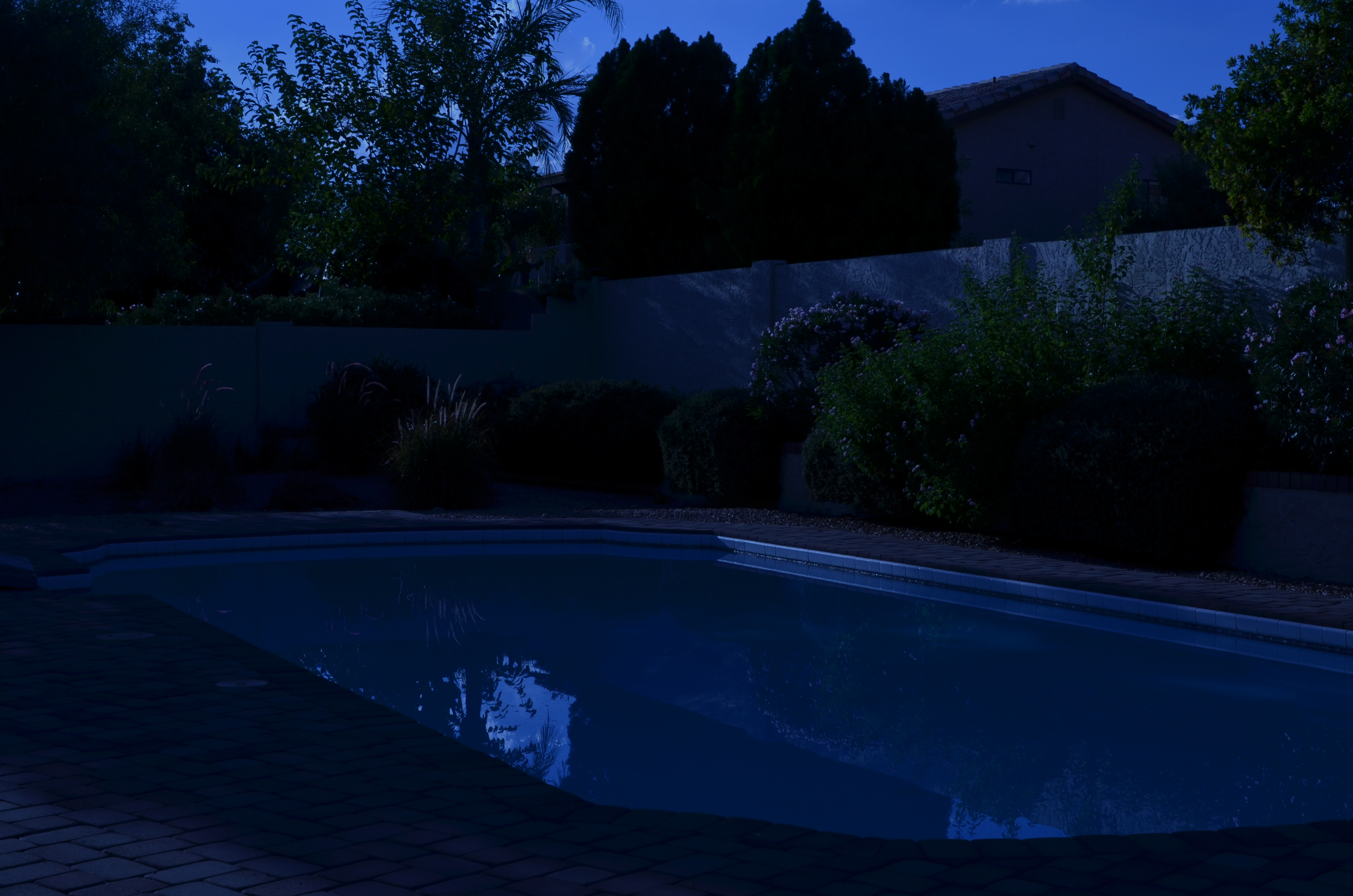
Moonlight night around the poolside, only not really: a “day-for-night” shot taken at 5:17pm. 1/400 sec., f/18, ISO 100, 35mm, using a tungsten white balance.
By MICHAEL PERKINS
TIME LIMITS US IN EVERY PHOTOGRAPHIC SITUATION: LIGHT HEMS US IN EVEN FURTHER. Of course, the history of photography is rife with people who refuse to just accept what time and nature feel like giving them. In fact, that refusal to settle is source of all the artistry. Too bright? Too bland? Wrong time of day? Hey, there’s an app for that. Or, more precisely, a work-around. Recently, I re-acquainted myself with one of the easiest, oldest, and more satisfying of these “cheats”, a solid, simple way to enhance the mood of any exterior image.
And to bend time… a little.

Same scene as above taken just seconds later, but with normal white balancing and settings of 1/250 sec., f/5.6, ISO 100, 35mm.
It’s based on one of Hollywood’s long-standing budget-savers, a technique called day-for-night. For nearly a century, cinematographers have simulated nightfall while shooting in the daytime, simply by manipulating exposure or processing. Many of the movie sequences you see represented as “night” are, in fact, better lit than any “normal” night, unless you’re under a bright, full moon. Day-for-night allows objects to be more discernible than in “real” night because their illumination is actually coming from sunlight, albeit sunlight that’s been processed differently. Shadows are starker and it’s easier to highlight what you want to call attention to. It’s also a romantically warm blue instead of, well, black. It’s not a replication of reality. Like most cinematic effects, it’s a little bit better than real.
If you’re forced to approach your subject hours before sunset, or if you simply want to go for a different “feel” on a shot, this is a great shortcut. Even better, in the digital era, it’s embarrassingly easy to achieve: simple dial up a white balance that you’d normally use indoors to balance incandescent light. Use the popular “light bulb” icon or a tungsten setting. Indoors this actually helps compensate for cold, bluish tones, but, outside, it amps up the blue to a beautiful, warm degree, especially for the sky. Colors like reds and yellows remain, but under an azure hue.
The only other thing to play with is exposure. Shutter-speed wise, head for the high country
A faux “night” at the park. 1/320 sec., f/20, ISO 100, 35mm.
at anywhere from f/18 to 22, and shorten your exposure time to at least 1/250th of a second or shorter. Here again, digital is your friend, because you can do a lot of trial and error until you get the right mix of shadow and illumination. Hey, you’re Mickey Mouse with the wizard hat on here. Get the look you want. And don’t worry about it being “real”. You checked that coat at the door already, remember?
Added treats: you stay anchored at 100 ISO, so no noise. And, once you get your shot, the magic is almost completely in-camera. Little or no post-tweaking to do. What’s not to like?
I’m not saying that you’ll get a Pulitzer-winning, faux-night shot of the Eiffel Tower, but, if your tour bus is only giving you a quick hop-off to snap said tower at 2 in the afternoon, it might give you a fantasy look that makes up in mood what it lacks in truth.
It ain’t the entire quiver, just one more arrow.
Follow Michael Perkins at Twitter @MPnormaleye.
LESS SHOWS MORE
You don’t have to reveal every stray pebble or every dark area in perfect definition to get a sense of texture in this shot. 1/160 sec., f/5.6, ISO 100, 35mm.
by MICHAEL PERKINS
THERE IS A WRONG-HEADED IDEA OUT THERE THAT ALL VISUAL OUTCOMES IN PHOTOGRAPHY SHOULD BE EQUAL. That’s a gob of words, so here’s what I’m getting at: higher ISO sensitivity, post-processing and faster lenses have all conspired, of late, to convince some of us that we can, and should, rescue all detail in even the most constrasty images. No blow-outs in the sky, no mushiness in the midrange, no lost information in the darkest darks. Everything in balance, every iota of grain and pattern revealed.
Of course, that is very seductive. Look at a well-processed HDR composite made from multiple bracketed images, in which the view out the window is deep and colorful, and the shadowy interiors are rich with texture. We’ve seen people achieve real beauty in creating what is a compelling illusion. But, like every other technique, it can come to define your entire output.
It’s not hard to see shooters whose “style” is actually the same effect applied to damn near all they shoot, like a guy who dumps ketchup on everything his wife brings to the table. When you start to bend everything you’re depicting to the same “look”, then you are denying yourself a complete range of solutions. No one could tell you that you always have to shoot in flourescent light, or that deep red is the only color that conveys passion, so why let yourself feel trapped in the habit of using HDR or other processes to always “average out” the tonal ranges in your pictures? Aren’t there times when it makes sense to leave what I will call “mystery” in the undiscovered patches of shadow or the occasional areas of over-exposure?
Letting some areas of a frame remain in shadow actually tamps down the clutter in a busy image like this. 1/60 sec., f/3.2, ISO 100, 35mm.
I am having fun lately leaving the “unknowns” in mostly darker images, letting the eye explore images in which it can NOT clearly make out ultimate detail in every part of the frame. In the mind’s eye, less can actually “show” more, since the imagination is a more eloquent illustrator than any of our wonderful machines. Photography began, way back when, rendering its subjects as painters did, letting light fall where it naturally landed and leaving the surrounding blacks as deep pools of under-defined space. Far from being “bad” images, many of these subtle captures became the most hypnotic images of their era. It all comes down to breaking rules, then knowing when to break even the broken rule as well.
Within this post are two of the latest cases where I decided not to “show it all”. Call it the photo equivalent of a strip-tease. Once you reveal everything, some people think the allure is over. The point I’m making is that the subject should dictate the effect, never the other way around. Someone else can do their own takes on both of these posted pictures, take the opposite approach to everything that I tried, and get amazing results.
There never should be a single way to approach a creative problem. How can there be?
Follow Michael Perkins on Twitter @thenormaleye.
Related articles
- HDR Under Control is a Thing of Beauty (thewayeyeseesit.com)
OPTING FOR IMPERFECTION

When additional detail needs to be extracted from shadows and from the texture of materials, HDR (High Dynamic Range) is a great solution. This shot of the entrance to the New York Public Library is a three-exposure bracket composited in Photomatix. Is this process great for all images of the same subject? See a different approach below….
By MICHAEL PERKINS
SOMETIMES I LOSE MY WAY, CREATIVELY. Given that cameras are technical devices and not creative entities, we all do. We have been given, in today’s market, wonderful aids to seeing and interpreting what we consider noteworthy. Technological advances are surging so swiftly in the digital era that we are being given scads of pre-packaged effects that are baked into the brains of our cameras, ideally designed to help us calculate and fail less, succeed and create more. To that end, we are awash in not only genuinely beneficial shortcuts like programmable white balance and facial recognition, but “miniature”, sketch, selective desaturation, and, recently, in-camera HDR options as well. Something of a tipping point is occurring in all this, and maybe you feel it as strongly as I do; more and more of our output feels like the camera, the toys, the gimmicks are dictating what gets shot, and what it finally looks like.
Here’s the nugget in all this: I have been wrestling with HDR as both a useful enhancer and a seductive destroyer for about three years now. Be assured that I am no prig who sees the technique as unworthy of “pure” photography. Like the old masters of burning and dodging, multiple exposure, etc., I believe that, armed with a strong concept, you use whatever tool it takes to get the best result. And when it comes to rescuing details in darker patches, crisping up details in certain materials like brick and stone, and gently amplifying color intensity, HDR can be a marvelous tool. Where it becomes like crack is in coming to seem as if it is the single best gateway to a fully realized image. That is wrong, and I have more than a few gooey Elvis-on-black-velvet paintings that once had a chance to be decent pictures, before they were deep-fried in the conceptual Crisco of bad HDR. Full disclosure: I also have a few oh-wow HDR images which delivered the range of tone and detail that I honestly believe would have been beyond my reach with a conventional exposure. The challenge, as always, is in not using the same answer to every situation, and also to avoid using an atomic bomb to swat a fly.

Same library, different solution: I could have processed this in HDR in an attempt to pluck additional detail from the darker areas, but after agonizing over it, I decided to leave well enough alone. The exposure was a lucky one over a wide range of light, and it’s close enough to what I saw without fussing it to death and perhaps making it appear over-baked. 1/30 sec., f/6.3, ISO 320, 18mm.
Recently, I am looking at more pictures that are not, in essence, flawless, and asking, how much solution do I need here? How much do I want people to swoon over my processing prowess versus what I am trying to say? As a consequence, I find that images that I might have reflexively processed in HDR just a few weeks ago, are now agonized over a bit longer, with me often erring on the side of whatever “flaws” may be in the originals. Is there any crime in leaving in a bit more darkness here, a slight blowout in light there, if the overall result feels more organic, or dare I say, more human? Do we have to banish all the mystery in a shot in some blind devotion to uniformity or prettiness?
I know that it was the camera, and not me, that actually “took” the picture, but I have to keep reminding myself to invest as much of my own care and precision ahead of clicking the shutter, not merely relying on the super-toys of the age to breathe life into something, after the fact, that I, in the taking, could not do myself. I’m not swearing off of any one technique, but I always come back to the same central rule of the best kind of photography; do all your best creative work before the snap. Afterwards, all your best efforts are largely compensation, compromise, and clean-up.
It’s already a divine photographic truth that some of the best pictures of all time are flawed, imperfect, incomplete. That’s why you go back, Jack, and do it again.
The journey is as important as the destination, maybe more so.
Thoughts?

SETTINGS
Fan Dance, 2020
By MICHAEL PERKINS
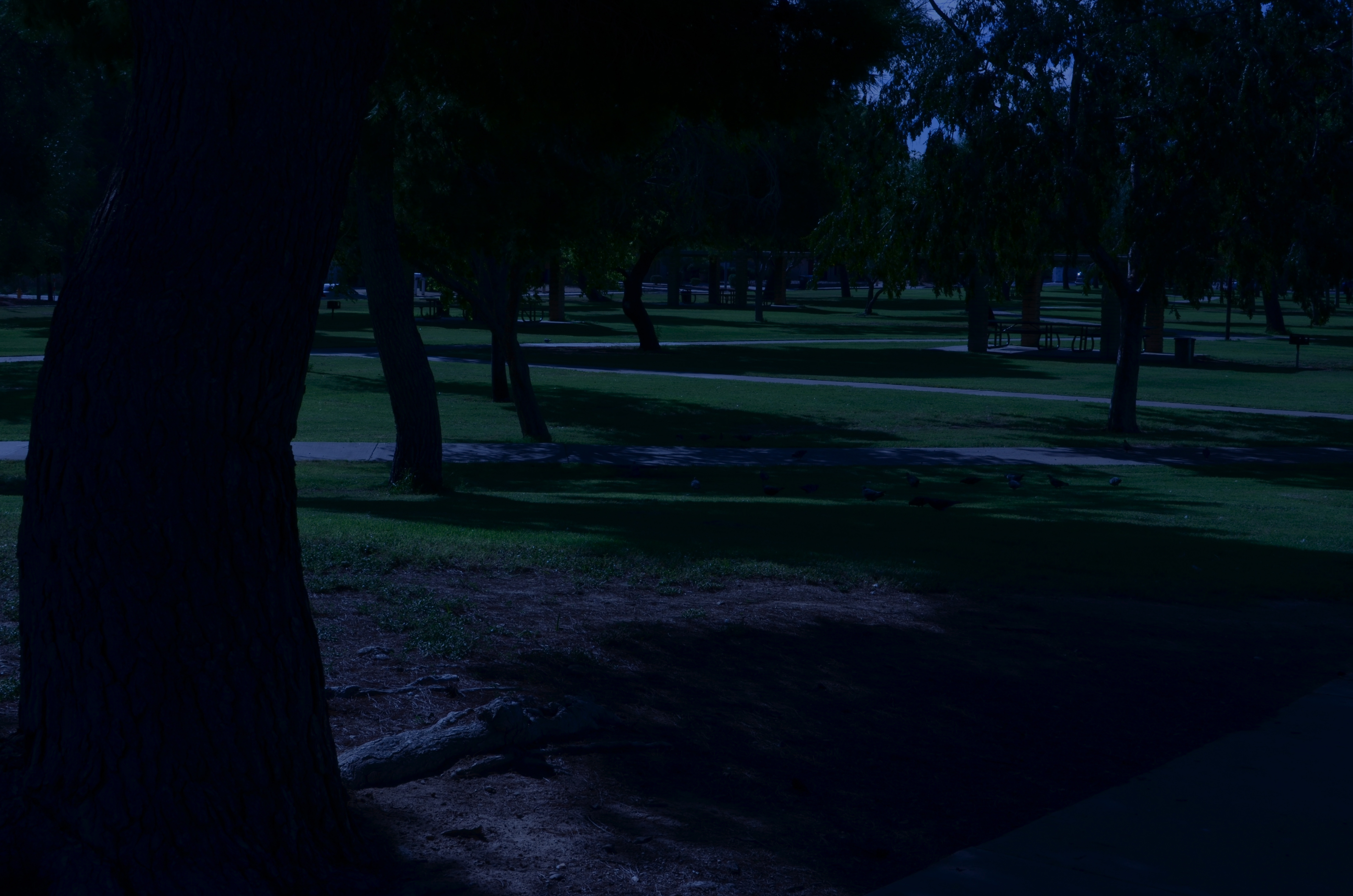
A PURELY TECHNICAL ANALYSIS OF A PHOTOGRAPH understandably centers upon the measurable aspects of their capture…..aperture, exposure rate, focus, et cetera. However, in any full understanding of why an image works (or fails to), the photographer him/herself has to be factored in, alongside any purely mechanical settings, because, when you change life for the photographer, everything else in the picture is changed as a consequence. That’s the most determinative factor for photography in this grotesque year. We have been altered in ways great and small, and that will have made all the difference in what we see, and what we say about it with a camera.
For me, as in the case of so many others, these months have meant the struggle to expand my own photographic strengths, even as the physical plane in which I operate has been increasingly restricted. Many of us who have never experienced the isolation of exile, imprisonment or war now have at least an inkling of how those events cut people off from each other, challenging us to glean more and more life experience from less and less sensory input. In the face of the ever-present need to keep shooting, there are the increasingly narrow choices of what to shoot, with many sites and subjects closed off, at least for the duration. We have all become experts on every nook and light change in our immediate environments, and have discovered that, yes, there may be a 35th different way of photographing a window, a door, or our own faces.
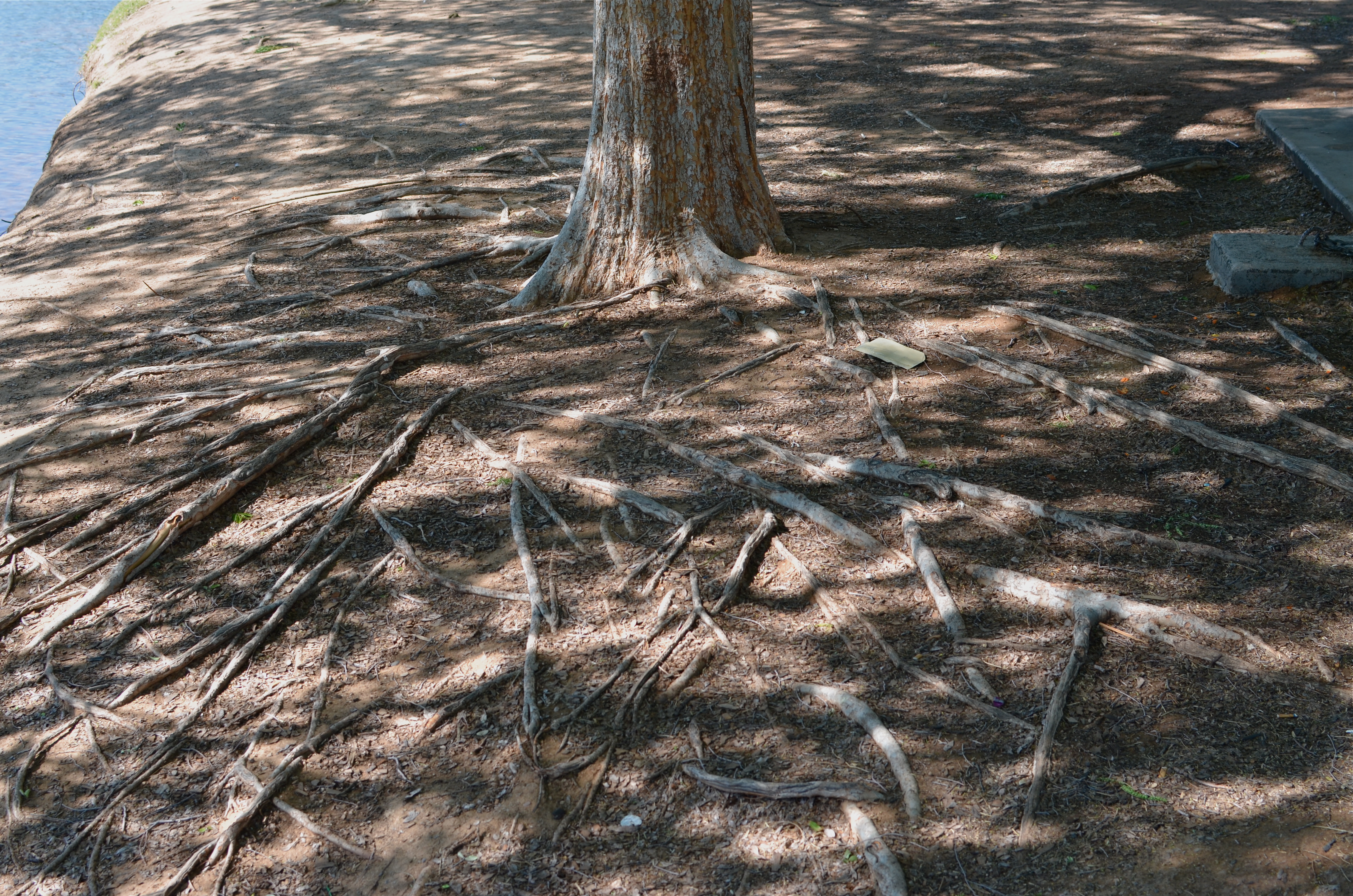
Looking over my own output for the year, I see a definite bent toward minimalism, an almost ruthless appetite for reducing compositions to their raw essences. I am shooting things closer, abstracting the contexts of familiar objects in an effort to see them anew. I have thrown off most standard approaches to exposure, shooting in the sparest light that I can; and I have re-imagined more and more shots as monochromes, seeing even color as an unneeded distraction in these spare times. Mostly, I have been faced, as have so many, with a nearly zen approach to things I have photographed many times over the years, searching for new secrets in old friends.
For one example; as a consequence of the pandemic, I find myself walking again and again through a few designated-safe gardens and parks, which means a lot of repeated shots of the kind of subjects I find most difficult to put my stamp on, which is landscape work. Give me a crowded, noisy metropolis and I’m right at home, whereas I have to emotionally educate myself to be at ease in a natural setting. Sad, I know, but there it is. And so, I experiment a lot with seeing patterns in plants, trees, terrain, in terms of raw design, such as in the agave plant seen here. Another fortunate corollary was the acquisition of a camera, early in the year, that finally enabled me to shoot birds with greater precision, which allows the winged wonders to become something of a substitute for traditional portrait work on humans. As I learn to read their feathered faces, I am somewhat consoled, even as I miss their human equivalents.
And so it goes. Change life for the photographer, and you change the photographs. And since this little small-town gazette has always been about intentions, rather than equipment, it’s important for us to do a skull, at year’s end, on how we’ve changed the way we approach using the Magic Light Boxes in our lives. We are different people now, and, if we’re honest and awake, amazing pictures will come about as a result.
Share this:
December 27, 2020 | Categories: Commentary, Composition | Tags: monochrome conversion, Under-exposure | Leave a comment