SOFTER AND QUIETER
By MICHAEL PERKINS
THE MEANING OF THE WORD NOISE HAS, IN RECENT YEARS, been expanded beyond its familiar role as an audio term, extending its usage into our visual vocabulary as well. A key shift in photo terminology, as film converted to digital, has been the re-purposing of the word to denote a degradation in quality, with noise replacing grain as the way to describe a less-than-pristine image. Same idea, different wording.
And now, in recent years, I have heard the word used even more widely to denote weaknesses in a composition, describing a picture with too much information or distraction as “noisy”. In a recent post on the blog PhotographyMad.com, you find the following citation:
Often a photo will lack impact because the main subject is so small it becomes lost among the clutter of its surroundings. By cropping tight around the subject you eliminate the background “noise”, ensuring the subject gets the viewer’s undivided attention.
I personally would extend this metaphor to include not only the subject matter within a frame but its color range as well. That means, simply, that too many colors in an image might dilute the effect of a shot as much as the density of its elements, and extends the idea of noise to encompass anything that lessens the communicative power it has for the viewer.

Deflowered (2016). 1/50 sec., f/4, ISO 100, 35mm.
In the above shot, the idea of the composition was to convey the bits of orange peel as some kind of spent or withered flower. I didn’t decide, in advance, to eat an orange in a yellow bowl, but I believe that the same peels in a red bowl might have hardened the look of the shot by calling attention to contrast instead of content. Keeping the entire composition to a two-tone color range (along with a decidedly shallow depth-of-field to reduce the texture detail) rendered it nice and soft. Of course there are a million ways to conceive this image; I just chose this way.
Noise is not merely a technical registration of visual or audio distortion. I think the word has real value if you’re looking to streamline your images. Just think noise=clutter.
Then turn down the volume.
THEY HAD FACES THEN
Happy Shining Houses: Two copies of the same image, balanced in Photomatix’ Tone Compression algorithm.1/1000 sec., f/5.6, ISO 100, 35mm
By MICHAEL PERKINS
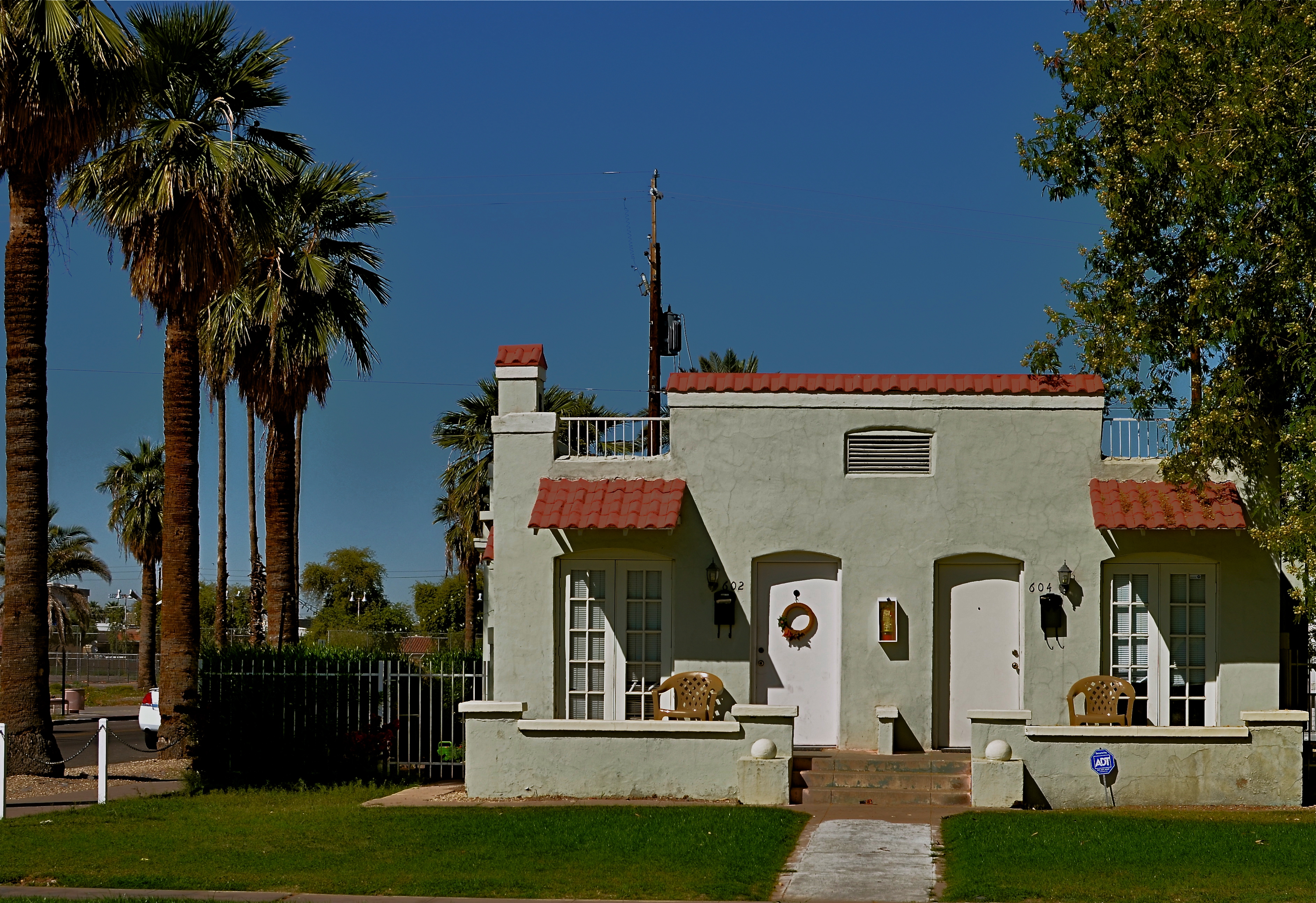
ONE OF THE MOST HORRIBLE CONSEQUENCES OF SUBURBAN SPRAWL, beyond the obscene commercial eye pollution, the devastation of open space, and the friendless isolation, is the absolute soulless-ness of the places we inhabit. The nowheres that we live in are everywhere. Wherever you go, there you are. Move three miles and the cycle has repeated. Same Shell stations, same Wal-Marts, same banal patterns.
The title of a classic book on the passing of the star era of Hollywood could also be the story of the end of the great American house: They Had Faces Then.
I believe that the best old houses possess no less a living spirit than the people who live inside them. As a photographer, I seek out mish-mosh neighborhoods, residential blocks that organically grew over decades without a “master plan” or overseeing developer. Phoenix, Arizona is singular because, within its limits, there are, God knows, endless acres of some of the most self-effacing herdblocks created by the errant hand of man, but also some of the best pre-WWII neighborhoods, divine zones where houses were allowed to sprout, erupt, and just happen regardless of architectural period, style, or standard. It is the wild west realized in stucco.
When I find these clutches of houses, I don’t just shoot them, I idealize them, bathing the skies above them in azure Kodachrome warmth, amping up the earth tones of their exteriors, emphasizing their charming symmetries. Out here in the Easy-Bake oven of the desert, that usually means a little post-production tweaking with contrasts and colors, but I work to keep the homes looking as little like fantasies and as much like objects of desire as I can.
One great tool I have found for this is Photmatix, the HDR software program. However, instead of taking multiple exposures and blending them into an HDR, I take one fairly balanced exposure, dupe it, darken one frame, lighten the other, and process the final in the Tone Compression program. It gives you an image that is somewhat better than reality, but without the Game of Thrones fantasy overkill of HDR.
Photography is partly about finding something to shoot, and partly about finding the best way to render what you saw (or what you visualized). And sometimes it’s all about revealing faces.
GOING OFF-MENU
By MICHAEL PERKINS
I AM ALREADY ON RECORD AS A CHAMPION OF THE ODD, THE OFF-KILTER, AND THE JOYFULLY STRANGE IN AMERICAN RETAIL. As a photographer, I often weep over the endangered status of the individual entrepreneur, the shopkeeper who strikes out in search of a culturally different vibe, some visual antidote to the tsunami of national chains and marts that threatens to drown out our national soul. Sameness and uniformity is a menace to society and a buzzkill of biblical proportions for photography. Art, like nature, abhors a vacuum.
It is, of course, possible that someone might have created a deathless masterpiece of image-making using a Denny’s or a Kohl’s as a subject, and, if so, I would be ecstatic to see the results, but I feel that the photog’s eye is more immediately rewarded by the freak start-ups, the stubborn outliers in retail, and nowhere is this in better evidence than in eateries. Restaurants are like big sleeves for their creators to wear their hearts on.
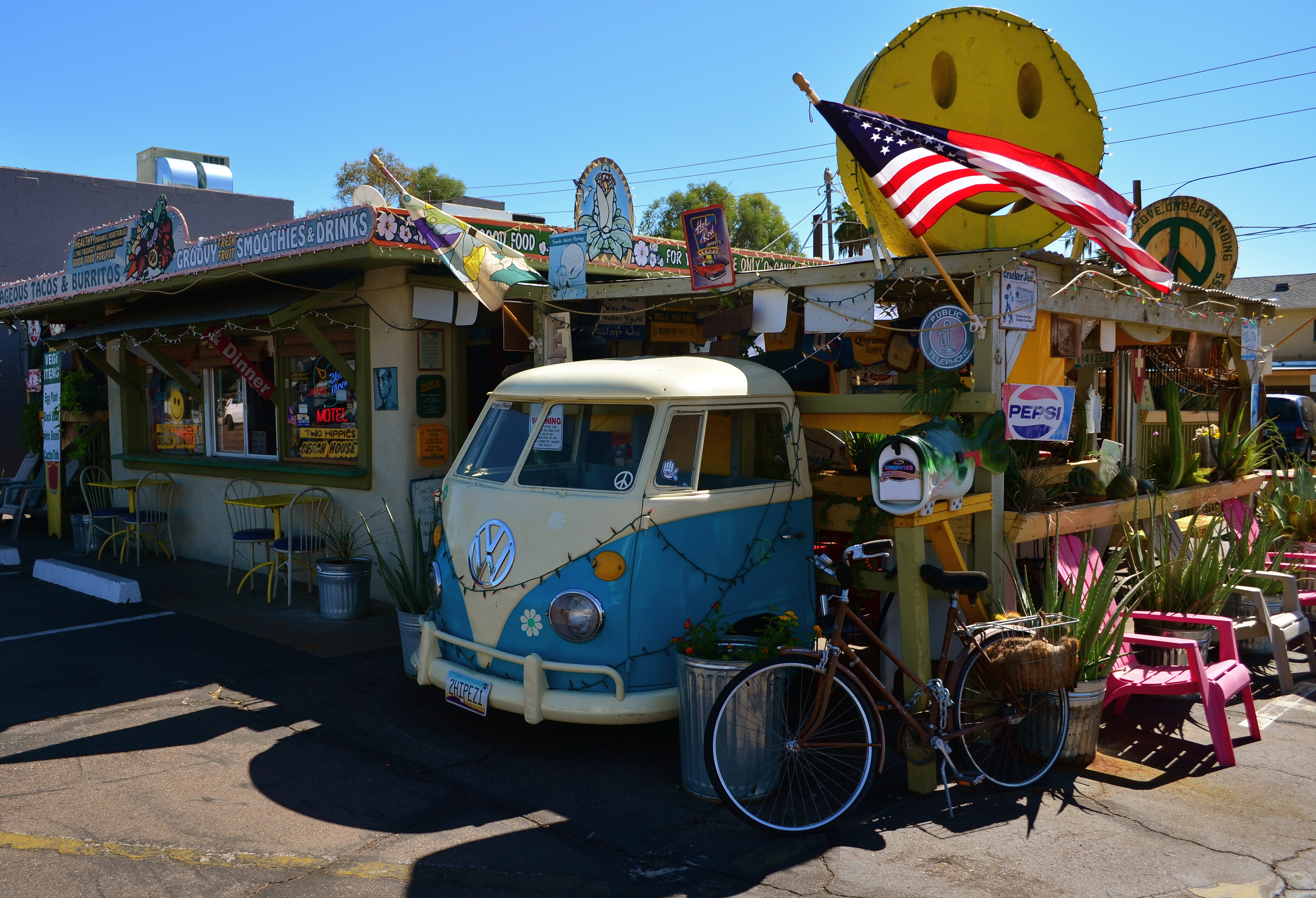
The surf is seldom “up” at the Two Hippies’ Beach House Restaurant in Phoenix, AZ, but the joint is “awash” in mood. 1/640 sec., f/5.6, ISO 100, 18mm.
That’s why this divinely misfit toy of a diner, which was hidden in plain sight on one of the main drags in central Phoenix, has given me such a smile lately. I have never eaten at the swelegant Two Hippies’ Beach House, but I have visually feasted on its unabashed quirkiness. And if the grub is half as interesting as the layout, it must be the taste equivalent of the Summer of Love.
Even if the food’s lousy, well, everyone still gets a B+ anyway for hooking whoever is induced to walk in the door.
On the day I shot this, the midday sun was (and is) harsh, given that it’s, duh, Arizona, so I was tempted to use post-processing to even out the rather wide-ranging contrast. Finally, though, I decided to show the place just as I discovered it. Amping up the colors or textures would have been overkill, as the joint’s pallette of colors is already cranked up to 11, so I left it alone. I did shoot as wide as I could to get most of the layout in a single frame, but other than that, the image is pretty much hands-off.
Whatever my own limited skill in capturing the restaurant, I thank the photo gods for, as the old blues song goes, “sending me someone to love.”
Trippy, man.
Follow Michael Perkins on Twitter @MPnormaleye.
HOLLYWOOD NIGHTS
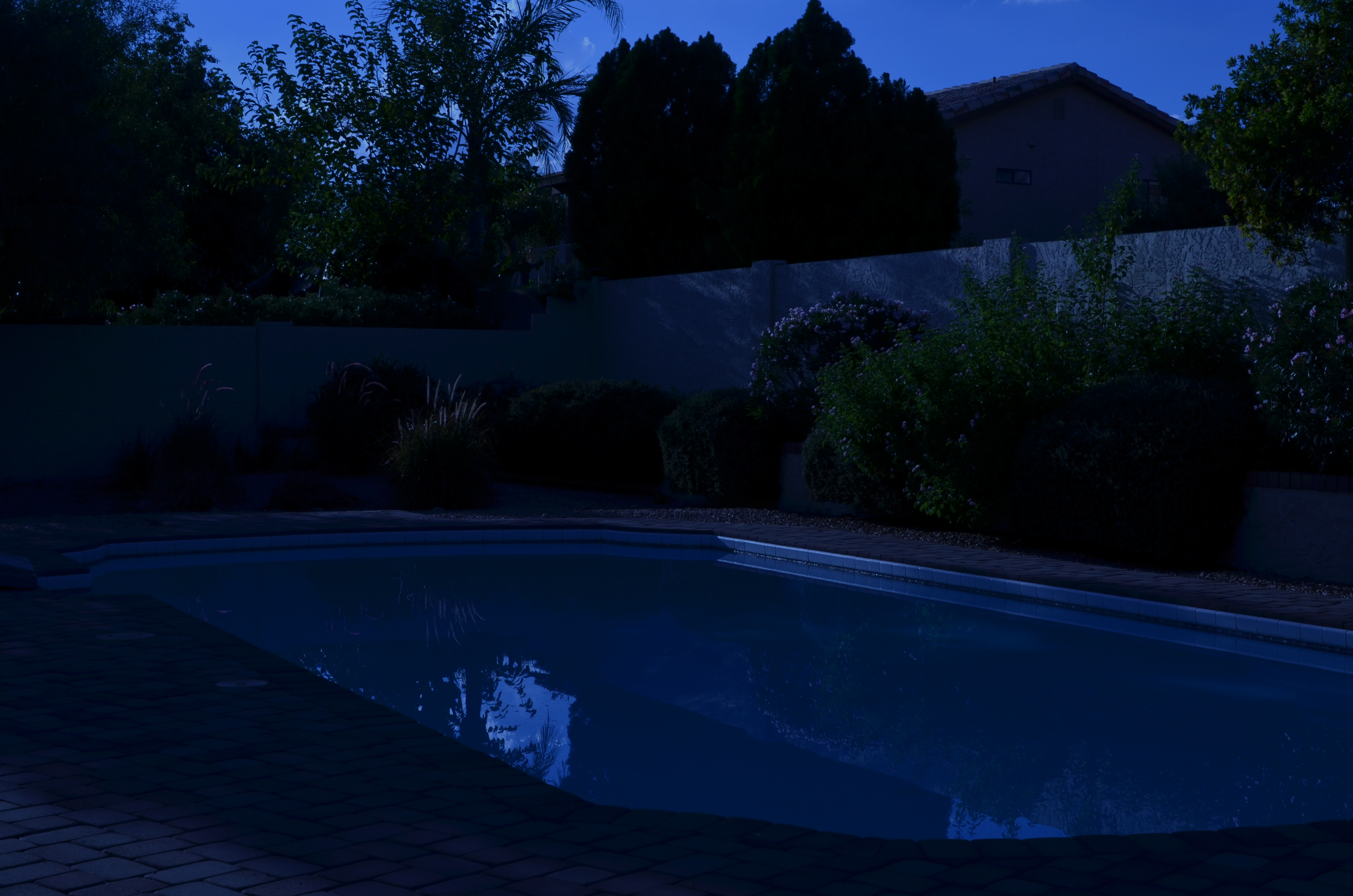
Moonlight night around the poolside, only not really: a “day-for-night” shot taken at 5:17pm. 1/400 sec., f/18, ISO 100, 35mm, using a tungsten white balance.
By MICHAEL PERKINS
TIME LIMITS US IN EVERY PHOTOGRAPHIC SITUATION: LIGHT HEMS US IN EVEN FURTHER. Of course, the history of photography is rife with people who refuse to just accept what time and nature feel like giving them. In fact, that refusal to settle is source of all the artistry. Too bright? Too bland? Wrong time of day? Hey, there’s an app for that. Or, more precisely, a work-around. Recently, I re-acquainted myself with one of the easiest, oldest, and more satisfying of these “cheats”, a solid, simple way to enhance the mood of any exterior image.
And to bend time… a little.
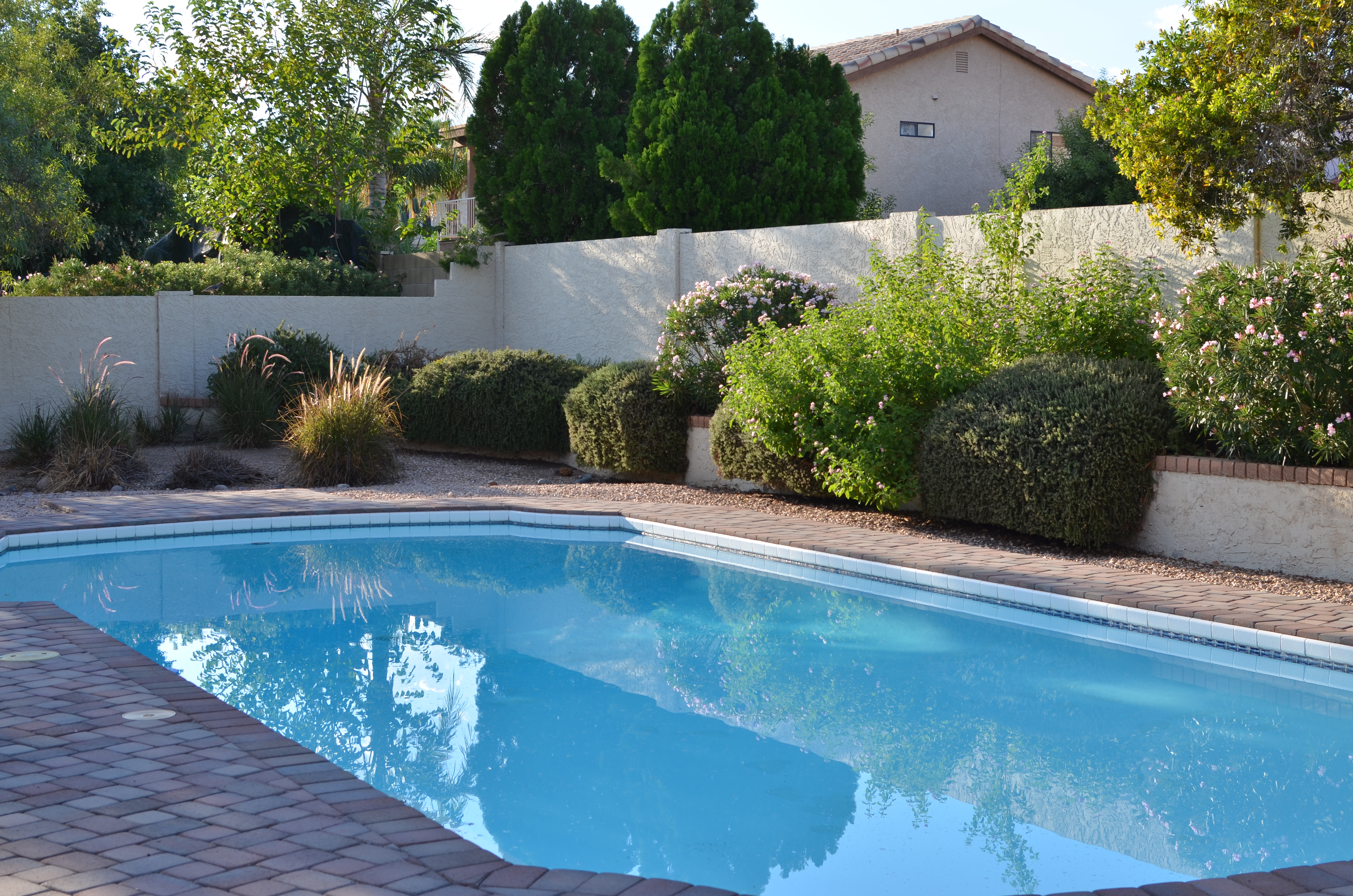
Same scene as above taken just seconds later, but with normal white balancing and settings of 1/250 sec., f/5.6, ISO 100, 35mm.
It’s based on one of Hollywood’s long-standing budget-savers, a technique called day-for-night. For nearly a century, cinematographers have simulated nightfall while shooting in the daytime, simply by manipulating exposure or processing. Many of the movie sequences you see represented as “night” are, in fact, better lit than any “normal” night, unless you’re under a bright, full moon. Day-for-night allows objects to be more discernible than in “real” night because their illumination is actually coming from sunlight, albeit sunlight that’s been processed differently. Shadows are starker and it’s easier to highlight what you want to call attention to. It’s also a romantically warm blue instead of, well, black. It’s not a replication of reality. Like most cinematic effects, it’s a little bit better than real.
If you’re forced to approach your subject hours before sunset, or if you simply want to go for a different “feel” on a shot, this is a great shortcut. Even better, in the digital era, it’s embarrassingly easy to achieve: simple dial up a white balance that you’d normally use indoors to balance incandescent light. Use the popular “light bulb” icon or a tungsten setting. Indoors this actually helps compensate for cold, bluish tones, but, outside, it amps up the blue to a beautiful, warm degree, especially for the sky. Colors like reds and yellows remain, but under an azure hue.
The only other thing to play with is exposure. Shutter-speed wise, head for the high country
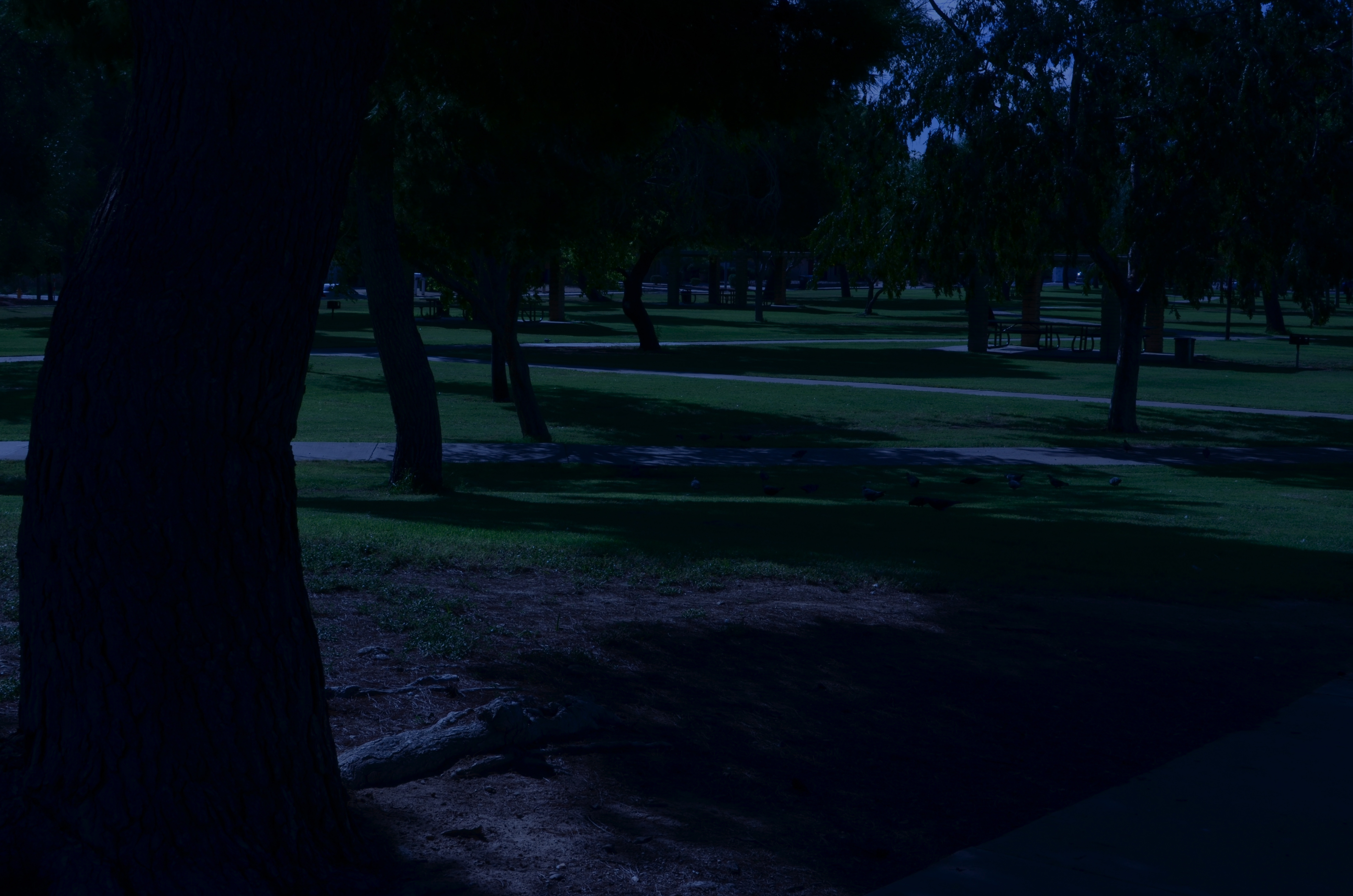
A faux “night” at the park. 1/320 sec., f/20, ISO 100, 35mm.
at anywhere from f/18 to 22, and shorten your exposure time to at least 1/250th of a second or shorter. Here again, digital is your friend, because you can do a lot of trial and error until you get the right mix of shadow and illumination. Hey, you’re Mickey Mouse with the wizard hat on here. Get the look you want. And don’t worry about it being “real”. You checked that coat at the door already, remember?
Added treats: you stay anchored at 100 ISO, so no noise. And, once you get your shot, the magic is almost completely in-camera. Little or no post-tweaking to do. What’s not to like?
I’m not saying that you’ll get a Pulitzer-winning, faux-night shot of the Eiffel Tower, but, if your tour bus is only giving you a quick hop-off to snap said tower at 2 in the afternoon, it might give you a fantasy look that makes up in mood what it lacks in truth.
It ain’t the entire quiver, just one more arrow.
Follow Michael Perkins at Twitter @MPnormaleye.
IT’S NOT EASY BEIN’ GREEN
This is the desert? A Phoenix area public park at midday. There is a way around the intense glare. 1/500 sec., f/5.6, ISO 100, 35mm, straight out of the camera.
By MICHAEL PERKINS
FOR YEARS I HAVE BEEN SHOOTING SUBJECTS IN THE URBAN AREAS OF PHOENIX, ARIZONA, trying to convey the twin truths that, yes, there are greenspaces here, and yes, it is possible for a full range of color to be captured, despite the paint-peeling, hard white light that overfills most of our days. Geez, wish I had been shooting here in the days of Kodachrome 25. Slow as that film was, the desert would have provided more than enough illumination to blow it out, given the wrong settings. Now if you folks is new around here, lemme tell you about the brilliant hues of the Valley of the Sun. Yessir, if’n you like beige, dun, brown, sepia or bone, we’ve got it in spades. Green is a little harder to come by, since the light registers it in a kind of sickly, sagebrush flavor….kind of like Crayola’s “green-yellow” (or is it “yellow-green”?) rather than a deep, verdant, top-o-the-mornin’ Galway green.
But you can do workar0unds.
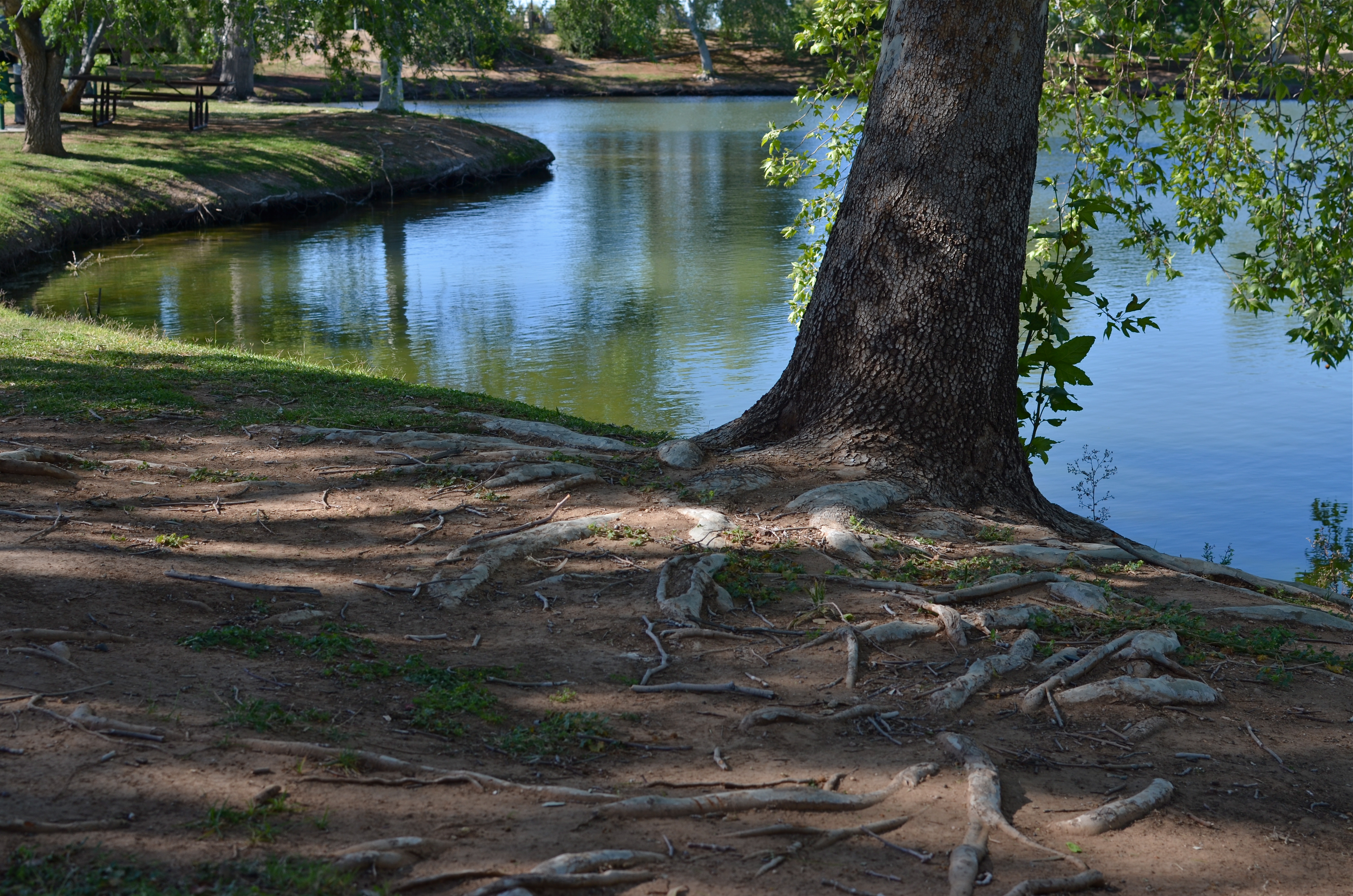
In nearby Scottsdale, hardly renowned for its dazzling urban parks (as opposed to the resort properties, which are jewels), Indian School Park at Hayden and Indian School Roads is a very inviting oasis, built around a curvy, quiet little pond, dozens of mature shade trees that lean out over the water in a lazy fashion, and, on occasion, some decorator white herons. Thing is, it’s also as bright as a steel skillet by about 9am, and surrounded by two of the busiest traffic arteries in town. That means lots of cars in your line of sight for any standard framing. You can defeat that by turning 180 degrees and aiming your shots out over the middle of the pond, but then there is nothing really to look at, so you’re better off shooting along the water’s edge. Luckily, the park is below street level a bit, so if you frame slightly under the horizon line you can crop out the cars, but, with them, the upper third of the trees. Give and take.
There is still a ton of light coming down between the shade trees, however, so if you want any detail in the water or trees at all, you must shoot into shade where you can, and go for a much faster shutter speed….1/500 up to 1/1000 or faster. It’s either that or shoot the whole thing at a small f-stop like f/11 or more. In desert settings you’ve got so much light that you can truly dance near the edge of what would normally be underexposure, and all it will do is boost and deepen the colors that are there. There will still be a few hot spots on projecting roots and such where the light hits, but the beauty of digital is that you can click away and adjust as you go.
It’s not quite like creating greenspace out of nothing, but there are ways to make things plausibly seem to be a representation of real life, and, since this is an interpretive medium, there’s no right or wrong. And the darker-than-normal shadows in this kind of approach add a little warmth and mystery, so there’s that.
It was “yellow-green”, wasn’t it?
Hope that’s not on the final.
(follow Michael Perkins on Twitter @mpnormaleye)
