GET YOUR MIND RITE
By MICHAEL PERKINS
“REALITY”, THOUGHT TO BE the normal end product of the process of pointing a camera at something, is actually rather limiting. Sure, our little boxes were originally created as an accurate, even scientific means for recording our world.. a method more reliable, somehow, than the imprecision of the painter. Soon afterward, however, the camera longed for a soul of its own, or at least the painter’s freedom to make a subjective choice as to what “real” should look like.
Bottom line: for photographers, mere reality turned out to be, well, kind of a yawner.
To go even further, it seems to me that certain subjects actually call for a kind of unworldly, almost hallucinatory quality, an attempt to make things look not like what they are but how they feel. Of course, we can’t actually show emotions or states of mind, but various photographic techniques can, and should suggest them.

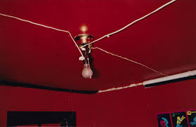
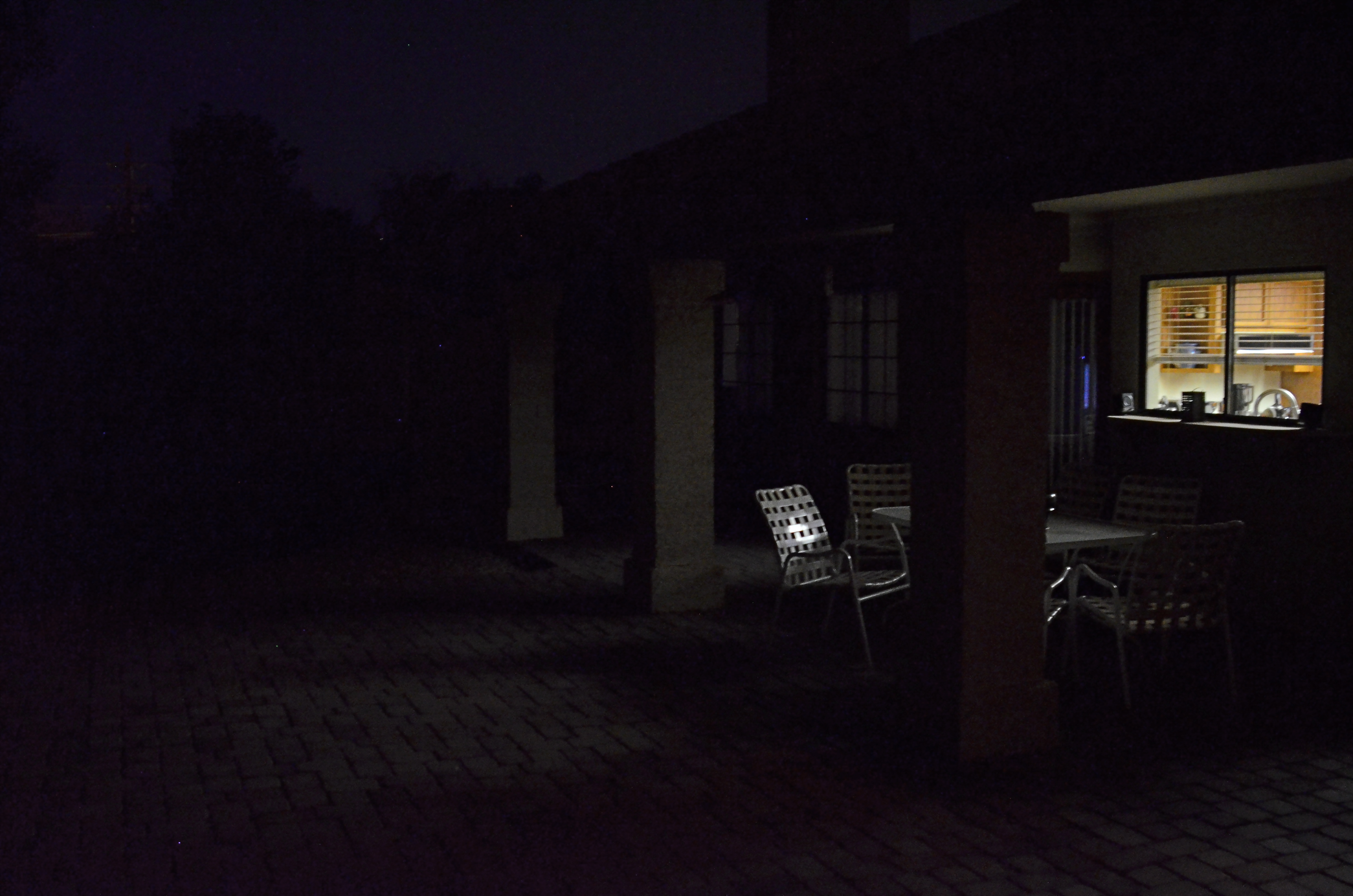
In visualizing ritual, ceremony, sacrament, or tradition, for example, you’re not merely chronicling activity. You’re also photographing mystery, or an extra dimension of consciousness. The above image, in terms of mere reality, is of a class for museum visitors curious to learn bout the Brazilian ritual of capoeira, a traditional fake-fighting martial arts performance that is performed during carnival and other national festivals. Now, you can shoot such a subject “realistically” (evenly lit, uniform focus, sharp detail), or aesthetically (dark, selectively blurred, even a little confusing), depending on what kind of feel you’re going for. This goes to the heart of interpretation. You’re not merely presenting reality: you are representing it.
Photographs originate in the mind, not in the camera, and so it must follow that there are as many “realities” as there are photographers.
TILES
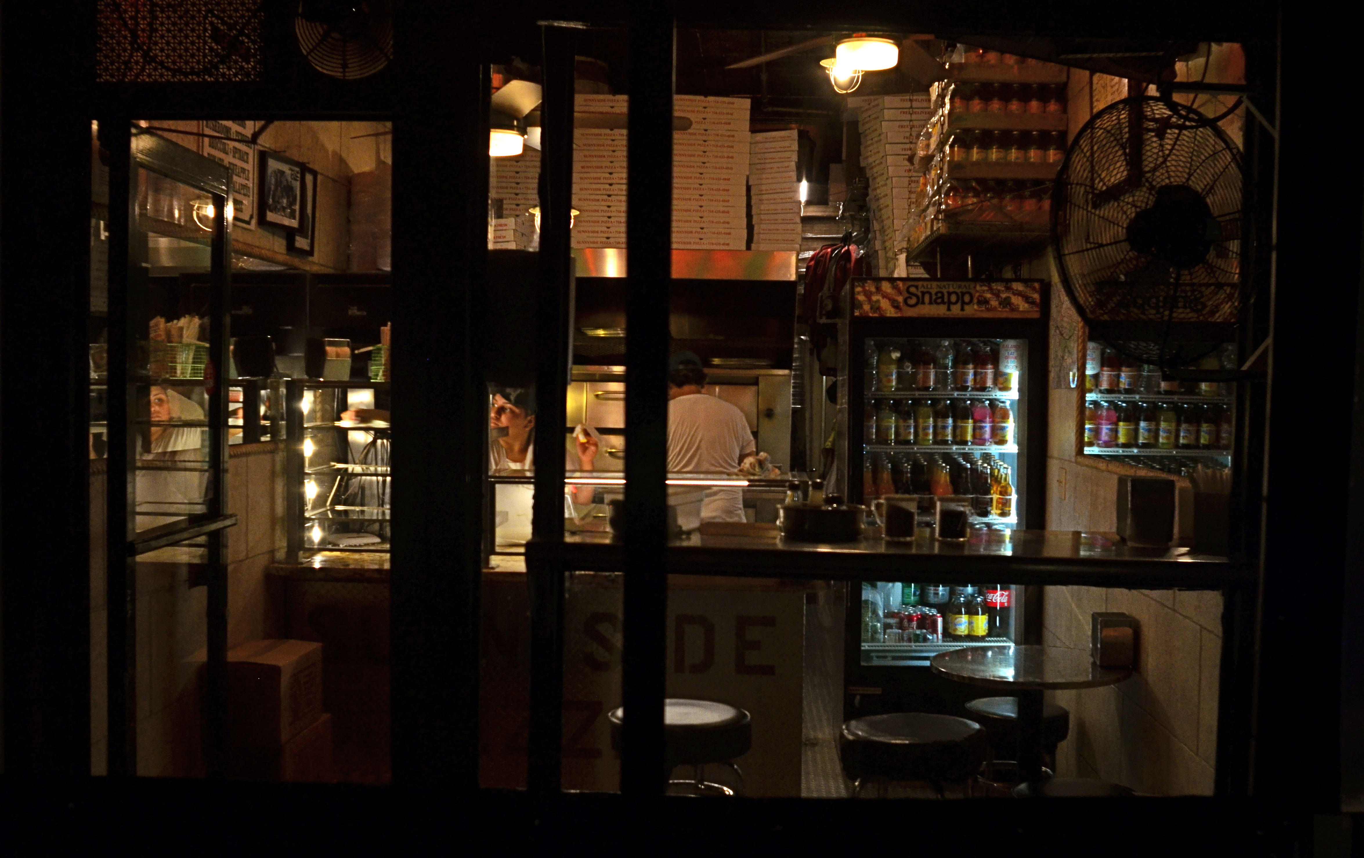
Carry Out (2017). 1/50 sec., f/4, ISO 640, 24mm.
By MICHAEL PERKINS
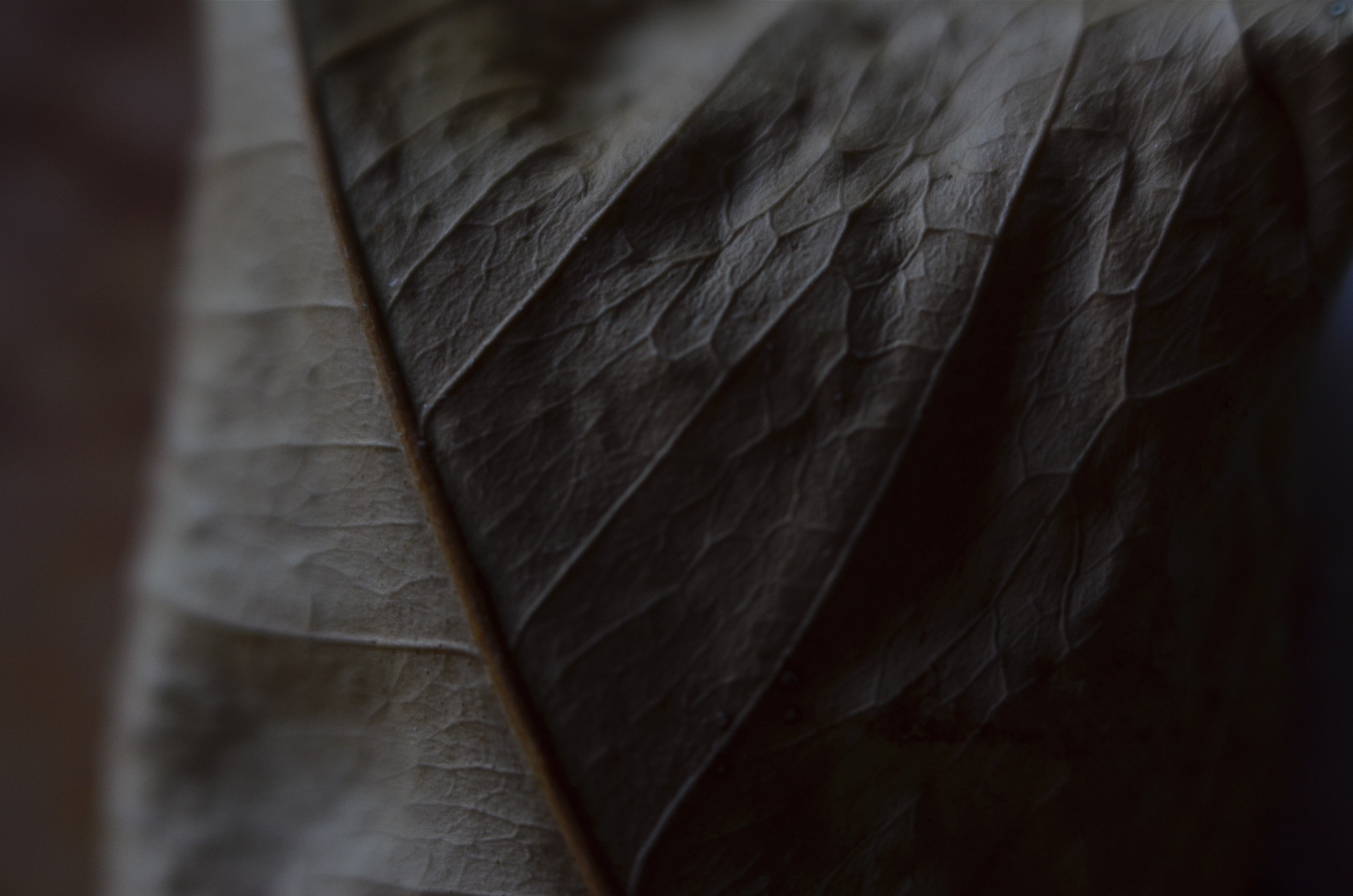
EVERY TIME I SEE SOMEONE working on a jigsaw puzzle, I can’t help but think that they’re missing all the fun. The idea of the project is, of course, to assemble enough pieces of a scene that it becomes recognizable. 200 pieces in: some kind of structure. 400 pieces in: looks like it’s made of iron, triangular maybe. 600 pieces in: oh, yeah, the Eiffel Tower!
But, whereas a picture puzzle is solved when the image looks complete enough, my favorite kind of photography centers on how few pieces of the puzzle can be supplied and still have the image communicate to the viewer. Formalists might call this minimalism: art curators might label it cubism: holy men in flowing robes might use the term zen. I just think of it as reducing pictures to the smallest number of components needed to convey ideas.
In fact, many photographic subjects actually present themselves in a kind of broken pattern right out of the gate, challenging us to create images from the spotty data they let through. For example, views through partially blocked windows, such as the one at the top of this page, in which what remains readable behind the darkened door and window framings, is more than enough to sell the message pizza shoppe.
For me, having everything spelled out to the Nth degree in a photograph is beyond boring. It’s much more interesting to engage the viewer in a kind of partnership in which he is looking on purpose and I am trying to maximize the power of my pitch, going as far beyond the obvious as I can while not letting the picture fly apart. The first minute I’ve snapped enough pieces into the puzzle to suggest the Eiffel Tower, I’m ready to leave the last 300 pieces in the box.
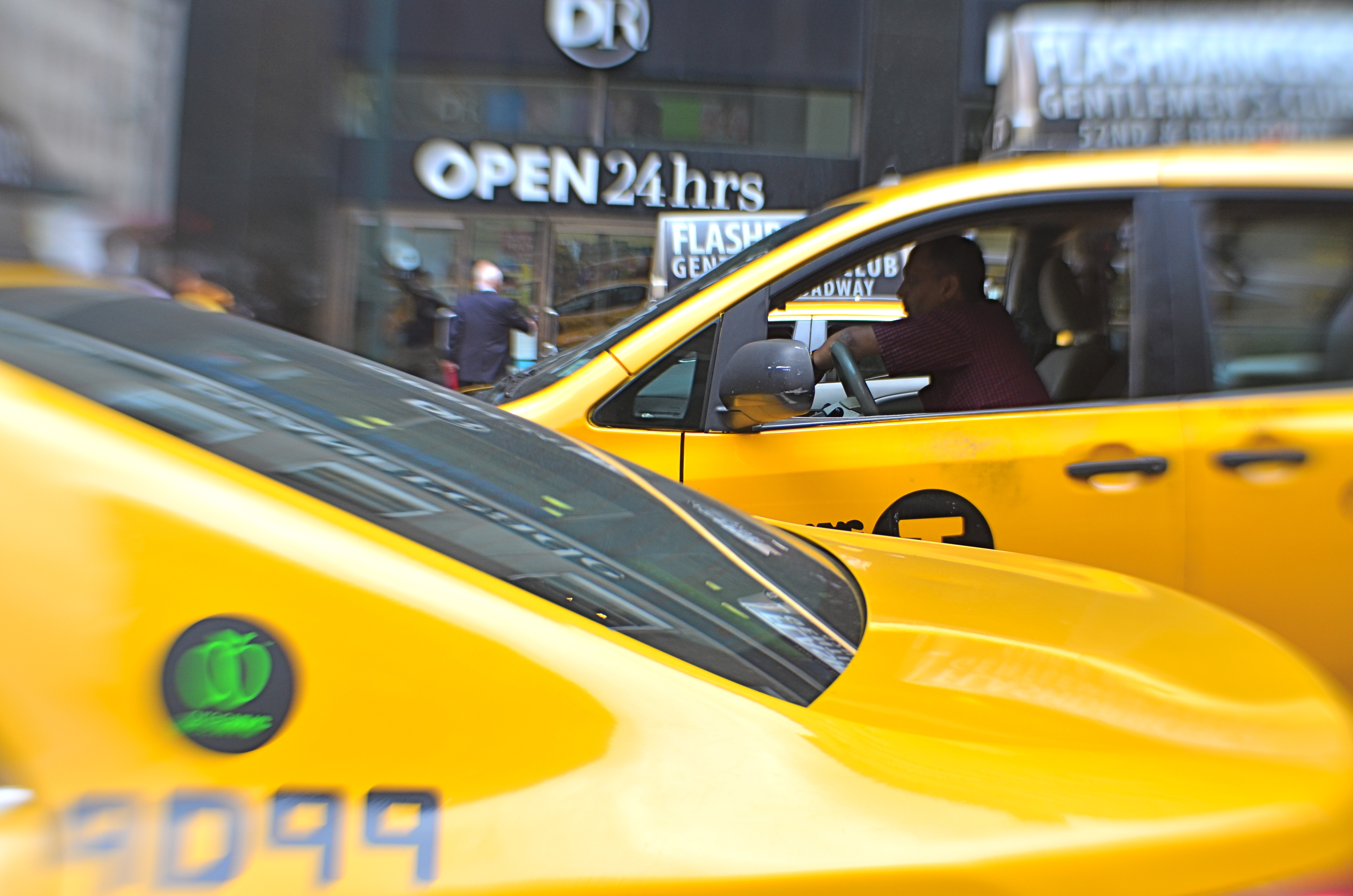
BOOKENDING
By MICHAEL PERKINS
THE HUMAN EYE HAS A SOFT SPOT FOR SYMMETRY, for countervailing energies that face off against each other in a composition. Design elements that pit left against right, top against bottom, even corner vs. corner appeal to a certain Math-Bach sense of balance in the universe. And, as does every other kind of visual art, photography builds strong images by “book-ending” elements in opposition, eye cues both tug toward the center and pull toward the edges.
Pictures benefit from this tension, this dynamic argument over what’s more dominant, or, more correctly, what’s dominant in this moment. Book-ending between extremes or contrasting forces is a visual kind of debate, a photographic arm-wrestling match. Sometimes shapes or things occupy opposing spaces in the frame are not, literally, fighting with each other, as in the two overlapping taxicabs seen above. Even so, the two yellow wedges at bottom left and top right in the frame are in a kind of balancing act with each other: call it a conversation.
In your own work, you’ve no doubt observed this visual tension occurring organically or even deliberately built it into a composition. An old building next to a new one: a tragic mask alongside a comic one: a kumquat facing off against a tomato. It doesn’t have to be dramatic to be effective. The bookends can be ornate Greek warriors or abstract slabs: it’s the opposition in the frame that starts the process of yin/yang, and lends a photograph extra heft.
NOTHING AT FACE VALUE

By MICHAEL PERKINS
SOMETIMES I THINK THAT PHOTOGRAPHERS, especially beginners, needlessly hem themselves in by “pre-editing” their work. Being human, we all care, to some degree, about how our images “play” to various viewers, and so it’s understandable that we can be scared away from attempting certain things that are too jarring or disorienting to our intended audiences. We work to hard to avoid the attachment of certain labels to our pictures.
The “a” word, “abstract”, is one such label. It’s a scare word. And it can spook us out of truly innovative image-making.
Sure, we may know that, strictly speaking, abstraction really just means extraction, pulling a visual shorthand of essence out of a more complex subject. Rather than merely recording the full detail of an object in a photograph, the abstract photographer reduces it to its most effective basics. A baseball loses its stitches and writing and becomes just a sphere. Abstraction can also yank something out of its familiar context, forcing the viewer to regard it on its own merits, so that an entire salad is reduced to the sensual curvature of one section of a single vegetable.
Okay, so that’s what we know about abstraction. However, what we feel, even about just the word, can cow us into conformity. We fear being called “artsy”, avant-grade, pretentious. And we gradually adjust our images to reflect what others regard as “real”. It’s tough: learning to trust your own vision is the single hardest lesson in any art. But what’s the alternative? Cranking out the same systematic execution of a flower for the next forty years just to curry favor with the mob?
If you observe an orchid (like the one above), and see, not merely a flower, but a winged creature taking flight, why not take the extra step and reclaim the “realness” of that object for your own purpose? The camera is an interpretative tool, not a video recorder.
Anytime we are tempted to restrict our pictures to what the world at large regards as “real”, we should listen for abstraction’s quiet but persistent question. “Real” according to whom?
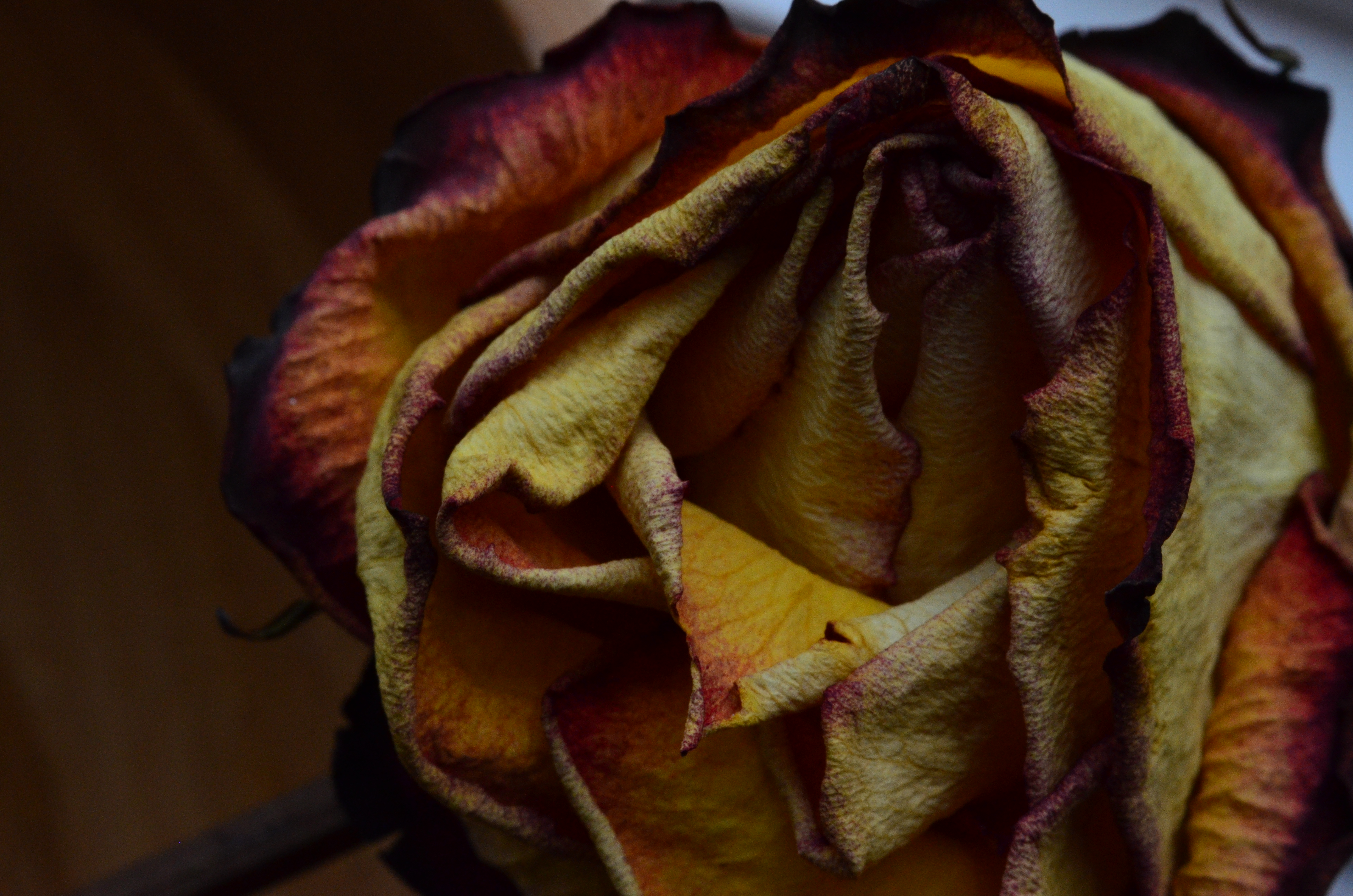
(VERY) STILL LIFE
By MICHAEL PERKINS
PHOTOGRAPHY, WHEN IT FLEXES TO ITS FULLEST LIMITS, should never be about merely accepting things at face value. The camera is a fairly reliable recording device, but simply using it to freeze time severely limits its narrative potential. Of course, on a purely personal level, that’s frequently just what we want: to stop the clock on the vanishing of tender times and loved ones: to preserve life.
However, I believe that the camera should also preserve death.
I’m not talking about doing a series of close-ups of Grandpa in the crypt. I’m mostly thinking biological subjects here. Living things are most typically photographed in the full bloom of health: the eye luxuriates over bright explosions of color, the hardy flesh of petals, the skyward reach of tender saplings. But if a photographic subject gains extra interpretive power as it’s removed from its standard context (nature in its regular settings), then a living thing achieves the ultimate visual re-contextualization as its life begins to ebb. Taking the familiar out of its comfort zone opens it up to alternate interpretations.
The rose seen above, taken with a Lensbaby Velvet 56 (a wonderful portrait lens which doubles as a decent macro), was days dead when I came upon it, and yet it presented textures more intriguing, colors deeper and richer than its fresher vase-mates. Is this ghoulish?
Depends. Decay is, after all, something we document with great enthusiasm as it applies to inanimate things like rusted cars, crumbling neighborhoods and abandoned infrastructures. How much more attention should be paid, then, to things that once mirrored our own fleeting arrangement with mortality, once throbbed with pulses as perishable as those bounding through our own veins.
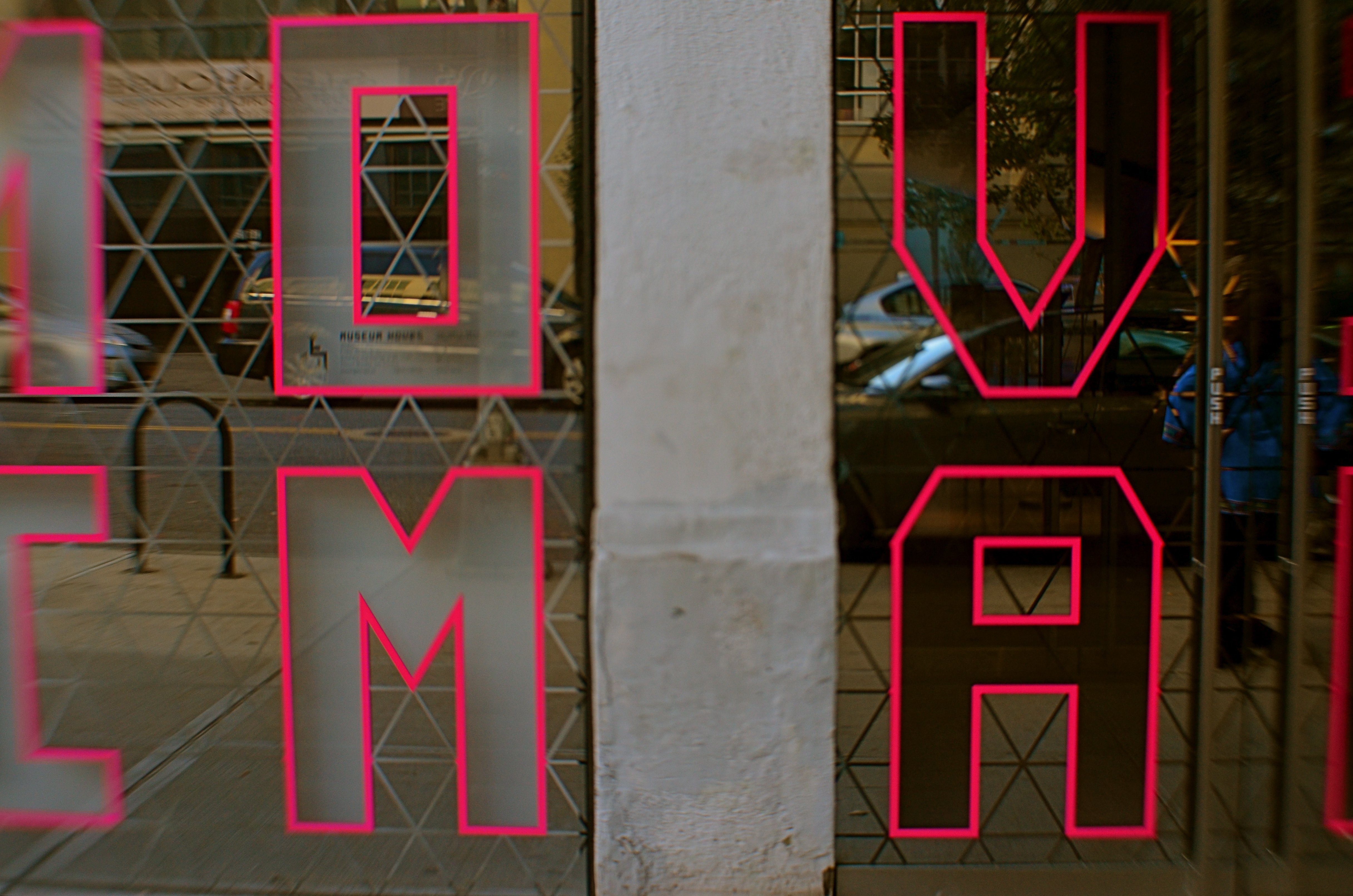
RE-PURPOSING INFORMATION
 By MICHAEL PERKINS
SIGNS ARE PRIMARILY SOURCES OF INFORMATION AND IDENTIFICATION, a utilitarian way of learning who’s who and what’s where. In photography, their primary use can move beyond those roles to become commentary, context, atmosphere, even pure abstract subject matter. As shooters, we all use signs in ways that are not strictly literal but are 100% visual. They are powerful tools.
This is a circular way of saying that, in an image, a sign is never just a sign, but a way of indicating and qualifying place, time, mood. Be it a hand-scrawled “keep out” warning outside a busted farmhouse or a day-glo neon “open” greeting outside a pawn shop, a sign is valuable narrative shorthand. Of course, just like human storytellers, some signs are untrustworthy narrators, undermining what they seem to “say” with the things they imply within an image. Managing their messaging then becomes the responsibility of the photographer, who can use their content to reveal, conceal, or comment as needed.
The sign seen here, announcing the Museum Of The Moving Image in Astoria,Queens, has its letters mounted on a mirror-like surface, allowing the viewer to see evolving street life over his shoulder as he “reads” the characters. It’s both advertisement and illustration, a low-tech demo of the museum’s intent. Like all signs, it’s a prop, a piece of stage dressing, interpreted as narrowly or broadly as you need it to be.
FIVE MINUTES OF FANCY
Start fooling around and see where it leads. It isn’t wasting time, it’s investing it.
By MICHAEL PERKINS
PUTTERING SUFFERS A BAD REPUTATION, coming somewhere on the disreputability scale between “screwing around” and “just passing the time”, poking an insolent finger in the eye of the Puritan work ethic. The headmaster’s voice echoes from the land of Hard-Won Wisdom: Time is money. Make something of yourself. Whattaya gonna do, waste the entire day?
Yeah, replies the photographer within you. Thought I might….
Making a picture isn’t the same process as building a bridge. You don’t always end the project with the same aims as you began with. Like any other artistic enterprise, the answer might come in the journey, rather than the destination. And a photographer, caught in mid-creation and asked, “what you doing?” should be quite comfortable answering, “you know, I’m not really sure yet…”
The above image is a total exercise in “let’s see what happens if I do this“, and at no time in the making of it did I have a set plan or firm objective: I just did know when to stop, but everything else was negotiable in the moment. I wasn’t wasting time: I was investing it.
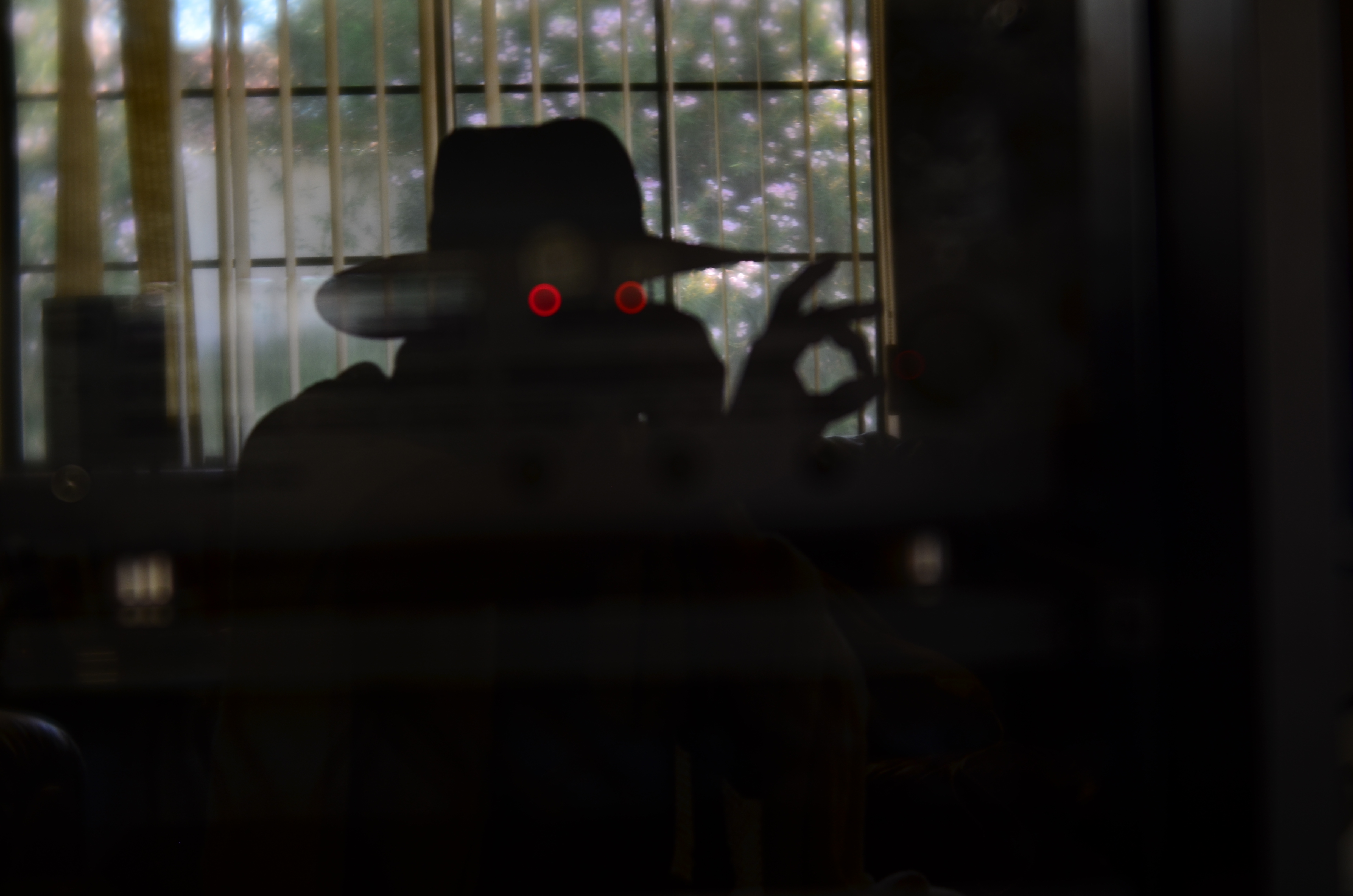
At first, I was trying to take a picture of my back yard, which over my shoulder, as it was reflected in the glass cabinet door in front of me. I was about to kill the power on the amplifier on a shelf behind the door when a test shot revealed something unusual. At my chosen aperture, the amp’s two red LEDs weren’t reading as sharp points of light, but as diffuse outer circles surrounding soft inner circles, almost like a pair of feral eyes. And at that point, the garden scene slowly started to take a back seat.
Shooting the glass door at a slight angle made my body register as a reflection, while shooting straight on turned me into a silhouette, which would become handy. Now that I was just a shape, I could be anything, so I positioned myself to where the dots indeed appeared to glowing, spooky eyes. Shooting with my right hand, my body details now masked by shadow, I crossed my left hand over beyond the right edge of my body, posing it to look as if I were stealing something, or perhaps twisting the dial on a combination safe. Having thus established the behavior for the character I was now creating, I grabbed my wife’s garden hat and threw a bed blanket around my shoulders for some sinister atmosphere. Click and done, with my newly imagined Phantom Blot plotting his way into the house. I didn’t know the whole story, but I knew when to stop playing. Total time investment: five big minutes.
You won’t always have an organized blueprint for a picture when you set about making one. Besides, if you confine yourself solely to the familiar when shooting, eventually all of your photos will start to resemble each other, and not in a good, “cohesive body of work” way.
Screw with the formula. Embrace the uncertain.
WHAT DREAMS MAY COME
Yestertoys (2017). Making this image look merely “real” held no interest, so…..
By MICHAEL PERKINS
MEMORY ISN’T SHARPLY DEFINED OR TIDY, and so the act of conjuring remembrance in art is never as forensically factual as sliding open an autopsy drawer. The yester-thing that we treasure most dearly are the true opposite of clinical artifacts: they are, instead, bleary, distorted, indistinct, and mysterious. Small wonder that trying to fix memory on a camera sensor is like trying to pitchfork smoke.
Creating images in an attempt to capture the past is a huge part of photography, but it’s a no-man’s land without clear markings or signs. We begin our visual argument by asserting that our version of a memory is the official one… but official according to whom? Even people who have shared a specific event will offer different testimony of what it “really” was. And that very subjective uncertainty becomes one of photography’s greatest charms.
It only took a few years for early shooters to conclude that photographs need not be confined to merely measuring or documenting the world. Early on, they enlisted fancy and whimsy to the cause of depicting memory, just as painters did. And conversely, once there was a machine like the camera to perform the task of faithfully recording “reality”, painters began to abandon it for Impressionism and everything that followed after. Both arts began, like Alice, to regularly venture out on both sides of the looking glass.
A great part of photography’s allure is in discovering how little objective reality has to be in image involving memory, and what an adventure it is to escape the actual in the pursuit of the potential. The camera lets us tell lovely lies in pursuit of the truth.
YOU’RE IN THE PICTURE
By MICHAEL PERKINS
THE BEST PHOTOGRAPHS ARE NOT STAND-ALONE WORKS OF ART, BUT CONVERSATIONS BETWEEN ARTIST AND AUDIENCE. You don’t just stride up to that framed image on the wall and let its wonderfulness wash over you; you bring what you have been, over a lifetime, to it, comparing those two entities side by side, and even assigning your own truth to the photo, “deciding” what it means. The pictures don’t speak to you: you debate with each other.
Think about the images that, over a lifetime, have reached you in the deepest way. Did those photographs bring you something that you didn’t already have, or was it echoed, defined, re-purposed, based on who you’ve been thus far, or how you see? How else to explain why a picture moves one person to tears, while it leaves another completely nonplussed? Of course, some photographs almost accidentally produce a similar result to a wide variety of viewers, but there are far more of them where the messaging is muddled, imprecise.
And that’s a good thing.
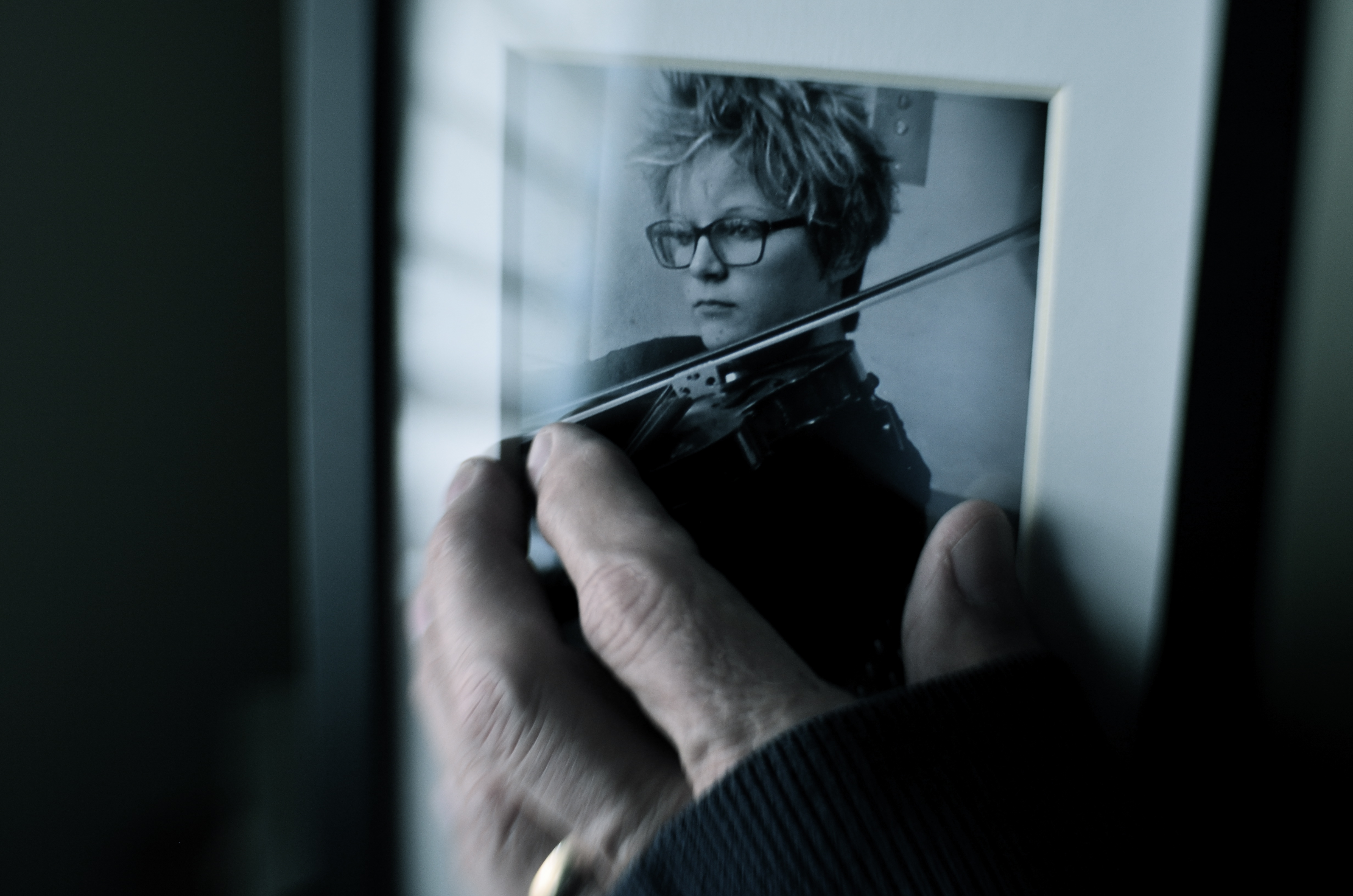
One way to repurpose a photograph is to make it part of another photograph. Or not.
I made the above image several days ago purely as an experiment, using an earlier one of my pictures as a prop within what’s obviously a staged shot. The completed “new” photograph was part of an assignment by an image sharing group I belong to, which laid down several elements that had to be in the final picture: a hand covered by something, that same hand touching something, and a de-saturated color palette. Beyond that, I had complete control of how those elements would be combined or interpreted.
The reason I began to play with some older pictures was chiefly to see if I could take a photo made with one specific mood in mind and re-purpose it within a new context, making the image elicit something completely different. So, without further background or explanation, the challenge to you: what does this particular image (which has an older image within it) convey to you, if anything? What is the dominant mood or the implied backstory? And even if what you’re seeing is not the same as what I set out to “say”, does the picture have any relevance for you personally? Does it have any narrative value, or is it merely an exercise in technique?
Context isn’t everything in a photograph, but neither is any image is absorbed in a vacuum. We color our approach to it in some way, becoming, in essence, its co-creator. You may not be in the frame, but you’re definitely in the picture.
SERVING UP SOME NUTS

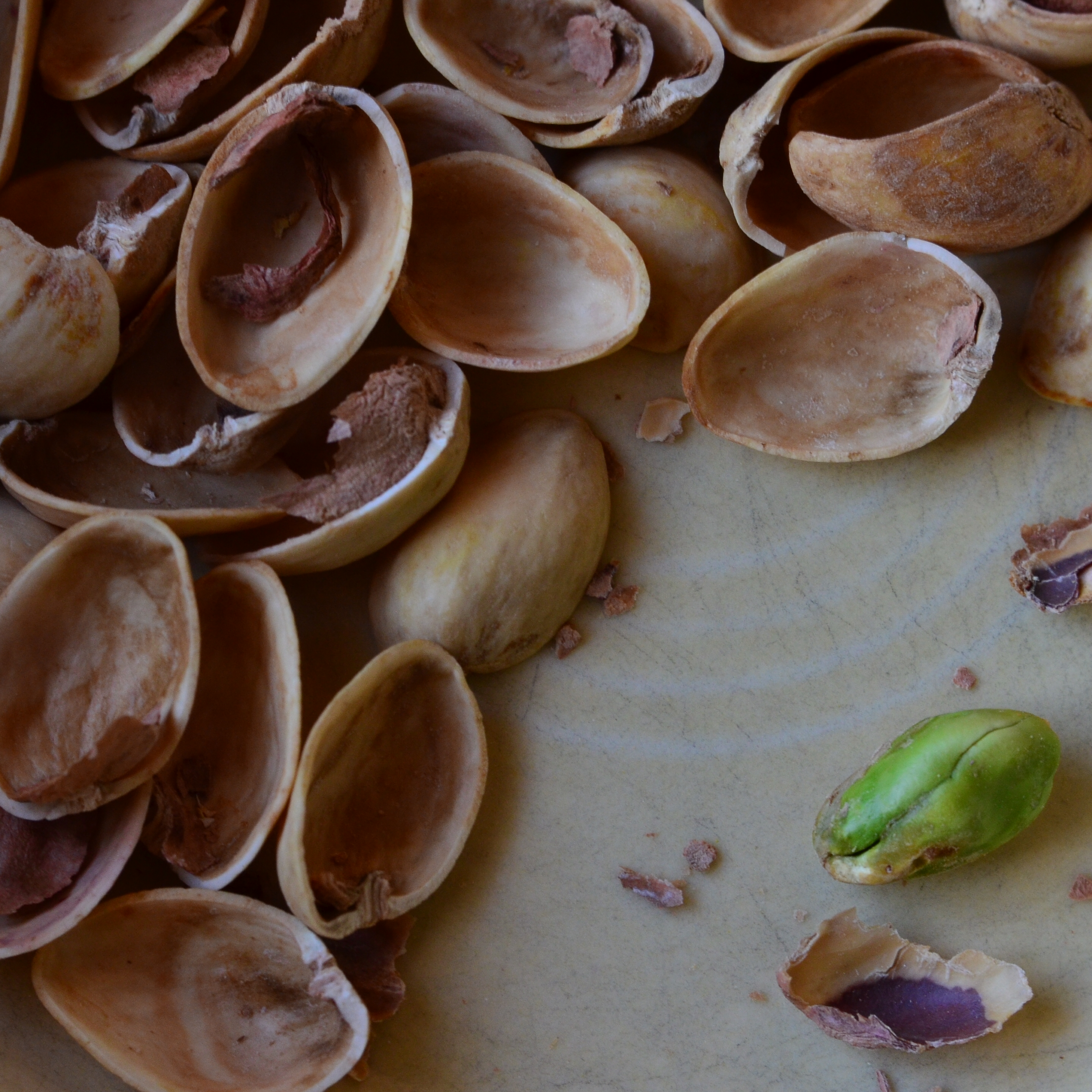
The Haves And The Have-Nots (2017)
By MICHAEL PERKINS
COMPOSITION IN PHOTOGRAPHY WOULD BE A SNAP (sorry) if the camera actually possessed not just an eye, but also a brain. But that’s where you come in.
When the human eye takes in a scene, the brain automatically ranks all the information within it, basically making a composition of priority. We “see” some things and “don’t see” others, based on how our grey matter ranks the importance of everything in our field of vision. A camera cannot make these fine decisions: it merely makes a light record of what it’s pointed at. That accounts for the fact that our “perfect” landscape, the one we ourselves recalled from the first day of vacation, comes back, in a mere photo, complete with electrical wires, distracting signs, junk near the beach, and any other number of things our brains filtered out of the original viewing experience.
Last Man Standing (2017)
Composition is thus a matter of our deliberately arranging things by priority, making an argument for our audience to Look Here First, Only Look Here, Give Greater Weight To This Over That, or any other messaging we desire. In sales terms, it’s what pitchmen call Asking For The Order. Simply, composing a photograph means setting the terms of engagement for the viewer’s eye.
With still-life photographs, the shooter has the greatest degree of control and responsibility. After all, our subject is stationary, easily moved and arranged to our whim. You pretty much are lord of your domain. That being said, it’s wise to use this luxury of time and control to envision as many ways as possible to convey your message. The image at the top of this page, for example, is crowded, but the nut shells and the unshelled nuts are a study in textural contrast. There’s lots of color and detail, with one side being somewhat blanched while the other is rough and complex. That’s one way of making the image.
For comparison, in the second frame, the terms of engagement are completely different. The pile of shells at left is more sharply contrasted with the single nut at right. The nut carries the only vivid color in the image; it’s an outlier, a misfit…maybe the last man/nut standing? The simplification of the composition lets it breathe a little, allowing the viewer to speculate, invent. Are the shells symbolic of a mound of nuts that have already been polished off in some grand snacking orgy? Why was one lone nut left to tell the tale? And so on.
Change the arrangement of subjects in a scene and you’ve changed the terms of narration, or even insisted that there is no narration, just patterns, light, or abstraction. Whichever path you choose, no composition comes to the camera “ready to eat”, as it were. You have to tell your camera’s mechanical eye what to see, and how to see it.
AT WAR WITH THE OBVIOUS
“I had this notion of what I called a democratic way of looking around, that nothing was more or less important. It quickly came to be that I grew interested in photographing whatever was there, wherever I happened to be. For any reason.” –William Eggleston
It’s a red ceiling. Don’t, says William Eggleston, look for anything else.
By MICHAEL PERKINS
MOST PHOTOGRAPHERS ARE NOT PRIME MOVERS, in that the majority of us don’t personally carve out the foundations of new truths, but rather build on the foundations laid by others. Art consists of both revolutionaries and disciples, and the latter group is always the larger. With that in mind, it’s more than enough for an individual shooter to establish a single beachhead that points the way for those who follow, and to be able to achieve two such breakthroughs is almost unheard of. Strangely, one of the photographers who did just that is, himself, also almost unheard of, at least outside of the intellectual elite.
William Eggleston (b. 1939) can correctly be credited as one of the major midwives of color photography at a time that it was still largely black and white’s unwanted stepchild. Great color work by others certainly preceded his own entry to the medium in 1965, but the limits of print technology, as well as a decidedly snobby bias toward monochrome by the world at large, slowed its adoption into artsy circle by decades. After modeling himself on the great b&w street shooters Robert Frank and Henri Cartier-Bresson, Eggleston practically stumbled into color, getting many of his first prints processed at ordinary drugstores rather than in his own darkroom. His accidental discovery of the dye-transfer color process on a lab’s price list sparked his curiosity, and he soon crossed over into brilliantly saturated transparencies, images bursting with radiant hues that were still a rarity even in major publications. Eggleston’s work was, suddenly, all about color. That was Revolution One.
Is it Eggelston’s job to provide the story context for this image? Or yours? or neither?
Revolution Two emerged when he stopped worrying about whether his pictures were “about” anything else. Eggleston began what he later termed his “war with the obvious”, eschewing the popular practice of using photographs to document or comment. His portfolios began to center on mundane subjects or street situations which fell beneath the notice of most other shooters. The fact that something was in the world was, for Eggleston, enough to warrant having a picture made of it. A street sign, an abandoned tricycle, a blood-red enameled ceiling..anything and everything was suddenly worth his attention.
Reaction in the photographic world was decidedly mixed. While John Szarkowski, the adventurous director of photography at the New York Museum Of Modern Art, marveled at a talent he saw as “coming out of the blue”, making Eggleston only the second major color photographer to exhibit at MOMA, others called the work ugly, banal, meaningless. Even today, Eggleston’s subjects elicit reactions of “…so what??” from many viewers, as if someone told them the front end of a joke but omitted the punch line. “People always want to know when something was taken, where it was taken, and, God knows, why it was taken”, Eggleston remarked in one interview. “It gets really ridiculous. I mean, they’re right there, whatever they are.”
However, as can frequently happen in the long arc of photographic history, Eggleston’s work reverberates today in the images created by the Instantaneous Generation, the shoot-from-the-hip, instinctive shooters of the iPhone era who celebrate randomness and a certain hip detachment in their view of the world. As a consequence of Eggleston’s work, images have long since been freed of the prison of “relevance”, as people rightfully ask who is qualified to say what a picture is, or if there is any standard for photography at all. Thus does the obvious become a casualty of war.
VISUAL SHORTHAND

On The Barrelhead (2017). Given your mind’s files on what, visually, a “dollar” is, not much literal detail is needed to convey said object in a photo.
By MICHAEL PERKINS
ONLY A SMALL PERCENTAGE OF OUR MIND’S INNER LIBRARY OF ACCUMULATED DATA is at the top of our consciousness. Staying aware of everything we’ve learned in our lives, every minute of the day, would obviously lead to a mental train wreck, as the vital and the trivial created an endless series of collisions between what we need to know and what we need to know right now. The brain, acting as a wonderful prioritizing network, moves information to the foreground or tucks it toward the back, as needed.
The visual patterns we’ve developed over a lifetime are also at work in how we create and interpret photographs. We know in an instant when we’ve seen something before, and so we process known objects in a kind of short-hand rather than as something we’re viewing for the first time. This allows us to make camera images that are abbreviated versions of things we first encountered long ago, images that merely suggest things, rather than delineate them in full detail. Call it abstraction, call it minimalism, heck, call it a ham sandwich if that helps. It merely means that we can use our brain vaults to show parts of things, and count on our memories to recognize those things solely from the parts.
Focus is but one such way of supplying visual information to the brain, and its selective use allows the photographer to convey the idea of an object without “spelling it out”, or showing it in absolutely documentarian terms. In the image above, our collective memory of the contours and details of a dollar bill are so deeply ingrained that we don’t actually need to see all of its numbers, letters, and images in full definition. Focus thus becomes an accent, a way of highlighting some features of a subject while downplaying others.
It may be that, in photographing selective aspects of objects rather than showing their every detail, we are teaching the camera to act like the flashing fragments of memory that our mind uses to transmit information….that is, teaching a machine to see in the code that we instinctively recognize. Is all interpretation just an attempt to ape the brain’s native visual language? Who knows? All that we really have to judge an image by is the final result, and its impact upon other viewers like ourselves.
THE LOVE OBJECT
By MICHAEL PERKINS
IN EARLIER OUTINGS, WE HAVE DISCUSSED THE VALUE of knowing how sunlight enters your house at all times of the day. Knowing where bright spots and slatted beams hit the interior of your home in different hours gives you a complete map of “sweet spots” where natural light will temporarily isolate and flatter certain objects, giving you at least several optimized minutes for prime shooting each day.
Keeping this little time-table in your head allows you to move your subjects to those places in the house where, say, the daily 10 a.m. sun shaft through the family room window will give you a predictably golden glow. For me, that location is my living room window, across which the southwestern sun tracks east/west, and the object is my white baby grand piano.
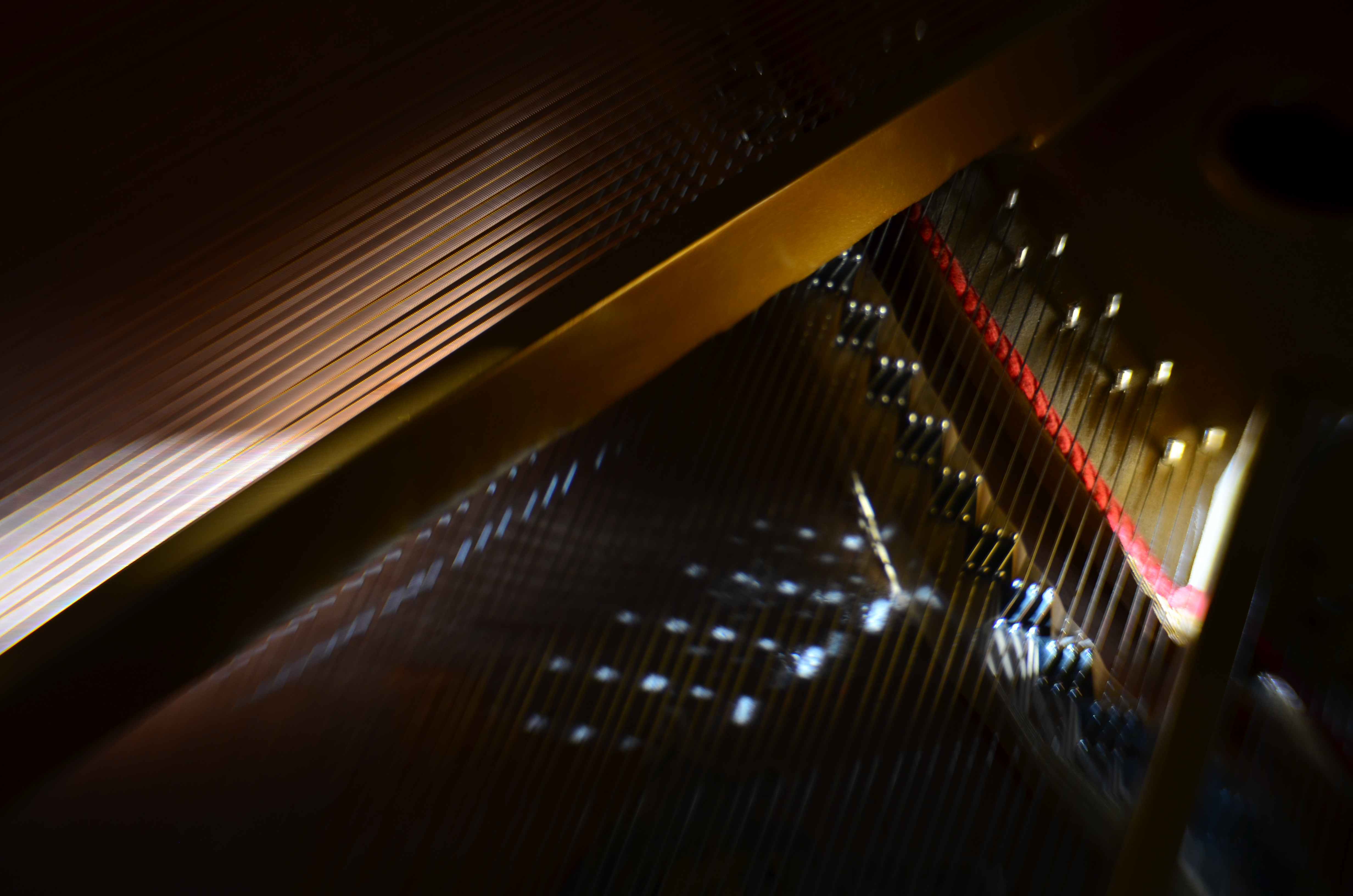
Cordophone Chroma (2017).
Pianos, to me, are divinely complex gadgets, creations of the first great industrial age, their impossibly intricate mechanics offering thousands of possibilities for macro shots, fisheye explosions, abstract compositions, shadow studies, and delicate ballets of reflections as the morning sun dances across harp, strings, and hammers in an endless kaleidoscope of radiance. I have long since tracked how the sun showcases different parts of the piano as the day progresses, and how that corresponds to the instrument’s various sections and subsections.
Hard-wiring that schedule into my skull over the years means I know when a shot will work and when it won’t, making the object more than just something to shoot. It becomes, in effect, an active kind of photo laboratory, a way of teaching and re-teaching myself about the limits of both light and my own abilities. Better still, the innate intricacy of the piano as an object guarantees that I can never really get “done” with the project, or that something that was a mystery in January will become a revelation by June.
What gives this process a special lure to me is my endless effort to exploit natural light to the full, believing, as I do, that nearly every other less organic form of illumination is measurably poorer and less satisfactory than that which comes plentifully, and for free. The house I live in has thus become, over the years, a kind of greenhouse for the management of light, an active farm for harvesting the sun.
BLUR IS THE NEW SHADOW

Modern art lenses allow different parts of objects that are all in one focal plane to be selectively blurred.
By MICHAEL PERKINS
I’M INCREASINGLY FASCINATED BY PHOTOGRAPHS THAT SUPPRESS INFORMATION, choosing to selectively conceal details rather than merely delineate everything in the frame in the same exhaustively sharp detail. At the same time, I hate it when this technique is referred to as being “painterly”, as if, after all this time, photos are still striving for the same pedigree that daubers automatically inherit merely by picking up a brush. Photographs are not, and should not try to be, paintings, just as a shoe should not try to pass as a glove. Love the function of the art you have, and leave the mimicry to the mockingbirds.
The “painterly” tag used to be tied mainly to anyone shrouding their images in shadow, as if we were all bucking to be the next Rembrandt or Reubens. And certainly the use of darkness in photography creates a kind of mysterious minimalism, telling more by showing less. We linger over what’s left out of a photo, and the deliberate subtraction of detail simplifies a composition to its barest terms. When there is less to see, you eye goes like a laser to what remains. It’s a big, bright “this way, dummy” arrow pointing toward the heart of the picture.
In the same way, the current wave of photographers are using blur to punch up the impact of images. Any Google search of the phrase “blur my photos” unearths a wellspring of apps that allow any part of any frame to be selectively de-focused, in most cases (as happens with apps) after the picture is taken. Long regarded as the stuff of artifact or accident, blur is now being arranged, managed, and chosen as a tool to remove distracting detail from compositions, or to render them softer and more intimate. In the above image, separate elements of the structure, all of which lie generally in the same focal plane, can be selectively softened so that one can become dominant, while the other is abstracted. This particular shot is done with a Lensbaby Sweet 35 lens, which allows the “sweet spot” of focus to be rotated to any location the shooter desires, although there are many paths to similar results.
Both apps and lenses, which include newly reworked versions of old optics, offer a return to the randomness from which early photographers longed to escape. Lomography, the revival of flawed and cheap cameras from the film era, actually touts blur as a strength, an arty accent much to be desired. To be totally counter-intuitive about it, blur is edgy. Of course, some blur is just another kind of visual noise, and if it’s applied too carelessly or too much, it actually pulls the eye away from the main message of a picture. However, it’s thrilling just to see the sheer breadth of approaches that are suddenly available everywhere, most of them cheap, fast and easy. Blur can “sharpen” a picture just like darkness can “illuminate” one. It’s the new shadow.
EMBRACING THE DARK, AND OTHER FLAVORS
By MICHAEL PERKINS
THERE IS A WHOLE SEPARATE WING OF THE PHOTOGRAPHIC ESTATE that values dark almost more than light. It’s a photography of near-night, work that suggests only the merest intrusion of illumination into a palette of black. An almost-nothing. A bleary, evanescent glimpse, a suggestion. Minimalism taken to the maximum.
Or, in other words, the dead opposite of the mindset of the majority of photographs made over time.
Phytomorphology 3 (2016). I could labor to make this image 100% accurate as to biologic detail, but do I need to?
For most of us, the camera was expected to get better and better at registering accurate detail in less and less light, giving us a reasonably balanced record of color and depth, a kind of realism, or at least documentation. This is the photography of the consumer, who was taught to want pictures in which everything is spelled out, obvious, apparent. Sunny Days, Natural Flesh Tones, Life As We Know It. The advance of the science of recording things with cameras seemed to suggest that well-lit meant well-realized, that we would eliminate murk and shadow in the name of clarity. We decided that those things which dealt in the dark basement of tones were “bad” pictures, defective in some basic way.
The development of art photography has often taken the opposite approach, with some artists going so far as to revive “dead” technologies like daguerrotyping, serigraphing, deliberate under-exposure, even purposeful degrading of the image (dragging negatives over ground glass, dancing on them, soaking them in bodily fluids) to get the look they desire, actually eliminating information from their pictures. Even the recent fad of lomography, which worships faulty cameras and errant processing, is indicative of the “dark” school. It doesn’t have to be in focus. It doesn’t have to be a picture “of” anything. And who made up these rules for composition, anyway?
Photography, as always, will not be reduced to a set of standards. Consumer products still try to steer customers toward predictable images, with most “how tos” listing simple steps for uniform results, or pictures that “look like photographs”. The dark worshippers, by contrast, are asking us to train our eyes to see what is not presented, as well as what is. Alright, they concede, we didn’t show everything. But you can supply the rest.
Finally, the camera remains essentially a mere servant, subject to the whims of its user. We cannot truly mechanize and regulate what comes from the eye or the soul. True art can never remain static, and any kind of creativity that doesn’t frequently threaten to break down into chaos may not be worth the effort.
ISLANDS IN THE SHADOWS
By MICHAEL PERKINS
FIFTY-PLUS YEARS INTO MY LOVE AFFAIR WITH PHOTOGRAPHY, I now regard my earliest concept of a “good picture” as I regard other ideas of my youth….that is, seeing how I viewed the world given the limited scope of my own experience. When I first started making my own pictures, my models were drawn from the pages of the then-dominant photo magazines, like Life, Look, and National Geographic. Thus, for me, “good” photographs served either the reportorial functions of a news assignment or the color-saturated visions of landscape lovers. And that, for me, back then, was more than enough.
Both these kinds of images favored a fairly literal translation from the actual into the photographed: interpretation and abstraction was not anything I gave serious thought to, since I wanted my simple box-camera creations to look like “real photographs”. Art photography certainly existed, but very much at the edges of the culture. Most museums, by the early 1960’s, had still not mounted their own photographic exhibitions. Most popular photography, shaped by a large middle-class consumer culture (think Kodak Instamatic), was candid and personal in nature. Most people wanted Grandma to look like Grandma, unfiltered through any Warholian irony, commentary or experimentation. It was still a compliment for someone to say of your pictures that they “looked like a photograph”.
Would more light, more detail, convey the story any better in this image? 1/10 sec., f/2.8, ISO 2000, 24mm.
Strangely, one of the things that revised my thinking on what was “good” was an increased awareness of the works of some of the first photographers, pioneers who sweated mightily to wrangle the infant media into something like reliable performance. In their work with ever-changing combinations of plates, media, lenses and emulsions, the first photogs’ breakthrough photographs often failed from a purely technical viewpoint, producing irregular patches of light appearing randomly like islands in a sea of shadows.
But what these wizards’ first attempts often achieved, almost by accident, was the first real abstraction in photography: pieces of reality, rather than its totality: hints of the truth which invited speculation, examination. New questions were posed: what was missing, and did it matter if it wasn’t there? Could a photographer, in fact, deliberately extract parts of the “whole” picture, letting the minimum speak for everything that was left out? I gradually began to wander in search of answers to these questions.
There are times when a picture speaks louder the less it says. My original orientation to “good” images, seeing them as the most faithful translation of the literal onto film, expanded gradually to include whatever visual language communicates best in a given picture. Sometimes, in some very key instances, it helps to think like the first practitioners, who discovered, however haphazardly, that mere reality sometimes comes up short.
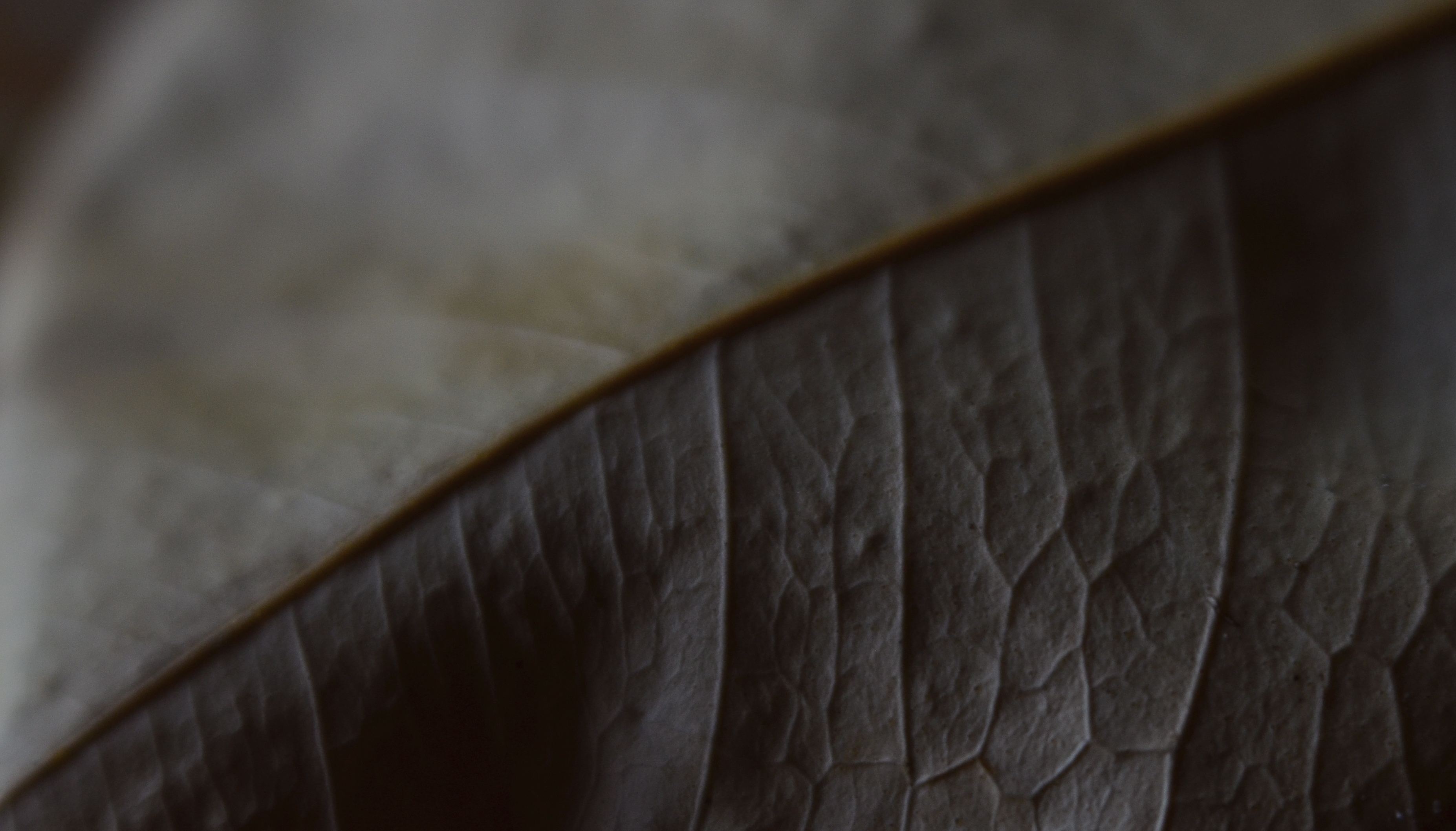
EXQUISITE CORPSES
Phytomorphology 2 (2017). Macrophotography helps alter the memory context of familiar objects.
By MICHAEL PERKINS
AS A BOY, THEODORE ROOSEVELT TAUGHT HIMSELF THE ANATOMY OF BIRDS that same way James Audubon did, by studying birds he himself had killed. Although this coldly clinical approach may strike us as cruel today, it was accepted practice for a young naturalist in the late 1800’s, a time when even eminent surgeons, faced with a shortfall of cadavers for academic study, occasionally hired freelancers to raid graves in search of, er, manpower. And so it goes.
At decidedly less risk, photographers have also made still-life studies of dead things, from game kills to seed pods, trying to appreciate structure, design, and function in a controlled environment. But there is more to their pokings than the grand advancement of science, given that death changes things in a way that transforms their aspect, altering their usefulness as visual subjects. Objects that have gone from living to non-living reflect light differently; textures and patterns are re-shaped; in short, the thing becomes an abstraction of itself.
Add magnification to the mix, and a thing becomes completely untethered from our usual conception of it, since, among other things, we are used to viewing it from a distance of feet or inches rather than millimeters. Just as where you stand affects the impact of a landscape, the place where you park a macro lens on an object dictates a completely different story with just the smallest variation.
There is a renewed fascination in the photographic world with minimalist abstraction, in which an object is changed so much in magnification and composition as to become a completely new thing, or…if the photographer so desires, a whole new nothing, a subject with which the viewer has no prior associations, functioning as pure pattern or design. For me, that’s the appeal of macro work…..to take the familiar and render it neutral in meaning, allowing me to re-assign it visually, to ask the viewer to, in effect, regard it as a foreign object, one that can take on whatever significance he sees fit.
Photography is primarily about what to see but it often provides cues as to how to see as well. Viewpoint is verification, and things impart different truths to our eyes, depending on how we approach them.
CHRISTMAS ON THE QUIET
By MICHAEL PERKINS
THE HOLIDAYS PROVIDE A REMARKABLE VARIETY OF VISUAL RESPONSES IN PHOTOGRAPHERS, so subjective are each person’s memories and experiences. This ensures that the subject is well nigh inexhaustible, although I seem to see images falling into one of two broad categories.
One class includes the snapshot-oriented, direct-experience images, which record one’s treasured good times……such as the family tree, the winner of the neighborhood’s exterior lights extravaganza, Bobby’s first moments with his new bike, etc. The other main class seems to center on a kind of abstract interpretation of pattern, color, and shape, and may be more subtle or understated in approach. Of these two basic groupings, one is specific, rooted in personal impressions, while the other is design or concept based. Both produce great photographs, but the aim, for each, is very distinct.
As my own Christmases have become more abbreviated and less populated (family and friends far away), my observance of the holidays is, accordingly, much more muted, less decorous than in years past. The merry little Christmas referred to in the song becomes the dominant theme, and I find my seasonal photos try to say more and more with less and less. The images are simpler, quieter. Whether I have chosen this or it’s chosen me is hard to say for sure. I only know that, as the million elements that define a busy family Christmas fade into memory, I create pictures that suggest the essence, rather than the exhaustive detail, of the holiday’s themes.
Of course, whether this time of year means anything at all to you is a matter of taste, especially as you age up. One of the most interesting places to spend the holidays, for example, is Las Vegas, simply because the town does not sport any decorations of any kind. In deference to many who want to flee rather than celebrate the hustle, the entire city becomes a strange sort of haven, filtering out both the profane and the holy. So, if I snap a picture at Caesar’s Palace on December 25, does that fact alone make the result a “Christmas” photo?
You get the idea: even in less extreme cases, the holidays are in the eye of the beholder. Eventually, what makes a day special is what makes it special for you. Whatever your own circumstances, enjoy the world as you would prefer to compose it. Make the season your personal treasure, whether loud, soft, lush or laid back. No image is a bridge too fa (la la la).
MAKE IT SO
I’ve been photographing this for years, and I still don’t know what I think about it. Needs more work….
By MICHAEL PERKINS
WHEN PHOTOGRAPHY IS PURELY REPORTORIAL, as it is in journalism or documentation, it sticks pretty close to the accepted state of the world. It tries to depict things plainly and without comment; it delineates and defines; it shows us the true dimensions of events.
But when the same technology is used interpretively, there is no absolute “real”, no pure authenticity, other than what we choose to show. It is in re-purposing the world visually, shaping and framing it as we choose, that we can confer meaning on it pretty much at our whim. That’s where the “art” part comes into what would otherwise be a merely technical measurement of light. We not only choose our subject….we set the conversation about it. Simply stated, what you shoot is about whatever you decide it’s about.
Even with hyper-familiar objects, things seen and re-seen to the point that they are iconic (think Empire State Building) images can re-set the way we take those objects in. And, in the case of what I like to call “found objects”, such as the image seen at the top, the photographer is completely unfettered. If your viewer’s eye has no prior mental association with something, you’re writing on a blank sheet of paper. You can completely dictate the terms of engagement, imbuing it with either clarity or mystery, simplicity or symbolism.
I have always been flat-out floored by photographs that take me on a journey. Those who can conjure such adventures are the true magicians of the craft. And that’s what I chose to play in this arena over a lifetime. Because, when photography liberates itself from mere reality, it soars like no other art.
APPEARS TO BE…..
Stylistically, I can say, without fear of refutation, that this is, um…a photograph. Ain’t it?
By MICHAEL PERKINS
I RECALL, MANY YEARS AGO, WHEN THE JUICIEST COMPLIMENT I COULD IMAGINE SNAGGING for a photograph was that “it looks just like a postcard”. That is to say, “the picture you’ve made looks like another picture someone else made while trying to make something look like…. a picture”.
Or something like that.
Seems that an incredible amount of photography’s time on earth has been spent trying to make images not so much be something as to be like something else. The number of effects we go for when making an image, in the twenty-first century, is a list of the inherited techniques and processes that have waxed and waned, and waxed again, over the entire timeline of the art’s history. We are now so marinated in all the things that photographs have been that we find ourselves folding the old tricks into new pictures, without self-consciousness or irony. Consider this partial roster of the things we have tried, over time, to make images look like:
Paintings Etchings Drawings Daguerreotypes Tintypes Cyanotypes Expired film Cross-Processed Film Kodachrome Sepiatone Toy Cameras Macro Lenses Badly-focused, Damaged and Flawed Lenses Obsolete Film Stock Daytime Night-Time Negatives Postcards Antique Printing Processes Dreams, Hallucinations, and Fantasies “Reality”
We not only manipulate photographs to make them more reflective of reality but to mock or distort it as well. We make pictures that pretend that we still have primitive equipment, or that we have much better equipment than we can afford. We utilize tools that make pictures look tampered with, that accentuate how much they’ve been tweaked. We make good pictures look bad and bad pictures look passable.
This post is turning out to be the evil twin of a recent article in which I emphasized how little we know about making “realistic” images. The more I turn it over in my mind, however, the more I realize that, in many cases, we are trying to make new photographs look like photographs that someone else took, in a different time, with different limits, with different motives. We steal not only from others but also from what they themselves were stealing.
All of a sudden my head hurts.
