SUNSET SITTINGS
By MICHAEL PERKINS
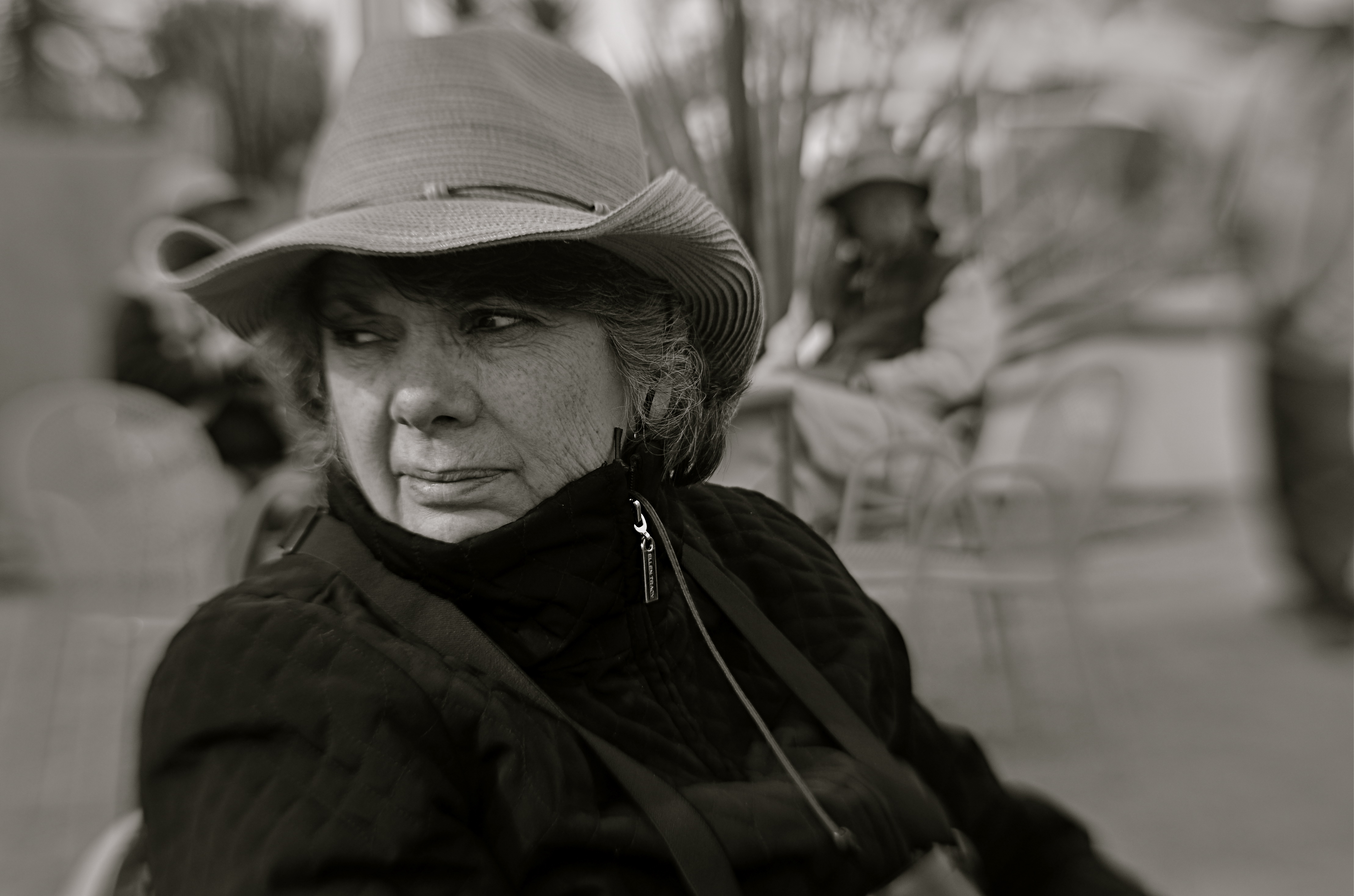
I DON’T POSSESS THE TALENT FOR COMPARTMENTALIZATION that pros like Annie Leibovitz or Richard Avedon have shown in making extremely intimate “final” images of the most important people in their lives. Annie’s sad, understated portraits of the last days of her partner Susan Sontag are oddly comforting, in contrast to the harrowing loneliness of Avedon’s images of his dying father, but, in both cases, they managed to force themselves to tell those stories in a way that I could never do. And, given that I believe that the camera can, and should, have universal access to any kind of story, I know that this makes me a bit of a hypocrite.

The reigning champion, my father.
My father, at this writing, is ninety-three years of age, and as fragile as a Japanese paper lantern. He may not be at the volcano’s edge just yet, but, damn, he is certainly in the neighborhood. I recognize the value in photographing the tough as well as the triumphant. And I get that, when I am feeling “reportorial”, that may strike someone else as being predatory, invasive. And my indecisiveness about taking, well, any pictures of him, at this point, has been exacerbated by the nagging realization that, living far from him, as I do, the next snap might well be the last one I will ever take.
During my most recent visit with him, the importance of the individual moments…our every ritual, each major or minor exchange, hung so heavy in the air that picking up my camera just seemed…vulgar, perhaps even disrespectful. How Leibovitz and Avedon could look upon that inexorable ebbing of life, day after day, and still be able to tuck their feelings into a pocket long enough to make an objective subject out of their dear ones….Jesus, the whole thing strikes me as supernatural, like being able to levitate, or render oneself invisible.
I took one picture of Pop the entire week I was around him, and it was just before I was due to fly “home” (what does that word even mean?), during an evening that was actually a little miracle, a night in which Mother and he were both awake, strong, playful even, and most importantly, really there…..present in a way that reminded me of the real, amazing people entombed inside these decaying carapaces. On such a night, through all the pain, despite all the storms on the horizon, there, for a minute, was my Father. Strong. Decisive. Reflective. Dignified.
Snap.
And, hopefully, not for the last time…
Liberty Liberated

A rather cold, imperious rendition of “Liberty” as seen on this 1879 U.S. silver dollar.
By MICHAEL PERKINS
THE BEST WAY TO APPROACH A PHOTOGRAPHIC SUBJECT PURELY ON YOUR OWN TERMS is for the thing to be severed from its original context, torn free of any associations it once had with the world at large. Once these so-called “found objects” come into our hands, we can make pictures of them as only we see them, not as they were anchored to everyday use. They become, in this way, blank canvasses of sorts.
In recently looking over some old coins ranging from the 1880’s to the 1920’s, I became struck with how self-obliterating their history was. That is, they were all something so commonly used by the public as to be virtually invisible…and then became literally invisible as newer designs vanished them, yanking them from circulation to be replaced by versions more consistent with the fashions and priorities of new eras. One thing that seemed particularly fluid was the depiction of Liberty, each generation’s edition created to conform to our conceptions of the concept they personified.
On the 1887 silver dollar, seen at top, the lady is a rather classic goddess figure, austere, inscrutable, even muscular. She’s shown in a classic two-dimensional profile, very much in the tradition of Greek and Roman antiquity. She’s remote, above it all. In contrast, the rendition that replaced her on the 1921 “peace” design, seen below, is more contoured, and decidedly a woman of the troubled twentieth century. Her neck is slender. Her expression is expectant, even anxious, coming at the end of a decade of horrendous global slaughter. Her “peace” is more of an aspiration than a fact, her femininity borne of a personal, more mortal idea of hope. I wanted to make a picture that captured those qualities.

Liberty for a new age: the same ideal as envisioned on the U.S. “peace” dollar coin.
For “my” Liberty, then, the clinically stern crispness of a standard macro shot, i.e., hard evidence of the tough life of a widely circulated coin (scratches, dents, etc., in bold relief) had to, in photographs, gave way to an idealized, softened kind of aspect, or as close as I could come to a kind of dream state. I used a Lensbaby Velvet 56 lens, which is deliberately designed to create the spherical and chromatic aberrations that used to produce glowy, softer focus as an accidental artifact of older, more flawed lenses. In recent years, Canon, Pentax and Mamiya have also made glass that mimic that flaw, especially at wider apertures (this was shot at f/3).
Working to liberate “my Liberty” was creatively easier because the coin she graces has vanished from daily use, and, with it, all the associative ties to the world that it was created for. That allowed me to imagine her for myself, and every photograph I have ever truly cared about began under just such terms.
THE LAND I LEFT BEHIND ME
By MICHAEL PERKINS
LANDSCAPES, AS I HAVE CONFESSED SEVERAL TIMES IN THESE PAGES, are not the lead arrow in my photographic quiver. Given an urban setting exploding with human activity, I will typically forsake a serene seacoast or majestic mountain range as shooting fodder, not because I necessarily disdain them, but because I often find myself unable to bring anything profoundly personal to them. Perhaps shooters with a more naturalist bent are inspired to new heights of expression when framing up scenery. I certainly value nature as a foundation for certain kinds of pictures, a backdrop for my “lead” components, if you will, but I find myself flummoxed in trying to depict them as the main attraction, as nature for its own sake. Why?
Of course, I have shot literally thousands of landscapes, and, under certain circumstances, such as the past year’s Great Hibernation, I have been forced to embrace more open spaces not only as refuge but as default subject matter. I simply am stuck miles from where I prefer to shoot, and so I have tried to capitalize on the surplus practice time to, at long last, be “better” at landscapes. This time, I have tried to plow into fresh ground by changing the way I depict such scenes, with the traditional sharpness and detail of the postcard giving way to understatement and atmosphere. And I’m finding that the resulting minimalism is comforting, that the idea of trying to say more things through mere suggestion might finally be my sweet spot.
Once the baseline information of a landscape needed for identification has been established…that is, once enough visual cues have been provided to attest to its being a picture of a boulder, shoreline, forest, etc., what really needs to be included that has any additional narrative power? I totally get the fact that detail and texture can be a story in themselves, as in the granite grandeur of Ansel Adams’ Yosemite giants, but I believe that landscapes rendered in paintings, for example, often reduce those details to their essence, especially in the work of impressionists. Why does the photograph have to be faithfully “graphic” or documentary in depicting those details?
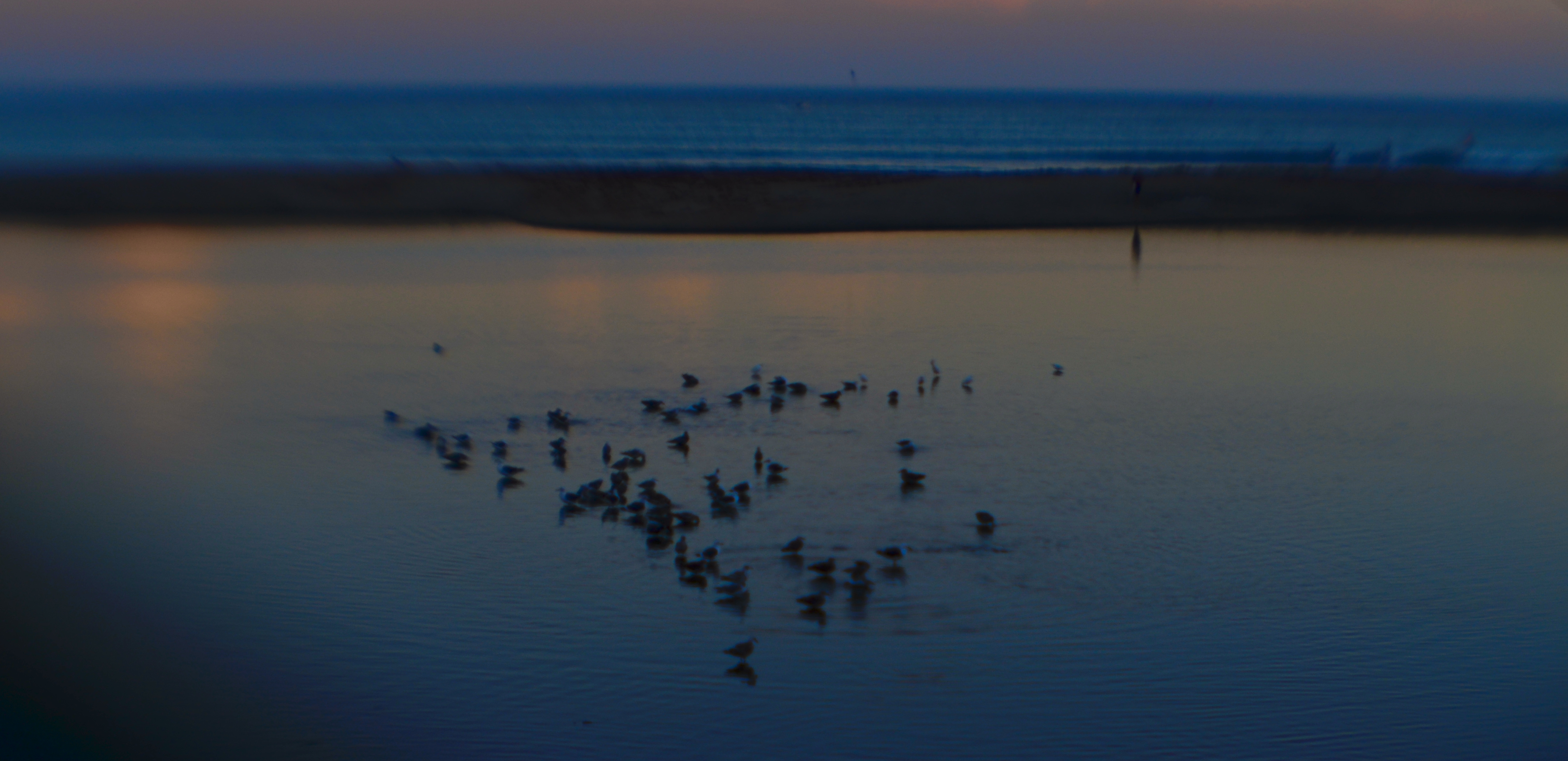
The image shown here certainly contains enough data to be perceived as a night shot of a beach with birds. Would a further rendering of every grain of sand and every ripple of ocean make the picture “work” any better, or can the piece just succeed as a hint of reality in which your heart or mind fill in the blanks, a picture in which the openness of the thing allows more individual interpretation on the part of the viewer? I understand that, to a certain audience, this is a blurry mess, while, for others, it might be the beginning of something that originates in the picture and finishes in the mind. What I’m starting to learn, finally, as a landscape photographer, is how to show just enough of the story I see to convey it to another person, but to rein myself in before I just produce a document that is technically accurate but emotionally threadbare.
PRECIOUS LITTLE THEFTS
By MICHAEL PERKINS
PHOTOGRAPHY, FOR BOTH ARTIST AND AUDIENCE, operates like all the other arts, in that it affords us entry into a million worlds beyond the narrow confines of our own. The camera is both reporter and thief, a kind of mechanical pack rat that comes back to home base bearing treasures from other people’s lives. Like poetry, painting, literature, and music, the art of making images is an act of purloining pieces of things that do not belong to us. And that’s a good thing?
The question mark at the end of that sentence is needful, as are further inquiries. Are the things we nick from the stores of other people’s experience thefts, or are they an innocent sampling of wonder, like a bunch of wildflowers carried home from the field? Obviously, such questions can only be settled one picture at the a time. Photographers have, indeed, hooked themselves, worm-like, onto the hearts of people who are both content and suffering, of those who deserve some kind of baseline privacy which the very existence of the camera has placed at risk.
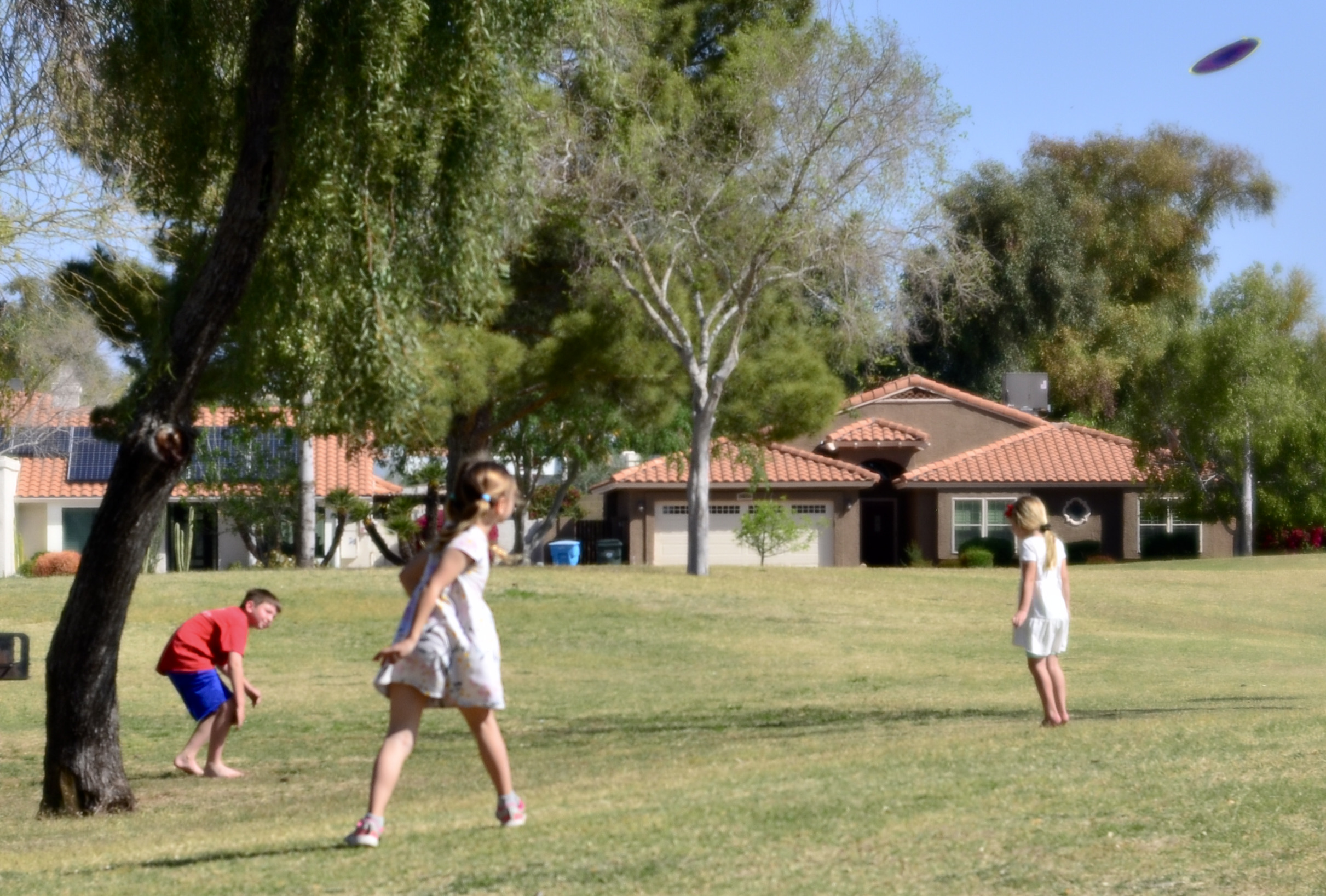
In making pictures of children at play, I make no bones about the fact that I am, certainly, eavesdropping on their experience. It can’t be expressed any other way. I am using a machine to freeze slices of their joy in an effort to enhance my own. But it’s not a predatory activity per se: I have no criminal motive in stealing a fragment of their carefree game, which is both private and public property in a strange see-saw that photographers must always struggle to keep in balance. The photograph shown here, for example, is more benign, even respectful, than the work of a reporter, say, who, under deadline, must extract loss or grief from the aftermath of war or disaster to earn his daily bread. But is my invasion only a friendly one because I have told myself it is? This is all to be discussed further, and by “further”, I mean “endlessly”.
In other arts, the audience comes into contact with a variety of lives, and yet, in novels or movies, those lives are largely invented to illustrate the creator’s point of view. In a photograph, the subjects are actual people, and our parking ourselves near them for our enjoyment dictates different rules of engagement. Appropriating someone’s story makes you, as its next translator, responsible for its truth.
OF SUBSTANCE AND SHADOW
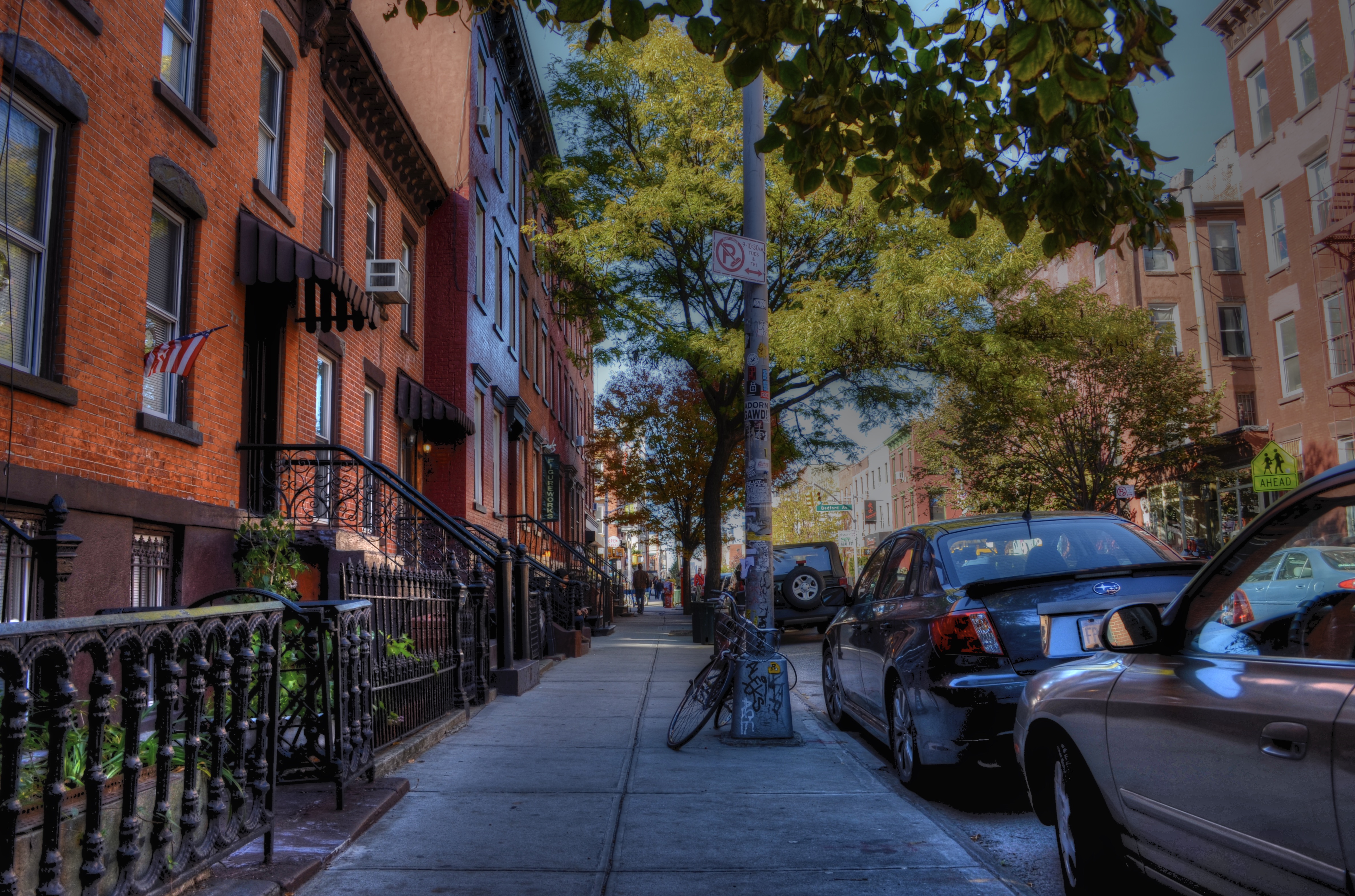
Brooklyn Morning Constitutional, 2011. A typical HDR experiment from earlier in the closing decade.
By MICHAEL PERKINS
THE END OF A DECADE is often used as an arbitrarily mile marker to measure the effects of a particular parcel of time. The requisite lists of “bests” “biggests” and “top” accomplishments or events, trotted out in an attempt to define an era, are as irresistible as they are meaningless. The appeal is understandable: people, including photographers, love trying to make sense of something, especially their own work. But ranking one thing as better than another is not nearly as important as noting contrasts in one’s output over time. Simply put, we produce different work at different periods because we are actually different people.
Looking at my own stuff between 2009 and 2019, I can see several shifts in emphasis that have shaped the way I make pictures today. For example, over that period, I re-embraced prime, or single focal-length lenses, which had been a fundamental part of my film years but which temporarily got supplanted by the first kit lenses and moderate zooms of the digital era. I also came to greatly reduce my use of ultra-wide angle glass, settling on 24mm as about as wide a frame as I would ever shoot. Also, after flirting with auto and semi-auto shooting modes with my first DSLRs, I resumed another old school habit, that of shooting on full manual. Along with millions of others, I saw my work with cel phone cameras evolve from “just in case” or “emergency” shots to images that I would purposefully plan, preferring some of the results over those from my “real” cameras. And, overall, I tried to stop just short of a full-on minimalist approach to gear, trying to do more and more with less and less. That meant eschewing flash almost completely, and choosing in-camera technique over post-processing whenever possible. For me, the real magic still happens inside the box, one momentary impulse at a time.
The biggest change for me over the last ten years, however, was far more fundamental, as I seem to have completely reprioritized what I look for in an “acceptable” picture. As the decade began, aware as I was of the contrast limits of the first digital sensors, I sought a way to rescue every single iota of detail from the darker portions of my pictures, even as I accented sharpness and focus with near-religious zeal. That led me to work heavily with the HDR platform Photomatix, taking multiple exposures of single subjects which were then blended to amp up every grain of sand and woodgrain. The pictures looked dramatic in their “equalizing” of all tones, from dark to light, but which could often result in an over-cooked, glowing surreality. A slightly more restrained 2011 example of my HDR “period” is shown above.
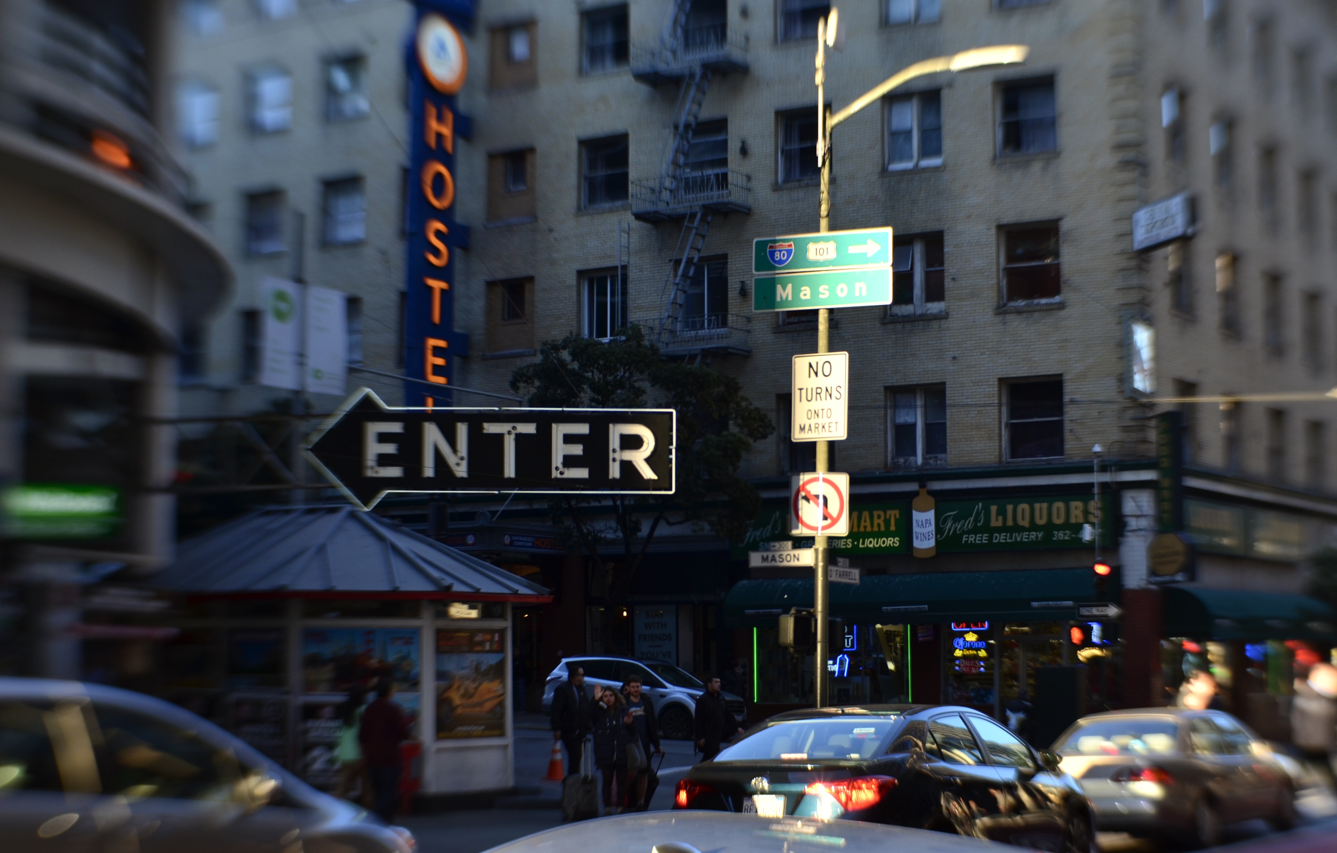
By contrast, around the middle of the decade, I began to value subjects for a different kind of narrative impact, things that were allowed to be softer or even selectively underexposed. In a sense, I started to regard sharpness and focus as negotiable for certain pictures, not merely allowing backgrounds to fuzz out in contrast to foregrounds, but using Lensbaby and other “art” lenses to select things within a single foreground plane that could be softened in reference to others in that same plane…assigning additional focus priorities within the overall focus strategy. An example of this approach is seen here, in a crowded San Francisco street scene from earlier this year.
Hurtling Toward Everywhere, 2019. Shot with a Lensbaby Sweet 35 tilt-shift lens, which can place the focal “sweet spot” variably within the frame.
Over the last ten years, my images, especially the urban scenes, have gradually taken on a looser look, a more dreamy, if less “realistic” aspect. These new pictures are not just “captures” of things that pass in front of me, nor are sharpness and perfect exposure the only objective in photographing them. Instead, I like to hope that their non-specific quality will invite a more interpretive look from the viewer. Since everything isn’t spelled out or recorded in such photographs, there’s breathing room in them for anyone to supply his or her own detail (or not). I don’t always produce pictures like this now, but I am far more open to the idea of relinquishing control than I was ten years ago. Progress? Who knows? End-of-decade lists don’t really make a statement about “better” or “worse”. They are only reflections that, as the mind is always in flux, so, too, must any products of that mind be.
Happy New Year.
Happy New Pictures.
Happy New Adventures.
PLANE SPEAKING
 By MICHAEL PERKINS
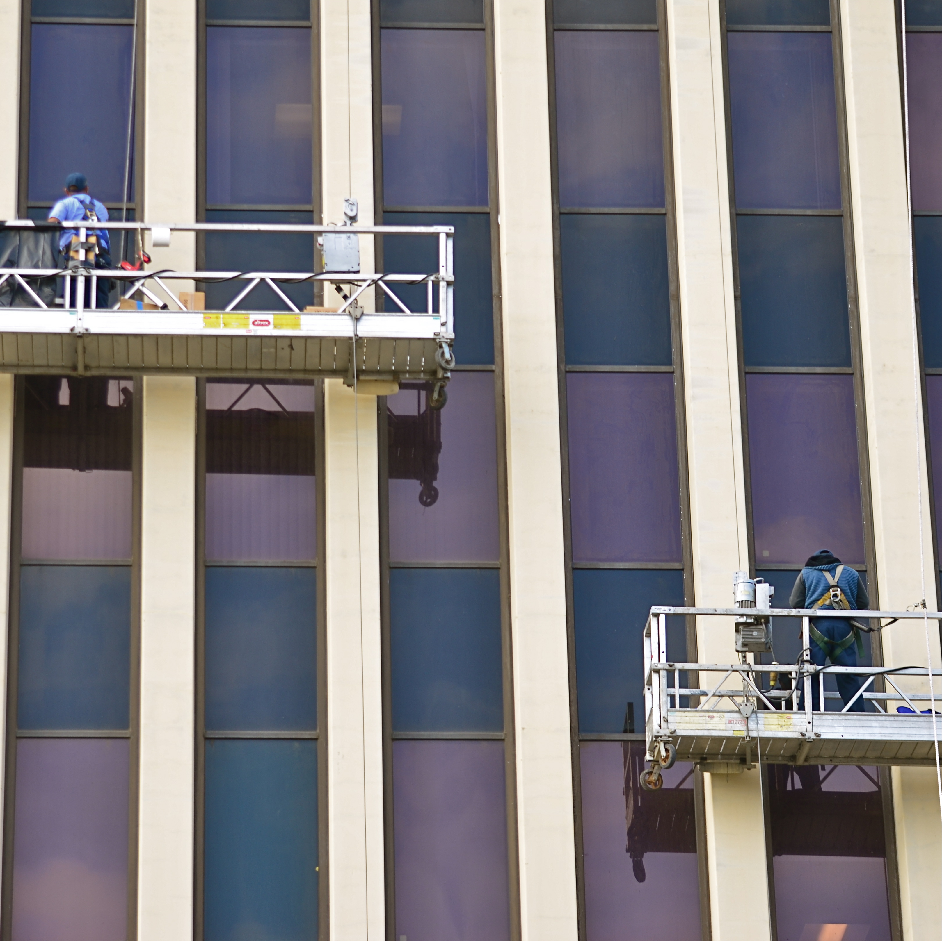
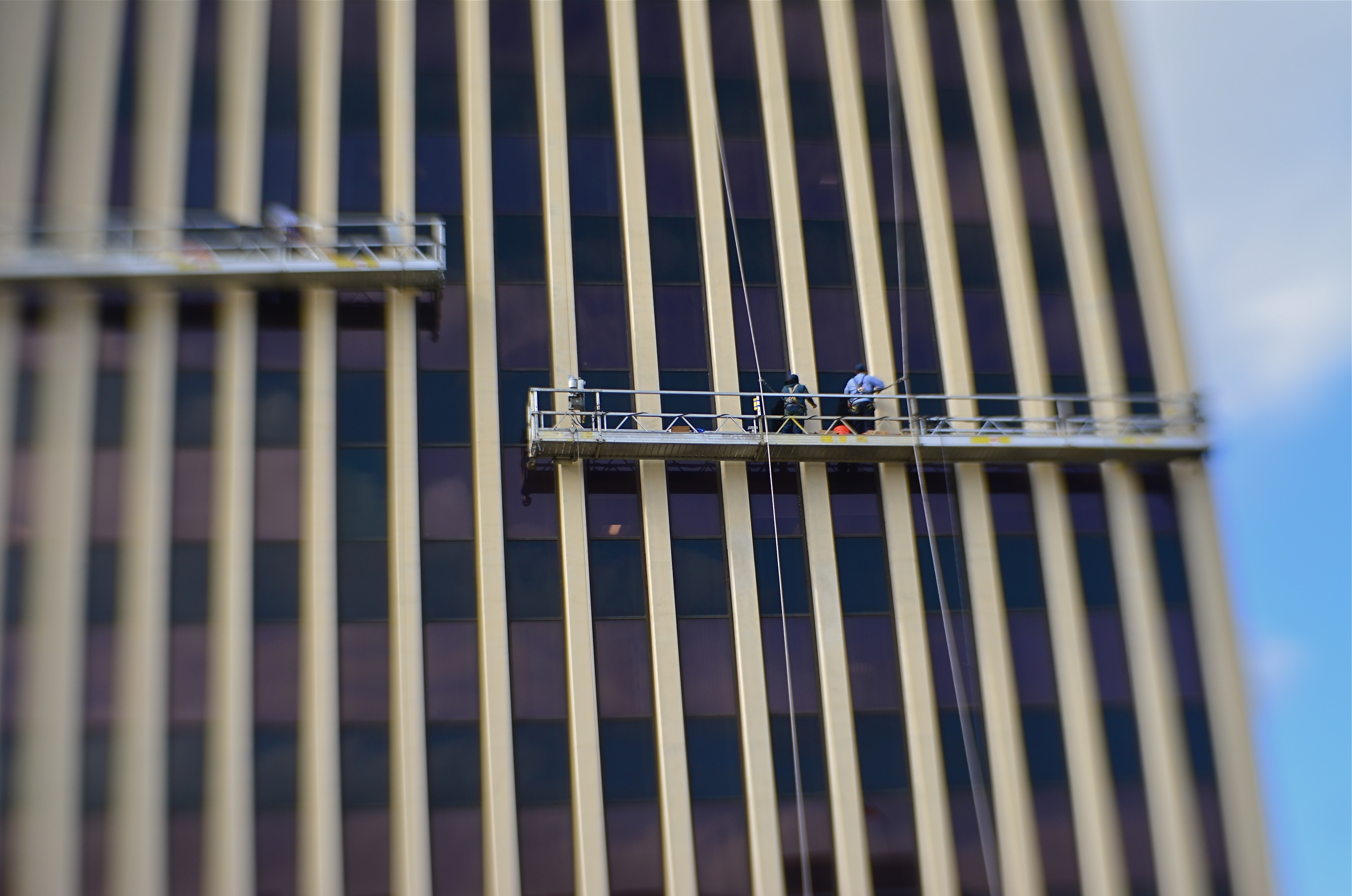
THE CONCEPT OF FOCUS HAS, over my lifetime (and, I’m sure in some of your own), moved through three distinct phases. The first, when I was very new to the making of pictures, was absolute. All or nothing. An image was either sharp from corner to corner, front to back, or it was worthless. My goals at this point all centered on technical mastery, I suspect because I had none.
The second phase for how I viewed focus could be called front plane, rear plane as I got more adept at the selective use of depth-of-field, making decisions to sharpen either the tree in the front plane or the mountain in the rear plane. Here, I started to actually make deliberate choices on what to emphasize within a frame, and thus to prioritize the order in which I wanted people to discover my pictures.
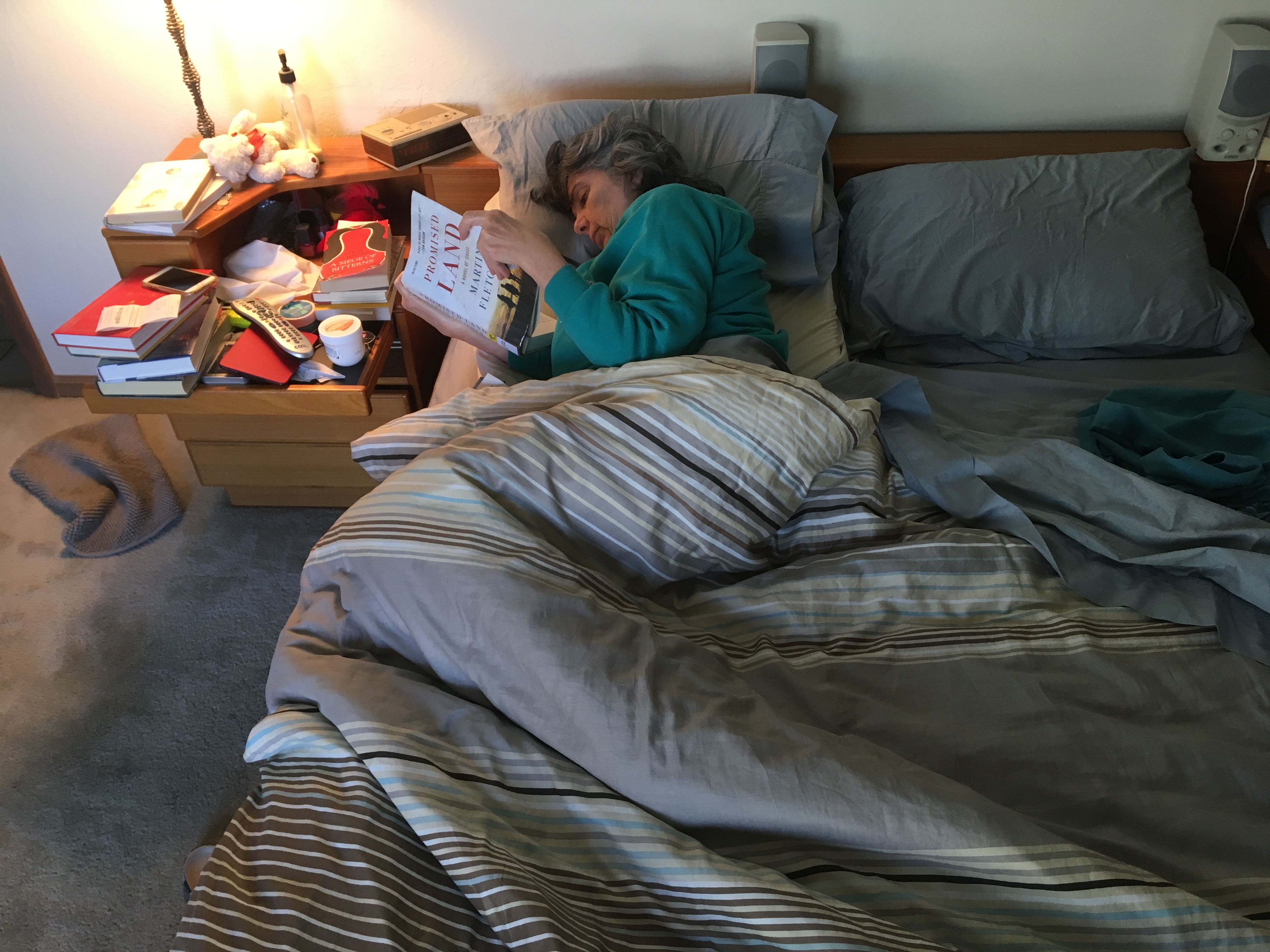
The third and most recent focal phase, one that could be called priorities within the plane, allows for even more controlled decision-making, as objects that are, from left to right, all the same general distance from the lens, rendered in vastly different degrees of sharpness as a matter of interpretation. This kind of selective focus is abetted by lenses like the Lensbaby line of products, many of which allow for the placement of a sharp “sweet spot” in-camera, anywhere within the image. Even more importantly, many remarkable apps allow for the same effect to be applied in post from a cel camera.
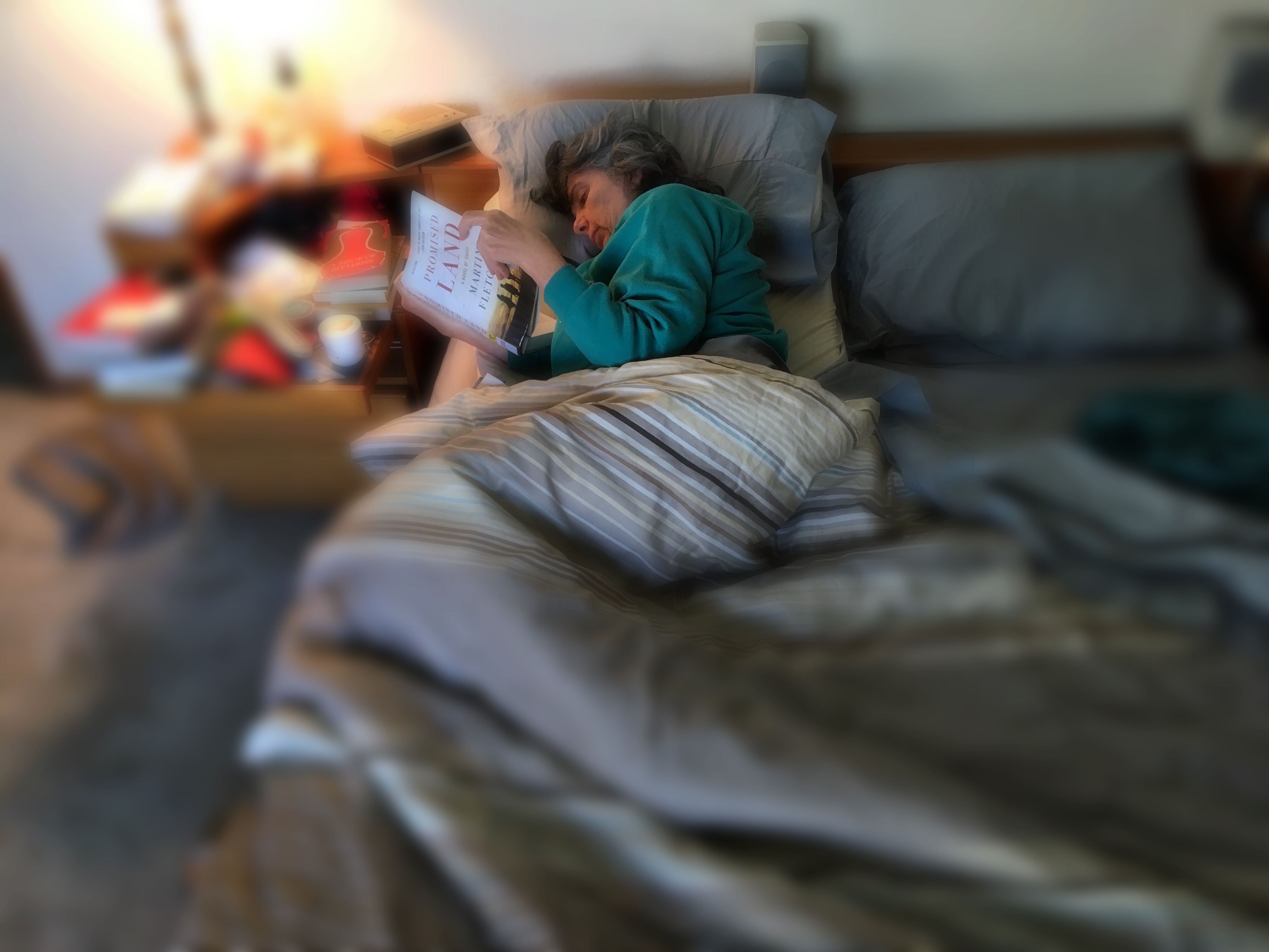
The image at the top left is straight from my iPhone, with all objects across the plane registering in the same depth of field. The larger frame just overhead was rendered using the popular Hipstamatic app, which features a depth-of-field control that can be applied by the same tap-pinch move used by millions for nearly ten years. The effect of the doctored shot is to isolate the subject and her book from the general clutter of the room, suggesting a gauzy dream state as she settles into her chill mode. In inter-plane imagery, even a finished photograph can be re-interpreted endlessly, each “reading” as potentially powerful as a conventionally focused shot, proving, as the best photography always does, that images benefit most from an open approach.
Years after I snapped my first shutter, I try to see myself as being on a journey. Every time I think I’ve arrived at a destination, it’s time to stick out my thumb again.
OH, HALE YEAH
By MICHAEL PERKINS
CONSIDER: MANY OF THE PHOTOGRAPHIC EFFECTS MOST DEARLY PRIZED by today’s edgier shooters actually have their roots in the shortcomings inherent in the techniques of the medium’s first years. That is, the artifacts produced in early photos (the blotches, streaks and smears that visually betrayed the limits of a particular era’s technology, from bad film emulsions to flawed lenses) are being sought out and deliberately inserted back into contemporary images, almost as if they confer some kind of authenticity on the final results. We came this far only to pretend that we haven’t moved at all.
There’s nothing to be gained by trying to figure out why we struggle to remove certain glitches from pictures in one age only to revere them in another. Fact is that many of us occasionally crave that “old timey” look, and so the very thing that once annoyed us as a defect becomes, later on, desired as an effect.
Halation, once an artifact of film processes, now can be achieved with special lenses.
Halation, or the soft, glowing aura around bright areas in an image (imagine the diffused appearance of street lamps in a thick fog) was originally an unwanted look that happened when light would go through sensitized film, then reflect off a surface behind it (say the inside back of the camera body) and bounce back through the film a second time. This so-called “light scatter” would appear as an ethereal haze around the brighter objects in the picture, almost like a halo around the head of a saint. Halo—Halation. Annoying defect if you don’t want it. Subtly dreamy effect if you do.
The “accidental” part of halation was addressed ages ago by adding inhibiting agents to film and matte surfaces to camera bodies. The “intentional”part has been added back in artificially, either with the use of layers in Photoshop, or with Lensbabys or other “art” lenses intentionally designed to render the effect (as seen in the above image). This kind of reverse-engineering, the process of “putting the scratches back into the record”, of restoring the very things we once rejected, is increasingly common in the post-digital era, as we still long for analog experiences, even, it seems, the imperfect ones.
ONE-TRICK PONIES
By MICHAEL PERKINS
YARD SALES AROUND THE WORLD abound with unwanted gadgets that, just a few year prior, seemed utterly indispensable, be they electric olive pit extractors or deluxe coffee foam skimmers. You know the kind of toys I mean– those glorious, gleaming, largely single-function devices that dazzle us on all-night infomercials and seem like depraved decadence after we’ve hooked them up a few times and found that, hey, you can still access a new batch of carrots with a 79-cent manual can opener and use the regained counter-space for something more essential. Like food.
And, of course, these one-trick ponies of gimmickdom are not only found in the world’s greatest kitchens, but also on dusty shelves in the closets of disaffected photographers, who, like any humans, are subject to the lure of the new. Hey, I get it. It’s fun to have a special, fresh, whirly-twirly glowing godalmighty gizmo, that little add-on that creates amazing effects, amusing simulations, crazy textures. Lens manufacturers are particularly great at getting the fishhook into the mouths of photogs when it comes to toy time, since no one responds better to the latest optical trick. But, as in the case of the pit extractor, you have to ask yourself how much permanent, sustaining, everyday use you will get out of a given piece of gear.
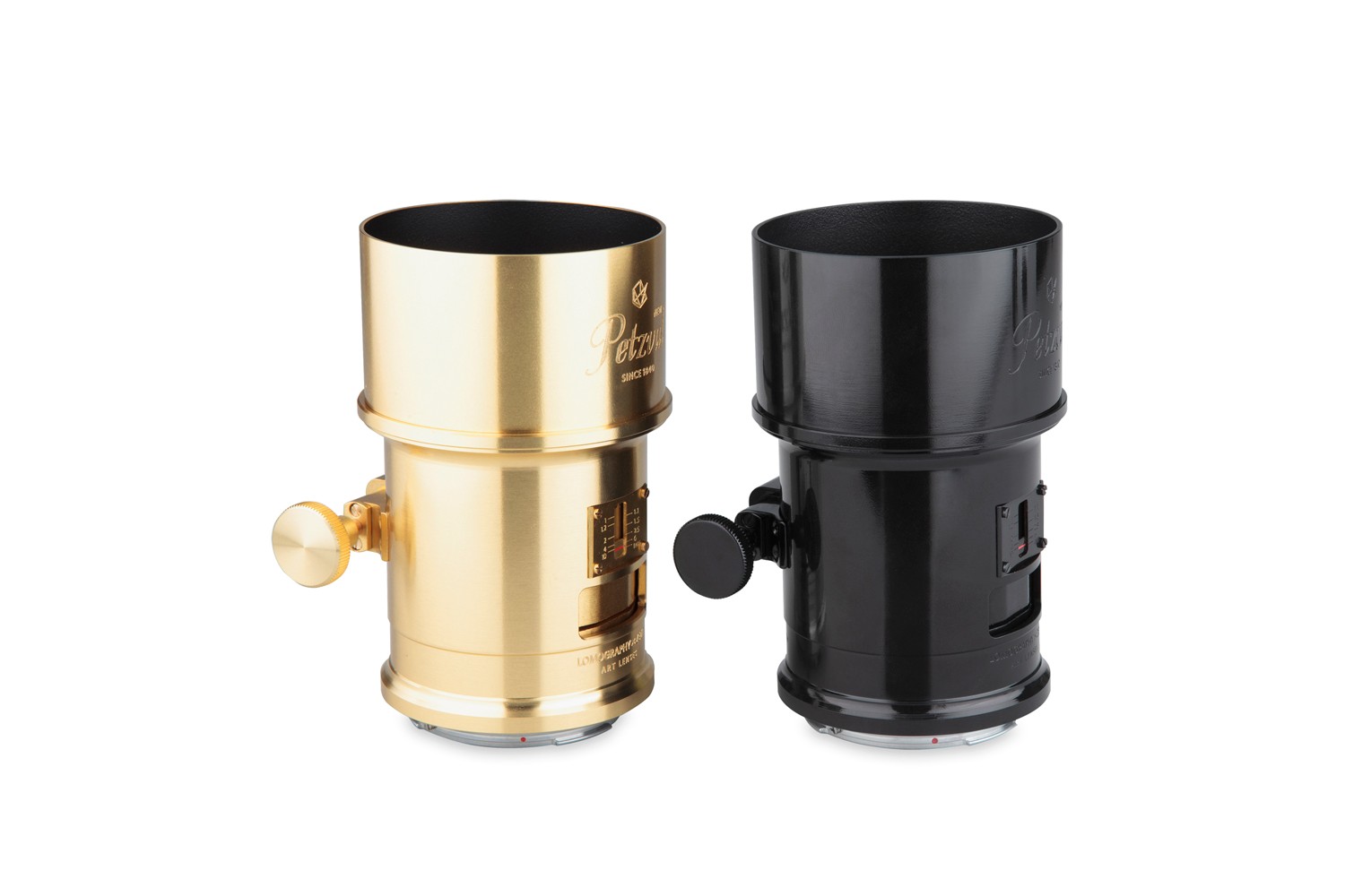
Want your pictures to party like it’s 1849? The Petzval might be the lens for you…
One great way lens manufacturers have devised to separate you from your cash is to introduce a new version of a classic or “art” lens that re-creates an effect that is associated with the halcyon days of early photography. One such lens is the Petzval, named after Josef Petzval, who developed it around the 1840’s. The optics of the Petzval are particularly seductive for portraitists, as they separate your subject from the ambient scenery by rendering it sharp at the center while making all background information look like a swirling blur. Very artsy, very specialized, and very, very expensive.
Neo-Petzvals are all-manual (niche market #1), metal bodied (niche market #2) and gorgeously nostalgic (niche market #3), looking like something Ahab would use to track Moby Dick around the seven seas. These beauties, which, again, can only make one kind of image at one focal length, can cost upwards of $700 through Lomography.com. Companies like Lensbaby can create the same effect for around $149 and more than a few phone apps can deliver the same thrill for $2.99 or under. But the cost is almost irrelevant. What counts is how much you will actually use the thing.
You have to decide what your approach to equipment is, making a personal calculation based on what you most need to do for you. My own version of this riddle is based on how much I can do with how little, making me prefer lenses and appliances that can multi-task. However, there’ll always be days when life’s hella hectic and you just haven’t got time to scrape your own coffee foam. As usual, the answer lies in the kind of photography that snaps your personal shutter. Your pictures, your playthings.
GET YOUR MIND RITE
By MICHAEL PERKINS
“REALITY”, THOUGHT TO BE the normal end product of the process of pointing a camera at something, is actually rather limiting. Sure, our little boxes were originally created as an accurate, even scientific means for recording our world.. a method more reliable, somehow, than the imprecision of the painter. Soon afterward, however, the camera longed for a soul of its own, or at least the painter’s freedom to make a subjective choice as to what “real” should look like.
Bottom line: for photographers, mere reality turned out to be, well, kind of a yawner.
To go even further, it seems to me that certain subjects actually call for a kind of unworldly, almost hallucinatory quality, an attempt to make things look not like what they are but how they feel. Of course, we can’t actually show emotions or states of mind, but various photographic techniques can, and should suggest them.

In visualizing ritual, ceremony, sacrament, or tradition, for example, you’re not merely chronicling activity. You’re also photographing mystery, or an extra dimension of consciousness. The above image, in terms of mere reality, is of a class for museum visitors curious to learn bout the Brazilian ritual of capoeira, a traditional fake-fighting martial arts performance that is performed during carnival and other national festivals. Now, you can shoot such a subject “realistically” (evenly lit, uniform focus, sharp detail), or aesthetically (dark, selectively blurred, even a little confusing), depending on what kind of feel you’re going for. This goes to the heart of interpretation. You’re not merely presenting reality: you are representing it.
Photographs originate in the mind, not in the camera, and so it must follow that there are as many “realities” as there are photographers.
ART ON THE CHEAP(ER)
Conventional focus with a standard optical zoom lens.
By MICHAEL PERKINS
ONE OF THE GREATEST BONUSES OF THE APPS ERA IN PHOTOGRAPHY is how fast certain effects and processes in picture-making have moved from proprietary functions to discretionary ones. Certain “looks” which were the sole domain of well-funded professionals in the film era have been democratized to an insane degree, allowing many more of us to make images that required expensive gear or exhaustive training (or both) just a heartbeat ago.
Selective focus is but one such area. Manipulating sharpness within sections of an image used to be the stuff of cunning calculation and infinite patience…in both shooting and post-processing. Now it’s yours for the flick of a button. The app installs, you click the picture, and you massage the results. Minutes from start to finish. And manufacturers of conventional cameras have had to react to the immediacy of effects available in the mobile market, re-introducing art lenses and specialized optics (think Lomo and Lensbaby) that allow shooters to add “artifacts” or “classic film looks” to their work as they are shooting. At this rate, it’s only a matter of time before these proprietary (think expensive) art lenses become more discretionary (easier to use and cheaper).
Same subject, five minutes later, with a selective-focus “art lens”.
When focus or any other main element in picture-making becomes more flexible, people experiment more and more. That, in turn, increases the number of average shooters who produce more sophisticated work. It’s part convenience, part economics: once the ability to do something on an occasional whim is granted to more people through innovation or pricing, the exotic becomes the normal, and the entire art advances. Photography began as a tinkerer’s hobby, costly and clunky in its execution. However, once it solved those problems, it went viral (or whatever one went in the 1800’s). And now digital apps are leading the entire market toward another level of ease and affordability.
The two pictures you see here were both, in fact, taken with camera-based lenses….but, those lenses are both infinitely more affordable to me today than they might have been a generation ago…something driven in part by the digital apps revolution. That means I had the option of trying two vastly different focal approaches on the same subject with little more effort than it took to swap one lens out for another. I used standard optics for this exercise because, frankly, the acuity and control in most mobiles is still less than I’d prefer. But that will change, and quickly. In just a few evolutionary clicks from now, I will be able to do this exact same study within my phone….cheaper, faster, and with less baggage to lug around. Will I abandon my traditional lenses at that point? I honestly can’t say. But if I don’t, I hope I have a better reason than “that’s not the way we used to do it.”
BLUR IS THE NEW SHADOW

Modern art lenses allow different parts of objects that are all in one focal plane to be selectively blurred.
By MICHAEL PERKINS
I’M INCREASINGLY FASCINATED BY PHOTOGRAPHS THAT SUPPRESS INFORMATION, choosing to selectively conceal details rather than merely delineate everything in the frame in the same exhaustively sharp detail. At the same time, I hate it when this technique is referred to as being “painterly”, as if, after all this time, photos are still striving for the same pedigree that daubers automatically inherit merely by picking up a brush. Photographs are not, and should not try to be, paintings, just as a shoe should not try to pass as a glove. Love the function of the art you have, and leave the mimicry to the mockingbirds.
The “painterly” tag used to be tied mainly to anyone shrouding their images in shadow, as if we were all bucking to be the next Rembrandt or Reubens. And certainly the use of darkness in photography creates a kind of mysterious minimalism, telling more by showing less. We linger over what’s left out of a photo, and the deliberate subtraction of detail simplifies a composition to its barest terms. When there is less to see, you eye goes like a laser to what remains. It’s a big, bright “this way, dummy” arrow pointing toward the heart of the picture.
In the same way, the current wave of photographers are using blur to punch up the impact of images. Any Google search of the phrase “blur my photos” unearths a wellspring of apps that allow any part of any frame to be selectively de-focused, in most cases (as happens with apps) after the picture is taken. Long regarded as the stuff of artifact or accident, blur is now being arranged, managed, and chosen as a tool to remove distracting detail from compositions, or to render them softer and more intimate. In the above image, separate elements of the structure, all of which lie generally in the same focal plane, can be selectively softened so that one can become dominant, while the other is abstracted. This particular shot is done with a Lensbaby Sweet 35 lens, which allows the “sweet spot” of focus to be rotated to any location the shooter desires, although there are many paths to similar results.
Both apps and lenses, which include newly reworked versions of old optics, offer a return to the randomness from which early photographers longed to escape. Lomography, the revival of flawed and cheap cameras from the film era, actually touts blur as a strength, an arty accent much to be desired. To be totally counter-intuitive about it, blur is edgy. Of course, some blur is just another kind of visual noise, and if it’s applied too carelessly or too much, it actually pulls the eye away from the main message of a picture. However, it’s thrilling just to see the sheer breadth of approaches that are suddenly available everywhere, most of them cheap, fast and easy. Blur can “sharpen” a picture just like darkness can “illuminate” one. It’s the new shadow.
2016: THE YEAR OF SEEING DIFFERENTLY

Isoceles’ Greatest Hits (2016). Our idea of what a photograph “is” must be constantly in play.
By MICHAEL PERKINS
IF YOU SPEND ENOUGH YEARS MAKING PICTURES, you will see, looking back over your shoulder, several visible mile markers indicating when something fundamental changed in how you went about the pursuit of the capture. It can be a simple time line from one camera or lens to the next, or a sequence of shifts in style or emphasis.
For some, it’s the leap from film to digital. For others, the moment when it seemed important to commit anew to monochrome, or the day when one’s work flow took on decidedly new features. For me, it’s always been those events or people who have allowed me to dramatically re-evaluate the process of seeing.
Poring over various things I attempted to do in 2016, I seem to be standing in a niche between how I have traditionally visualized subjects and how I’m aspiring to, marking a more dramatic evolution than I’ve experienced for a while. This change can be simply expressed as a different view of what’s “real” in a picture, brought on by my work with lenses that allowed focus to be more selectively manipulated within an image.
Some of this can be seen in images seen in the new page 20 for 16, clickable at the top of this one. Like other year-end summaries, it tries to cite examples of every type of photograph I attempted over the space of a year, from portraits to still lifes and everything in between. However, unlike most other years, the images have what I might call an evolving view of the role of sharpness; how it features in a composition, how much of it is essential, whether it is even needed at all, given the right conditions.
Some of these explorations in variable sharpness involved embracing a new crop of specialized lenses which either evoke the softer look of vintage glass or allow the shooter to place focus anywhere in the frame, and to any degree desired. However, at least one picture is the product of post-production apps applied to smart phone images, showing, if nothing else, that it’s probably the destination that matters more than the journey. Or not.
As an essential component in all photography, focus is a major determinant in that we think of as a “photograph”, and, in turn, what makes that photograph “real”. However, photography is not merely the recording of the actual but a visualization of the possible. It bridges the gap between tangible and potential. Merely unchaining sharpness, by itself, guarantees nothing in the way of order, and might merely produce chaos. Still, the moment when a particular choice can either enhance or enchant…. that’s we live for; that’s what we reach for.
Thank you again for your kind attention, your advice, and your enthusiasm….and Happy New Year.
POUNDING NAILS WITH A SCREWDRIVER

Ten feet out with a 56mm that shoots like an 85mm. Little cramped.
By MICHAEL PERKINS
IF YOU HAD ONE OF THOSE DADS WHO PURCHASED A SET OF “DO IT YOURSELF” ENCYCLOPEDIAS in the 1950’s, hoping to become some kind of amalgam of Edison and St. Joseph The Carpenter, you no doubt encountered some sort of Page One admonition to always get “the right tool for the job”. In other words, don’t use a screwdriver to pound nails. I successfully resisted the seductive gospel of Being Handy Around The House, but then found, in photography, that the same rule applies, at least as regards lenses. Right glass, right results, right?
Of course, unless you habitually lug the accumulated wisdom of 200 years of shutterbugging and its attendant gear along with you on a daily basis, you’re likely to get into situations where the lens you have readily at hand won’t allow you to do the thing you just decided to try. It’s back at the hotel, back in the parking lot, back at Alpha Centauri, wherever. Thing is, the thing you want is here, right in front of you, leaving one simple chance. Shoot or don’t.

Nearly the same front to back distance, but at a slight diagonal.
I recently wandered, on a weeklong practice run for a new Lensbaby Velvet 56, a manual prime lens that equates, on a full sized DSLR sensor, to about 85mm or so. Perfect for portraits, but very, very cramped for general street work. The Velvet, as its name implies, imparts a soft, gauzy layer over top of a sharp image at apertures wider than about f/5,6. From there to the upper stops, it behaves like a regular prime without the softer effect. The temptation is strong to limit its use to flattering portraits. But that vanishes, however, when you see what marvelous cushiness it confers on the hard textures you find in buildings. It creates a romantic, dreamy look for concrete, plaster, and stone, and so, since I had no other lens at the ready on this particular walkout, I decided to try a few street shots with it.
First problem: this thing can make a tight composition look absolutely claustrophobic. One cure is to walk way back to open up the shot; another is to try a diagonal or oblique angle to widen things out. Of course, since 85mm is treading close upon telephoto territory, the front-to-back information will be somewhat compressed; the distances which seem natural to your eye from 35 to 50 mm seem smashed in at 85. However, since we are shooting for the velvety effect with this lens, compromise is already the name of the game, so angle of composition becomes a partial fix. The feel from ten feet away, seen in the head-on top shot, seems pretty confined, whereas in the second shot, taken about twelve feet at a slight diagonal, the shot is snug but not uncomfortable.
The Velvet 56 is actually remarkably versatile, since, in addition to serving as a great portait lens and a nice landscape glass, it also macro-focuses to about 5 inches, allowing you to work more and switch out less. As always, it’s not so much what a given lens was primarily designed for but what you choose, perhaps out of desperation, to do with it.
Turns out some screwdrivers make pretty fair hammers, after all….
FRINGE ELEMENT

Extreme chromatic aberration (color fringeing) along the exterior line of the cactus.
By MICHAEL PERKINS
THE RESURRECTION, ABOUT TWENTY-FIVE YEARS AGO, of several low-end, cold-war-era plastic cameras as refurbished instruments of a kind of instinctual “art” photography has influenced even the digital and high-end photo markets, with light-leaking, optically sloppy toys like the Holga, the Diana and other “lomographic” devices shaking up the way many photographers see the world. Thus have these technically challenged little cameras, designed as children’s playthings, changed the conversation about what kind of formerly dreaded optical flaws we now elect to put back in to our work. Lomo shooters’ devotion to their craft has also meant a reprieve of sorts for film, since theirs in an analog realm.
But even digital shooters who don’t think of themselves as part of the “lomography” trip can dip a toe into the pool if they like, with filters on phone apps labelled “toy camera” which simulate light leaks, film-era “cross-processing” and the color variations caused by cheap plastic lenses. There are also companies like Lensbaby that manufacture all-new plastic optics designed to lend an element of creative control to what, in lomo cameras is largely random. The good news: you can, in effect, put defects into your pictures….on purpose.
Plastic lenses are generally much softer than glass lenses, giving a kind of gauzy appearance to your shots, so if you’re a fan of razor sharpness, they may not be your dish. More importantly, they produce a much higher amount of what is called “chromatic aberration”, which is more understandable under its nickname “color fringing”, since that more accurately describes how it looks. If you want a reasonably clear science-guy breakdown of CA, here’s a link to keep you busy this semester. The main take-home for most of us, though, is that the effect takes what would largely be a smoothly blended rendering of colors and makes them appear fractured, with the “fringe” look most noticeable along the peripheral edge of objects, where the colors seem to be separating like the ragged edge of an old scarf.
Why should you care? Well, mostly, you don’t have to. All lenses have a degree of CA, but in the better-built ones it is nearly undetectable to the naked eye, and can be easily processed away in Lightroom or a host of other editing suites. But people who are choosing to use plastic lenses will see it quite clearly, since such optics cause different wavelengths of light to “land” in the focal plane at slightly different speeds, meaning that, in essence, they fail to smoothly blend, hence the “fringing” effect.
Of course, chromatic aberration may be exactly the look you’re going for, if you want to create a kind of lo-fi, primitive look to your shots. In the cactus photo seen here, for example, taken with an all new plastic “art” lens, I found that the effect resembled old color printing processes associated with early postcards, and, for that particular image, I can live with it. Other times I would avoid it like the plague.
Plastic lenses, like any other add-ons or toys, come with their own pluses and minuses. Hey, if you’re a ketchup person, then soak your plate with the stuff. But if you believe that it just louses up a good steak, then push the bottle away. Just that simple.
THE EYES HAVE IT
How soft is too soft? Shot with a Lensbaby Sweet 35 optic at 1/30 sec., F/4, ISO 400, 35mm.
By MICHAEL PERKINS
WINDOW TO THE SOUL: that’s the romantic concept of the human eye, both in establishing our emotional bonds with each other and, in photography, revealing something profound in portraiture. The concept is so strong that it is one of the only direct links between painting (the way the world used to record emotional phenomena) and photography, which has either imitated or augmented that art for two full centuries. Lock onto the eyes, we say, and you’ve nailed the essence of the person.
So let’s do a simple comparison experiment. In recent years, I’ve begun to experiment more and more with selective-focus optics such as the Lensbaby family of art lenses. Lensbabies are unabashedly “flawed” in that they are not designed to deliver uniform focus, but, in fact, use the same aberrations that we used to design out of lenses to isolate some subjects in intensely sharp areas ( so-called “sweet spots”) surrounded by gradually increasing softness.
As a great additional feature, this softness can even occur in the same focal plane as a sharply rendered object. That means that object “A”, five feet away from the camera, can be quite blurry, while object “B”, located just inches to the side of “A”, and also five feet from the camera, can register with near-perfect focus. Thus, Lensbaby lenses don’t record “reality”: they interpret mood, creating supremely subjective and personal “reads” on what kind of reality you prefer.
Exact same settings as the prior example, but with a slightly tighter focus of the Lensbaby’s central “sweep spot”.
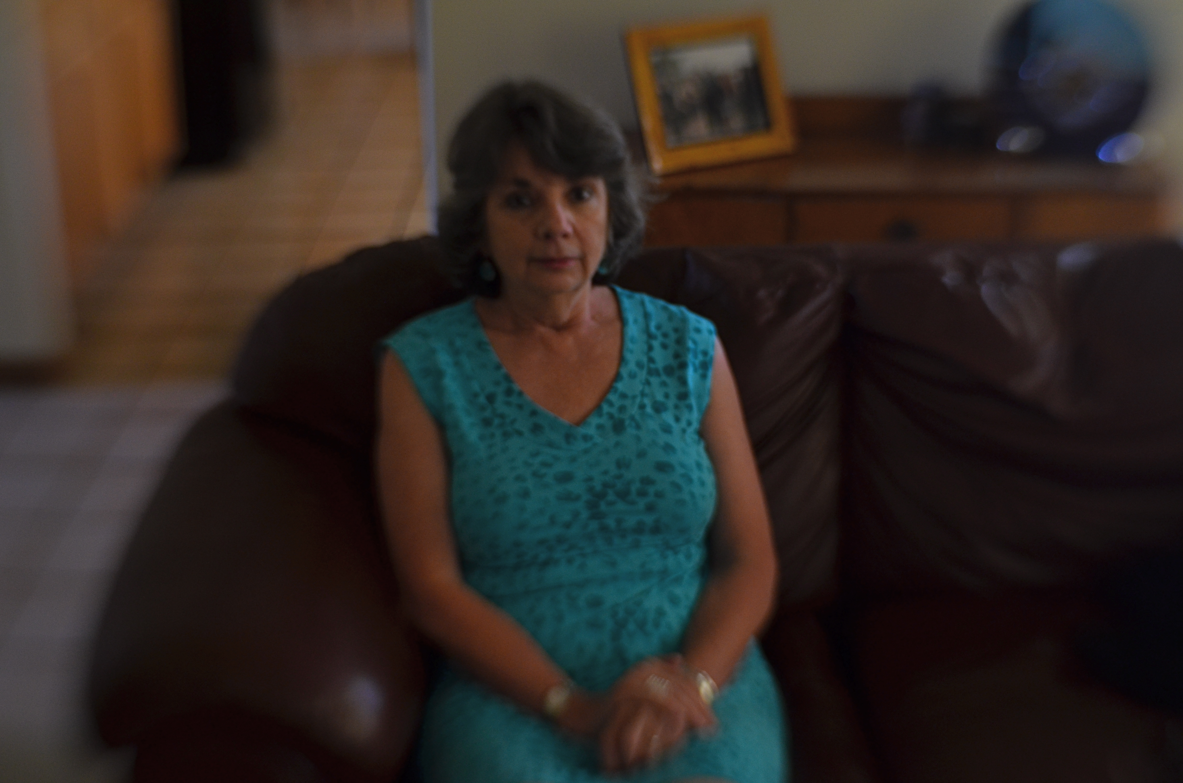
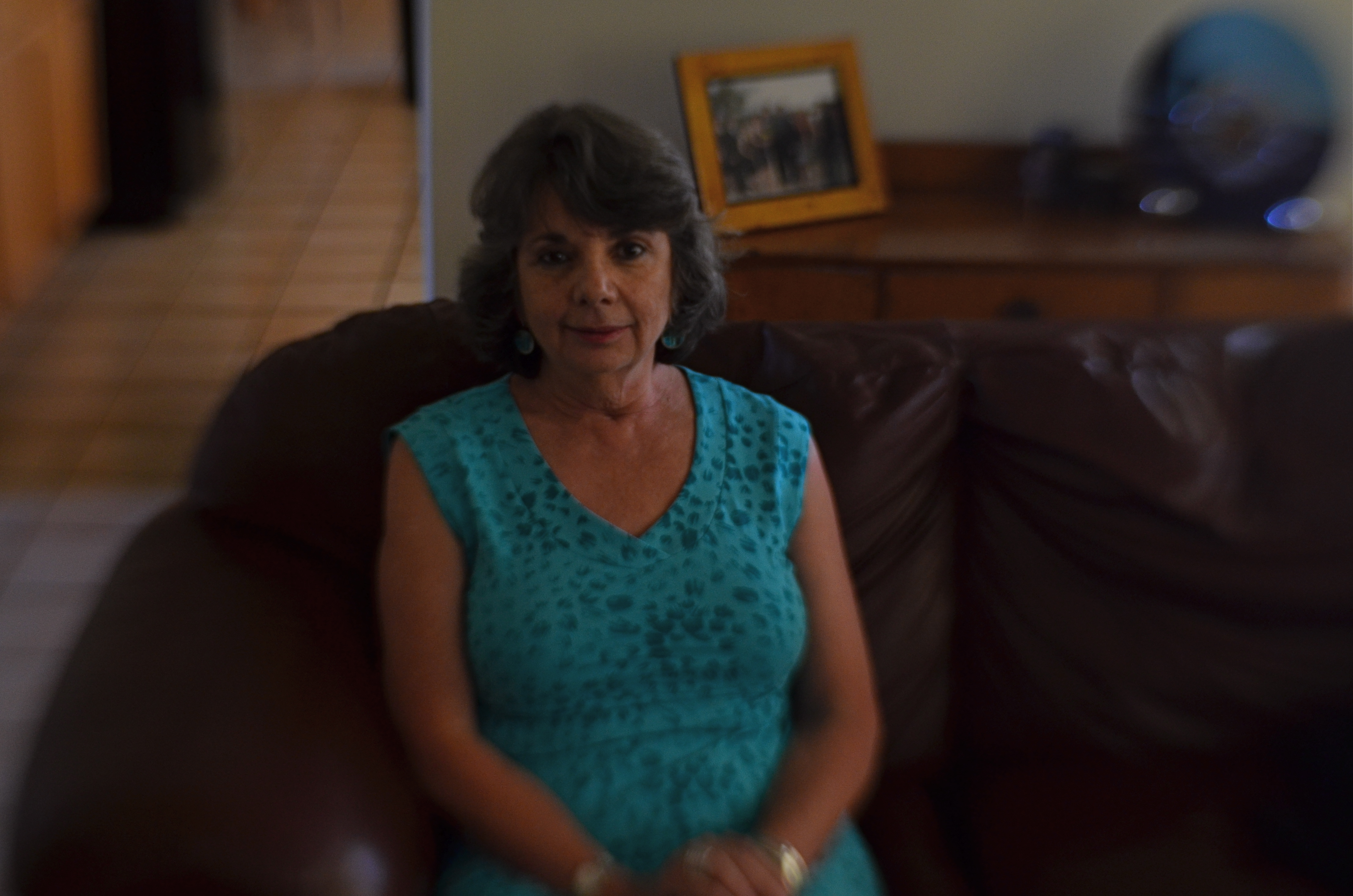
Art lenses can accentuate what we already know about faces, and specifically, eyes…that is, that they remain vital to the conveyance of the personality in a portrait. In the first sample, Marian’s entire face takes on the general softness of the entire frame, which is taken with a Lensbaby Sweet 35 lens at f/4 but is not sharply focused in the central sweet spot. In the second sample, under the same exposure conditions, there is a conscious effort to sharpen the center of her face, then feather toward softness as you radiate out from there.
The first exposure is big on mood, with Marian serving as just another “still life” object, but it may not succeed as a portrait. The second shot uses ambient softness to keep the overall intimacy of the image, but her face still acts as a very definite anchor. You “experience” the picture first in her features, and then move to the data that is of, let’s say, a lower priority.
Focus is negotiated in many different ways within a photograph, and there is no empirically correct approach to it. However, in portrait work, it’s hard to deny that the eyes have it, whatever “it” may be.
Windows to the soul?
More like main clue to the mystery.
THE FLEXIBLE FREEZE
By MICHAEL PERKINS
PHOTOGRAPHERS ACROSS THE LAST TWO CENTURIES HAVE CAPITALIZED ON ONE OF THEIR MEDIUM’S BEST TRICKS, the ability to freeze time, the sensation of carving out micro-seconds of reality and preserving them, like ancient scarabs trapped in amber. The thing known as “now”, with the aid of the camera, became something called “forever”, as things which were, by nature, fleeting were granted a kind of immortality. Events became exhibits, things to be studied or re-lived at our whim.
And yet, even as we extract these frozen moments, we mess around the edge of the illusion a bit, making still pictures also convey a sense of motion. Focus is a prime example of this retro-fitting of technique. No sooner had photography evolved the technical means to render sharp images than shooters began to put a little soft imprecision back into their pictures, by a variety of means: slow shutter speeds, time exposures, manual shaking, delayed flashes, and selective focus. Of all these techniques, at least for me, selective focus has proven to be the hardest to master.
….and two more lattes, 2016, shots on a Lensbaby Composer Pro, which allows a sweet spot of sharp focus to be moved anywhere in the frame the shooter desires.
Changing the messaging of a photographic story by using focus to isolate some elements and downplay others has always called for real practical knowledge of the workings of lenses and how they create focus as an effect. Recently, digital manipulation has allowed shooters to re-order the focal priorities of a shot after it’s taken, and in just the past few years, commercially available specialty lenses have allowed photographers to pre-select where and when focus will occur in an image, using it as interpretively as color or exposure.
I like to use the Lensbaby family of variable-focus lenses for what I call “flexible freeze” situations, times when focus can be massaged to create the illusion of speed. In the above shot, taken in a high-volume cafe, the small center of tight focus fans out to a near streaky quality at the outer edges of the picture. No one person is rendered sharp enough for features to register, or matter. What’s important here is the sensation of a busy lunch rush, which actually would be diminished if everything was in uniform focus.
Sharpness is certainly desirable in most cases for a strict re-creation of literal reality, but photography has never merely been a recording process. Focus can produce useful abstractions or atmospheres in a shot, so long as the effect serves the story. If it doesn’t help the image speak better, even a flexible freeze can quickly become a tiresome gimmick. Matching tools to goals is what good photography does best.
THE EYE OF MEMORY
By MICHAEL PERKINS
PHOTOGRAPHY DEALS IN FEELINGS, those inexact sensations of the heart that we try to capture or evoke in our visual messaging. Some subjects, such as war or celebration, convey emotions with such immediacy that we are really only acting as recorders, with the associative power of our minds providing much of the detail. Pictures of loss or celebration, such as the aftermath of a disaster or the birth of a new life, can be fairly simple to convey. What you see is what the thing is. For subtler regions of the brain, however, photos must use, if you will, a different vocabulary.
Newbie photographers are trained, to a a great degree, to seek the sharp image, to master focus as a technical “must”, but, as we vary the kinds of messages we want to convey, we change our attitudes about not only sharpness but most of the other “musts” on the beginner’s list. We learn that we should always do a certain thing….except when we shouldn’t. It’s worth remembering that some of the most compelling photos ever published were, according to someone’s standard, “flawed” in some way.
De-saturated color, soft focus. Items dealing with feelings, especially memory. are better served with less “realism”.
News shooters have long since learned that the emotional immediacy of a picture, along with its raw “news value”, outweighs mere technical precision by a country mile. The rules get bent or broken because, in their most perfect application, they may actually dull the impact of a given image. Thus, many a journalist has a Pulitzer on his wall for a picture that a beginner might regard as “wrong”. And the same goes for any picture we may want to make where an emotion simply must be conjured. Mere visual accuracy can and will be sacrificed to make the picture ring true.
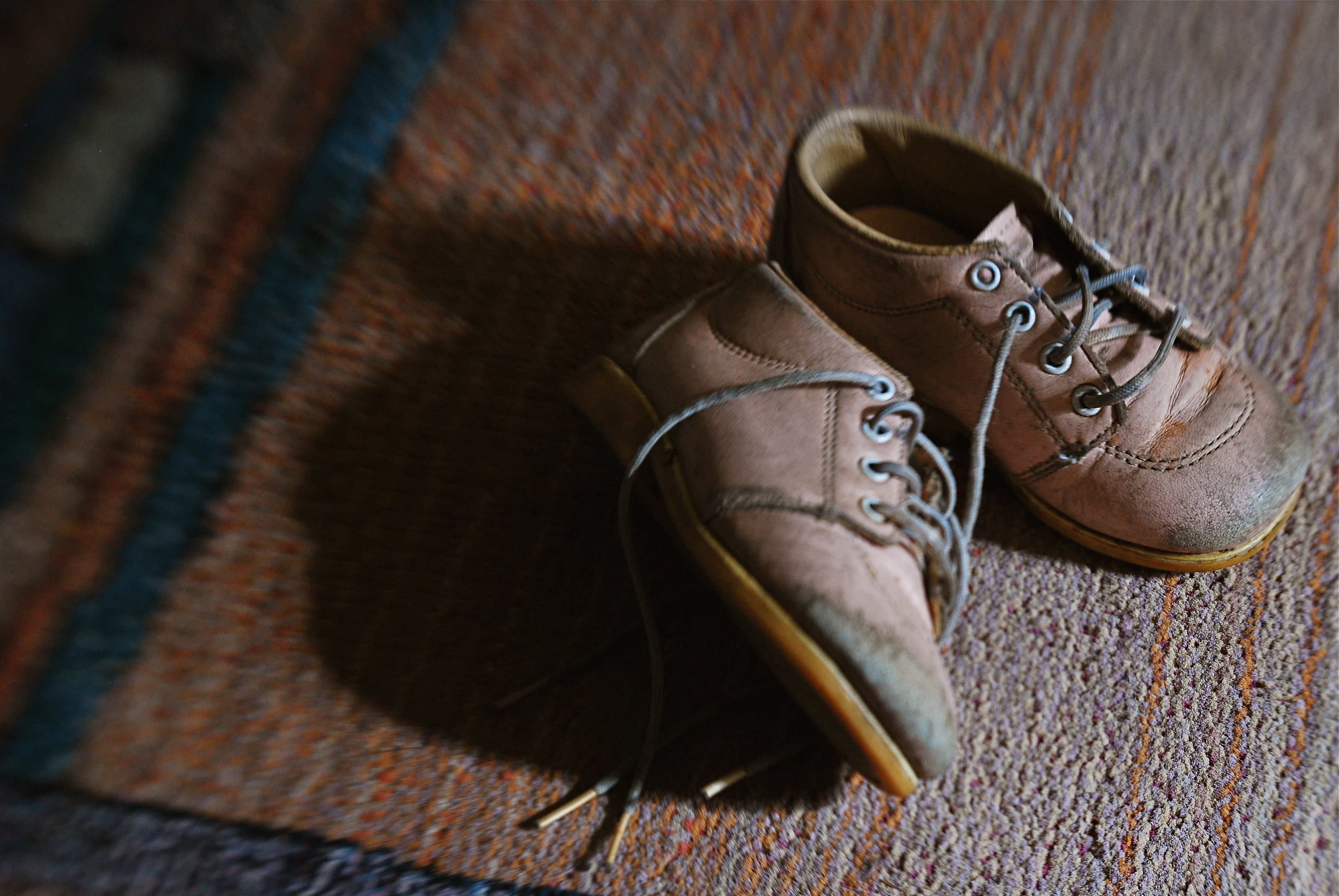
Asa personal example, I find that images that plumb the mysteries of memory often must stray from the arbitrary standards of so-called “realism”. When you work in the realms of recall, nostalgia, regret, or simply fond remembrance, a certain fluid attitude toward the niceties of sharpness and exposure may actually sell the idea better. Memory is day-dreaming, after all, and, in a dream, as Alice found in Wonderland, things look a bit…off. Dimension, delineation, depth…all these properties, and more, morph with the needs of the desired image. “Real” sells some things superbly. Emotion, however, as earlier stated, demands a language of its own.
The baby shoes shown in the image above are shot in uneven sharpness to suggest the gauzy nature of the memories they may evoke. Likewise the color is a bit washed-out, almost pastel, since a full, vibrant range of hues may seem less dreamy, more rooted in reportorial reality…which we don’t want for a picture like this. Rule-breaking ensues simply because nothing, no rule, no standard, is as important as making the picture work. If it doesn’t speak to the viewer, then the fact that it’s technically superb means nothing.
As Mr. Ellington sez, it don’t mean a thing if it ain’t got that swing.
MORE TOOLS IN MORE HANDS

Shot one inch away with Lensbaby macro converters, accessories for the company’s 35mm lens, amazingly priced at about $49.95.
By MICHAEL PERKINS
THE CELL PHONE CAMERA’S IMPACT ON PHOTOGRAPHY HAS BEEN SO SUDDEN AND FAR-REACHING that its full impact has yet to be fully measured. Within a decade, the act of making a picture has been democratized to a greater degree than at any other time in the history of the medium. It’s as if, overnight, everyone was given the ability to leap tall buildings in a single bound. Goodbye, Superman, hello, Everyman. The Kodak Brownie’s introduction prior to 1900 gave the average human his first camera. The cell phone is like the Brownie on steroids and four shots of Red Bull.
It’s more than just giving millions of people the ability to take a photo. That part had been done before, dozens of times. However, no other camera before the cell has also obliterated the number one obstacle to picture-making on this scale: cost. The cost of film. The cost of marketing and sharing one’s work quickly, and with uniform quality. The cost of artistry, with support apps allowing people to directly translate their vision into a finished product without investing in gear that, just a few years ago, priced most people out of the creative end of the market.
Most significantly, there is the cost saved in time. Time learning a technique. Time speeding past the birth pains of your creative energy. you know, those darn first 10,000 hours of bad pictures that used to take years of endurance and patience. The learning curve for photography, once a gradually arching line, is now a dramatic, vertical jump into the stratosphere.

A cell-app simulation of the film-based platinum printing process.
These insane leaps in convenience and, for the most part, real technical improvement occur across all digital media, but, in the cel phone, their impact is spread across billions, not mere millions, of users. Simulate a particular film’s appearance? Done. Do high-quality macro or fisheye without a dedicated lens running into the hundreds? Yeah, we can do that. Double-exposures, selective focus, miniature effects, pinhole exposures, even remote auxiliary lighting? Go fish. It’s all there.
And when cells raise the ante, traditional cameras have to up their game just to survive. The shot at the top of this page comes from a pair of Lensbaby macro converters up front of the company’s Sweet 35 optic, a shot that would only have come, a few years ago, from a dedicated macro lens costing upwards of $500. Lensbaby’s version? $49.95. And now, with less than a decade in the effects lens biz for DSLRs, Lensbaby makes macro, fisheye and other effect lenses for cells. A rising tide raises all boats.
I could make a list of the areas where the optics and outputs of cell phones are still behind conventional camera optics, but if this post is ever read more than a year past its publication, the future will make a liar out of me. Besides, that would put me on the same side as the carpers who still claim that film is better, more human, or “warm”, as the vinyl LP hipsters like to say. Your horse is nice, but it can’t outrun my Model T.
Part of photography’s appeal since day one has been the knowledge that, whatever era you live in, it’s a sure bet that some geek is slaving away in a lab somewhere, trying to make your sleek, easy, “latest thing” seem slow, clunky and over with. We’re never done. Which means that we’re always just beginning.
Cool.
TINY TOWNS AND BIG DREAMS
Eclectic Light Orchestra: Shooting the Musical Instrument Museum’s amazing orchestral diorama to scale.
By MICHAEL PERKINS
THE ART OF MESSING ABOUT WITH THE MIND’S CONCEPT OF SIZE, making the small look large, has been part of photography since the beginning, whether it’s been crafting the starship Enterprise at 1/25 scale for primitive special effects or making Lilliputian mockups of Roman warships for a sea battle in Ben-Hur. Making miniatures a convincing stand-in for full-size has been a constant source for amazing images.
Oddly, there has also been a growing fascination, in recent years, with using new processes to make full-sized reality appear toy-like, as if Grand Central Station were just a saltine box full of HO-scale boxcars. Seems no one thinks things are as they should be.
This turnabout trend fascinates me, as people use tilt-shift and selective-focus lenses, along with other optics, to selectively blur and over-saturate real objects taken at medium or long distances to specifically create the illusion that you’re viewing a tabletop model. Entire optical product lines, such as the Lensbaby family of effects lenses, have been built around this idea, as have endless phone apps and Photoshop variants. We like the big to look small just as much as we like the teeny to look mighty. Go figure.
Lefz Lim brings it on down to Tiny Town, converting a real city scene to a mock miniature.
And who can resist playing on both sides of the street?
The image at the top is the usual fun fakery, with my tiny-is-full-size take on the marvelous diorama made for the Musical Instrument Museum (the crown jewel of Phoenix, Arizona), which reproduces a complete symphony orchestra in miniature. This amazing illusion was created using a spectacular photo system that creates a 360-degree scan of each full-sized player, maps every item of his features, costume, and instrument, then converts that scan to a 3-d printed, doll-sized version of every member of the symphony. To read about this awesome process, go here.
As for making regular reality look like Tiny Towns, we offer the image at the left, taken by photographer Jefz Lim as part of his online tutorial on the creation of the “model” effect. We are in the age of ultimate irony when we deliberately try to palm off the real as the fake. The “how” of this kind of image-making is basic focus-pocus. The “why” is a little harder to put your finger on.
Size does matter. Ah, but what size matters the most…..that’s your call.
SAVING FACE
Looking West, 2016. A portrait shot with a Lensbaby Composer Pro, an effects lens with a moveable “sweet spot” of selective focus.
By MICHAEL PERKINS
THE CREATIVE USE OF SHARPNESS is one of the key techniques in photography. From the beginning of the medium, it’s been more or less conceded that not everything in an image needs to register at the same level of focus, that it can be manipulated to direct attention to the essence of a photograph. It’s always about telling the viewer to look here, ignore this, regard this as important.
This selective use of focus applies to the human face no less than to any other element in a composition. It’s strange that photography drew so strongly on painting in its early years without following the painter’s approach to portraits…..that is, that individual parts of a face can register in different degrees of sharpness, just like anything else in the frame. From the earliest days of photo-portraiture, there seems to have been an effort to show the entire face in very tight focus, de-emphasizing backgrounds by hazing them into a soft blur. It took a while before photography saw itself as a separate art, and thus this “always” rule only became a “sometimes” rule over a protracted period of time.
The Pictorialism fetish of the early 20th century, which avidly imitated the look of paintings, went completely the other direction, generating portraits that were almost uniformly soft, as if shot through gauze, or, you guessed it, painted on canvas. In recent years, shooters have begun a new turn toward a kind of middle stance, with the selective use of sharpness in specific parts of a face, say an eye or a mouth. It’s more subtle than the uniform crispness of olden days, and affords shooters a wider range of expression in portraits.
Some of this has been driven by technology, as in the case of the Lensbaby lenses, which often have a tack-sharp “sweet spot” at their center, with everything else in the frame fanning outward to a feathery blur. Additionally, certain Lensbabies, like the Composer Pro, are mounted on a kind of ball turret, allowing the user to rotate the center of the lens to place the sweet spot wherever in the image he/she wants. This makes it possible, as in the above shot, for parts of objects that are all in the same focal plane to be captured at varying degrees of sharpness. Note that, while all of the woman’s face is the same distance from the camera, only her eyes and the right side of her face are truly sharp. This dreamlike quality has become popular with a new breed of portraitists, and, indeed, there are already wedding photographers who advertise that they do entire events exclusively with these kinds of lenses.
The face is a composition element, and, as such, benefits from a flexible approach to focus. One man’s blur is another man’s beautification.
