HAPPY-EN-STANCE
By MICHAEL PERKINS
IT’S FAIR TO SAY that photographers are occasionally the worst possible judges of what will save or spoil a picture. Try as we may to judiciously assemble the perfect composition, there are random forces afoot in the cosmos that make our vaunted “concepts” look like nothing more than lucky guesses. And that’s just the images that actually worked out.
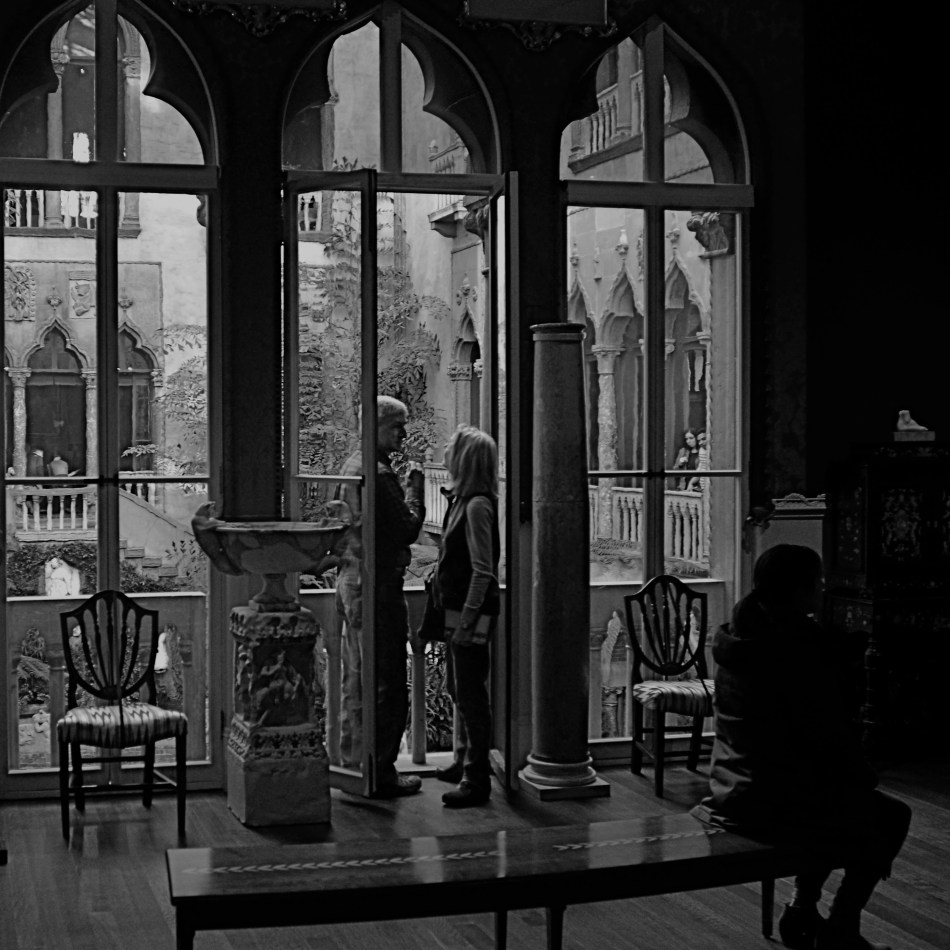
All great public places have within them common spaces in which the shooter can safely trust to such luck, areas where the general cross-traffic of humanity guarantees at least a fatter crop of opportunity for happy marriages between passersby and props. At Boston’s elegant Isabella Stewart Gardner Museum, the surrounding walls of the central court are the main public collecting point, with hundreds of visitors framed daily by the arched windows and the architectural splendor of a re-imagined 15th-century Venetian palace. The couple seen here are but one of many pairings observable in a typical day.
The pair just happens to come ready-made, with enough decent luck assembled in one frame for almost anyone to come away with a half-decent picture. The size contrast between the man and the woman, their face-to-face gaze, their balanced location in the middle arch of the window, and their harmony with the overall verticality of the frame seem to say “mission accomplished”. I don’t need to know their agenda: they could be reciting lines of Gibrhan to each other or discussing mortgage rates: visually, it doesn’t matter. At the last instant, however, the seated woman, in shadow just right of them, presents some mystery. Is she extraneous, i.e., a spoiler, or does she provide a subplot? In short, story-wise, do I need her?
I decide that I do. Just as it’s uncertain what the couple is discussing, it’s impossible to know if she’s overhearing something intimate and juicy, or just sitting taking a rest. And I like leaving all those questions open, so, in the picture she stays. Thus, what you see here is exactly one out of one frame(s) taken for the hell of it. Nothing was changed in post-production except a conversion to monochrome. Turns out that even the possibility of budding romance can’t survive the distraction of Mrs. Gardner’s amazing legacy seen in full color, and the mystery woman is even more tantalizing in B&W. Easy call.
As we said at the beginning, working with my own formal rules of composition, I could easily have concluded that my picture would be “ruined” by my shadowy extra. And, I believe now, I would have been wrong. As photographers, we try to look out for our own good, but may actually know next to nothing about what that truly is.
And then the fun begins….
CUES
By MICHAEL PERKINS
PHOTOGRAPHIC COMPOSITION is never the mere geographic assignment of elements within a frame. Certainly, mapping out what is to go up, down, left, or right in a picture is a vital part of the process, but you have to do more than rearrange the deck chairs. You also have to make real decisions about where the ship is sailing.
Aperture, focus, the use of light…..make up your own list of contributing factors… the assembly of a composition is about setting the terms of engagement between your vision and the eyes of the audience. It is never merely about the limits or contents within the frame. This means that a picture that you would shoot in a certain way today may seem completely out of synch with your thinking a year from now, because your idea of composition will (and should) be in constant flux.
In my own case, I have spent a lot of the last five years re-evaluating focus, deciding in many more cases to use it selectively, where, previously, I might have applied it more evenly. This is an exploratory journey, and I am not sure where it will wind up. I don’t really feel as if I’m abandoning sharpness per se, just trying to decide how much of it I need in a given situation, making its use a lot more intentional choice than it has historically been for me.
Focus is a way of prioritizing the visual elements in a picture. It cues the audience as to what information there is and how hard to look to retrieve it. It also tells if there is no object or “mission” in a picture, as in a totally abstract arrangement. Photographer Uta Barth, describing why practically all of her work is deliberately refocused, notes that “the question, for me, is how I can make you more aware of your activity of looking. I value confusion…”
Indeed, placing incomplete information before a viewer, about focus or anything else in a photograph, is inviting him/her into an interaction…..with all parties having a conversation about what a picture means. For the viewer, it means exercising more control: for the photographer, who no longer has to spell everything out, it can be freeing.
EVERYTHING IN ITS PLACE
By MICHAEL PERKINS
EVERY PHOTOGRAPH REMOVES SOMETHING from its original context, extracting it from its proper place in the world at large. In the act of placing things in a frame, the photographer excludes whatever else once surrounded that thing, so that, in the final result, a vast valley is reduced to one tree in one part of one meadow. Our mind stipulates to the supporting reality of whatever was extracted, and we either approve or disapprove of the shooter’s arbitrary editorial choice in composing the frame.
And so pictures often annihilate an object’s “origin story”, since we can’t often search them to view what something “came from”. Objects in a photograph merely are, with little obvious evidence of what they used to be. Sometimes that means that, when we do see where something originated, a picture of it can seem exotic or strange. And, as photographers, we can train ourselves to find that one view of a thing that has been, in effect, under-explored.
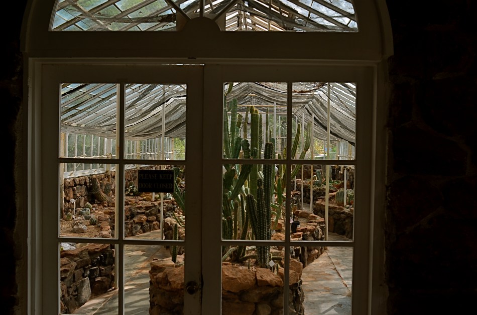
In the above picture, something that we tend to think of as being organically “born” in a natural setting (i.e., a cactus) is shown being deliberately farmed within a controlled environment (i.e., a greenhouse). It looks a little wrong, a bit strange…..certainly not typical. And yet, an interesting picture can be made from the scene, simply because we never see a cactus’ origin story, given that most photographs don’t select that story within their frames. This picture really doesn’t display its information in an original fashion: it’s the thing, in this particular context, that makes the photograph seem novel.
As always, the choices made inside and outside the frame of a photograph set the narrative for it. It’s therefore the most important choice a photographer can make.
CHECK THOSE ABS
By MICHAEL PERKINS
IT SEEMS ODD to hear someone refer to part of their photographic output as “abstract”…..as if the rest of their work somehow isn’t. I guess it depends on what you believe the word ” abstract” means, as well as what is meant by other words like, say, “reality”. For me , the whole discussion seems overthought. To my mind, all photography, all art is “abstract”.
 To abstract something is to extract it from its original context, to re-frame it, take it from one form and paste it into another. And there is no way not to do that with a photograph. We don’t show reality. We show shards, fragments, selectively sliced slivers of time. Even if we take great care to take a no-frills, documentary approach to the recording of an image, once we click the shutter, we have abstracted that moment from reality, making an editorial choice to pluck away this instant versus all others.
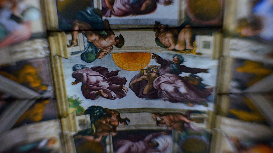
One way to illustrate this process is to consider the image at the top of the page, which represents a virtually endless chain of abstraction. Thinking backwards from this photo of a museum exhibit:
In the beginning, God creates man, an abstraction of himself. Then Michelangelo creates an abstraction of God (and a lot of other Biblical superstars) by depicting Him in the act of creation, even as he (the painter) is also abstracting representations of the Creator’s creatures. Centuries later, art historians take selective pictures of Michelangelo’s massive abstractions on the ceiling of the Sistine Chapel, abstracting them further by using selected excerpts as book illustrations. Inspired by those books, curators in Manhattan create an exhibit honoring Michelangelo’s ceiling by reproducing it as a miniature, assembling a replica composed of dozens of backlit transparencies suspended over guests at the Metropolitan museum in an artificial abstraction of the original Sistine frescoes. Finally, using a selective-focus art lens in 2017, I abstract those same guests to blobby smears of color and make editorial choices about which single panel in the faux-ceiling exhibit to shoot in sharp focus, thus hinting that it’s somehow more important than all the others.
Photographs snatch away parts of the real. To use a camera is to abstract that reality. Every snap of the shutter is a calculation of choice. Therefore choose wisely.
THE COWGIRL IN THE BLEACHERS
By MICHAEL PERKINS
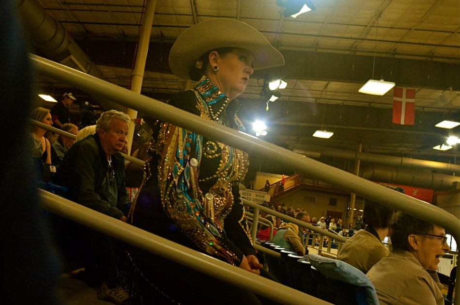
I AM NEVER TRULY COMFORTABLE working with a camera that isn’t physically locked onto my eye. Shooting without a viewfinder was, for me, perhaps the hardest part of gradually embracing cel photography, and continues to be a control issue that still inclines me toward my Nikons most of the time. Part of it, I freely admit, is mere sentimental habit……maybe even, who knows, superstition?…..and yet when I’m crammed up against that little square of glass, I feel as if I’m “really” taking a picture.
That’s why it’s really a rare bird for me to “shoot from the hip” with a DSLR, to try to sneak a street candid without my camera anywhere near my face at all, holding the thing at mid-chest or waist level or even squeezing off a frame while it’s hanging from my shoulder. If the opportunity is literally too juicy to resist, and if looking like a (gasp) photographer will spook my quarry (or get a Coke thrown in my face), well, then, desperate times call for desperate measures.
I arrived at such a “desperate times” moment the other day by being caught out with the wrong lens. I had thought that I would be spending my afternoon at a horse show inside barns and stables, indicating a wide-angle to open up cramped spaces, so I packed a 24mm to go wide but keep distortion to a minimum. Once Marian and I arrived at the event, however, she got interested in an arena competition, and so in we went. Now I’m taking big shots of a cavernous hall punctuated by long lines of little tiny horses. If a rider lopes directly in front of my seat, I can almost make out his face. Otherwise I’m zoomless and story-less. Can we go home now?
I hear a husky female drawl off to the left.
“Jus’ let her walk, Annie. She wants to walk.”
Turns out the voice belongs to a spangled matron with a Texas twang sharp enough to chop cheddar, herself apparently just off the competition track and now shouting guidelines to another woman in the field. I immediately fall in love with this woman, hypnotized by her steely stare, her no-nonsense focus, and the fact that, unlike the far-away formations of horses directly in front of me, she is a story. A story I need to capture.
But any visible sign of guy-with-a-camera will ruin it all. I will swing into the range of her peripheral vision. Her concentration will break. Worse, the change in her face will make the story all about the intrusive jerk six feet away. And so I hug the camera to the middle of my chest, the lens turned generally in her direction. Of course I have no reliable way to compose the shot, so I spend the next several minutes shooting high, low, losing her completely in the frame, checking results after every click, and finally settling on the image you see here, which, despite my “calculations” for a level horizon, looks a bit like a shot from the old Batman tv series. Holy carsickness.
Strangely, shooting at actual horses (at least with the glass I brung) was telling me nothing about horse culture. But the lady with the spangly blouse and Stetson got me there. It’s literally her beat, and I was grateful to, yes, sneak a glimpse at it.
SUBDIVISIONS
By MICHAEL PERKINS
VAN LINES USED TO GIVE OUT SMALL GRIDDED PAPER SQUARES that prospective customers could use as room diagrams for the planning of their next homes. The fancier versions even came with pre-cut geometric shapes that you could place on the squares, to see if the couch would look good next to the settee, or whether the piano should go along the north wall. It was like paper dolls for easy chairs and coffee tables.
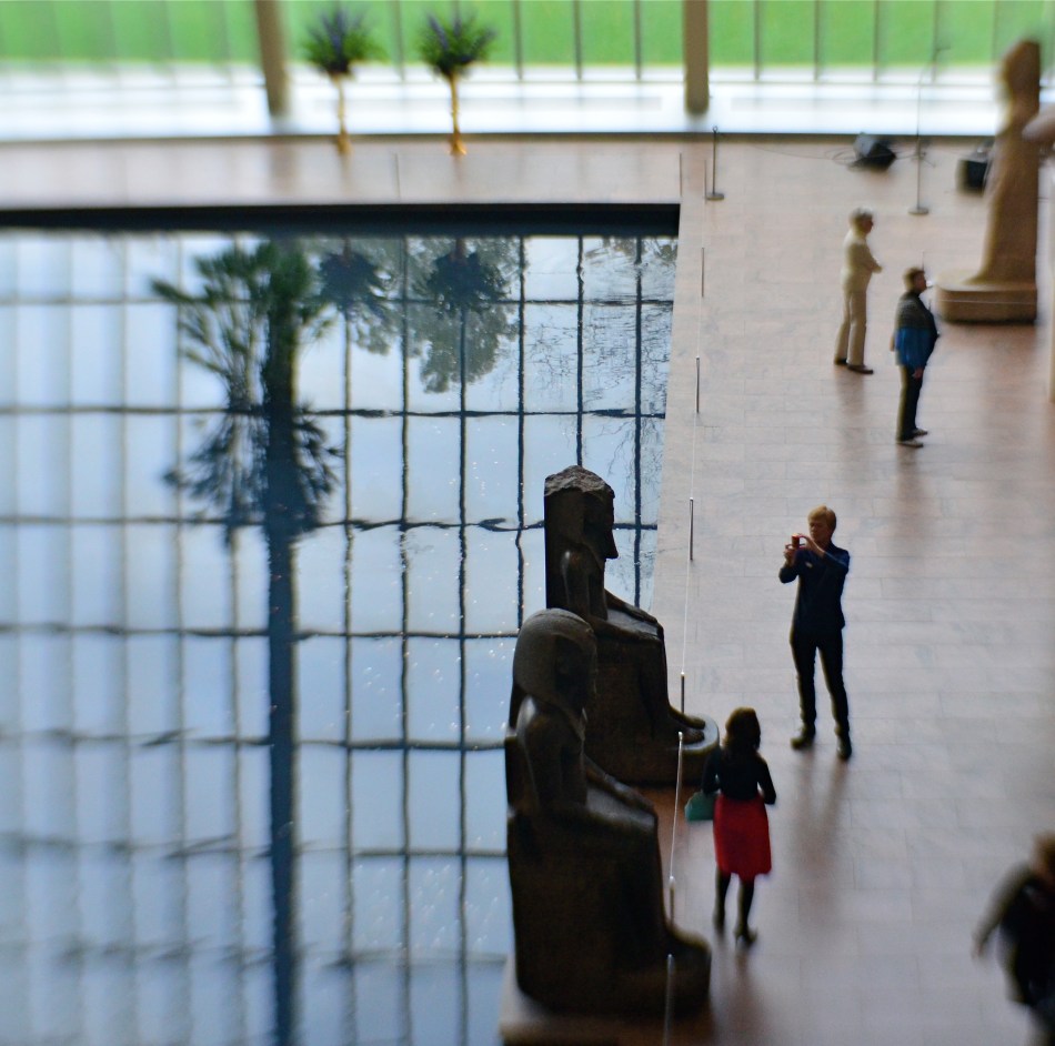
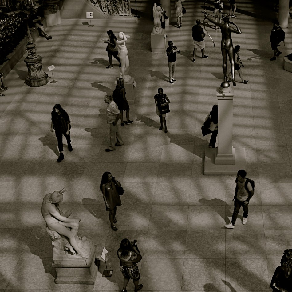
I recall those squares whenever I’m trying to photographically visualize the optimum composition of large spaces, especially if I’m lucky enough to do so from an elevated spot. Immense rooms start to look like rectangles within rectangles, squares butted up against other squares. Dividing lines between action and dead space begin to appear. Cropping parameters suggest one scheme, then argue for another. With enough time, a kind of strategy emerges for what should go where, much like those intricate battle maps used to illustrate the engagements in Ken Burns’ The Civil War.
The balance of “live” and “dead” space in public gathering places (like the museum seen here) has to carefully organized, since both kinds of space have their own special narrative power, and can intrude on each other if not orchestrated. In the above image, it’s almost as if the active roles by the tourists on the right ought to be contained, in order to avoid disturbing the abstract patterns on the left. A different method might also see the entire outer frame as a series of smaller squares and rectangles, just as a chessboard is a square composed of an infinite number of lesser squares. Depends on your eye.
Composition, if done at leisure rather than haste, is a negotiation, a bargaining session in which every inch of photographic real estate must earn its place in the final picture. It’d be glib to merely say “there’s no right answer”, but, if you look at images resulting from certain choices, it becomes apparent that such a statement cannot be true. Right will feel right. Wrong will always feel like you put the piano in front of the picture window. Not horrible… but not correct, either.
FACE FRONT
By MICHAEL PERKINS
HUMANS HAVE A DEFINITE ANTHROPOMORPHIC BIAS when it comes to faces. From dancing Disney flowers to Pixar office lamps, we tend to project our features onto nearly every kind of object or entity. And, as a photographer, I fall prey to that selfsame bias, especially when it comes to making pictures of buildings.
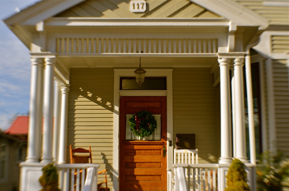
It’s isn’t much of a stretch, really. Windows become eyes. Doors assume the role of both noses and mouths. Overhangs and pitched rooves take on the appearance of eyebrows. And so on. For a variety of reasons, I tend to position houses in the same way I might shoot the most basic human portrait. Eyes facing straight toward the camera, face centered in the shot. No arty angles, no three quarter views. As clinical as a mug shot, or, in architectural terms, the plainspoken exposition of Walker Evans’ studies of houses and businesses in days of the New Deal.
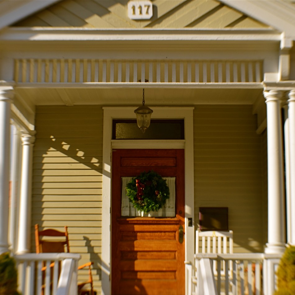
And, like the aforementioned mug shot, I tend to frame the picture as close as I dare without sacrificing either context or impact. Again, the human face is the template, with the same decisions to be made about cropping. Do you need the top of the hair, the width of both ears? Should the shot stop at the bottom of the chin? Below the shoulders? Does any surrounding information add to the selling of the picture?
Does the traditional rectangular framing of the house in the top shot feel roomy, or merely loose? Is the square re-cropping of the same image, seen just overhead, simplified, or cramped? If the front of a building truly has the same potential impact as that of a face, it would follow that a building study might benefit from the same compositional criteria. That means that, like a face, a building has to earn every inch it occupies within the frame.
LEADING FROM THE REAR
By MICHAEL PERKINS
PHOTOGRAPHING CROWDS IS SOMEWHAT AKIN to using one’s camera to track a billowing cloud of soap suds. The shape of the mass shifts constantly, roiling this way and that, presenting the shooter with an ever-evolving range of choices. Is this the shape that delivers the story? Or does this arrangement of shapes do it?
And is just the size of the overall crowd the main visual message….with the perfect picture merely showing a giant jumble of bodies? Plenty of great images have been made that convey a narrative with just mass or scale. But throngs are also collections of individuals. Can’t a compelling tale also be told focusing on the particular?
When shooting any large gathering, be it a festival, a party or a demonstration, I am torn between the spectacle of the “cast of thousands” type shot and the tinier stories to be had at the personal level. In the shot seen below, I was following a parade, actually behind the traditional approach to such an event. What arrested my attention from this vantage point was the printed shawl of the woman directly ahead of me. The graphic on the shawl had been seen on other flags and banners in the march, but, billowing in the breeze on her back, the print became a kind of uniform for the march… a theme, a face all its own.
In this context, I didn’t need to see the actual expressions of the marchers: there was enough information in their body language, especially if I composed to place the woman at the center of the shot, as if she were the leader. That was enough. The actual march boasted thousands, but I didn’t need to show them all. The essence of everyone’s intentions could be shown by the assemblage of small parts.
Some crowd photographs speak loudly by showing the sheer volume of participants on hand. Others show us the special energies of individuals. Neither approach is universally sufficient, and you’ll have to see which is better for the narrative you’re trying to relate in a particular moment.
LOOK ME IN THE ( ? ) AND SAY THAT
By MICHAEL PERKINS
PHOTOGRAPHY’S FIRST HUGE SURGE OF POPULARITY served notice on the painting world that there would, going forward, be more than one way to capture the human essence in a portrait. Initially dismissed as a mere recording device by panicky daubers the world over, the camera soon earned a place at the table by revealing just as much of the inner souls of its subjects as even the most trained brush, albeit by different roads. One of these, of course, was the eye, characterized as “the window to the soul.” To some, it seemed that painters merely drew your gaze to the eye, whereas the camera drilled straight through it.
Whether you share that view or shrink in horror from it, the fact is that generations of technical treatises have centered on the vital importance of engaging the eye in portraits: getting the right “catch light” spark reflected in it, making it the primary focus of the face, even zeroing out sharpness in the entire frame except in the orb’s immediate vicinity. It’s accepted wisdom that the eye sells the face and the face sells the picture. But what of faces that have another kind of story?
In the above image, we are, as viewers, denied access to the birdwatcher’s eyes, unless you interpret her binoculars as a kind of abstract substitute. But does that make the picture not a portrait? Using every other feature and prop available to the shooter, is there insufficient evidence to properly tell her story? Are we at all uncertain of her intent, enthusiasm, state of mind? Is her zeal any less obvious without those windows to the soul in sight? Or to think of it another way, would the picture have any greater narrative power if her eyes were visible?
Portraits are certainly anchored by their most provocative features, riveting our gaze to precise points of drama as urged by talented photographers. However, that list of elements is not absolute, any more than a blue sky is an absolute for a painter. Faces can spell out a message in upper-case neon letters or whisper it in muted shadows. But other than that, everything else is on the table. Portraits are a process, not a recipe.
ORCHESTRATING THE DARK
By MICHAEL PERKINS
PHOTOGRAPHERS LEARN, FAIRLY EARLY ON, that he who controls the frame controls the conversation. The act of composition is really forced upon the artist, since every picture has some kind of hard physical limits or arbitrary dimensions. And since no photographic vista is truly unlimited, one’s vision is subject to two crucial choices: what to put in the frame, and what to leave out.
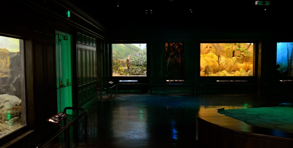
This process is lovingly demonstrated in 2017’s glorious film Wonderstruck, a nostalgic observation on the art of presentation, specifically the way it has historically been practiced by traditional museums, those special places where we arrange, as do photographs, a version of reality. The film chiefly centers upon New York’s Museum of Natural History, whose legendary dioramas of global habitats have transported generations of young minds to a universe of savannahs, shores, and deserts, all trapped in backlit cubicles and arranged in grand halls, warehouses of worlds orchestrated in darkness.
Here, in this supermarket of climates and locales, each diorama must convey its message in a shorthand of visual cues, hinting at entire ecosystems within a limited space and with only a modest number of props and textures. At their best, they echo the skills of the most effective of photographs, making eloquent choices on what is included, what is excluded, and whatever narrative power those choices generate in the finished product.
Of course, Wonderstruck’s affection for the museums it honors (including Los Angeles’ Museum Of Natural History, shown here) is a valentine to an age that is quickly vanishing, its prosaic, passive vistas giving way to the buzz and flash of ever more interactive, “hands-on” experiences, an immersive engagement that can make the dioramas of old seem like silent movies.
Still, if you can slow your absorption rate to pre-digital speeds, the old wonder boxes can still teach, because photographers are still bound by many of rules of engagement they observe. Don’t distract, attract: clarify your message: get the story told. Snapping an image is a fairly process. It takes time, real time, to learn to curate them.
SMALL WORLD
By MICHAEL PERKINS
OVER THE NEARLY SEVENTY-YEAR HISTORY of the legendary View-Master, showing generations “seven more wonders of the world” with each fresh reel of views, the format has been used to depict everything from targeting exercises for sharpshooters in World War II to detailed cut-aways of the human body for anatomy students. And of course, VM’s two mainstays of popular appeal persist to this day: armchair tours of the globe’s greatest attractions and an endless variety of children’s titles, including scenes from tv shows, movies, and, most prominently, fairy tales.
View-Master’s original headquarters in Portland, Oregon operated mainly to print, duplicate and package the views taken by its roving band of freelance scenic photographers. However, there was one part of the plant that created special, homegrown bits of pure fancy within the factory walls: the company’s legendary “table-top” studios. Here were created wondrous dioramas of everything from Cinderella’s castle to the Emerald City, built to scale and populated by tiny princesses, heroes, animals, and storybook legends. The range of product, from the Grimm Brothers to Disney, was not, as in later years, just frozen animation cels but solid clay art figures, lovingly created by a select staff of model makers and photographed in 3-d Kodachrome images for the children’s division. Later on, corners were cut, budgets were slashed, and View-Master’s worlds of wonder became the stuff of legend, not to mention keen interest among collectors.
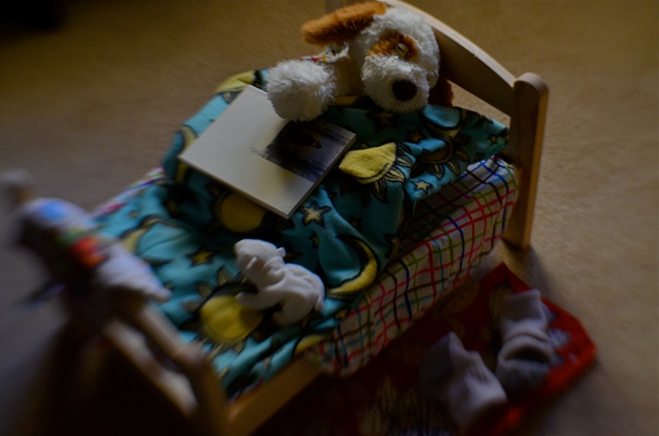
Every once in a while, I take a crack at an imaginary scene that the wizards of Portland might have dreamed up, such as the concoction you see here. The stuffed dog and miniature bed had both been purchased to help the sole survivor of a quartet of rabbits get over her grief at being the Last Bunny Standing, but both props had been rejected out of hand. Turns out she rather liked having all the room, grub and water to herself, so she retired her black armband within twenty-four hours without a backward glance.
Walking by the two blacklisted toys each day, I started to imagine the dog as a small child, and wondered what his night-time retiring ritual might be, from the book that eased him off to Dreamland to the socks shed by the side of his bed. Ten minutes of prep and I was ready to shoot my tribute to the days when clay models transported us all from mere reality into View-Master’s exquisite realms of possibility. Days are often arranged in too straight a line. At such times, a slight detour into daydreaming is all you need to render the journey a little more worthwhile.
NOMADS
By MICHAEL PERKINS
IN A PARTICULARLY CHILLING SCENE from the classic film The Third Man, Orson Welles, as the story’s amoral profiteer Harry Lime, looks down from a carnival ride to the teeming, tiny throngs on the pavement below, distancing himself from people that have been reduced, in his mind, to mere ‘dots’. ” Tell me”, he asks his friend Holly Martens, “would you really feel any pity if one of those dots stopped moving forever?” Lime has, in fact, been selling tainted medicine to desperate refugees in post-war Berlin, and his product does, almost certainly, make several of those dots stop moving. Forever. Horrible, and yet his estrangement from his fellow wanderers on that sidewalk occurs all the time in all our minds. When we look more carefully, more compassionately, however, photographs can happen.
We are all nomads, wanderers, dots on a map. We convince ourselves that our journey is surely taking us toward something….a very important something. As for everyone else….what? Like Harry Lime, we place great emphasis on our own story, with ourselves cast as the hero. In fact, though, pulling one’s eye just far enough back from the throng can show our camera’s eye the real story. Every journey, every destination is equal….equally vital or equally banal. It’s the process of observing that seeking that creates a tableau, a composition. That, and how we view it.
I take a lot of images of crowds in motion: streaming in and out of buildings, rushing for trains, teeming through malls, crowding the subway. What they’re after isn’t what gives them the drama. It’s the continuous process of seeking, of going toward all our collective somewheres, that provides the narrative. I don’t try to record faces: these are moving chess boards, not portraits. Additional clinical distance can come from the use of monochrome, or angle of view. Sometimes I think of the overhead camera shots of director Busby Berkeley, he of the kaleidoscopic dance routines in 42nd Street and other ’30’s musicals. The rush of the crowd is all a kind of choreography, intentional and random at the same time.
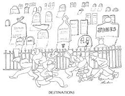
One of the images that brought this idea home to me as a child was a cartoon James Thurber drew for the New Yorker titled “Destinations”(above left). It shows, simply, a rightward mob rushing toward a leftward mob, with a cemetery in the background. Everyone is headed for the same end point but all act as if they are bound for someplace else. The story for a photographer in all this wandering lies in how we look as we do it. Where we eventually wind up may well be fate’s whim, but the story of all the comings and the goings, of ourselves and our fellow nomads, is in the hands of the camera.
LEADING THE WITNESS
“MEN ARE NOT INTERESTED“, said Jerry Seinfeld, “in what’s on tv. Men are interested in what else is on tv.”
The joke conjures up an image of some remote-happy goof in a man-cave endlessly clicking through channels in search of something ever better than what he already has. And it’s true, which makes it all the funnier. It also speaks to how all humans, both men and “not men”, view photographs, and how shooters can play to that propensity.
All photos, sliced as they are out of the continual flow of time, come with an implied sense of what went before the click and what’s to come after it. Trying to use the information from a stilled moment of time to mentally supply those two temporal bookends is an ever-fascinating game between photographer and viewer. What happened just before this? What will happen next?
In composing a frame, the photographer uses all the tools at his command to influence his audience’s assessment, including the simple device of leading lines, which can be used to direct the viewer’s eye wherever the artist wants it to go. LLs are usually effective in drawing you deeper “into” a picture that obviously only has two dimensions. Think train tracks at the front of the picture, receding toward the horizon. These lines tell you that you are being asked to go somewhere, and that you should be curious about what’s waiting for you there.
Leading lines can also go from what is shown in the picture to what is implied, asking you to speculate, as in the case of the above frame, what’s around the next bend, or, in Seinfeldian terms, “what else is on tv”. It’s a strange fact that, no wonder what may be shown within a photo, the most fascinating thing to the viewer’s mind, at least, may be the stuff that was left out of it. We all want what we can’t have, and knowing that very human thing can empower a photographer to much more effectively control the frame.
SILHOUETTE SHORTHAND
By MICHAEL PERKINS
AS AN OBSESSIVE CHILD, I became crazed with the drawing of short animations on pads of paper known as “flip books.” You know the drill. Draw a picture on the top sheet, turn the page, draw another picture with a small change in position, and repeat several dozen times until you produce a brief cartoon by flipping the entire pad from the front to the back. I actually got pretty good at it, if, by “good” you mean manically addicted to perfection and insanely fixated on detail. I could make three seconds of cinematic grandeur. I just couldn’t do it fast.
Meanwhile, on the other side of the playroom, my sister and her partner, my cousin Mark, had so such problem. While I would spend the better part of a week sweating over the laws of locomotion for such classics as The Mummy Goes Mad or Spider–Man vs The Vulture, Liz and Mark cranked out ten titles a day, crude stick-figure blackouts created in ten-minute surges of creative hysteria, all ending with the unfortunate (and unnamed) hero exploding, then emitting a dialogue balloon with the single, sad existential word “WHY??” While I was doing DeMille parting the Red Sea, they were doing Mack Sennett one-reel wonders, heavy on the pie fights. Fact is, I found their stuff gut-achingly hilarious. There was no disputing which of the two “studios” better understood the entertainment biz.
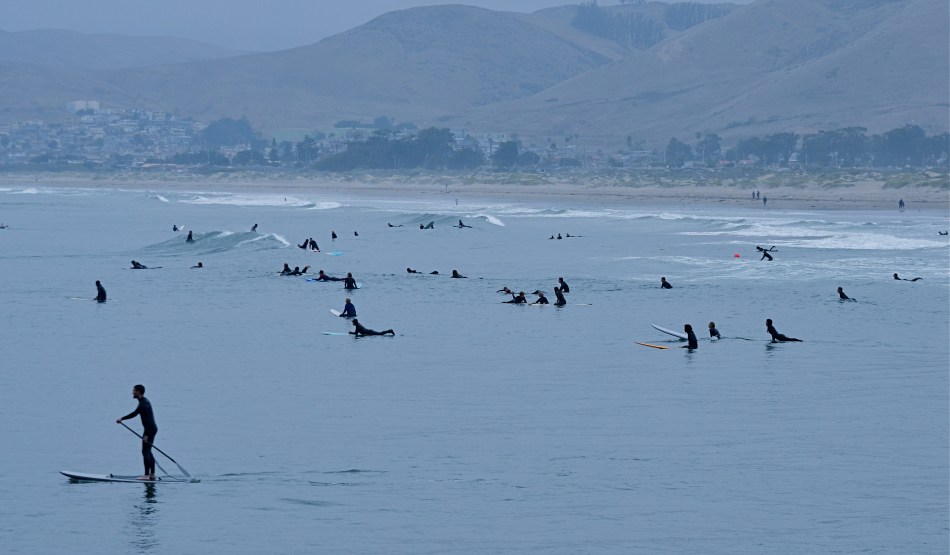
Lizzie and Mark’s stick figures moved every bit as well as my fully-rendered players, but their impact was more immediate. Their drawings didn’t have even a single line that wasn’t absolutely essential to their narratives. I thought of all this recently when working with some distant crowds which were reduced to mere silhouettes in a deep telephoto of the coastline at California’s Morro Bay. As components in a larger composition, they were just markers, measures of linear space. Shooting even closer might have revealed their hair color, lines on their faces or the shine of water on their wet suits, but to what benefit for the overall effectiveness of the picture?
There are many forms of visual shorthand in the making of a photograph, and they can be effective in speeding the journey from the viewer’s eye to his heart. We might think of photography as the complete recording of detail, a piece-for-piece re-play of reality, just as I thought I had to draw every single web line on Spider-Man’s head. However, the most eloquent images often speak louder by using fewer words.
Sometimes, a stick figure is exactly what you need, and no more.
BOOKENDING
By MICHAEL PERKINS
THE HUMAN EYE HAS A SOFT SPOT FOR SYMMETRY, for countervailing energies that face off against each other in a composition. Design elements that pit left against right, top against bottom, even corner vs. corner appeal to a certain Math-Bach sense of balance in the universe. And, as does every other kind of visual art, photography builds strong images by “book-ending” elements in opposition, eye cues both tug toward the center and pull toward the edges.
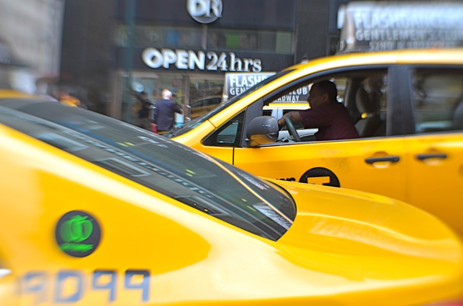
Pictures benefit from this tension, this dynamic argument over what’s more dominant, or, more correctly, what’s dominant in this moment. Book-ending between extremes or contrasting forces is a visual kind of debate, a photographic arm-wrestling match. Sometimes shapes or things occupy opposing spaces in the frame are not, literally, fighting with each other, as in the two overlapping taxicabs seen above. Even so, the two yellow wedges at bottom left and top right in the frame are in a kind of balancing act with each other: call it a conversation.
In your own work, you’ve no doubt observed this visual tension occurring organically or even deliberately built it into a composition. An old building next to a new one: a tragic mask alongside a comic one: a kumquat facing off against a tomato. It doesn’t have to be dramatic to be effective. The bookends can be ornate Greek warriors or abstract slabs: it’s the opposition in the frame that starts the process of yin/yang, and lends a photograph extra heft.
SPEED OF LIFE
By MICHAEL PERKINS
NEW YORK CITY HAS BEEN CALLED MANY THINGS: words like titanic, exciting, merciless, dizzying, dangerous, even magical spring to mind immediately. By comparison, fewer observers refer to the metropolis with words like peaceful, tranquil, or contemplative, and fewer still would ever label it slow. Manhattan may be lacking for modern subways, open space, or a cheap cup of coffee, but it’s never short on speed.
NYC runs on velocity the way other towns run on electricity: the entire metro is one big panicky White Rabbit, glancing at his pocket watch and screeching “I’m late!” As a consequence, anyone making photographs in the Apple has to factor in all that velocity, or, more precisely, decide how (or whether) to depict it.
Do you try, for example, to arrest the city’s rhythm in flight, freezing crucial moments as if trapping a fly in amber, or, as in the image above, do you actively engage the speed, creating the sensation of New York’s irresistible forward surge as a visual effect?
Fortunately, there is more than a century of archival evidence that both approaches have their own specific power. Pictures made in the precise instant before something occurs are rife with potential. Images that show things in the process of happening convey a sense of excitement and immediacy. Like the lanes in a foot race, speed has discrete channels that can reward varying photographic approaches.
TWO WORLDS, ONE WALL
By MICHAEL PERKINS
PHOTOGRAPHS BEGAN AS A SIMPLE HEAD–ON ENGAGEMENT. The viewpoint of the camera was essentially that of an audience member viewing a stage play, or reading a page of text, with all visual information reading from left to right. People stood in front of the lens in one flat plane, giving the appearance, as they posed before offices or stores, that they themselves were components in a two-dimensional painting. Everyone stared straight ahead as if in military formation or a class portrait, producing fairly stiff results.
We started photography by placing people in front of walls, then learned, like good stage managers, that selectively positioning or moving those walls could help image-makers manage the techniques of conceal/reveal. Now you see it, now you don’t. Photography no longer takes place in one plane: barriers shift to show this, or to hide that. They are part of the system of composition. Control of viewing angle does this most efficiently, as in the above image, where just standing in the right place lets me view both the front and back activities of the restaurant at the same time.
Of course, generations after the rigid formality of photography’s first framing so, we do this unconsciously. Adjusting where walls occur to help amplify our pictures’ narratives just seems instinctive. However, it can be helpful to pull back from these automatic processes from time to time, to understand why we use them, the better to keep honing our ability to direct the viewer’s eye and control the story.
SHATTERING THE FRAME
By MICHAEL PERKINS
ONE OF THE MOST REVOLUTIONARY ACTS a photographer can commit is the thwarting of expectation, a deliberate subverting of what the viewer assumes will happen next. Composition-wise, this means not just deciding what information makes it into the frame, but, indeed, whether there will even be a frame at all.
Any demarcation or line within an image can be used to direct attention to a given location. Whether including or excluding, pointing toward or pointing away from, the photographer has pretty much limited authority on how he’ll direct traffic within a composition. And so we shoot through holes, slats, panes, and skylights. We observe borders marked by cast shadows: we cut spaces in half to make two rooms out of one: we reveal facts in parts of reflections while obscuring the objects they reflect.
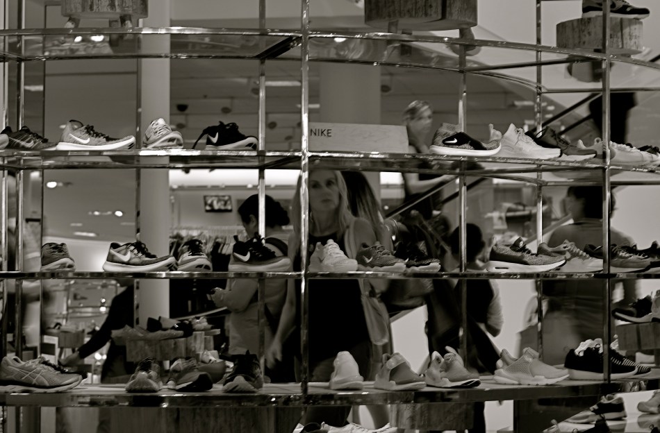
In the above image, I saw the subdivisions of the department store display unit like a wall of little tv’s, each screen showing its own distinct mini-drama. Is the woman seen eyeing the merchandise the most prominent “screen star”, or are we just seeing an arbitrary mosaic of the larger scene behind the display? Or is it both?
Framing within the larger frame of a composition can isolate and boost whatever message we’ve chosen to convey, and it’s perhaps the most total control a photographer can wield, more so in its way than even exposure or lighting.
AND NOW WE PAUSE FOR…
By MICHAEL PERKINS
A BREAK IN THE ACTION: a word from our sponsor: a coda before the chorus. Intrusions into the predictable rhythms of things can be either annoying or refreshing, depending on how we perceive them.
The right intervals between dots and dashes can drastically change the meaning of a telegram. A well-placed silence between musical notes can generate just the tension required to transform a composition into a masterpiece. And a sudden interruption in visual patterns can add impact to a photograph.
Once the eye detects, as they say on Sesame Street, that one of the things in a picture is not like the others, it pauses, re-evaluating every element in the scene, weighing it for relative value. Breaking an image’s pattern is either an unwelcome invasion or a kind of visual punctuation….again, varying as to the effect. The object violating the uniformity says pause, wait, re–consider, and begins a new conversation about what we’re seeing and what we think about it.
In the above picture, a human silhouette against the massive ceiling grid provides the basic context of scale, and defines the locale (a library) as a space where human activity takes place. The figure thus says how big the place is and what it is for, along with any other ancillary associations touched off in the viewer’s mind. Would the picture “work” without the figure? Certainly. The terms of engagement would just be different, that’s all.
Photographs are not merely pictures of things. They are also sets of instructions (suggestions?) on what to do with all that information. Think of them like roadside signs. It’s indeed helpful to be told, for example, that Sacramento is just another 100 miles away. But it’s just as important to have a big bright arrow telling you to head that–away.





(ALMOST) NO ADMITTANCE
By MICHAEL PERKINS
DOORS PRESENT A MOST INTRIGUING PARADOX for the photographer. They are both invitations and barriers, the threshhold of opportunity and the end of it. Entrances and exits create a two-way traffic, with people either vanishing into or emerging from mystery either behind or in front of them. In either case, there are questions to be answered. And while the camera is certainly no x-ray, it does set the terms of the discussion…an endless discussion… about secrets.
Think of those fateful doors beyond which we know something portentous or crucial occurs. Ten Downing Street. The portal to an execution chamber. A confessional. An organization open to “Members Only”. Doors are like red meat to the photographer because they mean everything and nothing at once. Like the children of Pandora, we inherit the insatiable curiosity to know what’s back of that thing. Who’s there? Who’s not there? What does the great Oz look like? What’s going on inside that doesn’t invite me, doesn’t want me?
All barriers seem wrong, even cruel to us, on some level. “Something there is that doesn’t love a wall, that wants it down” writes Robert Frost in the poem Mending-Wall, and it seems like a reasonable sentiment. I can’t walk past a door, forbidding or friendly, without wanting my camera to go back and ask, knock, knock, who’s there? As an example the above image came to me unbidden, on a night in which my wife and I had walked along Queens Boulevard in New York in search of an all-night diner. Having succeeded in securing sustenance, we were walking home when a brief glimpse of a rather substantial iron gate became visible down a side street during the few scant moments it took us to skip through an intersection. I knew two things at once: I would never know what lay beyond that grand facade, and I would, still, have to make time to come back, on another night, to have my camera ask “the question.”
Photography can be about The Big Reveal, and often traffics in the solving of puzzles. But just picturing the puzzle is all right too. We don’t have to know whether the lady or the tiger is behind that door. We just have to use our magic boxes to knock on it.
Share this:
November 23, 2017 | Categories: Commentary, Composition, Conception | Tags: Framing, Point Of View | Leave a comment