PRETTY/UGLY
By MICHAEL PERKINS
LEGEND HAS IT THAT ORSON WELLES, STAYING FOR A WHILE AS A GUEST AT PETER BOGDANOVICH’S HOME AROUND 1970, convinced him that the small Texas town he wanted to portray in the bleak drama The Last Picture Show would be “too charming” if shot in color. Bogdanovich went with the starkly toned palette of black and white, and you know the rest. Eight Oscar nominations, two wins, and an honored slot in cinema history.
Bogdanovich made an artistic decision to make something “uglier” in order to make it “real”.
For me, this idea has always been like swimming against the current, since, as a kid, I was influenced initially by scenic photographers, then, somewhat later, photojournalists, who seek a completely different end product. I tend to default to the idea of making things look pretty. Even today, me knowing the impact of recording things as they are, warts and all, is one thing, while me, deliberately manipulating an image in order to change or amplify its darker elements is a stretch. It’s not something I instinctively bend toward.
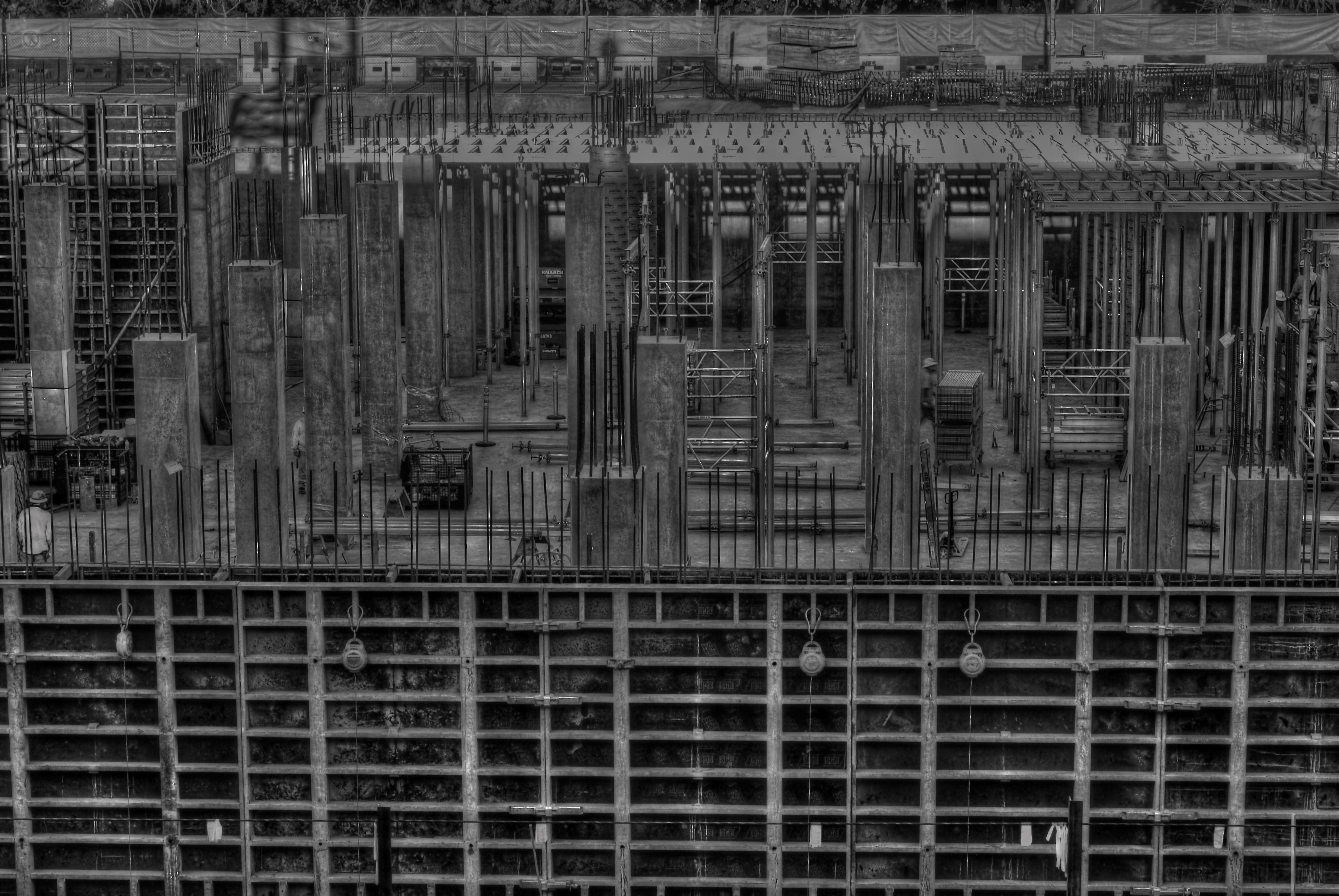
Hideous or wondrous, depending on how you see it. A deliberately “over-cooked” HDR from three exposures, all taken at f/11 for maximum detail, and ISO 100 with a 50mm prime lens.
Still, some stories are told in capture and others are revealed in processing, and while photography is interpretation as well as mere recording, I like to take a crack at changing the context of a picture, to make its parts add up to something drastically different. A few years ago, the parking garage near my job looked out at a massive construction project. My parking slot was situated such that I was about three floors up in the air, peering through the open wall of the garage to easily take in a panoramic view of the entire length of the new building’s emerging structure. I soon got into the habit of getting to work about fifteen minutes early so I could hop out and snap whatever activity I could catch.
The finished building eventually smoothed into something acceptably serviceable, if bland, but, with its raw skeleton mounting day by day, an immense feeling of grim, awful power was climbing out of that place. It couldn’t be seen in color, especially not in the benign, golden light of early morning. This thing was appearing to my eye as a sinewy, dark life force, inevitable, dreadful……an impression I would have to achieve through a complete reworking of tone and texture. I decided to use High Dynamic Range processing, not to merely rescue detail lost in highly contrasted nooks, but to intensify every grain, granule and hobnail of the building, to render it in a surreal, slightly hellish aspect. To make it “ugly” on purpose…..or, more exactly, to my purpose.
Playing at changing the emotional feel of a picture isn’t native to me, so I am always grateful when this part of my brain rouses from sleep and demands to be exercised. The persistent (and false) notion of photography since its inception is that it shows the world as it is, a lie which is debunked with every willful act of picture-taking. No less than painting, the photo image is both document and statement, truth and distortion.
It never has to settle for being mere reality, nor could it claim to be.
And that is its seductive pull.
STRING THEORY
Repose. 1/250 sec., f/3.5, ISO 125, 35mm prime lens.
By MICHAEL PERKINS
CERTAIN INANIMATE OBJECTS INTERACT WITH THE LIVING TO SUCH A LARGE DEGREE, that, to me, they retain a certain store of energy

Just horsehair and wood, but it has an elegance all its own.
even when standing alone. Things that act in the “co-creation” of events or art somehow radiate the echo of the persons who touched them.
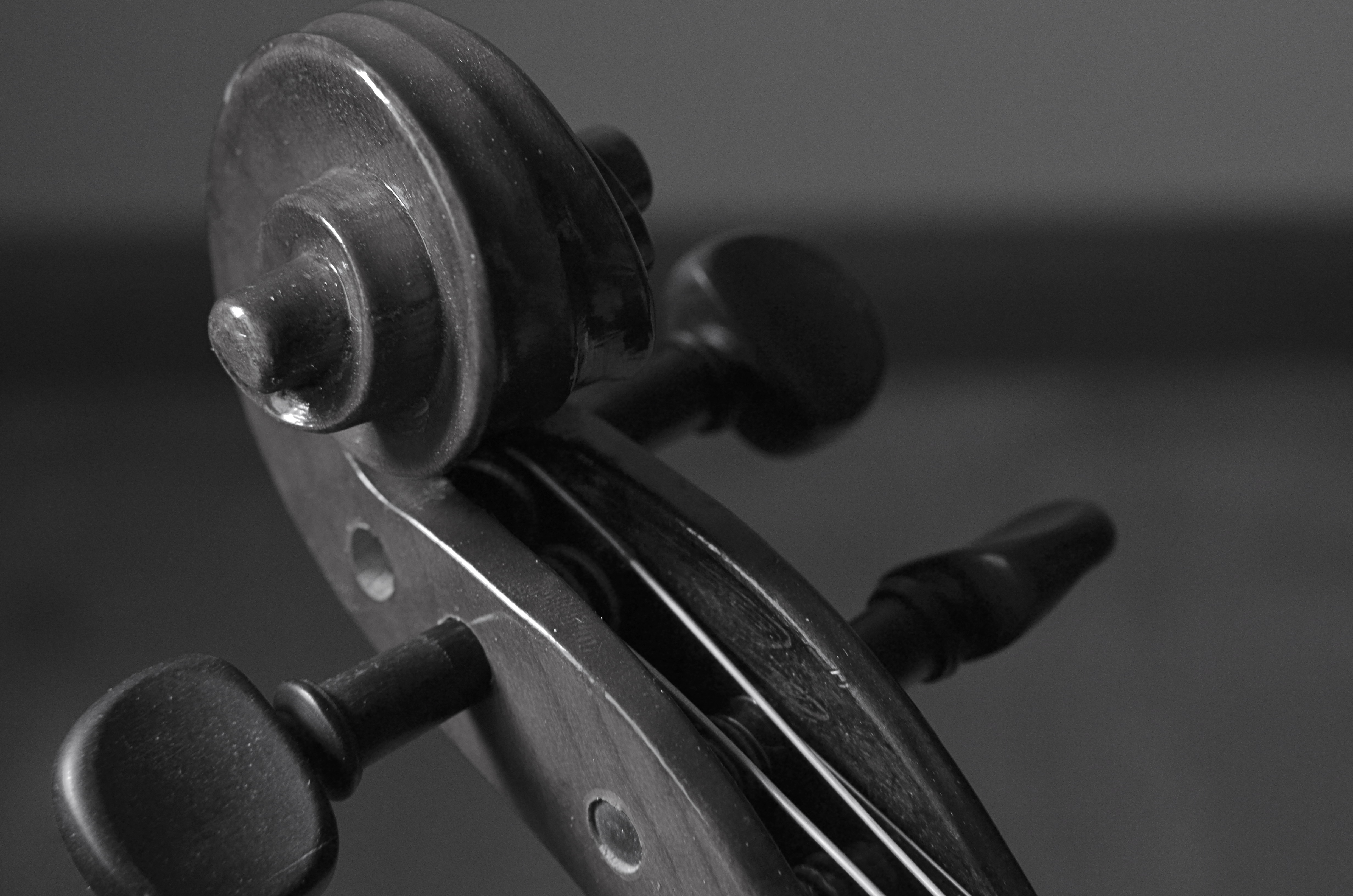
Musical instruments, for my mind’s eye, fairly glow with this force, and, as such, are irresistable as still life subjects, since, literally, there is still life emanating from them.

Staging the object just outside the reach of full light helped the violin sort of sculpt itself. 1/800 sec., f/2.5, ISO 100, 35mm prime lens.
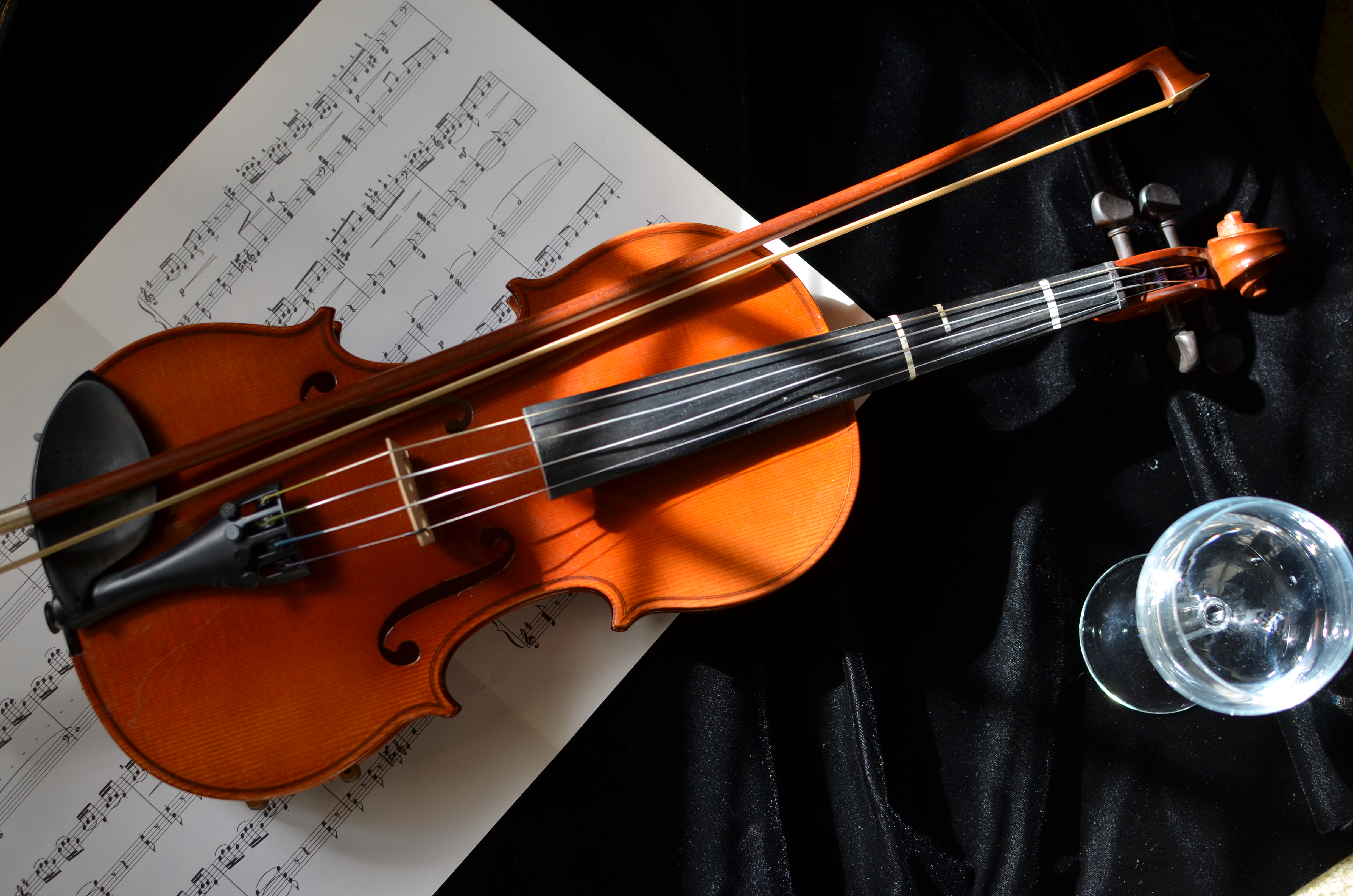
A while back I learned that my wife had, for years, held onto a violin once used for the instruction of one of her children. I was eager to examine and photograph it, not because it represented any kind of technical challenge, but because there were so many choices of things to look at in its contours and details. There are many “sites” along various parts of a violin where creation surges forth, and I was eager to see what my choices would look like. Also, given the golden color of the wood, I knew that one of our house’s “super windows”, which admit midday light that is soft and diffused, would lend a warmth to the violin that flash or constant lighting could never do.
Everything in the shoot was done with an f/1.8 35mm prime lens, which is fast enough to illuminate details in mixed light and allows for selectively shallow depth of field where I felt it was useful. Therefore I could shoot in full window light, or, as in the image on the left, pull the violin partly into shadow to force attention on select details.
Although in the topmost image I indulged the regular urge to “tell a story” with a few arbitrary
The delight is in the details.
props, I was eventually more satisfied with close-ups around the body of the violin itself, and, in one case, on the bow. Sometimes you get more by going for less.
One thing is certain: some objects can be captured in a single frame, while others kind of tumble over in your mind, inviting you to revisit, re-imagine, or more widely apprehend everything they have to give the camera. In the case of musical instruments, I find myself returning to the scene of the crime again and again.
They are singing their songs to me, and perhaps over time, I quiet my mind enough to hear them.
And perhaps learn them.
SPLINTERING THE SQUARE
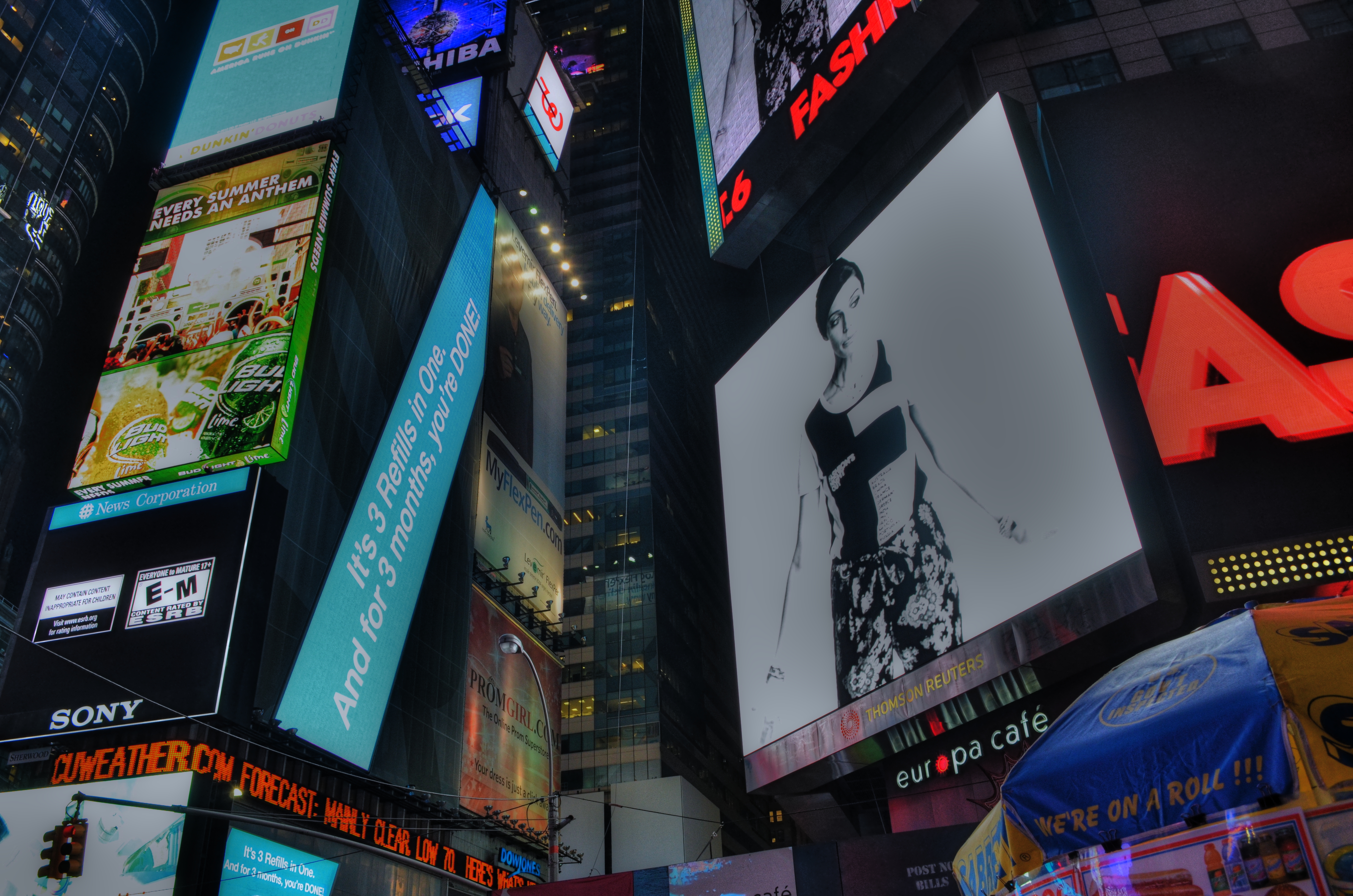
Times Square, August 2012. Somehow, the dark spaces in this spark my interest more than the garish light. 1/40 sec., F/8, ISO 320, 18mm.
By MICHAEL PERKINS
GOING BACK OVER HUGE FOLDERS OF IMAGES LONG AFTER THE FACT OF THEIR CREATION, a kind of aesthetic amnesia comes over me as to what the original intent of some of the pictures were. Who is this person? And why can’t I remember being him when this thing was shot?
A bit of background:
As much time as I have spent in New York’s Time Square, I should know better than to even raise my camera to my face, given that this particular locale has produced, for me, more hot messes and failed missions than any other subject I’ve ever aimed at. The place is a mirage, a trap for shooters: a visual overload, obscenely loud and demanding of attention, but spectacularly devoid of content. There is no “message” afoot in this vast glowing urban canyon except step right up we got what you need right here great seats at half price a whole dinner for just ten bucks hey watch who yer shovin’.
Hey, if you’re looking for meaning, stay home and read your Bible.
And yet, every time I’m there, I still try to take “THE shot”, vainly sticking to the idea that there is even one in there, and that all I have to do is find it. If I only had a helicopter, if I shot it at this end of the street, if I just find the great unifying theme, the truth will come forth….
Yeah, right.
Anyway, in reviewing the above image, one I originally consigned to the dustbin, I’m once again that aesthetic amnesiac. I don’t recognize the person who took it. It doesn’t look like anything I’d try, since it’s just an arrangement of angles, colors, and dark spaces. In other words, an attempt to see a design in part of the scene, rather than an overall tapestry of the entire phenom. Sort of splintering the square. It’s the casting of the city as a personality, I guess, that appeals to me, like the Los Angeles of Blade Runner or the neon neo-Asia of Joel Schumacher’s Gotham City.
What adds to the mystery is the fact that, I’m not usually this loose. I’m a little too formalized in my approach, a mite too Catholic. I tend to have a plan, an intention. Let’s stick with the outline, kids, and proceed in order. Shooting from the hip and living in the moment is not instinctual to me. I’m always fighting with my inner anal bureaucrat.
I seriously don’t remember what I was going for here, and maybe, with a subject like this, that’s the only way to go. Stop calculating, stop plotting, just react, and treat Times Square as the amusement park ride it is. Going for “THE shot” has always given me dozens of , eh, sorta okay pix, but this approach appeals to me a little bit. I am not totally unpleased with it, or as a more eloquent writer might put it, it doesn’t suck.
And given my track record in Times Square, that’s slightly better than a break-even.
Now if I could only remember who took the damned thing…..
Related articles
REWORKING THE UNIVERSE
By MICHAEL PERKINS
CONTEXT, FOR A PHOTOGRAPHER, IS LIKE THE CONDUCTOR’S BATON IN MUSIC, that magic wand that dictates fast and slow, soft and loud, ordering a specific world within a confined space. Since it impossible to show the world entire, all shooters decide what part of it, what story within it, that they will frame. Sounds obvious, but without the mastery of this skill, we fail as storytellers, and the eye that we develop for what to include and exclude is, despite all the tools and toys, the only thing that really makes an artistic performance out of a photograph.
It can also be a helluva lot of fun. With some dumb luck thrown in for good measure.
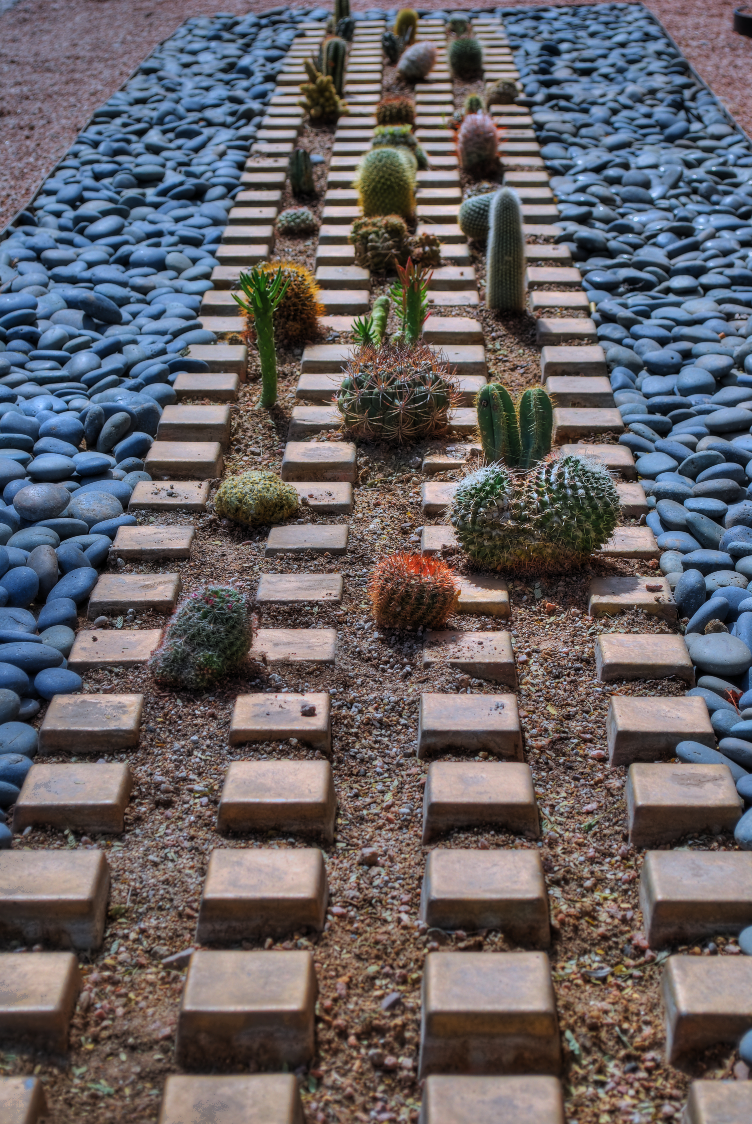
Cactropolis, 2011. A three-exposure HDR blend with a little color and contrast teaking. This whole layout, in reality, is about fifteen feet square, total. Various shutter speeds, f/8, ISO 100, 52mm.
I love opportunities that allow me to disrupt the original visual “place” of objects, to force them to be re-purposed for the viewer. A few years ago, my daily lunch routine involved a short walk across a bustling college campus to my habitual lunch hang, a stroll which took me past one of the school’s busiest crossroads, marked by the intersection of two superwide sidewalks flanked by small patches of landscaping. Since this is Arizona, such short plots of land frequently are not the stuff dreams are made of. We’re talking pink quartz gravel interrupted by the occasional scabby aloe plant or cholla. And that’s what made this one little rectangle, just several feet long on each side, vie for my attention.
An arrangement of several varieties of small cacti has been arranged in rows, regulated by square tiles, grounded in gravel, and bounded by smooth bluish stones. Simple stuff, really, but this was somebody’s deliberate design, a pattern that registered, to my eye, like some kind of fantasy urban streetscape, blocks of tiny, spiny skyscrapers vanishing off toward an unseen horizon….a miniature downtown from Weirdsville, a tabletop diorama from Beetlejuice.
I didn’t really have to compose anything. I was in the framing business. But getting that frame meant getting rid of the surrounding throngs of students, the sidewalks, the buildings, the sky…..anything that seemed outside of the closed world implied by that little rectangle. Changing the context. In fact, I was adding something for everything I was taking away.
So let’s crop this puppy and see what happens.
Now I saw what seemed to be a self-contained world, one in which I was free to imagine what lay “beyond”. I goosed up the hues and texture with HDR processing, but otherwise, what you see is what there was. Maybe it works as pure design. Maybe I conveyed something, but the fact is, we have to make choices as shooters. The only thing that marks us as individuals is what we decide to see, and show.
Like I said…fun….luck….some other somethings…..
(Many Thanks Dept.:The idea for this post was inspired, in part, by a suggestion from my good friend Michael Grivois.)
THE OTHER 50%
By MICHAEL PERKINS
The American Dream, Pacific Grove, California, 2012. A three-exposure HDR with shutter speeds ranging from 1/100 to 1/160, all three shots at f/8, ISO 100, 32mm.
Serene On Green, near Yosemite National Park, 2012. 1/640 sec., f/5.6, ISO 100, 300mm.
THE LAST SUNDAY EDITION OF THE NEW YORK TIMES FOR 2012 features its annual review of the year’s most essential news images, a parade of glory, challenge, misery and deliverance that in some ways shows all the colors of the human struggle. Plenty of material to choose from, given the planet’s proud display of fury in Hurricane Sandy, the full scope of evil on display in Syria, and the mad marathon of American politics in an electoral year. But photography is only half about recording, or framing, history. The other half of the equation is always about creating worlds as well as commenting on them, on generating something true that doesn’t originate in a battlefield or legislative chamber. That deserves a year-end tribute of its own, and we all have images in our own files that fulfill the other 50% of photography’s promise.
This year, for example, we saw a certain soulfulness, even artistry, breathed into Instagram and, by extension, all mobile app imaging. Time ran a front cover image of Sandy’s ravages taken from a pool of Instagramers, in what was both a great reportorial photo and an interpretive shot whose impact goes far beyond the limits of a news event. Time and again this year, I saw still lifes, candids, whimsical dreams and general wonderments of the most personal type flooding the social media with shots that, suddenly, weren’t just snaps of the sandwich you had for lunch today saturated with fun filters. It was a very strong year for something personal, for the generation of complete other worlds within a frame.
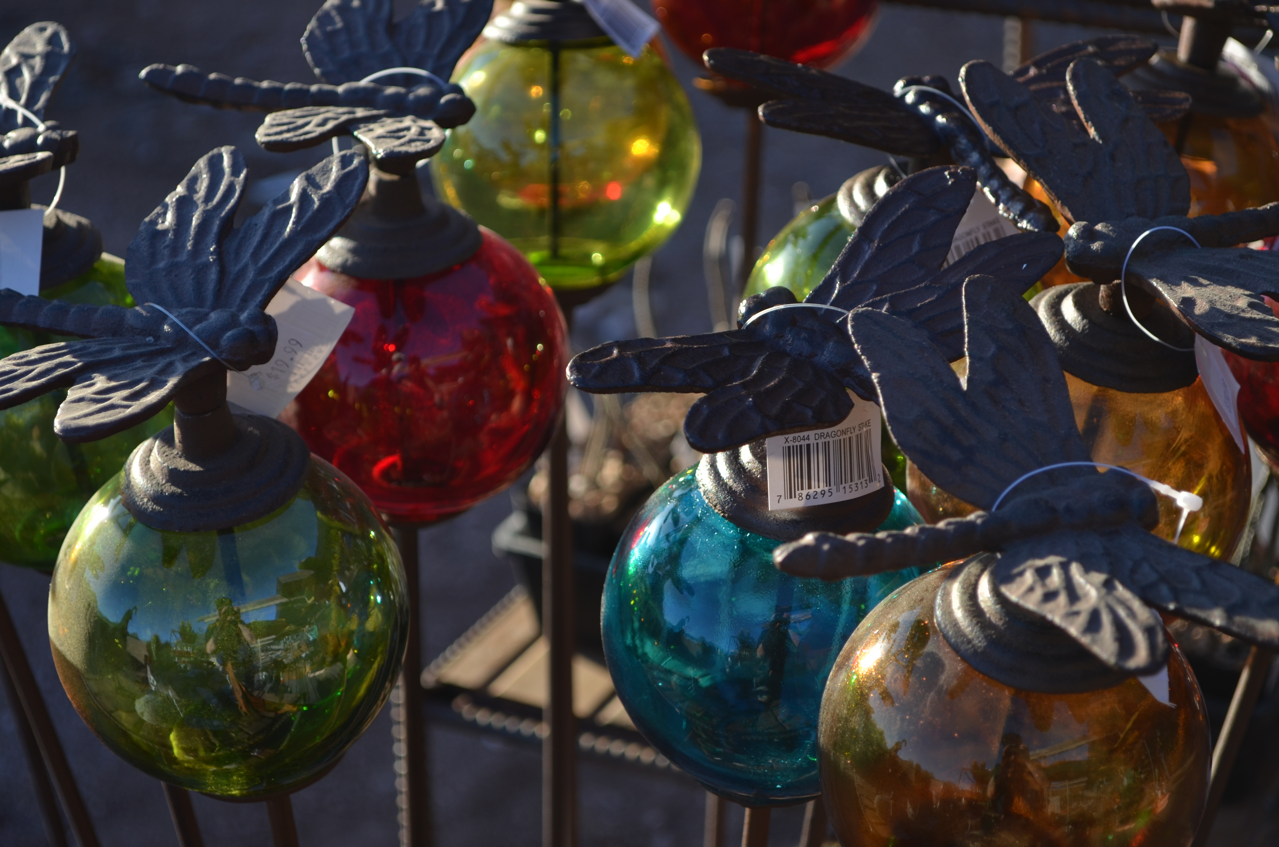
Dragonfly Globes, Tempe, Arizona, 2012. 1/200 sec., f/5.6, ISO 100, 55mm.
I love broad vistas and sweeping visual themes so much that I have to struggle constantly to re-anchor myself to smaller things, closer things, things that aren’t just scenic postcards on steroids, although that will always be a strong draw for me. Perhaps you have experienced the same pull on yourself…that feeling that, whatever you are shooting, you need to remember to also shoot…..something else. It is that reminder that, in addition to recording, we are also re-ordering our spaces, assembling a custom selection of visual elements within the frame. Our vision. Our version. Our “other 50%.”
My wife and I crammed an unusual amount of travel into 2012, providing me with no dearth of “big game” to capture…from bridges and skyscrapers to the breathlessly vast arrays of nature. But always I need to snap back to center….to learn to address the beauty of detail, the allure of little composed universes. Those are the images I agonize over the most at years’ end, as if I am poring over thumbnails to see a little piece of myself , not just in the mountains and broad vistas, but also in the grains of sand, the drops of dew, the minutes within the hours.
Year-end reviews are, truly, about the big stories. But in photography, we are uniquely able to tell the little ones as well. And how well we tell them is how well we mark that we were here, not just as observers, but as participants.
It’s not so much how well you play the game, but that you play.
Happy New Year, and many thanks for your attention, commentary, and courtesy in 2012.
Related articles
- 10 social mobile photography trends for 2013 (davidsmcnamara.typepad.com)
- Old-Timer Joins Instagram, Schools Everyone With Poignant Flood Photos (wired.com)
THE PROSCENIUM
By MICHAEL PERKINS
IT IS THE OLDEST FRAMING DEVICE IN HISTORY. If you’ve ever watched a play on any stage, anywhere in the world, you’ve accepted it as the classic method of visual presentation. The Romans coined the word proscenium, “in front of the scenery”. Between stage left and stage right exists a separate reality, defined and contained in the finite space of the theatre’s forward area. What is included in the frame is everything, the center of the universe of certain characters and events. What’s outside the frame is, indefinite, vague, less real.
Just like photography, right? Or to be accurate, photography is like the proscenium. We, too select a specific world to display. We leave out all the other worlds not pertinent to our message. And we follow information in linear fashion…left to right, right to left. The frame gives us the sensation of “looking in” to something that we are only visiting, just as we only “rent” our viewpoint from our theatre seats.
We learned our linear habit from the descendants of stage arrangement….murals, frescoes, paintings, all working, as our first literate selves would, from left to right. Painters were forced to arrange information inside the frame, to make choices of what that frame would include, and, as the quasi-legitimate children of painting, we inherited that deliberately chosen viewpoint, that decision to show a select world, by arranging visual elements within the frame.
Park Slope, Brooklyn, 2012. Trying to catch as much activity as a street glance, at any given moment, can. 1/320 sec., F/7.1, ISO 100, 24mm.
For some reason, in recent months, I have been abandoning the non-traditional in shooting street scenes and harking back to the proscenium, trying to convey a contained world of simple, direct left-right information. Candid neighborhood shots seem to work well without extra adornment. Just pick your borders and make your capture. It’s a way of admitting that some worlds come complete just as they are. Just wrap the frame around them like a packing crate and serve ’em up.
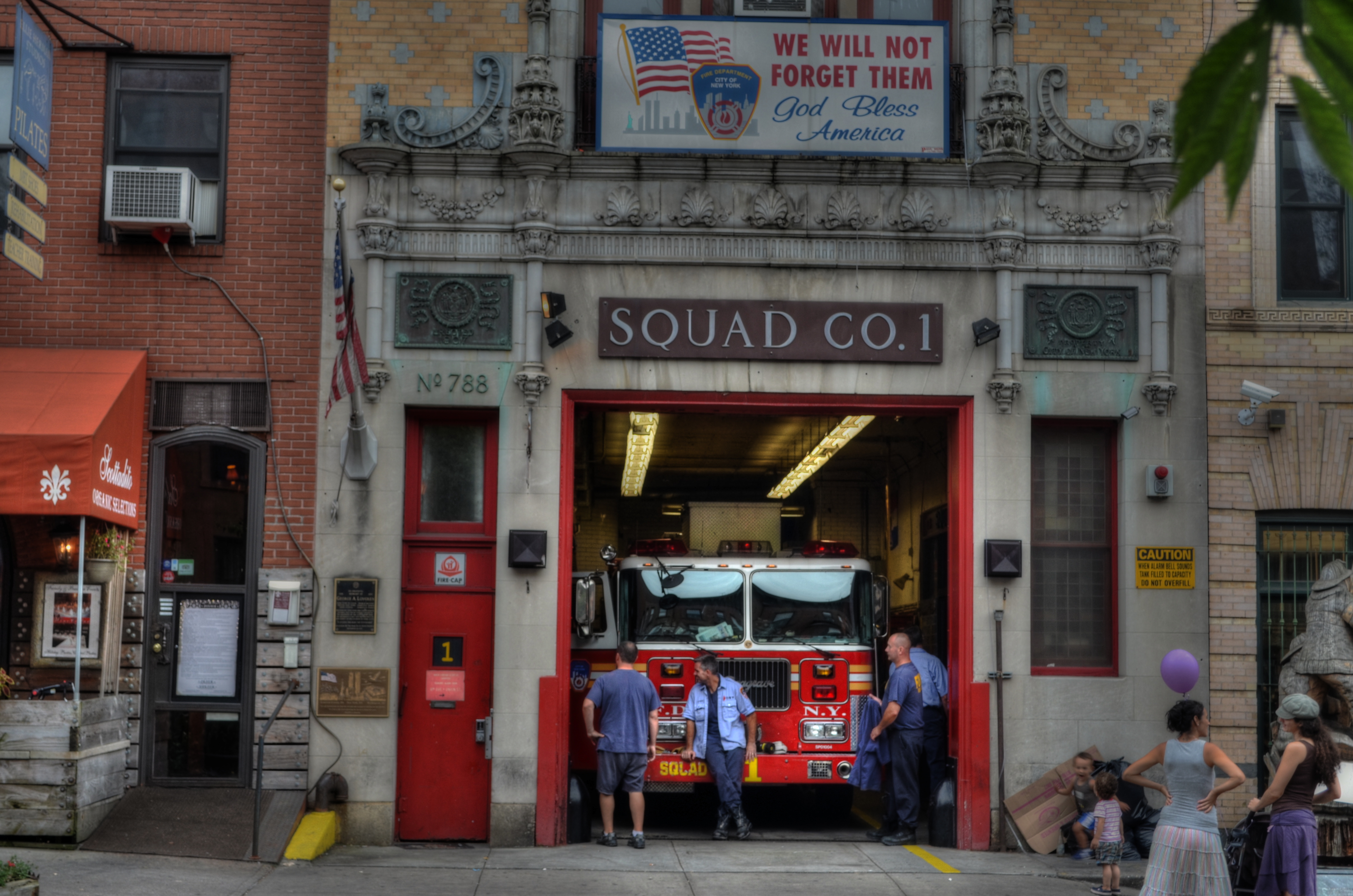
Like a theatre play, some images read best as self-contained, left-to-right “worlds”. A firehouse in Brooklyn, 2012. 1/60 sec., f/6.3, ISO 100, 38mm.
This is not to say that an angled or isometric view can’t portray drama or reality as well as a “stagy” one. Hey, sometimes you want a racing bike and sometimes you want a beach cruiser. Sometimes I don’t mind that the technique for getting a shot is, itself, a little more noticeable. And sometimes I like to pretend that there really isn’t a camera.
That’s theatre. You shouldn’t believe that the well-meaning director of the local production of Oklahoma really conjured a corn field inside a theatre. But you kind of do.
Hey what does Picasso say? “Art is the lie that tells the truth”?
Okay, now I’m making my own head hurt. I’m gonna go lie down.
TURNING UP THE MAGIC
By MICHAEL PERKINS
CHRISTMAS IS SO BIG THAT IT CAN AFFORD TO GO SMALL. Photographers can, of course, tackle the huge themes….cavernous rooms bursting with gifts, sprawling trees crowning massive plazas, the lengthy curve and contour of snowy lanes and rustic rinks…..there are plenty of vistas of, well, plenty. However, to get to human scale on this most superhuman of experiences, you have to shrink the frame, tighten the focus to intimate details, go to the tiny core of emotion and memory. Those things are measured in inches, in the minute wonder of things that bear the names little, miniature, precious.
And, as in every other aspect of holiday photography, light, and its successful manipulation, seals the deal.
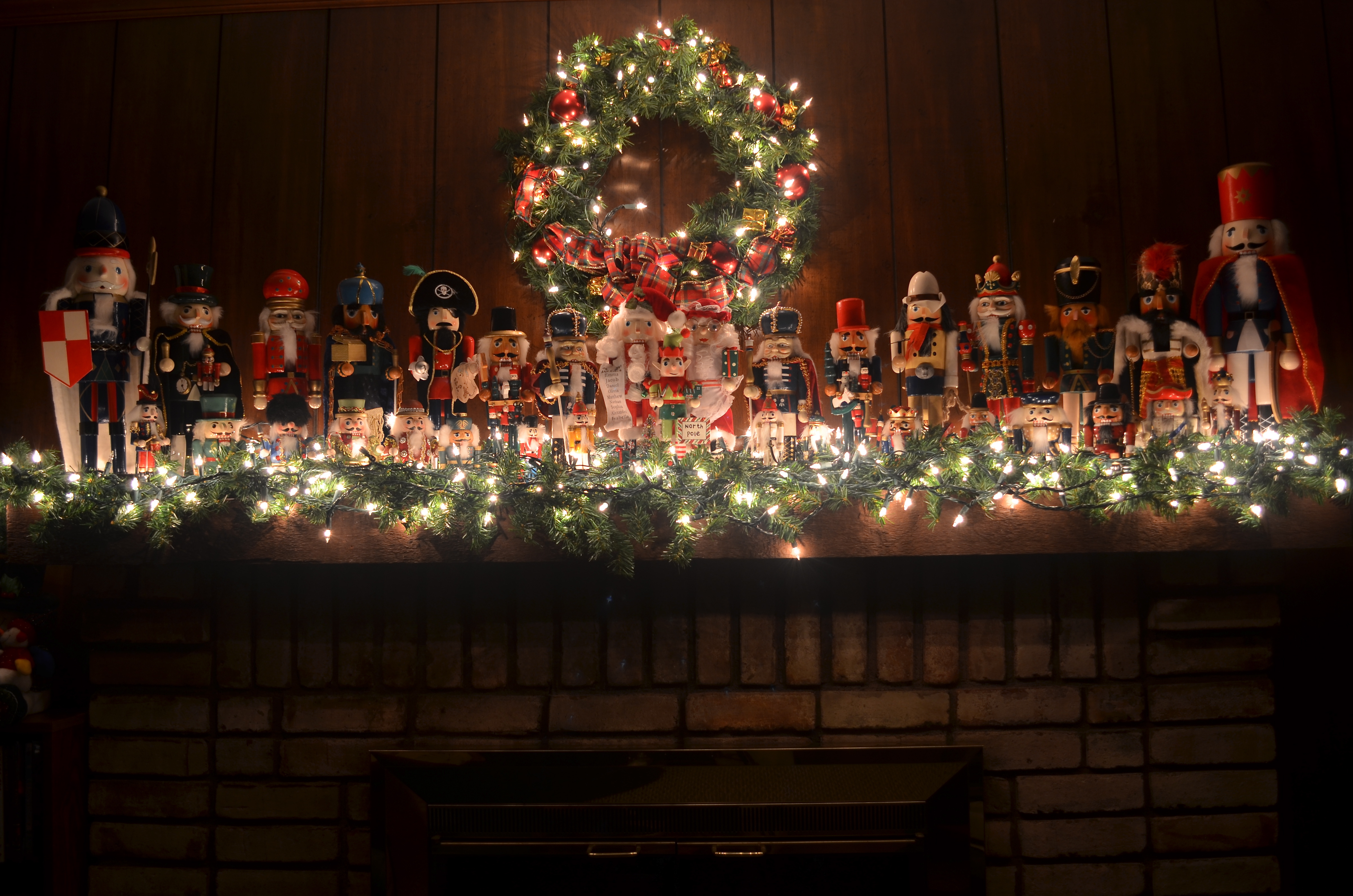
A proud regiment of nutcrackers, made a little more enchanting by turning off the room light and relying on tiny twinklers. 1/2 sec., f/4, ISO 100, 20mm
In recent years I have turned away from big rooms and large tableaux for the small stories that emanate from close examination of corners and crannies. The special ornament. The tiny keepsake. The magic that reveals itself only after we slow down, quiet down, and zoom in. In effect, you have to get close enough to read the “Rosebud” on the sled.
Through one life path and another, I have not been “home” (that is, my parents’ home) for Christmas for many years now. This year, I broke the pattern to visit early in December, where the airfare was affordable, the overall scene was less hectic and the look of the season was visually quiet, if no less personal. It became, for me, a way to ease back into the holidays as an experience that I’d laid aside for a long time.
A measured re-entry.
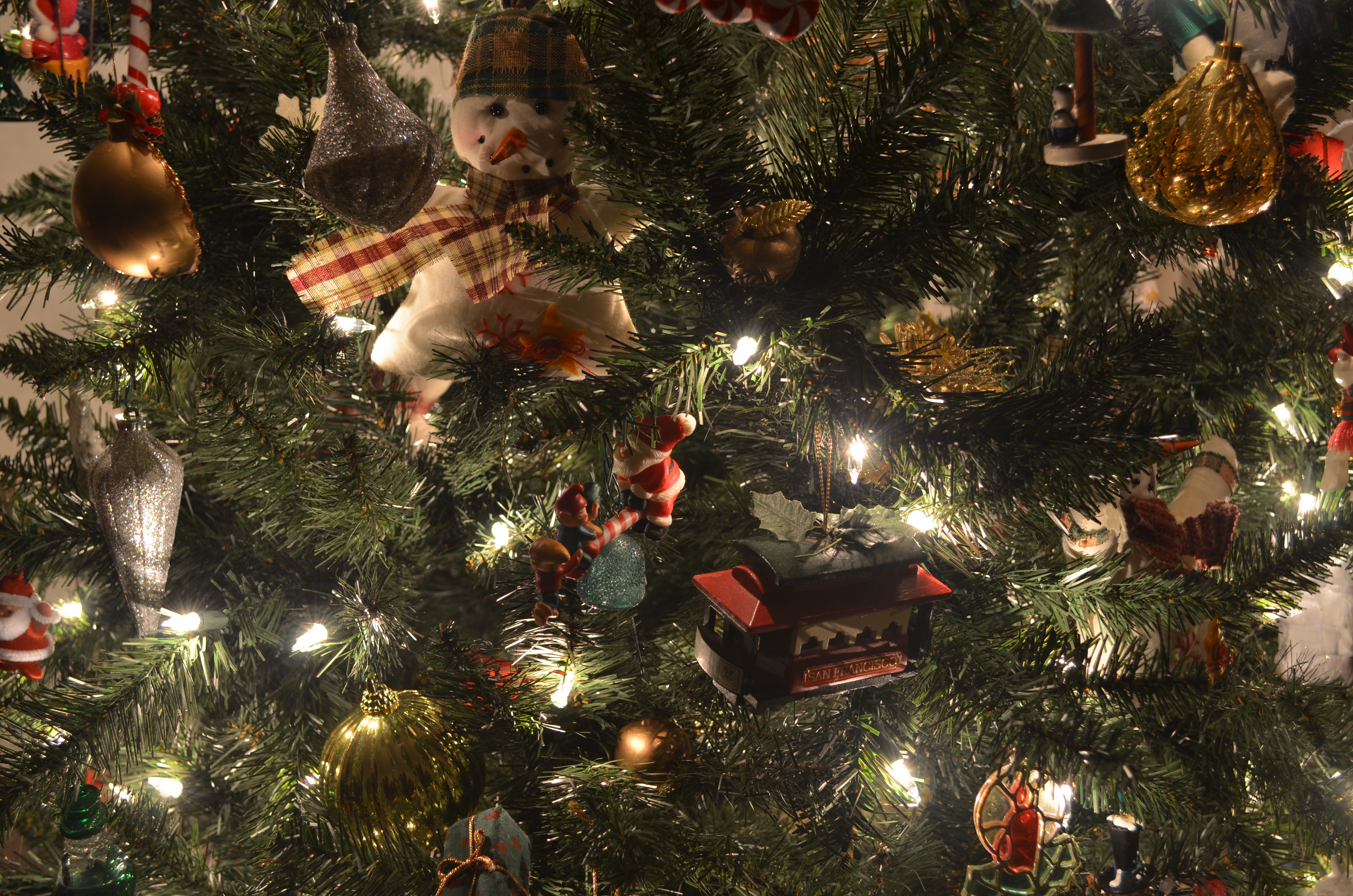
I wanted to eschew big rooms and super-sized layouts to concentrate on things within things, parts of the scene. That also went for the light, which needed to be simpler, smaller, just enough. Two things in my parents’ house drew me in: several select branches of the family tree, and one small part of my mother’s amazing collection of nutcrackers. In both cases, I had tried to shoot in both daylight and general night-time room light. In both cases, I needed some elusive tool for enhancement of detail, some way to highlight texture on a very muted scale.
Call it turning up the magic.
Use of low-power, local light instead of general room ambience enhances detail in tiny objects, revealing their textures. 1/2 sec., f/4, ISO 100, 20mm.
As it turned out, both subjects were flanked by white mini-lights, the tree lit exclusively by white, the nutcrackers assembled on a bed of green with the lights woven into the greenery. The short-throw range of these lights was going to be all I would need, or want. All that was required was to set up on a tripod so that exposures of anywhere from one to three seconds would coax color bounces and delicate shadows out of the darkness, as well as keeping ISO to an absolute minimum. In the case of the nutcrackers, the varnished finish of many of the figures, in this process, would shine like porcelain. For many of the tree ornaments, the looks of wood, foil, glitter, and fabric were magnified by the close-at-hand, mild light. Controlled exposures also kept the lights from “burning in” and washing out as well, so there was really no down side to using them exclusively.
Best thing? Whole project, from start to finish, took mere minutes, with dozens of shots and editing choices yielded before anyone else in the room could miss me.
And, since I’d been away for a while, that, along with starting a new tradition of seeing, was a good thing.
Ho.
Related articles
- How to Take a Picture of Your Christmas Tree (purdueavenue.com)
WHAT COULD BE

My umpteenth piano picture over a lifetime, but one which at least shows me something I don’t usually see. Available light, straight out of the camera. 1/50 sec., 5/5.6, ISO 100, 18mm.
By MICHAEL PERKINS
THERE ARE ALWAYS CONCEPTS THAT YOU FORCE YOURSELF TO RE-VISIT, almost to the point of obsession. We all have subjects that, as photographers, we just can’t stop turning over in our minds. This reluctance to “just move on” may occur with a place, a person’s face, an arrangement of shapes, a select element of light, but, whatever the source, it gnaws at us. We dream of the next chance to go back and tackle it again. We truly believe that the “right” shot is in there somewhere, just as a statue of an elephant is somewhere inside a slab of marble. As the old joke goes, just chip away anything that doesn’t look like an elephant and there you are (That’s either a really stupid joke or amazing profundity. Depending on which day you ask me, I can take either side. Anyway….).
I have at least one restaurant, a small city park, about a dozen still life projects, and one or two human faces that haunt me in this way. In every case, I get stuck on the idea that, with a moment of inspiration, I’m one click away from the ideal I see in my mind. Only, like a desert mirage, the ideal keeps wiggling and warping into something else. Maybe I’ve already made the best version of that picture already. Maybe there really is nothing more to be done.

Arnold Newman’s amazing abstract portrait of a piano, “accompanied” by composer Igor Stravinsky. This is a copyrighted image.
As a lifelong musical tinkerer, I’ve always been interested in pianos both as machines that are crafted to do incredibly complicated things, and as a kind of sculpture, a shaper of space and light. Some photographers have used them as incredibly dynamic design elements to remarkably dramatic effect. Arnold Newman’s classic portrait of composer Igor Stravinsky uses only the lid of a concert grand to flank the maestro, but it’s all the piano he needs to tell the story and it’s a wondrous horizontal use of space. Others have created brilliant images using just portions of the keyboard. Do a search of your own and be amazed at the variety of results.
Me, I’m a “guts” kinda guy. Lifting the lid on my first piano to see what made it tick was one of the most thrilling moments of my childhood, and, now, years later, I see the mechanism inside my own baby grand as a way to reflect, capture and shape light. It’s like having a giant Spirograph or a metallic spider web. Lots of ways this could go. In the above image, morning light gave me a big break, as the golden cast of the good, early stuff blended with ambient tones in the harp strings and the inside of the cabinet. While the light falls off sharply at the margins, it makes much of the mechanism fairly glow, and, while I can’t stop tinkering with my lifelong “piano-as-design-object” quest (at least this side of the grave), I think this is a step in the right direction. Where we’re eventually going, who knows?
As usual, I’m just enjoying the ride.
Thoughts?
Related articles
BASIC CABLE

In many ways, the Brooklyn Bridge, although not a “land” edifice, is the first of New York’s skyscrapers, and an elegant reminder of a bygone era. Three-shot HDR blend, shutter speeds of 1/160, 1/200, and 1/250 sec., all F/11, ISO 100, 55mm.
By MICHAEL PERKINS
THERE ARE ANY NUMBER OF LANDMARKS IN THE GREATER NEW YORK AREA which reward repeated viewings. Their mythic impact is such that it is never dulled or diminished. On the contrary, these special places (in a city which boasts so many) actually reveal distinctly different things to different visitors, and, doing so, cannot be exhausted by the millions of interpretations of them that flood the photographic world.
We make pictures of these objects, pictures of the pictures, a tribute picture to someone else’s picture, an impression of someone’s painting. We shoot them at night, in close-up, in fisheye, in smeary Warholian explosions of color, in lonely swaths of shadow.
For me, the Brooklyn Bridge is about two things: texture and materials.
After more than a century over the East River, John and Washington Roebling’s pioneering span, the first steel cable suspension bridge in the world, shows its wear and tear as a proud trophy of its constant service. The delicate and yet sinewy cables, amazingly strong interwoven strands of what Roebling manufactured under the name “steel rope”, are the most amazing design elements in the bridge, presenting an infinite number of kaleidoscopic web patterns depending on when and where you look.
As simply stunning as its two towers are, it is its grid of steel that mutates, shimmers, and hypnotizes the visitor as he makes his way past the crushing mobs of walkers, runners, skaters and cyclists that clog the span’s upper promenade from dawn to dusk. To show the bridge and only the bridge is a challenging trick. To get the dance of angles and rays that the cables have to offer in a way that speaks to you is both frustrating and fun.
Browse through several hundred amateur views of the bridge in one sitting sometime: marvel at how many ways it stamps itself onto the human imagination. Here, I tried to show the steady arc of the master cables as they dip down from the eastern tower, lope into a dramatic dip, then mount to the sky again to pass through the anchors on the western tower. HDR seemed like the way to go on exposure, with three separate shots at f/11, blended to maximize the detail of this most decorated of urban giants.
Next time, some other picture will call out to me, and to you. The bridge will display all the ways it wants to be seen, like a magician fanning out a trick deck. Pick a card, it invites, any card.
Doesn’t matter which one you choose.
They’re all aces.
Thoughts?
Related articles
- Video: Building the Brooklyn Bridge (history.com)
- Brooklyn Bridge Manhattan (markd.typepad.com)
BEAUTIFUL LOSERS

Shooting on the street is bound to give you mixed results. I have been messing with this shot of a Brooklyn coffee shop for days, and I still can’t decide if I like it. 1/80 sec., f/5, ISO 100, 24mm.
By MICHAEL PERKINS
THERE ARE A LOT OF INSTANTANEOUS “KEEP” OR “LOSE” CALLS that are made each day when first we review a new batch of photos. Which to cherish and share, which to delete and try to forget? Thumbs up, thumbs down, Ebert or Roper. Trash or treasure. Simple, right?
Only, the more care we take with our shooting, the fewer the certainties, those shots that are immediately clear as either hits or misses. As our experience grows, many, many more pictures fall into the “further consideration” pile. Processing and tweaking might move some of them into the “keep” zone, but mostly, they haunt us, as we view, re-view and re-think them. Even some of the “losers” have a sort of beauty, perhaps for what they might have been rather than what they turned out to be. It’s like having a kid that you know will always be “C” average, but who will never stop reaching for the “A”, God love their heart.
I have thousands of such pictures now,pictures that I study, weep over, slap my forehead about, ask “what was I thinking?” about. I never have been one for doing a reflexive jab on the “delete” button as I shoot, as I believe that the near misses, even more than the outright disasters, teach us more than even the few lucky aces. So I wait at least to see what the shot really looks like beyond the soft deception of the camera monitor. I buy the image at least that much time, to really, really make sure I dropped a creative stitch.
Many times my initial revulsion was correct, and the shot is beyond redemption.
Ah, but those other times, those nagging, guilt-laden re-thinks, during which I get to twist in the wind a little longer. Pretty? Ugly? Genius? Jerk? Just like waiting for an old Polaroid to gradually fade in, so too, the ultimate success or failure of some pictures takes a while to emerge. And even then, well, let’s come back and look at this one later…….
The above frame, taken while I was walking toward the pedestrian ramp to the Brooklyn Bridge, is just such a shot. My wife stepped into a coffee shop just fast enough to grab us some bottled water, while I waited on the sidewalk trying to make my mind up whether I had anything to shoot. As you can see, what I got could be legitimately called a fiasco. Nice color on the store’s neon sign, and a little “slice of life” with the customer checking out at the register, but then it all starts to mush into a hot mess, with the building and car across the street eating up so much of the front window that your eye is dragged all over the place trying to answer the musical question, “what are we doing here?” Storefront shots are a real crap shoot. That is, sometimes you have something to shoot, and sometimes you just have crap.
Even at this point, with more than a few people giving the shot a thumbs-up online, I can’t be sure if I just captured something honest and genuine, or if I’ve been reading too many pointy-headed essays on “art” and have talked myself into accepting a goose egg as something noble.
But as I said at the top of this piece, the choices get harder the more kinds of stuff you try. If you shoot your entire life on automode, you don’t have as many shots that almost break your heart. I wonder what my personal record is for how long after the fact I’ve allowed myself to grieve over the shots that got away. It’s tempting to hit that delete button like a trigger-happy monkey and just move on.
But, finally, the “almosts” show you something, even if they just stand as examples of how to blow it.
And that is sometimes enough to make the losers a little bit beautiful.
Thoughts?
A BLOCK OF THE MILE

The building that originally housed Desmond’s department store, and one of the mostly intact survivors of a golden age of Art Deco along Los Angeles’ historic “Miracle Mile”.
By MICHAEL PERKINS
 CALIFORNIA’S CITIES, FOR STUDENTS OF DESIGN, contain the country’s largest trove of Art Deco, the strange mixture of product packaging, graphics, and architectural ornamentation that left its mark on most urban centers in America between 1927 and the beginning of World War II. The Golden State seems to have a higher concentration of the swirls, chevrons, zigzags and streamlined curves than many of the country’s “fly over” areas, and the urban core of Los Angeles is something like a garden of delights for Deco-dent fans, with stylistic flourishes preserved in both complete buildings and fragmented trim accents on business centers that have been re-purposed, blighted, re-discovered, resurrected or just plain neglected as the 20th century became the 21st. And within that city’s core (stay with me) the up-again-down-again district once dubbed the “Miracle Mile”, centered along Wilshire Boulevard, remains a bounteous feast of Deco splendor (or squalor, depending on your viewpoint).
The Miracle Mile was born out of the visionary schemes of developer A. W. Ross, who, in the 1920’s, dreamed of drawing retail dollars to an area covered in farm fields and connected only tentatively to downtown L.A. by the old “red car” trolley line and the first privately owned automobiles. Ignoring dire warnings that the creation of a massive new business district in what was considered the boondocks was financial suicide, Ross pressed ahead, and, in fact, became one of the first major developers in the area to design his project for the needs of passing car traffic. Building features, display windows, lines of sight and signage were all crafted to appeal to an auto going down the streets at about thirty miles per hour. As a matter of pure coincidence, the Mile’s businesses, banks, restaurants and attractions were also all being built just as the Art Deco movement was in its ascendancy, resulting in a dense concentration of that style in the space of just a few square miles.

The period-perfect marquee for the legendary El Rey Theatre, formerly a movie house and now a live-performance venue.
It was my interest in vintage theatres from the period that made the historic El Rey movie house, near the corner of Wilshire and Dunsmuir Avenue, my first major discovery in the area. With its curlicue neon marquee, colorful vestibule flooring and chromed ticket booth, the El Rey is a fairly intact survivor of the era, having made the transition from movie house to live-performance venue. And, as with most buildings in the neighborhood, photographs of it can be made which smooth over the wrinkles and crinkles of age to present an idealized view of the Mile as it was.
But that’s only the beginning.
On the same block, directly across the street, is another nearly complete reminder of the Mile’s majesty, where, at 5514 Wilshire, the stylish Desmond’s department store rose in 1929 as a central tower flanked by two rounded wings, each featuring enormous showcase windows. With its molded concrete columns (which resemble abstract drawn draperies), its elaborate street-entrance friezes and grilles, and the waves and zigzags that cap its upper features, the Desmond had endured the Mile’s post 1950’s decline and worse, surviving to the present day as host to a Fed Ex store and a few scattered leases. At this writing, a new owner has announced plans to re-create the complex’s glory as a luxury apartment building.
The details found in various other images in this post are also from the same one-block radius of the Wilshire portion of the Mile. Some of them frame retail stores that bear little connection to their original purpose. All serve as survivor scars of an urban district that is on the bounce in recent years, as the Los Angeles County Museum of Art (installed in a former bank building), the La Brea Tar Pits, and other attractions along the Mile, now dubbed “Museum Row”, have brought in a new age of enhanced land value, higher rents and business restarts to the area. Everything old is new again.

The Wilshire Boulevard entrance to Desmond’s, with its period friezes, ornate grillwork and curved showcases intact.
Ironically, the district that A.W. Ross designed for viewing from behind the wheel of a car now rewards the eye of the urban walker, as the neighborhoods of the Miracle Mile come alive with commerce and are brought back to life as a true pedestrian landscape. Walk a block or two of the Mile if you get a chance. The ghosts are leaving, and in their place you can hear a beating heart.

The wonderfully patterned lobby floor and streamlined ticket booth of the El Rey.
Suggested reading: DECO LAndmarks: Art Deco Gems of Los Angeles, by Arnold Schwartzman, Chronicle Books, 2005.
Suggested video link: Desmond’s Department Store http://www.youtube.com/watch?v=yJj3vxAqPtA
BEYOND THE THING ITSELF

Saved from the trash can, long enough to satisfy my curiosity. 1/50 sec., f/5.3, ISO 200, 40mm.
By MICHAEL PERKINS
YOU NO DOUBT HAVE YOUR OWN “RULES” as to when a humble object becomes a noble one to the camera, that strange transference of energy from ordinary to compelling that allows an image to do more than record the thing itself. A million scattered fragments of daily life have been morphed into, if not art, something more than mundane, and it happens in an altogether mysterious way somewhere between picking it and clicking it. I don’t so much have a list of rules as I do a sequence of instincts. I know when I might have stumbled across something, something that, if poked, prodded or teased out in some way, might give me pleasure on the back end. It’s a little more advanced than a crap shoot and a far cry from science.
With still life subjects, unlike portraits or documentary work. there isn’t an argument about the ethics or “purity” of manipulating the material….rearranging it, changing the emphasis, tweaking the light. In fact, still lifes are the only kinds of pictures where “working it” is the main objective. You know you’re molding the material. You want to see what other qualities or aspects you can reveal by, well, kind of playing with your food. It’s like Richard Dreyfuss shaping mashed potatoes into the Devil’s Tower.
If I have any hard and fast rule about still lifes, it may be to throw out my trash a little slower. I can recall several instances in which I was on my way the garbage can with something, only to save it from oblivion at the last minute, turn it over on a table, and then try to tell myself something new about it from this angle or that. The above image, taken a few months ago, was such a salvage job, and, for reasons only important to myself, I like what resulted. Hey, Rauschenburg glued egg cartons on canvas. This ain’t new.
My wife had packed a quick fruit and nut snack into a piece of aluminum foil, forgot to eat it, and brought it back home in her lunch sack. In cleaning out the sack, I figured she would not want to take it a second day and started to throw it out. Re-wrapped several times, the foil now had a refractive quality which, in conjunction with window light from our patio, seemed to amp up the color of the apple slice and the almonds. Better yet, by playing with the crinkle factor of the foil, I could turn it into a combination reflector pan and bounce card. Five or six shots worth of work, and suddenly the afternoon seemed worthwhile.
I know, nuts.
Fruits and nuts, to be exact. Hey, if we don’t play, how will we learn to work? Get out on the playground. Make the playground.
And inspect your trash as you roll it to the curb.
Hey, you never know.
Thoughts?
SMALL MAY BE ALL

Along came a (light) spider. Intense mid-day light on Summer Solstice 2012 creates dramatic shadows and heightened texture in this HDR image.
By MICHAEL PERKINS
SOME SUBJECTS SEEM AS IF THEY ARE GOING TO FOLLOW A SURE PATH, then dog-leg on you in the doing. Last week I was fascinated to attend a celebration of the summer solstice in a building designed to highlight the drama of its unique light. Phoenix’ Burton Barr Library reading room, an enormous space bordered by shaded glass on its north and south faces and slab concrete for its west and east walls, has, since its opening, hosted an annual midday demonstration by its architect, Will Bruder centered on the longest day of the year. First, a capacity crowd watches intense light crawl dramatically down the library’s west wall, seeming to sweep shadows downward like a rapidly descending curtain until the entire west surface fairly glows with light. For a few minutes, under this enhanced illumination,what normally appears as a seamless monolith of concrete shimmers with a million tiny fractures, creases, and flaws, rendering the usually dull surface alive with small but perceptible dances of color.
Immediately following this subtle but sweet show, as the sun travels to the west over the top of the library, the same display begins in reverse on the east wall, as shadows begin to crawl up from the floor and eventually confine sunlight on the concrete surface to a narrow slit at its top. The same intense reveal on every facet of the slab’s surface is seen again, and, along the ceiling, the library’s carefully designed support pillars, all positioned under individual circular skylights in the reading room’s roof, begin to resemble glowing candles. The entire phenomenon, subtle and quiet, yet beautiful in aspect, is all completed within a half hour.
In that half hour, my original shooting strategy, an overall wide shot to show the amazed onlookers inside the vast room, craning their necks to observe the miracle between rows of book shelves, moved from “sure thing” to “what was I thinking”? As it turned out “the story” was too big to be trusted to a big picture (!), and I came to realize that the heart of the light effect might best be told, for me, in one part of one wall. All the other props inside the structure provided so much visual information that nothing true was going to emerge in any attempt at an overall “coverage” image. I decided to show the shadowy tendrils trailing from a single part of the ceiling structure, but to shoot a three-shot bracket of exposures, all at ISO 100, to be combined later in High Dynamic Range software, to glean as much information (and the widest range of tone) on the texture revealed by the travel of the light across the wall.
The result was a shot that eliminated the rest of the overall solstice story as I tried instead to show object, shadow and detail combining as elements in one integrated design. It’s up to anyone as to whether I made the correct decision, but it’s safe to say that it was correct for me at the time. Sometimes a thing is interesting to look at by itself, for itself, without context or alibi. Of course I realize that I have provided both those things by writing this, but this forum is dedicated to the urge that makes us all throw something at the wall (excuse the expression) to see if anything sticks, so maybe it’s not wrong to give this a bit of backstory. Eventually, however, it’s either a picture or it’s not.
Thoughts?
Related articles
- Spiritual Significance of the Summer Solstice (aquariuschannelings.com)
I WANT TO BE A PART OF IT…..
One belongs to New York instantly. One belongs to it as much in five minutes as in five years.
-Tom Wolfe

Old power, new power. The American Stock Exchange, a titan of the might of another era, stands in lower Manhattan alongside the ascending symbol of the city’s survival in another age, as the frame of WTC 1 climbs the New York sky. The tower, recently surpassing the height of the Empire State Building, will eventually top out, in 2013, at 1,776 feet. Single-image HDR designed to accentuate detail, then desaturated to black & white. 1/160 sec., f/8, ISO 100, 18mm.
THERE IS NO GREATER CANDY STORE FOR PHOTOGS than New York City. It is the complete range of human experience realized in steel and concrete. It is both a monument to our grandest dreams and a mausoleum for all our transgressions. It casts shadows that hide both joy and fear; it explodes in light that illuminates, in equal measure, the cracked face of the aged contender and the hopeful awe of the greenest newcomer. There is not another laboratory of human striving like it anywhere else on the planet. Period period period. Its collapses and soarings are always news to the observer. Bob Dylan once said that he who is not busy being born is busy dying. New York is, famously, always busy doing both.
I would give the greatest sunset in the world for one sight of New York’s skyline.
-Ayn Rand

Returning from Liberty Island and Ellis Island in November 2011, a packed tour boat’s passengers crowd the rail for a view of WTC 1, rising as the new king of the New York skyline.
This month’s announcement that the new WTC 1 (built on the site of the old 6 World Trade Center building, itself a rather short edifice) has finally surged past the height of the Empire State Building (a repeat champ for height, given the strange twists of history) is a bittersweet bulletin at best. Cheers turned to tears turned back into cheers. In the long-view, the inevitable breathe-in-breathe-out rhythm of NYC’s centuries-old saga, the site’s entire loop from defeat to defiant rebirth is only a single pulse point. Still, on a purely emotional, even sentimental level, it’s thrilling to see spires spring from the ashes. The buildings themselves, along with their daily purposes and uses, hardly matter. In a city of symbols, they are affirmations in an age when we need to remain busy being born.
Thoughts?
“WHAT” IS THE QUESTION
ONE OF THE MOST FREQUENTLY ASKED QUESTIONS of shooters is, “what’s that supposed to be?”, usually asked of any image that is less obvious than a sunset shot of the Eiffel Tower or a souvenir snap of Mount Rushmore. You may have found, in fact, that the number of times that the question is asked is directly proportional to how intensely personal your vision is exercised on a given project. As much as the hidden aspects of life fascinate us, the obvious recording of familiar objects soothe the eye, like a kind of ocular comfort food. The farther you wander in your own direction as a photographer, the greater journey you also ask of your viewers. Sometimes the invitation is taken. Sometimes you must face “the question”.
What’s that supposed to be?
How, actually, in a world shaped by our own subjective experience, an image is “supposed” to be anything is a little baffling. It’s probably safe to say that what we present, as artists is probably supposed to be the view as one’s mind filters it through his or her accumulated life. When we use the camera as a mere recorder, it may make it easier, presenter-to-viewer, to agree on that image’s terms of engagement, but that may or may not reveal what we actually felt about when creating it. If I use the same three colors to render a picture of the American flag as everyone else uses, I may get into fewer arguments about how appropriate the resulting image is, but then, I don’t get to open up the discussion to any other conceptions of that flag. Back in the first days of the environmental movement, the simple use of green on the original, Old-Glory-derived ecology flag suggested an alternative way of being American, of living your life. As I recall, some viewed the design as sacrilegious, while others embraced it as liberating.
Over 150 years after the first photographs were regarded as a threat to the painter’s domain, we are still most at ease with pictures that ape the painting’s method for framing the world. Oddly, it is always outlaws and amateurs that break free of these pictorial chains first; the professionals must protect the turf they have so carefully mapped out for themselves in the mainstream. There remains, then, an ongoing battle over what should or should not be called a “picture”. Abstractions, arranged or perceived patterns, even selected details or drastic re-imaginings of small parts of the so-called “actual” world must always fight for their place at the table alongside the technically accurate mirroring of easily named subjects. We still regard that which is realistic as being the most real, and the most worthy of praise.

Cactropolis, 2011. Three bracketed shots about a half-stop apart combined into an HDR composite. CLICK TO ENLARGE.
To want to show something for its own sake on our own terms is to move into more personal territory, and hence onto shakier ground for critical evaluation, but occasionally we strike a balance between what people want to see and what we must show. In the above image, I only wanted to focus attention on an arrangement that was a very small and visually ignored accent along a heavily travelled public street. An unsung landscaper’s arrangement of tiles, gravel, paving rock, and succulent plants, was in plain view, and yet, at only a few inches in height, easily missed by the thousands of daily passersby speeding along the street. To me, when framed close to ground level, it resembled a kind of desert cityscape, blocks of abstract skyscrapers, a cactus metropolis, and that’s how I tried to frame and process it. Of course, it us, after all, just a pattern, and anyone who looks at the image can fill in their own blanks with impressions that are just as valid as my kind of toy idea.
The vital point is that no one else’s take on your dream can be wrong, just because it differs with yours. Art is not a science, which is why we don’t become photographers, or as the word implies, “light writers” just by pushing a button.
We become photographers by pushing everyone’s buttons.
What is it “supposed to be”? You tell me, and I’ll tell you.
Thoughts?
