SOFT AND SHALLOW
By MICHAEL PERKINS
IN RECENT YEARS THERE HAS BEEN A MOMENTOUS SURGE in the number of photographic optics that market themselves as “art lenses”, as if all other lenses were, what….non-artistic? This murky term essentially denotes lenses that deliver customized or selective focal effects, such as the Lensbaby “sweet spot”, a partial area of sharpness, surrounded by soft blur, that can be placed, at will, at various parts of the frame. Other so-called “art lenses” produce unique patterns of bokeh, or blur artifacts, while yet others produce vignetting, or darkening around the outside corners of the image. Some of these lenses are great overall performers, while a number of them are either one-trick ponies or muy espensivo or both.
Thing is, if you possess a fast “normal” lens, such as a 35 or 50mm “prime”, you can already achieve some of the same effects of many over-hyped proprietary lenses in the “art” arsenal. Primes have but a single focal length and thus have no telephoto function. The photographer frames by physically moving closer to, or farther away from, his subject, by, in effect, “zooming with the feet”. Since their focal range is fixed, primes are extremely simple in their construction, and therefore extremely sharp. In addition, they often will open to at least f/2.8, with many rated at f/1.8 or even faster. And that’s where the arty focus fun starts.

Wide open to f/1.8, the 50mm prime used for this image creates an extremely shallow depth of field. And that can be good news for flattering pics of faces. Primes of this focal length are already prized as portrait lenses, since they produce faces with normal proportions, as opposed to the Silly Putty stretching you get with wide-angles. Add to that a fast prime’s ability to deliver a very buttery transition between sharpness and blur, and you have the potential for a very finely-tuned look. Notice that there is no real hard sharpness in the cat’s face beyond one eye and about one third of his face. The rest rolls off very softly. My point is that nearly any good prime can deliver this effect: it isn’t essential to invest in a custom piece of “art” glass to get it.
One caveat: shooting this far open, at this distance, your auto-focus may endlessly gyrate back and forth trying to find a place to lock in. My advice: go manual. At this DOF, you’ll have to practice with how to nail the focus, and I personally am driven bonkers trying to find the sharpness at f/1.4 or faster: the range is so very razor-thin. Even so, before you pony up for a lens that’s designed to deliver arty focus, play with the primes you already have. You may be delighted. The focus may be shallow, but the satisfaction can run deep.
SOFTER AND QUIETER
By MICHAEL PERKINS
THE MEANING OF THE WORD NOISE HAS, IN RECENT YEARS, been expanded beyond its familiar role as an audio term, extending its usage into our visual vocabulary as well. A key shift in photo terminology, as film converted to digital, has been the re-purposing of the word to denote a degradation in quality, with noise replacing grain as the way to describe a less-than-pristine image. Same idea, different wording.
And now, in recent years, I have heard the word used even more widely to denote weaknesses in a composition, describing a picture with too much information or distraction as “noisy”. In a recent post on the blog PhotographyMad.com, you find the following citation:
Often a photo will lack impact because the main subject is so small it becomes lost among the clutter of its surroundings. By cropping tight around the subject you eliminate the background “noise”, ensuring the subject gets the viewer’s undivided attention.
I personally would extend this metaphor to include not only the subject matter within a frame but its color range as well. That means, simply, that too many colors in an image might dilute the effect of a shot as much as the density of its elements, and extends the idea of noise to encompass anything that lessens the communicative power it has for the viewer.

Deflowered (2016). 1/50 sec., f/4, ISO 100, 35mm.
In the above shot, the idea of the composition was to convey the bits of orange peel as some kind of spent or withered flower. I didn’t decide, in advance, to eat an orange in a yellow bowl, but I believe that the same peels in a red bowl might have hardened the look of the shot by calling attention to contrast instead of content. Keeping the entire composition to a two-tone color range (along with a decidedly shallow depth-of-field to reduce the texture detail) rendered it nice and soft. Of course there are a million ways to conceive this image; I just chose this way.
Noise is not merely a technical registration of visual or audio distortion. I think the word has real value if you’re looking to streamline your images. Just think noise=clutter.
Then turn down the volume.
THE EYES HAVE IT

How soft is too soft? Shot with a Lensbaby Sweet 35 optic at 1/30 sec., F/4, ISO 400, 35mm.
By MICHAEL PERKINS
WINDOW TO THE SOUL: that’s the romantic concept of the human eye, both in establishing our emotional bonds with each other and, in photography, revealing something profound in portraiture. The concept is so strong that it is one of the only direct links between painting (the way the world used to record emotional phenomena) and photography, which has either imitated or augmented that art for two full centuries. Lock onto the eyes, we say, and you’ve nailed the essence of the person.
So let’s do a simple comparison experiment. In recent years, I’ve begun to experiment more and more with selective-focus optics such as the Lensbaby family of art lenses. Lensbabies are unabashedly “flawed” in that they are not designed to deliver uniform focus, but, in fact, use the same aberrations that we used to design out of lenses to isolate some subjects in intensely sharp areas ( so-called “sweet spots”) surrounded by gradually increasing softness.
As a great additional feature, this softness can even occur in the same focal plane as a sharply rendered object. That means that object “A”, five feet away from the camera, can be quite blurry, while object “B”, located just inches to the side of “A”, and also five feet from the camera, can register with near-perfect focus. Thus, Lensbaby lenses don’t record “reality”: they interpret mood, creating supremely subjective and personal “reads” on what kind of reality you prefer.
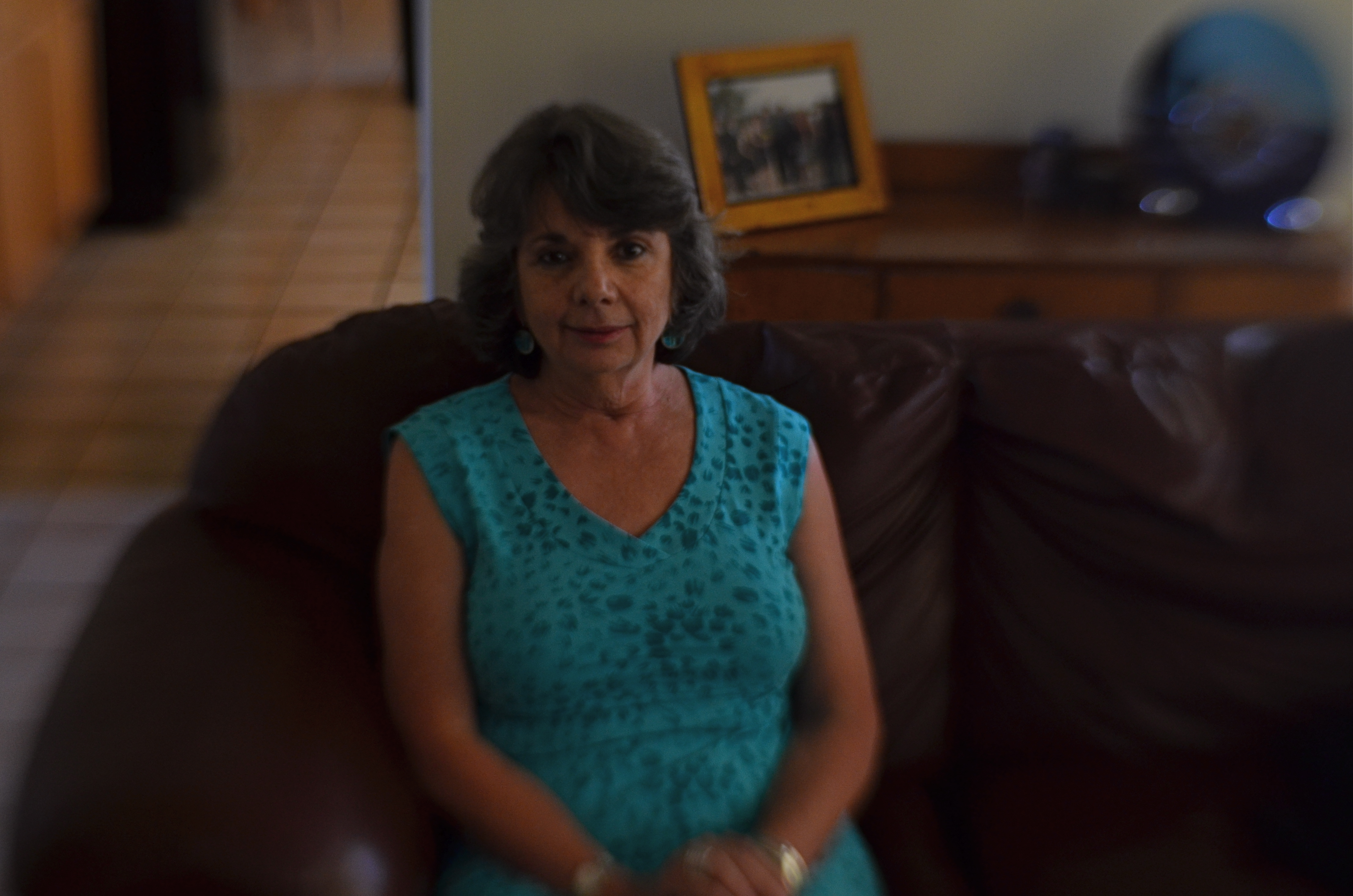
Exact same settings as the prior example, but with a slightly tighter focus of the Lensbaby’s central “sweep spot”.
Art lenses can accentuate what we already know about faces, and specifically, eyes…that is, that they remain vital to the conveyance of the personality in a portrait. In the first sample, Marian’s entire face takes on the general softness of the entire frame, which is taken with a Lensbaby Sweet 35 lens at f/4 but is not sharply focused in the central sweet spot. In the second sample, under the same exposure conditions, there is a conscious effort to sharpen the center of her face, then feather toward softness as you radiate out from there.
The first exposure is big on mood, with Marian serving as just another “still life” object, but it may not succeed as a portrait. The second shot uses ambient softness to keep the overall intimacy of the image, but her face still acts as a very definite anchor. You “experience” the picture first in her features, and then move to the data that is of, let’s say, a lower priority.
Focus is negotiated in many different ways within a photograph, and there is no empirically correct approach to it. However, in portrait work, it’s hard to deny that the eyes have it, whatever “it” may be.
Windows to the soul?
More like main clue to the mystery.
EQUATIONS

“Sharpness” can mean so many things to so many different photographers.
By MICHAEL PERKINS
EVERY CHANGE YOU MAKE IN THE CREATION OF A PHOTOGRAPHIC IMAGE also changes every other element of the picture.
You can’t alter a single element in a photo in isolation. Each decision you make is a separate gear, with its own distinctive teeth, and the way those teeth mesh with all the other gears in the photographic equation determines success in the final picture.
As an example, let’s look at sharpness, perhaps the big “desirable” in an image. The term sounds simple, but is, in fact determined by an entire raft of factors, among them:
A) Choice Of Lens. How uniform is the sharpness of your glass? Is it softer at the edges? Completely sharp at smaller apertures? Does it deliver amazing pictures at one setting while causing distortions or inaccuracies at another?
B) Aperture. The most basic predictor of sharpness, whether you scrimped or splurged on Item “A”.
C) Choice Of Autofocus Setting. Are you telling your camera to selectively sharpen a key object in an isolated part of your image, or asking it to provide uniform sharpness across the entire frame?
D) Anti-vibration. On some longer exposures (for example, on a tripod) this feature may actually be costing you sharpness. Protecting your shot against the hand-held shakes is good. Confusing a camera with active Anti-vibe on a stabilized shot may not work out as well.
E) Contrast. Some people believe that the sharpness of lines and textures is actually the viewable distance between light and darkness, that contrast is “sharpness”. Based on what you prefer, other big choices can be affected, such as the decision to shoot in color or black and white.
F) Stability. Deals with everything from how steady you grip a camera to what else besides yourself, from shutter triggering to SLR mirror shifting, can cause measurable vibration, and thus less sharpness.
G) Editing/Processing. This is where miracles occur. Sometimes. Other times, it’s where we try to slap lipstick on a pig.
We could go on, and so could you. And then consider that this quick checklist only deals with sharpness, just a single element, which, in turn, affects every other aspect of your pictures. Photography is a constant juggling act between technique, experience, experiment, and instinct. What you want to show in your images will dictate how much (or how well) you keep all those balls aloft.
CUT YOUR LOSSES
By MICHAEL PERKINS
ANYONE WHO’S SLOGGED THROUGH MORE A FEW OF THESE DISPATCHES knows all too well that I am a passionate preacher for shooting images completely on manual, not because it’s a more “pure” form of photography (and thus deserving of nobility and praise), but because I prefer to exercise as much personal control as possible. This, again, is not a quality judgement, since amazing pictures are made every day with the use of either complete or partial automodes. I just feel that I, personally, learn more by trying more, and manual settings place so much direct pressure on me to innovate and experiment that even my gross failures serve as education.
Sometimes. And other times they’re well, just gross.
The mode known in Nikon as Aperture Priority (“Av” on Canons) is the only semi-auto mode I use with any regularity, and always because I make an educated guess, before going on a shoot, about what conditions will likely prevail. AP allows you to manually dial in your aperture on those occasions when you want a uniform depth of field in everything you’re shooting, with your camera metering light on the fly and providing the shutter speed you need for a correct exposure. AP tend to be a rare bird for me because, in many cases, I am not shooting so fast that I can’t pause at least a few seconds between frames to dial in every exposure factor. However, there are cases when the technology gives you a decided edge.
Landscapes, especially in rapidly variable weather, call upon the shooter to react to conditions that could last, at best, for only seconds at a time. When skies are crystal clear and you have ample time to set up a shot, then, by all means, rely on your own experience shooting on full manual. If, however, you are moving and shooting quickly from dark to medium to extreme light and back again, then you might consider AP as a way to cut your reaction time in half. At this point, full manual may be costing you shots rather than making them better.
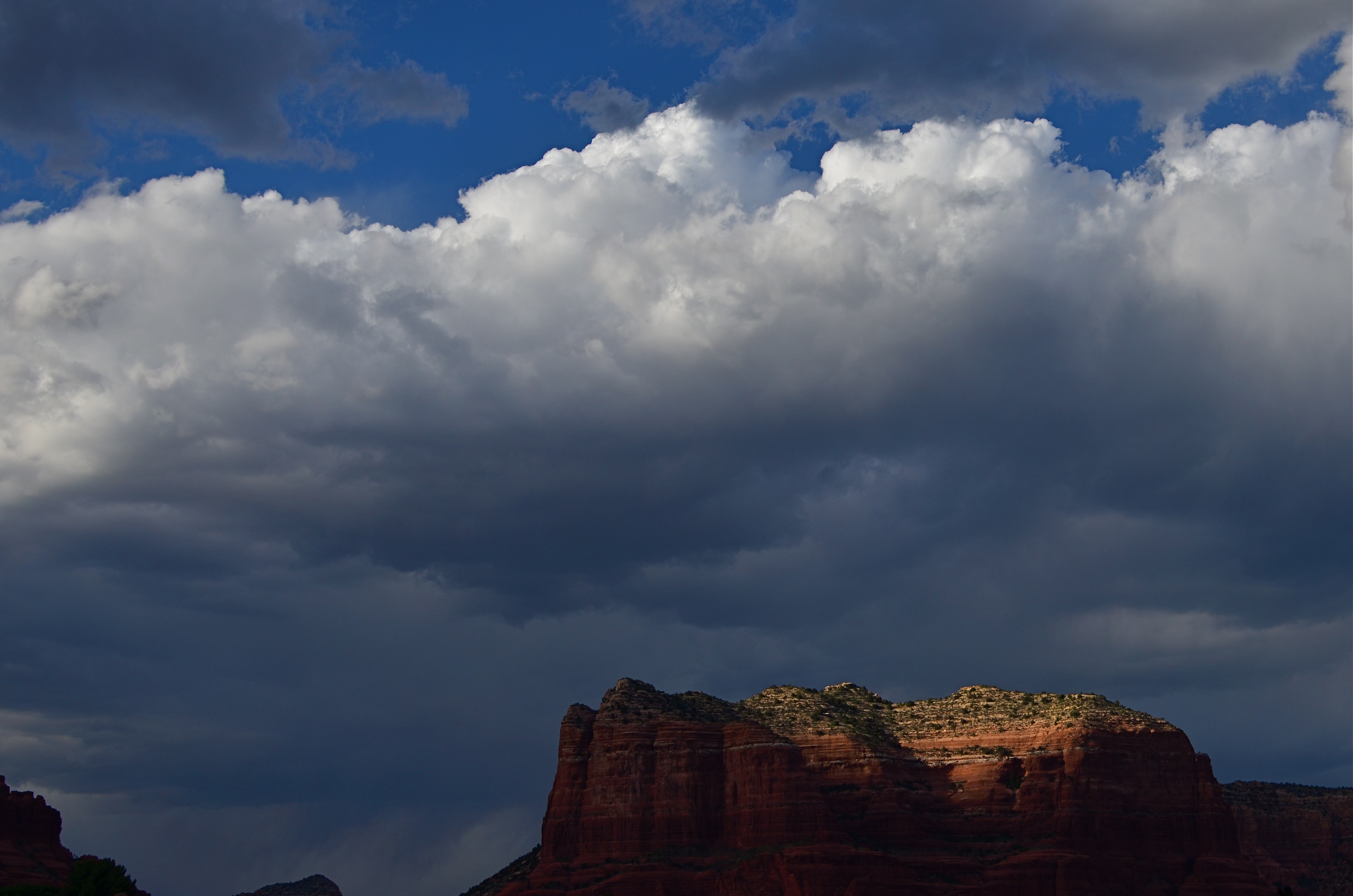
Last Embers (2016), taken on Nikon’s Aperture Priority setting. 1/640 sec., f/6.3, ISO 100, 35mm.
On the day the above image was taken, the town of Sedona, a miraculous array of red-tinged mountains in northern Arizona, was colored variously by a swiftly shifting broken cloud cover. One moment, the crest of a butte might take on a crimson glow, then be swallowed in shadow just moments later, with the gulch next door temporary hyper-lit in the same fashion. The clouds over Sedona were also backed by a decent headwind, shortening the stretches between scene changes even more. Moreover, the sunlight added a ton of contrast to the clouds themselves, making the sky a more attractive compositional component, with typically indistinct shapes rendered more sharply (because contrast is sharpness, right?).
As a result, the combination of light you see in this shot lasted exactly fifteen seconds, so, if I had paused to shoot a couple of trial frames on manual, just to try to nail the lighting, I likely would have missed this moment completely. Again, at this point, assist modes ain’t a compromise; they’re strategy.
The best practice is to anticipate, as much as possible, where you’ll be shooting and what the “game on the ground” is likely to be. Fashion shooters, journalists and other pros swear by Aperture Priority as insurance against lost shots. You may almost certainly find that to be true for some situations yourself . But the name of the game is Get The Picture, so, at the end of the day, the mode that makes you smile is the “right” mode. And don’t let nobody tell you no differnt.
THE ONLY REAL PRIORITY
By MICHAEL PERKINS
THERE ARE MANY VALUABLE SERVICES OUR CAMERAS WILL RENDER without our consent or participation. Without even considering how many people shoot on full automatic 100% of the time, there are a hundred small calculations that these marvelous devices make to prevent the kind of errors in judgment that used to routinely trip us up, from autofocus and white balance, face detection and contrast control. However, there is a variable percentage of decisions on which we should really take personal action, despite the camera’s best efforts to, in effect, save us from ourselves.
In iffy light situations, for example, several key “semi-auto” modes are truly handy in helping us compensate for grey days or dark corners. One of these is called aperture control, in which you dial in the f-stop you want, based on your preferred depth of field, leaving the camera to set the shutter speed needed to properly expose at that aperture. At first blush, this seems to be a great short cut, and is in fact a neat option for people who are “running and gunning”..shooting lots of frames in a very quick time span. However, what looks like cutting your work in half can also mean cutting the legs off your creativity.

Aperture priority would have worked too hard to make this exposure “balanced”, which was the opposite of what I wanted.
In the above situation, I had a severely overcast day in a lushly green Japanese garden. Without shadows for contrast, I would need colors to be as deep as possible to bring off the mood I was going for, so a slightly underexposed look seemed to be in order. Dialing in f/5.6 as a desired D.O.F. in aperture priority was giving me very slow shutter speeds as the camera tried to give me an ideal exposure. This made a handheld shot a little tougher and gave me way too much high color to suggest anything quiet or moody.
Going to full manual, I dialed in a shutter speed that would render the greens nice and deep, around 1/80, and bumped up the ISO a tad as insurance. It was true that I was shooting a lot at the same f-stop, but not so fast that I would have to surrender fine control by shooting in aperture priority for mere convenience’s sake.
I love some of the protections against my own folly offered by today’s devices, but I just can’t go completely driver-less and feel that I am taking enough responsibility for my results. Hey, if I blow it completely, I can still explain a lousy shot in two simple words.
“…stupid camera…”
