CONFER GRACE
By MICHAEL PERKINS
NO ONE EVER INTENTIONALLY DESIGNS SOMETHING TO BE UGLY. There has never been an artist’s or architect’s rendering that shows a project, from a city park to a shopping mall, as anything but ideal. Drawings created to excite investors and planners are consistently festooned with bright, broad sidewalks, strolling families (with their dogs), and bowers of flowers. When you see a sign saying, “coming soon on this site”, it’s always a sunny day.
Of course, once the dedication ribbon is cut, reality intervenes. Neighborhoods rise and fall. Things wear out. The cool things that were to be built during “phase two” get un-funded. The dream of the possible becomes the dreariness of the actual. And photographers are there to measure the distance between those extremes.
Sadly, merely making images of what has gone wrong in modern life is almost a default for many shooters, and their predictably bleak work reflects that. Creating pictures of decay or failure is certainly easy, almost a cynical cop-out, as if seeing the ugliness in things is somehow more honest, more “authentic”. I can understand taking that bait. I have taken that bait. But I think photographers need to struggle to confer grace on things as well, to try to show how things might have worked out. Yes, there’s a lot of drama to be had in documenting what went wrong. But, at one point in the process, before the beginnings of things, people invested faith in what they were creating, a faith that said that things would be generally better Once This Thing Is Completed. Pictorially, trying to portray potential, especially wasted potential, is far tricker.

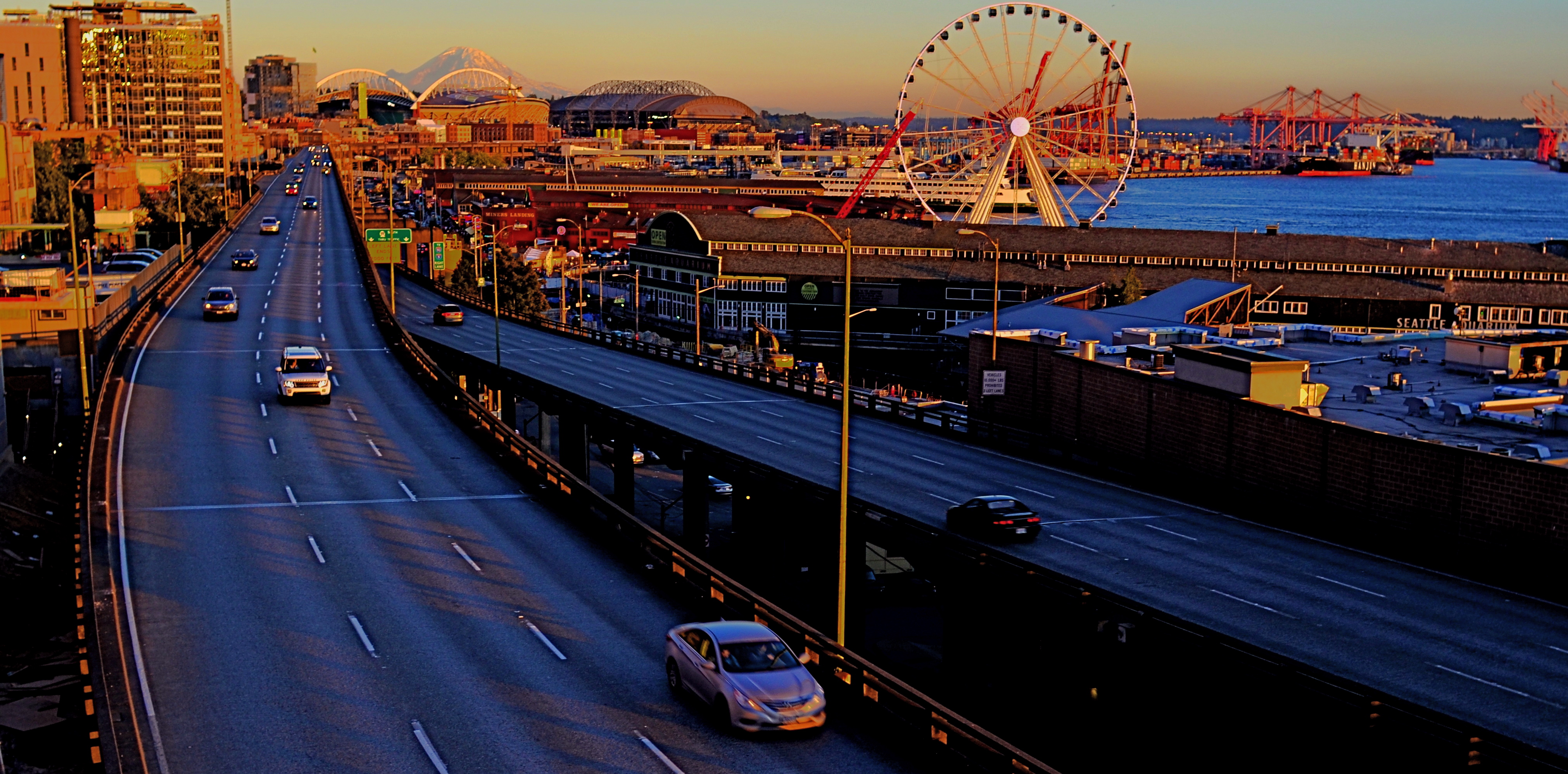
As to the image shown here, I’d like to say it was the result of some marvelous act of planning, but the fact is, the entire scene, bathed in the deep golds of dusk, was seen and seized in an instant. I remember being struck by the feeling that this kind of light was so miraculous that it could confer nobility on even a car wash in a shopworn neighborhood, and that a momentary break in the clouds had given the reds and yellows the hyper-saturated look of an old, slow film stock like Kodachrome. Again, all these impressions registered inside a few seconds, and I went for it. The result reminded me that, once, someone thought this car wash would at least be neat, or efficient, or attractive. Sometimes that dream is totally submerged in the crust of What Happened Later. But I feel compelled to search for it anyway, to confer grace on what the dreamers saw. After all, under the skin, we’re all in the same game.
NARROW PALETTES

An early example of two-strip, or “red-green” Technicolor as seen in The King Of Jazz (1930)
By MICHAEL PERKINS
I’M A HUGE FAN OF THE EARLIEST VERSION of the classic Technicolor film process, the so-called “two-strip” technique from the 1920’s, which simultaneously exposed two separate frames of black and white film of a single subject, one strip through a green filter, the other through a red one. Combined in the lab, the composite image simulated most of the colors of nature that contained either red or green, but absent the third layer of blue/cyan which would be added in the more advanced three-strip Technicolor process, the one which became the industry standard by the early ’30’s. Two-strip features like Mystery Of The Wax Museum or The King Of Jazz are a kind of object lesson for photographers in learning to work with narrow color palettes. The message: do the most with what you’ve got.
Every shooter encounters situations, most of them dictated by changes in available light, which severely limit the full spectrum of reproducible color. We might eagerly embrace the warmth of the two daily “golden hours” that bathe most bright hues in gold. We might bemoan cloudy days, which can drain everything of saturation or contrast. We might have to make adjustments when shade makes our cameras read light at the wrong color temperature, giving our images “the blues”. Whatever the challenge, photographers make myriad choices about color in a single minute, and, unlike the early technicians at Technicolor, they don’t necessarily see a faithful rendering of “reality” as Job One. How “natural” do we want to present color, and how do we define that word, anyway? Is color a determinant of comfort, tension, revelation, drama? Do we intentionally choose hues that either conceal or reveal?
Deep sunset, as seen in the above image, is one situation in which nature itself narrows the color palette. All yellows and reds tend to morph into orange. All blacks, browns and grays migrate to blues. Middle tones head for the hills. Contrast jumps off the meter. Subtlety takes a vacation. Suddenly, as in the case of the old two-strip Technicolor, you’re forcing very few colors to do the work of many….to deliver a version of the world rather than a faithful reproduction of it.
Color processes since the beginning of photography have embraced the idea that you could either reflect reality or, in the pursuit of a great picture, bend it a little.
Or more than a little.
Or a hell of a lot more.
LEARNING HOW TO FALL
BY MICHAEL PERKINS
Don’t lose your confidence if you slip…..be grateful for a pleasant “trip“…..
Jerome Kern & Dorothy Fields, “Pick Yourself Up”
THE UNDERSTANDABLE EXCITEMENT THAT ACCOMPANIES the acquisition of a new camera is like that experienced by the first-time driver of a finely-tuned sports car,…..i.e., let’s open this baby up and see what’ll she’ll do.
All well and good. However, for the best translation of your vision, from eye to finger to shutter, I contend that it’s more important to know what your camera won’t do. Or more precisely, to learn what you don’t know to tell it to do.
Just as we are eager to credit ourselves, and not the camera, for those shots that really work out well, we need also to shoulder our share of the blame when things fail. The camera that delivers your message perfectly is the same camera that produced the shots that deserve to line birdcages. The difference is you. Your gear is composed of servo-mechanisms. They are neither intuitive nor interpretative. Anything that smacks of aesthetic judgement or nuance is on you. Am I saying there’s no such thing as a “good” or “bad” camera? No, but those two labels should be a measure of design, function and technical parameters. Your skill can both empower a limited camera and hobble an advanced one, so talk of “good” or “bad” falls apart once a disposable creates a masterpiece or a Leica delivers garbage.
The path to a good image runs through yourself, not your camera.
This means that, at bottom, your choice of camera matters very little, whereas the choices your eye asks the camera to execute is, simply, everything. Try as it might, the camera cannot compensate for what you didn’t know how to articulate. Finding out what your camera won’t do means learning how to respect its technical limits while trying to eradicate those selfsame limits in yourself. That means, as Paul Simon wrote, “learning how fall”. It’s a pretty good strategy, since every one of us had to learn that in order to learn how to walk.
UPractice. Be eager to fail, and to learn yourself past future failure. And eventually get to the point where you never, ever write a check your camera can’t cash. Then, and only then will you really see what that baby will do.
CALM AT THE CENTER
BY MICHAEL PERKINS
ALL OF WHAT WE CALL “EFFECTS” LENSES can additionally be used as “art” lenses, but they can also, for a photographer, merely be a way of saying, “hey, look at the cool trick I learned!” In what and how we shoot, we draw the line between “showing something” and just showing off.
Since no single lens can produce every desired optical look, we swap out speciality glass to get the effect we want in a given image. But is the final picture complemented or defined by that effect? Is the photograph “about” how close you zoomed in, or what you zoomed in to see? Did you shoot with a stereoscopic lens just to demonstrate 3D, or is there some deeper understanding of your subject achieved with the added sensation of dimensionality? You see where this is going: the yin and yang between calling on technique and calling attention to that technique for its own sake.

In trying to be mindful of this either/or way of using effects gear, from macro filters to pinhole lenses to ultra wides, I try to use some of them counter-intuitively, forcing them to tell stories in ways that go beyond the obvious. One such lens, and one which comes with its own set of pre-conceptions and biases, is the fisheye, which, for many, never left the bendy realm of psychedelic album covers and black-light posters, time-locked somewhere between Warhol and Peter Max. However, even in the most exaggerated fisheye shots there is the opportunity to create what I call “calm at the center”….an area roughly one third of the total frame where distortion is either muted or completely absent.
When a compelling and more normally proportioned middle is built into your shot, such as the stair steps leading toward the bench in this greenhouse shot, the bending that increases toward the outer edge of the shot can act as a framing device that leads the eye to your chief focus. The emphasis can then be placed on what is not distorted rather than what is. The fisheye lens is thus used to call attention to what it’s serving in the picture, rather than calling attention to itself.
Does this shot deliver what I was seeking? That’s for others to judge: the only thing I can be sure of is my intention, after all. Effects lenses are not automatically art lenses, any more than every camera owner is automatically a photographer. Results, finally, are the best testimony.
THE TOGGLE
 BY MICHAEL PERKINS
THERE HAS BEEN A PERPETUAL ROMANCE, over the past two hundred years, between the arts of photography and live performance. The camera can’t look away at the magical moments when the transformation of play-acting takes place, and players can’t help inviting the camera to catch them at donning and doffing their various masks. This endless dance produces an infinite number of collisions between the two crafts, teasing miraculous moments from both.
However, when it comes to photographing performers, my perception is that, over decades, the bulk of the images we recall are of the finished product, the final on-stage result of all the unseen practice and prep that precedes showtime. I think this leaves half of the story untold, or at least under-told, because photos of the person that is dominant before the lights go up are no less dramatic, no less revelatory than the persona that springs to life at the opening of the curtain.
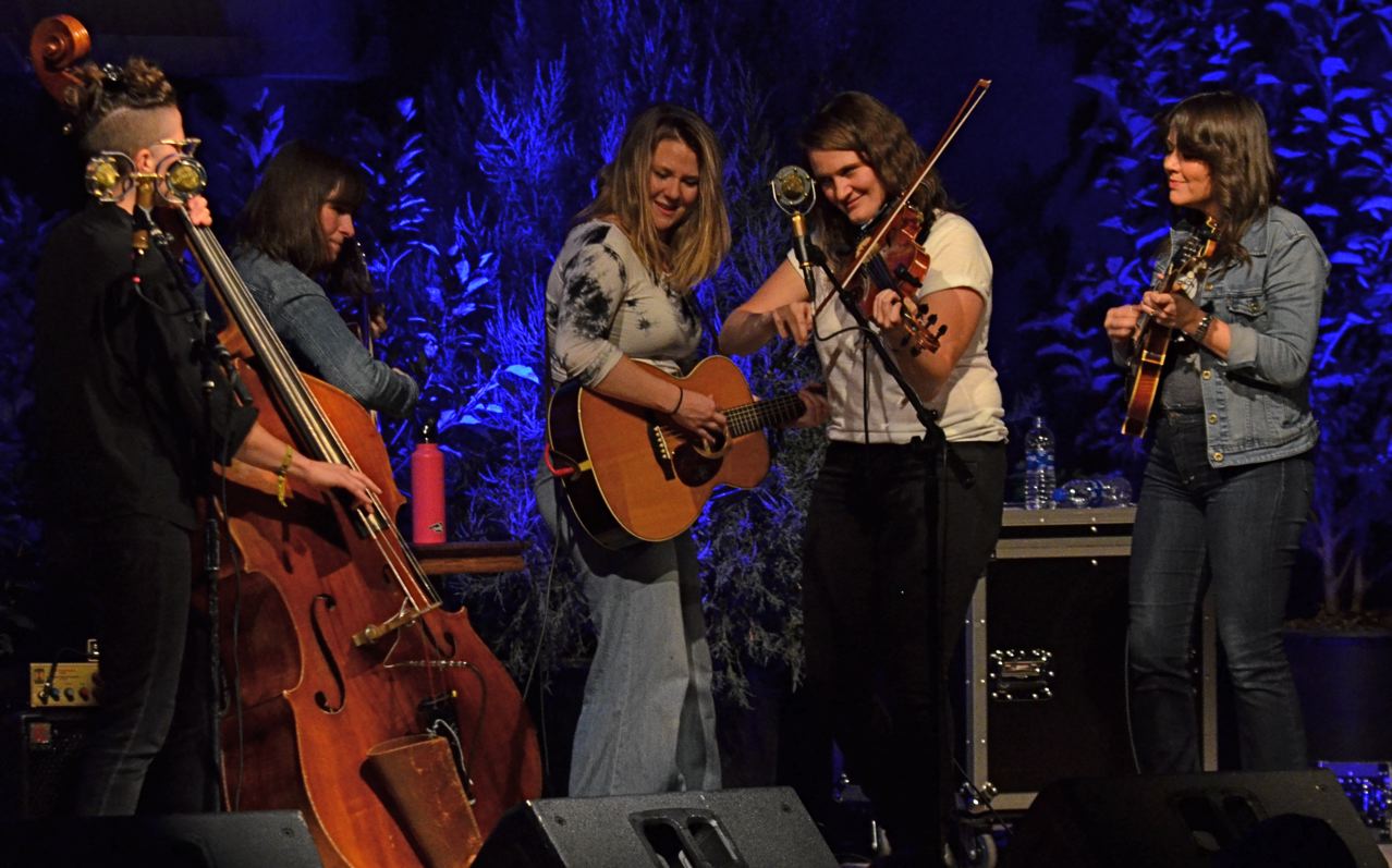
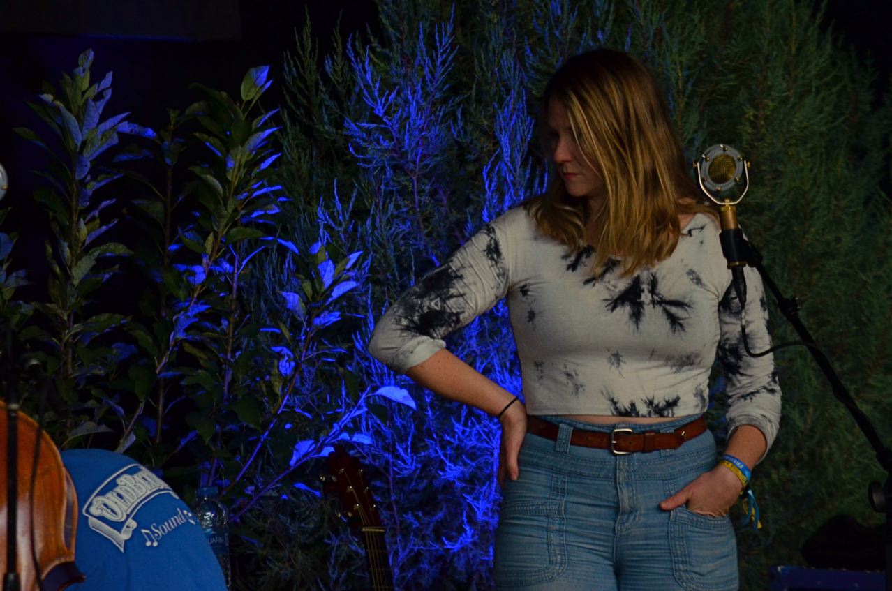
This was all brought home to me anew this week when I had the chance to snap some last-minute sound check shots of Celia Woodsmith, the one-woman power station that is the lead vocalist for the bluegrass-flavored band Della Mae. Like every other member of this all-female troupe, Celia makes a nightly metamorphosis from poet to party girl, worldly-wise dreamer to sassy force of nature, oftimes in the space of a single song. And yet the moments of silent concentration she displays in the last moments before the flag drops (see top image) is itself a profound thing, her face and form encompassing the emotions of every woman, just as her show self does, albeit in a completely different way.
Della Mae is one of the busiest bands in America, careening from weeklong festival gigs in the heartland to State Department-sponsored trips to the world’s hot spots, in years that often find them booked well past the 250-day mark. That’s a ton of transformation from pensive to explosive (see lower image). And the images to be harvested in those moments when performers toggle between selves can be sublime stuff, indeed.
THAT’S THE WAY WE DO IT AROUND HERE
BY MICHAEL PERKINS
“STRANGE” IS IN THE EYE OF THE BEHOLDER, and anytime you and your camera are, in terms of travel, the new kids in town, your time as a street shooter is better spent finding the “weird” things that the locals find….normal. Now, let’s be clear: many times towns will capitalize on their World’s Biggest Ball Of Twine or haunted house tours or such, but that’s just naked capitalism, and everyone deserves to make a fast buck wherever they can. No, the local weirdness you want is something that’s been odd for so long that it’s not only normal to the locals….it’s damn near invisible.
Of course, I concede that one photographer’s instance of Undiscovered Ironic Hipness is another’s Tourist Sucker Bait. This can be an additionally tough call in a town like Portland, Oregon, a town practically marinating in ironic hipness, so the things about the city that recently tickled my fancy may, to real Portlanders, be beneath both notice and contempt. To be sure I was on the right track, I would have to actually be cool, and, sadly, that ship has not only sailed, but it’s struck an iceberg.
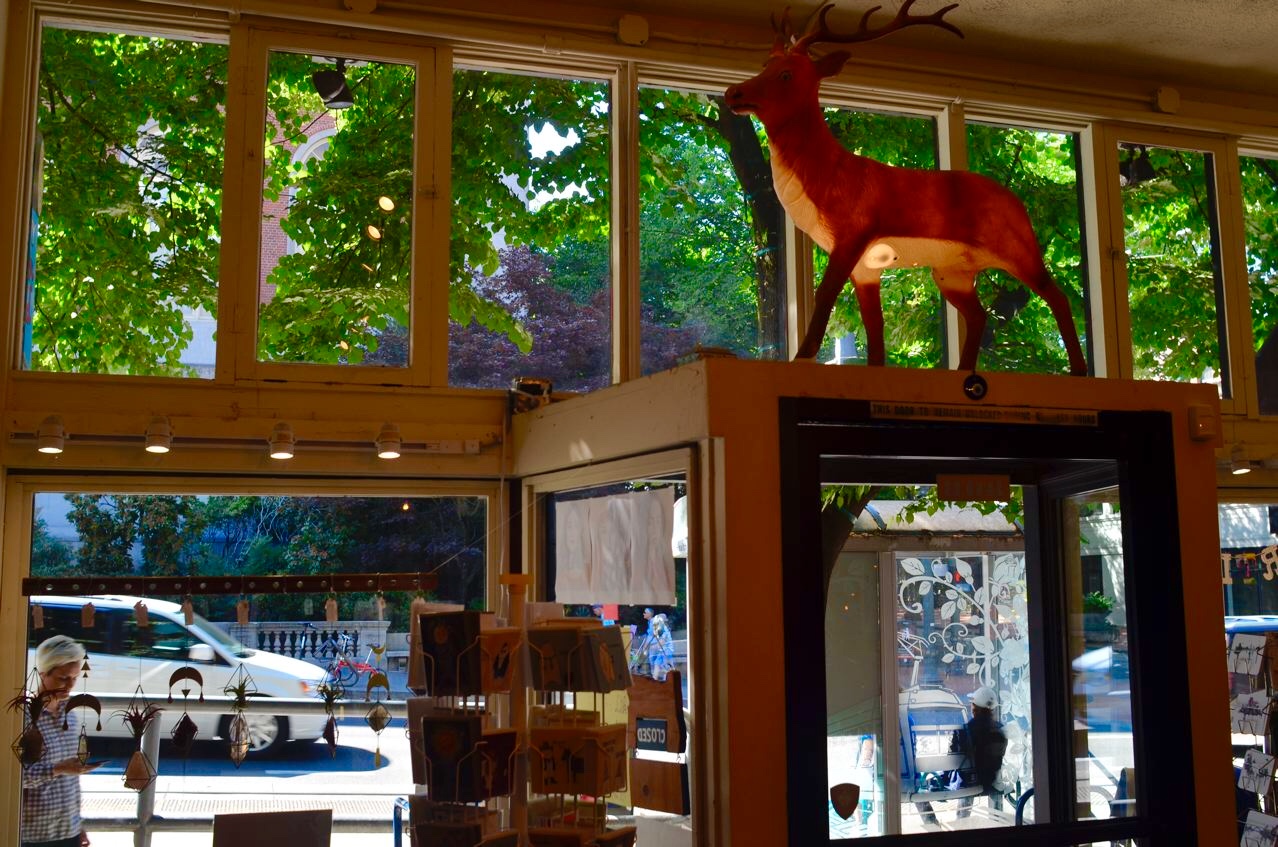
So, in truth, I have no idea if the stag seen here crowning the vestibule of a small area boutique is really freaky or merely play-to-the-visitors freaky. Or both. Hey, this is the city that painted the plea Keep Portland Weird on the whole side of a building (and then turned that phrase into just another way to sell tee shirts). It’s also the city whose visual trademark is a sign featuring a giant leaping neon deer. Soon…as Tower of Power famously sang, “What Is Hip?”
And, again, I repeat, how the hell should I know? My only point is that, when I’m trolling new streets with a camera, I’d rather bypass the sites that the local chamber of commerce is telling me are “points of interest” and try instead to find where the quirkiness truly meets the road…in local shops, bars, neighborhood celebrations, or improvised “traditions” that make a city unforgettable.
Or at least weird.
SHOW US WHAT YOU SEE
By MICHAEL PERKINS
THE ACT OF PUBLISHING A PHOTOGRAPH is roughly equivalent to a lawyer’s closing argument, in that it is an attempt to persuade, to sell an idea. To make his own “case”, a photographer must be fearlessly certain of what he is trying to say, a process that begins with the conviction that what he has frozen in an exposure is the truth, because his eye is a reliable narrator. Lying eye, lying result.
The best images narrow the gap between hand and eye.
The development of the photographer’s eye is one of two parallel tracks on the road to truthful images, the other being technical mastery. The challenge, then, for the photographer, is in narrowing the gap between what the camera captures and what the eye contends is the essence of the picture. Bear in mind that, between photographer and camera, only one of those things has an imagination. You have to tell the camera what to see in such a way that, as a mere technical measuring device, it has no choice but to obey.
John Szarkowski, the legendary director of photography at the New York Museum of Modern Art and a great shooter in his own right, expressed perfectly the problem that occurs when the eye and the hand are not on the same wavelength:
No mechanism has ever been devised that recorded visual fact so clearly as photography. The consistent flaw in the system has been that it recorded the wrong “facts”: not what we “knew” was there, but what had appeared to be there.
Long story short (and isn’t about time I tried one?) : don’t blame the camera when your vision isn’t realized in the final frame. Either you need a better vision, or a better way of setting up the shot so that the camera can’t help but deliver it. If you don’t turn on the water, the best hose in the world can’t put out a fire.
Stand in front of the court and make your case.
Show us what you see.
OVERSEEN ON THE STREET
By MICHAEL PERKINS
THE MASS PROLIFERATION OF THE CELL PHONE has fundamentally changed the dynamics of personal interaction, in a way unforeseen in the first days of Alexander Graham Bell’s original devices. In general, the first telephones were seen as an overall boon to mankind. They annihilated distance, sped up commerce, established connections between every person on the planet and every other person on the planet. If anyone in the nineteenth century had been familiar with the phrase “win-win”, the arrival of the phone might have elicited its first use.
But let’s now examine conversation itself, thinking of it as potentially photographic, an exchange which may not be overheard, but which, in terms of street photography, can be, if you will, overseen. Many wonderful images have been captured of people in the act of this kind of vigorous verbal ballet, their joy, vulnerability and engagement making for solid, natural visual drama. And the thing that has been at the base of many a conversation is that it was necessary for people to be physically adjacent to each other in order to have it. The telephone’s physical “reach” was finite. You had to be where a phone was to use one. From home. From the office. Or whenever Clark Kent freed up a booth.
With the arrival of the mobile, however, came the elimination, in millions more conversations, of the need for face-on communications….which, in turn, eliminated the “overseen” direct chat from the photographer’s daily street menu. Certainly it isn’t hard to see at least one half of a million calls ( try walking the streets without seeing one), but the narrative of a traditional conversation, captured visually by the camera, offers substantially more impact. Half a phone conversation is certainly real, but it isn’t real interesting. Technology is never really win-win, after all. In actuality, you trade off managable losses for potential major wins.
There is something palpably authentic about the connection between the women in the above image. And unlike the case of a shot of someone on their phone, the camera in this case doesn’t have to suggest or guess. It can show two people in active engagement. Trading that photographic opportunity away for mobility and convenience is one of the real consequences of the wireless revolution. And as a photographer, you may find yourself longing for a bygone, more personal kind of connectivity.
SEA CHANGE
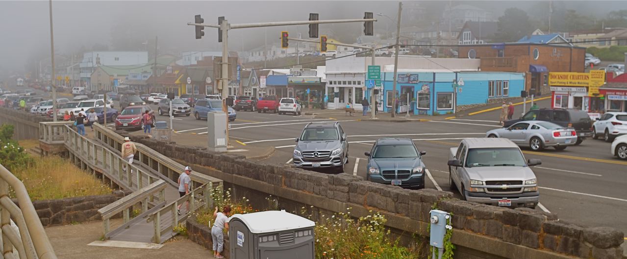
Downtown Depoe Bay, Oregon
By MICHAEL PERKINS
THE COASTAL OREGON TOWN OF DEPOE BAY (pop. 1,398) advertises itself as “the world’s smallest harbor”. They might have saved themselves the cost of a sign. Everything about this little strip of gristle along U.S.101 suggests small, conveying the unmistakable feeling that you are Miles From This, A Further Piece Up The Road From That, or On The Way To Elsewhere. This place right here, though, is not much more than craggy connection tissue between other places, places that have substantially more going on.
But then there is that coastline, most of it seen in five minute out-of-the-car stretches by passersby who follow the signs for the Whale Watching Center. The decidedly no-nonsense concrete slab that houses said center sits atop a pile of blackened, stony scab that boasts but one break in its protective sea wall, a narrow channel that admits just one boat at a time (tourist charter local fishing skiff, or Coast Guard cutter) from the “harbor” across the street, a small collection of crafts most towns would label a “marina”. This traffic flow is regulated by the outcome of the daily conundrum, will there be whales, or, more accurately, will whales, or anything else, be visible beyond a hundred yards?
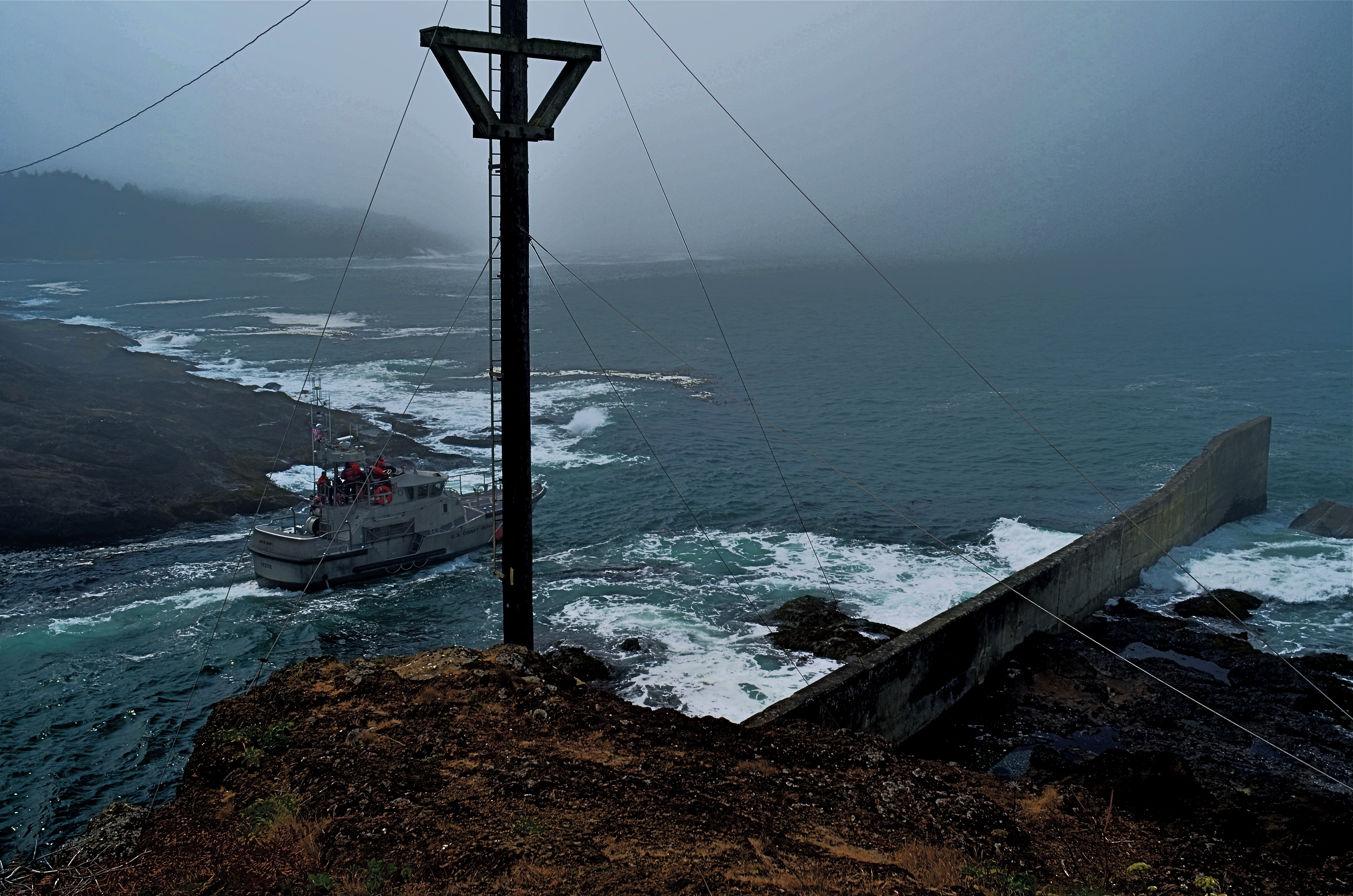
And yet, even swallowed up in soupy fog, the snaky fingers of which close upon the coast like grasping, ghostly fingers balling into a fist, Depoe Bay could make Melville’s Ishmael himself pine for the open sea. Paradoxically, it reveals all and conceals all at the same moment. It’s a portal to departures, an end point to journeys, a portent, a welcome, a warning…..and an irresistible itch that only a camera seems able to scratch.
Coastal towns like Depoe can subsist on their four blocks of bar-laden business district, their single low-power oldies radio station, their preciously tacky gift shoppes, the gallons of chowder dispensed each day. But the real show is the one that won’t stay still, the one that is equal parts miracle and menace, doldrum and dream. With it, the Depoe Bays of the world maintain their tenuous spots on the map. Without it, all poetry vanishes in a bank of mist.
SOFT AND SHALLOW
By MICHAEL PERKINS
IN RECENT YEARS THERE HAS BEEN A MOMENTOUS SURGE in the number of photographic optics that market themselves as “art lenses”, as if all other lenses were, what….non-artistic? This murky term essentially denotes lenses that deliver customized or selective focal effects, such as the Lensbaby “sweet spot”, a partial area of sharpness, surrounded by soft blur, that can be placed, at will, at various parts of the frame. Other so-called “art lenses” produce unique patterns of bokeh, or blur artifacts, while yet others produce vignetting, or darkening around the outside corners of the image. Some of these lenses are great overall performers, while a number of them are either one-trick ponies or muy espensivo or both.
Thing is, if you possess a fast “normal” lens, such as a 35 or 50mm “prime”, you can already achieve some of the same effects of many over-hyped proprietary lenses in the “art” arsenal. Primes have but a single focal length and thus have no telephoto function. The photographer frames by physically moving closer to, or farther away from, his subject, by, in effect, “zooming with the feet”. Since their focal range is fixed, primes are extremely simple in their construction, and therefore extremely sharp. In addition, they often will open to at least f/2.8, with many rated at f/1.8 or even faster. And that’s where the arty focus fun starts.

Wide open to f/1.8, the 50mm prime used for this image creates an extremely shallow depth of field. And that can be good news for flattering pics of faces. Primes of this focal length are already prized as portrait lenses, since they produce faces with normal proportions, as opposed to the Silly Putty stretching you get with wide-angles. Add to that a fast prime’s ability to deliver a very buttery transition between sharpness and blur, and you have the potential for a very finely-tuned look. Notice that there is no real hard sharpness in the cat’s face beyond one eye and about one third of his face. The rest rolls off very softly. My point is that nearly any good prime can deliver this effect: it isn’t essential to invest in a custom piece of “art” glass to get it.
One caveat: shooting this far open, at this distance, your auto-focus may endlessly gyrate back and forth trying to find a place to lock in. My advice: go manual. At this DOF, you’ll have to practice with how to nail the focus, and I personally am driven bonkers trying to find the sharpness at f/1.4 or faster: the range is so very razor-thin. Even so, before you pony up for a lens that’s designed to deliver arty focus, play with the primes you already have. You may be delighted. The focus may be shallow, but the satisfaction can run deep.
LEADING THE WITNESS
By MICHAEL PERKINS
PHOTOGRAPHY IS GUILTY OF MANY AN UNTRUTH, simply by the very nature of how it mimics reality. And chief among these falsehoods is its assertion that it’s reproducing depth as well as length and breadth, that you’re not only looking at a photograph but into it as well. Compositional tricks employed to sell this illusion are as old as the medium itself, many employing the technique familiarly known as leading lines.
The phrase is practically an explanation in itself: two or more lines of some kind seem to originate near the foreword edge of the picture and trail inward, receding toward the “back” of the frame, usually toward a horizon line of infinity, at a point at which the lines seem to converge, like train tracks that grow closer as they fade into the distance. Leading lines can take the form of a spiral staircase, a winding stream, or some similar invitation for your eye to “buy into” the idea that the flat image is actually “deep”.
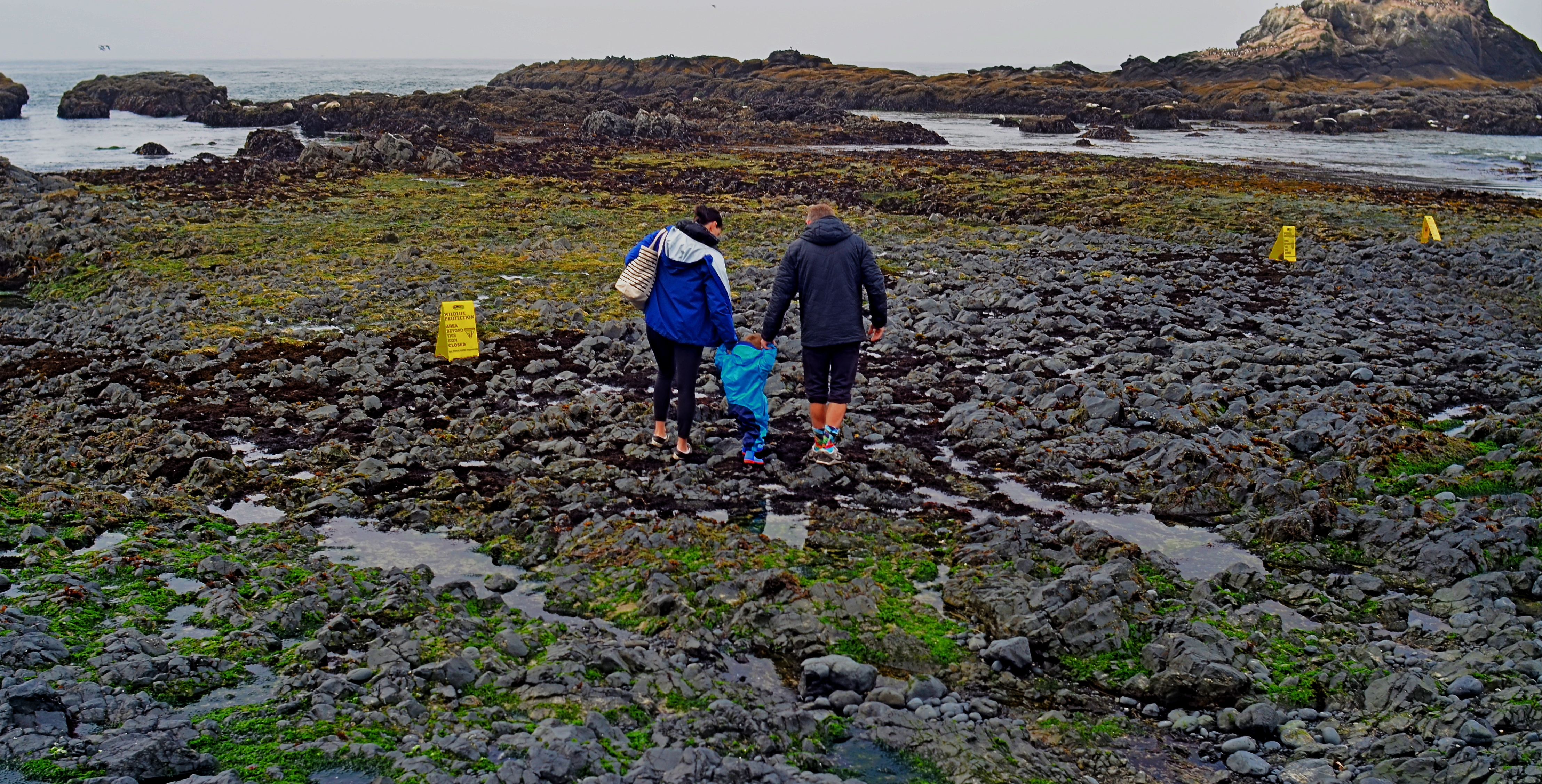
As surefire as leading lines can be, it’s also fun to experiment with other ways to convey the illusion of depth. The image seen here uses no obvious leading lines, and yet it achieves a reasonable effect of dimensionality. Several things can help “sell” the trick.
First and easiest is the choice of a 24mm lens. This optic qualifies as an “ultra-wide” and will always exaggerate the distance from front to back. Then there’s the detailed texture of rock and sand, whose particles shrink in size as the tide pool recedes toward the sea, and just as our mind knows it would in nature. As to focus, setting at infinity helps the eye look deeper into the shot, whereas just shooting only the family in sharpness might stop the audience at a shallower viewing point. Finally, the placing of the family at center and at the mid-point of the front-to-back distance means you have to “look into” the shot fairly deeply just to engage them, at which point your brain has already been dragged halfway to the rear of the shot.
And this is only one very elementary example of how you can effect the depth of a leading line image without….the leading lines. In some ways, photographic compositions are much like musical ones: both require orchestration and a willful conductor.
ALL AROUND THE TOWN
By MICHAEL PERKINS
THE MAIN OBJECTIVE OF THE NORMAL EYE has always been to promote mindfulness in the making of photographs, to be engaged in the why of images more than the mere how of mechanical technique. This is, I continue to believe, the correct emphasis. Learning how to operate a camera is a fairly short-term thing: figuring out what to do with the thing can take a lifetime.
As a sidebar to all that, TNE also was designed to suggest how photographic ideas might be developed, illustrated by the use of links to image galleries organized around selected themes. The idea here wasn’t so much to show off my own “greatest hits” as it was an attempt to demonstrate potential approaches. The image galleries are not a portfolio, nor are they auditions: they’re just examples. Like everything else used as an illustration in the pages of TNE, they’re supposed to act as a point of departure or discussion fodder.
I usually accompany the publication of new gallery pages with a preamble like this to reinforce the idea that this forum is about batting ideas back and forth, not earning my pictures blue ribbons. That said, I had a great deal of fun this week looking back at the last three years of photos from various trips to New York, my favorite playground, corralling a handful of them under the new tab Small Slices From A Big Apple, which, beginning today, you’ll find in the menu at the top of this page. Obviously, with such a vast subject, no photographer can ever consider himself “done”. However, that’s no reason not to make a start.
As usual, The Normal Eye is less about what I have done and more about what you will do. All we do around here is tee up ideas. The follow-up strokes are up to you.
REFRAMING THE INFINITE
By MICHAEL PERKINS
THE SMARTPHONE–ERA SELFIE, which may comprise the biggest single category in amateur photography, may actually be the worst thing to happen to portraiture since the invention of the flashgun. Make a qualitative pie chart of the general yield. Many are technical misfires which should have been deleted but were not: more are uniformly safe, conforming to an unspoken set of rules on how much of one’s face to crowd into the frame or how “natural” a smile to effect: nearly all fall short of potraiture’s main mission, which is to interpretively reveal new features or new flavors of a familiar subject. The problem with the selfie, finally, is that it’s too important to be entrusted to, well, yourself.
Mainly, it’s a matter of objectivity. Simply, when it comes to evaluating our own faces, we have none. We are untrustworthy narrators. Now, certainly, it sounds counter-intuitive to suggest that others (with cameras!) can know something more of our faces, and what lies behind them, than we ourselves. But we actually only “know” two things about our own surface features: what we believe we look like and what we want to look like. Neither kind of nebulous “knowledge” leads to either accuracy or innovation in the making of a portrait.

Marian By Maclight (2018)
The answer: outsource the job. For yourself, find someone you trust (not necessarily love) to interpret your face. The evaluative distance gained by reframing your own idea of yourself through others’ eyes far outweighs any minor injury to your vanity. And for others, be that other set of eyes. Of course, as always, these observations are rooted in my own experience, but, really, what else is photography about, anyhow?
To clarify: my wife is a great muse for me, since interpreting her face is an exercise in what I call “reframing the infinite”. Simply put, she is a subject I cannot exhaust, whereas, in self-portraiture, she’s instinctively hemmed in by the what-I-think-I-look-like/what-I-want- to-look-like trap. I can simply see things that she cannot, even though (and this cannot be repeated enough), I’m not even that good.
We’ve all reacted to many a self-portrait with a response that sounds something like get over yourself. However, the precise prescriptive might instead be “get OUTSIDE yourself”. Don’t assume that you’re the lucky, lone photographer born without a blind spot, a perceptual dead zone that includes knowing What’s Best About Your Own Face. Unilaterally banish the selfie? Nope. But ask lots of tough questions.
Especially of yourself.
DUST IN THE WIND
By MICHAEL PERKINS
ENVY, WHILE A COMPLETELY UNDERSTANDABLE HUMAN EMOTION, has only occasionally helped me advance as a photographer. Eating one’s heart out over someone else’s talent is, at best, a kind of sweet misery, but there are a few instances in which it’s almost a pleasure to look upon another person’s work and know that you’ll never approach that level of mastery.
For me, that juicy jealousy has always been reserved for the legendary output of the Farm Security Administration, the New Deal program charged with chronicling the nationwide impact of the Great Depression of the 1930’s, the idea being that you couldn’t marshall public action against a problem people couldn’t see. The titanic FSA archive, containing more than 175,000 negatives, capitalized on the emerging 35mm film format and the country’s then-ubiquitous photo news magazines to produce images which were both objective reportage and so-called “street” photography. There is simply no comparable project in the history of the medium.
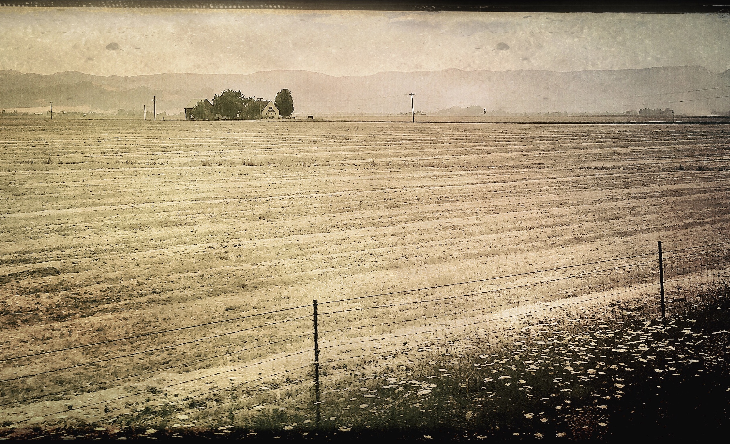
So, again, my own work, as previously confessed, is a admixture of envy and admiration. I can never take a crack at creating a narrative for the Dust Bowl or the great Oakie migration, but I can create an “homage” to those who did. You know how this works. When you get caught aping someone else’s technique, that’s “theft”. When you out yourself for doing the very same thing, it’s an “homage”. Soooooo…
The master shot of the above image was taken out the window of an Amtrak train winding its way between Portland and Eugene, Oregon, about ten days ago. I was struck by the visual isolation of the farm structures and the profound emptiness of the surrounding fields. The antique feel and texture of the finished product was supplied by the Hipstamatic app, the whole deal created completely in-camera on an iPhone, which is, to our era, what the Leica was to the FSA’s journeyman shooters….that is, the tool at hand. I can’t honestly chronicle the events of that time…..but I can render an echo of their feeling.
Some seventy-five years have passed since the Roosevelt administration sent a small army of shutterbugs across the country to live among those whose lives had been shattered by the Crash, to record what they were trying to do to restore equilibrium to a world that had run into a ditch. I will never be able to do that exact work. Still, I hope I can bring rigor to the challenges that my own time have placed before me. Sometimes, the two eras seem uncomfortably close, as if some very old dust were blowing up into a new storm…..
COMFORT FOOD (AND LIGHT)
By MICHAEL PERKINS
SINGLE–SOURCE LIGHT IS ALMOST ALWAYS USED, IN PHOTOGRAPHY, with the aim of calling attention to something other than itself. Typically the light’s origination point is hidden or removed from the final composition, entering from outside the frame via a side window or a top-down studio lamp, modeling or dimensionalizing an object, creating the illusion that all the light in the room just happened organically.
And that’s pretty much as it should be. You usually don’t use the tools of a craft to say, in effect, look at the way these cool tools helped me play a trick on you. As photographers we don’t like to be caught in the act of fooling, and so there are many images where the single source light is seen just in its effect, not as a cause.
Many, but not all. Sometimes the light actually needs to be part of the story, as shown here.
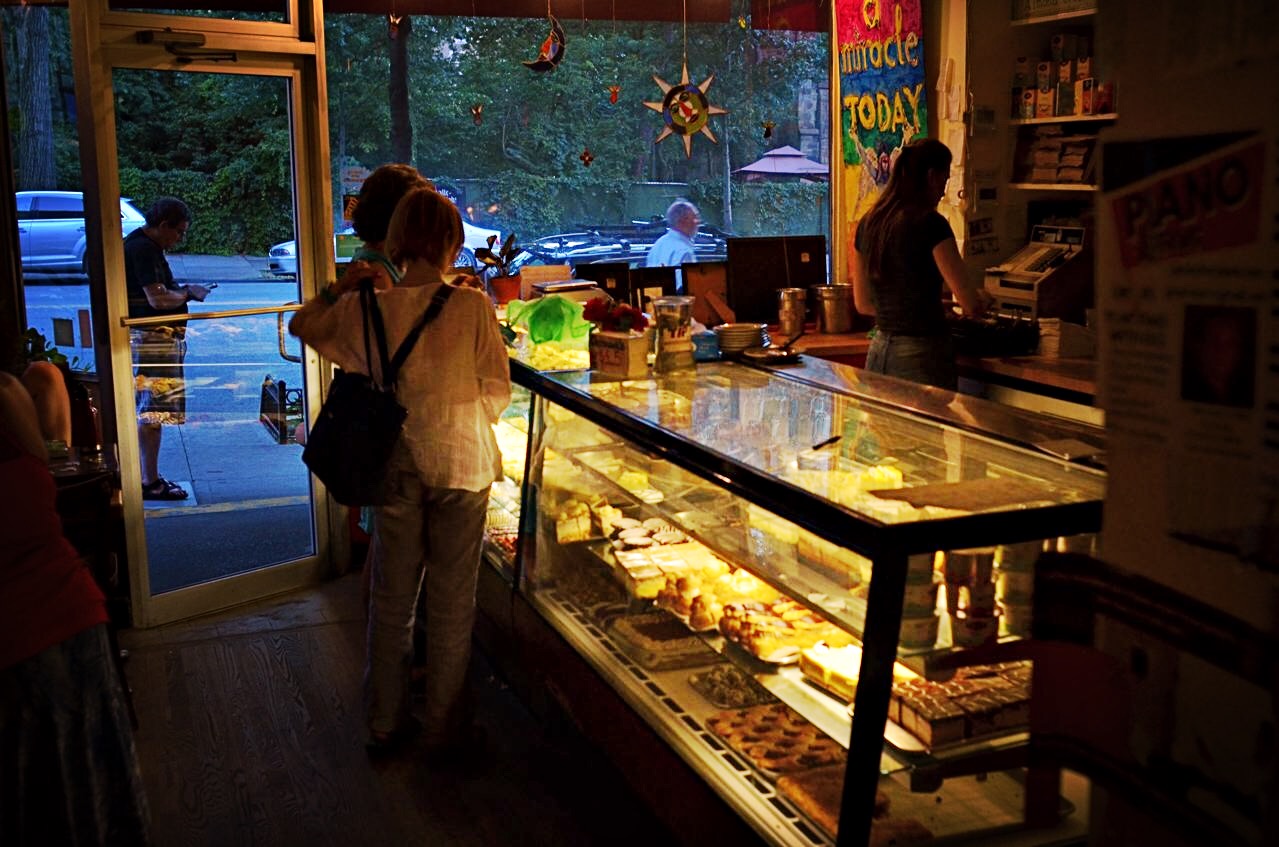
Most places of business naturally react to the daily dying of exterior light by turning on their interior lamps. Sun goes down, lights go up. But occasionally, as in this wondrous and quirky little bakery cafe in Morningside Heights in Manhattan, the comfort food was accompanied by what could easily be termed comfort light. The lights inside the pastry case, at least during this particular evening, were allowed to serve as the only illumination for the entire inside of the store, lending the customers around the counter the warm intimacy of a shared fireplace.
The moment filled me with longing for a world whose labors and leisure were once defined solely by the parameters of day or night, mitigated only by the occasional torch or oil lamp. And so, in this special case (and in many more you can no doubt name from your own experiences), the source of the image’s light really is part of the narrative, and thus deserves its place at center stage.
PLAN “D”
By MICHAEL PERKINS
ANYONE THAT IS NOT BORN AN OCTOPUS figures out early that photography is often about living with the consequences of unforseen choices. Perhaps creatures born with eight arms might actually be able to produce the best images, since they’d be equipped with the means to carry every piece of equipment they possessed into the field for a shoot. As for the rest of us, results rise or fall on the strength of our planning…..and resiliency.
To be clear, the word planning is meant to denote all of your process, not merely the first preference you imagined when anticipating a shoot. That “version” we label “Plan “A”, which might also be entitled “do everything the way you first envisioned it with precisely the gear you originally selected”, an outcome roughly equivalent to Marrying The Prom Queen And Retiring To Tahiti. Let’s face it: shoot enough pictures and you’ll be struck by how seldom you were able to simply step up, click, and go hang a golden trophy on your mantel. In most cases, Plan “A” is usually just a point of departure, a preliminary sketch.
So let’s assume your photo shoot has proceeded to Plan “B”, which might be named “rejecting your original conception”. At this stage, you’ve begun to question everything from composition to gear to even the strength of your initial subject. Based on how many alternate equipment choices may be available, several tough decisions can be made at this juncture, including my favorite, Doing The Best You Can (the path of least resistance), otherwise known as Shoot It Anyway. Assuming this doesn’t work out, you move briskly on to:

Plan “C”, in which you have new strategies forced on you by either the technical limits of your gear, or the boundaries of your skill level with it. This assumes that, not only did you bring the wrong lens for the job, but also that the right lens is four acres away in the parking lot. Let’s also stipulate, for purposes of this exercise, that everyone around you is getting (a) impatient, (b) tired, or (c) hungry, just to add to the pressure. Hey, pal, no rush, but take the picture already, willya? But have no fear… there’s always:
Plan “D”, in which a change in your entire approach to the image is unavoidable, but suddenly and strangely…..alluring. Being stuck with gear that won’t absolutely deliver your original vision no matter what you do, you begin to embrace the idea of experimenting, otherwise known as the What The Hell or Weary Resignation option. Hey, you grabbed a fisheye lens for the inside of the conservatory building…..but maybe you can also make it work as a standard ultra-wide (see above result). Cue up Kiss’ Nothing To Lose…
All of which is to say, in a very roundabout fashion, that it pays to be as flexible as, say, an octopus.
With one-fourth the arms.
OF CLEARINGS AND COVER
By MICHAEL PERKINS
“LOST IN THE WOODS”. “DEEP IN THE FOREST”…conjure your own phrase for the sensation of entering, and being swallowed by, dark, mysterious places. Realms of shadow, primordial laboratories in which both dreams and nightmares are brewed. In other words, sites where photographers can wax poetic. Or crash and burn.
Forested areas are both challenge and opportunity for shooters, since they are seldom subject to the same laws of composition or exposure as subjects shot out in the open. Mastering light in woodsy settings can be a crusade in its own right: details can melt into dark murk or be completely blown out in sudden shafts of sunlight. I have produced more mushy, indecipherable messes with more cameras in more forests than I care to count, in pictures which inadvertently produce more mystery than they reveal, as in “what’s this supposed to be?”
I can come a lot closer to coherence when I work with partial clearings rather than dense woods, working with simpler compositions that suggest the feel of the forest from its near edge rather than its center. Exposure becomes a more streamlined process as well.
Also, since the emphasis in such a shot is on mood rather than detail, even the basics of focus can become, well, negotiable, as seen here. But then, almost anything in the making of a photograph is. Or should be. My point being that, when the taking of a picture fails, it can be because the photographer is trying to execute too many things at once. Eliminating some of those things until the image becomes manageable can be, like walking out of a dark forest, a profound relief.
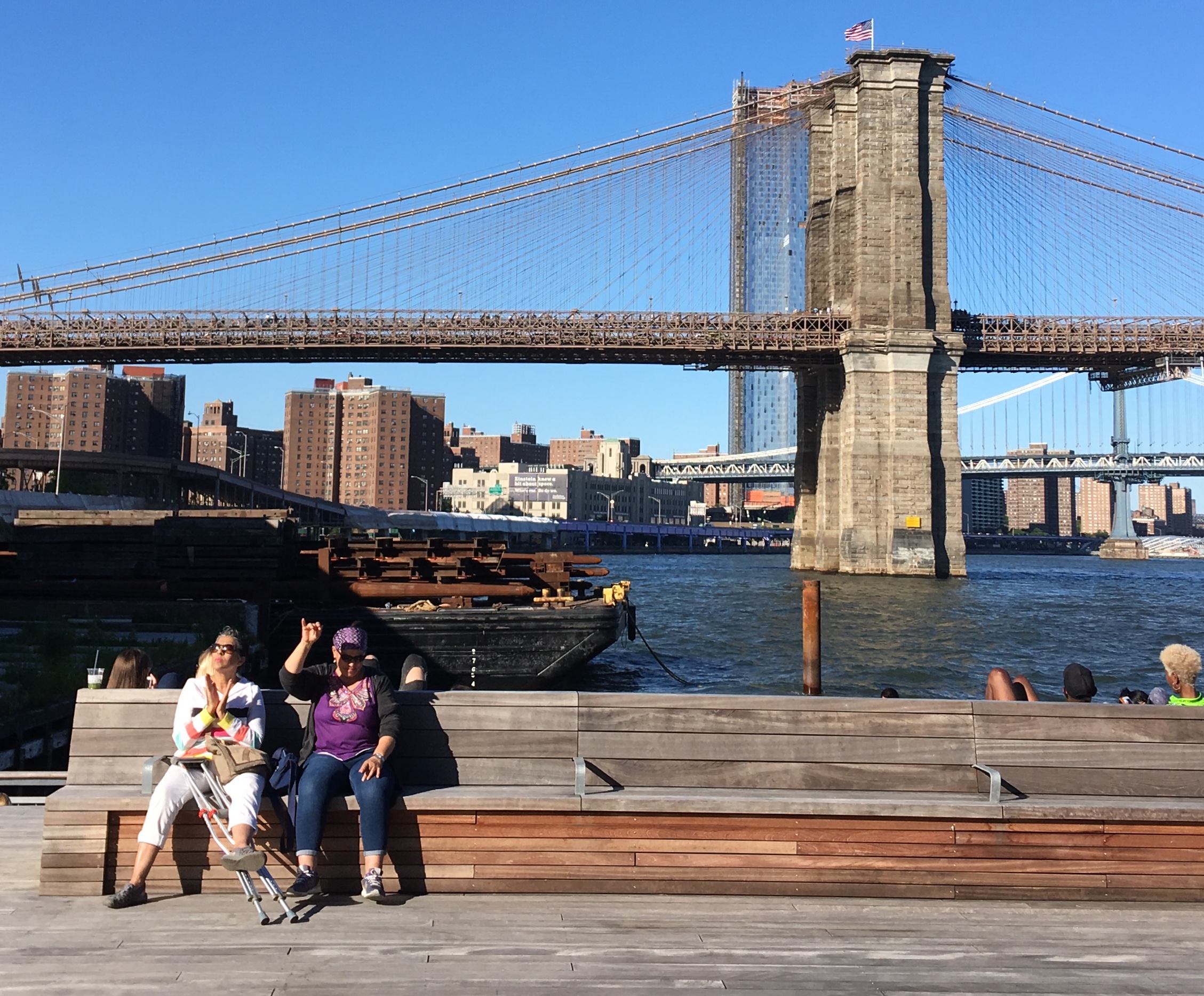
BIG STORIES, LITTLE STORIES
By MICHAEL PERKINS
IT ISN’T THE EASIEST THING, upstaging one of the world’s key postcard views. And yet, in final analysis, people should rank higher, in the photographer’s eye, than the things people build for their use. So it should come as no surprise that, to the patient eye, human-sized scene stealers abound everywhere, big setting or small.
This view of the southern side of the Brooklyn Bridge certainly needs no additional context, and yet, the nearby Pier 17 promenade, repaired and re-imagined as all-new public space near the Fulton Street market region in the aftermath of Hurricane Sandy (and shown here), provides a daily flood of people-watching opportunity. Indeed, almost any other framing along the deck at the moment this shot was taken would show just how much company the ladies seen here actually had on this particular Saturday evening. The word throng definitely applied, with just about any other composition revealing hundreds of singles, couples, and families crowding the Pier’s restaurants, bars, kiosks, tour boats and viewing rails……however, we have decided, for the moment, to concentrate on these two ladies, and the bond of friendship that is more than enough story to power a photograph.
What you can’t hear, and they clearly could, is the incredible music beat being pumped throughout the pier. What you can certainly see is that you don’t have to be standing, or even using your entire body, to dance…to feel….to be one with that beat. In truth, given that the woman at left is sporting a pair of crutches, “dancing” becomes the living embodiment of the motto work what you got, with mere hand claps getting the job done. As for the lady in purple, a single, upraised hand and a bowed head testify, yes, I’m feelin‘ it. They are both sitting, but they are in no way sedentary. It’s on.
And while all this is going on, just like that, the Great Bridge has dropped to second billing. A backdrop. Atmosphere. Which is something that can happen anywhere, but especially here. For as they know all too well on Broadway, on any given night, the understudy can take stage instead of the star.
And steal the show.
THE TEMPORARY COLLECTION
By MICHAEL PERKINS
FOR PHOTOGRAPHERS, MUSEUMS SHOULD NEVER BE A ONE–WAY STREET. The popular conception of the role of our various Hallowed Halls of Important Stuff is that the artifacts do all the sensory sending and we, the visiting public, do all the receiving. The idea prevails that paintings and sculptures and installations impart their wisdom and we passively soak it up, like ambulatory blotters. Thus, this logic must follow, a photographic record of the museum experience should only pointed in one direction.
But of course this is nonsense.
Anywhere you have hundreds of humans assembling in a common area, you have created an active anthropological laboratory, and thus a rich harvesting ground for the camera. A myriad of motives and paths, from “something to do” to a personal thirst for experience to a place to duck in out of the rain, converge as a “temporary collection” mixing with the museum’s’ more permanent ones. All these arrivals, each with their own energy, curiosity, hostility, apathy, fatigue, and joy to deal with, create a kaleidoscopic pattern of intrapersonal intersections and collisions. The eager attendee and the unwilling hostage exist side by side. That creates the unpredictable, and that unpredictability, for the photographer, creates opportunity.
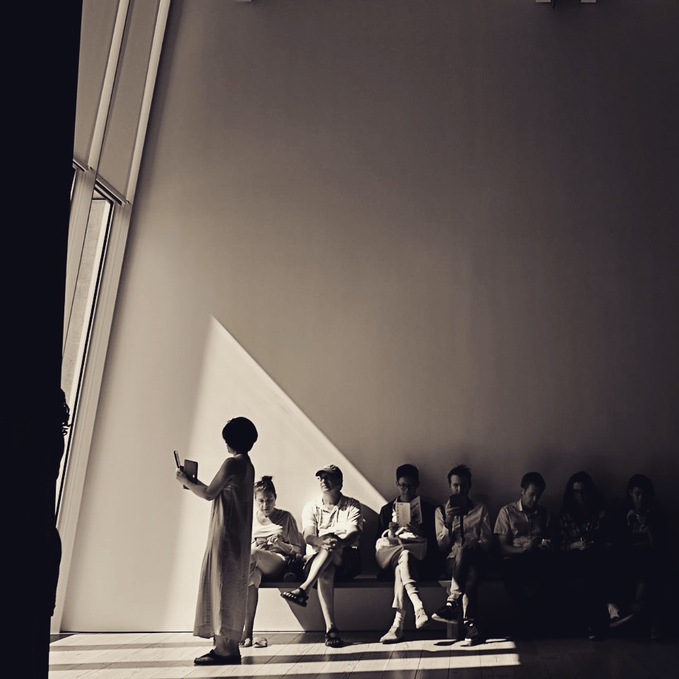
In the image shown here, the “official” delights of the museum in question have failed to amaze, at least for the group occupying the bench. As for the woman peering out the window, she has simply found something with bigger “wow” value than anything hanging on the walls. The sheer dimensions of the space threaten to dwarf the group, to make it seem small or insignificant, and yet their faces and bodies contain a strange mix between tension and ennui that is so wonderfully human that it invites the investigative eye of the shooter.
This shot came to me virtually ready-made, although a later conversion to monochrome eliminated the minor color distractions of various articles of clothing. When a picture is this simple, everything that tends to complicate it becomes expendable. The phrase keep it simple, stupid, may not have originated with photographers, but we ought really to have it tattooed on our foreheads.
I spent nearly two hours in the museum in question (name withheld) and, I assure you, this was one of the most interesting tableaux I observed in the entire joint. It’s not that I find no interest in the arts: quite the opposite. It’s just that, visually, people reacting to the world is more vital to me than just pictures of the world alone. The whole gig is a museum, really, and frequently, the permanent collection of life is thus upstaged by the temporary one. Go figure.

THE SNARE OF CHEAP REWARD
By MICHAEL PERKINS
SOCIAL NETWORKS HAVE PRODUCED TWO PROFOUND EFFECTS in the world of photography, one essentially beneficial, one essentially harmful. Certainly the ease with which photographs are instantly publishable on every conceivable distribution platform is a boon to communication and art. In one sense, every photographer has the potential to have his/her work seen: the world is now a gallery. However, that very same effortless global forum has the potential to flood the world with images that are ill-conceived, trite, lazy, or just plain banal. The world’s shooters are fully woke, for sure, but the world’s editors have joined the ranks of Rip Van Winkle.
Photographers before the web era were hemmed in by more stringent parameters of quality than is typical of the digital age. In professional circles, editors rejected 90% of a shooter’s work to select the small number of shots that would pass through the narrow neck of available publication platforms. At the same time, cost and technical barriers kept the total number of people who could even be photographers artificially low. The result was an exclusive club limited to only the best people and their best work.
As for the amateur market, people’s good and bad personal pictures had no practical publication platform beyond albums, slide trays and shoeboxes. Good and bad pictures alike seldom traveled beyond one’s own inner circle. Now consider the present landscape: no picture needs remain private or unpublished. Taking pictures is cheap, fast, and technically effortless, as is the kick of instant gratification as we click to make our images the world’s instantaneous and universal property. Equally fast counter-clicks deliver the drug of instant approval through reflexive “likes”, keeping us addicted to the entire feedback loop.
However, just making pictures available does not guarantee that anyone will actually see them. In fact, much of what we’e done on social media is create a vast dumping ground for nearly everything we shoot, a belt of data bits girding the earth like an orbiting loop of space garbage. Art is not improved merely through the generation of tonnage. More is usually less, and even our best work may be hidden in plain sight.
The lifelong perfecting of our own seeing eye, along with a fiercely developed and objective editor’s sensibility, is the only thing that can produce great photographs in an age where excellence and mediocrity are rewarded exactly the same. Social media will continue to snare us with the promise of cheap reward regardless of the quality of our work. The only cure for this slouching toward sloppiness is in ourselves. We need to love ourselves a lot less and love true excellence a lot more.
Share this:
September 10, 2018 | Categories: Commentary, editing, Opinion, P.O.V., Uncategorized | Tags: Flickr, Instagram, Social Media | Leave a comment