NOMADS
Animate/Inanimate (2017)
By MICHAEL PERKINS
IN A PARTICULARLY CHILLING SCENE from the classic film The Third Man, Orson Welles, as the story’s amoral profiteer Harry Lime, looks down from a carnival ride to the teeming, tiny throngs on the pavement below, distancing himself from people that have been reduced, in his mind, to mere ‘dots’. ” Tell me”, he asks his friend Holly Martens, “would you really feel any pity if one of those dots stopped moving forever?” Lime has, in fact, been selling tainted medicine to desperate refugees in post-war Berlin, and his product does, almost certainly, make several of those dots stop moving. Forever. Horrible, and yet his estrangement from his fellow wanderers on that sidewalk occurs all the time in all our minds. When we look more carefully, more compassionately, however, photographs can happen.
We are all nomads, wanderers, dots on a map. We convince ourselves that our journey is surely taking us toward something….a very important something. As for everyone else….what? Like Harry Lime, we place great emphasis on our own story, with ourselves cast as the hero. In fact, though, pulling one’s eye just far enough back from the throng can show our camera’s eye the real story. Every journey, every destination is equal….equally vital or equally banal. It’s the process of observing that seeking that creates a tableau, a composition. That, and how we view it.
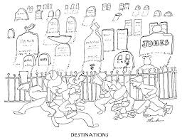
James Thurber, Destinations
I take a lot of images of crowds in motion: streaming in and out of buildings, rushing for trains, teeming through malls, crowding the subway. What they’re after isn’t what gives them the drama. It’s the continuous process of seeking, of going toward all our collective somewheres, that provides the narrative. I don’t try to record faces: these are moving chess boards, not portraits. Additional clinical distance can come from the use of monochrome, or angle of view. Sometimes I think of the overhead camera shots of director Busby Berkeley, he of the kaleidoscopic dance routines in 42nd Street and other ’30’s musicals. The rush of the crowd is all a kind of choreography, intentional and random at the same time.
One of the images that brought this idea home to me as a child was a cartoon James Thurber drew for the New Yorker titled “Destinations”(above left). It shows, simply, a rightward mob rushing toward a leftward mob, with a cemetery in the background. Everyone is headed for the same end point but all act as if they are bound for someplace else. The story for a photographer in all this wandering lies in how we look as we do it. Where we eventually wind up may well be fate’s whim, but the story of all the comings and the goings, of ourselves and our fellow nomads, is in the hands of the camera.
PLANDIDS
By MICHAEL PERKINS
NOWHERE ELSE IN PHOTOGRAPHY does the conflict between mere recording and deliberate interpretation manifest itself more than in the portrait. We love the spontaneity of the unposed snap, with its potential for capturing the innocent, unguarded moment. However, snaps are a random thing, and by nature undisciplined, raw. The control of the studio, with its calculated exposure and modulated light, has its allure as well. It’s not like we want it both ways: no, we definitely want it both ways.
Hence the emergence of the Plandid.
Recent trends on social media have given rise to a new portrait hybrid called the planned candid, or “plandid”, formalized shots that are designed to create the illusion of a spontaneous snap. In fact, people have been faking “happy accidents” like these for as long as there’ve been cameras. What distinguishes plandids from earlier versions of faked reality, however, is that most of them are self-portraits and the majority of them are created primarily on mobiles.
In some ways this was inevitable. Everyone, but everyone has already done the trombone-arm, face-only selfie, the wide-screen lenses on our phone cameras distorting our heads into ovoids and ballooning our noses into sausages. Enter the plandid, which feeds into two dearly held articles of human faith; one, nothing is more worth pointing a camera at than us; and two, the only person who gets us well enough to turn us into something even more fascinating is….wait for it……us.
“Plandids” are a kind of Selfie 2.0.
And thus arrives the age of Selfie 2.0, in which we employ tripods and timers and pull the typical headshot back, to reveal entire bodies, props, and atmosphere. However, doing that much advance prep is way too much like conventional photography, and thus anathema to the hipster within, so the trick becomes faking the look of having “just stumbled upon” a great picture. Huh?
Of course, I’m exactly like the school dietitian who guiltily sneaks fries on the side, because of course I have absolutely hopped into this narcissistic playpen, doing my own plandids with a DSLR for that extra degree of control. Add my own patented, wistful away-from-the-camera look and you get the perfect moment in which I’m caught by some discerning, lucky amateur (me) in a stolen moment of quiet (fake) contemplation.
Diane Arbus once called a photograph a lie that tells you the truth. But there’s something to be said about just flat-out lying, just for fun.
ON THE JOB
Information, Please (2017)
By MICHAEL PERKINS
ONE OF THE MOST EXHAUSTIVE portrait projects in the history of photography was August Sander’s Face Of Our Time, a collection from the 1920’s of sixty formal portraits of German tradesmen of every class and social station, each shown with the tools or uniforms unique to his chosen profession. Sanders photographed his subjects as documents, without any hint of commentary or irony. The story in their pictures was, simply, the visual record of their place in society and, eventually, as cultural bookmarks.
Since Sander’s eloquent, if clinical work, similar photo essays have taken on the same subject with a little more warmth, notably Irving Penn’s Small Trades portrait series from the early 1950’s. Like Sander, however, Penn also shot his images in the controlled environment of the studio. In my own work, I truly feel that it’s important to capture ordinary workers in their native working environment, framed by everything that defines a typical day for them, not merely a few symbolic tools, such as a bricklayer’s trowel or a butcher’s cleaver. I also think such portraits should be unposed candids, with the photographer posing as little distraction as possible.
I really like the formal look of a studio portrait, but it doesn’t lend itself to reportage, as it’s really an artificial construct….a version of reality. So called “worker” portraits need room to breathe, to be un-self-conscious. And, at least for me, that means getting them back on the street.
ON DISPLAY
By MICHAEL PERKINS
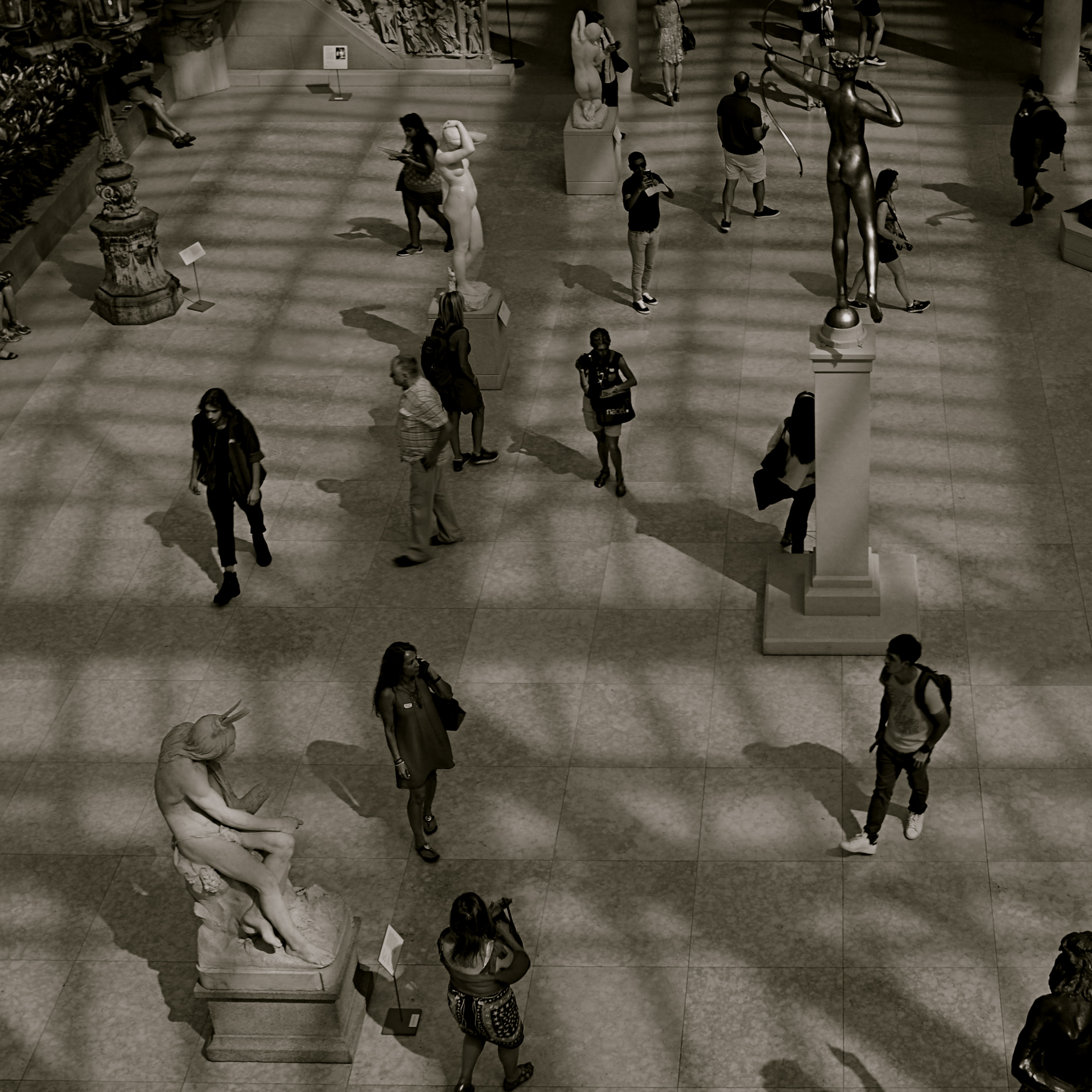
ALTHOUGH MUSEUMS ARE DESIGNED as repositories of history’s greatest stories, I often find that the most compelling narratives within those elegant walls, for the photographer in me, are provided by the visitors rather than the exhibits.
We’ve seen this effect at zoos: sometimes the guy outside the ape house bears a closer resemblance to a gorilla then the occupant within. With the museum experience, making controlled, serene exposures of the artifacts is never as interesting as turning your reporter’s eye on the folks who came in the door. The juxtaposition of all the museum’s starched, arbitrary order with humanity’s marvelously random energy creates a beautifully strange staging site for social interaction….great hunting for street shooters.
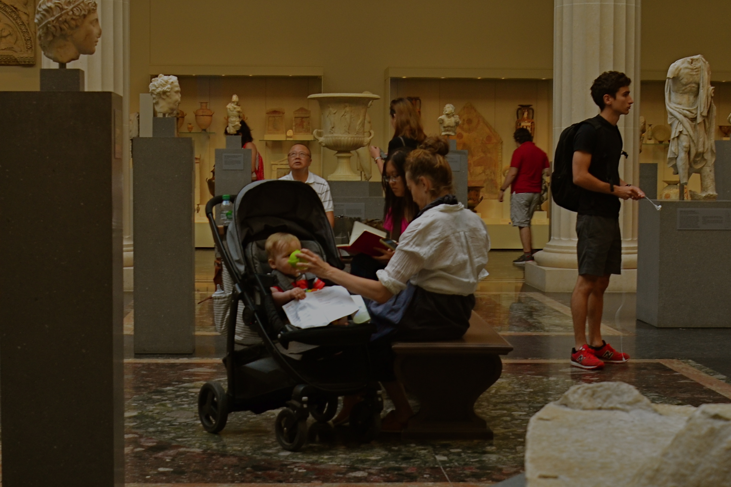
The sculpture gallery shown here, one of the most beautiful rooms in Manhattan’s Metropolitan Museum of Art, is certainly “picturesque”enough all by itself. However when the room is used to frame the chessboard-like weaving of live humans into the pattern of sculpted figures, it can create its own unique visual choreography, including the mother who would love to bottle-bribe her baby long enough to finish just one more chapter.
Anyone who’s visited The Normal Eye over the years recognizes this museum-as-social-laboratory angle is a consistent theme for me. I just love to mash-up big art boxes with the people who visit them. Sometimes all you get is statues. Other times, one kind of “exhibit” feeds off the other, and magic happens.
RIDING THE SLIDER
By MICHAEL PERKINS
ONE OF THE MUST–HAVES during the golden age of component stereo was the graphic equalizer, a panel on the front of many hi-fi receivers that divvied up the audible spectrum into five zones, allowing the discriminating audiophile to create a custom low-midrange-hi mix of frequencies by adjusting each zone’s vertical slider switch. It gave a clear representation of the desired fidelity curve. It was visual. It was visceral. Most importantly, it was cool, man.
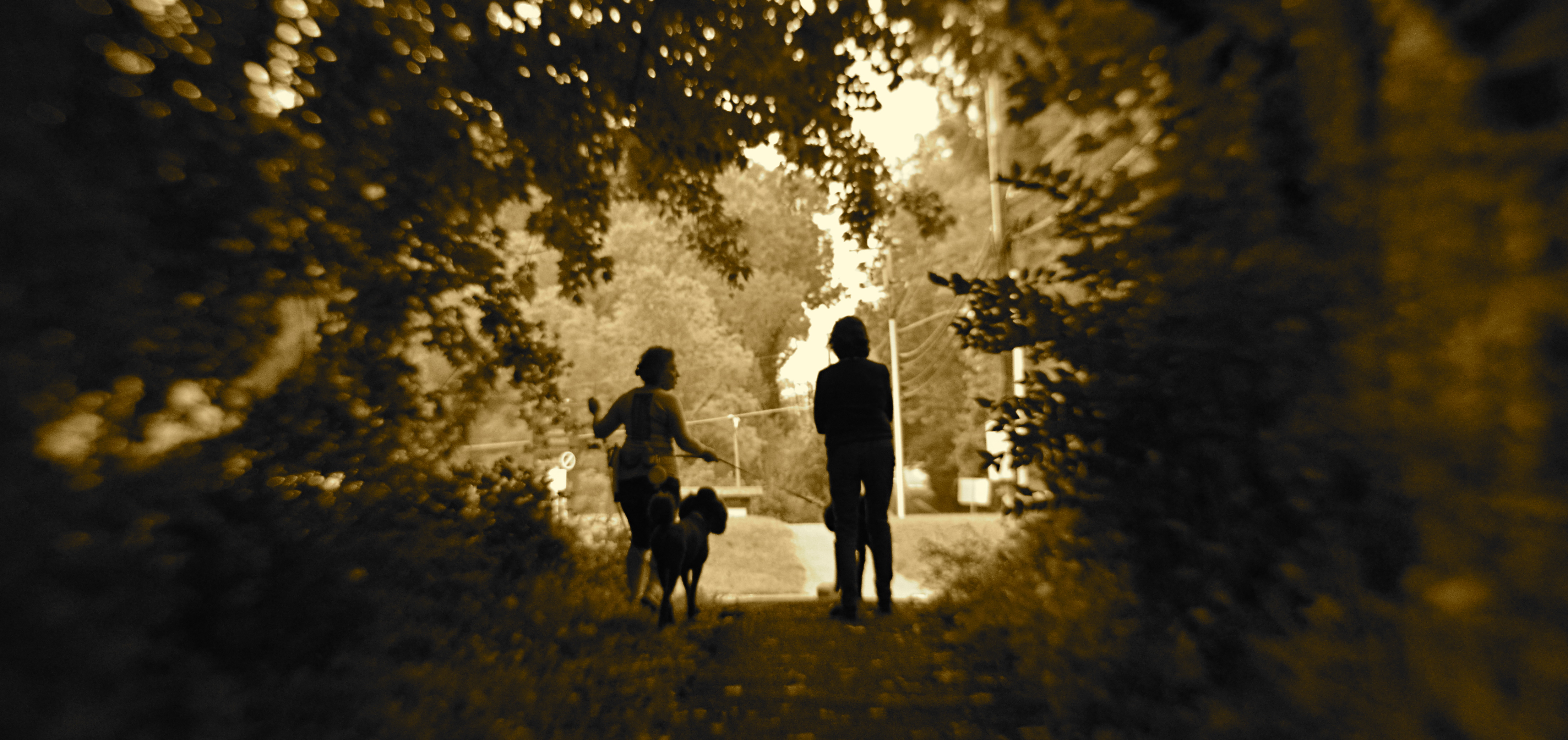
The “slider” is also, for me, a frame of reference for my photography, since it gives me a mental picture of where I’m at along the track from work that’s left-brained (precision-driven, analytical) and right-brained (instinctual, reactive, emotional). The slider almost never travels to either extreme in the making of pictures, but veers closer to one or the other in a custom e.q.’d mix between rational control and total abandon. This is becoming more common with photographers in general than at any time in the past. When it came to crafting an image, we almost always asked about the how of things. Now many more of us also ask about the why.
The above image is illustrative of this balancing act. In walking behind the two women emerging from a forest at the end of their dog walk, I was never going to have a lot of time to formally set up any one shot…..not unless I was willing to interrupt the ladies’ together time, which seemed counter-intuitive at best. Optically, I was shooting with a selective-focus lens, designed to be sharp at the center, then progressively softer at the edges. Additionally, I decided to under-expose both women, eliminating all detail and reducing them to silhouettes. This meant that I had to wait until they were fairly centered in the clearing at the edge of the woods, one of the only reference points I would have for sharp focus, the backlighting of their forms, and any suggestion of depth.
And so you have a shot which is neither all-rational nor all-instinctual but a mixture of the two, the slider’s mid-point between preparation and improvisation. Total adherence to the left brain can produce shots which are technically precise but emotionally sterile. Working too much on the right side can yield pictures that are chaotic or random. Learning to jockey the slider is at least as important a skill as either composition or conception.
GET YOUR MIND RITE
By MICHAEL PERKINS
“REALITY”, THOUGHT TO BE the normal end product of the process of pointing a camera at something, is actually rather limiting. Sure, our little boxes were originally created as an accurate, even scientific means for recording our world.. a method more reliable, somehow, than the imprecision of the painter. Soon afterward, however, the camera longed for a soul of its own, or at least the painter’s freedom to make a subjective choice as to what “real” should look like.
Bottom line: for photographers, mere reality turned out to be, well, kind of a yawner.
To go even further, it seems to me that certain subjects actually call for a kind of unworldly, almost hallucinatory quality, an attempt to make things look not like what they are but how they feel. Of course, we can’t actually show emotions or states of mind, but various photographic techniques can, and should suggest them.

In visualizing ritual, ceremony, sacrament, or tradition, for example, you’re not merely chronicling activity. You’re also photographing mystery, or an extra dimension of consciousness. The above image, in terms of mere reality, is of a class for museum visitors curious to learn bout the Brazilian ritual of capoeira, a traditional fake-fighting martial arts performance that is performed during carnival and other national festivals. Now, you can shoot such a subject “realistically” (evenly lit, uniform focus, sharp detail), or aesthetically (dark, selectively blurred, even a little confusing), depending on what kind of feel you’re going for. This goes to the heart of interpretation. You’re not merely presenting reality: you are representing it.
Photographs originate in the mind, not in the camera, and so it must follow that there are as many “realities” as there are photographers.
LOW INFO AND HIGH NARRATIVE

By MICHAEL PERKINS
YOU DON’T HAVE TO KNOW all the elements of a story to tell it visually. Yes, photography certainly has the technical means to tell a detailed tale, but that narrative need not be spelled out in every particular by the camera.
Indeed, it might be the very information that’s “missing” that may be the most compelling element of a visual story. That is to say, if you don’t know all the facts, make the picture. And if you do have all the facts, maybe leave out a few…. and make the picture anyway.
The above image illustrates this strange mis-match between storytelling and story material. As a shooter, I’m tantalizingly close to the couple at the table next door to me at a plaza restaurant. I mean, I can practically count the salt grains on the lady’s salad. I can also tell, by her male companion’s hand gestures, that a lively conversation is underway. But that is the sum total of what I know. I can’t characterize the discussion. A business planner? A lover’s quarrel? Closing the sale? Sharing some gossip? Completely unknown. Sure, I could strain to pick up a word here or there, but that alone may not be enough to provide any additional context, and, in fact, I don’t need that information to make a picture.
This is what I call “low info, high narrative”, because I don’t require all the facts of this scene to sell the message of the picture, which is conversation. As a matter of fact, my having to leave out part of the image’s backstory might actually broaden the appeal of the final product, since the viewer is now partnering with me to provide his/her version of what that story might be. It’s like my suggesting the face of a witch. By merely using words like ugly or horrible, I’ve placed you in charge of the “look” of the witch. You’ve provided a vital part of the picture.
You won’t always have the luxury of knowing everything about what you’re photographing. And, thankfully, it doesn’t really matter a damn. That’s why we call this process making a picture. We aren’t merely passive recorders, but active, interpretive storytellers. High narrative beats low info every time.
SILHOUETTE SHORTHAND
1/250 sec., f/8, ISO 100, 300mm.
By MICHAEL PERKINS
AS AN OBSESSIVE CHILD, I became crazed with the drawing of short animations on pads of paper known as “flip books.” You know the drill. Draw a picture on the top sheet, turn the page, draw another picture with a small change in position, and repeat several dozen times until you produce a brief cartoon by flipping the entire pad from the front to the back. I actually got pretty good at it, if, by “good” you mean manically addicted to perfection and insanely fixated on detail. I could make three seconds of cinematic grandeur. I just couldn’t do it fast.
Meanwhile, on the other side of the playroom, my sister and her partner, my cousin Mark, had so such problem. While I would spend the better part of a week sweating over the laws of locomotion for such classics as The Mummy Goes Mad or Spider–Man vs The Vulture, Liz and Mark cranked out ten titles a day, crude stick-figure blackouts created in ten-minute surges of creative hysteria, all ending with the unfortunate (and unnamed) hero exploding, then emitting a dialogue balloon with the single, sad existential word “WHY??” While I was doing DeMille parting the Red Sea, they were doing Mack Sennett one-reel wonders, heavy on the pie fights. Fact is, I found their stuff gut-achingly hilarious. There was no disputing which of the two “studios” better understood the entertainment biz.
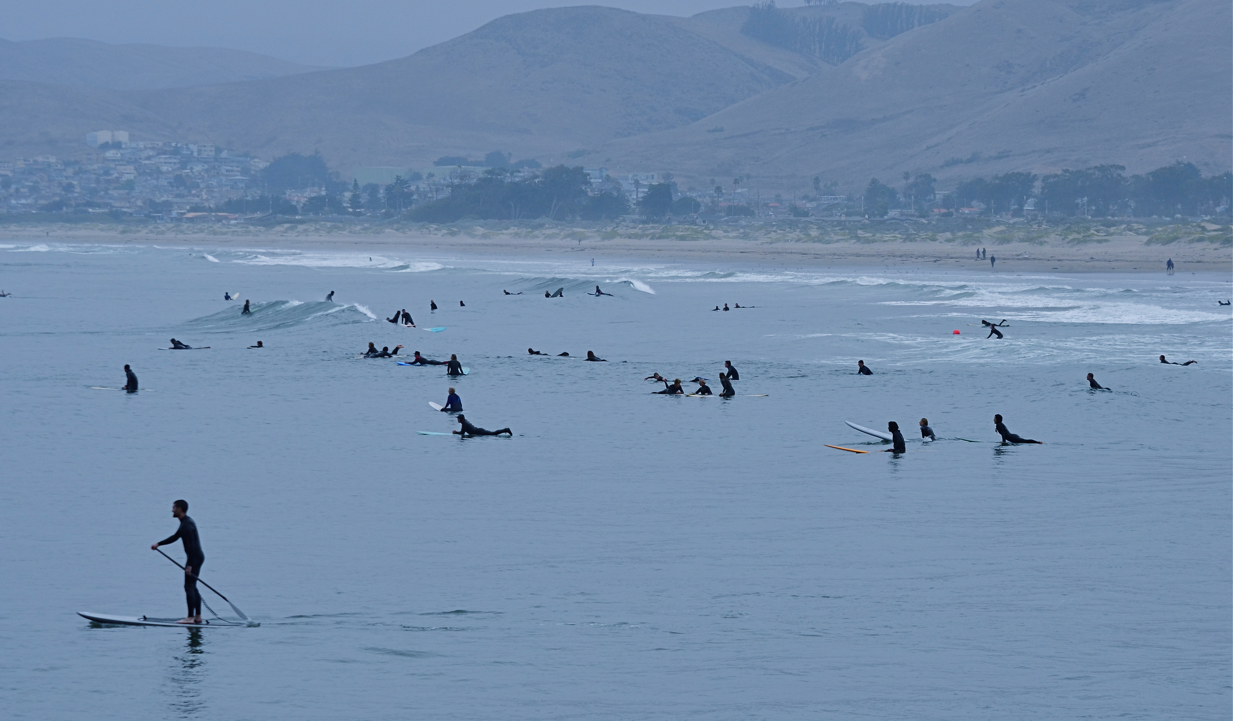
Lizzie and Mark’s stick figures moved every bit as well as my fully-rendered players, but their impact was more immediate. Their drawings didn’t have even a single line that wasn’t absolutely essential to their narratives. I thought of all this recently when working with some distant crowds which were reduced to mere silhouettes in a deep telephoto of the coastline at California’s Morro Bay. As components in a larger composition, they were just markers, measures of linear space. Shooting even closer might have revealed their hair color, lines on their faces or the shine of water on their wet suits, but to what benefit for the overall effectiveness of the picture?
There are many forms of visual shorthand in the making of a photograph, and they can be effective in speeding the journey from the viewer’s eye to his heart. We might think of photography as the complete recording of detail, a piece-for-piece re-play of reality, just as I thought I had to draw every single web line on Spider-Man’s head. However, the most eloquent images often speak louder by using fewer words.
Sometimes, a stick figure is exactly what you need, and no more.
TILES
Carry Out (2017). 1/50 sec., f/4, ISO 640, 24mm.
By MICHAEL PERKINS
EVERY TIME I SEE SOMEONE working on a jigsaw puzzle, I can’t help but think that they’re missing all the fun. The idea of the project is, of course, to assemble enough pieces of a scene that it becomes recognizable. 200 pieces in: some kind of structure. 400 pieces in: looks like it’s made of iron, triangular maybe. 600 pieces in: oh, yeah, the Eiffel Tower!
But, whereas a picture puzzle is solved when the image looks complete enough, my favorite kind of photography centers on how few pieces of the puzzle can be supplied and still have the image communicate to the viewer. Formalists might call this minimalism: art curators might label it cubism: holy men in flowing robes might use the term zen. I just think of it as reducing pictures to the smallest number of components needed to convey ideas.
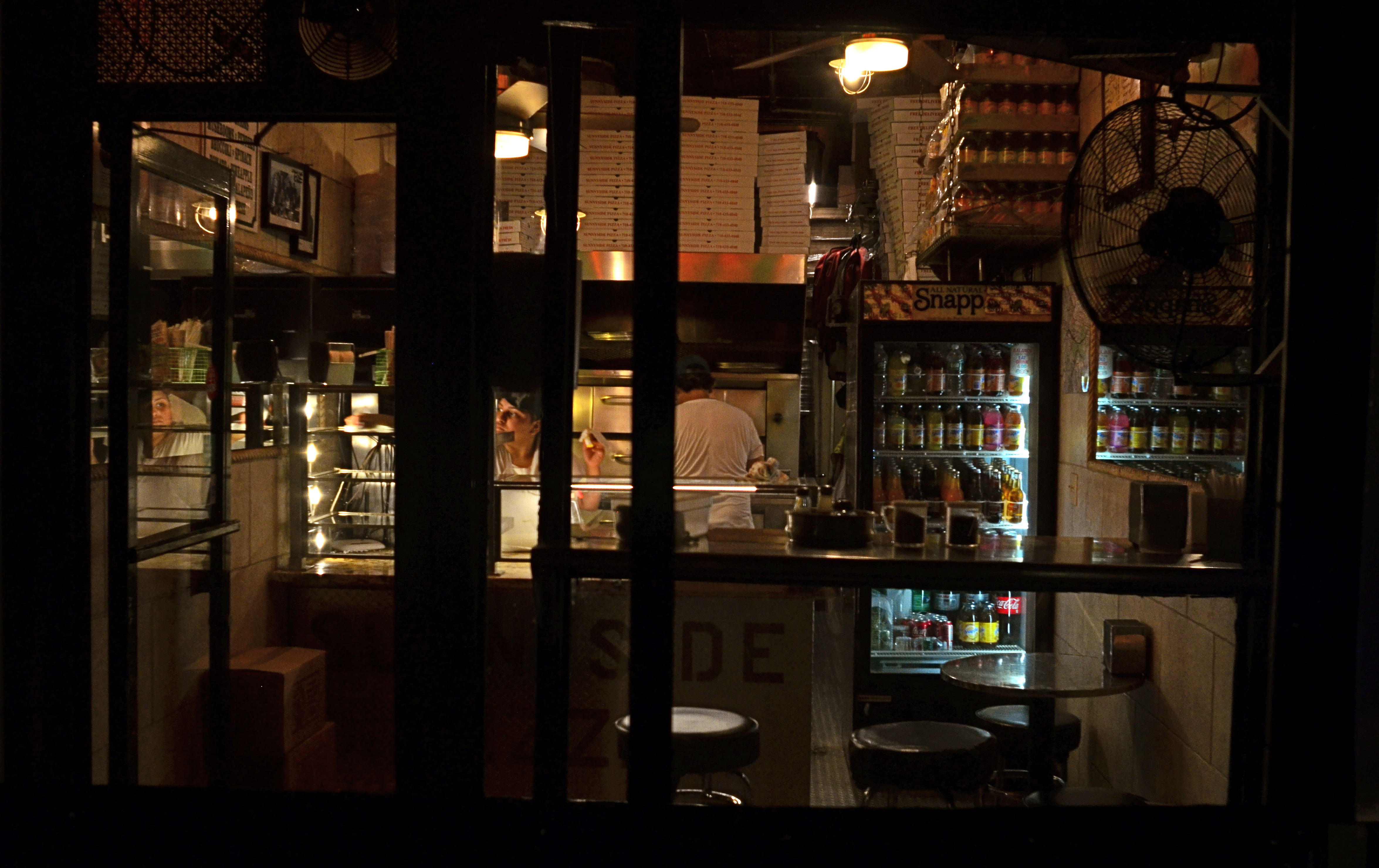
In fact, many photographic subjects actually present themselves in a kind of broken pattern right out of the gate, challenging us to create images from the spotty data they let through. For example, views through partially blocked windows, such as the one at the top of this page, in which what remains readable behind the darkened door and window framings, is more than enough to sell the message pizza shoppe.
For me, having everything spelled out to the Nth degree in a photograph is beyond boring. It’s much more interesting to engage the viewer in a kind of partnership in which he is looking on purpose and I am trying to maximize the power of my pitch, going as far beyond the obvious as I can while not letting the picture fly apart. The first minute I’ve snapped enough pieces into the puzzle to suggest the Eiffel Tower, I’m ready to leave the last 300 pieces in the box.
ONE GLIMPSE OF WAS
1/320 sec., f/5.6, ISO 100, 35mm.
By MICHAEL PERKINS
ONE OF THE EXQUISITE PLEASURES usually denied to even the best portrait photographers is the ability to turn back the clock, to use the camera to x-ray one’s way past a subject’s accumulated life layers, peering into the “them” that was. It’s not really that it’s impossible to retrieve part of a person’s yester-faces. It’s that it’s maddingly elusive, like getting a brief glimpse of a lighthouse beacon amidst billows of pea-soup fog. We have to take faces, for the most part, at, well, face value.
Case in point: meeting my wife, as I did, long after we both had lived fairly complete first lives, I can only know the early visual version of her through other people’s pictures. It allows me to look for parts of those earlier faces whenever I make new images of her, but I can never know when any of them will flash up to the surface. It does happen, but there’s no way to summon it at will.
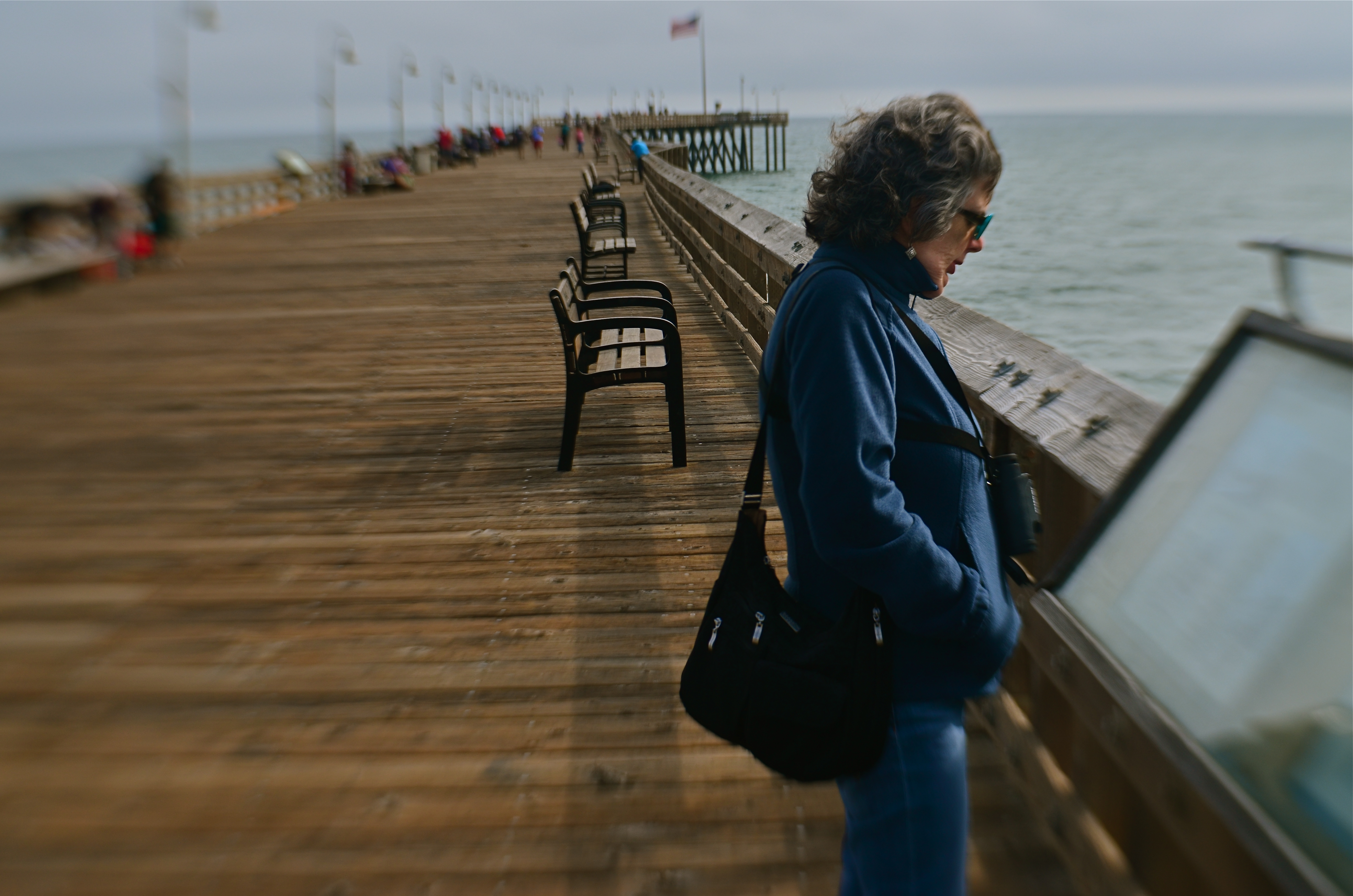
Marian grew up in a beach town, with the seasons and rhythms of shore life defining her own to a degree. As a consequence, I always welcome the chance to shoot her near the sea….along beaches, atop windswept piers, weaving her way through the sights and sounds of boardwalks and harbors.
Of course, restoring Marian to her original context, by itself, is no guarantee that I’ll harvest any greater photographic truth about her face’s formative years than I do on any other day. Still, I find the idea romantic and brimming with tantalizing potential. Will I be given an audience with the ghosts of Marian past today? Will they even show up? The mystery of faces leads photographers on a blind chase, with only the occasional find to convince us to continue the hunt.
OTHER KINDS OF FACES
By MICHAEL PERKINS
AS A SON, I am extremely aware that my parents are in the final innings of their particular ballgame, a journey they began nearly sixty-seven years ago and a pairing that has defined their lives along with those of countless others. And, as a photographer, I have come to realize that every phase of Mother and Dad’s time together has produced its own unique visual treasures and challenges.
The images that are made of them these days….congratulatory parties, miraculous birthdays, mythic anniversaries….are repeats of similar occasions spanning decades, even as they are also emotional re-castings of old roles. Such pictures are both records of what has been and chronicles of what remains. For both Mother and Dad, steps do indeed come slower these days, but memories still move at light speed. Physical age and emotional wisdom conduct an ongoing tug-of-war across all their days. Making photographs of this process is tricky.
I know that, when my camera is too visibly present, it creates discomfort for them. For a variety of reasons that may include merely being over it all, they are not keen on the idea of “sitting for portraits”. I can best respect this by seizing other kinds of moments, in other kinds of ways.
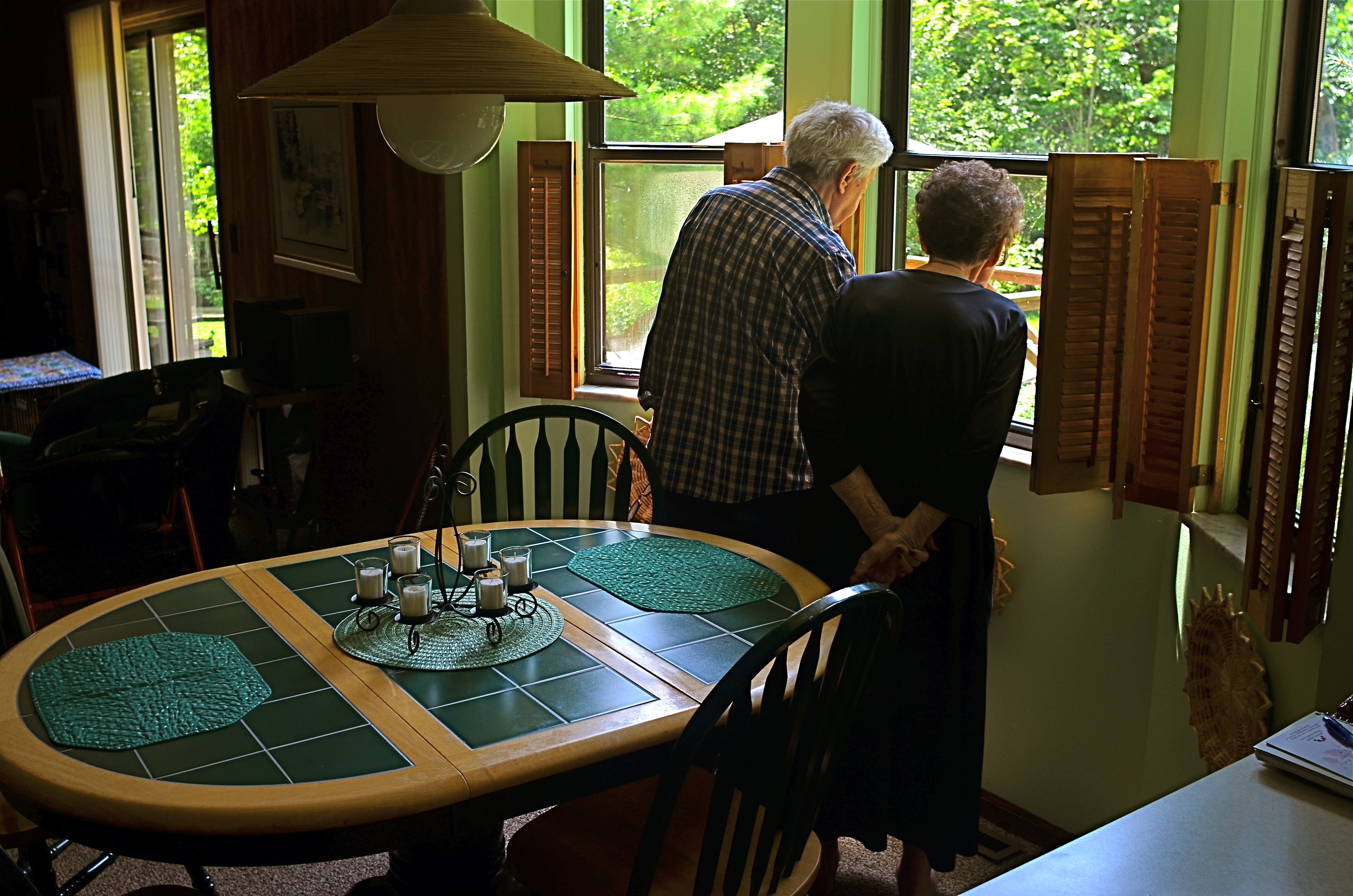
The long–distance newlyweds: Ralph and Jean Perkins, August 2017.
Recently, I caught a very lucky break, when they both went to their kitchen window to look over their beloved back yard, the acre lot resplendent with the tree plantings, deck buildings, and family events they’ve staged in it over more than a third of a century. Certainly, I don’t always instantly comprehend the value of a shot in the moment, but this one was obvious enough for even me.
There, in the moment, was the entire marriage in miniature: two people seeking, dreaming, discovering in tandem. No shy faces or self-conscious “say cheese” moments were needed to photograph their twinned hopes, their linked optimism. You can’t see their features, but these two people are unmistakably my parents.
Faces are remarkable documents, but they aren’t the only ones available to a photographer. That’s because there are a million tiny ways for humans to visually register emotional truth, a universe full of little grace moves that, singly or collectively, convey identity. My parents, like everyone’s, are eloquent, even when they do not stare into the camera to make their testimony.
SPEED OF LIFE
By MICHAEL PERKINS
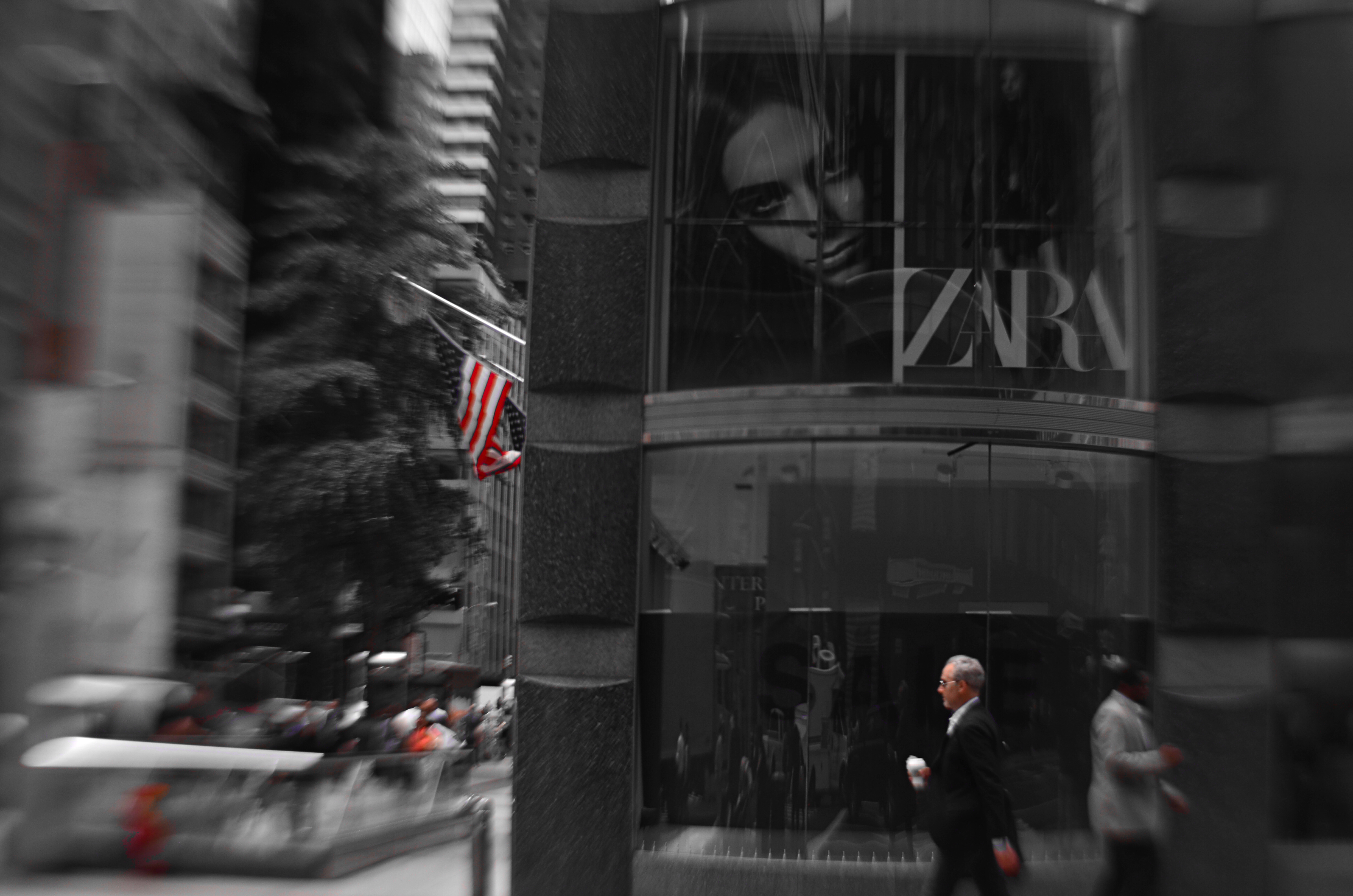
NEW YORK CITY HAS BEEN CALLED MANY THINGS: words like titanic, exciting, merciless, dizzying, dangerous, even magical spring to mind immediately. By comparison, fewer observers refer to the metropolis with words like peaceful, tranquil, or contemplative, and fewer still would ever label it slow. Manhattan may be lacking for modern subways, open space, or a cheap cup of coffee, but it’s never short on speed.
NYC runs on velocity the way other towns run on electricity: the entire metro is one big panicky White Rabbit, glancing at his pocket watch and screeching “I’m late!” As a consequence, anyone making photographs in the Apple has to factor in all that velocity, or, more precisely, decide how (or whether) to depict it.
Do you try, for example, to arrest the city’s rhythm in flight, freezing crucial moments as if trapping a fly in amber, or, as in the image above, do you actively engage the speed, creating the sensation of New York’s irresistible forward surge as a visual effect?
Fortunately, there is more than a century of archival evidence that both approaches have their own specific power. Pictures made in the precise instant before something occurs are rife with potential. Images that show things in the process of happening convey a sense of excitement and immediacy. Like the lanes in a foot race, speed has discrete channels that can reward varying photographic approaches.
NOTHING AT FACE VALUE

By MICHAEL PERKINS
SOMETIMES I THINK THAT PHOTOGRAPHERS, especially beginners, needlessly hem themselves in by “pre-editing” their work. Being human, we all care, to some degree, about how our images “play” to various viewers, and so it’s understandable that we can be scared away from attempting certain things that are too jarring or disorienting to our intended audiences. We work to hard to avoid the attachment of certain labels to our pictures.
The “a” word, “abstract”, is one such label. It’s a scare word. And it can spook us out of truly innovative image-making.
Sure, we may know that, strictly speaking, abstraction really just means extraction, pulling a visual shorthand of essence out of a more complex subject. Rather than merely recording the full detail of an object in a photograph, the abstract photographer reduces it to its most effective basics. A baseball loses its stitches and writing and becomes just a sphere. Abstraction can also yank something out of its familiar context, forcing the viewer to regard it on its own merits, so that an entire salad is reduced to the sensual curvature of one section of a single vegetable.
Okay, so that’s what we know about abstraction. However, what we feel, even about just the word, can cow us into conformity. We fear being called “artsy”, avant-grade, pretentious. And we gradually adjust our images to reflect what others regard as “real”. It’s tough: learning to trust your own vision is the single hardest lesson in any art. But what’s the alternative? Cranking out the same systematic execution of a flower for the next forty years just to curry favor with the mob?
If you observe an orchid (like the one above), and see, not merely a flower, but a winged creature taking flight, why not take the extra step and reclaim the “realness” of that object for your own purpose? The camera is an interpretative tool, not a video recorder.
Anytime we are tempted to restrict our pictures to what the world at large regards as “real”, we should listen for abstraction’s quiet but persistent question. “Real” according to whom?
EYE OF THE BEHOLDER
By MICHAEL PERKINS
PHOTOGRAPHERS TRY TO IDENTIFY the so-called “eternal” verities of life, the common elements of experience that are unchanging over time. We all find our way to sunsets, shores, the mysteries of the human face, the course of light. But how about the more subjective “truths”, those purely emotional facts which may wax and wane with passing fancy?
Can we say, visually, what beauty is, or for that matter, what the depiction of humor, truth, or other subjective values should look like? Pictures of anything that is governed by fashion or fad will find themselves shredded by the same temporal process that makes Grandpa’s handlebar moustache seem ridiculous rather than rakish and makes the miniskirt a measure of folly instead of hipness.
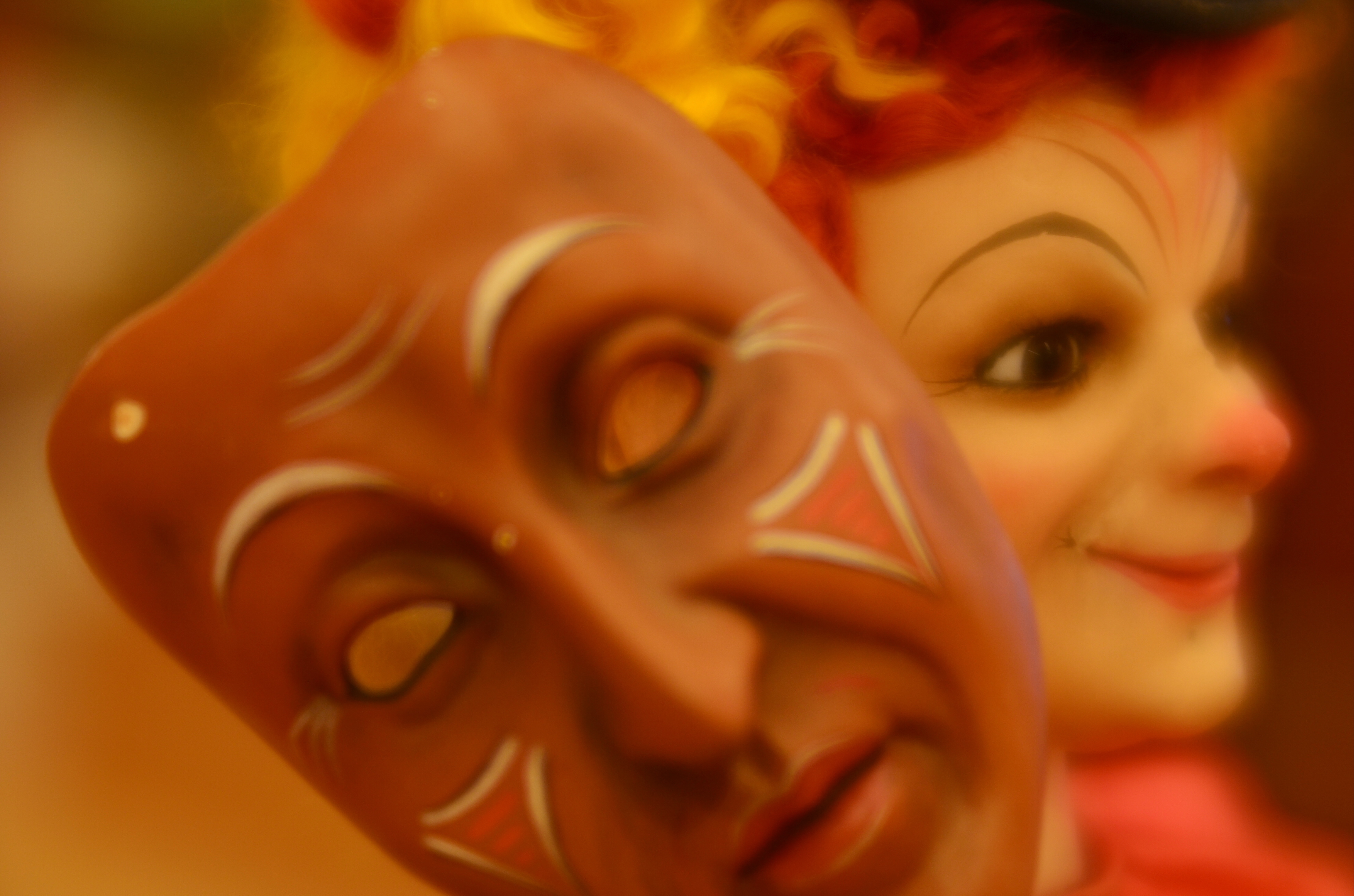
Consider something as personal as a toy. In one era, its features are comical and cute, whereas, a few decades later, they might register as, well, creepy. As a case in point, the image seen above is of a 19th-century automaton, a mechanized dancing musical doll called “The Mask Vendor”. The grinning harlequin on the right is the vendor, and the visage at left is one of his wares, which range in expression from foolish to demonic. Good times, eh? Oh, look at this jolly prankster selling “counterfeits” of faces! What rascally fun!
I can tell you, as a tour guide in the museum that “the Vendor” calls home, that he is regarded with horror, not joy, and that the feeling he projects on young visitors is one of dread, not mischief (one Hispanic tour guest, a seven-year-old, referred to him, shakily, as “el Diablo!”). So how to make a picture of such an oddity?
As a photographer, I’m in an odd place here. I have enough historic knowledge to know that the doll was originally associated with gaiety, and yet I live in a time in which its message of fun has long since been twisted and corrupted to suggest something dark…..so much so that any image I make of it, as filtered through current-day sensitivities, must shift between both “realities”. I am thus free to add as much irony or ghoulishness as I choose, like the veneer of haze I added to accentuate the dreariness/nightmarishness of the thing. Nothing is over the top.
Even when we snap something as eternal as a sunrise, we may unconsciously be adding some additional layer of ourselves as a similarly hazy veneer. But how can it be helped? Unlike the Vendor, we’re only human. Brrrrrr.
IRVING’S CURTAIN
By MICHAEL PERKINS
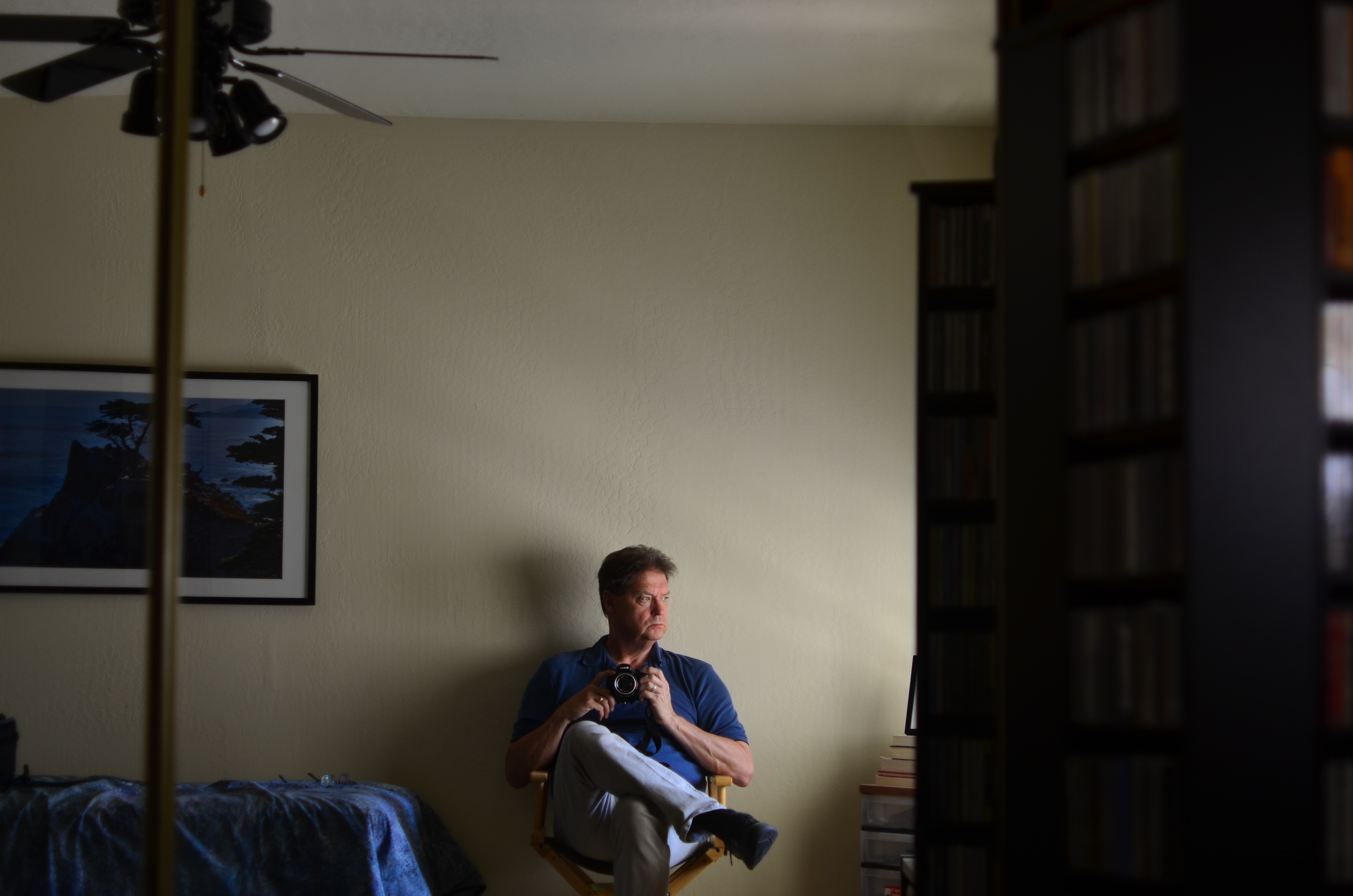
BY THE TIME IRVING PENN (1917–2008) WAS ESTABLISHED as a portraitist without equal for Vogue magazine, he had chalked off clear parameters for his style. Natural over artificial light: large format, high-resolution monochromes: a patient talent for extracting the essence of even the most reluctant subject: and an almost lucky-charm devotion to the worn and stained curtain he would use, almost exclusively, as his backdrop for the length and breadth of his legendary career.
Salvaging the curtain from a Paris theatre in 1950, Penn used it as the great equalizer in all his portrait work, staging everything from Picasso’s puckish gaze to Audrey Hepburn’s gamine charm in front of its collection of stains, spills and discolorations. The curtain was as essential to a Penn shoot as the great man’s lenses, and where he went, from remote African villages to literary salons, it went also. And finally, eight years after his death, it traveled one more time to New York, for a supporting role in an Instagram near you.

As part of the Metropolitan Museum Of Art’s centennial celebration of Penn’s work for 2017, the curtain was installed in a room chocked with shots of the famous people with which it had co-starred. Studio-style, it was mounted on a curved panel to avoid hot spots from glare, and visitors were invited to pose themselves in front of it, fore-lit by a well-placed fashion light. The message was seductively mis-leading. If the cloth is magic, maybe it’s transferable! Maybe it is that black crow’s feather that makes Dumbo fly…..
The Met’s true genius in installing this Penn-it-yourself feature in its exhibit became obvious once you took the bait. That is, there’s nothing better to teach you that his work was great than allowing you to take very bad pictures under some of the same circumstances. I certainly got the point after clicking off a seriously flawed candid of my wife, seen here. I mean, other than blowing the focus, the metering, and the placement of light and shadow, the shot’s perfect, right?
Of course, the Penn curtain challenge had a kind of theme-park appeal, sort of like when you stick your face through a hole in the back of a cartoon cutout at Coney Island to have your picture taken as a “strongman”…and just about as convincing. Because art isn’t gear: genius isn’t mere tools. And you can’t be Rembrandt just by picking up Rembrandt’s brush.
RE-PURPOSING INFORMATION
 By MICHAEL PERKINS
SIGNS ARE PRIMARILY SOURCES OF INFORMATION AND IDENTIFICATION, a utilitarian way of learning who’s who and what’s where. In photography, their primary use can move beyond those roles to become commentary, context, atmosphere, even pure abstract subject matter. As shooters, we all use signs in ways that are not strictly literal but are 100% visual. They are powerful tools.
This is a circular way of saying that, in an image, a sign is never just a sign, but a way of indicating and qualifying place, time, mood. Be it a hand-scrawled “keep out” warning outside a busted farmhouse or a day-glo neon “open” greeting outside a pawn shop, a sign is valuable narrative shorthand. Of course, just like human storytellers, some signs are untrustworthy narrators, undermining what they seem to “say” with the things they imply within an image. Managing their messaging then becomes the responsibility of the photographer, who can use their content to reveal, conceal, or comment as needed.
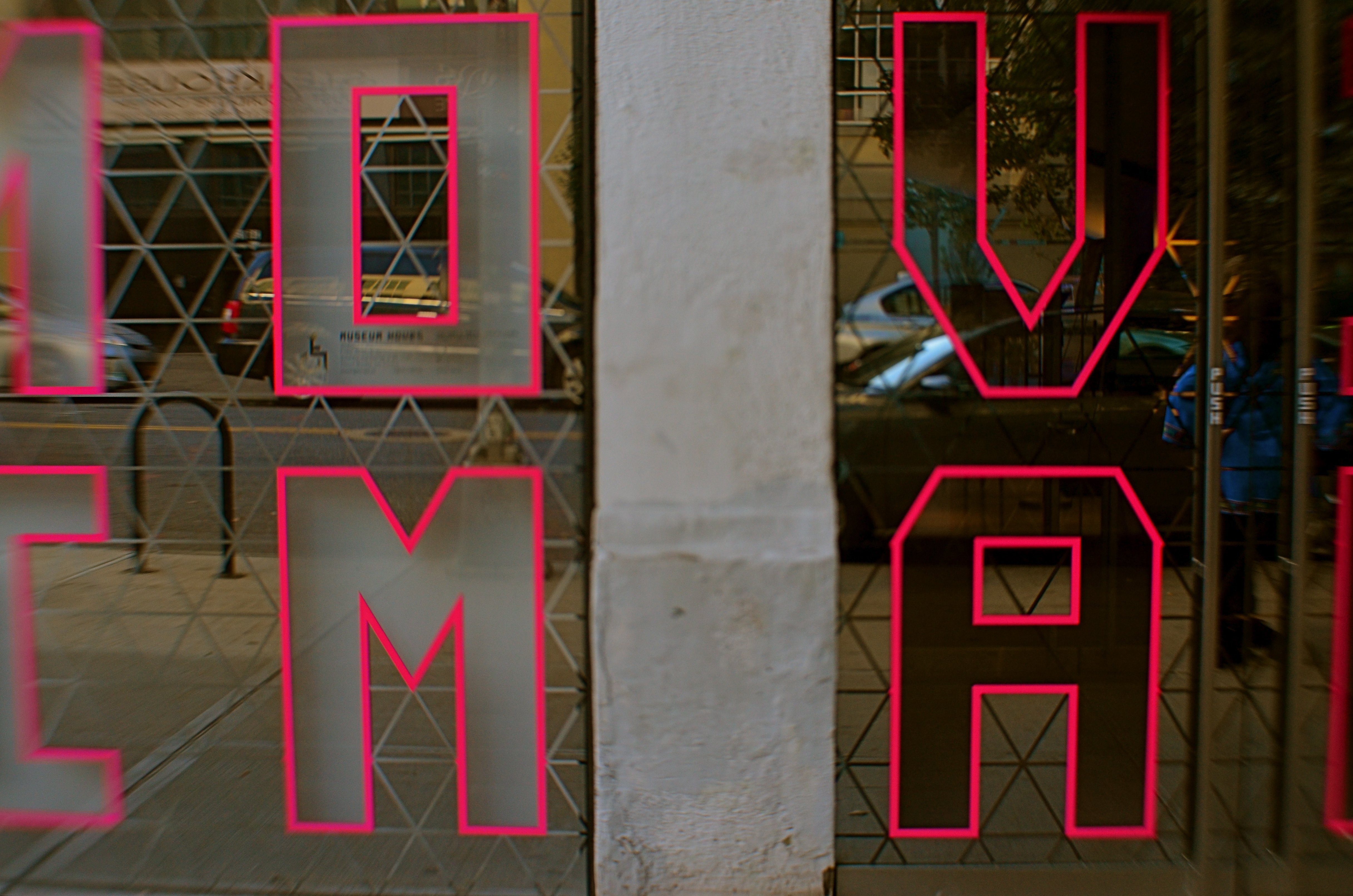
The sign seen here, announcing the Museum Of The Moving Image in Astoria,Queens, has its letters mounted on a mirror-like surface, allowing the viewer to see evolving street life over his shoulder as he “reads” the characters. It’s both advertisement and illustration, a low-tech demo of the museum’s intent. Like all signs, it’s a prop, a piece of stage dressing, interpreted as narrowly or broadly as you need it to be.
TWO WORLDS, ONE WALL

By MICHAEL PERKINS
PHOTOGRAPHS BEGAN AS A SIMPLE HEAD–ON ENGAGEMENT. The viewpoint of the camera was essentially that of an audience member viewing a stage play, or reading a page of text, with all visual information reading from left to right. People stood in front of the lens in one flat plane, giving the appearance, as they posed before offices or stores, that they themselves were components in a two-dimensional painting. Everyone stared straight ahead as if in military formation or a class portrait, producing fairly stiff results.
We started photography by placing people in front of walls, then learned, like good stage managers, that selectively positioning or moving those walls could help image-makers manage the techniques of conceal/reveal. Now you see it, now you don’t. Photography no longer takes place in one plane: barriers shift to show this, or to hide that. They are part of the system of composition. Control of viewing angle does this most efficiently, as in the above image, where just standing in the right place lets me view both the front and back activities of the restaurant at the same time.
Of course, generations after the rigid formality of photography’s first framing so, we do this unconsciously. Adjusting where walls occur to help amplify our pictures’ narratives just seems instinctive. However, it can be helpful to pull back from these automatic processes from time to time, to understand why we use them, the better to keep honing our ability to direct the viewer’s eye and control the story.
FAKING YESTERDAY (AND LOVING IT)
By MICHAEL PERKINS
PHOTOGRAPHS ARE POWERFUL ALLIES when it comes to wish fulfillment. One of the medium’s first great artists, Julia Margaret Cameron (1815-1879) not only preserved the faces of Charles Darwin, Alfred Lord Tennyson and Robert Browning for posterity, but also went the extra step into fantasy by draping her subjects in historical costumes and posing them in illustrations from Shakespeare and Arthurian legend. Her stars masqueraded as legends, their features made dreamy and ethereal with her soft, long exposures on collodion-coated glass plates.
Everyone deserves at least one such photo fantasy, the chance to effectively leap into a treasured era while also creating the look that would have been common in that time. For a kid in baby-boom Ohio, daydreaming about standing up in front of a world-class orchestra, a kid who never played air guitar but who exhausted himself playing “air baton”, my photographic era of choice was that of Columbia Masterworks’ 30th Street recording studio in the Manhattan of the early 1960’s.
At the insistence of the label’s classical producer Goddard Lieberson, chief photographer Don Hunstein shot the greats not in starched, formal portraits, but in the very act of creation, immortalizing maestros from Leonard Bernstein and Pierre Boulez to George Szell and Igor Stravinsky. In terms of the “feel” of the images, most photo illustrations for album jackets from the period were still in black-and-white, lending Hunstein’s shots a gritty realism, as did the slower, higher-grain film emulsions and softer portrait lenses of the time.
Enter my self-generated conductor fantasy, shooting myself with a remote shutter release in a nearly dark room, just about half an hour after sunset at 1/40 of a second to allow me to hold a fake “caught in the action” pose with just a small amount of manually tweaked de-focusing for softness at f/4 and an ISO of 1250 to simulate the old Kodak Tri-X grain.
Vain beyond belief? You bet. More fun than my five best Halloweens combined? Indeed. “Alright everyone. Let’s take it from bar 124…”
WHEN COLOR IS ALL

By MICHAEL PERKINS
JUST A LITTLE SCROLL STROLL THROUGH GOOGLE will show just how long and how intensely the debate over color has raged in the photographic world……that is to say, whether color should be used at all, or whether, indeed, it was the spawn of Satan, turning the art of imaging into a crude carnival trick. Today, we routinely concede that both monochrome and color have distinct uses in the making of images, each bringing singular strengths to the process. But it was not that long ago that the two camps went at it like Hatfields and McCoys.
Many still feel that color should only be called on to help complete or “sell” a picture, a finishing touch of sorts. “In black and white you suggest”, wrote Paul Outerbridge in Modern Photography. “In color, you state.” Others, like myself, believe that there are times when color is content, complete in itself, regardless of the “official” subject of the image. Or, as Alex Webb writes, “Color is very much about atmosphere and emotion and the feel of a place.”

The photos seen here show how, if color is a compelling enough messenger, most of the visual information in a picture can be pared away to let that color message breathe. The master shot of a street vendor at sundown (seen at directly above) might have worked out if I had done one or two things better, but upon later examination, I realized that the long horizontal string of neon-hued ukuleles at the top of the shot could work if cropped loose from the less effective uber-shot (as seen at top). Better still, the color in the cropped shot is not actually about “ukuleles”, since a string of tropical fruits or a rack of hats with the same tonal palette would sell the image just as well. This is truly a case of color “just because”, conveying Alex Webb’s “emotion and feel” without assistance.
A lot of the photo world’s resistance to color, which ended barely more than a generation ago, stemmed in part from a loathing for the limited printing processes which made it harder to predict or control results compared to monochrome. But there was also the fear that untalented shooters would use it as a sensational crutch to boost mediocre work. Now it seems clear that color, like any other technical element, lives or dies based on what it is called upon to do, and how well the individual artist makes his argument.

ALONE OR LONELY?
By MICHAEL PERKINS
NO TWO ARTISTS view the human condition of solitude in quite the same way. In photography, there are scores of shades between alone and lonely, between the peace of private reflection and the terror of banishment, shades which define their images as everything from comforting to terrifying. Thoreau hangs out solo in the woods and finds fulfillment. Hansel and Gretel, stranded in the forest, feel only dread.
Alone again…..naturally?
The argument might be made that modern society at large fears solitude, that there is nothing more horrific than being alone left with one’s self. And, if that is your viewpoint, then that will eventually be reflected in how you depict people in isolation. Conversely, if you see “being apart” as an opportunity for self-discovery, then your photographs will show that, as well. You can’t “sit out” commenting on a fundamental part of the human condition. Some part of your own outlook will be stamped onto your photography.
That’s not to say that you can’t shade your “alone” work with layers of mystery, even some playfulness. Is the young woman shown here glad to be away from the crowd, or does she feel banished? Is her physical attitude one of relaxation or despair? The photographer need not spell everything out in bold strokes, and can even conspire to trick or confound the viewer as to his true feelings.
To make things even trickier, images can also convey the feeling of being alone in a crowd, lonely in a crushing multitude. That’s when the pictures get really complicated. With any luck, that is.
Share this:
September 18, 2017 | Categories: America, Commentary, Conception, Interpretation | Tags: Urban Photography, Viewpoint | Leave a comment