HOLDING BACK
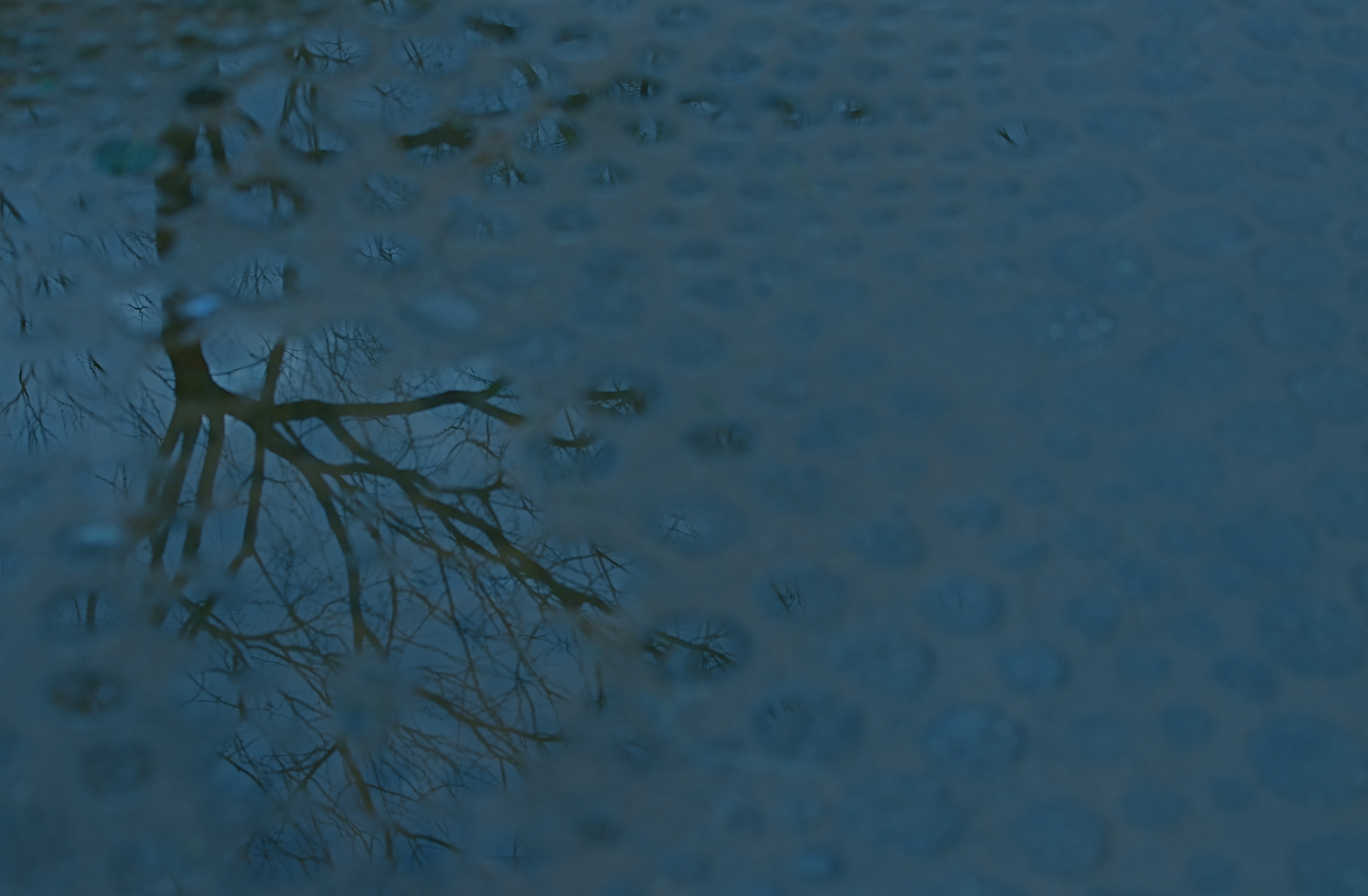
Rainy day dream away: 1/160 sec., f/4.5, ISO 100, 35mm.
By MICHAEL PERKINS
THE MIND WANTS TO PAINT ITS OWN PICTURES, and often responds better to art that veils at least part of its message in mystery. The old vaudeville adage, “always leave them wanting something” is especially applicable in the visual arts, where, often as not, the less you show, the better it connects with the viewing public. It’s precisely because you didn’t show everything that your work may reach deeper into people’s imaginations, which are then invited to “partner” in providing what you merely suggested.
This is why radio created more personal “pictures” than television, why an abstract suggestion of on-screen romance is more erotic than full-on depiction of every physical mechanic of an encounter, and why, occasionally, deciding to hold back, to withhold “full disclosure” can create an image that is more compelling because its audience must help build it.
Given the choice between direct depiction of an object and referential representation of it in a reflection or pool of water, I am tempted to go with the latter, since (as is the stated goal of this blog) it allows me to move from taking a picture to making one. Rendering a picture of a tree is basically a recording function. Framing a small part of it is abstraction, thus an interpretive choice. And, as you see above, showing fragments of the tree in a mosaic of scattered puddles gives the viewer a chance to supply the remainder of the image, or accept the pattern completely on its own merits. Everyone can wade in at a level they find comfortable.
I don’t always get what I’m going for with these kind of images, but I find that making the attempt is one of the only ways I can flex my muscles, and ask more of the viewer.
It’s the kind of partnership that makes everything worthwhile.
(follow Michael Perkins on Twitter @mpnormaleye)
Check out the excellent minds of our newest followers:
http://www.en.gravatar.com/insideoutbacktofront
A TALE OF TWO KINGS

A determined Martin Luther King, Jr. stares forward into the future at the newly dedicated MLK Memorial on Washington’s National Mall. Fusion of three exposures, all with an aperture of f/5.6, all ISO 100, all 48mm. The shutter speeds, due to the high tones in the white statue, are 1/200, 1/320, and 1/500 sec.
By MICHAEL PERKINS
DEATH PERMANENTLY RENDERS REAL HUMAN BEINGS INTO ABSTRACTIONS. With every photo, formerly every painting, drawing, or statue of a renowned person, some select elements of an actual face are rearranged into an approximation, a rendering of that person. Not the entire man or woman, but an effect, a simulation. The old chestnut that a certain image doesn’t do somebody “justice”, or the mourner’s statement that the body in the casket doesn’t “look like” Uncle Fred are examples of this strange phenomenon.
Nothing amplifies that abstraction like having your image “officially” interpreted or commemorated after death, and, in the case of the very public Dr. Martin Luther King Jr., Washington’s National Mall offers two decidedly contrasting ways of “seeing” the civil rights pioneer. One is more or less a tourist destination, while the other is muted, nearly invisible amongst the splendors of the U.S. Capitol. Both offer a distinct point of view, and both are, in a way, incomplete without the other.
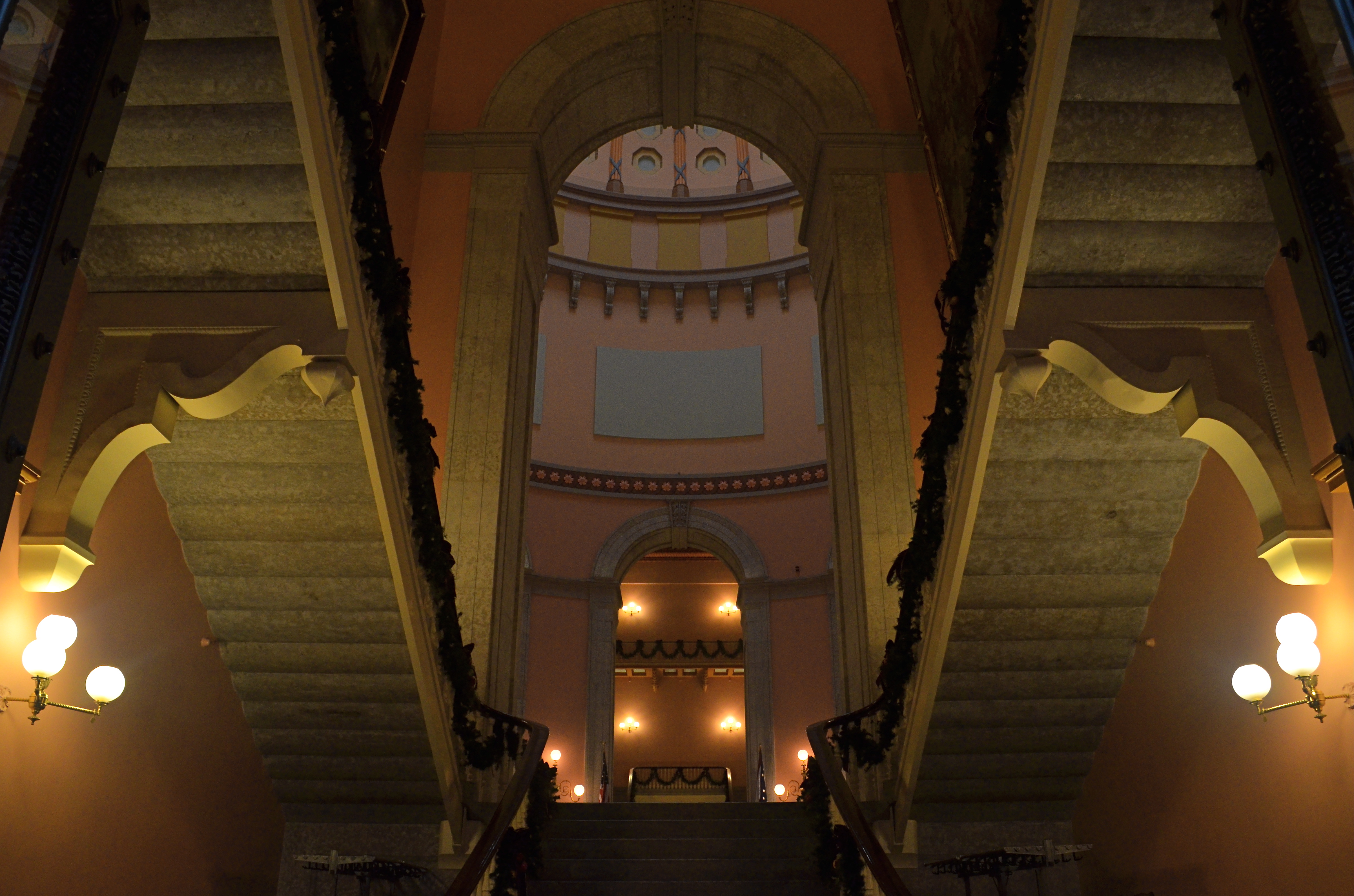
The official MLK memorial, opened in 2011 as one of the newest additions to the Mall, stands at the edge of the Tidal Basin, directly across a brief expanse of water from the Jefferson Memorial. Its main feature shows a determined, visionary King, a titanic figure seeming to sprout from a huge slab of solid stone, as if, in the words of the monument, “detaching a stone of hope from a mountain of despair”. Arms folded, eyes fixed on a point some distance hence, he is calm, confident, and resolute. This gleaming white sculpture’s full details can best be captured with several bracketed exposures (fast shutter speeds) blended to highlight the grain and texture of the stone, but such a process abstract’s King even further into something out of history, majestic but idealized, removed.
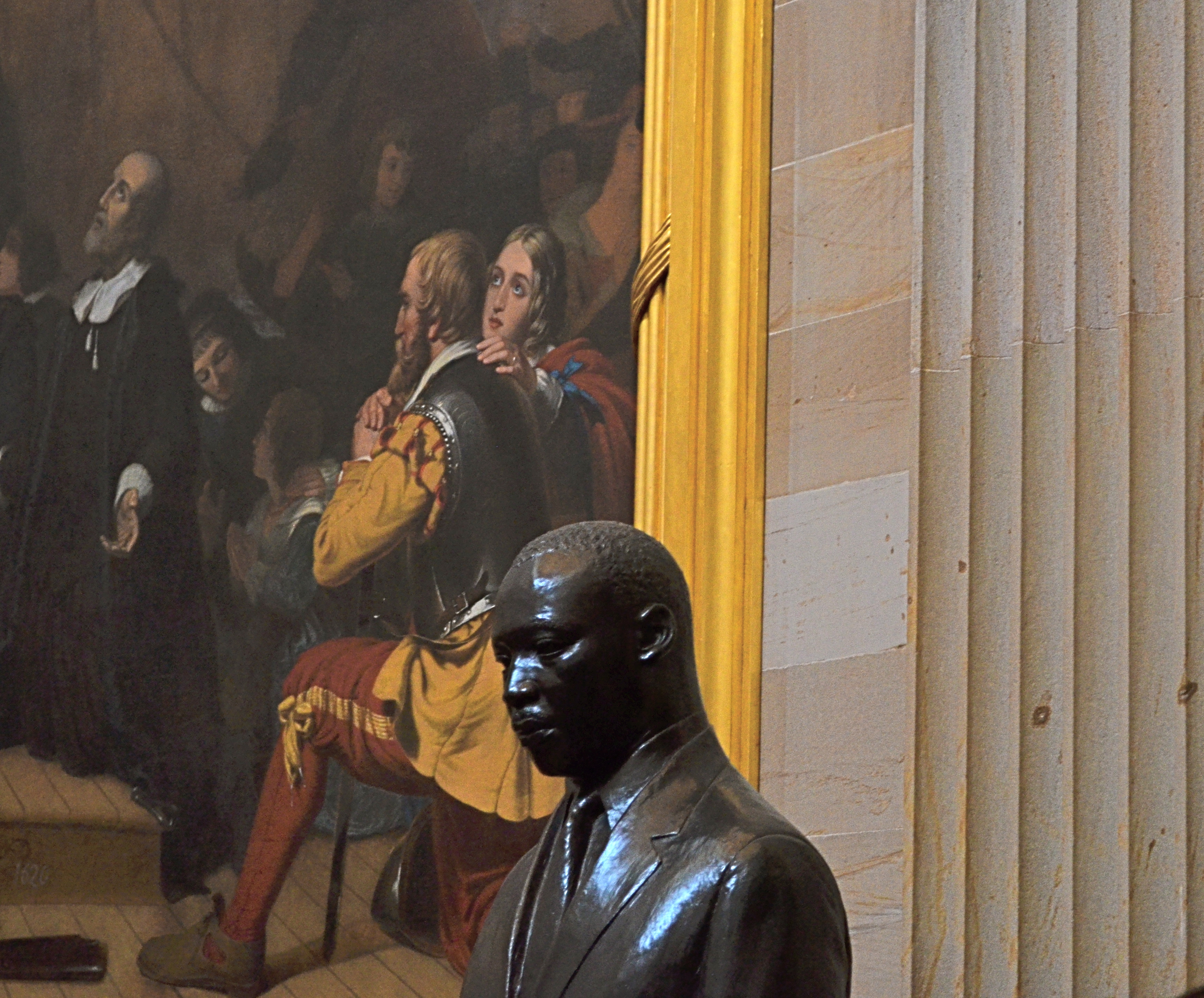
Another view: a somber bronze bust of Dr. King in the U.S. Capitol rotunda, flanked by the painting The Embarkation Of The Pilgrims. 1/30 sec., f/5.6, ISO 640, 55mm.
The contrast could not be greater between this view and the bronze bust of King installed in 1988 in the rotunda of the Capitol building. This King is worried, subdued, straining under the weight of history, burdened by destiny. The bust gains some additional spiritual context when framed against its near neighbor, Robert Weir’s painting The Embarkation Of The Pilgrims, which shows the weary wayfarers of the Mayflower, bound for America, on bended knee, praying for freedom, for justice. Used as background to the bust, they resemble a kind of support group, a congregation eager to be led. Context mine? Certainly, but you shoot what you see. Inside the capitol, light from the dome’s lofty skylights falls off sharply as it reaches the floor, so underexposure is pretty much a given unless you jack up your ISO. Colors will run rich, and some post-lightening is needed. However, the dark palette of tones seems to fit this somber King, just as the triumphant glow of the MLK Memorial’s King seems suited to its particular setting.
Death and fame are twin transfigurations, and what comes through in any single image is more highly subjective than any photo taking of a living person.
But that’s where the magic comes in, and where mere recording can aspire to become something else.
Follow Michael Perkins on Twitter @mpnormaleye.
INNER SPACE, OUTER MIND
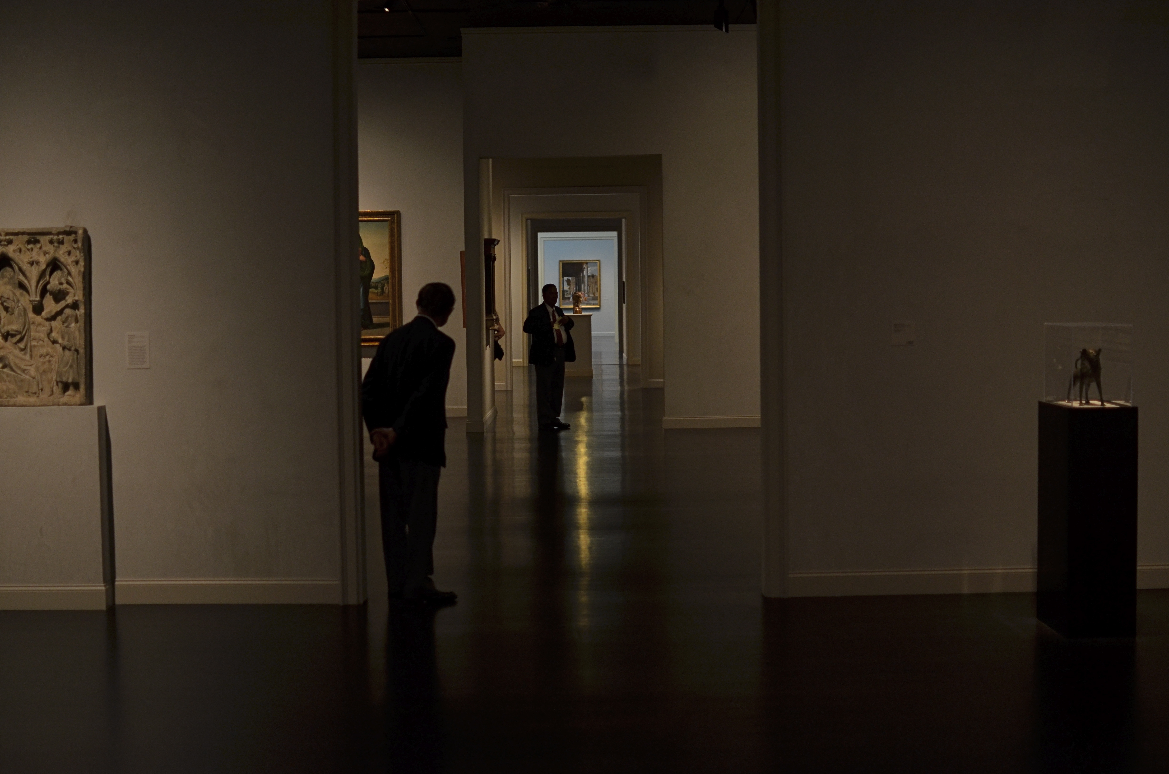
There really was a nice exhibit on display the day I took this at LACMA in Los Angeles. But this arrangement of space was arguing louder for my attention. 1/160 sec., f/1.8, ISO 320, 35mm.
By MICHAEL PERKINS
IF YOU VISIT ENOUGH MUSEUMS IN YOUR LIFETIME, you may decide that at least half of them, seen as arranged space, are more interesting than their contents. It may be country-cousin to that time in your childhood when your parents gave you a big box with a riding toy inside it, and, after a few minutes of excitement, you began sitting in the box. The object inside was, after all, only a fire engine, but a box could be a mine shaft, a Fortress of Solitude, the dining car on the Orient Express, and so on.
Spaces, divided, bisected, hidden, revealed. Art in itself.
And so with museums.
I truly do try to give lip service to the curated exhibits and loaned shows that cram the floors and line the walls of the various museums I visit. After all, I am, harumph and ahem, a Patron Of The Arts, especially if said museums are hosting cocktail parties and trays of giant prawns in their hallowed halls…I mean, what’s not to like? However, there are times when the endless variations on just a room, a hall, a mode of lighting, or the anticipatory feeling that something wonderful is right around the next corner is, well, a more powerful spell than the stuff they actually booked into the joint.
Spaces are landscapes. Spaces are still lifes. Spaces are color studies. Spaces are stages where people are dynamic props.
Recently spinning back through my travel images of the last few years, I was really surprised how many times I took shots inside museums that are nothing more than attempts to render the atmosphere of the museum, to capture the oxygen and light in the room, to dramatize the distances and spaces between things. It’s very slippery stuff. Great thing you find, also, is that the increased light sensitivity and white balance controls on present-day cameras allow for a really wide range of effects, allowing you to “interpret” the space in different ways, making this somewhat vaporous pursuit even more …vaporous-y.
In the end, you shoot what speaks to you, and these “art containers” sometimes are more eloquent by far than the treasures they present. That is not a dig on contemporary art (or any other kind). It means that an image is where you find it. Staying open to that simple idea provides surprise.
And delight.
follow Michael Perkins on Twitter @mpnormaleye.
CONTAIN YOURSELF
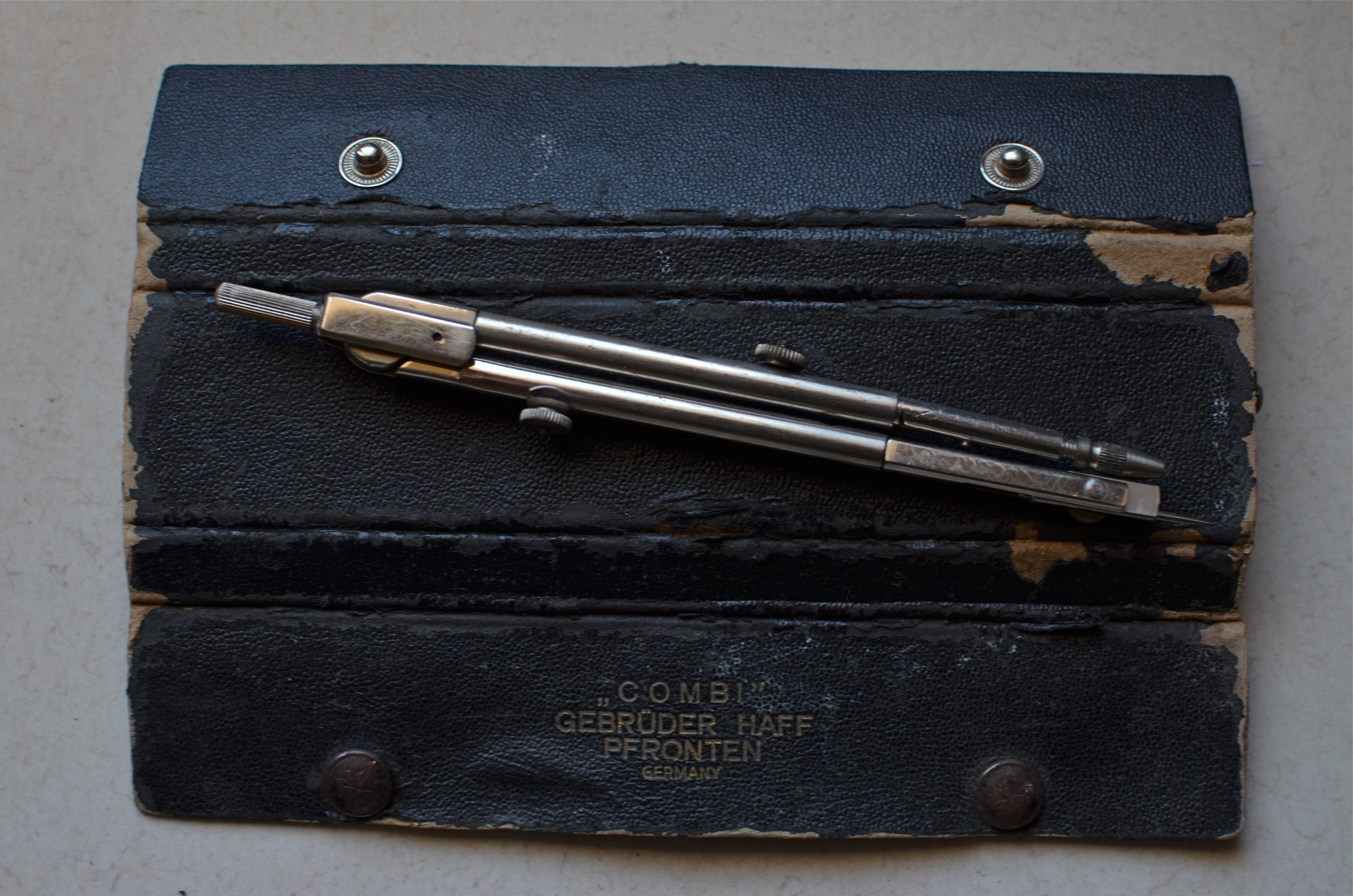
The Things They Carried: my wife’s father’s leather instrument case and compass. 1/60 sec., f/5.6, ISO 250, 35mm.
By MICHAEL PERKINS
WE LIVE IN AN AGE IN WHICH MOST OF OUR LIVES ARE EXHAUSTIVELY OVER-DOCUMENTED. We are, compared to our recent ancestors, photographically bitmapped from cradle to grave with a constellation of snaps that practically draw an outline around us and everything we do.
Globally, we will take more photographs in two minutes today than the entire world took over the entire 19th century.
That said, it’s amazing how few photos taken of, or by, us really look deeply into our souls, or whatever it is that animates us, makes us truly alive. It’s not that there aren’t enough pictures of us being taken: it’s how inarticulate so many of them are.
But go back just a generation or two, and observe the contrast. Far fewer images of most lives. And, with their increasing rarity or loss, more and more value attached to each and every one of those images that survives. Grandfather is gone, leaving only a handful of curled, cracked, and browning snapshots to mark his passing. But how rich the impact of those remaining pictures. The thirst for more, for a greatest number of clues to who this person was!
How to increase or deepen his spirit without having him here?
Explore the things he left behind. The tools he touched. The places where he invested his spirit, his aura. The parts of the world that he deemed important.
And I say: if you love someone, and have to let them go, use your camera to sniff around the found objects of their lives. It may not conjure them up like a holograph of Obi-Wan, but it will focus your thoughts about them in away which is nearly, well, visual.
I fell in love with the worn little instrument case you see at the top of this page. It belonged to my wife’s father, a man whose life was cut short by illness, a life under-represented in photographs. He made his living with his wits and with his hands. The compass which was carried in this case was a tool of survival, something he used to make his living, to measure out his skill and art. It’s a treasure to have it around to look at, and it’s a privilege to be able to photograph its worn corners, its tattered grain, its rusted buttons. Time has allowed it to speak, louder than its owner ever can, and to act as his visual proxy.
I’ve explored this theme in past posts, because I feel so strongly about the expressive power of things as emblems of lives. Long before our every action could be captured in an endless Facebook page of banal smartphone snaps, images had to work a lot harder, and say more. I’m not saying you should spend the next six months of your life raiding your closets for Ultimate Truth. I am saying you might be walking past a chunk of that Truth every day, and that it might just be worth framing up.
And thinking about.
(let’s help each other find amazing images! Follow Michael Perkins on Twitter @mpnormaleye.)
Related articles
- Behind the lens (theoriginalblogofthecentury.wordpress.com)
- Old Photographs Given New Life (modcloth.com)
GET LOST
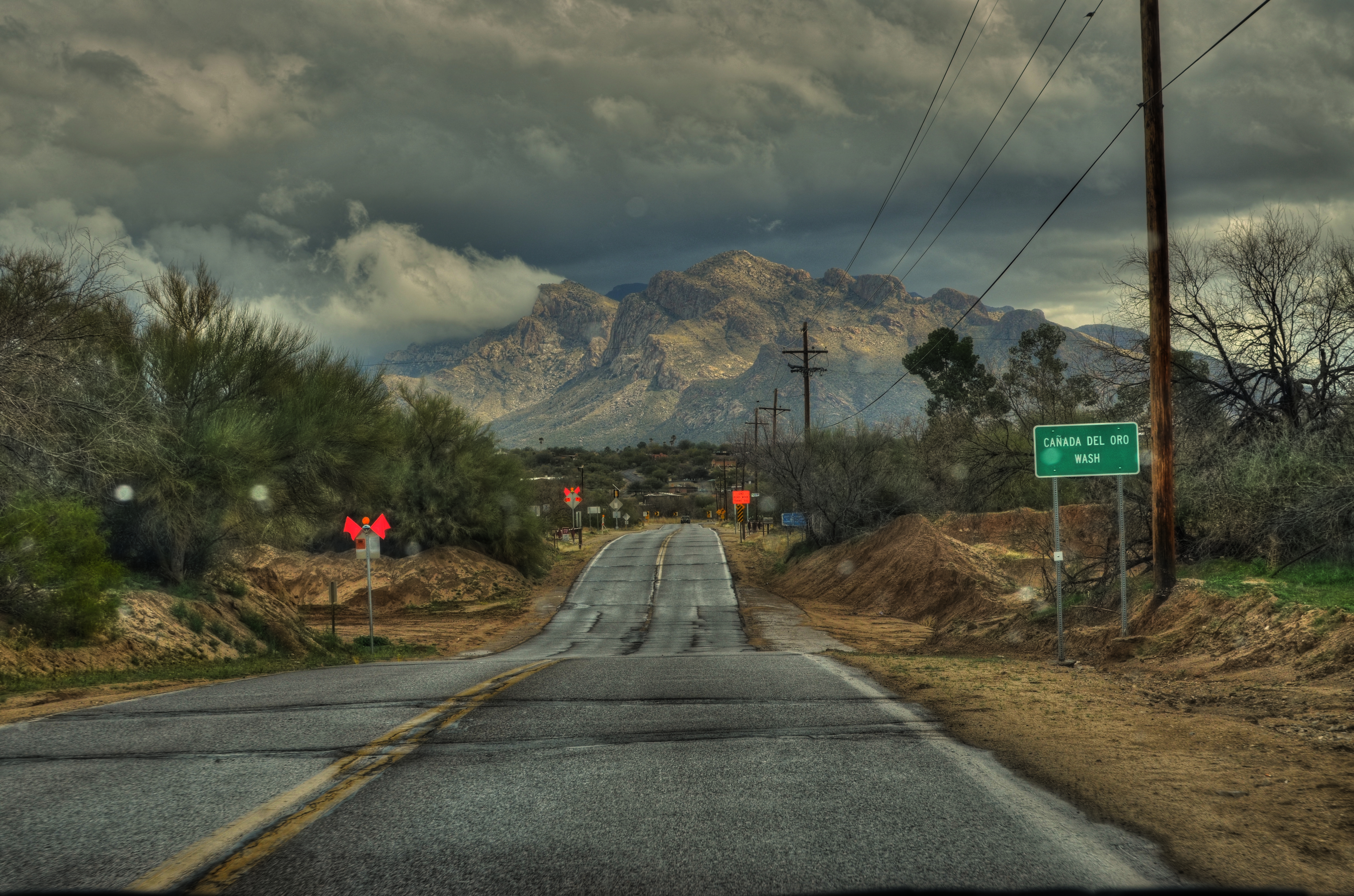
Straight through the windshield, using a technique I like to call “dumb luck”. Original shot specs: 1/320 sec., f/8, ISO 100, 35mm.
By MICHAEL PERKINS
PHOTOGRAPHY IS 10% PLANNING, 90% SERENDIPITY. Yes, I know. we would all rather believe that most of our images spring from brilliant conceptions, master plans, and, ahem, stunning visions. But a lot of what we do amounts to making the most of what fate provides.
There is no shame in this game. In fact, the ability to pivot, to improvise, to make the random look like the intentional…all of these things reveal the best in us. It exercises the eye. It flexes the soul. And, in terms of images, it delivers the goods.
Getting lost (geographically, not emotionally) is less an emergency than in ages past. Armed with smartphones, GPS, and other hedges against our own ignorance, we can get rescued almost as soon as we wander off the ranch. It is easier than ever to follow the electronic trail of crumbs back to where we belong, so drifting from the path of righteousness is no longer cause for panic. Indeed, for shooters, it’s pure opportunity.
Okay, so you’re not where you’re supposed to be. Fine. Re-group and start shooting. There is something in all these “unfamiliar” things that is worth your gaze.
Last week , my wife and I decided to trust her car’s onboard guidance system. The results were wrong but interesting. No danger, just the necessary admission that we’d strayed really far afield of our destination. We’re talking about twenty minutes of back-tracking to set things right.
But first….
One of the rural roads we drifted down, before realizing our error, led us to a stunning view of the back end of Tucson’s Catalina mountains, framed by small town activity, remnants of rainfall, and a portentous sky. I squeezed off a few shots straight out of the windshield and got what I call the “essence” exposure I needed. That single image was relatively well-balanced, but it wouldn’t show the full range of textures from the stormy sky and the mountains. Later, in post, I duplicated the one keeper frame that I got, modifying it in Photomatix, my HDR processing program. Adding underexposure, deeper contrast, and a slight rolloff of highlights on the dupe, I processed it with the original shot to get a composite that accentuated the texture of the clouds, the stone,, even the local foliage. A sheer “wild” shot had given me something that I would have totally missed if the car’s GPS had actually taken us to our “correct” destination.
What was ironic was that, once we got where we were going, most of the “intentional” images that I sweat bullets working on were lackluster, compared to the one I shot by the seat of my pants. Hey, we’ve all been there.
Maybe I should get lost more often.
Actually, people have been suggesting that to me for years.
Especially when I whip out a camera.
Related articles
PRETTY/UGLY
By MICHAEL PERKINS
LEGEND HAS IT THAT ORSON WELLES, STAYING FOR A WHILE AS A GUEST AT PETER BOGDANOVICH’S HOME AROUND 1970, convinced him that the small Texas town he wanted to portray in the bleak drama The Last Picture Show would be “too charming” if shot in color. Bogdanovich went with the starkly toned palette of black and white, and you know the rest. Eight Oscar nominations, two wins, and an honored slot in cinema history.
Bogdanovich made an artistic decision to make something “uglier” in order to make it “real”.
For me, this idea has always been like swimming against the current, since, as a kid, I was influenced initially by scenic photographers, then, somewhat later, photojournalists, who seek a completely different end product. I tend to default to the idea of making things look pretty. Even today, me knowing the impact of recording things as they are, warts and all, is one thing, while me, deliberately manipulating an image in order to change or amplify its darker elements is a stretch. It’s not something I instinctively bend toward.
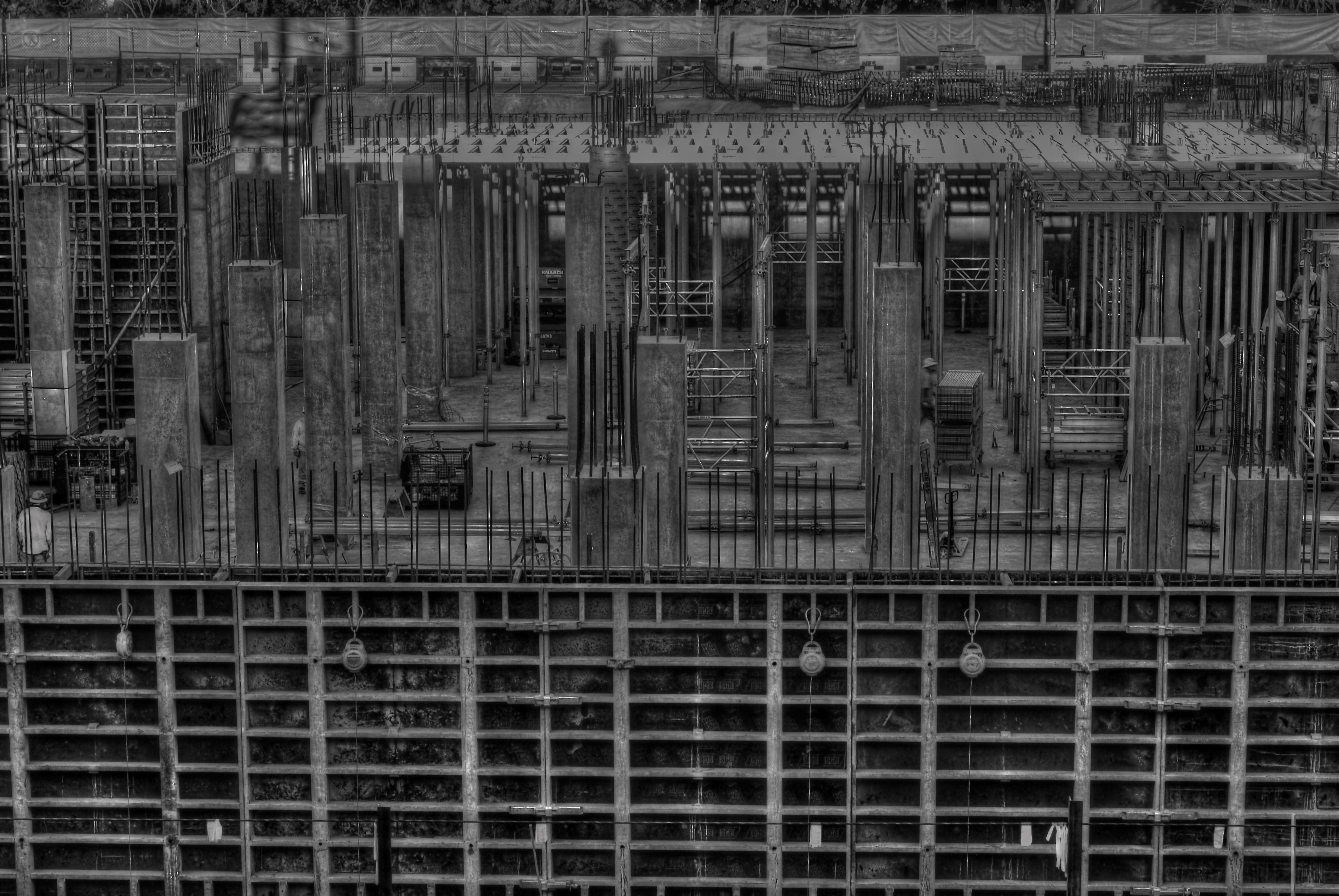
Hideous or wondrous, depending on how you see it. A deliberately “over-cooked” HDR from three exposures, all taken at f/11 for maximum detail, and ISO 100 with a 50mm prime lens.
Still, some stories are told in capture and others are revealed in processing, and while photography is interpretation as well as mere recording, I like to take a crack at changing the context of a picture, to make its parts add up to something drastically different. A few years ago, the parking garage near my job looked out at a massive construction project. My parking slot was situated such that I was about three floors up in the air, peering through the open wall of the garage to easily take in a panoramic view of the entire length of the new building’s emerging structure. I soon got into the habit of getting to work about fifteen minutes early so I could hop out and snap whatever activity I could catch.
The finished building eventually smoothed into something acceptably serviceable, if bland, but, with its raw skeleton mounting day by day, an immense feeling of grim, awful power was climbing out of that place. It couldn’t be seen in color, especially not in the benign, golden light of early morning. This thing was appearing to my eye as a sinewy, dark life force, inevitable, dreadful……an impression I would have to achieve through a complete reworking of tone and texture. I decided to use High Dynamic Range processing, not to merely rescue detail lost in highly contrasted nooks, but to intensify every grain, granule and hobnail of the building, to render it in a surreal, slightly hellish aspect. To make it “ugly” on purpose…..or, more exactly, to my purpose.
Playing at changing the emotional feel of a picture isn’t native to me, so I am always grateful when this part of my brain rouses from sleep and demands to be exercised. The persistent (and false) notion of photography since its inception is that it shows the world as it is, a lie which is debunked with every willful act of picture-taking. No less than painting, the photo image is both document and statement, truth and distortion.
It never has to settle for being mere reality, nor could it claim to be.
And that is its seductive pull.
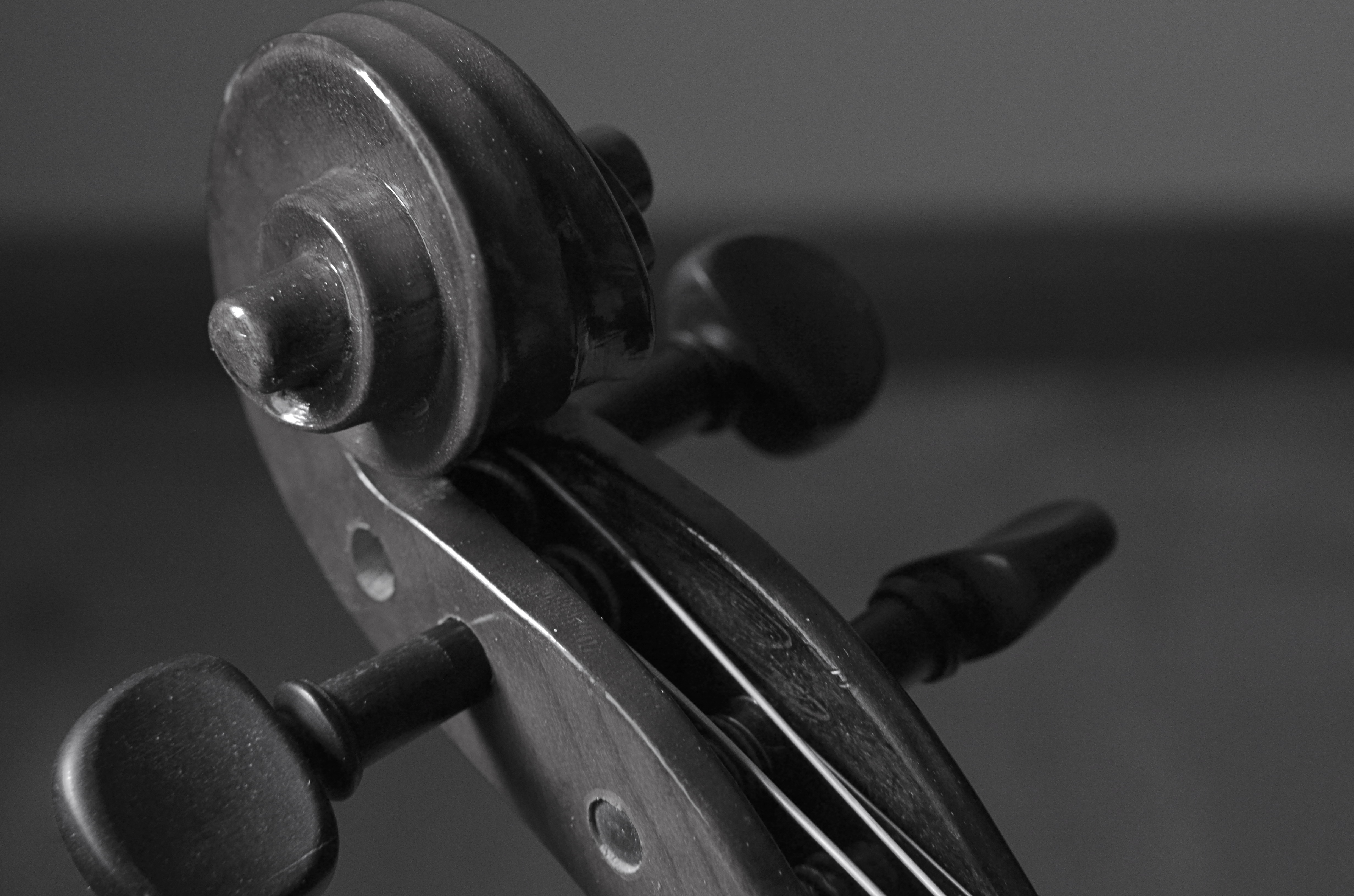
STRING THEORY
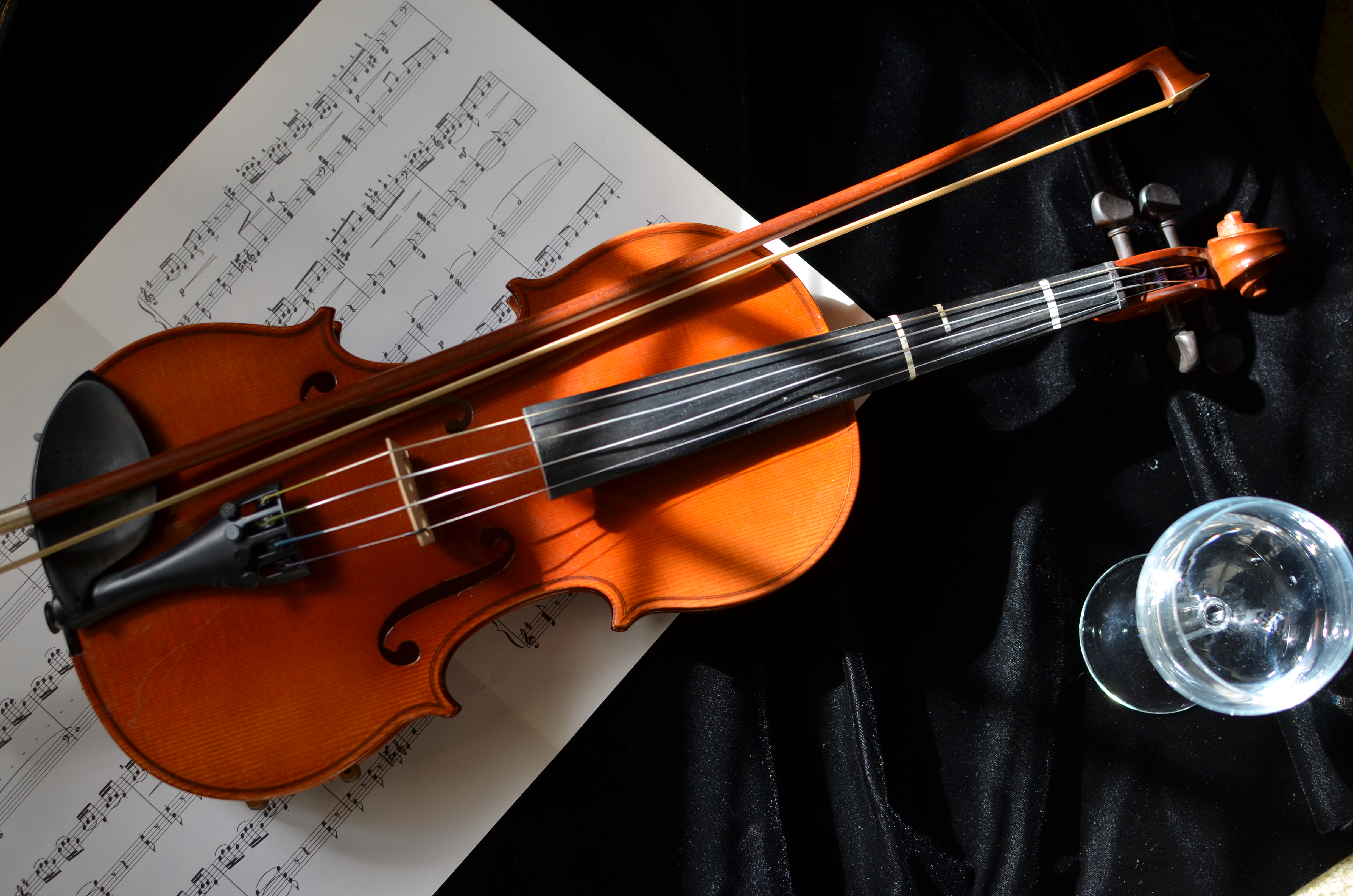
Repose. 1/250 sec., f/3.5, ISO 125, 35mm prime lens.
By MICHAEL PERKINS
CERTAIN INANIMATE OBJECTS INTERACT WITH THE LIVING TO SUCH A LARGE DEGREE, that, to me, they retain a certain store of energy

Just horsehair and wood, but it has an elegance all its own.
even when standing alone. Things that act in the “co-creation” of events or art somehow radiate the echo of the persons who touched them.
Musical instruments, for my mind’s eye, fairly glow with this force, and, as such, are irresistable as still life subjects, since, literally, there is still life emanating from them.

Staging the object just outside the reach of full light helped the violin sort of sculpt itself. 1/800 sec., f/2.5, ISO 100, 35mm prime lens.
A while back I learned that my wife had, for years, held onto a violin once used for the instruction of one of her children. I was eager to examine and photograph it, not because it represented any kind of technical challenge, but because there were so many choices of things to look at in its contours and details. There are many “sites” along various parts of a violin where creation surges forth, and I was eager to see what my choices would look like. Also, given the golden color of the wood, I knew that one of our house’s “super windows”, which admit midday light that is soft and diffused, would lend a warmth to the violin that flash or constant lighting could never do.
Everything in the shoot was done with an f/1.8 35mm prime lens, which is fast enough to illuminate details in mixed light and allows for selectively shallow depth of field where I felt it was useful. Therefore I could shoot in full window light, or, as in the image on the left, pull the violin partly into shadow to force attention on select details.
Although in the topmost image I indulged the regular urge to “tell a story” with a few arbitrary
The delight is in the details.
props, I was eventually more satisfied with close-ups around the body of the violin itself, and, in one case, on the bow. Sometimes you get more by going for less.
One thing is certain: some objects can be captured in a single frame, while others kind of tumble over in your mind, inviting you to revisit, re-imagine, or more widely apprehend everything they have to give the camera. In the case of musical instruments, I find myself returning to the scene of the crime again and again.
They are singing their songs to me, and perhaps over time, I quiet my mind enough to hear them.
And perhaps learn them.
SKIN IN THE GAME
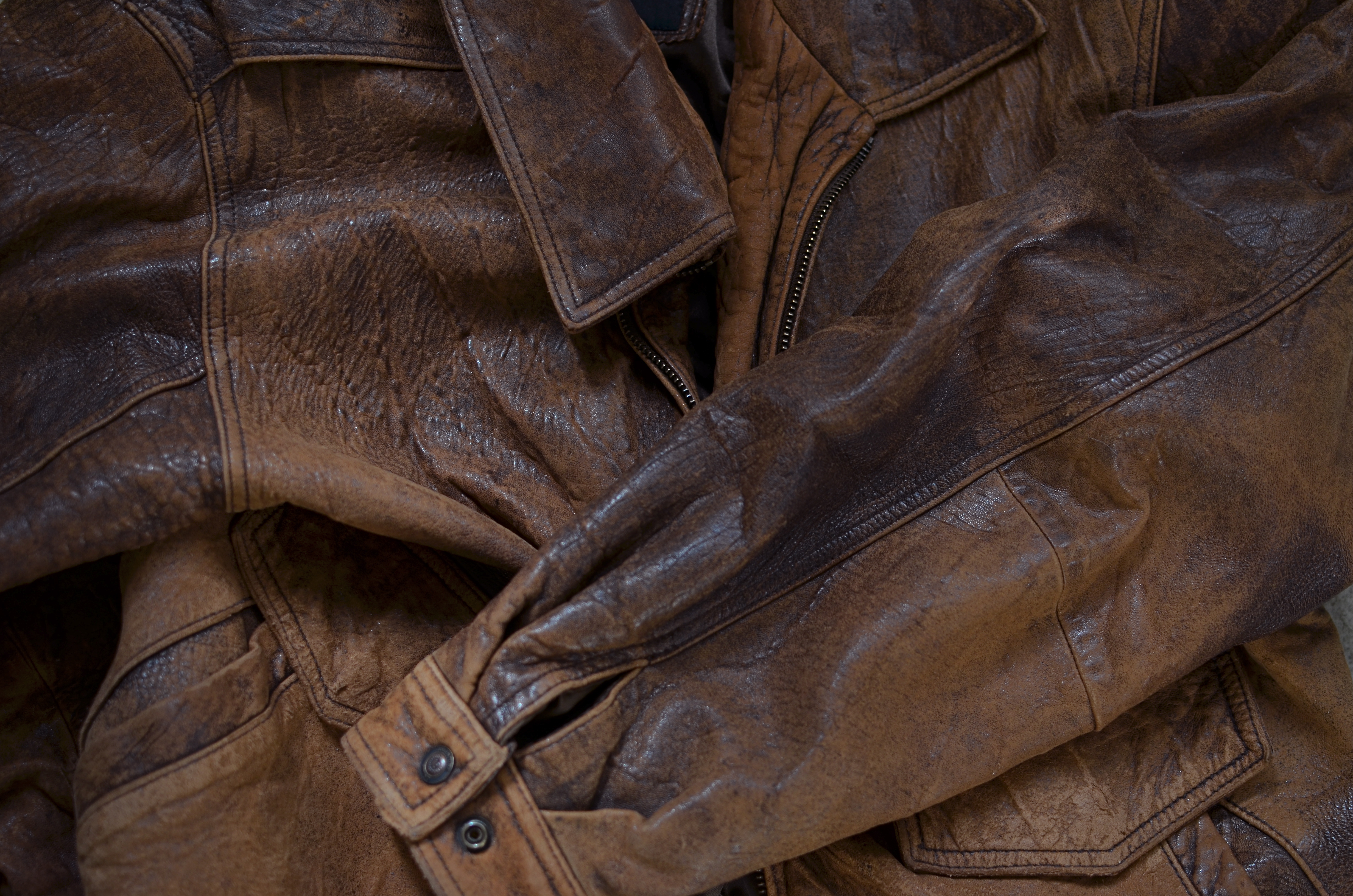
“Old Faithful”, the jacket that has accompanied me on more shoots than any other single piece of “gear”. 1/200 sec., f/2.8, ISO 100, 35mm.
By MICHAEL PERKINS
THE ONE PIECE OF “EQUIPMENT” THAT HAS SEEN ME THROUGH THE TRANSITION FROM FILM TO DIGITAL is not a hunk of techno gear. In fact, it has not directly figured in the taking of even a single picture. I was reminded of its amazing longevity a few months ago, as I was going through a 2002 shoot done in Ireland. Among my own shots was a pretty good candid of me, taken by my wife, as I crouched to line up a shot next to a road heading to the Ring of Kerry. And there “it” was with me.
In fact, it was keeping me warm and dry.
Context: I never took the plunge of the eager amateur and purchased one of those puffy, sleeveless photog vests, honeycombed with a zillion pockets, pouches and secret compartments, much as I never painted the words CAMERA NERD on my face in day-glo orange. Chalk it up to self-consciousness. I figured it was hard enough to blend in and keep people relaxed in a shooting situation without looking like a cross between a spinster butterfly hunter and a middle-school lab assistant. Call me vain.
And you’d be right.
So, a plain brown leather jacket. Gimme three good pockets and call it day. And thus it was that, for the next thirteen years or so, I have had “skin in the game”, skin that has survived exploded pens, leaked batteries, rotten weather on two sides of the Atlantic, and more scrapes, tears, and rips than I care to recall. It has also helped keep countless camera straps from inscribing a permanent groove in my left shoulder, and, here in the Land Of Incipient Arthritis, I appreciate that more than I can say.
Such service calls for a little respect, and so, in the name of the weirdest still lifes ever, I figured it was time for Old Faithful to pose for a portrait of its own. Originally I thought to lay it out straight, the way they show off famous duds at the Smithsonian. But what really caught my eye was that, texture-wise, it is almost six different jackets, from the glossy sheen of an old horse saddle to the frayed look of something that’s been making out with a cheese grater.
At the last, I simply experimented with a few crumpled waves of grain, as if the jacket had been hastily tossed aside, which, trust me, it has been, on countless occasions.
Best thing is, when I’m ready, it’s still there.
I’m not a big fan of good luck charms, but maybe some things protect against bad luck, and that’s no easy feat, either. Either way, me and what Kipling would have called my “Lazarushian leather” and I will keep signing up new missions.
At least until one of our arms fall off.
REWORKING THE UNIVERSE
By MICHAEL PERKINS
CONTEXT, FOR A PHOTOGRAPHER, IS LIKE THE CONDUCTOR’S BATON IN MUSIC, that magic wand that dictates fast and slow, soft and loud, ordering a specific world within a confined space. Since it impossible to show the world entire, all shooters decide what part of it, what story within it, that they will frame. Sounds obvious, but without the mastery of this skill, we fail as storytellers, and the eye that we develop for what to include and exclude is, despite all the tools and toys, the only thing that really makes an artistic performance out of a photograph.
It can also be a helluva lot of fun. With some dumb luck thrown in for good measure.
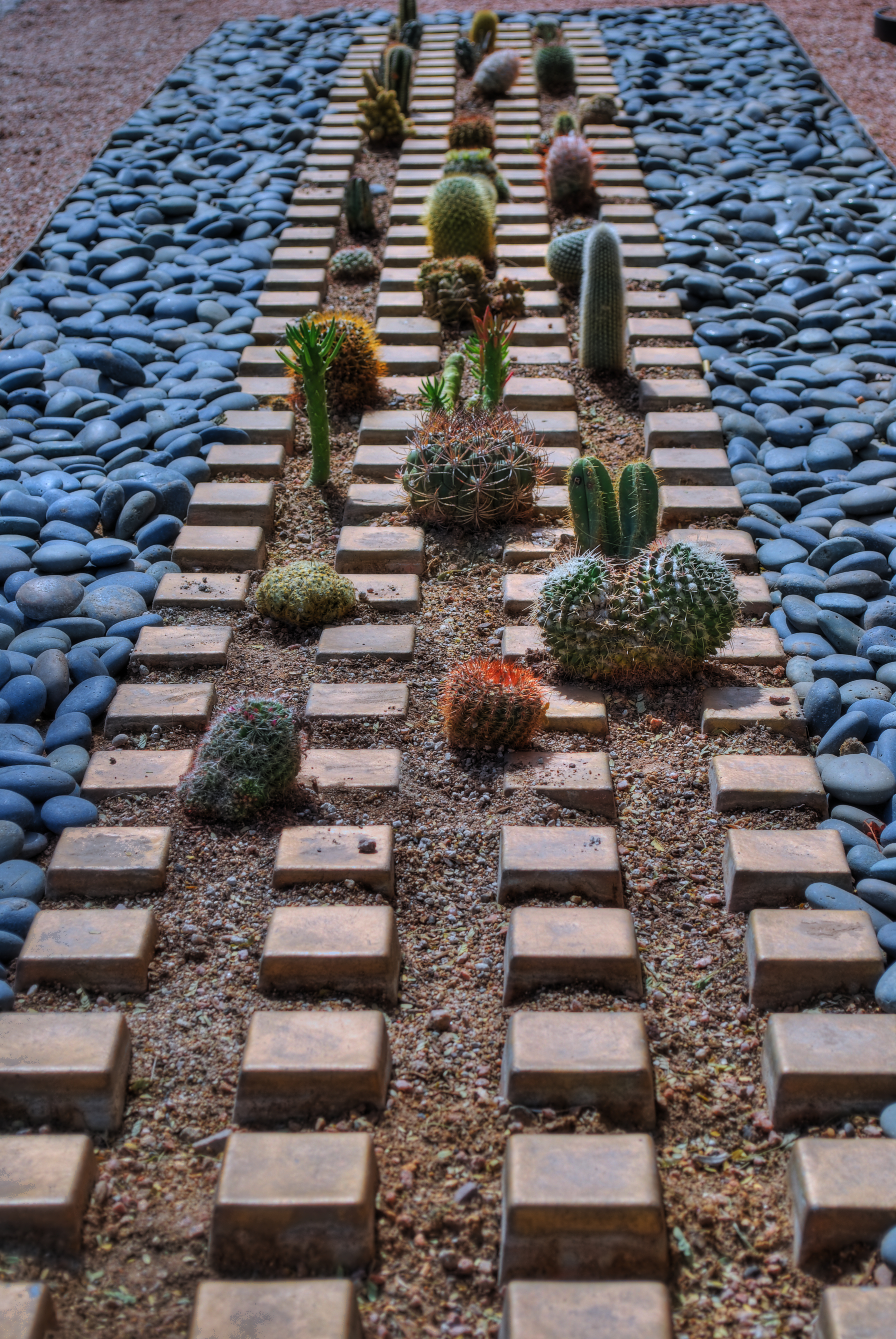
Cactropolis, 2011. A three-exposure HDR blend with a little color and contrast teaking. This whole layout, in reality, is about fifteen feet square, total. Various shutter speeds, f/8, ISO 100, 52mm.
I love opportunities that allow me to disrupt the original visual “place” of objects, to force them to be re-purposed for the viewer. A few years ago, my daily lunch routine involved a short walk across a bustling college campus to my habitual lunch hang, a stroll which took me past one of the school’s busiest crossroads, marked by the intersection of two superwide sidewalks flanked by small patches of landscaping. Since this is Arizona, such short plots of land frequently are not the stuff dreams are made of. We’re talking pink quartz gravel interrupted by the occasional scabby aloe plant or cholla. And that’s what made this one little rectangle, just several feet long on each side, vie for my attention.
An arrangement of several varieties of small cacti has been arranged in rows, regulated by square tiles, grounded in gravel, and bounded by smooth bluish stones. Simple stuff, really, but this was somebody’s deliberate design, a pattern that registered, to my eye, like some kind of fantasy urban streetscape, blocks of tiny, spiny skyscrapers vanishing off toward an unseen horizon….a miniature downtown from Weirdsville, a tabletop diorama from Beetlejuice.
I didn’t really have to compose anything. I was in the framing business. But getting that frame meant getting rid of the surrounding throngs of students, the sidewalks, the buildings, the sky…..anything that seemed outside of the closed world implied by that little rectangle. Changing the context. In fact, I was adding something for everything I was taking away.
So let’s crop this puppy and see what happens.
Now I saw what seemed to be a self-contained world, one in which I was free to imagine what lay “beyond”. I goosed up the hues and texture with HDR processing, but otherwise, what you see is what there was. Maybe it works as pure design. Maybe I conveyed something, but the fact is, we have to make choices as shooters. The only thing that marks us as individuals is what we decide to see, and show.
Like I said…fun….luck….some other somethings…..
(Many Thanks Dept.:The idea for this post was inspired, in part, by a suggestion from my good friend Michael Grivois.)
I SEE YOUR FACE BEFORE ME
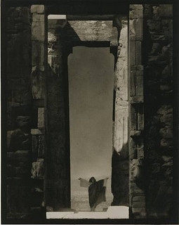
Edward Steichen’s amazing 1921 portrait of dance icon Isadora Duncan beneath a massive arch of the Parthenon in Greece, an image which recently surged to the top of my mind. See a link to a larger view of this shot, below.
By MICHAEL PERKINS
THE IMAGES SIT AT THE BOTTOM OF THE BRAIN, LIKE STONE PILLARS IN THE FOUNDATION OF AN IMMENSE TOWER.The structures erected on top of them, those images we ourselves have fashioned in memory of these foundations, dictate the height and breadth of our own creative edifices. Between these elemental pictures and what we build on top of them, we derive a visual style of our own.
In my own case,many of the pillars that hold up my own house of photography come from a single man.
Edward Steichen is arguably the greatest photographer in history. If that seems like hyperbole, I would humbly suggest that you take a reasonable period of time, say, oh, twenty years or so, just to lightly skim the breadth of his amazing career….from revealing portraits to iconic product shots to nature photography to street journalism and half a dozen other key areas that comprise our collective craft of light writing. His work spans the distance from wet glass plates to color film, from the Edwardian era to the 1960’s, from photography as an insecure imitation of painting to its arrival as a distinct and unique art form in its own right.
At the start of the 20th century, Steichen co-sponsored many of the world’s first formal photographic galleries, and was a major contributor to Camera Work, the first serious magazine dedicated wholly to photography. He ended his career as the creator of the legendary Family Of Man, created in the early 1950’s and still the most celebrated collection of global images ever mounted anywhere on earth. He is, simply, the Moses of photography, towering above many lesser giants whose best work amounts to only a fraction of his own prodigious output.
Which is why I sometimes see fragments of what he saw when I view a subject. I can’t see with his clarity, but through the milky lens of my own vision I sometime detect a flashing speck of what he knew on a much larger scale, decades before. The image at left recently rocketed to my mind’s eye several weeks ago, as I was framing shots inside a large government building in Ohio.In 1921, Steichen journeyed to Greece to use the world’s oldest civilization basically as a prop for portraits of Isadora Duncan, then in the forefront of American avant-garde dance. Framing her at the bottom of an immense arch in the ruins of the Parthenon, he made her appear majestic and minute at the same time, both minimized and deified by the huge proportions in the frame. It is one of the most beautiful compositions I have ever seen, and I urge you to click the Flickr link at the end of this post for a slightly larger view of it. (Also note the link to a great overview of Steichen’s life on Wikipedia.)
Uplighting creates a moody frame-within-frame feel at the Ohio Statehouse building, in a shot inspired by Edward Steichen’s images of massive arches. 1/30 sec., f/8, ISO 800, 18mm.
In framing a similarly tall arch leading into the rotunda of the Ohio Statehouse in Columbus, I didn’t have a human figure to work with, but I wanted to show the building as a series of major and minor access cavities, in, around, under and through one of its arched entrance to the central lobby. I kept having to back up and step down to get at least a partial view of the rotunda and the arch at the opposite end of the open space included in the frame, which created a kind of left and right bracket for the shot, now flanked by a pair of staircases. Given the overcast sky meekly leaking grey light into the rotunda’s glass cupola, most of the building was shrouded in shadow, so a handheld shot with sufficient depth of field was going to call for jacked-up ISO, and the attendant grungy texture that remains in the darker parts of the shot. But at least I walked away with something.
What kind of something? There is no”object” to the image, no story being told, and sadly, no dancing muse to immortalize. Just an arrangement of color and shape that hit me in some kind of emotional way. That and Steichen, that foundational pillar, calling up to me from the basement:
“Just take the shot.”
Related articles
- The Photograph as a Social Statement (halsmith.wordpress.com)
- Picture Imperfect (andrewsullivan.thedailybeast.com)
- http://www.flickr.com/photos/quelitab/5793648357/lightbox/
- http://en.wikipedia.org/wiki/Edward_Steichen
THE PROSCENIUM
By MICHAEL PERKINS
IT IS THE OLDEST FRAMING DEVICE IN HISTORY. If you’ve ever watched a play on any stage, anywhere in the world, you’ve accepted it as the classic method of visual presentation. The Romans coined the word proscenium, “in front of the scenery”. Between stage left and stage right exists a separate reality, defined and contained in the finite space of the theatre’s forward area. What is included in the frame is everything, the center of the universe of certain characters and events. What’s outside the frame is, indefinite, vague, less real.
Just like photography, right? Or to be accurate, photography is like the proscenium. We, too select a specific world to display. We leave out all the other worlds not pertinent to our message. And we follow information in linear fashion…left to right, right to left. The frame gives us the sensation of “looking in” to something that we are only visiting, just as we only “rent” our viewpoint from our theatre seats.
We learned our linear habit from the descendants of stage arrangement….murals, frescoes, paintings, all working, as our first literate selves would, from left to right. Painters were forced to arrange information inside the frame, to make choices of what that frame would include, and, as the quasi-legitimate children of painting, we inherited that deliberately chosen viewpoint, that decision to show a select world, by arranging visual elements within the frame.
Park Slope, Brooklyn, 2012. Trying to catch as much activity as a street glance, at any given moment, can. 1/320 sec., F/7.1, ISO 100, 24mm.
For some reason, in recent months, I have been abandoning the non-traditional in shooting street scenes and harking back to the proscenium, trying to convey a contained world of simple, direct left-right information. Candid neighborhood shots seem to work well without extra adornment. Just pick your borders and make your capture. It’s a way of admitting that some worlds come complete just as they are. Just wrap the frame around them like a packing crate and serve ’em up.
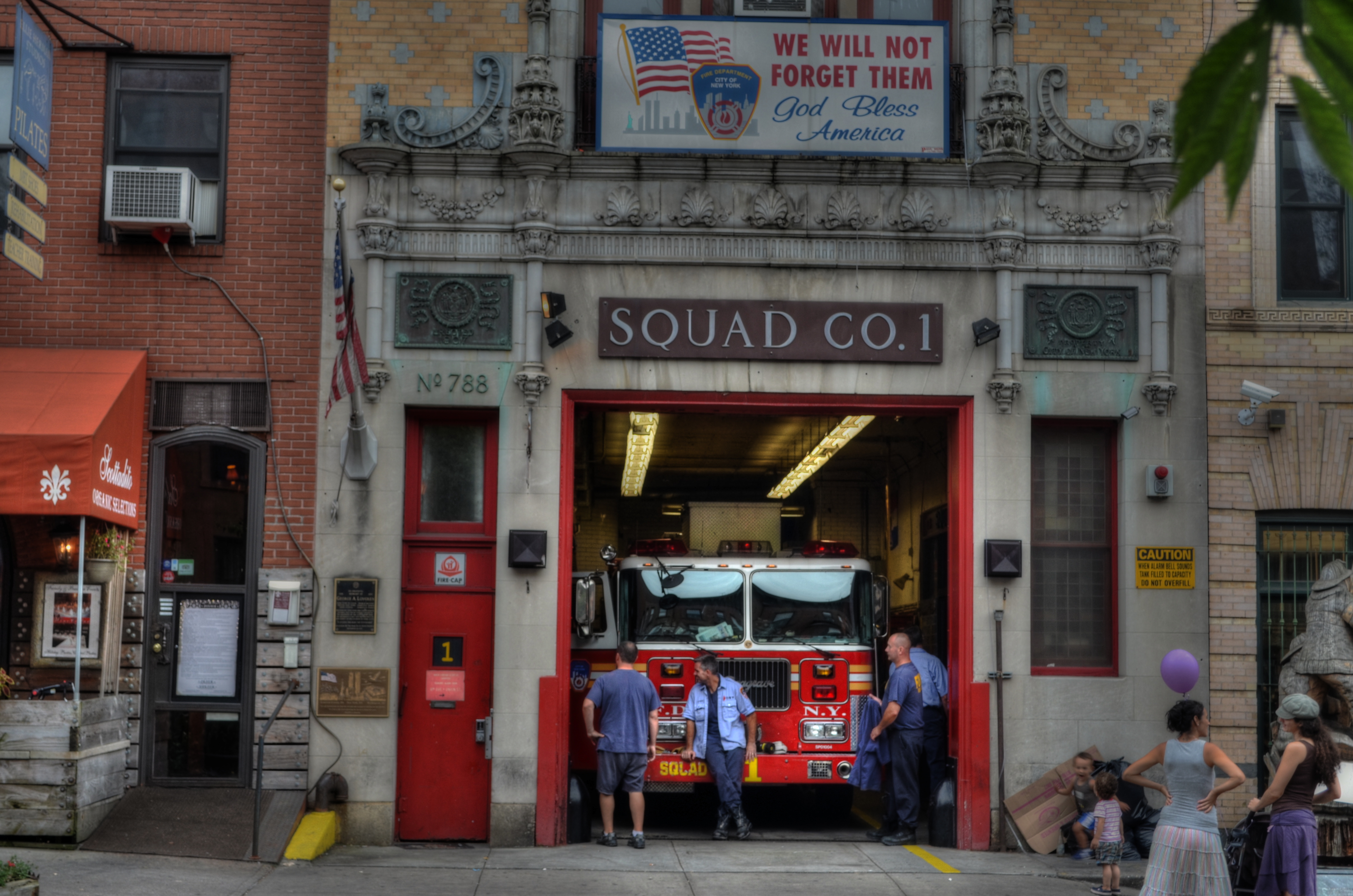
Like a theatre play, some images read best as self-contained, left-to-right “worlds”. A firehouse in Brooklyn, 2012. 1/60 sec., f/6.3, ISO 100, 38mm.
This is not to say that an angled or isometric view can’t portray drama or reality as well as a “stagy” one. Hey, sometimes you want a racing bike and sometimes you want a beach cruiser. Sometimes I don’t mind that the technique for getting a shot is, itself, a little more noticeable. And sometimes I like to pretend that there really isn’t a camera.
That’s theatre. You shouldn’t believe that the well-meaning director of the local production of Oklahoma really conjured a corn field inside a theatre. But you kind of do.
Hey what does Picasso say? “Art is the lie that tells the truth”?
Okay, now I’m making my own head hurt. I’m gonna go lie down.
TURNING UP THE MAGIC
By MICHAEL PERKINS
CHRISTMAS IS SO BIG THAT IT CAN AFFORD TO GO SMALL. Photographers can, of course, tackle the huge themes….cavernous rooms bursting with gifts, sprawling trees crowning massive plazas, the lengthy curve and contour of snowy lanes and rustic rinks…..there are plenty of vistas of, well, plenty. However, to get to human scale on this most superhuman of experiences, you have to shrink the frame, tighten the focus to intimate details, go to the tiny core of emotion and memory. Those things are measured in inches, in the minute wonder of things that bear the names little, miniature, precious.
And, as in every other aspect of holiday photography, light, and its successful manipulation, seals the deal.
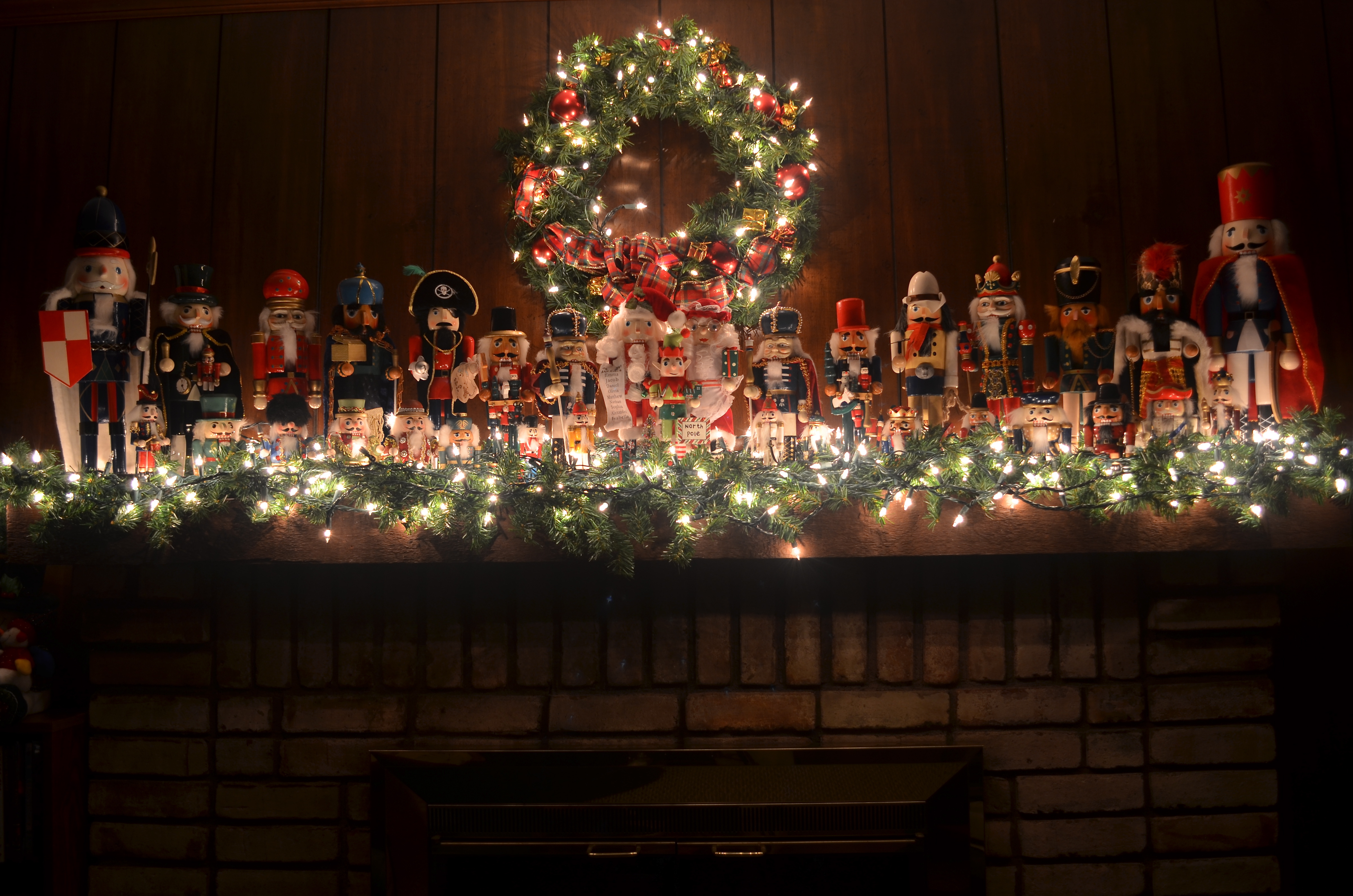
A proud regiment of nutcrackers, made a little more enchanting by turning off the room light and relying on tiny twinklers. 1/2 sec., f/4, ISO 100, 20mm
In recent years I have turned away from big rooms and large tableaux for the small stories that emanate from close examination of corners and crannies. The special ornament. The tiny keepsake. The magic that reveals itself only after we slow down, quiet down, and zoom in. In effect, you have to get close enough to read the “Rosebud” on the sled.
Through one life path and another, I have not been “home” (that is, my parents’ home) for Christmas for many years now. This year, I broke the pattern to visit early in December, where the airfare was affordable, the overall scene was less hectic and the look of the season was visually quiet, if no less personal. It became, for me, a way to ease back into the holidays as an experience that I’d laid aside for a long time.
A measured re-entry.
I wanted to eschew big rooms and super-sized layouts to concentrate on things within things, parts of the scene. That also went for the light, which needed to be simpler, smaller, just enough. Two things in my parents’ house drew me in: several select branches of the family tree, and one small part of my mother’s amazing collection of nutcrackers. In both cases, I had tried to shoot in both daylight and general night-time room light. In both cases, I needed some elusive tool for enhancement of detail, some way to highlight texture on a very muted scale.
Call it turning up the magic.
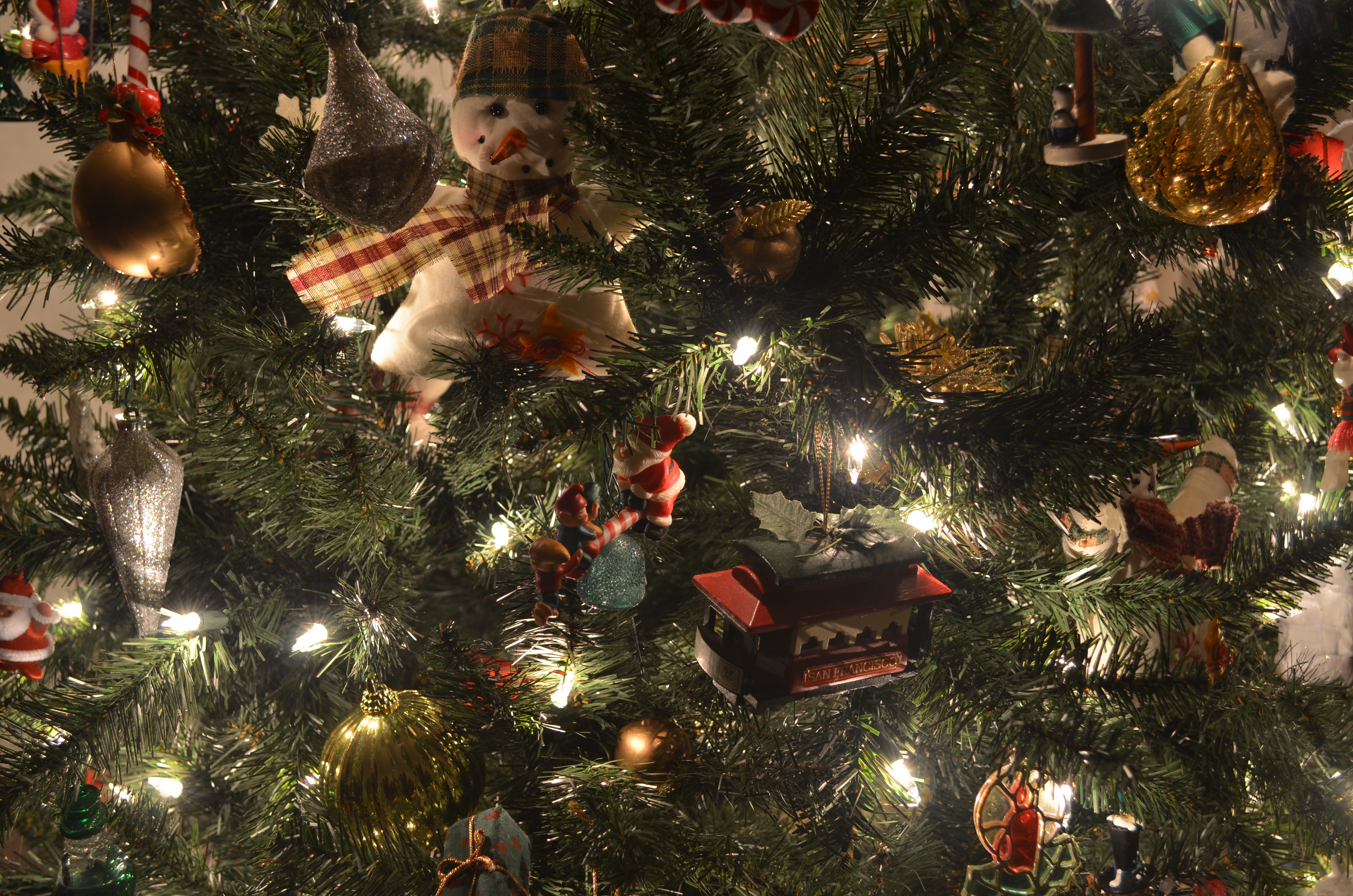
Use of low-power, local light instead of general room ambience enhances detail in tiny objects, revealing their textures. 1/2 sec., f/4, ISO 100, 20mm.
As it turned out, both subjects were flanked by white mini-lights, the tree lit exclusively by white, the nutcrackers assembled on a bed of green with the lights woven into the greenery. The short-throw range of these lights was going to be all I would need, or want. All that was required was to set up on a tripod so that exposures of anywhere from one to three seconds would coax color bounces and delicate shadows out of the darkness, as well as keeping ISO to an absolute minimum. In the case of the nutcrackers, the varnished finish of many of the figures, in this process, would shine like porcelain. For many of the tree ornaments, the looks of wood, foil, glitter, and fabric were magnified by the close-at-hand, mild light. Controlled exposures also kept the lights from “burning in” and washing out as well, so there was really no down side to using them exclusively.
Best thing? Whole project, from start to finish, took mere minutes, with dozens of shots and editing choices yielded before anyone else in the room could miss me.
And, since I’d been away for a while, that, along with starting a new tradition of seeing, was a good thing.
Ho.
Related articles
- How to Take a Picture of Your Christmas Tree (purdueavenue.com)
LOOK THROUGH ANY WINDOW, PART TWO
By MICHAEL PERKINS
I WILL DO ANYTHING TO PHOTOGRAPH BOOKSTORES. Not the generic Costco and Wal-Mart bargain slabs laden with discounted bestsellers. Not the starched and sterile faux-library air of Barnes & Noble. I’m talking musty, dusty, crammed, chaotic collections of mismatched, timeless tomes…. “many a quaint and curious volume of forgotten lore” as Poe labeled them. I’m looking for places run by dotty old men with their glasses high on their forehead, cultural salvage yards layered in multiple stories of seemingly unrelated offerings in random stacks and precarious piles. Something doomed by progress, and beautiful in its fragility.
I almost missed this one.

Through the window, and into a forgotten world. A fake two-shot HDR from a single exposure at 1/80 sec., f/5, ISO 400, 18mm.
In my last post, I commented that, even when your photography is rules-based….i.e., always do this, never do that, there are times when you have to shoot on impulse alone and get what you can get. It sometimes begins when you’re presented with something you’re not, but should be, looking for. A few weeks ago, I was spending the afternoon at one of Monterey, California‘s most time-honored weekly rituals..the marvelous, multi-block farmers’ market along Alvarado Street. The sheer number of vendors dictates that some of the booths spill over onto the side streets, and that’s where I found The Book Haven. The interior of the store afforded an all-in-one view of its entire sprawling inventory, but the crush of tourists bustling in and out of its teeny front door meant that any image was going to look like the casting call for The Ten Commandments.
I had to come back, when both the store and I were alone.
With the limited amount of time I had in town, that meant that I would have to stroll by just hours ahead of my plane for home. Heading out at 8:30 in the morning, I had obviously solved the problem of “too many people in the picture”, but I had traded that hassle for a new one: the store would not be open for another three hours.
For the second time in a week (see “Look Through Any Window, Part One”) I was forced to shoot through a window, but at least there was enough light inside to illuminate nearly all of the store’s interior. To avoid a reflection, I would have to cram my lens right up against the glass. Once my autofocus stopped fidgeting, I could only obtain the framing I wanted by shooting through a narrow open place on the center of the front door, standing on tiptoe to hold the composition. I also had to keep the ISO dialed low enough to not create extra noise, but high enough so I could take a fairly fast handheld exposure and get as much detail from the dark corners as possible. Balancing act.
Let’s see what happens.
In viewing the image later, I saw that there wasn’t enough detail to suit me, either in the individual books or the darker spaces around the store, so I pulled a small cheat. Making a copy of the shot, I pulled down the contrast, boosted the exposure, and sucked out some shadow, then loaded both shots into Photomatix, fooling the HDR program into thinking they were two separate exposures. Photomatix is also a detail enhancer program, so I could add sharper textures to the books and a richer range of tones than were seen in the original through-the-window shot.
Hey, you can’t have it all, but, by at least trying, you get more than nothing.
And sometimes that’s everything.
Nice bookstore.
WHAT COULD BE

My umpteenth piano picture over a lifetime, but one which at least shows me something I don’t usually see. Available light, straight out of the camera. 1/50 sec., 5/5.6, ISO 100, 18mm.
By MICHAEL PERKINS
THERE ARE ALWAYS CONCEPTS THAT YOU FORCE YOURSELF TO RE-VISIT, almost to the point of obsession. We all have subjects that, as photographers, we just can’t stop turning over in our minds. This reluctance to “just move on” may occur with a place, a person’s face, an arrangement of shapes, a select element of light, but, whatever the source, it gnaws at us. We dream of the next chance to go back and tackle it again. We truly believe that the “right” shot is in there somewhere, just as a statue of an elephant is somewhere inside a slab of marble. As the old joke goes, just chip away anything that doesn’t look like an elephant and there you are (That’s either a really stupid joke or amazing profundity. Depending on which day you ask me, I can take either side. Anyway….).
I have at least one restaurant, a small city park, about a dozen still life projects, and one or two human faces that haunt me in this way. In every case, I get stuck on the idea that, with a moment of inspiration, I’m one click away from the ideal I see in my mind. Only, like a desert mirage, the ideal keeps wiggling and warping into something else. Maybe I’ve already made the best version of that picture already. Maybe there really is nothing more to be done.

Arnold Newman’s amazing abstract portrait of a piano, “accompanied” by composer Igor Stravinsky. This is a copyrighted image.
As a lifelong musical tinkerer, I’ve always been interested in pianos both as machines that are crafted to do incredibly complicated things, and as a kind of sculpture, a shaper of space and light. Some photographers have used them as incredibly dynamic design elements to remarkably dramatic effect. Arnold Newman’s classic portrait of composer Igor Stravinsky uses only the lid of a concert grand to flank the maestro, but it’s all the piano he needs to tell the story and it’s a wondrous horizontal use of space. Others have created brilliant images using just portions of the keyboard. Do a search of your own and be amazed at the variety of results.
Me, I’m a “guts” kinda guy. Lifting the lid on my first piano to see what made it tick was one of the most thrilling moments of my childhood, and, now, years later, I see the mechanism inside my own baby grand as a way to reflect, capture and shape light. It’s like having a giant Spirograph or a metallic spider web. Lots of ways this could go. In the above image, morning light gave me a big break, as the golden cast of the good, early stuff blended with ambient tones in the harp strings and the inside of the cabinet. While the light falls off sharply at the margins, it makes much of the mechanism fairly glow, and, while I can’t stop tinkering with my lifelong “piano-as-design-object” quest (at least this side of the grave), I think this is a step in the right direction. Where we’re eventually going, who knows?
As usual, I’m just enjoying the ride.
Thoughts?
Related articles
BASIC CABLE

In many ways, the Brooklyn Bridge, although not a “land” edifice, is the first of New York’s skyscrapers, and an elegant reminder of a bygone era. Three-shot HDR blend, shutter speeds of 1/160, 1/200, and 1/250 sec., all F/11, ISO 100, 55mm.
By MICHAEL PERKINS
THERE ARE ANY NUMBER OF LANDMARKS IN THE GREATER NEW YORK AREA which reward repeated viewings. Their mythic impact is such that it is never dulled or diminished. On the contrary, these special places (in a city which boasts so many) actually reveal distinctly different things to different visitors, and, doing so, cannot be exhausted by the millions of interpretations of them that flood the photographic world.
We make pictures of these objects, pictures of the pictures, a tribute picture to someone else’s picture, an impression of someone’s painting. We shoot them at night, in close-up, in fisheye, in smeary Warholian explosions of color, in lonely swaths of shadow.
For me, the Brooklyn Bridge is about two things: texture and materials.
After more than a century over the East River, John and Washington Roebling’s pioneering span, the first steel cable suspension bridge in the world, shows its wear and tear as a proud trophy of its constant service. The delicate and yet sinewy cables, amazingly strong interwoven strands of what Roebling manufactured under the name “steel rope”, are the most amazing design elements in the bridge, presenting an infinite number of kaleidoscopic web patterns depending on when and where you look.
As simply stunning as its two towers are, it is its grid of steel that mutates, shimmers, and hypnotizes the visitor as he makes his way past the crushing mobs of walkers, runners, skaters and cyclists that clog the span’s upper promenade from dawn to dusk. To show the bridge and only the bridge is a challenging trick. To get the dance of angles and rays that the cables have to offer in a way that speaks to you is both frustrating and fun.
Browse through several hundred amateur views of the bridge in one sitting sometime: marvel at how many ways it stamps itself onto the human imagination. Here, I tried to show the steady arc of the master cables as they dip down from the eastern tower, lope into a dramatic dip, then mount to the sky again to pass through the anchors on the western tower. HDR seemed like the way to go on exposure, with three separate shots at f/11, blended to maximize the detail of this most decorated of urban giants.
Next time, some other picture will call out to me, and to you. The bridge will display all the ways it wants to be seen, like a magician fanning out a trick deck. Pick a card, it invites, any card.
Doesn’t matter which one you choose.
They’re all aces.
Thoughts?
Related articles
- Video: Building the Brooklyn Bridge (history.com)
- Brooklyn Bridge Manhattan (markd.typepad.com)
BEAUTIFUL LOSERS

Shooting on the street is bound to give you mixed results. I have been messing with this shot of a Brooklyn coffee shop for days, and I still can’t decide if I like it. 1/80 sec., f/5, ISO 100, 24mm.
By MICHAEL PERKINS
THERE ARE A LOT OF INSTANTANEOUS “KEEP” OR “LOSE” CALLS that are made each day when first we review a new batch of photos. Which to cherish and share, which to delete and try to forget? Thumbs up, thumbs down, Ebert or Roper. Trash or treasure. Simple, right?
Only, the more care we take with our shooting, the fewer the certainties, those shots that are immediately clear as either hits or misses. As our experience grows, many, many more pictures fall into the “further consideration” pile. Processing and tweaking might move some of them into the “keep” zone, but mostly, they haunt us, as we view, re-view and re-think them. Even some of the “losers” have a sort of beauty, perhaps for what they might have been rather than what they turned out to be. It’s like having a kid that you know will always be “C” average, but who will never stop reaching for the “A”, God love their heart.
I have thousands of such pictures now,pictures that I study, weep over, slap my forehead about, ask “what was I thinking?” about. I never have been one for doing a reflexive jab on the “delete” button as I shoot, as I believe that the near misses, even more than the outright disasters, teach us more than even the few lucky aces. So I wait at least to see what the shot really looks like beyond the soft deception of the camera monitor. I buy the image at least that much time, to really, really make sure I dropped a creative stitch.
Many times my initial revulsion was correct, and the shot is beyond redemption.
Ah, but those other times, those nagging, guilt-laden re-thinks, during which I get to twist in the wind a little longer. Pretty? Ugly? Genius? Jerk? Just like waiting for an old Polaroid to gradually fade in, so too, the ultimate success or failure of some pictures takes a while to emerge. And even then, well, let’s come back and look at this one later…….
The above frame, taken while I was walking toward the pedestrian ramp to the Brooklyn Bridge, is just such a shot. My wife stepped into a coffee shop just fast enough to grab us some bottled water, while I waited on the sidewalk trying to make my mind up whether I had anything to shoot. As you can see, what I got could be legitimately called a fiasco. Nice color on the store’s neon sign, and a little “slice of life” with the customer checking out at the register, but then it all starts to mush into a hot mess, with the building and car across the street eating up so much of the front window that your eye is dragged all over the place trying to answer the musical question, “what are we doing here?” Storefront shots are a real crap shoot. That is, sometimes you have something to shoot, and sometimes you just have crap.
Even at this point, with more than a few people giving the shot a thumbs-up online, I can’t be sure if I just captured something honest and genuine, or if I’ve been reading too many pointy-headed essays on “art” and have talked myself into accepting a goose egg as something noble.
But as I said at the top of this piece, the choices get harder the more kinds of stuff you try. If you shoot your entire life on automode, you don’t have as many shots that almost break your heart. I wonder what my personal record is for how long after the fact I’ve allowed myself to grieve over the shots that got away. It’s tempting to hit that delete button like a trigger-happy monkey and just move on.
But, finally, the “almosts” show you something, even if they just stand as examples of how to blow it.
And that is sometimes enough to make the losers a little bit beautiful.
Thoughts?
9/11: ANOTHER KIND OF ANNIVERSARY

One of the two pools marking the foundations of the original Twin Towers. This began as a single exposure, then was augmented by copying the shot, adjusting the copy, and blending the two into a kind of synthetic HDR image in Photomatix.
By MICHAEL PERKINS
THIS WEEK, THE SPACE AT GROUND ZERO marks an anniversary that is slightly different from the annual reverences afforded the fallen of September 11, 2001. Even as we put a little more chronological, if not emotional, distance between ourselves and the unspeakable and obscene events that tore the fabric of history on that morning, we begin a second era of sorts, as we mark the first year of operation for the 9/11 Memorial that tries so nobly to advance, if not complete, the healing process. The site, specifically the pools marking the foundational footprints of the north and south towers of the World Trade Center, is no less noble because it has been asked to provide an impossible service. Some things are beyond our reach, but that does not mean that the reaching effort should not be made. Something must endure that physically, visually states who our lost brothers and sisters were. And even a compromised version of that effort, wrested from people’s individual hearts and needs in an agonizing discussion, needs to be attempted.
Visiting the site just two months after its opening last year, I asked myself, how could we have done better, or more? Is there enough, just enough here, to fight off our lazy national habit of collective amnesia? Is there at least a start, marked on this spot, at trying to makes these names matter and persist in memory?
Every day, thousands ask that same question, and there are endless versions of the answer. It’s a gravesite, but a gravesite that is missing many of those being remembered. It is a memorial, but unlike most memorials, it is not located on a neutrally designated “elsewhere”, but on the actual place where the victims fell. It is a beautiful thing that evokes horror, and it is a place of horror where beauty is sorely needed to make going forward imaginable. Standing at the pool’s perimeters, you are struck silent, and you worry over the day when silence may not be the first response to this vista, as, properly, it still is at Gettysburg and Pearl Harbor. And we wish we could know that there was even one atom of comfort afforded by this effort to those left behind, many of whom were annihilated no less in spirit than their loved ones were in fact. If you ever pray here, that’s what you pray for.
Shooting the above image, I wanted to wait for the morning surge of visitors to clear away as completely as possible. I felt, and still feel, that the site itself is at last, a noble thing, and neither I nor any other people around it can help breaking the visual serenity it presents. My shot is also, now, a bit of a time machine, since the rebuilding of the WTC site is now nearer completion by a year. The weather that morning was flawless, in a way in which, on every other place on the earth, does not automatically trigger a feeling of foreboding. I wished I was a better photographer, or that, on that morning, I could become one, if even for an instant. Looking around, I saw many others making the same vain wish. And, in the end, I still feel that I left something untold. But, whatever I captured was at least my personal way of seeing it, and it was about as close to “right” as I was going to get.
And getting “as close we can” is what we have to settle for, at this point in time, in processing the events of 9/11. I am always struck, in reading the remembrances from surviving families and spouses, by how absent of hate and anger most of them are. They fight only to understand, to place it all in some kind of workable context for living. Many of us may never get there. However, life is a journey, and, today, as with all of the anniversaries of this tragedy, we have to hope that we can at least stay on the path toward discovery and peace. The memorial is the first step in that journey.
Related articles:
- NYC 9/11 memorial surpasses 4 million visitors (kfwbam.com)
A BLOCK OF THE MILE

The building that originally housed Desmond’s department store, and one of the mostly intact survivors of a golden age of Art Deco along Los Angeles’ historic “Miracle Mile”.
By MICHAEL PERKINS
 CALIFORNIA’S CITIES, FOR STUDENTS OF DESIGN, contain the country’s largest trove of Art Deco, the strange mixture of product packaging, graphics, and architectural ornamentation that left its mark on most urban centers in America between 1927 and the beginning of World War II. The Golden State seems to have a higher concentration of the swirls, chevrons, zigzags and streamlined curves than many of the country’s “fly over” areas, and the urban core of Los Angeles is something like a garden of delights for Deco-dent fans, with stylistic flourishes preserved in both complete buildings and fragmented trim accents on business centers that have been re-purposed, blighted, re-discovered, resurrected or just plain neglected as the 20th century became the 21st. And within that city’s core (stay with me) the up-again-down-again district once dubbed the “Miracle Mile”, centered along Wilshire Boulevard, remains a bounteous feast of Deco splendor (or squalor, depending on your viewpoint).
The Miracle Mile was born out of the visionary schemes of developer A. W. Ross, who, in the 1920’s, dreamed of drawing retail dollars to an area covered in farm fields and connected only tentatively to downtown L.A. by the old “red car” trolley line and the first privately owned automobiles. Ignoring dire warnings that the creation of a massive new business district in what was considered the boondocks was financial suicide, Ross pressed ahead, and, in fact, became one of the first major developers in the area to design his project for the needs of passing car traffic. Building features, display windows, lines of sight and signage were all crafted to appeal to an auto going down the streets at about thirty miles per hour. As a matter of pure coincidence, the Mile’s businesses, banks, restaurants and attractions were also all being built just as the Art Deco movement was in its ascendancy, resulting in a dense concentration of that style in the space of just a few square miles.

The period-perfect marquee for the legendary El Rey Theatre, formerly a movie house and now a live-performance venue.
It was my interest in vintage theatres from the period that made the historic El Rey movie house, near the corner of Wilshire and Dunsmuir Avenue, my first major discovery in the area. With its curlicue neon marquee, colorful vestibule flooring and chromed ticket booth, the El Rey is a fairly intact survivor of the era, having made the transition from movie house to live-performance venue. And, as with most buildings in the neighborhood, photographs of it can be made which smooth over the wrinkles and crinkles of age to present an idealized view of the Mile as it was.
But that’s only the beginning.
On the same block, directly across the street, is another nearly complete reminder of the Mile’s majesty, where, at 5514 Wilshire, the stylish Desmond’s department store rose in 1929 as a central tower flanked by two rounded wings, each featuring enormous showcase windows. With its molded concrete columns (which resemble abstract drawn draperies), its elaborate street-entrance friezes and grilles, and the waves and zigzags that cap its upper features, the Desmond had endured the Mile’s post 1950’s decline and worse, surviving to the present day as host to a Fed Ex store and a few scattered leases. At this writing, a new owner has announced plans to re-create the complex’s glory as a luxury apartment building.
The details found in various other images in this post are also from the same one-block radius of the Wilshire portion of the Mile. Some of them frame retail stores that bear little connection to their original purpose. All serve as survivor scars of an urban district that is on the bounce in recent years, as the Los Angeles County Museum of Art (installed in a former bank building), the La Brea Tar Pits, and other attractions along the Mile, now dubbed “Museum Row”, have brought in a new age of enhanced land value, higher rents and business restarts to the area. Everything old is new again.

The Wilshire Boulevard entrance to Desmond’s, with its period friezes, ornate grillwork and curved showcases intact.
Ironically, the district that A.W. Ross designed for viewing from behind the wheel of a car now rewards the eye of the urban walker, as the neighborhoods of the Miracle Mile come alive with commerce and are brought back to life as a true pedestrian landscape. Walk a block or two of the Mile if you get a chance. The ghosts are leaving, and in their place you can hear a beating heart.

The wonderfully patterned lobby floor and streamlined ticket booth of the El Rey.
Suggested reading: DECO LAndmarks: Art Deco Gems of Los Angeles, by Arnold Schwartzman, Chronicle Books, 2005.
Suggested video link: Desmond’s Department Store http://www.youtube.com/watch?v=yJj3vxAqPtA
HELLO DARKNESS MY OLD FRIEND

This still life, designed to recall the “cold war” feel of the tape recorder and other props, was shot in a completely darkened room, and lit with sweeps and stabs of light from a handheld LED, used to selectively create the patterns of bright spots and shadows. Taken at 19 seconds, f/6.3, ISO 100 at 50mm.
By MICHAEL PERKINS
MOST OF THE PICTURES WE TAKE involve shaping and selecting details from subjects that are already bathed, to some degree, in light. “Darkness” is in such images, but it resides peripherally in the nooks and crannies where the light didn’t naturally flow or was prevented from going. Dark is thus the fat that marbles the meat, the characterizing texture in a generally bright palette of colors. It is seasoning, not substance.
By contrast, shooting that begins in total darkness means entering a realm of mystery, since you start with nothing, a blank and black slate, onto which you selectively import some light, not enough to banish the dark, but light that suggests, implies, hints at definition. For the viewer, it is the difference between the bright window light of a chat at a mid-afternoon cafe and the intimacy of a shared huddle around a midnight campfire. What I call “absolute night” shots are often more personal work than just managing to snap a well-lit public night spot like an urban street or an illuminated monument after dusk. It’s teaching yourself to show the minimum, to employ just enough light to the tell the story, and no more. It is about deciding to leave out things. It is an editorial, rather than a reportorial process.
The only constants about “absolute dark” shooting are these:
You need a tripod-mounted camera. Your shutter will be open as long as it takes to create what you want, and far longer than you can hope to hold the camera steady. If you have a timer and/or a remote shutter release, break those out of the bag, too. The less you touch that camera, the better. Besides, you’ll be busy with other things.
Set the minimum ISO. If you’re quickly snapping a dark subject, you can compromise quality with a higher and thus slightly noisier ISO setting. When you have all the time you need to slowly expose your subject, however, you can keep ISO at 100 and banish most of that grain. Some cameras will develop wild or “hot” pixels once the shutter’s open for more than a minute, but for many hand-illuminated dark shots, you can get what you need in far less than that amount of time.
Use some kind of small hand-held illumination. Something about the size of a keychain-sized LED, with an extremely narrow focus of very white light. Pick them up at the dollar store and get a model that works well in your hand. This is your magic wand, with which, after beginning the exposure in complete darkness, you will be painting light onto various parts of your subject, depending on what kind of effect you want. Get a light with a handy and responsive power switch, since you may turn the light on and off many times during a single exposure.
You can use autofocus, even in manual mode, but compose and lock the focus when all the room lights are on. Set it, forget it, douse the power and get to work.
Which brings us to an important caveat. Even though you are avoiding the absolute blast-out of white that would result if you were using a conventional flash, lingering over a particular contour of your subject for more than a second or so will really burn a hot spot into its surface, perhaps blowing out an entire portion of the shot. Best way to curb this is to click on, paint, click off, re-position, click back on and repeat the sequence as needed. Another method could involve making slow but steady passes over the subject….back and forth, imagining in your mind what you want to see lit and what you want to remain dark. It’s your project and your mood, so you’ll want to shoot lots of frames and pause between each exposure to adjust what you’re doing, again based on what kind of look you’re going for.
Beyond that, there are no rules, and, over the course of a long shoot, you will probably change your mind as to what your destination is anyhow. No one is getting a grade on this, and the results aren’t going in your permanent file, so have fun with it.

Also shot in a darkened room, but with simpler lighting plan and a shorter exposure time. The dial created its own glow and a handheld light gave some detail to the grillwork. 1/2 sec., 5/4.8, ISO 100, 32mm.
Some objects lend themselves to absolute night than others. For example, I am part of the last generation that often listened to radio in the dark. You just won’t get the same eerie thrill listening to The Shadow or Inner Sanctum in a gaily lit room, so, for the above image of my mid-1930’s I.T.I. radio, I wanted a somber mood. I decided to make the tuning dial’s “spook light” my primary source of interest, with a selective wash of hand-held light on the speaker grille, since the dial was too weak (even with a longer exposure) to throw a glow onto the rest of the radio’s face. Knobs are less cool so they are darker, and the overall chassis is far less cool, so it generally resides in shadow. Result: one ooky-spooky radio. Add murder mystery and stir well.
Flickr and other online photo-sharing sites can give you a lot of examples on what subjects really come alive in the dark. The most intoxicating part of point-and-paint lighting is the sheer control you have over the process, which, with practice, is virtually absolute. Control freaks of the world rejoice.
Head for the heart of darkness. You’ll be amazed what you can see, or, better yet, what you can enable others to see.
Thoughts?
NOTE: If you wish to see comments on this essay, click on the title at the top of the article and they should be viewable after the end of the post.
Related articles
- Lighting Techniques: Light Painting (nikonusa.com)
- Light Writing (cutoutandkeep.net)
BOXFULS OF HISTORY

Once, these objects were among the most important in our daily lives. Seen anew after becoming lost in time, they show a new truth to our eyes. 1/60 sec., f/4.5, ISO 100, 30mm.
By MICHAEL PERKINS
THERE ARE DAYS WHEN THERE IS NOTHING TO SHOOT, or so it seems. The “sexy” projects are all out of reach, the cool locales are too far away, or the familiar themes seem exhausted. Indolence makes the camera feels like it weighs thirty pounds, and, in our creative doldrums, just the thought of lifting it into service seems daunting. These dead spots in our vision can come between projects, or reflect our own short-sighted belief that all the great pictures have already been made. Why bother?

“Time is wasting”… but need not be wasted. Find the small stories of lost objects lurking in your junk drawers. 1/30 sec., f/2.8, ISO 200, 7.9mm.
And yet, in most people’s immediate circle of life there are literally boxfuls of history …..the debris of time, the residue of the daily routines we no longer observe. In Raiders Of The Lost Ark, the villain Rene Belloq makes the observation that everything can be an archaeological find:
Look at this pocket watch. It’s worthless. Ten dollars from a vendor in the street. But I take it, I bury it in the sand for a thousand years, and it becomes priceless.
Subjects ripe for still lifes abound in our junk drawers, in the mounds of memorabilia that our loving friends or spouses dreamily wish we would give to the Goodwill. Once ordinary, they have been made into curiosities by having been taken out of the timeline. In many ways, our camera is acting as we did when we first beheld them. And getting to see something familiar in a new way is photography’s greatest gift, a creative muscle we should all be seeking to flex.
Call it “seeing practice.”
Ordinary things are no longer ordinary once they are removed from daily use. Their context is lost and we are free to judge them as we cannot when they are part of the invisible fabric of daily habit. For example, how ordinary are those old piles of 45-rpm records on which we no longer drop a needle? Several revolutions in sound later, they no longer provide the same aural buzz they once did, and yet they still offer something special in the visual sense. The bright colors and bold designs that the record labels used to grab the attention of music-crazed teenagers in the youth-heavy ’60’s are now vanished in a world that first made all “records” into bland silver-colored CDs and then abolished the physical form of the record altogether. They are little billboards for the companies that packaged up our favorite hits; there is no “art” message on most of the sleeves, as there would have been on album covers. They are pure, unsentimental marketing, but the discs they contain are now a chronicle of who we were and what we thought was important, purchases which now, at the remove of half a century, allow us to make a picture, to interpret or re-learn something we once gave no thought to at all.
Old trading cards, obsolete clothing, trinkets, souvenirs, heirlooms….our houses are brimming with things to be looked at with a different eye. There is always a picture to be made somewhere in our lives. And that means that many of the things we thought of as gone are ready to be here, again, now. Present in the moment, as our eyes always need to be.
The idea of “re-purposing” was an everyday feat for photographers 150 years before recycling hit its stride. Everything our natural and mechanical eyes see is fit for a second, or third, or an infinite number of imaginings.
Your crib is bulging with stories.
All the tales need is a teller.
Thoughts?
