THE (LATENT) BLUES
By MICHAEL PERKINS
WE HAVE CONTROL OVER NEARLY EVERY PART OF THE PHOTOGRAPHIC PROCESS BUT… ACCESS. We can learn to master aperture, exposure, composition, and many other basics of picture making, but we can’t help the fact that we are typically at our shooting location for one time of day only.
Whatever “right now” may be….morning, afternoon, evening….it usually includes one distinct period in the day: the pier at sunset, the garden at break of dawn. Unless we have arranged to spend an extended stretch of time on a shoot, say, chasing the sun and shadows across a daylong period from one location at the Grand Canyon or some such, we don’t tend to spend all day in one place. That means we get but one aspect of a place…however it’s lit, whoever is standing about, whatever temporal events are native to that time of day.
Many locations that are easily shot by day are either unavailable or technically more complex after sundown. That’s why the so-called “day for night” effect appeals to me. As I had written sometime back, the name comes from the practice Hollywood has used for over a hundred years to save time and ensure even exposure by shooting in daylight and either processing or compensating in the camera to make the scene approximate early night.
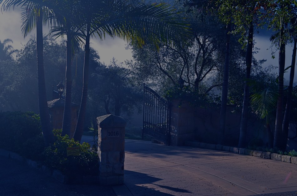
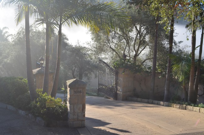
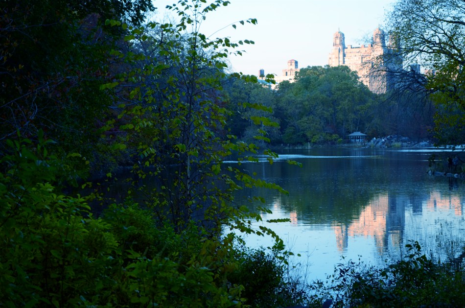
In the case of the image you see up top, I have created an illusion of night through the re-contrasting and color re-assignment of a shot that I originally made as a simple daylight exposure. In such cases, the mood of the image is completely changed, since the light cues which tell us whether something is bright or mysterious are deliberately subverted. Light is the single largest determinant of mood, and, when you twist it around, it reconfigures the way you read an image. I call these faux-night remakes “latent blues”, as they generally look the way the sky photographs just after sunset.
This effect is certainly not designed to help me avoid doing true night-time exposures, but it can amplify the effect of images that were essentially solid but in need of a little atmospheric boost. Just because you can’t hang around ’til midnight, you shouldn’t have to do without a little midnight mood.
OH, IT’S HIDEOUS. I LOVE IT.
By MICHAEL PERKINS
THERE MAY BE NO RULES LEFT TO BREAK IN PHOTOGRAPHY, in that everybody is comfortable doing absolutely anything….compositionally, conceptually, technologically…to get the picture they want. Maybe that’s always the way it’s been, seeing as the art of image-making, like the science of breeding apple trees, has always grown faster and stronger through cloning and grafting. Hacks. Improvisations. “Gee-What-If”s.
Shots in the dark.
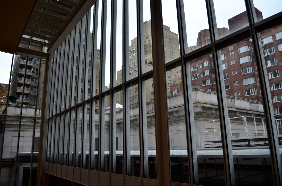
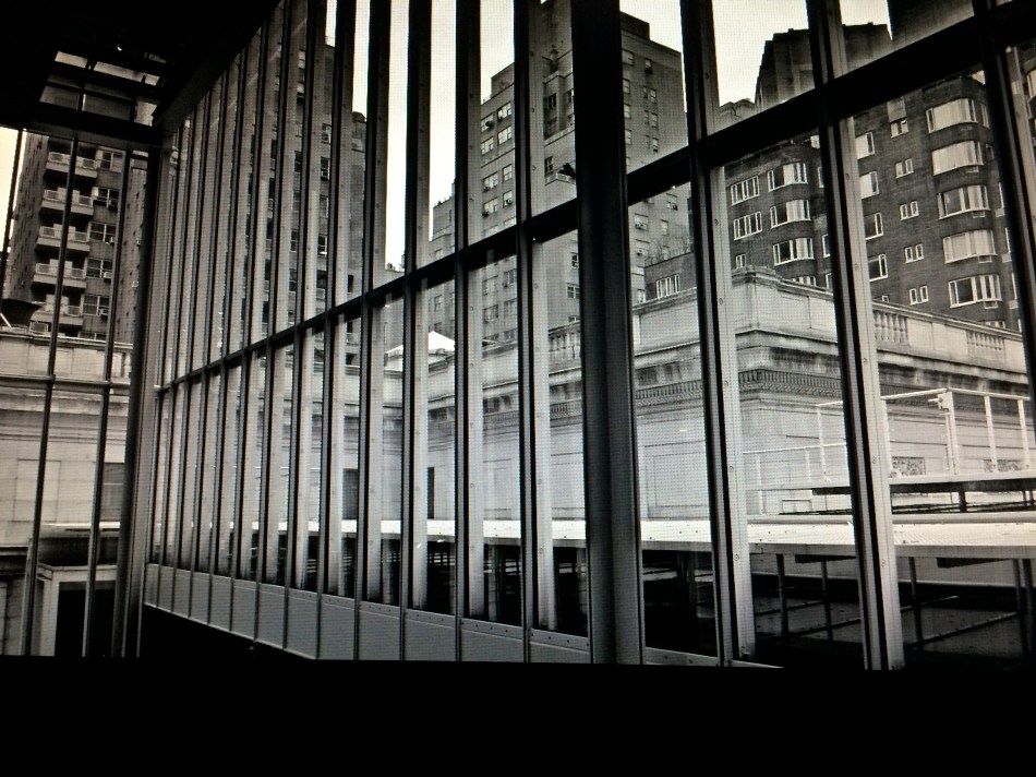
Recently I walked out into the gigantic atrium that connects all of the original buildings of the Morgan Library complex in NYC to get a good look at the surrounding neighborhood of big-shouldered buildings. I was fascinated by the way my wide-angle lens seemed to line up the horizontal grid lines of the atrium with the receding lines of the towers and boxes down the block. Only one thing bothered me about the result: the color, or rather, the measly quality of it.
A rainy day in Manhattan is perhaps the final word on rainy days. Some colors, like the patented screaming yellow of a New York cab, or the loud neon reds of bodegas, are intensified into a romantic wash when the drops start. This view, however, was just a bland mash of near-color. If the neighborhood was going to look dour anyway, I wanted it to be dour-plus-one. Thing is, I made this, ahem, “artistic” decision after I had already traveled 3,000 miles back home. In the words of Rick Perry, whoops.
Time to hack my way to freedom. I remembered liking the look of old Agfa AP-X film in a filter on my iPhone, so I filled the screen of my Mac with the bland-o image, shot the screen with the phone, applied the filter, uploaded the result back into the Mac again, and twisted the knobs on the new cheese-grater texture I had gained along the way. At least now it looked like an ugly day….but ugly on my terms. Now I had the kind of rain-soaked grayscale newspaper tones I wanted, and the overall effect helped to better meld the geometry of the atrium and the skyline.
No rules? Sure, there’s still at least one.
Get the shot.
ATTRACTION / DISTRACTION
By MICHAEL PERKINS
PHOTOGRAPHERS ARE ADDICTED TO “INVISIBLE” STORYTELLING, to hinting at a context beyond what is actually shown in a given image. Sometimes our eyes arrive at a scene just seconds after something important has happened. Sometimes it’s just moments before. Sometimes we have to use emptiness to suggest how full something just was. And, most importantly, we need to determine if color will be a warm accompaniment to something magical, or an unwanted intruder in a scene where less is more.
Wonderfully, this choice has never been easier. Digital photography affords us the luxury of changing our strategy on the color of a shot from frame to frame in a way that film never could. It also allows us to delay the final choice of what works and what doesn’t, to live with an image for a while, and decide, further down the road, whether something needs to be re-ordered or altered, rendered either neutral or vivid. It is a great time to be a photographer. For those picking up a camera today, it must seem absurd that it was ever any other way. For those of us with a few more rings around the trunk, it can seem like a long promised miracle.
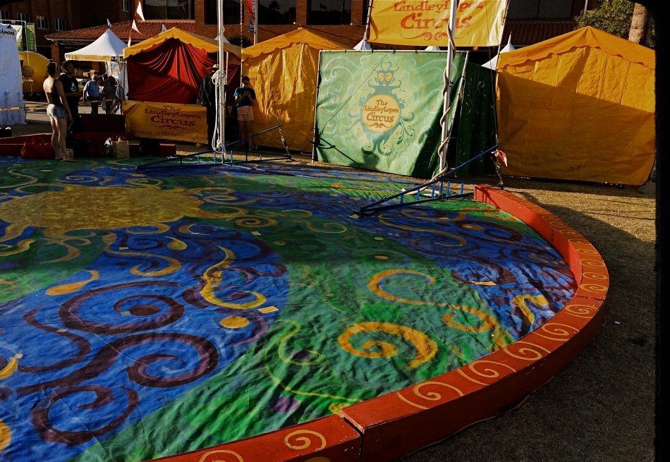
Color can be either addition or distraction to a shot, and usually you know, in an instant, whether to welcome or banish it for best effect. Two recent walk-bys afforded me the chance to see two extreme examples of this process. In the first, seen above, I am minutes too early to take in a small street circus, giving me nothing but the garish tones of the tents and staging areas to suggest the marvels that are to come. I need something beyond the props of people to say “circus” in a big way. Color must carry the message, maybe shouting at the top of its lungs. See what I mean? Easy call.
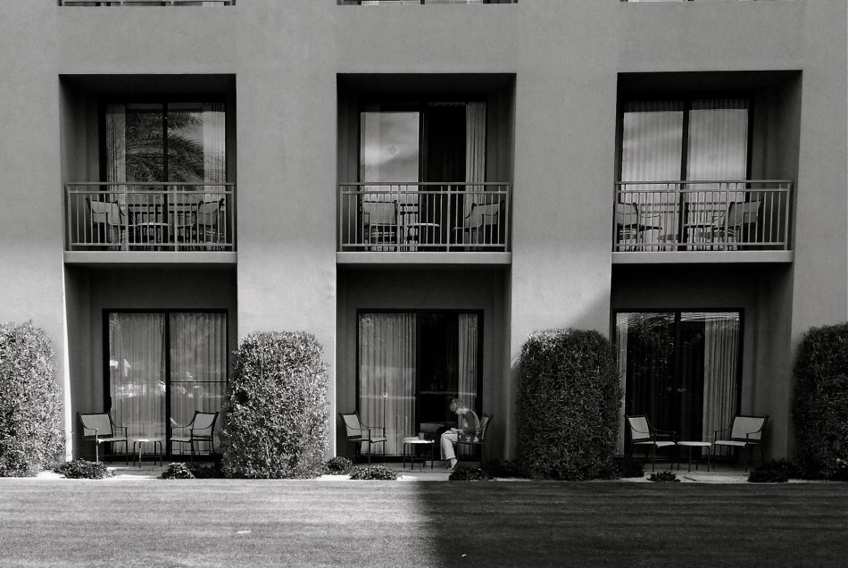
The isolation of the woman in the frame argues against the use of garish color. 1/700 sec., f/2.2, ISO 32, 18mm.
In the second image, which features a lone woman reading against a backdrop of largely featureless, uniform apartment cubes, I am off on an opposite errand. Here, I seem to be wondering why she is alone, who is waiting (or not waiting) for her, what her being in the picture means. The starkness of her isolation will never be served with anything “pretty” in the scene. The original frame, done in color, actually had the drama drained out of it by hues that were too warm. On a whim, I converted it to the look of an old red-sensitive black and white film. It gave me a sharp detailed edge on materials, enhanced contrast on shadows, and a coldness that I thought matched the feel of the image. In audio terms, I might compare it to preferring a punchy mono mix on a rock record to the open, more “airy” quality of stereo.
Dealer’s choice, but I think our photography gains a lot by weighing the color/no color choice a lot more frequently than we did in our film days. The choices are there.The technology could not be easier. Relative to earlier eras, we really do have wings now.
We just need to get used to flapping them more often.
THEY HAD FACES THEN
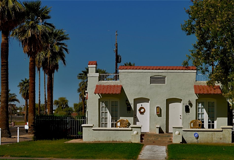
Happy Shining Houses: Two copies of the same image, balanced in Photomatix’ Tone Compression algorithm.1/1000 sec., f/5.6, ISO 100, 35mm
By MICHAEL PERKINS
ONE OF THE MOST HORRIBLE CONSEQUENCES OF SUBURBAN SPRAWL, beyond the obscene commercial eye pollution, the devastation of open space, and the friendless isolation, is the absolute soulless-ness of the places we inhabit. The nowheres that we live in are everywhere. Wherever you go, there you are. Move three miles and the cycle has repeated. Same Shell stations, same Wal-Marts, same banal patterns.
The title of a classic book on the passing of the star era of Hollywood could also be the story of the end of the great American house: They Had Faces Then.
I believe that the best old houses possess no less a living spirit than the people who live inside them. As a photographer, I seek out mish-mosh neighborhoods, residential blocks that organically grew over decades without a “master plan” or overseeing developer. Phoenix, Arizona is singular because, within its limits, there are, God knows, endless acres of some of the most self-effacing herdblocks created by the errant hand of man, but also some of the best pre-WWII neighborhoods, divine zones where houses were allowed to sprout, erupt, and just happen regardless of architectural period, style, or standard. It is the wild west realized in stucco.
When I find these clutches of houses, I don’t just shoot them, I idealize them, bathing the skies above them in azure Kodachrome warmth, amping up the earth tones of their exteriors, emphasizing their charming symmetries. Out here in the Easy-Bake oven of the desert, that usually means a little post-production tweaking with contrasts and colors, but I work to keep the homes looking as little like fantasies and as much like objects of desire as I can.
One great tool I have found for this is Photmatix, the HDR software program. However, instead of taking multiple exposures and blending them into an HDR, I take one fairly balanced exposure, dupe it, darken one frame, lighten the other, and process the final in the Tone Compression program. It gives you an image that is somewhat better than reality, but without the Game of Thrones fantasy overkill of HDR.
Photography is partly about finding something to shoot, and partly about finding the best way to render what you saw (or what you visualized). And sometimes it’s all about revealing faces.
HIGH DYNAMIC RAGE
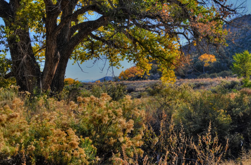
HDR, used here to recover a few dark details in this somewhat contrasty ladnscape. Far from perfect, but I can live with this.
By MICHAEL PERKINS
THE INTERNET HAS A UNIQUE WAY OF TURNING AN IFFY LOOKING MOLE INTO TERMINAL SKIN CANCER, that is, fanning small sparks into raging infernos by squaring and cubing people’s discontents until they appear monumental. In photographic circles, this phenomenon has made the process known as High Dynamic Range, or HDR a hot potato. Whereas just a few years ago this technique sparked input from people who found it “kind of helpful” or “just not for me”, the current intensity of dialogue on the subject now characterizes HDR as either the greatest tragedy since Ben Affleck got cast as Batman or the miraculous equivalent of mother’s milk.
What has made the average shooter feel like they he has to side with either Mommy or Daddy in a custody battle for the soul of picture-taking? Jeez H. Loueeze. HDR, which is actually just a tool, and thus good or bad depending on how it’s used, has become an enormous bone of contention, with both sides of the debate hurling burning tar balls at each other, safe within the knowledge that they alone possess Real Truth.
Uh….okay, fine.
How’s this for Real Truth: processing in the digital age is no different from the burning, dodging, manipulation and filtering of the analog era, and, somehow, photography has survived both the modest and excessive uses of these and countless others for over two centuries. HDR’s original stated purpose was to modulate the tones of extremely contrasty subject matter, rendering a smoother transition between really light and really dark values to produce a picture that seemed to more accurately reflect how the human eye compensates for contrast. It was concocted as a workaround for one of the optical barriers that cameras are always striving to overcome.
So what do you expect humans, always the “X” factor in any art, to do with any new tool? Answer: Anything they damn well please. Of course some people are going to produce beauty while others produce sludge. Of course some will use it to mask or slap a band-aid on badly conceived images. And, of course decent HDR processing platforms will be imitated by cheap apps created in Hacky McHackmore’s Dad’s garage and selling for $1.99.
I have had my own uneasy romance with HDR going back several years. I have found it to be a nice way to tweak color, an intensifier for detail and grain in things like stone and wood, and, yes, a way to dramatize contrasts in superkeen ways. I have also been guilty of slathering it on in the desperate hope that I can “rescue” a shot with it, and have been horrified at the way it makes human skin look like it was hosed down in molten Crayolas. Sometimes I have used it to make things more natural, while, at other times, I have taken advantage of its special talent for making things unearthly. And even when I have made the most inane use of HDR, the planets have, amazingly, continued on their daily orbits. In the words of the not-too-great Bobby Brown, it’s my prerogative.
The intense hater-ama currently being mounted against HDR might better be aimed at what makes its misuse all too predictable: the fact that human judgement is variable, unpredictable, and sometimes, twisted. If there’s a photo process that can eliminate that from the pitcher-taking mix, I’d love to see it. In the meantime, HDR is no more harmful (or salvational) than any other processing platform. If there’s a flaw, it’s inside the skull of the guy pressing the button.
Always has been, always will be.
QUICK STUDY

Don’t think you’re paying me a compliment to say that this “looks like a painting”. Or a cabbage. Or a hammer. It’s a picture.
By MICHAEL PERKINS
THE INCREASINGLY COMMON USE OF THE WORD “PAINTERLY” AS A GENERIC COMMENT ON CERTAIN KINDS OF PHOTOGRAPHIC IMAGES has got me grinding my teeth, as it perpetuates the use of a term that is absolutely meaningless. Almost as meaningless as noting, or caring, at this late date, whether elements of painting are present in photos. This argument goes back so far that I feel compelled to provide the following “Cliff’s Notes” in order to compress 150 years of bickering into a compact format. Presenting:
A COMPLETE CHRONOLOGY OF PHOTOGRAPHIC “TRUTH”
a) We are just as good as painting.
b) No seriously, we are.
c) Who said that? We are so not like painting, which is old and tired.
d) Well, we’re a little bit like it, but we kinda feel weird about it.
e) Wow, I’d love to photograph that painting.
f) Man, I’d love to layer paint on that photograph.
g) Hey, I found a way to make my photographs look like paintings!
Enough already. We never praise a painting by saying it looks “Photo-ish”, so why make the opposite comment? What visual flavor makes any image fall on either side of an arbitrary line, and who the $%#&! cares? The only comment that could possibly matter is to remark that something is “a great picture”, but even that is superfluous. Does it speak? Did it work? Is there something there? Was anything amplified, simplified, defined, revealed in said picture?
This kind of semantic drift persists because, amazingly, some people don’t think photography is miraculous enough without being laden with little linguistic Christmas ornaments that display their acumen and intellect. These are the same people who fret that processing is “cheating” and that expensive cameras make better pictures than cheap ones, and it’s a disservice to any authentic discussion, like the fact that those who wield brushes and those who wield Nikons can both exalt, or denigrate, the human experience.
You don’t have to paint me a picture. You just have to tell me a story.
Related articles
- Blending painterly elements with photography (flickr.net)
LIPSTICK ON A PIG

Bad day at the office: having failed at making this house charming, I then went on to also fail at making it sinister and forbidding. I did, however, succeed in making it an unholy mess.
By MICHAEL PERKINS
IT’S TV-DOCTOR SHOW CLICHE NUMBER ONE. The frantic ER crew valiantly works upon a patient who is coding, pulling out every tool in a desperate search for a discernible pulse. Then the close-up on the earnest nurse: “He’s gone.” and the final pronouncement by the exhausted resident: “Okay, anyone have the time? I’m calling it….”
That’s pretty much what it’s like to try to rescue a lousy photograph by extraordinary means…tweaking, sweetening, processing, whatever you call the ultimately futile emergency measures. Sometime the unthinkable is obvious: the picture’s a goner…no pulse, no soul, no life.
Cue Bones McCoy: It’s dead, Jim.
I have made my share of ill-advised interventions in the name of “saving” photos that I was unwilling to admit were lifeless, pointless, just a plain waste of time. You’ve done it too, I’m sure. Trying to give some kind of artistic mouth-to-mouth to an image that just wasn’t a contender to begin with. It was a bunch of recorded light patterns, okay, but it damn sure wasn’t a photograph. Smear as much lipstick on a pig as you want….it’s still a pig.
The above image shows the worst of this pathology. I wanted to show the charm of an old bed-and-breakfast in the gloriously beautiful little town of Pacific Grove, located just up the peninsula from Monterey in California (see image at left). But everything that could have made the image memorable, or even usable, was absent. The color, a cool buttercup yellow, is common to many town dwellings. In the warm glow of dawn or the late waning, dappled light of late afternoon, it can be charming, even warm. In the mid-day light, weak, withered. Then there was the total lack of a composition. The picture was taken in a second, and looked it.
So, angry at having failed at the “charming” look I had gone for, and unable to make the backlighting on the house work for me, I went into Photomatix (usually a very solid HDR tool) and started, almost angrily, to take revenge on the damned thing. If I can’t make you pretty, I’ll make you magnificently ugly, hahaha…. Seriously, I was pretty far into the journey from “happy little house” to “creepy little twilight creep castle” before realizing there was nothing to be extracted from this picture. No amount of over-glop, taffy-pulling or prayer would magically compensate for a central core concept that just wasn’t there. Like it or not, the pig was always going to show through the lipstick.
Sometimes you just gotta declare the unlucky patient in front of you dead, and try to save the kid on the next gurney over.
This blog was always supposed to be about choices, both good and bad, and how we learn from each. I have shared my failures before, and firmly believe that the only honest conversation comes from admitting that sometimes we make colossal errors in judgement, and that a fair examination of even our “misses” is more important than an endless parade of our “hits”.
Photography is not about consistent genius. It’s about extracting something vital from something flawed.
Being able to identify when we have fallen short is the most important skill, the most essential tool.
MUTATION

Okay, this has a LOT of processing. Love me or hate me based on whether it worked. 1/500 sec., f/1.8, ISO 100, 35mm.
BY MICHAEL PERKINS
NOT CONTENT TO BE AN ART ON ITS OWN TERMS, PHOTOGRAPHY IS ALSO CONSTANTLY RE-INTERPRETING ALL THE OTHER ARTS AS WELL. Ever since imaging fell out of the cradle in the early 1800’s, several of us have always been looking at the works of others and saying, “eh, I can probably do something with that.”
Yeah, not too presumptuous, right? And the trend has continued (some say worsened) to the present day. Half the time we are creating something. The other half of the time we are tweaking, mocking, honoring, loving, hating, shredding, re-combining, or ragging on somebody else’s work. Are these mashups also art? Are we co-creators or just cheesy thieves?
And does it matter?
The Phoenix Art Museum greets customers with a stunning original sculpture in glass and plexi right at the entrance to its ticket lobby. A huge installation of light bulbs, mirrored surfaces and reflective discs, Josiah McIlheny’s The Last Scattering Surface resembles a brightly burning orb (planet? asteroid? dwarf star?) surrounded by jutting rods that carry the central sphere’s light along “rays” to a series of circular satellites (moons? craft? debris?) Like many examples of pure design it is both everything and nothing, that is, it is mutative based on your observation. So, in a way, as in the manner of a photographer, you are already a participant in the co-creation of this object just by looking at it. Does this mean that it’s less theif-ish to go ahead and mutate the man’s work?
Well, there’s probably a lively back-and-forth on that.
For my own “take”, I wanted to remove the background walls, visitors, ambient blurry light from other junk, to isolate this nova-like work in “space”. I only had one frame that I liked from my short blast of shots, so I duped it, slammed the contrast real light/real dark on the pair, and did an exposure fusion in Photomatix. Adding a little edge blur and a re-tinting to the composite gave me the look of an interstellar explosion.
I freely advertise that I am making a semi-original re-mix on a completely original work. It’s not much more radical than shooting with a filter on the lens, or choosing black and white for a color subject, and yet, it always feels funny to try and make something beautiful that was beautiful in the first place.
But art is supposed to be about starting conversation, so consider this mine.
I just did my talking with a box instead of a mouth.
follow Michael Perkins on Twitter @ mpnormaleye.com
OPTING FOR IMPERFECTION

When additional detail needs to be extracted from shadows and from the texture of materials, HDR (High Dynamic Range) is a great solution. This shot of the entrance to the New York Public Library is a three-exposure bracket composited in Photomatix. Is this process great for all images of the same subject? See a different approach below….
By MICHAEL PERKINS
SOMETIMES I LOSE MY WAY, CREATIVELY. Given that cameras are technical devices and not creative entities, we all do. We have been given, in today’s market, wonderful aids to seeing and interpreting what we consider noteworthy. Technological advances are surging so swiftly in the digital era that we are being given scads of pre-packaged effects that are baked into the brains of our cameras, ideally designed to help us calculate and fail less, succeed and create more. To that end, we are awash in not only genuinely beneficial shortcuts like programmable white balance and facial recognition, but “miniature”, sketch, selective desaturation, and, recently, in-camera HDR options as well. Something of a tipping point is occurring in all this, and maybe you feel it as strongly as I do; more and more of our output feels like the camera, the toys, the gimmicks are dictating what gets shot, and what it finally looks like.
Here’s the nugget in all this: I have been wrestling with HDR as both a useful enhancer and a seductive destroyer for about three years now. Be assured that I am no prig who sees the technique as unworthy of “pure” photography. Like the old masters of burning and dodging, multiple exposure, etc., I believe that, armed with a strong concept, you use whatever tool it takes to get the best result. And when it comes to rescuing details in darker patches, crisping up details in certain materials like brick and stone, and gently amplifying color intensity, HDR can be a marvelous tool. Where it becomes like crack is in coming to seem as if it is the single best gateway to a fully realized image. That is wrong, and I have more than a few gooey Elvis-on-black-velvet paintings that once had a chance to be decent pictures, before they were deep-fried in the conceptual Crisco of bad HDR. Full disclosure: I also have a few oh-wow HDR images which delivered the range of tone and detail that I honestly believe would have been beyond my reach with a conventional exposure. The challenge, as always, is in not using the same answer to every situation, and also to avoid using an atomic bomb to swat a fly.

Same library, different solution: I could have processed this in HDR in an attempt to pluck additional detail from the darker areas, but after agonizing over it, I decided to leave well enough alone. The exposure was a lucky one over a wide range of light, and it’s close enough to what I saw without fussing it to death and perhaps making it appear over-baked. 1/30 sec., f/6.3, ISO 320, 18mm.
Recently, I am looking at more pictures that are not, in essence, flawless, and asking, how much solution do I need here? How much do I want people to swoon over my processing prowess versus what I am trying to say? As a consequence, I find that images that I might have reflexively processed in HDR just a few weeks ago, are now agonized over a bit longer, with me often erring on the side of whatever “flaws” may be in the originals. Is there any crime in leaving in a bit more darkness here, a slight blowout in light there, if the overall result feels more organic, or dare I say, more human? Do we have to banish all the mystery in a shot in some blind devotion to uniformity or prettiness?
I know that it was the camera, and not me, that actually “took” the picture, but I have to keep reminding myself to invest as much of my own care and precision ahead of clicking the shutter, not merely relying on the super-toys of the age to breathe life into something, after the fact, that I, in the taking, could not do myself. I’m not swearing off of any one technique, but I always come back to the same central rule of the best kind of photography; do all your best creative work before the snap. Afterwards, all your best efforts are largely compensation, compromise, and clean-up.
It’s already a divine photographic truth that some of the best pictures of all time are flawed, imperfect, incomplete. That’s why you go back, Jack, and do it again.
The journey is as important as the destination, maybe more so.
Thoughts?
