NEED DICTATES USE

In most cases, my standard 18mm wide-angle could have captured all of this unusual art installation.
By MICHAEL PERKINS
I TEND TO LOOK MOST KINDLY ON THOSE LENSES that will perform the widest variety of tasks. Over time, photography can easily experience what the military call mission creep, with equipment escalating in both cost and complexity as the hobby sinks its roots into the bedrock of our little shooter’s souls. This can contribute to an ever-escalating array of specialized tools, or what I call more and more of things that do less and less. Over the decades, my aching back and wounded wallet have conspired to make me seek out optics that can handle macro, landscape, street and portrait work all by themselves, shrinking the number of instances in which I have to switch to hyper-dedicated gizmos, thus increasing how much I lug about with me. That said (don’t you hate sentences that begin this way?), there are times when you need a scalpel instead of a Swiss army knife.
A fisheye is the textbook example of an over-specialized lens, a hunk of glass that delivers a very distinctive, very controversial view of the world. To some, they are the gateway to innovation, to viewpoints beyond the power of the human eye. To others, they’re a gimmicky abomination. They’re really just ultra wide-angles that take in such a vast view (anywhere from 120 to 180 degrees or even wider) that they literally bend the field of vision, encompassing shots within an actual circle in full-frame cameras or what’s called a diagonal fisheye in cropped sensors. In both cases, the shot features dark vignettes at the corners in images where proportions are nearly normal at the center, then increasingly bowed-out closer to the edge of the shot. They are still in the minority as far as general lens use is concerned for a variety of reasons, including the rarity of cases in which they can be truly appropriate or effective, the heinous cost of the good ones, and the heinous artifacts in the cheap ones.
I happened to have lucked out with a fisheye that is fairly crisp and free of chroma flaring at f/16 or smaller, although the accompanying need for increased ISO bears watching. I shoot on a crop, so I don’t worry about maintaining the “encircled” look since I can’t get it anyway, allowing me to crop to wherever the frame is strongest. In the “before” shot of a strange but huge art installation at Phoenix’ Desert Botanical Garden (see above), you see what a standard 18mm wide-angle will do. Given that I had very limited space either behind or above me, there was no way to back up in order to include the entire scene, and so, out came the fisheye, shooting at about 12mm and taking in a 160mm field of view (see below).

Same vantage point, but shot with a 12mm fisheye instead. Now I can show the entire story.
Now, standing in exactly the same place, I could see where the “yellow wave” of straw-like fibers originated at the far end of the shot, while the distortion factor in the lens gave the flow of straws a kind of “S” curve as it made its way to the foreground. Other considerations: super-wides exaggerate the distance between front and back, making the whole installation seem more vast than it was in reality; and also, by keeping most of the crucial action in the center, I kept the image’s most radical distortion (like on the footbridge at upper left) confined to the outer edge of the composition.
Would I, for this shot, have resorted to the fisheye except out of desperation? Unlikely. It is not a “go to” tool in any real way, since like all gimmick glass tends to pull attention away from the subject and toward itself. However, even though I love to head out with “one lens to rule them all”, I find, like any good sawbones, that I will, occasionally, need that scalpel.
EYE OF THE BEHOLDER
By MICHAEL PERKINS
PHOTOGRAPHERS LOVE A GOOD SCRAP. We spar about gear: we argue about technique: we defend both film and digital with equal fervor: we crab about the purity of our own artistic vision (as opposed to the pedestrian pap of other shooters).
We even squabble about what blur is. Or isn’t.
If you have an afternoon to burn sometime (and if you care) Google the phrase “bokeh versus blur” and get ready to rumble. Notwithstanding the fact that few outside photography’s elite inner circle had even heard of the word “bokeh” (in the original Japanese, literally “blur” or “haze”) until about a decade ago, many of us are now choosing up sides about what it, and blur, are…or are not. Does it finally matter? Depends on who you ask, and whether they’ve had a good night’s sleep and a solid breakfast. But let’s put on our waders and tenderly tiptoe into the slipstream. Watch out for alligators.
Photographers may choose an art lens like the Helios 44 for the unique shapes of its bokeh.
I would think of blur as any unfocused or under-defined area within a photograph, a place where textures become soft enough for their details to be indistinguishable. It is, essentially, a visual condition. Think of the trees behind your portrait subject that turn to soft mush when you set for a shallow depth of field. Because you want to showcase a face and not a tree, right? Simple.
By comparison, bokeh is the distinct pattern or texture of the blur, something which may or may not be considered “desirable” by photographers, as if it were another design element to be shaped to complement the foreground. This could be anything from replications of the shape of your aperture (little floating pentagrams) to egg-shaped dots in a swirl, or a million other things, depending on the performance and design of your particular lens. It is, as compared to mere blur, a visual quality.
Now, I realize that merely trying to assign simple definitions to these two things will automatically alienate me from a planet-sized portion of the internet, so go to it. But here’s the point I really want to make.
Blur or bokeh, their usefulness, their positive or negative effect, even their potential aesthetic appeal….these are all judgement calls and are totally in the eye of the beholder. Some of us will actually choose a lens based solely on what kind of bokeh it will produce. Conversely, others will never assign any artistic value or priority to the effect whatsoever…and that’s completely fine. I myself have definitely lived on both sides of the streets in this issue, and so, by turns, the whole thing both is and isn’t important, based on what the job at hand is. The main reason I study the debate is because it shapes the intentions of photographers, and so is part of an overall understanding of why we shoot, which is the main idea of this little small-town newspaper.
Bokeh has come to the fore in recent years because photographers seem to want to shape it no less than any other visual element within the frame. And, like anything else about our art that gets discussed to death, it can create clannish, even clownish posturing about what’s more “authentic”, a discussion which takes us nowhere fast. Finally, blur elements are just like trees, furniture, or buildings. Want ’em in your picture? Put ’em there, and God Bless. However, the only thing we don’t want to do, ever, is to try to develop a list of commandments, of things that are always good or always bad for the making of pictures. That shuts down discussion, and eventually clamps down on creativity.
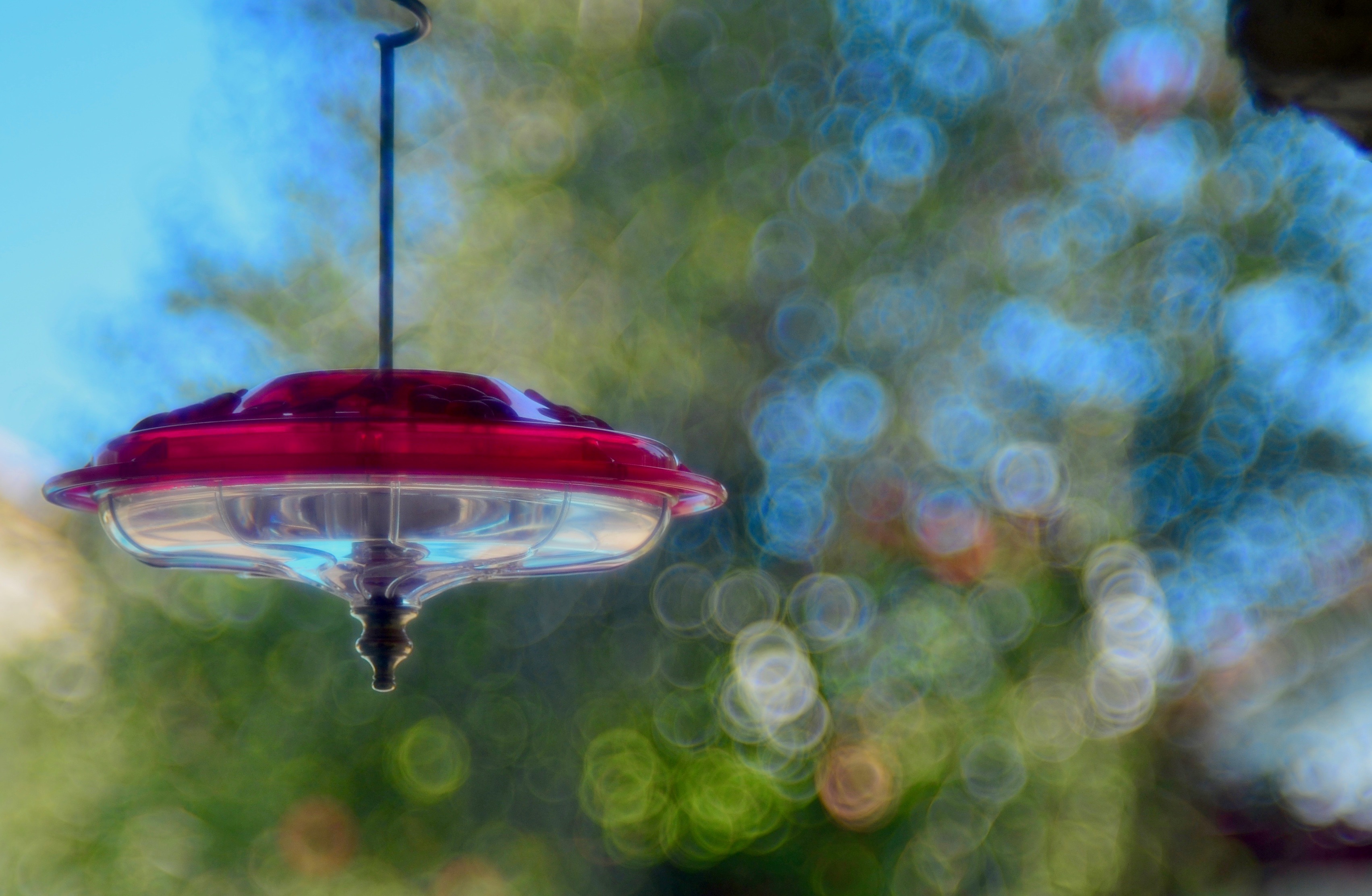
FRINGE ELEMENT
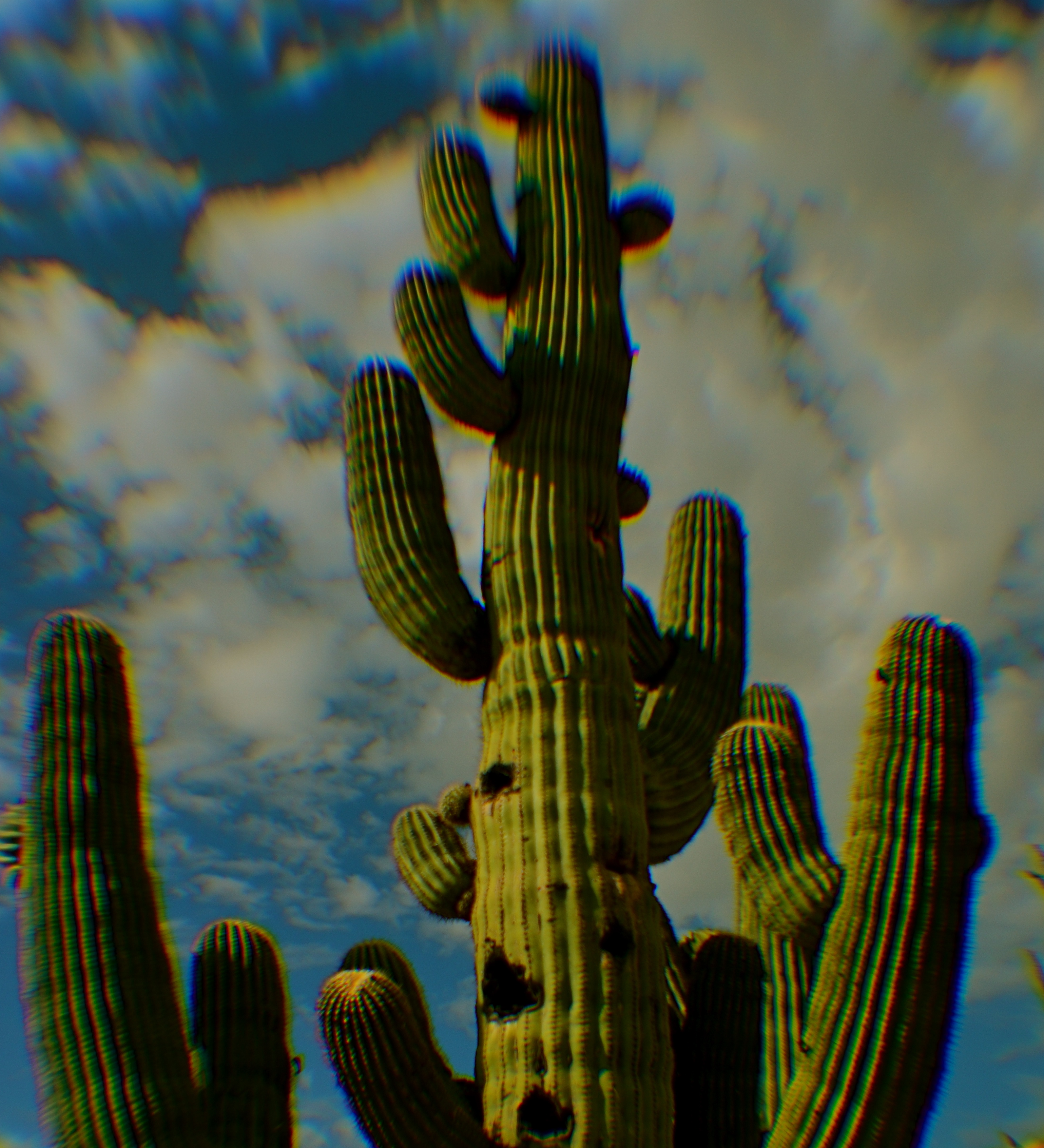
Extreme chromatic aberration (color fringeing) along the exterior line of the cactus.
By MICHAEL PERKINS
THE RESURRECTION, ABOUT TWENTY-FIVE YEARS AGO, of several low-end, cold-war-era plastic cameras as refurbished instruments of a kind of instinctual “art” photography has influenced even the digital and high-end photo markets, with light-leaking, optically sloppy toys like the Holga, the Diana and other “lomographic” devices shaking up the way many photographers see the world. Thus have these technically challenged little cameras, designed as children’s playthings, changed the conversation about what kind of formerly dreaded optical flaws we now elect to put back in to our work. Lomo shooters’ devotion to their craft has also meant a reprieve of sorts for film, since theirs in an analog realm.
But even digital shooters who don’t think of themselves as part of the “lomography” trip can dip a toe into the pool if they like, with filters on phone apps labelled “toy camera” which simulate light leaks, film-era “cross-processing” and the color variations caused by cheap plastic lenses. There are also companies like Lensbaby that manufacture all-new plastic optics designed to lend an element of creative control to what, in lomo cameras is largely random. The good news: you can, in effect, put defects into your pictures….on purpose.
Plastic lenses are generally much softer than glass lenses, giving a kind of gauzy appearance to your shots, so if you’re a fan of razor sharpness, they may not be your dish. More importantly, they produce a much higher amount of what is called “chromatic aberration”, which is more understandable under its nickname “color fringing”, since that more accurately describes how it looks. If you want a reasonably clear science-guy breakdown of CA, here’s a link to keep you busy this semester. The main take-home for most of us, though, is that the effect takes what would largely be a smoothly blended rendering of colors and makes them appear fractured, with the “fringe” look most noticeable along the peripheral edge of objects, where the colors seem to be separating like the ragged edge of an old scarf.
Why should you care? Well, mostly, you don’t have to. All lenses have a degree of CA, but in the better-built ones it is nearly undetectable to the naked eye, and can be easily processed away in Lightroom or a host of other editing suites. But people who are choosing to use plastic lenses will see it quite clearly, since such optics cause different wavelengths of light to “land” in the focal plane at slightly different speeds, meaning that, in essence, they fail to smoothly blend, hence the “fringing” effect.
Of course, chromatic aberration may be exactly the look you’re going for, if you want to create a kind of lo-fi, primitive look to your shots. In the cactus photo seen here, for example, taken with an all new plastic “art” lens, I found that the effect resembled old color printing processes associated with early postcards, and, for that particular image, I can live with it. Other times I would avoid it like the plague.
Plastic lenses, like any other add-ons or toys, come with their own pluses and minuses. Hey, if you’re a ketchup person, then soak your plate with the stuff. But if you believe that it just louses up a good steak, then push the bottle away. Just that simple.
THIS MUST BE / MIGHT BE THE PLACE
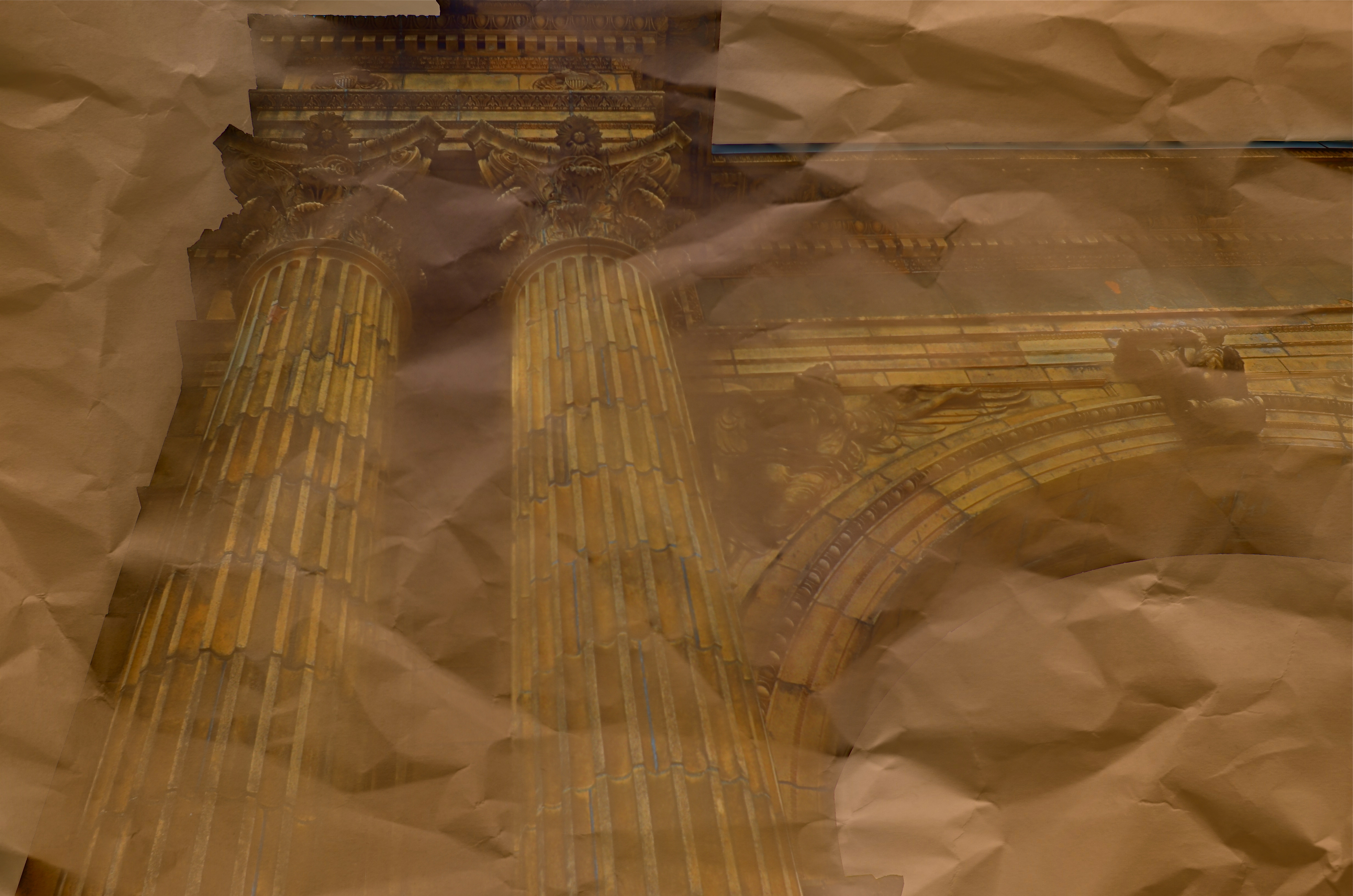
Dream Parchment, 2016.
By MICHAEL PERKINS
URBAN PHOTOGRAPHERS ACT IN MUCH THE SAME WAY AS ARCHAEOLOGISTS in that they must try to supply context for objects, backstories that have been either altered or erased. Cities are collections of things created by humans for specific motives, be it profit, shelter, play, or worship. Often, the visual headstones of these dreams, that is, the buildings, survive beyond the people that called them into being. Photographers have to imply the part of the story that’s crumbled to dust. Like the archaeologist, we try to look at shards and imagine vases, or see an entire temple in a chunk of wall.
During the dreaded “urban renewal” period in the mid-twentieth century, my home town of Columbus, Ohio duplicated the destruction seen in cities across the country in the wanton devastation of neighborhoods, landmarks and linkages in the name of Progress. Today’s urban planners thumb sadly through vast volumes of ill-considered “improvements” wrought upon history from that period, with New York’s Penn Station, Pittsburgh’s Forbes Field, and Columbus’ Union Station surviving today only as misty symbols of fashion gone amok.
In the case of Columbus’ grand old railroad station, there is at least a fragment of the original structure, its beaux-arts entry arch, left standing, serving as either stately souvenir or cautionary tale, depending on your viewpoint. The arch has been moved several times since the demolition of its matching complex, and presently graces the city’s humming new hockey and entertainment district, itself a wondrous blend of new and repurposed architecture. Better late than never.
Thus, the Union arch has, by default, become one of the most photographed objects in town, giving new generations of artists permission to widely interpret it, freed, as it is, of its original context. Amateur archaeologists all, they show it as not only what it is, but also what it was and might have been. It has become abstracted to the point where anyone can project anything onto it, adding their own spin to something whose original purpose has been obliterated by time.
I have taken a few runs at the subject myself over the years, and find that partial views work better than views of the entire arch, which is crowded in with plenty of apartment buildings, parklands and foot traffic, making a straight-on photo of the structure busy and mundane. For the above image, I imagined that I had recovered just an old image of the arch….on a piece of ancient parchment, a map, perhaps an original artist’s rendering. I shot straight up on a cloudy day, rendering the sky empty and white. Then I provided a faux texture to it by taking separate a sepia-toned photo of a crumpled piece of copier paper and fusing the two exposures (the HDR software Photomatix’ “exposure fusion” feature does this easily). Letting the detail of the arch image bleed randomly through the crumpled paper picture created a reasonable illusion of a lost document, and I could easily tweak the blend back and forth until I liked the overall effect.
Cities are treasure hunts for photographers, but not everything we find has to be photographed at, let’s say, face value. Reality, like fantasy, sometimes benefits from a little push.
CHANGE YOUR ATTITUDE
By MICHAEL PERKINS
PHOTOGRAPHY IS OFTEN A GAME OF INCHES, a struggle in which outcomes vary wildly based on small, rather than large issues. Early photographers learned this the hard way, since their limited gear forced them to innovate composition and exposure with tiny tweaks that slowly but gradually added more refined skill to their work and better performance from their equipment. Ernest Haas’ great quote that a wide-angle lens is just as close as taking three steps backward still holds true. What has changed is that we have a greater tendency to think that we need more tech to make better pictures. That concept, simply, is poppycock.
For years, the option of a zoom lens was out of the question for the average photographer. The consumer-level zooms that existed were often optically inferior to standard or wide-angle glass (as testified to by Annie Leibowitz and other heavyweights), and so composition was acquired by physically closing or widening the actual distance between yourself and your subject. This is not to say that zooms didn’t eventually prove amazing tools, because they have. However, they demonstrate and instance in which tech has automated, and thus eliminated, an extra step of mindful concentration that used to reside solely in the photographer’s brain. This can lead, over time to an over-reliance on the gear to bring everything home, something it cannot ever do.
Learning to simply maximize the effect of whatever you have up front of the shutter is the easiest, and yet most overlooked aspect of many people’s work. We’d spend a lot less time lugging and swapping lenses if we knew how far we could push whatever we’ve got attached at the moment, and, indeed, masters like Scott Kelby, author of the best-selling Digital Photography Book series, has several “why change lenses? hunks of glass like the 18-200mm that can get him through an entire day without a swap. This works because he works a little harder at exploiting everything his gear can do.
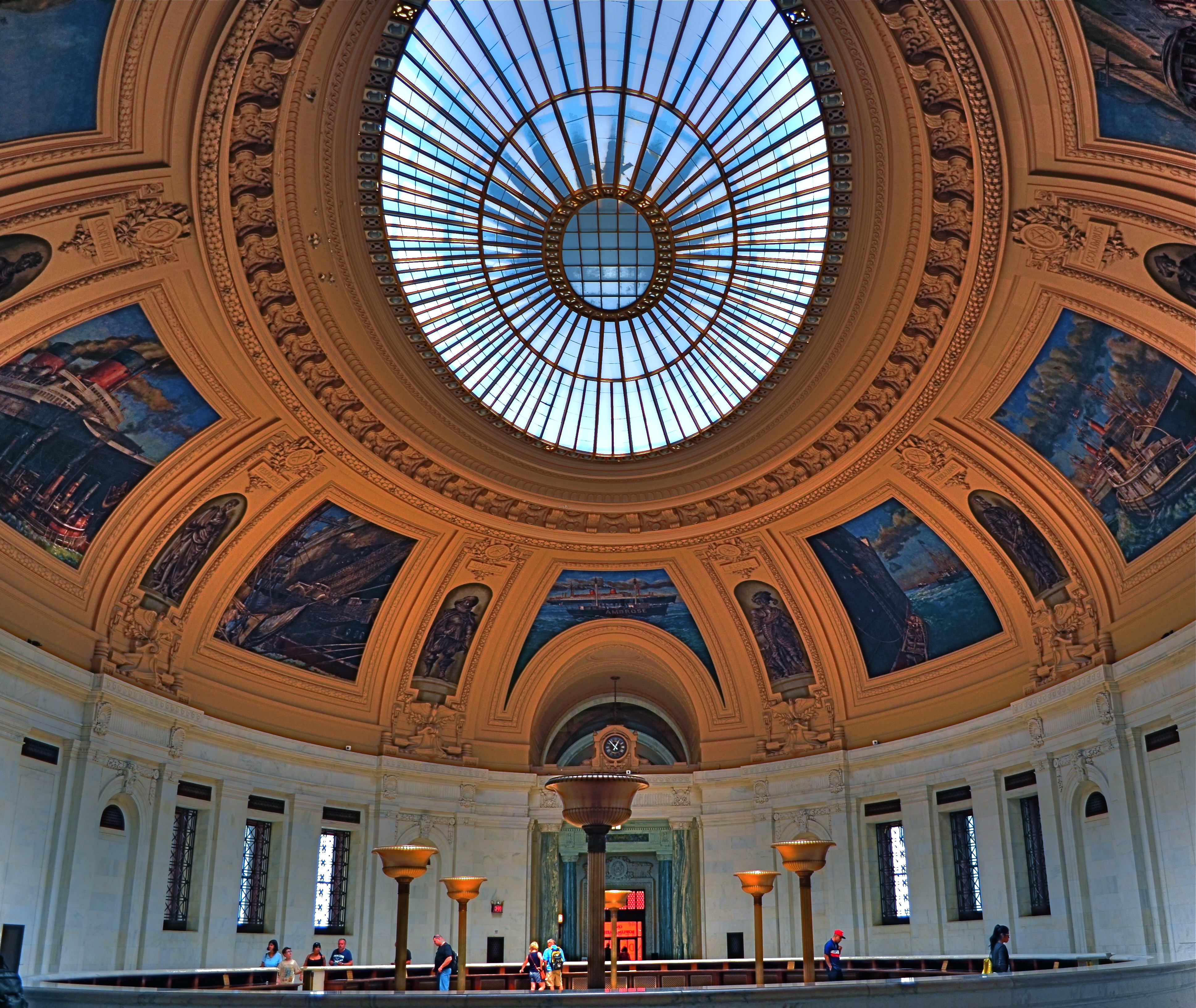
Wide-angle lenses deliver a variety of effects beyond just width.
Consider the above image. It’s taken at 18mm, but, because I arched the shot upwards, instead of maintaining a level horizon line, I forced the lens to do a little more of what it was originally designed to do….exaggerate dimensions and distances. The development of wide-angle lenses was, after all, pursued by shooters who wanted an enhancement, an interpretation, and not a recording, of reality. As such, the wide-angle in this shot over-accentuates the most prominent feature of this room within the old U.S. Customs building in Manhattan…its amazing murals. It also creates an illusion of vastness, front-to-back, in a room that is already pretty huge. And this is all done by pivoting my head upward about 30 degrees.
The game of inches is the great equalizer in photography between pro and amateur, because it gives the advantage to those who plan the best, see the most, and think the widest. And you don’t need a closet full of geegaws to do that.
WHAT IS HIP?

Shooting “from the hip” can be an urban photographer’s secret weapon. 1/40 sec., f/3.5, ISO 500, 18mm.
By MICHAEL PERKINS
WHEN FACED WITH A COMPLETELY DIFFERENT APPROACH TO OUR PHOTOGRAPHY, the crabbier among us are liable to utter one of two responses. Both sound negative, but one could be positive:
Response #1: “I’d never do that!” (Emphatically negative. Discussion over. You will not persuade me.)
Response #2:”Why would I want to do that???” (Possibly as close-minded as response #1, but the person could be asking a legitimate question, as in, ‘show me the benefit in doing it your way, because I can’t imagine a single reason why I should change’.)
When first reading about the street photography technique of “shooting from the hip”, I was a definite response #2. Wasn’t going to slam the door on trying it, but failed to see what I would get out of it. The phrase means just what you’d think it does, referring to people with obvious cameras who do “street” work, shooting with the camera hanging at waist level, never bringing the viewfinder up to their eye. Subjects don’t cringe or lock up because you don’t “seem” to be taking a picture, and thus your images of them are far more unguarded and natural.
Now, suggesting this to a person who has never even owned a camera that didn’t have a viewfinder is a little like asking him to try to take pictures from the inside of a burlap sack. Kinda makes my inner control freak throw a bratrum (a brat tantrum). Think of it from my point of view. If I shoot manually all the time (I do) and if I need my viewfinder like Linus needs his blanket (cause, hey, I’m a tortured and insecure artist), then squeezing off a shot without even knowing if it’s in frame is, to say the least, counter-intuitive (French for “nuts”).
So there you have your honestly expressed Response #2.
Some things that finally made it worth at least trying:
It don’t cost nothin’.
I can practice taking pictures that I don’t care about. I wouldn’t be shooting these things or people even with total control, so what’s to lose?
Did I mention it don’t cost nothin’?
Shooters beware: clicking from the hip is far from easy to master. Get ready to take lots of photos that look like they came from your Urban Outfitter Soviet Union-era Plastic Toy Hipsta Camera. You want rakish tilt? You got it. You like edgy, iffy focus? It’s a given. In other words, you’ll spend a lotta time going through your day’s work like the Joker evaluating Vicki Vale’s portfolio (….”crap….crap….crap….” ). But you might eventually snag a jewel, and it feels so deliciously evil to procure truly candid shots that you may develop an addiction to the affliction. Observe a few basics: shoot as wide as you can, cause 35s, 50s and other primes won’t give you enough scope in composition at close range: go with as fast a shutter speed as the light will allow (in low light, compromise on the ISO): if possible, shoot f/5.6 or smaller: and, finally,learn how to pre-squeeze the autofocus and listen for its quiet little zzzz, then tilt the camera just far enough up to make sure everyone has a head, and go.
At worst, it forces you to re-evaluate the way you “see” a shot, since you have no choice but to accept what the camera could see. At best, you might see fewer bared fangs from people snarling, “hey is that a $&@*! camera?” inches from your nose. And that’s a good thing.
IT’S UNNATURAL, NATURALLY
By MICHAEL PERKINS
ONE OF THE MOST FREEING PARTS OF PICTURE MAKING IS RELEASING YOURSELF FROM THE RIGIDITY OF REALITY. Wait. What is he babbling about? Don’t photographers specialize in reality?
Well, yeah, the photographers who work at the DMV, the city jail and immigration do. Also the guy in Wal-mart HR who made your first employee badge. Other than that, everyone is pretty much rendering the world the way they see it right this minute, with more revisions or re-thinks coming tomorrow. And beyond.
Color processing, once the sole domain of the “photo finishers” has now been taken back in-house by pretty much everyone, and, even before you snap the shutter, there are fat stacks of options you can exercise to recast the world in your own image.
1/60 sec., f/3.5, ISO 320, 35mm. White Balance set for tungsten.
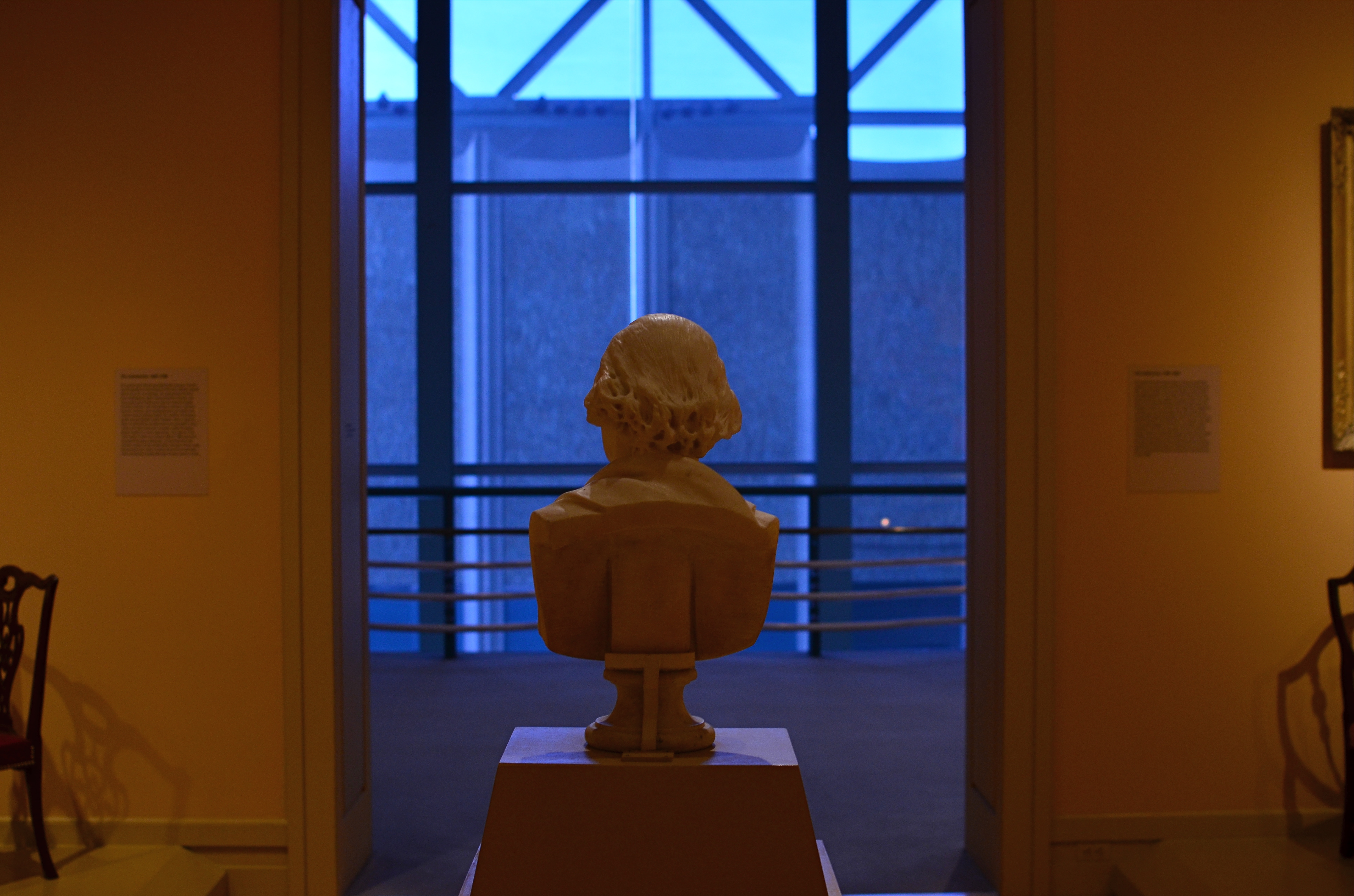
The practice of bracketing shots has made a bit of a comeback since the advent of High Dynamic Range, or HDR processing. You know the drill: shoot any number of shots of the same subject with varying exposure times, then blend them together. But bracketing has been a “best practice” among shooters for decades, especially in the days of film, where you took a variety of exposures of the same scene so you had coverage, or the increased chance that at least one of the frames was The One. Today, it still makes sense to give yourself a series of color choices by the simple act of taking multiple shots with varying white balances. You can already adjust WB to compensate for the color variances of brilliant sun, incandescent bulbs, tube lights, or shade for a more “natural” look. But using white balance settings counter-intuitively, that is, against “nature”, can give your shots a variety of tonal shifts that can be dramatic in their own right.
In the image above, the normal color balance of the gallery entrance would have rendered the bust off-white and the outer vestibule a light grey. Shooting on a tungsten setting when the prevailing light was incandescent gave the interior room a creamy orange look and amped the vestibule into deep blue, setting the two areas sharply off against each other and creating a kind of “end of day” aspect. I shot this scene with about five different white balances and kept the one I liked. Best of all, a comparison of all my choices could be reviewed in a minute and finished by the time the shutter clicked. Holy instant gratification, Batman.
OH, IT’S HIDEOUS. I LOVE IT.
By MICHAEL PERKINS
THERE MAY BE NO RULES LEFT TO BREAK IN PHOTOGRAPHY, in that everybody is comfortable doing absolutely anything….compositionally, conceptually, technologically…to get the picture they want. Maybe that’s always the way it’s been, seeing as the art of image-making, like the science of breeding apple trees, has always grown faster and stronger through cloning and grafting. Hacks. Improvisations. “Gee-What-If”s.
Shots in the dark.
Not a bad starting point, but either too pretty, or not ugly enough…or something.
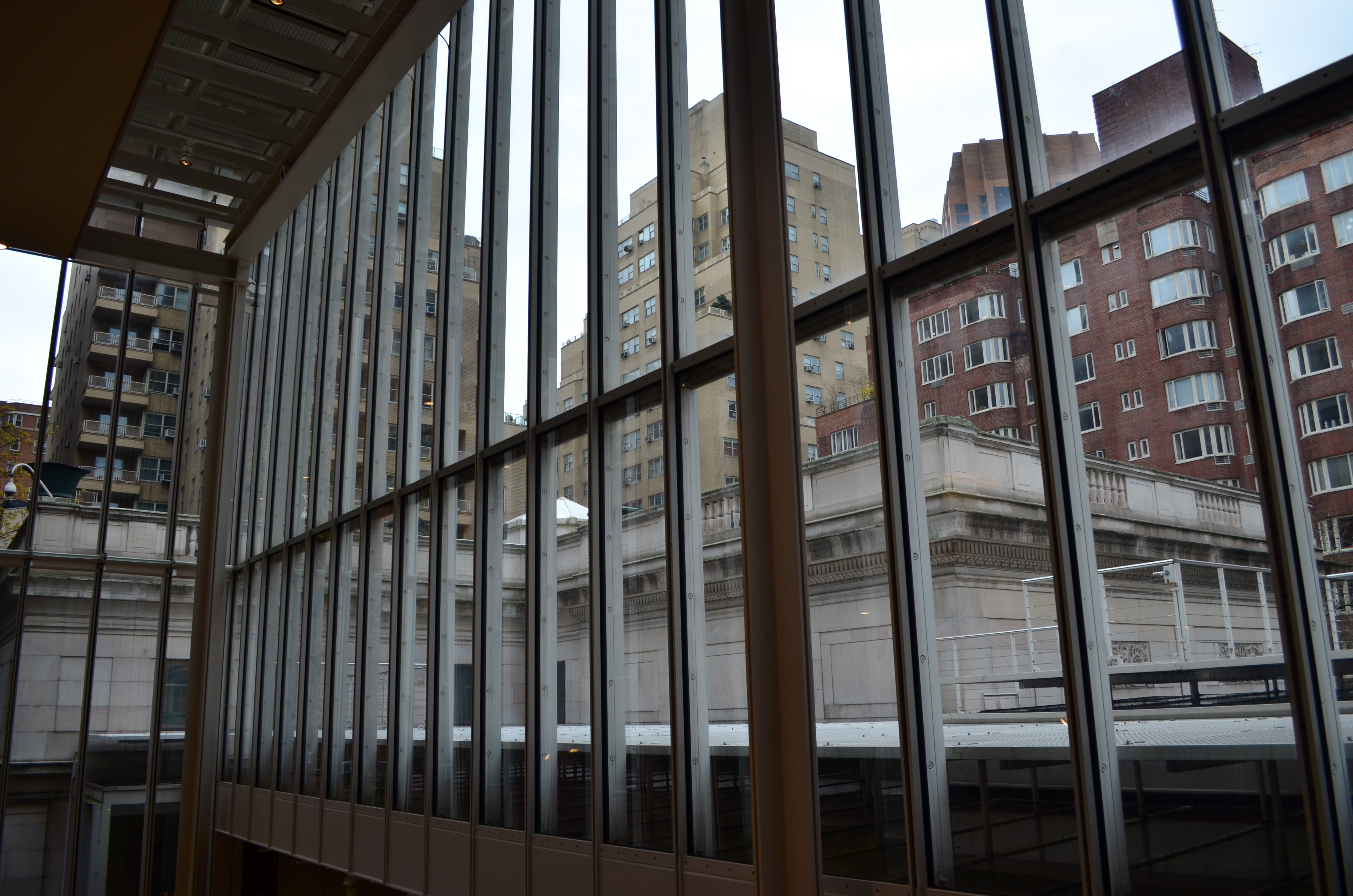
Recently I walked out into the gigantic atrium that connects all of the original buildings of the Morgan Library complex in NYC to get a good look at the surrounding neighborhood of big-shouldered buildings. I was fascinated by the way my wide-angle lens seemed to line up the horizontal grid lines of the atrium with the receding lines of the towers and boxes down the block. Only one thing bothered me about the result: the color, or rather, the measly quality of it.
A rainy day in Manhattan is perhaps the final word on rainy days. Some colors, like the patented screaming yellow of a New York cab, or the loud neon reds of bodegas, are intensified into a romantic wash when the drops start. This view, however, was just a bland mash of near-color. If the neighborhood was going to look dour anyway, I wanted it to be dour-plus-one. Thing is, I made this, ahem, “artistic” decision after I had already traveled 3,000 miles back home. In the words of Rick Perry, whoops.
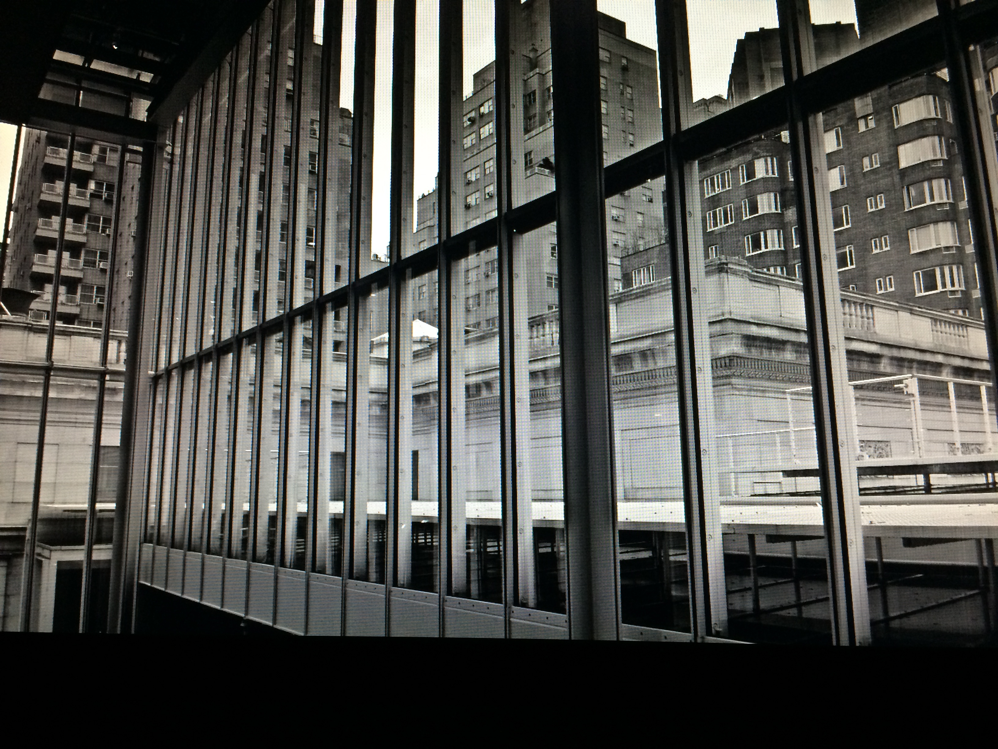
Time to hack my way to freedom. I remembered liking the look of old Agfa AP-X film in a filter on my iPhone, so I filled the screen of my Mac with the bland-o image, shot the screen with the phone, applied the filter, uploaded the result back into the Mac again, and twisted the knobs on the new cheese-grater texture I had gained along the way. At least now it looked like an ugly day….but ugly on my terms. Now I had the kind of rain-soaked grayscale newspaper tones I wanted, and the overall effect helped to better meld the geometry of the atrium and the skyline.
No rules? Sure, there’s still at least one.
Get the shot.
NIGHT GALLERY
By MICHAEL PERKINS
I RECENTLY READ AN INTRIGUING STATEMENT ON THE DIFFERENCE BETWEEN PAINTING AND PHOTOGRAPHY to the effect that painters start with nothing, and add information until the image is created, whereas photographers start with total information and work to selectively remove things until their pictures are made. Of course, there are times when both artists borrow the approach of the other, and the practice of “light painting” is one place where photogs can actually wield a kind of brush, beginning in pure darkness and then adding illumination, literally by hand, until a picture, layer by layer, emerges.
Bascially, you’re going down two potential paths with light painting. One is the depiction of fantasy, a custom light creation that is the central subject of the image, rather than an augmentation of something else. Visit the tutorial link below to view some of these visions, as they are truly fascinating (not to mention work-intensive): the flaming fireball dancing across the lake, the geometric noodlings hanging in mid-air, the angel wings growing out of your girlfriend’s back, and so on. The other approach is to amplify the impact of a subject which has either no illumination at night or a lighting scheme that is counter to the mood you’re going for. In this case, your flashlight, LED or light coil is creating the visual reality that you wish existed. It’s “reality-plus”, rather than a complete fantasy. This is the avenue I have tended to favor.
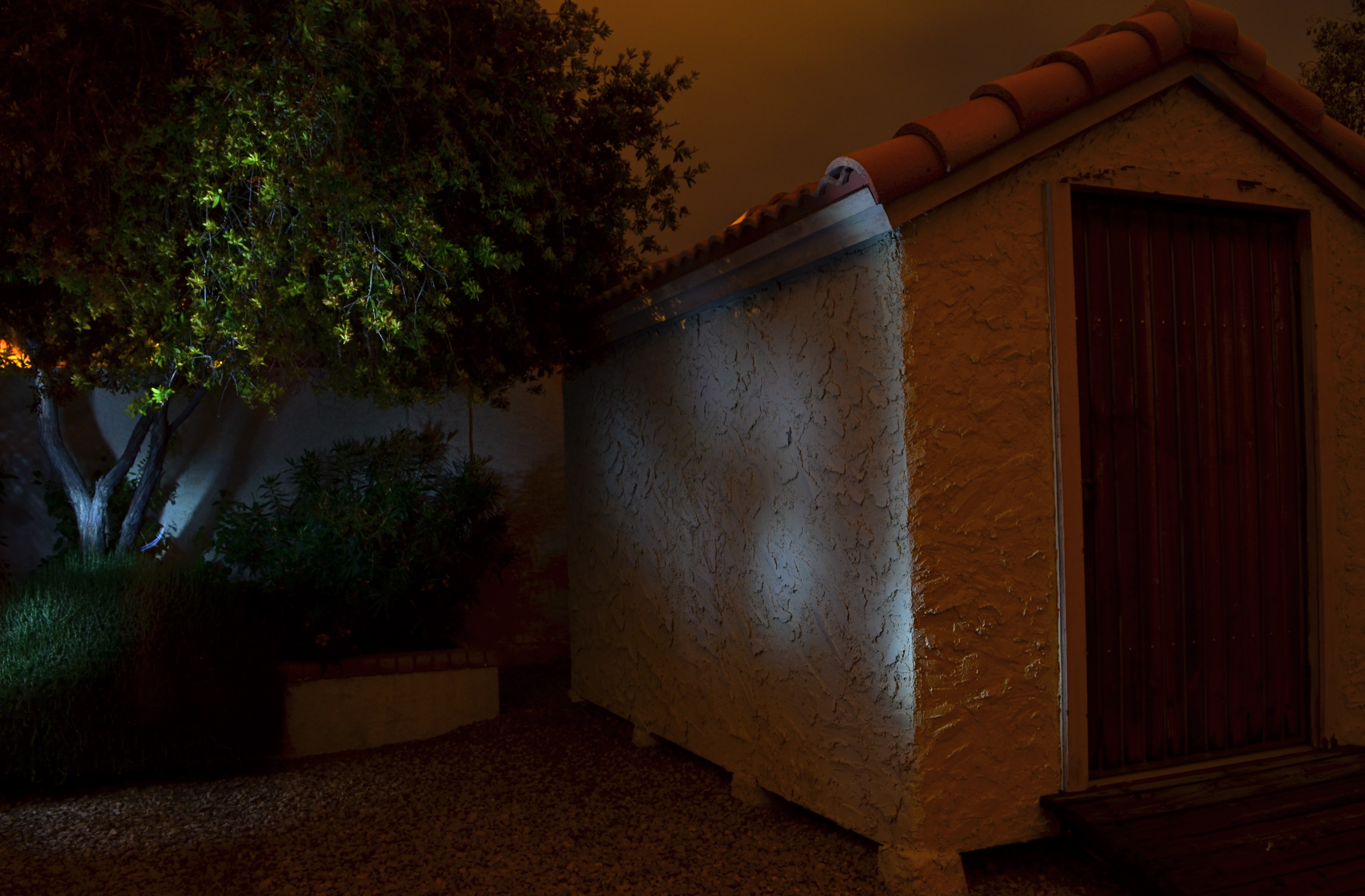
No lighting in the back yard, unless you “paint” it on: 30 sec., f/8, ISO 100, 18mm.
After a year away from light painting, I have started to slink back into it, moving from tabletop arrangements, where control is less of an issue, to exterior locales, which are, frankly, the very definition of trial-and-error.With the camera locked onto its tripod and with a pre-determined exposure and aperture, the responsibility for whether the magic happens is literally in your hands, hands that need real-world training in this technique.
As for lighting: these days, even dollar-store LEDs provide a pretty intense white light in darkness but they don’t throw it very far, and they are also pretty narrowly focused, so, if you want to paint the side of, say, a barn, it’s really hard to do so evenly. Best thing is to avoid the bargain lights: get yourself a powerful torch with a variable focus, something that can shoot both soft and wide. It’ll save you lots of time trying to guess about coverage on larger surfaces. Also, within a single exposure, you can still change off to the pencil-thin lights for special detailing, since, in complete darkness, your shutter will be open long enough for you to switch lights on and off, change position, and touch things up.
The above image was done in a yard with no landscape lighting on hand, other than the light I am applying during a thirty-second exposure. Not a perfect execution, but a quick example of how you can impart night mood to objects that are duller than dishwater in daylight. Lighting is all about setting the terms of view, and hand-painting the light allows you to control that mood, almost as completely as you would with oil, brush or canvas.
More to look at:
