FREE ATMOSPHERE
Panos are not for every kind of visual story. The best thing is, you can make them so quickly, it’s easy to see if it’s merely a gimmick effect or the perfect solution, given what you need to say.
By MICHAEL PERKINS
PANORAMIC APPS FOR MOBILE CAMERAS CONSTITUTE A HUGE STEP FORWARD in convenience and simplicity in taking the kind of sweeping images that used to require keen skills either in film processing or in digital darkroom stitching. The newest versions of these apps are far from flawless, and, like any effect-laden add-on, they can become cheesy gimmicks, or, used to excess, merely boring. That said, there is a time and place for everything.
99% of the impact in a pano comes from the selection of your subject. Supposing a panoramic view to be a specialized way to tell a story, is the story you’re attempting to tell interesting in its own right? Does it benefit from the wider frame? Let’s recall that, as well as including a ton of extra left-and-right information, handheld pano apps create a distorted version of reality. In the earliest days of panoramas, multiple photos of a scene were taken side-by-side, all with the same distance from camera to subject. This was usually accomplished by shooting on a tripod, which was moved and measured with each new portion of what would eventually be a wide composite. At each exposure, the distance of the tripod to, say, the mountain range was essentially constant across the various exposures, rendering the wide picture all in the same plane….an optically accurate representation of the scene.
With handheld panos done in-camera, the shooter and his camera must usually pivot in a large half-circle, just as you might execute a video pan,so that some objects are closer to the lens than others, usually near the center. This guarantees a huge amount of dramatic distortion in at least one part of the image, and frequently more than one. The effect is that you are not just recording a straight left-to-right scene, but creating artificial stretches and warps of everything in your shot. You are not recording a scene that unfolds across a straight left-right horizon, but capturing things that actually encircle you and trying to “flatten them out” so they appear to occur in one unbroken line. By showing objects that may be beside or behind you, you’re kinda making a distortion of an illusion. Huh?
Again, if this is the look you want, that is, if your subject is truly served by this fantasy effect, than click away. You’ll know in a minute if it all made sense, anyhow, and that alone is a remarkable luxury. These days, we can not only get to “yes” faster, we can, more importantly, get rid of all the “no’s” in an instant as well.
IT’S UNNATURAL, NATURALLY
By MICHAEL PERKINS
ONE OF THE MOST FREEING PARTS OF PICTURE MAKING IS RELEASING YOURSELF FROM THE RIGIDITY OF REALITY. Wait. What is he babbling about? Don’t photographers specialize in reality?
Well, yeah, the photographers who work at the DMV, the city jail and immigration do. Also the guy in Wal-mart HR who made your first employee badge. Other than that, everyone is pretty much rendering the world the way they see it right this minute, with more revisions or re-thinks coming tomorrow. And beyond.
Color processing, once the sole domain of the “photo finishers” has now been taken back in-house by pretty much everyone, and, even before you snap the shutter, there are fat stacks of options you can exercise to recast the world in your own image.
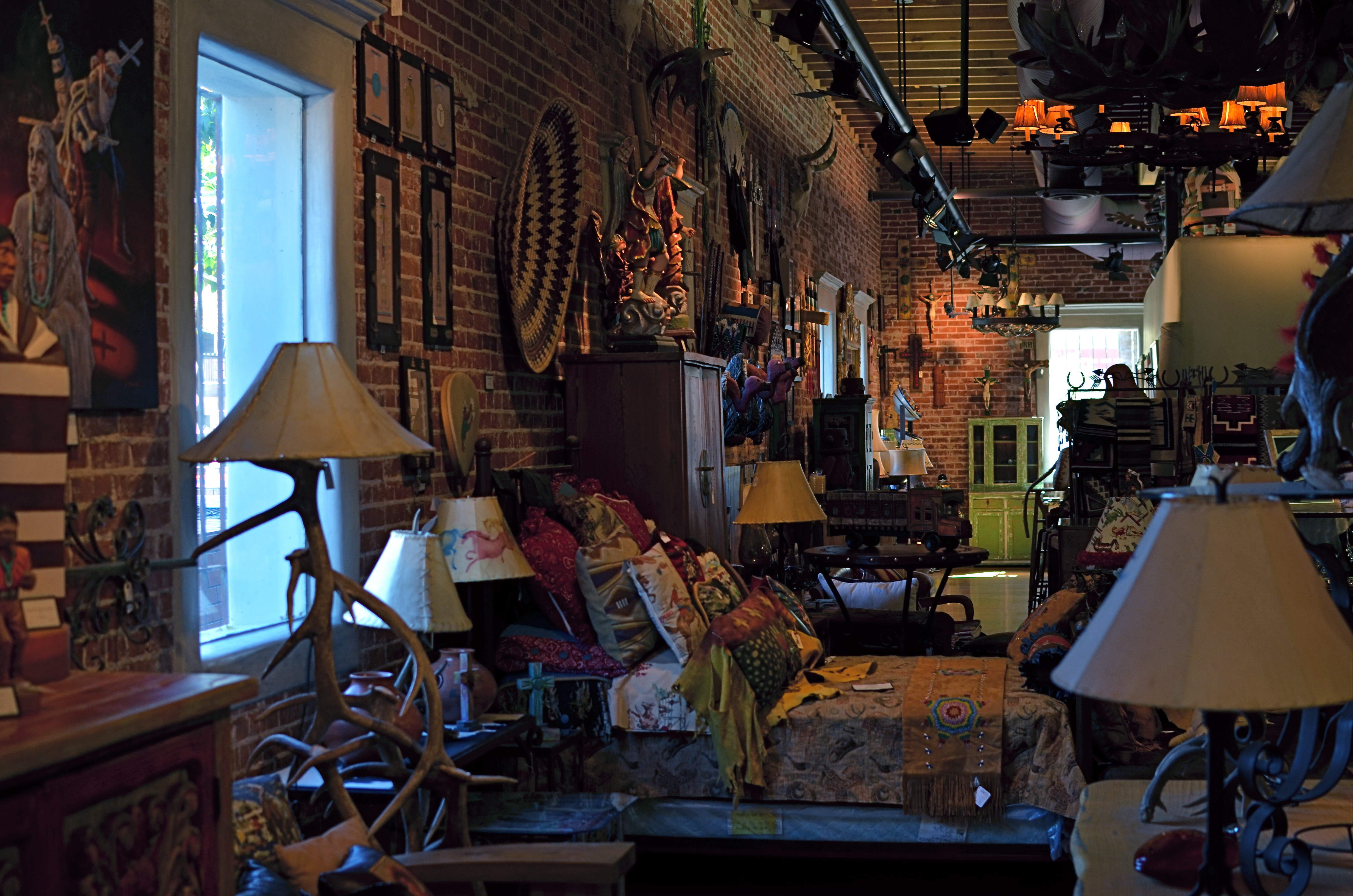
1/60 sec., f/3.5, ISO 320, 35mm. White Balance set for tungsten.
The practice of bracketing shots has made a bit of a comeback since the advent of High Dynamic Range, or HDR processing. You know the drill: shoot any number of shots of the same subject with varying exposure times, then blend them together. But bracketing has been a “best practice” among shooters for decades, especially in the days of film, where you took a variety of exposures of the same scene so you had coverage, or the increased chance that at least one of the frames was The One. Today, it still makes sense to give yourself a series of color choices by the simple act of taking multiple shots with varying white balances. You can already adjust WB to compensate for the color variances of brilliant sun, incandescent bulbs, tube lights, or shade for a more “natural” look. But using white balance settings counter-intuitively, that is, against “nature”, can give your shots a variety of tonal shifts that can be dramatic in their own right.
In the image above, the normal color balance of the gallery entrance would have rendered the bust off-white and the outer vestibule a light grey. Shooting on a tungsten setting when the prevailing light was incandescent gave the interior room a creamy orange look and amped the vestibule into deep blue, setting the two areas sharply off against each other and creating a kind of “end of day” aspect. I shot this scene with about five different white balances and kept the one I liked. Best of all, a comparison of all my choices could be reviewed in a minute and finished by the time the shutter clicked. Holy instant gratification, Batman.
THROUGH THE LOOKING GLASS
By MICHAEL PERKINS
PHOTOGRAPHY IS THE LATEST THING.
PHOTOGRAPHY IS OBSOLETE.
PHOTOGRAPHY IS DEAD.
PHOTOGRAPHY IS JUST BEING BORN.
All these statements are true.
Art cannot hide from the world, nor can it sequester itself away from change. There cannot be one “final” or “permanent” way to create a painting, one lasting method for bringing forth a face from a block of marble, one eternal way to capture and shape light. It’s more than obvious that, like most arts, photography has been in a constant state of metamorphosis since its inception, something which should comfort those for whom things seem to be, at present, “moving too fast”. Comfort, however, is not in the offing for many of us.
The sense that nothing is “permanent” anymore in the making of pictures is especially keen in recent years, since the shift from film-based imaging to digital has been such a convulsive and comprehensive break with the past. But, even though we’ve been using film for over a hundred years, the kind of film we use has always been in transition. We feel a little less solid right now because the technical means for photography are changing on a much more fundamental level. And we’re just getting started.
Shooting and processing this image in the film era would have been the work of hours, maybe days. With an iPhone app, I have it within two minutes.
The explosion of the post-processing photo app, itself a product of the ongoing evolution of the telephone, is changing the terms of engagement for everyone who takes pictures. Everyone. Okay, you don’t have a smartphone and don’t want one. I get it. That doesn’t change the fact that the essential means for capturing and shaping an image is shifting into overdrive. More than ever before, anyone can take a picture…..anywhere, anytime, instantly, and under damn near any circumstances. The walls of experience, privilege, and access between pro and amateur are dissolving faster than Splenda in a non-fat latte. Techniques which used to be the exclusive domain of the learned, the elite, are now available to the peasantry. There are no more secrets. The Bastille has fallen.
Apps are leading all this, making any kind of effect, tint, re-focus, re-balance and re-do feasible for anyone. The tsunami of new images flooding into the internet on any given day is the output of people whose vision can now be acted upon, without exhaustive expense, without years of slaving in a newspaper bullpen, without decades of chemical-stained fingers and dingy diligence in darkrooms. If you don’t have a good eye for what makes a good picture, then that one factor can keep you from greatness. But access to tools is no longer, and can never again be, a disqualifier.
Apps are already raising the question of whether bulkier cameras with costly lenses are even needed, and the next step is for apps to answer that question with shortcuts that will, at the very least, render whole classes of cameras superfluous, and, eventually, remove all but the most basic functions of traditional lenses themselves. Custom-made “glass” is one of the remaining barriers to complete photographic democracy: it costs too much and requires too steep a learning curve for today’s ADD universe. It will have to go.
And here’s where you decide whether, in your own case, that’s a positive or negative thing. The bad news is, everything is changing. The good news is, everything is changing.
You pays your money and you takes your choice.
TERRA INCOGNITA
By MICHAEL PERKINS RANDOMNESS HAS STUBBORNLY ASSERTED ITSELF AS ONE OF THE MOST DECISIVE FORCES IN ALL OF PHOTOGRAPHY.One of the eternal struggles in our craft has been between our intense attempts to reduce the recording of light to a predictable science, and nature’s insistent pushback, allowing things that just happen to shape our results. I think most of our work as individuals is a constant wrestling between these two forces. One moment we fancy ourselves mastering all the variables that create images, and in the next we celebrate the wilding potential of just letting go, and actually celebrating the random effect. I find myself careening between the comfort of all the techniques I have accumulated over a lifetime, the so-called “guarantees” that I’ll capture what I’m looking for, and the giddy discovery that accidentals, or artifacts, somehow found themselves in my pictures despite my best efforts. The problem, for me, is learning to celebrate something wonderful that happened without my consciously causing it.
Brooklyn Bodega, 2014.
Phone cameras are forcing me to accept a little less control, since, even at their best, they can’t be managed in the way that standard DSLRs can. That leaves a certain number of results to chance, or, more exactly, to a display of the camera’s limits. One one hand, I’m grateful for the shots that I can “save” by using a mobile, since there will always be times that other types camera will be blocked, forbidden, or inconvenient. On the other hand, the results always make me wonder what else might have been possible if I had been completely at the helm in the making of the images. Some of the things I get “on the fly” with a phone camera are actually a bit magical, so that I actually love the things that are “wrong” with the picture. I’m sure this is part of the enjoyment that the lomography crowd derive from working with plastic toy cameras which create totally unpredictable results purely as a result of the camera’s shortcomings. In the above image, the garish register of nearly every color by my iPhone works well with the bizarre collision of dusk, neon, urban textures, even the overblown mystery of what’s going on inside the crazed little bodega shown here. The extreme wide-angle bias of the iPhone also has stretched things into exotic exaggerations of perspective, and the camera’s auto-boosted ISO produces a high level of noise. Does it all work? Yeah, pretty much. I don’t surrender control easily, but I’ve seen enough of the fortunate accidents of photographers from all over the world not to welcome nature’s interventions. I mean, after all, the idea that we’re actually in control is, at best, a pleasant illusion. We don’t really understand lightning, and yet, somehow, we’ve been given the ability to capture it in a box. Strange.
“EFFECT” VS. “EFFECTIVE”

Panoramic shots like this are no longer a three-day lab project, but an in-camera click. But what is being said in the picture?
By MICHAEL PERKINS
THERE ISN’T ANYTHING EMPTIER THAN THE PERFECT EXECUTION OF A FLAWED IDEA. And in the present effects-drenched photographic arena, where nearly any texture, color, or conception can be at least technically realized, we need, always, to be making one crucial distinction: separating what we can do from what we should do.
The basic “fixes” which come natively loaded in even the most basic cameras (filters, effects, nostalgic slathers of antique colors) suggest a broad palette of choices for the photographer looking to extend his reach through what is basically an instantaneous short cut. Fine and dandy, so far. Who, after all, wants to labor for hours to augment a shot with a particular look if that effect can be achieved at the touch of a button? Certainly no one gets into photography anymore with the understanding that they will also have to act as a chemist, and creativity need not be the exclusive playground of the scientifically elite. We all agree that the aim of photography always has and always should be the placing of all tools in as many hands as possible, etc., etc.
But waita seccint. Did I say the world tool? ……(will the recorder read that last part back….?……”placing of all tools in as many…”)… yep, tool. Ya see, that word has meaning. It does not mean an end unto itself. A fake fisheye doth not a picture make. Nor doth a quickie panorama app, a cheesy sepia filter, nor (let’s face it) the snotty habit of saying “doth”. These things are supposed to supplement the creative moment, not be a substitute for it. They are aids, not “fixes”.
This comes back to the earlier point. Of course we can simulate,imitate, or re-create certain visual conditions. But what are we actually saying in the picture? Did we use the effect to put a firm period at the end of a strong sentence, or did we use it as a smoke bomb to allow us to exit the stage before the audience gets wise to the fakery?
One of the original objections to photography, as stated by painters, was that we were handing off the actual act of visual artistry to a (gasp!) machine. A little hysterical, to be sure, but a concern is still worth addressing.
There is a soul in that machine, to be sure.
But only if we supply it.
MORE BOUNCE TO THE OUNCE

Fish ‘n’Books, 2013. 1/200 sec., f/3.5, ISO 100, 35mm.
By MICHAEL PERKINS
FOR THE MOST PART, THE USE OF ON-CAMERA FLASH SHOULD BE CONSIDERED A CRIME AGAINST HUMANITY. Scott Kelby, the world’s best-selling author of digital photography tutorials, famously remarked that “if you have a grudge against someone, shoot them with your pop-up flash, and it will even the score.” But, to be fair, let’s look at the pros and cons of using on-board illumination:
PROS : Cheap, handy
CONS: Harsh, Weak, Unflattering, Progenitor of Red-eye. Also, Satan kills a puppy every time you use it. Just sayin’.
There are, however, those very occasional situations where supplying a little bit of extra light might give you just the fill you need on a shot that is getting 90% of its light naturally. Even so, you have to employ trickery to harness this cruel blast of ouch-white, and simple bounces are the best way to get at least some of what you want.
In the above situation, I was shooting in a hall fairly flooded with bright mid-morning light, which was extremely hot on the objects it hit squarely but contrasty as an abandoned cave on anything out of its direct path. The fish sculpture in my proposed shot was getting its nose torched pretty good, but in black and white, the remainder of its body fell off sharply, almost to invisibility. I wanted the fish’s entire body in the shot, the better to give a sense of depth to the finished picture, but I obviously couldn’t flash directly into the shelf that overhung it without drenching the rest of the scene in superfluous blow-out. I needed a tiny, attenuated, and cheap fix.
Bending a simple white stationery envelope into a “L”, I popped up my camera’s flash and covered the unit with the corner of the envelope where the two planes intersected. The flash was scooped up by the envelope, then channeled over my shoulder, blowing onto the wall at my back, then bouncing back toward the fish in softened condition near the underside of the shelf, allowing just enough light to allow the figure’s bright nose to taper back gradually into shadow, revealing additional texture, but not over-illuminating the area. It took about five tries to get the thing to look as if the light could have broken that way naturally. Fast, cheap, effective.
The same principle can be done, with some twisting about, to give you a side or ceiling bounce, although, if high reflectivity is not crucial, I frankly recommend using your hand instead of the envelope, since you can twist it around with greater control and achieve a variety of effects.
Of course, the goal with rerouting light is to look as if you did nothing at all, so if you do save a picture with any of these moves, keep it to yourself. Oh, yes, you say modestly, that’s just the look I was going for.
Even as you’re thinking, whew, fooled ’em again.
THE BLUE AND THE GREY
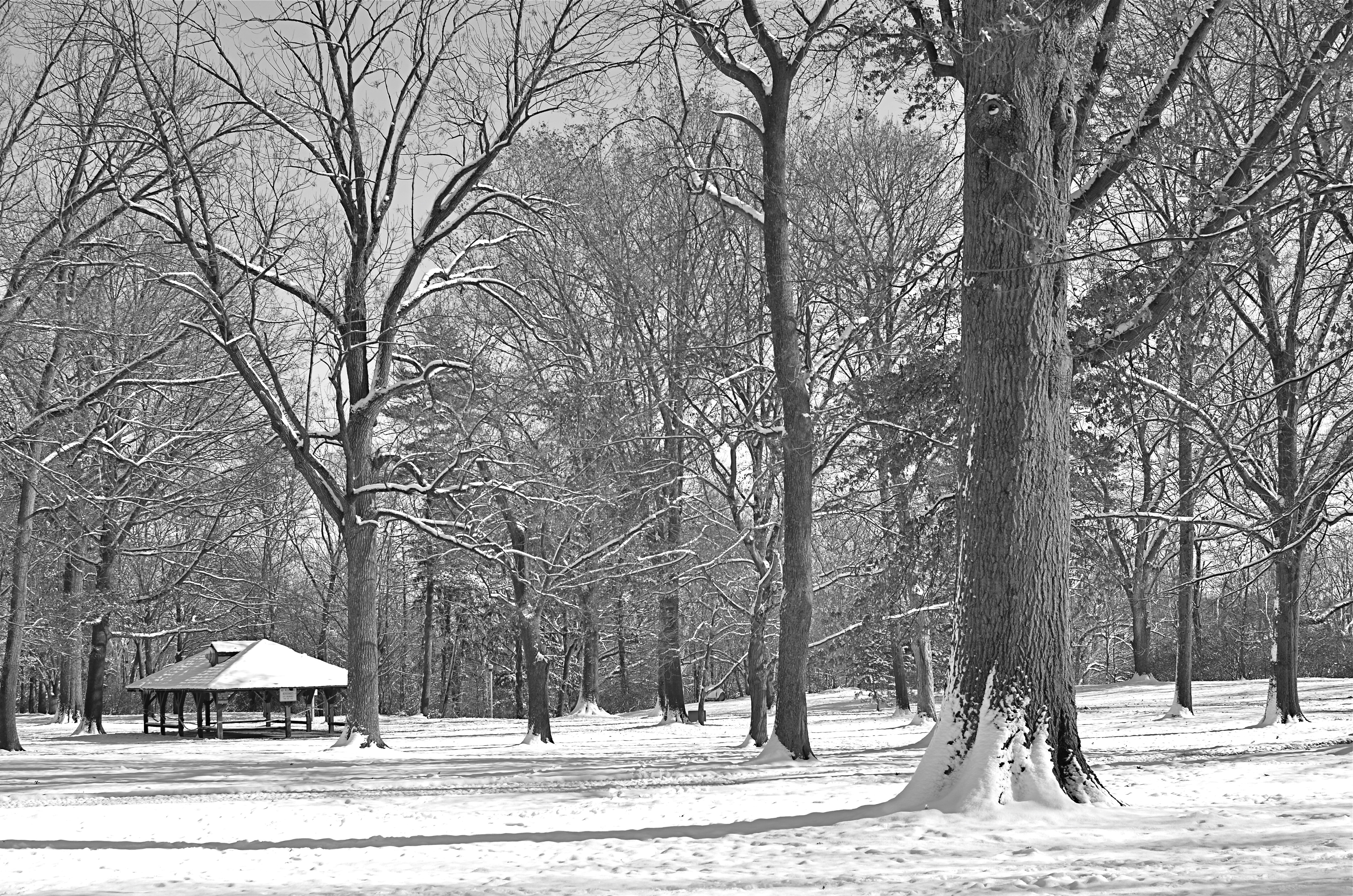
A decent winter scene, a bit too charming in its full color original, converted in-camera to straight monochrome. Now, however, it’s too bland.
By MICHAEL PERKINS
ONE OF THE GREAT BENEFITS OF DIGITAL PHOTOGRAPHY, other than its ease and affordability, is the speed at which it allows you to make comparative value judgements on images in the field. Even as digital darkrooms make it ever easier to change or modify your vision after the fact, today’s cameras also allow you to choose between several versions of a photograph while its subject is right at hand. This is an amazing mental and artistic economy, and it’s another reason why this is the absolute best time in history to be making pictures.
Many of us who made the transition from film have a lifelong habit of “bracketing”, taking multiples of the same image over a range of exposure rates to ensure that we are “covered” with at least one keeper in the batch. Others have already adopted the equivalent habit of taking several different frames with a sampling of varying white balances. I also find it helpful to use today’s in-camera filters to instantly convert color shots to three other monochrome “takes”….straight black and white, sepia and cyanotype. It’s a way to see if certain low-color subject matter will actually benefit from being reworked as duotone, and knowing that fact extra fast.
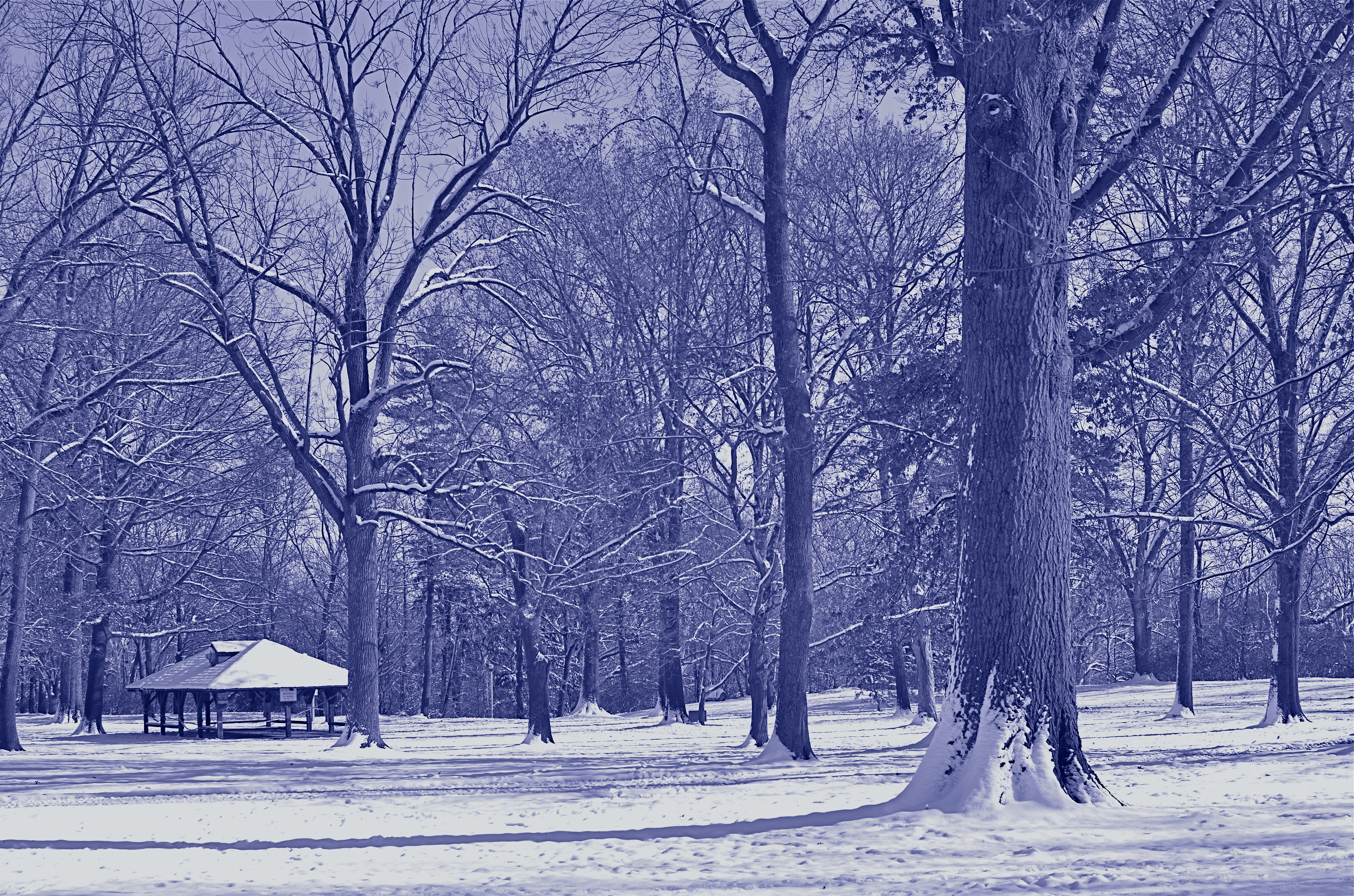
Another in-camera conversion, this time to cyanotype. This one says “winter” to me. 1/320 sec, f/5.6, ISO 100, 35mm.
Color or its selective elimination is one of the easiest tools to wield in photography. In the case of the series shown in this post, I decided that the winter scene was a little too warm and cheery in full color, a little flat in straight B&W, but properly evocative of winter’s severity in cyan. The choice was quick, and I still had the color master shot that I could choose to massage later on.
Shooting fast, that is, at the speed of your mood or whim, is a remarkable luxury, and exploiting it to the max is easy with even the most elementary camera. And anything that converts more “maybe” shots to “yes” is my idea of a good time.
I’ll have a Blue Christmas, thank you.
Related articles
- 5 Good Photography Habits to Start Today (digital-photography-school.com)
NOT A LEG TO STAND ON
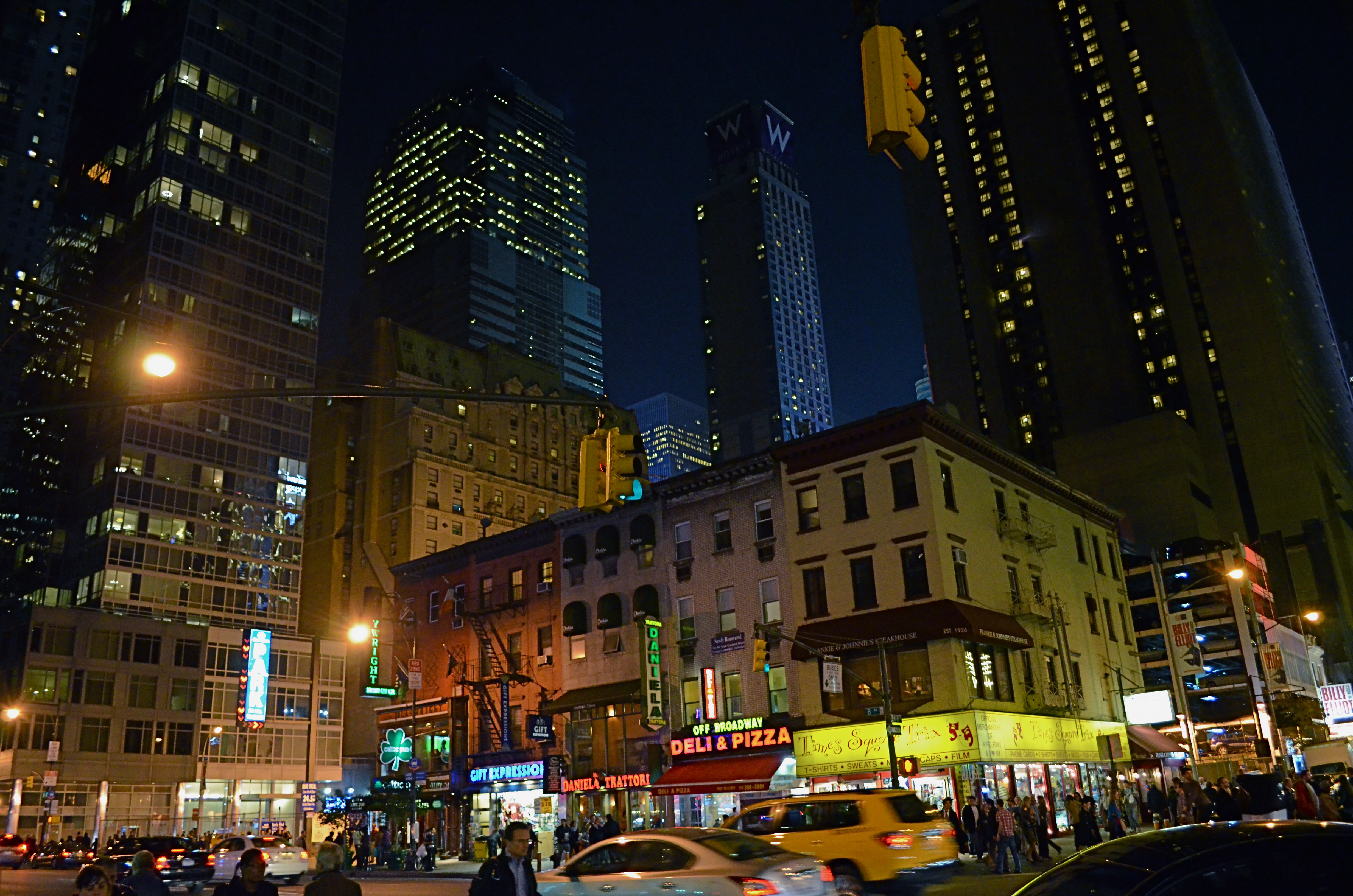
No tripod, no problem. Minimal noise even at 3200 ISO. Handheld in NYC’s theatre district at 1/50 sec., f/3.5, 18mm.
By MICHAEL PERKINS
ADVANCES IN PHOTOGRAPHY, WHETHER IN THE SCIENCES OF LENSES, FILMS, SENSORS OR TECHNIQUE, ALL HAVE, AS THEIR AIM, THE SAME RESULT: to make it easier to take more pictures…more often, and with fewer barriers between what you see and what you can catch in the box. Taking more pictures means increasing the yield of wonderful pictures, even if 95% of what you shoot is doody, and getting to the decisive moment of the “click” beats any other imperative. Any gimmicks or toys that don’t increase your readiness to shoot are wasteful detours.
This means that we are constantly weeding out dead growth, trimming away systems or ideas that have outgrown their usefulness. Rusty ways of doing things that cost us time, require extra steps, and eventually rob us of shots.
And that’s why it’s the age of the tripod is nearly over.
Getting past our artistic bias toward the ‘pod as a vital tool in the successful creation of images is tough; we still associate it with the “serious” photographer, even though today’s cameras solve nearly all of the problems tripods were once reliable in offsetting. What we’re left with, regarding the tripod’s real value, then, is old brain wiring and, let’s face it, sentiment.
More importantly, to my first point, the tripod is not about, “Okay, I’m ready!”. It’s about, “Hold on, I’ll be ready in a minute.” Worse yet, to the petty dictators who act as the camera police in churches, monuments, retail establishments and museums, they scream, “you can’t be here”. Call me crazy, but I still think of lack of access (spelled “getting kicked out”) as, well, sort of a hindrance to photography.
Just sayin’.
Tripods were, once upon a time, wonderful protection again several key problems, among them: slow film/sensor speed, vibration risk, and sharpness at wider apertures, all of which have long since been solved. Moreover, tripods may tempt people to shoot at smaller apertures, which could lead to softer overall images.
Had I stopped to set up a tripod here, my light, and my chance, would have melted away. 1/15 sec,. handheld, with a 35mm prime, wide-open, at f/1.8, ISO 640.
I readily concede that tripods are absolutely vital for extended night exposures, light painting, miniature work, and some other very selective professional settings. But for more than a century, ‘pods have mostly been used to compensate where our cameras were either flawed or limited. So, if those limits and flaws have faded sufficiently to allow you to take a nighttime snap, handheld at f/1.8, with a 1/15 shutter speed and the virtual guarantee of a well-lit shot, with negligible noise, why would you carry around twice the gear, pretty much ensuring that you would lose time, flexibility, and opportunities as a result?
The tripod has served us well, as was once true of flash powder, glass plates, even the torturous neck braces used to hold people’s heads in position during long exposures. But it no longer has a leg to stand on.
Follow Michael Perkins on Twitter @MPnormaleye.
FEWER TOYS, MORE TOOLS
This is Nikon’s “High-Key” effects mode. It’s a cheap gimmick, and you paid for it, even though (a) it is not High Key and (b) you can easily make this shot yourself. 1/30 sec., f/2.8, ISO 1250, 35mm.
By MICHAEL PERKINS
MANY OF THE “ENHANCEMENTS” OFFERED BY TODAY’S MAJOR PHOTO GEAR MANUFACTURERS ARE, IN FACT, OBSTACLES to learning how to take responsibility for making pictures. The automatic bells and whistles that are being engineered into today’s cameras seems to send the message: you don’t have to think too hard. Push the button and we will provide (and predict) the results.
It may be fabulous for convenience, but it’s lousy news for the experimentation and personal risk which are required for great photography to occur.
We live in a time of short cuts, of single-button solutions for every creative problem. We have modes for that. Low light, too much light, a day at the beach, a day in the snow, a closeup, a landscape? Guaranteed results at the dial-up of an automode. Hey, you’re an artist. No need to obsess about all that techno-whatsis. Your camera will determine the results. Just dial up what you want: it’s all automatic. You need hardly be there.
Does anyone really believe that anything of artistic value can evolve from machines being in charge? When’s the last time a computer created a novel of staggering impact? Who is taking the picture here…..you or your camera?
Fully automatic, aperture priority and shutter priority are all good basic tools, and wonderful work is done in all three modes as well as full manual. But there is a huge leap between these settings and the gaudy, gimmicky “effects” modes that are increasingly larding up cameras with novelty and diversion.
Let’s take a look at some of the prime offenders. Are these toys necessary?
NIGHT VISION: If you want a picture to look like you took it while on combat recon in a forward area of Afghanistan, go for this option. Boosts your ISO up to 25,600 so you can get some image on the sensor, even in utter blackness, loaded with grain and visual muck. And why? Useless.
COLOR SKETCH: Concerts your original image into an “arty” rendering, minus the shadows, attenuating tones, or subtlety. Looks just like a classy artist knocked out a masterpiece with his box of charcoals! Fools no one except perhaps extremely learning-challenged chimps. If you want to be a painter, fine, then do it, but let’s stop calling this an enhancement.
MINIATURE EFFECT. Okay, so you can’t afford a real tilt-shift lens to create the illusion that your aerial shot of Paris is really a toy-sized tabletop model, so let’s take your photo and throw selective parts of it out of focus. That should be good enough. We’ll now allow a five-minute pause here for the exactly two times you’ll ever care about making a picture like this.
SELECTIVE COLOR. De-saturate portions of your original for dramatic effect. This is the opposite of the images of a century ago, when people, before color film, added selective hues to monochrome images…for dramatic effect. Only thing is, drama should already be in the picture before you apply this gimmick, hmm? Like many effects modes, this one tempts you to use it to fix a photo that didn’t tell its story properly in the first place. And yes, I have sinned in this area, sadly.
SILHOUETTE. The camera makes sure your foreground subjects are dark and have no detail. In other words, it takes pictures exactly the way your Aunt Sadie did with her Instamatic in 1963. Oh, but it’s so artistic! Yes, cameras always make great art. All by themselves.
HIGH KEY or LOW KEY. This used to mean lightening or darkening of selected items done by meticulous lighting. Now, in Camera Toyland, it means deliberately under-or-overexposing everything in the frame. See earlier reference to your Aunt Sadie.
As far as what should be built into cameras, I’m sure that you could compose your own wish list of helpful tools that could be available as quick-dial aids. My own list would, for example, include the moving of white balance choices from the screen menus to the mode dial. Point is, for every ready-made effect that you delegate to the camera, you are further delaying the education that can only come from doing things yourself. If you want a happy picture, make one, rather than taking a middling one and then dialing up the insertion of a magical birthday cake in the middle of the shot after the fact.
As point-and-shoots are eventually replaced by smartphones and DSLRs position themselves to remain competitive as least on the high-end portion of the market, there seems to be a real opportunity for a revolution in camera design….away from toys and in favor of tools.
follow Michael Perkins on Twitter @mpnormaleye.
LESS SHOWS MORE
You don’t have to reveal every stray pebble or every dark area in perfect definition to get a sense of texture in this shot. 1/160 sec., f/5.6, ISO 100, 35mm.
by MICHAEL PERKINS
THERE IS A WRONG-HEADED IDEA OUT THERE THAT ALL VISUAL OUTCOMES IN PHOTOGRAPHY SHOULD BE EQUAL. That’s a gob of words, so here’s what I’m getting at: higher ISO sensitivity, post-processing and faster lenses have all conspired, of late, to convince some of us that we can, and should, rescue all detail in even the most constrasty images. No blow-outs in the sky, no mushiness in the midrange, no lost information in the darkest darks. Everything in balance, every iota of grain and pattern revealed.
Of course, that is very seductive. Look at a well-processed HDR composite made from multiple bracketed images, in which the view out the window is deep and colorful, and the shadowy interiors are rich with texture. We’ve seen people achieve real beauty in creating what is a compelling illusion. But, like every other technique, it can come to define your entire output.
It’s not hard to see shooters whose “style” is actually the same effect applied to damn near all they shoot, like a guy who dumps ketchup on everything his wife brings to the table. When you start to bend everything you’re depicting to the same “look”, then you are denying yourself a complete range of solutions. No one could tell you that you always have to shoot in flourescent light, or that deep red is the only color that conveys passion, so why let yourself feel trapped in the habit of using HDR or other processes to always “average out” the tonal ranges in your pictures? Aren’t there times when it makes sense to leave what I will call “mystery” in the undiscovered patches of shadow or the occasional areas of over-exposure?
Letting some areas of a frame remain in shadow actually tamps down the clutter in a busy image like this. 1/60 sec., f/3.2, ISO 100, 35mm.
I am having fun lately leaving the “unknowns” in mostly darker images, letting the eye explore images in which it can NOT clearly make out ultimate detail in every part of the frame. In the mind’s eye, less can actually “show” more, since the imagination is a more eloquent illustrator than any of our wonderful machines. Photography began, way back when, rendering its subjects as painters did, letting light fall where it naturally landed and leaving the surrounding blacks as deep pools of under-defined space. Far from being “bad” images, many of these subtle captures became the most hypnotic images of their era. It all comes down to breaking rules, then knowing when to break even the broken rule as well.
Within this post are two of the latest cases where I decided not to “show it all”. Call it the photo equivalent of a strip-tease. Once you reveal everything, some people think the allure is over. The point I’m making is that the subject should dictate the effect, never the other way around. Someone else can do their own takes on both of these posted pictures, take the opposite approach to everything that I tried, and get amazing results.
There never should be a single way to approach a creative problem. How can there be?
Follow Michael Perkins on Twitter @thenormaleye.
Related articles
- HDR Under Control is a Thing of Beauty (thewayeyeseesit.com)
BLUE ON THIRD AVENUE

The cyanotype option in Nikon’s monochrome posting menu makes this in-camera conversion from color easy. 1/80 sec., f/5.6, ISO 160, 18mm.
By MICHAEL PERKINS
COLOR IS LIKE ANY OTHER COMPONENT IN LIGHT COLLECTION AND ARRANGEMENT, which is, really, what we are doing. Seen as a tool instead of an absolute, it’s easy to see that it’s only appropriate for some photographs. Since the explosion of color imaging for the masses seen in the coming of Kodachrome and other early consumer films in the 1930’s, the average snapper has hardly looked back. Family shots, landscapes, still life arrangements….full color or go home, right?
Well….
Oddly, professional shooters of the early 20th century were reluctant to commit to the new multi-hued media, fearing that, for some novelty-oriented photographers, the message would be the color, instead of the color aiding in the conveying of the message. Even old Ansel Adams once said of magazine editors, that, when in doubt, they “just make it red”, indicating that he thought color could become a gimmick, the same way we often regard 3-d.
In the digital age, by comparison, the color/no color decision is almost always an afterthought. There are no special chemicals, films or paper to invest in before the shutter clicks, and plenty of ways to render a color shot colorless after the fact. And now, even the post-processing steps involved in creating a monochrome image need not include an investment in Photoshop or other software. For the average shooter, monochrome post-processing is in-camera, at the touch of a button. Straight B/W and sepia and even what I call the “third avenue”, the blue duotone or cyanotype, as I’ve used above.Do such quickie options worsen the risk of gimmick-for-gimmick’s sake more than ever? As Governor Palin would say, “you betcha”. Google “over-indulgence”, or just about half of every Instagram ever taken, as evidence.
Hundreds of technical breakthroughs later, it still comes down to the original image itself. If it was conceived properly, color won’t lessen it. If it was a bad idea to start with, monochrome won’t deliver the mood or the tone changes needed to redeem it. Imagine the right image, then select the best way to deliver the message. Having quick fixes in-camera aren’t, initially, a guarantee of anything but the convenient ability to view alternatives. In the photo above, my subject was just too warm, too pretty in natural color. I thought the building itself evoked a certain starkness, a cold, sterile kind of architecture, that cyanotype could deliver far better. The shadows are also a bit more mysteriously rendered.
At bottom, the shot is just a study, since I will be using it to take far more crucial pictures of far more intriguing subjects. But the in-camera fix allows you to analyze on the fly. And, since I got into this racket to shoot pictures, and not to be a chemist, I occasionally like a fast thumbs-up, thumbs-down verdict on something I’ve decided to try in the moment.
Giving yourself the blues can be a good thing.
(follow Michael Perkins on Twitter @ mpnormaleye)
Related articles
- Toning my Cyanotype with Haritaki (altlab2011.wordpress.com)
- Beyond Color (piaffephotos.wordpress.com)
