DESTROY IT TO SAVE IT
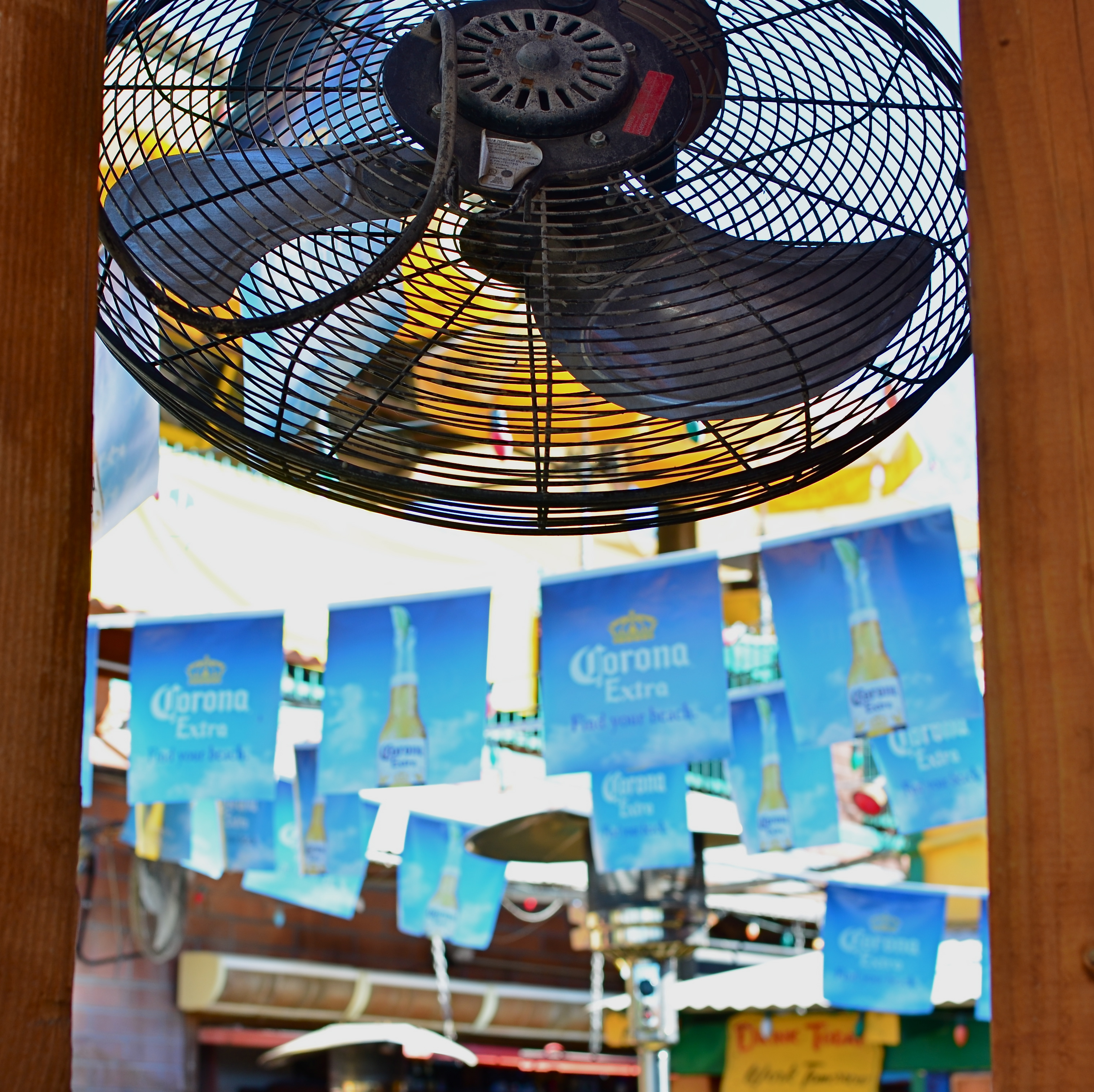
Fan photo: 1/80 sec., ISO 100, 35mm.
By MICHAEL PERKINS
THERE ARE TIMES WHEN THE RAW VISUAL FLOOD OF INTENSE COLOR IS THE MOST INTOXICATING DRUG ON THE PLANET, at least for photographers. Sometimes you are so overcome with what’s possible from a loud riot of hues that you just assume you are going to be able to extract a coherent image from it. It happens the most, I find, with large, sprawling events: festivals, open restaurants, street fairs, carnivals, anywhere your eyeballs just go into overload. Of course there must be a great picture in all this, you promise yourself.
And there may be. But some days you just can’t find it in the sheer “Where’s Waldo”-ness of the moment. Instead, you often wind up with a grand collection of clutter and no obvious clues as to where your viewer should direct his gaze. The technical term for this is “a mess”.
I stepped in a great one the other day. It’s a local college-crowd bar in Scottsdale, Arizona, where 99% of the customers sit outside on makeshift benches, shielded from the desert sun by garish Corona umbrellas, warmed by patio heaters, and flanked by loud pennants, strings of aerial lightbulbs and neon booze ads. The place radiates fun, and, even during the daylight hours before it opens, it just screams party. The pictures should take themselves, right?
Well, maybe it would have been better if they had. As in, “leave me out of it”. As in, “someone get me a machete so I can hack away half of this junk and maybe find an image.” Try as I might, I just could not frame a simple shot: there was just too much stuff to give me a clean win in any frame. In desperation, I shot through a window to make a large cooling fan a foreground feature against some bright pennants, and accidentally did what I should have done first. I set the shot so quickly that the autofocus locked on the fan, blurring everything else in the background into abstract color. It worked. The idea of a party place had survived, but in destroying my original plan as to how to shoot it, I had saved it, sorta.
I have since gone back to the conventional shots I was trying to make, and they are still a vibrant, colorful mess. There are big opportunities in big, colorful scenes where showing “everything in sight” actually works. When it doesn’t, you gotta be satisfied with the little stories. We’re supposed to be interpreters, so let’s interpret already.
I MAY HAVE TO WORK LATE
Say Hi To The Cleaning Crew: 1/50 sec., f/1.8, ISO 640, 35mm.
By MICHAEL PERKINS
SOME OF THE BEST HUMAN INTEREST STORIES, EVEN WITH A CAMERA, CAN ONLY BE VIEWED INDIRECTLY. There are many cases in which even the best of us have to merely hint or suggest something about people that we clearly cannot show (or cannot show clearly). Maybe that intractable bit of visual mystery actually bonds us to our audiences, united as we are in speculation about what is beyond that wall or behind that door. The visual tease such photos provide are part of the art of making pictures, in that we are challenged to do more with less, and “show” something beyond the visible.
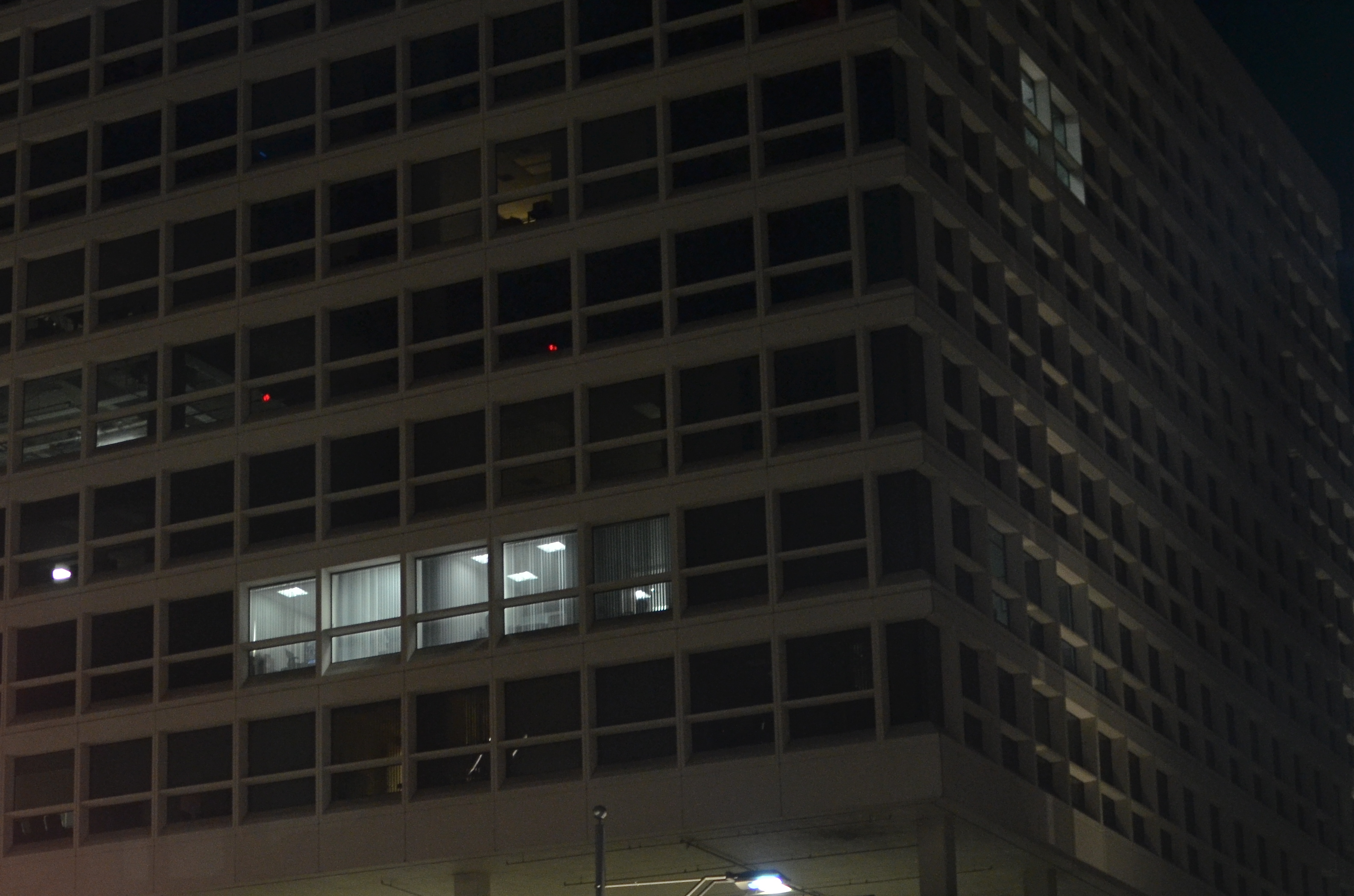
One of the simplest such stories to capture is very urban in nature: the last remaining nighttime lights in largely dormant buildings. Many of us have been the “last man standing” at the end of an extended work day. Others flee to engagements, family, dinner, but there we sit, chained to our desks until the report/project/research/budget is ready to be put to bed. There’s a readily identifiable feeling of loneliness, plus a little bit of martyr complex, that we can share in the plight of these unknown soldiers of the night.
Whenever I am driving through a city at night, I deliberately seek out those bluish, tube-lit warrens within the cubes and grids of otherwise featureless glass boxes. Who is there? What private eureka or oh, no moments are they experiencing? Which of a million potential dramas are being acted out, and with whom? The uncertainty, even from a photograph with little detail, sparks the imagination, and suddenly our viewers are completing the picture we were forced to deliver unfinished.
It’s the ongoing paradox of photography: what you don’t show is as vital as what you do show.
JUST ENOUGH
1/250 sec., f/5.6, ISO 100, 35mm.
By MICHAEL PERKINS
I’VE PROBABLY SCRIBBLED MORE WORDS, IN THESE PAGES, ABOUT OVERCROWDED SHOTS than about any other single photographic topic, so if I sound like I’m testifyin’ in the Church-Of-I-Have-Seen-The-Light, bear with me. If any single thing has been a common theme in the last five years of my photography (or a factor in my negligible growth), it’s been the quest to take pictures that tell just enough, then back off before they become cluttered with excess visual junk.
Composing a photograph, when we start out as young budding photogs, seems to be about getting everything possible into the frame. All your friends. All the mountains and trees. Oh, and that cute dog that walked by. And, hey, those clouds, aren’t they something? Then, as we grow grayer of beard and thinner of scalp, the dead opposite seems to be true. We begin looking for things to throw away in the picture. Extra visual detours and distractions that we can pare away and, not only still have a picture, but, ironically, have more of a picture, the less we include. It’s very Zen. Or Buddhist. Or Zen Buddhist. Or something. Hey, I ain’t Depak Chopra. I just get a smidge better, as I age, at not making every image into a Where’s Waldo tapestry.
Especially in an age of visual overload, it’s too easy to make photographs that make your eye wander like a nomad all over the frame, unsure of where to land, of what to fix upon. Unable to detect the central story of the shot. Professionals learn this before any of the rest of us, since they often have to submit their work to editors or other unfeeling strangers outside their family who will tell them where their photos track on the Suck-O-Meter. There’s nothing like having someone that you have to listen to crumple up about 90% of your “masterpieces” and bounce them off your nose. Humility the hard way, and then some. But, even without a cruel dictator screaming in your ear that you ought to abandon photography and take up sewer repair, you can train yourself to take the scissors to a lot of your photos, and thereby improve them.
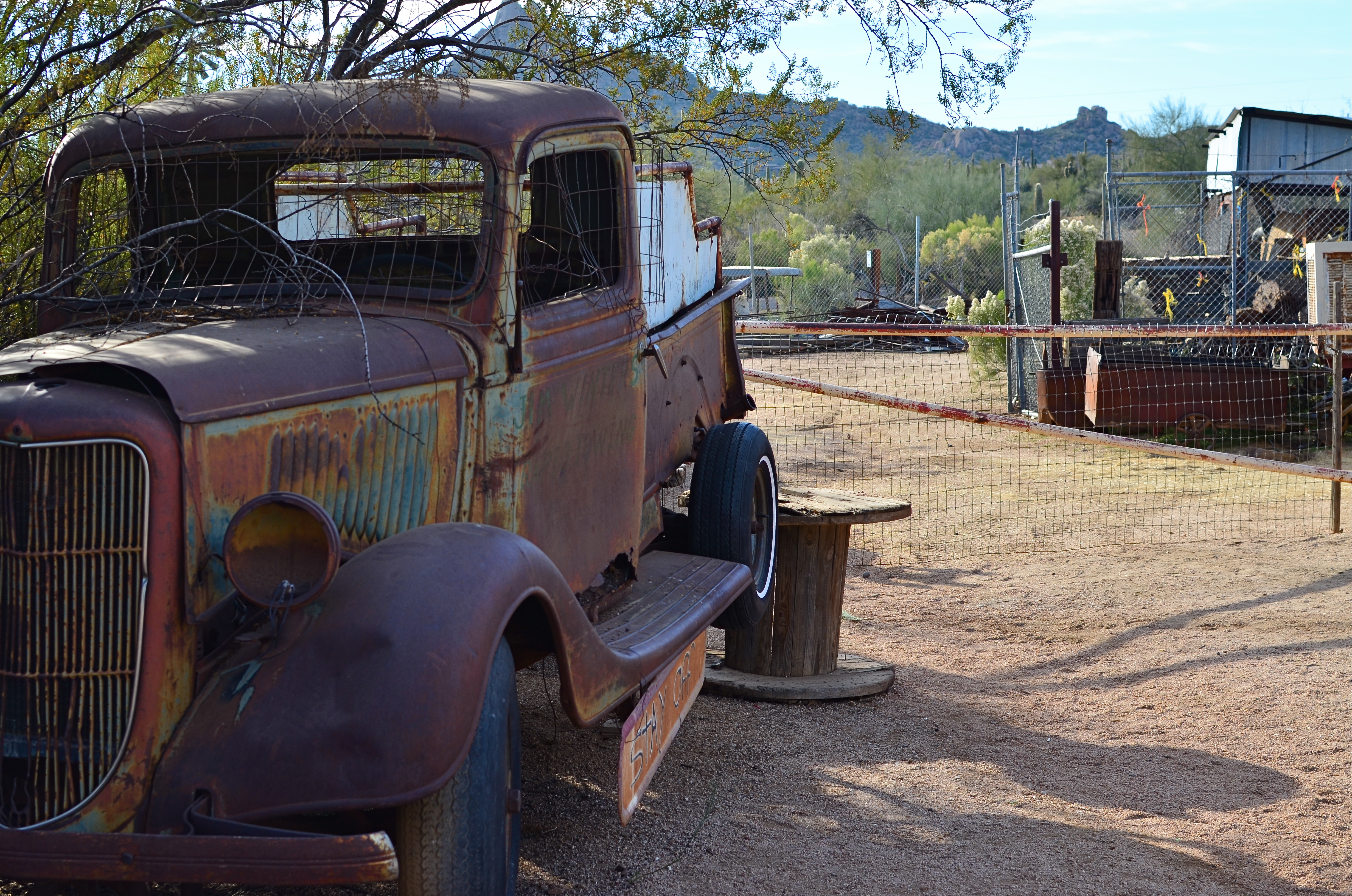
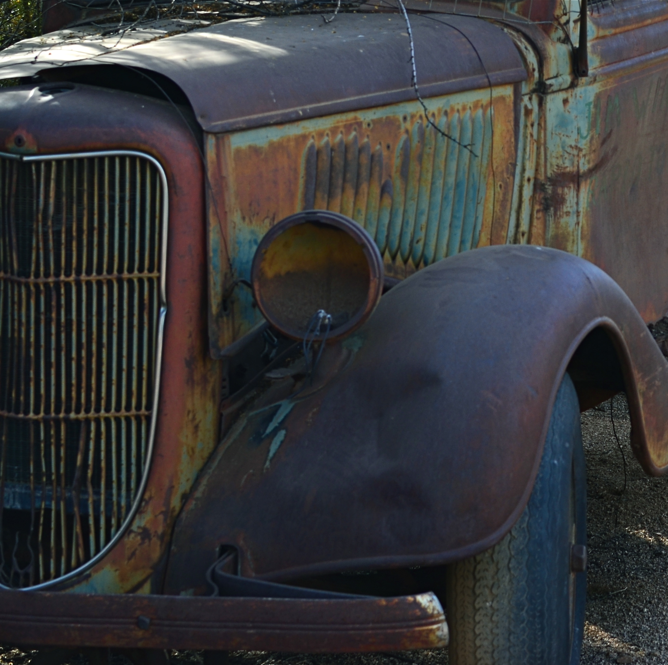
The original shot. Cool truck, but what’s all that lame junk off to the side?
The image up top began with the truck occupying just part of what I hoped would be a balanced composition, showing it in the context of a western desert scene. Only the truck is far more interesting a subject than anything else in the image, so I cropped until the it filled the entire frame. Even then, the grille of the truck was worthy of more attention than the complete vehicle, so I cut the image in half a second time, squaring off the final result and shoving the best part of the subject right up front.
The picture uses its space better now, and, strong subject or weak, at least there is no ambiguity on where you’re supposed to look. Sometimes that’s enough. That’s Zen, too.
I think.
ONE OUT OF FOUR
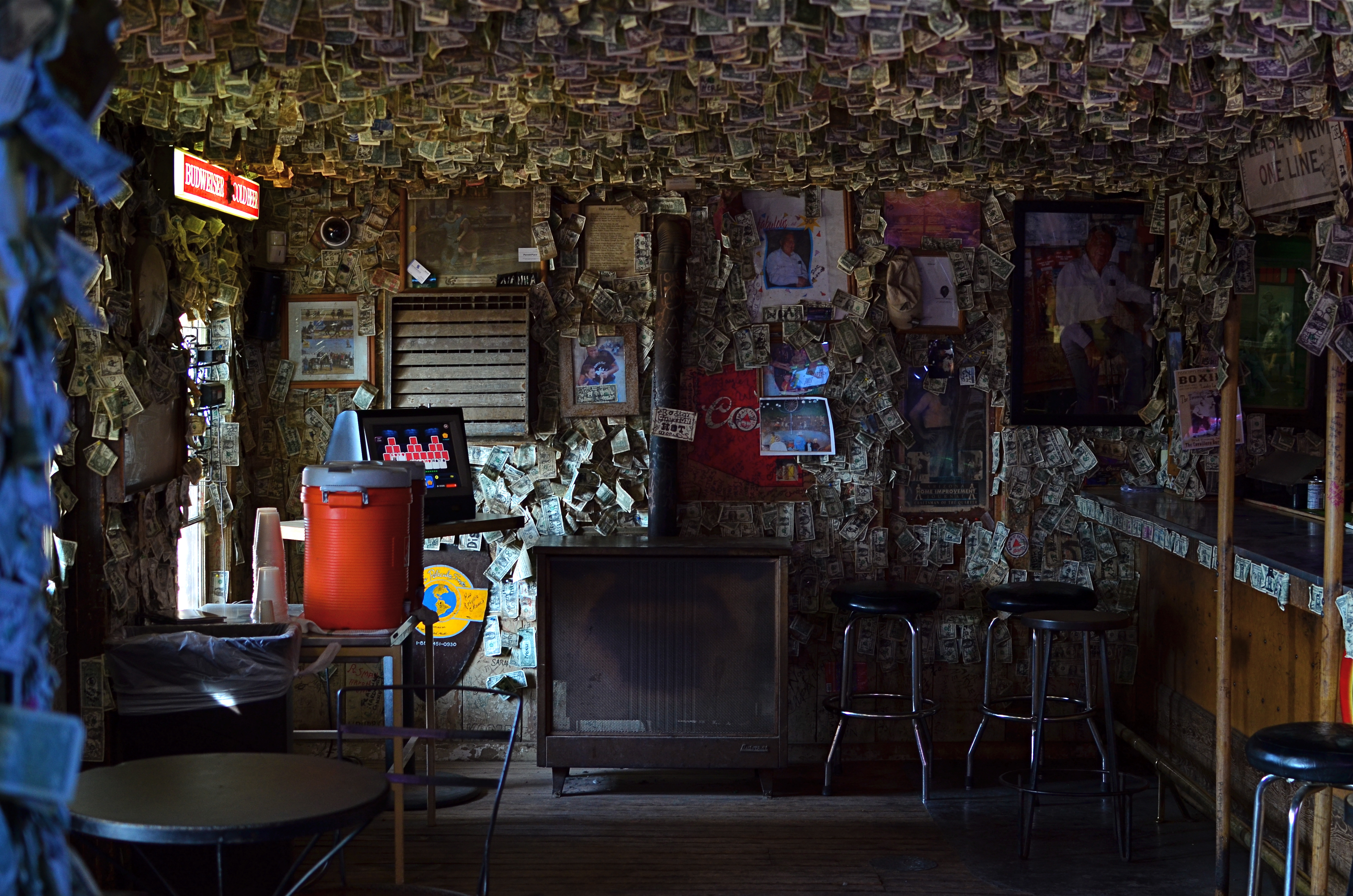
Main bar, Greasewood Flats, Arizona, 1/12/14. 1/30 sec., f/3.5, ISO 250, 35mm.
By MICHAEL PERKINS
IF YOU ARE DEPENDENT ON NATURAL LIGHT FOR YOUR ONLY SOURCE OF ILLUMINATION IN AN IMAGE, you have to take what nature and luck afford you. Making a photograph with what’s available requires flexibility, patience, and, let’s face it, a sizable amount of luck. It means waiting for your moment, hell, maybe your instant of opportunity, and it also means being able to decide quickly that now is the time (perhaps the only time) to press the button.
I recently had such a situation, measured in the space of several seconds in which the light was ready and adequate for a shot. And, as usual, the subject seemed as if it would serve up anything but acceptable conditions. The main bar of the classic western “joint” named Greasewood Flats, just outside of northern Scottsdale, Arizona, is anything but ideal in its supply of available light. Most of the room is a tomb, where customers become blobby silhouettes and fixtures and features are largely cloaked in shadow. I had squeezed off a few shots of customers queued up for bar orders, and they all registered as shifting shadows. The shots were unworkable, and I turned my attention to the fake-cowboy-ersatz-dude-ranch flavor of the grounds outside the bar, figuring that the hunt inside would be fruitless.
Minutes later, I was sent back inside the building to fetch a napkin, and found the bar empty of customers. I’m talking no human presence whatever. In an instant, I realized that the outside window light, which was inadequate to fill a four-sided, three-dimensional space, was perfectly adequate as it spread along just one wall. With crowds out of the way, the rustic detail that made the place charming was suddenly a big still-life, and the whole of that single wall was suddenly a picture. My earlier shots were too constrasty at f/5.6, so I tried f/3.5 and picked up just enough detail to fill the frame with Old West flavor. Click.
All natural light is a gift, but it does what it wants to do, and, to harness it for a successful shot, you need to talk nice, wait your turn, and remember to give thanks. And, in a dark room, be happy with one wall out of four that wants to work with you.
TAKE WHAT YOU NEED AND LEAVE THE REST
By MICHAEL PERKINS
LOOKING OVER MY LIFETIME “FAIL” PHOTOGRAPHS, FROM EARLIEST TO LATEST, it’s pretty easy to make a short list of the three main problems with nearly all of them, to wit:
Too Busy.
Too Much Stuff Going On.
I Don’t Know Where I’m Supposed To Be Looking.
Okay, you got me. It’s the same problem re-worded three ways. And that’s the point, not only with my snafus but with nearly other picture that fails to connect with anybody, anywhere. As salesmen do, photographers are always “asking for the order”, or, in this case, the attention of the viewer. Often we can’t be there when our most earnest work is seen by others. If the images don’t effectively say, this is the point of the picture, then we haven’t closed the deal.
It’s not simple, but, yeah, it is that simple.
If we don’t properly direct people to the main focus of our story, then we leave our audiences wandering in the woods, looking for a way out. Is it this path? Or this one?
In our present era, where it’s possible to properly expose nearly everything in the frame, we sometimes lose a connection to the darkness, as a way to cloak the unimportant, to minimize distraction, to force the view into a succinct part of the image. Nothing says don’t look here like a big patch of black, and if we spend too much time trying to show everything in full illumination, we could be throwing away our simplest and best prop.

Let sleeping wives lie. Work the darkness like any other tool. 1/40 sec., f/1.8, ISO 1250 (the edge of pain), 35mm.
In the above picture of my beautiful Marian, I had one simple mission, really. Show that soft sleeping face. A little texture from the nearby pillows works all right, but I’m just going to waste time and spontaneity rigging up a tripod to expose long enough to show extra detail in the chair she’s on, her sweatshirt, or any other surrounding stuff, and for what? Main point to consider: she’s sleeping, and (trust me) sleeping lightly, so one extra click might be just enough to end her catnap (hint: reject this option). Other point: taking extra trial-and-error shots just to show other elements in the room will give nothing to the picture. Make it a snapshot, jack up the ISO enough to get her face, and live with the extra digital noise. Click and done.
For better or worse.
Composition-wise, that’s often the choice. If you can’t make it better, for #%$&!’s sake don’t make it worse.
Follow Michael Perkins on Twitter @MPnormaleye.
SPLIT INFINITIVES
Consignment Shop, Manhattan. 1/80 sec., f/5.6, ISO 100, 35mm.
By MICHAEL PERKINS
IF YOU’RE OLD ENOUGH TO REMEMBER WHEN USE OF THE WORD “AIN’T” LABELED YOU AS A GRAMMATICAL LOWBROW, you may also recall the snooty disdain reserved for a verbal construction called the split infinitive. A simple infinitive involved following the preposition “to” with an action verb, such as “go”. To split the infinitive, the writer or speaker inserts an adverb between the two words for an extra boost of emphasis. Thus, in the most famous split infinitive ever, Gene Roddenberry invited Star Trek viewers
to boldly go where no man has gone before.
Nice, right? A little extra drama. A slight bending of the rules that delivers the goods.
Photography has a formal “grammar” about composition that also begs for a kind of “split infinitive”. Strictly speaking, compositions are supposed to be simple, clean, uncluttered. A perfect line of visual data from top to bottom, left to right. A picture frame, if you will, an organized way of seeing.
Attractive yes, even desirable, but a must? Nope. Life itself, as we observe it everyday, is far from a series of perfect frames. Lines of sight get broken, fragmented, blocked. Nature and light conspire to take that flawless composition and crash it, refract it, photobomb it until it resembles, well, life. And yet we often try to take pictures that show the very opposite of the sloppy, imprecise nature of things.
We try for “perfection” instead of perfect concepts.
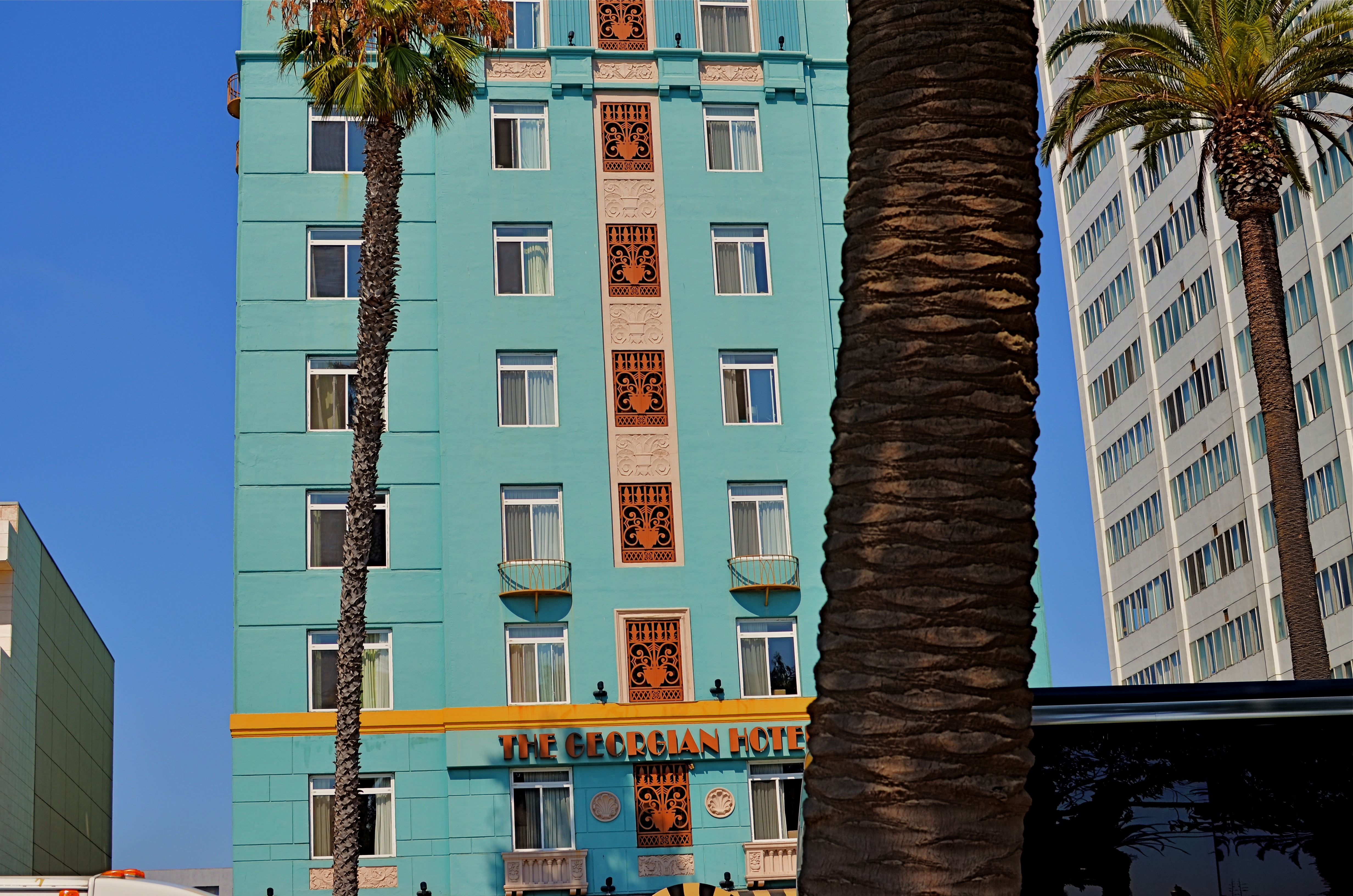
Georgian Hotel, Santa Monica, CA. 1/60 sec., f/5.6, ISO 100, 35mm.
Reviewing images for the last several years, I find that I am taking more compositions on their own terms, with light poles, weird reflections, broken planes of view and shadows all becoming more welcome in my final photos. I still labor to get a clean look when I can. But I also make peace with elements that used to doom a photo to the dustbin.
Street scenes especially can better reflect the visual chaos of busy cities if everything isn’t “just right”. It’s really hard (at least in my case) to tear out the mental hardwiring of a lifetime and take a picture that may be more abstract or cubist than I ever thought I could allow myself to be. Maybe it’s a function of aging, but things seem to be relaxing in my approach. Don’t get me wrong. I’m still Alpha Male enough to want to bring everything in a frame under my unswerving control. I just don’t get blood pressure when circumstances force me to unclench my iron fist once in a while.
It’s a process.
To see, yes, but, in allowing my visual infinitives to be occasionally split, it means learning to differently see.
Follow Michael Perkins on Twitter @mpnormaleye.
Welcome to our newest followers. Check out their mad genius at:
HOLDING BACK
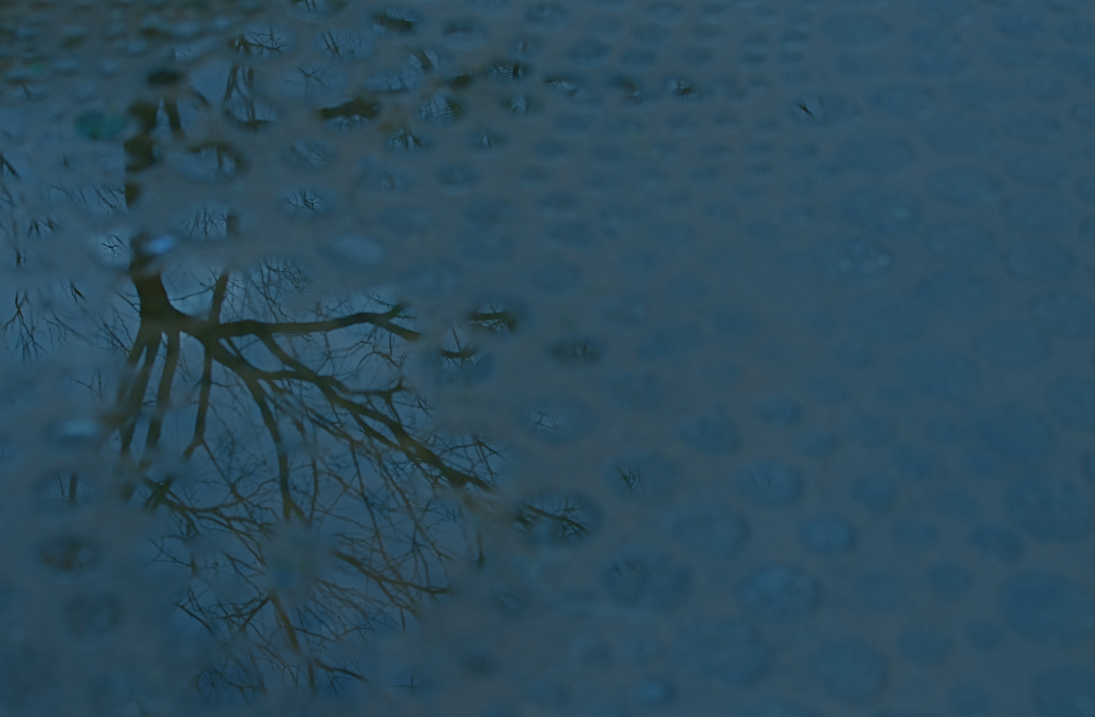
Rainy day dream away: 1/160 sec., f/4.5, ISO 100, 35mm.
By MICHAEL PERKINS
THE MIND WANTS TO PAINT ITS OWN PICTURES, and often responds better to art that veils at least part of its message in mystery. The old vaudeville adage, “always leave them wanting something” is especially applicable in the visual arts, where, often as not, the less you show, the better it connects with the viewing public. It’s precisely because you didn’t show everything that your work may reach deeper into people’s imaginations, which are then invited to “partner” in providing what you merely suggested.
This is why radio created more personal “pictures” than television, why an abstract suggestion of on-screen romance is more erotic than full-on depiction of every physical mechanic of an encounter, and why, occasionally, deciding to hold back, to withhold “full disclosure” can create an image that is more compelling because its audience must help build it.
Given the choice between direct depiction of an object and referential representation of it in a reflection or pool of water, I am tempted to go with the latter, since (as is the stated goal of this blog) it allows me to move from taking a picture to making one. Rendering a picture of a tree is basically a recording function. Framing a small part of it is abstraction, thus an interpretive choice. And, as you see above, showing fragments of the tree in a mosaic of scattered puddles gives the viewer a chance to supply the remainder of the image, or accept the pattern completely on its own merits. Everyone can wade in at a level they find comfortable.
I don’t always get what I’m going for with these kind of images, but I find that making the attempt is one of the only ways I can flex my muscles, and ask more of the viewer.
It’s the kind of partnership that makes everything worthwhile.
(follow Michael Perkins on Twitter @mpnormaleye)
Check out the excellent minds of our newest followers:
http://www.en.gravatar.com/insideoutbacktofront
THE EASIEST ABSTRACTION
By MICHAEL PERKINS
YOU’VE HEARD THE JOKE ABOUT THE WRITER WHO TAGGED A NOTE TO A FRIEND BY SAYING, “If I’d had more time, I’d have written you a shorter letter”. That line speaks volumes about how we increase the power of communication by leaving things out. Just as great books are not so much written as re-written, so photographs often gain in eloquence when everything but the essence of the message is pared away.

You already know a tree “goes with” this reflection..but is it needed to complete the image? 1/500 sec., f/5.6, ISO 100, 35mm.
It means being your own best editor, and, to do that, you have to be able to hate on your own work a little bit. Tough love and all that. Spare the picture and spoil the image. No sacred cows, just because they are your cows. There is no avoiding the fact that no real art comes about unless you take direct, often brutal action, to overcome the imperfections of a raw first effort. You have to intervene, again and again, in the shaping of your conception.
You can probably infer from all this that I am no fan of automodes, or of any other abdication of responsibility that lets a device, for Pete’s sake, dictate the outcome of image-making.
A few basic truths to keep before you:
Your camera is a machine with an eye attached.
You are an eye with a brain attached.
One of you is supposed to be in charge.
Guess which one.
When we merely snap a scene, freezing an arrangement of whatever we see in frame, we are only making a record. Creativity comes with abstraction, of exploring what is beyond the obvious cause-and-effect. The standard approach to showing things should actually be called the “average” approach. Look, here’s a tree, and, below, here is its shadow. Behold, here’s a scenic object next to the water, and, in the water, a reflection of that object. This simple reproduction of “reality” involves craft, to be sure, but something that falls short of art. Abstracting, adding or taking away something, and actively partnering with the viewer’s imagination take the photograph beyond a mere recording.
And that, boys and girls, is where the “art” part comes in.
Take away even a single obvious element and you change the discussion, for better or worse. Does the tree always have to be accompanied by its shadow? Does the mountain and its reflection always need to be presented as a complete “set”? It’s interesting to take even the “perfect” or “balanced” shots we cherish most and again take the scissors to part of them. Can the picture speak louder if we trim away the obvious? Can the image turn out to be something if it just stops trying to be everything?
The easiest abstractions come from changing small things, and editing can often, oddly, be an act of completion. Pictures taken in the moment are convenient, but too many images are trusted to the ease of leaning on automodes, and almost no photo is fully realized “straight out of the camera.” Believe this if you believe nothing else: nothing truly excellent ever results from putting your imagination in neutral. You have to decide whether you or the machine is the principal picture-taker.
That decision decides everything else.
Follow Michael Perkins on Twitter @mpnormaleye
IT’S NOT EASY BEIN’ GREEN
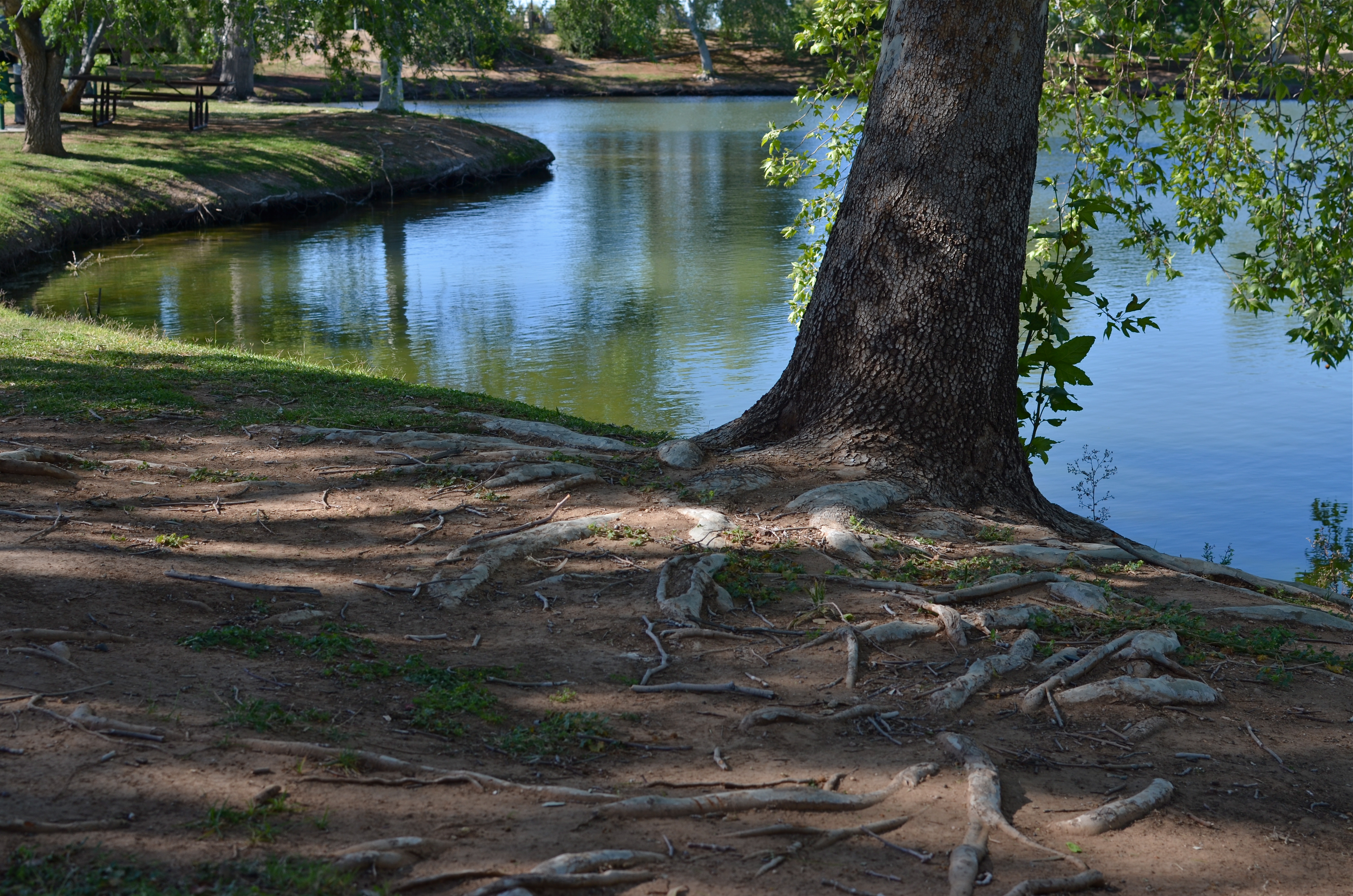
This is the desert? A Phoenix area public park at midday. There is a way around the intense glare. 1/500 sec., f/5.6, ISO 100, 35mm, straight out of the camera.
By MICHAEL PERKINS
FOR YEARS I HAVE BEEN SHOOTING SUBJECTS IN THE URBAN AREAS OF PHOENIX, ARIZONA, trying to convey the twin truths that, yes, there are greenspaces here, and yes, it is possible for a full range of color to be captured, despite the paint-peeling, hard white light that overfills most of our days. Geez, wish I had been shooting here in the days of Kodachrome 25. Slow as that film was, the desert would have provided more than enough illumination to blow it out, given the wrong settings. Now if you folks is new around here, lemme tell you about the brilliant hues of the Valley of the Sun. Yessir, if’n you like beige, dun, brown, sepia or bone, we’ve got it in spades. Green is a little harder to come by, since the light registers it in a kind of sickly, sagebrush flavor….kind of like Crayola’s “green-yellow” (or is it “yellow-green”?) rather than a deep, verdant, top-o-the-mornin’ Galway green.
But you can do workar0unds.
In nearby Scottsdale, hardly renowned for its dazzling urban parks (as opposed to the resort properties, which are jewels), Indian School Park at Hayden and Indian School Roads is a very inviting oasis, built around a curvy, quiet little pond, dozens of mature shade trees that lean out over the water in a lazy fashion, and, on occasion, some decorator white herons. Thing is, it’s also as bright as a steel skillet by about 9am, and surrounded by two of the busiest traffic arteries in town. That means lots of cars in your line of sight for any standard framing. You can defeat that by turning 180 degrees and aiming your shots out over the middle of the pond, but then there is nothing really to look at, so you’re better off shooting along the water’s edge. Luckily, the park is below street level a bit, so if you frame slightly under the horizon line you can crop out the cars, but, with them, the upper third of the trees. Give and take.
There is still a ton of light coming down between the shade trees, however, so if you want any detail in the water or trees at all, you must shoot into shade where you can, and go for a much faster shutter speed….1/500 up to 1/1000 or faster. It’s either that or shoot the whole thing at a small f-stop like f/11 or more. In desert settings you’ve got so much light that you can truly dance near the edge of what would normally be underexposure, and all it will do is boost and deepen the colors that are there. There will still be a few hot spots on projecting roots and such where the light hits, but the beauty of digital is that you can click away and adjust as you go.
It’s not quite like creating greenspace out of nothing, but there are ways to make things plausibly seem to be a representation of real life, and, since this is an interpretive medium, there’s no right or wrong. And the darker-than-normal shadows in this kind of approach add a little warmth and mystery, so there’s that.
It was “yellow-green”, wasn’t it?
Hope that’s not on the final.
(follow Michael Perkins on Twitter @mpnormaleye)
FIND THE OUTLIERS
Not the kind of space you’d expect to see in a visually crowded suburban environment. And that’s the point. 1/320 sec., f/8, ISO 100, 18mm.
By MICHAEL PERKINS
EVERY TIME MY WIFE AND I TRAVEL, A STRANGE PHENOMENON OCCURS. We will be standing on the exact same geographic coordinates, pointing separate cameras in generally the same general area. And, invariably when she gets her first look at the pictures I took on that day, I will hear the following:
Where was THAT? I don’t remember seeing that!? Where was I?
Of course, we see differently, as do any two shooters. Some things that are blaring red fire alarms to one of us are invisible, below the radar, to the other. And of course we are both right. And valid. Admittedly, I do seem to come back with more strange, off-to-the-side-of-the road oddities than Marian does, but that may be due more to my wildly spasmodic attention span than any real or rare “vision”. Lots of it comes because I consciously trying to overcome the numbing experience of driving in a car. I have to work harder to take notice of the unconventional when repeatedly tracking back and forth,day after day, down routine driving routes. Familiarity not only breeds contempt, it also fosters artificial blindness. The “outliers” within five miles of your own house should glow like fluorescent paint….but often they seem cloaked by a kind of habit-dulled camo.
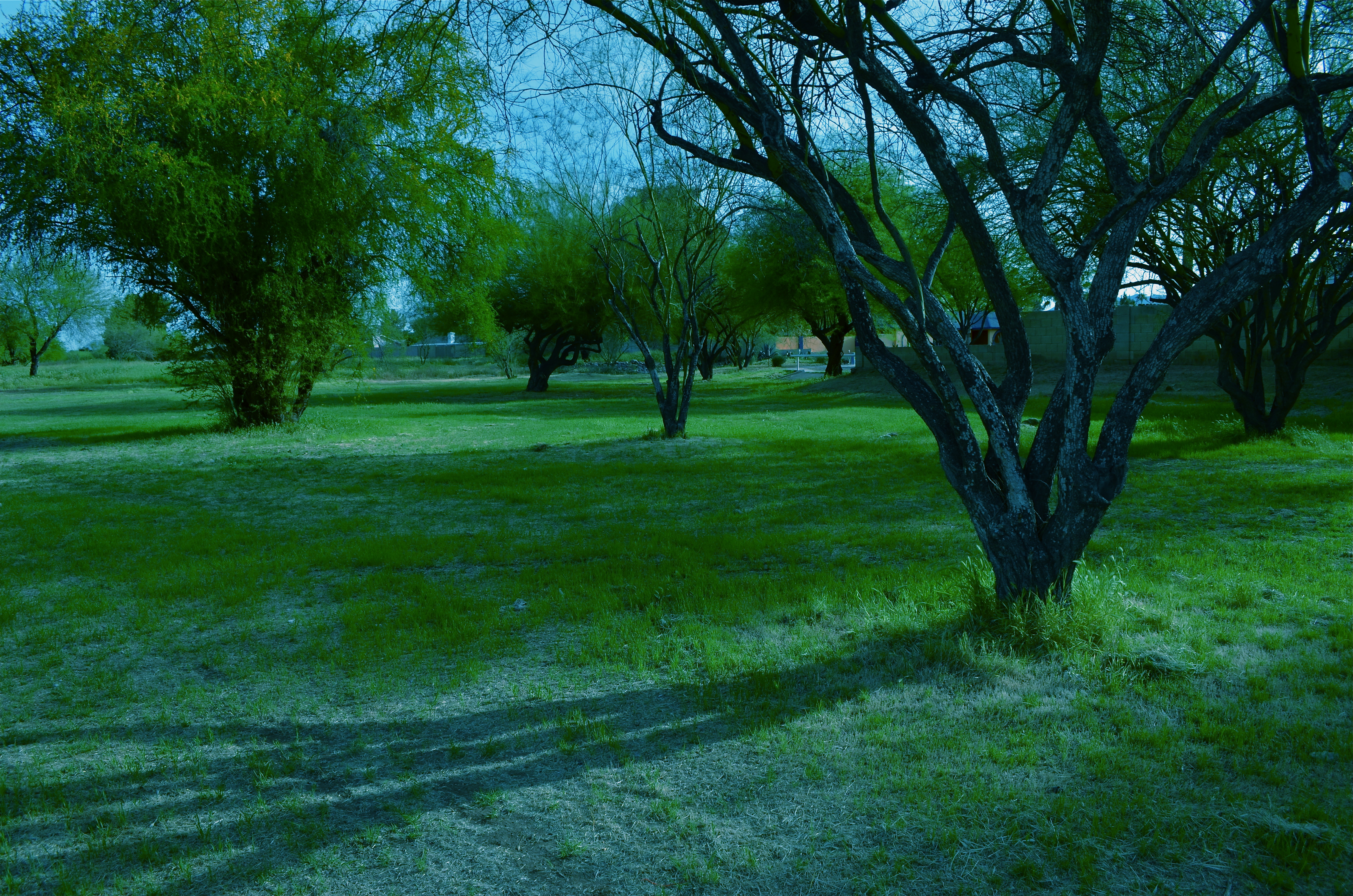
Once detected, outliers don’t quite fit within their neighboring context. The last Victorian gingerbread home in a clutch of tract houses. The old local movie theatre reborn as a Baptist church. Or, in a place like Phoenix, Arizona, where urban development is not only unbridled but seemingly random, the rare “undeveloped” lot, crammed between more familiar symbols of sprawl.
The above image is such an outlier. It’s about an acre-and-a-half of wild trees bookended by a firehouse,
The sprawl-laden neighborhood that surrounds my “enchanted forest” Hey. it”s all about the context.
a row of ranch houses, and a busy four-lane street. Everything else on the block screams “settled turf”, while this strange stretch of twisted trunks looks like it was dropped in from some fairy realm. At least that’s what it says to me.
My first instinct in cases like this is to get out and shoot, attempting, as I go, to place the outlier in its own uncluttered context. Everything else around my “find” must be rendered visually irrelevant, since it adds nothing to the image, and, in fact, can diminish what I’m after. Sometimes I also tweak my own color mix, since natural hues also may not get my idea across.
Even after all this, I often find that there is no real revelation to be had, and I must chalk the entire thing up to practice. Occasionally, I come back with something to show my wife. And I know I have struck gold if the first thing out of her mouth is, “Where is THAT?”
To paraphrase the old proverb, behind every great man is a woman who rightfully asks, “Do you know what you’re doing?”
Sometimes I have an answer….
REWORKING THE UNIVERSE
By MICHAEL PERKINS
CONTEXT, FOR A PHOTOGRAPHER, IS LIKE THE CONDUCTOR’S BATON IN MUSIC, that magic wand that dictates fast and slow, soft and loud, ordering a specific world within a confined space. Since it impossible to show the world entire, all shooters decide what part of it, what story within it, that they will frame. Sounds obvious, but without the mastery of this skill, we fail as storytellers, and the eye that we develop for what to include and exclude is, despite all the tools and toys, the only thing that really makes an artistic performance out of a photograph.
It can also be a helluva lot of fun. With some dumb luck thrown in for good measure.
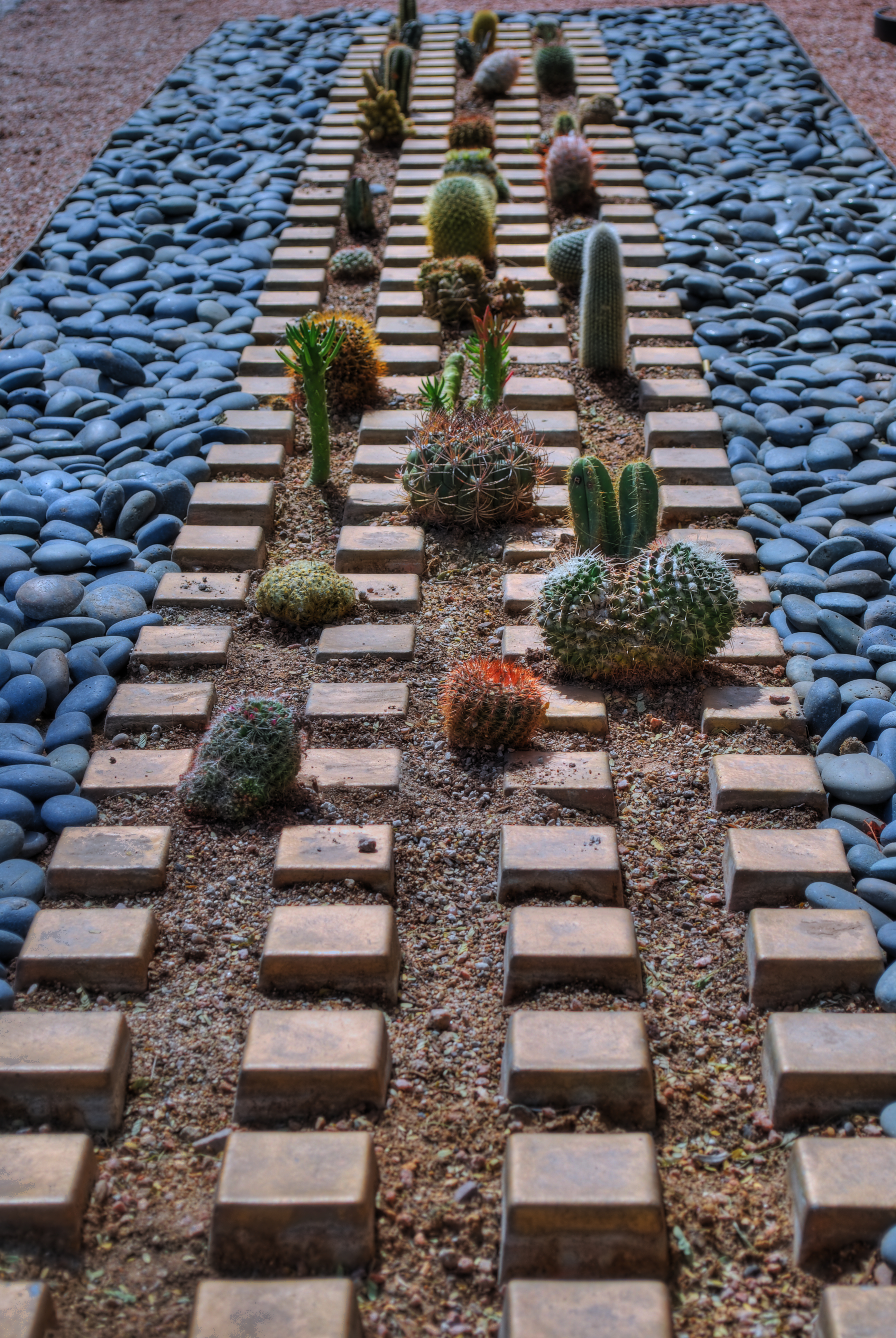
Cactropolis, 2011. A three-exposure HDR blend with a little color and contrast teaking. This whole layout, in reality, is about fifteen feet square, total. Various shutter speeds, f/8, ISO 100, 52mm.
I love opportunities that allow me to disrupt the original visual “place” of objects, to force them to be re-purposed for the viewer. A few years ago, my daily lunch routine involved a short walk across a bustling college campus to my habitual lunch hang, a stroll which took me past one of the school’s busiest crossroads, marked by the intersection of two superwide sidewalks flanked by small patches of landscaping. Since this is Arizona, such short plots of land frequently are not the stuff dreams are made of. We’re talking pink quartz gravel interrupted by the occasional scabby aloe plant or cholla. And that’s what made this one little rectangle, just several feet long on each side, vie for my attention.
An arrangement of several varieties of small cacti has been arranged in rows, regulated by square tiles, grounded in gravel, and bounded by smooth bluish stones. Simple stuff, really, but this was somebody’s deliberate design, a pattern that registered, to my eye, like some kind of fantasy urban streetscape, blocks of tiny, spiny skyscrapers vanishing off toward an unseen horizon….a miniature downtown from Weirdsville, a tabletop diorama from Beetlejuice.
I didn’t really have to compose anything. I was in the framing business. But getting that frame meant getting rid of the surrounding throngs of students, the sidewalks, the buildings, the sky…..anything that seemed outside of the closed world implied by that little rectangle. Changing the context. In fact, I was adding something for everything I was taking away.
So let’s crop this puppy and see what happens.
Now I saw what seemed to be a self-contained world, one in which I was free to imagine what lay “beyond”. I goosed up the hues and texture with HDR processing, but otherwise, what you see is what there was. Maybe it works as pure design. Maybe I conveyed something, but the fact is, we have to make choices as shooters. The only thing that marks us as individuals is what we decide to see, and show.
Like I said…fun….luck….some other somethings…..
(Many Thanks Dept.:The idea for this post was inspired, in part, by a suggestion from my good friend Michael Grivois.)
I SEE YOUR FACE BEFORE ME
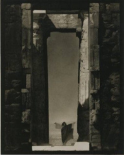
Edward Steichen’s amazing 1921 portrait of dance icon Isadora Duncan beneath a massive arch of the Parthenon in Greece, an image which recently surged to the top of my mind. See a link to a larger view of this shot, below.
By MICHAEL PERKINS
THE IMAGES SIT AT THE BOTTOM OF THE BRAIN, LIKE STONE PILLARS IN THE FOUNDATION OF AN IMMENSE TOWER.The structures erected on top of them, those images we ourselves have fashioned in memory of these foundations, dictate the height and breadth of our own creative edifices. Between these elemental pictures and what we build on top of them, we derive a visual style of our own.
In my own case,many of the pillars that hold up my own house of photography come from a single man.
Edward Steichen is arguably the greatest photographer in history. If that seems like hyperbole, I would humbly suggest that you take a reasonable period of time, say, oh, twenty years or so, just to lightly skim the breadth of his amazing career….from revealing portraits to iconic product shots to nature photography to street journalism and half a dozen other key areas that comprise our collective craft of light writing. His work spans the distance from wet glass plates to color film, from the Edwardian era to the 1960’s, from photography as an insecure imitation of painting to its arrival as a distinct and unique art form in its own right.
At the start of the 20th century, Steichen co-sponsored many of the world’s first formal photographic galleries, and was a major contributor to Camera Work, the first serious magazine dedicated wholly to photography. He ended his career as the creator of the legendary Family Of Man, created in the early 1950’s and still the most celebrated collection of global images ever mounted anywhere on earth. He is, simply, the Moses of photography, towering above many lesser giants whose best work amounts to only a fraction of his own prodigious output.
Which is why I sometimes see fragments of what he saw when I view a subject. I can’t see with his clarity, but through the milky lens of my own vision I sometime detect a flashing speck of what he knew on a much larger scale, decades before. The image at left recently rocketed to my mind’s eye several weeks ago, as I was framing shots inside a large government building in Ohio.In 1921, Steichen journeyed to Greece to use the world’s oldest civilization basically as a prop for portraits of Isadora Duncan, then in the forefront of American avant-garde dance. Framing her at the bottom of an immense arch in the ruins of the Parthenon, he made her appear majestic and minute at the same time, both minimized and deified by the huge proportions in the frame. It is one of the most beautiful compositions I have ever seen, and I urge you to click the Flickr link at the end of this post for a slightly larger view of it. (Also note the link to a great overview of Steichen’s life on Wikipedia.)
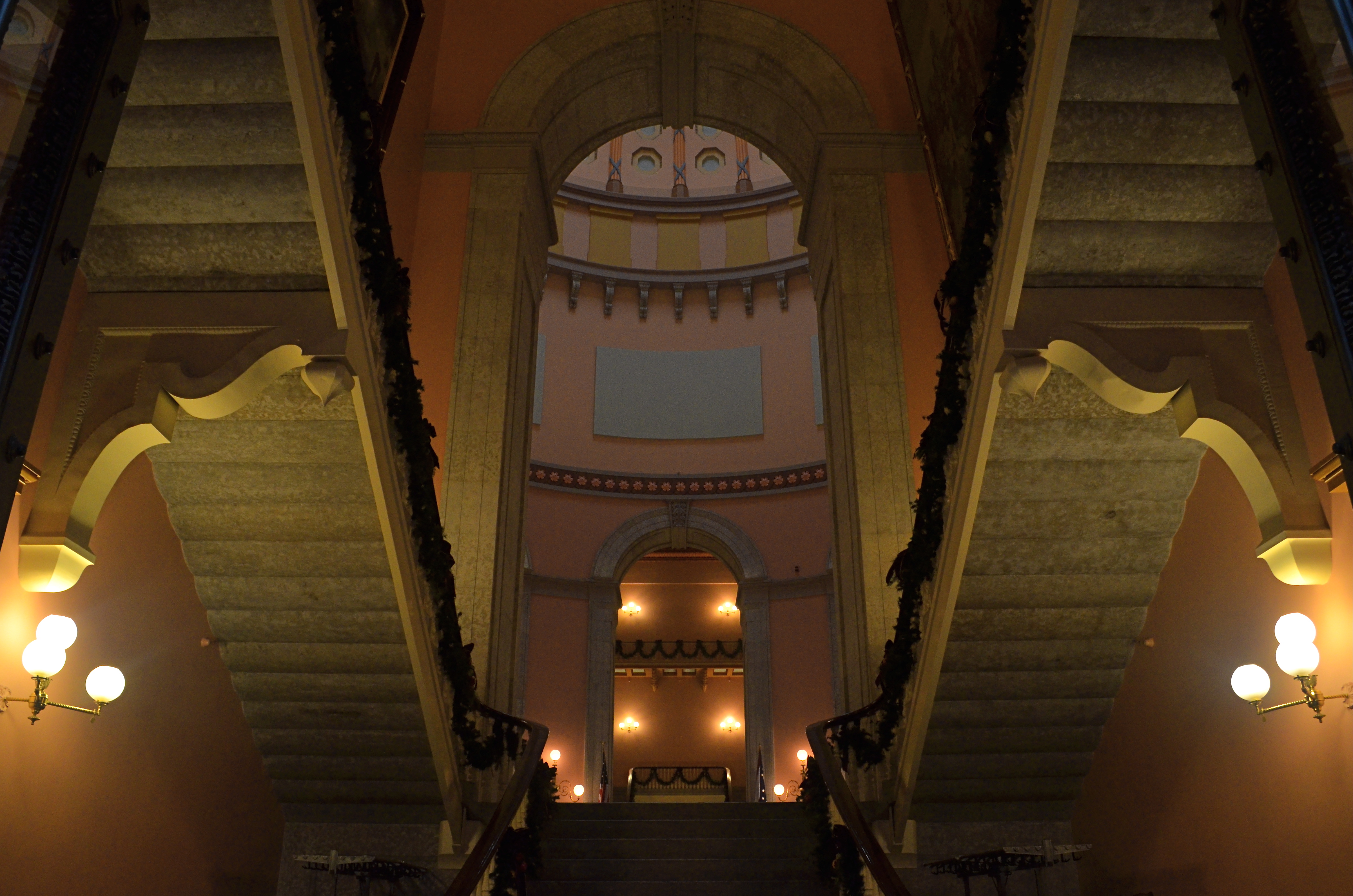
Uplighting creates a moody frame-within-frame feel at the Ohio Statehouse building, in a shot inspired by Edward Steichen’s images of massive arches. 1/30 sec., f/8, ISO 800, 18mm.
In framing a similarly tall arch leading into the rotunda of the Ohio Statehouse in Columbus, I didn’t have a human figure to work with, but I wanted to show the building as a series of major and minor access cavities, in, around, under and through one of its arched entrance to the central lobby. I kept having to back up and step down to get at least a partial view of the rotunda and the arch at the opposite end of the open space included in the frame, which created a kind of left and right bracket for the shot, now flanked by a pair of staircases. Given the overcast sky meekly leaking grey light into the rotunda’s glass cupola, most of the building was shrouded in shadow, so a handheld shot with sufficient depth of field was going to call for jacked-up ISO, and the attendant grungy texture that remains in the darker parts of the shot. But at least I walked away with something.
What kind of something? There is no”object” to the image, no story being told, and sadly, no dancing muse to immortalize. Just an arrangement of color and shape that hit me in some kind of emotional way. That and Steichen, that foundational pillar, calling up to me from the basement:
“Just take the shot.”
Related articles
- The Photograph as a Social Statement (halsmith.wordpress.com)
- Picture Imperfect (andrewsullivan.thedailybeast.com)
- http://www.flickr.com/photos/quelitab/5793648357/lightbox/
- http://en.wikipedia.org/wiki/Edward_Steichen
THE PROSCENIUM
By MICHAEL PERKINS
IT IS THE OLDEST FRAMING DEVICE IN HISTORY. If you’ve ever watched a play on any stage, anywhere in the world, you’ve accepted it as the classic method of visual presentation. The Romans coined the word proscenium, “in front of the scenery”. Between stage left and stage right exists a separate reality, defined and contained in the finite space of the theatre’s forward area. What is included in the frame is everything, the center of the universe of certain characters and events. What’s outside the frame is, indefinite, vague, less real.
Just like photography, right? Or to be accurate, photography is like the proscenium. We, too select a specific world to display. We leave out all the other worlds not pertinent to our message. And we follow information in linear fashion…left to right, right to left. The frame gives us the sensation of “looking in” to something that we are only visiting, just as we only “rent” our viewpoint from our theatre seats.
We learned our linear habit from the descendants of stage arrangement….murals, frescoes, paintings, all working, as our first literate selves would, from left to right. Painters were forced to arrange information inside the frame, to make choices of what that frame would include, and, as the quasi-legitimate children of painting, we inherited that deliberately chosen viewpoint, that decision to show a select world, by arranging visual elements within the frame.

Park Slope, Brooklyn, 2012. Trying to catch as much activity as a street glance, at any given moment, can. 1/320 sec., F/7.1, ISO 100, 24mm.
For some reason, in recent months, I have been abandoning the non-traditional in shooting street scenes and harking back to the proscenium, trying to convey a contained world of simple, direct left-right information. Candid neighborhood shots seem to work well without extra adornment. Just pick your borders and make your capture. It’s a way of admitting that some worlds come complete just as they are. Just wrap the frame around them like a packing crate and serve ’em up.
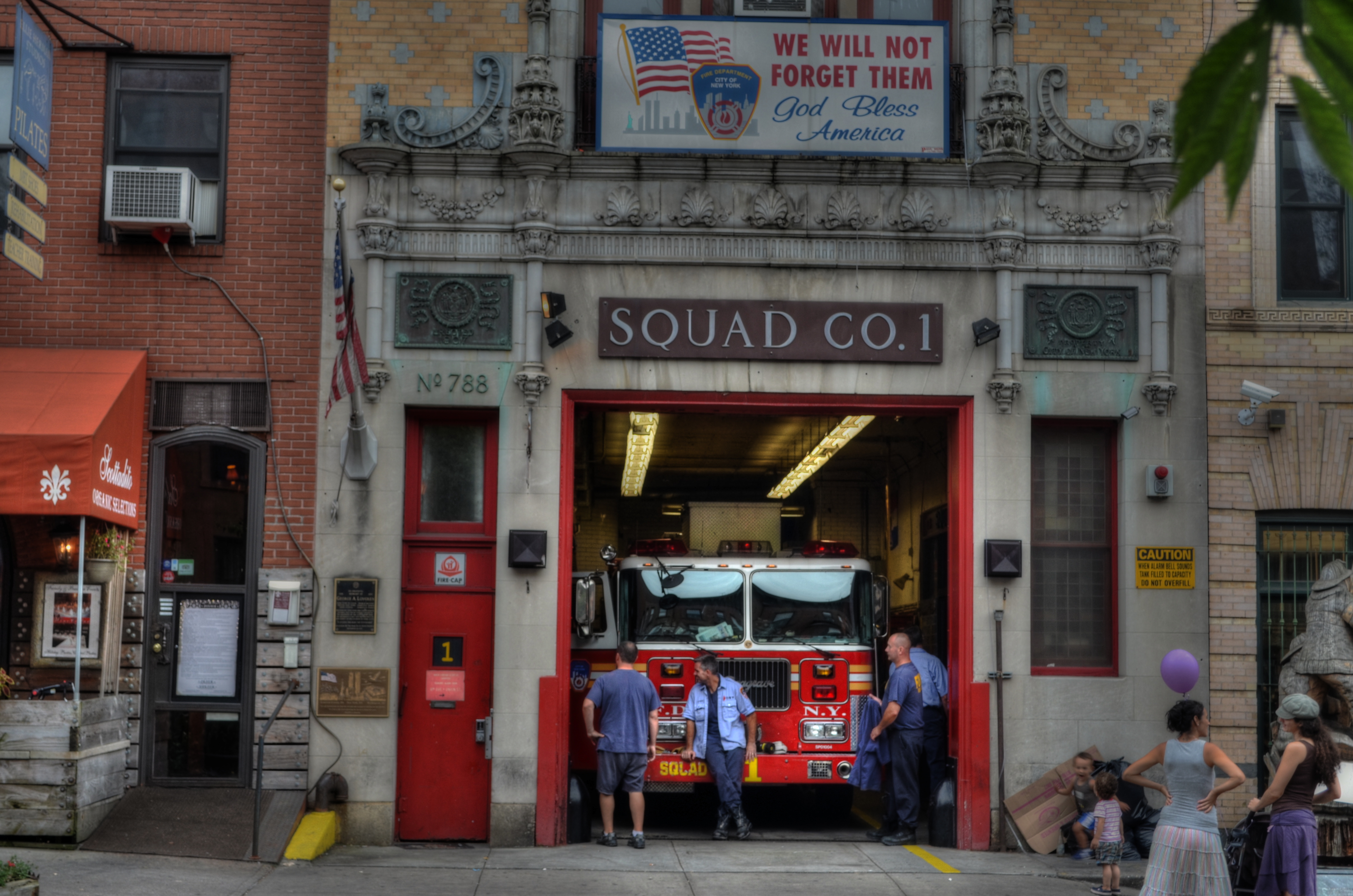
Like a theatre play, some images read best as self-contained, left-to-right “worlds”. A firehouse in Brooklyn, 2012. 1/60 sec., f/6.3, ISO 100, 38mm.
This is not to say that an angled or isometric view can’t portray drama or reality as well as a “stagy” one. Hey, sometimes you want a racing bike and sometimes you want a beach cruiser. Sometimes I don’t mind that the technique for getting a shot is, itself, a little more noticeable. And sometimes I like to pretend that there really isn’t a camera.
That’s theatre. You shouldn’t believe that the well-meaning director of the local production of Oklahoma really conjured a corn field inside a theatre. But you kind of do.
Hey what does Picasso say? “Art is the lie that tells the truth”?
Okay, now I’m making my own head hurt. I’m gonna go lie down.
