NOTHING AT FACE VALUE

By MICHAEL PERKINS
SOMETIMES I THINK THAT PHOTOGRAPHERS, especially beginners, needlessly hem themselves in by “pre-editing” their work. Being human, we all care, to some degree, about how our images “play” to various viewers, and so it’s understandable that we can be scared away from attempting certain things that are too jarring or disorienting to our intended audiences. We work to hard to avoid the attachment of certain labels to our pictures.
The “a” word, “abstract”, is one such label. It’s a scare word. And it can spook us out of truly innovative image-making.
Sure, we may know that, strictly speaking, abstraction really just means extraction, pulling a visual shorthand of essence out of a more complex subject. Rather than merely recording the full detail of an object in a photograph, the abstract photographer reduces it to its most effective basics. A baseball loses its stitches and writing and becomes just a sphere. Abstraction can also yank something out of its familiar context, forcing the viewer to regard it on its own merits, so that an entire salad is reduced to the sensual curvature of one section of a single vegetable.
Okay, so that’s what we know about abstraction. However, what we feel, even about just the word, can cow us into conformity. We fear being called “artsy”, avant-grade, pretentious. And we gradually adjust our images to reflect what others regard as “real”. It’s tough: learning to trust your own vision is the single hardest lesson in any art. But what’s the alternative? Cranking out the same systematic execution of a flower for the next forty years just to curry favor with the mob?
If you observe an orchid (like the one above), and see, not merely a flower, but a winged creature taking flight, why not take the extra step and reclaim the “realness” of that object for your own purpose? The camera is an interpretative tool, not a video recorder.
Anytime we are tempted to restrict our pictures to what the world at large regards as “real”, we should listen for abstraction’s quiet but persistent question. “Real” according to whom?
EYE OF THE BEHOLDER
By MICHAEL PERKINS
PHOTOGRAPHERS TRY TO IDENTIFY the so-called “eternal” verities of life, the common elements of experience that are unchanging over time. We all find our way to sunsets, shores, the mysteries of the human face, the course of light. But how about the more subjective “truths”, those purely emotional facts which may wax and wane with passing fancy?
Can we say, visually, what beauty is, or for that matter, what the depiction of humor, truth, or other subjective values should look like? Pictures of anything that is governed by fashion or fad will find themselves shredded by the same temporal process that makes Grandpa’s handlebar moustache seem ridiculous rather than rakish and makes the miniskirt a measure of folly instead of hipness.
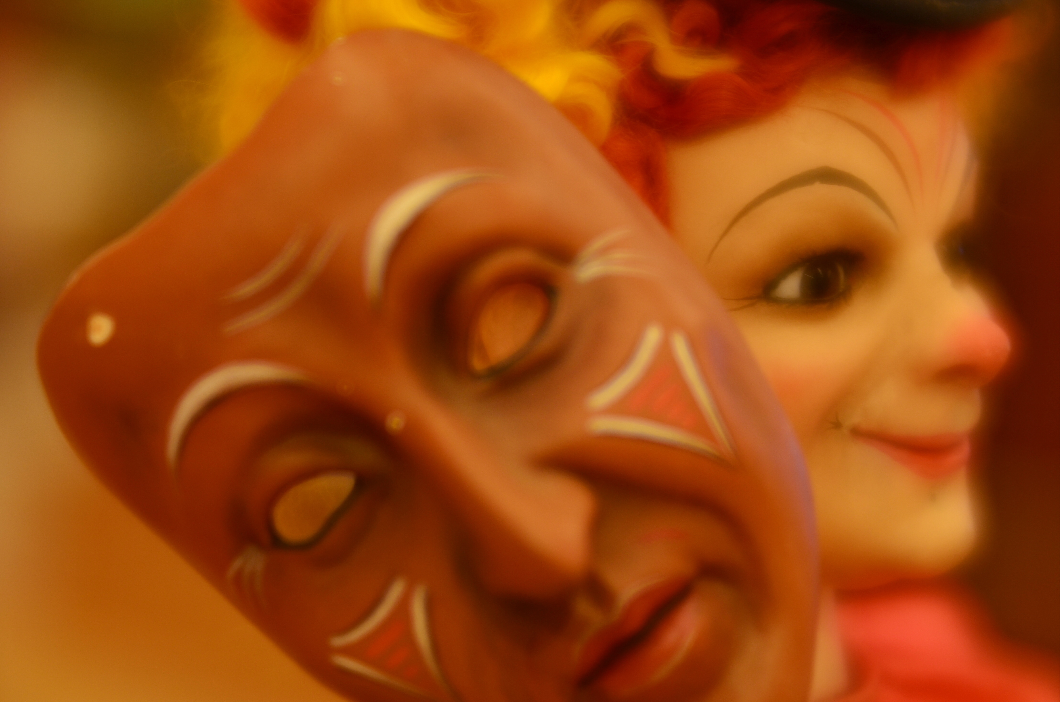
Consider something as personal as a toy. In one era, its features are comical and cute, whereas, a few decades later, they might register as, well, creepy. As a case in point, the image seen above is of a 19th-century automaton, a mechanized dancing musical doll called “The Mask Vendor”. The grinning harlequin on the right is the vendor, and the visage at left is one of his wares, which range in expression from foolish to demonic. Good times, eh? Oh, look at this jolly prankster selling “counterfeits” of faces! What rascally fun!
I can tell you, as a tour guide in the museum that “the Vendor” calls home, that he is regarded with horror, not joy, and that the feeling he projects on young visitors is one of dread, not mischief (one Hispanic tour guest, a seven-year-old, referred to him, shakily, as “el Diablo!”). So how to make a picture of such an oddity?
As a photographer, I’m in an odd place here. I have enough historic knowledge to know that the doll was originally associated with gaiety, and yet I live in a time in which its message of fun has long since been twisted and corrupted to suggest something dark…..so much so that any image I make of it, as filtered through current-day sensitivities, must shift between both “realities”. I am thus free to add as much irony or ghoulishness as I choose, like the veneer of haze I added to accentuate the dreariness/nightmarishness of the thing. Nothing is over the top.
Even when we snap something as eternal as a sunrise, we may unconsciously be adding some additional layer of ourselves as a similarly hazy veneer. But how can it be helped? Unlike the Vendor, we’re only human. Brrrrrr.
(VERY) STILL LIFE
By MICHAEL PERKINS
PHOTOGRAPHY, WHEN IT FLEXES TO ITS FULLEST LIMITS, should never be about merely accepting things at face value. The camera is a fairly reliable recording device, but simply using it to freeze time severely limits its narrative potential. Of course, on a purely personal level, that’s frequently just what we want: to stop the clock on the vanishing of tender times and loved ones: to preserve life.
However, I believe that the camera should also preserve death.
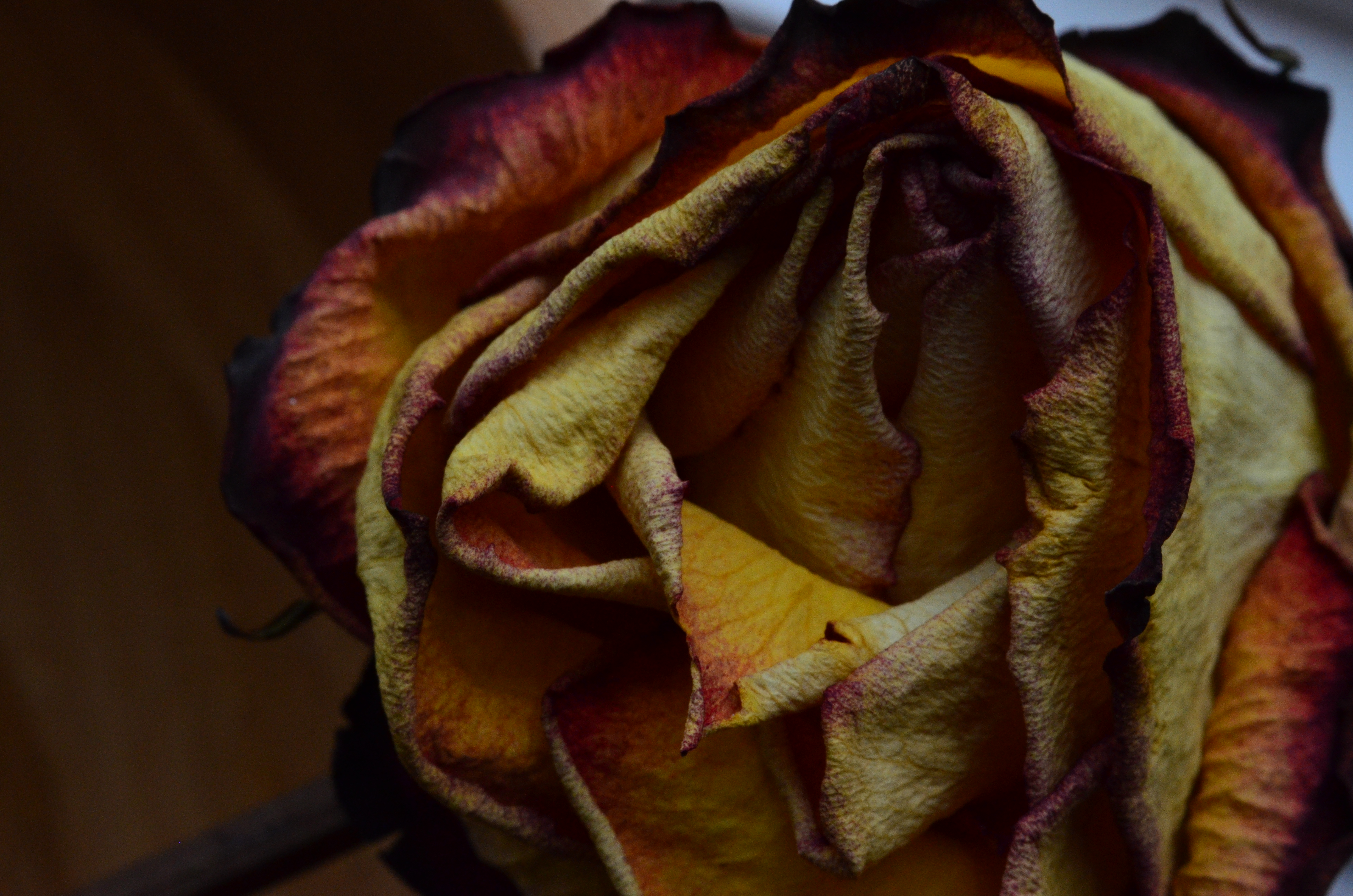
I’m not talking about doing a series of close-ups of Grandpa in the crypt. I’m mostly thinking biological subjects here. Living things are most typically photographed in the full bloom of health: the eye luxuriates over bright explosions of color, the hardy flesh of petals, the skyward reach of tender saplings. But if a photographic subject gains extra interpretive power as it’s removed from its standard context (nature in its regular settings), then a living thing achieves the ultimate visual re-contextualization as its life begins to ebb. Taking the familiar out of its comfort zone opens it up to alternate interpretations.
The rose seen above, taken with a Lensbaby Velvet 56 (a wonderful portrait lens which doubles as a decent macro), was days dead when I came upon it, and yet it presented textures more intriguing, colors deeper and richer than its fresher vase-mates. Is this ghoulish?
Depends. Decay is, after all, something we document with great enthusiasm as it applies to inanimate things like rusted cars, crumbling neighborhoods and abandoned infrastructures. How much more attention should be paid, then, to things that once mirrored our own fleeting arrangement with mortality, once throbbed with pulses as perishable as those bounding through our own veins.
IRVING’S CURTAIN
By MICHAEL PERKINS
BY THE TIME IRVING PENN (1917–2008) WAS ESTABLISHED as a portraitist without equal for Vogue magazine, he had chalked off clear parameters for his style. Natural over artificial light: large format, high-resolution monochromes: a patient talent for extracting the essence of even the most reluctant subject: and an almost lucky-charm devotion to the worn and stained curtain he would use, almost exclusively, as his backdrop for the length and breadth of his legendary career.
Salvaging the curtain from a Paris theatre in 1950, Penn used it as the great equalizer in all his portrait work, staging everything from Picasso’s puckish gaze to Audrey Hepburn’s gamine charm in front of its collection of stains, spills and discolorations. The curtain was as essential to a Penn shoot as the great man’s lenses, and where he went, from remote African villages to literary salons, it went also. And finally, eight years after his death, it traveled one more time to New York, for a supporting role in an Instagram near you.
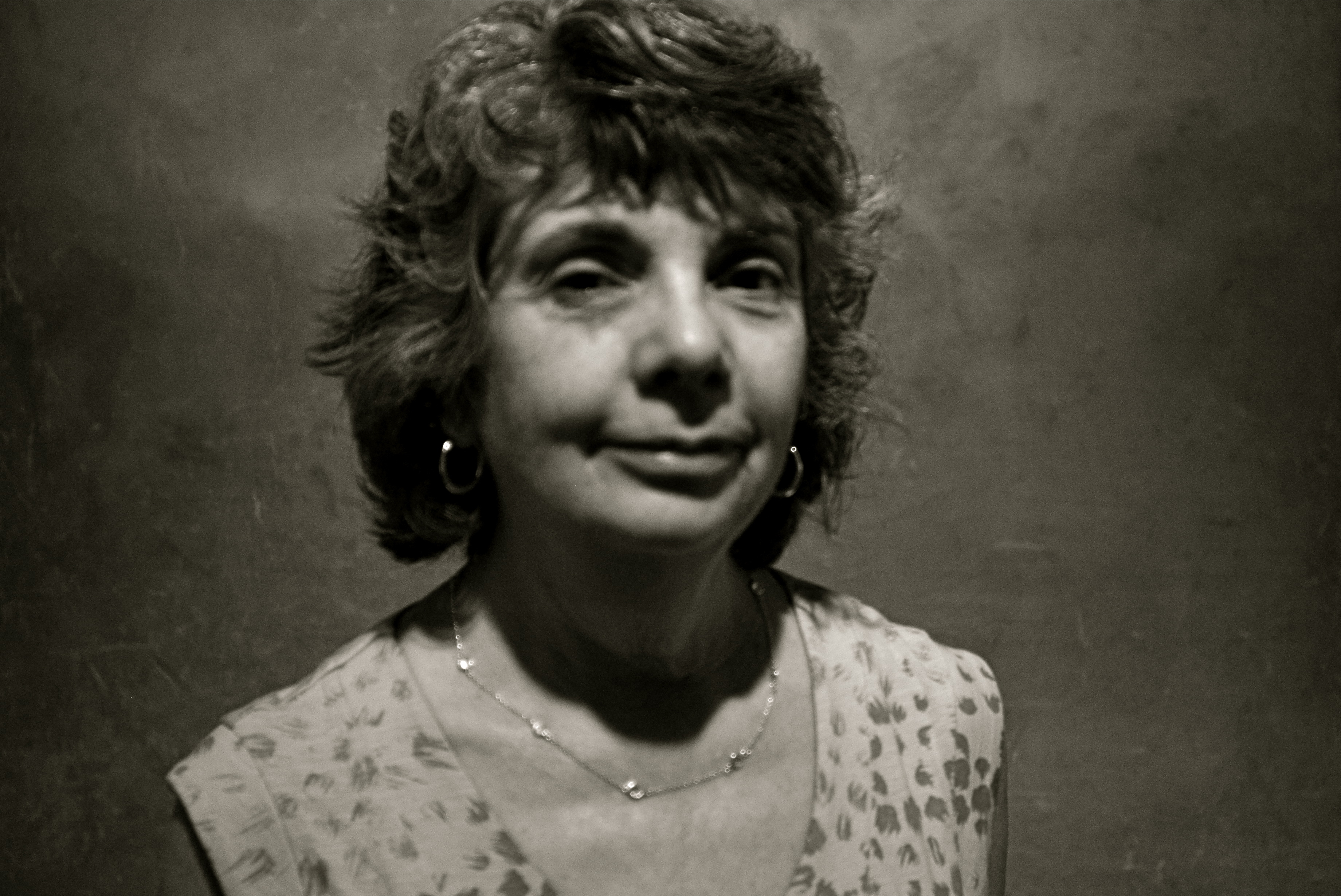
As part of the Metropolitan Museum Of Art’s centennial celebration of Penn’s work for 2017, the curtain was installed in a room chocked with shots of the famous people with which it had co-starred. Studio-style, it was mounted on a curved panel to avoid hot spots from glare, and visitors were invited to pose themselves in front of it, fore-lit by a well-placed fashion light. The message was seductively mis-leading. If the cloth is magic, maybe it’s transferable! Maybe it is that black crow’s feather that makes Dumbo fly…..
The Met’s true genius in installing this Penn-it-yourself feature in its exhibit became obvious once you took the bait. That is, there’s nothing better to teach you that his work was great than allowing you to take very bad pictures under some of the same circumstances. I certainly got the point after clicking off a seriously flawed candid of my wife, seen here. I mean, other than blowing the focus, the metering, and the placement of light and shadow, the shot’s perfect, right?
Of course, the Penn curtain challenge had a kind of theme-park appeal, sort of like when you stick your face through a hole in the back of a cartoon cutout at Coney Island to have your picture taken as a “strongman”…and just about as convincing. Because art isn’t gear: genius isn’t mere tools. And you can’t be Rembrandt just by picking up Rembrandt’s brush.
SPHERE ITSELF
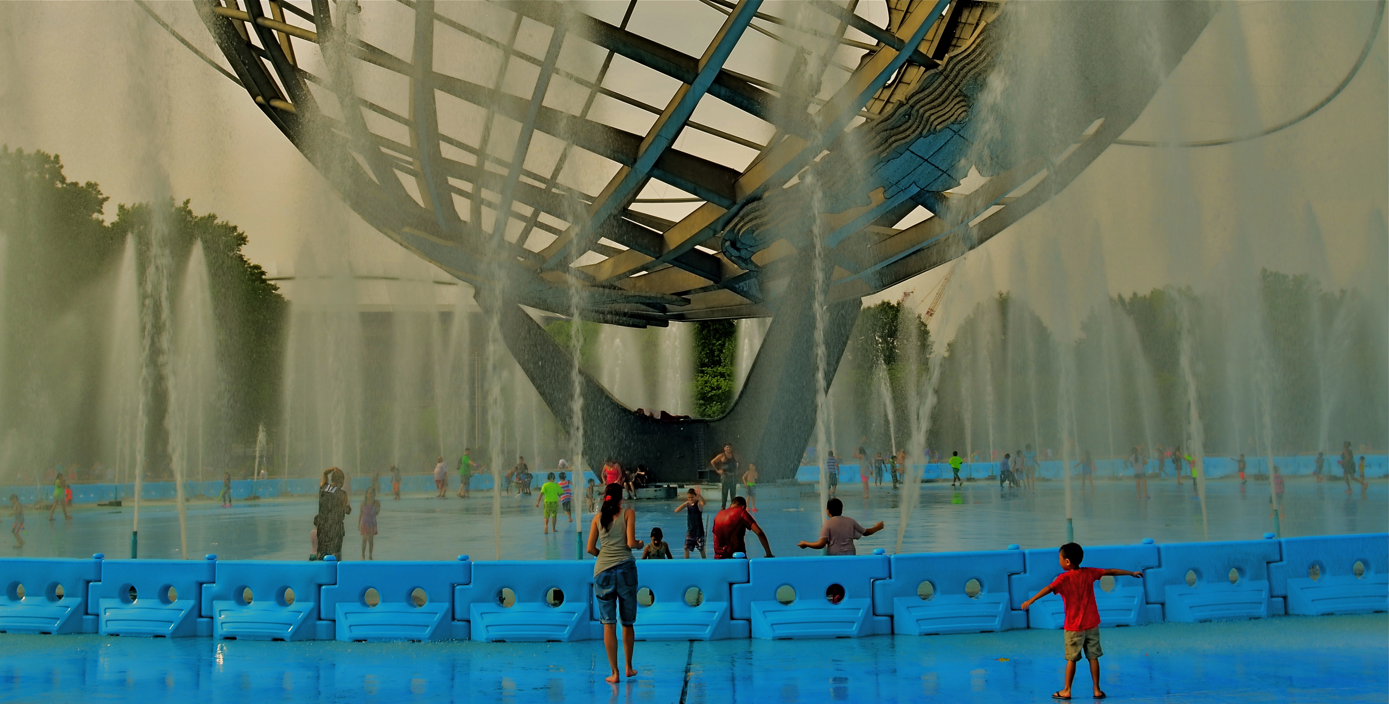
Wet Democracy (2017): The 1964 World’s Fair’s central icon as play space.
By MICHAEL PERKINS
CULTURAL ICONS, which burn very distinct patterns into our memory, can become the single most challenging subjects for photography. As templates for our key experiences, icons seem to insist upon being visualized in very narrow ways–the “official” or post card view, the version every shooter tries to emulate or mimic. By contrast, photography is all about rejecting the standard or the static. There must be, we insist, another way to try and see this thing beyond the obvious.
Upon its debut as the central symbol for the 1964 New York World’s Fair, the stainless steel structure known as the Unisphere was presented as the emblem of the peaceful ideals put forth by the Exhibition’s creators. Under the theme “Peace Through Understanding”, the Uni, 120 feet across and 140 feet in height, was cordoned off from foot traffic and encircled by jetting fountains,which were designed to camouflage the globe’s immense pedestal, creating the illusion that this ideal planet was, in effect, floating in space. Anchoring the Fair site at its center, the Unisphere became the big show’s default souvenir trademark, immortalized in hundreds of licensed products, dozens of press releases and gazillions of candid photographs. The message was clear: To visually “do” the fair, you had to snap the sphere.
After the curtain was rung down on the event and Flushing Meadows-Corona Park began a slow, sad slide toward decay, the Unisphere, coated with grime and buckling under the twin tyrannies of weather and time, nearly became the world’s most famous chunk of scrap metal. By 1995, however, the tide had turned; the globe was protected by the New York City Landmarks Preservation Commission, and its rehabilitation was accompanied by a restoration of its encircling fountains, which were put back in service in 2010. The fair park, itself staging a comeback, welcomed back its space-age jewel.
As for photography: over the decades, 99% of the amateur images of the Unisphere have conformed to the photographic norm for icons: a certain aloof distance, a careful respect. Many pictures show the sphere alone, not even framed by the park trees that flank it on all sides, while many others are composed so that not one of the many daily visitors to the park can be seen, robbing this giant of the impact imparted by a true sense of scale.
In shooting Uni myself for the first time, I found it impossible not only to include the people around it, but to marvel at how completely they now possess it. The decorum of the ’64 fair as Prestigious Event now long gone, the sphere has been claimed for the very masses for whom it was built: as recreation site, as family gathering place..and, yes, as the biggest wading pool in New York.
This repurposing, for me, freed the Unisphere from the gilded cage of iconography and allowed me to see it as something completely new, no longer an abstraction of the people’s hopes, but as a real measure of their daily lives. Photographs are about where you go and also where you hope to go. And sometimes the only thing your eye has to phere is sphere itself.
RE-PURPOSING INFORMATION
 By MICHAEL PERKINS
SIGNS ARE PRIMARILY SOURCES OF INFORMATION AND IDENTIFICATION, a utilitarian way of learning who’s who and what’s where. In photography, their primary use can move beyond those roles to become commentary, context, atmosphere, even pure abstract subject matter. As shooters, we all use signs in ways that are not strictly literal but are 100% visual. They are powerful tools.
This is a circular way of saying that, in an image, a sign is never just a sign, but a way of indicating and qualifying place, time, mood. Be it a hand-scrawled “keep out” warning outside a busted farmhouse or a day-glo neon “open” greeting outside a pawn shop, a sign is valuable narrative shorthand. Of course, just like human storytellers, some signs are untrustworthy narrators, undermining what they seem to “say” with the things they imply within an image. Managing their messaging then becomes the responsibility of the photographer, who can use their content to reveal, conceal, or comment as needed.
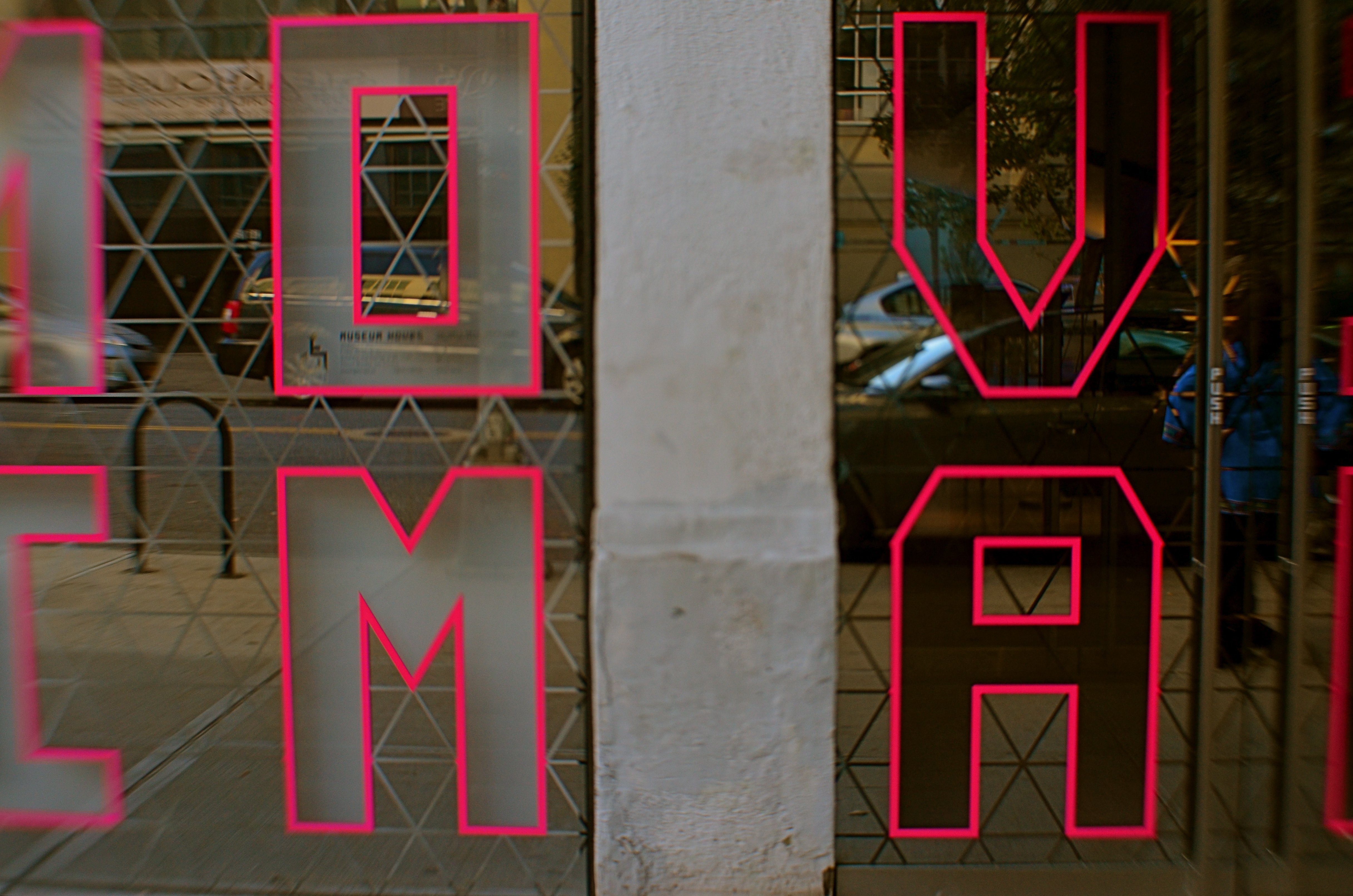
The sign seen here, announcing the Museum Of The Moving Image in Astoria,Queens, has its letters mounted on a mirror-like surface, allowing the viewer to see evolving street life over his shoulder as he “reads” the characters. It’s both advertisement and illustration, a low-tech demo of the museum’s intent. Like all signs, it’s a prop, a piece of stage dressing, interpreted as narrowly or broadly as you need it to be.
TWO WORLDS, ONE WALL
By MICHAEL PERKINS
PHOTOGRAPHS BEGAN AS A SIMPLE HEAD–ON ENGAGEMENT. The viewpoint of the camera was essentially that of an audience member viewing a stage play, or reading a page of text, with all visual information reading from left to right. People stood in front of the lens in one flat plane, giving the appearance, as they posed before offices or stores, that they themselves were components in a two-dimensional painting. Everyone stared straight ahead as if in military formation or a class portrait, producing fairly stiff results.
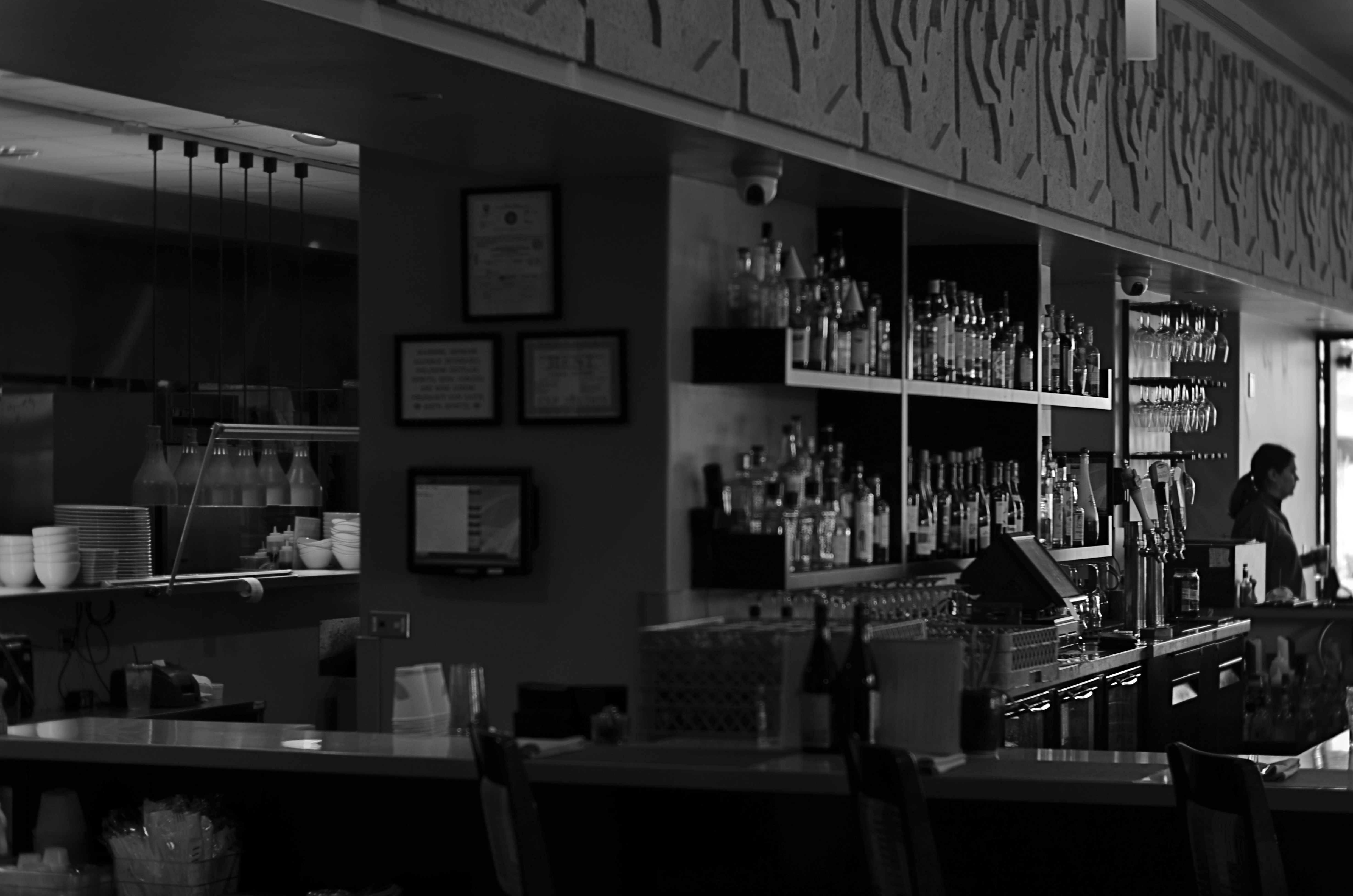
We started photography by placing people in front of walls, then learned, like good stage managers, that selectively positioning or moving those walls could help image-makers manage the techniques of conceal/reveal. Now you see it, now you don’t. Photography no longer takes place in one plane: barriers shift to show this, or to hide that. They are part of the system of composition. Control of viewing angle does this most efficiently, as in the above image, where just standing in the right place lets me view both the front and back activities of the restaurant at the same time.
Of course, generations after the rigid formality of photography’s first framing so, we do this unconsciously. Adjusting where walls occur to help amplify our pictures’ narratives just seems instinctive. However, it can be helpful to pull back from these automatic processes from time to time, to understand why we use them, the better to keep honing our ability to direct the viewer’s eye and control the story.
FAKING YESTERDAY (AND LOVING IT)
By MICHAEL PERKINS
PHOTOGRAPHS ARE POWERFUL ALLIES when it comes to wish fulfillment. One of the medium’s first great artists, Julia Margaret Cameron (1815-1879) not only preserved the faces of Charles Darwin, Alfred Lord Tennyson and Robert Browning for posterity, but also went the extra step into fantasy by draping her subjects in historical costumes and posing them in illustrations from Shakespeare and Arthurian legend. Her stars masqueraded as legends, their features made dreamy and ethereal with her soft, long exposures on collodion-coated glass plates.
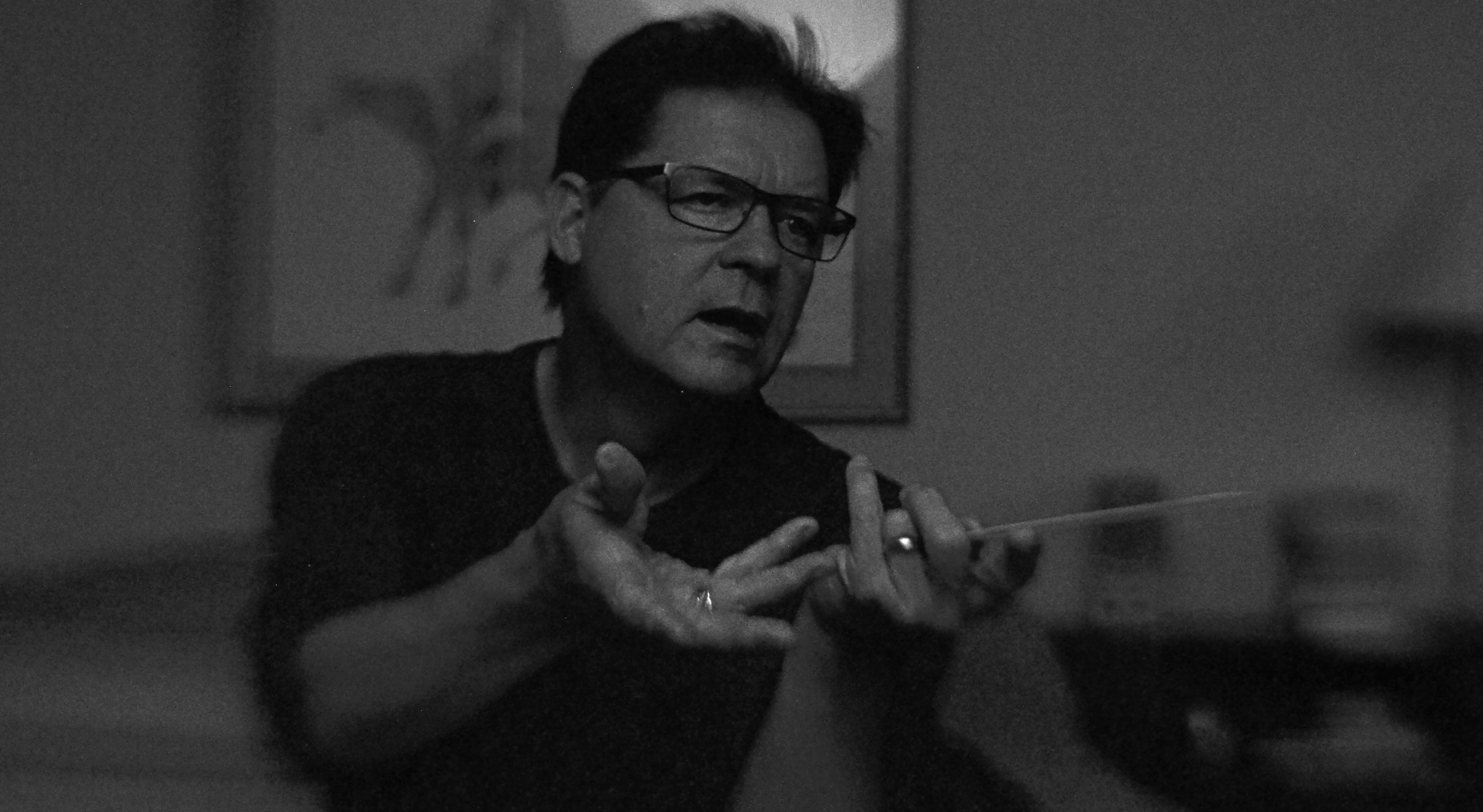
Everyone deserves at least one such photo fantasy, the chance to effectively leap into a treasured era while also creating the look that would have been common in that time. For a kid in baby-boom Ohio, daydreaming about standing up in front of a world-class orchestra, a kid who never played air guitar but who exhausted himself playing “air baton”, my photographic era of choice was that of Columbia Masterworks’ 30th Street recording studio in the Manhattan of the early 1960’s.
At the insistence of the label’s classical producer Goddard Lieberson, chief photographer Don Hunstein shot the greats not in starched, formal portraits, but in the very act of creation, immortalizing maestros from Leonard Bernstein and Pierre Boulez to George Szell and Igor Stravinsky. In terms of the “feel” of the images, most photo illustrations for album jackets from the period were still in black-and-white, lending Hunstein’s shots a gritty realism, as did the slower, higher-grain film emulsions and softer portrait lenses of the time.
Enter my self-generated conductor fantasy, shooting myself with a remote shutter release in a nearly dark room, just about half an hour after sunset at 1/40 of a second to allow me to hold a fake “caught in the action” pose with just a small amount of manually tweaked de-focusing for softness at f/4 and an ISO of 1250 to simulate the old Kodak Tri-X grain.
Vain beyond belief? You bet. More fun than my five best Halloweens combined? Indeed. “Alright everyone. Let’s take it from bar 124…”
WHEN COLOR IS ALL

By MICHAEL PERKINS
JUST A LITTLE SCROLL STROLL THROUGH GOOGLE will show just how long and how intensely the debate over color has raged in the photographic world……that is to say, whether color should be used at all, or whether, indeed, it was the spawn of Satan, turning the art of imaging into a crude carnival trick. Today, we routinely concede that both monochrome and color have distinct uses in the making of images, each bringing singular strengths to the process. But it was not that long ago that the two camps went at it like Hatfields and McCoys.
Many still feel that color should only be called on to help complete or “sell” a picture, a finishing touch of sorts. “In black and white you suggest”, wrote Paul Outerbridge in Modern Photography. “In color, you state.” Others, like myself, believe that there are times when color is content, complete in itself, regardless of the “official” subject of the image. Or, as Alex Webb writes, “Color is very much about atmosphere and emotion and the feel of a place.”

The photos seen here show how, if color is a compelling enough messenger, most of the visual information in a picture can be pared away to let that color message breathe. The master shot of a street vendor at sundown (seen at directly above) might have worked out if I had done one or two things better, but upon later examination, I realized that the long horizontal string of neon-hued ukuleles at the top of the shot could work if cropped loose from the less effective uber-shot (as seen at top). Better still, the color in the cropped shot is not actually about “ukuleles”, since a string of tropical fruits or a rack of hats with the same tonal palette would sell the image just as well. This is truly a case of color “just because”, conveying Alex Webb’s “emotion and feel” without assistance.
A lot of the photo world’s resistance to color, which ended barely more than a generation ago, stemmed in part from a loathing for the limited printing processes which made it harder to predict or control results compared to monochrome. But there was also the fear that untalented shooters would use it as a sensational crutch to boost mediocre work. Now it seems clear that color, like any other technical element, lives or dies based on what it is called upon to do, and how well the individual artist makes his argument.
SLAGIATT
Lighting A, Concept D…
By MICHAEL PERKINS
I CALL IT NO–FUNDAY, the painful exercise of poring over photographs that I once considered “keepers” and now must reluctantly re-classify as “obviously, I’m an idiot.” For any photographer, self-editing one’s output is just the kind of humiliation one needs to keep on shooting, if only to put greater distance between one’s self and one’s yester-duds.
To make the shame of disowning my photographic spawn even worse, I find that, more often than not, technical failure is usually not the reason I’m lunging for the delete button: it’s the weakness of the conception, a basic lifelessness or lack of impact that far outweighs any errors in exposure, lighting, even composition. In other words, my worst pictures are, by and large, bad because they are well-executed renditions of measly ideas.
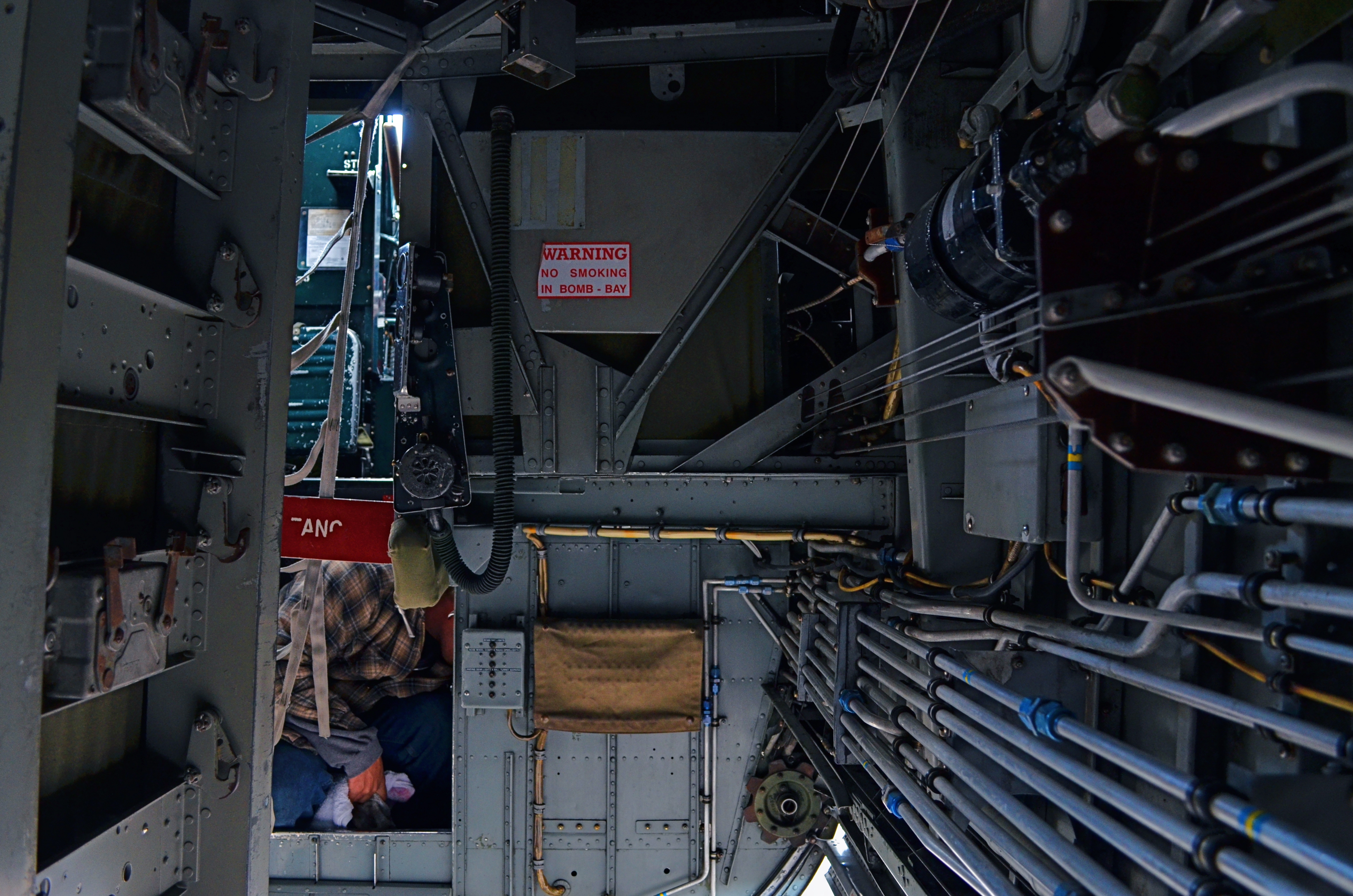
In my mental filing cabinet, I refer to these images under the acronym SLIGIATT, or Seemed Like A Good Idea At The Time. The image above is a perfect example. This shot, taken inside the underbelly of a WWII bomber, presented a ton of lighting challenges, but I spent so much time tweaking this aspect of it that I neglected to notice that there just isn’t a picture here. It tells no story. It explains nothing. It’s just an incomprehensible jumble of old equipment which lets the eye wander all over the frame, only to land on…..well, what exactly? But, boy howdy, it is well-lit.
SLIGIATT photos are, of course, necessary. You have to take all the wrong pictures to teach yourself how to create the good ones. And mere technical prowess can, for a time, resemble quality of a sort. But technique is merely craft, and can be had rather easily. The art part comes in when you’re lucky enough to also build a soul into a machine. As Frankenstein figured out, that’s the difference between being God and playing God.
SHATTERING THE FRAME
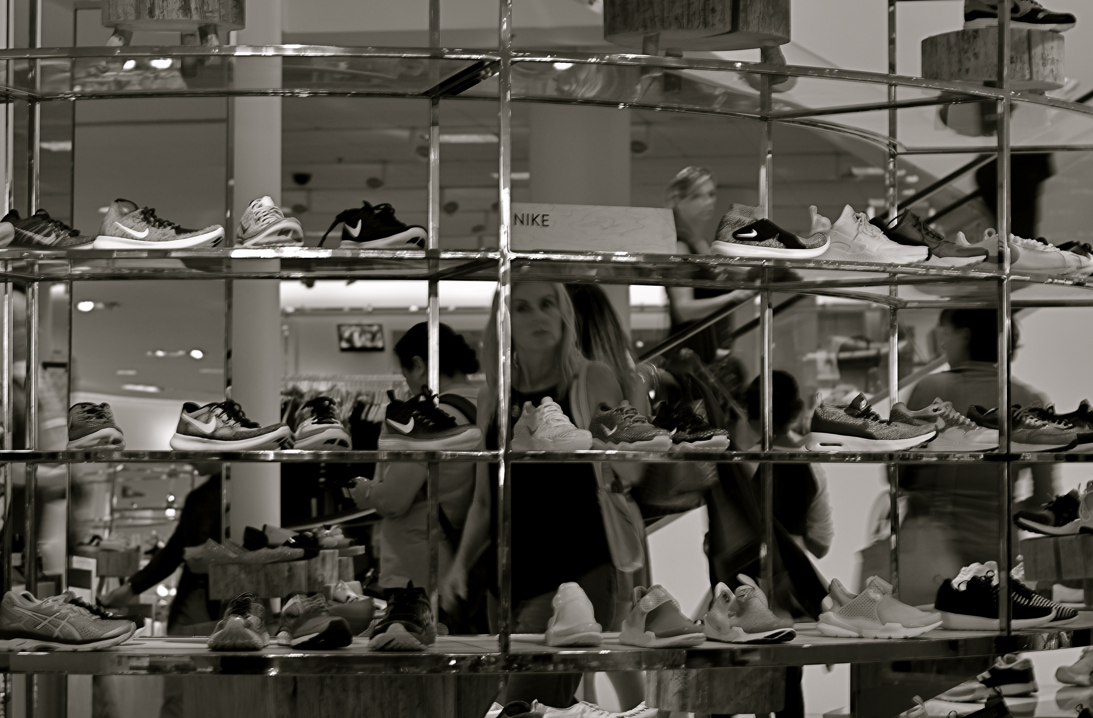
Which piece of the puzzle should be prominent?
By MICHAEL PERKINS
ONE OF THE MOST REVOLUTIONARY ACTS a photographer can commit is the thwarting of expectation, a deliberate subverting of what the viewer assumes will happen next. Composition-wise, this means not just deciding what information makes it into the frame, but, indeed, whether there will even be a frame at all.
Any demarcation or line within an image can be used to direct attention to a given location. Whether including or excluding, pointing toward or pointing away from, the photographer has pretty much limited authority on how he’ll direct traffic within a composition. And so we shoot through holes, slats, panes, and skylights. We observe borders marked by cast shadows: we cut spaces in half to make two rooms out of one: we reveal facts in parts of reflections while obscuring the objects they reflect.
In the above image, I saw the subdivisions of the department store display unit like a wall of little tv’s, each screen showing its own distinct mini-drama. Is the woman seen eyeing the merchandise the most prominent “screen star”, or are we just seeing an arbitrary mosaic of the larger scene behind the display? Or is it both?
Framing within the larger frame of a composition can isolate and boost whatever message we’ve chosen to convey, and it’s perhaps the most total control a photographer can wield, more so in its way than even exposure or lighting.
THE WHATS OF WHOS
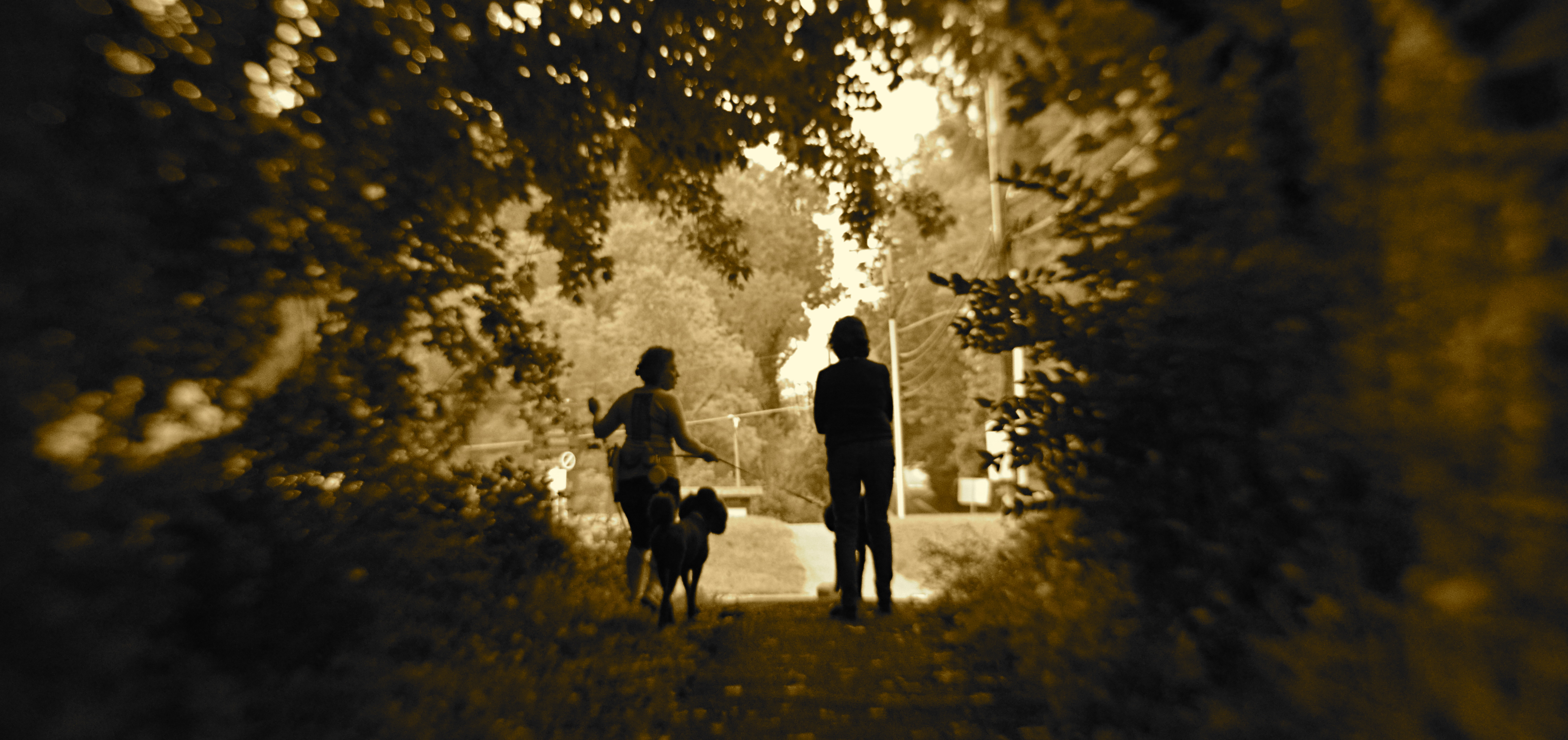
Portraits introduce and re–re–re–introduce us to people, in a process that never really ends.
By MICHAEL PERKINS
RENDERING THE HUMAN IN THE FULL CONTEXT OF THE WORLD is, for me, the one true way to produce a photographic portrait. Sitting someone in a nice room with flattering light and a serene atmosphere might be a formalized way to record a person’s features……but….
Yeah, that’s always the problem with pictures, innit? That insistent but. The part left unspoken. The case left unmade. The squirmy essence of personhood that stubbornly resists imprisonment in our little boxes. It’s quite revealing that, in trying to compliment someone on a portrait, we used to actually say, “I really think you’ve captured him”, as if “he” were a lightning bug in a jar. But such statements miss the very point of portraiture, even photography itself.
Photographs of people can’t be “one and done”, or “official”, or, God help us, “the last word”, any more than sunsets can. We aren’t making a document of a static thing, only serving up a time-slice of something that, by virtue of being in the world, is in constant flux.
To illustrate, the shot you see above is, for me, every bit as much a “portrait” of my wife (the one on the right) as any organized or traditional rendering of her face, because it shows her in the context of a world she inhabits: a world defined by nature, friendships, and animals. I don’t need her face to tell a story about her.
What people do is as telling as what they look like, and so it has to enter into any image-making about who they are.
THAT WHICH IS EARNED
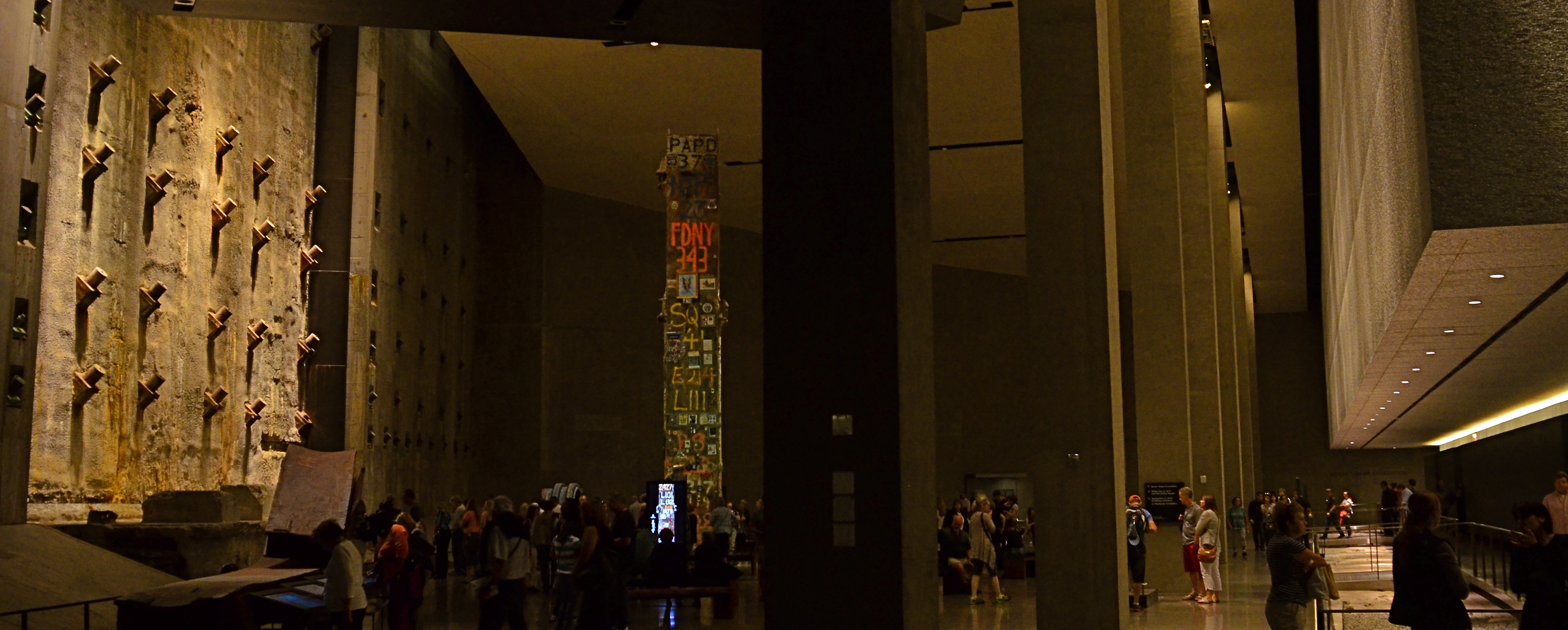
By MICHAEL PERKINS
THE MORE INDEPENDENCE DAYS that I mark as an American, the more the holiday is fine-tuned, for me, from one of pure celebration to one of sober reflection. As a child, I waved my little flag, oohed and ahhed at fireworks, and ran up the scores of all our national wins and points of pride. As a middle-aged man, I think of the USA as a wonderful, but incomplete “to-do” list. I cherish what we’ve been but also try to be mindful of what we need to be. And that, in turn, widens my concept of what an Independence Day photograph can look like.
The above image, taken within the solemn sanctum of the 9/11 memorial, may not be many people’s choice for a “Happy 4th” -type picture, for a whole bunch of reasons. And I get that. There’s nothing celebratory about it. No wins, no rousing anthems. No amber waves of grain. That doesn’t mean, however, that it’s inappropriate. It may not rhapsodize about victory, but it does affirm survival. It doesn’t brag about what we have, but it does remind us of how much we stand to lose, if we take it easy, or take our eye off the ball.
The 9/11 site is unique in all the world in that it is battlefield, burial ground, transportation hub, commercial center, and museum all in one, a nexus of conflicting agendas, motives and memories. And while it’s a lot more enjoyable smiling at a snapshot of a kid with a sparkler than making pictures of the most severe tests of our national resilience, photography taken at the locations of our greatest trials are a celebration of sorts. Such pictures demonstrate that it’s the freedom we earn, as well as the freedom we inherit, that’s worth raising a cheer about.
And worth capturing inside a camera.
AND NOW WE PAUSE FOR…
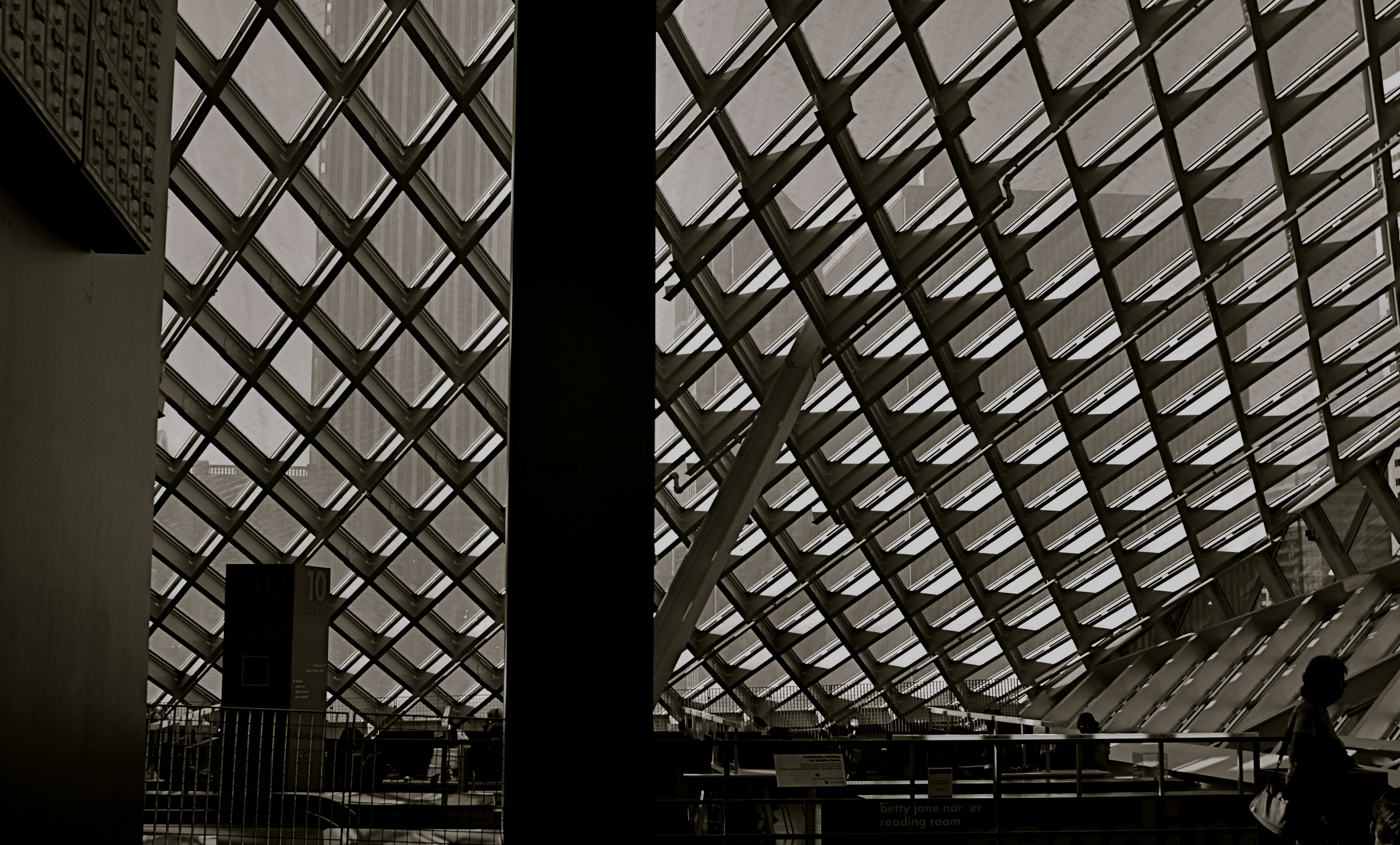
Patterns can gain impact when they are suddenly interrupted.
By MICHAEL PERKINS
A BREAK IN THE ACTION: a word from our sponsor: a coda before the chorus. Intrusions into the predictable rhythms of things can be either annoying or refreshing, depending on how we perceive them.
The right intervals between dots and dashes can drastically change the meaning of a telegram. A well-placed silence between musical notes can generate just the tension required to transform a composition into a masterpiece. And a sudden interruption in visual patterns can add impact to a photograph.
Once the eye detects, as they say on Sesame Street, that one of the things in a picture is not like the others, it pauses, re-evaluating every element in the scene, weighing it for relative value. Breaking an image’s pattern is either an unwelcome invasion or a kind of visual punctuation….again, varying as to the effect. The object violating the uniformity says pause, wait, re–consider, and begins a new conversation about what we’re seeing and what we think about it.
In the above picture, a human silhouette against the massive ceiling grid provides the basic context of scale, and defines the locale (a library) as a space where human activity takes place. The figure thus says how big the place is and what it is for, along with any other ancillary associations touched off in the viewer’s mind. Would the picture “work” without the figure? Certainly. The terms of engagement would just be different, that’s all.
Photographs are not merely pictures of things. They are also sets of instructions (suggestions?) on what to do with all that information. Think of them like roadside signs. It’s indeed helpful to be told, for example, that Sacramento is just another 100 miles away. But it’s just as important to have a big bright arrow telling you to head that–away.
TLI
Is a self-portrait just a face crammed into an iPhone screen, or should it be more?
By MICHAEL PERKINS
THERE MAY BE NO PART OF PRESENT–DAY PHOTOGRAPHY that is more practiced and less understood than the humble self-portrait. This has not always been the case. Turning the lens on oneself was a much less common act until the arrival of mobile phones, at which time the somewhat awkward old technique of setting a timer and jumping into the picture was supplanted by an act that was at once instantaneous and effortless. Ironically, at that point, the sheer numerical proliferation of the selfie overwhelmed the artistic fact that many of us weren’t doing them very well.
The modern selfie has been degraded largely because any variance from the same banal fill-the-entire-frame-with-your-face approach is so rare. We get plenty of features and not much context, a condition that could be called TLI, or Too Little Information. Worse, selfies in the iPhone era are limited mostly to what framing is permitted by the length of the shooter’s arm, causing any surrounding people, places or events to be eclipsed from the shot, rendering an image of “me at the canyon” maddeningly identical to one of “me in front of the cathedral.” Add the distortion of near objects inherent in the wide-angle lenses of many mobiles, and too many selfies conceal or mutate more than they reveal. And don’t get me started on the effects of on-board flash. In short, who are these bloated ghosts?
A portrait is more than a mere record of one’s features. The self is also defined by its surroundings, with the accompanying props of one’s life anchoring that person in an era and providing scale, the staging needed for a complete narrative. Can the face alone sufficiently “sell” one’s story? In the hands of the right shooter, absolutely.But riff through a few hundred online selfies and see how often you behold such gems.
In all too many self-portraits, we mostly settle for mere volume, for blurred and puffy smears of ourselves instead of insights. And, as is often the case when taking pictures is so incredibly easy, we fail to plan. This isn’t vanity, but self-sabotage. The self-portrait needs to slow down, to once more become something of a special occasion.
More information, please..
RE-ASSIGNING VALUE

Can you judge this man’s mind from how he’s shown in the image?
By MICHAEL PERKINS
PHOTOGRAPHY DEMONSTRATED, EARLY IN ITS HISTORY, that, despite the assumption that it was merely a recording device, it regarded “reality” as….overrated. Since those dawning daguerreotype days, it has made every attempt possible to distort, lie about, or improve upon the actual world. There is no “real” in a photograph, only an arrangement between shooter and viewer, who, together, decide what the truth is.
So-called street photography is rife with what I call “reassigned value” when it comes to the depiction of people. Obviously, the heart of “street” is the raw observation of human stories as the photographer sees them, tight little tales of endeavor, adventure…even tragedy. However, the nature of the artist is not to merely document but also to interpret: he may use the camera to freeze the basic facts of a scene, but he will inevitably re-assign values to every part of it, from the players to the props. He becomes, in effect, a stage manager in the production of a small play.
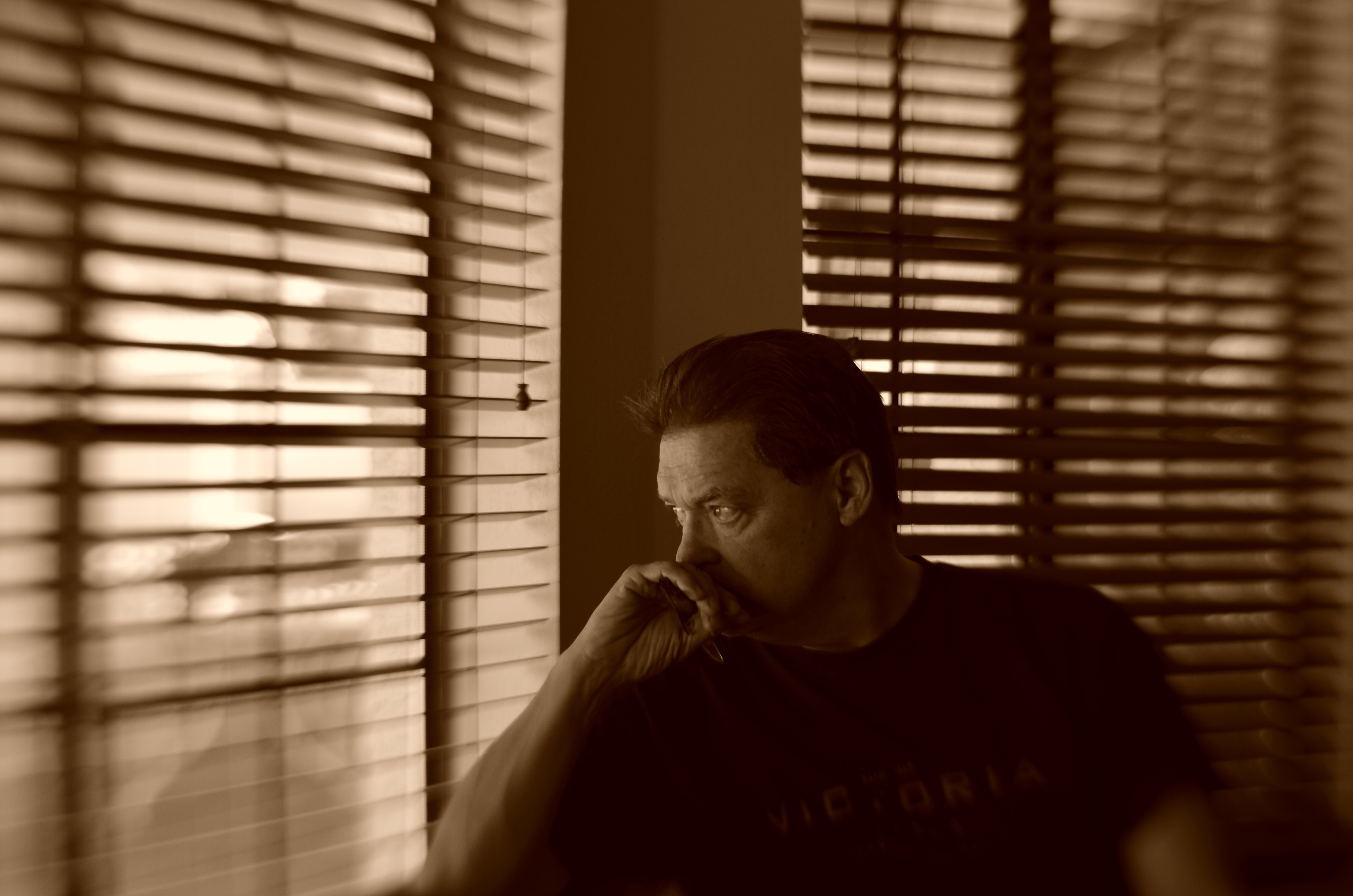
In the above image you can see an example of this process. The man sitting at his assigned post at a museum gallery began as a simple visual record, but I obviously didn’t let the matter end there. Everything from the selective desaturation of color to the partial softening of focus is used to suggest more than what would be given in just a literal snap.
So what is the true nature of the man at the podium? Is he wistfully gazing out the distant window, or merely daydreaming? Is he regretful, or does he just suffer from sore feet? Is he chronically bored, or has his head in fact turned just because a patron asked him the direction of the restroom? And, most importantly, how can you creatively alter the perception of this (or any) scene merely by dealing the cards of technique in a slightly different shuffle?
Photographers traffic in the technical measure of the real, certainly. But they’re not chained to it. The bonds are only as steadfast as the limit of our imagination, or the terms of the dialogue we want with the world at large.
FIVE MINUTES OF FANCY
Start fooling around and see where it leads. It isn’t wasting time, it’s investing it.
By MICHAEL PERKINS
PUTTERING SUFFERS A BAD REPUTATION, coming somewhere on the disreputability scale between “screwing around” and “just passing the time”, poking an insolent finger in the eye of the Puritan work ethic. The headmaster’s voice echoes from the land of Hard-Won Wisdom: Time is money. Make something of yourself. Whattaya gonna do, waste the entire day?
Yeah, replies the photographer within you. Thought I might….
Making a picture isn’t the same process as building a bridge. You don’t always end the project with the same aims as you began with. Like any other artistic enterprise, the answer might come in the journey, rather than the destination. And a photographer, caught in mid-creation and asked, “what you doing?” should be quite comfortable answering, “you know, I’m not really sure yet…”
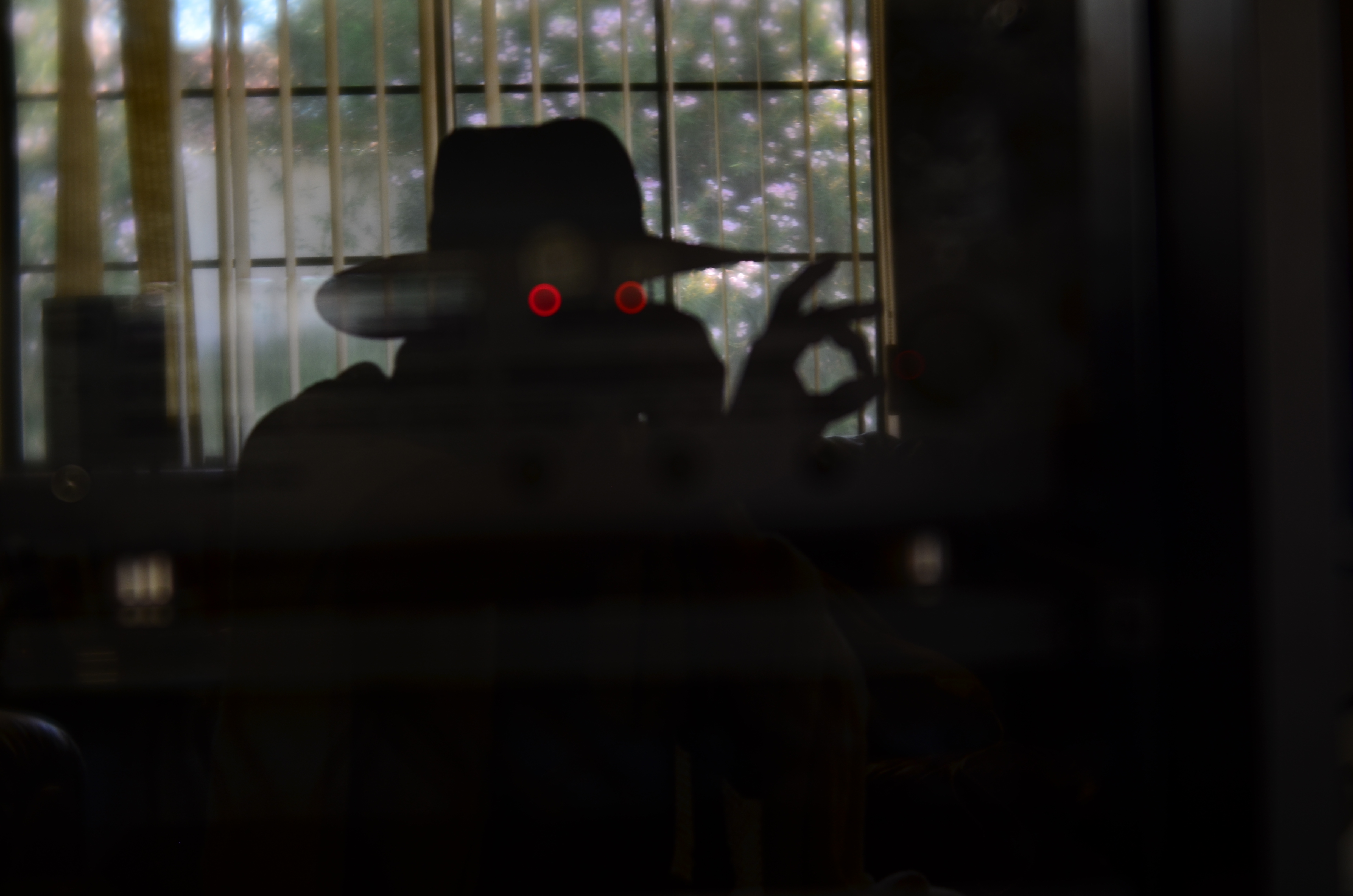
The above image is a total exercise in “let’s see what happens if I do this“, and at no time in the making of it did I have a set plan or firm objective: I just did know when to stop, but everything else was negotiable in the moment. I wasn’t wasting time: I was investing it.
At first, I was trying to take a picture of my back yard, which over my shoulder, as it was reflected in the glass cabinet door in front of me. I was about to kill the power on the amplifier on a shelf behind the door when a test shot revealed something unusual. At my chosen aperture, the amp’s two red LEDs weren’t reading as sharp points of light, but as diffuse outer circles surrounding soft inner circles, almost like a pair of feral eyes. And at that point, the garden scene slowly started to take a back seat.
Shooting the glass door at a slight angle made my body register as a reflection, while shooting straight on turned me into a silhouette, which would become handy. Now that I was just a shape, I could be anything, so I positioned myself to where the dots indeed appeared to glowing, spooky eyes. Shooting with my right hand, my body details now masked by shadow, I crossed my left hand over beyond the right edge of my body, posing it to look as if I were stealing something, or perhaps twisting the dial on a combination safe. Having thus established the behavior for the character I was now creating, I grabbed my wife’s garden hat and threw a bed blanket around my shoulders for some sinister atmosphere. Click and done, with my newly imagined Phantom Blot plotting his way into the house. I didn’t know the whole story, but I knew when to stop playing. Total time investment: five big minutes.
You won’t always have an organized blueprint for a picture when you set about making one. Besides, if you confine yourself solely to the familiar when shooting, eventually all of your photos will start to resemble each other, and not in a good, “cohesive body of work” way.
Screw with the formula. Embrace the uncertain.
WHAT DREAMS MAY COME
Yestertoys (2017). Making this image look merely “real” held no interest, so…..
By MICHAEL PERKINS
MEMORY ISN’T SHARPLY DEFINED OR TIDY, and so the act of conjuring remembrance in art is never as forensically factual as sliding open an autopsy drawer. The yester-thing that we treasure most dearly are the true opposite of clinical artifacts: they are, instead, bleary, distorted, indistinct, and mysterious. Small wonder that trying to fix memory on a camera sensor is like trying to pitchfork smoke.
Creating images in an attempt to capture the past is a huge part of photography, but it’s a no-man’s land without clear markings or signs. We begin our visual argument by asserting that our version of a memory is the official one… but official according to whom? Even people who have shared a specific event will offer different testimony of what it “really” was. And that very subjective uncertainty becomes one of photography’s greatest charms.
It only took a few years for early shooters to conclude that photographs need not be confined to merely measuring or documenting the world. Early on, they enlisted fancy and whimsy to the cause of depicting memory, just as painters did. And conversely, once there was a machine like the camera to perform the task of faithfully recording “reality”, painters began to abandon it for Impressionism and everything that followed after. Both arts began, like Alice, to regularly venture out on both sides of the looking glass.
A great part of photography’s allure is in discovering how little objective reality has to be in image involving memory, and what an adventure it is to escape the actual in the pursuit of the potential. The camera lets us tell lovely lies in pursuit of the truth.
SETTING THINGS STRAIGHT
By MICHAEL PERKINS
ONE OF THE MOST ELUSIVE EFFECTS IN ARCHITECTURAL PHOTOGRAPHY would seem to be the one most easily achieved: the look of a straight line, the foundation upon which an orderly image is built. However, the human eye is often more unreliable than assumed when it comes to reading and identifying that which is supposed to be “straight.”
We’ve all been confounded by optical illusions that present lines that are not, objectively, straight at all, even though our brains, based on our interpretation of the visual data, say they must be. However, we tend to dismiss this sensation as trickery, something we don’t have to sweat about in making a “real” picture. And that is probably a mistake.
Based on what kind of architectural design you’re shooting, what lens you choose, even where you stand, a straight line, either horizontal or vertical, can seem to bend or lean, making our “factual” images less than trustworthy.

Even setting up a shot on a carefully calibrated tripod and a bubble level can produce a result that looks as if it was manipulated. Of course, based on what look you desire, you may regard geometric reality as irrelevant, and deliberately engineer ” unreality” into a photograph. That’s why we make a distinction between taking a picture and making one.
As an example, the picture seen above was taken super-wide, at 18mm, to intentionally exaggerate the size of the room, making some verticals bow in while others register normally, and playing stretchy with the ceiling arches and floor horizon. The idea here was to distort the already extreme Art Deco accents and give them an extra funhouse quality. Shooting with a more conventional focal length like 35 or 50 mm would have made for straighter lines, but would also have sacrificed every other effect achieved at 18mm.
Bottom (straight or crooked) line: dimensions and angles are suggestions, not commandments. But it’s a lot easier to break rules creatively once you understand how they work.

SPEED OF LIFE
By MICHAEL PERKINS
NEW YORK CITY HAS BEEN CALLED MANY THINGS: words like titanic, exciting, merciless, dizzying, dangerous, even magical spring to mind immediately. By comparison, fewer observers refer to the metropolis with words like peaceful, tranquil, or contemplative, and fewer still would ever label it slow. Manhattan may be lacking for modern subways, open space, or a cheap cup of coffee, but it’s never short on speed.
NYC runs on velocity the way other towns run on electricity: the entire metro is one big panicky White Rabbit, glancing at his pocket watch and screeching “I’m late!” As a consequence, anyone making photographs in the Apple has to factor in all that velocity, or, more precisely, decide how (or whether) to depict it.
Do you try, for example, to arrest the city’s rhythm in flight, freezing crucial moments as if trapping a fly in amber, or, as in the image above, do you actively engage the speed, creating the sensation of New York’s irresistible forward surge as a visual effect?
Fortunately, there is more than a century of archival evidence that both approaches have their own specific power. Pictures made in the precise instant before something occurs are rife with potential. Images that show things in the process of happening convey a sense of excitement and immediacy. Like the lanes in a foot race, speed has discrete channels that can reward varying photographic approaches.
Share this:
August 15, 2017 | Categories: Commentary, Composition, Conception, Documentary, Uncategorized | Tags: Street Photography, urban neighborhoods | Leave a comment